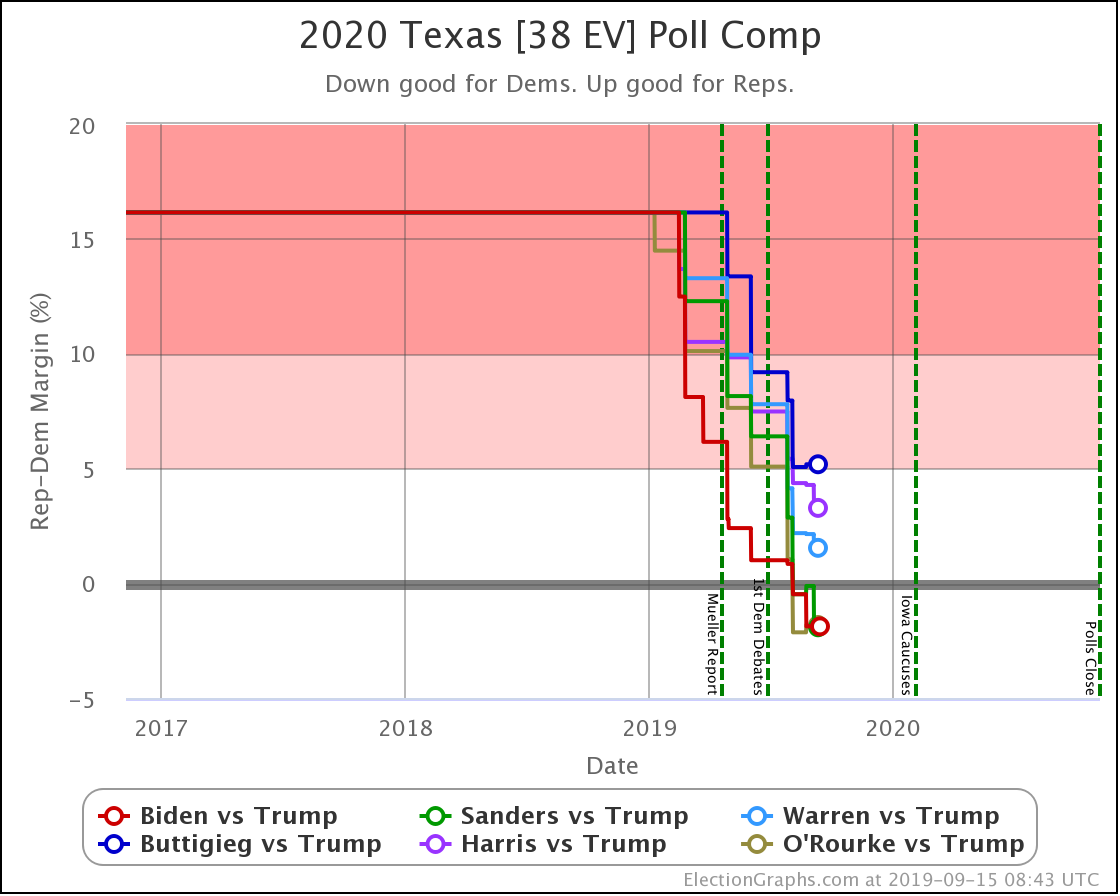
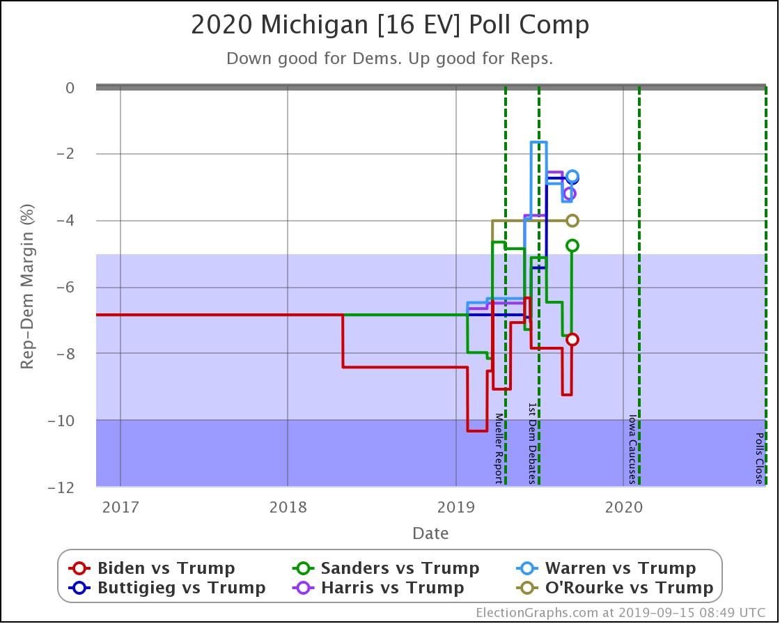
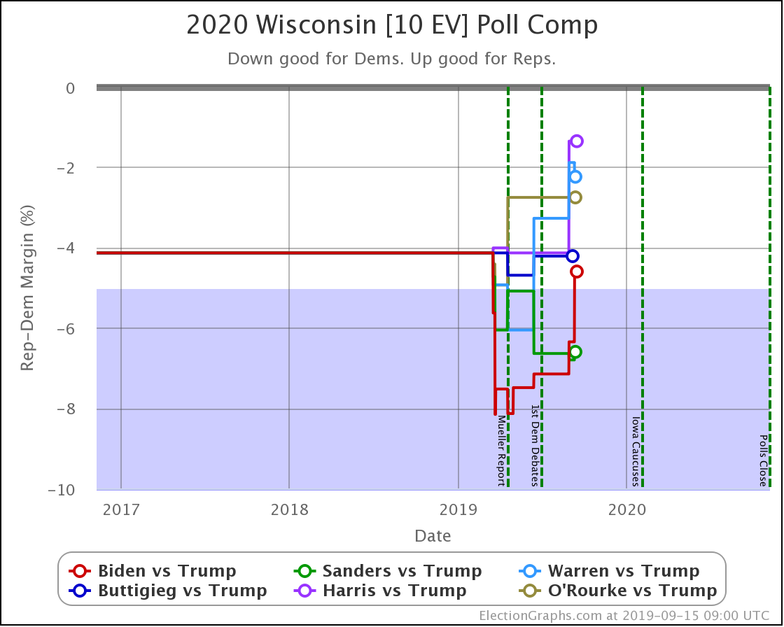
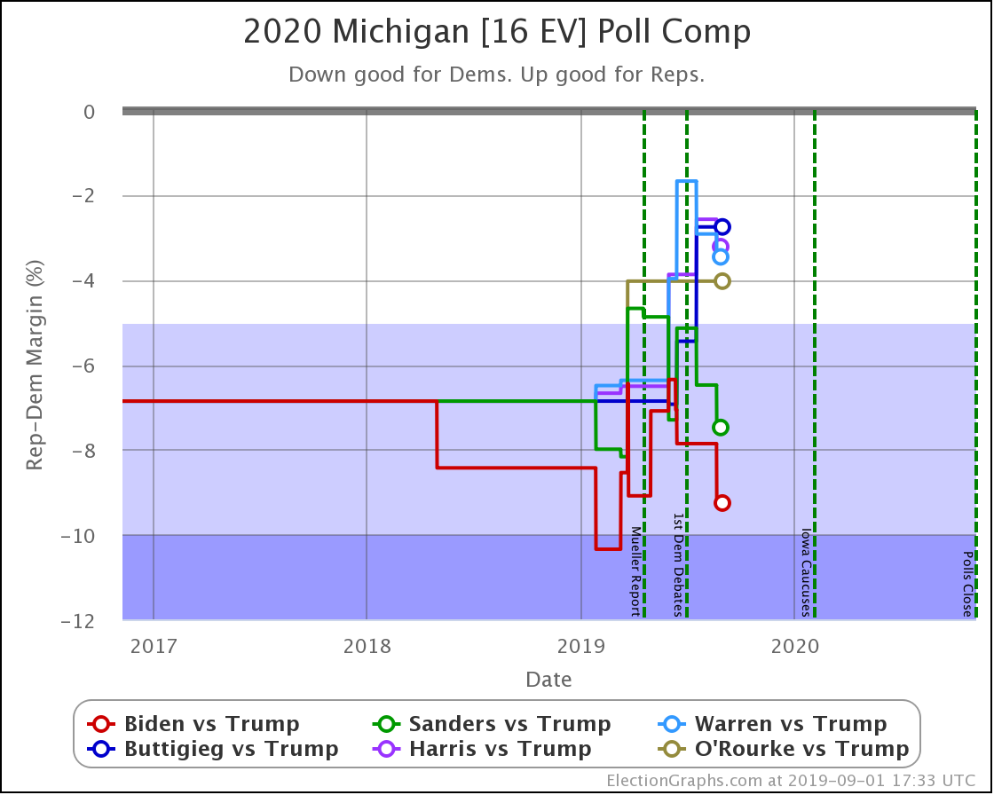
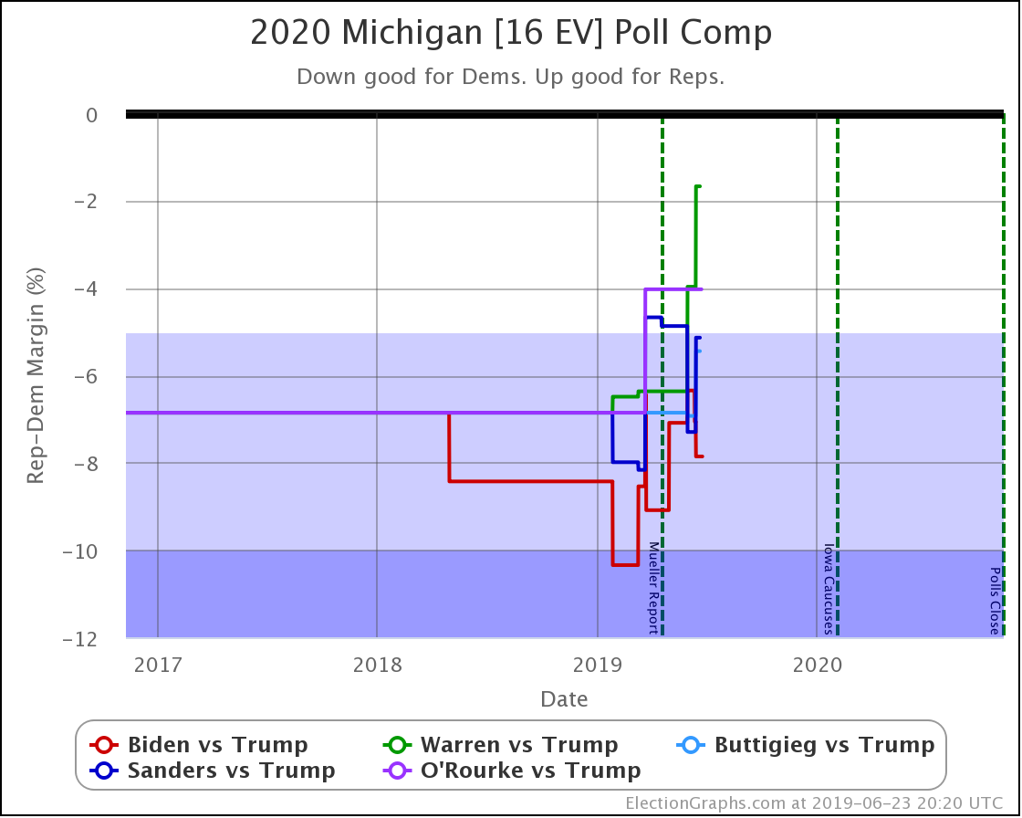
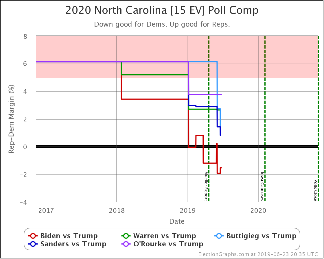
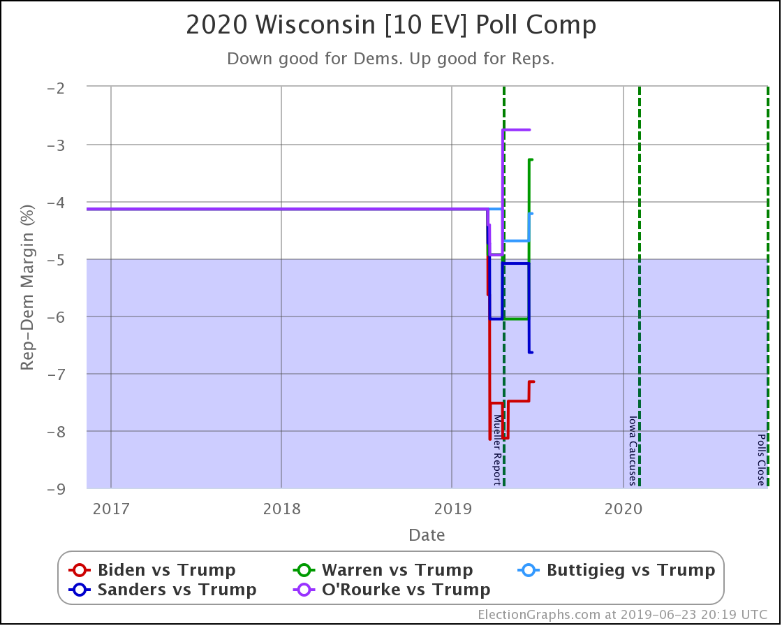
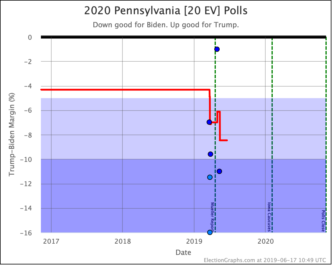
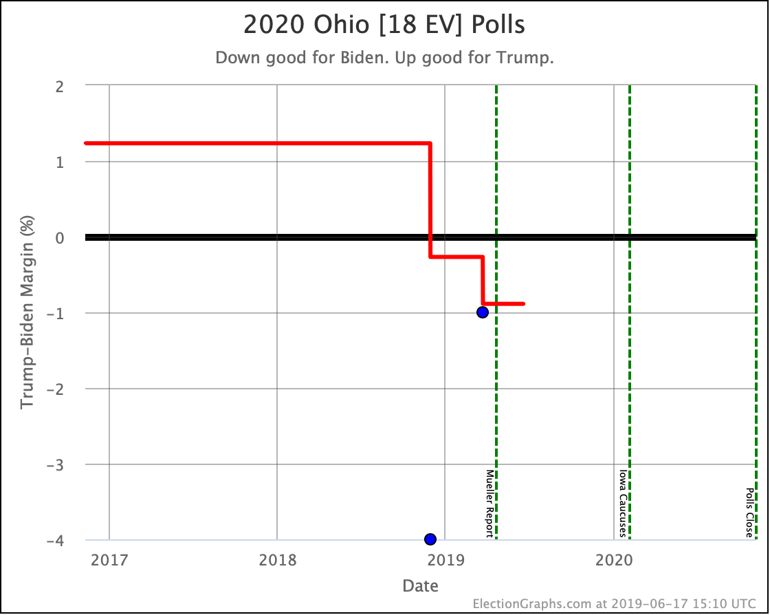
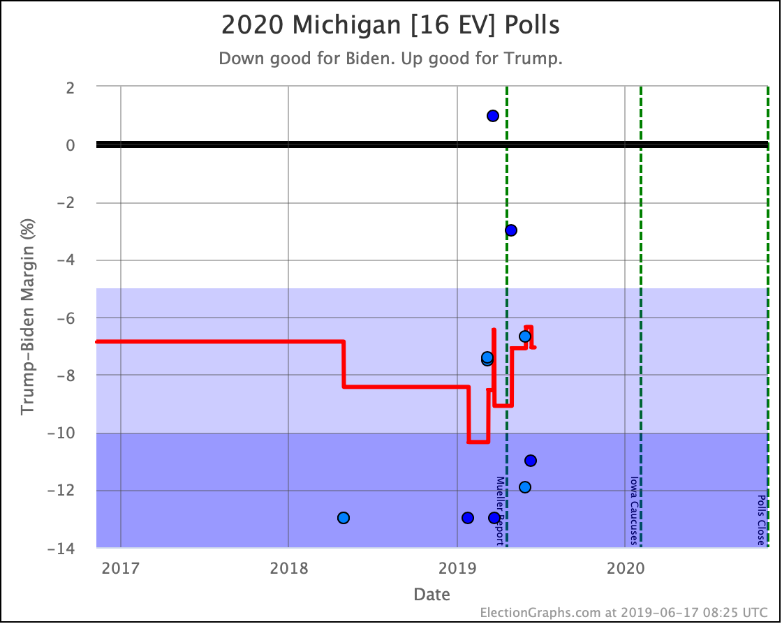
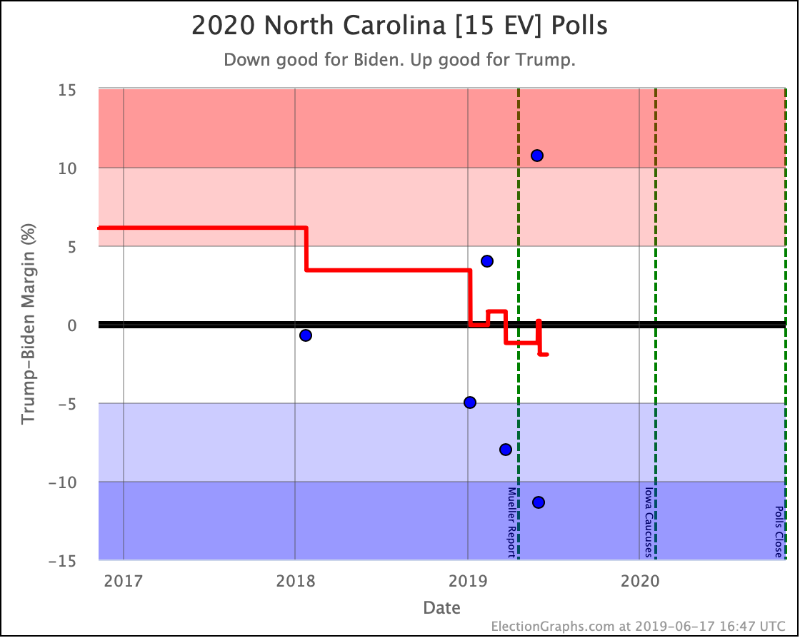
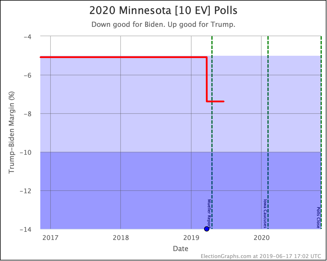
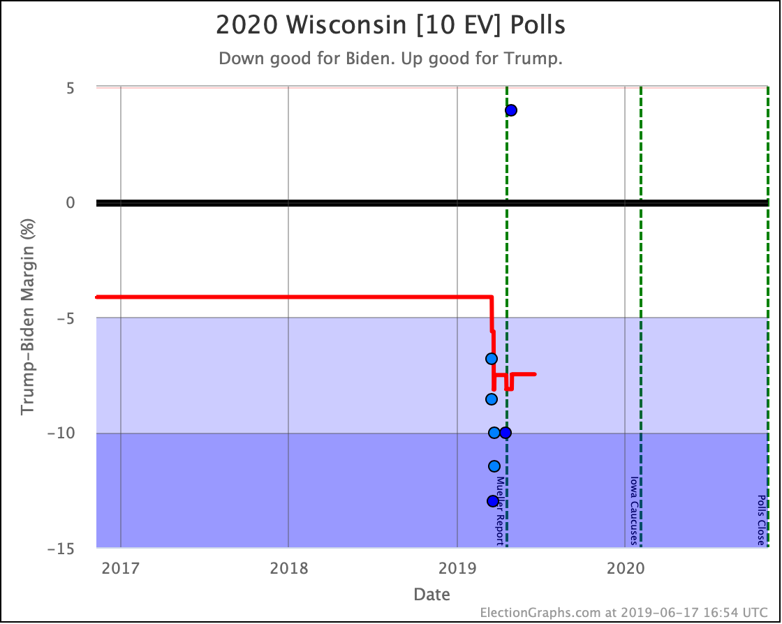
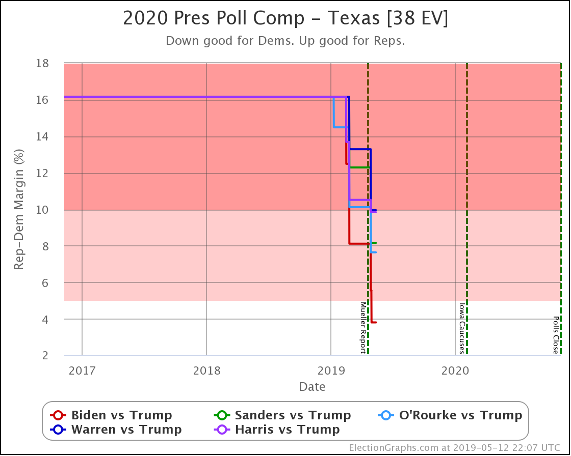
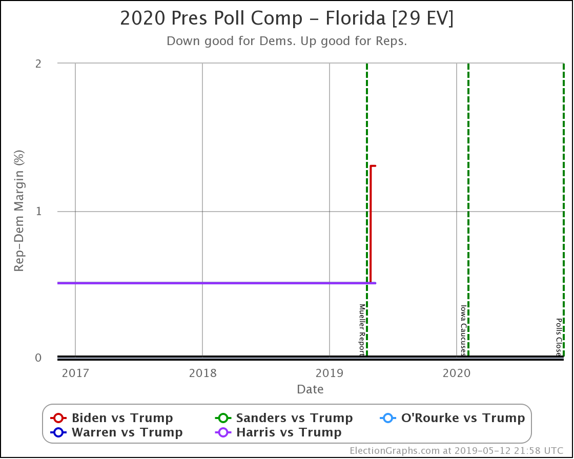
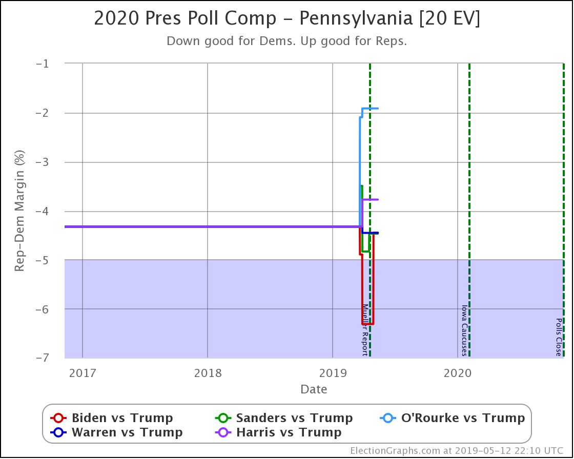
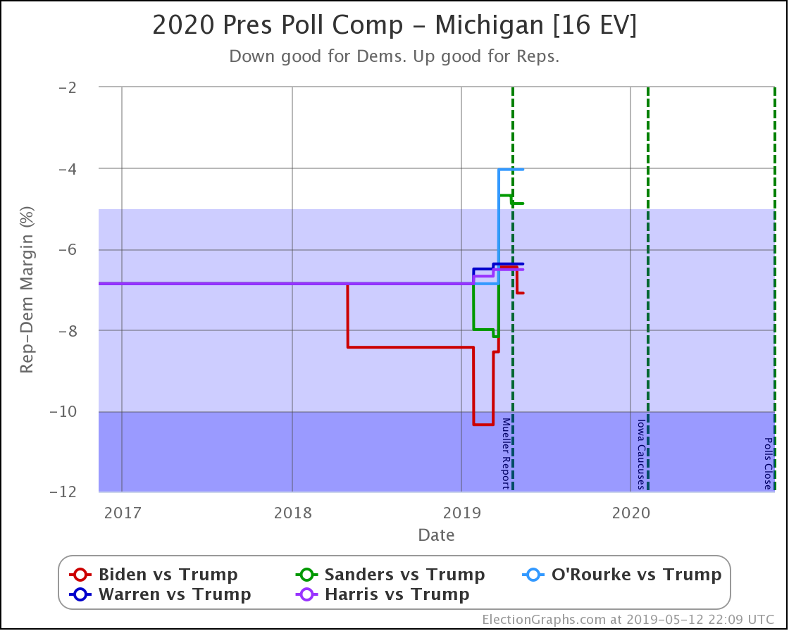
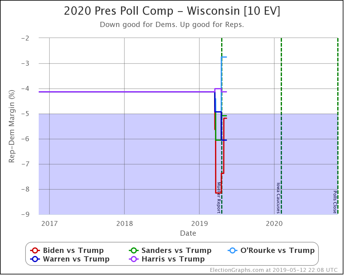
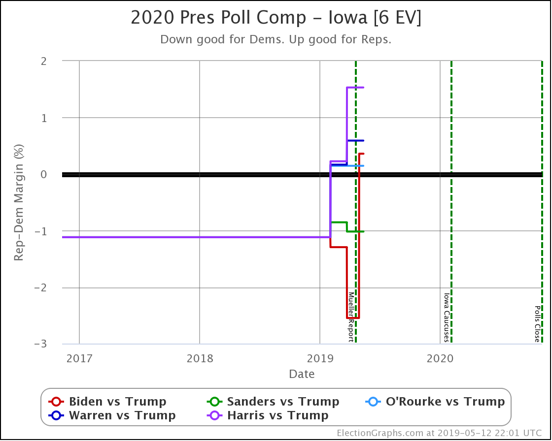
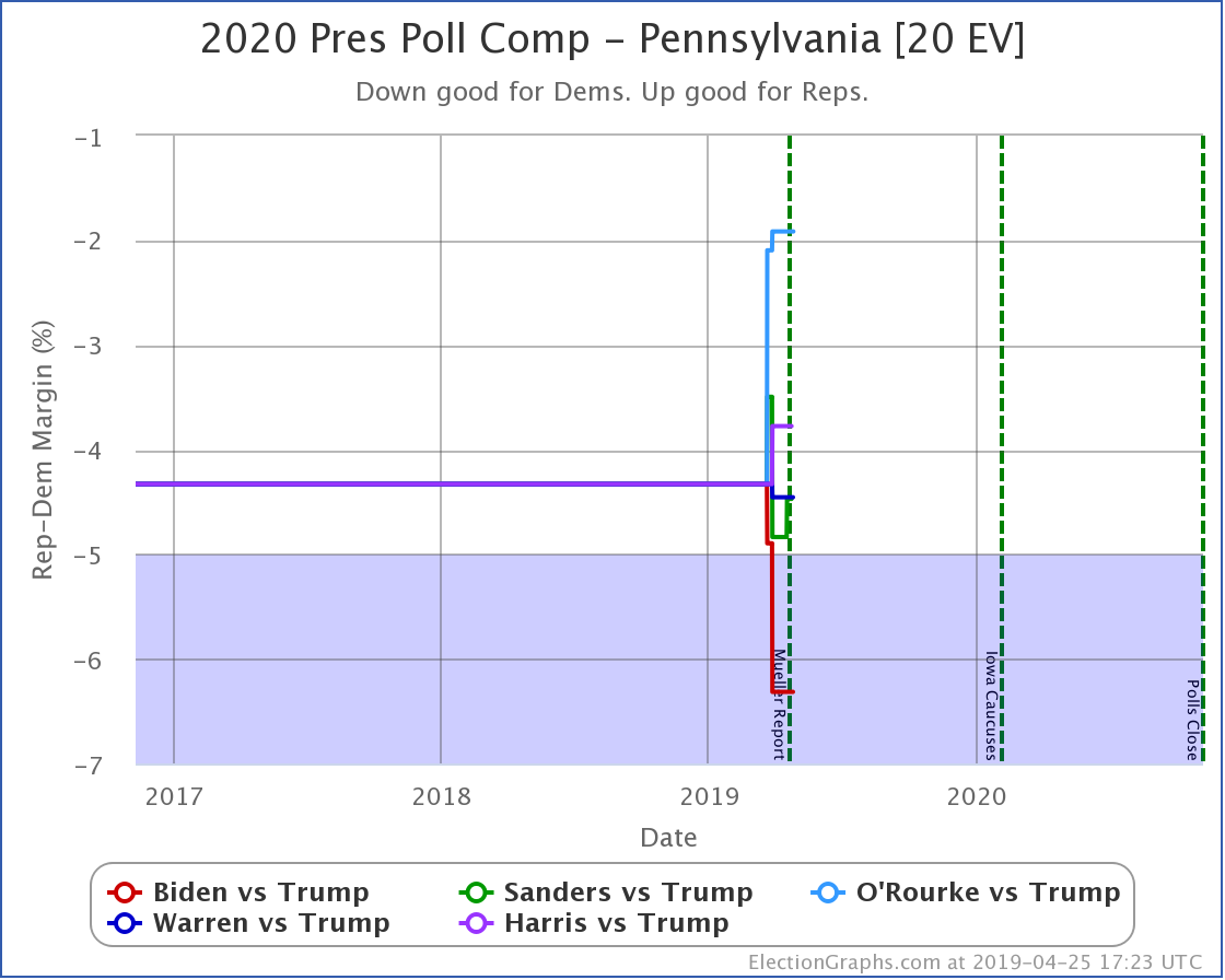
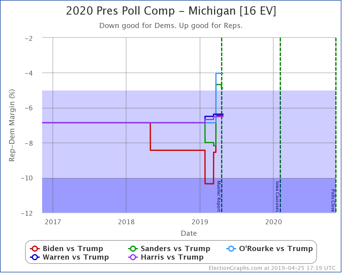
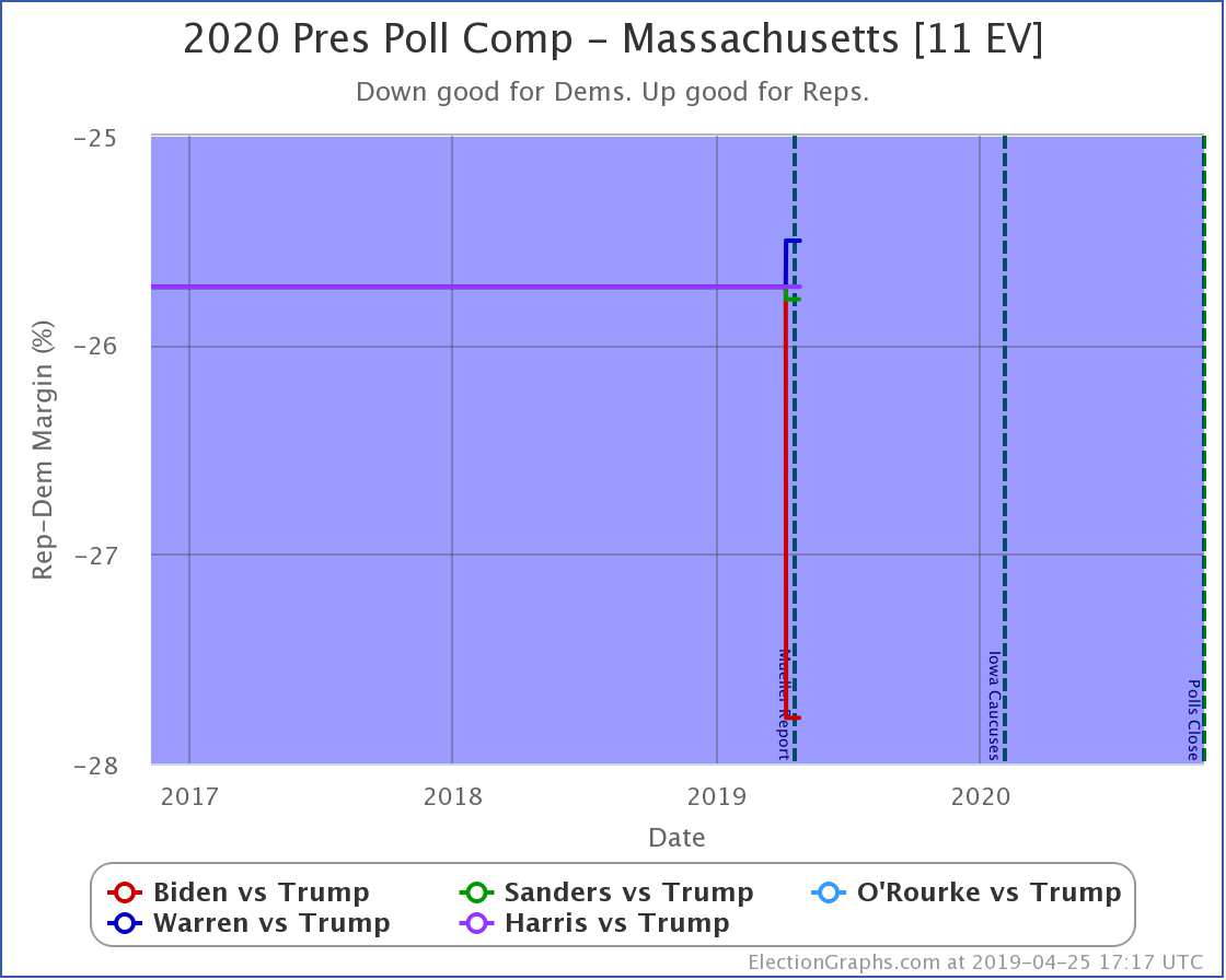
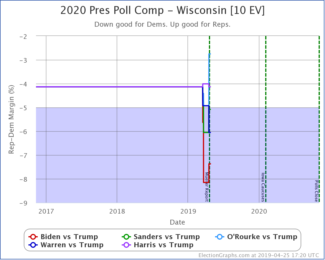
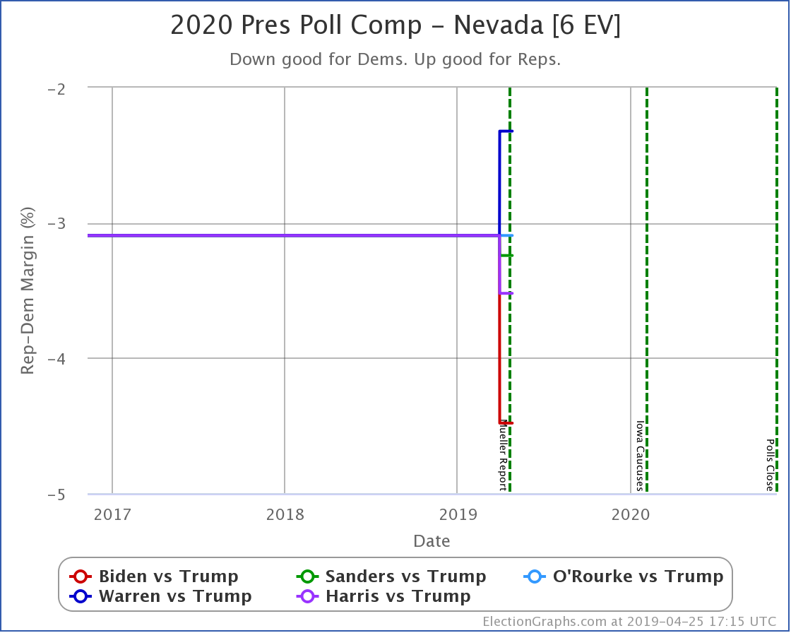
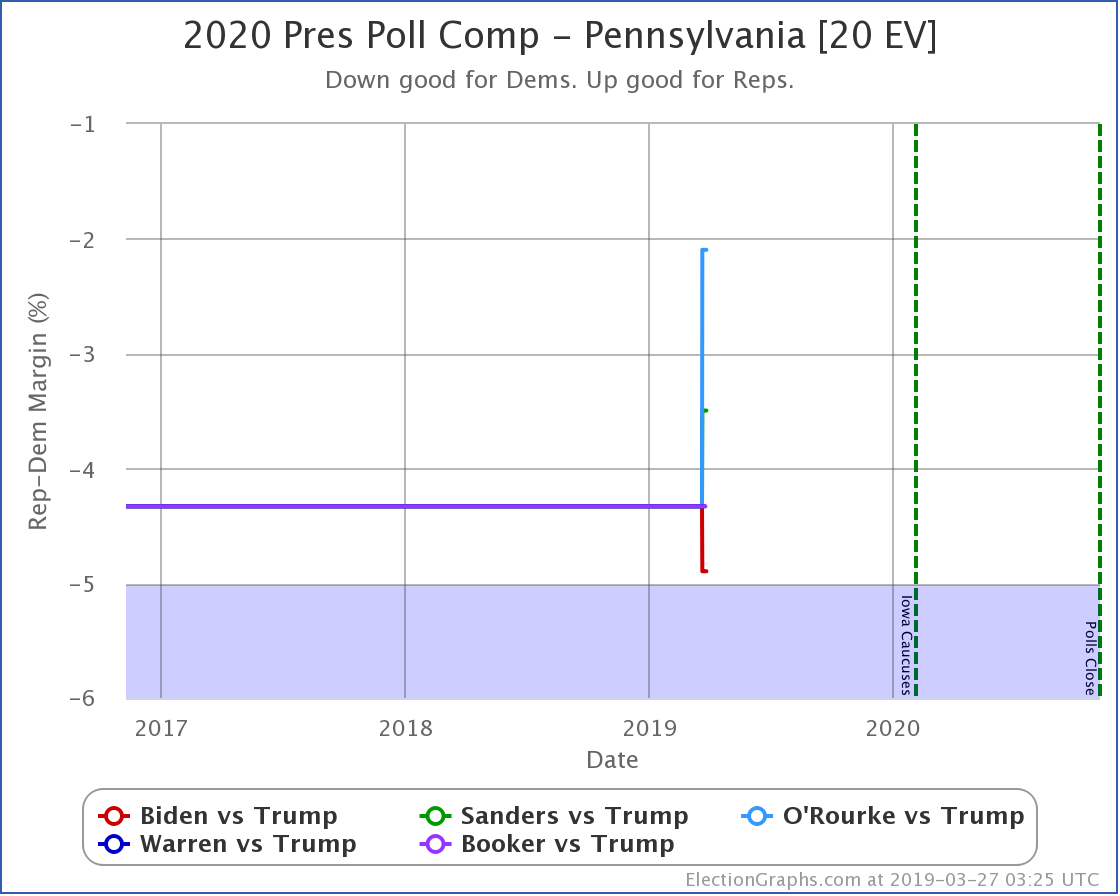
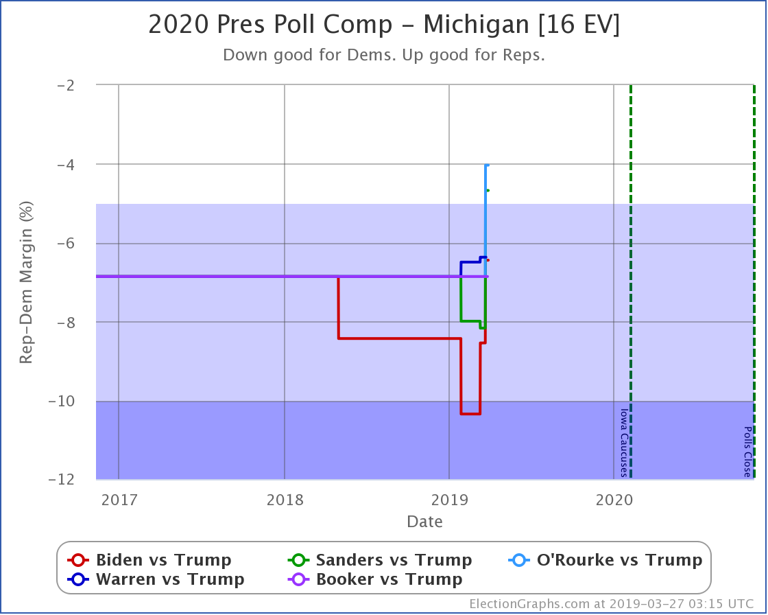
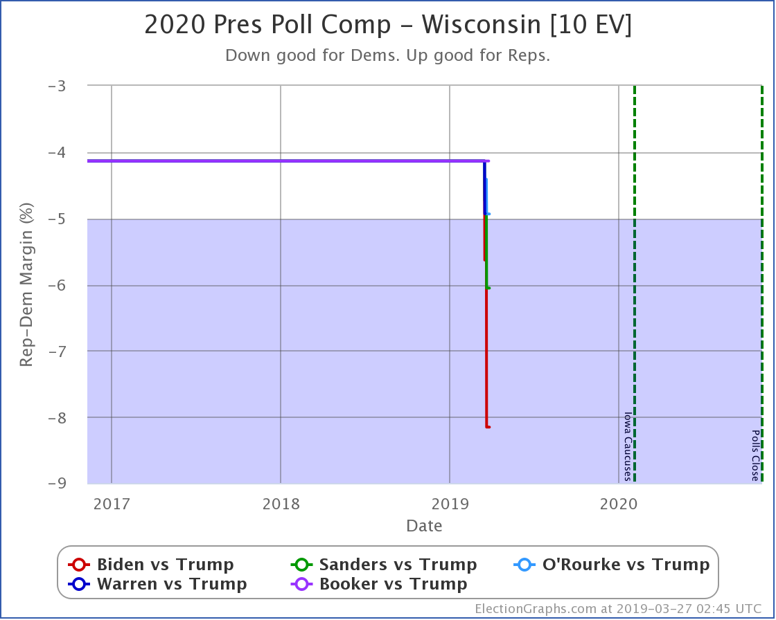
Since last week's update, there have been new polls in Michigan, Ohio, and Wisconsin.
First of all, I should mention that while the 2020 Electoral College page on Election Graphs lets you pick any Democrat and any Republican that has been polled in the 2020 cycle, here on the blog, we restrict ourselves to talking about the six "best polled" candidate combinations. I use a metric for this that is a weighted average of how far back in time the "five poll averages" go in each state. The weighting gives low margin states more influence in the metric than places where one candidate is far ahead.
Up until now, this had been six different Democrats vs Trump. In mid-September though, SurveyUSA did a poll of California that included Pence and Haley as potential Republicans in the general election too. And this last week, Emerson included Pence in a poll of Ohio.
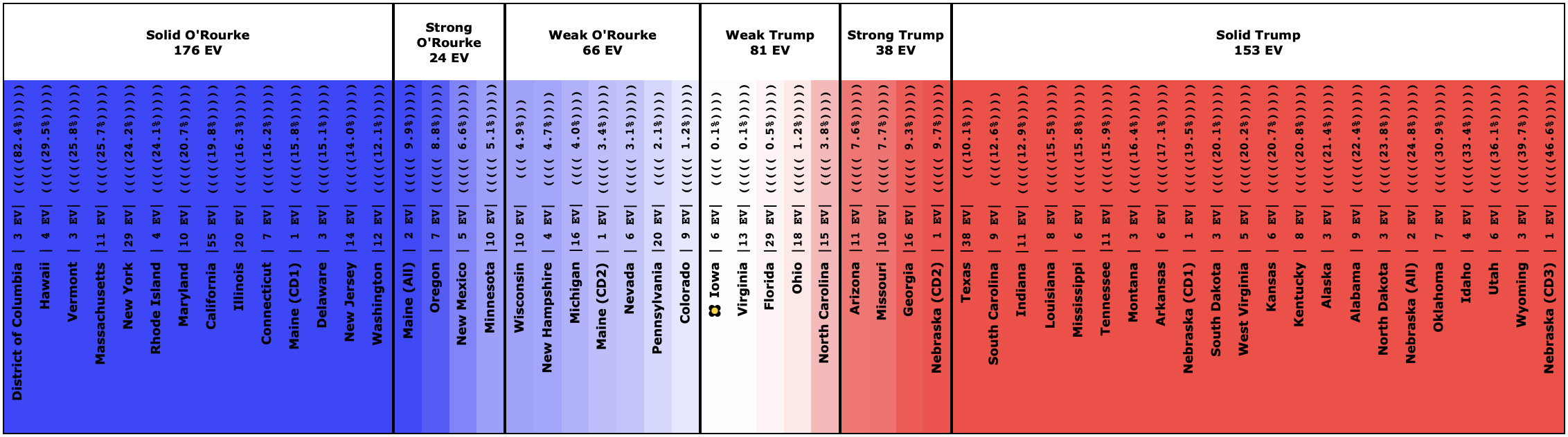
This is pretty sparse polling, but it happened to make the new Sanders vs. Pence polling average in Ohio very close to a tie, which because of the way my metric for "best polled" works, increases the Sanders vs. Pence poll quality up higher than it probably deserves, and Sanders vs. Pence bumps O'Rourke vs. Tump off of my top six.
I suspect this will not last, but for now, I'm looking at Biden, Sanders, Warren, Buttigieg, and Harris vs. Trump… and Sanders vs. Pence.
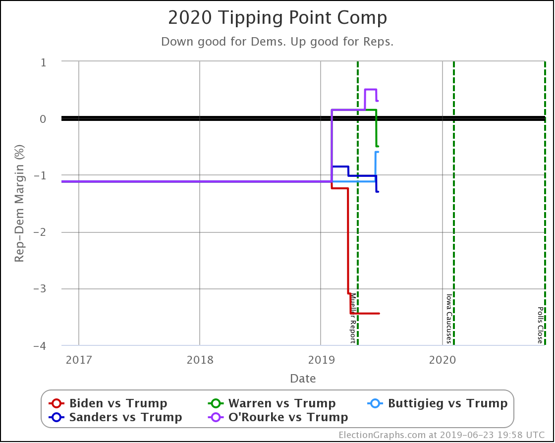
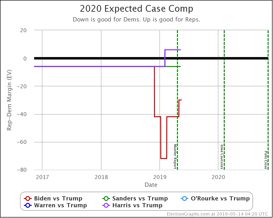
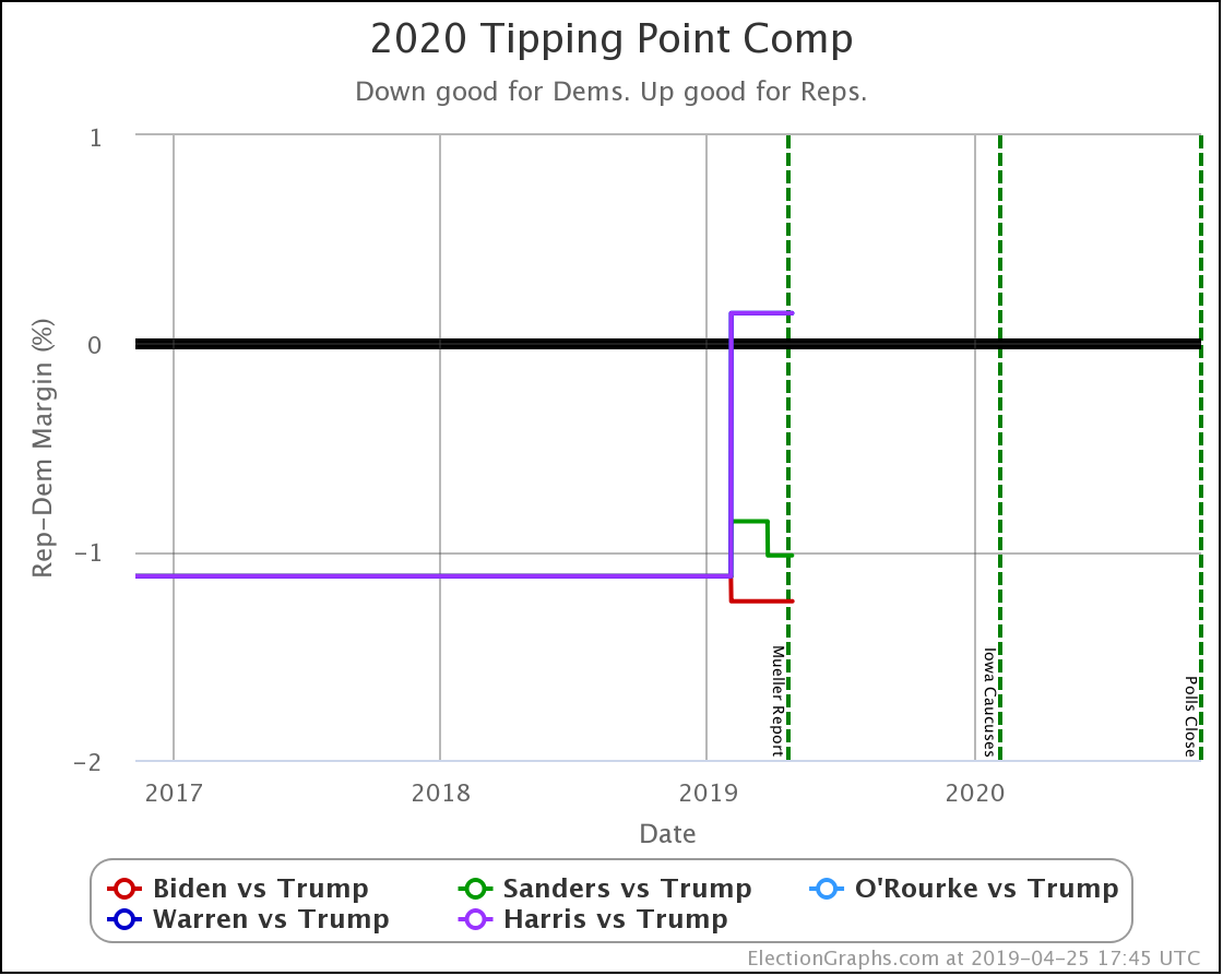
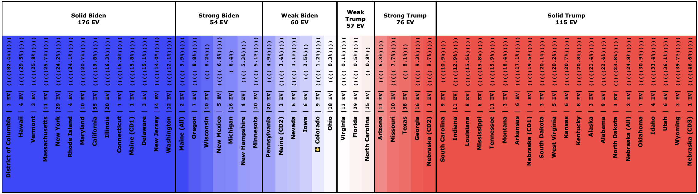
Within these candidate combinations, the only change in the categorization model was Ohio flipping from just barely Trump, to just barely Sanders:
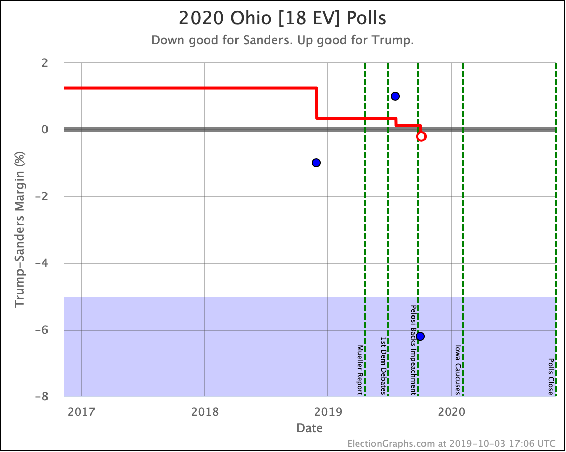
The current average here includes three actual 2020 polls, plus the 2008 and 2016 elections, ending up with a 0.2% Sanders lead. Now, this is one of those zones that is a bit different. Based on the historical performance of Election Graphs averages, a 0.2% Democratic lead only translates into a 47.8% chance of the Democrat winning.
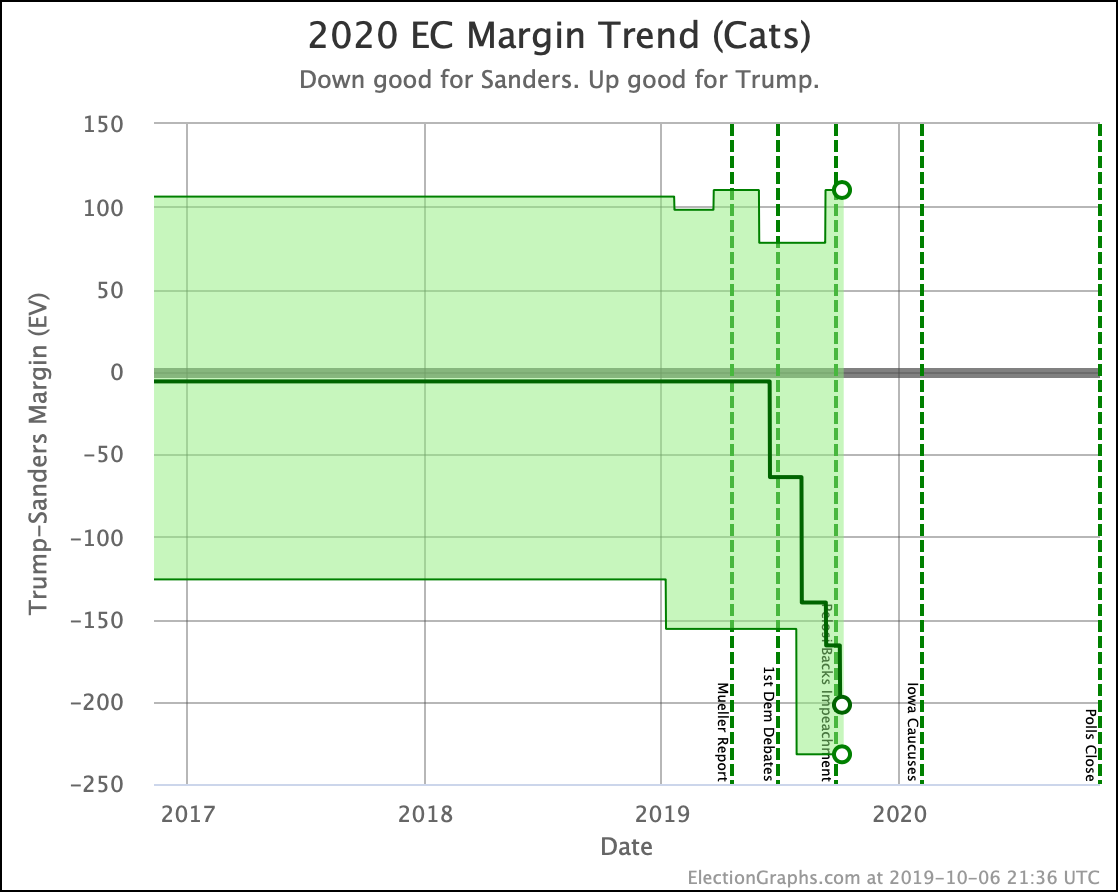
The categorization model doesn't care about that, though. Ohio is now on the blue side of the centerline for Sanders, so the "Expected Case" includes him winning Ohio. Sanders now leads in this "everybody gets all the states where they lead in the average" case by 202 electoral votes.
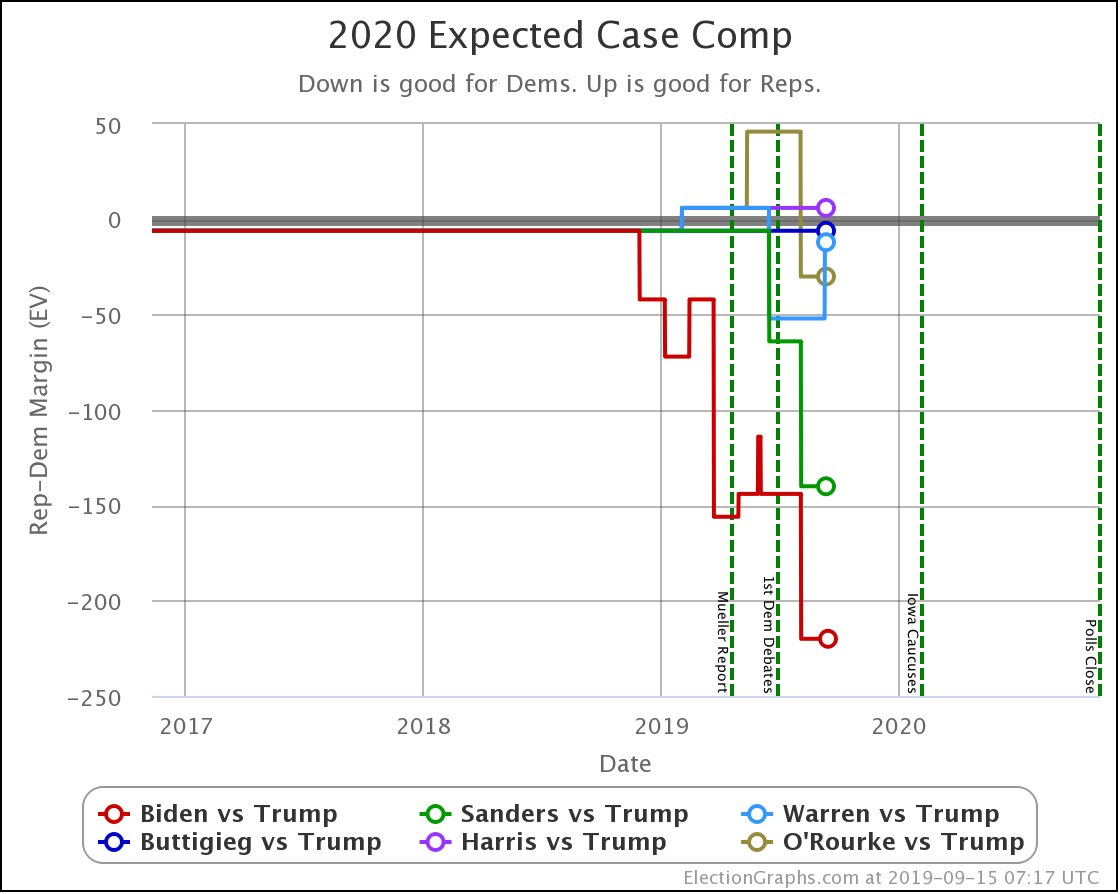
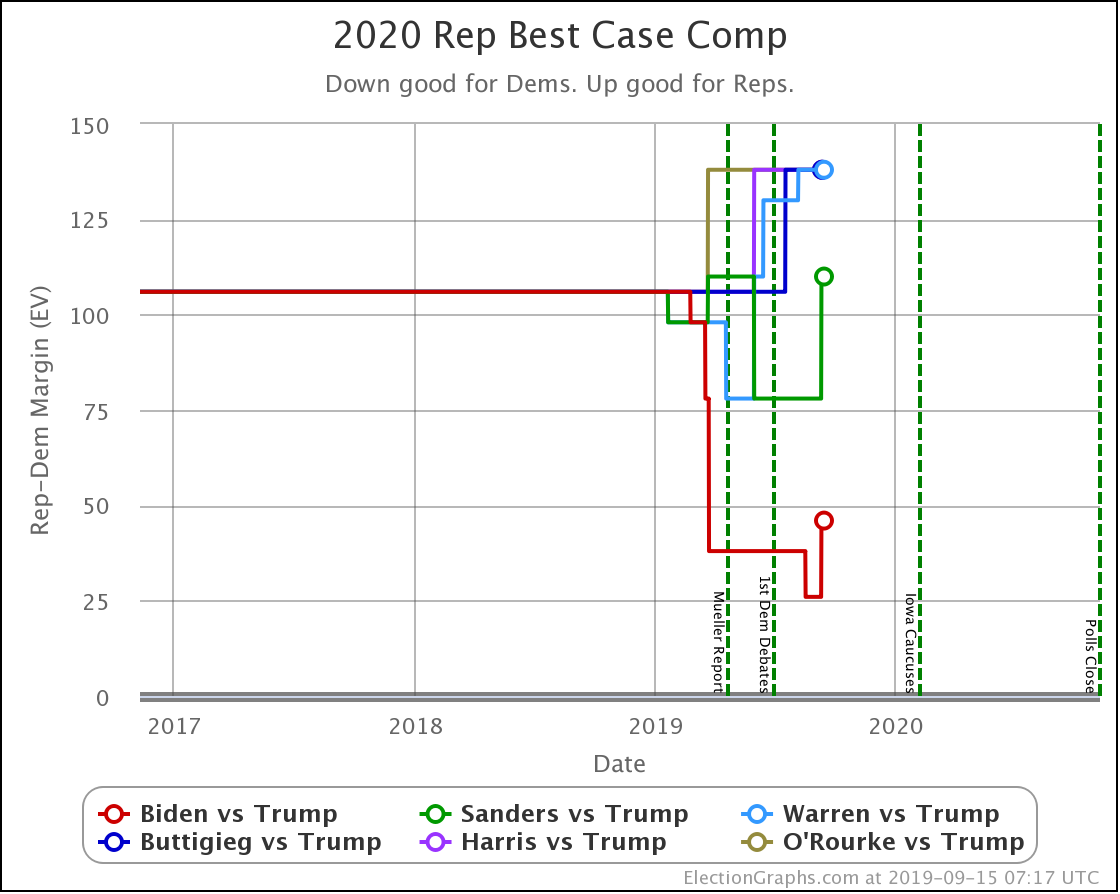
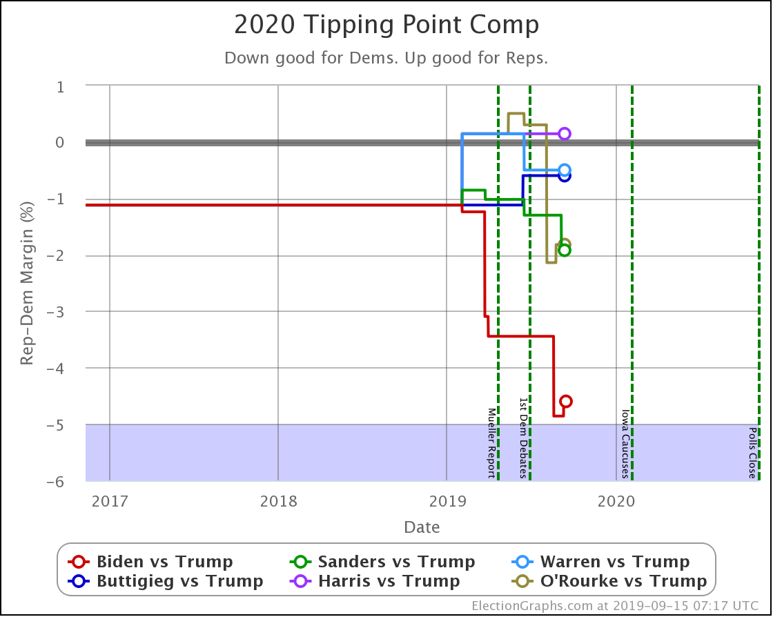
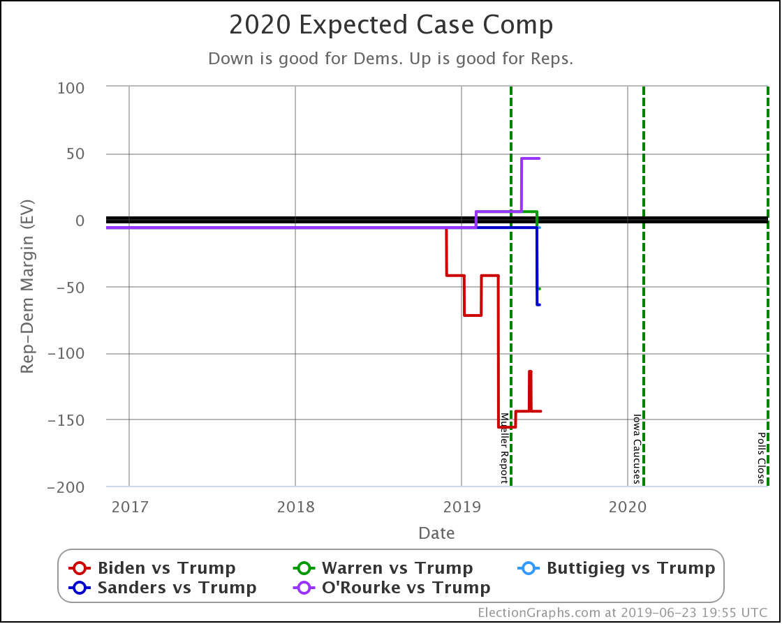
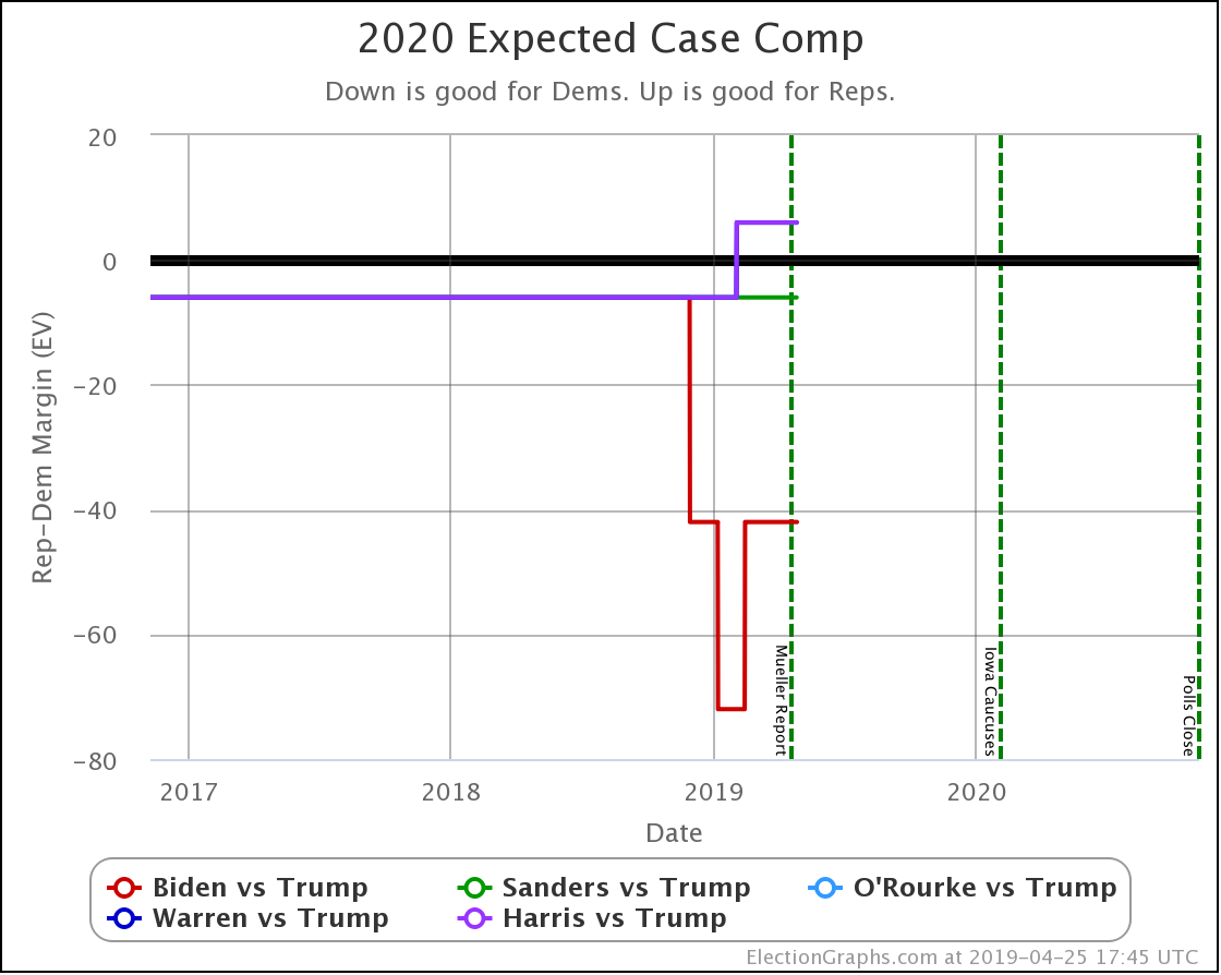
I've been spending a lot of time on these blog posts lately on the probabilistic model, and I'll get to that in a second, but first a quick look at the expected cases for all six of the best-polled candidate matchups in terms of the categorization model:
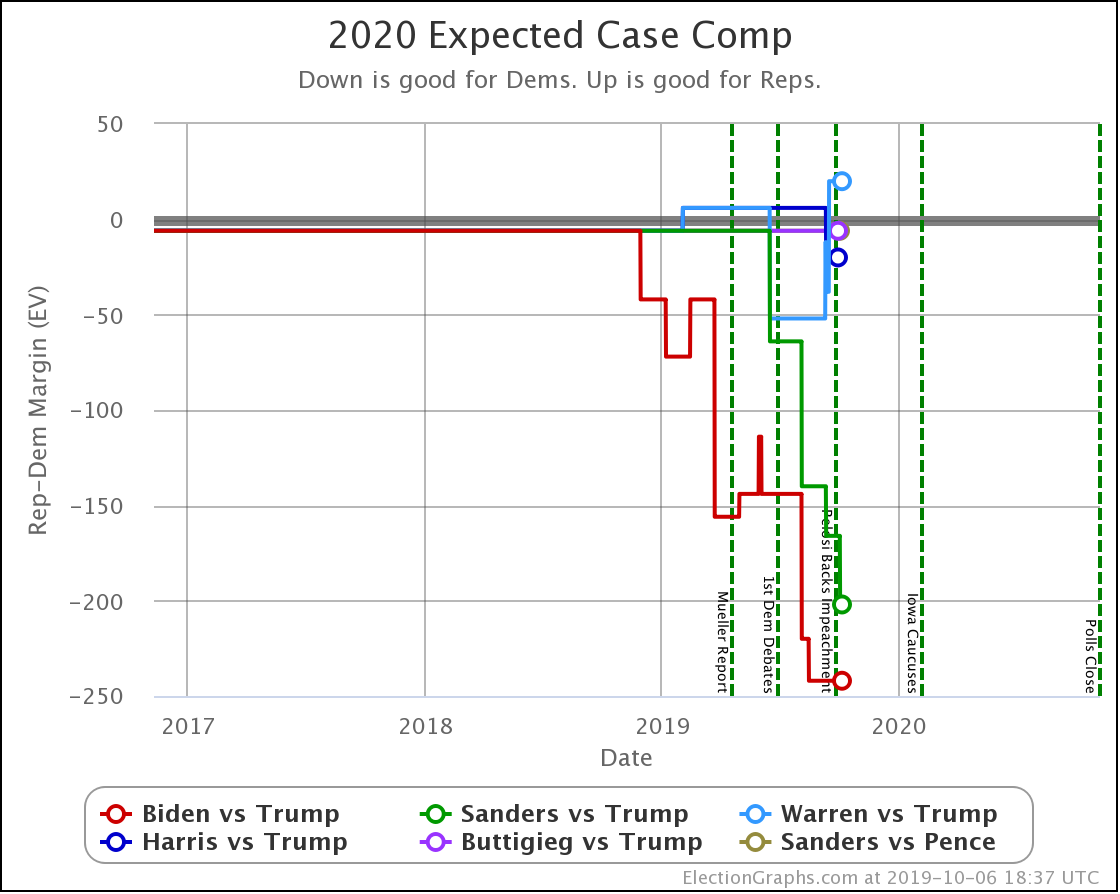
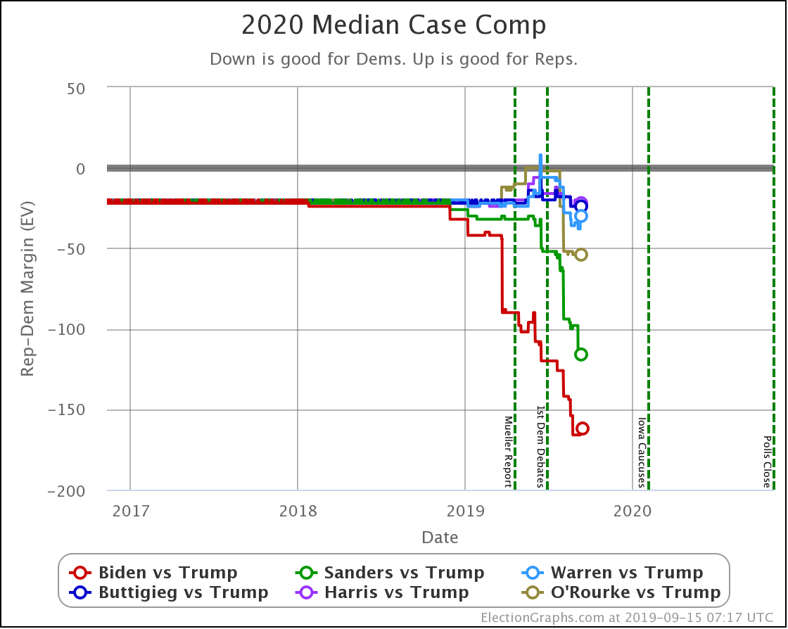
Biden leads Trump by 242 electoral votes. Sanders now leads Trump by 202 electoral votes. Every one of the other combinations is a close race. The only Democrat losing is Warren, who falls short by 20 electoral votes.
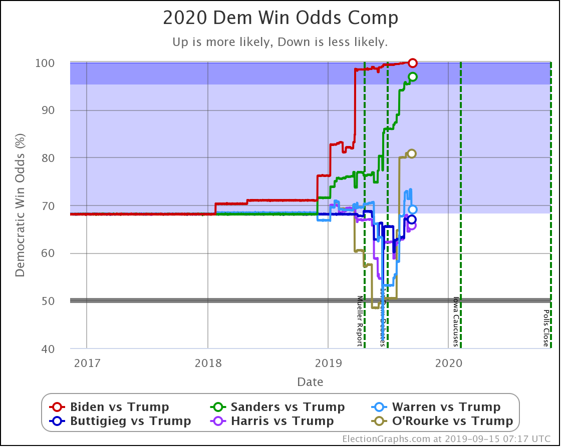
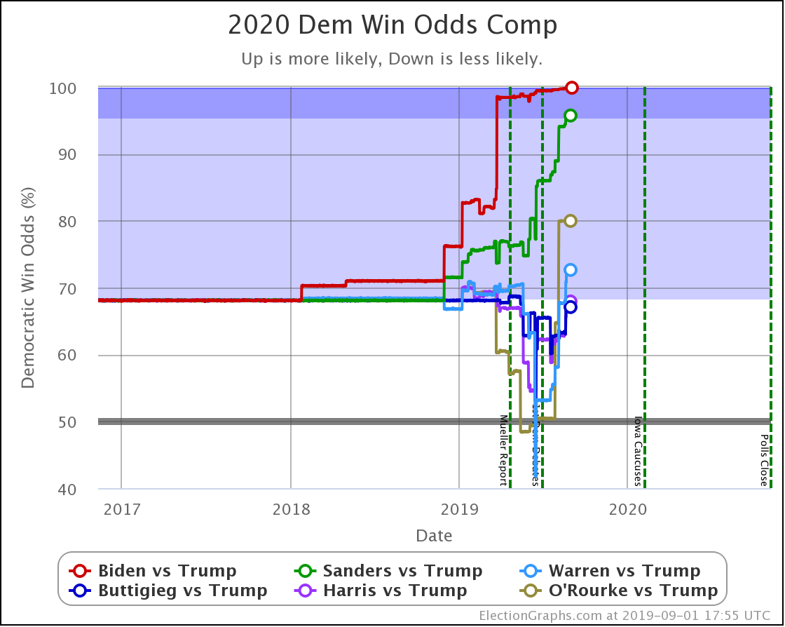
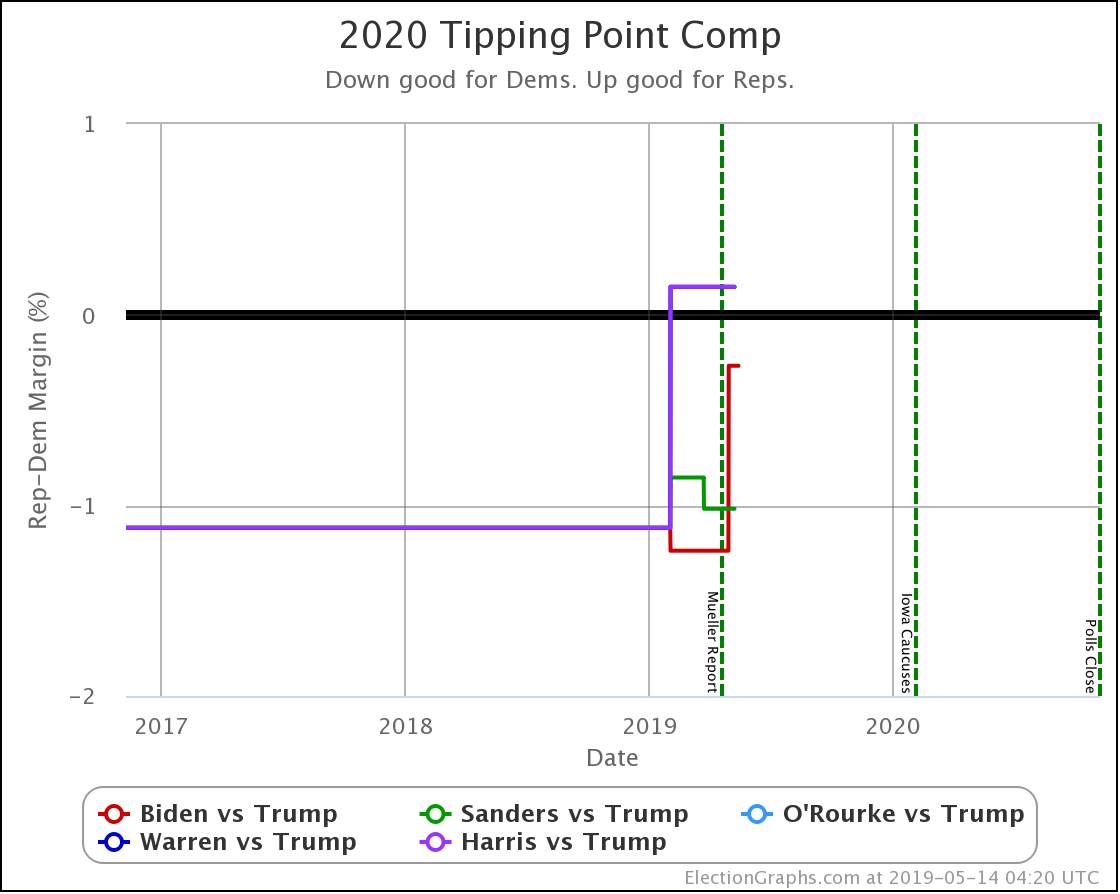
Flipping back to the probabilistic view, which takes into account all the changes in all three states that got polls this week, not just the one category change, we see this:

| Dem | 29 Sep | 6 Oct | 𝚫 |
| Biden | 99.9% | 99.9% | Flat |
| Sanders | 97.2% | 97.3% | +0.1% |
| Warren | 66.7% | 68.9% | +2.2% |
| Buttigieg | 66.5% | 66.5% | Flat |
| Harris | 64.0% | 64.0% | Flat |
Of these five, only Biden, Sanders, and Warren received new results this week. Nothing new for Buttigieg or Harris.
But let's not forget Sanders vs. Pence. Based only on the results of the last five presidential elections, this stood at a 68.1% chance of a Sanders victory. The earlier California poll had not changed this at all. But adding the new Ohio poll to the average brings Sanders up to a 72.8% chance of beating Pence.
Let's also look at how the median electoral college result for these candidate matchups have changed in the last week:
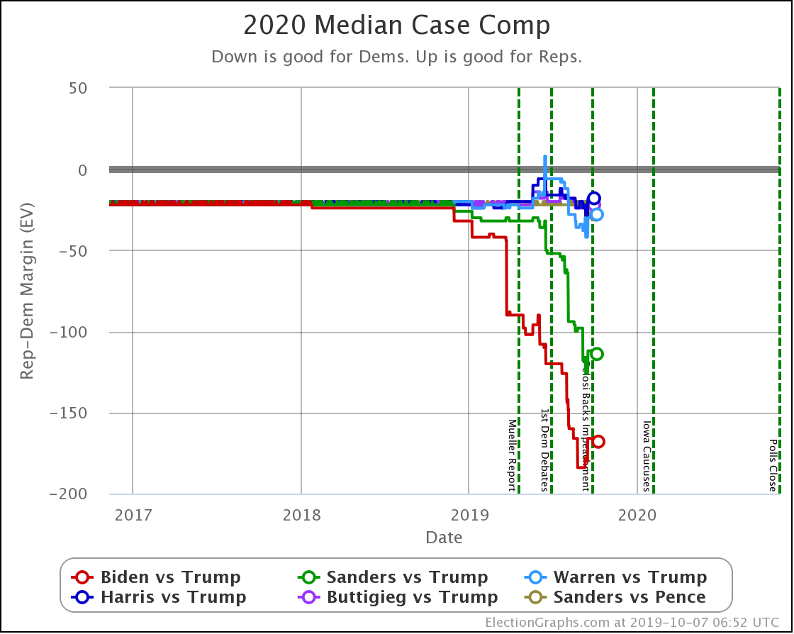
| Dem | 29 Sep | 6 Oct | 𝚫 |
| Biden | +166 | +170 | +4 |
| Sanders | +112 | +114 | +2 |
| Warren | +30 | +28 | -2 |
| Buttigieg | +22 | +22 | Flat |
| Harris | +18 | +18 | Flat |
And of course, Sanders vs. Pence. The result based only on the last five election results was Sanders +22. The new polling moves that to Sanders +28.
And that's it for this week.
393.7 days until polls start to close.
For more information:
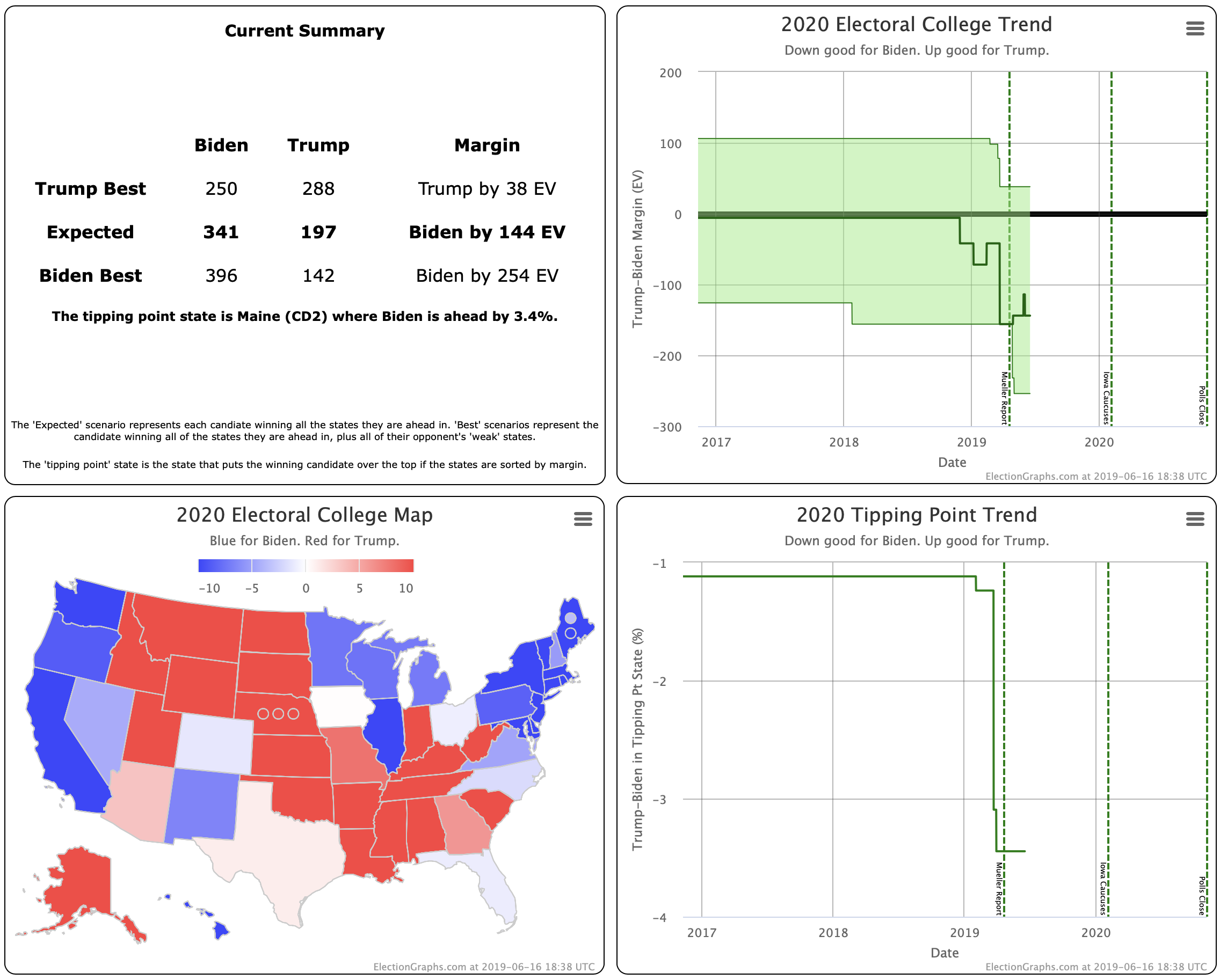
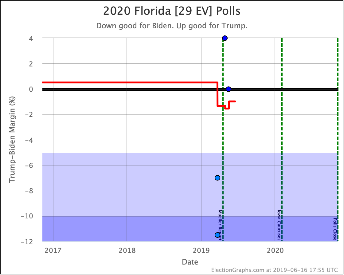
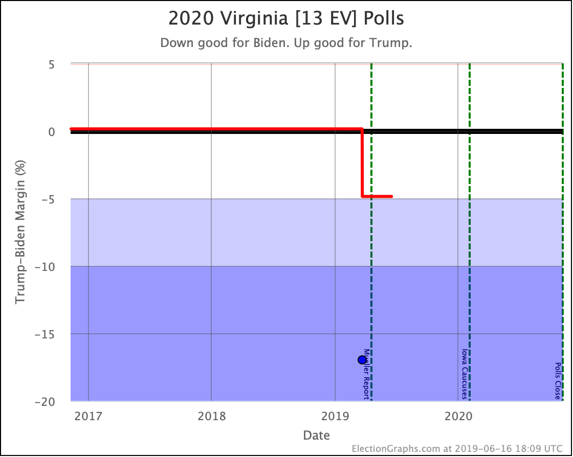
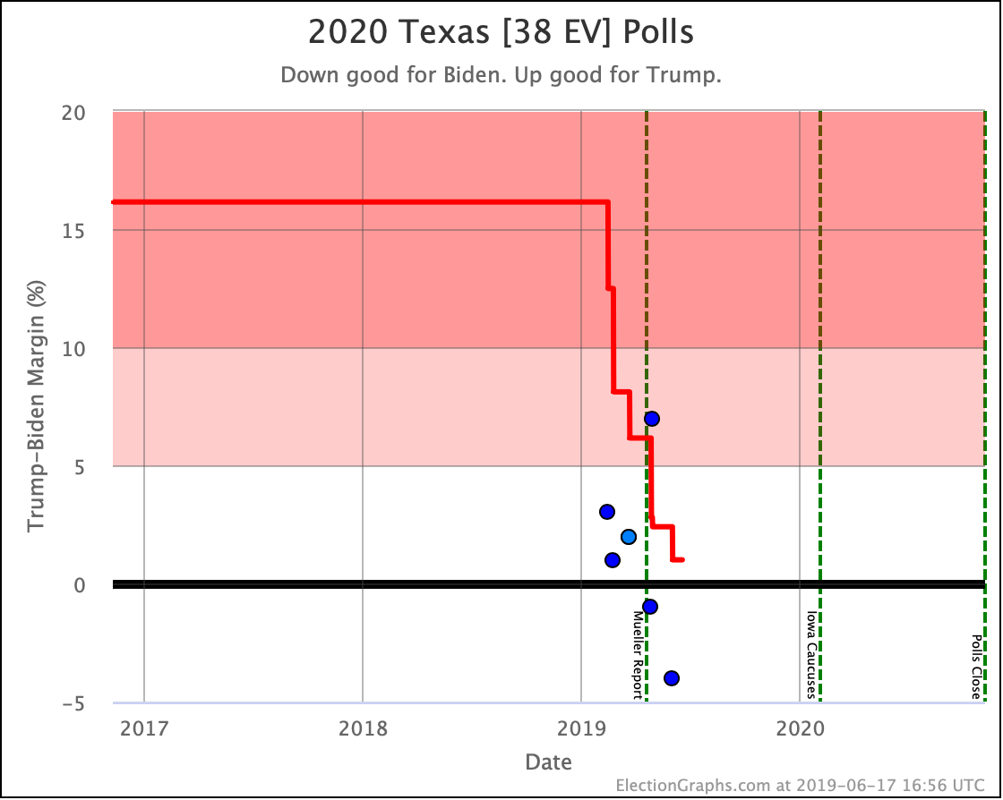
This post is an update based on the data on the Election Graphs Electoral College 2020 page. Election Graphs tracks a poll-based estimate of the Electoral College. The charts, graphs, and maps in the post above are all as of the time of this post. Click through on any image to go to a page with the current interactive versions of that chart, along with additional details.
Follow @ElectionGraphs on Twitter or Election Graphs on Facebook to see announcements of updates. For those interested in individual poll updates, follow @ElecCollPolls on Twitter for all the polls as I add them. If you find the information in these posts informative or useful, please consider visiting the donation page.