
Since the last update (not counting the update about new graphs) there have been new polls in Maine (All), South Carolina, Ohio, Michigan, Texas, and North Dakota.
Of those, only Texas and Michigan resulted in category changes for any of the six best-polled candidate pairs.
In Michigan, Buttigieg moved from a 6.4% lead to a weak 2.8% lead in the Election Graphs average.
In Texas, Sanders, Warren, and O'Rourke pulled Trump's lead down under 5% into the "weak" category in the Election Graphs average. Biden had already gotten there back in June.
Texas is the headline.
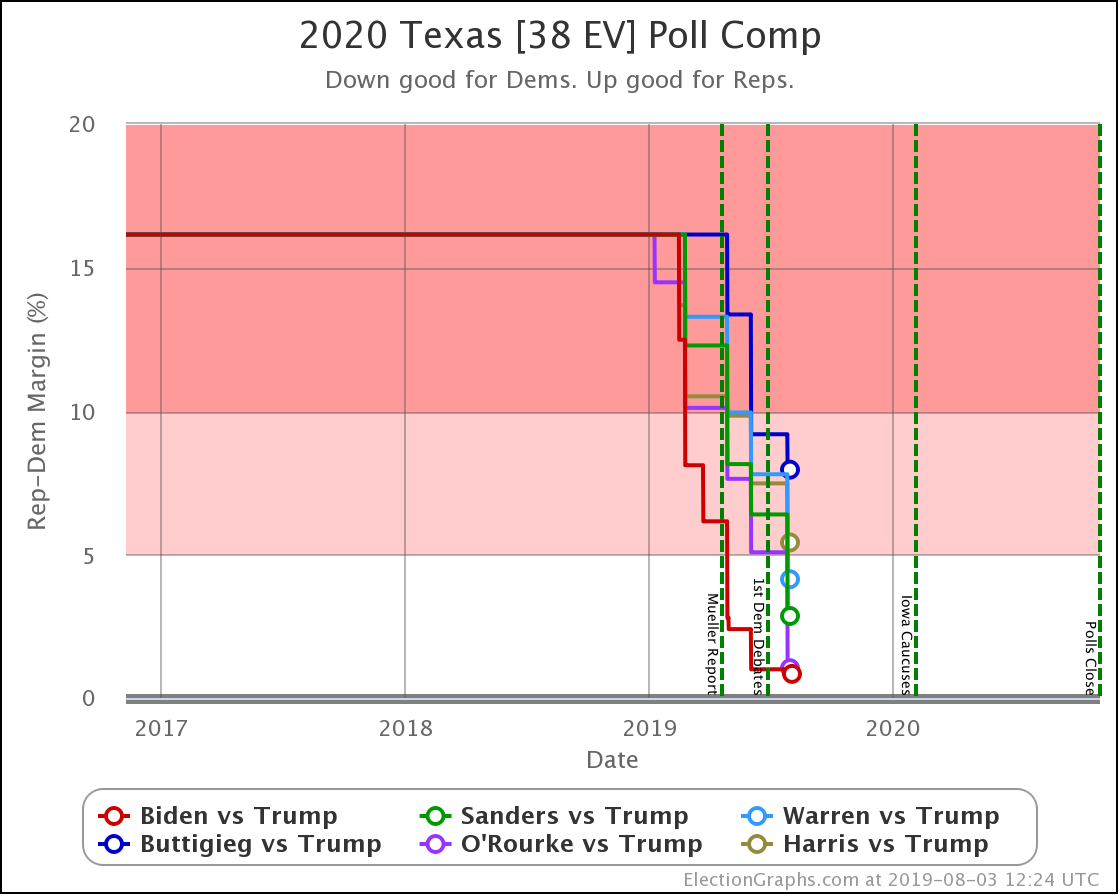
Trump's lead in Texas in the Election Graphs average is now down to under 5% for four of the six most polled Democrats against him. Only Buttigieg and Harris lag. But even they are trending stronger as more polls come in.
None of the averages show a Democratic lead in Texas. That would be seismic. However, at this point five of the six Democrats have at least one poll showing them ahead in Texas. (The exception is Buttigieg.)
Nobody would call Texas blue at this point. But it is trending purple. We have enough polls for enough candidates showing only narrow Republican leads (or even Democratic leads) to say that it looks competitive.
Now, what does competitive mean? Let's look at the "odds" view, where we use the historical performance of final Election Graphs averages to convert the poll margins into odds of victory:
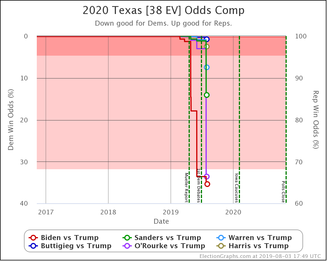
Democrats making Texas "close" essentially means Trump has a noticeably less than 100% chance of winning.
Of these six Democrats, Buttigieg is weakest… with Trump still having a 99.2% chance of winning the state.
Biden is strongest, but Trump still has a 64.6% chance of winning Texas against him.
Now, that means Biden has a 35.4% shot, which is remarkable given where Texas has been in other cycles. But Trump is still favored.
Now is the time to once again mention that Election Graphs does not model how the race evolves. These "odds" are static snapshots in time. "If the election was today." The election is not even remotely today. Polls can swing wildly in just a matter of weeks, let alone the 15 months we still have until the general election.
This "closeness" in Texas could evaporate long before we get to November 2020. Or it could turn into a Democratic lead.
But it is clear that Texas is a state to watch, and Republicans will need to play defense there, and not take it for granted, as has often been the case in recent cycles.
Now, the national picture, where all the caveats above also apply:
This batch of polls changed the "Best Case" scenarios for Sanders, Warren, and O'Rourke in the category based ranges (their best cases now include winning Texas). But the "Expected Case" and "Tipping Point" did not change.
However, the new probabilistic based simulations do show changes worth reviewing.
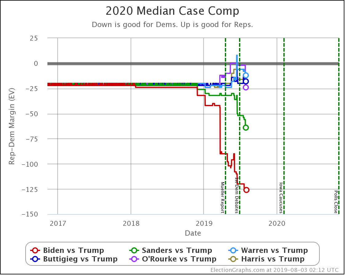
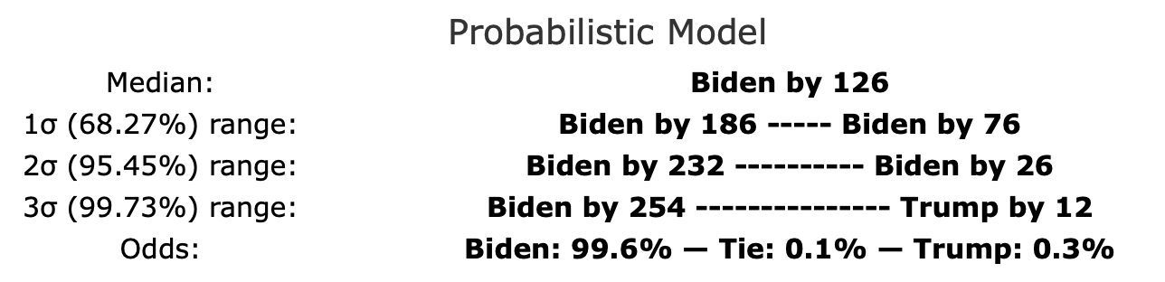
This first chart shows the "median case" of the simulations, the spot where half the time the Republican does better, and half the time the Democrat does better.
Biden doing better than the rest of the pack stands out clearly. His median case is a 126 electoral vote margin over Trump. To put this in historical context, this would exactly match Obama's 2012 margin over Romney but be quite a bit less than Obama's 2008 margin over McCain.
Sanders also breaks out from the pack, doing considerably better than the other Democrats.
Both Biden and Sanders have improved their median positions significantly over the last few weeks covered by this batch of new polls.
Meanwhile, Warren, Buttigieg, O'Rourke, and Harris stay within a zone maintaining only small electoral college margins in the median case.
So, switching from looking at margins to looking at chances of winning:
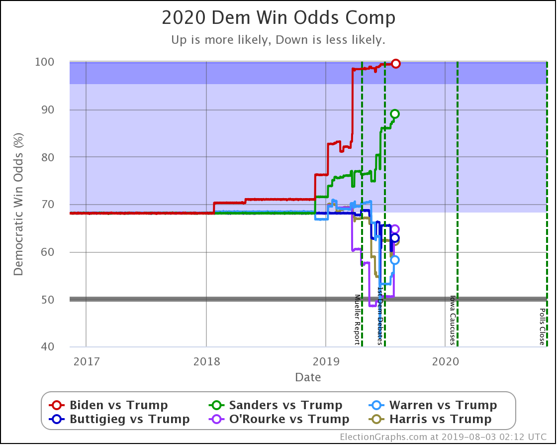
Biden is pegged near the top right now. 99.6% chance of victory over Trump. There isn't that much room to improve, although weaker polls could certainly knock him off this pedestal.
Sanders clocks in second at an 89.0% chance of beating Trump.
Looking at the others, while they do have the upper hand on Trump, if this were election day, it wouldn't be fair to say it was anything other than "too close to call" with odds ranging from Warren at 58.2% to O'Rourke at 64.7%.
Election Graphs didn't have a probabilistic view in 2016, but the median "chance of Trump winning" from the sites that did was 14% going into Election Day. Only Biden and Sanders push Trump below that line at the moment.
So how have things been changing?
Comparing the odds of the Democrat winning from the update on June 23rd to where things stand now, we see this:
| Dem | 23 Jun | 3 Aug | 𝚫 |
| Biden | 99.4% | 99.6% | +0.2% |
| Sanders | 86.0% | 89.0% | +3.0% |
| Buttigieg | 65.5% | 62.9% | -2.6% |
| Harris | 62.3% | 62.2% | -0.1% |
| O'Rourke | 50.5% | 64.7% | +14.2% |
| Warren | 53.2% | 58.2% | +5.0% |
The stand out is, of course, O'Rourke. His improvement is almost all due to his performance in the latest Texas poll, which was better than all other Democrats, and significantly better than his previous polling in the state as well. So he adds to his chances of winning Texas, which while still under 50%, is enough to boost his chances of taking the whole thing significantly.
Warren and Sanders also improved a bit. Buttigieg dropped a bit. And Biden and Harris are essentially flat.
Finally, a quick preview of a new chart type coming soon to Election Graphs:
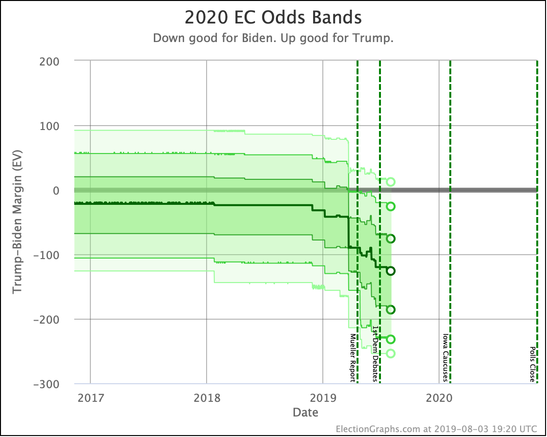
It is the equivalent of the Electoral College trend chart based on the straight-up categorization of states based on who is ahead, but with the results of the probabilistic modeling.
The dark line represents the median electoral college result in the simulation. Then the bands represent result ranges at different levels of probability. The deeper the shade, the more likely the result.
This is a visual representation of the single candidate time series of the probabilistic summary now on the comparison page:
The text summary will also, of course, be added to the candidate national summary pages once I get a chance.
I also added little circles in a lot of the time series charts to highlight the current values better. I think it makes the charts clearer. Hope you like them.
In any case… 458.1 days until polls start to close. Stay tuned!
For more information:
This post is an update based on the data on the Election Graphs Electoral College 2020 page. Election Graphs tracks a poll-based estimate of the Electoral College. The charts, graphs, and maps in the post above are all as of the time of this post. Click through on any image to go to a page with the current interactive versions of that chart, along with additional details.
Follow @ElectionGraphs on Twitter or Election Graphs on Facebook to see announcements of updates. For those interested in individual poll updates, follow @ElecCollPolls on Twitter for all the polls as I add them. If you find the information in these posts informative or useful, please consider visiting the donation page.
One thought on “Whoa, Look at Texas”