Election Day: Final Tightening?

It is Election Day.

Election Graphs has logged its last poll on Twitter for the 2020 season. In just a couple of hours, polls will start closing, and we will start getting actual election results.

So where did Election Graphs end up? What is our final prediction?

If you just want the bottom line, without any of the pretty charts or discussion, it is this:

Biden continues to be heavily favored to win. He is still in a stronger position than Clinton was four years ago. However, our numbers show a significant last-minute strengthening by Trump which makes Biden's lead much more tenuous than it was a week ago. If we had the same size polling error as 2016 in Trump's direction, he would win. (The same size error in the other direction would get to a Biden landslide… there are LOTS of close states.)

Having said that, the nature of some of the recent polls raises a real question about how much of this final move is "real" rather than just a lot of partisan and lesser-known pollsters flooding the final averages with polls that are favorable to Trump.

OK. If that is all you need, goodbye! See you for the 2024 cycle!

If you want more detail though, keep reading.

(There will also be a post tracking results as they come in tonight, and eventually, later this year once all the results are known and final, an analysis of how we did, so if those interest you, check back in later!)

The last blog update here was yesterday on November 2nd. There were hundreds of new polls (or at least it seemed that way) on that last day. Here are the changes in our metrics just in the last 24 hours.

Model Metric 2 Nov 3 Nov 𝚫
Probabilities
(Indep States)
Trump 2σ
Median
Biden 2σ
Biden +10
Biden +112
Biden +228
Trump +6
Biden +108
Biden +232
Trump +16
Trump +4
Biden +4
Trump Win
Tie
Biden Win
1.2%
0.1%
98.6%
2.5%
0.3%
97.2%
+1.3%
+0.2%
-1.4%
Probabilities
(Uniform Swing)
Trump 2σ
Median
Biden 2σ
Trump +84
Biden +102
Biden +314
Trump +86
Biden +132
Biden +294
Trump +2
Biden +30
Trump +20
Trump Win
Tie
Biden Win
18.8%
0.0%
81.2%
31.9%
0.0%
68.1%
+13.1%
FLAT
-13.1%
Categories Trump Best
Expected
Biden Best
Trump +64
Biden +102
Biden +288
Trump +64
Biden +132
Biden +288
FLAT
Biden +30
FLAT
Tipping Point Biden +3.5% Biden +2.3% Trump +1.2%

On the one hand, North Carolina moved back to the Biden side of the centerline. Which strengthens Biden by 30 EV in both the Uniform Swing Median and the Expected Case Median. But in the meantime, the huge wave of final polls reduced Biden's margin in the critical "Weak Biden" states.

And yes, it is the same thing I mentioned last time when I said:

There have been dozens of new polls since the update on the 31st. While there were exceptions, the overwhelming theme was polls showing a better picture for Trump and a worse one for Biden than we had seen any time recently. So almost all of the metrics above move in Trump's direction.

As with a couple of the other recent spikes toward Trump in the last few weeks, you can look at the specific polls in the average, and start wondering if this is just a bunch of right-leaning pollsters flooding the zone with polls in the last few days. While there were plenty of results from large mainstream pollsters released in these last few days, there were quite a few partisan polls released too, and some of them definitely helped move the averages toward Trump. I talked about this phenomenon on October 20th, October 24th, and October 31st… so I won't delve into that in-depth again.

Will this deteriorate further in the limited time left? Or bounce back? Or neither? If I had to guess, I'd say reversion to the mean. There have been no major news events in the last week that would seem likely to drive a tightening. So I expect this "tightening" is actually just an artifact. But that is just an educated guess. We will all know soon enough.

It did not revert to the mean. Biden's situation deteriorated a lot more. It ended up being significant in the final numbers.

So I guess I do have to delve into it again. Bottom line, in the last few days before Election Day, every pollster in existence seems to have wanted to make sure they got a shot at Election 2020, and a huge volume of polls was released. Many of these were from pollsters that have clear partisan leanings, and whose results were much more positive to Trump than what we had been seeing. Others were just lesser-known pollsters.

Election Graphs uses a "Last X Polls" model, specifically so that as the election approaches and there is more polling, we look at shorter and shorter timeframes and are more responsive to changes. We also use the mid-date of polls to determine just which polls are part of the "Last X" rather than the end-date. This means that in terms of the "final" averages we favor the very last-minute polls put out with very short times in the field.

The result is that many of the large well-known polling companies with good reputations that put out their final polls late last week or even over the weekend got crowded out of the critical state averages by the large volume of random polls, which often just covered one or two days in the field.

Those pollsters tended to be much more bullish on Trump than the usual suspects who had been polling this race regularly over the last year.

So the averages in many states jerked a few percentage points toward Trump, just in the last few days.

If there was a big event in the news that was bad for Biden, then it would be easy to say that was the cause. The closest thing to that has been the drip-drip of information about Biden's son, but for the most part that has not seemed to actually get much traction. But maybe?

In the absence of a clear reason for movement, while there is most definitely a clear difference in the nature of the polling that comprises the average, it seems reasonable to think that maybe the movement is just an artifact of the polling, and doesn't represent a real change.

So perhaps the picture the site had of the race a week or two ago is actually a better representation of what is happening?

Maybe.

But four years ago we had a similar move in the last few days before the election. And that time it also seemed to be driven by a surge of polls from outlets that hadn't been doing a lot of polling earlier in the cycle. And we ended up closer to the final result because we reflected the change caused by those polls. That last burst of polls ended up being closer to reality than the more established pollsters they displaced.

Of course, that could well have just been luck too.

We set the rules for how we define the averages, what we would include and would not include, etc over two years ago, based heavily on what we did in 2008, 2012, and 2016. We're not going to change anything on the last day.

So it is what it is.

We'll find out in a few hours if the short time frames and the burst of lower quality polls ended up causing Election Graphs to dramatically overestimate Trump and underestimate Biden. If we are way off, maybe we'll change something for 2024. Or maybe the movement seen in these last 48 hours actually better represents what is going on.

I don't know. We will see.

So I can give the caveats above, but the numbers are what they are, and so we'll do the rest of this discussion taking them at face value.

Let's look at all the graphs.

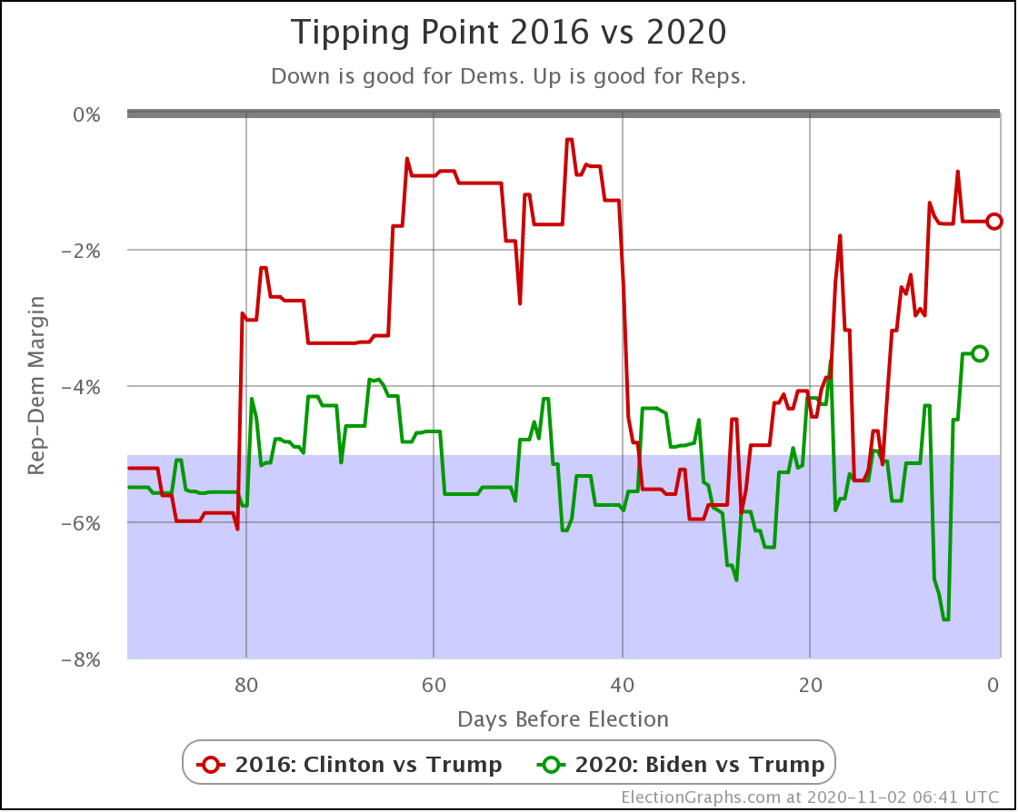
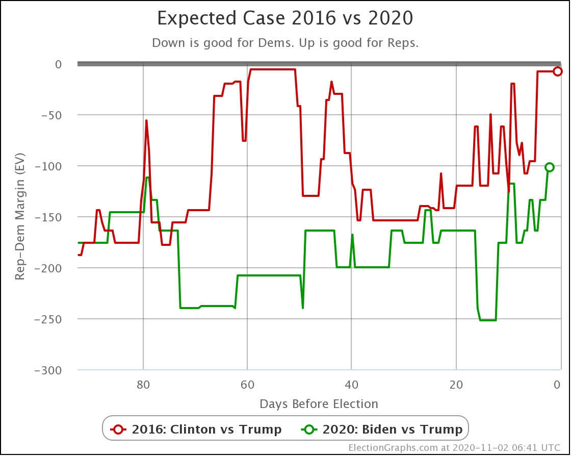
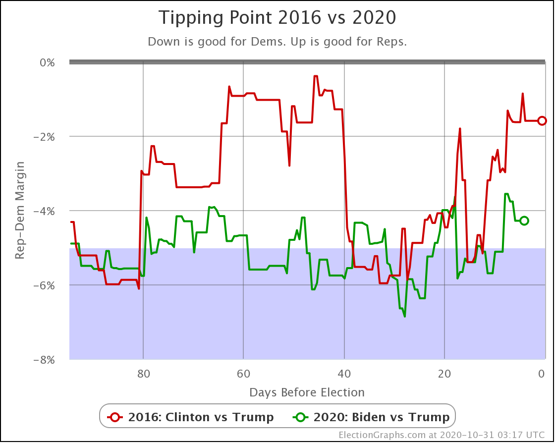
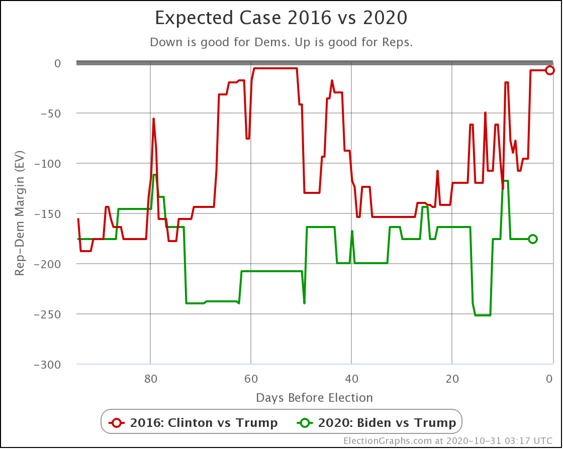
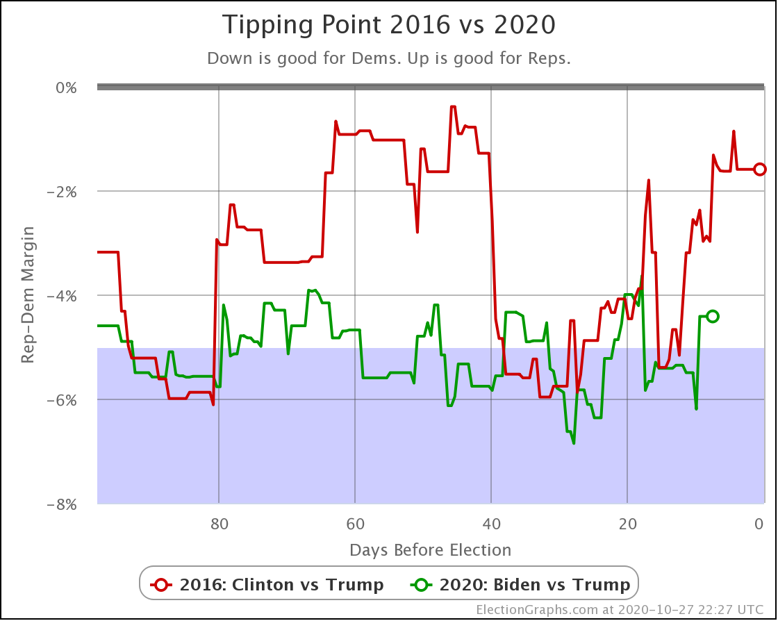
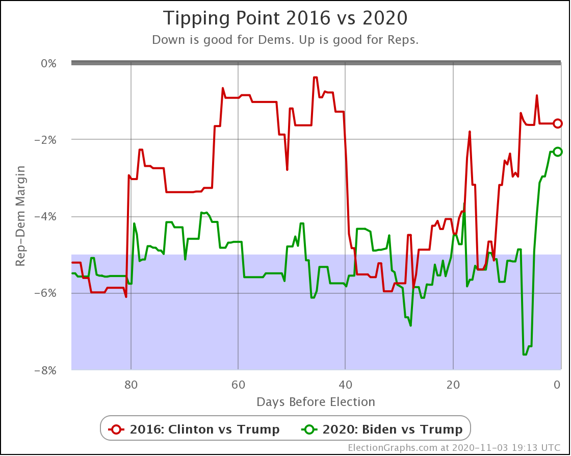
First of all, the comparison with 2016:

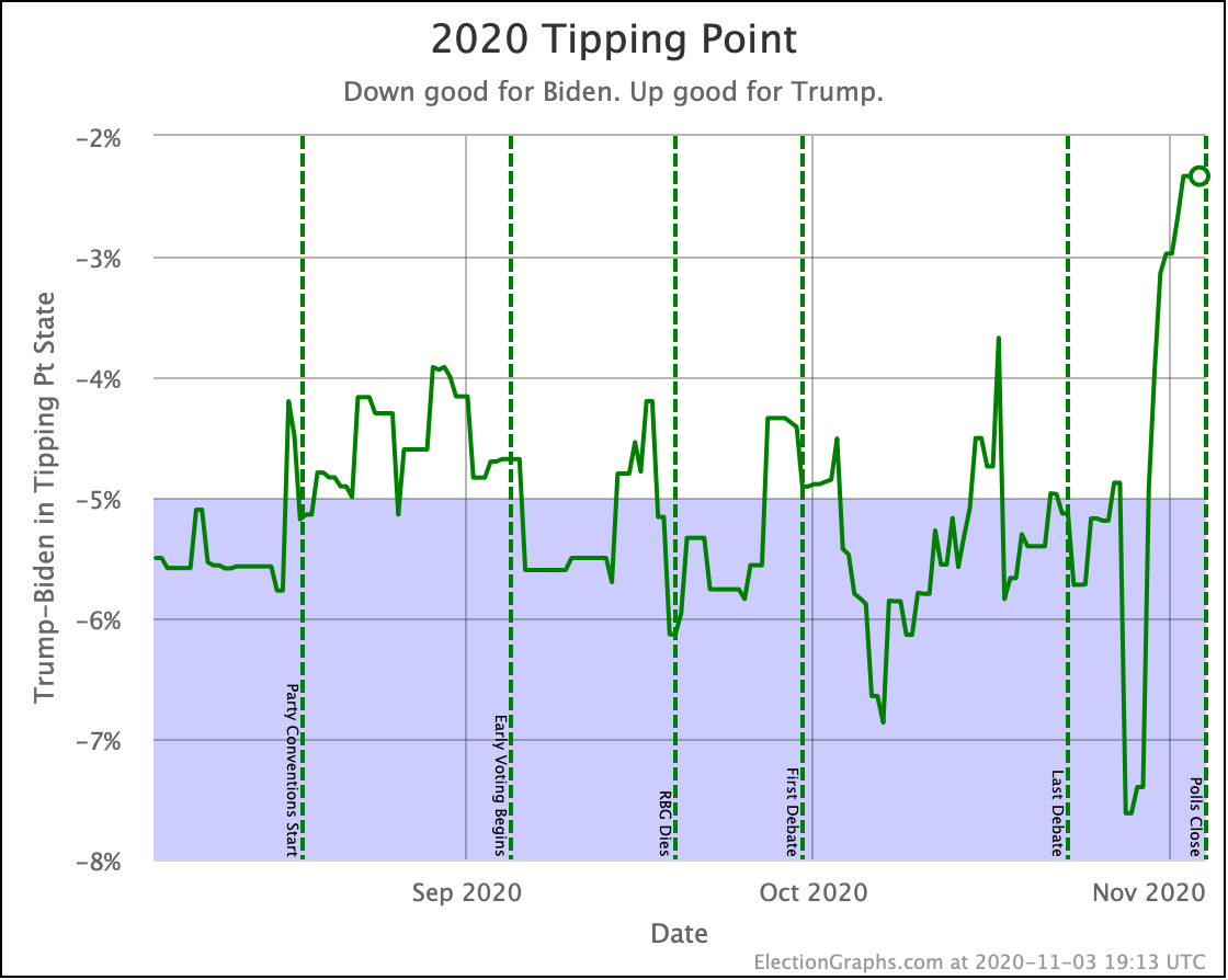
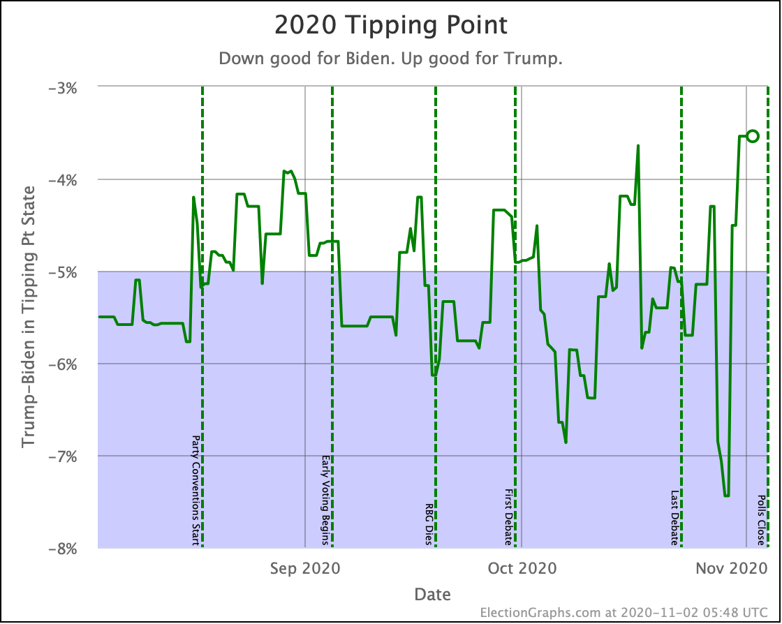
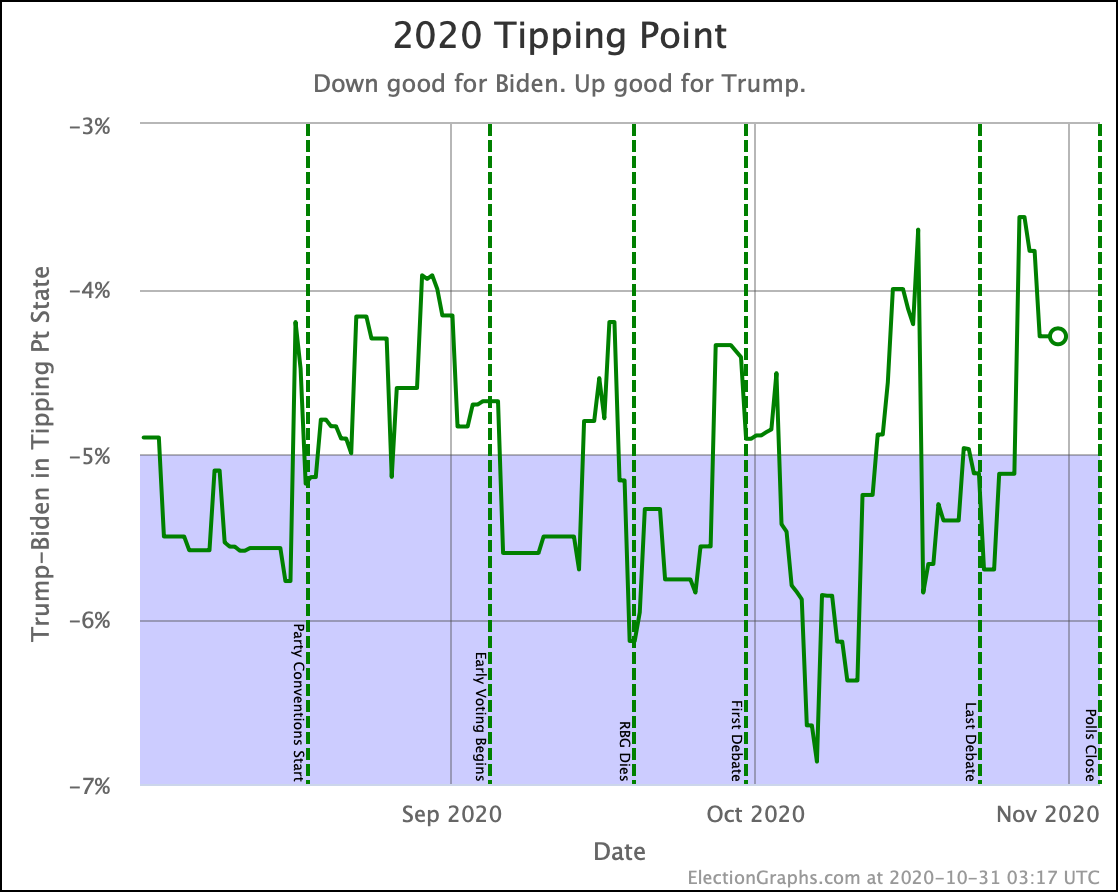
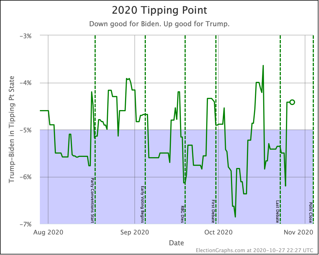
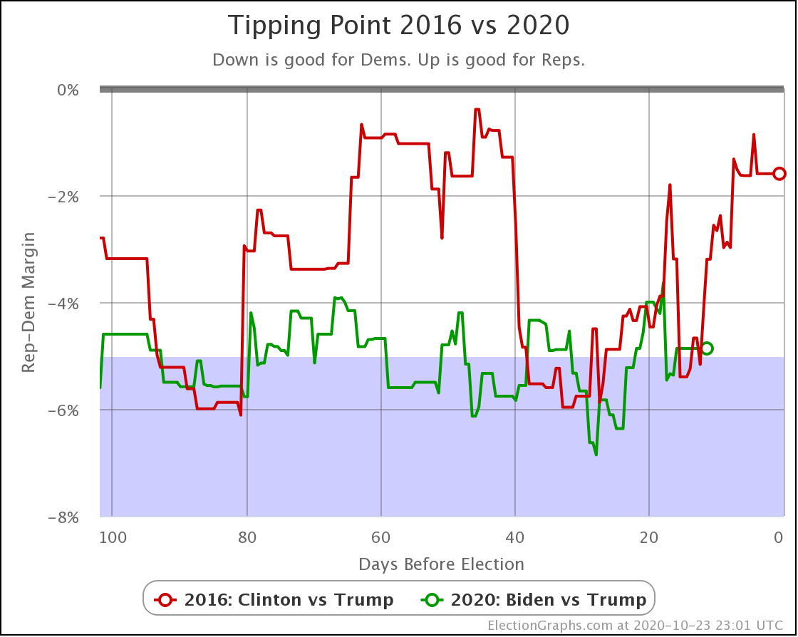
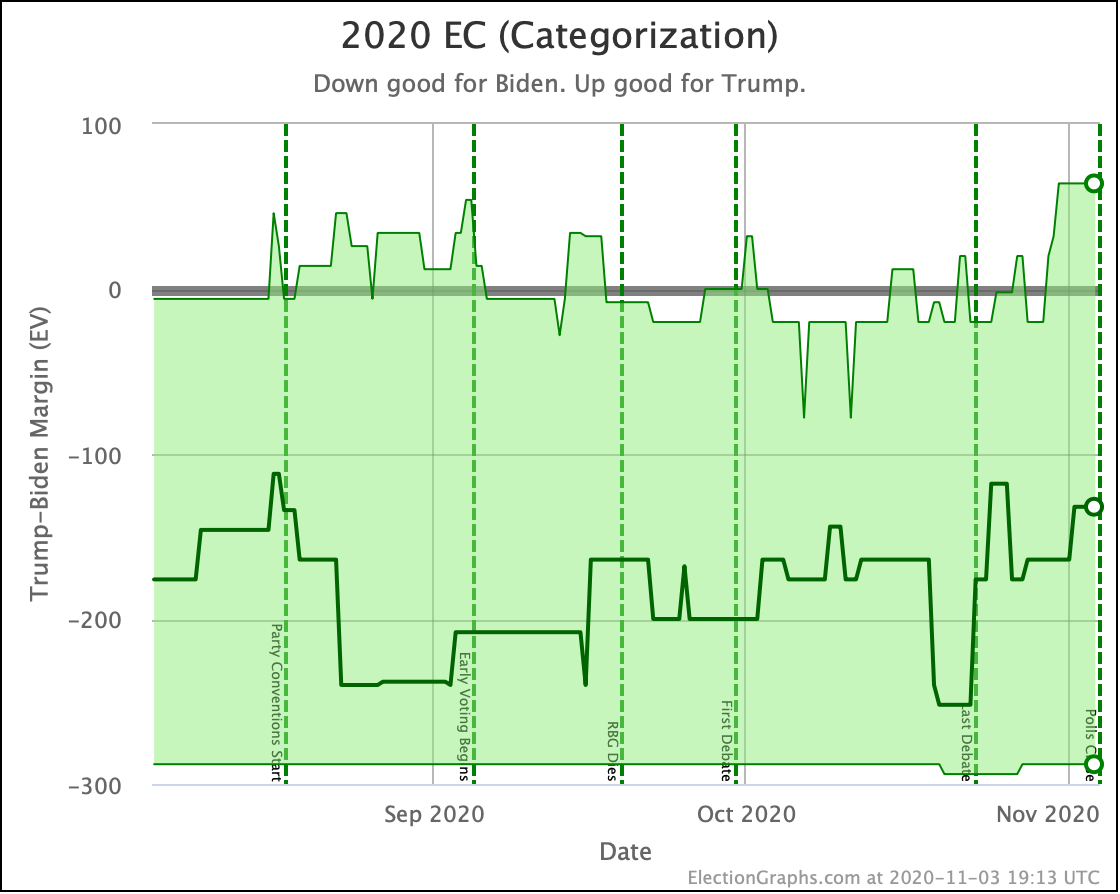
After a brief spike toward a stronger position for Biden, the collapse we have been talking about happened. The final tipping point was only a 2.3% Biden lead. Biden had seen worse tipping points, but not since early June.

Even at this level though, Biden is stronger than the 1.6% that Clinton ended with. So he is still in a better position.

However, the difference between the Election Graphs final tipping point and the actual election results in 2016 was 2.36%. So the same size error in the correct direction would make Trump the winner.

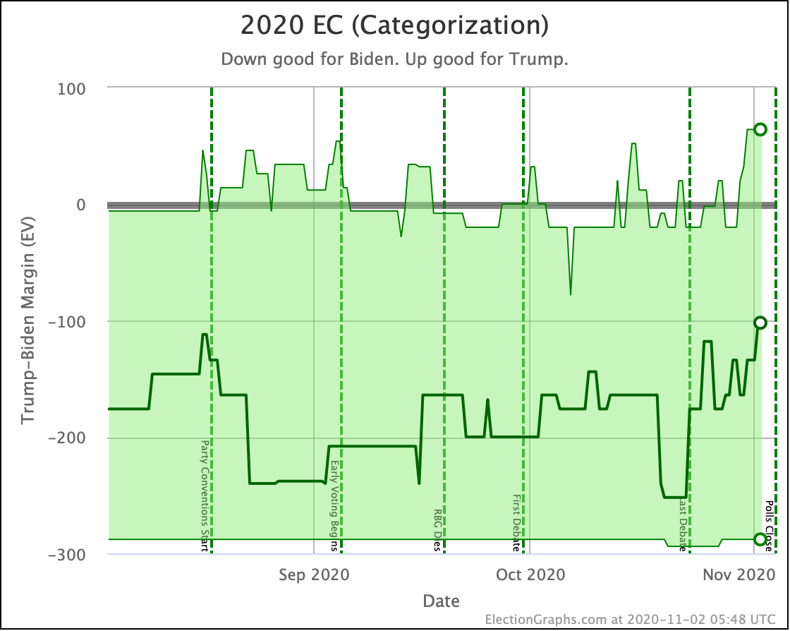
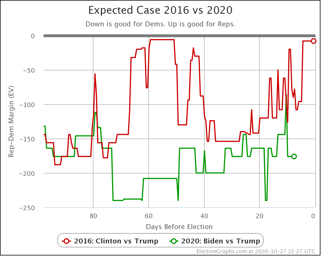
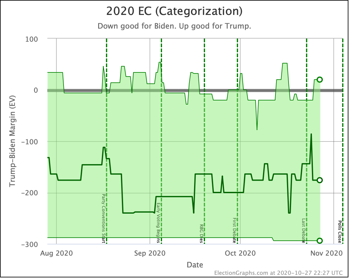
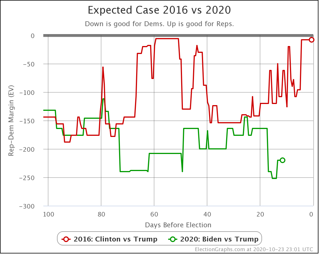
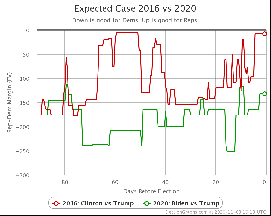
In terms of the expected case, where each candidate wins every state where they lead the Election Graphs average, Biden is in the low end of his recent range, but not any lower, and still significantly ahead of where Clinton was.

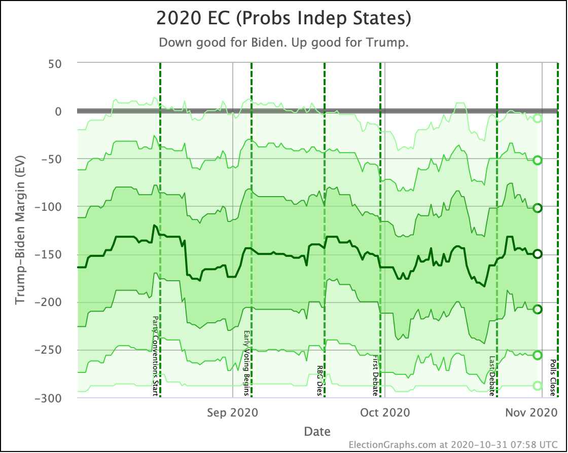
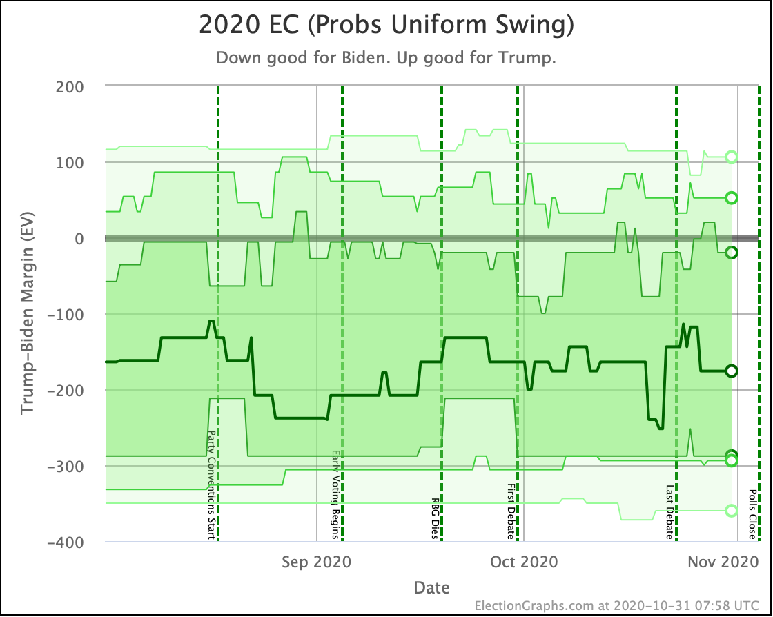
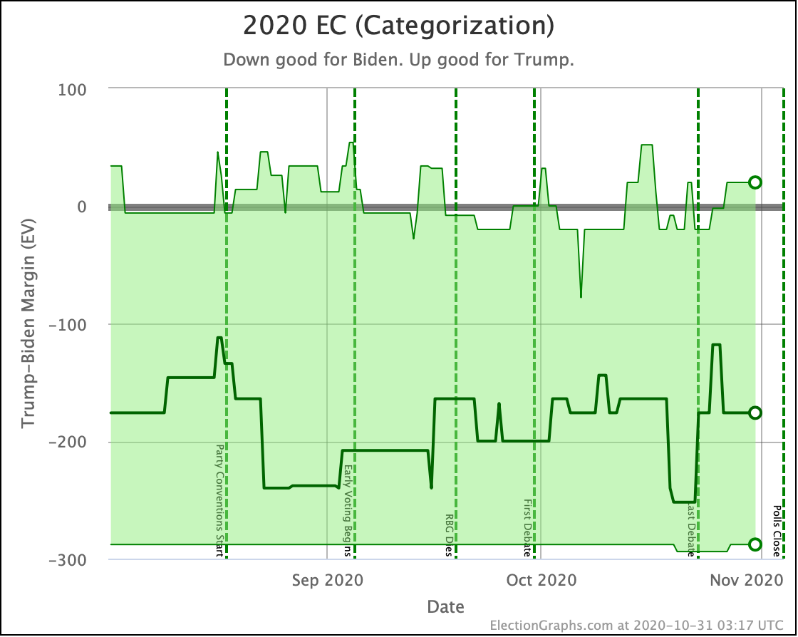
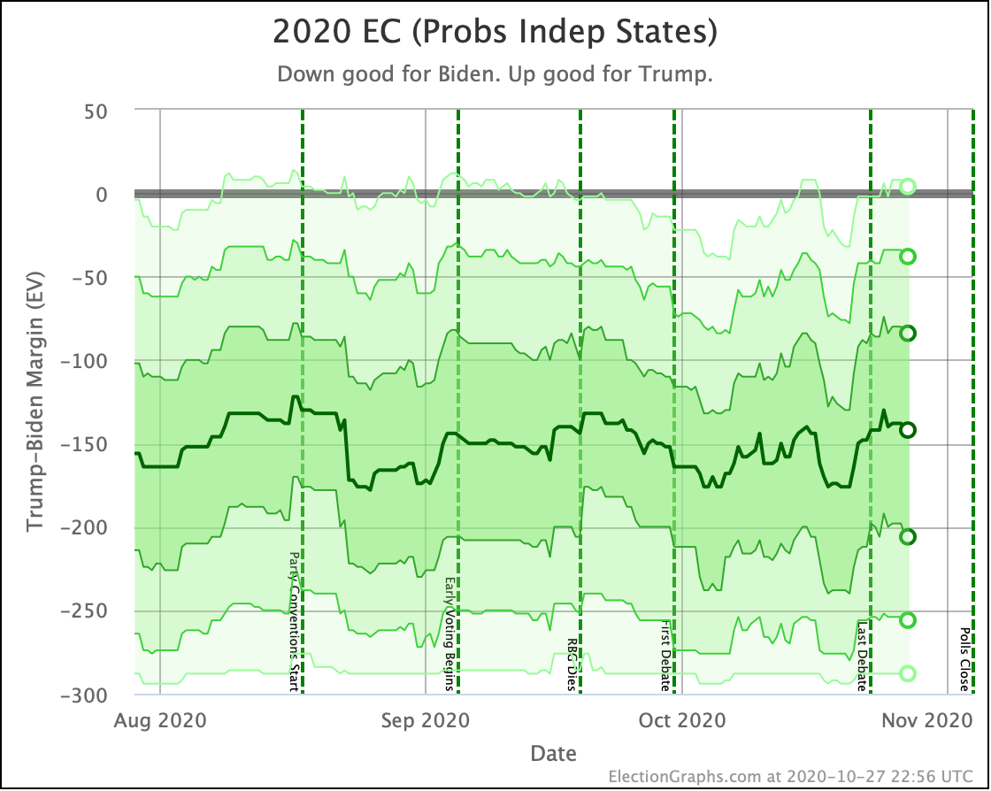
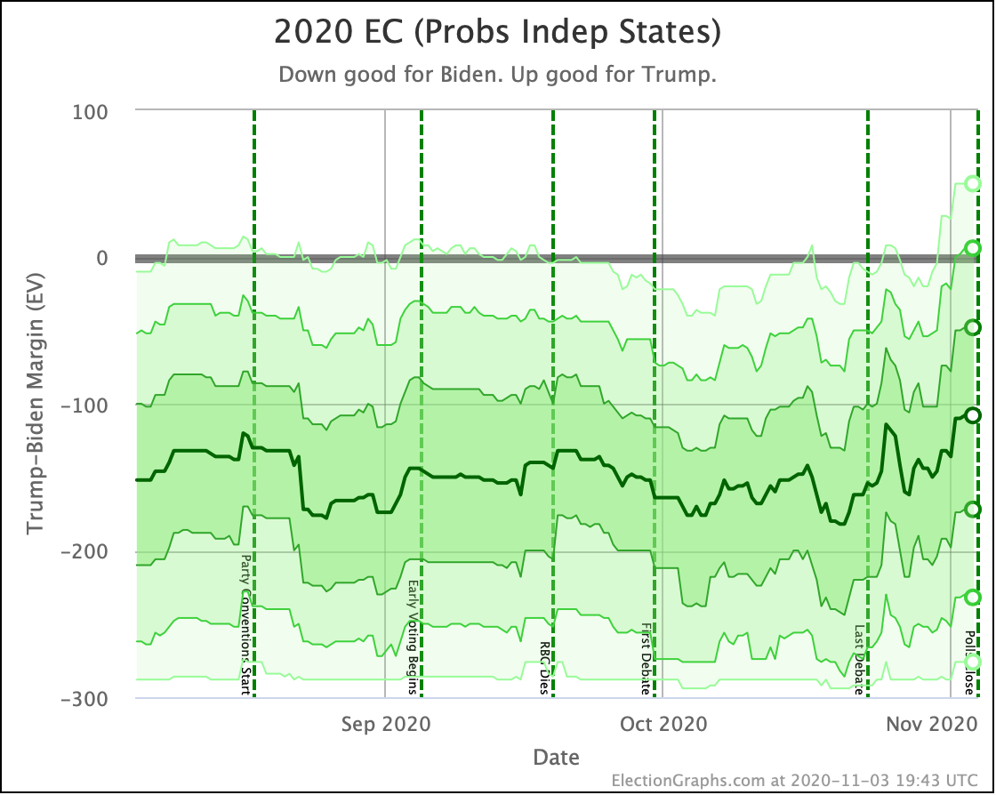
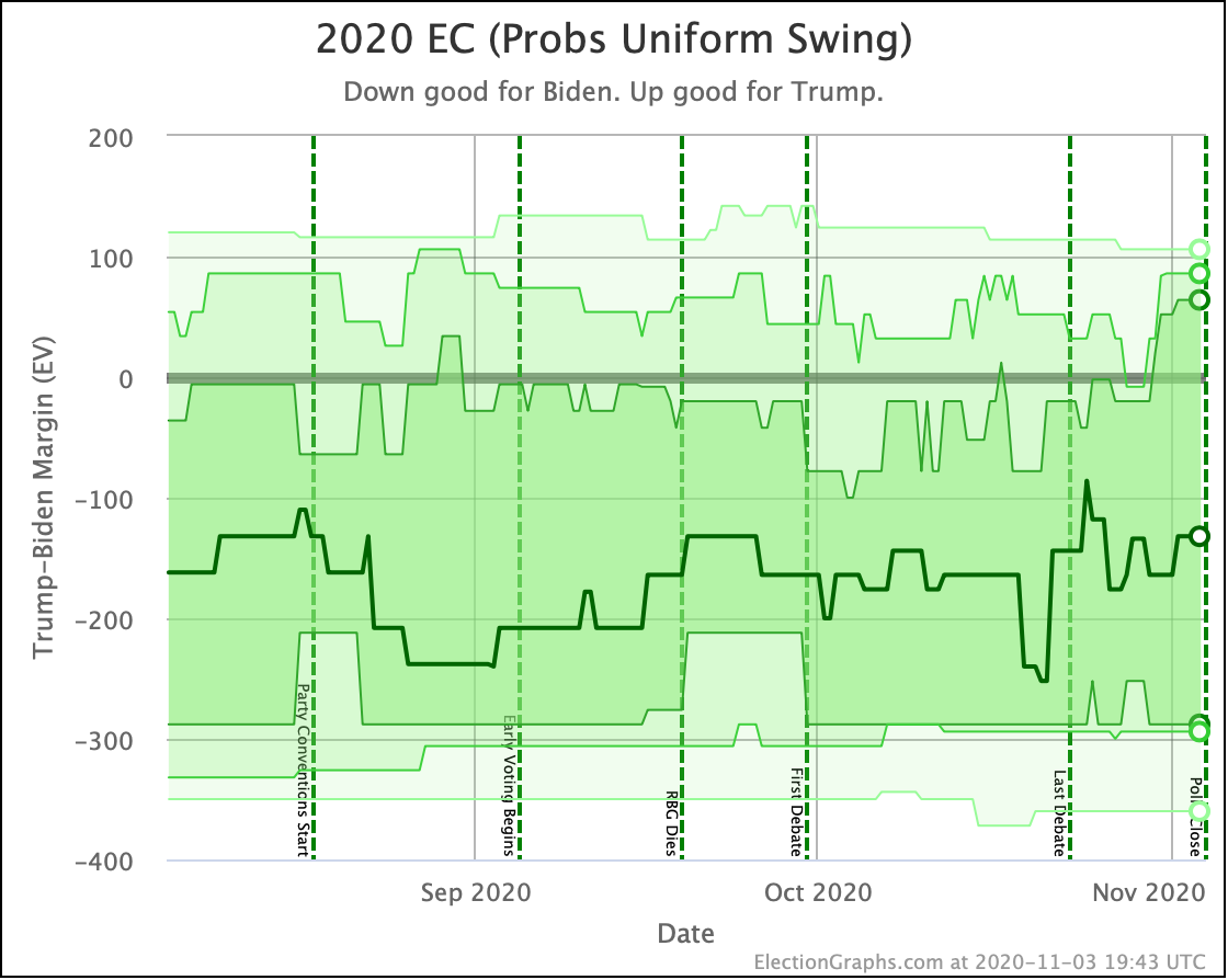
OK. Let's look at the range of margins predicted by our three models:

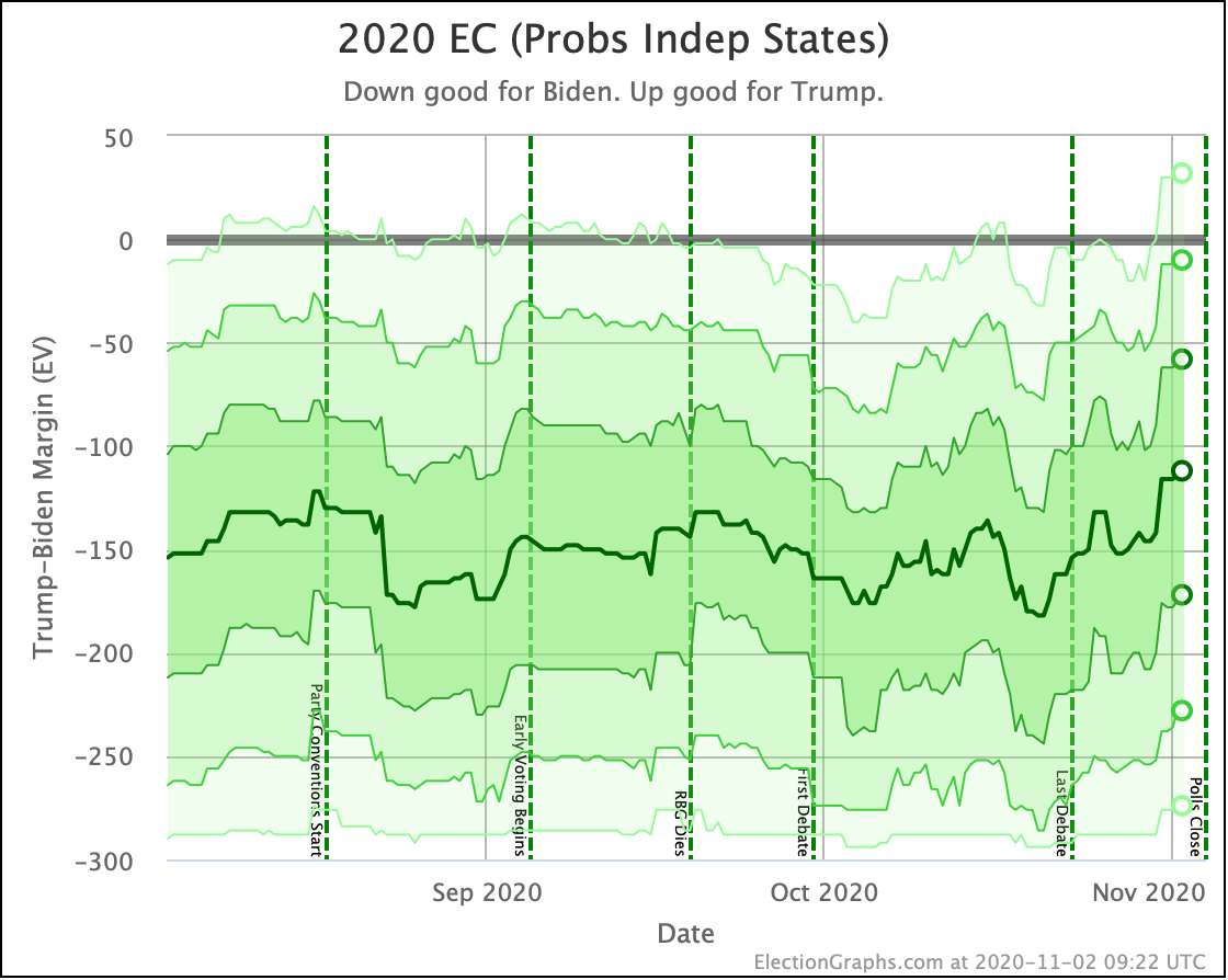
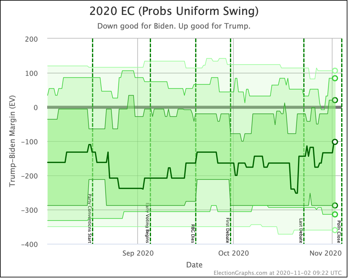
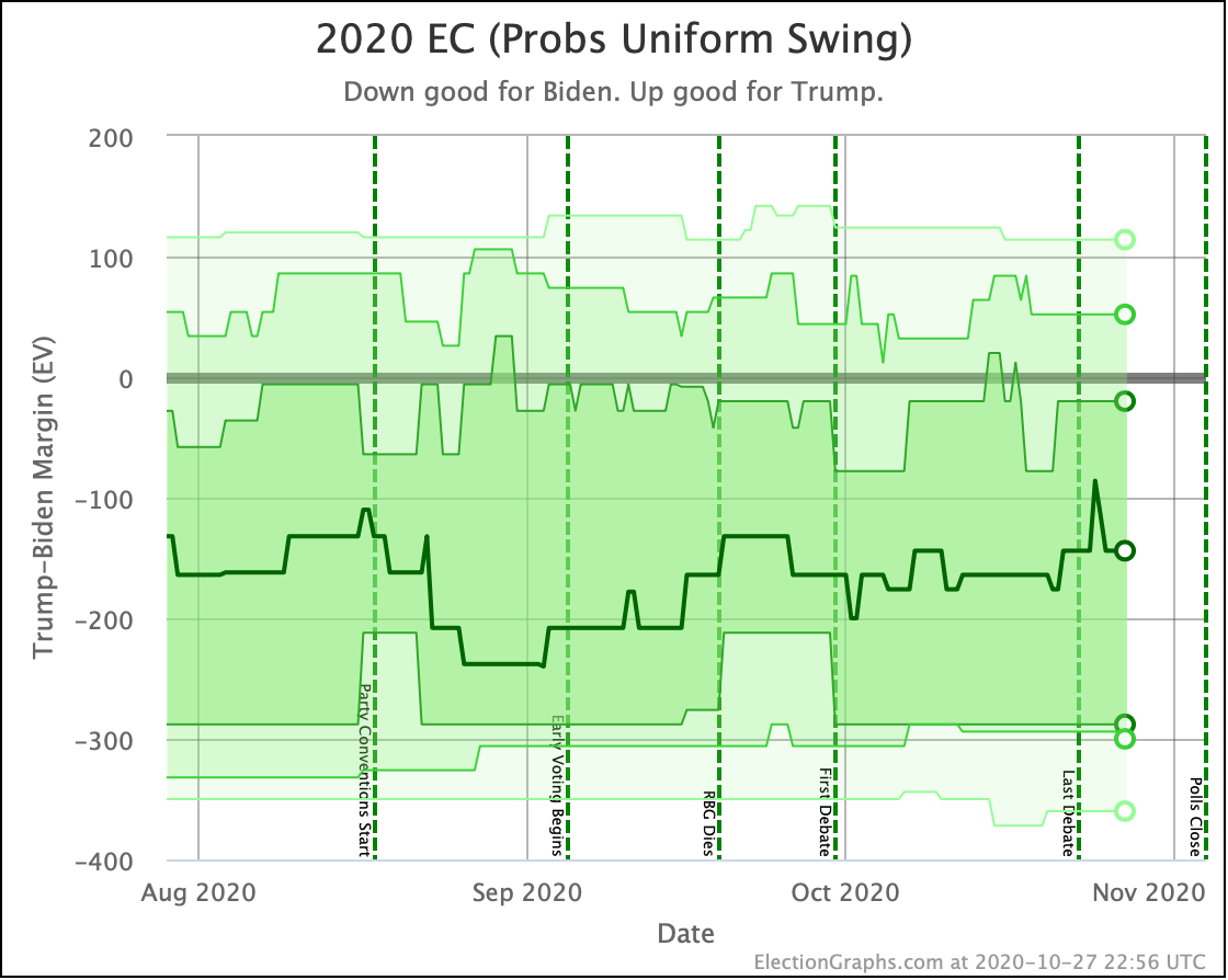
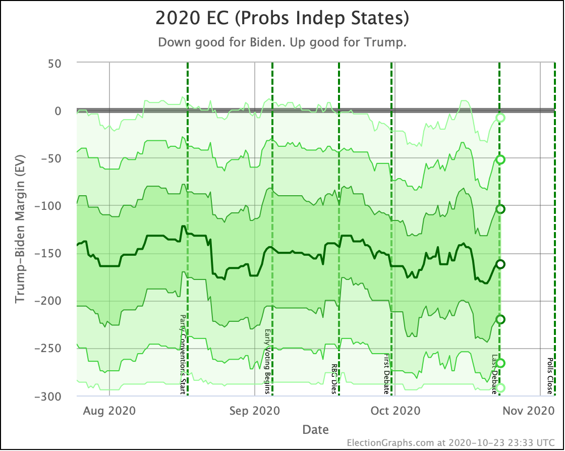
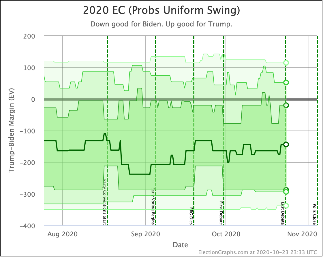
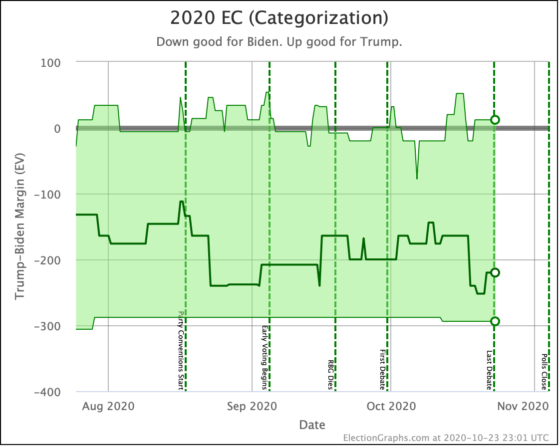
In all three of these cases, the center lines have moved toward Trump, but are either still in their normal ranges, or are just barely out it. What has changed though is that in all cases the upper end of the envelopes, representing Trump's best cases has stretched out significantly further into the Trump wins zone.

This makes sense because most of what we saw was not states actually flipping from Biden to Trump in the averages, just Biden's lead in states being significantly diminished. So the straight-up scenario that happens if the averages are all correct doesn't move much. But the sensitivity to the averages being wrong and therefore states flipping to Trump based on those errors increases significantly.

As a sanity check, let's compare our three centerlines with what other sites are saying at the moment:

So I'm in the zone. Most of the big folks have Biden doing better than I do, but there are a few places that have him doing worse.

And the Election Graphs "expected case" exactly matches what the Upshot says would be the result if the polling error in 2020 was the same magnitude and direction as the error in 2016. Which is interesting.

I note of course that nobody has Trump winning in their "expected case".

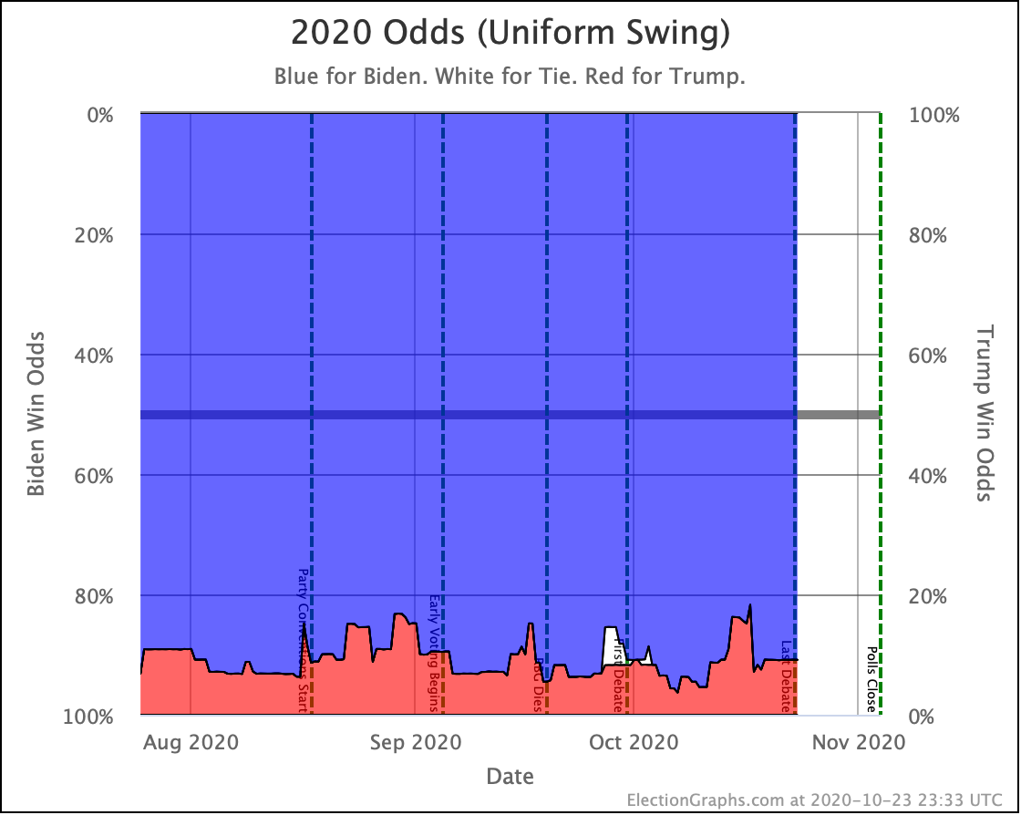
OK, with that done, let's look at odds.

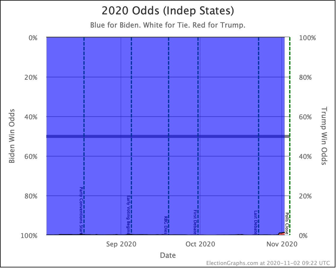
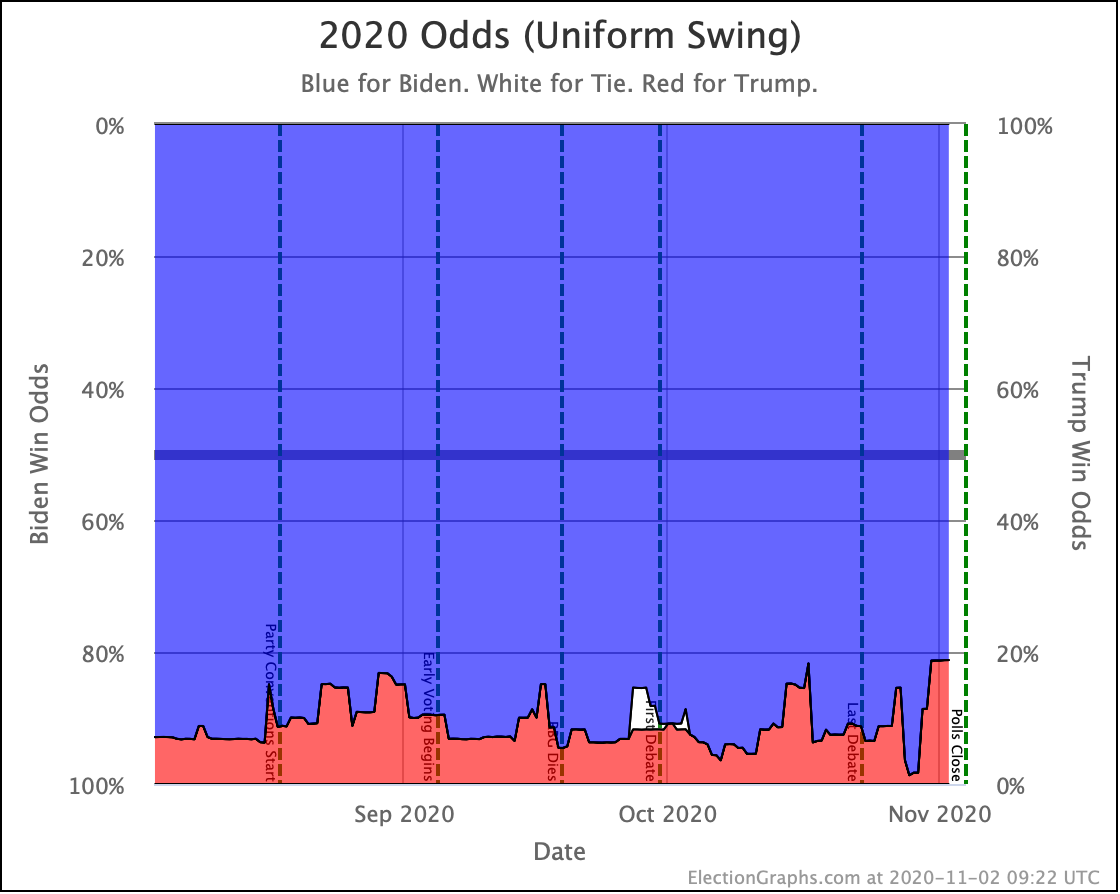
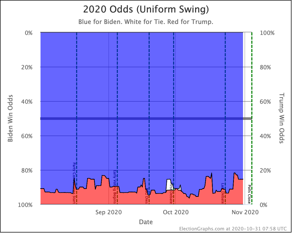
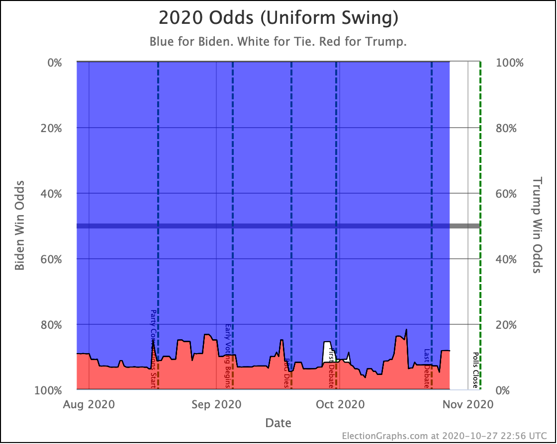
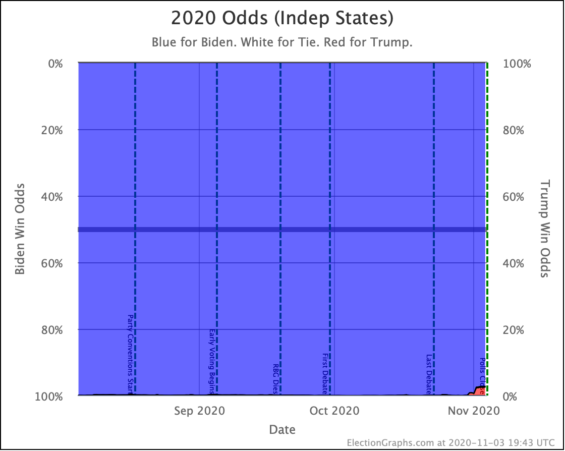
While still small, the red zone in the Independent States odds view is now significantly larger, with Trump's chances now at 2.5%.

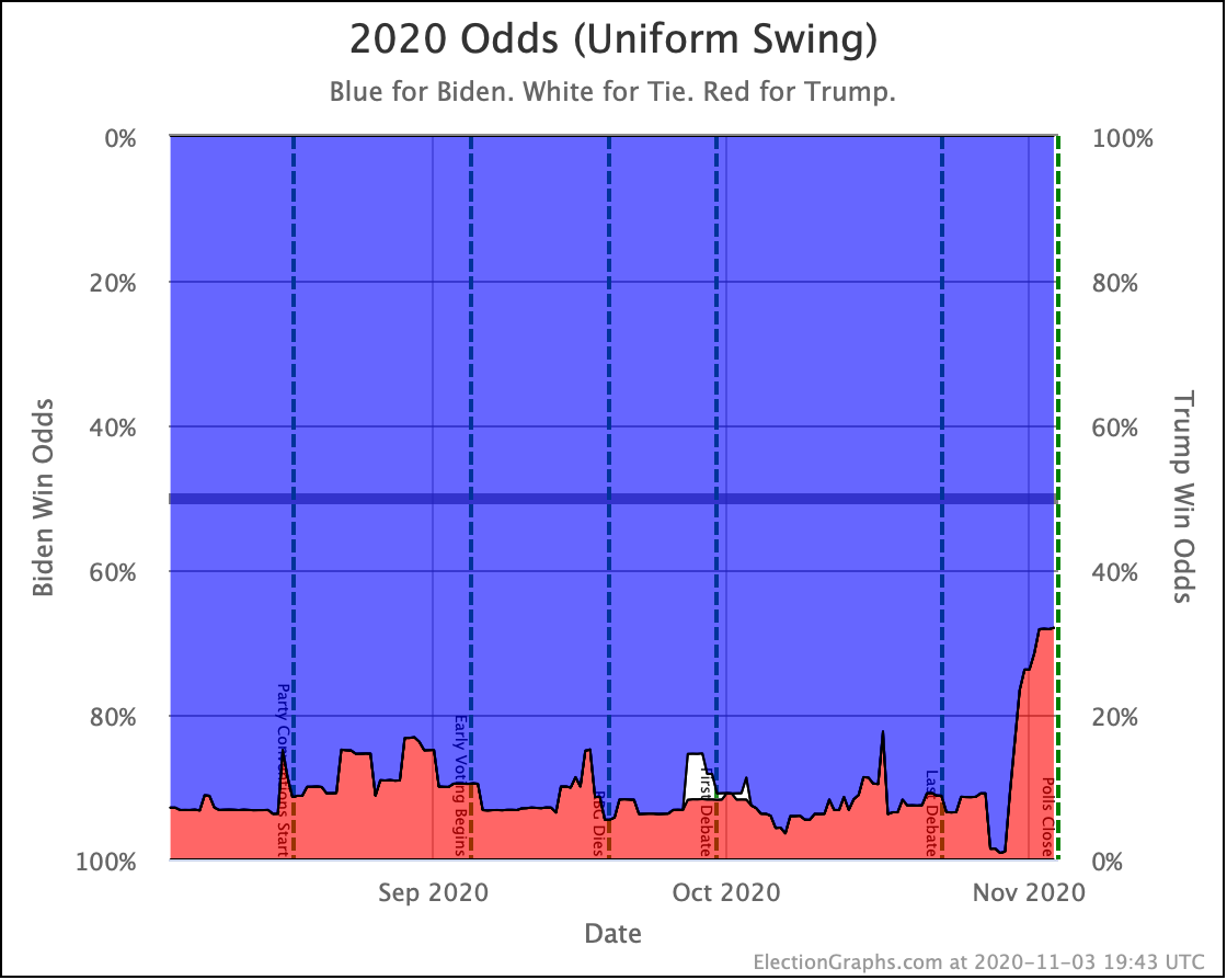
Trump's odds in the uniform swing model are massive now though, at 31.9%.

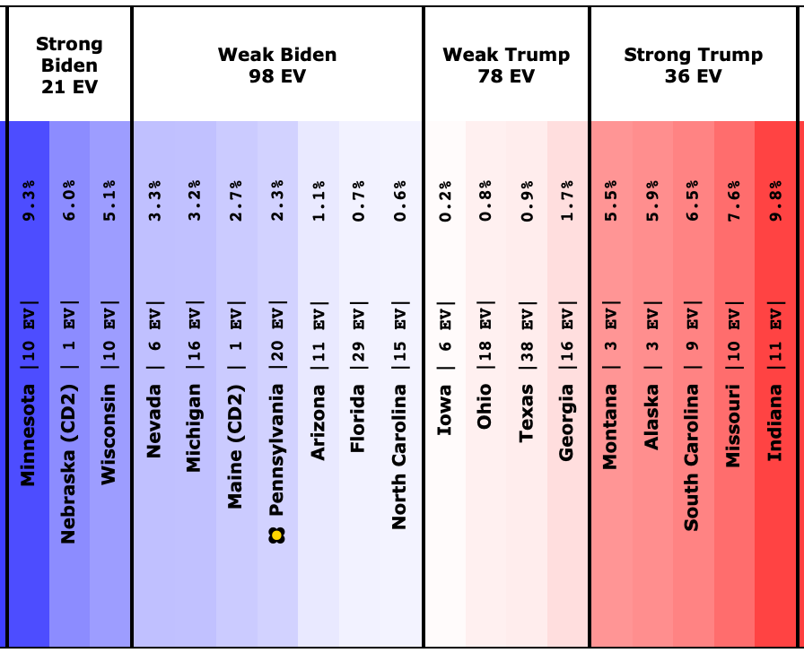
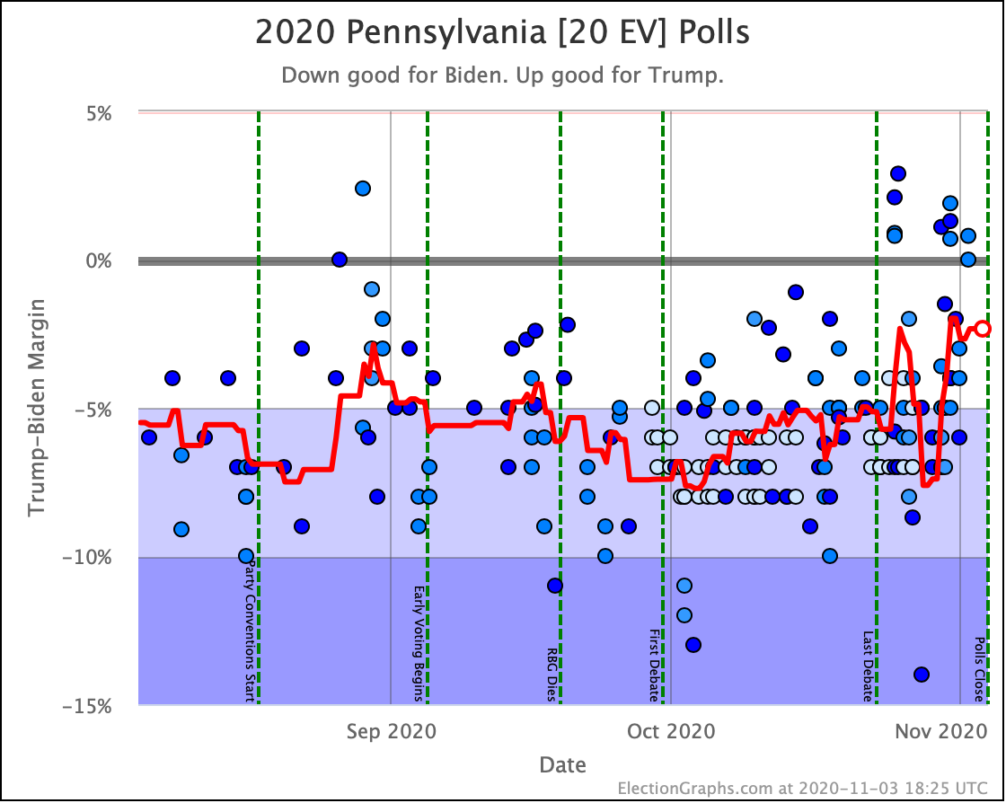
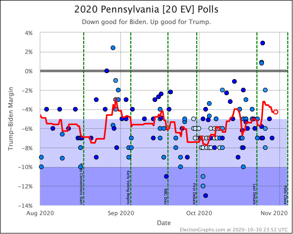
Fundamentally, since this imagines the extreme case where all the states move in a completely synchronous way, the only thing that matters is the odds in the tipping point state. And as of the final situation, the tipping point is Pennsylvania, and our average has Biden leading Pennsylvania by only 2.3%.

And in our analysis of our results from 2008 to 2016, we discovered that when we have a Democrat leading by 2.3%, that translates into a 68.1% chance of the Democrat winning, and a 31.9% chance of the Republican winning.

So Trump's chance of winning Pennsylvania is 31.9%, and if all the states are locked together, that means his odds of winning the whole election would be 31.9% too.

Since both of these models are extremes, and the truth is somewhere in between, the official Election Graphs statement on Trump's chances at this point is "between 2.5% and 31.9%". Election Graphs doesn't actually model where the right spot is within this range, but the middle is as good a spot to look at as any. That would be a 17.2% chance of a Trump win at the moment.

Once again, let's compare with the other folks:

My two extreme models are unsurprisingly near the extremes. "The middle" puts me lower than most of the "big" outlets. So maybe they think which there is some correlation between the states, their models still think they are more independent than not.

In any case, Biden is a favorite in all of these views. But in some, the chances of an upset are much more than others.

Not including the three from me, the median is a 9.3% chance of a Trump win. Including all three of mine, the median is 10.0%.

So as usual I make the statement that people tend to be bad at interpreting odds. 10% is not 0%. 10% happens all the time. Biden is favored, but a Trump win is still very possible.

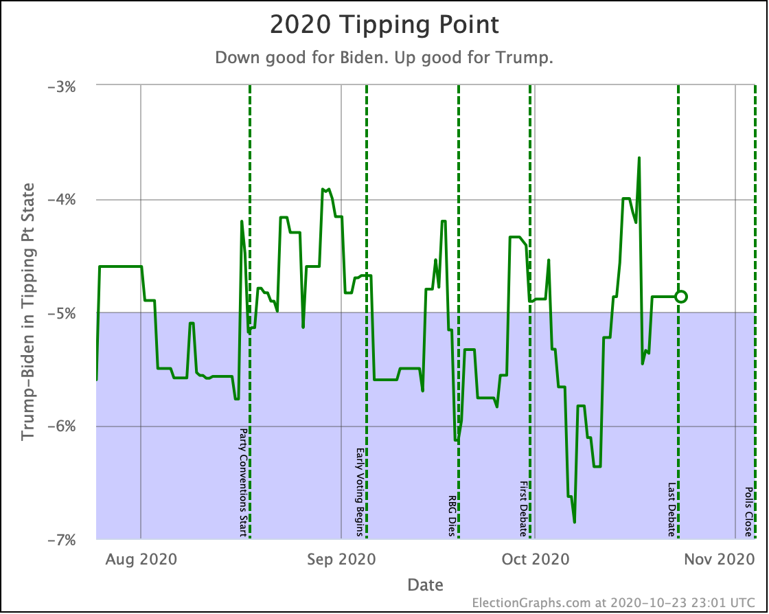
Looking at the tipping point without the 2016 comparison, the main thing to notice is the huge volatility at the end. Swinging first in favor of Biden, then against him. This is an indication that perhaps for 2024, I should look into ways to make this a little LESS sensitive to short term changes in the last weeks.

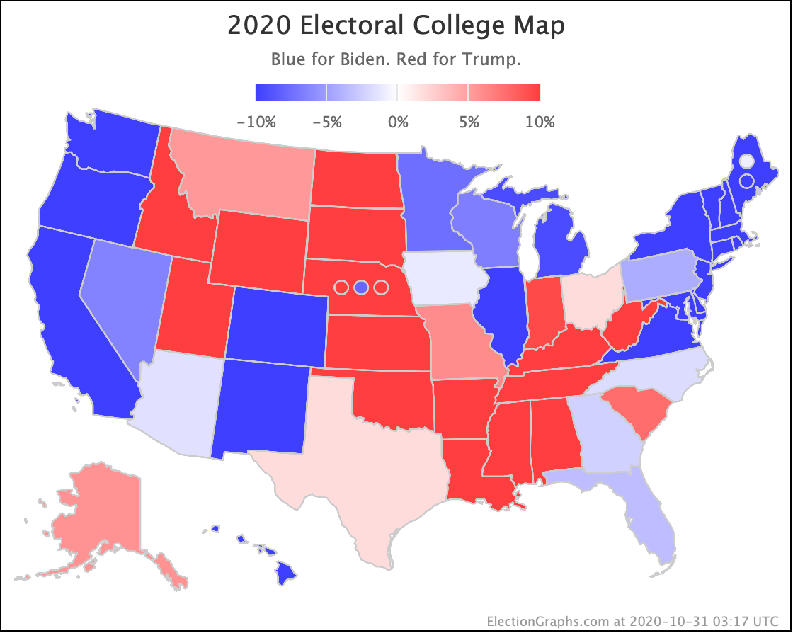
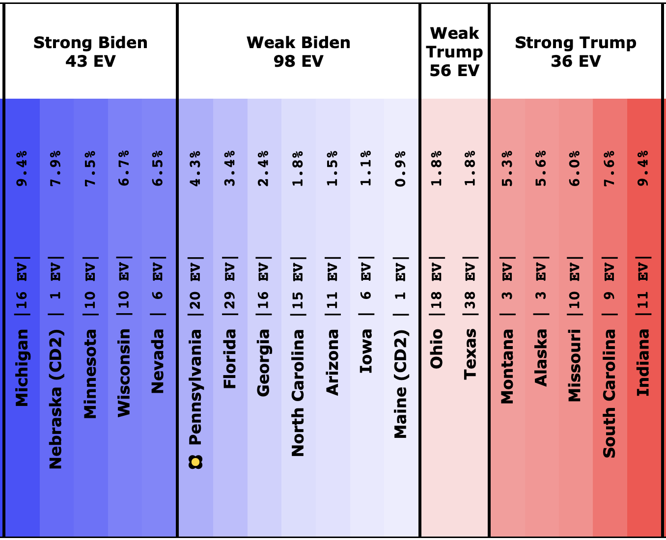
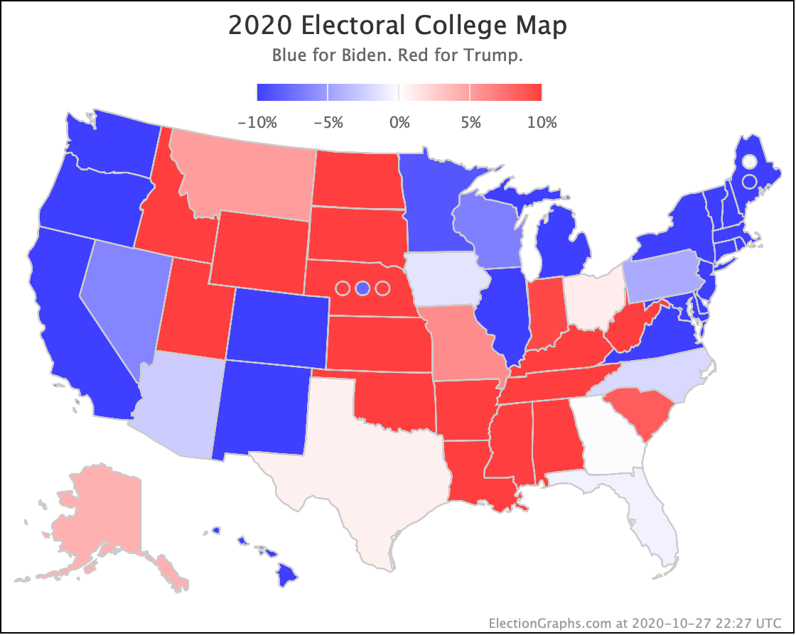
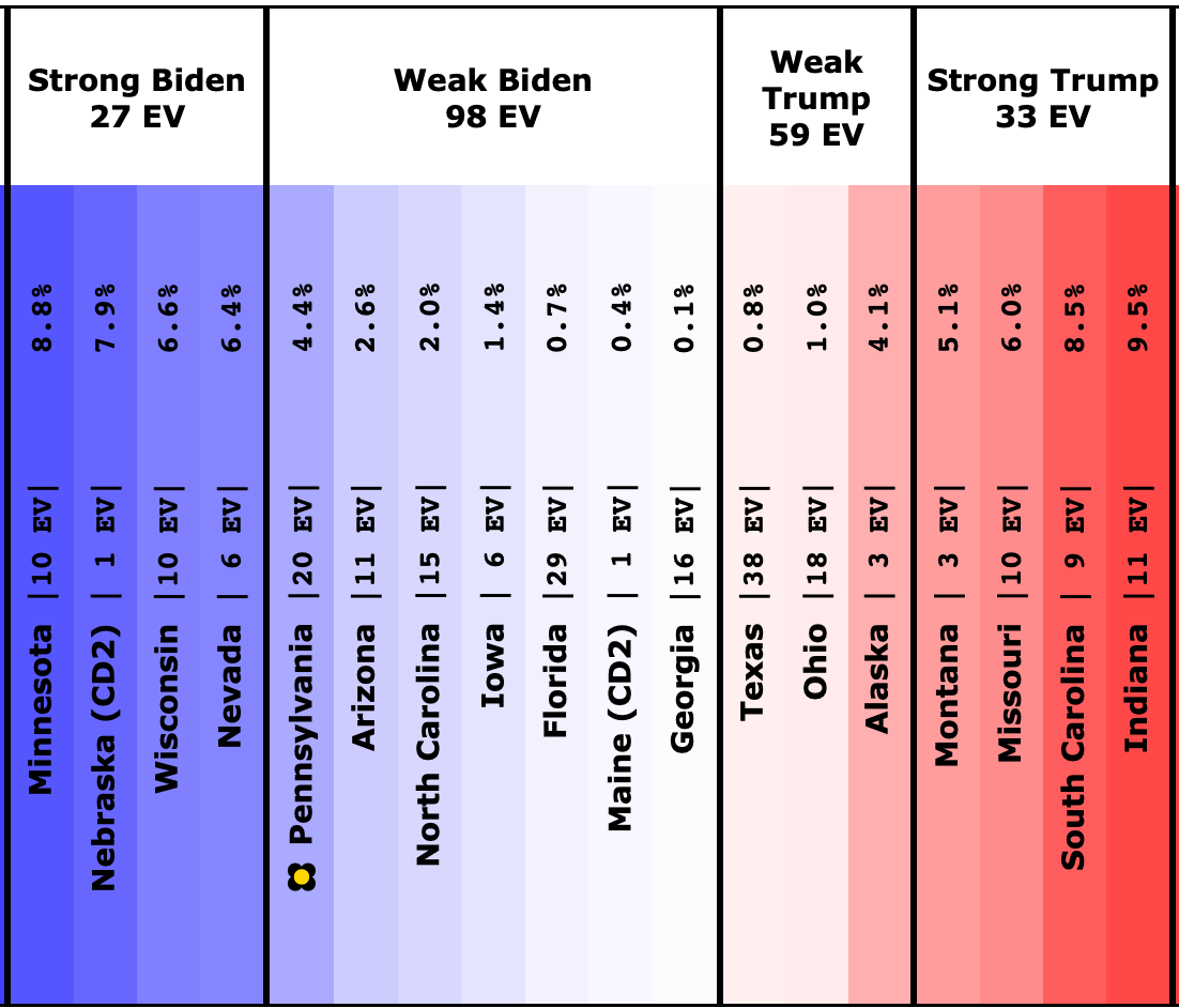
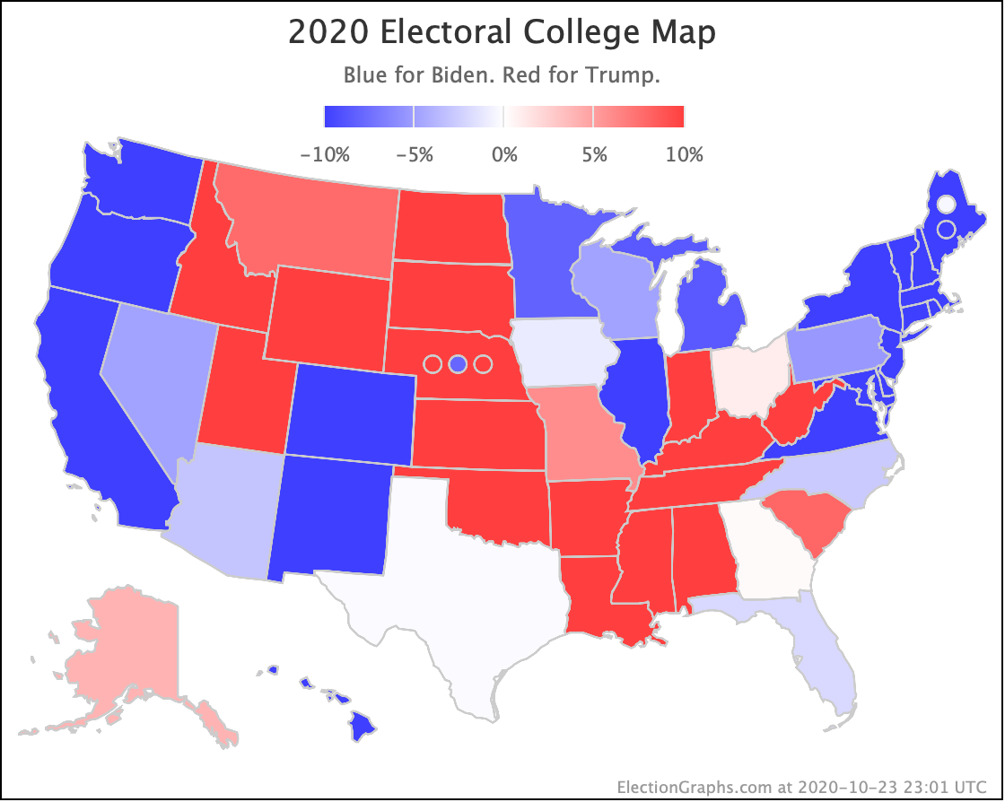
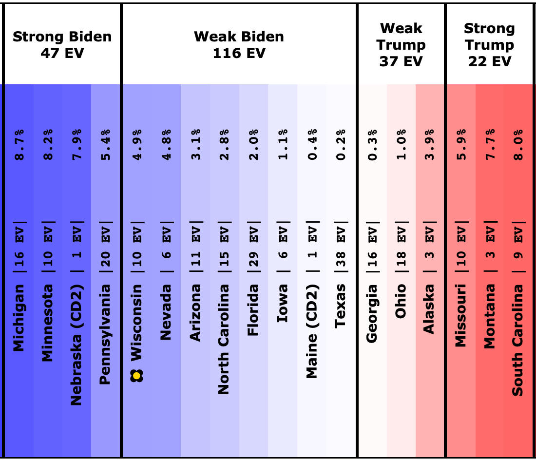
OK. Time for the map and spectrum:

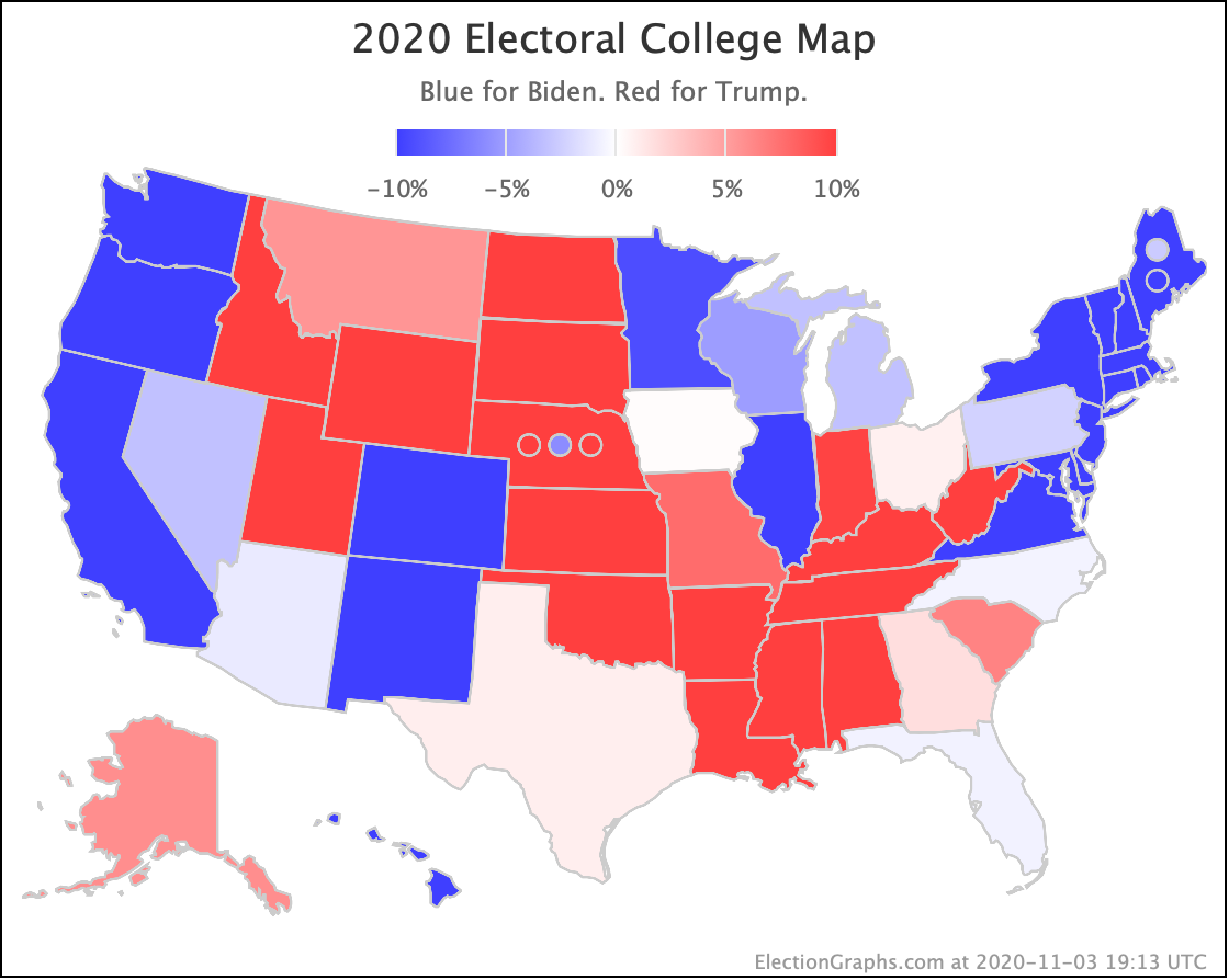
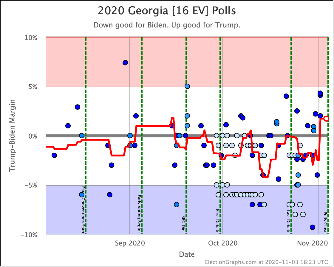
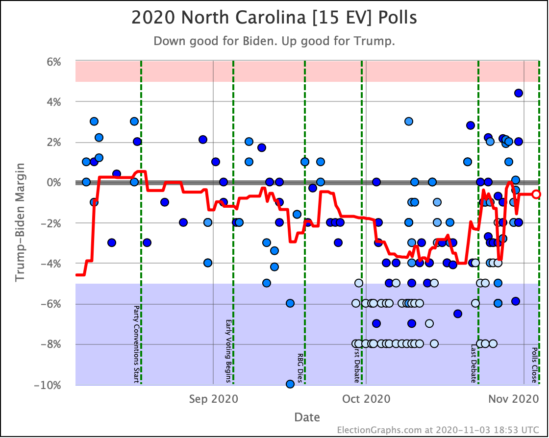
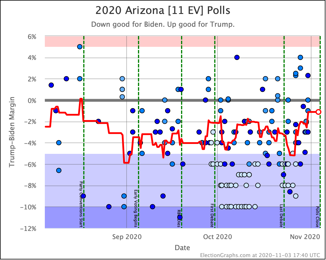
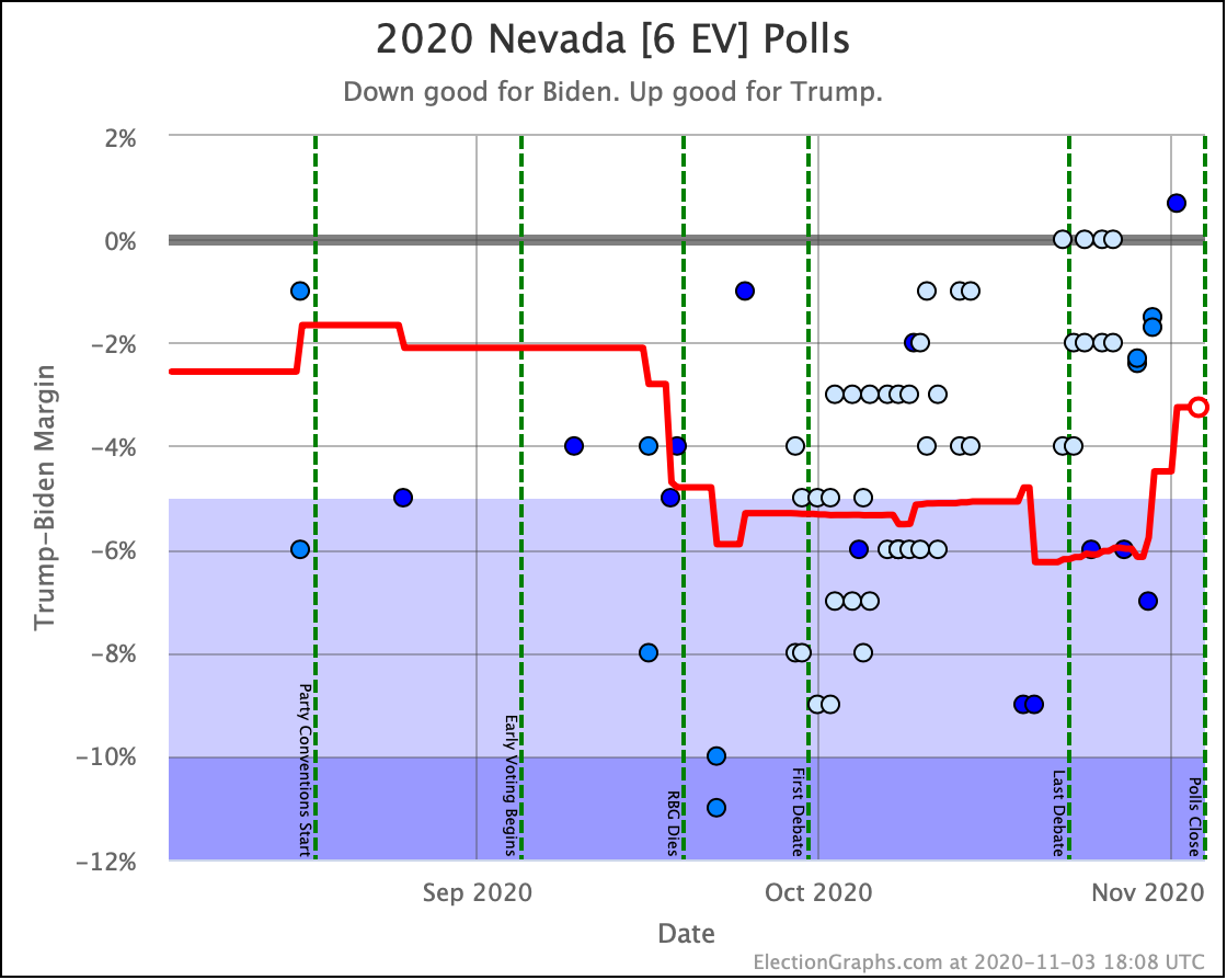
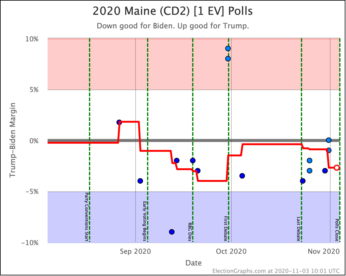
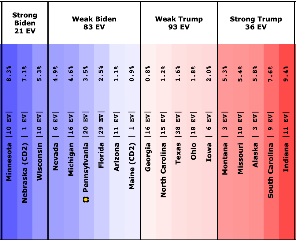
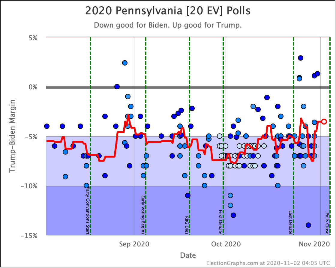
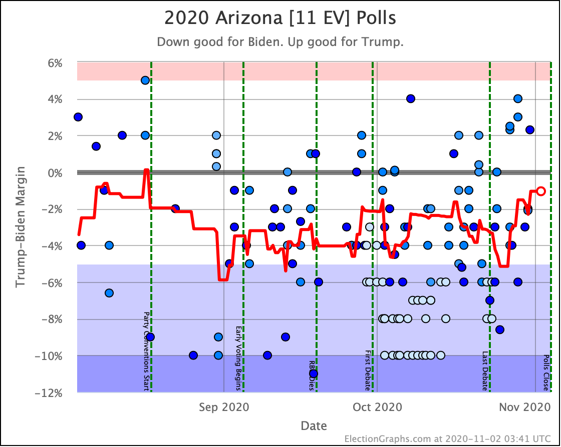
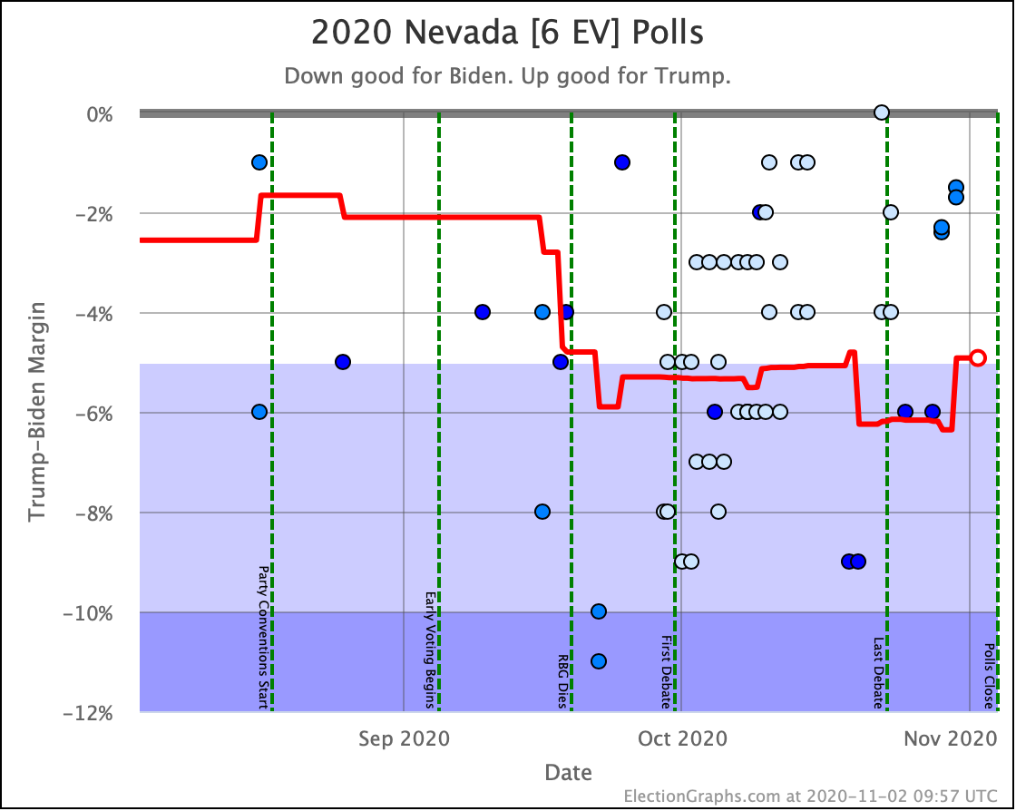
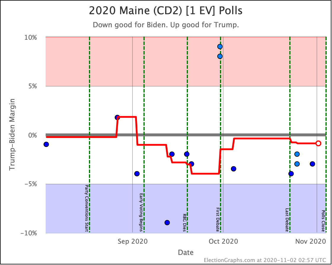
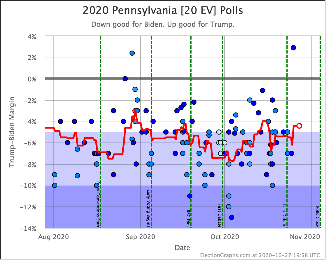
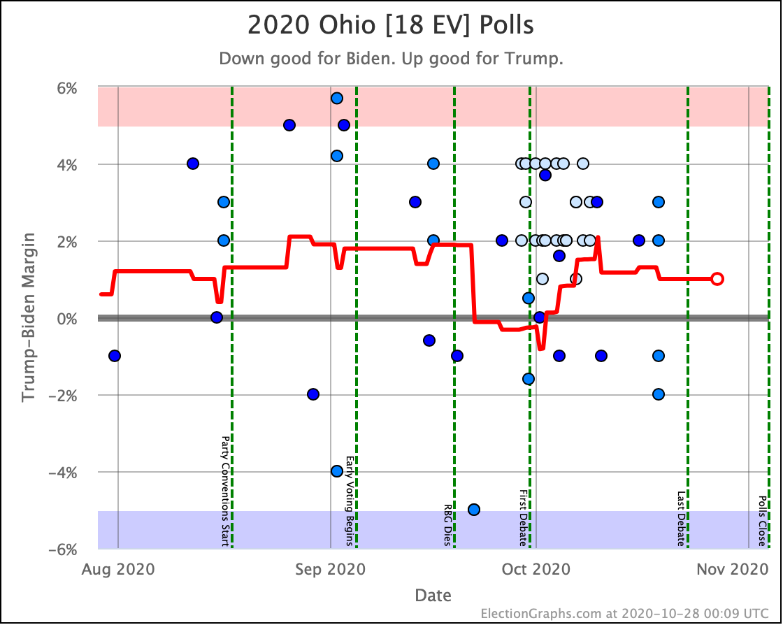
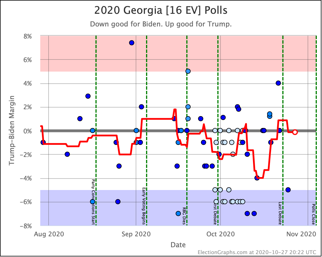
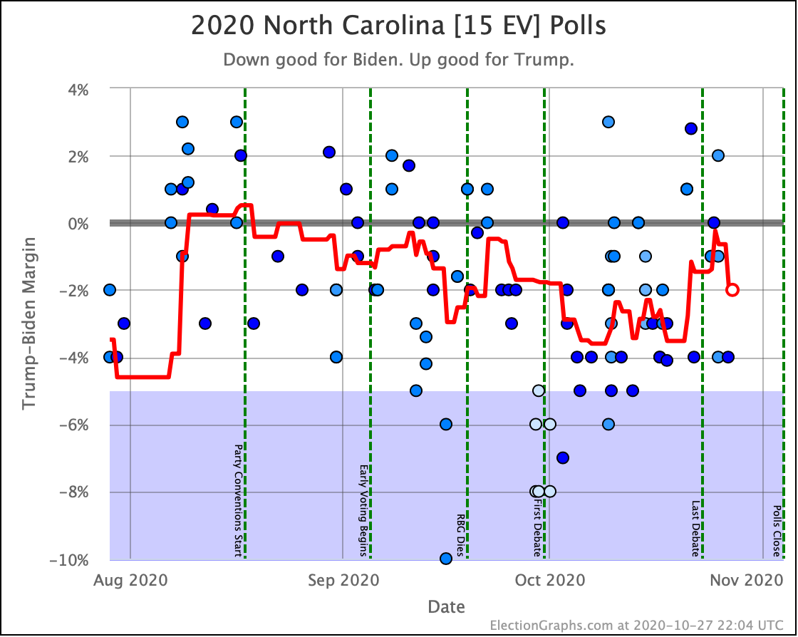
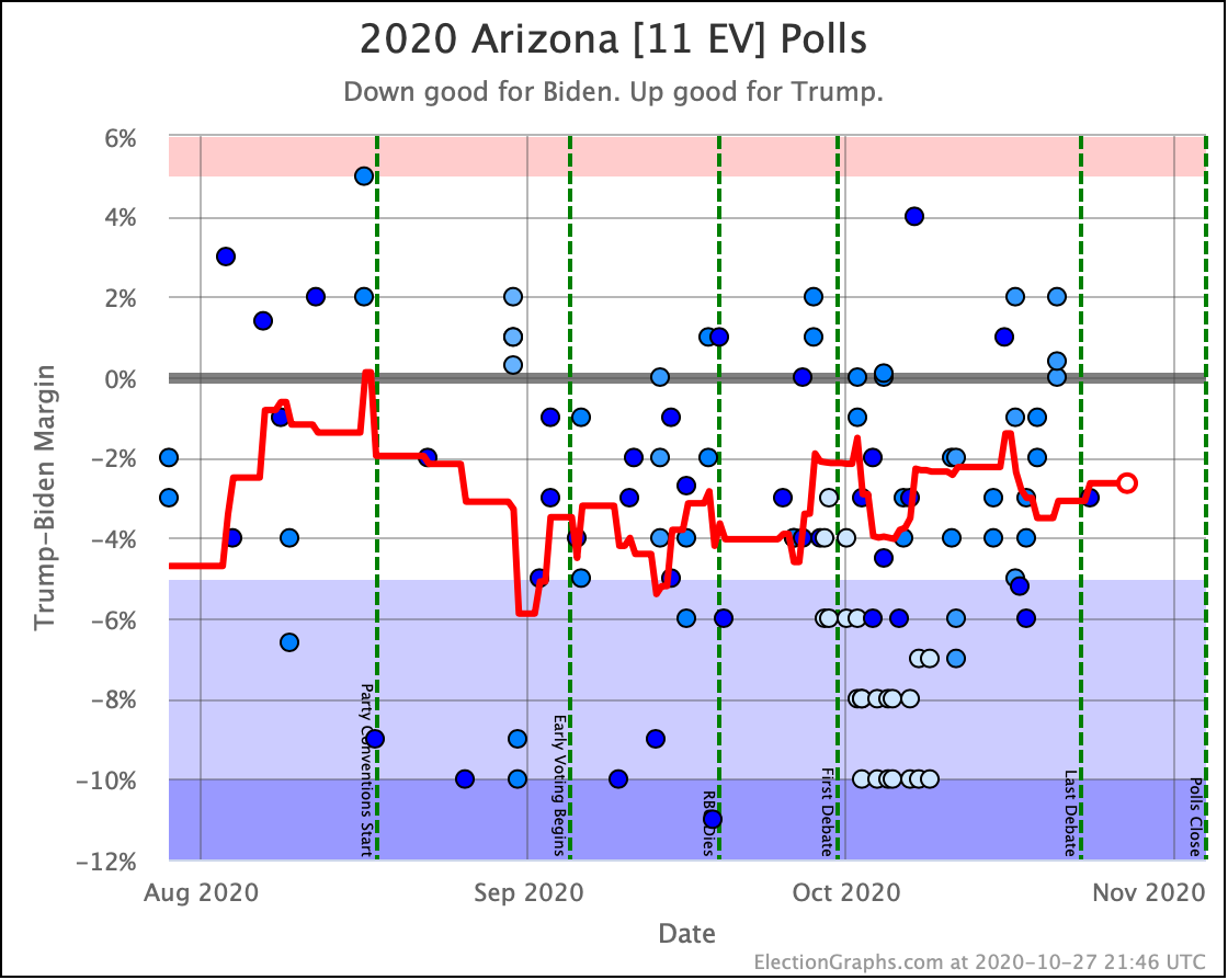
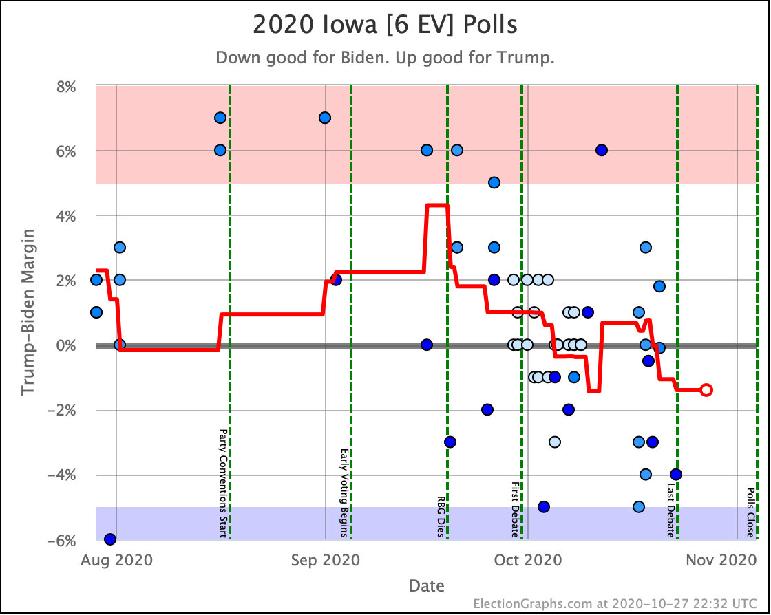
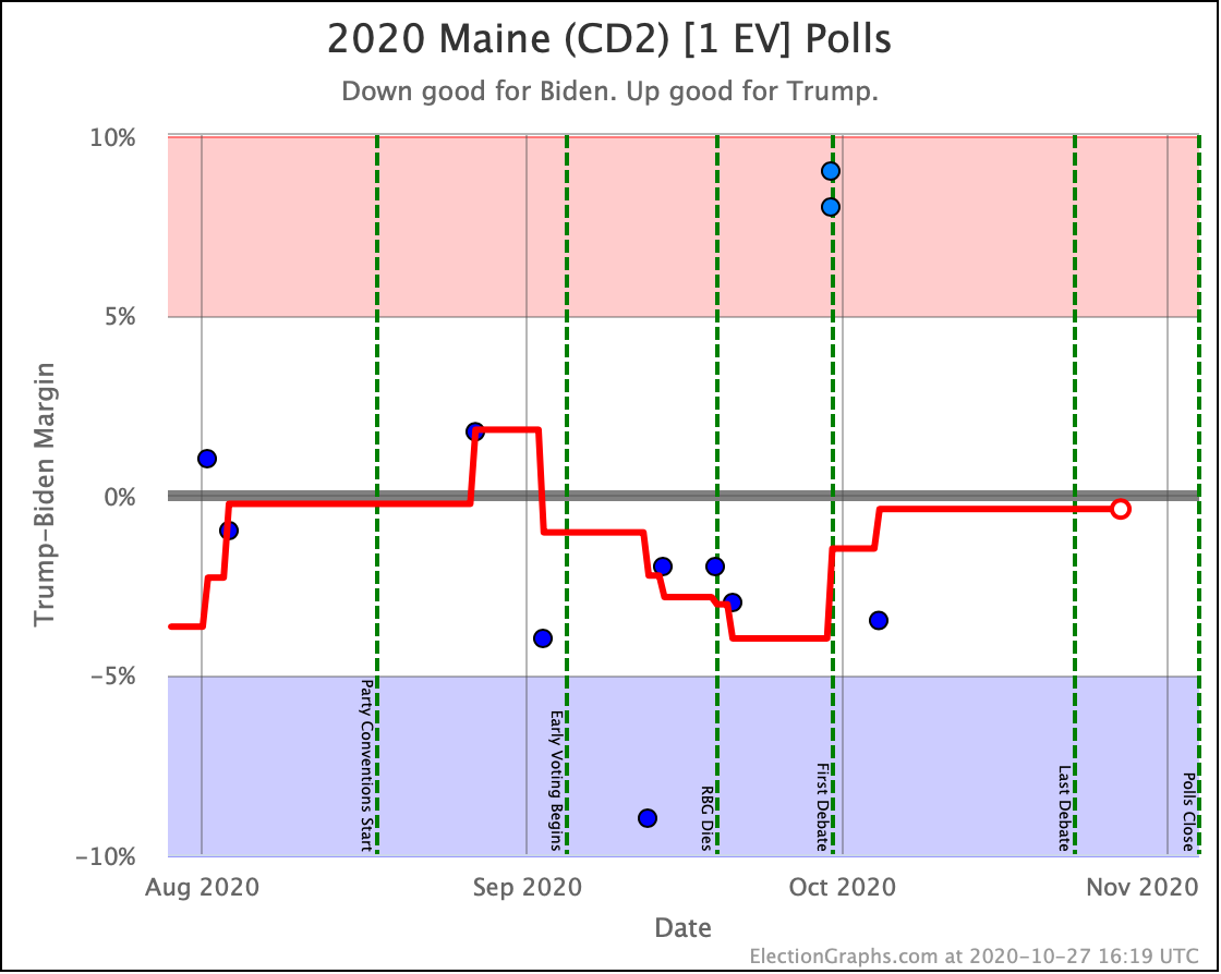
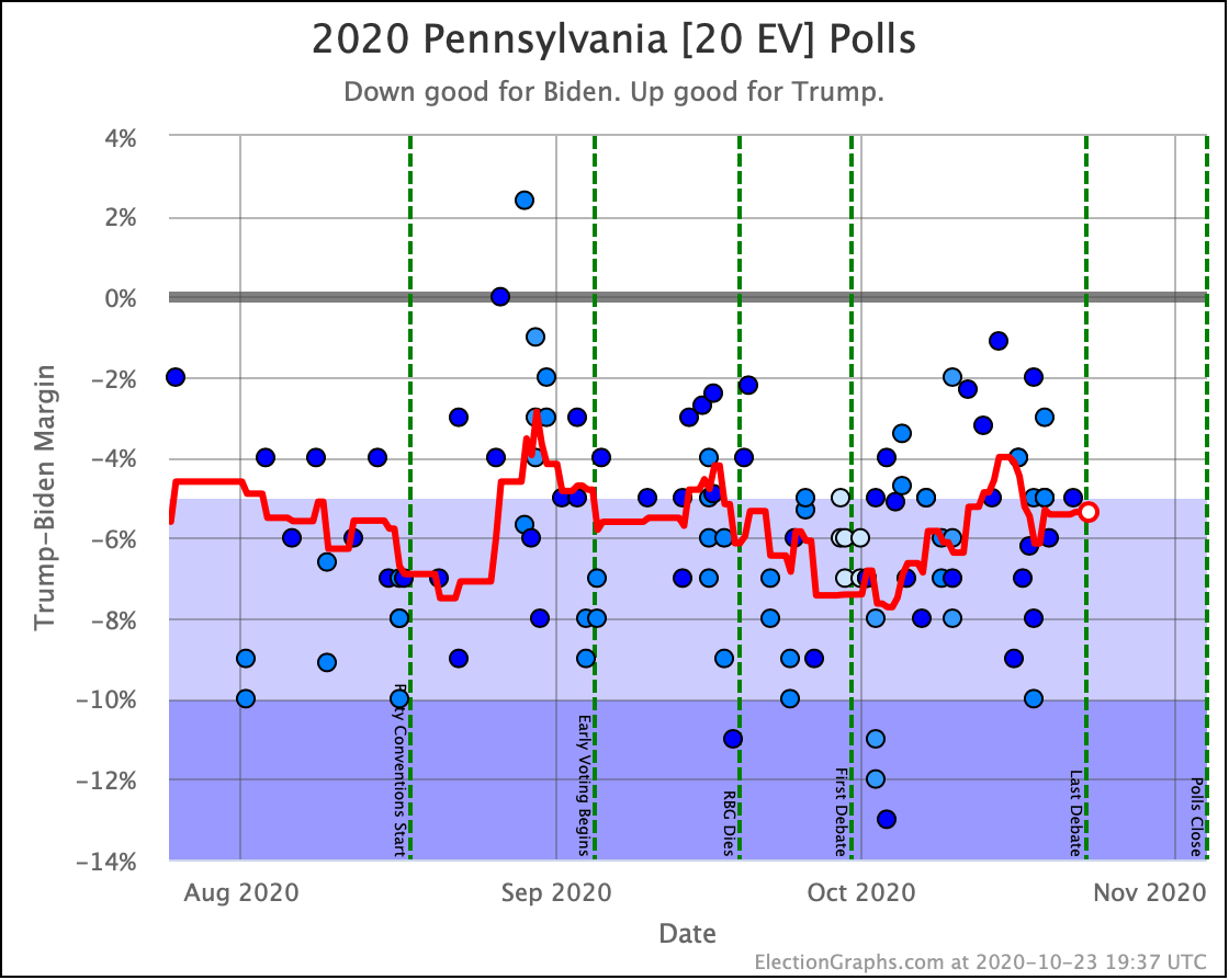
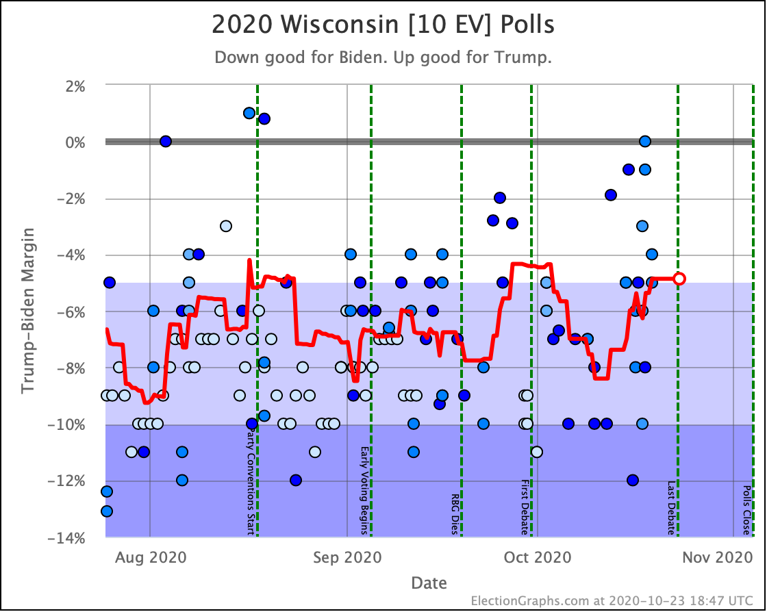
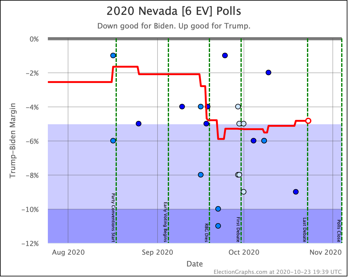
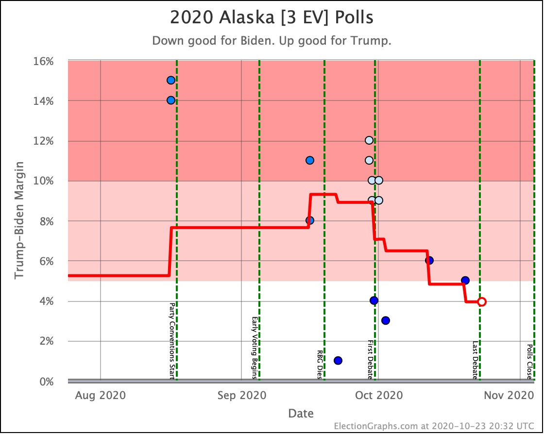
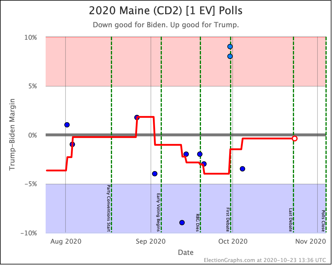
This view makes the volatility of the race clear. There are 10 states (and Maine CD2) with margins less than 5%.

The polling error in 2016 was 2.36%. There are 8 states closer to the centerline than that, including the tipping-point state.

If we get a 2016 size error favoring Trump, we get a very narrow win for Trump, squeaking past the post with an 18 EV margin.

If we get a 2016 size error favoring Biden, Biden wins by 288 EV, the largest winning margin since 1988.

More likely than either extreme of course is that we just get a solid but not extraordinary Biden win.

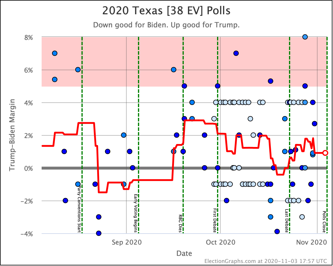
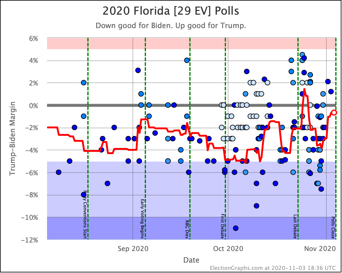
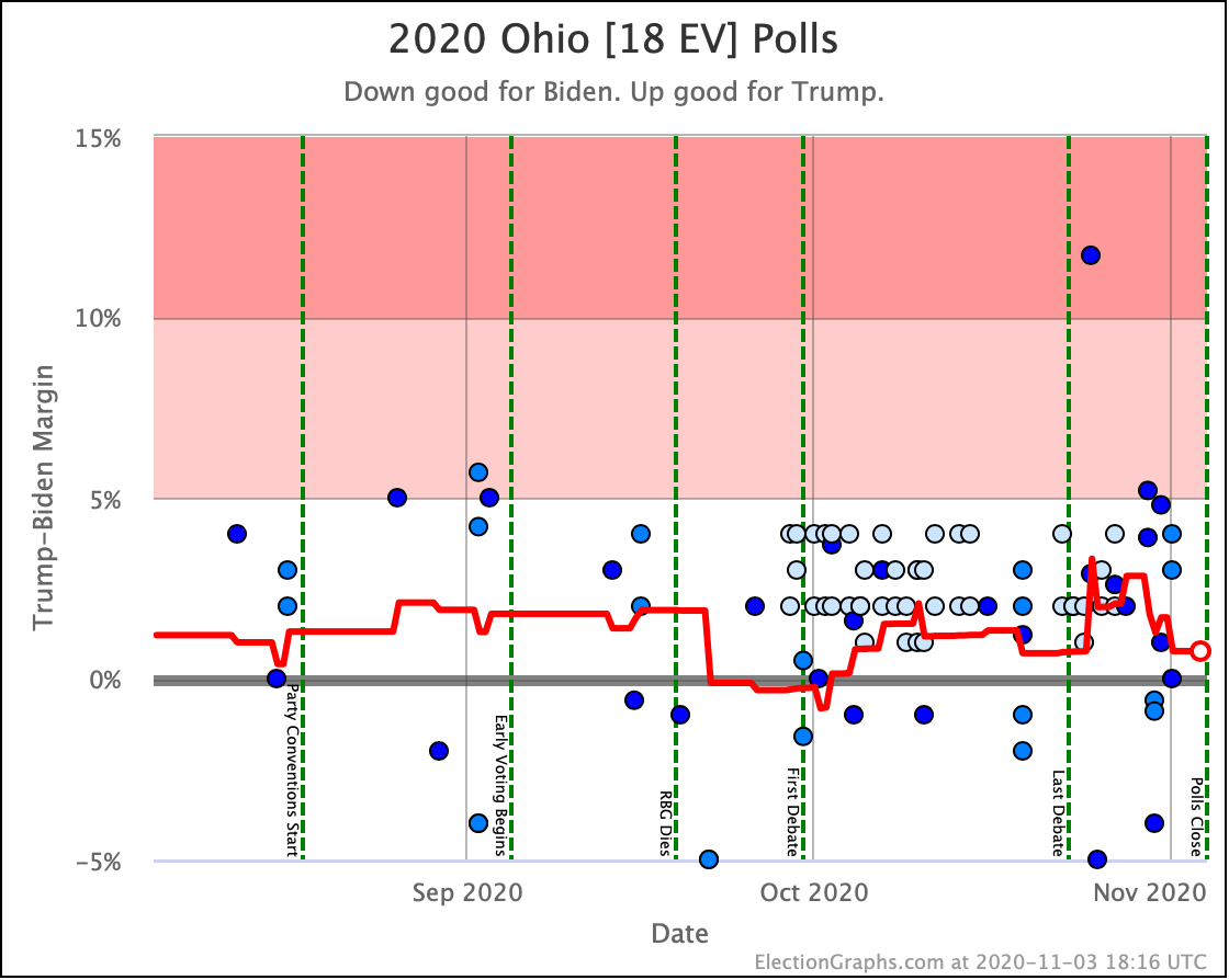
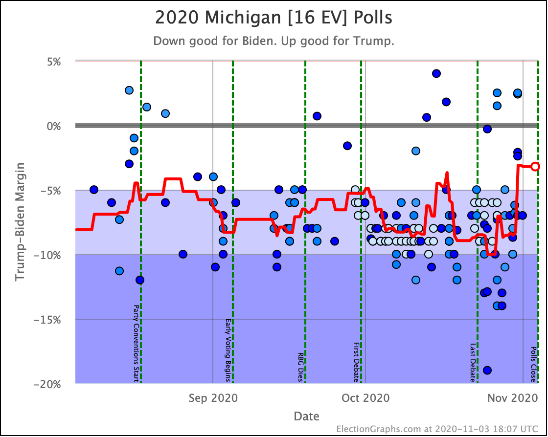
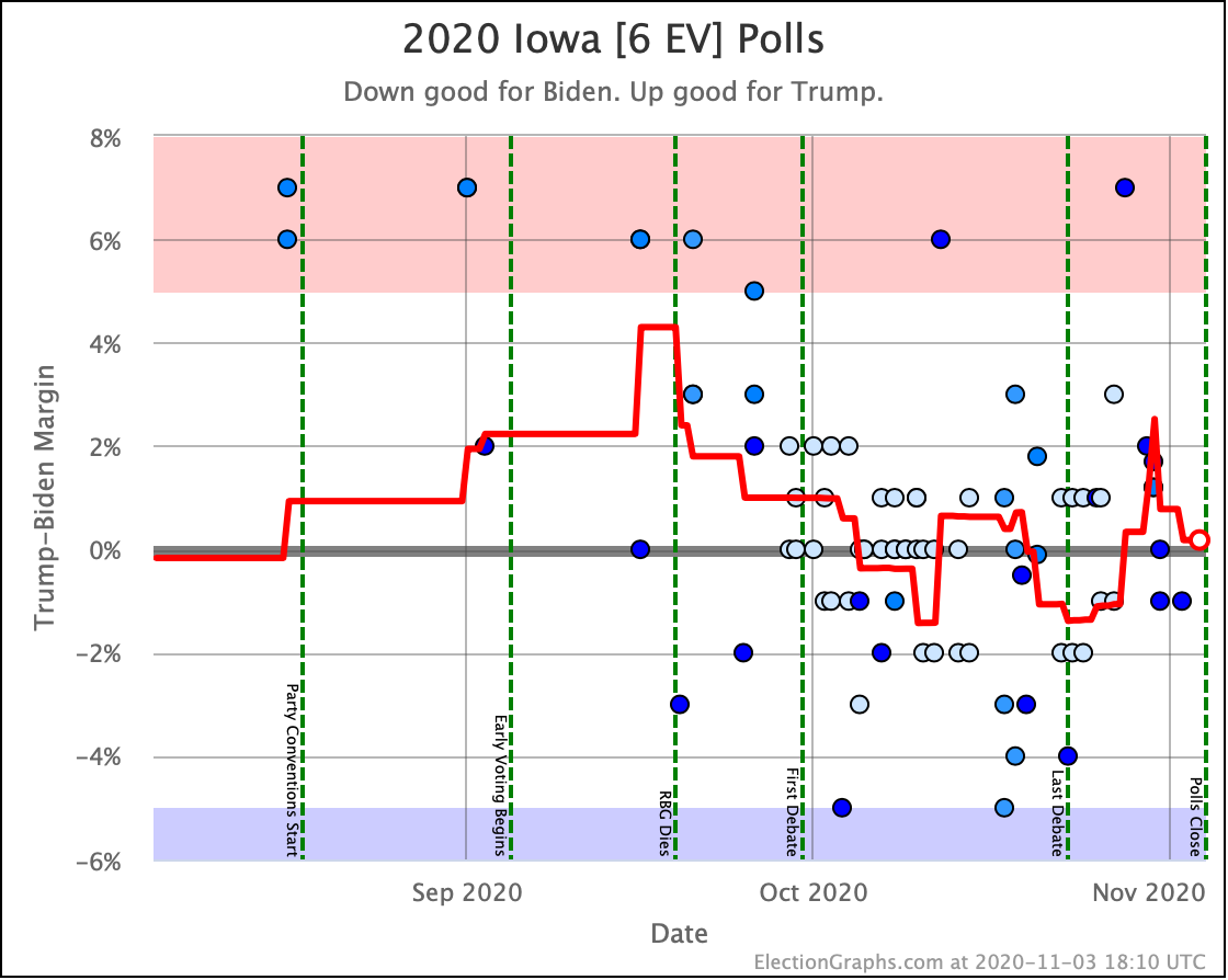
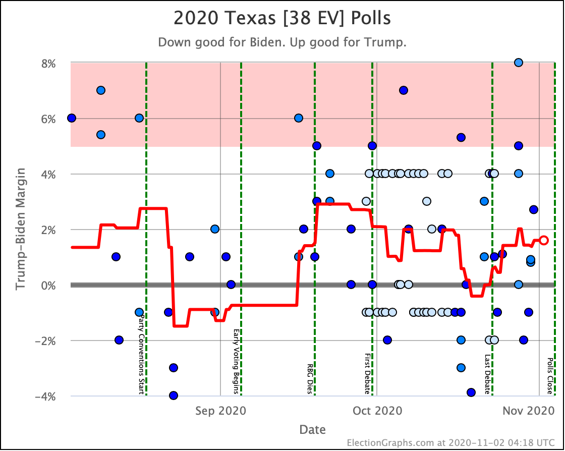
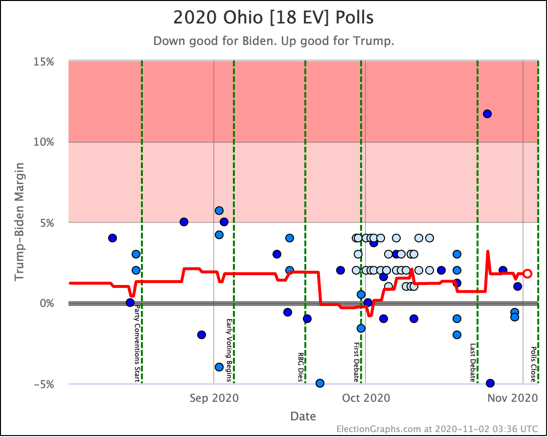
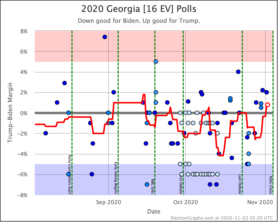
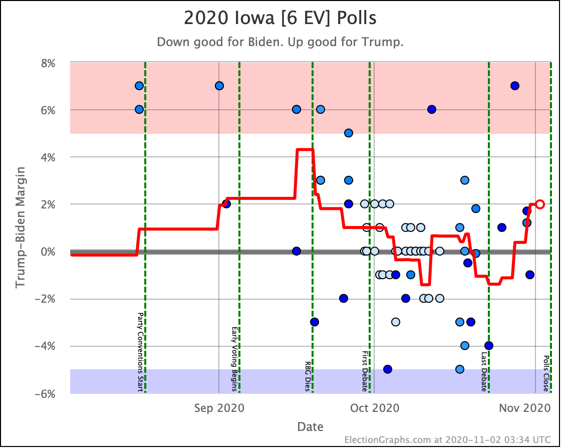
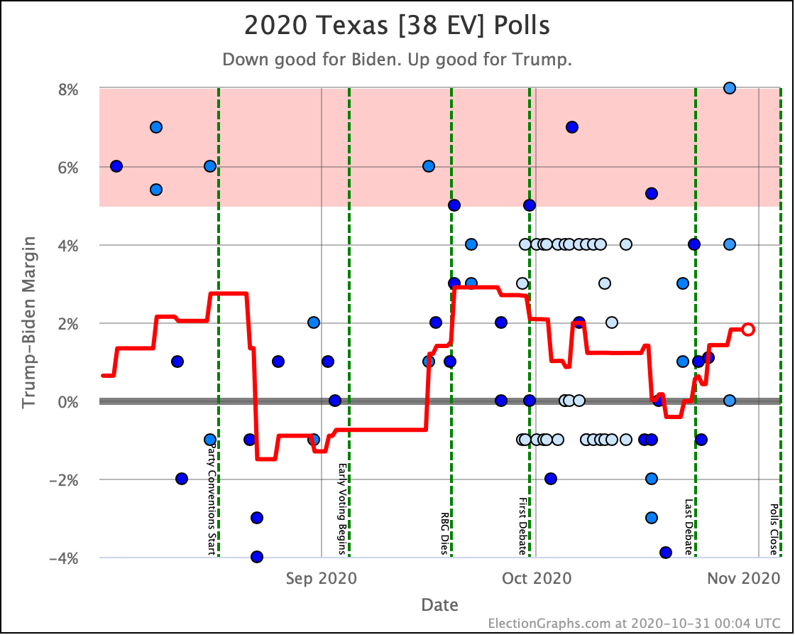
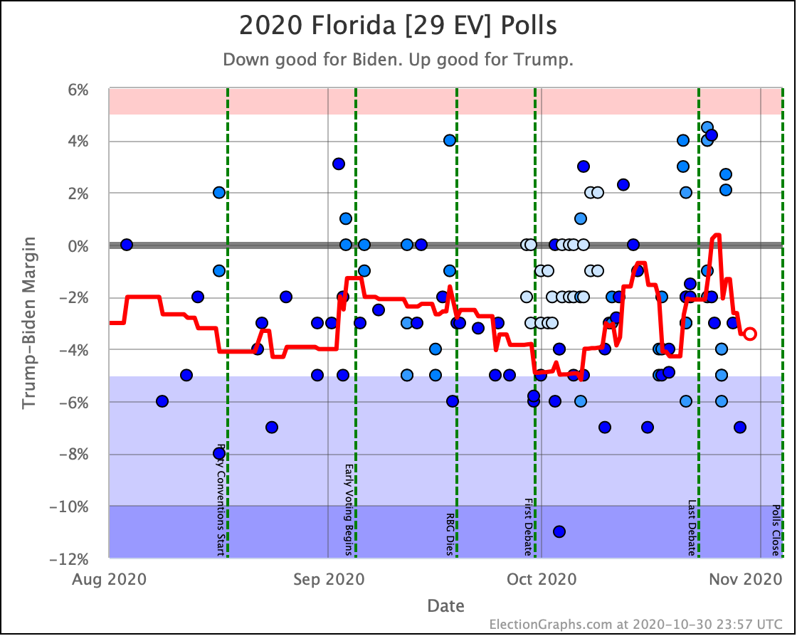
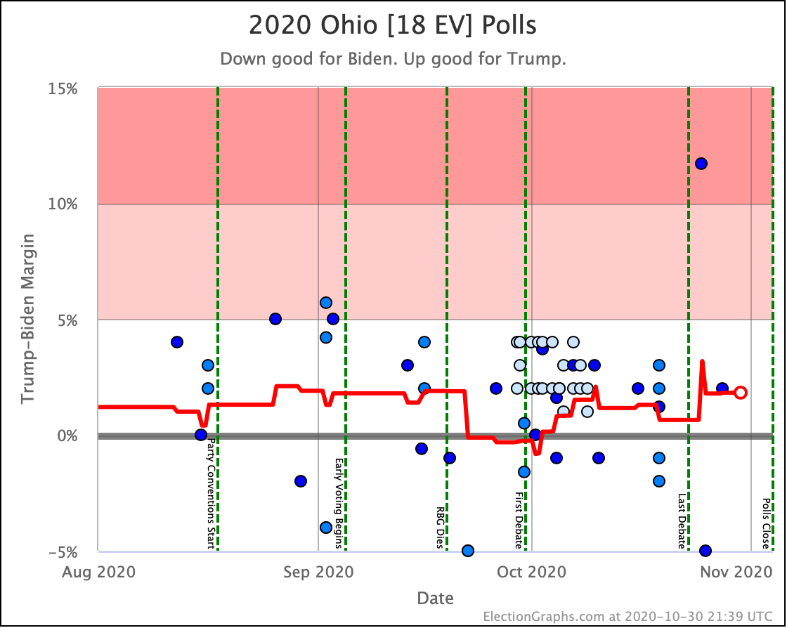
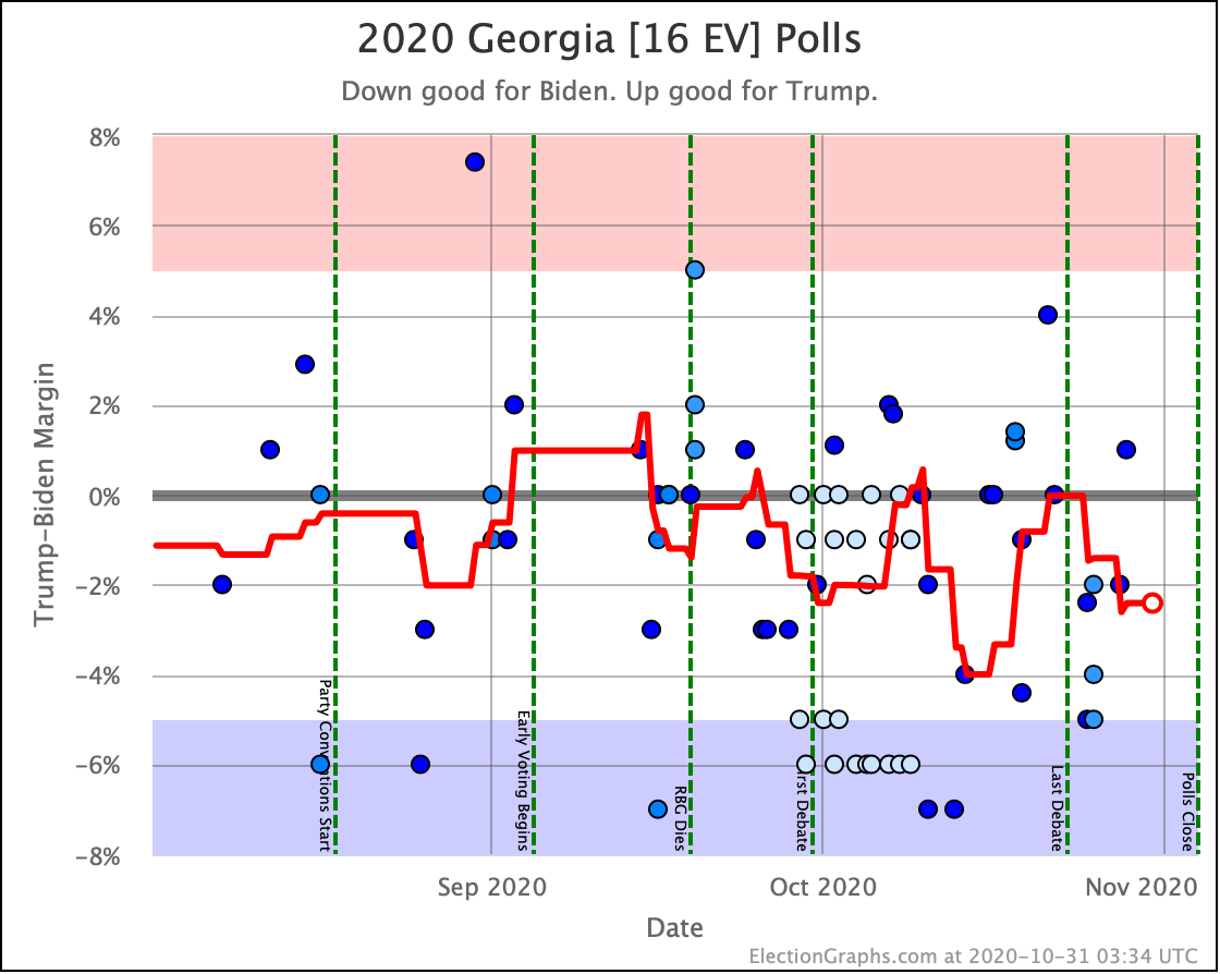
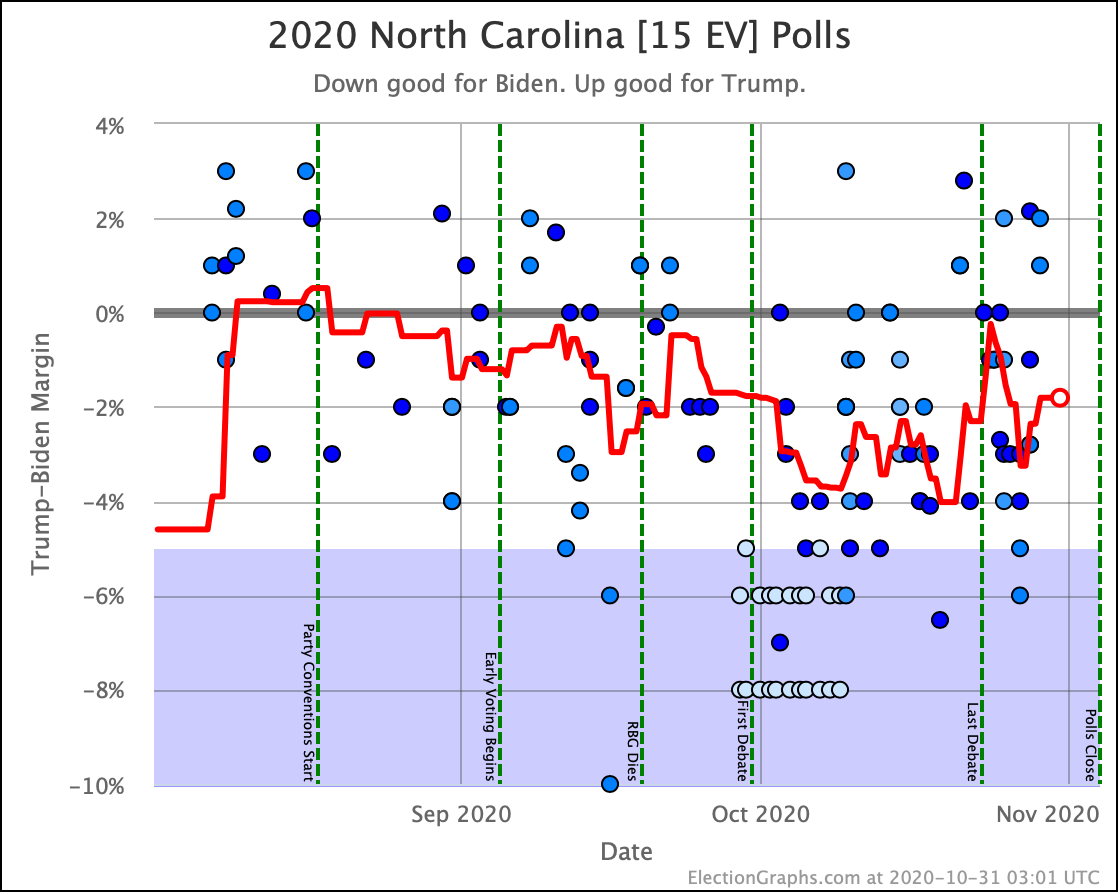
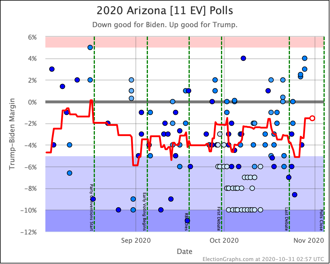
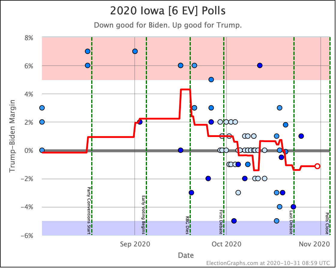
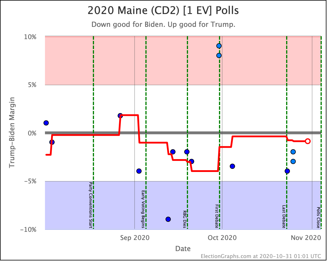
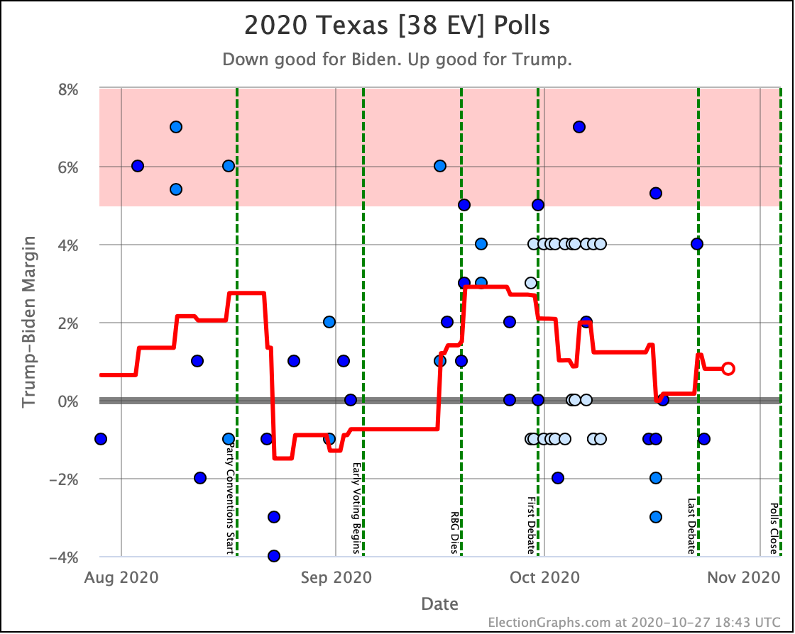
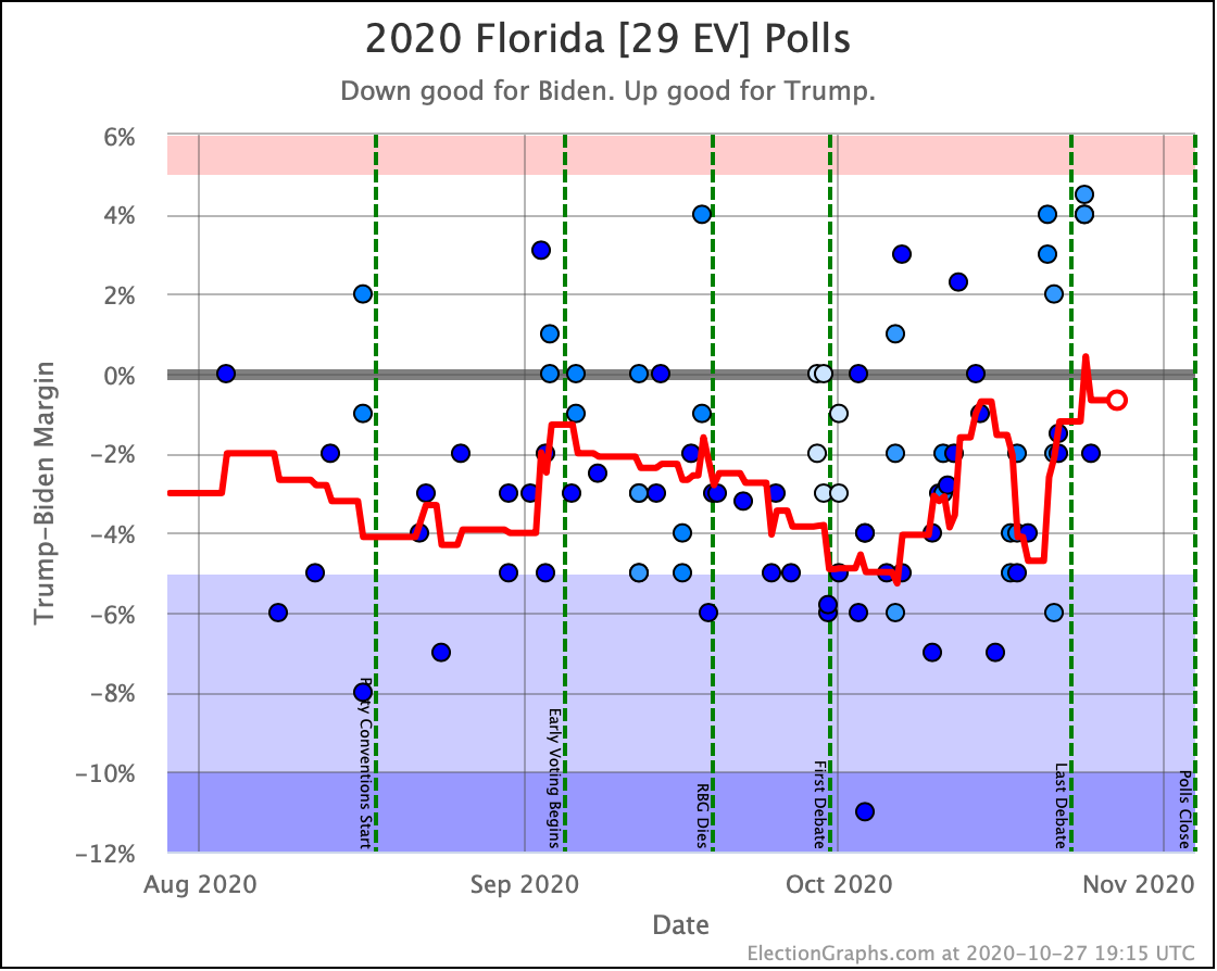
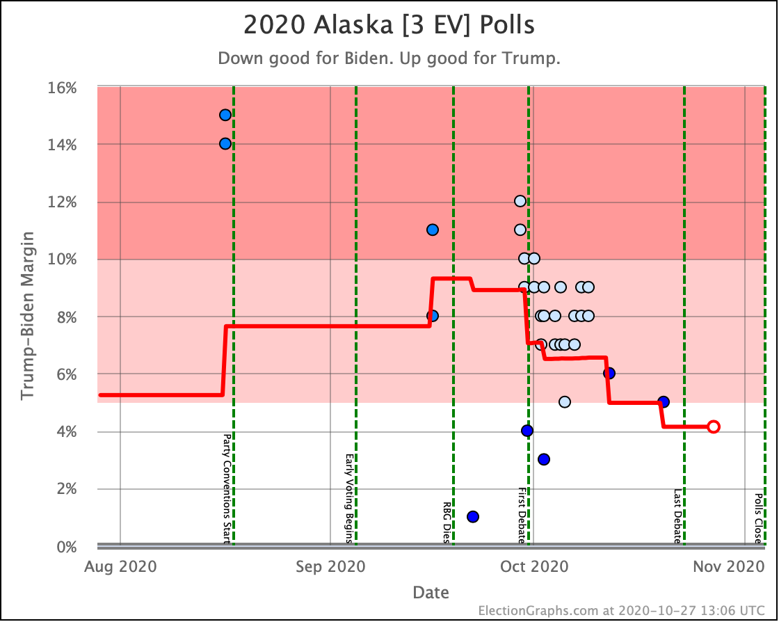
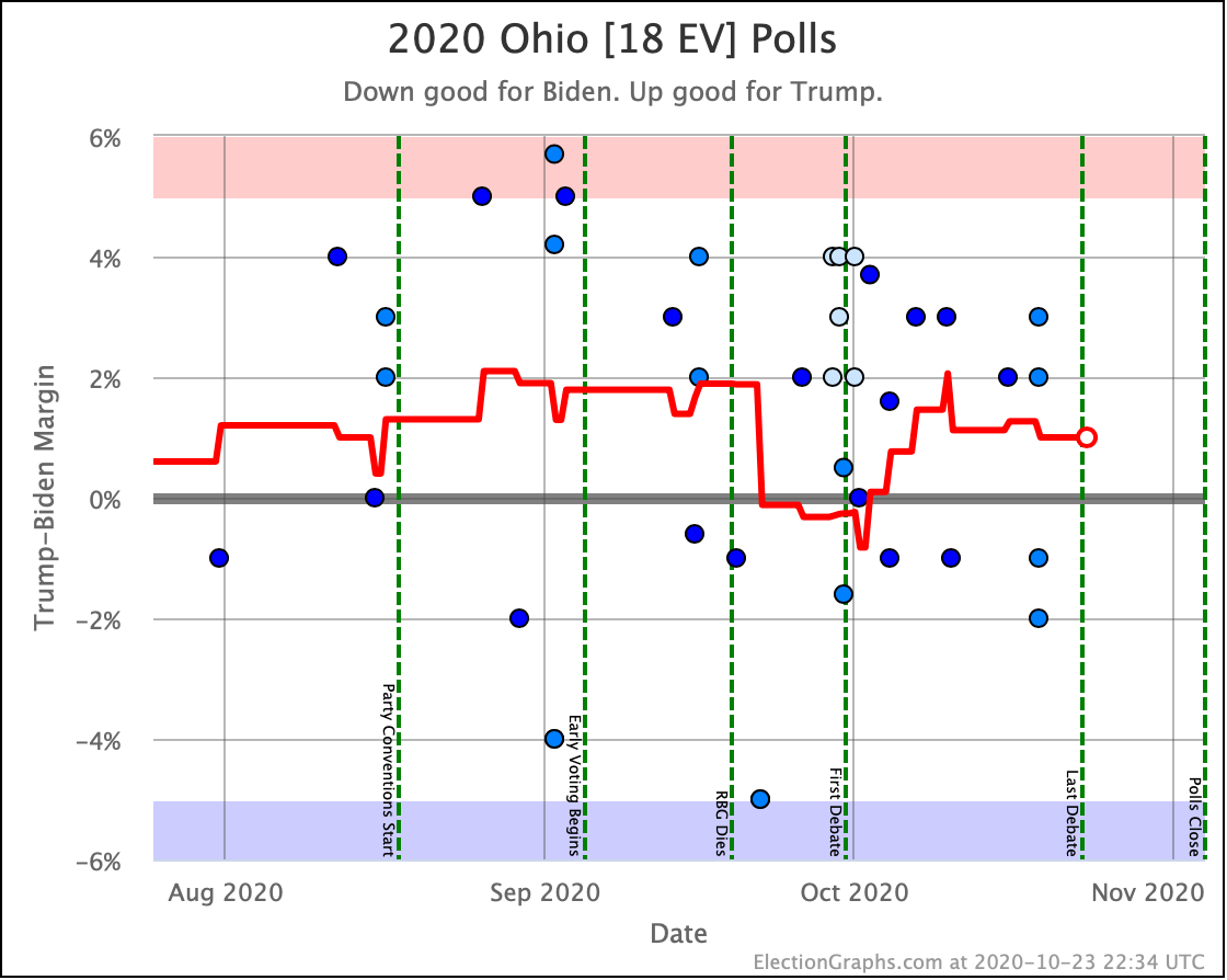
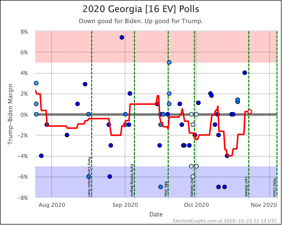
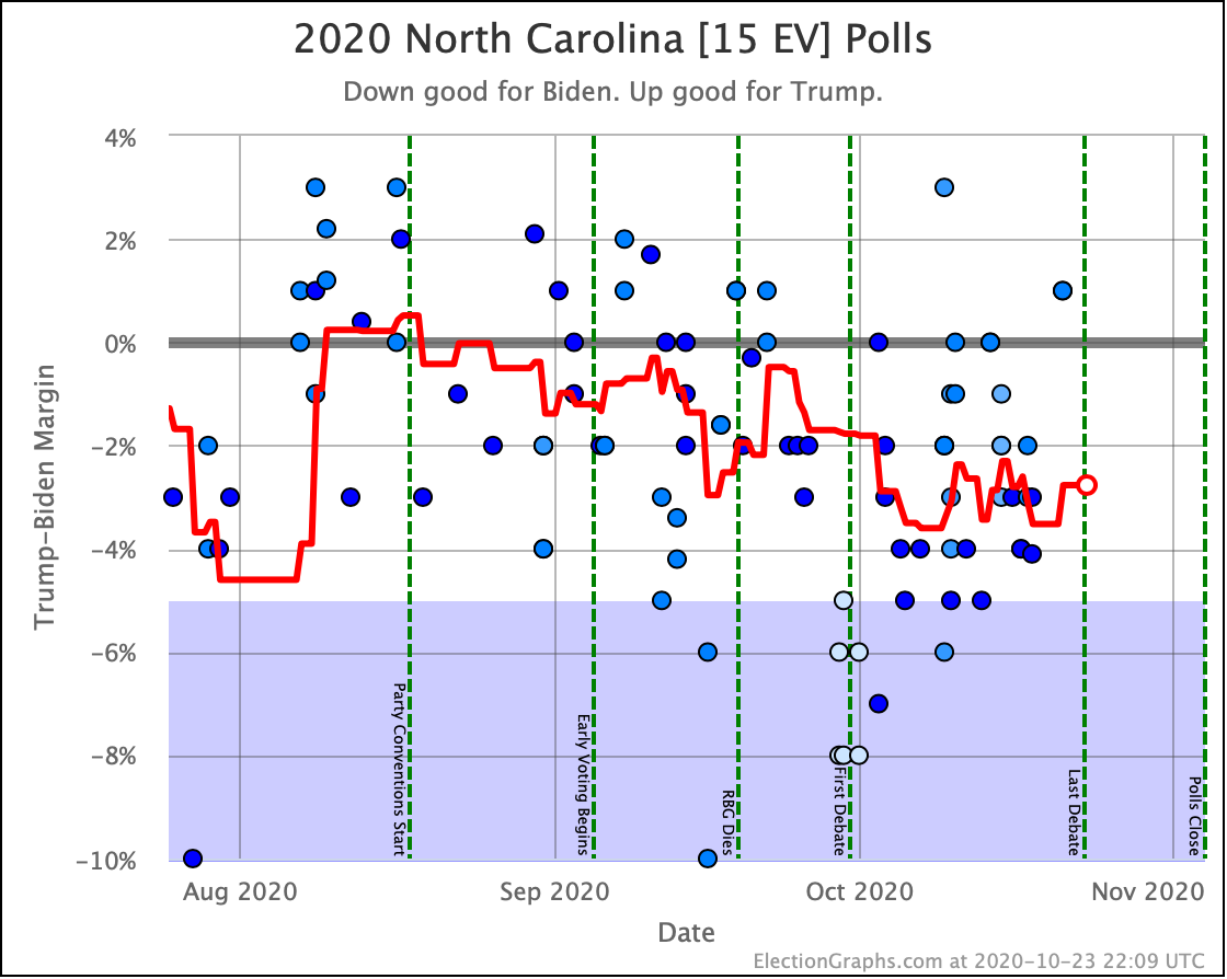
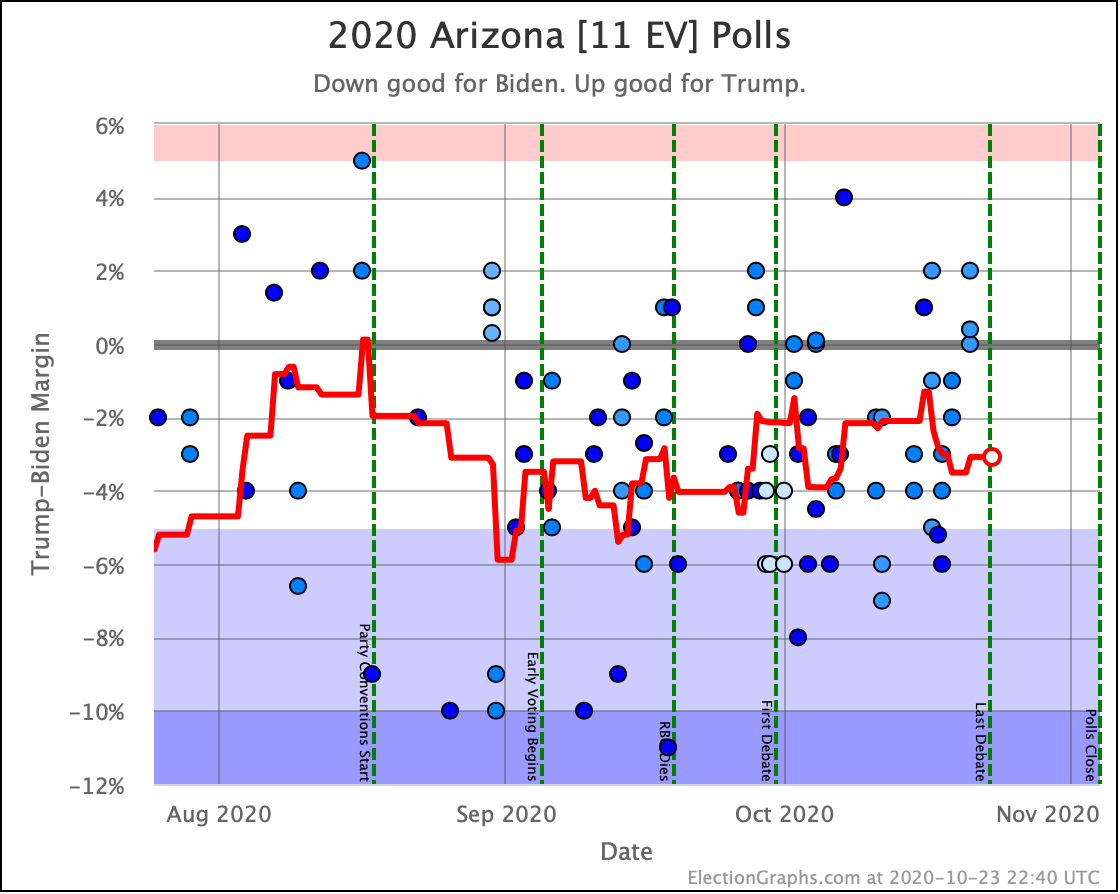
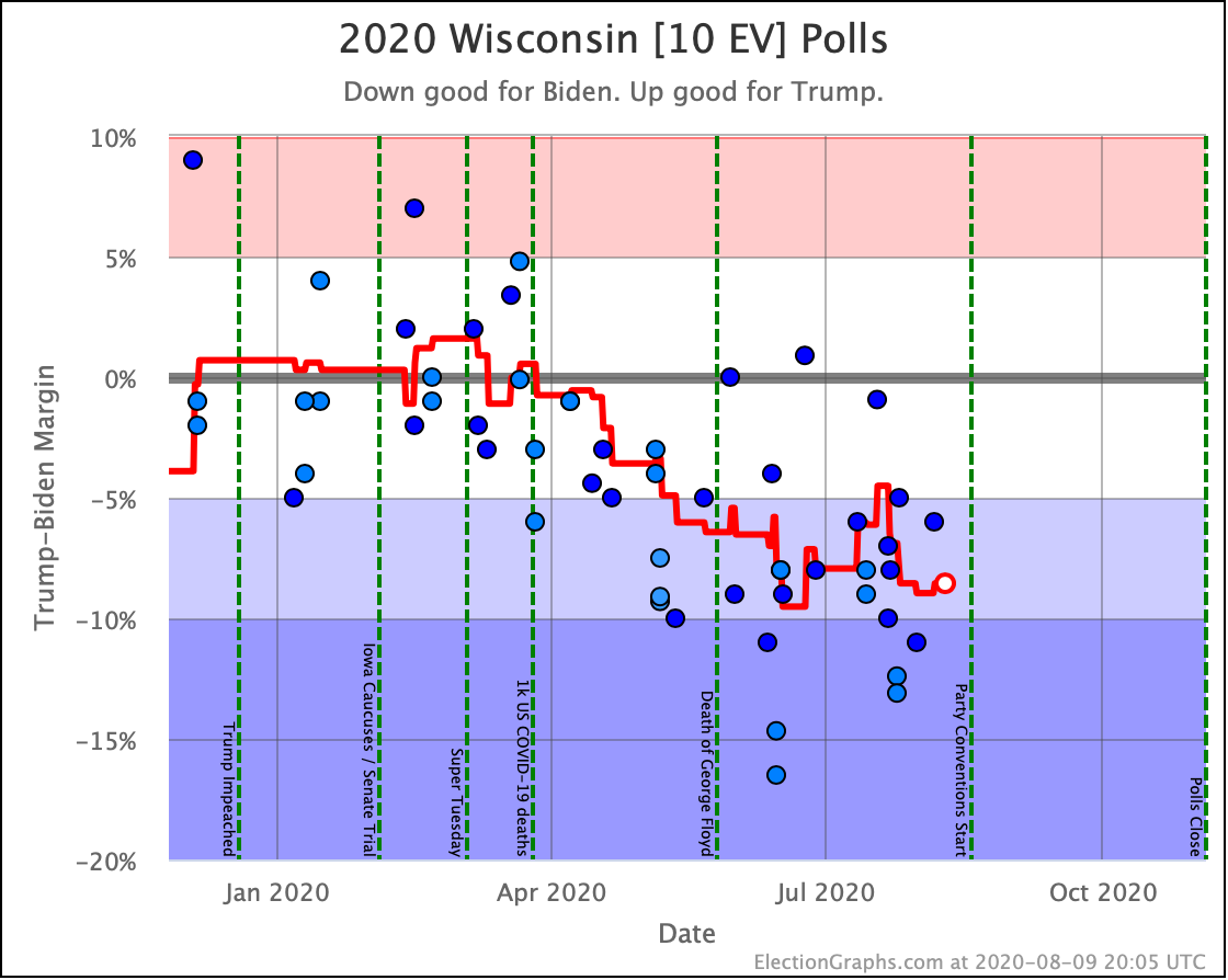
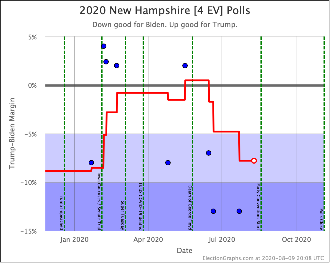
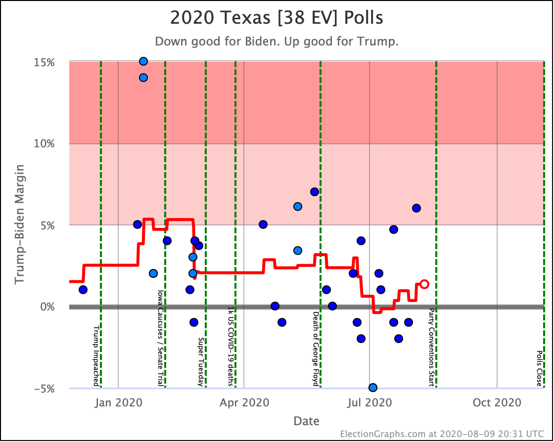
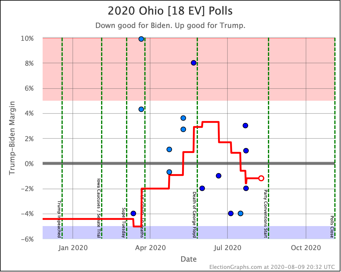
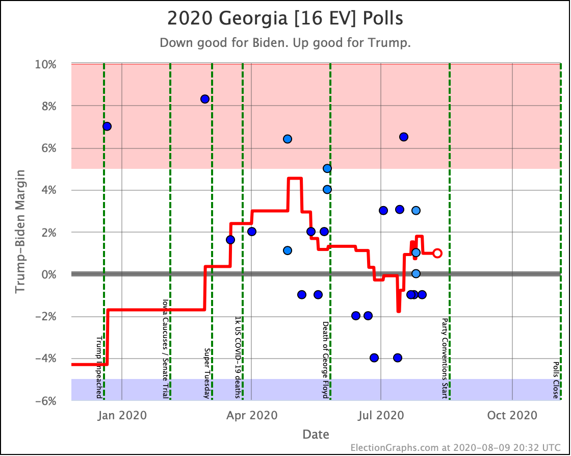
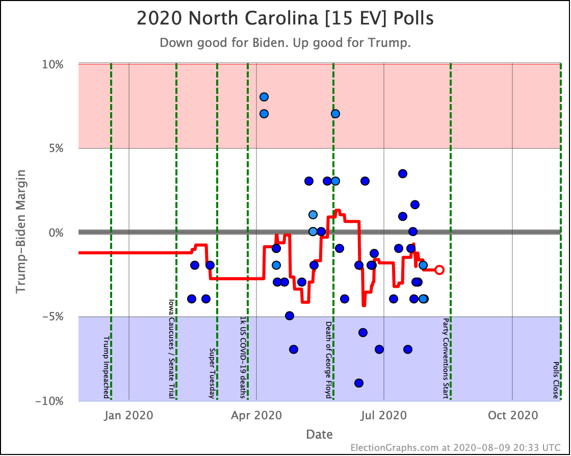
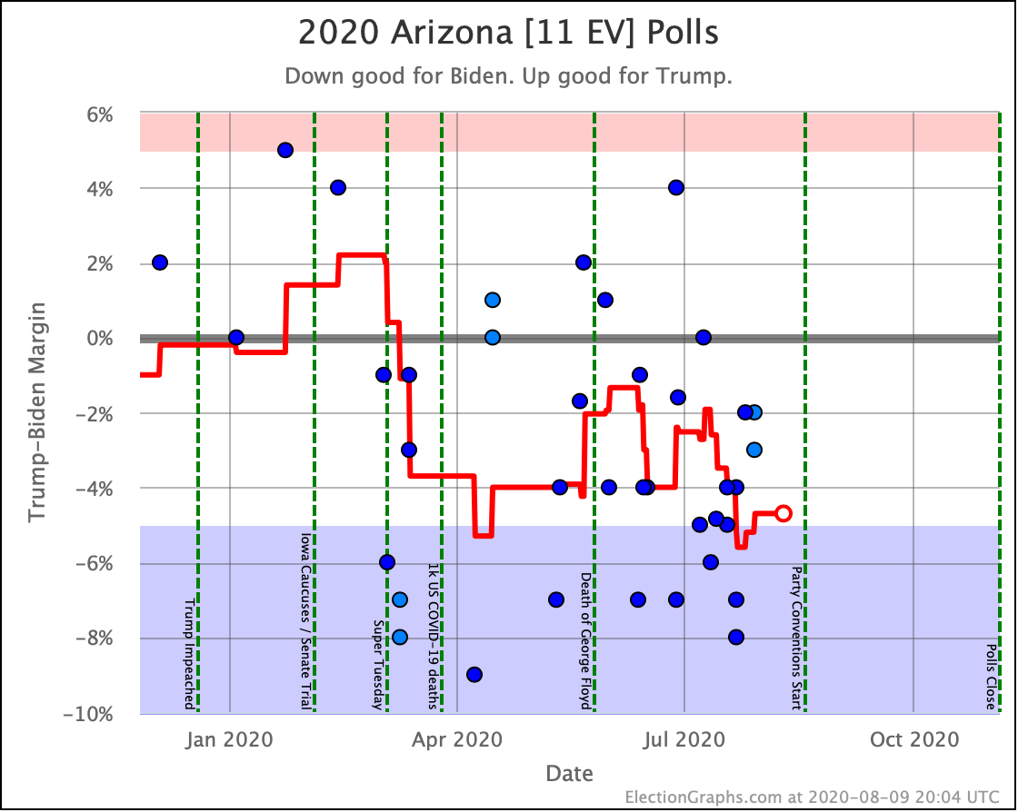
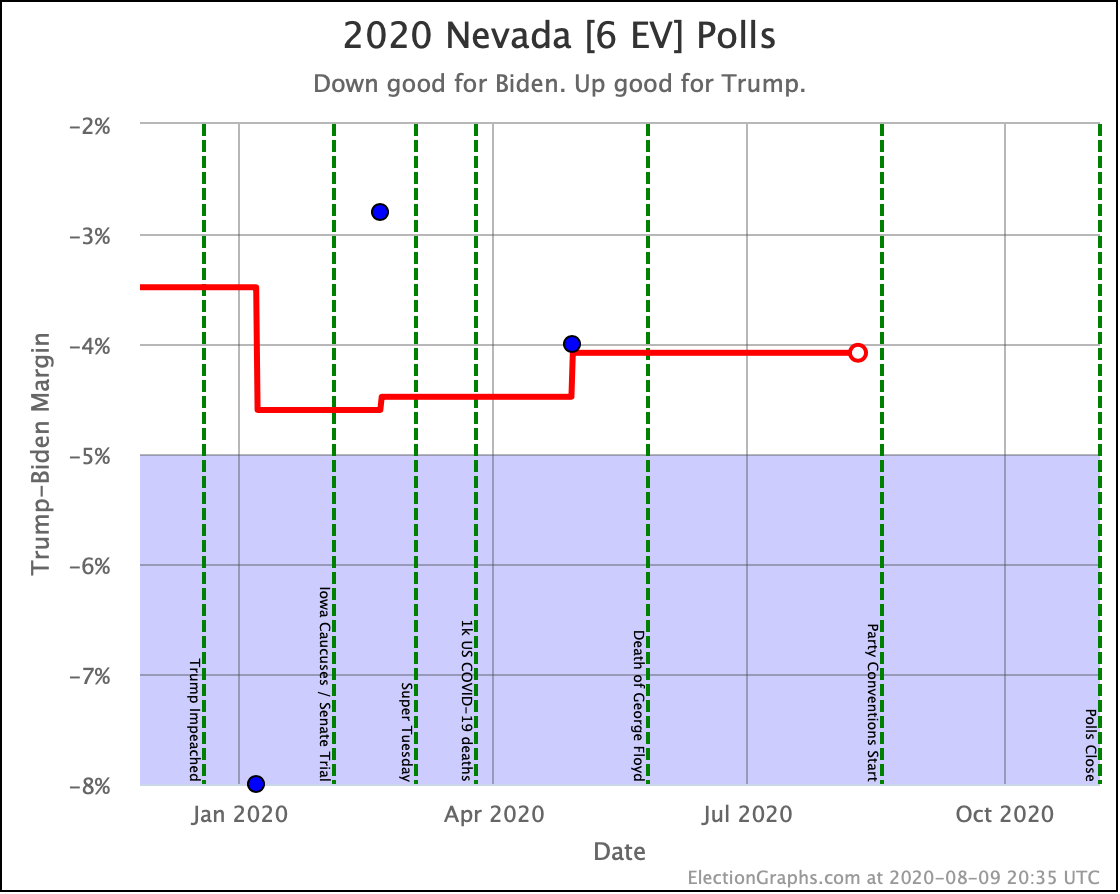
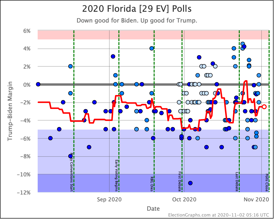
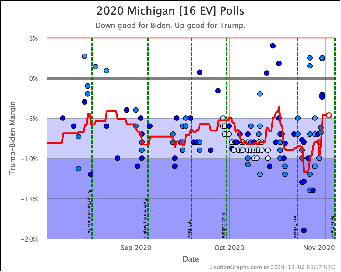
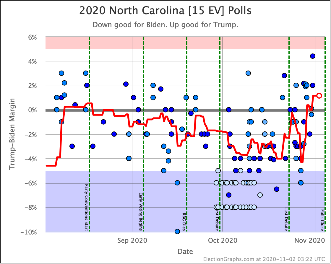
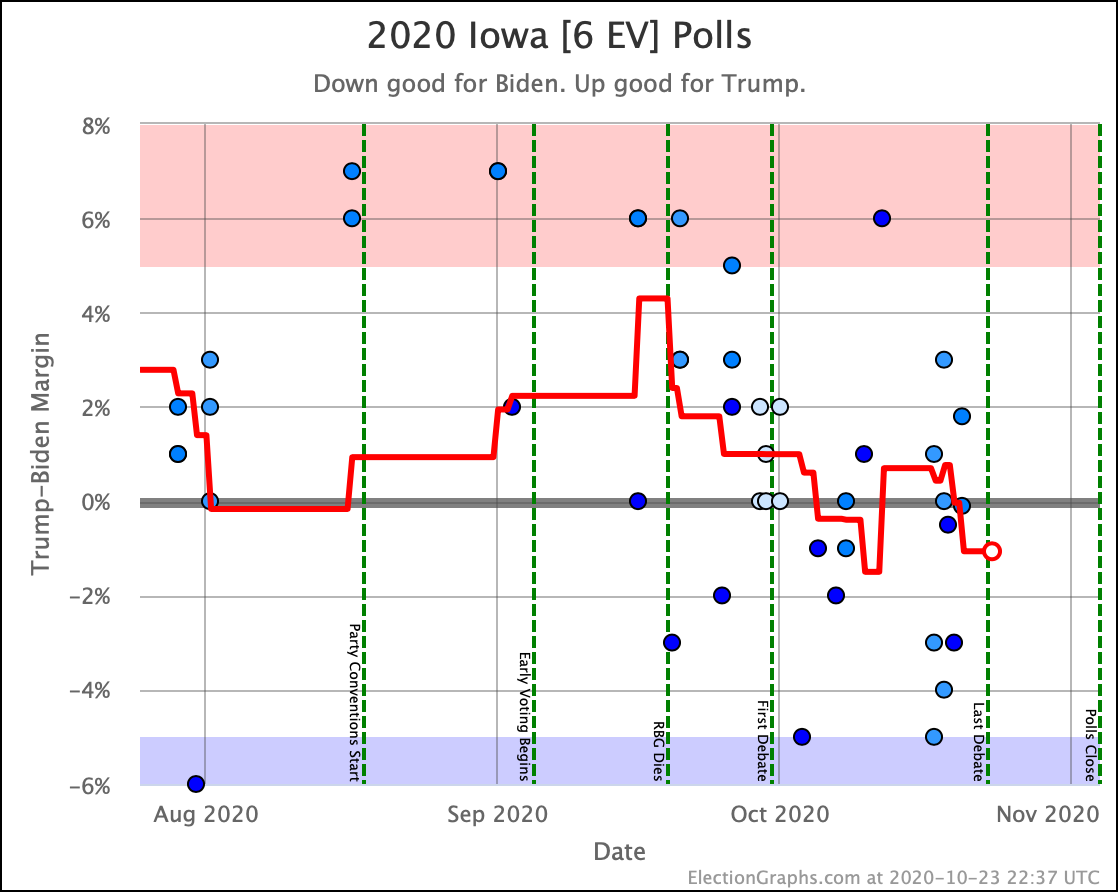
And now the trends in all the close states:


And that is that.

It is election night. The first results will be coming out within a couple of hours. We may or may not end up knowing who wins tonight, but we'll still learn a lot. And soon enough, we will indeed have a winner.

I hope you have enjoyed Election Graphs and found it useful this year. Aside from seeing how things turn out and how we did, we are done.

It was fun. Thanks everyone!

For more information:

This post is an update based on the data on the Election Graphs Electoral College 2020 page. Election Graphs tracks a poll-based estimate of the Electoral College. The charts, graphs, and maps in the post above are all as of the time of this post. Click through on any image for current interactive versions of the chart, along with additional details.

Follow @ElectionGraphs on Twitter or Election Graphs on Facebook to see announcements of updates. For those interested in individual poll updates, follow @ElecCollPolls on Twitter for all the polls as I add them. If you find the information in these posts informative or useful, please consider visiting the donation page.

1.5 Days Out: Good Poll Cycle for Trump

As always, if you are impatient for one of these updates, the 2020 Electoral College pages on Election Graphs are updated multiple times every day as new polls come in. Or you can follow @ElecCollPolls on Twitter to see all the polls as I add them. While you are at it, follow @ElectionGraphs too.

The last blog update here was on October 31st. It is now November 2nd. We only have about a day and a half to go until we start getting actual results from Election 2020. I expect to do one more blog update before polls close on Election Day.

Model Metric 31 Oct 2 Nov 𝚫
Probabilities
(Indep States)
Trump 2σ
Median
Biden 2σ
Biden +52
Biden +150
Biden +256
Biden +10
Biden +112
Biden +228
Trump +42
Trump +38
Trump +28
Trump Win
Tie
Biden Win
0.1%
0.0%
99.9%
1.2%
0.1%
98.6%
+1.1%
+0.1%
-1.3%
Probabilities
(Uniform Swing)
Trump 2σ
Median
Biden 2σ
Trump +52
Biden +176
Biden +294
Trump +84
Biden +102
Biden +314
Trump +32
Trump +74
Biden +20
Trump Win
Tie
Biden Win
14.6%
0.0%
85.4%
18.8%
0.0%
81.2%
+4.2%
FLAT
-4.2%
Categories Trump Best
Expected
Biden Best
Trump +20
Biden +176
Biden +288
Trump +64
Biden +102
Biden +288
Trump +44
Trump +74
FLAT
Tipping Point Biden +4.3% Biden +3.5% Trump +0.8%

There have been dozens of new polls since the update on the 31st. While there were exceptions, the overwhelming theme was polls showing a better picture for Trump and a worse one for Biden than we had seen any time recently. So almost all of the metrics above move in Trump's direction.

As with a couple of the other recent spikes toward Trump in the last few weeks, you can look at the specific polls in the average, and start wondering if this is just a bunch of right-leaning pollsters flooding the zone with polls in the last few days. While there were plenty of results from large mainstream pollsters released in these last few days, there were quite a few partisan polls released too, and some of them definitely helped move the averages toward Trump. I talked about this phenomenon on October 20th, October 24th, and October 31st… so I won't delve into that in-depth again.

But there is one critical difference. Judging by what happened in the last couple of cycles, there might be a handful of straggler polls released Tuesday morning, but we really only have one full day left for polls to be released. And many of the major pollsters have already released their "final polls" for the critical states. That means that any outliers introduced in the last few days, or in the remaining time we have left, will very likely still be part of the final averages this site produces.

There is no longer much time for an outlier poll to be "washed out" by additional polling. We are nearly at the end.

So while there may be some changes tomorrow, let's take seriously what we have today, and not try to make excuses. Four years ago on this site, there was a similar move toward Trump in the final days, and I somewhat dismissed it by pointing out the influence of partisan pollsters and what looked like possible outliers in the late-breaking polls. And of course, in retrospect, that move was real.

Is this move real? We'll know once the actual votes get counted.

So what do we have today if we take our averages seriously?

So let's look at all the graphs.

First of all, the comparison with 2016:

In the tipping point, which represents the degree polls need to be wrong and/or change before the end in order to flip the winner, Biden now holds a 3.5% lead. This is the worst level Biden has been at since mid-June, but it still beats the 1.6% Clinton was at four years ago by a significant amount.

Will this deteriorate further in the limited time left? Or bounce back? Or neither? If I had to guess, I'd say reversion to the mean. There have been no major news events in the last week that would seem likely to drive a tightening. So I expect this "tightening" is actually just an artifact. But that is just an educated guess. We will all know soon enough.

In terms of the expected case, where each candidate wins every state where they lead the Election Graphs average, Biden has a slightly lower margin than he has seen before in the last three months. Georgia, North Carolina, Texas, Ohio, and Iowa, all of which have spent time on the Biden side of the centerline, are all now in "Weak Trump" territory in the Election Graphs averages at the same time.

But Biden is still ahead by 102 electoral votes in this view. By this time four years ago, Clinton was hanging on with only an 8 electoral vote lead.

OK. Let's look at the range of margins predicted by our three models:

All three of these still have their centerlines with the narrowest Biden lead they have seen in the last three months. These levels were last seen in June. So not unprecedented, but still breaking out of the recent zone.

In terms of odds from the probabilistic views, the Independent States chart no longer just looks like a blue square. So here it is:

See that little bit of red at the bottom right? For the first time in a long time, Trump's chance of winning is visible in this view, as it rises to 1.2%. Prior to this bump, the highest this has been in the last three months was 0.2%.

Those odds assume that there is no correlation between polling errors in different states though. So time to look at the other extreme.

In this view, Trump is now at an 18.8% chance of winning.

As with all of the other views, this is the best Trump's numbers have been in the last three months.

Since both of these models are extremes, and the truth is somewhere in between, the official Election Graphs statement on Trump's chances at this point is "between 1.2% and 18.8%". The middle of that range is 10.1%.

While Election Graphs doesn't actually model where the right spot is within this range, the middle is as good a spot to look at as any. So I'll just call it a 10.1% chance of a Trump win at the moment. That is up from 7.4% when we looked at this two days ago.

As 2016 should have taught everyone, a 10% chance of winning is not the same thing as a 0% chance of winning. Things that happen 1 in 10 times happen many many times every day.

Having said that, Biden is still a heavy favorite. We're not in a coin toss scenario, and certainly not in a situation where Trump is favored.

Looking at the tipping point without the 2016 comparison, there is one additional thing I would like to point out besides the fact that the tipping point is at a 3.5% Biden lead, which is outside of the range it has been in for the last three months.

Specifically, look a few days earlier. The many polls that came since the last update included a lot of polls that were very favorable to Biden that were in the field a few days earlier than the ones that drove the current numbers toward Trump. So I now show a peak on October 29th to a 7.4% tipping point lead for Biden based on that polling! That was also outside the normal range for the last three months. In fact, it was the best tipping point number Biden has EVER seen!

Because polls are coming in fast and furious, and Election Graphs is intentionally very sensitive to short term changes as polling velocity increases, we are seeing LOTS of volatility as outliers come and go from the averages.

Which is another reason to think that the "truth" here is probably a fairly stable Biden +5% tipping point lead, and the ups and downs here are just polling noise. Maybe in future cycles, I should consider making things a little LESS sensitive to short term changes. Maybe a 10 poll average instead of a 5 poll average. That would smooth things out a little bit.

For now though, when you see a noisy graph like this, it almost always means that the true "signal" is not actually an underlying reality rapidly moving up and down, but rather you are just seeing measurement artifacts, and you want to consider the overarching trend, not the transient jiggles.

OK. Time for the map and spectrum:

As with all the other views, we have shown, this spectrum shows a lot closer race than we have seen since June. There are more states on the Trump side of the centerline, and the "Weak Biden" states are weaker than they were.

Subject to any changes due to additional polls coming in over the next day or so, what does that mean in different polling error scenarios?

As we discussed last time, the Election Graphs tipping point was off by 0.89% in 2012, 2.36% in 2016, and 3.45% in 2008.

You need a larger error than any of those three election cycles to get a straight-up Trump victory.

But a 2008 level error would have Trump winning Maine CD2, Arizona, and Florida in addition to the states he leads, and leave Biden's win dependant on a lead of less than 0.1% in Pennsylvania. With all of the talk of legal disputes over what ballots are counted, a 2008 level polling error in this direction would certainly put that scenario into play.

On the other hand, even a 2016 level polling error in the other direction would result in Biden winning Georgia, North Carolina, Texas, Ohio, and Iowa. That would be Biden 413, Trump 125 in the final count, or a 288 electoral vote margin, which would be the largest win since Bush beat Dukakis in 1988.

The most likely result is of course in between: A Biden win, but not by an overwhelming margin.

And now the trends in all the close states:

And that is that.

1.5 days until the first results start coming in on election night.

If you are eligible to vote in the US and have not yet done so, make your plan and get it done.

For more information:

This post is an update based on the data on the Election Graphs Electoral College 2020 page. Election Graphs tracks a poll-based estimate of the Electoral College. The charts, graphs, and maps in the post above are all as of the time of this post. Click through on any image for current interactive versions of the chart, along with additional details.

Follow @ElectionGraphs on Twitter or Election Graphs on Facebook to see announcements of updates. For those interested in individual poll updates, follow @ElecCollPolls on Twitter for all the polls as I add them. If you find the information in these posts informative or useful, please consider visiting the donation page.
3.5 Days Out: No Big Changes

As always, if you are impatient for one of these updates, the 2020 Electoral College pages on Election Graphs are updated multiple times every day as new polls come in. Or you can follow @ElecCollPolls on Twitter to see all the polls as I add them. While you are at it, follow @ElectionGraphs too.

The last blog update here was early UTC on October 28th (with numbers as of the end of the 27th UTC). Just over three days ago. Here are the high-level changes since that last post:

Model Metric 27 Oct 31 Oct 𝚫
Probabilities
(Indep States)
Trump 2σ
Median
Biden 2σ
Biden +38
Biden +142
Biden +256
Biden +52
Biden +150
Biden +256
Biden +14
Biden +8
FLAT
Trump Win
Tie
Biden Win
0.1%
0.0%
99.8%
0.1%
0.0%
99.9%
FLAT
FLAT
+0.1%
Probabilities
(Uniform Swing)
Trump 2σ
Median
Biden 2σ
Trump +52
Biden +144
Biden +300
Trump +52
Biden +176
Biden +294
FLAT
Biden +32
Trump +6
Trump Win
Tie
Biden Win
11.8%
0.0%
88.2%
14.6%
0.0%
85.4%
+2.8%
FLAT
-2.8%
Categories Trump Best
Expected
Biden Best
Trump +20
Biden +176
Biden +294
Trump +20
Biden +176
Biden +288
FLAT
FLAT
Trump +6
Tipping Point Biden +4.4% Biden +4.3% Trump +0.1%

I'm updating more often since we are so close to the end, but the bottom line is again that things are fairly steady. If you look at the numbers above, yes, they move around a bit. But we still have nothing that looks like a sustained move as opposed to just poll averages meandering up and down as specific polls come in and out of the average.

Now, if I'd been making this post a bit sooner, it might have looked a lot like my "The Race Tightens? Or Not?" post from October 20th. This time the tipping point moved from Biden+4.4% on the 27th, down to Biden+3.1% on the 29th. I would be asking if this was the beginning of the race starting to tighten.

But as with that post, I would have expressed skepticism because just as it was back on October 20th, this spike was driven by a rash of polls from pollsters that tend to put out outliers. As new polls came out on the 30th, the tipping point bounced back to Biden+4.3%, almost back to where it had been before. It was just a transient spike.

In some cases the outliers that drive this are extreme. In one dramatic instance, Trafalgar came out with a poll showing Trump ahead by 2% in Michigan at a time when the other polls in the Election Graphs average ranged from Biden+7.7% to Biden+13%. The Trafalgar number was not just at the Trump end of the range we had been seeing, it was on a whole different planet.

Whenever I see polls like that come in, I start wondering if I shouldn't have switched Election Graphs from using averages to using medians years ago. Or maybe that I need some sort of weighting by historical pollster accuracy, or to do something more complex to deal with and adjust for outliers, or just include more polls to wash these outliers out a bit more.

But one of the main ideas of Election Graphs from the beginning has been to include everything and keep to relatively simple averages, and see how far that gets you. It does make us bounce around when we get outliers though, and makes us VERY sensitive to just which pollsters have been in the field most recently.

If there is a REAL move, then after you get a spike led by a particular poll, additional polls will confirm the move, and you'll see a sustained change that lasts even after that first poll rolls off of the average. When it is just a movement driven by an outlier though, things will move back to where they were once a few new polls come in.

The problem here at the very end of the race is that at some point there will be no new polls. The last pollsters in the field will dominate the average. And they may or may not be the ones with the most accurate results. Last time around in 2016 Election Graphs did pretty well. Maybe we were lucky. We'll see how it goes this time.

For the moment though, when you look at the graphs, it seems that after a brief spike where it looked closer for a moment, we're back in the same familiar territory for this race as we have been since June, showing Biden as a heavy favorite, but with the possibility of a Trump upset not completely out of the picture.

So let's look at all the graphs.

First 2020 vs 2016 comparisons since everybody on both sides keeps saying "But what about 2016?" when people talk about Biden's lead.

In the tipping point, which represents the degree polls need to be wrong and/or change before the end in order to flip the winner, Biden now holds a 4.3% lead. Clinton was at 1.6% by this point in 2016.

Biden is closer to the 4% part of his "normal range" than the 6% end, but we are still in very familiar territory. This race is pretty much in the same place it has been for months, Biden remains stronger than Clinton was, and we do not see any evidence of a collapse.

In terms of the expected case, where each candidate wins every state where they lead the Election Graphs average, Biden is still pretty much in the center of his normal zone, and significantly ahead of where Clinton was.

OK. Time for the three envelopes we have covering this year:

Instead of saying it three times, I'll say this once, since it is the same for all three:

There has been no substantive change to the race in months. All of these charts just show little bounces up and down as polls move in and out of the averages.

Fundamentally, the race looks the same now as it did at the beginning of August or even mid-June.

In terms of odds from the probabilistic views, the Independent states chart still looks like a big blue square. Biden's chances in that model have been pegged near 100% for many months.

So looking at Uniform Swing…

In this view, Trump is now at a 14.6% chance of winning. That is higher than his chances have usually been, but not out of the range we have seen.

Since both of these models are extremes, the official Election Graphs statement on Trump's chances at this point is "between 0.1% and 14.6%".

We don't officially specify a spot within that range since we haven't modeled how much correlation between states to expect, but I guess the midpoint is as good a value to look at as any other. The middle of that range is 7.4%.  That intuitively feels reasonable. Not total correlation, not total independence, but right in between. And frankly, that seems to be in the same general ballpark as all the big players who are doing election modeling. So call it 7.4%.

At 7.4%, Trump has about a 1 in 14 chance of winning. That would clearly be an upset, but is not so far out of the realm of possibility that people should be thinking about it as if a Biden win was a done deal. Of course, because of 2016, almost nobody is.

By contrast, Trump was at about 14% in 2016 if you looked at the median of all the sites giving odds. That would be about a 1 in 7 chance of winning.

So yes, Biden's polling lead is not so great you can say that there is a negligible chance of a Trump upset, but the chances of that kind of an upset are around half what they were in 2016.

This is just zooming in on the Tipping Point line without the 2016 comparison. Like all the other charts, this shows some bouncing around, but fundamentally a static race. The few times it looked like we might have been breaking into new territory in one direction or the other, it has proven to only be a short term spike once more data came in.

Of course, there is no guarantee that something won't change in the last few days, but there simply isn't much time left for a significant change.

Looking at this spectrum, one thing that you can look at more clearly than some of the other views is imagining polling errors of the sizes we have seen in the last three elections.

As measured by the difference between the final Election Graphs tipping point, and the actual tipping point based on votes cast in the elections, you had these errors:

  • 2008: 3.45%
  • 2012: 0.89%
  • 2016: 2.36%

Assuming uniform swing, and that the polls are overestimating Biden:

  • 2012 level error: Just our expected case, Biden wins by 176 EV
  • 2016 level error: Trump wins the states he leads, plus Maine CD2, Iowa, Arizona, and North Carolina. Biden still wins, but only by 110 EV.
  • 2008 level error: Trump wins all the states above, plus Georgia and Florida. Biden still wins, but only by 20 EV, and with only an 0.85% margin in the tipping point state of Pennsylvania… perhaps within range of complicating things with recounts and court challenges.

So in order to win based on "polls were wrong" (rather than a last-minute move in the polls in the next few days), we would need a bigger polling error than we have seen in the last three cycles.

On the other hand, also assuming uniform swing, but this time assuming the polls are overestimating Trump:

  • 2012 level error: Just our expected case, Biden wins by 176 EV
  • 2016 level error: Biden wins all the states he leads, but also Ohio and Texas, which ends up at what we call Biden's best case, winning by 288 EV.
  • 2008 level error: Biden by 288 EV. Same result as the 2016 level error. Even a 2008 level error isn't enough to pull in wins for Biden in the next closest states of Montana, Alaska, and Missouri.

And now the trends in all the close states:

That is all for today.

3.5 days until the first results start coming in on election night.

We are so close. Almost there now.

For more information:

This post is an update based on the data on the Election Graphs Electoral College 2020 page. Election Graphs tracks a poll-based estimate of the Electoral College. The charts, graphs, and maps in the post above are all as of the time of this post. Click through on any image for current interactive versions of the chart, along with additional details.

Follow @ElectionGraphs on Twitter or Election Graphs on Facebook to see announcements of updates. For those interested in individual poll updates, follow @ElecCollPolls on Twitter for all the polls as I add them. If you find the information in these posts informative or useful, please consider visiting the donation page.
7 Days Out: Still Pretty Static

As always, if you are impatient for one of these updates, the 2020 Electoral College pages on Election Graphs are updated every day as new polls come in. Or you can follow @ElecCollPolls on Twitter to see all the polls as I add them. While you are at it, follow @ElectionGraphs too.

The last blog update here was three days ago on October 24th. Here are the high-level changes since that last post:

Model Metric 24 Oct 27 Oct 𝚫
Probabilities
(Indep States)
Trump 2σ
Median
Biden 2σ
Biden +52
Biden +162
Biden +254
Biden +38
Biden +142
Biden +256
Trump +14
Trump +20
Biden +2
Trump Win
Tie
Biden Win
0.1%
0.0%
99.9%
0.1%
0.0%
99.8%
FLAT
FLAT
-0.1%
Probabilities
(Uniform Swing)
Trump 2σ
Median
Biden 2σ
Trump +52
Biden +144
Biden +294
Trump +52
Biden +144
Biden +300
FLAT
FLAT
Biden +6
Trump Win
Tie
Biden Win
9.1%
0.0%
90.9%
11.8%
0.0%
88.2%
+2.7%
FLAT
-2.7%
Categories Trump Best
Expected
Biden Best
Trump +12
Biden +220
Biden +294
Trump +20
Biden +176
Biden +294
Trump +8
Trump +44
FLAT
Tipping Point Biden +4.9% Biden +4.4% Trump +0.5%

So, as we are only 7 days out now, I'm trying to update much more frequently. But honestly, not much has changed since the post three days ago.

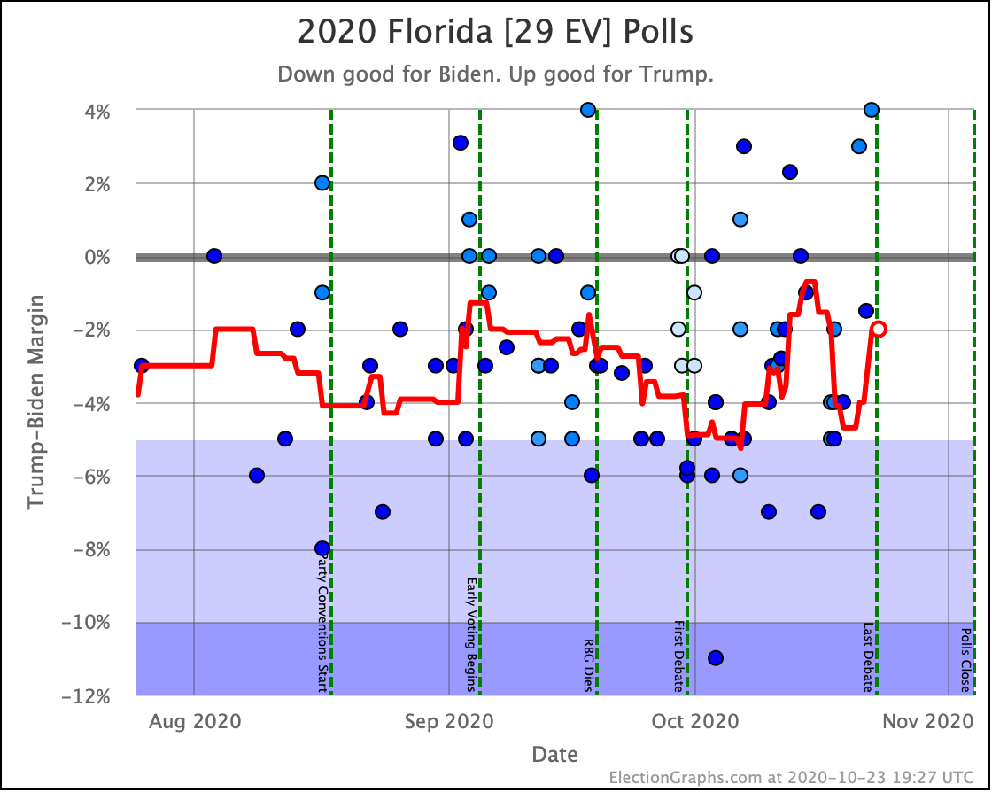
Some states have bounced around. Biden had taken a tiny lead in Texas last time. Texas has now moved back to a small Trump lead. Meanwhile, Georgia had bumped into a small Trump lead but is now back to a small Biden lead. Iowa crossed the center line too, moving from Trump to Biden. Florida moved from Weak Biden to Weak Trump, and then back to Weak Biden again since last time as well.

All of these are states that are really toss-ups getting jostled around by whatever individual polls come out at any given moment. There is still no evidence of any sustained trend.

It looks like we are back once again to the part of the normal range that is most favorable to Trump, but we are still in the same range we have been since June. That translates to the reasonable possibilities ranging from a narrow Trump win if there is a substantial polling error or last-minute move, to a Biden landslide if the error or move goes in the other direction.

That entire range is reasonably possible, but the most likely outcome continues to look like a Biden win of a magnitude somewhere between Obama's 2012 win and Obama's 2008 win.

So with that out of the way, let's just look at all of the graphs.

This time, we'll start with 2020 vs 2016 comparisons since that continues to come up again and again in the discussions of this election cycle.

In the tipping point, which represents the degree polls need to be wrong and/or change before the end in order to flip the winner, Biden now holds a 4.4% lead. Clinton had dropped to 1.3% by this point in 2016.

Biden is closer to the 4% end of his 4% to 6% range than he is to the 6% end, but he is still in the same zone he has been in for a long time. By this time Clinton had collapsed and there was a really close race happening.

To be fair though, 7 days out from the 2016 election we didn't know this yet. Her tipping point number at the 7-day mark as we look back at it today is influenced by polling that was in the field at this point, but not actually released until the last few days before the election. The first Election Graphs post noting the final Trump surge in 2016 came at the 4-day mark.

So while we haven't seen any signs of Biden collapse yet, and Biden's pattern has been much less volatile than Clinton, this is just another reminder that Clinton's final collapse didn't show up here until the very very end.

In terms of the expected case, where each candidate wins every state where they lead the Election Graphs average, Biden is pretty much in the center of the normal zone. Within the last two weeks, the expected case has ranged from Biden +86 to Biden+240. That is a huge range!

But with Texas (38 EV), Florida (29 EV), Georgia (16 EV), and Iowa (6 EV) all close enough that they are flipping back and forth across the center line semi-regularly, having volatility of this sort should be expected. With the exception of one brief moment though, Biden has consistently been ahead of where Clinton was four years ago, and usually by quite a bit.

OK. Forget 2016 now.

Time for the three envelopes we have covering this year:

Our median of the probabilistic view assuming all states are completely independent shows us near the top end of the normal range, but still in the range.

The 3σ envelope (99.73% of all outcomes within the bubble) just barely stretches to a Trump win by 4 EV, while the other end of this bubble would be Biden winning by the largest margin since Bush beat Dukakis in 1988.

The darker bubbles are of course more likely than those extreme scenarios. The 1σ (68.27%) range goes from Biden by 84 to Biden by 206. Comparing that to previous elections, that is basically from a narrow win similar in scale to Trump's win in 2016 to a Clinton 1992 level win on the other.

Converting this to odds, this view has Biden with a 99.8% chance of winning. This is down a little from before, but still so close to 100% that our chart of this just looks like a blue box. So we once again skip that chart.

As we have discussed before though, the independent states view results in the narrowest possible distribution of possibilities, since a candidate outperforming the polls in one state tends to be balanced by underperforming in another.

The uniform swing view instead locks all the states so they move together. This results in a much wider range of possibilities, since now if a candidate overperforms the polls, we assume they do so in EVERY state.

With this view, the 3σ (99.73%) range goes all the way from Trump beating his 2016 numbers with a 114 EV win, to Biden having a landslide even bigger than Bush in 1988 (but not quite as big as Reagan in 1984).

This view also shows a race with very little movement though.

Looking at the odds corresponding to the uniform swing view, Trump is now at an 11.8% chance of winning. Again, not breaking new ground.

Both of these views are extremes though. The official Election Graphs view of Trump's chances at this point is "between 0.1% and 11.8%". The middle of that range is just about 6%, but we don't specify a spot within the range since we haven't modeled how much correlation between states to expect.

And of course the good old categorization view we have used on Election Graphs since 2008. The lack of movement in this race is even more obvious in this view.

Biden's best case (where he wins every single state with a margin under 5%) barely moves at all.

Trump's best case does wander a little bit as some blue states dip over and under the 5% Biden lead line, but there is no trend here. At the moment though, if Trump wins every one of the close states, he squeaks out a 20 EV win.

Similarly, the centerline just meanders up and down as the very close states move back and forth between "Weak Biden" and "Weak Trump" as new polls bat them back and forth.

But overall, we just don't have any substantial change in the overall picture or trend in months.

Without the 2016 comparison line, we're more zoomed in on the tipping point here, so it looks like this is swinging dramatically, but that is just the scale. Aside from very brief moments, this has been between 4% and 6% for months.

OK, now the map and spectrum of the states:


And now the trends in all the close states:

And that is that.

7.0 days until the first results start coming in on election night.

One week. That's all.

For more information:

This post is an update based on the data on the Election Graphs Electoral College 2020 page. Election Graphs tracks a poll-based estimate of the Electoral College. The charts, graphs, and maps in the post above are all as of the time of this post. Click through on any image for current interactive versions of the chart, along with additional details.

Follow @ElectionGraphs on Twitter or Election Graphs on Facebook to see announcements of updates. For those interested in individual poll updates, follow @ElecCollPolls on Twitter for all the polls as I add them. If you find the information in these posts informative or useful, please consider visiting the donation page.
Back To The Normal Zone

As always, if you are impatient for one of these updates, the 2020 pages on Election Graphs are updated every day as new polls come in. Or you can follow @ElecCollPolls on Twitter to see all the polls as I add them. While you are at it, follow @ElectionGraphs too.

I'm trying to do these blog updates more often now that we are in the last two weeks. The last blog update here was on October 20th. Here are the high-level changes since that last post:

Model Metric 20 Oct 24 Oct 𝚫
Probabilities
(Indep States)
Trump 2σ
Median
Biden 2σ
Biden +32
Biden +140
Biden +254
Biden +52
Biden +162
Biden +266
Biden +20
Biden +22
Biden +12
Trump Win
Tie
Biden Win
0.3%
0.0%
99.7%
0.1%
0.0%
99.9%
-0.2%
FLAT
+0.2%
Probabilities
(Uniform Swing)
Trump 2σ
Median
Biden 2σ
Trump +52
Biden +164
Biden +294
Trump +52
Biden +144
Biden +294
FLAT
Trump +20
FLAT
Trump Win
Tie
Biden Win
23.3%
0.0%
76.7%
9.1%
0.0%
90.9%
-14.2%
FLAT
+14.2%
Categories Trump Best
Expected
Biden Best
Biden +40
Biden +164
Biden +294
Trump +12
Biden +220
Biden +294
Trump +52
Biden +56
FLAT
Tipping Point Biden +3.1% Biden +4.9% Biden +1.8%

Last time we talked a lot about how the big move in Trump's direction we saw then could very well just be a transient thing because there was a rush of Pennsylvania polls from small pollsters that were favorable to Trump, which might not be sustained once the bigger pollsters released new results for Pennsylvania.

That is exactly what happened. In the days since that blog post, there were quite a few additional polls released in Pennsylvania. Here is what Pennsylvania looks like now:

A brief foray into "Weak Biden", and then right back to "Strong Biden".

These results not only moved the tipping point back toward Biden, but they also knocked the top off the peak we saw last time, so instead of the tipping point getting down to a 3.1% Biden lead, now Biden's worst tipping point was only 3.6%.

The tipping point is now at Biden by 4.9%, right smack in the middle of that 4% to 6% range it has normally been in ever since mid-June.

Not only that, but the same is true of almost all of the main metrics. They are all in their "normal ranges".

Let's take a quick look:

The Tipping Point, the Independent States View, the Uniform Swing View, the Categorization View, and the odds generated from the two probabilistic views all show the race back in the "normal zone". (I didn't bother with showing the second odds chart since it is just a blue rectangle.)

So bottom line, a few days of bad polls in Pennsylvania moved things in Trump's direction. But with more polling, it doesn't seem like a "real" move representing a fundamental change.

Instead, it once again looks like this race has basically been frozen since June. The moves up and down we see are mostly just random results of which pollsters released results recently, and normal sampling errors and such. Very little, if any, real movement.

Roughly speaking, ever since June, this has looked like a race where Biden leads by between 4% and 6% in the tipping-point state, with a potential winning margin somewhere between 100 and 200 electoral votes.

We still have 11 days left of course. There is still a little bit of time left for that to change.

And also, there is still the possibility of a systematic polling error. Between our two probabilistic models based on how far off Election Graphs state averages were in 2008, 2012, and 2016, the Election Graphs estimate for Trump's odds of winning if the election was today currently stand at "somewhere between 0.1% and 9.1%".

Where in that range depends on how closely linked the results in the different states are, which we don't estimate. But everyone needs to continue to remember that 10%, or 5%, or even 1% aren't the same as 0%, and there are still paths to a win for Trump. This isn't over yet.

The map and the center of the spectrum of states look like this now:

To win, Trump needs to run the table and win every single close state, or pull in some not so close states.

Let's do the comparison to 2016 now:

In terms of the Electoral College in the categorization view, Biden has been in a better spot than Clinton since we hit 76 days out, most of the time being more than just a little bit ahead of her pace.

But Biden's tipping point has been comparable to where Clinton's was at the same point four years ago for the last few weeks. Biden has not been consistently ahead of Clinton on this metric.

As of this blog post, Biden is once again ahead of where Clinton was though. Eleven days out Biden is at 4.9%, Clinton was at 3.2%. And it was mostly downhill for Clinton after this point.

Clinton's final drop was precipitated by the Comey letter. So far nothing comparable has hit Biden, and as I write this, nearly 53 million votes have already been cast. So yes, something could still change, but time is running out fast.

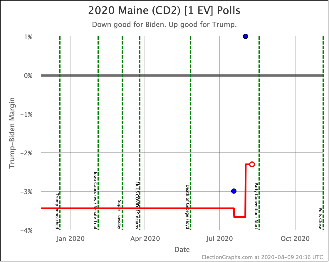
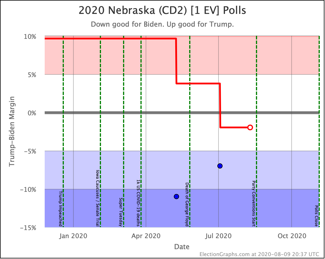
OK. We didn't do it earlier in the post, so here is a quick look at the current graphs for all of the states and CDs where the Election Graphs margin is currently under 5%. I won't comment on all of them individually. Some of them have switched categories in the last few days, some have not. But all of these should be considered as active possibilities for both candidates at this point.

And that is it for today. More soon.

10.9 days until the first results start coming in on election night.

We are almost at the end!

For more information:

This post is an update based on the data on the Election Graphs Electoral College 2020 page. Election Graphs tracks a poll-based estimate of the Electoral College. The charts, graphs, and maps in the post above are all as of the time of this post. Click through on any image for current interactive versions of the chart, along with additional details.

Follow @ElectionGraphs on Twitter or Election Graphs on Facebook to see announcements of updates. For those interested in individual poll updates, follow @ElecCollPolls on Twitter for all the polls as I add them. If you find the information in these posts informative or useful, please consider visiting the donation page.
Trump Narrows The Gap

I am overdue for another update. The 2020 pages on Election Graphs are updated nearly every day as new polls come in. So you can always see the current status there for yourself in between these posts. But here comes another blog post…

Since the last update on July 24th, there have been new state polls in Pennsylvania (x8), Arizona (x7), Florida (x7), Michigan (x10), Ohio (x5), North Carolina (x9), South Carolina (x4), Minnesota (x5), Colorado (x3), Georgia (x5), Texas (x4), Virginia (x3), Wisconsin (x9), New Jersey, Massachusetts, Alaska, Iowa (x5), Maine All (x4), Montana (x2), Maine CD1 (x2), Maine CD2 (x2), Washington, New Hampshire (x3), California, Alabama, Kentucky (x4), Hawaii, Indiana, Oklahoma, Utah, and Kansas.

That's 31 out of the 56 entities that allocate electoral votes in only 16 days. That's more than half. Given that, I'm going to stop calling out the states with polls each update. In short, the answer from now until the election is always going to be "a lot of them", and "multiple polls for all the close states".

It has been 16 days, how much has changed?

First the summary table of changes:

Model Metric 24 Jul 9 Aug 𝚫
Categories Trump Best
Expected
Biden Best
Biden +36
Biden +168
Biden +288
Trump +34
Biden +180
Biden +288
Trump +70
Biden +12
FLAT
Tipping Point Biden +6.5 Biden +4.2% Trump +2.3%
Probabilities Trump 2σ
Median
Biden 2σ
Biden +80
Biden +168
Biden +272
Biden +50
Biden +154
Biden +264
Trump +30
Trump +14
Trump +8
Trump Win
Tie
Biden Win
0.0%
0.0%
100.0%
0.1%
0.0%
99.9%
+0.1%
FLAT
-0.1%

So compared to 16 days ago, what is the TL;DR summary?

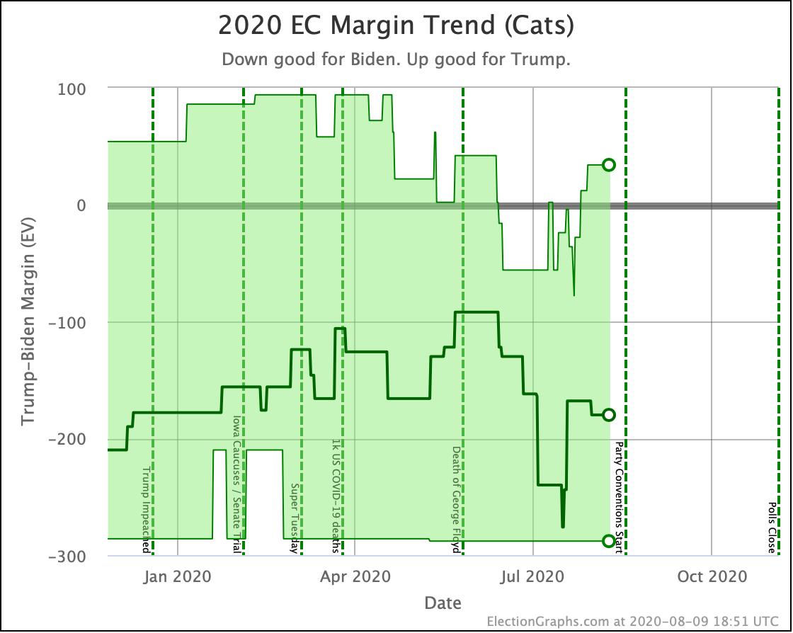
Biden still leads by a large margin and actually improves his margin in the "everybody wins every state where they lead the average" expected case metric, but overall Trump has managed to reduce Biden's margin in a number of states, thus increasing the likelihood he might steal those states back and strengthening his position. And if he managed to flip ALL the close states, he could once again pull off a narrow win.

Now some of the charts, starting with the categorization view:

We can see that while Biden improved his expected case, Trump's best case has improved significantly.

So which specific states changed?

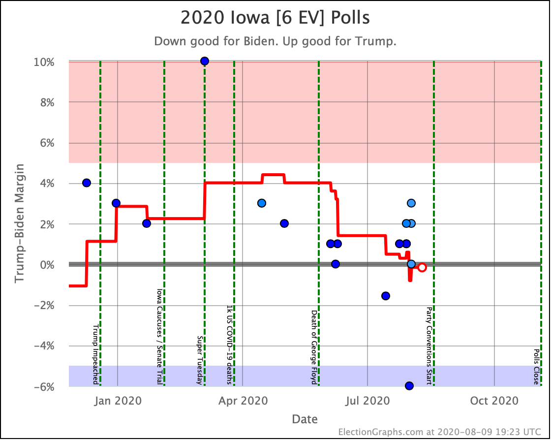
First, it was Iowa that moved from barely Trump to barely Biden, improving Biden's margin in the case where each candidate wins every state where they lead the average. But Biden leads Iowa by only 0.2%. And it looks pretty likely that the lead is due to a single outlier poll that showed a 6% Biden lead. So far no other polls indicate a Biden lead of that magnitude. So it would not be surprising at all to see Iowa slip back to the Trump side with the next poll, or at least when that outlier slips out of the average.

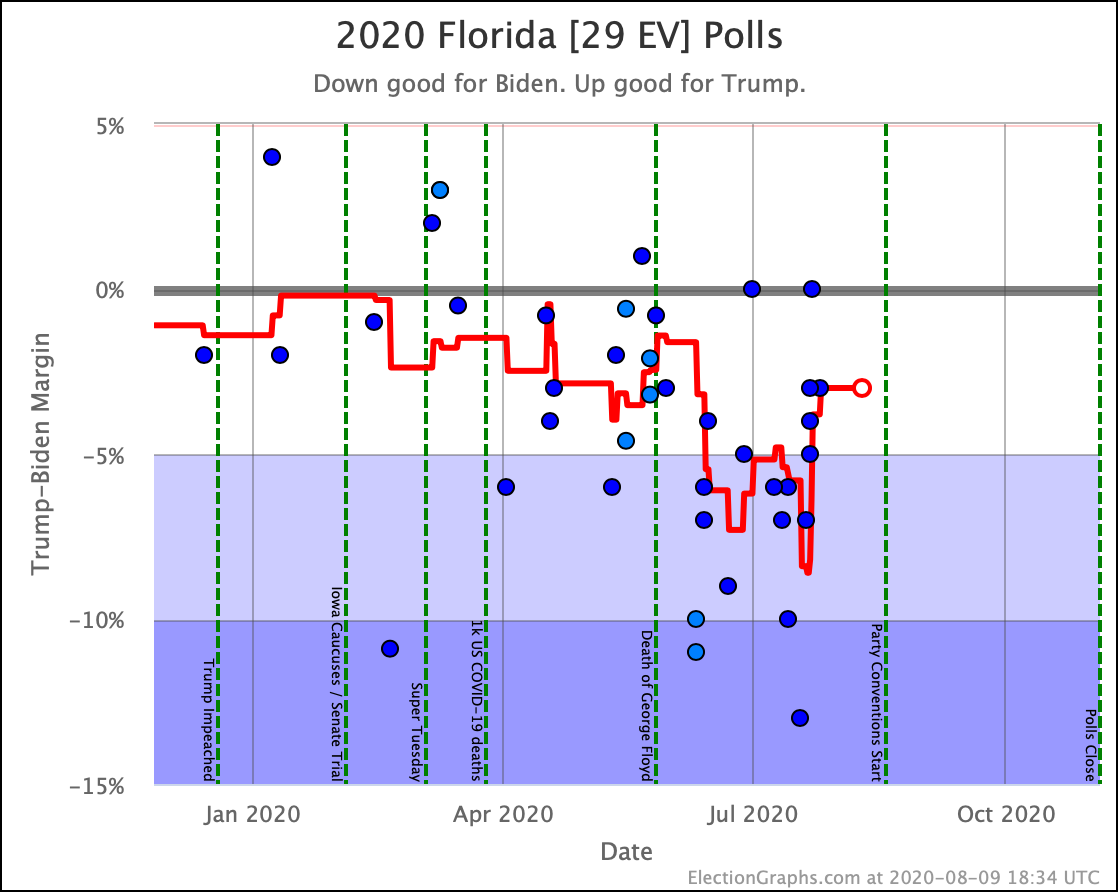
But then there is Florida. Biden's substantial lead in Florida has slipped significantly. He still leads, but no longer by huge margins. In our average Biden now only leads Florida by 3.0%. If the election was today, we estimate that translates into a 73.8% chance that Biden would win the state. But we actually have 86 days until the election, and there is plenty of room for this to move further.

The substantial swings here over June and July indicate that as polarized as things tend to be these days, there is still a non-trivial group of voters who have shown they can change their minds over time. In this case, they moved away from Trump for a while, but seem to be coming home again, once again putting Florida within Trump's reach.

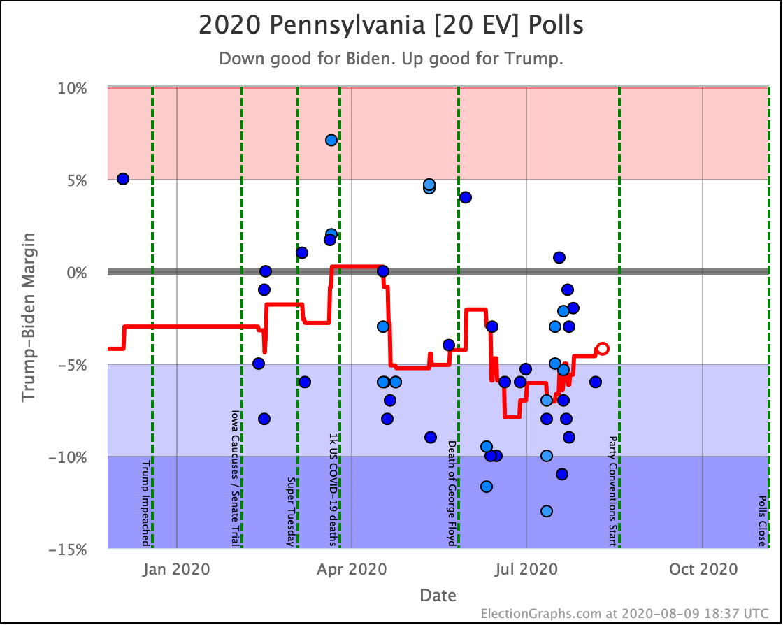
Much the same pattern has played out in Pennsylvania. Biden built a substantial lead in June, but over the course of July, it faded quite a bit. Biden still leads Trump by 4.2% in Pennsylvania, translating into an 84.9% chance of winning the state in our model if the election was today. But that is significantly less certain than the 98.8% we had at Biden's peak.

Given Florida's 29 electoral votes and Pennsylvania's 20 electoral votes, together these states can change the margin by a massive 98 electoral votes.

Having these two states close enough to be in play is critical to Trump. At the moment, he is still behind, but close enough that it is easy to imagine scenarios where Trump could come back from behind and win them.

Not all of the movement was bad for Biden.

In Wisconsin, at the time of the last update, Wisconsin had flipped from "Strong Biden" down to "Weak Biden". But that didn't last long, and Wisconsin is once again a strong enough Biden state that we don't include it in Trump's best case. (At an 8.6% lead, our odds estimate is a 99.1% chance of a Biden win if the election was today.)

New Hampshire also moves out of Trump's reach with Biden leading the average by 7.8%, which would be a 98.6% chance of a win if the election was today.

But Wisconsin and New Hampshire are only 14 electoral votes, compared to 49 electoral votes for Florida and Pennsylvania. So the net change is 35 electoral votes in reach for Trump that were not when we did the last blog post, meaning a 70 electoral vote increase in Trump's best case.

So, now to dash through the "weak" states that are in play that didn't switch broad categories this time around, in order by  the number of electoral votes:

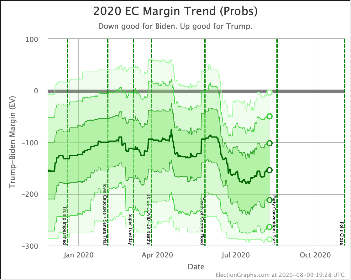
When you mash all of these movements together into our probabilistic model that doesn't just say that since one candidate is ahead in a state they are going to win it, but instead simulates many possible election results recognizing that close states can go either way, you get these trends:

Roughly speaking, the darker the color, the more likely the final margin will be in that range.

Looking at the center median line, where half the simulated election results were better for Biden, and half were better for Trump, Biden's most recent peak was a 180 electoral vote margin on July 17th. Since then he has slipped down to a 154 electoral vote margin.

All of the other bands have moved toward Trump as well, each to a differing degree. The moves aren't as dramatic as the categorization view shows, but there has been a steady deterioration for Biden since that peak.

June and the first half of July were a constant stream of bad news for Trump, and his position in election polls reflected that. Since then things have slowly been moving back in his direction.

To be absolutely clear, Biden still has a huge advantage. But less so than he did a few weeks ago.

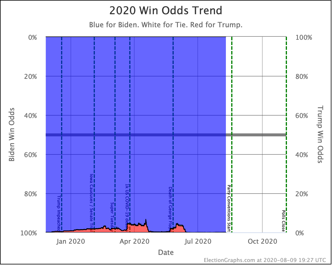
It is still too small to see directly on the chart, but Biden's chances of winning when we did our last update rounded to 100.0% (it was actually 99.9931% in our simulation), and now they round to 99.9% (it is actually 99.9265% in our current simulation).

So that is still substantial, even if it is less than it was.

But that is if the election was today.

How vulnerable is that lead?

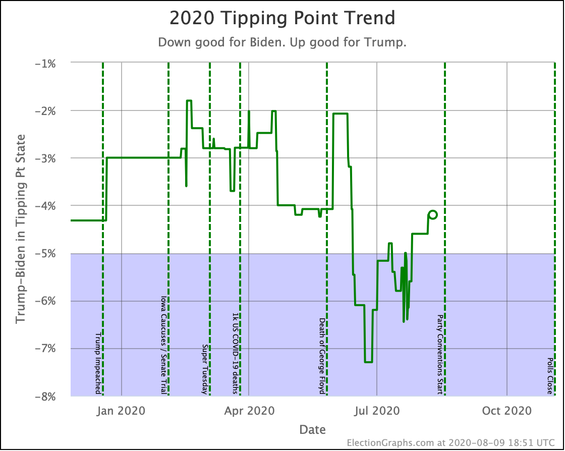
Biden's tipping point lead peaked at 7.3%. It is down to 4.2%. That's a 3.1% decline in a little over a month. If that trend continued, in another month Biden would still have a lead, but it would be quite tenuous.

That is not a prediction. It seems more likely that if Biden's spike in June was just an aberration and things are returning to the mean, that the tipping point will settle out between a 2% and 4% Biden lead.

But that is the level of lead that might just be a systematic polling error. Or that could be erased by a major event in the last few days of the campaign, too late to be measured by the polls.

So how does this look compared to 2016?

<86 Days Out> 2016 2020
Expected Case Clinton by 164 Biden by 180
Tipping Point Clinton by 6.0% Biden by 4.2%

So Biden is ahead of Clinton at this same point in time in terms of expected margins if all the states fell where their polls indicated. But Clinton's lead was actually a bit more secure than Biden's is right now, and of course, it slipped away before the end.

If the election was today, Biden would almost certainly win. But his lead is somewhat precarious. If 2% or 3% of people change their minds from Biden to Trump in a few critical states, Trump takes the lead.

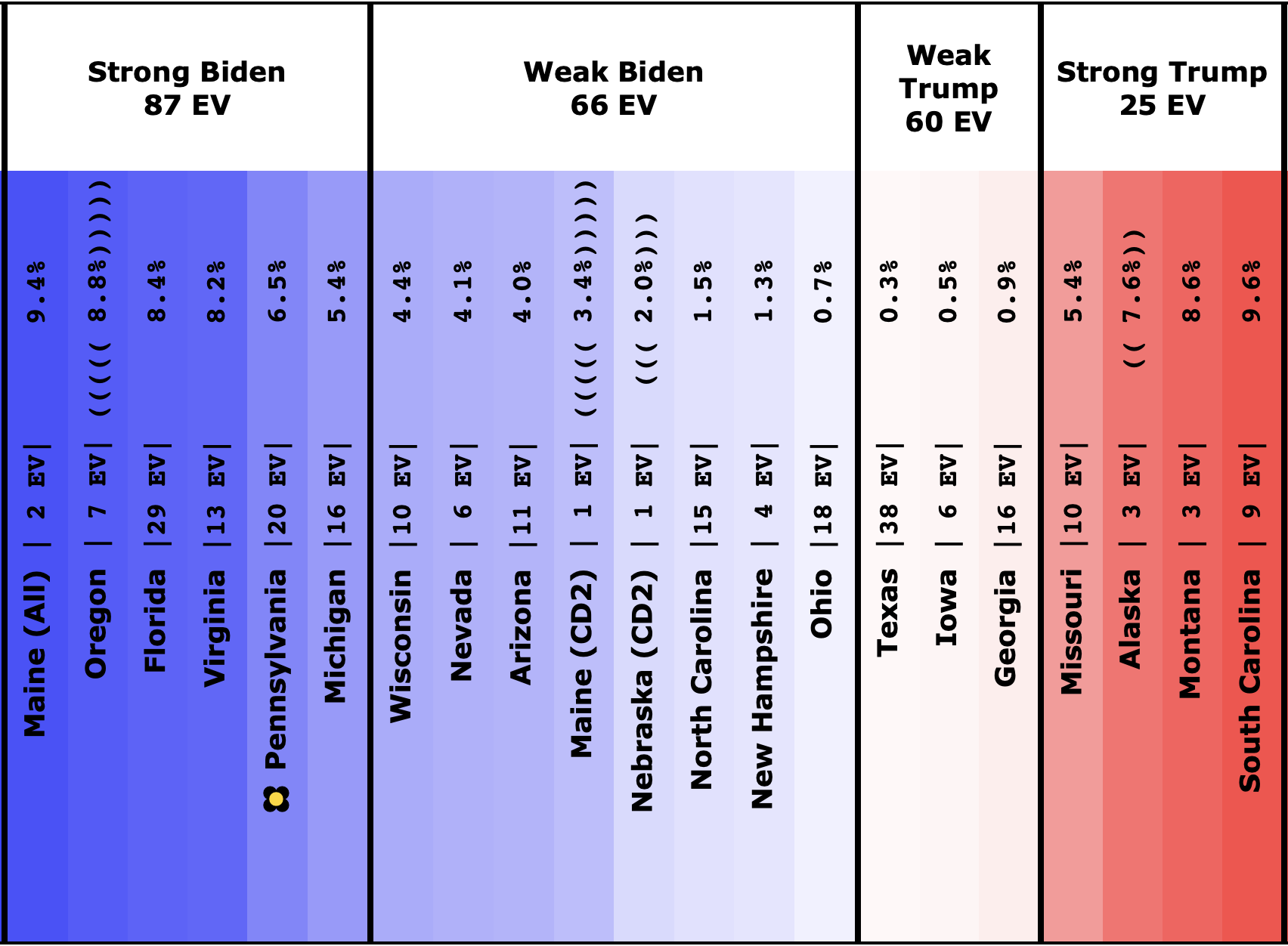
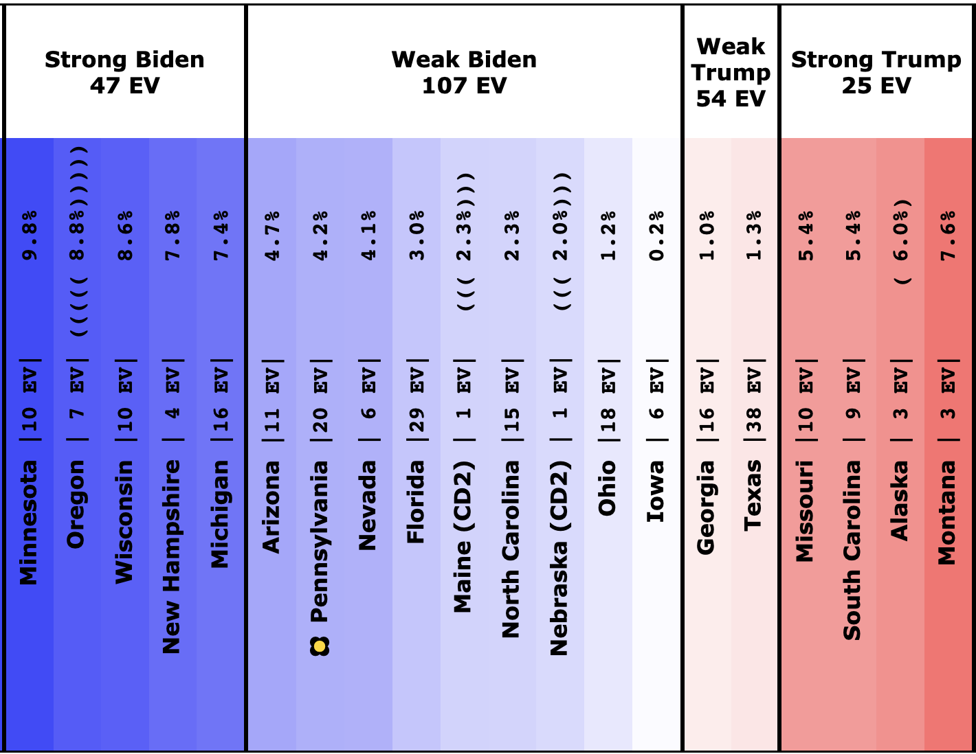
Now the spectrum of battleground states :

Here is what it looked like in our last update:

And here it is today:

Out of the close ("weak") states, Biden only has to hold Arizona and Pennsylvania. He can afford to lose all the rest and still win.

But we're once again in a position where with a sweep of all the close states, Trump could win.

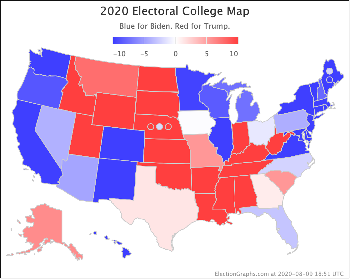
Finally, the current map:

86.0 days until polls start to close on election night. Stay tuned!

For more information:

This post is an update based on the data on the Election Graphs Electoral College 2020 page. Election Graphs tracks a poll-based estimate of the Electoral College. The charts, graphs, and maps in the post above are all as of the time of this post. Click through on any image for current interactive versions of the chart, along with additional details.

Follow @ElectionGraphs on Twitter or Election Graphs on Facebook to see announcements of updates. For those interested in individual poll updates, follow @ElecCollPolls on Twitter for all the polls as I add them. If you find the information in these posts informative or useful, please consider visiting the donation page.
Harris and Buttigieg Struggling in Trump Matchups

Apologies for the radio silence. I had been trying to post a blog update here weekly, but things got in the way the last few weeks. One of the items was the fact that my wife Brandy is running for local office, and I've been helping do things like put out signs and such. If you happen to live in South Snohomish County, Washington, take a look at her campaign site and vote! Ballots are due Tuesday! No polls for races like this, so no previews. We'll see the results when we see the results.

In any case, it is only the blog summaries that have suffered; the actual polls have continued to be updated this whole time. You can always check the 2020 Electoral College page for the current status. In any case, let's look at what has changed.

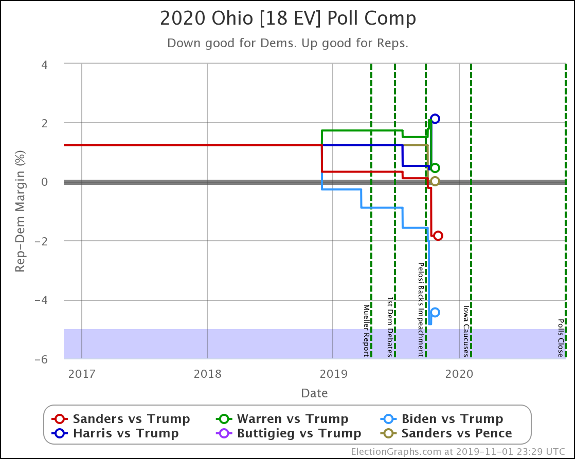
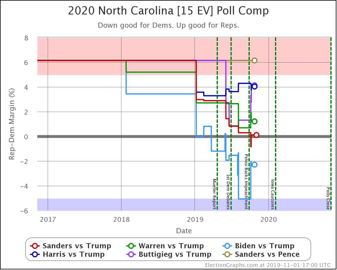
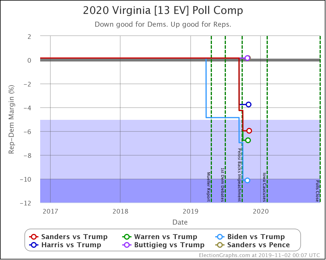
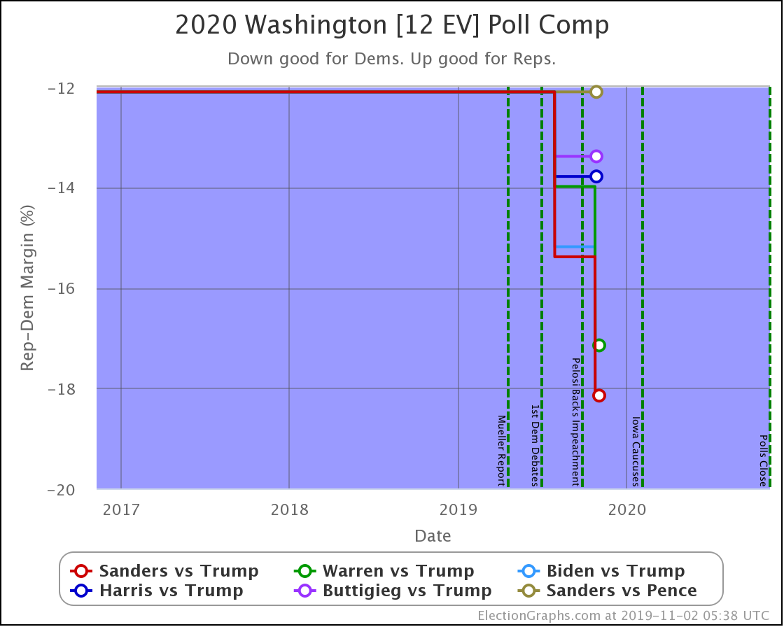
Since the last update, there have been new polls in North Carolina (x2), Ohio (x2), Virginia, Maine (All), Iowa, Minnesota, California, Florida, Wisconsin, Arizona, and Washington.

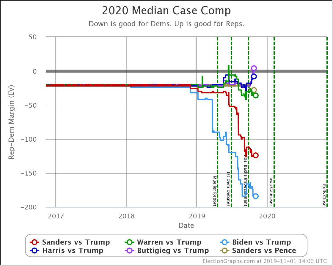
Let's look first at the changes to the national probabilistic views.

The main theme of the nearly three weeks since the last update is Harris and Buttigieg doing significantly worse in matchups against Trump.

Dem 13 Oct 1 Nov 𝚫
Biden +166 +184 +18
Sanders +124 +124 Flat
Warren +30 +36 +6
Harris +20 +8 -12
Buttigieg +24 -4 -28

All of the above vs. Trump. Sanders vs. Pence flat at Sanders +28.

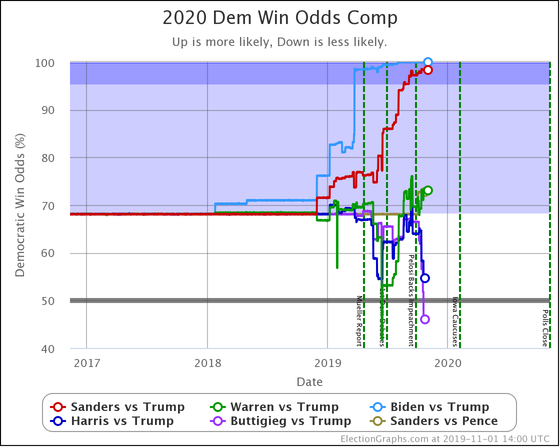
The decline for Harris and Buttigieg is even more apparent in the win odds:

Dem 13 Oct 1 Nov 𝚫
Biden 99.9% 100.0% +0.1%
Sanders 98.3% 98.3% Flat
Warren 70.6% 73.1% +2.5%
Harris 68.0% 54.6% -13.4%
Buttigieg 66.8% 46.0% -20.8%

All of the above vs. Trump. Sanders vs. Pence at a 72.7% chance of a Sanders win. This percentage is down 0.1% from 72.8% on 13 Oct, but this is just random fluctuation of the Monte Carlo model, not a real change. (There was one new Sanders vs. Pence poll, but it was in California and did not make any difference.)

Biden ticks up to 100.0%, but that is because I round. It is really 99.98% at the moment. Still, Biden is doing extraordinarily well in these state by state polls against Trump and continues to get stronger.

Note that Buttigieg is now at a less than 50% chance to win against Trump. The last time any of the most polled Democrats were under 50% was in June when Warren briefly dropped below that threshold before rebounding.

At this point, there are three tiers of Democrats against Trump.

  • Winning decisively: Biden and Sanders
  • Leading, but narrowly: Warren
  • Coin toss: Harris and Buttigieg

Next, let's look at the changes in each state with new polls to see what is driving the national results.

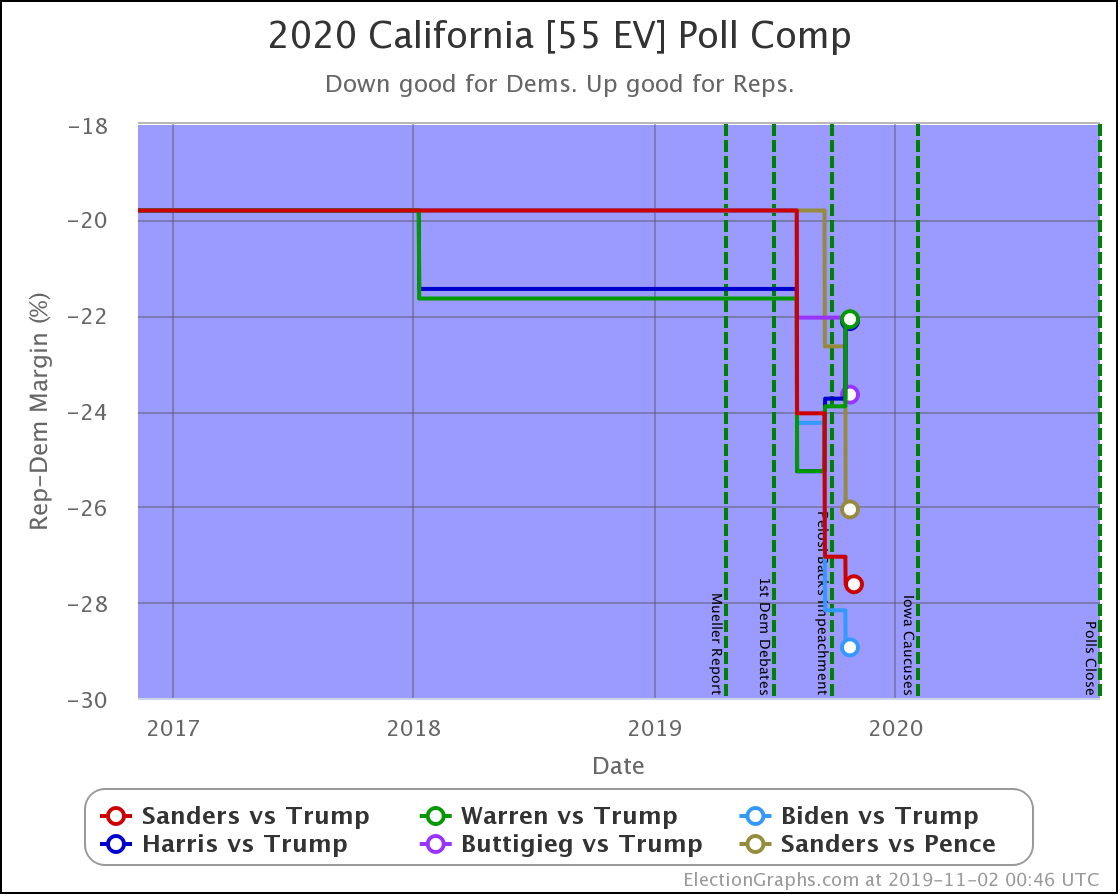
Starting with California since it has the most electoral votes, but you won't find any hints as to changes to the national picture here. California is very solidly blue, and nothing is changing about that.

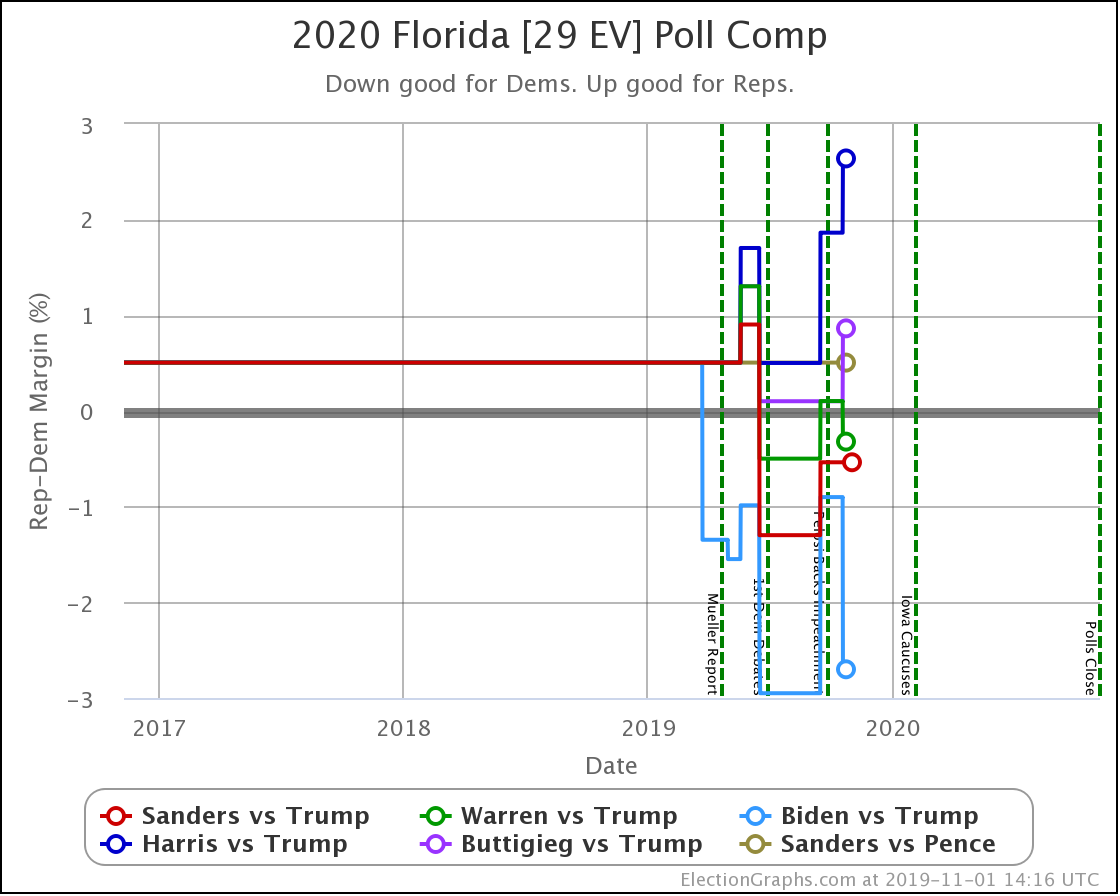
Florida, on the other hand, has lots of electoral votes and is close. So small changes make a big difference. Harris is now 2.6% behind Trump, which translates into only having a 16.6% chance of winning the state, down from 24.2% before this update. With 29 electoral votes at stake, that makes a real difference in the overall picture.

Similarly, Buttigieg moves from a 45% chance of winning the state down to 35%.

Compare to Biden with a 2.7% lead and a 71% chance of winning.

Florida is important. Winning it is part of many paths to victory on the national level.

So when Biden and Warren make gains in Florida and lead, while Harris and Buttigieg fall further behind, it makes a difference.

No category changes, but Sanders, Warren, and Biden are clearly improving, while Harris and Buttigieg (whose lines overlap) are moving in the opposite direction. In win chance terms, Harris and Buttigieg move from a 40% chance of winning Ohio, down to only 23%.

North Carolina is a key state. It is in the "swing state" zone for all five of these Democrats against Trump.

Sanders flipped from just barely winning, to barely losing in North Carolina.

That was the only category change, but both Biden and Buttigieg weakened considerably here. Looking at how this translates into win chances, Biden goes from a 91% chance of winning North Carolina to a 68% chance. Either way, still nicely favored, although certainly by less than before.

But Buttigieg drops from a 30% chance of winning down to only about 8%. Basically, from "OK, he's behind but has a shot" to "Yeah, not impossible, but it would be a major upset if he pulled off a win."

Every Democrat improves in Virginia. The state is still significantly under polled. So far, each update makes it look bluer as real 2020 polls replace old elections in the averages.

Biden's lead moves from "strong" to "solid" in my categorization.

Sanders' and Warren's leads both improve from "weak" to "strong" in the categories.

All the polled Democrats increased their leads over the historical average margin. Washington is a blue state that is getting bluer. It is not in contention right now.

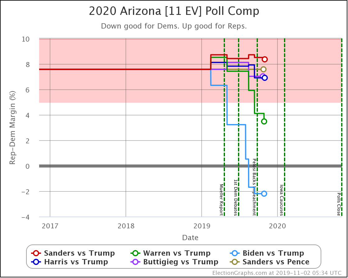
In Arizona, Warren improves a little bit against Trump, but every other combination is flat.

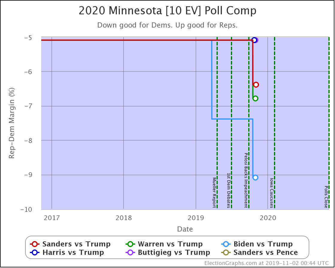
All of the Democrats have significant leads in Minnesota, and the new polling just increased the margins for those polled. Minnesota is not currently in play.

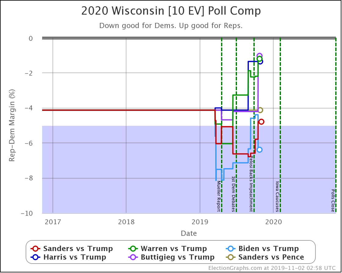
With this last update, Wisconsin moved from Weak Biden to Strong Biden, and from Strong Sanders to Weak Sanders.

But the most significant change was for Buttigieg, whose 4.2% lead (85% chance of winning) dropped to a 1.0% lead (56% chance of winning).

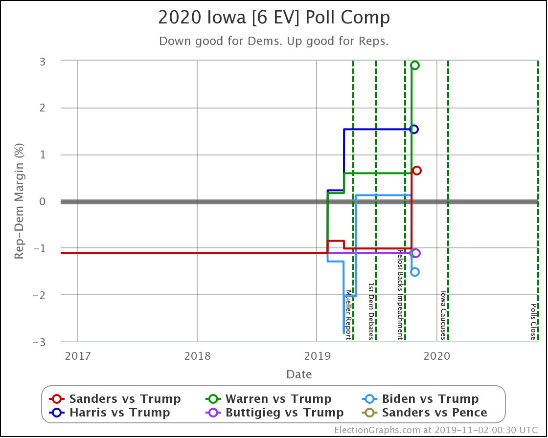
Iowa is a swing state for all candidate combinations. But with this last update, Sanders and Warren both weakened, with Sanders moving from slightly ahead to slightly behind. Biden strengthened, moving from just slightly behind to just slightly ahead. Warren drops to only a 14% chance of winning the state.

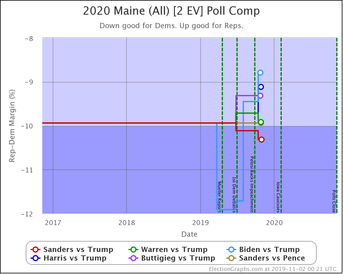
The worst Democrat in Maine (Biden) still has a 99.2% chance of winning the state. Maine (CD2) might come into play again, but Maine as a whole doesn't look like it will.

That's all the states.

Now to wrap things up by looking at the changes on the categorization view. I prefer the probabilistic view these days, but just looking at who leads where and by how much is still useful.

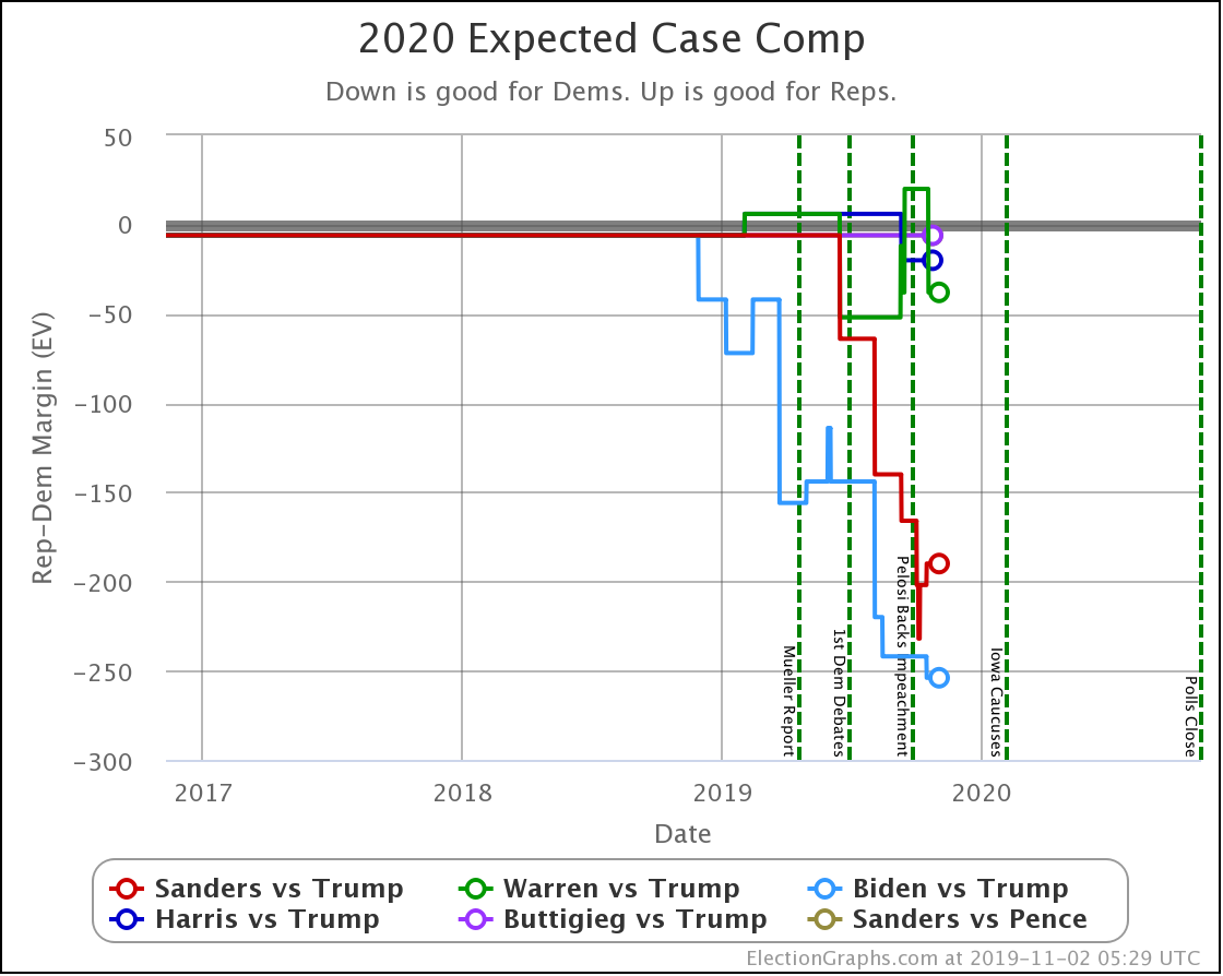
The expected case changes:

  • Biden vs. Trump: Biden +242 to Biden +254
  • Sanders vs. Trump: Sanders +232 to Sanders +190
  • Warren vs. Trump: Trump +20 to Warren +38

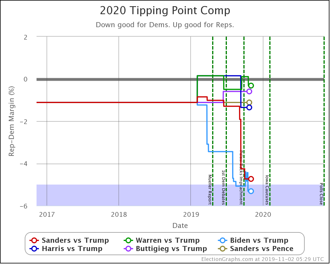
And the tipping point changes were:

  • Biden vs. Trump: Biden by 4.4% in WI to Biden by 5.3% in PA
  • Sanders vs. Trump: Sanders by 4.3% in VA -> Sanders by 4.7% in VA
  • Warren vs. Trump: Trump by 0.1% in NC to Warren by 0.3% in FL

A reminder that sometimes the "median case" in the probabilistic view can have a different leader than the "expected case" in the categorization view.

Divergence like this occurs when there are states that the leader barely leads, and there is a better chance of enough of them to make a difference flipping than there is of states flipping the other direction.

One final categorization comparison to show the three tiers of Democratic candidates against Trump that I mentioned at the start of the post. Time to look at the "spectrum of the states" for the five Democrats against Trump and compare what they look like:

The Democrats that are winning decisively:

The Democrat who is leading, but narrowly:

The Democrats whose chances are a coin toss:

And that is where we are.

367.7 days until polls start to close.

For more information:

This post is an update based on the data on the Election Graphs Electoral College 2020 page. Election Graphs tracks a poll-based estimate of the Electoral College. The charts, graphs, and maps in the post above are all as of the time of this post. Click through on any image to go to a page with the current interactive versions of that chart, along with additional details.

Follow @ElectionGraphs on Twitter or Election Graphs on Facebook to see announcements of updates. For those interested in individual poll updates, follow @ElecCollPolls on Twitter for all the polls as I add them. If you find the information in these posts informative or useful, please consider visiting the donation page.
Whoa, Look at Texas

Since the last update (not counting the update about new graphs) there have been new polls in Maine (All), South Carolina, Ohio, Michigan, Texas, and North Dakota.

Of those, only Texas and Michigan resulted in category changes for any of the six best-polled candidate pairs.

In Michigan, Buttigieg moved from a 6.4% lead to a weak 2.8% lead in the Election Graphs average.

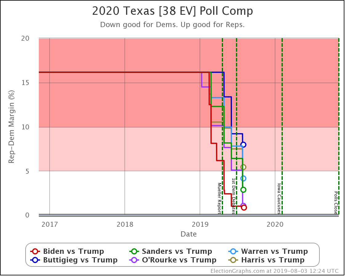
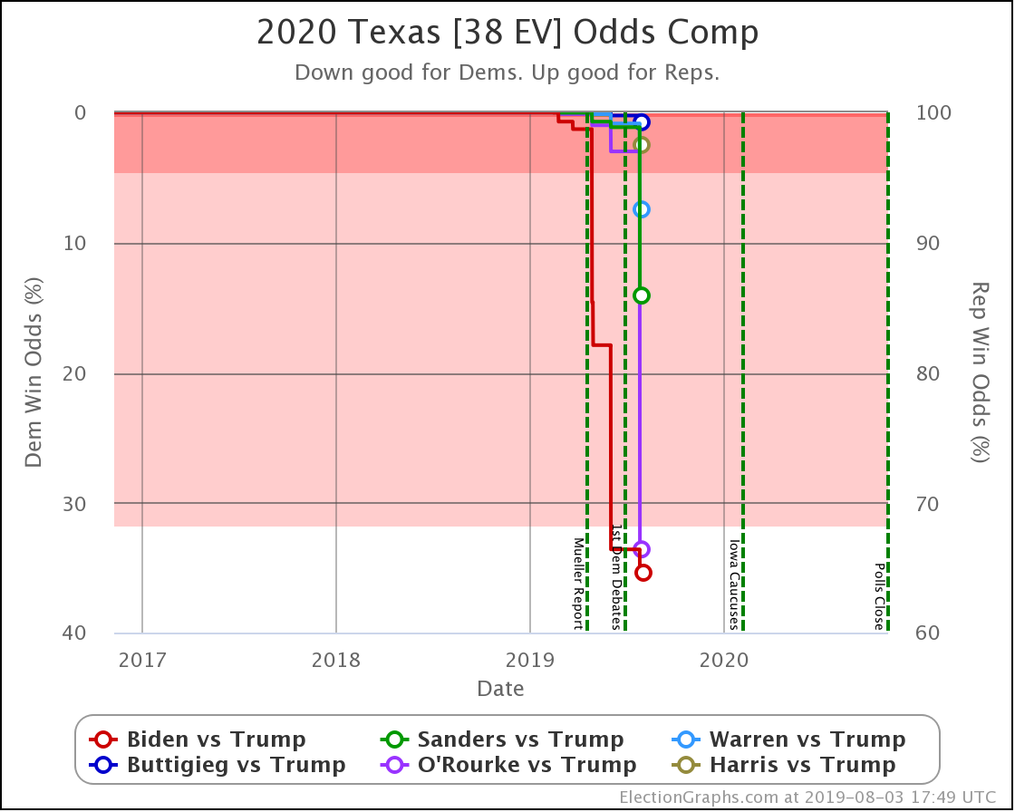
In Texas, Sanders, Warren, and O'Rourke pulled Trump's lead down under 5% into the "weak" category in the Election Graphs average. Biden had already gotten there back in June.

Texas is the headline.

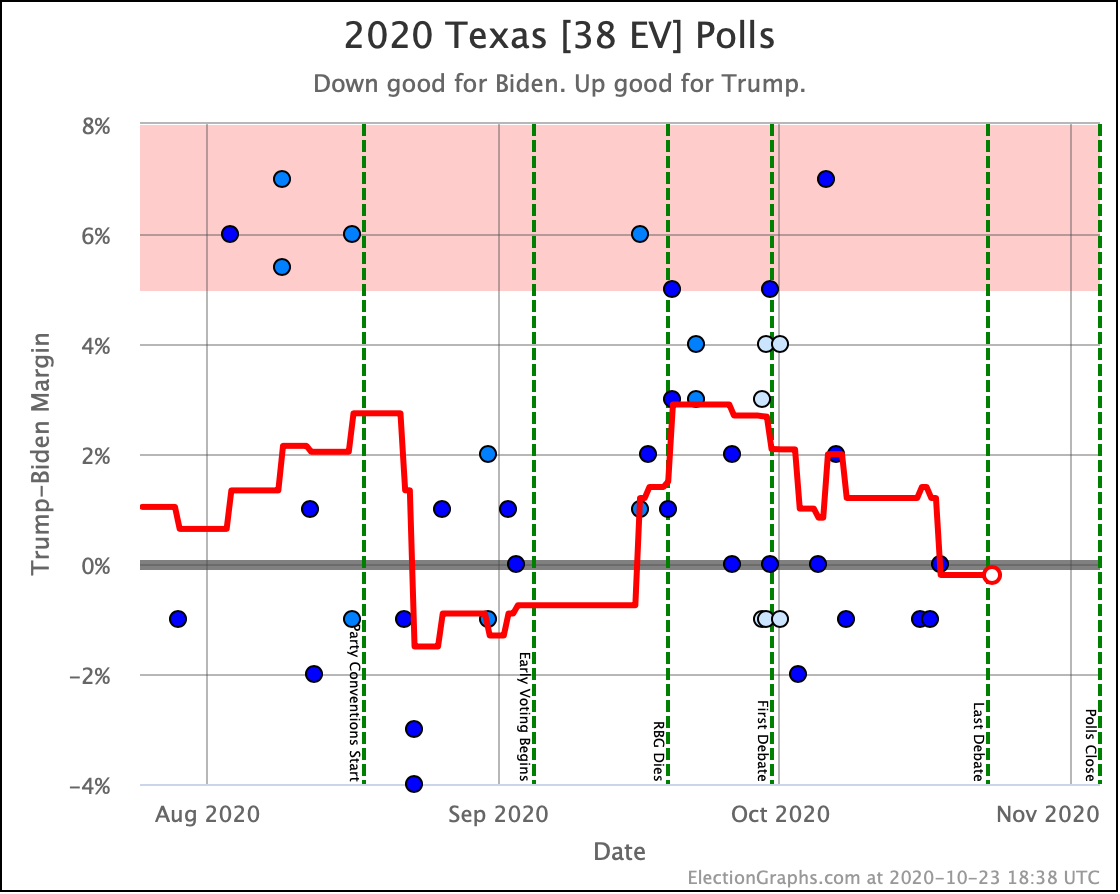
Trump's lead in Texas in the Election Graphs average is now down to under 5% for four of the six most polled Democrats against him. Only Buttigieg and Harris lag. But even they are trending stronger as more polls come in.

None of the averages show a Democratic lead in Texas. That would be seismic. However, at this point five of the six Democrats have at least one poll showing them ahead in Texas. (The exception is Buttigieg.)

Nobody would call Texas blue at this point. But it is trending purple. We have enough polls for enough candidates showing only narrow Republican leads (or even Democratic leads) to say that it looks competitive.

Now, what does competitive mean? Let's look at the "odds" view, where we use the historical performance of final Election Graphs averages to convert the poll margins into odds of victory:

Democrats making Texas "close" essentially means Trump has a noticeably less than 100% chance of winning.

Of these six Democrats, Buttigieg is weakest…  with Trump still having a 99.2% chance of winning the state.

Biden is strongest, but Trump still has a 64.6% chance of winning Texas against him.

Now, that means Biden has a 35.4% shot, which is remarkable given where Texas has been in other cycles. But Trump is still favored.

Now is the time to once again mention that Election Graphs does not model how the race evolves. These "odds" are static snapshots in time. "If the election was today." The election is not even remotely today. Polls can swing wildly in just a matter of weeks, let alone the 15 months we still have until the general election.

This "closeness" in Texas could evaporate long before we get to November 2020. Or it could turn into a Democratic lead.

But it is clear that Texas is a state to watch, and Republicans will need to play defense there, and not take it for granted, as has often been the case in recent cycles.

Now, the national picture, where all the caveats above also apply:

This batch of polls changed the "Best Case" scenarios for Sanders, Warren, and O'Rourke in the category based ranges (their best cases now include winning Texas). But the "Expected Case" and "Tipping Point" did not change.

However, the new probabilistic based simulations do show changes worth reviewing.

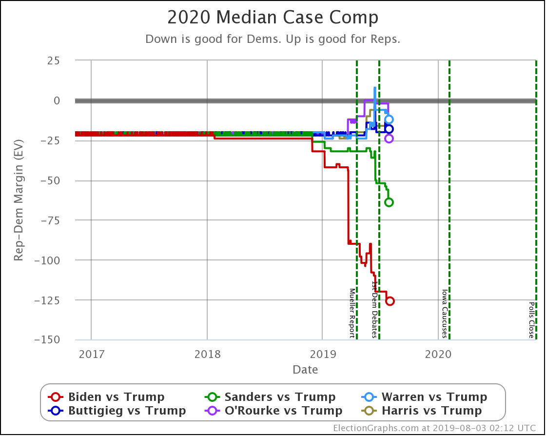
This first chart shows the "median case" of the simulations, the spot where half the time the Republican does better, and half the time the Democrat does better.

Biden doing better than the rest of the pack stands out clearly. His median case is a 126 electoral vote margin over Trump. To put this in historical context, this would exactly match Obama's 2012 margin over Romney but be quite a bit less than Obama's 2008 margin over McCain.

Sanders also breaks out from the pack, doing considerably better than the other Democrats.

Both Biden and Sanders have improved their median positions significantly over the last few weeks covered by this batch of new polls.

Meanwhile, Warren, Buttigieg, O'Rourke, and Harris stay within a zone maintaining only small electoral college margins in the median case.

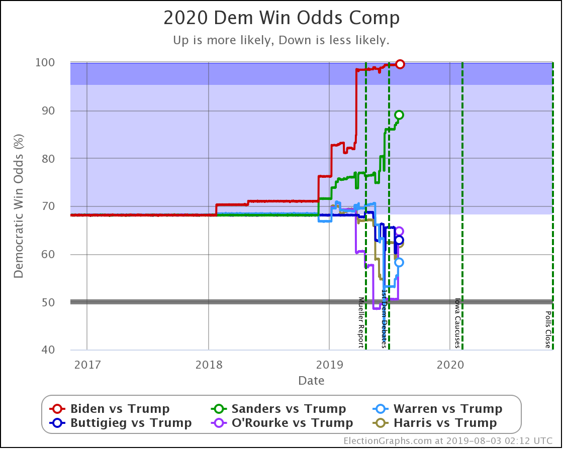
So, switching from looking at margins to looking at chances of winning:

Biden is pegged near the top right now. 99.6% chance of victory over Trump. There isn't that much room to improve, although weaker polls could certainly knock him off this pedestal.

Sanders clocks in second at an 89.0% chance of beating Trump.

Looking at the others, while they do have the upper hand on Trump, if this were election day, it wouldn't be fair to say it was anything other than "too close to call" with odds ranging from Warren at 58.2% to O'Rourke at 64.7%.

Election Graphs didn't have a probabilistic view in 2016, but the median "chance of Trump winning" from the sites that did was 14% going into Election Day. Only Biden and Sanders push Trump below that line at the moment.

So how have things been changing?

Comparing the odds of the Democrat winning from the update on June 23rd to where things stand now, we see this:

Dem 23 Jun 3 Aug 𝚫
Biden 99.4% 99.6% +0.2%
Sanders 86.0% 89.0% +3.0%
Buttigieg 65.5% 62.9% -2.6%
Harris 62.3% 62.2% -0.1%
O'Rourke 50.5% 64.7% +14.2%
Warren 53.2% 58.2% +5.0%

The stand out is, of course, O'Rourke. His improvement is almost all due to his performance in the latest Texas poll, which was better than all other Democrats, and significantly better than his previous polling in the state as well. So he adds to his chances of winning Texas, which while still under 50%, is enough to boost his chances of taking the whole thing significantly.

Warren and Sanders also improved a bit. Buttigieg dropped a bit. And Biden and Harris are essentially flat.

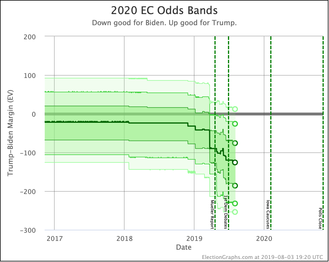
Finally, a quick preview of a new chart type coming soon to Election Graphs:

It is the equivalent of the Electoral College trend chart based on the straight-up categorization of states based on who is ahead, but with the results of the probabilistic modeling.

The dark line represents the median electoral college result in the simulation. Then the bands represent result ranges at different levels of probability. The deeper the shade, the more likely the result.

This is a visual representation of the single candidate time series of the probabilistic summary now on the comparison page:

The text summary will also, of course, be added to the candidate national summary pages once I get a chance.

I also added little circles in a lot of the time series charts to highlight the current values better. I think it makes the charts clearer. Hope you like them.

In any case… 458.1 days until polls start to close. Stay tuned!

For more information:

This post is an update based on the data on the Election Graphs Electoral College 2020 page. Election Graphs tracks a poll-based estimate of the Electoral College. The charts, graphs, and maps in the post above are all as of the time of this post. Click through on any image to go to a page with the current interactive versions of that chart, along with additional details.
Follow @ElectionGraphs on Twitter or Election Graphs on Facebook to see announcements of updates. For those interested in individual poll updates, follow @ElecCollPolls on Twitter for all the polls as I add them. If you find the information in these posts informative or useful, please consider visiting the donation page.