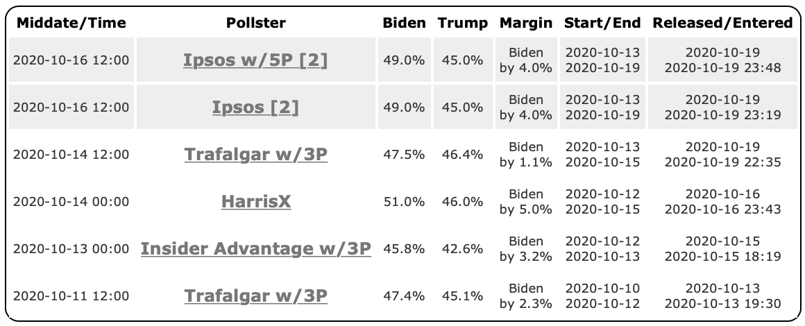
As always, if you are impatient for one of these updates, the 2020 Electoral College pages on Election Graphs are updated multiple times every day as new polls come in. Or you can follow @ElecCollPolls on Twitter to see all the polls as I add them. While you are at it, follow @ElectionGraphs too.
The last blog update here was early UTC on October 28th (with numbers as of the end of the 27th UTC). Just over three days ago. Here are the high-level changes since that last post:
| Model | Metric | 27 Oct | 31 Oct | 𝚫 |
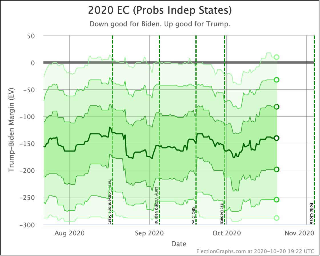
| Probabilities (Indep States) |
Trump 2σ Median Biden 2σ |
Biden +38 Biden +142 Biden +256 |
Biden +52 Biden +150 Biden +256 |
Biden +14 Biden +8 FLAT |
| Trump Win Tie Biden Win |
0.1% 0.0% 99.8% |
0.1% 0.0% 99.9% |
FLAT FLAT +0.1% |
|
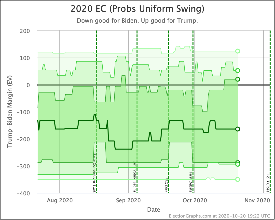
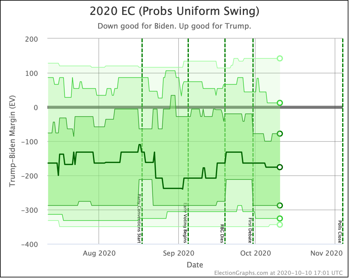
| Probabilities (Uniform Swing) |
Trump 2σ Median Biden 2σ |
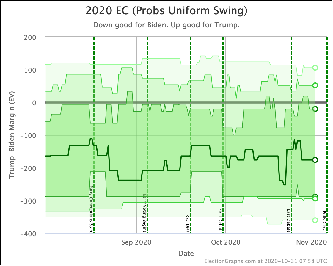
Trump +52 Biden +144 Biden +300 |
Trump +52 Biden +176 Biden +294 |
FLAT Biden +32 Trump +6 |
| Trump Win Tie Biden Win |
11.8% 0.0% 88.2% |
14.6% 0.0% 85.4% |
+2.8% FLAT -2.8% |
|
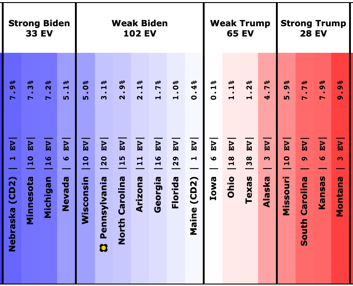
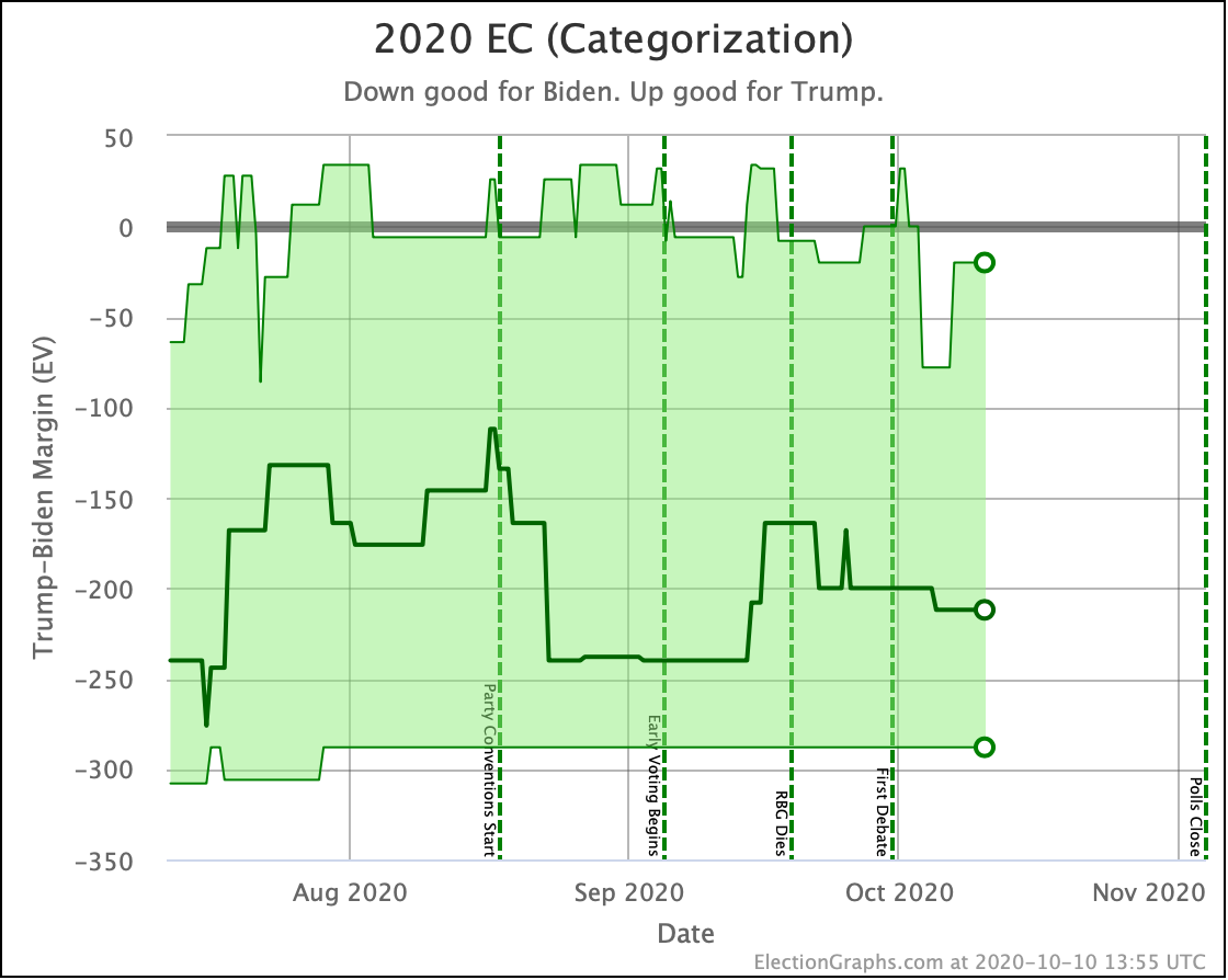
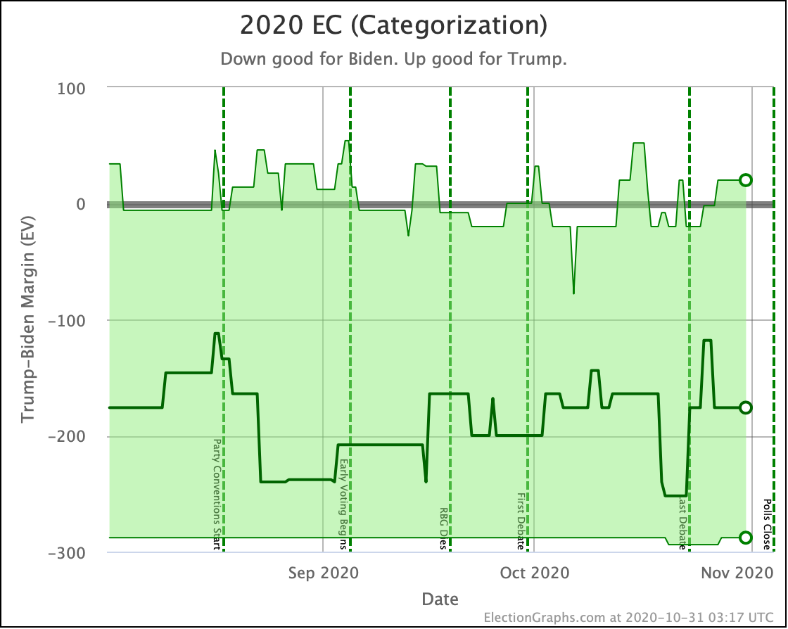
| Categories | Trump Best Expected Biden Best |
Trump +20 Biden +176 Biden +294 |
Trump +20 Biden +176 Biden +288 |
FLAT FLAT Trump +6 |
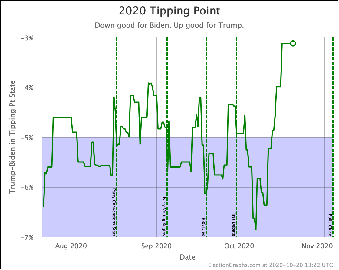
| Tipping Point | Biden +4.4% | Biden +4.3% | Trump +0.1% |
I'm updating more often since we are so close to the end, but the bottom line is again that things are fairly steady. If you look at the numbers above, yes, they move around a bit. But we still have nothing that looks like a sustained move as opposed to just poll averages meandering up and down as specific polls come in and out of the average.
Now, if I'd been making this post a bit sooner, it might have looked a lot like my "The Race Tightens? Or Not?" post from October 20th. This time the tipping point moved from Biden+4.4% on the 27th, down to Biden+3.1% on the 29th. I would be asking if this was the beginning of the race starting to tighten.
But as with that post, I would have expressed skepticism because just as it was back on October 20th, this spike was driven by a rash of polls from pollsters that tend to put out outliers. As new polls came out on the 30th, the tipping point bounced back to Biden+4.3%, almost back to where it had been before. It was just a transient spike.
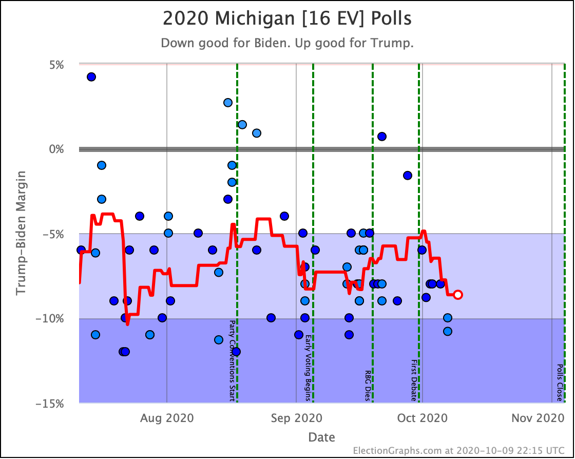
In some cases the outliers that drive this are extreme. In one dramatic instance, Trafalgar came out with a poll showing Trump ahead by 2% in Michigan at a time when the other polls in the Election Graphs average ranged from Biden+7.7% to Biden+13%. The Trafalgar number was not just at the Trump end of the range we had been seeing, it was on a whole different planet.
Whenever I see polls like that come in, I start wondering if I shouldn't have switched Election Graphs from using averages to using medians years ago. Or maybe that I need some sort of weighting by historical pollster accuracy, or to do something more complex to deal with and adjust for outliers, or just include more polls to wash these outliers out a bit more.
But one of the main ideas of Election Graphs from the beginning has been to include everything and keep to relatively simple averages, and see how far that gets you. It does make us bounce around when we get outliers though, and makes us VERY sensitive to just which pollsters have been in the field most recently.
If there is a REAL move, then after you get a spike led by a particular poll, additional polls will confirm the move, and you'll see a sustained change that lasts even after that first poll rolls off of the average. When it is just a movement driven by an outlier though, things will move back to where they were once a few new polls come in.
The problem here at the very end of the race is that at some point there will be no new polls. The last pollsters in the field will dominate the average. And they may or may not be the ones with the most accurate results. Last time around in 2016 Election Graphs did pretty well. Maybe we were lucky. We'll see how it goes this time.
For the moment though, when you look at the graphs, it seems that after a brief spike where it looked closer for a moment, we're back in the same familiar territory for this race as we have been since June, showing Biden as a heavy favorite, but with the possibility of a Trump upset not completely out of the picture.
So let's look at all the graphs.
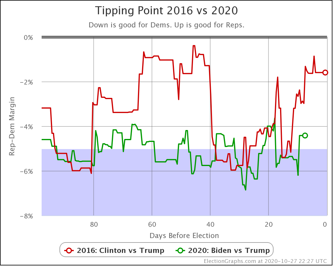
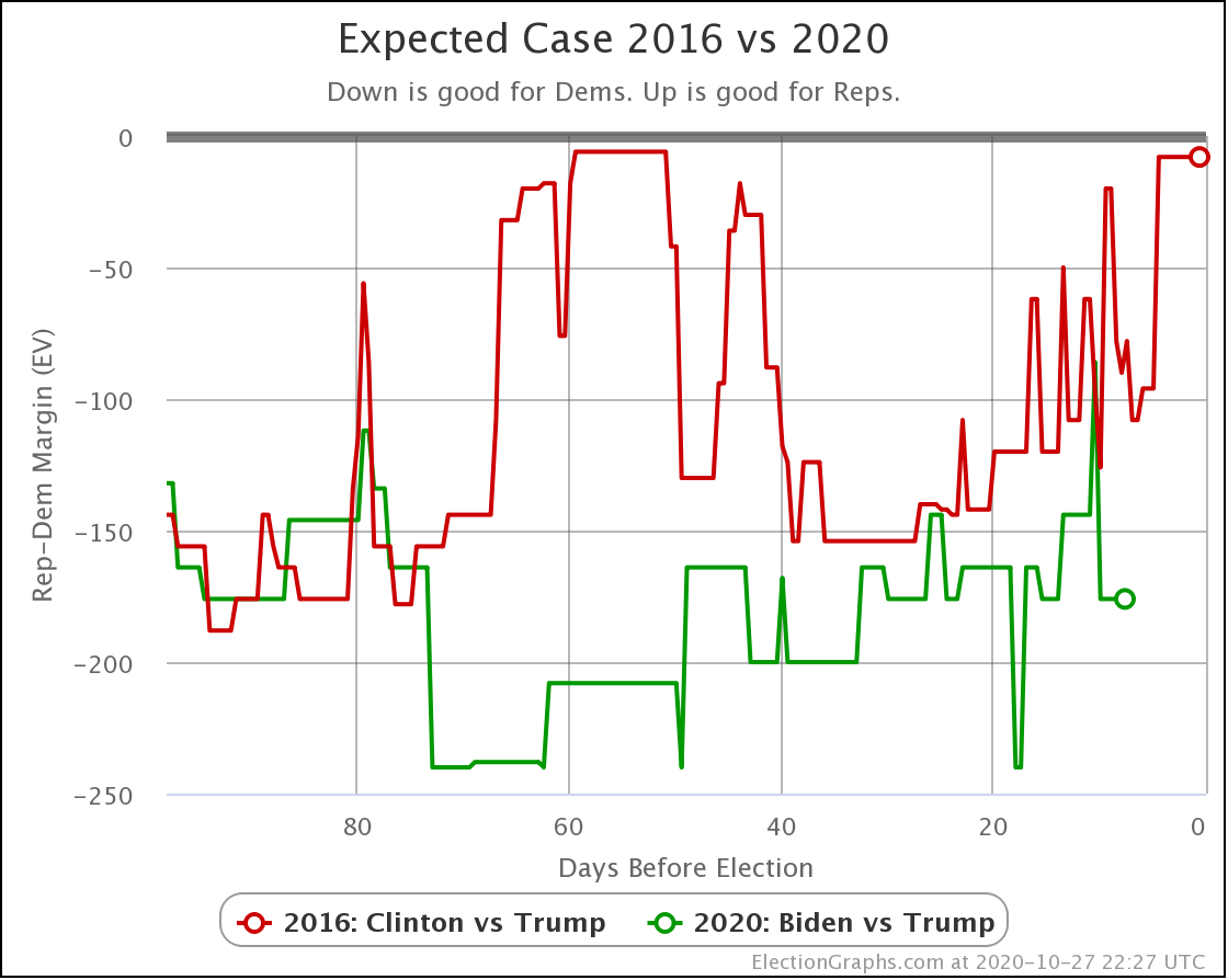
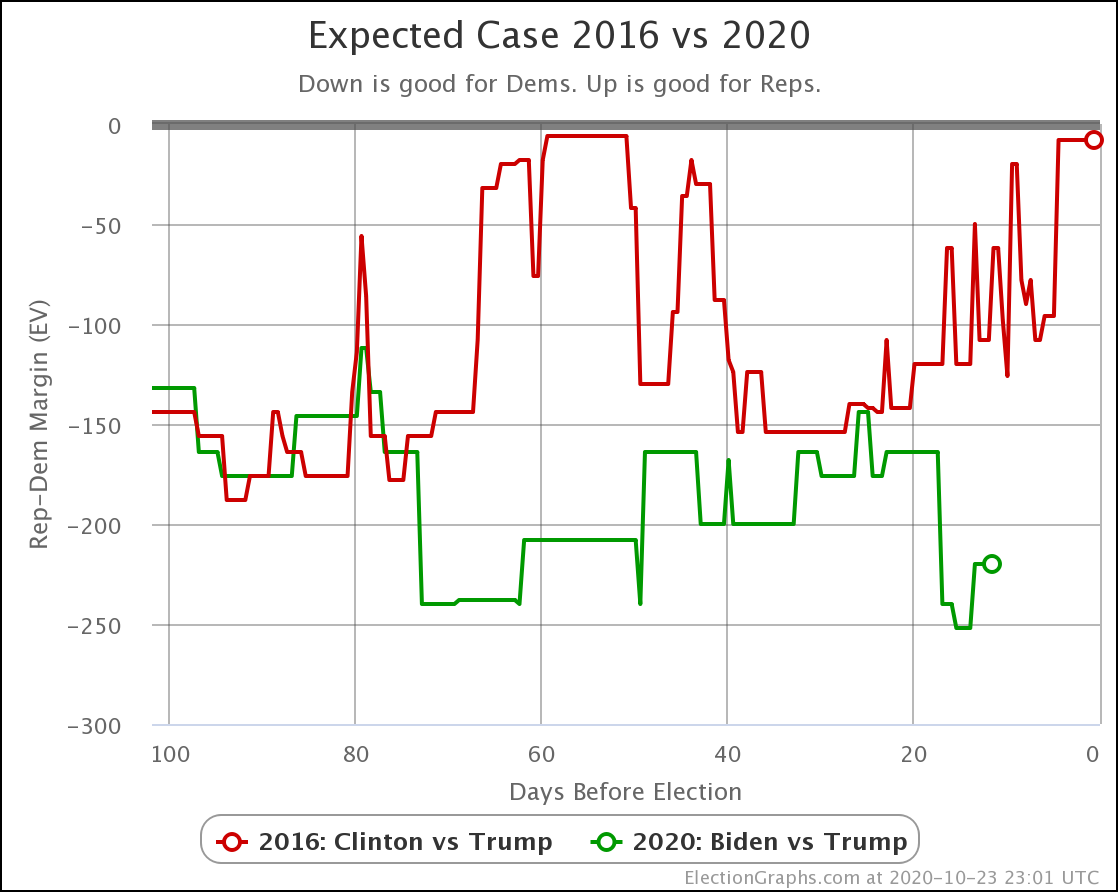
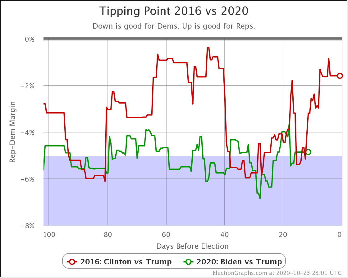
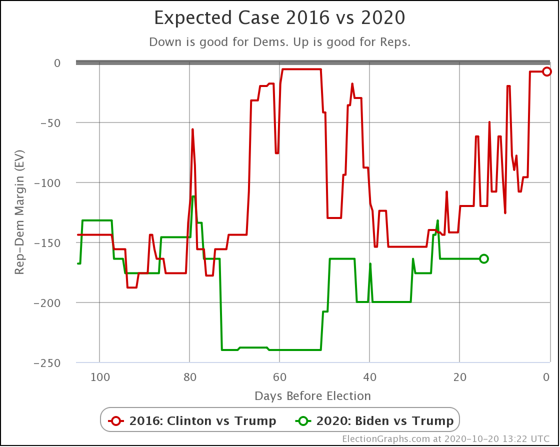
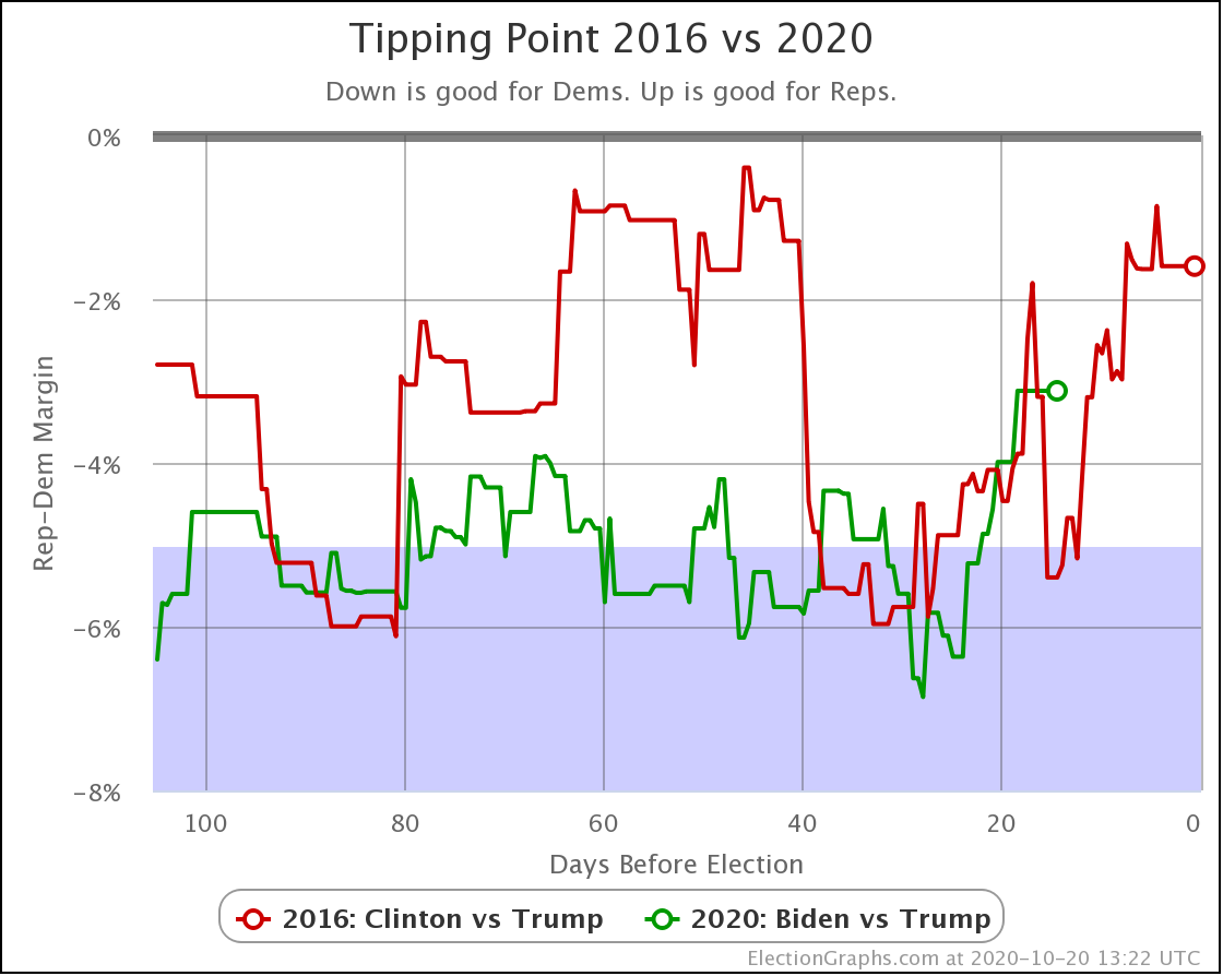
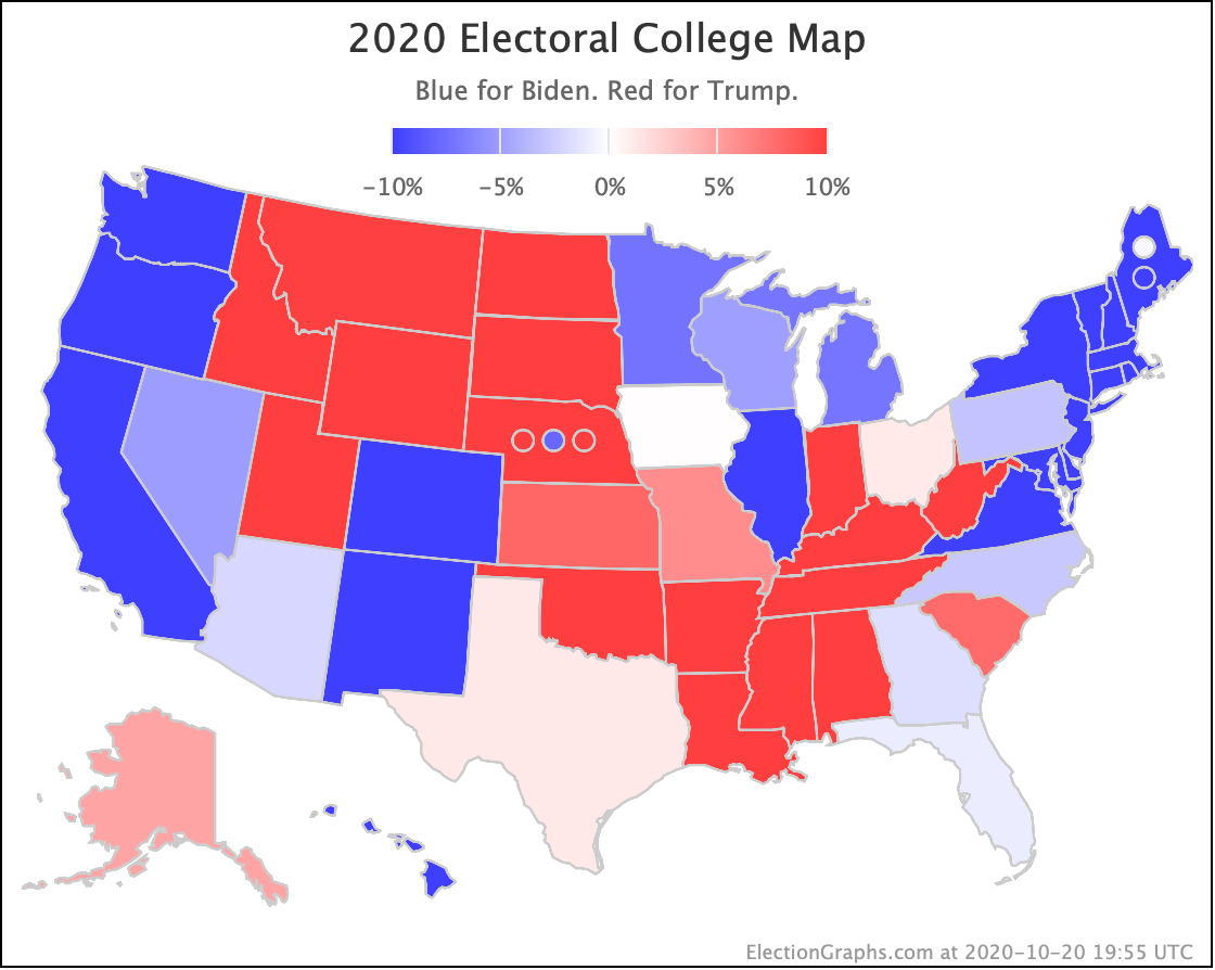
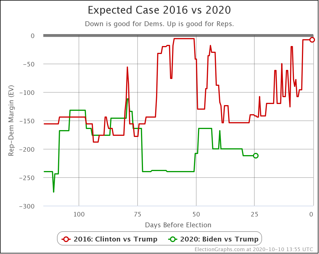
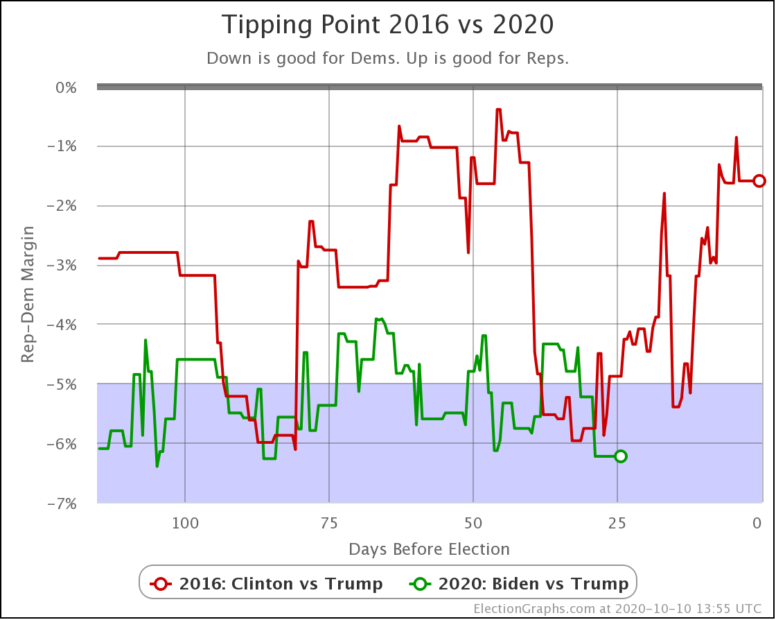
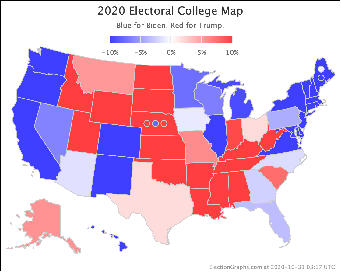
First 2020 vs 2016 comparisons since everybody on both sides keeps saying "But what about 2016?" when people talk about Biden's lead.
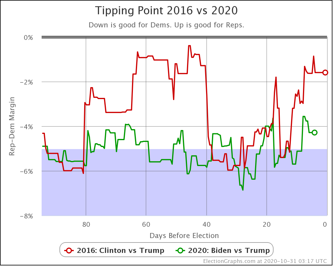
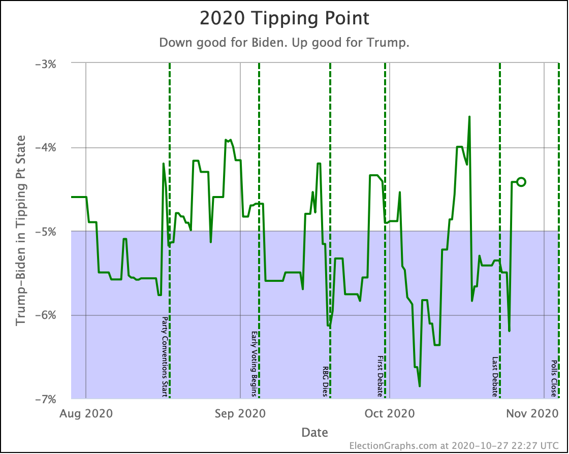
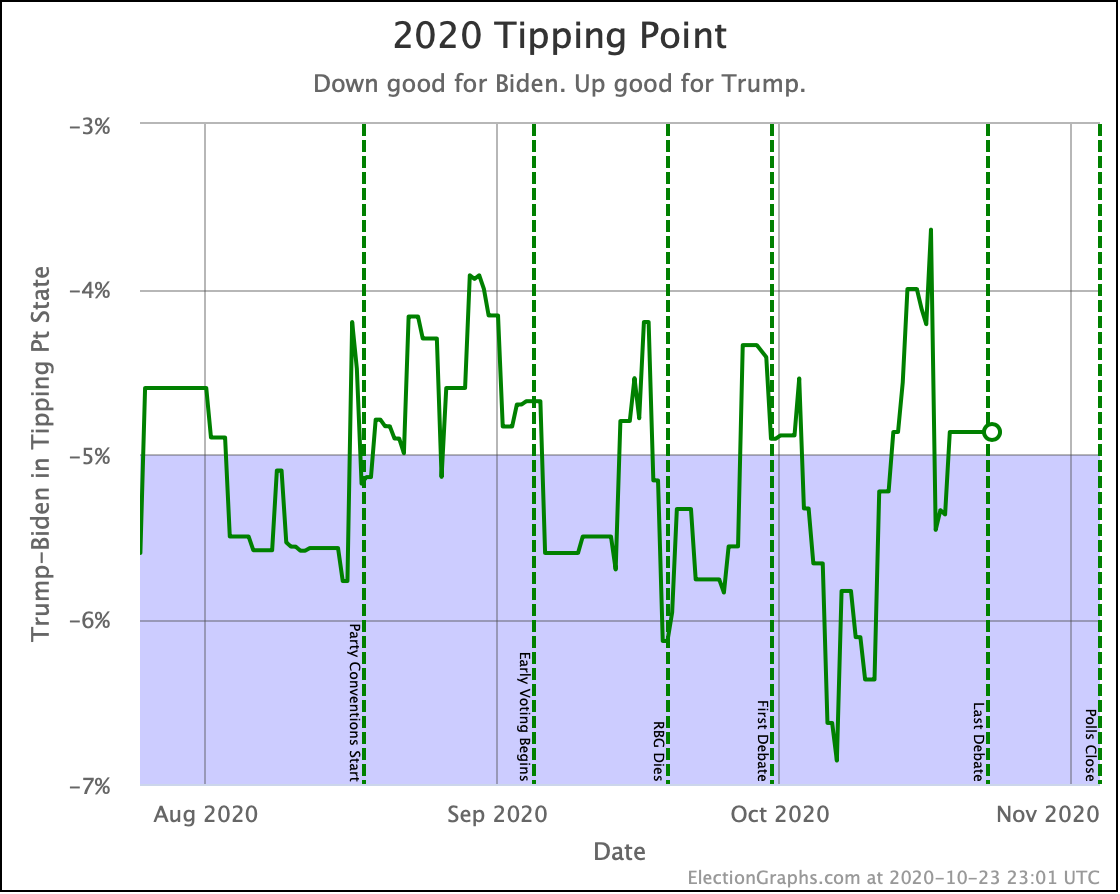
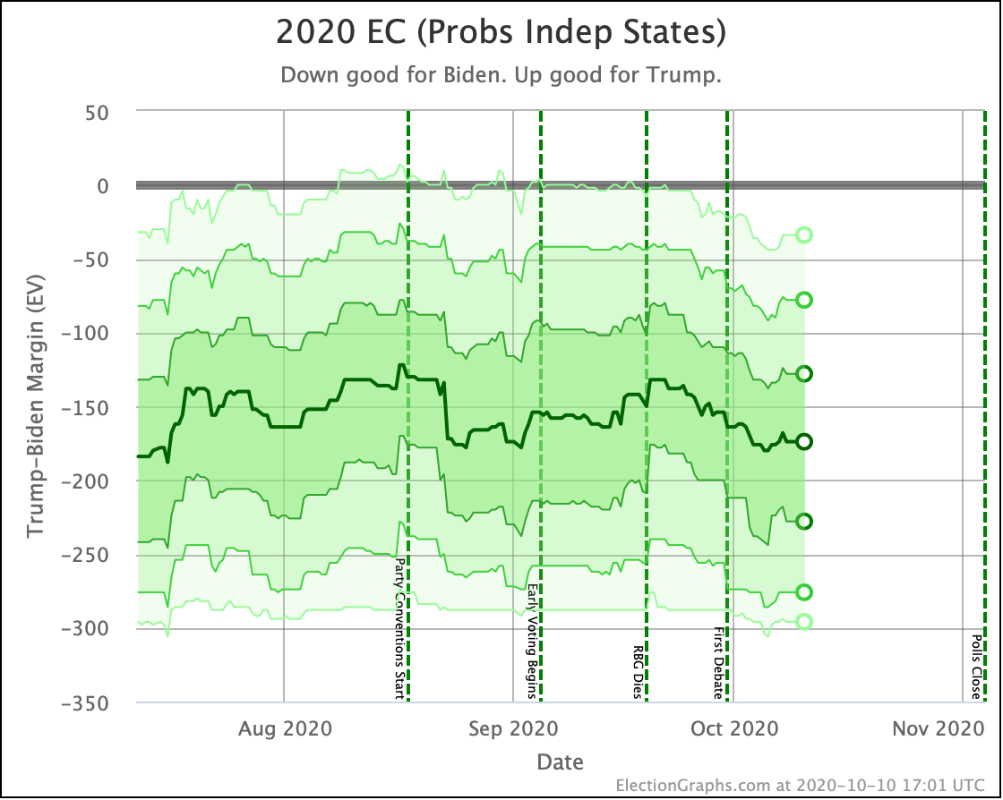
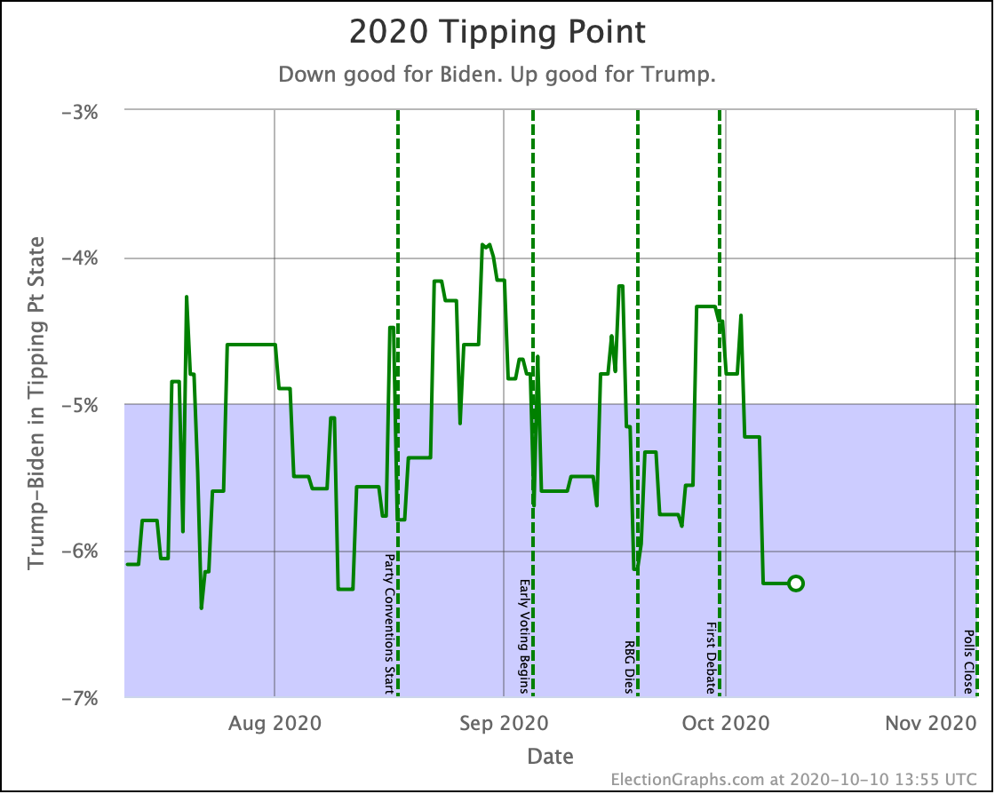
In the tipping point, which represents the degree polls need to be wrong and/or change before the end in order to flip the winner, Biden now holds a 4.3% lead. Clinton was at 1.6% by this point in 2016.
Biden is closer to the 4% part of his "normal range" than the 6% end, but we are still in very familiar territory. This race is pretty much in the same place it has been for months, Biden remains stronger than Clinton was, and we do not see any evidence of a collapse.
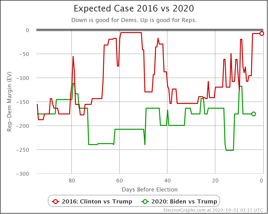
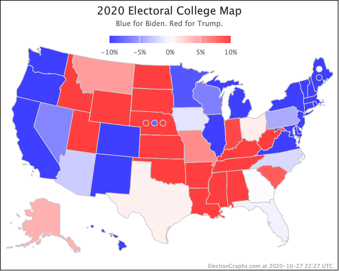
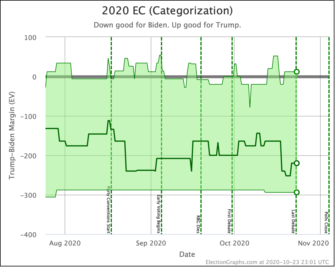
In terms of the expected case, where each candidate wins every state where they lead the Election Graphs average, Biden is still pretty much in the center of his normal zone, and significantly ahead of where Clinton was.
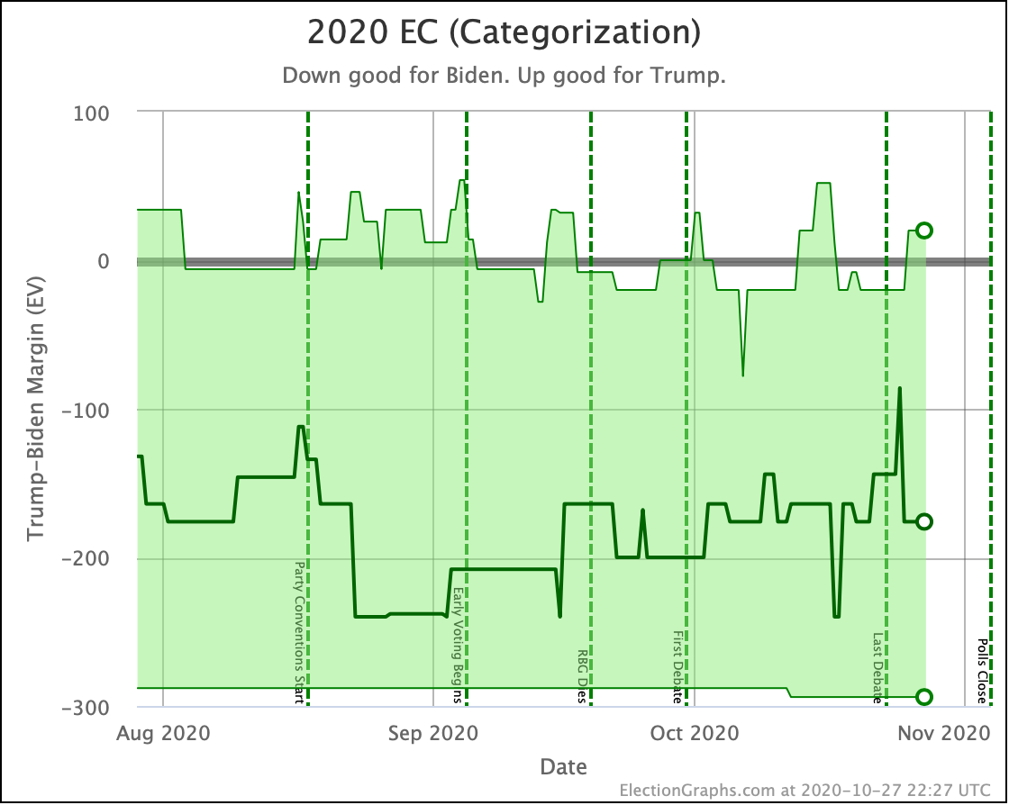
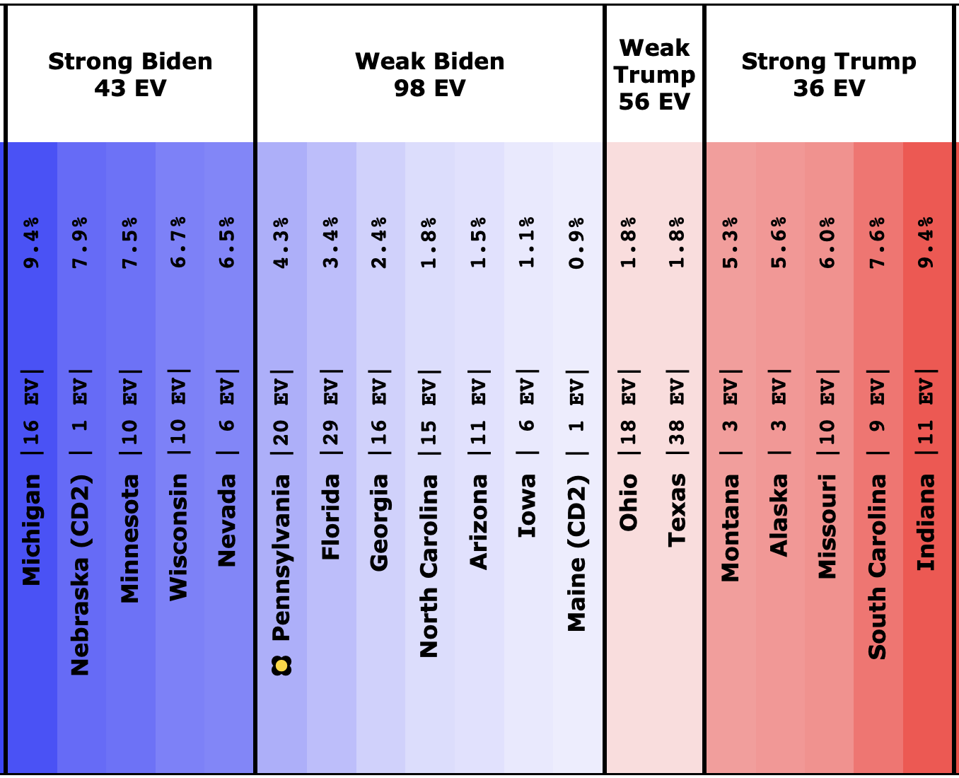
OK. Time for the three envelopes we have covering this year:
Instead of saying it three times, I'll say this once, since it is the same for all three:
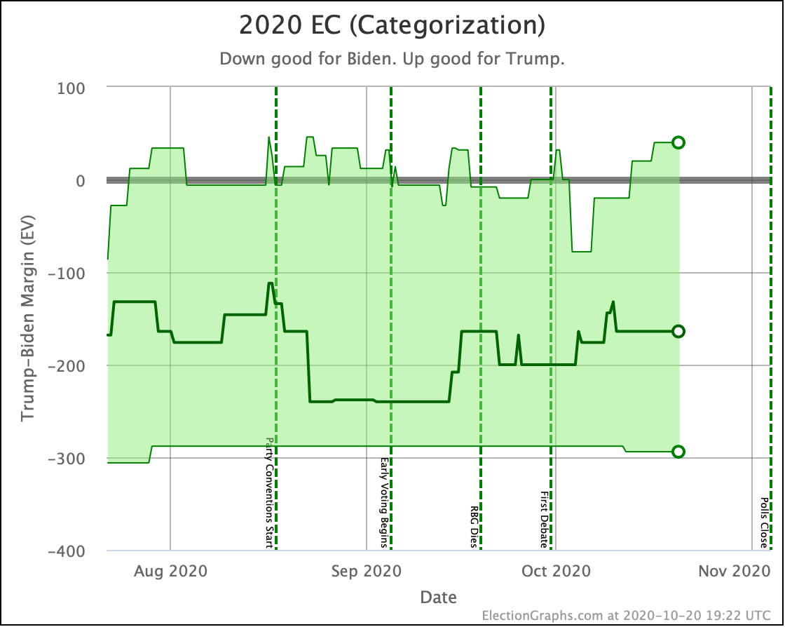
There has been no substantive change to the race in months. All of these charts just show little bounces up and down as polls move in and out of the averages.
Fundamentally, the race looks the same now as it did at the beginning of August or even mid-June.
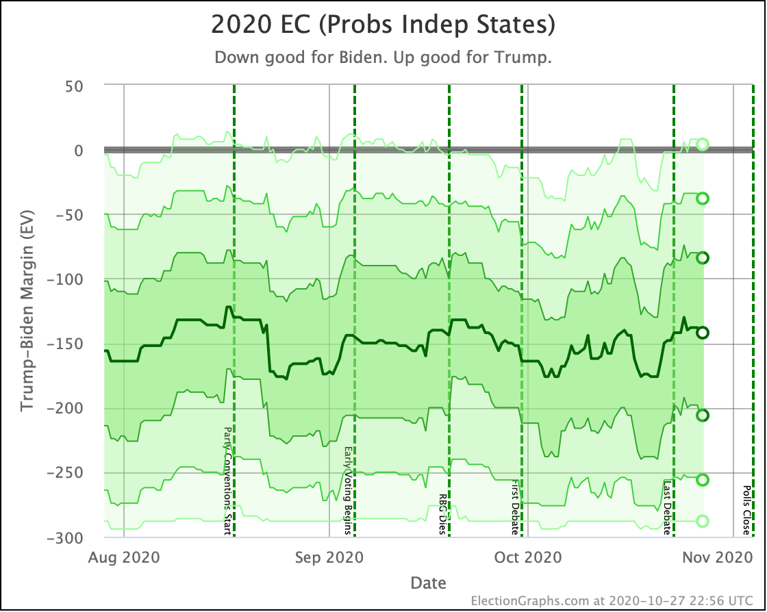
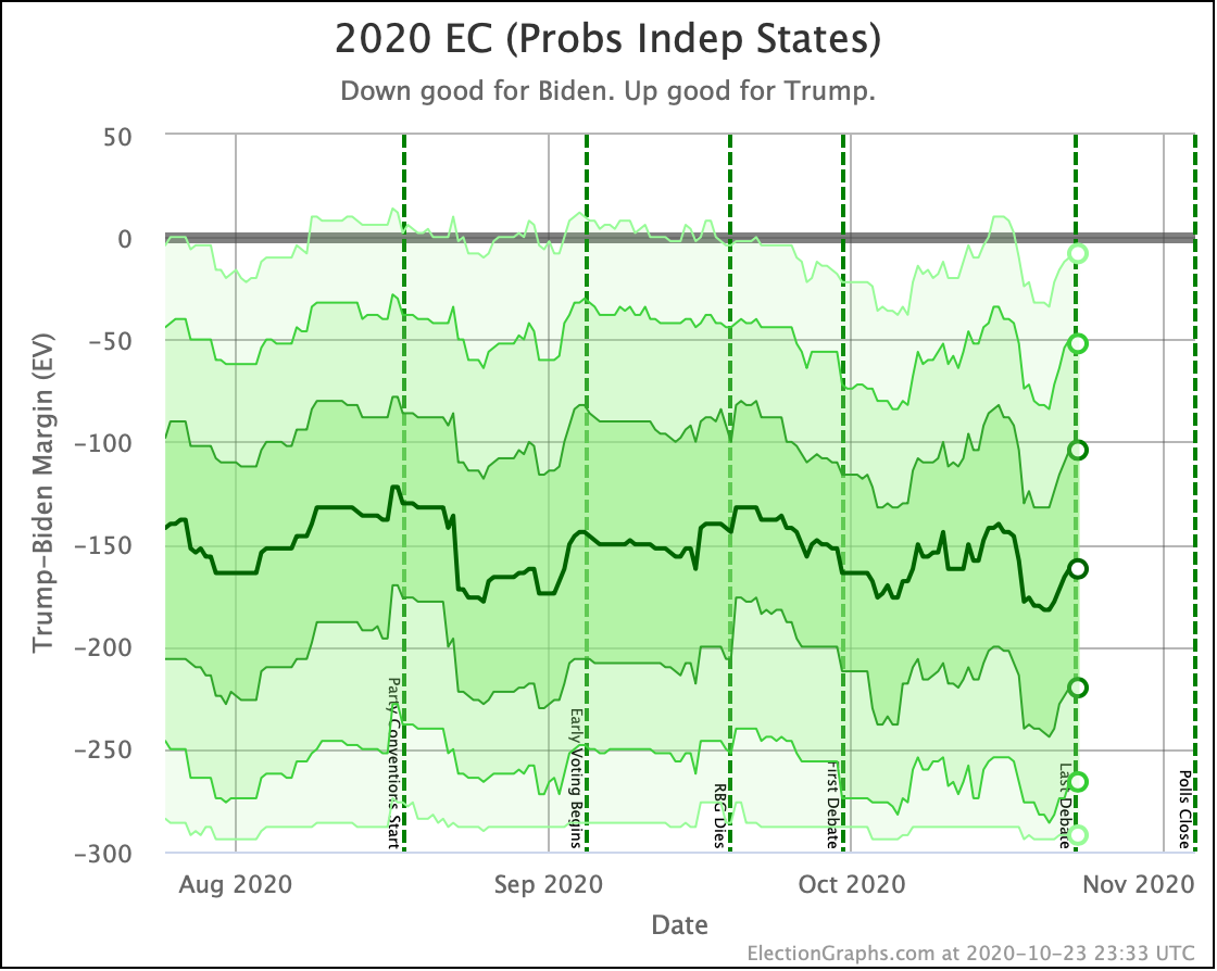
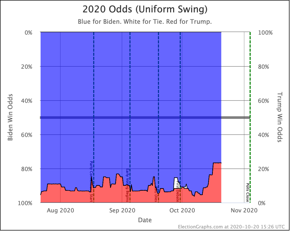
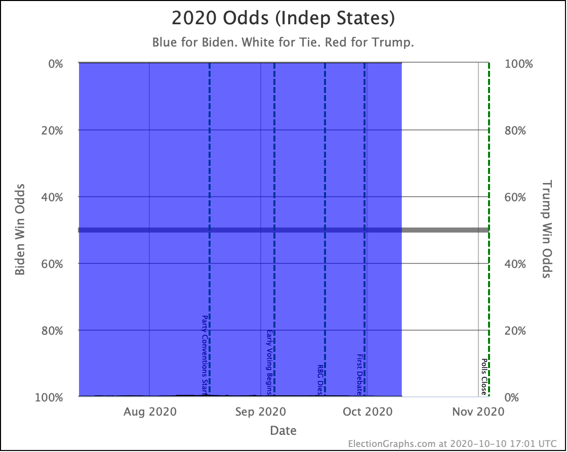
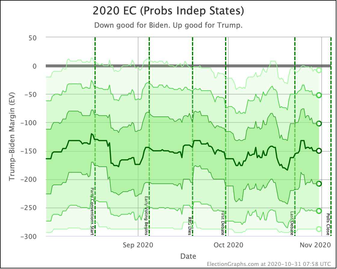
In terms of odds from the probabilistic views, the Independent states chart still looks like a big blue square. Biden's chances in that model have been pegged near 100% for many months.
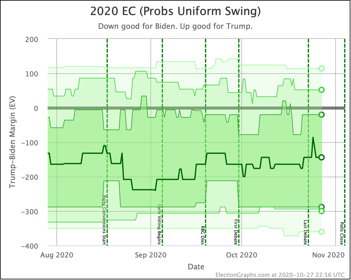
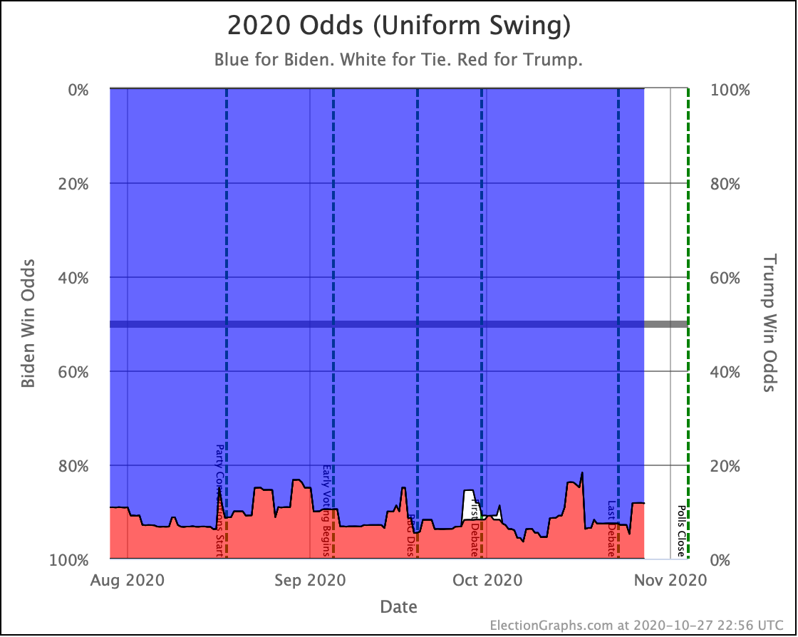
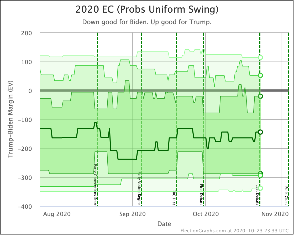
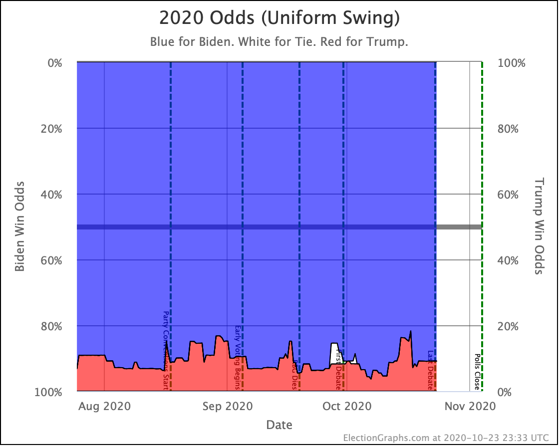
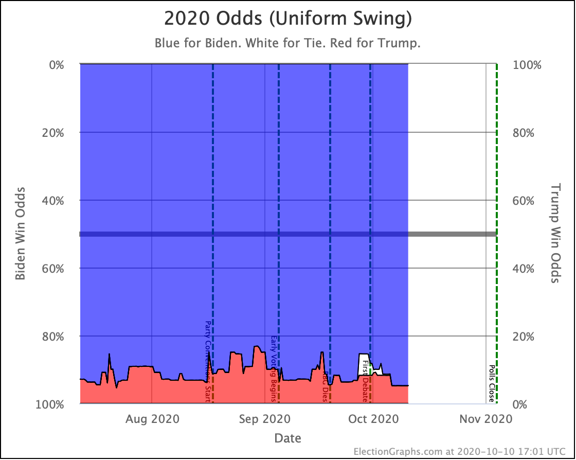
So looking at Uniform Swing…
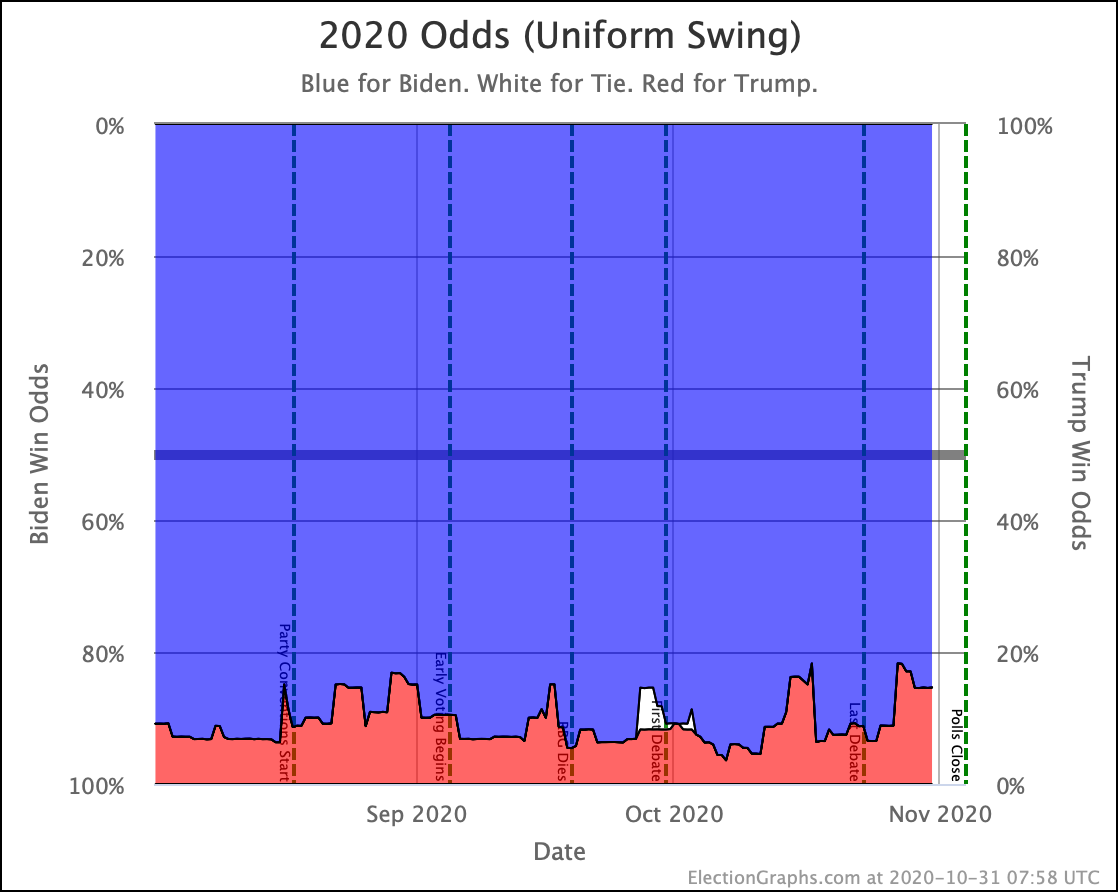
In this view, Trump is now at a 14.6% chance of winning. That is higher than his chances have usually been, but not out of the range we have seen.
Since both of these models are extremes, the official Election Graphs statement on Trump's chances at this point is "between 0.1% and 14.6%".
We don't officially specify a spot within that range since we haven't modeled how much correlation between states to expect, but I guess the midpoint is as good a value to look at as any other. The middle of that range is 7.4%. That intuitively feels reasonable. Not total correlation, not total independence, but right in between. And frankly, that seems to be in the same general ballpark as all the big players who are doing election modeling. So call it 7.4%.
At 7.4%, Trump has about a 1 in 14 chance of winning. That would clearly be an upset, but is not so far out of the realm of possibility that people should be thinking about it as if a Biden win was a done deal. Of course, because of 2016, almost nobody is.
By contrast, Trump was at about 14% in 2016 if you looked at the median of all the sites giving odds. That would be about a 1 in 7 chance of winning.
So yes, Biden's polling lead is not so great you can say that there is a negligible chance of a Trump upset, but the chances of that kind of an upset are around half what they were in 2016.
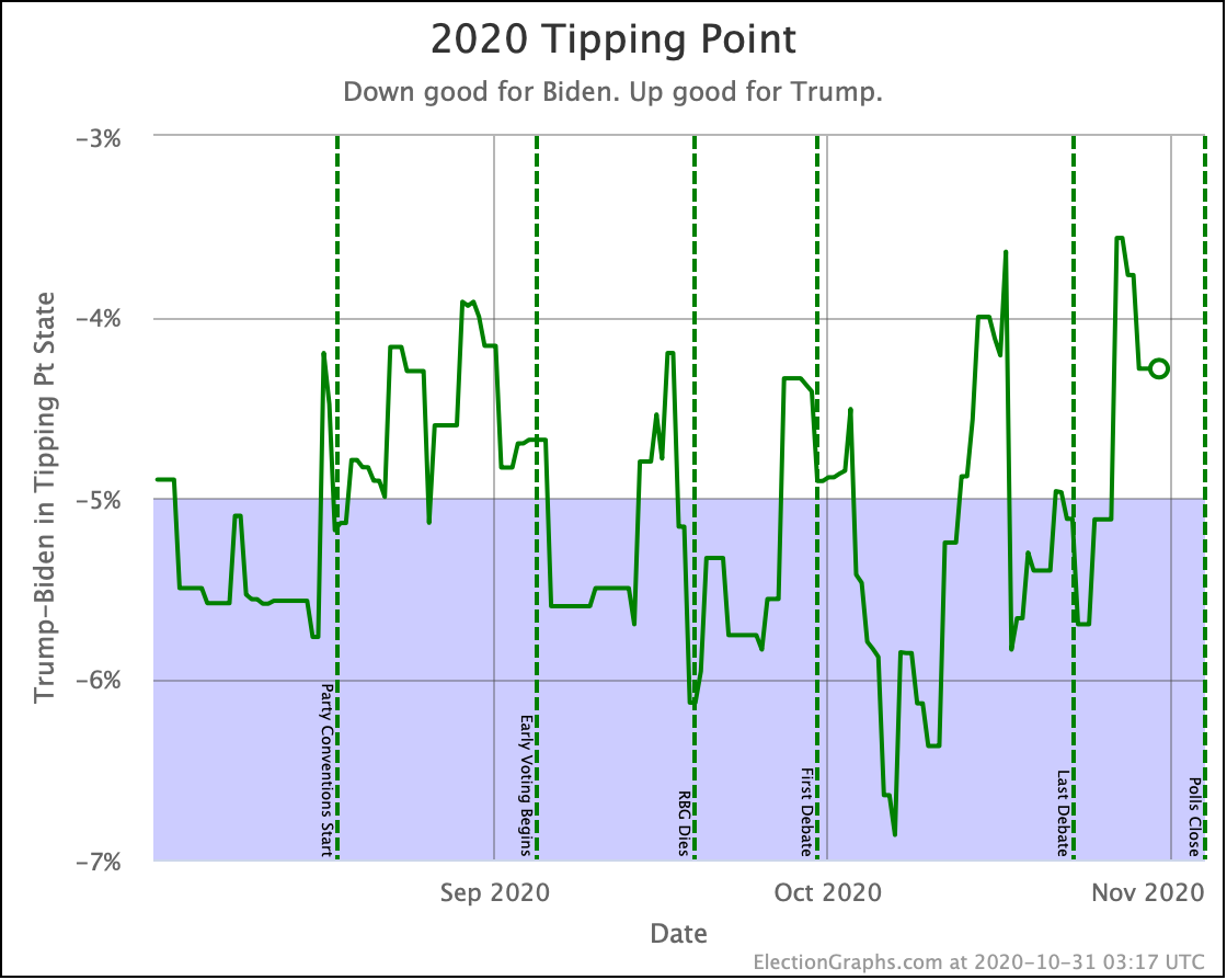
This is just zooming in on the Tipping Point line without the 2016 comparison. Like all the other charts, this shows some bouncing around, but fundamentally a static race. The few times it looked like we might have been breaking into new territory in one direction or the other, it has proven to only be a short term spike once more data came in.
Of course, there is no guarantee that something won't change in the last few days, but there simply isn't much time left for a significant change.
Looking at this spectrum, one thing that you can look at more clearly than some of the other views is imagining polling errors of the sizes we have seen in the last three elections.
As measured by the difference between the final Election Graphs tipping point, and the actual tipping point based on votes cast in the elections, you had these errors:
- 2008: 3.45%
- 2012: 0.89%
- 2016: 2.36%
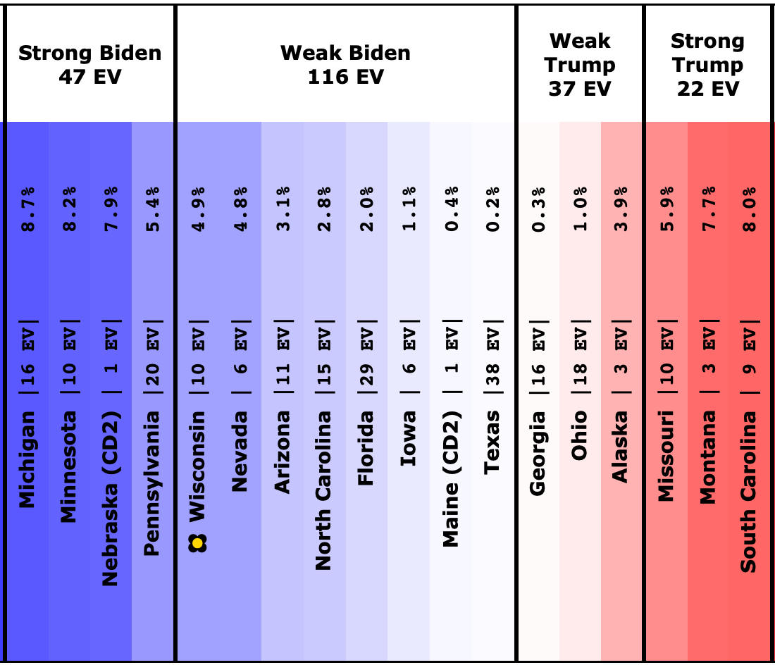
Assuming uniform swing, and that the polls are overestimating Biden:
- 2012 level error: Just our expected case, Biden wins by 176 EV
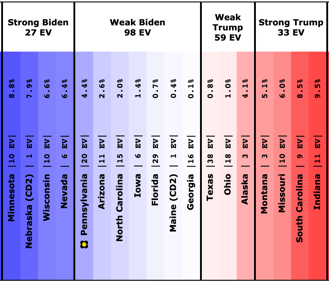
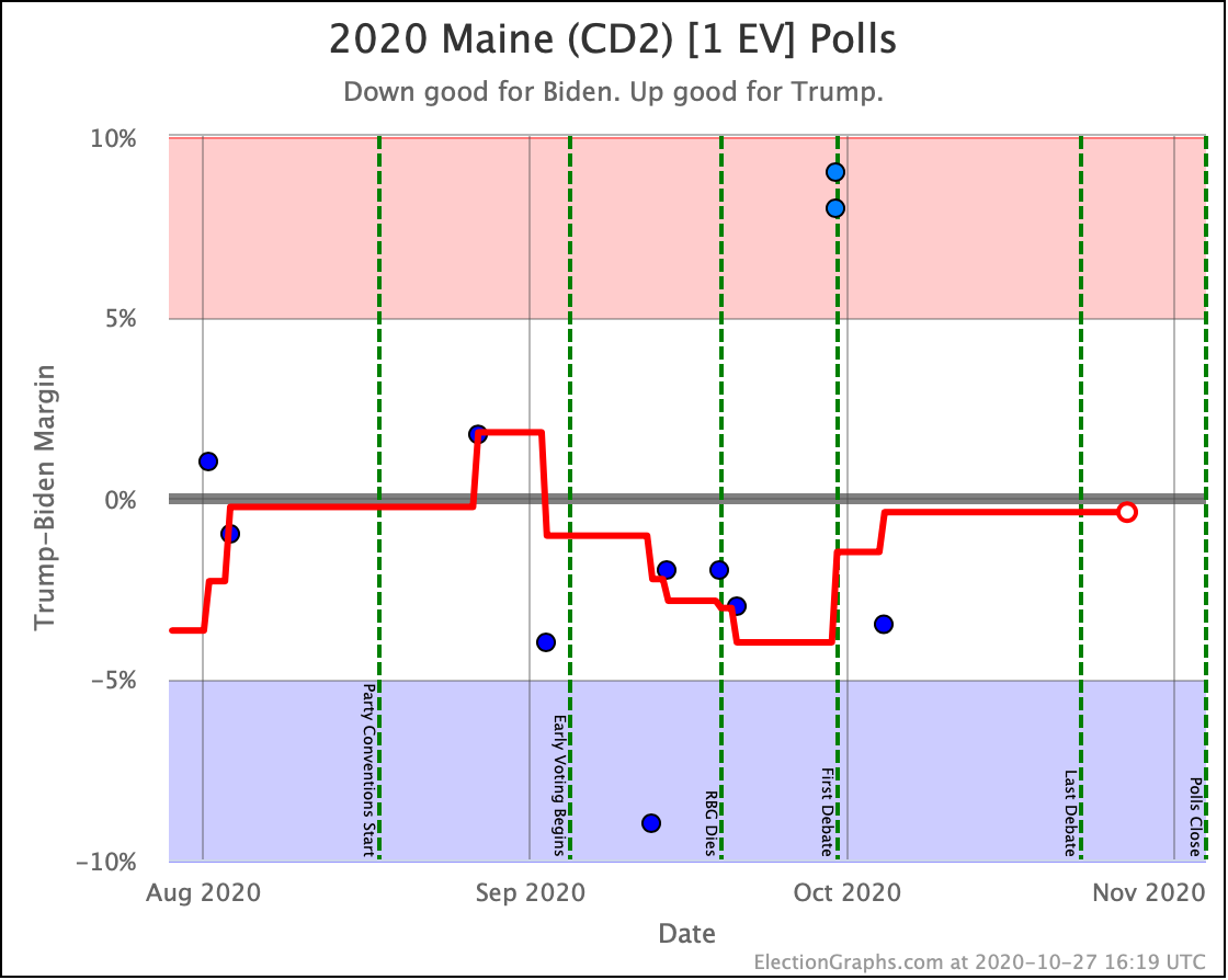
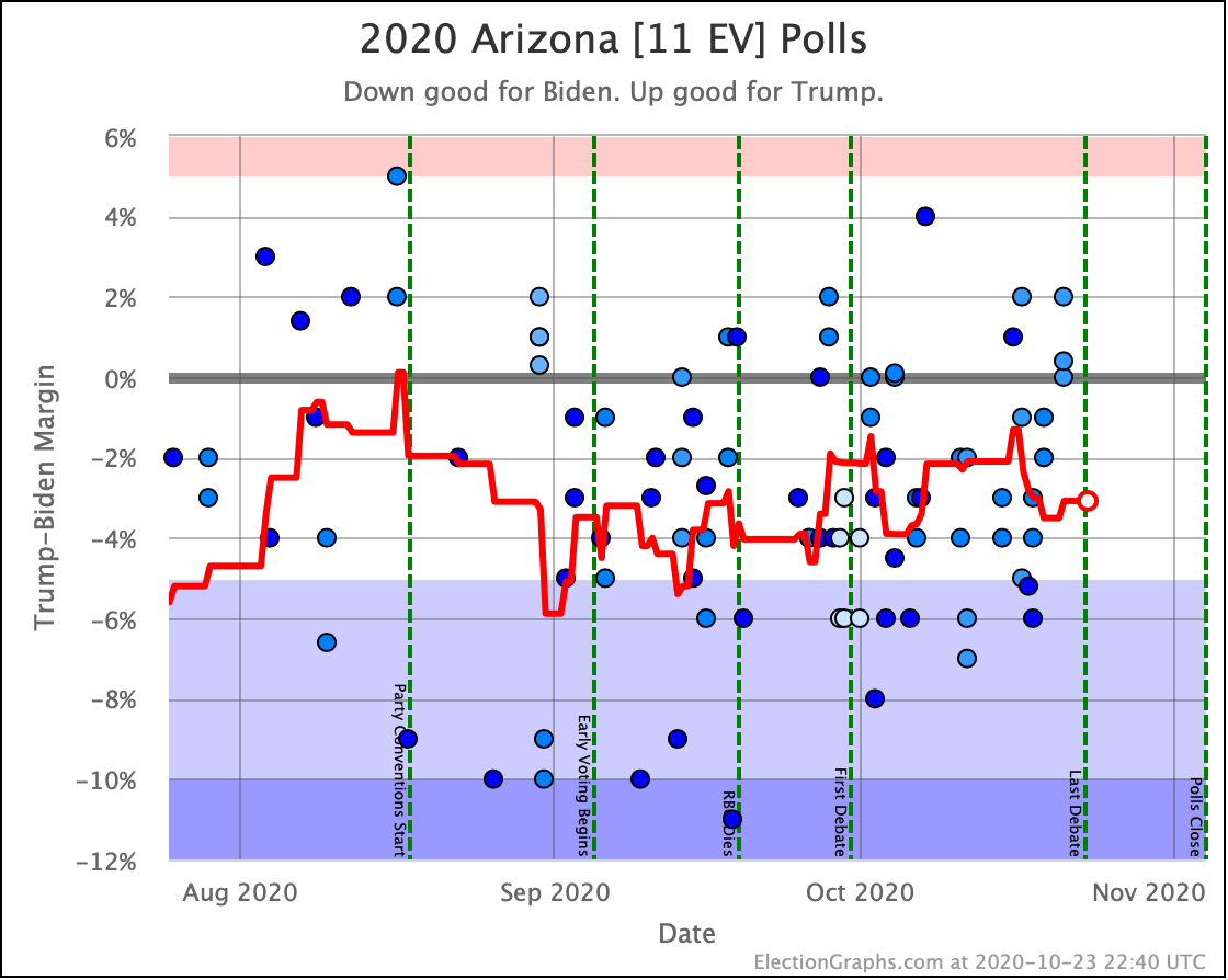
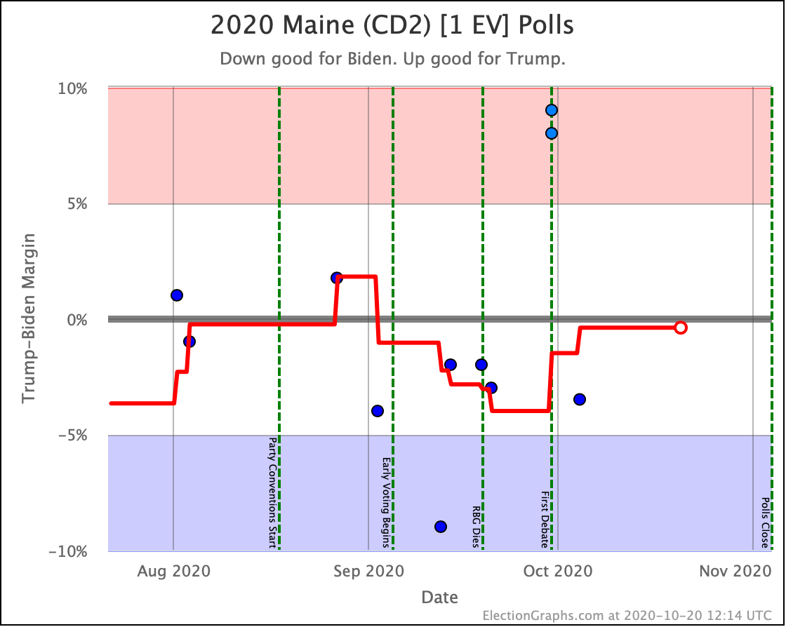
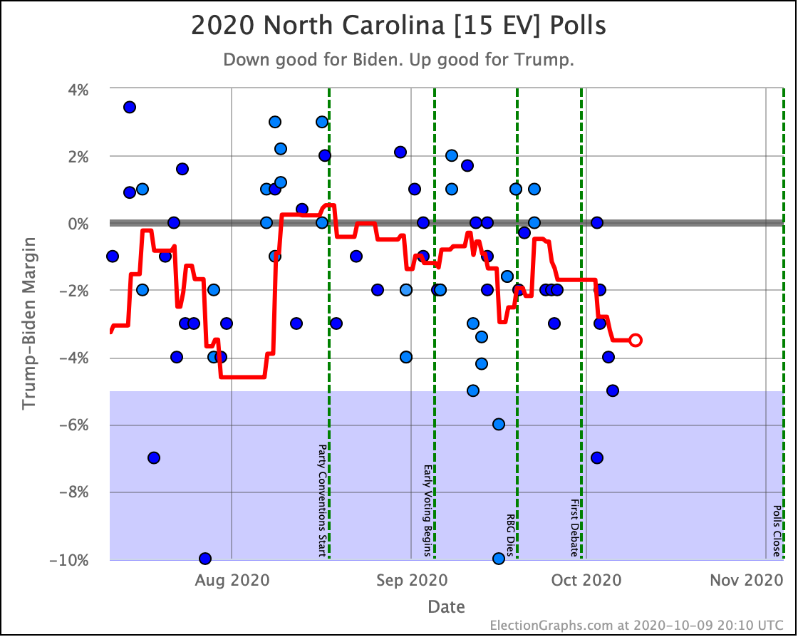
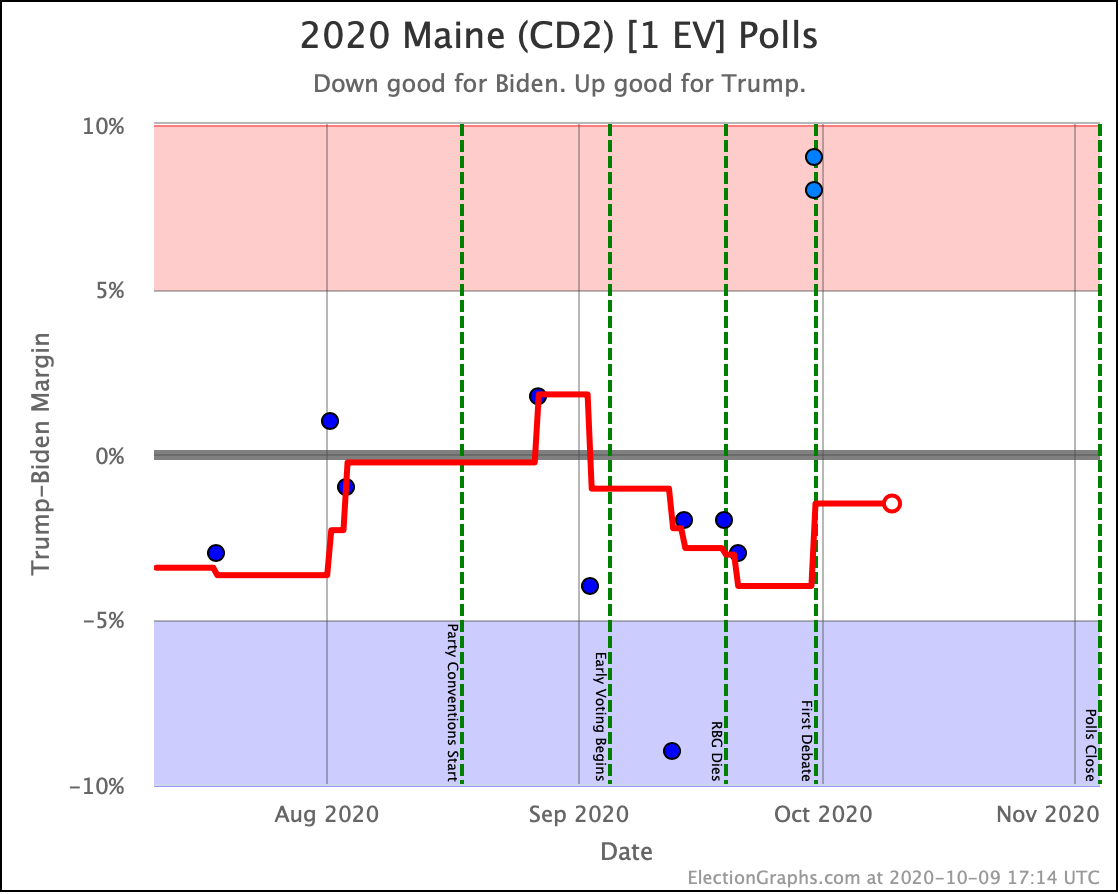
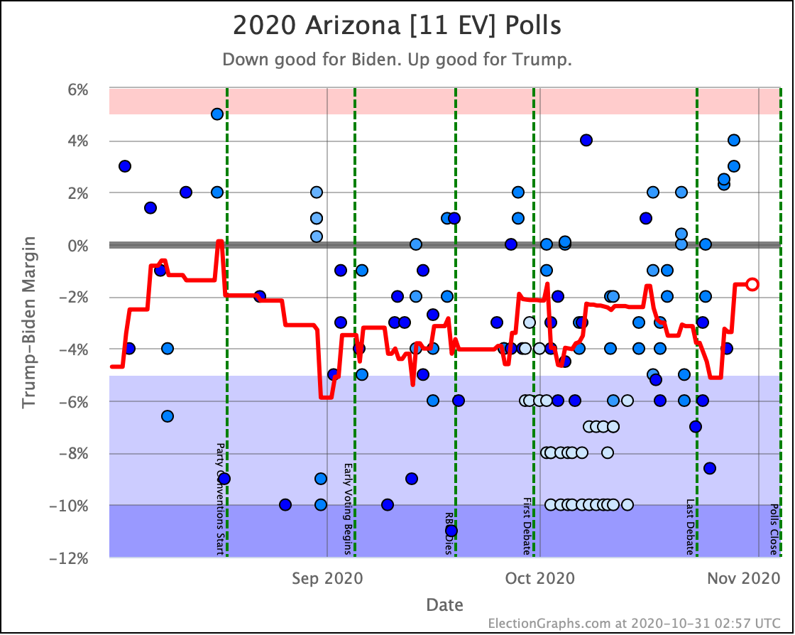
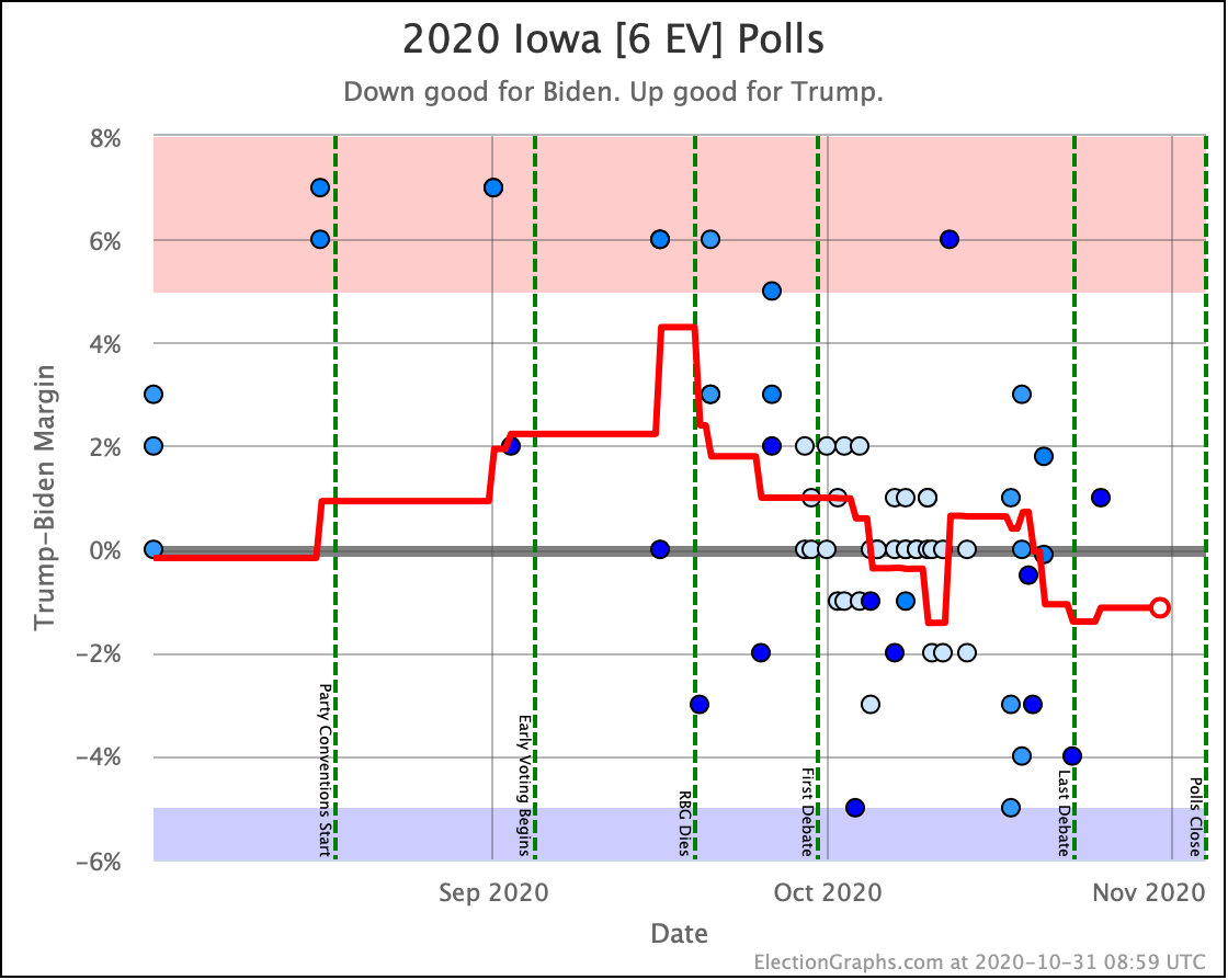
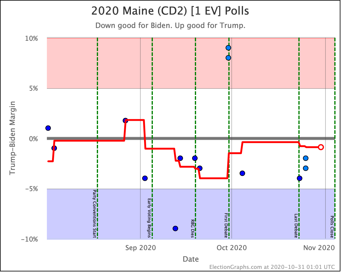
- 2016 level error: Trump wins the states he leads, plus Maine CD2, Iowa, Arizona, and North Carolina. Biden still wins, but only by 110 EV.
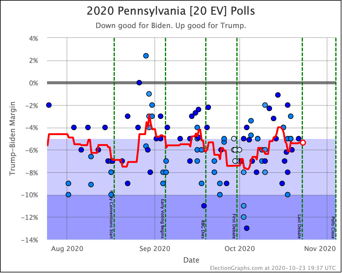
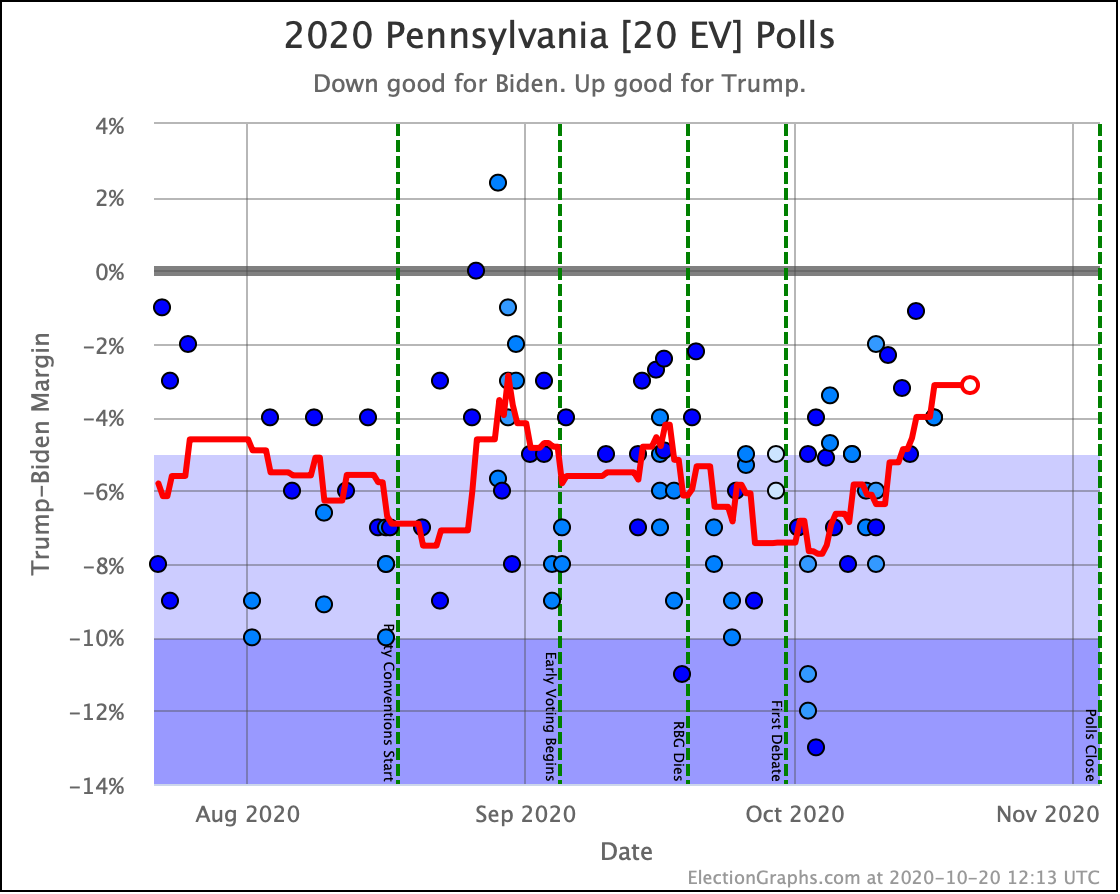
- 2008 level error: Trump wins all the states above, plus Georgia and Florida. Biden still wins, but only by 20 EV, and with only an 0.85% margin in the tipping point state of Pennsylvania… perhaps within range of complicating things with recounts and court challenges.
So in order to win based on "polls were wrong" (rather than a last-minute move in the polls in the next few days), we would need a bigger polling error than we have seen in the last three cycles.
On the other hand, also assuming uniform swing, but this time assuming the polls are overestimating Trump:
- 2012 level error: Just our expected case, Biden wins by 176 EV
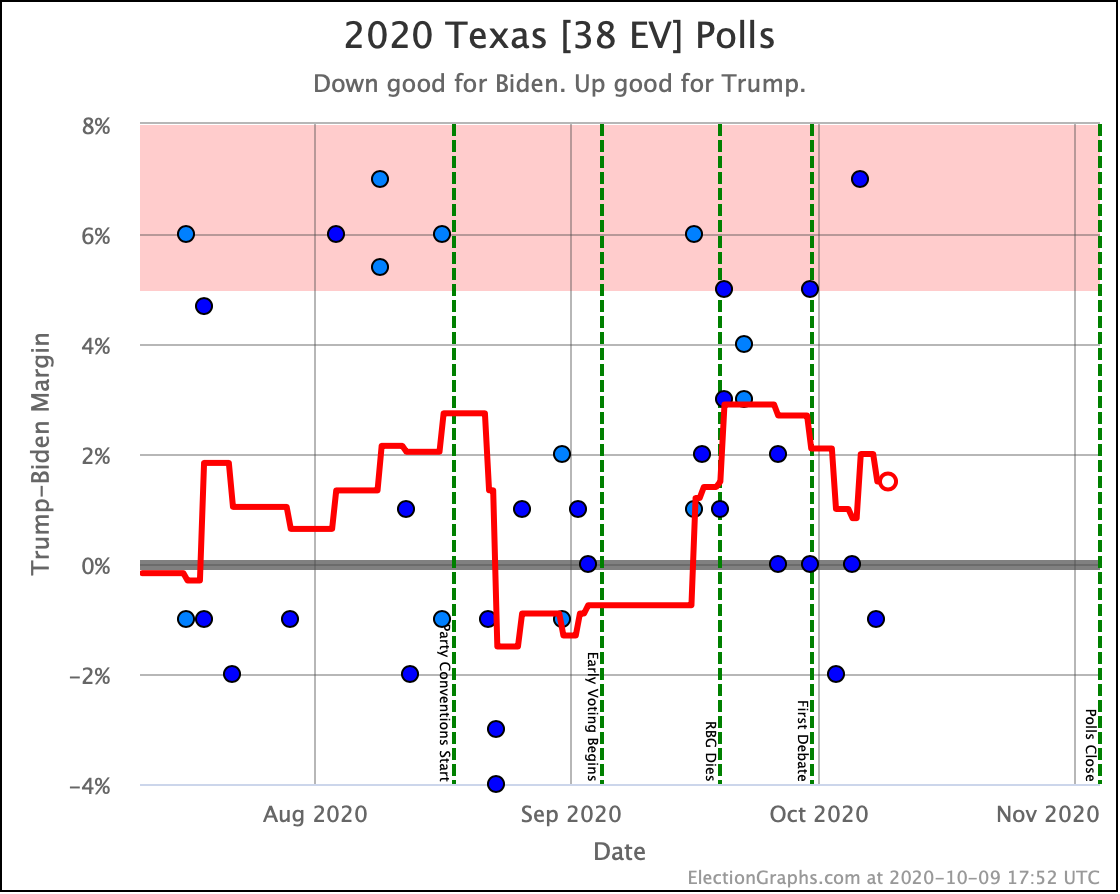
- 2016 level error: Biden wins all the states he leads, but also Ohio and Texas, which ends up at what we call Biden's best case, winning by 288 EV.
- 2008 level error: Biden by 288 EV. Same result as the 2016 level error. Even a 2008 level error isn't enough to pull in wins for Biden in the next closest states of Montana, Alaska, and Missouri.
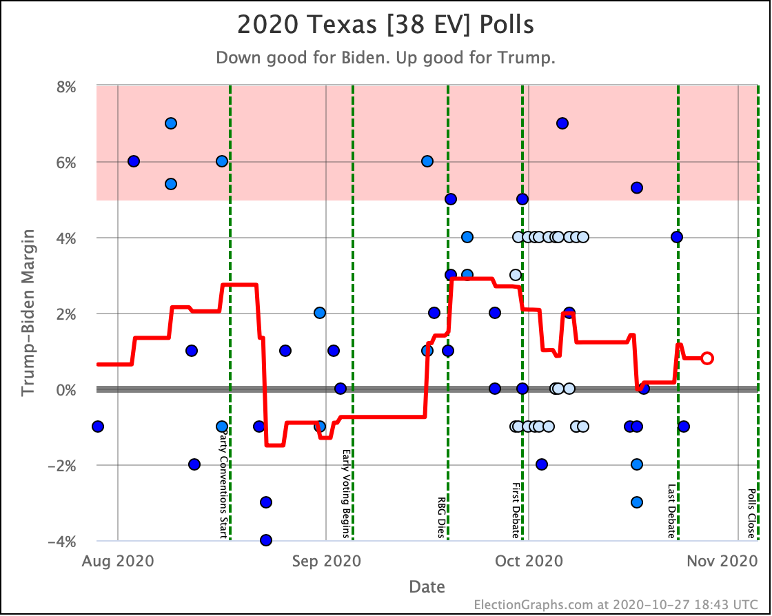
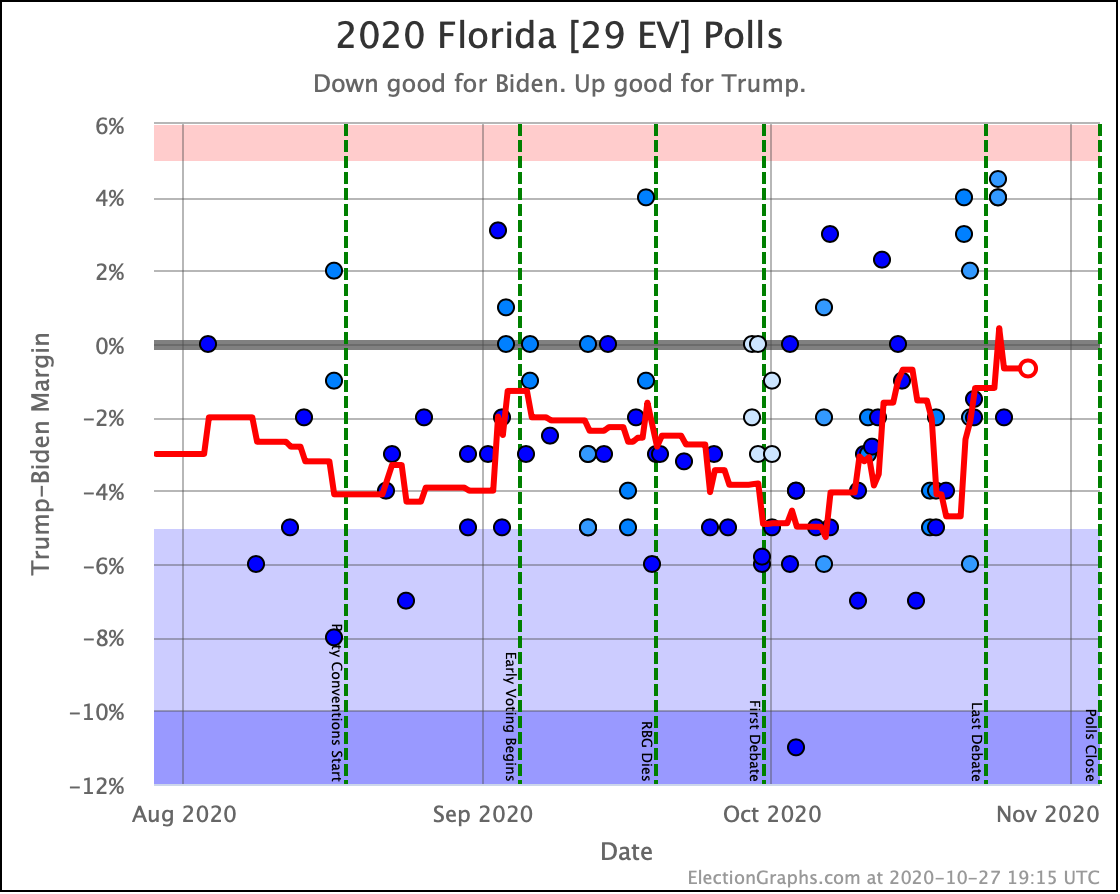
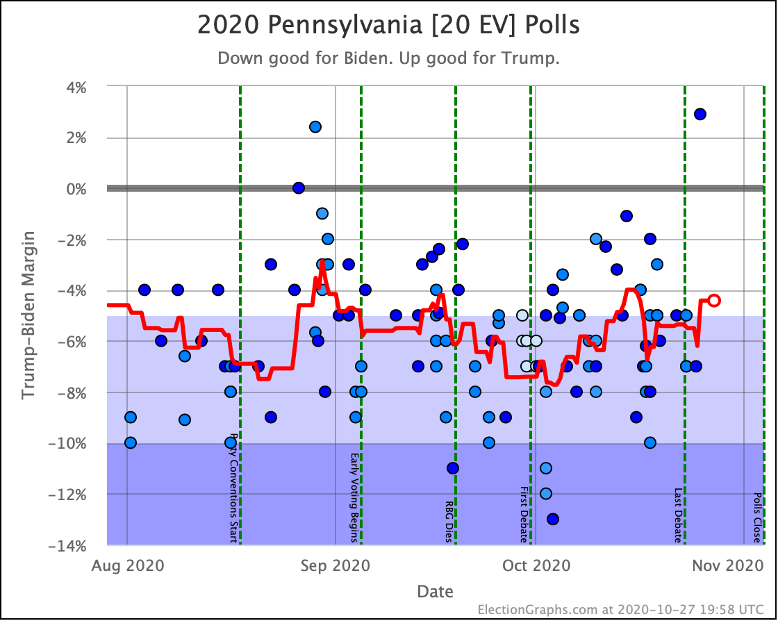
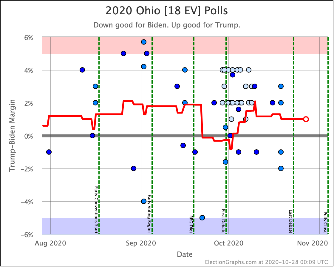
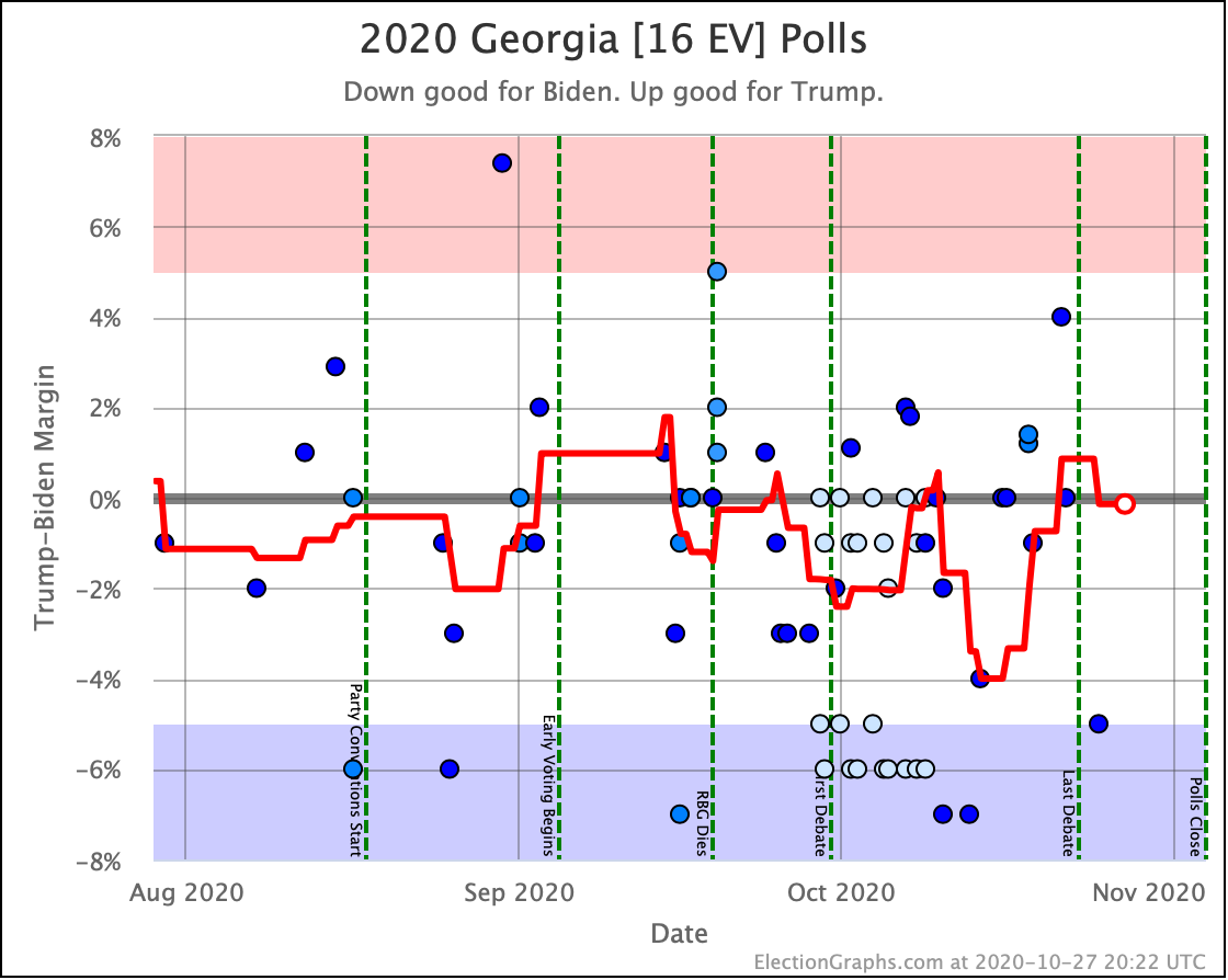
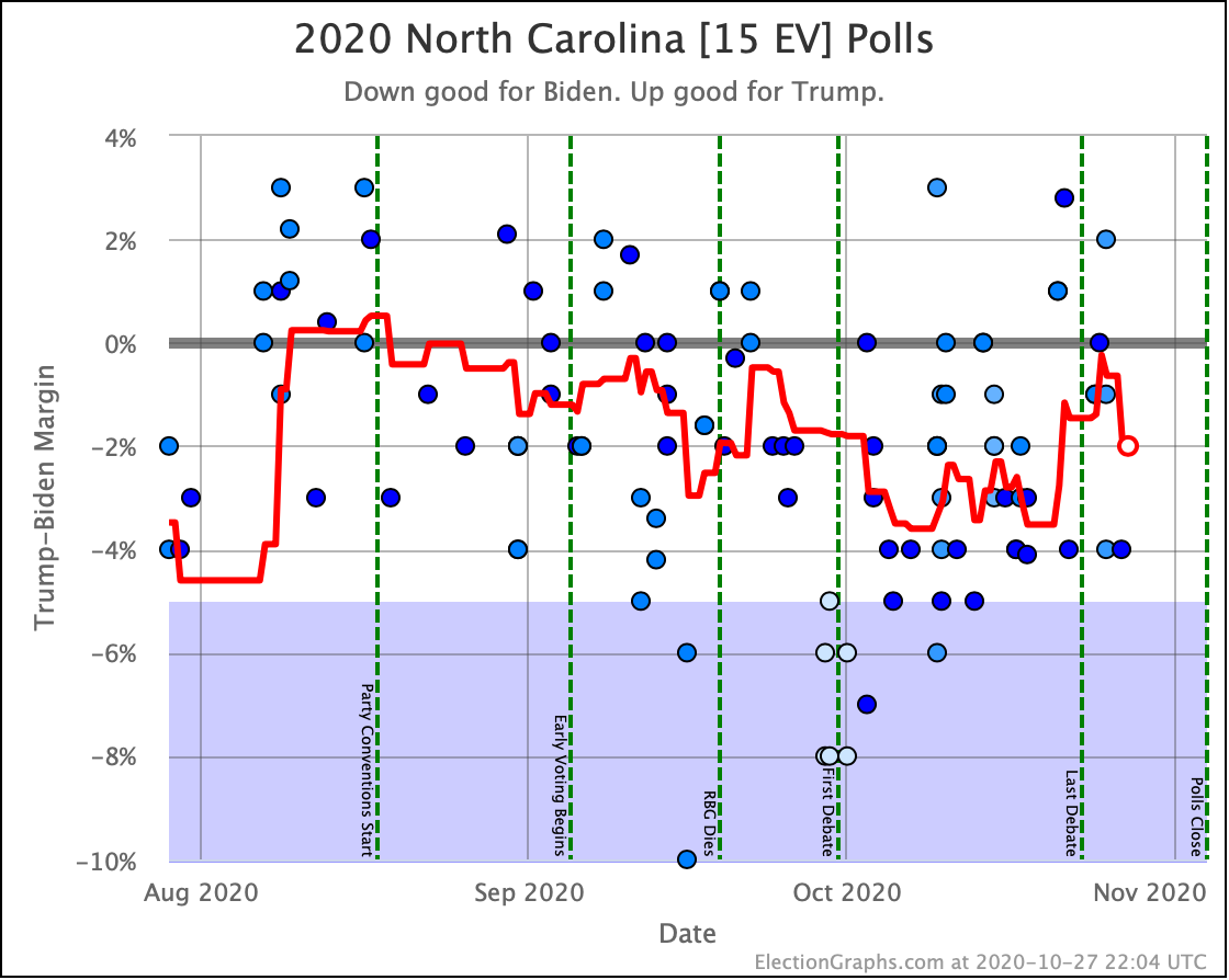
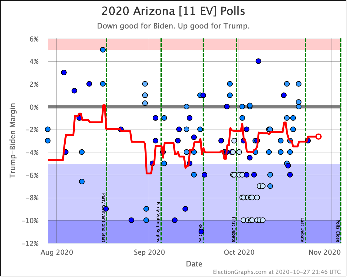
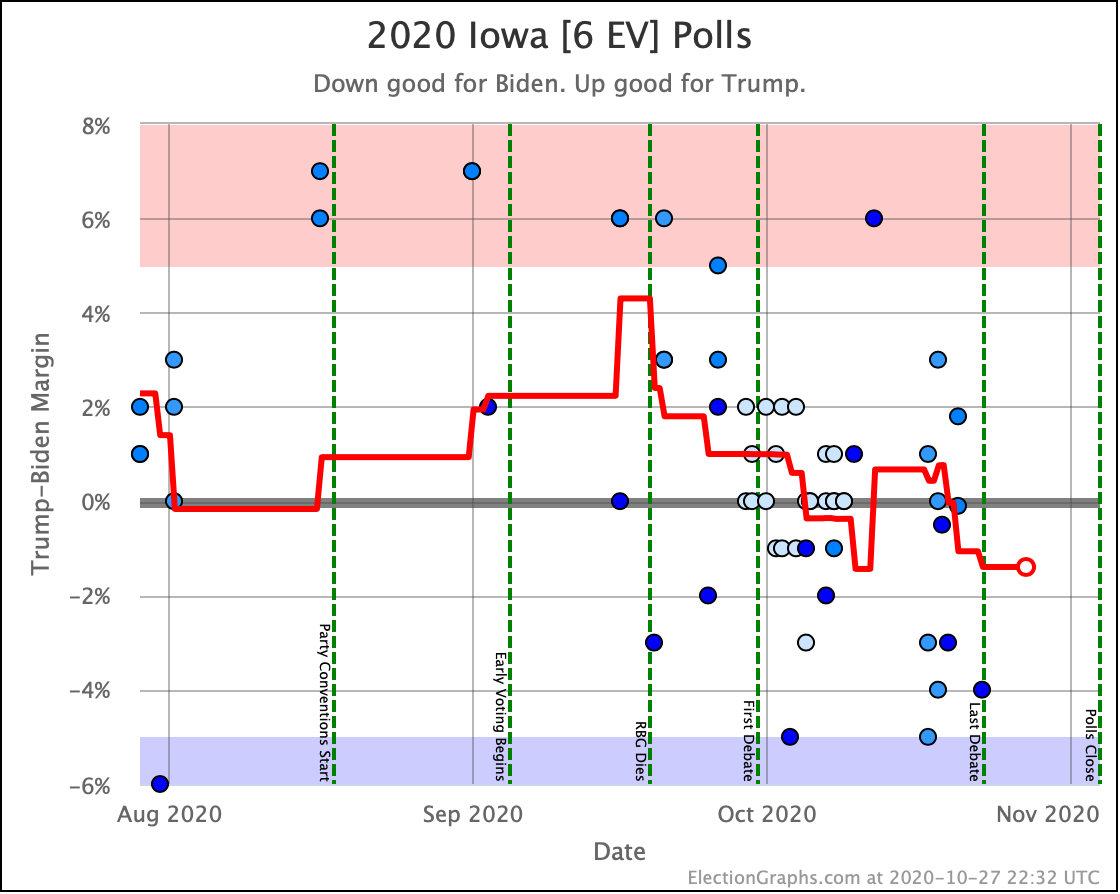
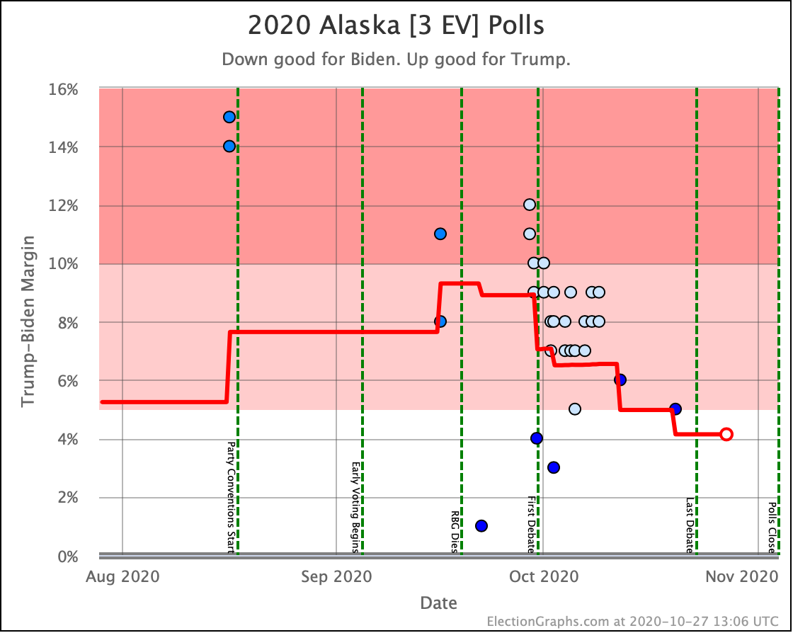
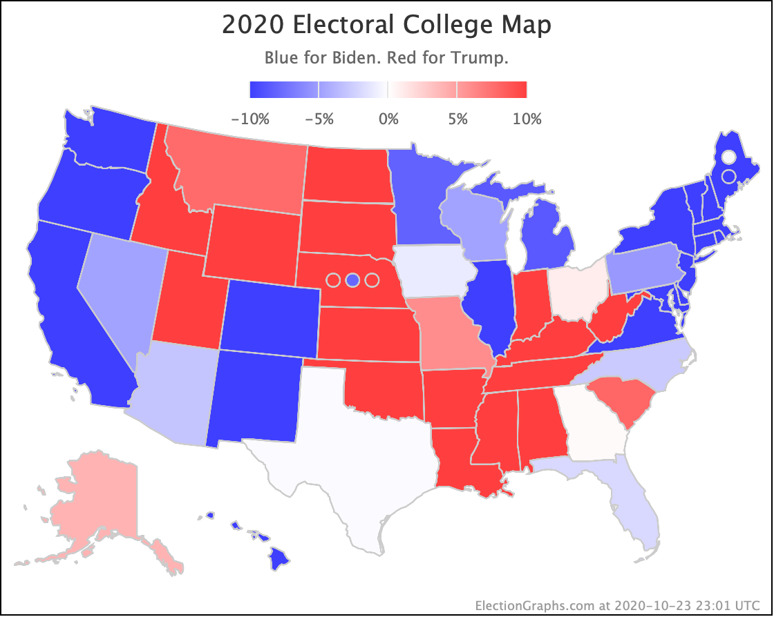
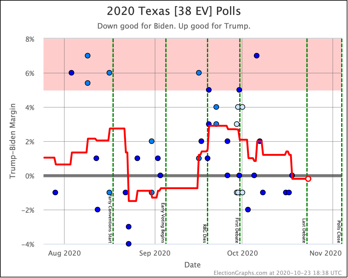
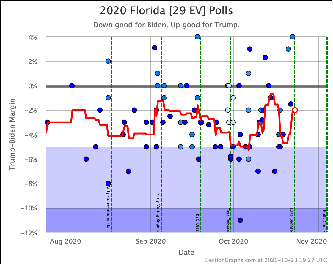
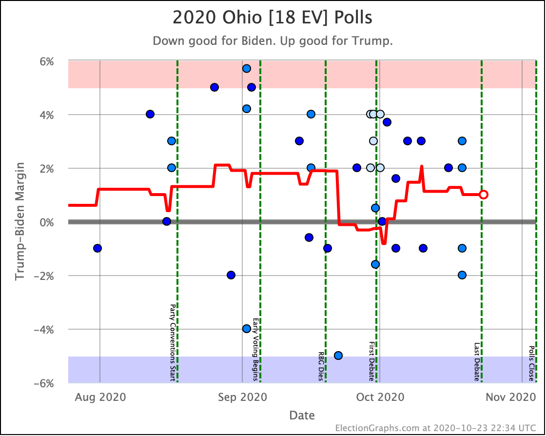
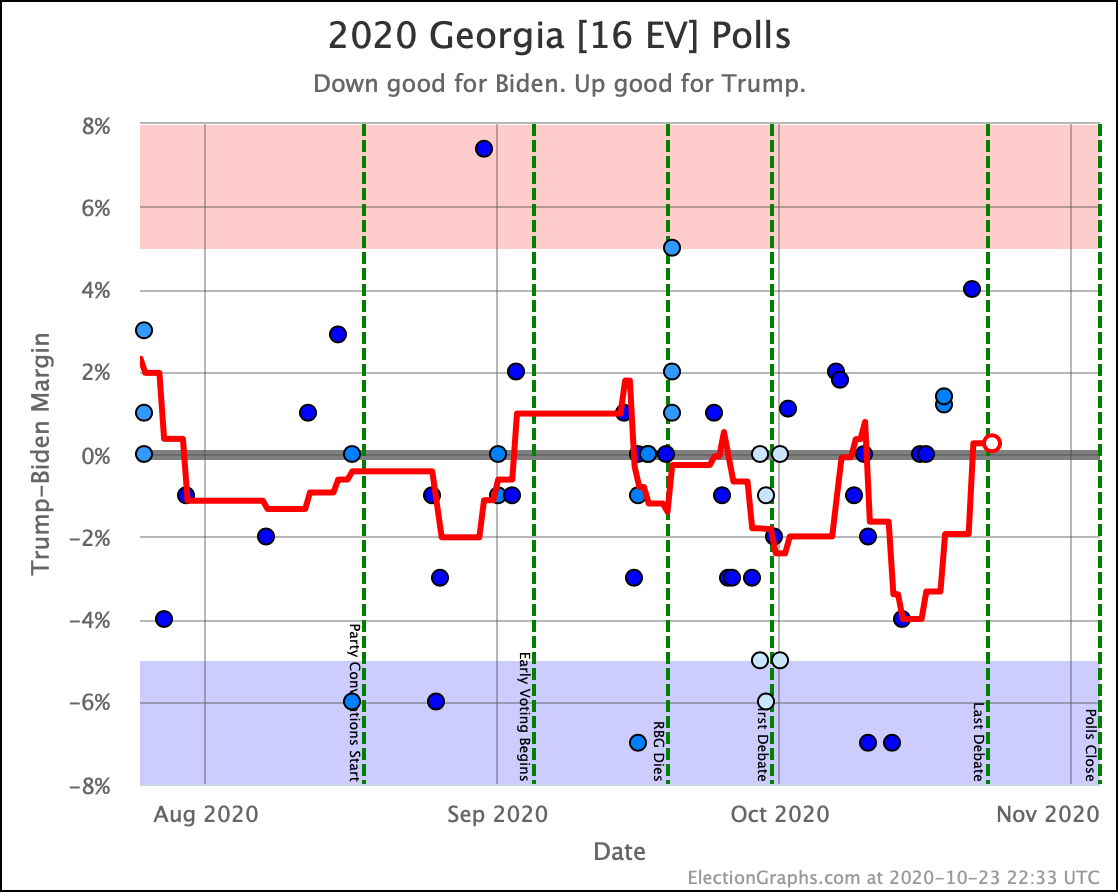
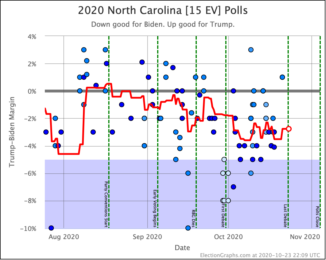
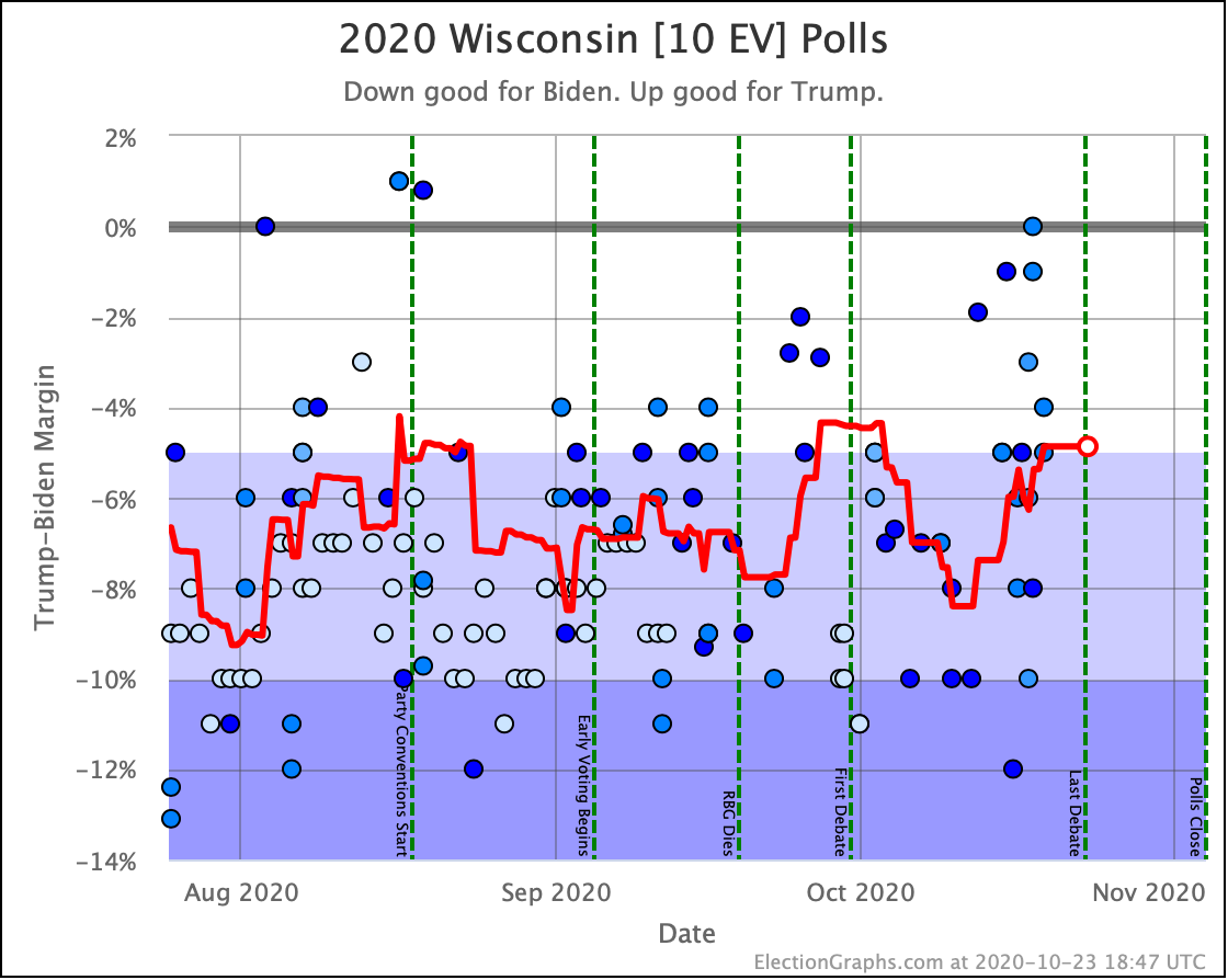
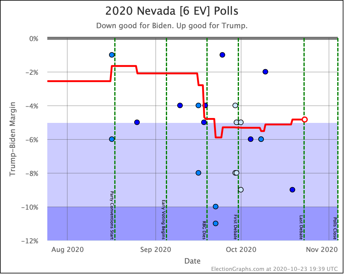
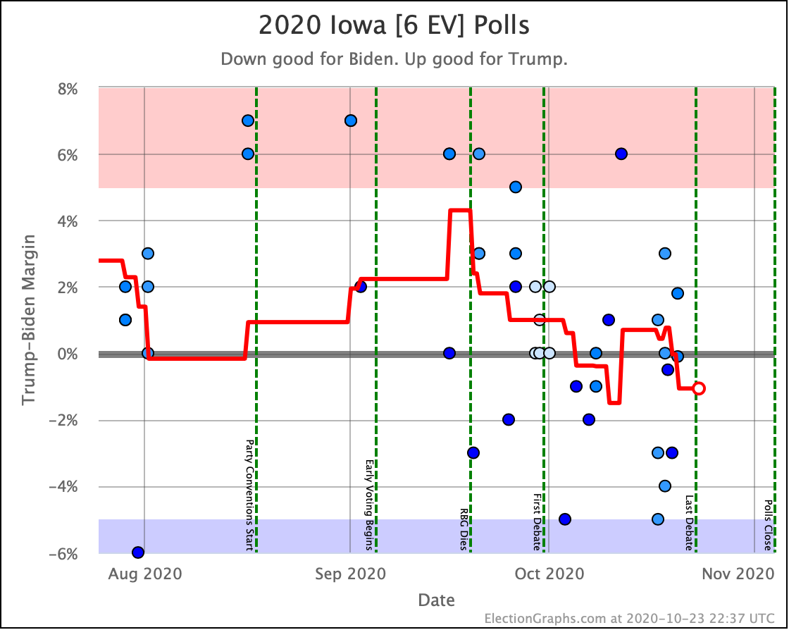
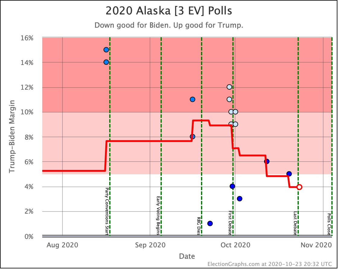
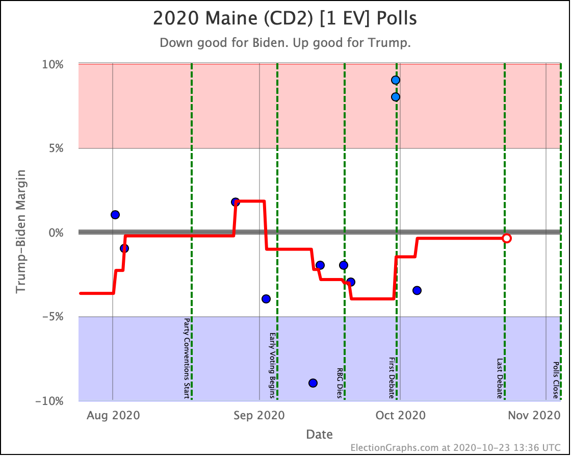
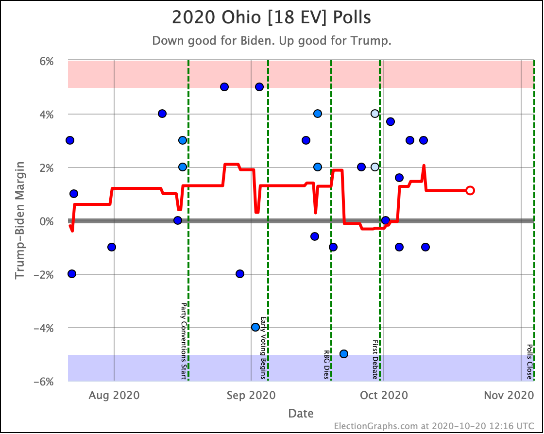
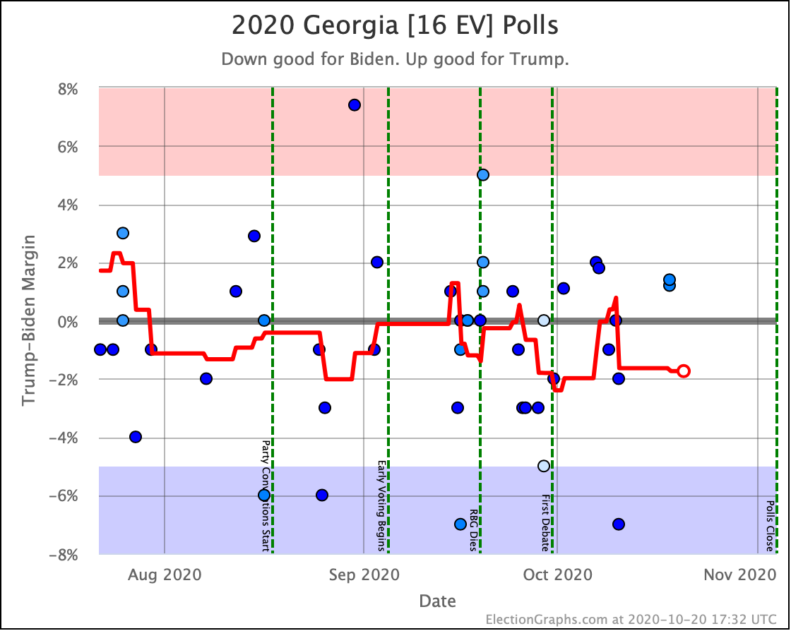
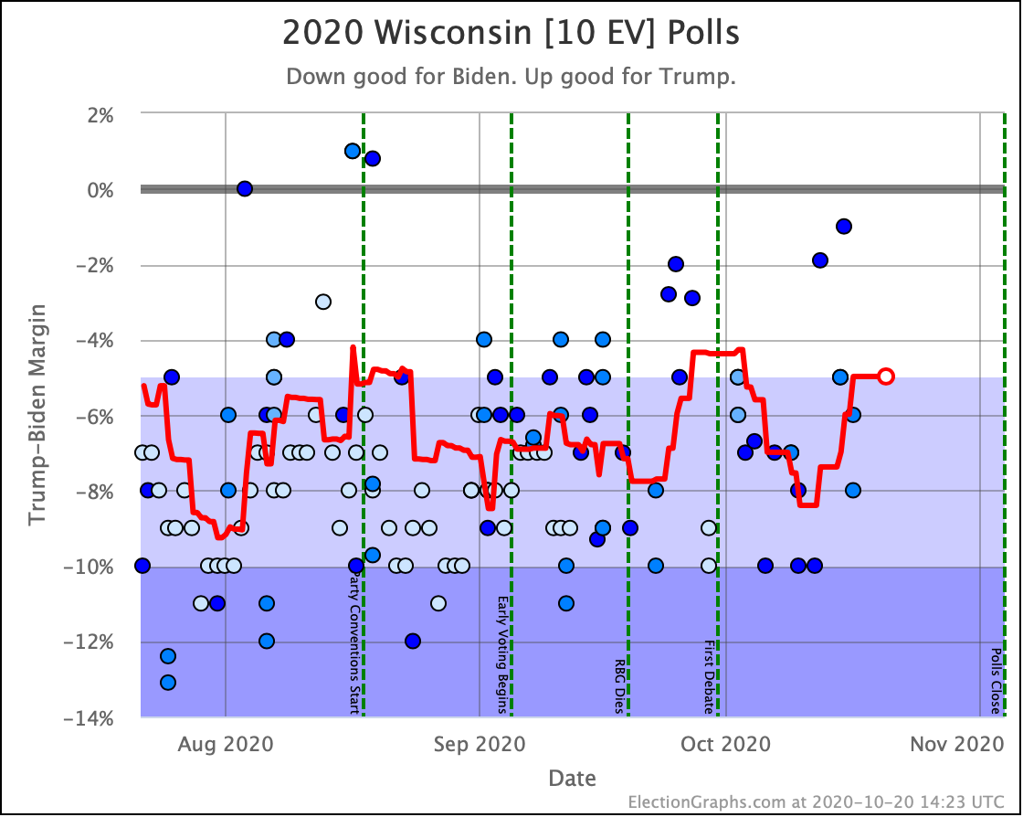
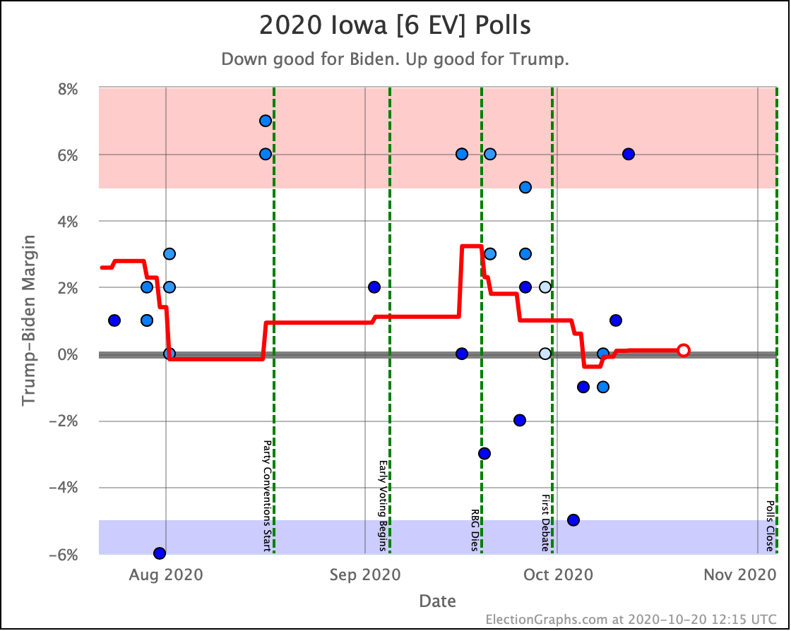
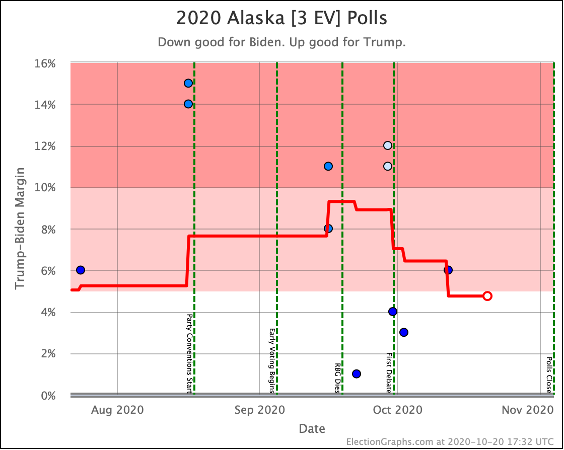
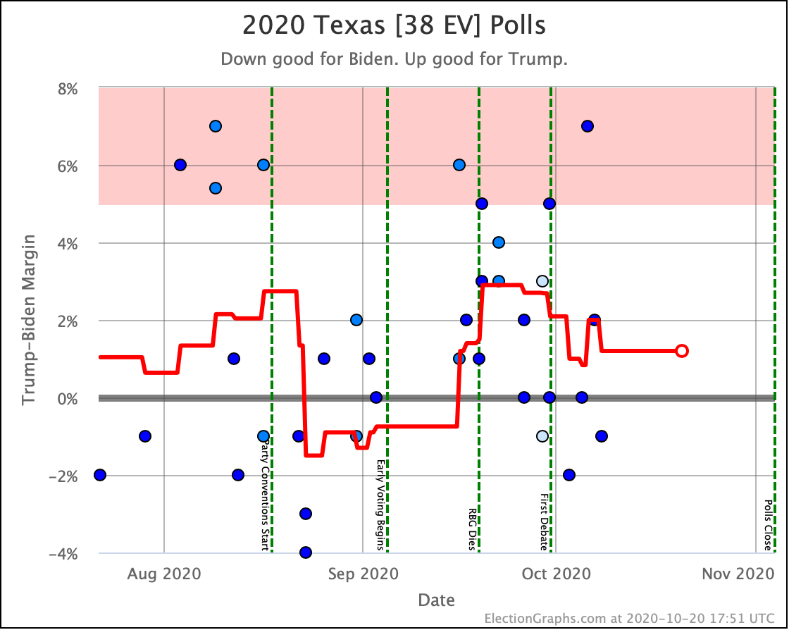
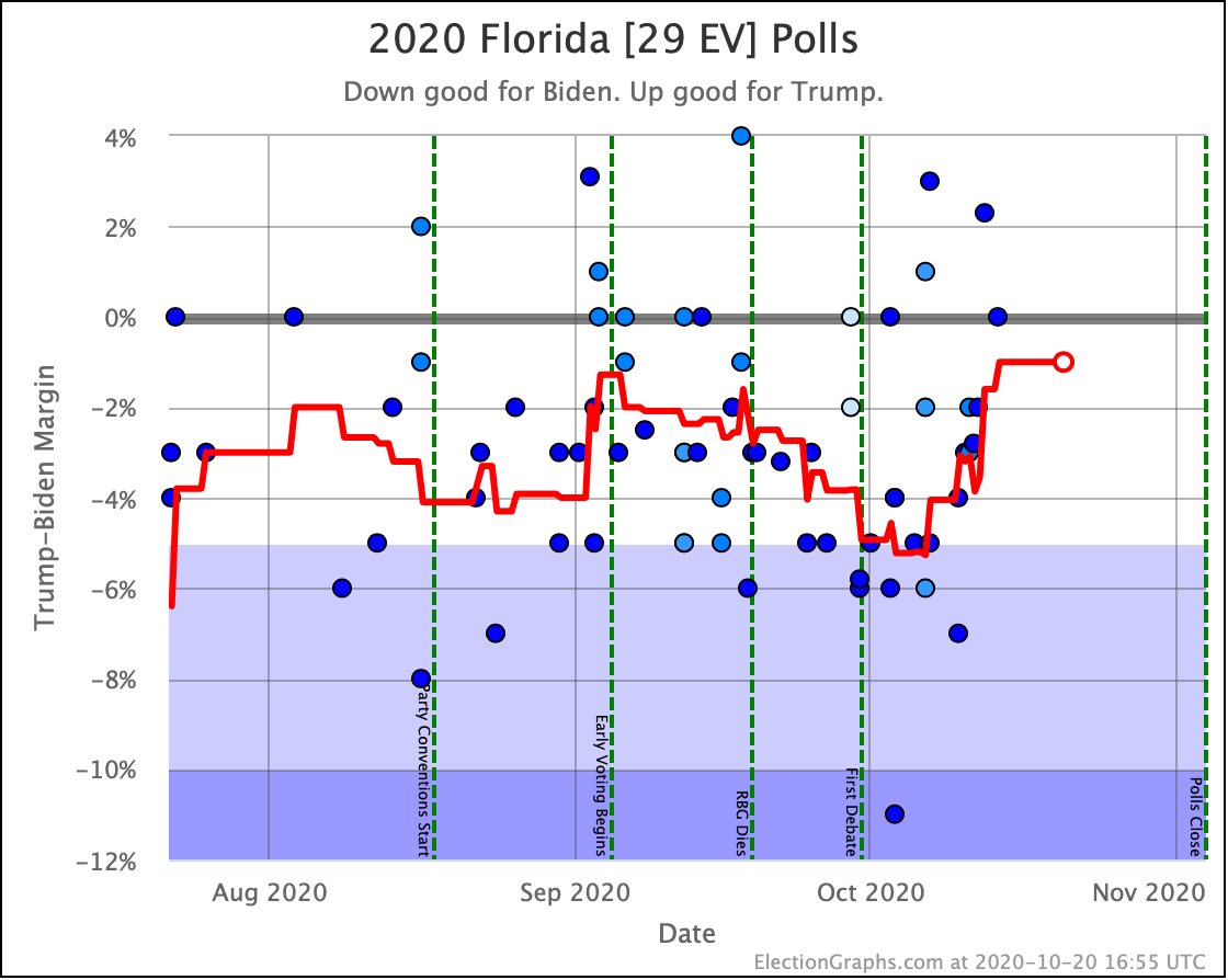
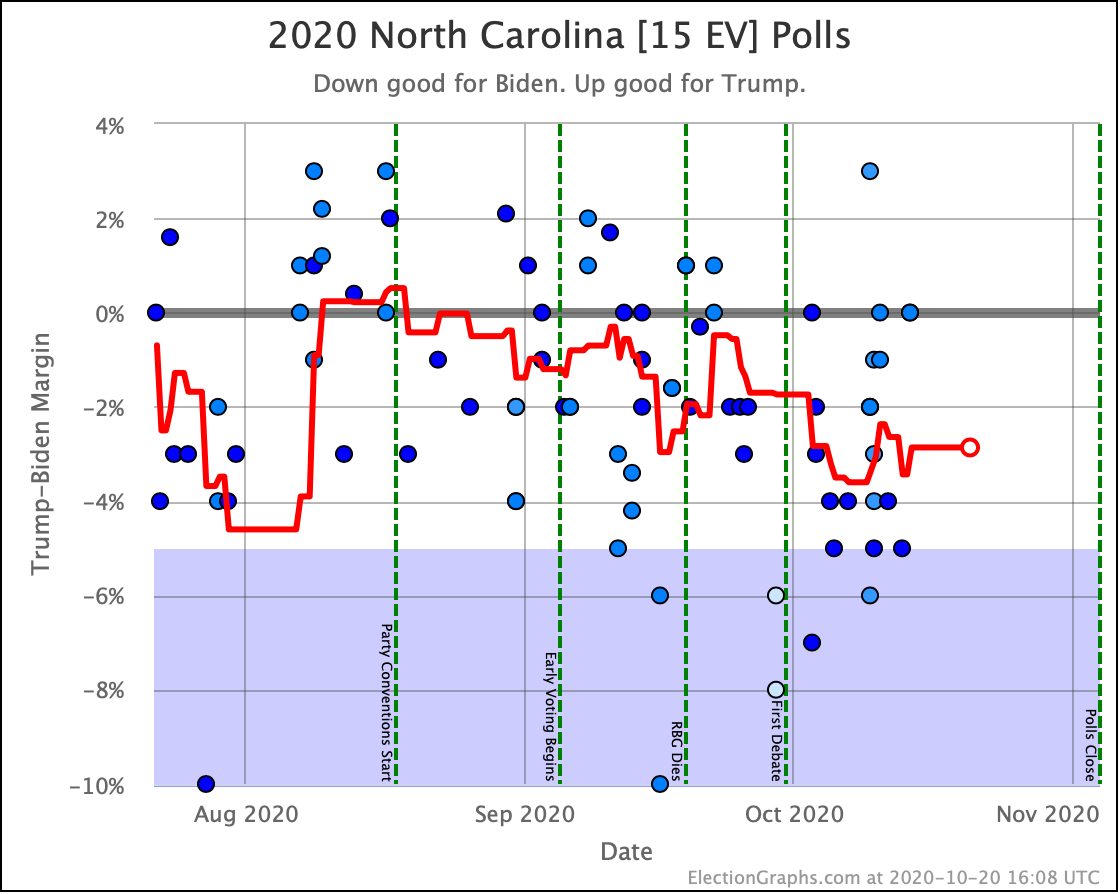
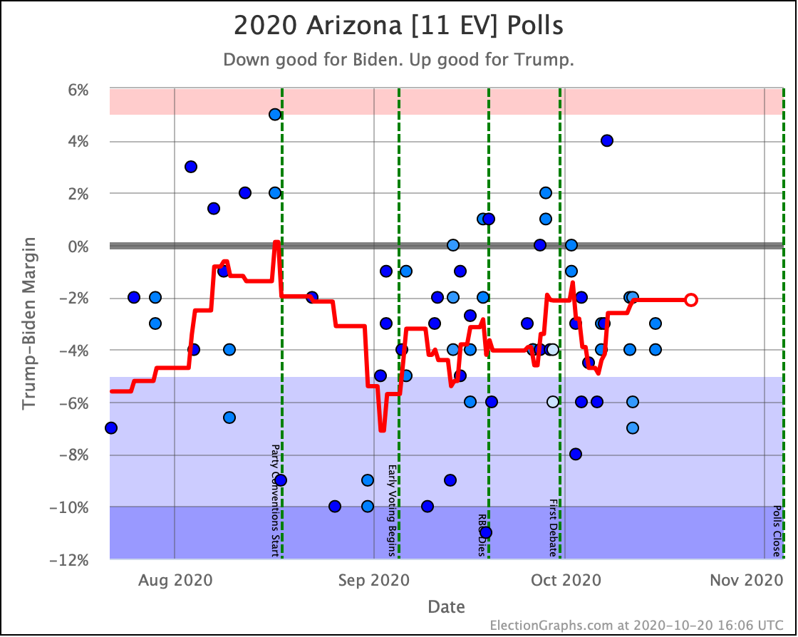
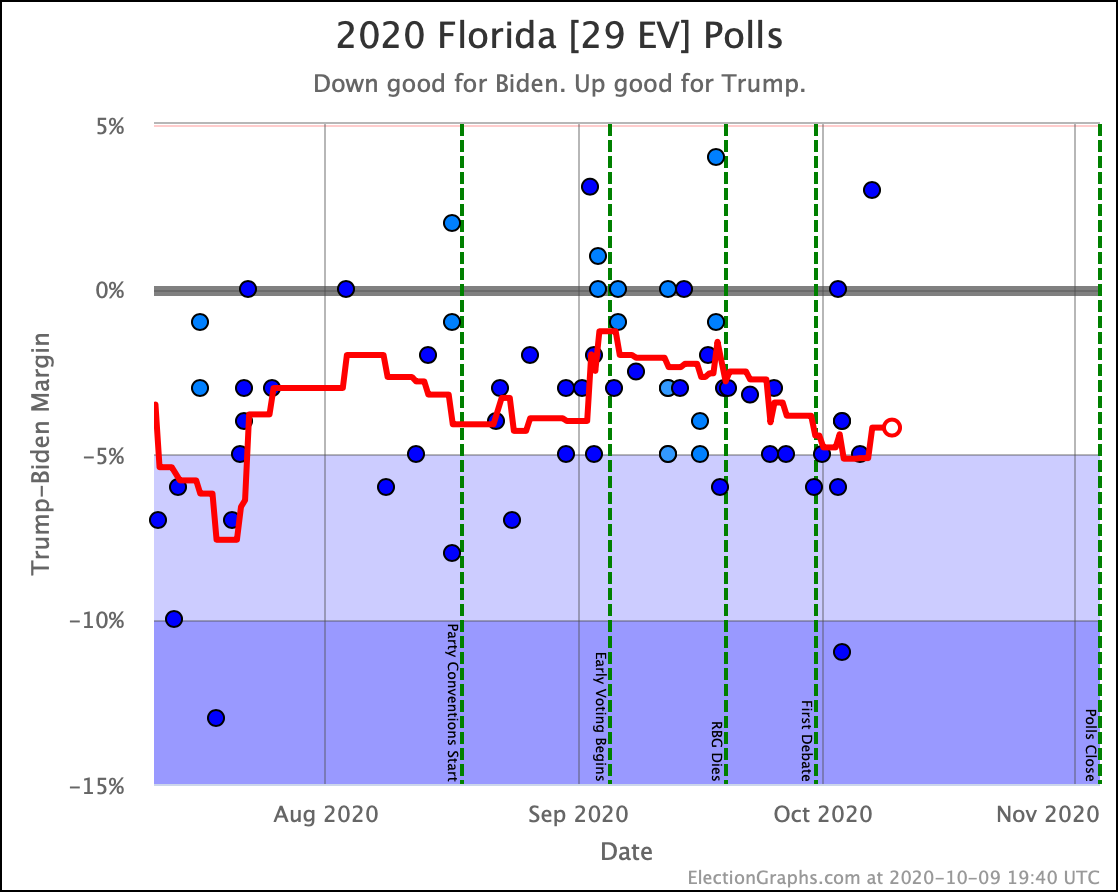
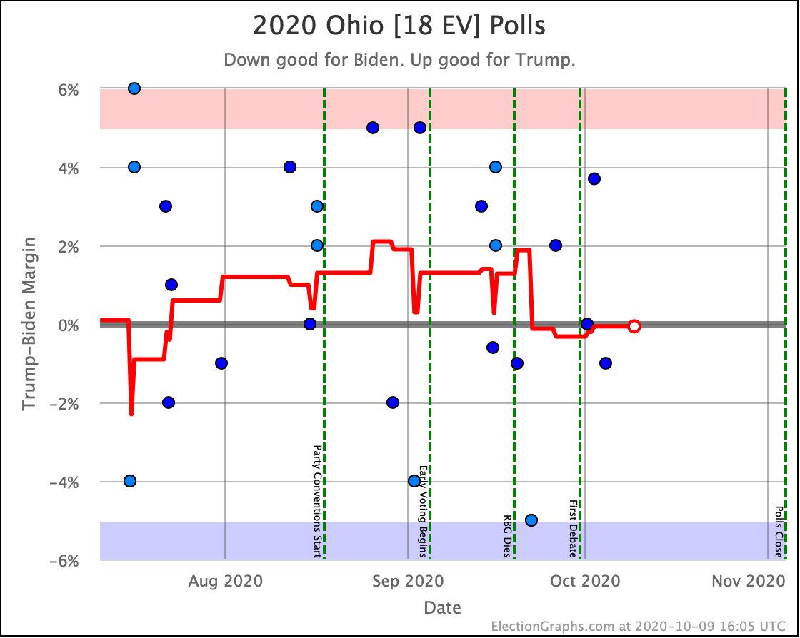
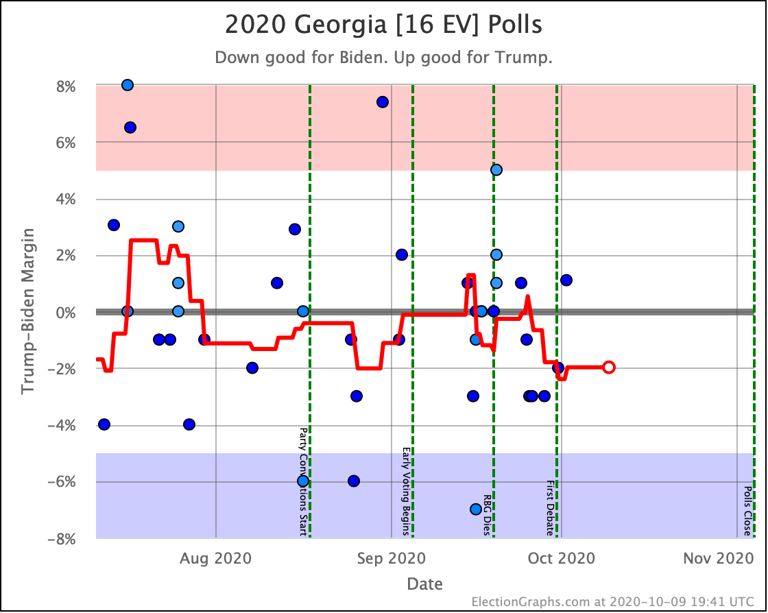
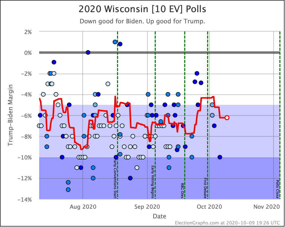
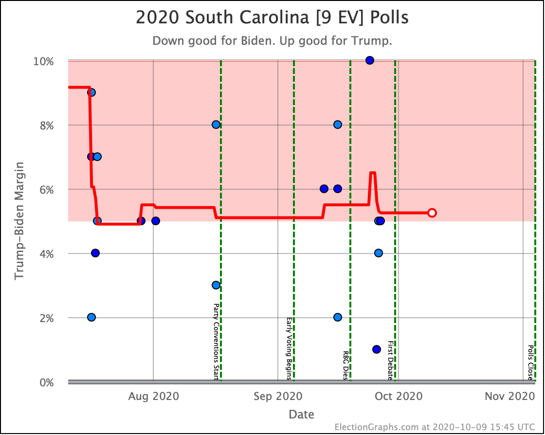
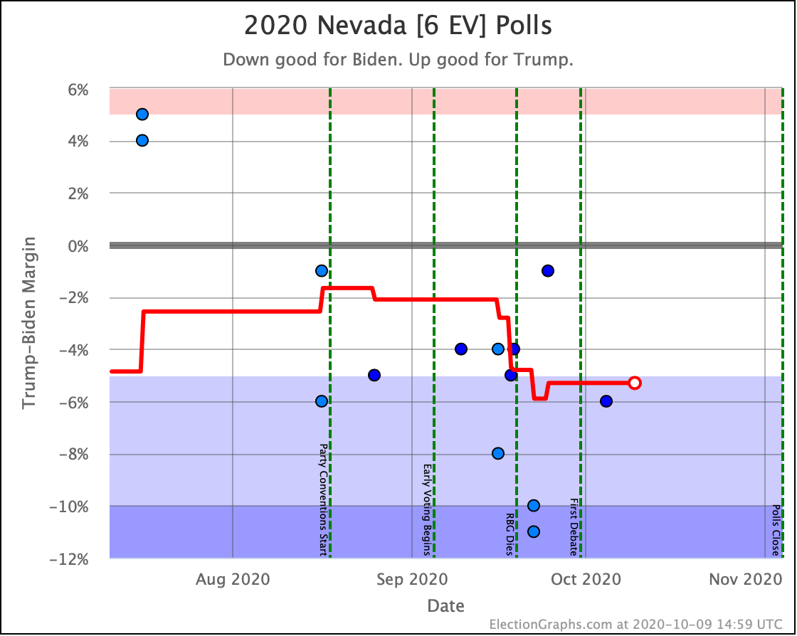
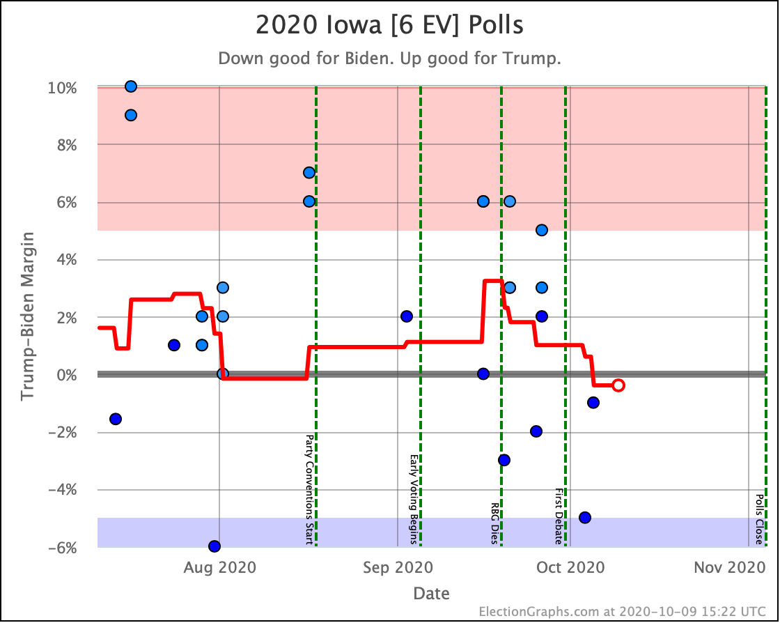
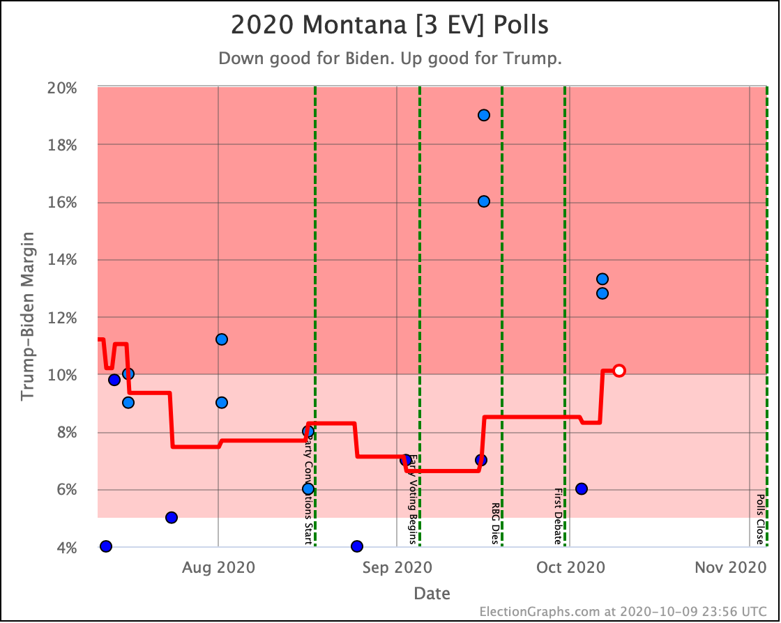
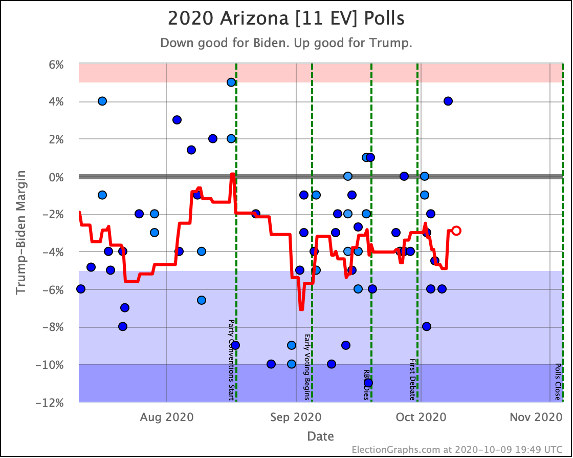
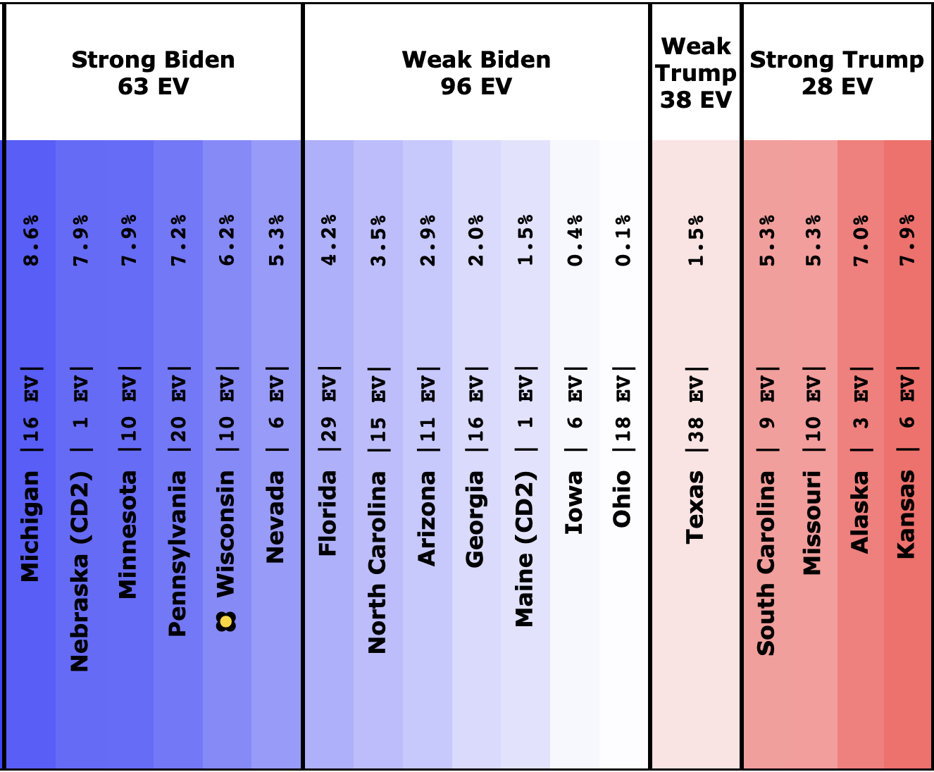
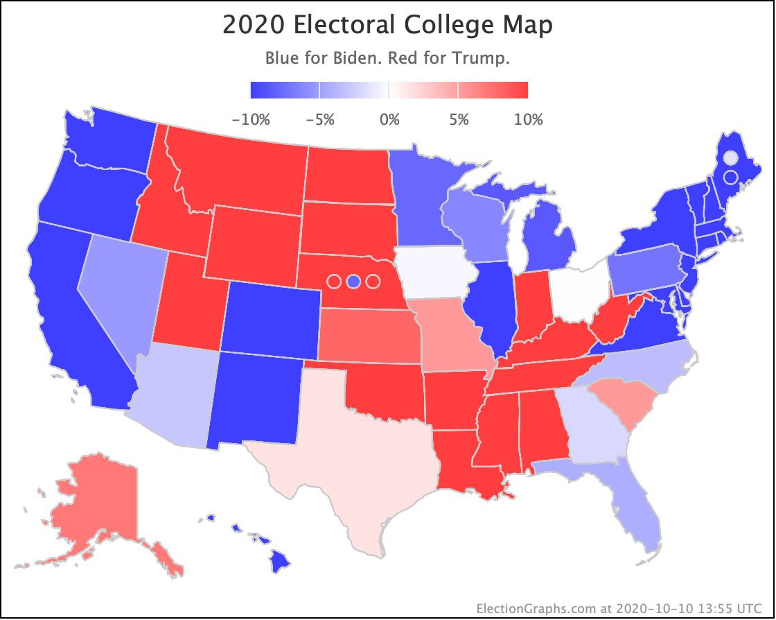
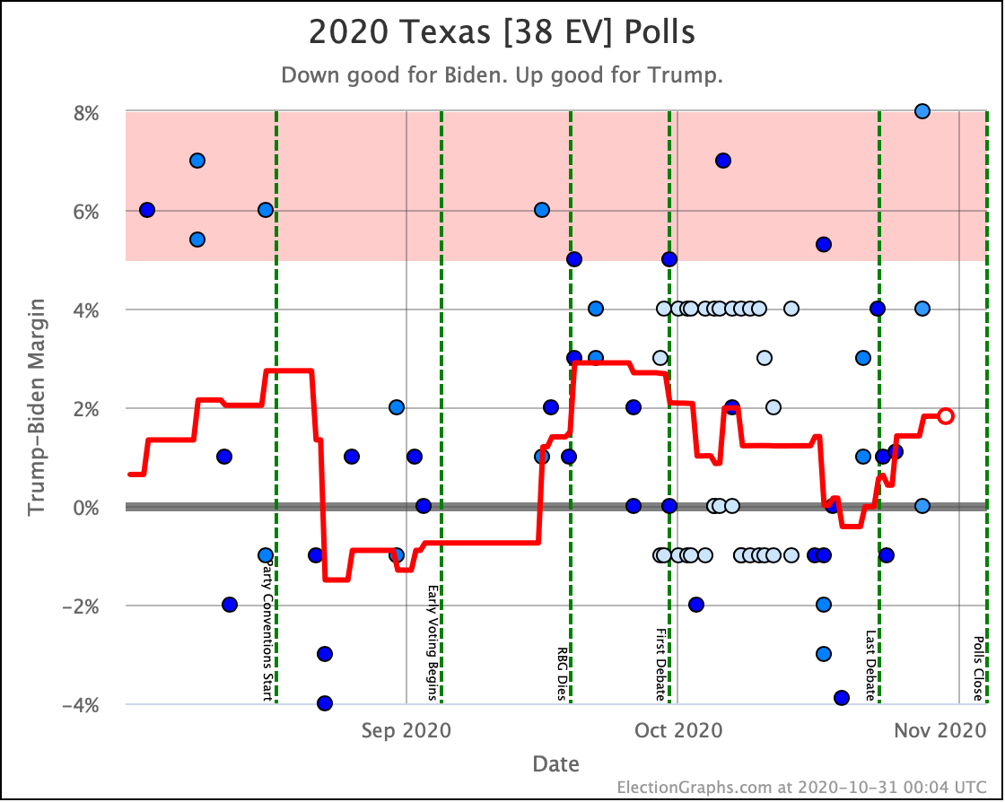
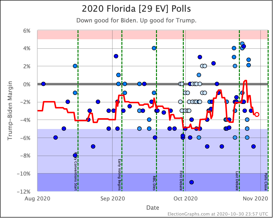
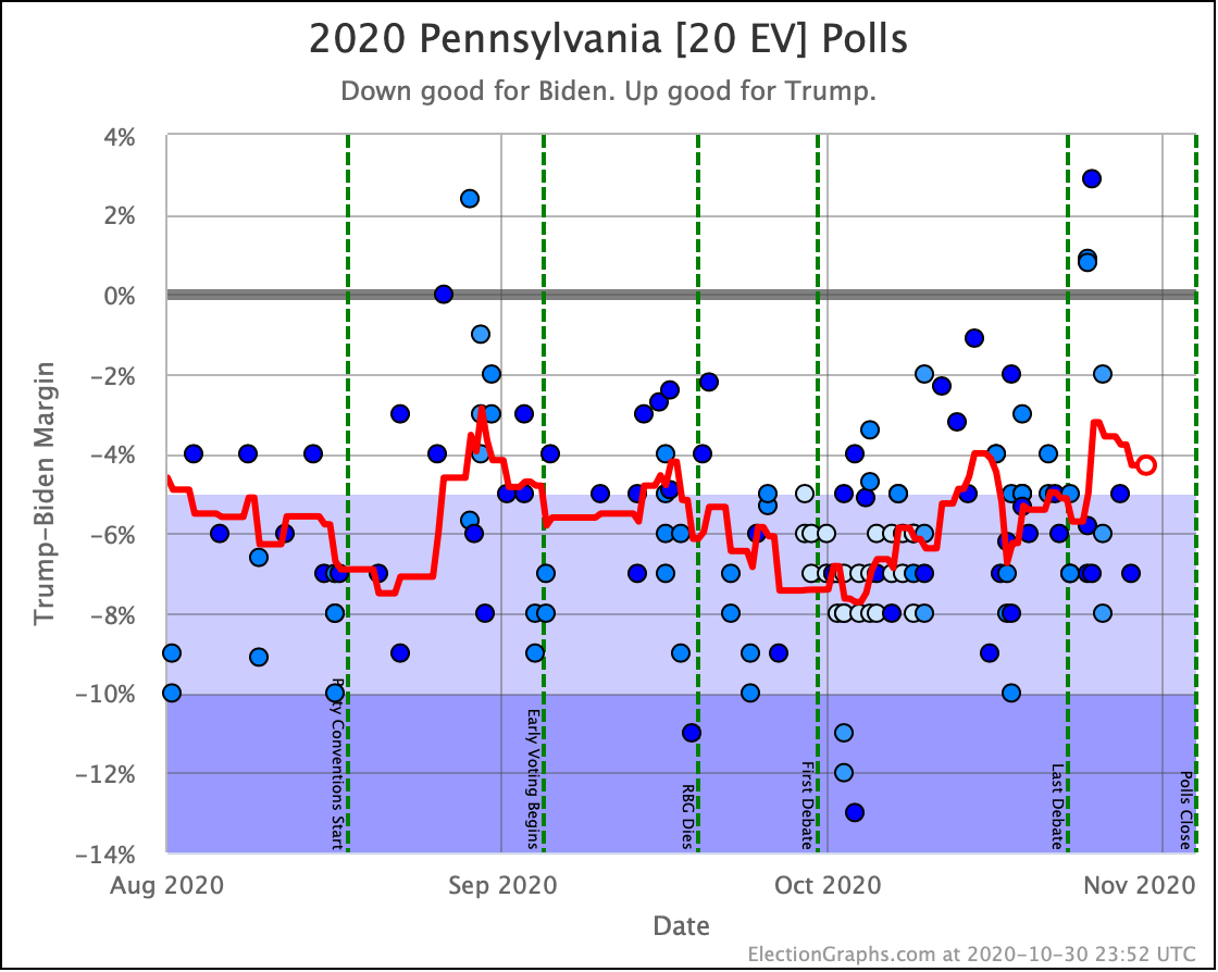
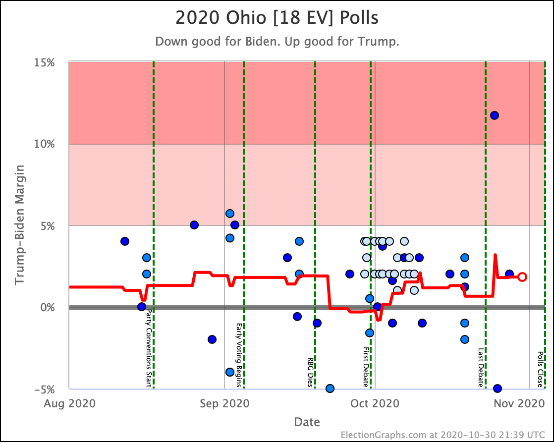
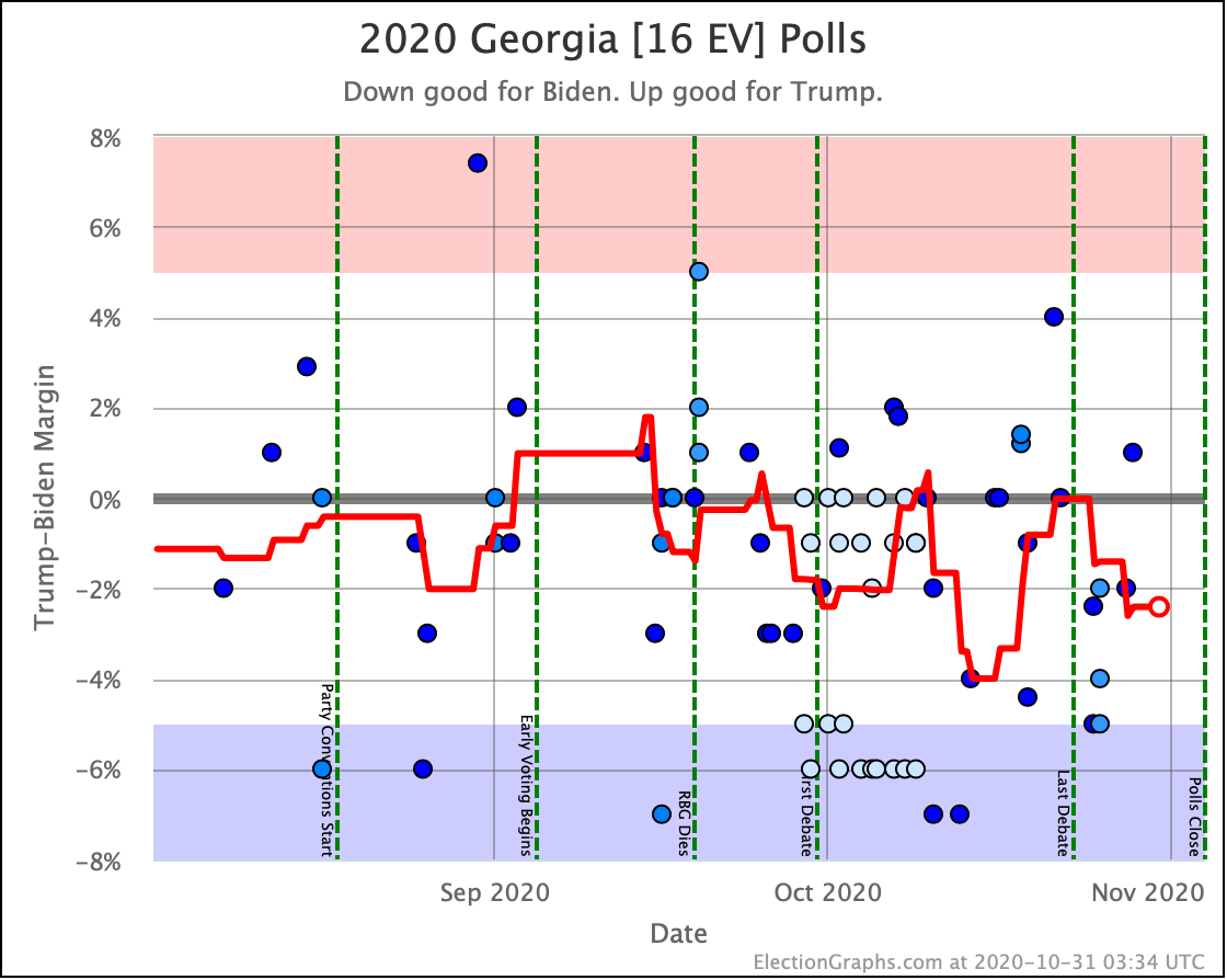
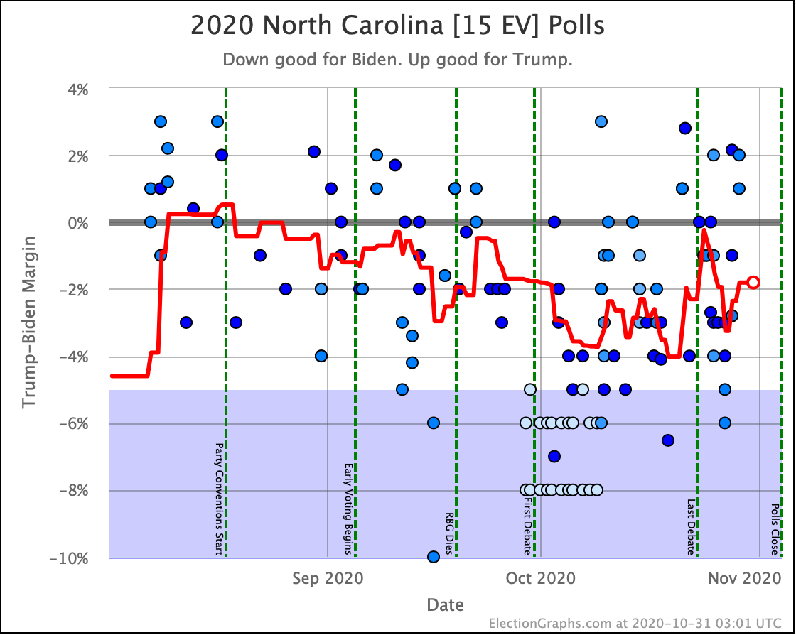
And now the trends in all the close states:
That is all for today.
3.5 days until the first results start coming in on election night.
We are so close. Almost there now.
For more information:
This post is an update based on the data on the Election Graphs Electoral College 2020 page. Election Graphs tracks a poll-based estimate of the Electoral College. The charts, graphs, and maps in the post above are all as of the time of this post. Click through on any image for current interactive versions of the chart, along with additional details.
Follow @ElectionGraphs on Twitter or Election Graphs on Facebook to see announcements of updates. For those interested in individual poll updates, follow @ElecCollPolls on Twitter for all the polls as I add them. If you find the information in these posts informative or useful, please consider visiting the donation page.