The Race Tightens? Or Not?

As always, if you are impatient for one of these updates, the 2020 pages on Election Graphs are updated every day as new polls come in. Or you can follow @ElecCollPolls on Twitter to see all the polls as I add them.

The last blog update here was 10 days ago on October 10th. Here are the high-level changes since that last post:

Model Metric 10 Oct 20 Oct 𝚫
Probabilities
(Indep States)
Trump 2σ
Median
Biden 2σ
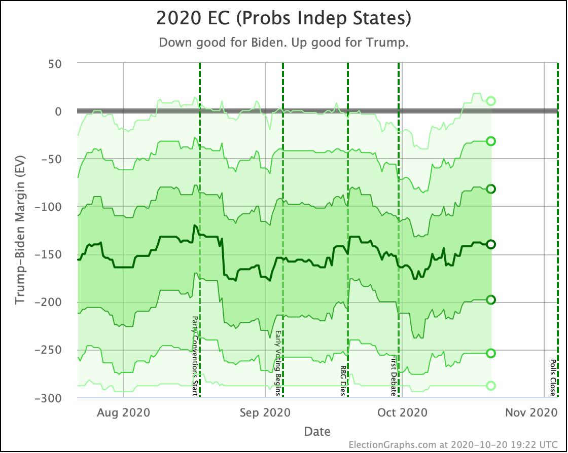
Biden +78
Biden +174
Biden +276
Biden +32
Biden +140
Biden +254
Trump +42
Trump +34
Trump +22
Trump Win
Tie
Biden Win
0.0%
0.0%
100.0%
0.3%
0.0%
99.7%
+0.3%
FLAT
-0.3%
Probabilities
(Uniform Swing)
Trump 2σ
Median
Biden 2σ
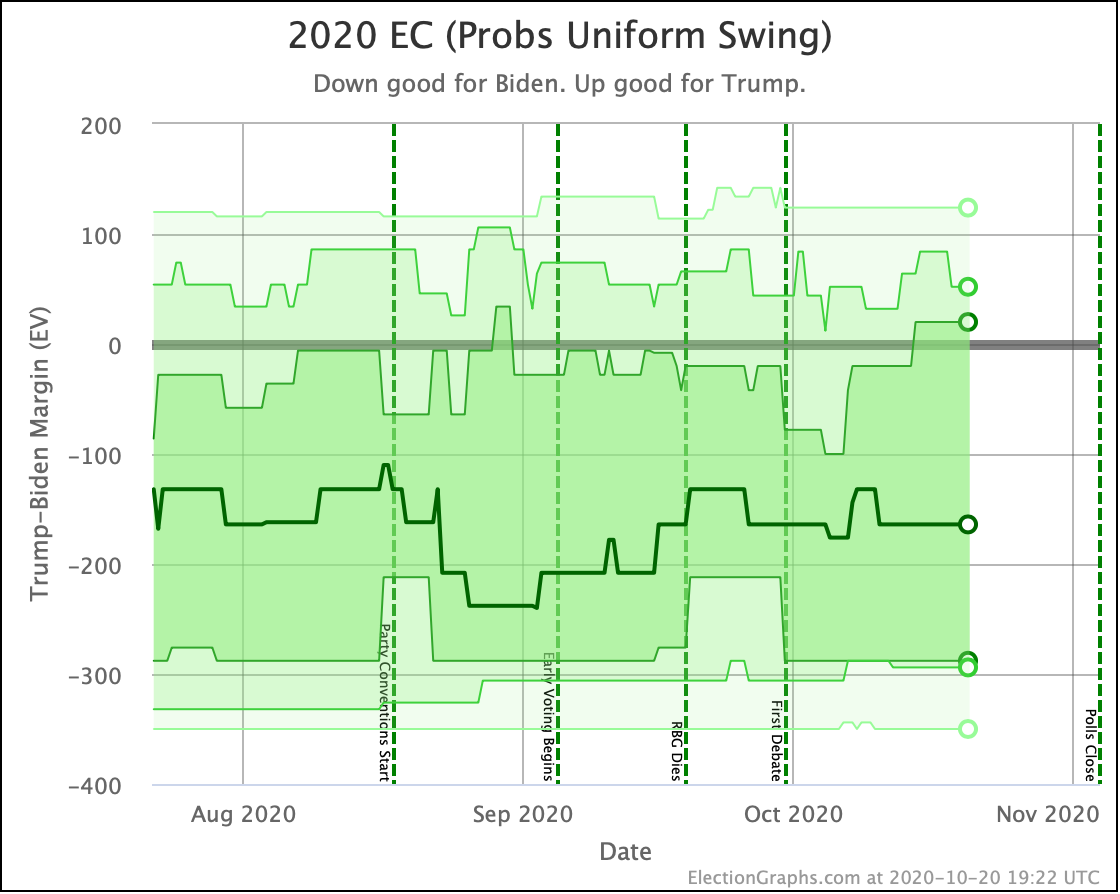
Trump +12
Biden +176
Biden +326
Trump +52
Biden +164
Biden +294
Trump +40
Trump +12
Trump +32
Trump Win
Tie
Biden Win
5.2%
0.0%
94.8%
23.3%
0.0%
76.7%
+18.1%
FLAT
-18.1%
Categories Trump Best
Expected
Biden Best
Biden +20
Biden +212
Biden +288
Trump +40
Biden +164
Biden +294
Trump +60
Trump +48
Biden +6
Tipping Point Biden +6.2% Biden +3.1% Trump +3.1%

We'll hit the main story for this update before going through the cavalcade of all of the charts:

Last time we said "not too fast" to notions that Trump's numbers were collapsing. Instead, we suggested that Trump was just at the low end of the normal range we had been in since June, and it would be unsurprising to see some reversion to the mean.

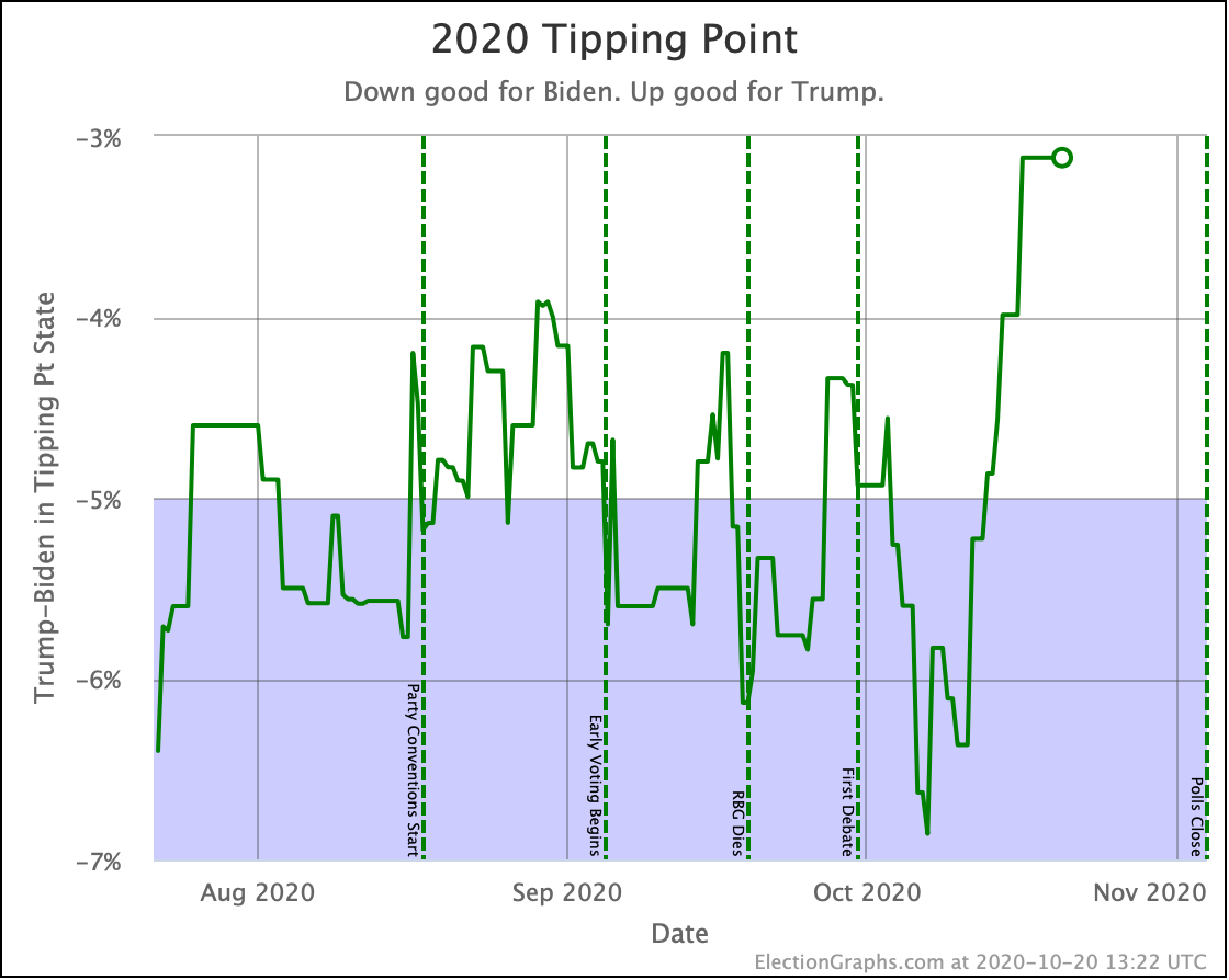
And that is exactly what we have seen. Things have moved back toward Trump on almost all metrics we track. In fact, in the critical tipping point metric, we've moved out of the 4% to 6% Biden lead band that we have been in since June, as Biden falls to 3.1%.

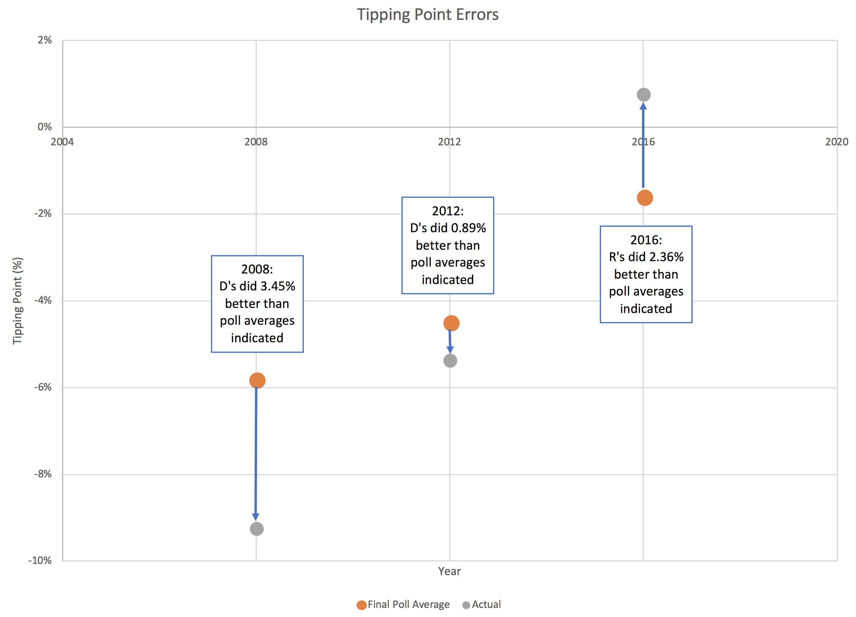
In the three election cycles we have tracked this, the largest difference between the final tipping point and the actual tipping point in the election was not in 2016. It was in 2008. Nobody cared, because the actual results were a bigger Obama win than predicted by the polls, rather than having a different winner than the polls predicted. But in 2008 the final tipping point was off by 3.45%. That is a bigger error than the 3.1% that currently separates Biden's tipping point from a Trump win.

So we are in the zone where simple polling error could make the difference to who is leading, even without further "movement".

As a consequence, the chances of a Trump win in the Uniform Swing view (the most optimistic for him) have jumped up to 23.3%.

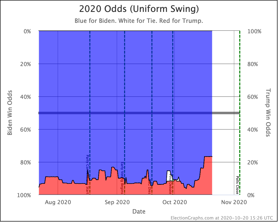
Wow. This is a big change.

Reader Jonathan T emailed to ask if I had any thoughts on the possible causes of this big change. So let's talk about that.

Rather than look for a specific "cause" though, it is worth discussing if this change is even "real".

The tipping point change is driven by one state. Pennsylvania.

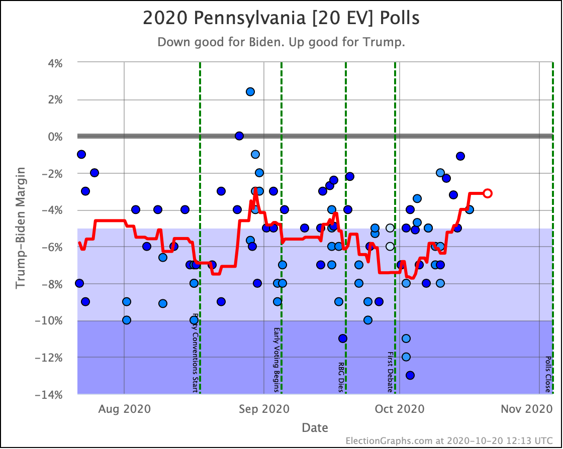
As polls that were very favorable to Biden from early October drop off the average, they are being replaced by new polls that show a much narrower race.

Now, what are the actual polls currently in my Pennsylvania average?

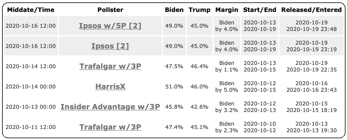
Why do I bring up the specific pollsters? I never bring up the specific pollsters. I just throw them into the average.

Well, I bring it up because right now we have no big-name high-quality pollsters in the mix. In fact, we have Trafalgar, which is widely panned as intentionally constructing their polls to find "hidden" conservative voters, and therefore push results to the right, show up twice! And we have others that people have criticized as being lower quality for one reason or another.

538's Nate Silver tweeted this earlier today:

Folks, Biden's lead didn't shrink from 7.3 points to 3.6 points in PA in a week (as per RCP) at the same time it was steady or slightly growing nationally. This is why you need poll averages that take a longer time horizon and/or adjust for house effects.

RCP's averages are extremely subject to who happens to have polled the state recently, which is often the spammier, lower-quality pollsters, and that's been especially true recently with live-caller polls not having been terribly active in the states over the past 2 weeks.

I love many things about RCP, but if you have an average and 1/3 of it consists of Trafalgar and InsiderAdvantage and 0% of it consists of live-caller polls, it's not going to be a very reliable average.

He is talking about the RCP Pennsylvania average, not Election Graphs. We're too small for 538 to notice. But all of the same things are true for us.

Both Election Graphs and RCP are straight numerical averages without weighting for historical pollster quality or correcting for historical pollster bias. And we both decide which polls to include in ways that result in looking at narrower time windows as the election approaches.

These are valid criticisms. This may be a temporary transient spike caused by a series of polls from low-quality pollsters which will immediately move back in the other direction as soon as the bigger more respected pollsters put out some new numbers.

If I had to bet right now, I'd actually bet on that. We moved from the high end of Biden's range in PA to the low end of his range, and I would expect to see it revert back to the middle since we have been in a pretty steady range for months, and this seems to be an aberration, especially since there are no big news events, and as Nate Silver points out, we haven't seen a similar movement in the national polls.

But…

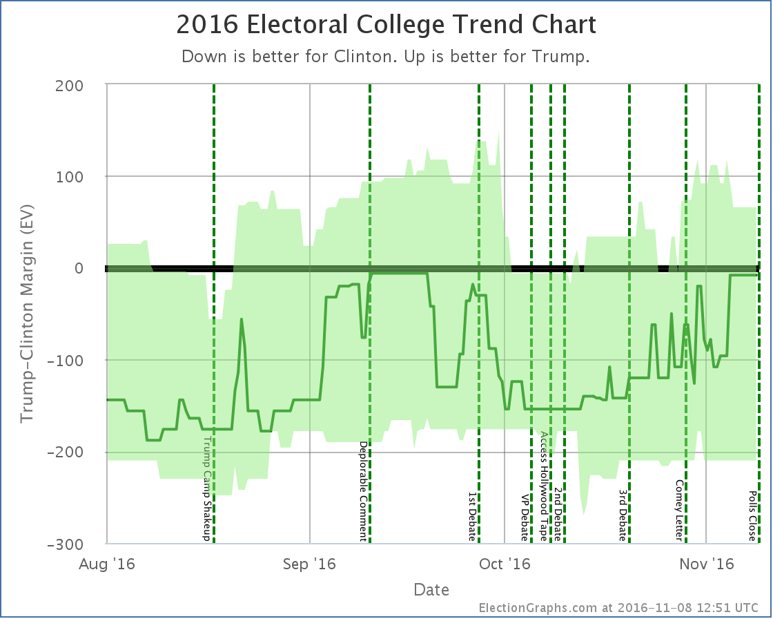
Let's do a quick look at where a bunch of websites ended up right before Election Day in 2016. This is from a post-mortem I did of the 2016 performance of Election Graphs. At the time I logged the following as the final electoral college predictions from a bunch of sites:

  • Clinton 323 Trump 215 (108 EV Clinton margin) – Daily Kos
  • Clinton 323 Trump 215 (108 EV Clinton margin) – Huffington Post
  • Clinton 323 Trump 215 (108 EV Clinton margin) – Roth
  • Clinton 323 Trump 215 (108 EV Clinton margin) – PollyVote
  • Clinton 322 Trump 216 (106 EV Clinton margin) – New York Times
  • Clinton 322 Trump 216 (106 EV Clinton margin) – Sabato
  • Clinton 307 Trump 231 (76 EV Clinton margin) – Princeton Election Consortium
  • Clinton 306 Trump 232 (74 EV Clinton margin) – Election Betting Odds
  • Clinton 302 Trump 235 (67 EV Clinton margin) – FiveThirtyEight
  • Clinton 276 Trump 262 (14 EV Clinton margin) – HorsesAss
  • Clinton 273 Trump 265 (8 EV Clinton margin) – Election Graphs
  • Clinton 272 Trump 266 (6 EV Clinton margin) – Real Clear Politics
  • Clinton 232 Trump 306 (74 EV Trump margin) – Actual "earned" result

Hmmm. Who got closest to the actual results? Election Graphs and RCP.

And specifically, WHY did that happen? My hypotheses are:

  1. We both were averaging based on very short time frames by the time we got to the election, allowing us to catch a last-minute move that was "smoothed out" from a lot of the other sites.
  2. We both included some of these low-quality pollsters, including Trafalgar, who started to show movement toward Trump that the other pollsters were not showing.

I could be wrong, I have not done an in depth analysis, but at first blush, those seem to be the common elements.

Now, as I said, I would still bet on reversion to the mean here, and that we will see Pennsylvania bounce back toward a greater than 5% Biden lead over the next week or so as new polls come in.

But in 2016, right before the end, I doubted the results of my own average because it was moving in a way that most of the big sites were not in that last week and because there were other sites specifically calling out Trafalgar and others as garbage noise that maybe should just be excluded from the averages because they were clearly biased and wrong. But it turned out those polls were closer to what actually happened than some of the others.

So we're not doing that this time. We throw in all the polls, and we see what happens, and yes, near the election we have a very short time frame, so what polls have been in the field lately does make a big difference. But we are where we are.

At the moment Election Graphs shows a significant tightening in Pennsylvania. And because Pennsylvania is the tipping-point state, and there is somewhat of a gap between the states that are closer than Pennsylvania and the states where Biden has a more solid lead, that means that as Pennsylvania moves, so does the national race, at least for the moment.

Don't be surprised if this moves back in the opposite direction tomorrow though. And don't be surprised if the high-quality polls confirm this movement and it stays tight either. I view that as less likely, but certainly not impossible. I'm not going to preemptively say to ignore this tightening as clearly not real though. In 2016, it was an indicator of actual tightening at the end of the race.

Or maybe Election Graphs and RCP were just lucky in 2016. That might also be the case. This is VERY POSSIBLE!

Anyway, that is the big story of the week.

But we still have to review the rest of the main charts! So here we go!

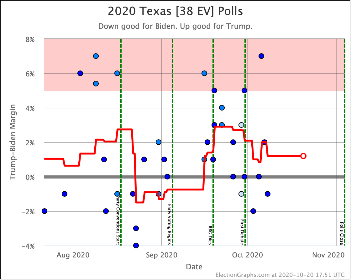
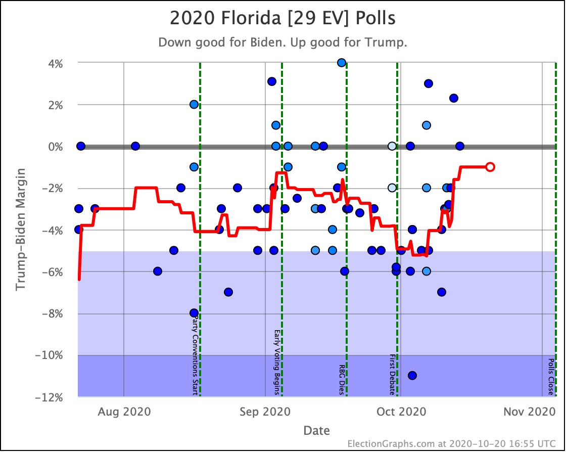
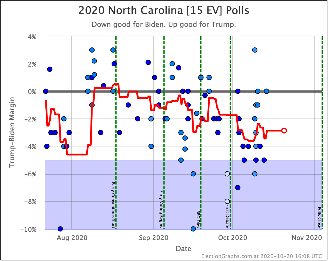
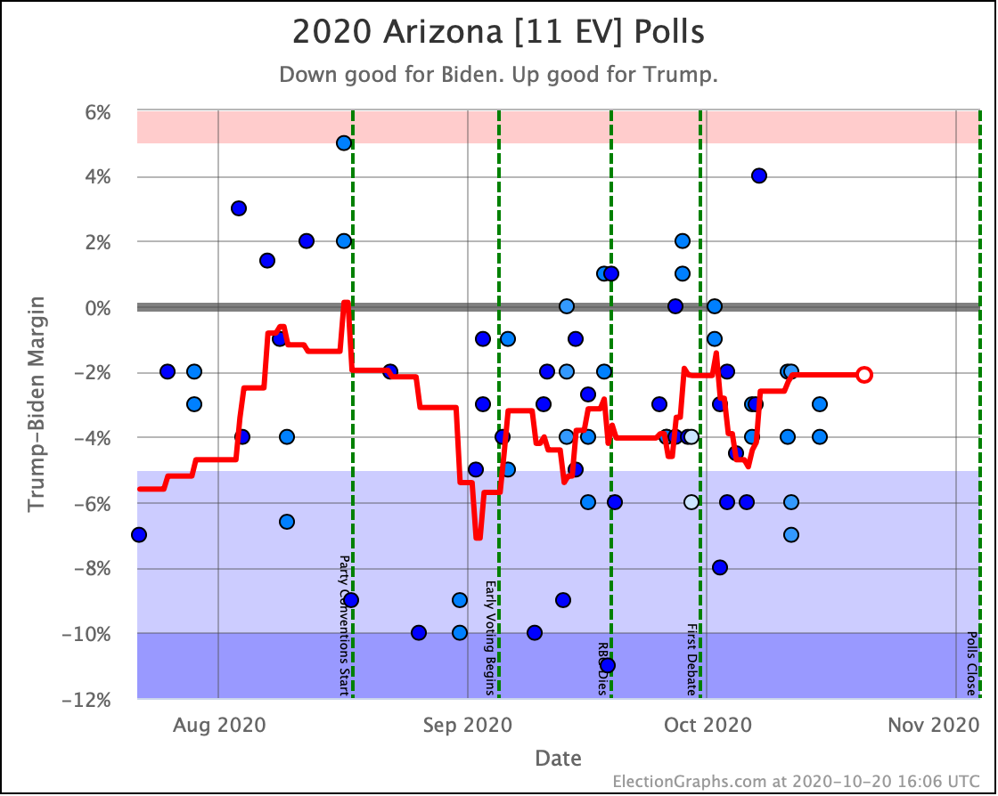
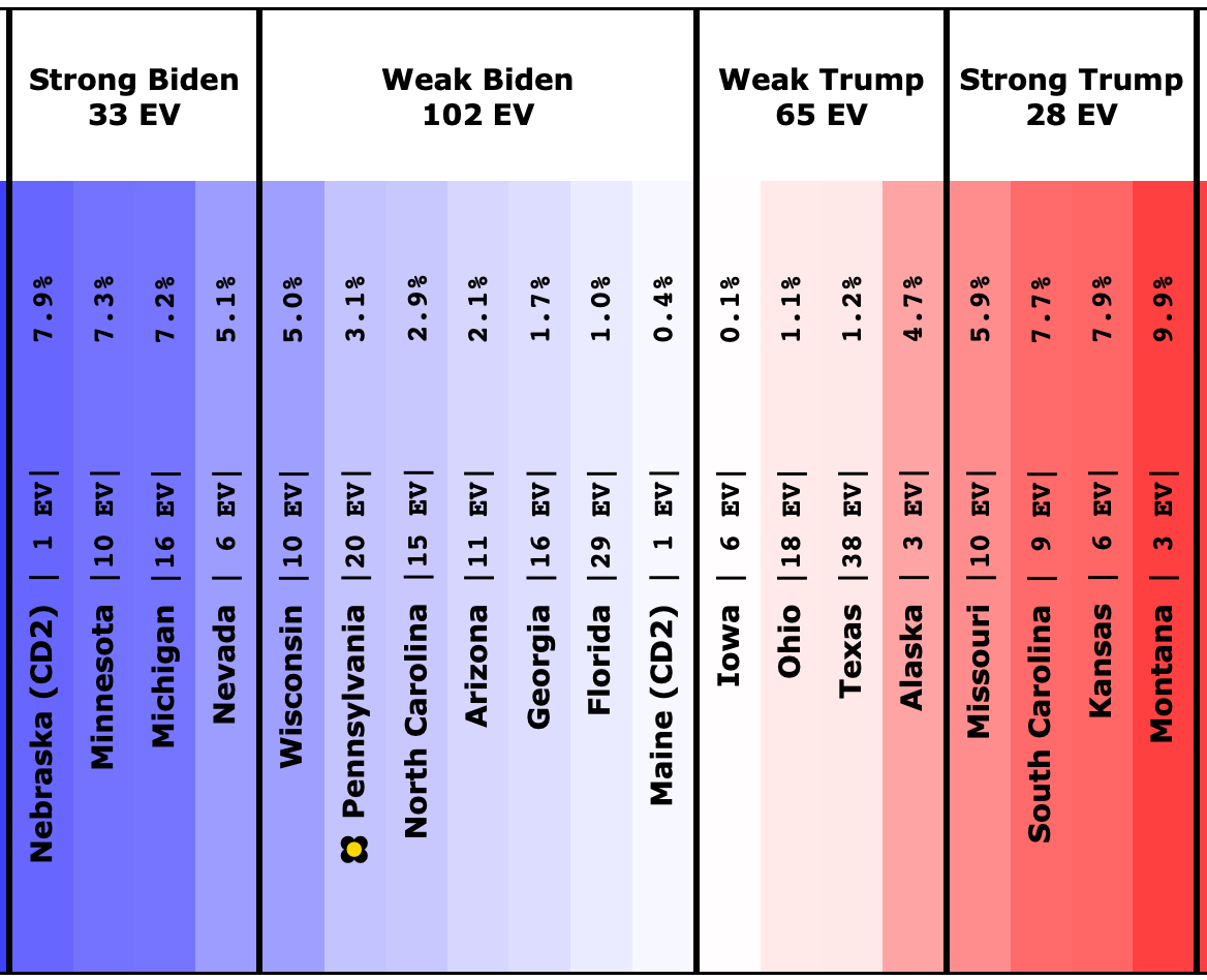
First up, states that moved in or out of our "Weak Biden" and "Weak Trump" categories:

OK, we already talked about Pennsylvania, but here it is again. It moved from Strong Biden to Weak Biden since the last update, and as the current tipping point state drives a lot of the national picture too. But we discussed all that, so… moving on…

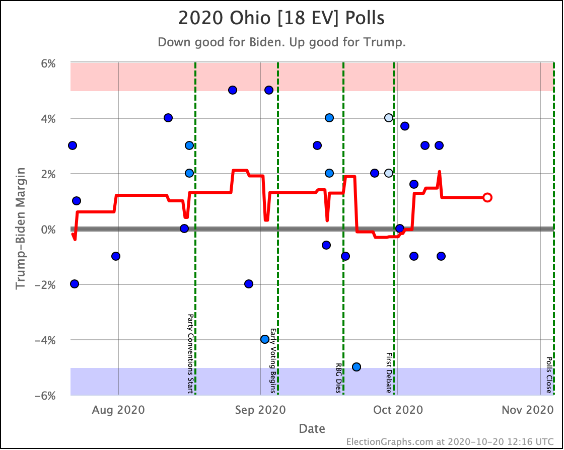
Last time Ohio had moved into the blue zone by the thinnest of margins. Now it returns to "Weak Trump" where it has usually been. Either way though, Ohio is extremely close.

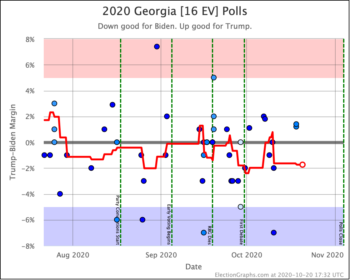
Since last time, Georgia popped over to the Trump side of the centerline, but it didn't last long, and Georgia is back to being just barely blue. Just like Ohio though, the truth is that Georgia is extremely close and could easily go either way.

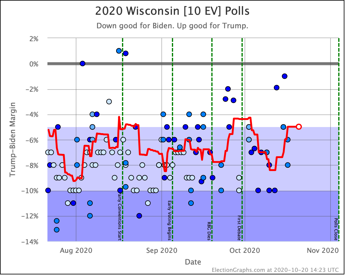
Since the last update, there has been significant weakening in Wisconsin, with it just barely moving into the "Weak Biden" category with the last poll. But if you look at the specific polls in the Wisconsin average, you see EXACTLY the same sort of issues we discussed with Pennsylvania.

If the tightening in Pennsylvania turns out to be a mirage based on having a bunch of low-quality pollsters releasing results recently, then most likely it will also be a mirage in Wisconsin. If Pennsylvania turns out to be real on the other hand, then Wisconsin probably will be too. (Thus showing why assuming completely independent states is not realistic, and we need to balance that by also showing uniform swing.)

But like Pennsylvania, if I had to bet right now, I'd say that Wisconsin has been in a 4% to 8% range for most of the last few months, and we are just at the low end of that range for Biden right now, and we'll probably revert back to the middle of that range with a few more polls.

But we won't really know until we indeed get a few more polls.

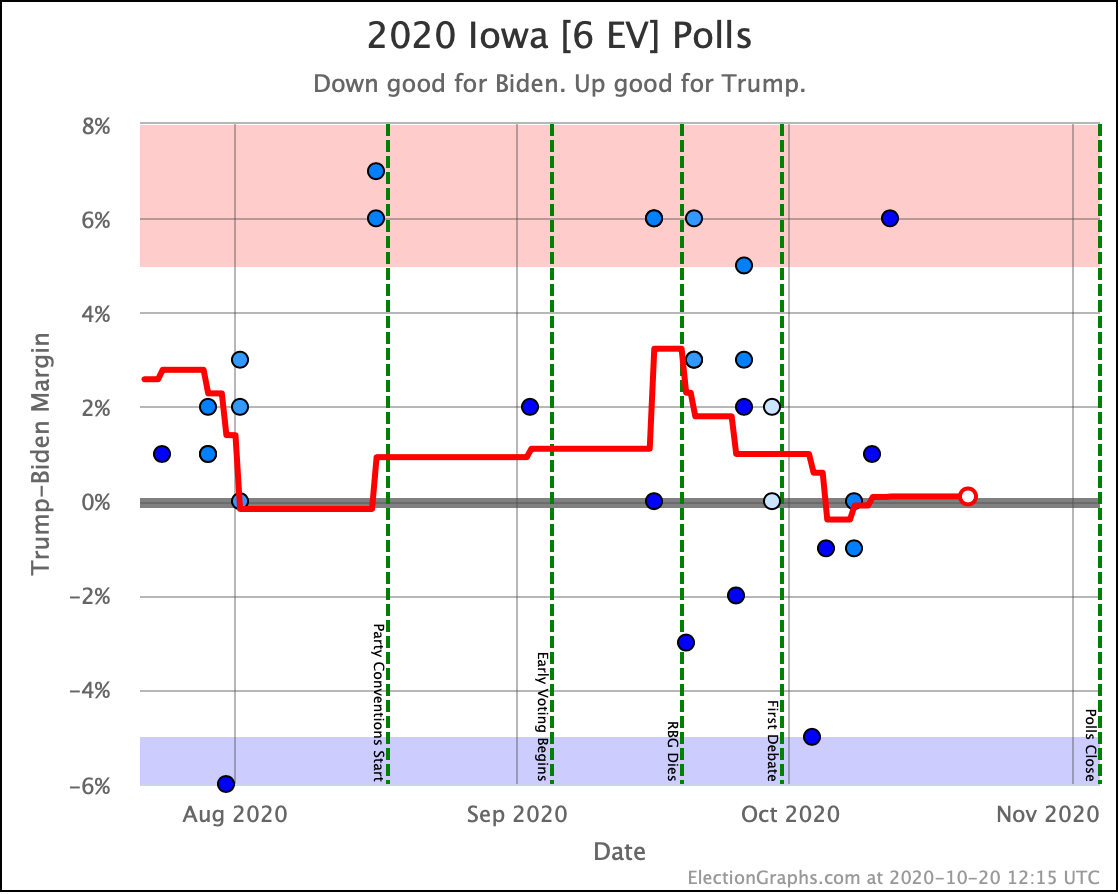
Like Ohio, last time Iowa had popped over to the blue side of the line, but this time it reverts to being just barely on the red side like it usually has been. But like Ohio and Georgia, the bottom line is Iowa is too close to call.

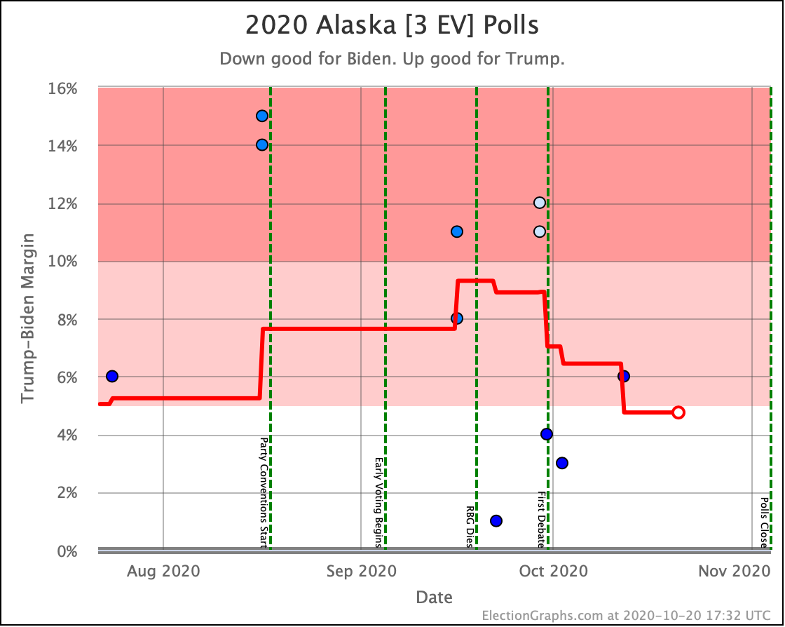
And finally, Trump's lead drops below 5% in Alaska, bringing it into range as a possible pickup in a Biden landslide scenario.

OK, now the rest of the close electoral votes we haven't already discussed, without additional commentary:

OK. With those out of the way, let's look at our three "envelopes" with the ranges of possibility in the categorization view, and the two extreme probabilistic views:

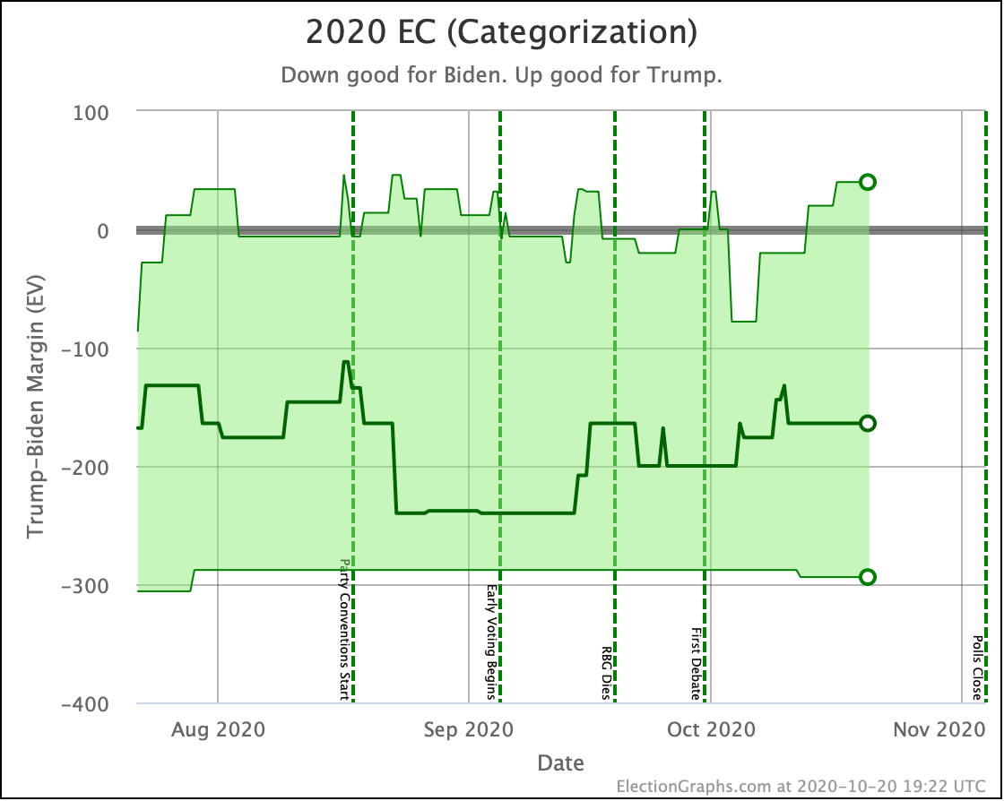
Unlike the tipping point, where it looks like a breakout from the normal "since June" range, all three of these views show us basically consistent with where this race has been since July.

In all three cases, Trump's high end does look a bit better than it did a few weeks ago and is near the high end of Trump's range.  And in all three the centerline is closer to the worst of Biden's range. But none of these are breaking out from the normal range.

Right now that "breakout" is only showing up in the tipping point. Which means that while the range of possible options is about the same, it is more precarious, because Biden's lead in the tipping point state is a lot less than it had been.

Subject again to all the caveats we discussed earlier in the post of course. I won't repeat them here.

Bottom line, carefully watch the next polls in Wisconsin, Pennsylvania, and North Carolina… the three states currently closest to the tipping point… to see if the tipping point reverses itself right away, or if it starts to look like the new closer tipping point might be real and sustained.

In the meantime, here is the current spectrum of states where the margin in the averages are under 10%:

The RCP average of national polls currently shows an 8.6% Biden lead. Comparing to the 3.1% tipping point, this implies that the structure of the electoral college is currently giving Trump a 5.5% head start… if this tipping point holds up. This "head start" is up from 3.4% in the last update.

The increase in this head start is due to the margin in the tipping point of Pennsylvania dropping considerably while the national margin, while it has tightened a bit, does not show the same kind of movement. Which again, is one reason to suspect maybe the Pennsylvania movement will prove to be an illusion. More polls will resolve that question soon enough.

Finally, time for the 2016 comparison:

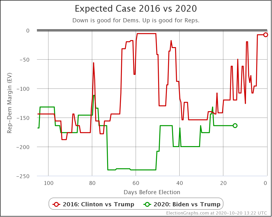
In the expected case, where each candidate wins every state where they lead the average, Biden continues to outperform Clinton at the same point in time four years ago, although not by as much as he was a month ago, and there was a short moment where he moved above her curve. But for the most part, Biden has been outpacing Clinton on this metric.

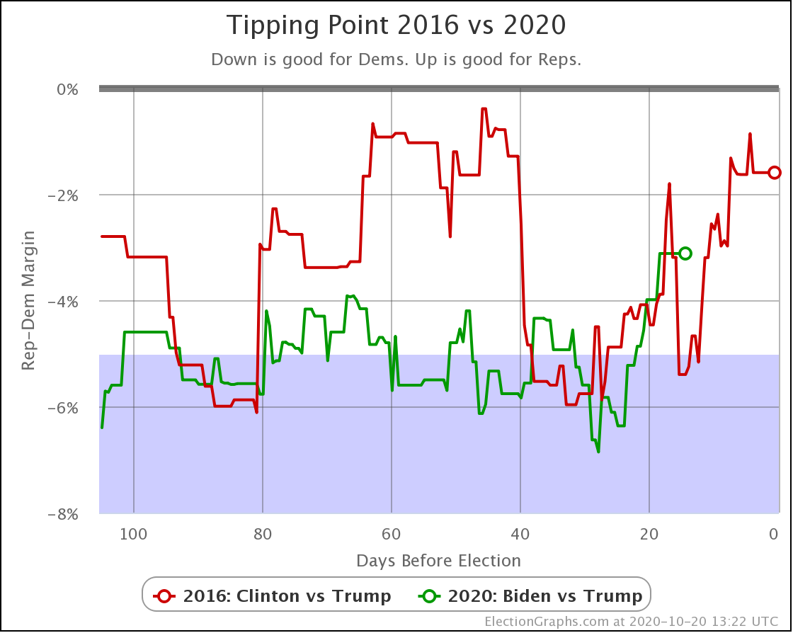
Meanwhile, the same can't be said at the moment for the tipping point.

While the general trend of Clinton weakening started at about the 30-day point, at about this moment, two weeks out, Clinton had a bunch of good polling and had one final peak before her final collapse. Meanwhile, as we have discussed, Biden's tipping point is now the smallest it has been since June 10th.

If this is just an aberration, and it gets reversed or erased by new high-quality polls that come out in the next few days, then the picture will be back to what it has been for months. Namely, Biden is heavily favored, but a Trump win is not impossible.

If however new polls sustain this change, then it would indicate that Trump's chances of winning have increased substantially, and there is a real race happening in these last two weeks.

Watch the next few days of polling, and we should know which scenario we are in.

Right now, with our current averages, and the two extreme probabilistic scenarios, Election Graphs gives Trump's odds of winning as somewhere between 0.3% and 23.3% depending on how correlated the polling errors in each state end up being.

That's a big range of course, and that is "if the election was today" when we have two weeks left. But at the very least, it means to take the chances of a Trump comeback and win seriously.

We shall see.

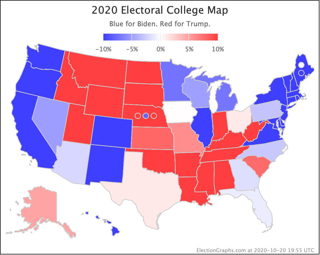
Finally, the map as it stands right now:

I locked the poll updates on Monday evening US time to make this update. As I finish writing the post it is now Tuesday afternoon. As usual for this point in the cycle, there have already been a bunch of new polls released during that time. So I'll be getting back to data entry shortly.

I've taken the remaining time from now until the election off from the day job to better be able to keep up with the deluge of new polls. That also probably means you'll get more than just one update here on the blog before election day.

So keep checking in for updates, both here on the blog and on the main 2020 Electoral College page.

But first, the usual closing with the countdown:

14.1 days until the first results start coming in for Election 2020.

We are in the home stretch. Almost there now!

For more information:

This post is an update based on the data on the Election Graphs Electoral College 2020 page. Election Graphs tracks a poll-based estimate of the Electoral College. The charts, graphs, and maps in the post above are all as of the time of this post. Click through on any image for current interactive versions of the chart, along with additional details.

Follow @ElectionGraphs on Twitter or Election Graphs on Facebook to see announcements of updates. For those interested in individual poll updates, follow @ElecCollPolls on Twitter for all the polls as I add them. If you find the information in these posts informative or useful, please consider visiting the donation page.

So what to do for 2020?

This is the sixth and LAST in a series of blog posts for folks who are into the geeky mathematical details of how Election Graphs state polling averages have compared to the actual election results from 2008, 2012, and 2016. If this isn’t you, feel free to skip this series. Or feel free to skim forward and just look at the graphs if you don’t want or need my explanations.

If you just want 2020 analysis, stay tuned, that will be coming soon.

You can find the earlier posts here:

The electoral College trend chart

In the last few posts, I spent a lot of time on looking at various ways of determining what is a "close state". This is because in the past Election Graphs has defined three classifications:

  • "Weak": Margin < 5% – States that really are too close to call. A significant polling error or rapid last minute movement before election day could flip the leader easily.
  • "Strong": 5% < Margin < 10% – States where one candidate has a substantial lead, but where a big event could still move the state to "Weak" and put it into play.
  • "Solid": Margin > 10% – States where one candidate's lead is substantial enough that nobody should take seriously the idea of the leader not actually winning.

The "main" chart on Election Graphs has been the Electoral College Trend Chart. The final version on Election Day 2016 looked like this:

The "band" representing the range of possibilities goes from all the Weak states being won by the Democrat, to all the weak states being won by the Republican.

One of the reasons for all the analysis in this series is of course that this method yielded a "best case" for Trump of a 66 EV margin over Clinton. But the actual earned margin (not counting faithless electors) was 74 EV.

So the nagging question was if these bounds were too narrow. Would some sort of more rigorous analysis (as opposed to just choosing a round number like 5%) lead to a really obvious "oh yeah, you should use 6.7% as your boundary instead of 5%" realization or something like that.

After digging in and looking at this, the answer seems to be no.

As I said in several venues in the week prior to the 2016 election, a Trump win, while not the expected or most likely result given the polling, should not have been surprising. It was a close race. Trump had a clear path to victory.

But the fact he won by 74 EV (77 after faithless electors) actually was OK to be surprised about.

Specifically, the fact that he won in Wisconsin, where the Election Graphs poll average had Clinton up by 7.06% is an outlier based on looking at all the poll average vs actual results deltas from the last three cycles. It is the only state in 2016 where the result was actually surprising. Without Wisconsin, Trump would have won by 54 EV, which was within the "band".

Advantages of simplicity

So after all of that, and this will be very anti-climactic, I've decided to keep the 5% and 10% boundaries that I've used for 2008, 2012, and 2016.

Several of the ways of defining close states that I looked at in this series are actually quite tempting. I could just use the 1σ boundaries of one of the methods to replace my 5% boundary between "weak" and "strong" states, and the 2σ numbers to replace the 10% boundary between "strong" and "solid" states.

I could even use one of the asymmetrical methods that reflect that things may be different on the two sides.

But frankly, I keep coming back to the premise of Election Graphs being that something really simple can do just as well as fancy modeling.

From the 2016 post mortem here is a list of where a bunch of the election tracking sites ended up:


  • Clinton 323 Trump 215 (108 EV Clinton margin) – Daily Kos
  • Clinton 323 Trump 215 (108 EV Clinton margin) – Huffington Post
  • Clinton 323 Trump 215 (108 EV Clinton margin) – Roth
  • Clinton 323 Trump 215 (108 EV Clinton margin) – PollyVote
  • Clinton 322 Trump 216 (106 EV Clinton margin) – New York Times
  • Clinton 322 Trump 216 (106 EV Clinton margin) – Sabato
  • Clinton 307 Trump 231 (76 EV Clinton margin) – Princeton Election Consortium
  • Clinton 306 Trump 232 (74 EV Clinton margin) – Election Betting Odds
  • Clinton 302 Trump 235 (67 EV Clinton margin) – FiveThirtyEight
  • Clinton 276 Trump 262 (14 EV Clinton margin) – HorsesAss
  • Clinton 273 Trump 265 (8 EV Clinton margin) – Election Graphs
  • Clinton 272 Trump 266 (6 EV Clinton margin) – Real Clear Politics
  • Clinton 232 Trump 306 (74 EV Trump margin) – Actual result


The only site (that I am aware of) that came closer to the actual result than I did was RCP… who like me just used a simple average, not a fancy model.

This says something about sticking with something simple.

Or maybe I was just lucky.

To be fair, there was a lot of movement just in the last day of poll updates. Before that, I had a 108 EV margin for Clinton as my expected case and would have been one of the worst sites instead of one of the best sites in terms of final predicted margin. Noticing that last minute Trump surge in the last few polls in some critical states was important, and the fact Election Graphs uses a "last 5 polls" methodology made our numbers able to pick up that change quickly.

But even aside from how close we got, a regular person who doesn't follow these things that closely could come to Election Graphs and just say "oh, close states are under 5%, they could go either way". More complex models have their places, but it hasn't been Election Graphs' niche. One of the main points of this site was always doing something relatively simple, and still getting decent results.

So. I'm sticking to 5% and 10%. Even though they are just nice round numbers, without a mathematical justification.

Because they are nice round numbers that are still reasonable for these purposes, and not too far out from numbers you COULD pick with some sort of mathematical hand waving if you wanted to.

So. Less than 5% for a weak state, less than 10% for a strong state, and over 10% is solid.

Just like before.

What about the tipping point?

OK, with everything I have said about nice round boundaries, and keeping it simple, I think I will actually allow myself to move in the limits of what I show as "close" on the chart of the tipping point. Maybe 5% is too close to call on a state level, but if the tipping point is at 5%, that is more substantial.

Having said that, 2016 did see 6% swings in the tipping point within two week periods of time. It can move quite a bit, quite quickly. So of course, just watch, 2020 will see someone with a 6% lead in the tipping point on election day proceed to lose the race. But for now, I feel OK tightening these bounds.

I'll be using the 2.36% and 3.45% levels described in the last post to really emphasize that if you are in that zone, you have a super close race. Regardless of what the electoral college center line is, or the "best case" scenarios for the two candidates, if we see a 1% tipping point margin again, it would be crazy not to emphasize that you are looking at a race that is too close to call.

[Note added 2019-03-01: Once I started actually building out the 2020 site, I tried changing the limits for the tipping point as described above, but with everything else left at 5% and 10%, it looked out of place, so I actually left them at 5% and 10% as well. So alas, all this analysis of other ways to define limits that were not nice round numbers ended up with me just using the nice round numbers from before.]

What about that Monte Carlo thing?

Well, once again ignoring everything I said above about simplicity, I've never quite liked the fact that the "band" is generated by swinging ALL the close states back and forth, which is actually not very likely. The fact that a bunch of states are close and could go either way, does not imply that it would be easily possible for them to ALL flip the same direction at the same time. (Although yes, if polling assumptions are all wrong the same way, all the polling may be off in the same direction.)

Election Graphs shows that whole range of possibility, with no way of showing some outcomes within the range are more likely than others, or that some outcomes outside the range actually are still possible, just less likely. It would be nice to add some nuance to that.

And I'll be honest, I've been slowly introducing more complexity over the last three cycles, and I kind of enjoy it. For instance, the logic for how to determine which polls to include in the "5 poll average" that I used in 2016 has a lot more going on than what I did in 2008 or 2012. And for that matter, in 2016 everything was generated automatically from the raw poll data, while in previous cycles I did everything by hand. Progress!

So… while I am going to keep the main display using the 5% and 10% boundaries, I am actually kind of excited to now have a structured way to also do a Monte Carlo style model…

I would use the data from the Polling Error vs Final Margin post to do some simulations and show win odds and electoral college probability distributions as they change over time as well as the current numbers. I have a vision in my head for how I would want it all to look.

But that would be an alternative view, not the main one… if I actually have time.

The plan

I had originally intended to have the 2020 site up by the day after the 2018 midterms. Then I'd hoped to be done by the end of November. Then December. Then January. But life and other priorities kept getting in the way.

I'd also intended to launch with a variety of changes and refinements over the 2016 site, including perhaps changing the 5% and 10% bounds, but also other things. Some changes to how some of the charts look. Additional changes to how the average itself was calculated. A completely different alternative view to switch to if a third party was actually strong enough to win electoral votes. Or the Monte Carlo view. Or making the site mobile friendly. Or a bunch of other things.

But frankly, I've just run out of time. I now know of seven state level general election matchup polls for 2020 that are already out, and there are probably more I have missed. And the pace is increasing rapidly now that candidates are announcing. So there are already results I could be showing.

(Yes, I am quite aware that general election match up polls this far out are not predictive of the actual election at all, but they still tell you something about where things are NOW.)

So at this point my priority is to just get the site up and running as fast as possible, which means making all the logic and visuals an exact clone of 2016, just with 2020 data. At least to start with.

After that, I'll start layering in changes or additions if and when I have time to do so. I still hope to be able to do a variety of things, but that depends on many factors, so I'm not making any promises at this point. I'll do what I can.

So that's the plan.

Conclusion

I have been dragging my feet working off and on (mostly off) on collecting the data, making the graphs, and writing my little commentary on this series of posts for literally more than six months. Maybe more than nine months. I forget exactly when I started.

If there are any of you who have actually read all of this to the end, thank you. I don't expect there are many of you, if any. That's just the way it goes.

But I felt like I needed to get all this done and out before starting to set up the 2020 site. I wanted to see what the results of looking at this old data would show, and I wanted to share it. Maybe I didn't really need to and it was just an excuse to procrastinate on doing the actual site.

But I have no more excuses left. Time to start getting the 2020 site ready to go… I'll hopefully have the basics up very soon.

Stay tuned!

You can find all the posts in this series here:

Criticism and Tipping Points

This is the fifth in a series of blog posts for folks who are into the geeky mathematical details of how Election Graphs state polling averages have compared to the actual election results from 2008, 2012, and 2016. If this isn’t you, feel free to skip this series. Or feel free to skim forward and just look at the graphs if you don’t want or need my explanations.

If you just want 2020 analysis, stay tuned, that will be coming soon.

You can find the earlier posts here:

Criticism

So, after the Predicting 2016 by Cheating post went up, Patrick Ruffini decided to quote tweet it, after which Nate Silver replied saying "whoever did that is incompetent".

That was exciting.

In any case, despite being incompetent, I will soldier on.

A reminder here though that I am indeed an amateur doing this sort of thing for fun in my spare time. I am not a professional statistician, data scientist, or even pundit. (Although, like everybody else on the planet, I do have a podcast.)

This is not my day job. I make no money off this. I never expect to make any money off this. I just enjoy doing it. I am always happy to take constructive criticism. I've changed things on the site based on reader feedback before, and undoubtedly will again.

Also though, in this series of blog posts specifically, I have been exploring different ideas and ways of looking at the 2008-2016 data. The Monte Carlo simulation in the last post was NEVER a valid prediction for 2016, because it used the actual results of 2016 in the model. Which I said repeatedly in that post. It was just a proof of concept that using that data in that way would provide something reasonable looking.

I'm not sure if Nate actually read the posts describing how I was modeling things and all the caveats about how running that simulation was cheating since I was using 2016 data to predict 2016. Maybe he did. Maybe he didn't.

He is right of course that the Monte Carlo graph he was reacting to does give a much narrower distribution than his model did. The Polling Error vs Final Margin post shows how I got the probabilities that led it to be that narrow. The distribution is actually narrower than I expected coming in. But that particular way of looking at the data leads there. It may or may not be a good way of looking at things. I am experimenting.

Having said that, the results gave Trump win odds near what FiveThirtyEight had, but with the median being further toward Trump than their model, and with a narrower distribution. Looking at some other folks who showed distributions for 2016 on their sites (and still have them easily findable today in 2019), it looks like this distribution would not have been out of place. It didn't match any of them of course, since the methodology is different from all of them. But it isn't wildly out of line.

Running this on 2016 data is bogus of course, as I explained in the last post, and again a few paragraphs ago. But the results are interesting enough that using the data from the analysis in the Polling Error vs Final Margin post to do some Monte Carlo simulations for 2020 would at least be fun to look at.

OK, enough of that unintended detour. Now back to the originally intended topic for this post…

Tipping Points

All of the previous posts have been looking exclusively at the state poll averages as they compared to the actual election results in 2008 through 2016. But for the last couple of cycles, Election Graphs has also looked at the "tipping point". I borrowed the idea from the "meta-margin" Sam Wang at Princeton Election Consortium uses. Basically, it is the margin in the state that would put the winning candidate over the edge if you sorted the states by margin.

The tipping point essentially gives a measure of the overall margin in the national race, similar to a popular vote margin, but modified to account for the structure of the electoral college. It is a nice way of looking at who is ahead and who is behind in a way that isn't (quite) as volatile as looking directly at the center line of the electoral college estimates.

So how did the final Election Graphs tipping point numbers based on our state poll averages do compared to the actual tipping point as measured by the final vote?

For this, since there is only one tipping point per election, we unfortunately only have three data points:

In 2016, I used the same 5% boundary to determine what was "close" for the tipping point as I did for state poll averages. Once again just a round number, with nothing specific behind it other than a gut feel that less than 5% seemed close.

We only have three data points, but even with just that, we can produce a very VERY rough estimate of the 1σ and 2σ levels. Basically, for 1σ, you use the 2 closest of the 3 data points, and for 2σ you use all 3. This is ballpark only (at best) due to the low number of data points, but it gives an idea.

So to be 68.27% sure the current leader will actually win, you want a tipping point margin greater than 2.36%.

For 95.45% confidence, you want a tipping point margin lead of more than 3.45%.

OK, OK, that is kind of pathetic. I know. But there is only so much you can do with only three data points.

Anyway…

Clinton's final tipping point margin in 2016 was only 1.59% in Pennsylvania. Even assuming you only knew the 2008 and 2012 results, it should have been clear that a 1.59% tipping point represented an incredibly close race, far closer than either 2008 or 2016, and well within the realm where it could have gone either way.

The 5% boundary Election Graphs used in 2016 also indicated a close race of course, but narrowing that boundary based on the results of the last three elections seems like it would give a better impression on how close things need to be before we should consider that things really do look like a toss up where anything could reasonably happen.

So, what, if anything, will Election Graphs actually do differently for the 2020 cycle compared to 2016?

I'll talk about that in the next post…

You can find all the posts in this series here: