New Charts for State Odds

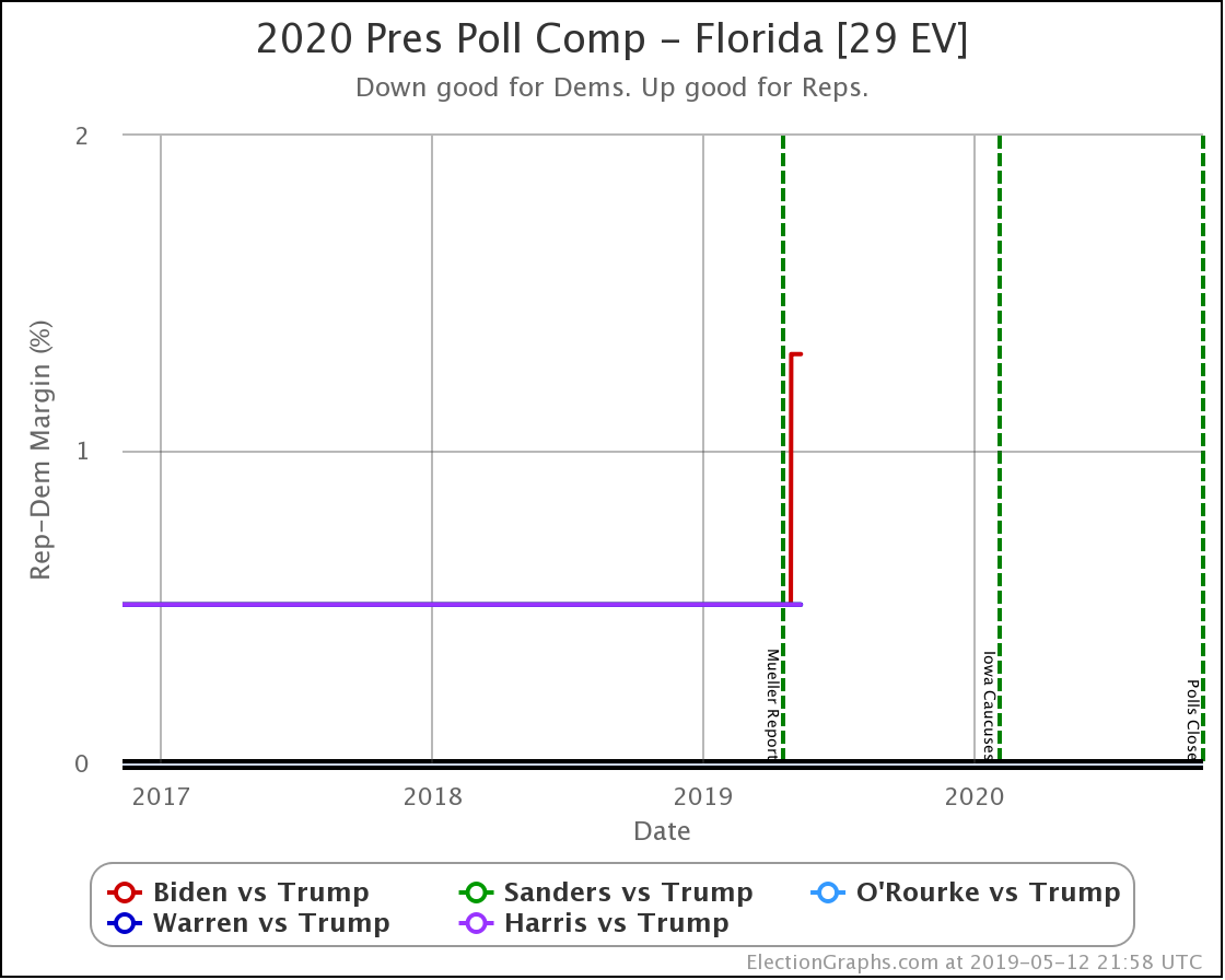
There were new polls in Florida since the last update, but they didn't result in any category changes for the state, so instead I'll talk about some new features I added to the site a few days ago.

Back on January 29th, I discussed a way of taking the historical performance of state-level Election Graphs averages vs. actual election results and using that to infer the odds of the Republican or Democratic candidate winning based on the current Election Graphs average.

Now, to be clear, since this analysis compares the FINAL average before the election to the election results… it did not look at how those averages varied over time in the leadup to the election… this is looking at the odds "if the election was today." There is no factoring in the likelihood of changes over those intervening months as some more complicated models might.

But it still gives a snapshot I think is interesting, and EVERYTHING on Election Graphs is "if the election was today," so it fits in well.

In my May 8th post, I mentioned that I had added a display of these state-level win odds to the state detail pages and state comparison pages. I was only displaying the numbers, not any visualizations. As of this week, I am now displaying charts of how these numbers change over time as well.

To illustrate, I'll show examples of the new charts and how they relate to the older charts.

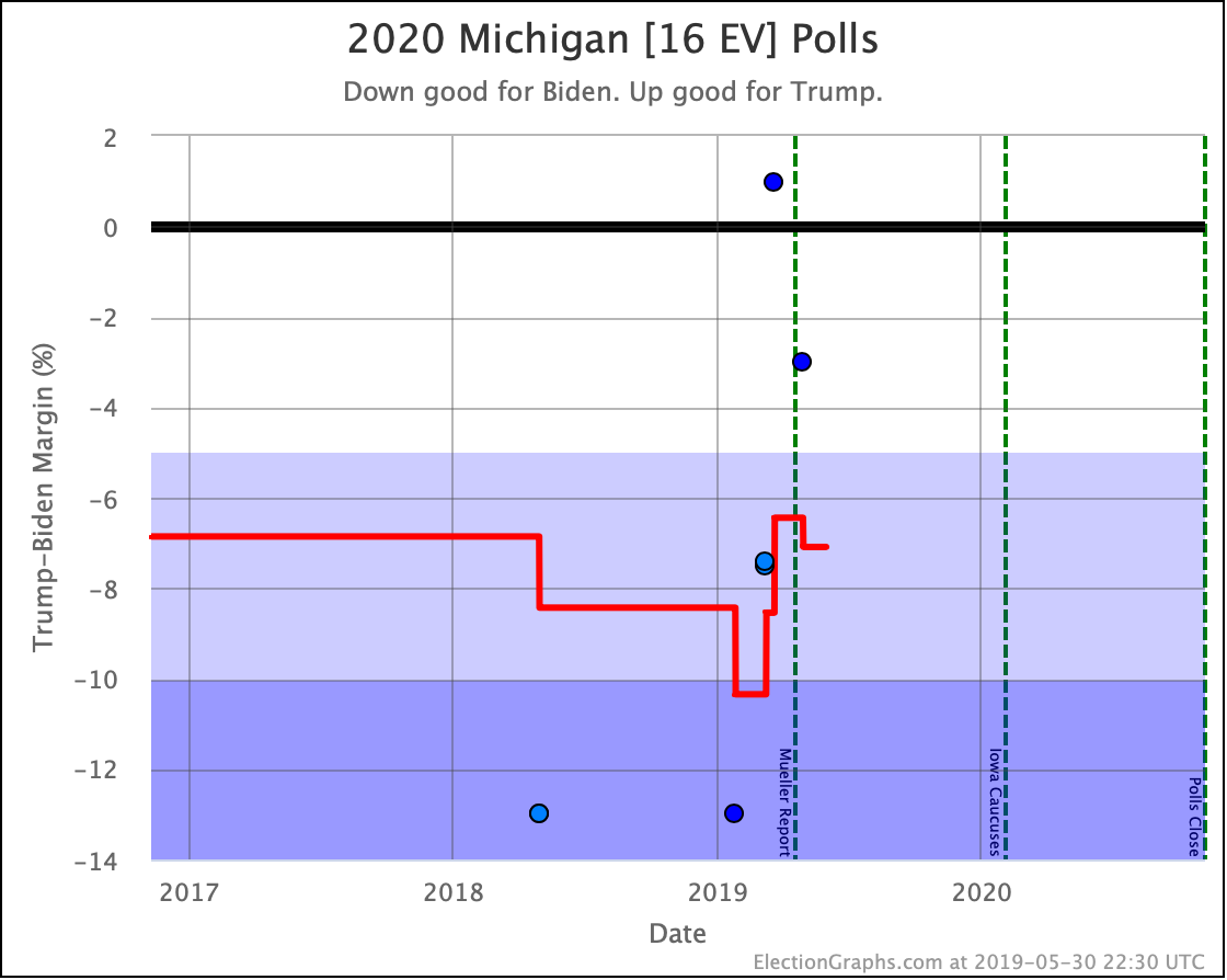
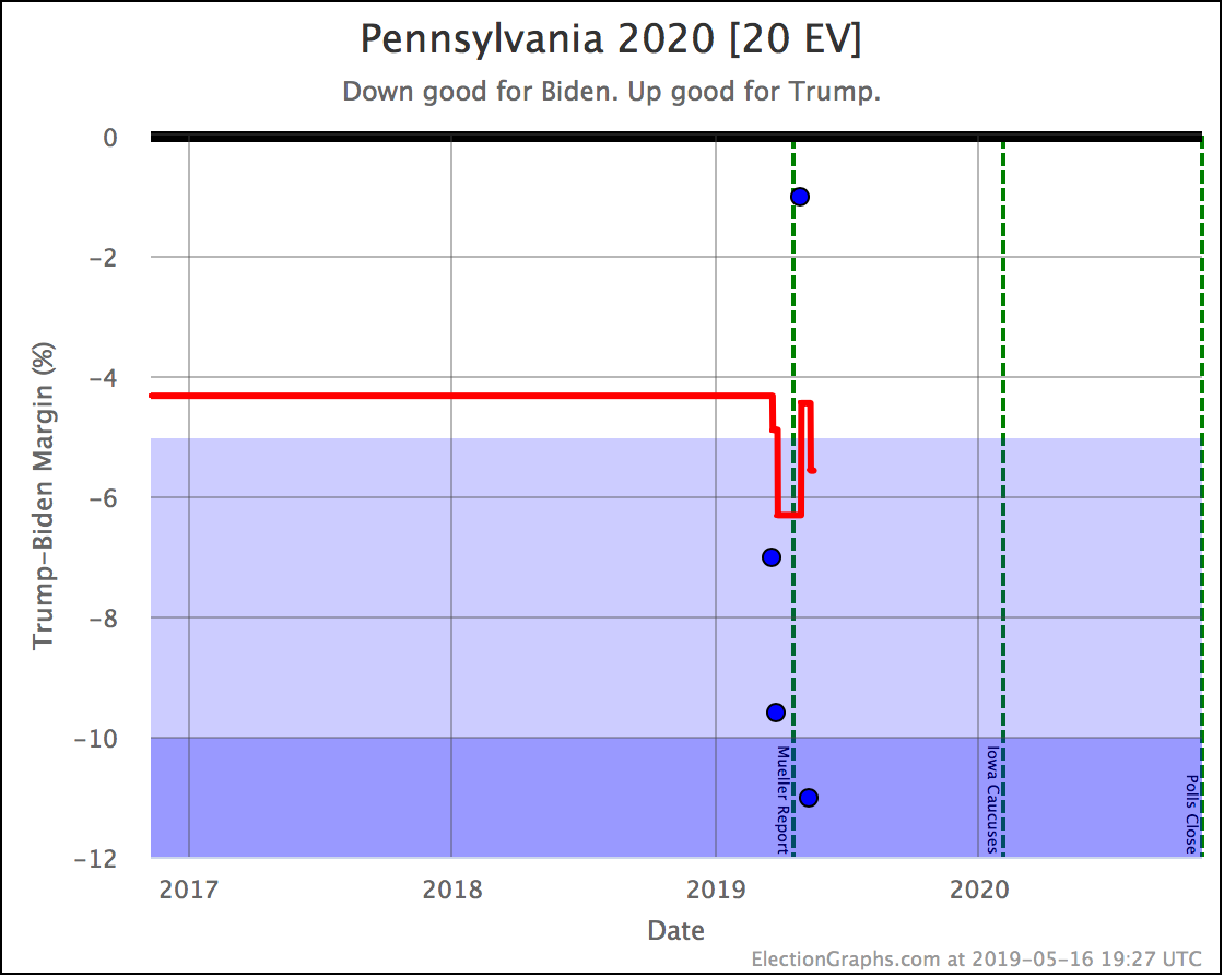
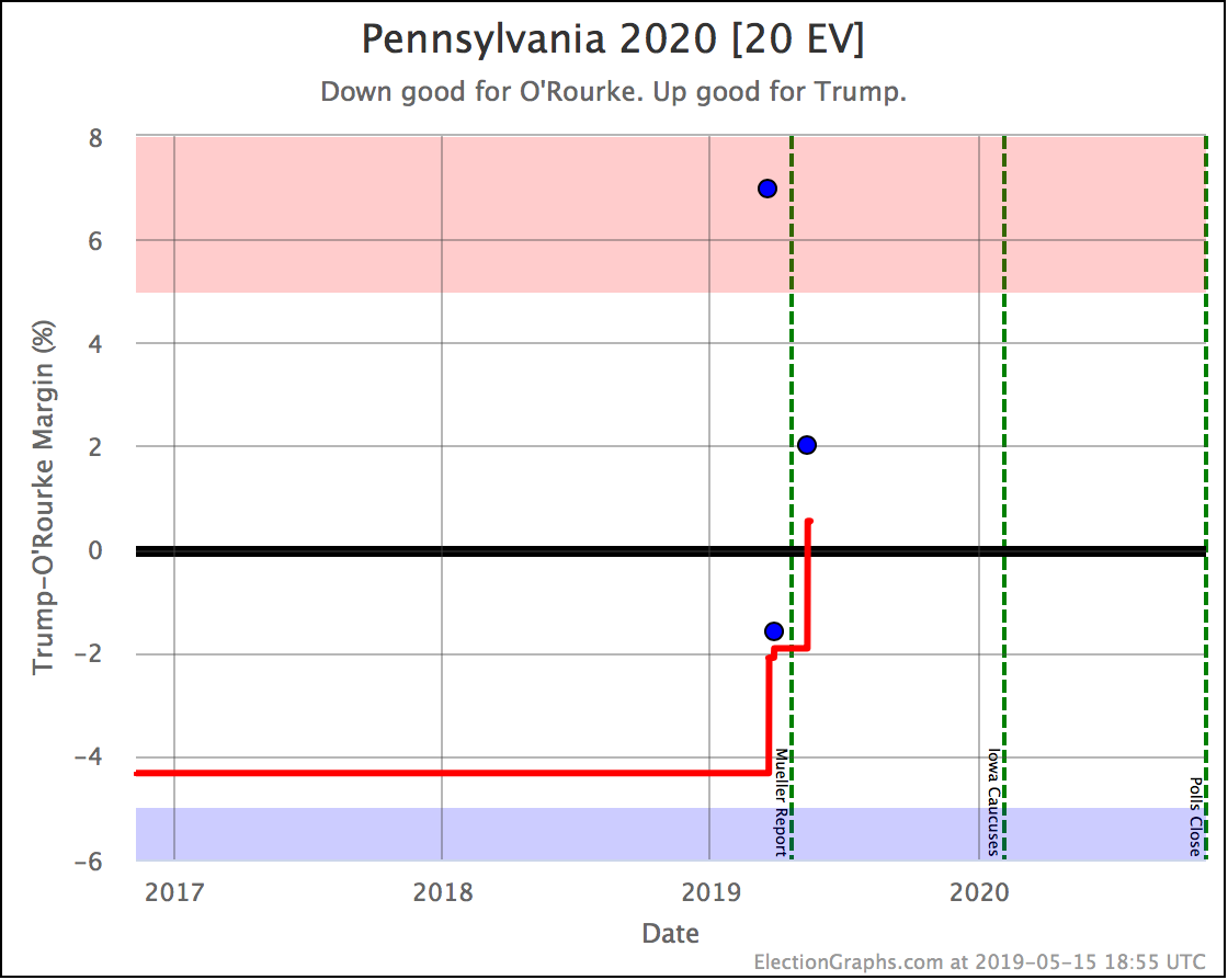
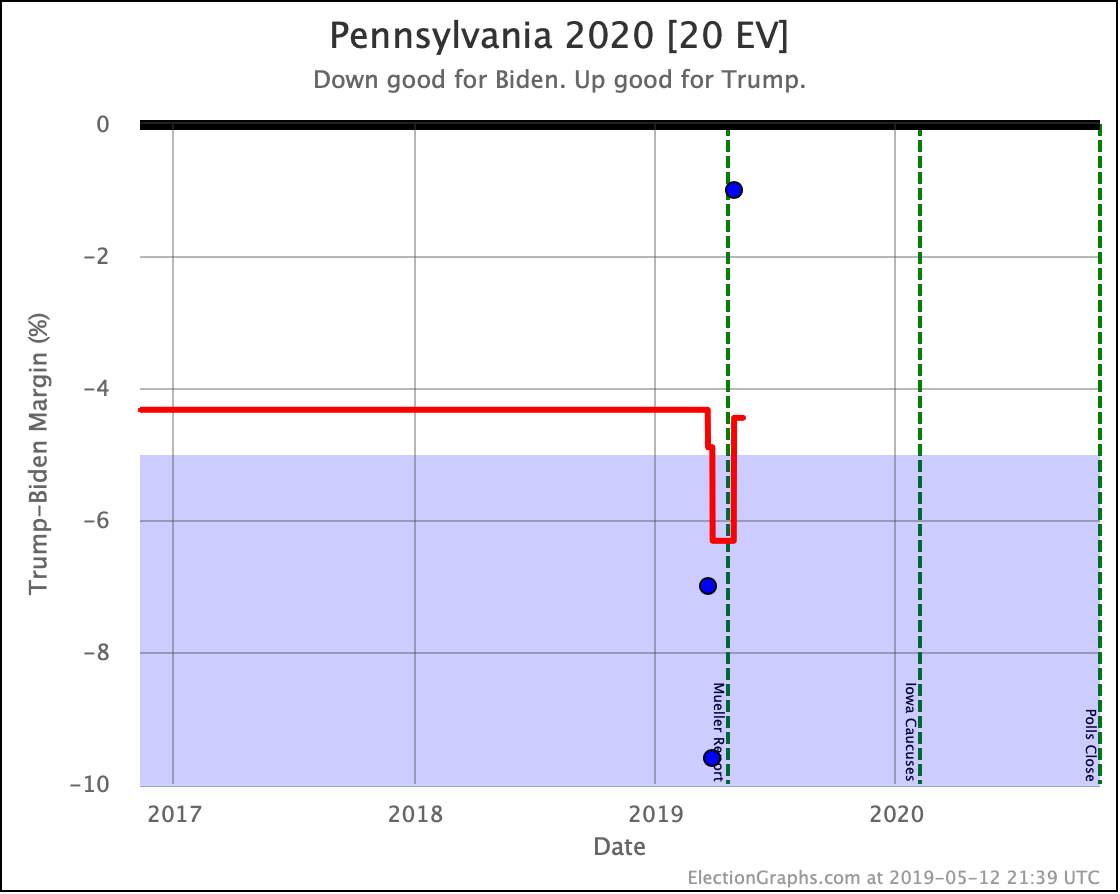
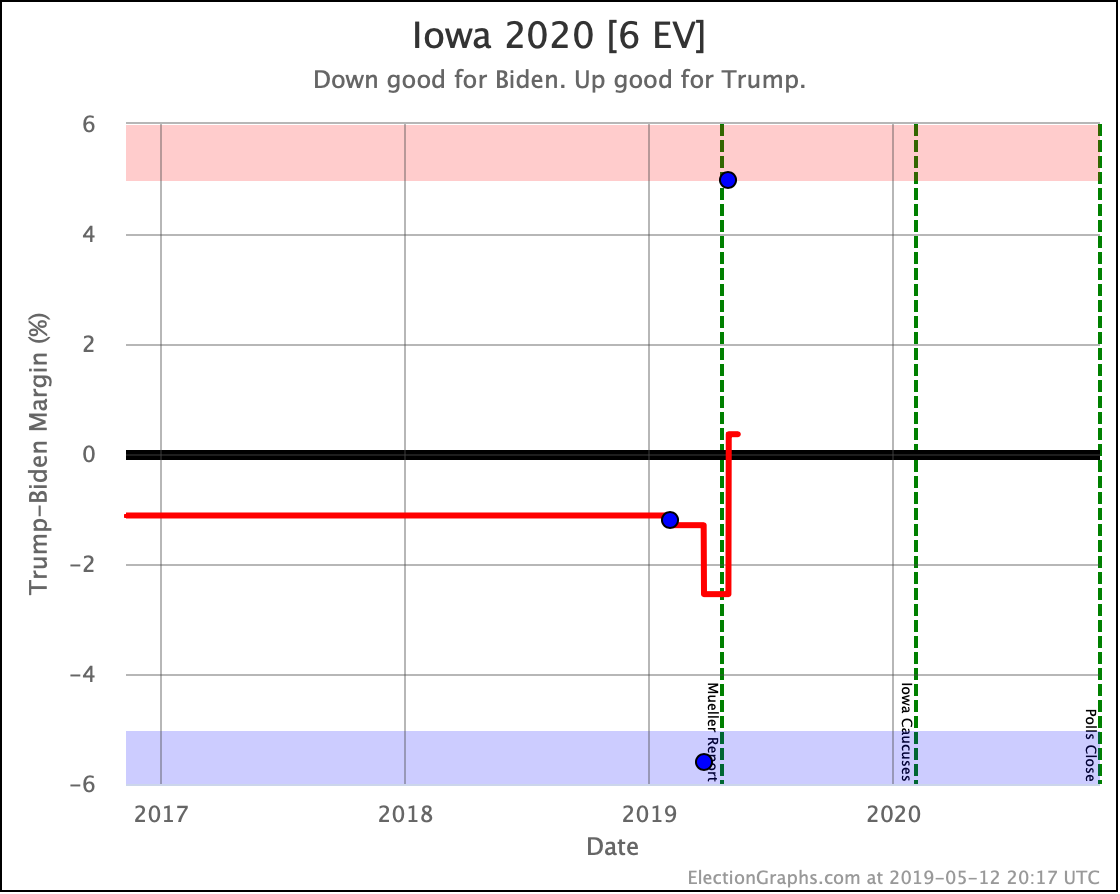
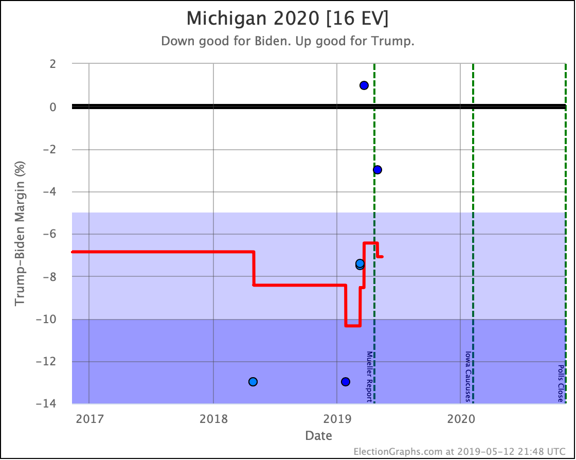
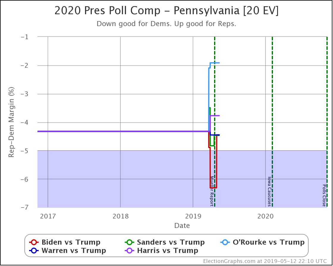
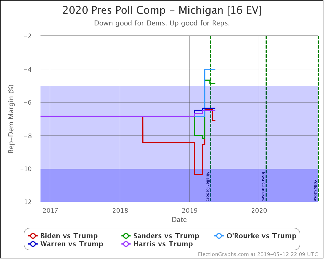
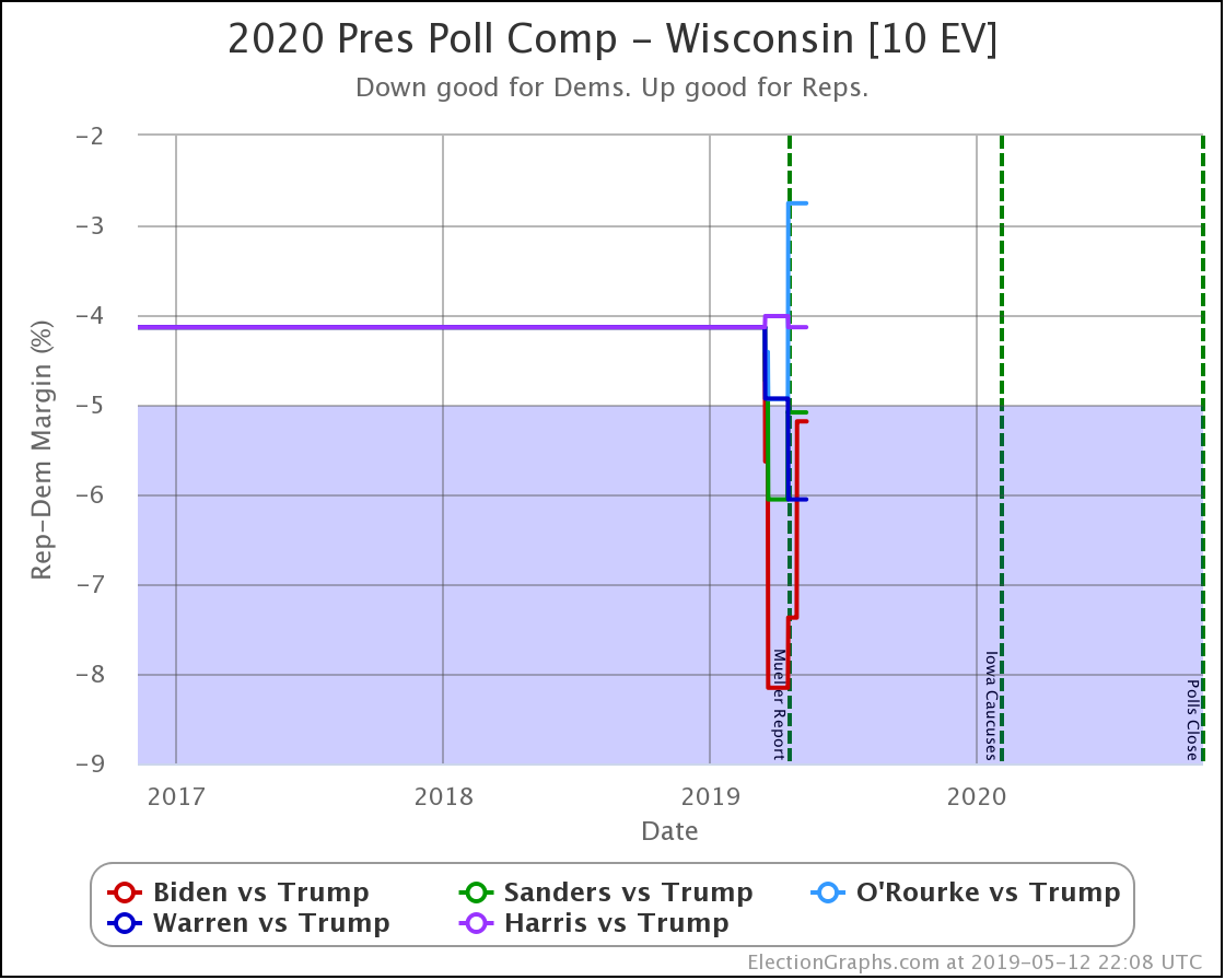
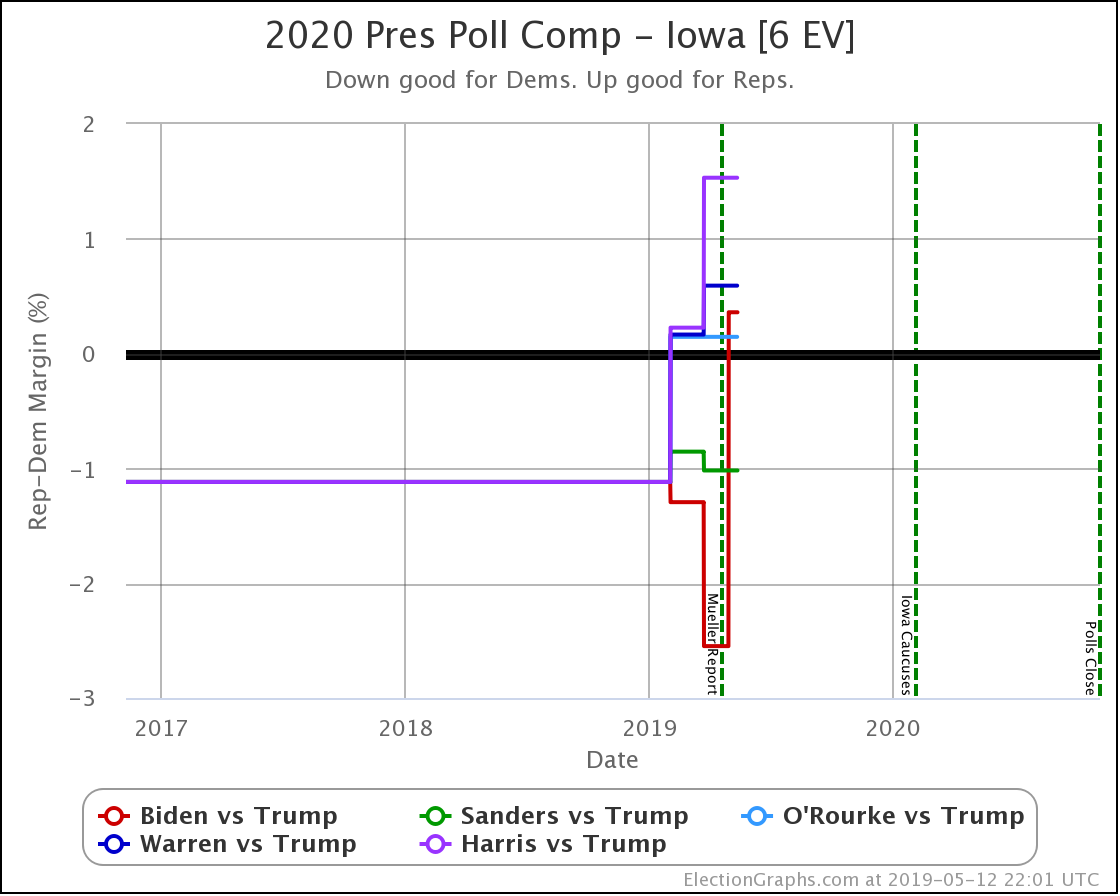
The above is the standard graph for an individual candidate combination and state that has been on Election Graphs since the 2016 cycle. It shows dots for the specific polls and a red line for the Election Graphs average. While this is only a static image in this blog post, on the actual detail page, you can hover over elements of the chart and get more details.

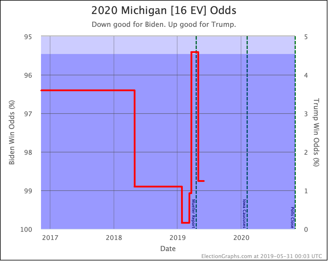
This new view is the graph that I added to the page. It translates the poll average into the chances of each candidate winning the state based on the methodology detailed in that January blog post.

So, in this example, as of right now, Biden has a 7.1% lead in the poll average, which translates into a 98.8% chance of Biden winning the state (or a 1.2% chance of Trump winning). I show the axis labels for the Democrat's chances on the left, but if you prefer, the axis labels on the right show the Republican's chances.

While the first chart does a great job at showing in an absolute way where the polls are, this second chart gives a better idea as to what this means for who is probably going to win and shows how much changes in the poll average do or do not change those odds.

When looking at the state detail page, these two charts are side by side for easy comparison:

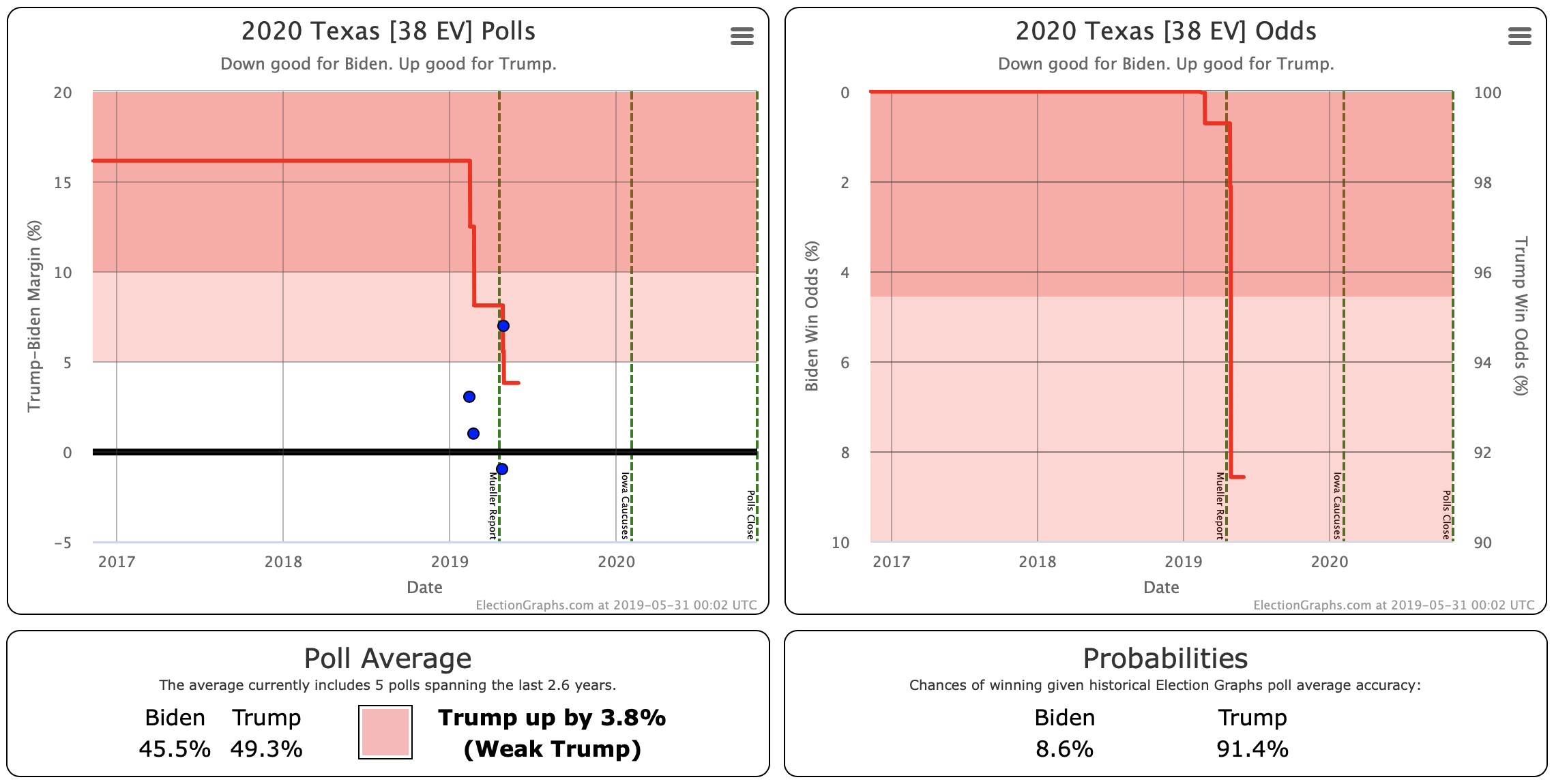
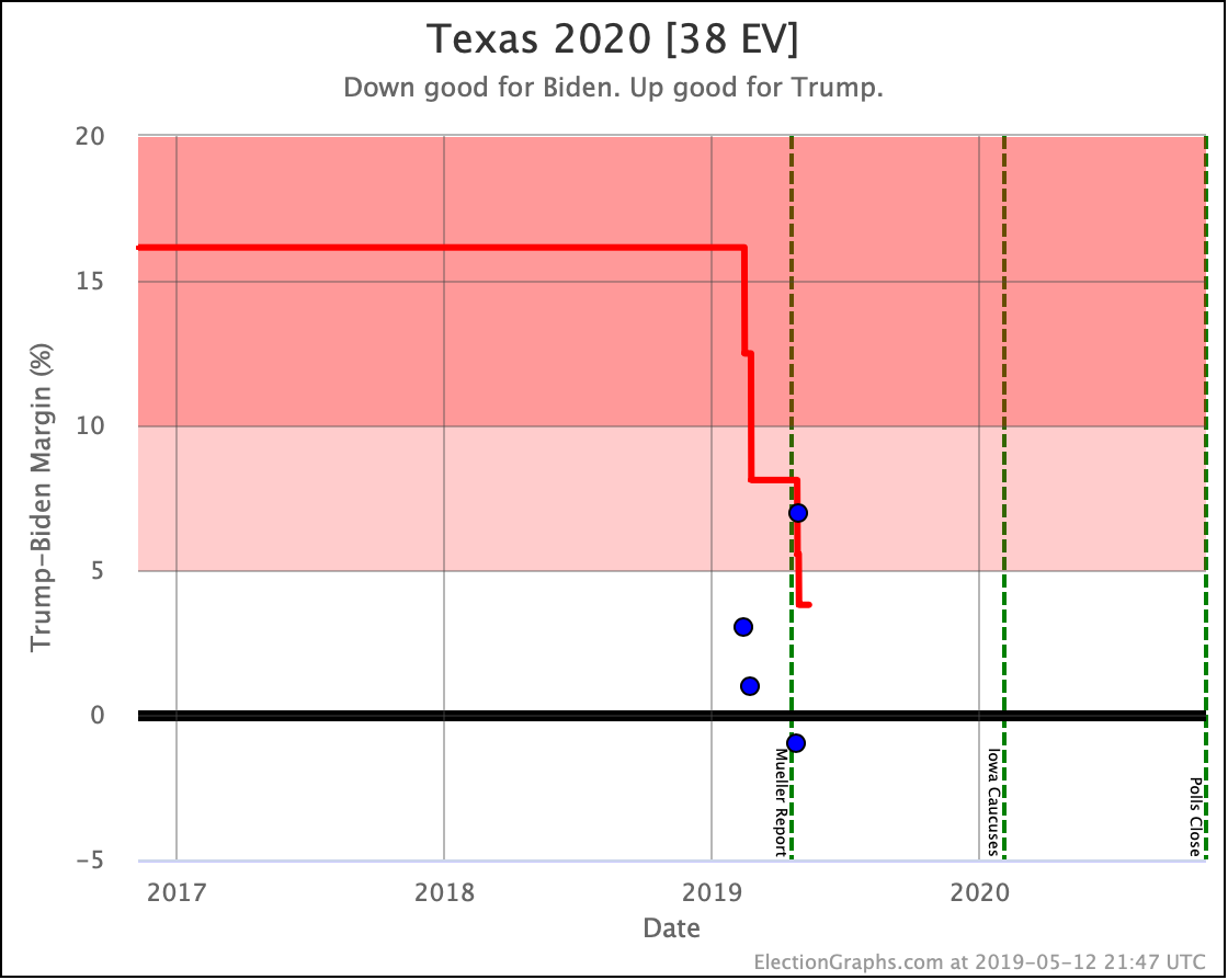
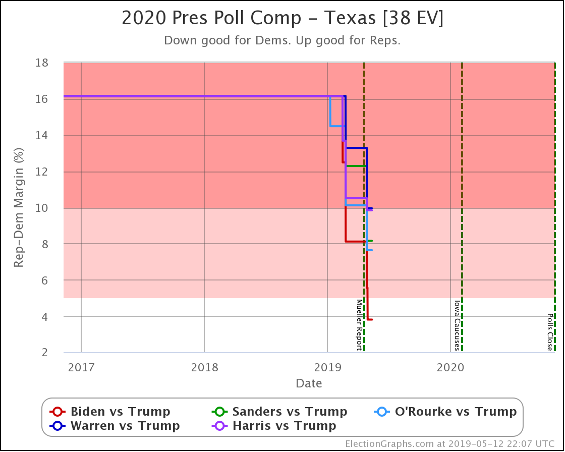
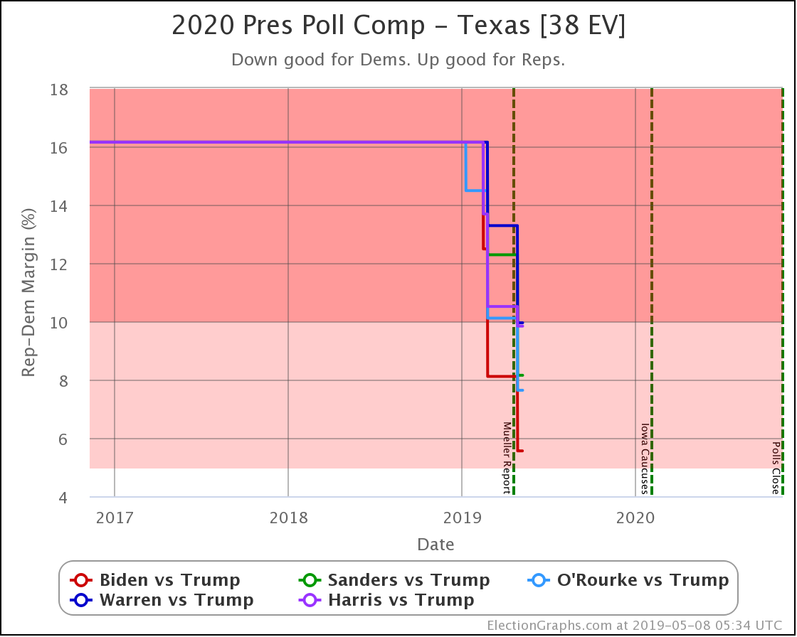
Looking at this example makes clear that the "Weak" category is still pretty broad! That 3.8% Trump lead in Texas translates into a 91.4% chance of Trump winning!

Remember though the following important caveats:

  • As mentioned above, this is "if the election was today." It does not take into account how polls may move in the time between now and the election. Until we get right up to the election, this is very important. Poll averages can and do move quickly. A few weeks can make a huge difference (as shown by the last few weeks before the 2016 election). In the over 500 days we have left at the moment, the world could change completely!
  • I base the odds estimates on the aggregated performance of the Election Graphs averages in 2008, 2012, and 2016. It is possible that those three elections will not be representative or predictive of 2020. As they say in the investment world, "past performance is not a guarantee of future results."
  • For the moment, Michigan is the only state where the Election Graphs average is based only on 2020 polls. For the rest, I'm still "priming" the numbers with election results from 2000 to 2016. Only 13 states have any 2020 polling at all at this early stage, and most of them have three or less. So we still have pretty sparse data.

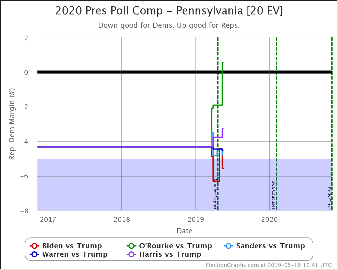
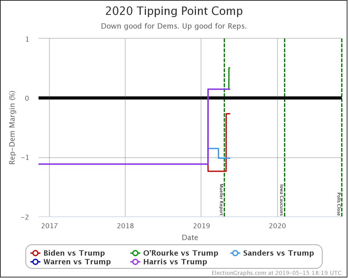
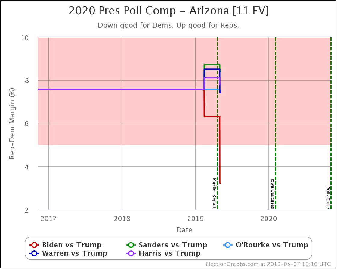
Of course, in addition to the state detail pages for individual candidate matchups, there are also the charts on the comparison page:

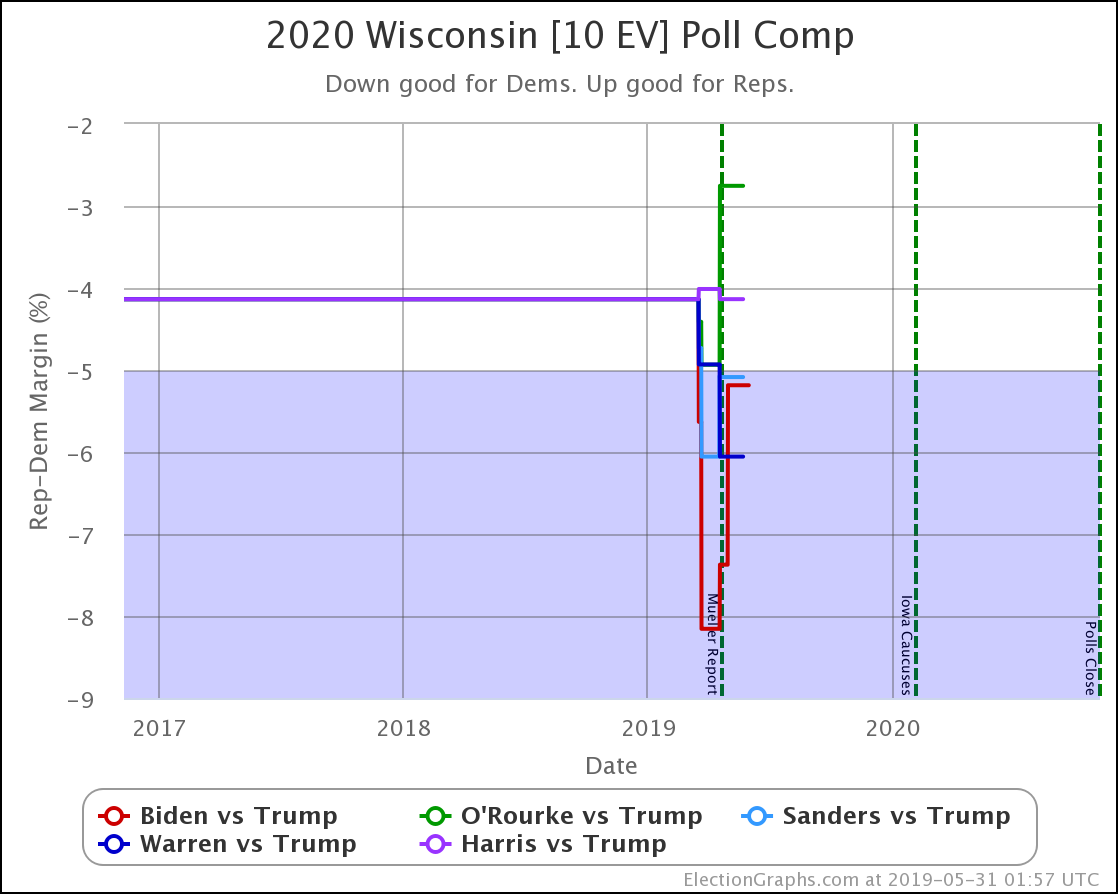
Above is the traditional poll view.

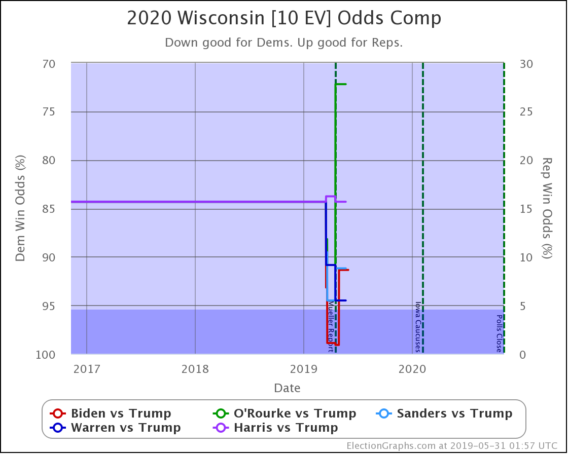
And then the odds based view. The idea is the same as the view for the individual candidate pairs, but of course, you see all five of the best-polled candidate pairs and can compare how they are doing.

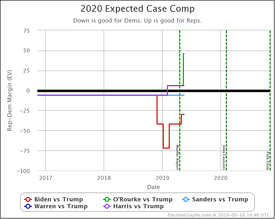
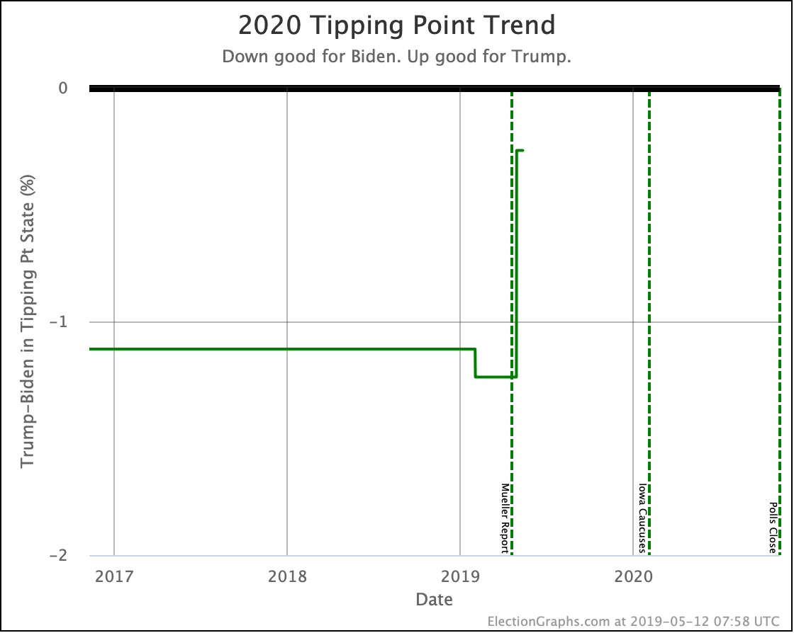
Now, all of the new graphs are on state-level views. What about national? How does this roll up into an overall picture of the election?

Well, it is coming but isn't ready yet. As I described in my January 30th post, you can use these state-level probabilities as part of a Monte Carlo simulation to generate some information on the national picture.

I don't have any of that automated and live yet on the site yet, but I have started to build some of the elements. So here is a preview of the kinds of information this will produce.

First, looking at the odds of winning for the five best-polled candidate pairs (with all the caveats I mentioned above) based on the current Election Graphs averages and 1,000,001 Monte Carlo trials each:

  • Biden 87.3% to Trump 11.9% (0.8% tie)
  • Sanders 74.9% to Trump 23.7% (1.5% tie)
  • Warren 66.1% to Trump 32.0% (1.9% tie)
  • Harris 58.9% to Trump 39.0% (2.0% tie)
  • O'Rourke 48.6% to Trump 49.7% (1.7% tie)

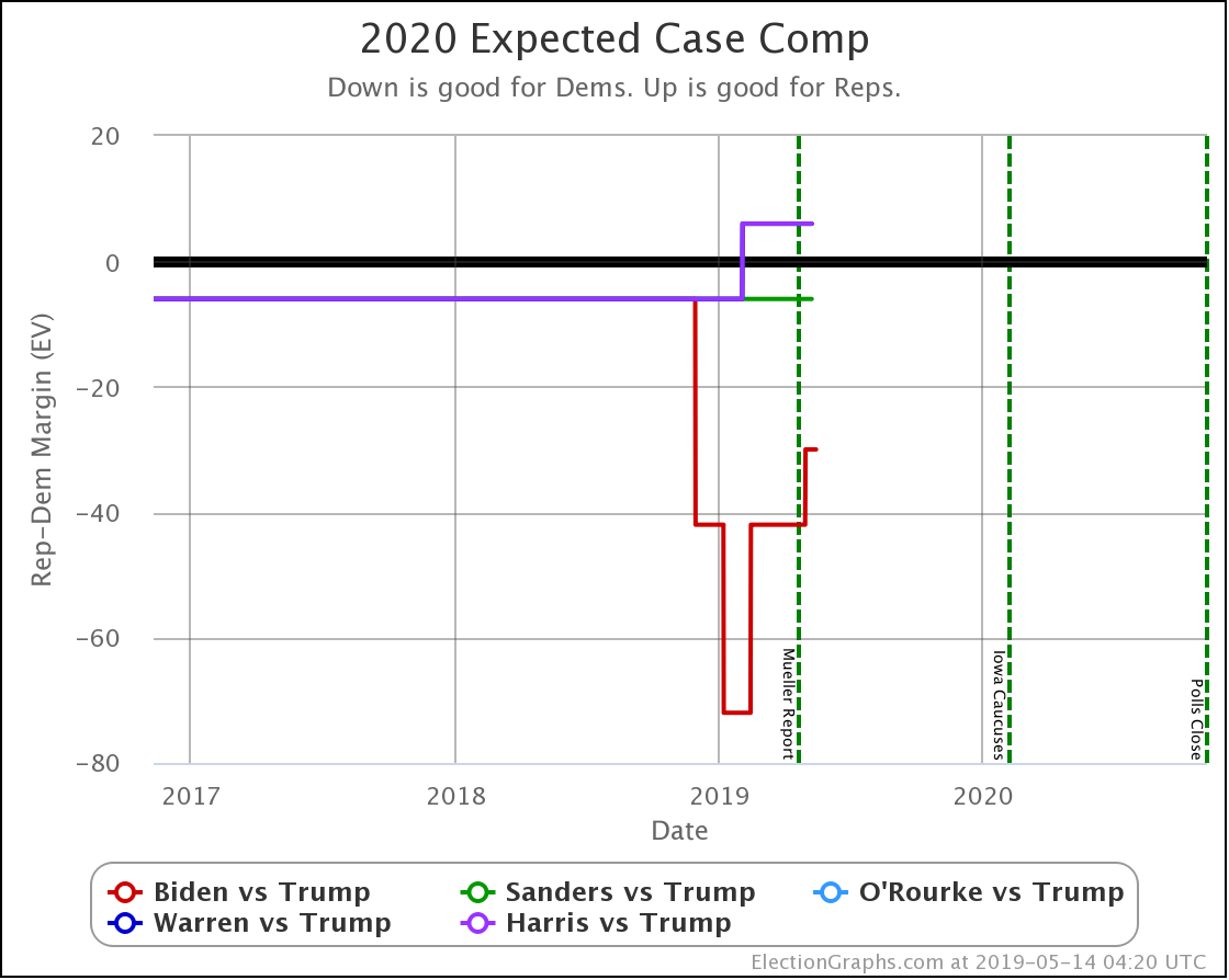
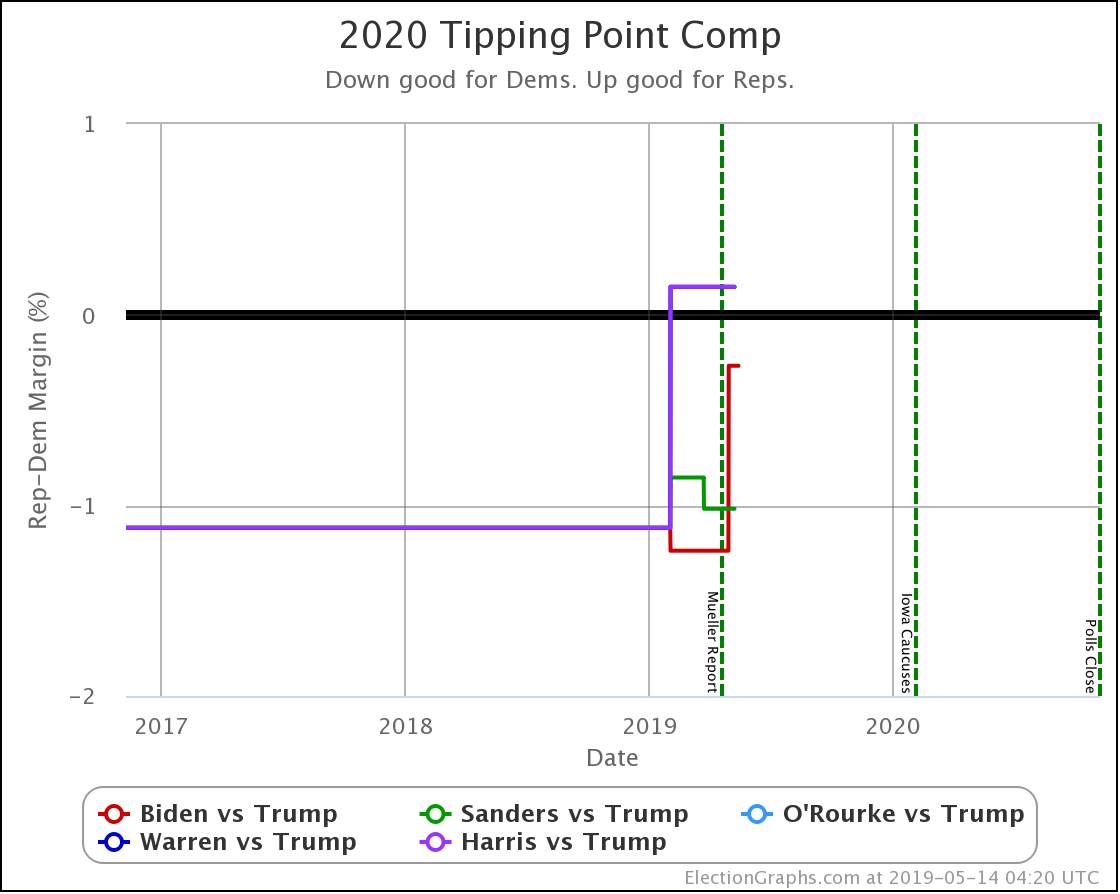
These stats differ a little bit from simply looking at the "expected result" where each candidate wins every state they lead in, or looking at the tipping point metric, as these also look at how likely it is that the various close states end up flipping and going the other way. So this should provide a bit better view of what might happen than those simpler ways of looking at things. But of course, that comes at the cost of complexity and being a bit harder to understand.

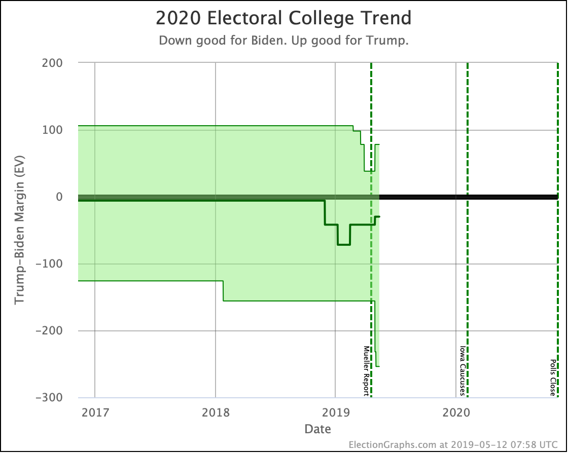
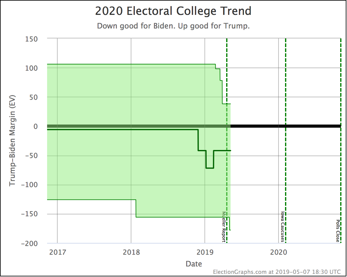
Another kind of view that will come out of this is looking at the range of possibilities in a bit more sophisticated way than the "envelopes" already shown on the site. Looking at Biden vs. Trump as an example:

  • Median Result: Biden by 52 electoral votes
  • Central 1σ (68.3% chance): Biden by 106 EV to Biden by 6 EV
  • Central 2σ (95.4% chance): Biden by 158 EV to Trump by 30 EV
  • Central 3σ (99.7% chance): Biden by 218 EV to Trump by 66 EV

So, sometime in the next few weeks, I'll probably get these textual stats added to the live site and automatically updated when I add new polls. After that, I'll try to get some visualizations of both the current state and how that evolves up on the site, but that will take longer.

Anyway. Coming soon.

522.8 days until polls start to close!

For more information:

This post is an update based on the data on the Election Graphs Electoral College 2020 page. Election Graphs tracks a poll-based estimate of the Electoral College. The charts, graphs, and maps in the post above are all as of the time of this post. Click through on any image to go to a page with the current interactive versions of that chart, along with additional details.

Follow @ElectionGraphs on Twitter or Election Graphs on Facebook to see announcements of updates. For those interested in individual poll updates, follow @ElecCollPolls on Twitter for all the polls as I add them. If you find the information in these posts informative or useful, please consider visiting the donation page.

Biden strong again in PA, while O'Rourke falters

Since the last update, there was a new Quinnipiac poll in Pennsylvania.

This resulted in status shifts for Biden vs. Trump and O'Rourke vs. Trump.

Biden vs. Trump:

  • PA has moved from Weak Biden to Strong Biden
  • Trump best case vs Biden has changed: Biden 230 to Trump 308 -> Biden 250 to Trump 288

O'Rourke vs. Trump:

  • PA has moved from Weak O'Rourke to Weak Trump
  • Tipping point change: Trump by 0.1% in VA -> Trump by 0.5% in FL
  • O'Rourke vs Trump expected case changed: O'Rourke 266 to Trump 272 -> O'Rourke 246 to Trump 292

Lets look at some of the relevant charts:

The Quinnipiac poll is the fourth Biden vs. Trump poll in Pennsylvania. The last one, from WPA Intelligence, is looking like an outlier at this point. As with the last post, I will link to a great thread on Twitter by Charles Franklin that explains why this is not entirely unexpected.

The average is currently made up of three polls showing a 7% to 11% Biden lead, one poll showing only a 1% lead, and the 2016 election, which was a 0.7% Republican win. The three polls showing strong Biden leads are enough to pull Pennsylvania back out of the swing state category for now with a 5.6% Biden lead over Trump.

Based on historical Election Graphs average accuracy, this translates into a 93.2% chance of a Biden win.

Meanwhile, this is the third O'Rourke vs. Trump poll in Pennsylvania, and none of them are great for O'Rourke. The best of the three has him ahead by only 1.6%, and the other two have him losing to Trump. Adding in the 2016 and 2012 elections to round out a five poll average, O'Rouke is now behind in Pennsylvania. Trump leads by 0.5%.

Based on historical Election Graphs average accuracy, this translates into a 59.8% chance of a Trump win.

Looking at the comparison view with all of the five best polled Democrats against Trump, you can see that Biden is once again doing better than any of the other Democrats, followed by Sanders, Warren, Harris, and finally O'Rourke.

For those counting, this now puts Biden as doing better than the other Democrats in 9 out of the 13 states where there has been Biden vs. Trump polling. That's 69.2%. Not quite the 83.3% he had a week ago, but still notable.

Looking nationally, the "expected case" where every candidate wins every state where they lead in the Election Graphs average, this now puts O'Rourke in the worst position of these five Democrats against Trump, losing to Trump by 46 electoral votes. Biden does best, winning by 30 electoral votes.

The tipping point also shows O'Rourke doing the worst of these Democrats, with the tipping point being a 0.5% Trump lead in Florida. On this metric though, Sanders does best, leading Trump by 1.0% in Iowa.

In both of these metrics, we have Biden and Sanders very narrowly leading Trump, while Trump very narrowly leads O'Rourke, Warren, and Harris.

But all five races are very narrow. We've got a long way to the election still, and lots of states with little or no polling, but for now, the story is still that this could easily go either way.

537.1 days until polls start to close.

For more information:

This post is an update based on the data on the Election Graphs Electoral College 2020 page. Election Graphs tracks a poll-based estimate of the Electoral College. The charts, graphs, and maps in the post above are all as of the time of this post. Click through on any image to go to a page with the current interactive versions of that chart, along with additional details.

Follow @ElectionGraphs on Twitter or Election Graphs on Facebook to see announcements of updates. For those interested in individual poll updates, follow @ElecCollPolls on Twitter for all the polls as I add them. If you find the information in these posts informative or useful, please consider visiting the donation page.

Texas and Pennsylvania close, Iowa flips red

Since the last update, there have been poll updates in Florida, Iowa, Texas, Wisconsin, Michigan, and Pennsylvania. These new polls were all part of a single release from WPA Intelligence, and they ONLY polled the Biden vs. Trump matchup.

There are several caveats about this polling. For more on that, I'll point you to a great thread on Twitter by Charles Franklin, Director of the Marquette Law School Poll where he goes into the details.

Election Graphs tries to include everything though, without any fancy weighting, so a poll like this can make some waves. So let's look at what Election Graphs status changes came out of this polling.

Due to Iowa:

  • IA has moved from Weak Biden to Weak Trump
  • Biden vs. Trump tipping point change: Biden by 1.2% in CO -> Biden by 0.3% in OH
  • Biden vs. Trump expected case changed: Biden 290 to Trump 248 -> Biden 284 to Trump 254

Due to Texas:

  • TX has moved from Strong Trump to Weak Trump
  • Biden best case vs. Trump has changed: Biden 358 to Trump 180 -> Biden 396 to Trump 142

Due to Pennsylvania:

  • PA has moved from Strong Biden to Weak Biden
  • Trump best case vs. Biden has changed: Biden 250 to Trump 288 -> Biden 230 to Trump 308

We'll look at the national charts first, then dig into the state charts.

The most significant impact on the "envelope" is that it has widened significantly. Texas and Pennsylvania are now "in play," and just a few days ago Arizona started looking close too.

The difference between the case where all the close states go to Trump (a 78 electoral vote margin in Trump's favor, coming close to replicating Trump's 2016 margin), and the case where all the close states go to Biden (a 254 electoral vote margin in Biden's favor), is now huge.

There are lots of electoral votes in swing states, so there is a wide range of reasonable possibilities here.

At the same time, the middle line, showing where we are if both candidates win precisely the set of states where they are ahead in the poll average, gets closer. Biden still leads, but by only 30 electoral votes.

At the moment, this looks to be a very close race.

The tipping point chart shows this as well. The tipping point is the margin in the state that puts the winning candidate over the top. That is now Ohio, where Biden leads Trump by 0.3% in the current polling average.

As a comparison, on election eve in 2016, Clinton led Trump by 1.6% in the tipping point metric. And she lost.

Adding to that, given the historical performance of Election Graphs poll averages, an 0.3% Democratic lead ends up being only about a 48.8% chance of the Democrat winning. Given how actual election results have gone vs. the Election Graphs poll averages, the Republican is more likely to succeed when the Democrat leads by this narrow a margin!

Now, I don't have simulations in place yet for the full general election to produce odds there (maybe that will happen sometime in June if I get enough free time to do that), but with the tipping point this close to zero, and the envelope being so broad, things are clearly too close to call.

Now, let's look at some of the individual states, first with Biden vs. Trump only, then we'll compare to some of the other candidates.

In Texas, the new poll, showing Trump leading Biden by 7%, is the most favorable of the four surveys done in Texas so far, but along with the others, it confirms a race much closer than the historical average of a 16.1% Republican win from the 2000-2016 elections.

This change was enough to tip the state into "Weak Trump" territory. With a 3.8% lead in the average though, this still translates into a 91.4% chance of a Trump win.

In Pennsylvania, this is only the third Biden vs. Trump poll. This poll shows the closest race yet and brings the average for the state back near the historical average election performance. Which of course means it is back in "Weak Biden" territory after a brief foray in the "Strong Biden" zone. Given the historical accuracy, this 4.5% Biden lead becomes an 88.6% chance of a Biden win.

Once again the best poll result for Trump out of three, and once again a large range in recent polls. This time the average gets pulled from just barely Biden, to just barely Trump.

Before we start comparing to other candidates, one more state to highlight:

Biden vs. Trump in Michigan now has FIVE polls. This matchup/state combo is the first to have a full five data points, meaning the polling average is based only on actual polls and is not being "filled out" using previous election results.

Presumably, this will be happening more and more often now, but this is the first.

Now, this set of polls ONLY looked at Biden vs. Trump, but it moved how Biden was doing relative to the other Democratic contenders in terms of how they fare against Trump.

Before this set of polls, there had been Biden vs. Trump polling in 12 states: MA, MI, NH, WI, NV, PA, OH, IA, NC, AZ, TX, SC.

Of those states, Biden did better against Trump than the rest of the "best polled" candidates in all except New Hampshire and Michigan.

So he was better than the other Democrats in 83.3% of the states where there was polling.

Let's see where he is after these six polls:

In Texas, Biden continues to do better than the other Democrats. So still 10/12.

This survey is the very first poll in Florida, so the other candidates still show up as the average of the last five elections. But the new data point makes Florida a bit redder, so Biden is not doing better than the others here now. So 10/13 now.

In Pennsylvania, Biden had been doing better than the rest, but now he ties with Sanders and Warren. So now 9/13.

Michigan WAS one of the two states where Biden wasn't doing better than the other Democrats. Now he is. So 10/13.

Biden had been doing best in Wisconsin. Now Warren does better. 9/13.

Biden had been doing best in Iowa, now both Sanders and O'Rourke do better. So we are now at 8/13.

8/13 = 61.5%. So of the individual states where there has been polling, what HAD been a very consistent story of Biden doing better than everyone else against Trump has slipped considerably.

A quick look nationally:

The "expected case" where each candidate gets the states where they lead in the Election Graphs average, no more, no less, still has Biden winning by a 30 electoral vote margin, while Sanders only wins by 6 electoral votes, and O'Rourke, Warren, and Harris all LOSE to Trump by 6 electoral votes. So Biden is still slightly ahead here.

In the tipping point though,  Biden now leads by 0.3%, which is better than O'Rourke, Warren, and Harris, who all lose by 0.1%. But Sanders leads by 1.0%.

So by this metric Sanders is doing better in the national race than Biden against Trump.

So what does this mean? Biden being ahead on the electoral vote margin, but behind on tipping point, essentially means that while his expected winning margin might be more, that lead is much more precarious.

Of course, as I said before, Clinton had a 1.6% tipping point lead and lost. So with all of these tipping points, the bottom line is that this still looks like a very very close race.

No matter which Democrat you pit against Trump, it looks like a dead heat.

And there is no longer a convincing case that any one of those Democrats is doing distinctly better than the others against Trump.

Can I put this in terms of percent chances of winning for each of the Democrats when matched against Trump? No. Not yet. But I'll be working on it.

Stay tuned. Everything is wide open.

539.8 days until polls start to close.

For more information:

This post is an update based on the data on the Election Graphs Electoral College 2020 page. Election Graphs tracks a poll-based estimate of the Electoral College. The charts, graphs, and maps in the post above are all as of the time of this post. Click through on any image to go to a page with the current interactive versions of that chart, along with additional details.

Follow @ElectionGraphs on Twitter or Election Graphs on Facebook to see announcements of updates. For those interested in individual poll updates, follow @ElecCollPolls on Twitter for all the polls as I add them. If you find the information in these posts informative or useful, please consider visiting the donation page.

Biden makes Arizona close

Since the last update, there have been polls in Texas and Arizona.

Only Arizona resulted in a blog-worthy change.

Namely, the Biden vs. Trump matchup moved from "Strong Trump" to "Weak Trump."

The two polls we have so far on this matchup in Arizona have Biden doing significantly better than Democrats have fared here in recent Presidential elections. The latest one shows Biden ahead.

Given these results, the average is moving in the Democratic direction, but given Arizona's history, it would take more polls to pull the race into blue territory. For now, Biden will have to settle for the state being in reach as Trump's lead drops under 5% to 3.2% which improves Biden's "best case" on our bubble:

The case where Biden wins all the close states, now including Arizona, is the downward bump in the bottom right of the "envelope of possibilities" shown above.

Now, Democrats shouldn't be too excited about Arizona yet.

This week Election Graphs has added "win probabilities" based on the data shown in the "Polling Error vs. Final Margin" post back in January. Basically, given the history of how Election Graphs poll averages have matched up against actual election results in the 2008 to 2016 elections, I produce an estimate for the chances of each outcome given the margin. You can now see this on any of the state detail pages and state comparison pages.

At the "Republican leads by 3.2%" level this gives an estimate that Trump has an 87.7% chance of winning Arizona, leaving Biden with only a 12.3% chance. Now, this is non-trivial. But Trump still has a pretty substantial advantage, until or unless more polls come out confirming a Biden lead.

A few caveats since this is the first time I'm referencing this type of calculation:

  1. These "win chances" are based on the past performance of Election Graphs averages, and past performance may or may not be a good indicator of future results.
  2. The model represents "if the election was today." It does not take into account the probabilities of the polls moving one way or another in the time between now and the election.
  3. Since there are only two polls of this matchup in this state so far, only 2/5 of the data points included in the average are even real polls as opposed to results from previous elections.
  4. It is still a long, long time until the election. Things will change.

But still, this is a fun new number to look at, and I'll be referring to the "win odds" more often as new results come in. There will also be new visualizations of this metric coming soon. And while so far I've only added this information on the state detail and comparison pages, the intention is, of course, to use this as the basis for a Monte Carlo simulation of the national race in the way I mentioned in the January "Predicting 2016 by Cheating" post.

Stay tuned.

In the meantime, back to Arizona for a bit.

As has been the pattern in poll after poll, Biden is doing better against Trump than the other Democrats. You can see above that so far Biden vs. Trump is the only one of the five best-polled candidate combinations where the Democrat is polling dramatically different than the historical election result average in Arizona.

Biden looks like he makes Arizona competitive.

The others, not so much.

Finally, just a quick look at Texas as well:

Unlike Arizona, in the case of Texas, ALL FIVE Democrats are doing significantly better against Trump than the historical election average. But that average was much more Republican to start with, so even with the polling averages moving in a Democratic direction, none of the five Democrats put Texas into swing state territory yet.

Biden, as usual, is doing best. Trump only leads Biden by 5.6%.

Using the new probabilities feature on Election Graphs, this translates into a 2.1% chance of Biden taking Texas.

545.7 days until polls start to close.

For more information:

This post is an update based on the data on the Election Graphs Electoral College 2020 page. Election Graphs tracks a poll-based estimate of the Electoral College. The charts, graphs, and maps in the post above are all as of the time of this post. Click through on any image to go to a page with the current interactive versions of that chart, along with additional details.

Follow @ElectionGraphs on Twitter or Election Graphs on Facebook to see announcements of updates. For those interested in individual poll updates, follow @ElecCollPolls on Twitter for all the polls as I add them. If you find the information in these posts informative or useful, please consider visiting the donation page.