New Charts for the Probabilistic View

A couple of months ago, Election Graphs added charts showing how the odds of candidates winning each state evolved. Since then we have referred to those odds quite a bit, and have also discussed how I can combine those individual state by state odds through a Monte Carlo simulation.

I started doing those simulations offline and occasionally reporting results based on that here on the blog. But these were still only manual simulations I was doing offline. Nothing on the ElectionGraphs.com pages for Election 2020 showed this.

Well, a couple of weekends ago, I fixed that, and have done a bit of debugging since, so it is ready to talk about here. I have started with the comparison page where you can look at how various candidate pairs stack up against each other.

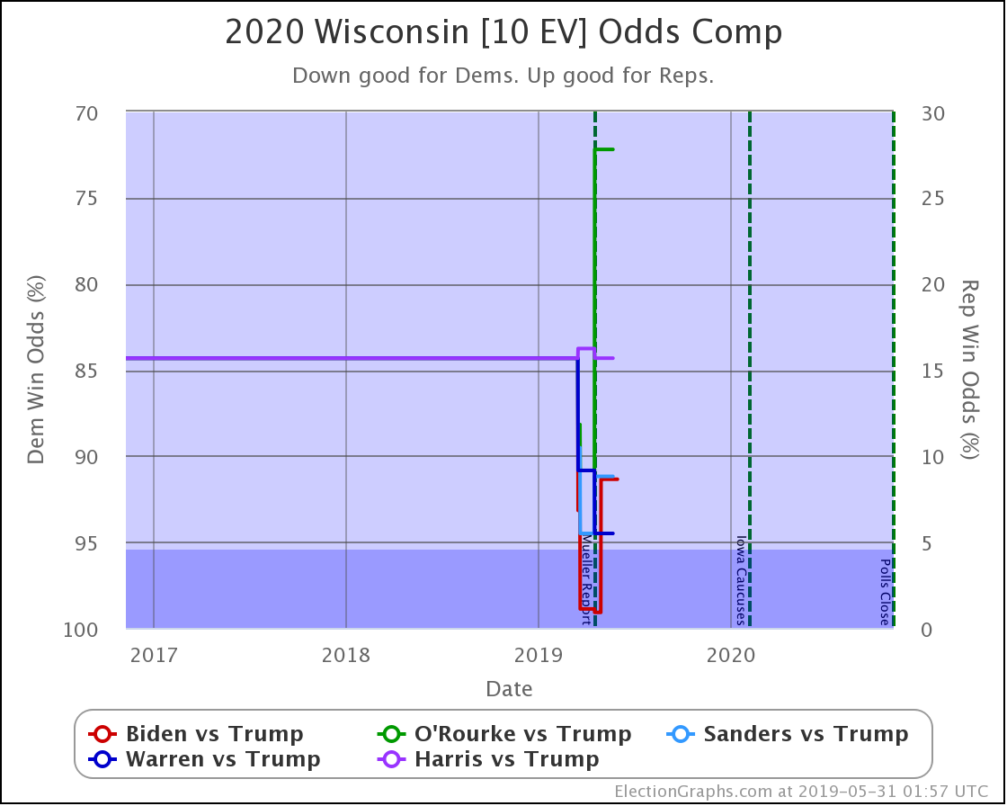
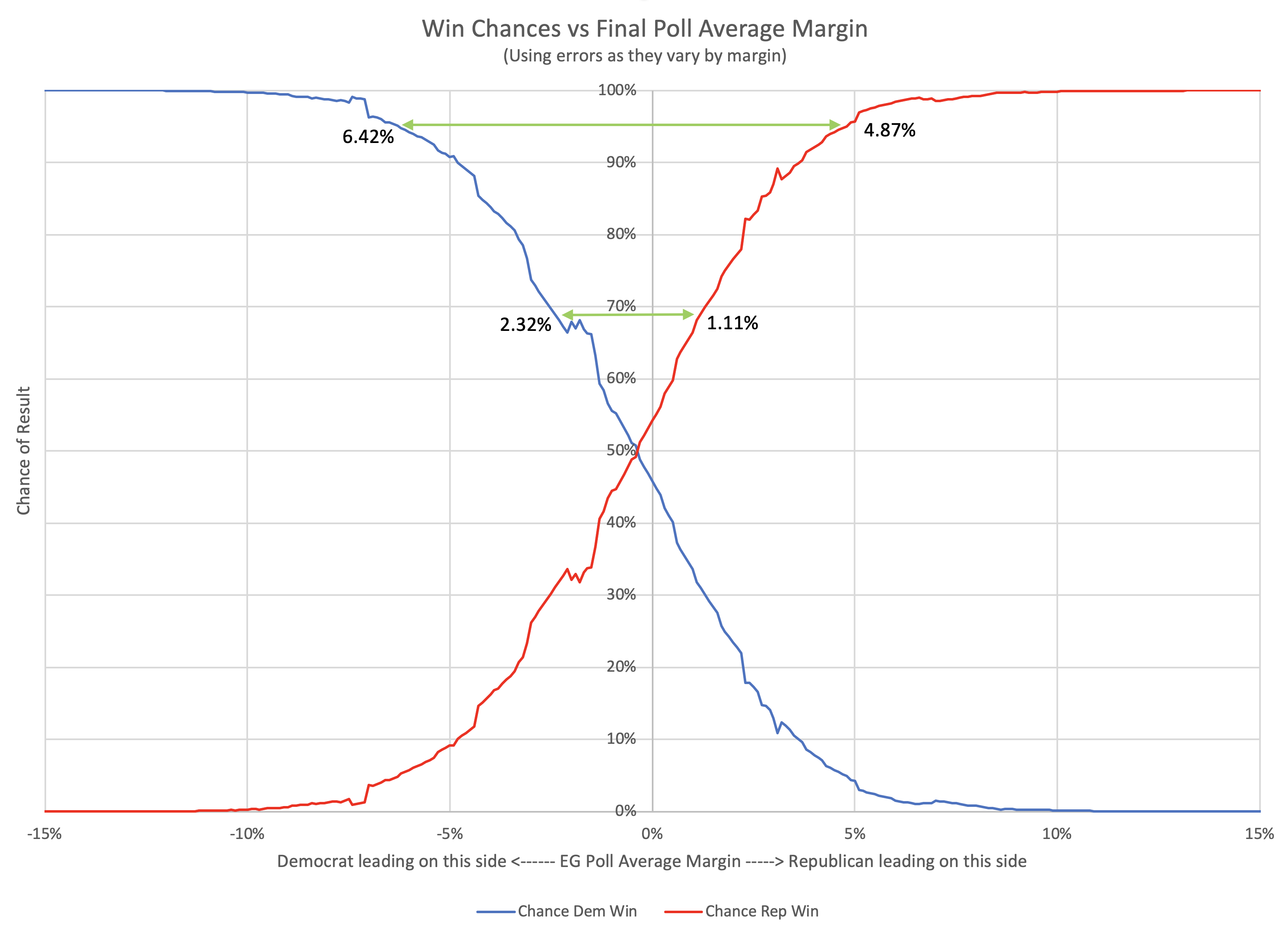
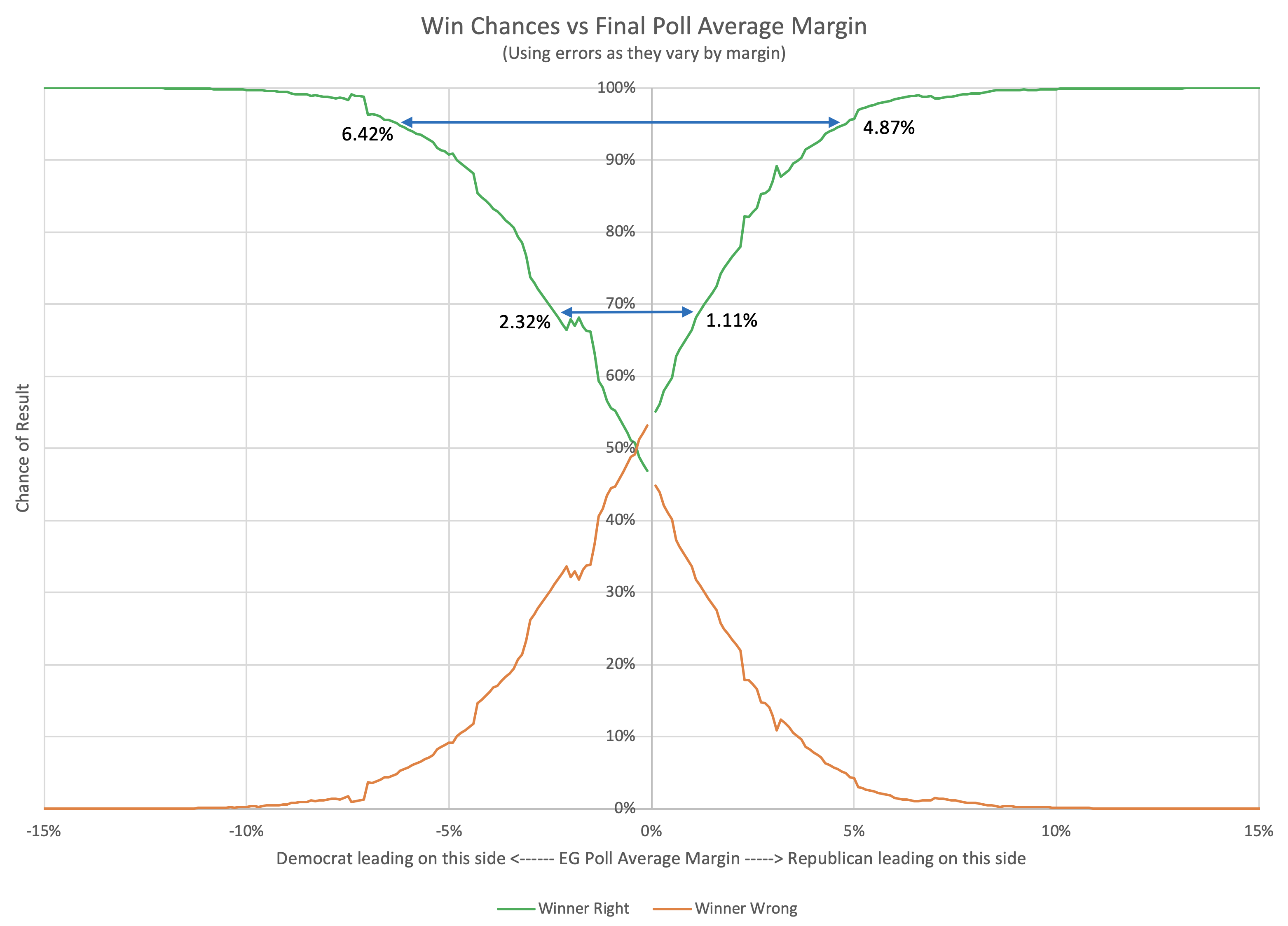
Here is the key chart:

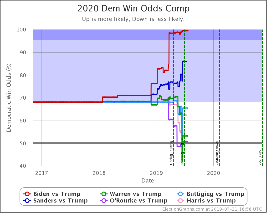
This chart shows the evolution over time of the odds of the Democrats winning as new state polls have come in. The comparison page also shows graphs for the odds of a Republican win, if you prefer looking at things from that point of view. Those two don't add up to 100% because there is of course also a chance of a 269-269 electoral college tie, and there is also a chart of that. Together the three will add to 100%.

The charts are automatically updated as I add new polls to my database.

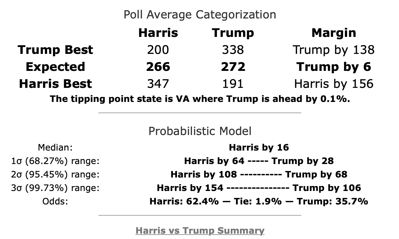
The summary block for each candidate pair on the comparison page has also been updated to include the win odds information:

For the moment this is only on the comparison page, not on the individual candidate pages. This summary also contains more detail than is available in the graphs at this point. I will be adding more charts to close that gap when I get a chance.

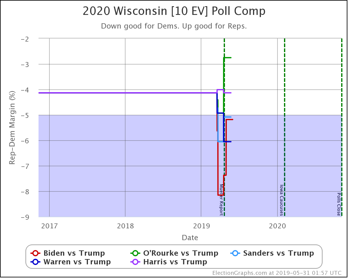
I've used the Harris vs. Trump summary as the example here because it (along with O'Rourke vs. Trump) contains something curious that requires a closer look. Namely, you'll notice that the "Expected" scenario (where every candidate wins all the states where they lead in the poll average) shows a different winner than the "Median" scenario (the "center" of the Monte Carlo simulations when sorted by outcome).

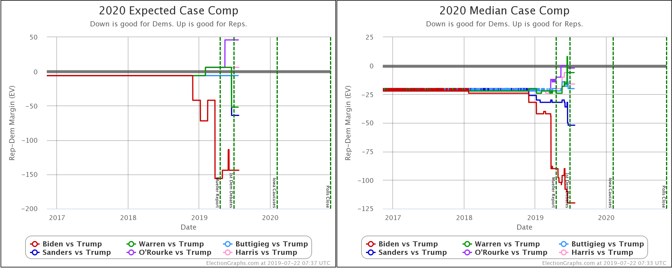
When you look at the charts for the expected case vs. the median case, it is evident that the median in the Monte Carlo simulations does not precisely track the expected case. In fact, in some instances, the trends don't even move in the same direction. So what is going on here?

It would take some detailed digging to understand specific cases, but as an example, a quick look at the spectrum of the states for Harris vs. Trump can get some insights.

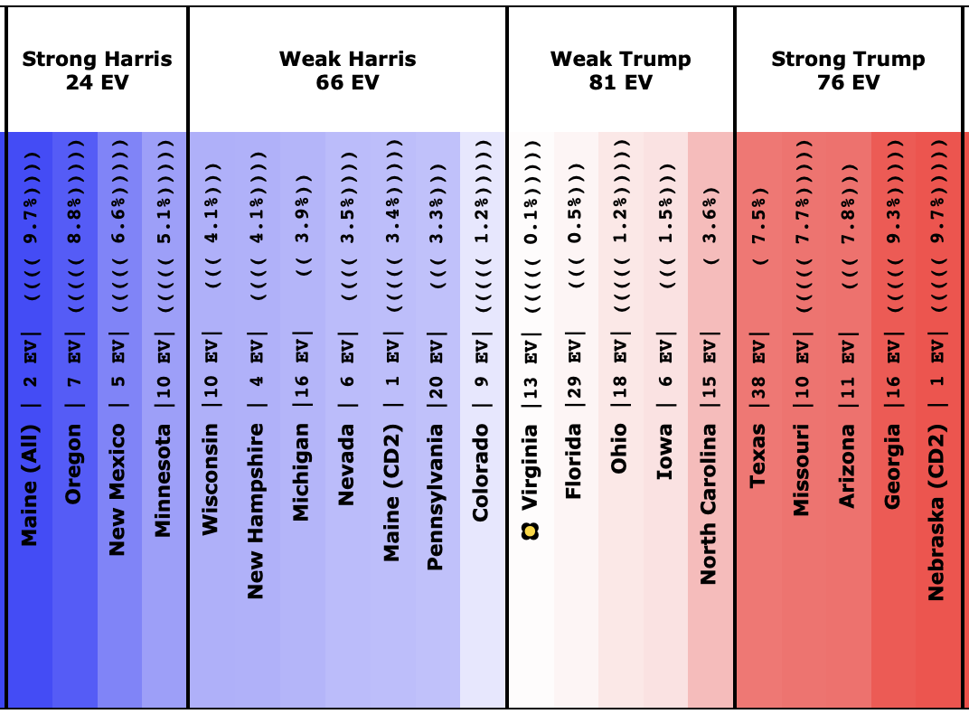
Now, I don't currently have a version of this spectrum showing win odds instead of the margin, but without that, you can still immediately see why even though Trump leads by six electoral votes "if everybody wins the states they lead", Harris might win in the median case in a simulation that looks at the situation more deeply.

The key is the margins in the swing states. With only a six electoral vote margin, it only takes three electoral votes flipping to make a 269-269 tie, and 4 to switch the winner.

Fundamentally, there are four "barely Trump" states that have a good chance of ending up going to Harris, but only one "barely Harris" jurisdiction that has a decent chance of going to Trump.

Looking at the details:

Trump's lead in Virginia's (13 EV) poll average is only 0.1%, which translates into a 44.9% chance of a Harris win.

Trump's lead in Florida's (29 EV) poll average is only 0.5%, which translates into a 40.2% chance of a Harris win.

Trump's lead in Ohio's (18 EV) poll average is only 1.2%, which translates into a 30.9% chance of a Harris win.

Trump's lead in Iowa's (6 EV) poll average is only 1.5%, which translates into a 28.4% chance of a Harris win.

Those are all the states with a Trump lead where Harris has more than a 25% chance of winning the state. Harris only needs to win ONE of those states to end up winning nationwide. Doing the math, if the odds of winning are independent (which is not strictly true, but is probably a decent first approximation), there is an 83.7% chance that Harris will win at least one of these four states.

Now, there is one Harris state where Trump has a greater than 25% chance of winning. That would be Colorado, where Harris leads by 1.2%, which translates into a 41.6% chance of a Trump win. So that compensates a bit.

But in the end, with this mix of swing states, Harris wins more often than she loses in the simulations (62.4% of the time), and the median case is a narrow 16 EV Harris win.

The straight-up "if everybody wins all the states they are ahead in" expected case metric is a decent way of looking at things as far as it goes. Election Graphs has used it, along with the tipping point, as the two primary methods of looking at how elections are trending in the analysis here from 2008 to 2016. And it has done pretty well. In those three elections, 155/163 ≈ 95.09% of races did indeed go to the candidates who were ahead in the poll average. That view has the advantage of simplicity.

But the Monte Carlo simulations (using state win probabilities based on Election Graph's previous results) give a way of quantifying how often the underdog wins states based on the margin, and how that rolls up into the national results. It can catch subtleties that are out of reach if you only look at who is ahead.

So from now on, Election Graphs will be looking at things both ways. The site will still have the expected case, tipping point, and "best cases" gotten from simply classifying who is leading and which states are close. But we'll also be looking at the probabilistic view. We may be looking at things the new way a bit more. But they will both be here.

Right now that information is on the national comparison page, the state detail pages, the state comparison pages, and the blog sidebar. There is still nothing about the probabilistic view on the candidate pages. That is next on the list once I get some time to put some things together.

469.6 days until polls start to close.

Stay tuned.

For more information:

This post is an update based on the data on the Election Graphs Electoral College 2020 page. Election Graphs tracks a poll-based estimate of the Electoral College. The charts, graphs, and maps in the post above are all as of the time of this post. Click through on any image to go to a page with the current interactive versions of that chart, along with additional details.

Follow @ElectionGraphs on Twitter or Election Graphs on Facebook to see announcements of updates. For those interested in individual poll updates, follow @ElecCollPolls on Twitter for all the polls as I add them. If you find the information in these posts informative or useful, please consider visiting the donation page.

New Charts for State Odds

There were new polls in Florida since the last update, but they didn't result in any category changes for the state, so instead I'll talk about some new features I added to the site a few days ago.

Back on January 29th, I discussed a way of taking the historical performance of state-level Election Graphs averages vs. actual election results and using that to infer the odds of the Republican or Democratic candidate winning based on the current Election Graphs average.

Now, to be clear, since this analysis compares the FINAL average before the election to the election results… it did not look at how those averages varied over time in the leadup to the election… this is looking at the odds "if the election was today." There is no factoring in the likelihood of changes over those intervening months as some more complicated models might.

But it still gives a snapshot I think is interesting, and EVERYTHING on Election Graphs is "if the election was today," so it fits in well.

In my May 8th post, I mentioned that I had added a display of these state-level win odds to the state detail pages and state comparison pages. I was only displaying the numbers, not any visualizations. As of this week, I am now displaying charts of how these numbers change over time as well.

To illustrate, I'll show examples of the new charts and how they relate to the older charts.

The above is the standard graph for an individual candidate combination and state that has been on Election Graphs since the 2016 cycle. It shows dots for the specific polls and a red line for the Election Graphs average. While this is only a static image in this blog post, on the actual detail page, you can hover over elements of the chart and get more details.

This new view is the graph that I added to the page. It translates the poll average into the chances of each candidate winning the state based on the methodology detailed in that January blog post.

So, in this example, as of right now, Biden has a 7.1% lead in the poll average, which translates into a 98.8% chance of Biden winning the state (or a 1.2% chance of Trump winning). I show the axis labels for the Democrat's chances on the left, but if you prefer, the axis labels on the right show the Republican's chances.

While the first chart does a great job at showing in an absolute way where the polls are, this second chart gives a better idea as to what this means for who is probably going to win and shows how much changes in the poll average do or do not change those odds.

When looking at the state detail page, these two charts are side by side for easy comparison:

Looking at this example makes clear that the "Weak" category is still pretty broad! That 3.8% Trump lead in Texas translates into a 91.4% chance of Trump winning!

Remember though the following important caveats:

  • As mentioned above, this is "if the election was today." It does not take into account how polls may move in the time between now and the election. Until we get right up to the election, this is very important. Poll averages can and do move quickly. A few weeks can make a huge difference (as shown by the last few weeks before the 2016 election). In the over 500 days we have left at the moment, the world could change completely!
  • I base the odds estimates on the aggregated performance of the Election Graphs averages in 2008, 2012, and 2016. It is possible that those three elections will not be representative or predictive of 2020. As they say in the investment world, "past performance is not a guarantee of future results."
  • For the moment, Michigan is the only state where the Election Graphs average is based only on 2020 polls. For the rest, I'm still "priming" the numbers with election results from 2000 to 2016. Only 13 states have any 2020 polling at all at this early stage, and most of them have three or less. So we still have pretty sparse data.

Of course, in addition to the state detail pages for individual candidate matchups, there are also the charts on the comparison page:

Above is the traditional poll view.

And then the odds based view. The idea is the same as the view for the individual candidate pairs, but of course, you see all five of the best-polled candidate pairs and can compare how they are doing.

Now, all of the new graphs are on state-level views. What about national? How does this roll up into an overall picture of the election?

Well, it is coming but isn't ready yet. As I described in my January 30th post, you can use these state-level probabilities as part of a Monte Carlo simulation to generate some information on the national picture.

I don't have any of that automated and live yet on the site yet, but I have started to build some of the elements. So here is a preview of the kinds of information this will produce.

First, looking at the odds of winning for the five best-polled candidate pairs (with all the caveats I mentioned above) based on the current Election Graphs averages and 1,000,001 Monte Carlo trials each:

  • Biden 87.3% to Trump 11.9% (0.8% tie)
  • Sanders 74.9% to Trump 23.7% (1.5% tie)
  • Warren 66.1% to Trump 32.0% (1.9% tie)
  • Harris 58.9% to Trump 39.0% (2.0% tie)
  • O'Rourke 48.6% to Trump 49.7% (1.7% tie)

These stats differ a little bit from simply looking at the "expected result" where each candidate wins every state they lead in, or looking at the tipping point metric, as these also look at how likely it is that the various close states end up flipping and going the other way. So this should provide a bit better view of what might happen than those simpler ways of looking at things. But of course, that comes at the cost of complexity and being a bit harder to understand.

Another kind of view that will come out of this is looking at the range of possibilities in a bit more sophisticated way than the "envelopes" already shown on the site. Looking at Biden vs. Trump as an example:

  • Median Result: Biden by 52 electoral votes
  • Central 1σ (68.3% chance): Biden by 106 EV to Biden by 6 EV
  • Central 2σ (95.4% chance): Biden by 158 EV to Trump by 30 EV
  • Central 3σ (99.7% chance): Biden by 218 EV to Trump by 66 EV

So, sometime in the next few weeks, I'll probably get these textual stats added to the live site and automatically updated when I add new polls. After that, I'll try to get some visualizations of both the current state and how that evolves up on the site, but that will take longer.

Anyway. Coming soon.

522.8 days until polls start to close!

For more information:

This post is an update based on the data on the Election Graphs Electoral College 2020 page. Election Graphs tracks a poll-based estimate of the Electoral College. The charts, graphs, and maps in the post above are all as of the time of this post. Click through on any image to go to a page with the current interactive versions of that chart, along with additional details.

Follow @ElectionGraphs on Twitter or Election Graphs on Facebook to see announcements of updates. For those interested in individual poll updates, follow @ElecCollPolls on Twitter for all the polls as I add them. If you find the information in these posts informative or useful, please consider visiting the donation page.

Polling Error vs Final Margin

This is the third in a series of blog posts for folks who are into the geeky mathematical details of how Election Graphs state polling averages have compared to the actual election results from 2008, 2012, and 2016. If this isn’t you, feel free to skip this series. Or feel free to skim forward and just look at the graphs if you don’t want or need my explanations.

You can find the earlier posts here:

Error vs Margin scatterplot

In the last post I ended by mentioning that assuming the error on poll averages was independent of the value of the poll average might not be valid. There are at least some reasonable stories you could tell that would imply a relationship. So we should check.

I've actually looked at this before for 2012. That analysis showed the error on the polls DID vary based on the margin of the poll average. But it wasn't "close states are more accurate". But maybe that pattern was unique to that year.

So I looked at this relationship again now with all the data I have for 2008, 2012, and 2016:

That is just a blob right? Not a scatterplot we can actually see much in? Wrong. There is a bottom left to upper right trend hiding in there.

Interpreting the shape of the blob

Before going further, let's talk a bit about what this chart shows, and how to interpret it. Here are some shapes this distribution could have taken:

Pattern A would indicate the errors did not favor either Republicans or Democrats, and the amount of error we should expect did not change depending on who was leading in the poll average or how much.

Pattern B would show that Republicans consistently beat the poll averages… so the poll averages showed Democrats doing better than they really were, and the error didn't change substantially based on who was ahead or by how much.

Pattern C would show the opposite, that Democrats consistently beat the poll averages, or the poll averages were biased toward the Republicans. The error once again didn't depend on who was ahead or by how much.

Pattern D shows no systematic bias in the poll averages toward either Republicans or Democrats, but the polls were better (more likely to be close to the actual result) in the close races, and more likely to be wildly off the mark in races that weren't close anyway.

Pattern E would show that when Democrats were leading in the polls, Republicans did better than expected, and when Republicans were leading in the polls, Democrats did better than expected. In other words, whoever was leading, the race was CLOSER than the polls would have you believe.

Finally, Pattern F would show that when the polls show the Democrats ahead, they are actually even further ahead than the polls indicate, and when the Republicans are ahead, they are also further ahead than the polls indicate. In other words, whoever is leading, the race is NOT AS CLOSE as the polls would indicate.

In all of these cases the WIDTH of the band the points fall in also matters. If you have a really wide band, the impact of the shape may be less, because the variance overwhelms it. But as long as the band isn't TOO wide the shape matters.

Also, like everything in this analysis, remember this is about the shape of errors on the individual states, NOT on the national picture.

Linear regressions

Glancing at the chart above, you can determine which of these is at play. But lets be systematic and drop some linear regressions on there…

2008 and 2012 were similar.

2016 had a steeper slope and is shifted to the left (indicating that Republicans started outperforming their polls not near 0%, but for polls the Democrats led by less than about 11%). But even 2016 has the same bottom left to top right shape.

I haven't put a line on there for a combination of the three election cycles, but it would be in between the 2008/2012 lines and the 2016 line.

Of the general classes of shapes I laid out above, Pattern F is closest.

Capturing the shape of the blob

But drawing a line through these points doesn't capture the shape here. We can do better. There are a number of techniques that could be used here to get insight into the shape of this distribution.

The one I chose is as follows:

  1. At each value for the polling average (at 0.1% intervals), collect all of the 163 data points that are within 5% of the value under consideration. For instance, if I am looking at a 3% Democratic lead, I look at all data points that were between an 8% Democratic lead and a 2% Republican lead (inclusive).
  2. If there are less than 5 data points, don't calculate anything. The data is too sparse to reach any useful conclusions.
  3. If there are 5 or more points, calculate the average and standard deviation, and use those to define boundaries for the shape.

Here is what you get:

This is a more complex shape than any of the examples I described. Because it is real life messy data. But it looks more like Pattern F than anything else.

It does flatten out a bit as you get to large polling leads, even reversing a bit, with the width increasing like Pattern D, and there some flatter parts too. But roughly, it is Pattern F with a pretty wide band.

Fundamentally, it looks like there IS a tendency within the state level polling averages for states to look closer than they really are.

Is this just 3P and undecided voters?

All of my margins are just "Republican minus Democrat". Out of everybody, including people who say they are undecided or support 3P candidates. But those undecideds eventually pick someone. And many people who support 3rd parties in polls end up voting for the major parties in the end. Could this explain the pattern?

As an example assume the poll average had D's at 40%, R's at 50%, and 10% undecided, that's a 10% R margin… then split the undecideds at the same ratio as the R/D results to simulate a final result where you can't vote "undecided", and you would end up with D's at 44.4% and R's at 55.6% which is an 11.1% margin… making the actual margin larger than the margin in the poll average, just as happens in Pattern F. 

Would representing all of this based on share of the 2-party results make this pattern go away?

To check this, I repeated the entire analysis using 2-party margins.

Here, animated for comparison, is the same chart using straight margins and two party margins.

While the pattern is dampened, it does not go away.

It may still be the case that if we were looking at more than 3 election cycles, this would disappear. I guess we'll find out once 2020 is over. But it doesn't seem to be an illusion caused simply by the existence of undecided and 3P voters.

Does this mean anything?

Now why might there be a tendency that persists in three different election cycles for polls to show results closer than they really are? Maybe close races are more interesting than blowouts so pollsters subconsciously nudge things in that direction? Maybe people indicate a preference for the underdog in polls, but then vote for the person they think is winning in the end? I don't know. I don't have anything other than pure speculation at the moment. I'd love to hear some insights on this front from others.

Of course, this is all based on only 3 elections and 163 data points. It would be nice to have more data and more cycles to determine how persistent this patten is, vs how much may just be seeing patterns in noise and/or something specific to these three election cycles. After all, 2016 DID look noticeably different than 2008 and 2012, but I'm just smushing it all together.

It is quite possible that the patterns from previous cycles are not good indicators of how things will go in future cycles. After all, won't pollsters try to learn from their errors and compensate? And in the process introduce different errors? Quite possibly.

But for now, I'm willing to run with this as an interesting pattern that is worth paying some attention to.

Election Result vs Final Margin

Before determining what to do with this information, lets look at this another way. After all, while the amount and direction of the error is interesting, in terms of projecting election results, we only really care if the error gives us a good chance of getting the wrong answer.

Above is the actual vote margins vs the final Election Graph margins, with means and standard deviations for the deltas calculated earlier plotted as well. Essentially, the first graph is this new second graph with the y=x line (which I have added in light green) subtracted out.

The first view makes the deviation from "fair" more obvious by making an unbiased result horizontal instead of diagonal, but this view makes it easier to see when this bias may actually make a difference.

Lets zoom in on the center area, since that is the zone of interest.

Accuracy rate

Out of the 163 poll averages, there were only actually EIGHT that got the wrong result. Those are the data points in the upper left and lower right quadrants on the chart above. That's an accuracy rate of 155/163 ≈ 95.09%. Not bad for my little poll averages overall.

The polls that got the final result wrong range from a 7.06% Democratic lead in the polls (Wisconsin in 2016) to a Republican lead of 3.40% (Indiana in 2008).

For curiosity's sake, here is how those errors were distributed:

  D's lead poll avg
but R's win
R's lead poll avg
but D's win
Total
Wrong
2008 1 (MO) 2 (NC, IN) 3
2012 0 0 0
2016 4 (PA, MI, WI, ME-CD2) 1 (NV) 5
Total 5 3 8

So, less than 5% wrong out of all the poll averages in three cycles, but at least in 2016, some of the states that were wrong were critical. Oops.

Win chances

Anyway, once we have averages and standard deviations for election results vs poll averages, if we assume a normal distribution based on those parameters at each 0.1% for the poll average, we can produce a chart of the chances of each party winning given the poll average.

Here is what you get:

Alternately, we could recolor the graph and express this in terms of the odds the polls have picked the right winner:

You can see that the odds of "getting it wrong" get non-trivially over 50% for small Democratic leads. The crossover point is a 0.36% Democratic lead. With a Democratic lead less than that, it is more likely that the Republican will win. (If, of course, this analysis is actually predictive.)

You can also work out how big a lead each party would need to have to be 1σ or 2σ sure they were actually ahead:

  68.27% (1σ)
win chance
95.45% (2σ)
win chance
Republicans Margin > 1.11% Margin > 4.87%
Democrats Margin > 2.32% Margin > 6.42%
Average Margin > 1.72% Margin > 5.64%

Democrats again need a larger lead than Republicans to be sure they are winning.

These bounds are the narrowest from the various methods we have looked at though.

Can we do anything to try to understand what this would mean for analyzing a new race? We obviously don't have 2020 data yet, and I don't have 2004 or earlier data lying around to look at either. So what is left?

Using the results of an analysis like this to look at a year that provided data for that analysis is not actually legitimate. You are testing on your training data. It is self-referential in a way that isn't really OK. You'll match the results better than you would looking at a new data set. I know this.

But it may still give an idea of what kind of conclusions you might be able to draw from this sort of data.

So in the next post we'll take the win odds calculated above and apply them to the 2016 race, and see what looks interesting…

You can find all the posts in this series here:

Win Chances from Poll Averages

This is the second in a series of blog posts for folks who are into the geeky mathematical details of how Election Graphs state polling averages have compared to the actual election results from 2008, 2012, and 2016. If this isn't you, feel free to skip this series. Or feel free to skim forward and just look at the graphs if you don't want or need my explanations.

Last time we looked at some basic histograms showing the distributions for how far off the actual election results were from the state polling averages, but pointed out at the end that we don't just care about how far off the average is, we care about whether it will actually make a difference to who wins.

For instance if we knew the poll average overestimated Democrats by 5%, this means something very different depending on the value of the poll average:

  • If the Democrat was ahead by 15% the overestimation wouldn't matter, because it wouldn't be enough to change the outcome. The Democrat would just win by a smaller margin.
  • If the poll average showed the Democrat ahead by 3% the overestimation would mean the Republican is actually ahead. This is the case where the overestimation would actually make a difference.
  • If the poll showed the Republicans ahead the overestimation of the Democrats wouldn't change the outcome, it would just mean that the Republicans would win by a bigger margin.

Two sided by individual results

So lets look at this same data we did in the last post, but in a different way to try to take this into account… Instead of bundling up the polling deltas into a histogram, we consider all 163 results, and try to figure out at each possible margin, how many poll results had a big enough error that they could have changed the result.

As an example, if you look at all 163 data points for cases where the Democrats beat the poll average by more than 15%, you only find 2 cases out of the 163. (For the record that would be DC in 2008 and 2016.) That lets you infer that if the Republicans have a 15% lead, you can estimate the Democratic chances of winning given previous polling errors is about 2/163 ≈ 1.23%, which of course means in those cases Republicans have a 98.77% chance of winning.

Here is the chart you get when you repeatedly do this calculation:

As you would expect, as the polls move toward Republican leads, the Democratic chance of winning diminishes, and the Republican chance of winning increases. The break even point is almost exactly at the 0% margin point. (It is actually at an approximately 0.05% Republican lead based on my numbers, but that is close enough to zero for these purposes.)

This is good, because it means even if there are some differences in the shape of the distribution on the two sides, at least the crossover point is basically centered.

Taking the exact same graph, but coloring it differently, we can look at not which party wins based on the polling average at a certain place, but instead at the chances that the polling average is RIGHT or WRONG in terms of picking the winner.

For instance, at the same "Republicans lead by 15% in the polling average" scenario used above, there is a 98.77% chance the polling average has picked the right winner, and a 1.23% change the polling average is picking the wrong side.

Here is that chart: 

Looking at it this way, and again looking at 1σ being getting things right about 68.27% of the time, and 2σ being getting things right about 95.45% of the time we can construct the table below. With the asymmetry, it is different for Republicans and Democrats:

  68.27% (1σ)
win chance
95.45% (2σ)
win chance
Republicans Margin > 1.76% Margin > 8.26%
Democrats Margin > 3.01% Margin > 12.56%
Average Margin > 2.38% Margin > 10.41%

Basically, given the results of the last three election cycles, Democrats need a bit larger lead to have the same level of confidence that they are really ahead.

Now, doing something for Election Graphs based on this asymmetry is tempting as it has now showed up in two different ways of looking at this data, but…

A) It is certainly possible that this asymmetry is something that just happens to show up this way after these three elections, and it would be improper to generalize. 163 data points really is not very much compared to what you would really want, and it is very possible that this pattern in an illusion caused by limited data and/or there are changes over time that will swamp the patterns seen here.

B) A big part of the appeal of Election Graphs has always been having a really simple easy to understand model… including having nice symmetric bounds… "a close race is one where the margin is less than X%"… without that being different depending on which party is ahead… is a big part of that, even if it is a massive oversimplification.

So lets look at this in a one sided way again…

One sided by individual results

Once again we we calculate a "chance of being right" number, as we did earlier, but now just looking at the absolute error. We will assume we only know the magnitude of the current margin and the previous errors, not the directions, and that errors have an equal chance of going in either direction.

Running through an example:

At the 5% mark, there were 107 poll averages out of 163 that were off by less than 5%. These 107 would all give a correct winner no matter which direction the error was in.

The remaining 56 polls had an error of more than 5%, so could have resulted in getting the wrong winner. But since we are assuming a symmetric distribution of the errors now, we would only expect half of these errors to be in the direction that would change the winner. So another 28.

107+28 = 135. So we would expect at the 5% mark the poll averages would be right 135/163 ≈ 82.82% of the time, and wrong 17.18% of the time.

Repeat this over and over again, and you get the following graph: 

So if you are looking to be 68.27% (1σ) confident that a state poll average will be indicating the right winner, the leader needs to be ahead by at least 2.49%. To be 95.45% (2σ) confident though, you need an 11.36% margin.

  68.27% (1σ)  95.45% (2σ)
Margin 2.49% 11.36%

These last two ways of looking at things have the 68.27% level considerably narrower than the 5% that is the current first boundary on Election Graphs. If we are thinking of this as the boundary for "really close state that could easily go either way" this seems counter intuitive.

If we kept the same "Weak/Strong/Solid" names for the categorizations, then in the final state of the 2016 poll averages Michigan would get reclassified as "Strong Clinton" instead of "Weak Clinton", while Ohio and Georgia would move from "Weak Trump" to "Strong Trump". Given that Michigan ended up actually won by Trump, this seems like it might not be a good move.

Or maybe it would just be even more important to be clear that "Strong" states are actually states that have a non-trivial chance of flipping. The "Solid" category was intended to be the states that really should not be expected to go the other way. "Strong" was originally intended to indicate a significant lead, but not that a state was completely out of play. "Weak" was supposed to be states that really were so close enough you shouldn't count on the lead being real.

If we changed the categories in a way that moved the first boundary inward, it would be important to make this very clear, perhaps by changing the names.

If, on the other hand, we moved the "close state boundary" outward to the 95.45% (2σ) level, it just seems way too wide. A state where one candidate is ahead by 11.36% just isn't a close state. Maybe it is true that there is a 4.55% chance that the poll average is picking the wrong winner. This seems to imply that. But even so, it seems misleading to say that big a lead is still a close race.

There is something else to think about as well. The analysis above assumes that the difference between the election result and the final poll average is not dependent on the value of the poll average itself.

But is that reasonable?

One might think (for instance) that maybe poll averages in the close states would be more accurate than polls in the states where nobody expects a real contest. The theory here would be that because close states get more frequent polling the average can catch last minute moves better than in less competitive states that are more sparsely polled. (At least this logic might make sense for a poll average like the Election Graphs average that uses the "last X polls", other ways of calculating a poll average may differ.)

Or maybe there is some other factor at play that makes it so we can say more about how far off a poll may be if we take into account what that poll average is in the first place.

And that's what we will look into in the next post…

You can find all the posts in this series here: