
This is the second in a series of blog posts for folks who are into the geeky mathematical details of how Election Graphs state polling averages have compared to the actual election results from 2008, 2012, and 2016. If this isn't you, feel free to skip this series. Or feel free to skim forward and just look at the graphs if you don't want or need my explanations.
Last time we looked at some basic histograms showing the distributions for how far off the actual election results were from the state polling averages, but pointed out at the end that we don't just care about how far off the average is, we care about whether it will actually make a difference to who wins.
For instance if we knew the poll average overestimated Democrats by 5%, this means something very different depending on the value of the poll average:
- If the Democrat was ahead by 15% the overestimation wouldn't matter, because it wouldn't be enough to change the outcome. The Democrat would just win by a smaller margin.
- If the poll average showed the Democrat ahead by 3% the overestimation would mean the Republican is actually ahead. This is the case where the overestimation would actually make a difference.
- If the poll showed the Republicans ahead the overestimation of the Democrats wouldn't change the outcome, it would just mean that the Republicans would win by a bigger margin.
Two sided by individual results
So lets look at this same data we did in the last post, but in a different way to try to take this into account… Instead of bundling up the polling deltas into a histogram, we consider all 163 results, and try to figure out at each possible margin, how many poll results had a big enough error that they could have changed the result.
As an example, if you look at all 163 data points for cases where the Democrats beat the poll average by more than 15%, you only find 2 cases out of the 163. (For the record that would be DC in 2008 and 2016.) That lets you infer that if the Republicans have a 15% lead, you can estimate the Democratic chances of winning given previous polling errors is about 2/163 ≈ 1.23%, which of course means in those cases Republicans have a 98.77% chance of winning.
Here is the chart you get when you repeatedly do this calculation:
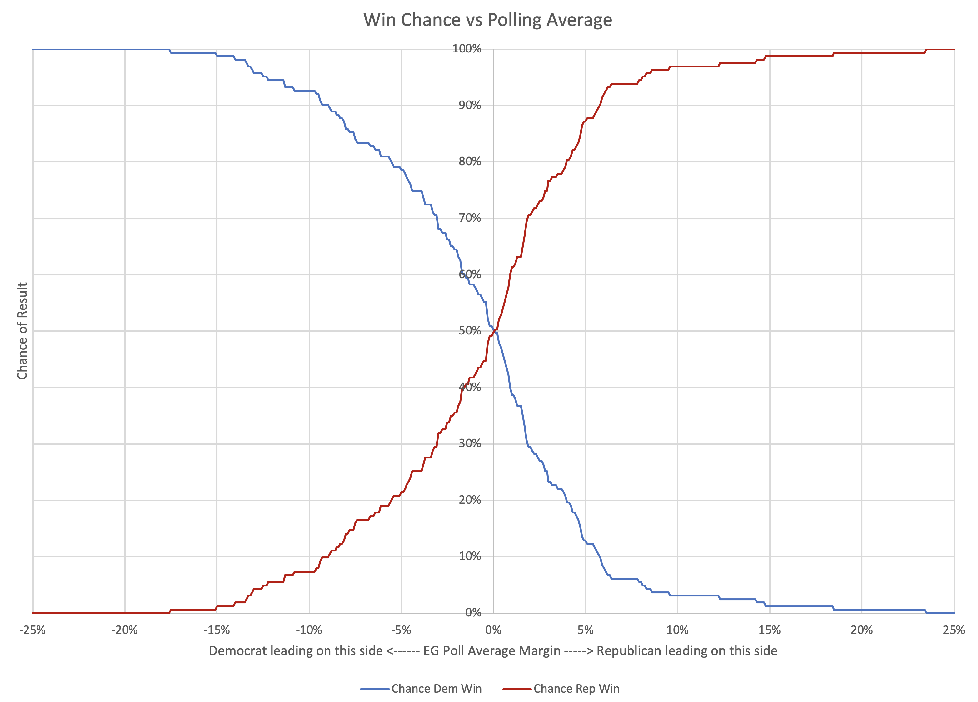
As you would expect, as the polls move toward Republican leads, the Democratic chance of winning diminishes, and the Republican chance of winning increases. The break even point is almost exactly at the 0% margin point. (It is actually at an approximately 0.05% Republican lead based on my numbers, but that is close enough to zero for these purposes.)
This is good, because it means even if there are some differences in the shape of the distribution on the two sides, at least the crossover point is basically centered.
Taking the exact same graph, but coloring it differently, we can look at not which party wins based on the polling average at a certain place, but instead at the chances that the polling average is RIGHT or WRONG in terms of picking the winner.
For instance, at the same "Republicans lead by 15% in the polling average" scenario used above, there is a 98.77% chance the polling average has picked the right winner, and a 1.23% change the polling average is picking the wrong side.
Here is that chart:
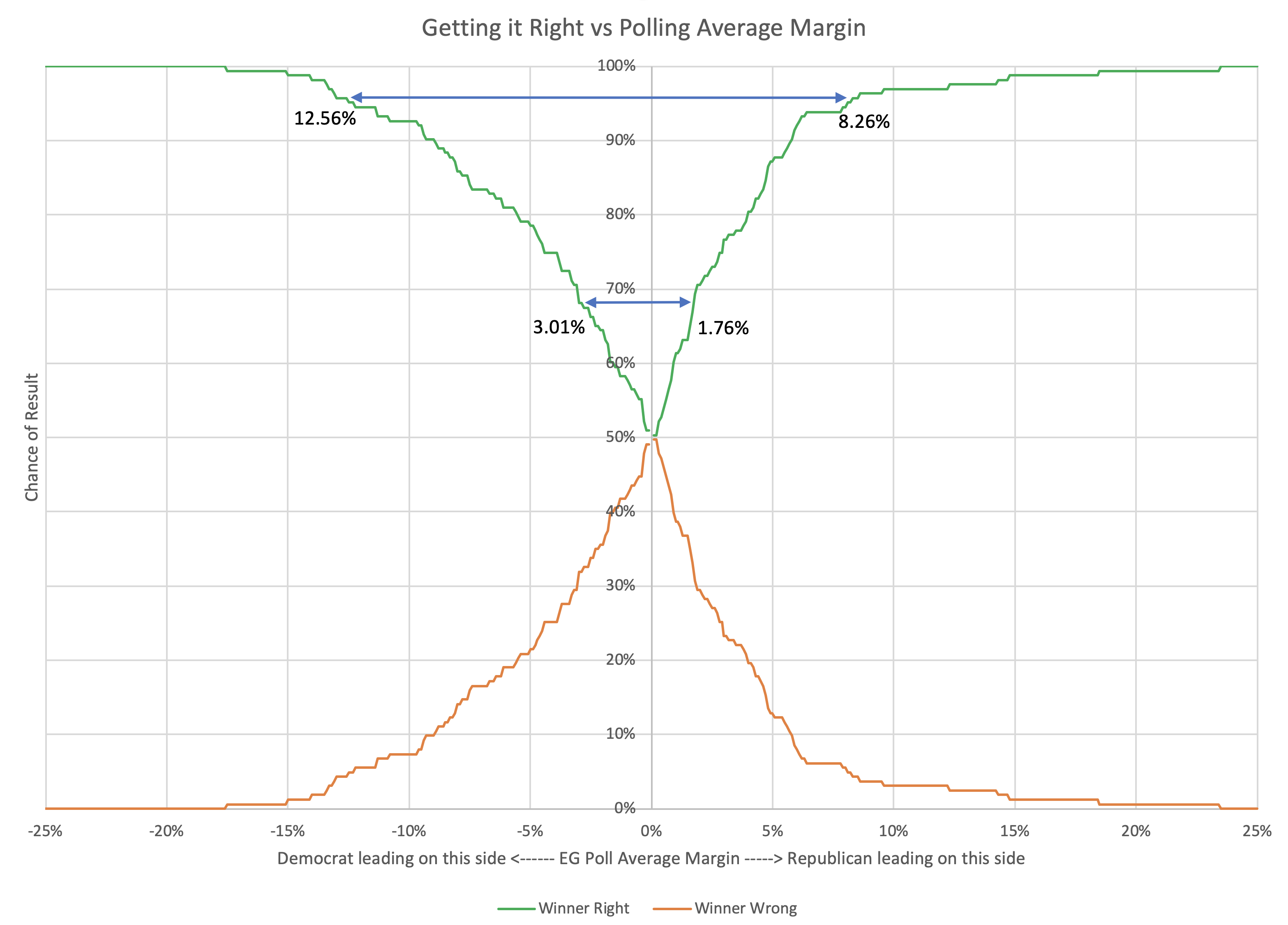
Looking at it this way, and again looking at 1σ being getting things right about 68.27% of the time, and 2σ being getting things right about 95.45% of the time we can construct the table below. With the asymmetry, it is different for Republicans and Democrats:
| 68.27% (1σ) win chance |
95.45% (2σ) win chance |
|
| Republicans | Margin > 1.76% | Margin > 8.26% |
| Democrats | Margin > 3.01% | Margin > 12.56% |
| Average | Margin > 2.38% | Margin > 10.41% |
Basically, given the results of the last three election cycles, Democrats need a bit larger lead to have the same level of confidence that they are really ahead.
Now, doing something for Election Graphs based on this asymmetry is tempting as it has now showed up in two different ways of looking at this data, but…
A) It is certainly possible that this asymmetry is something that just happens to show up this way after these three elections, and it would be improper to generalize. 163 data points really is not very much compared to what you would really want, and it is very possible that this pattern in an illusion caused by limited data and/or there are changes over time that will swamp the patterns seen here.
B) A big part of the appeal of Election Graphs has always been having a really simple easy to understand model… including having nice symmetric bounds… "a close race is one where the margin is less than X%"… without that being different depending on which party is ahead… is a big part of that, even if it is a massive oversimplification.
So lets look at this in a one sided way again…
One sided by individual results
Once again we we calculate a "chance of being right" number, as we did earlier, but now just looking at the absolute error. We will assume we only know the magnitude of the current margin and the previous errors, not the directions, and that errors have an equal chance of going in either direction.
Running through an example:
At the 5% mark, there were 107 poll averages out of 163 that were off by less than 5%. These 107 would all give a correct winner no matter which direction the error was in.
The remaining 56 polls had an error of more than 5%, so could have resulted in getting the wrong winner. But since we are assuming a symmetric distribution of the errors now, we would only expect half of these errors to be in the direction that would change the winner. So another 28.
107+28 = 135. So we would expect at the 5% mark the poll averages would be right 135/163 ≈ 82.82% of the time, and wrong 17.18% of the time.
Repeat this over and over again, and you get the following graph:
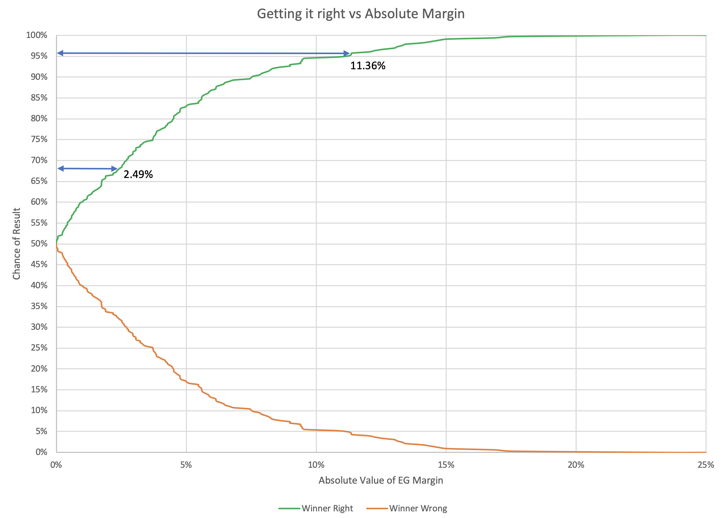
So if you are looking to be 68.27% (1σ) confident that a state poll average will be indicating the right winner, the leader needs to be ahead by at least 2.49%. To be 95.45% (2σ) confident though, you need an 11.36% margin.
| 68.27% (1σ) | 95.45% (2σ) | |
| Margin | 2.49% | 11.36% |
These last two ways of looking at things have the 68.27% level considerably narrower than the 5% that is the current first boundary on Election Graphs. If we are thinking of this as the boundary for "really close state that could easily go either way" this seems counter intuitive.
If we kept the same "Weak/Strong/Solid" names for the categorizations, then in the final state of the 2016 poll averages Michigan would get reclassified as "Strong Clinton" instead of "Weak Clinton", while Ohio and Georgia would move from "Weak Trump" to "Strong Trump". Given that Michigan ended up actually won by Trump, this seems like it might not be a good move.
Or maybe it would just be even more important to be clear that "Strong" states are actually states that have a non-trivial chance of flipping. The "Solid" category was intended to be the states that really should not be expected to go the other way. "Strong" was originally intended to indicate a significant lead, but not that a state was completely out of play. "Weak" was supposed to be states that really were so close enough you shouldn't count on the lead being real.
If we changed the categories in a way that moved the first boundary inward, it would be important to make this very clear, perhaps by changing the names.
If, on the other hand, we moved the "close state boundary" outward to the 95.45% (2σ) level, it just seems way too wide. A state where one candidate is ahead by 11.36% just isn't a close state. Maybe it is true that there is a 4.55% chance that the poll average is picking the wrong winner. This seems to imply that. But even so, it seems misleading to say that big a lead is still a close race.
There is something else to think about as well. The analysis above assumes that the difference between the election result and the final poll average is not dependent on the value of the poll average itself.
But is that reasonable?
One might think (for instance) that maybe poll averages in the close states would be more accurate than polls in the states where nobody expects a real contest. The theory here would be that because close states get more frequent polling the average can catch last minute moves better than in less competitive states that are more sparsely polled. (At least this logic might make sense for a poll average like the Election Graphs average that uses the "last X polls", other ways of calculating a poll average may differ.)
Or maybe there is some other factor at play that makes it so we can say more about how far off a poll may be if we take into account what that poll average is in the first place.
And that's what we will look into in the next post…
You can find all the posts in this series here:
4 thoughts on “Win Chances from Poll Averages”