It has only been eight days since the last update. Still, there have been new polls in Nevada, Michigan, Pennsylvania (x2), Wisconsin (x2), Virginia, New York, Missouri (x2), Maryland, Montana, New Hampshire, Arkansas, California (x2), Texas (x2), and South Carolina.
So we might as well get in another update before South Carolina primary results start coming in, and Super Tuesday results three days later.
There are lots of reasons not to pay attention to current head-to-head polls against Trump when making decisions about primary choices. Most pointedly, things change and change quickly, so where things are at the end of February do not necessarily correspond to where they will be at the beginning of November. And of course, things like policy and character should also play a role.
But for those for whom "How might the general election go?" is an important decision making factor, here is the latest from Election Graphs, based on state poll averages.
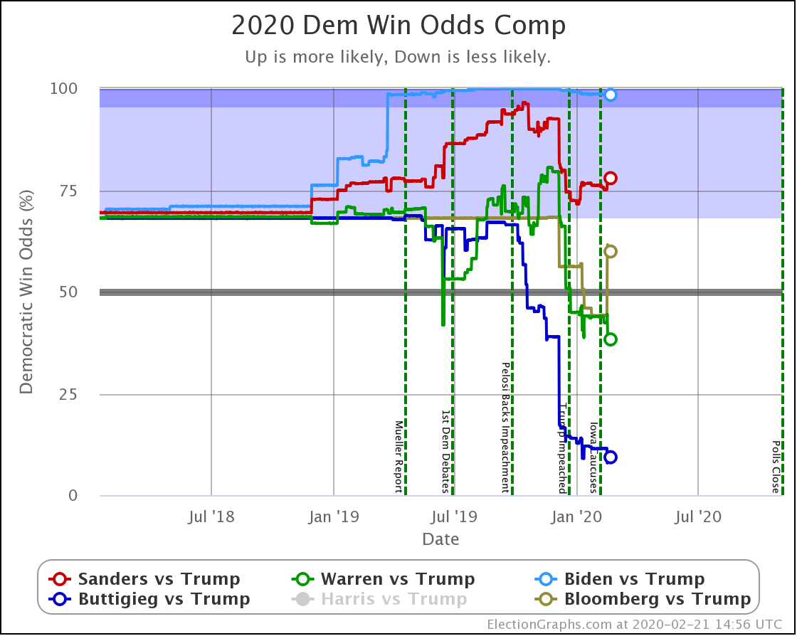
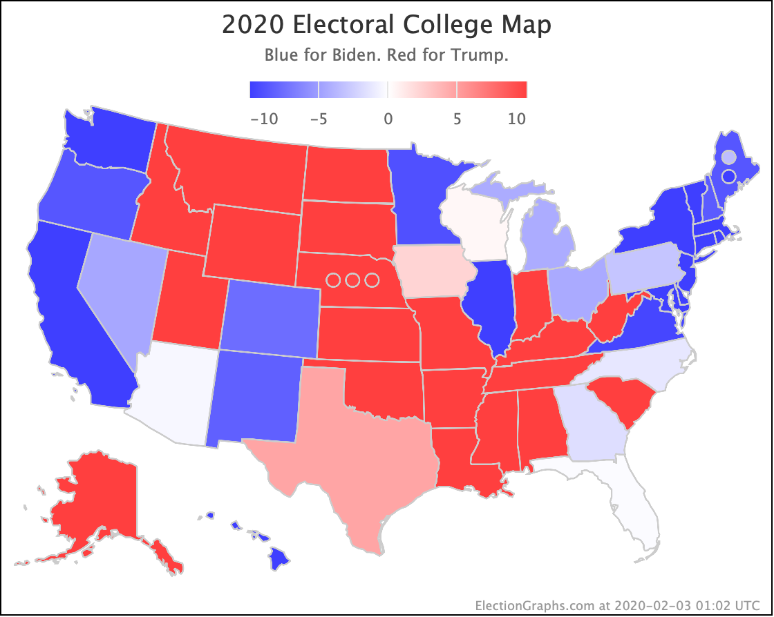
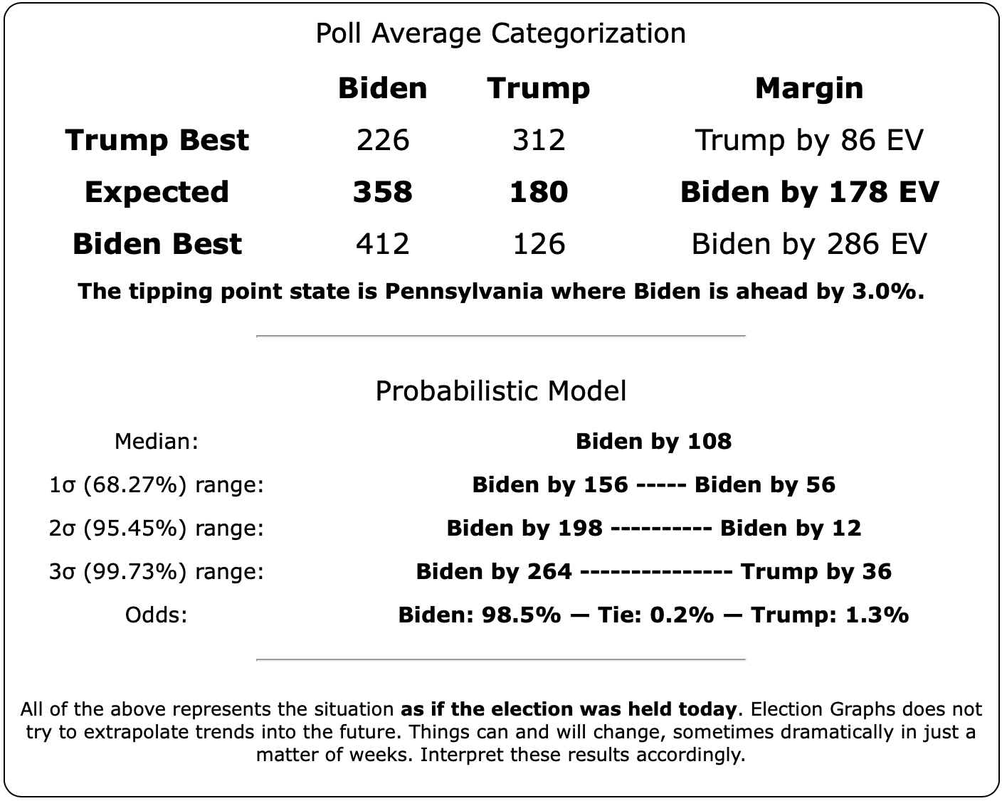
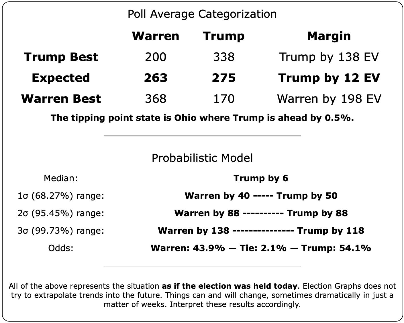
Let's start with the "odds of winning the electoral college" based on the state level head-to-head poll averages, and a Monte Carlo model using the historical accuracy of the final Election Graphs poll averages to determine how far off the polls tend to be. Keep in mind this is "if the election was today." Which it is not.
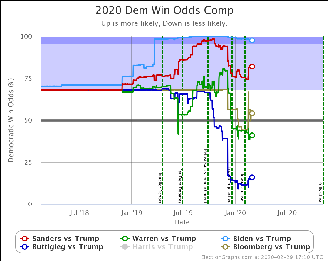
| Dem | 21 Feb | 29 Feb | 𝚫 |
| Biden | 98.4% | 97.7% | -0.7% |
| Sanders | 77.9% | 82.0% | +4.1% |
| Bloomberg | 59.9% | 54.1% | -5.8% |
| Warren | 38.3% | 40.9% | +2.6% |
| Buttigieg | 9.3% | 15.9% | +6.6% |
The last week of polling has improved Sanders, Warren, and Buttigieg's prospects against Trump.
Meanwhile, Biden and Bloomberg have both slipped.
The order has not changed, though.
- Biden still is the strongest against Trump by far.
- Sanders is more of a gamble but still significantly favored.
- Bloomberg is a little better than a coin toss, but not much.
- Warren is a bit worse than a coin toss but still has a decent chance.
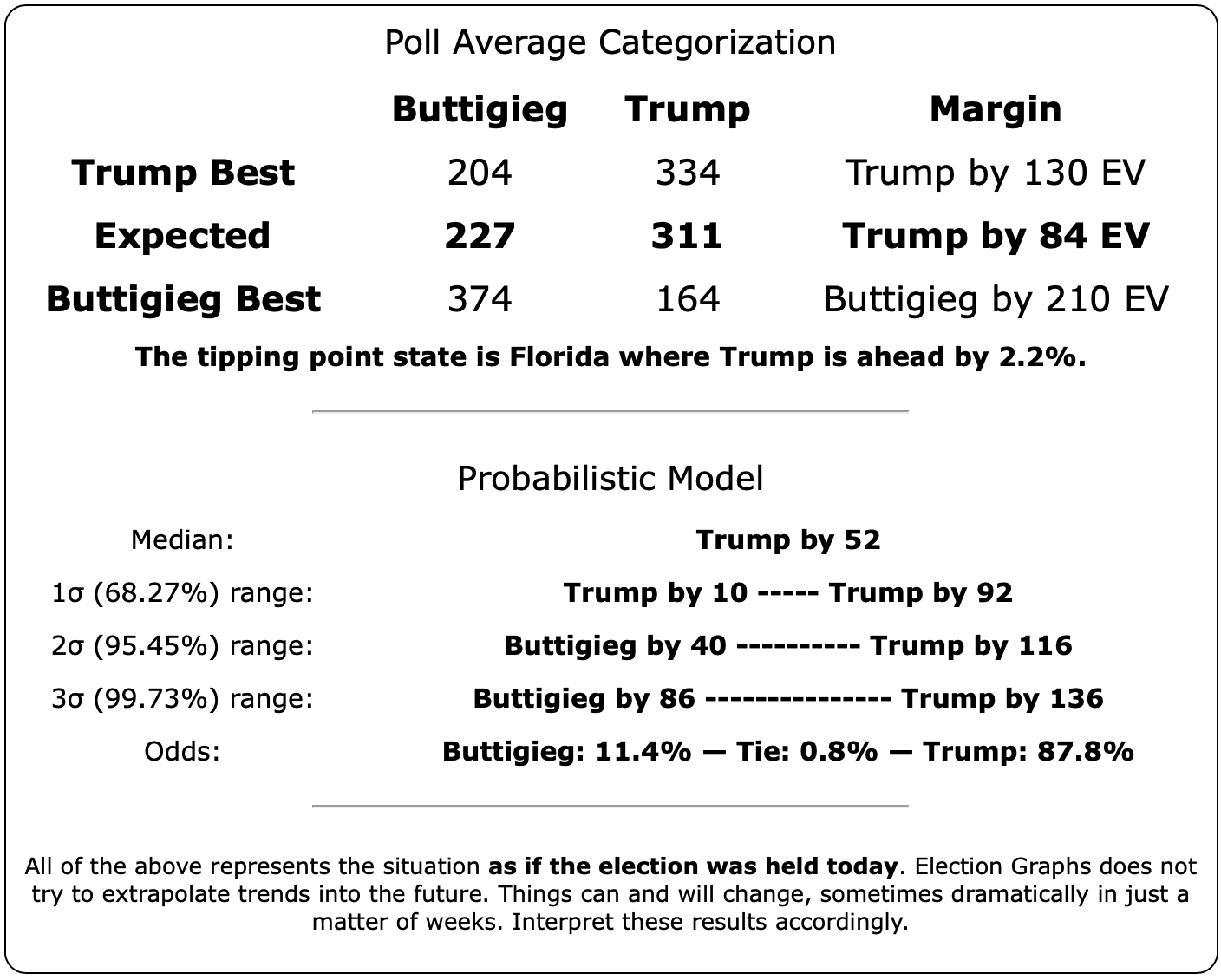
- Buttigieg would be a long shot. About the same as Trump in 2016.
Now would be a good time to talk a little about a Twitter thread by Johnathan Mummolo, a political scientist at Princeton. The thread summarizes a paper by Westwood, Messing, and Lelkes titled "Projecting Confidence: How the probabilistic horserace confused and demobilizes the public."
The bottom line is that the vast majority of people do not understand probabilities.
I have repeatedly ranted both here and on my Curmudgeon's Corner podcast ever since the 2016 election about people looking at a 14% chance of Trump winning (the median odds from all the sites I could find that gave odds) and acting as if it was 0%. That 14% is approximately the same as rolling a one on a six-sided die. And while people might be disappointed in that result if they wanted a six, nobody would be surprised by getting a one. Ones happen all the time.
This paper gets at a different but related problem. When looking at a probability of a candidate winning, vs. an equivalent percentage margin in the polls, people looking at the margins will interpret the situation as being a closer race and be more likely to vote than the people looking at probabilities even though the underlying truth is precisely the same.
Here at Election Graphs, we used the historical performance of the final, right before election day, Election Graph poll averages for every state vs. actual election results in 2008, 2012, and 2016 to estimate given a particular margin, how often would each party win? The detailed methodology is in this post from January 2019.
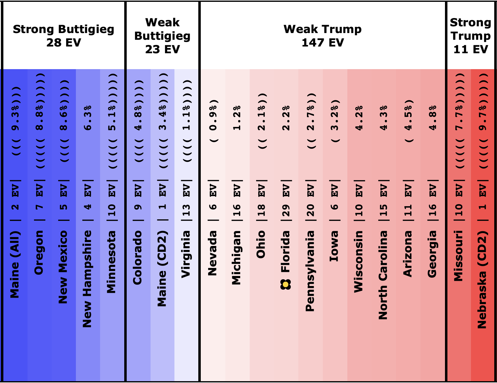
This analysis gives us numbers like if a Democrat is leading a state by 3.0% entering election day, they have a 73.8% chance of winning the state.
But it seems if people see 73.8%, they think it is a sure thing, so why should they bother voting? Whereas if they see a 3.0% lead, they believe it is a close race, and maybe they should vote.
Of course, 73.8% is not a sure thing at all! There is more than a one in four chance things will go the other way!
But human psychology and probabilistic innumeracy win the day!
The thread and paper also mention that at the moment, Democrats are more likely to frequent sites (like this one!) that give probabilistic forecasts. So presenting this sort of information ends up serving as a form of voter suppression for Democrats (if the Democrat is in the lead anyway).
I'll also note that when looking at a national election based on the Electoral College instead, people are going to be confused too. A significant Electoral College margin can rely on a small number of states being just barely on one side of the line or the other. A lead there can disappear in a flash with a slight movement in those states.
But of course, looking at the popular vote isn't a solution either, since as both 2000 and 2016 illustrated nicely, we don't pick presidents by the popular vote.
Here at Election Graphs, we are going to continue to present the probabilistic views anyway, of course. But if you are paying attention to them, you do need to understand what they mean, as well as pay attention to the various caveats about how quickly things change that I repeat endlessly. It is important.
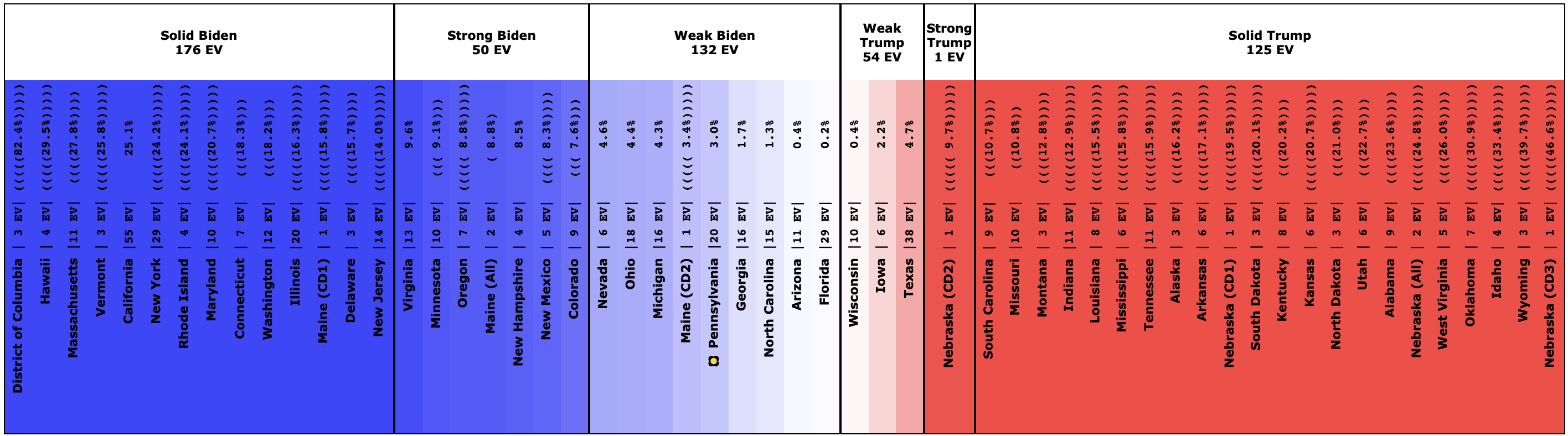
But to get a full view of what is going on, we also present the national picture in three other ways regularly in the blog, and there are even more available on the blog. We let you dig into what is happening in all of the states and see all the individual polls too if you want to get granular.
This stuff is complicated. Dig in. Understand the details.
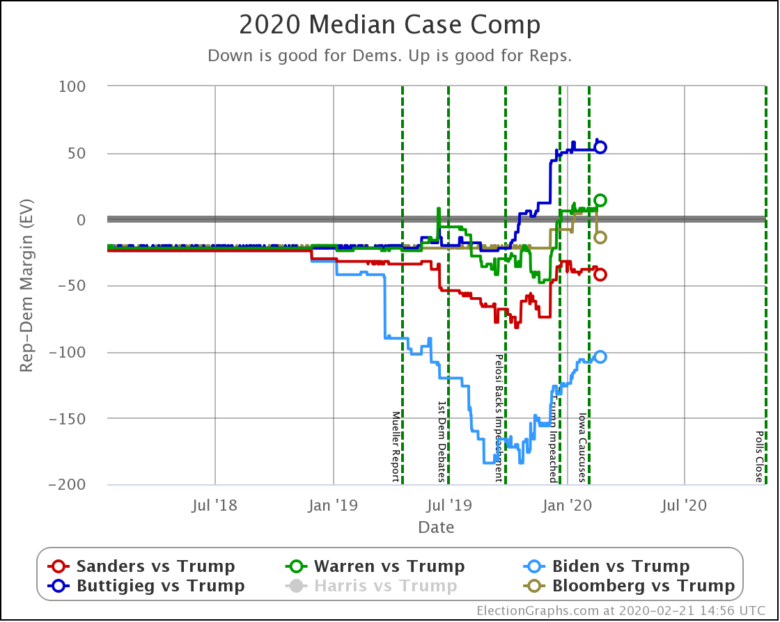
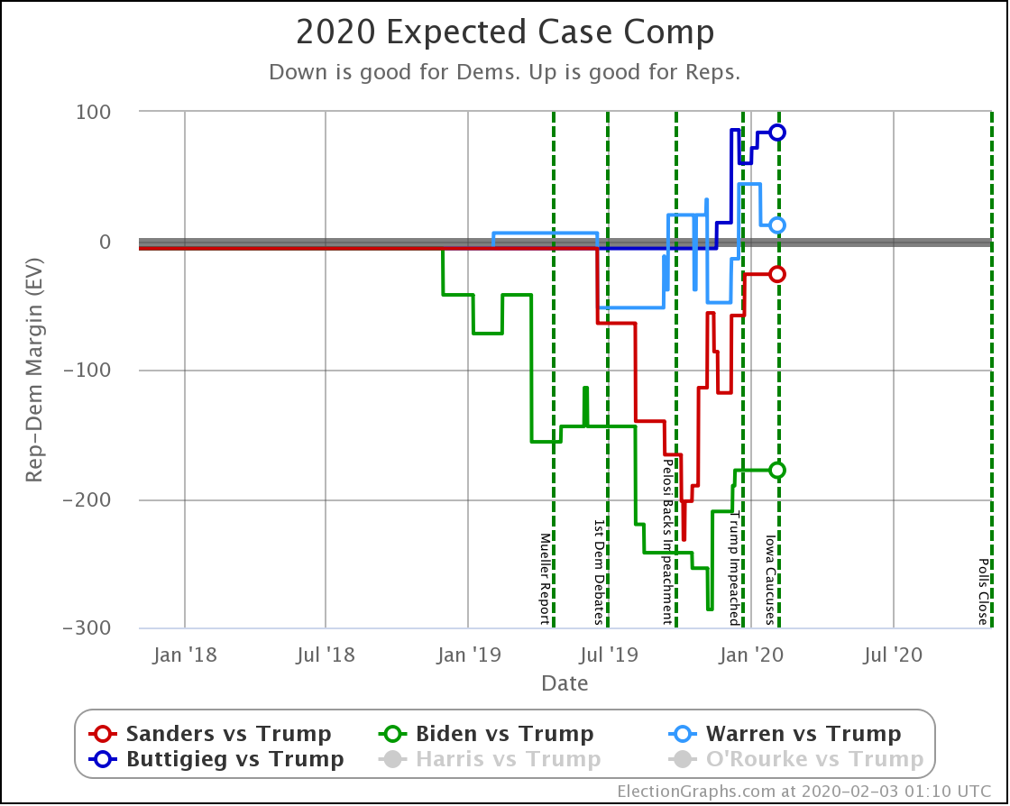
Anyway, we now turn to the median of the Electoral College margin simulations. Roughly speaking half the time, the Democrat will do better than this, and half the time, they will do worse than this. Maybe that is a little less confusing than the probability of winning?
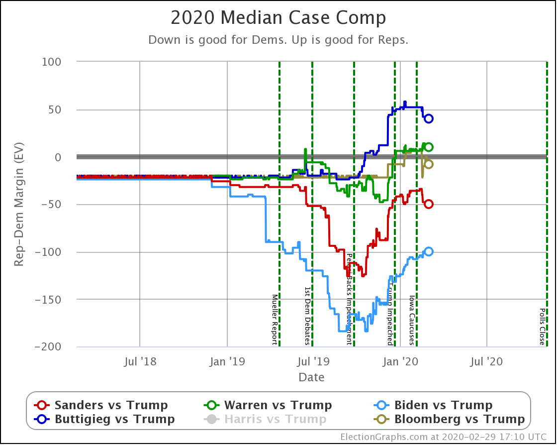
| Dem | 21 Feb | 29 Feb | 𝚫 |
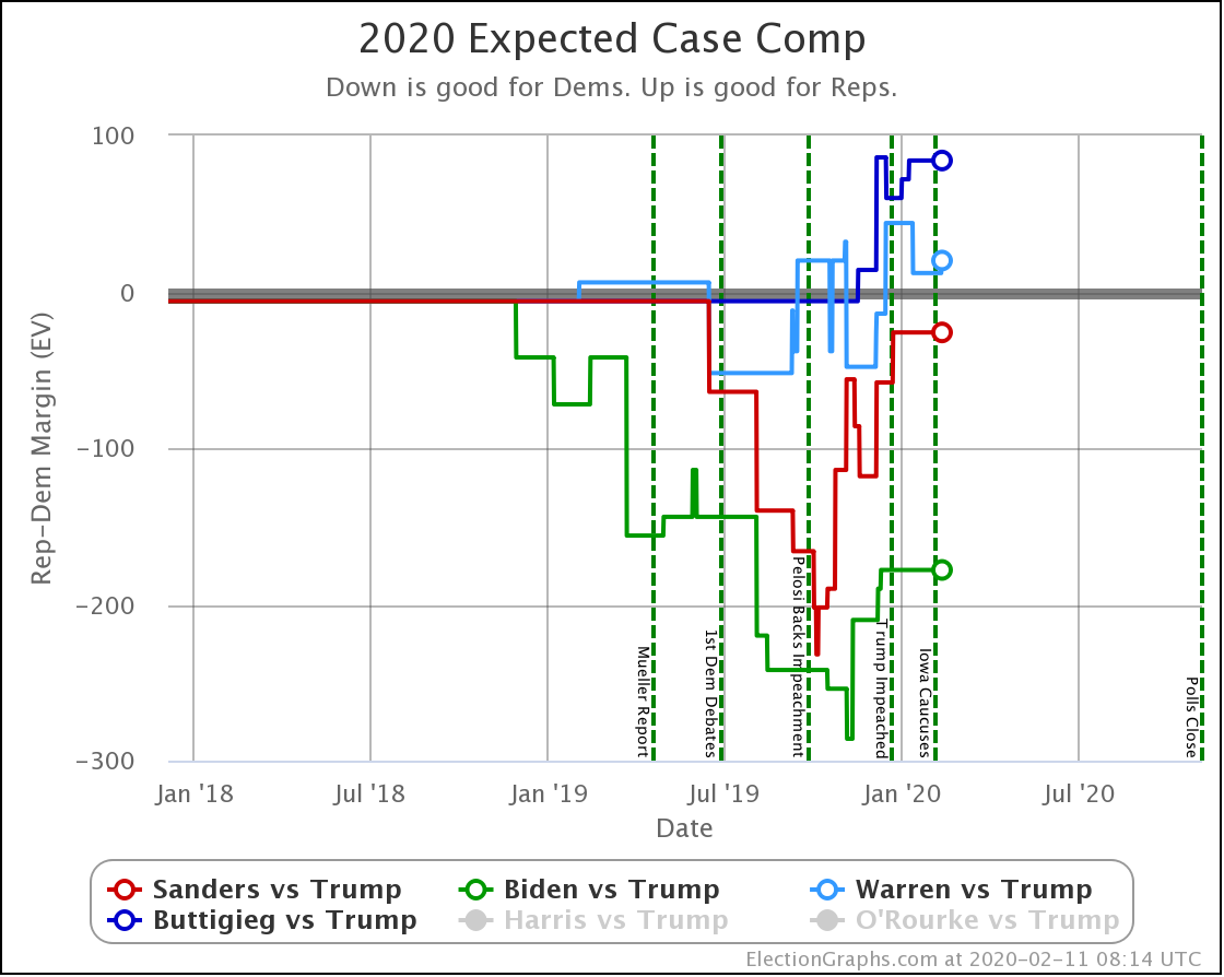
| Biden | +104 | +100 | -4 |
| Sanders | +42 | +50 | +8 |
| Bloomberg | +14 | +8 | -6 |
| Warren | -14 | -10 | +4 |
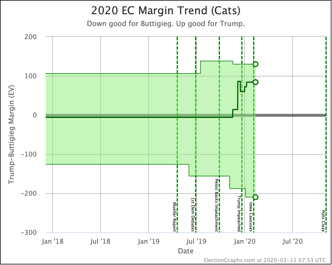
| Buttigieg | -54 | -40 | +14 |
The changes here parallel the odds, of course. But does presenting it at a margin make you FEEL differently about the results? Maybe.
Also, of course, the median margin in the model does not alone tell you how about the distributions, and how easily it would be for things to change. That is what the probability helps to understand. Two candidates might show the same median margin, but be in very different situations depending on the margins in the individual states.
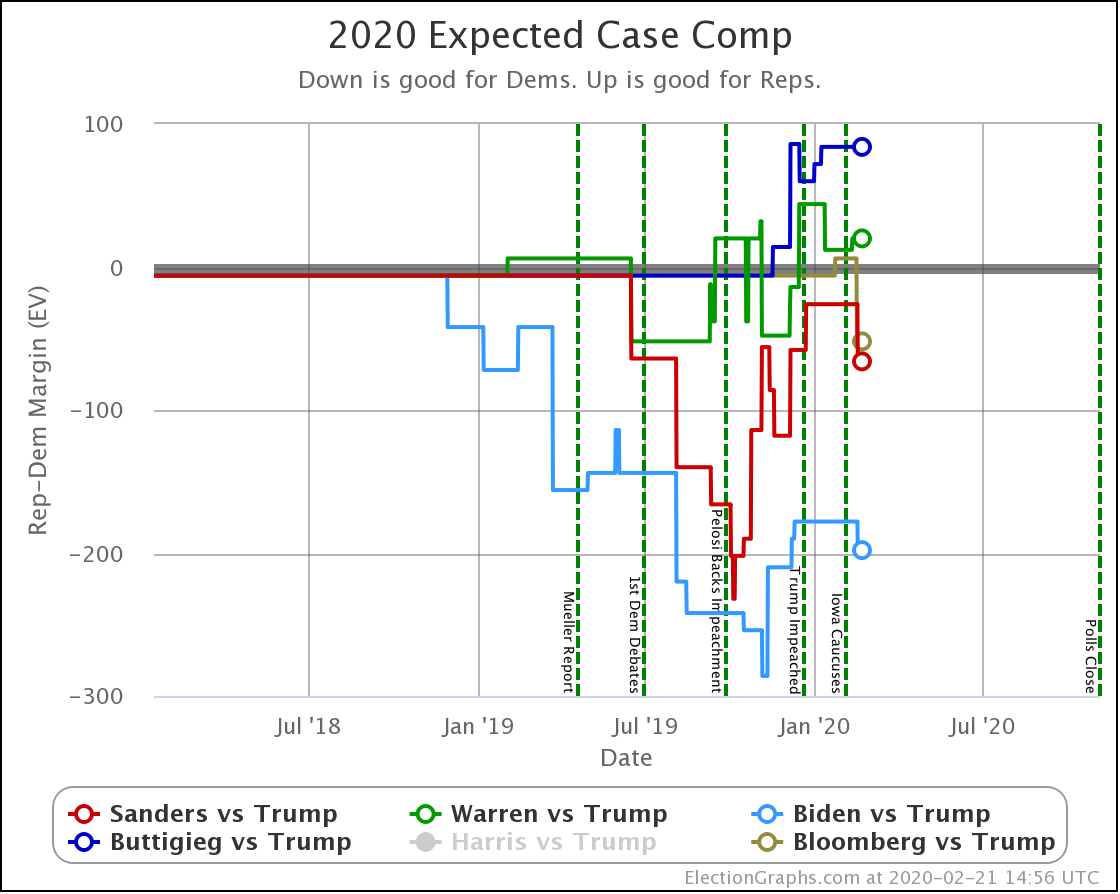
Simplifying this even further to look at the margins if each candidate wins exactly the states they lead, you get this:
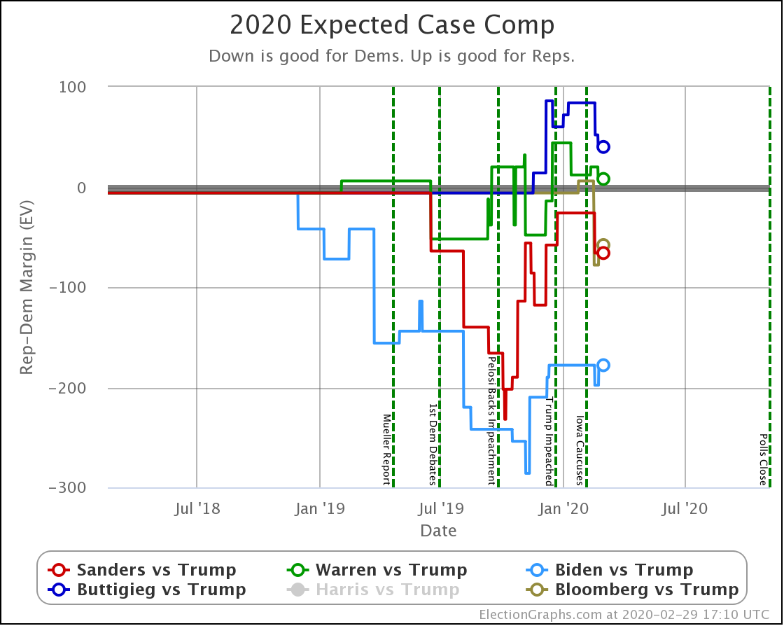
| Dem | 21 Feb | 29 Feb | 𝚫 |
| Biden | +198 | +178 | -20 |
| Sanders | +66 | +66 | Flat |
| Bloomberg | +52 | +58 | +6 |
| Warren | -20 | -8 | +12 |
| Buttigieg | -84 | -40 | +44 |
Interestingly, in this view, Bloomberg improves, even though his odds of winning and his median margin got worse. This divergence is because Bloomberg improved his margin by 6 EV by taking the lead in Virginia (13 EV) and losing the edge in Wisconsin (10 EV). But meanwhile, he weakened in other states enough to lower his overall chance of winning, even though the straight-up list of places he is ahead improved.
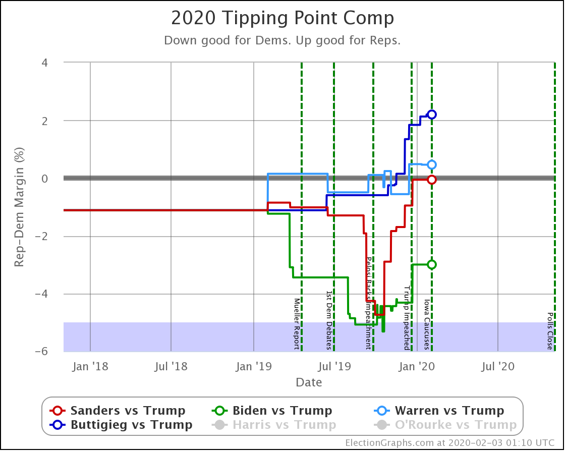
Finally, the tipping point, representing how much of a national shift in polls would change the outcome:
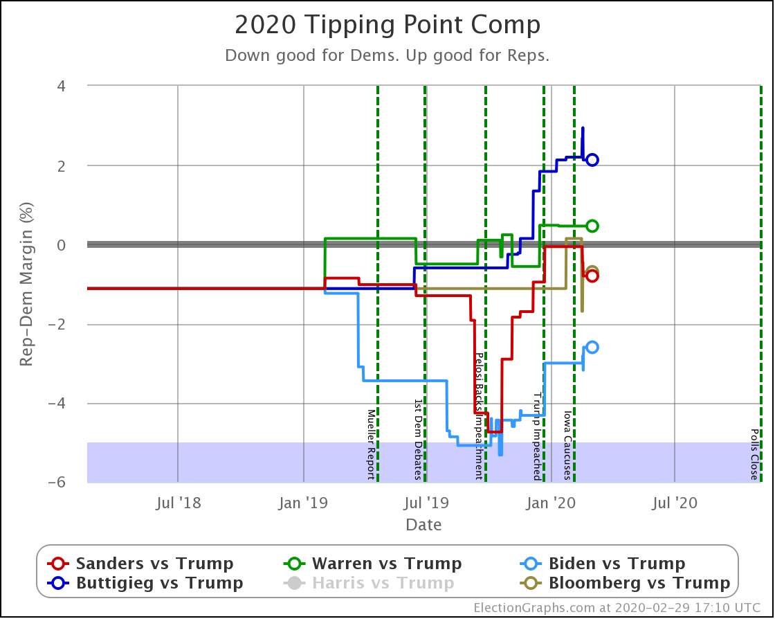
| Dem | 21 Feb | 29 Feb | 𝚫 |
| Biden | +2.8% | +2.6% | -0.2% |
| Sanders | +0.5% | +0.8% | +0.3% |
| Bloomberg | +0.7% | +0.7% | Flat |
| Warren | -0.5% | -0.5% | Flat |
| Buttigieg | -2.9% | -2.1% | +0.8% |
If I could only keep two of these charts, it would be the probability of winning and the tipping point. The likelihood of winning tells you what might happen if the election was today. But the tipping point tells you how easy it is for those probabilities to change.
There is not a single one of these five candidate combinations that are further than 3% from the centerline. That means that if there is a systematic bias of 3% in the polls toward the other side, the outcome will change. Similarly, any news event that can move the margins by 3% can change the results.
To kill a 3% margin, only 1.5% of the public needs to change their minds. People deciding to stay home and not vote can also eliminate a 3% margin in an instant.
So yes, the odds here show that if a Biden vs. Trump election were today, Biden would have a 97.7% chance of winning. But a tipping point of only 2.6% tells you that Biden's entire advantage could disappear virtually overnight with the right bit of negative news hitting the headlines, or with a pretty slight polling error in the critical states.
Which brings us back to the importance of correctly interpreting the numbers we share here on Election Graphs.
There is a big difference between "would probably win if the election was today" and "will probably win in November."
And even if the election was tomorrow, 97.7% is not the same as 100%. And 82.0% is certainly not the same as 100%.
No matter which candidate pair you look at, this is still a close and highly contested election.
The results of the South Carolina primary start coming in just a few hours.
248.2 days until polls start to close on the general election.
We have a long way to go.
For more information:
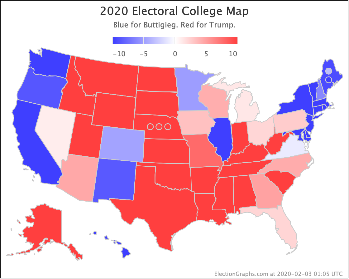
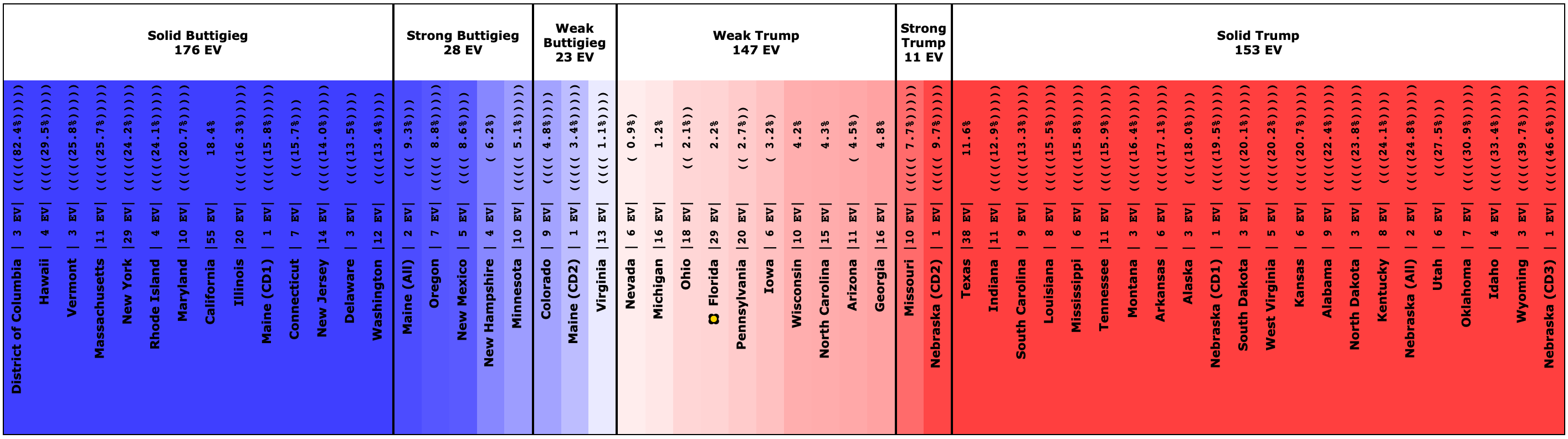
This post is an update based on the data on the Election Graphs Electoral College 2020 page. Election Graphs tracks a poll-based estimate of the Electoral College. The charts, graphs, and maps in the post above are all as of the time of this post. Click through on any image for current interactive versions of the chart, along with additional details.
Follow @ElectionGraphs on Twitter or Election Graphs on Facebook to see announcements of updates. For those interested in individual poll updates, follow @ElecCollPolls on Twitter for all the polls as I add them. If you find the information in these posts informative or useful, please consider visiting the donation page.