As always, if you are impatient for one of these updates, the 2020 pages on Election Graphs are updated every day as new polls come in. Or you can follow @ElecCollPolls on Twitter to see all the polls as I add them.
The last blog update here was 11 days ago on September 29th. Here are the high-level changes since that last post:
| Model |
Metric |
29 Sep |
10 Oct |
𝚫 |
Probabilities
(Indep States) |
Trump 2σ
Median
Biden 2σ |
Biden +46
Biden +144
Biden +256 |
Biden +78
Biden +174
Biden +276 |
Biden +32
Biden +30
Biden +20 |
Trump Win
Tie
Biden Win |
0.1%
0.0%
99.9% |
0.0%
0.0%
100.0% |
-0.1%
FLAT
+0.1% |
Probabilities
(Uniform Swing) |
Trump 2σ
Median
Biden 2σ |
Trump +84
Biden +168
Biden +312 |
Trump +12
Biden +176
Biden +326 |
Biden +72
Biden +8
Biden +14 |
Trump Win
Tie
Biden Win |
7.5%
0.0%
92.5% |
5.2%
0.0%
94.8% |
-2.3%
FLAT
+2.3% |
| Categories |
Trump Best
Expected
Biden Best |
Biden +8
Biden +168
Biden +294 |
Biden +20
Biden +212
Biden +288 |
Biden +12
Biden +44
Trump +6 |
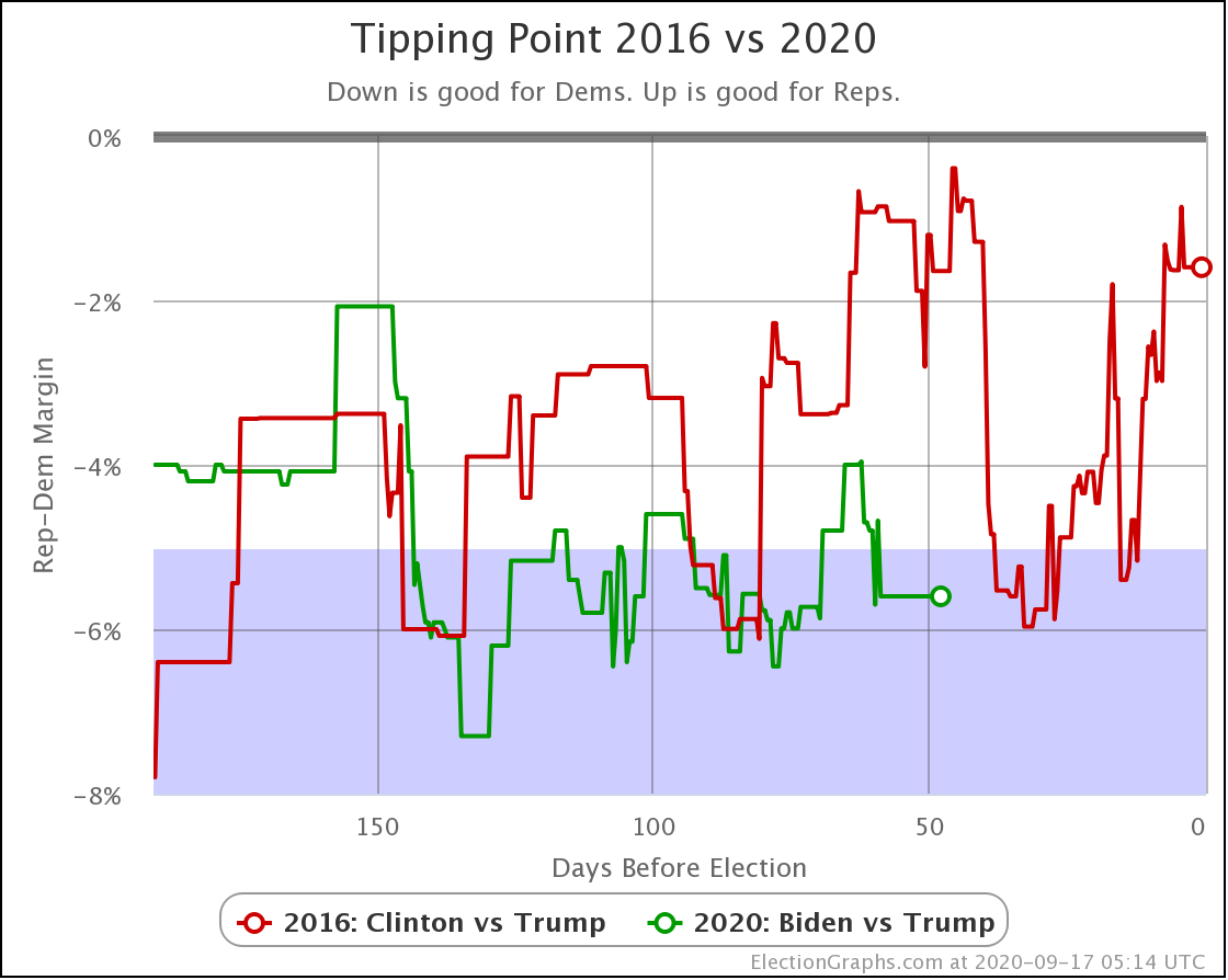
| Tipping Point |
Biden +5.4% |
Biden +6.2% |
Biden +0.8% |
To summarize before we get to review all the current graphs:
These 11 days have been very good for Biden in the polling. He hasn't moved past his all-time best marks, but he is once again near the top of the range we have observed over the last year. The flip side of course is that Trump is near the bottom of his range.
The key metrics right now show that if the election was today (it is not) Trump's chance of winning is no more than 5.2%, probably less, and Biden's tipping point is up to a 6.2% lead, which is the best it has been since mid-August, and which is better than Clinton saw any time in the last 100 days before the 2016 election.
But I wouldn't call this a Trump collapse quite yet. He has returned to the low end of the range we have been seeing for months. We are not breaking new ground, seeing things worse for Trump than we have ever seen. At least not yet.
From here it is quite possible that we get a reversion to the mean, with Trump improving a bit, rather than seeing further Trump deterioration. Does it look bad for Trump? Yes. Certainly. But not in an unprecedented way, and he could still make up ground before the end.
OK, now for the parade of graphs…
As usual, we'll look at the critical states, then the nationwide electoral college trend charts, the win odds graphs, the spectrum of states, then finally close it up with the comparison to 2016 and a map. Here we go.
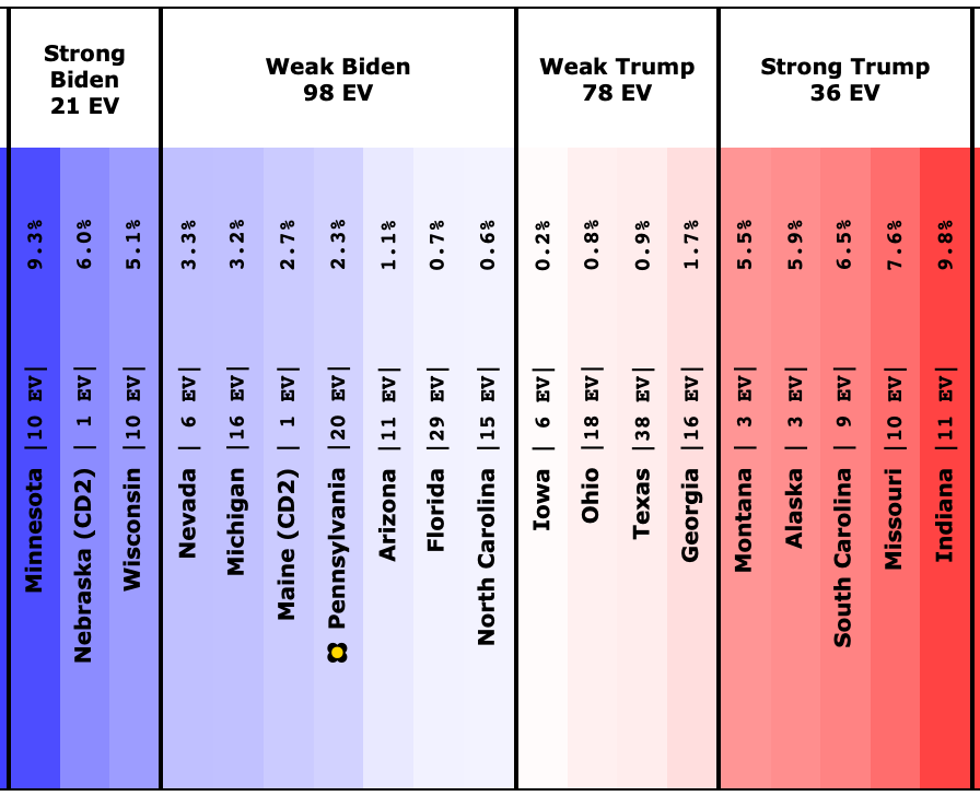
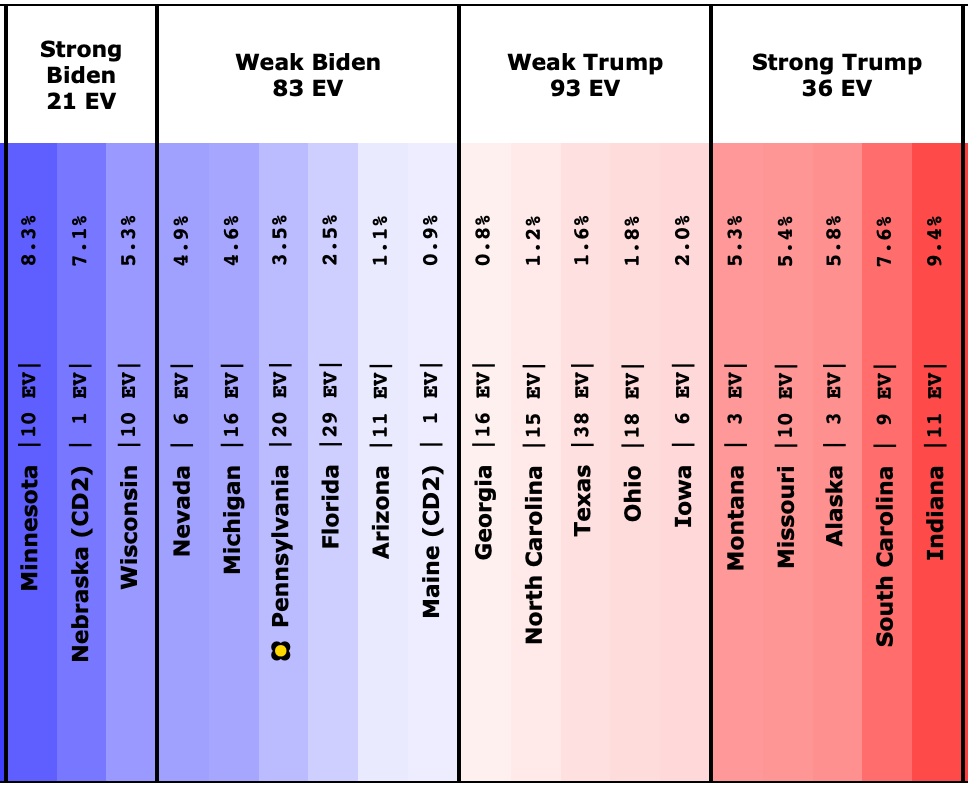
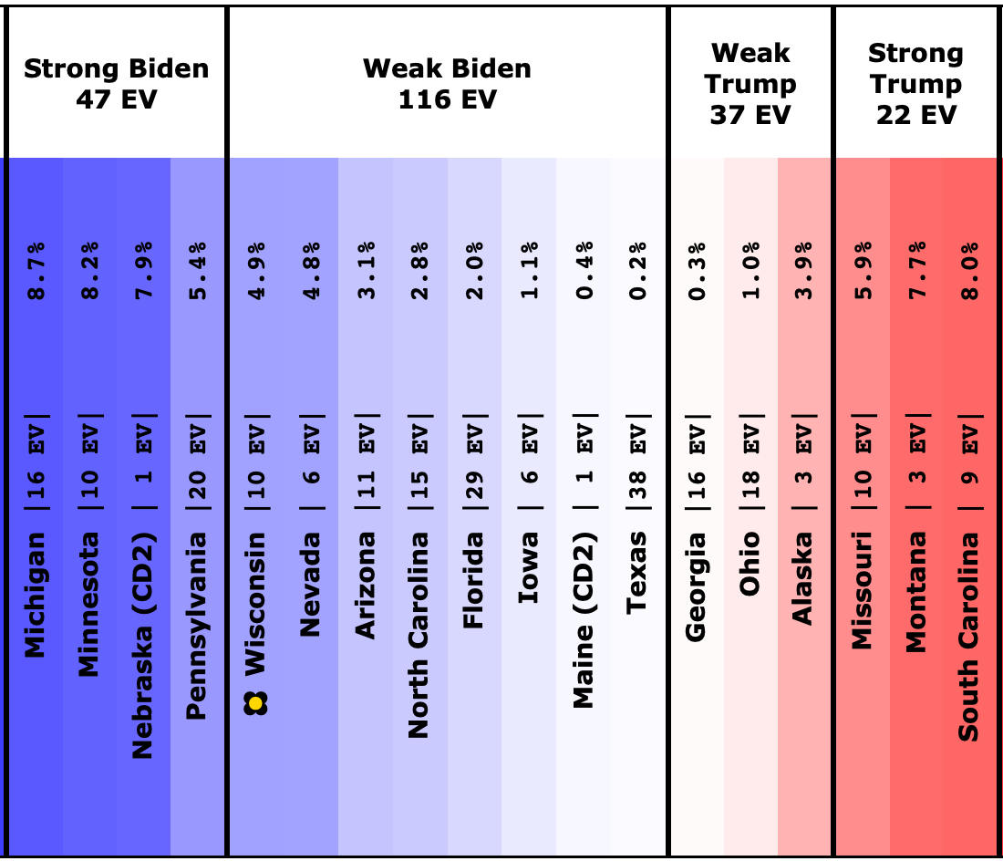
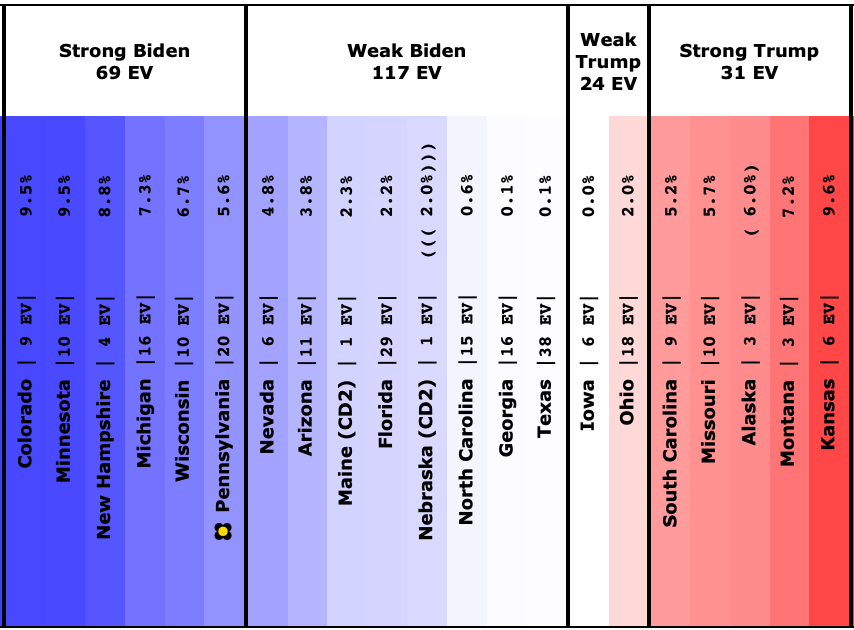
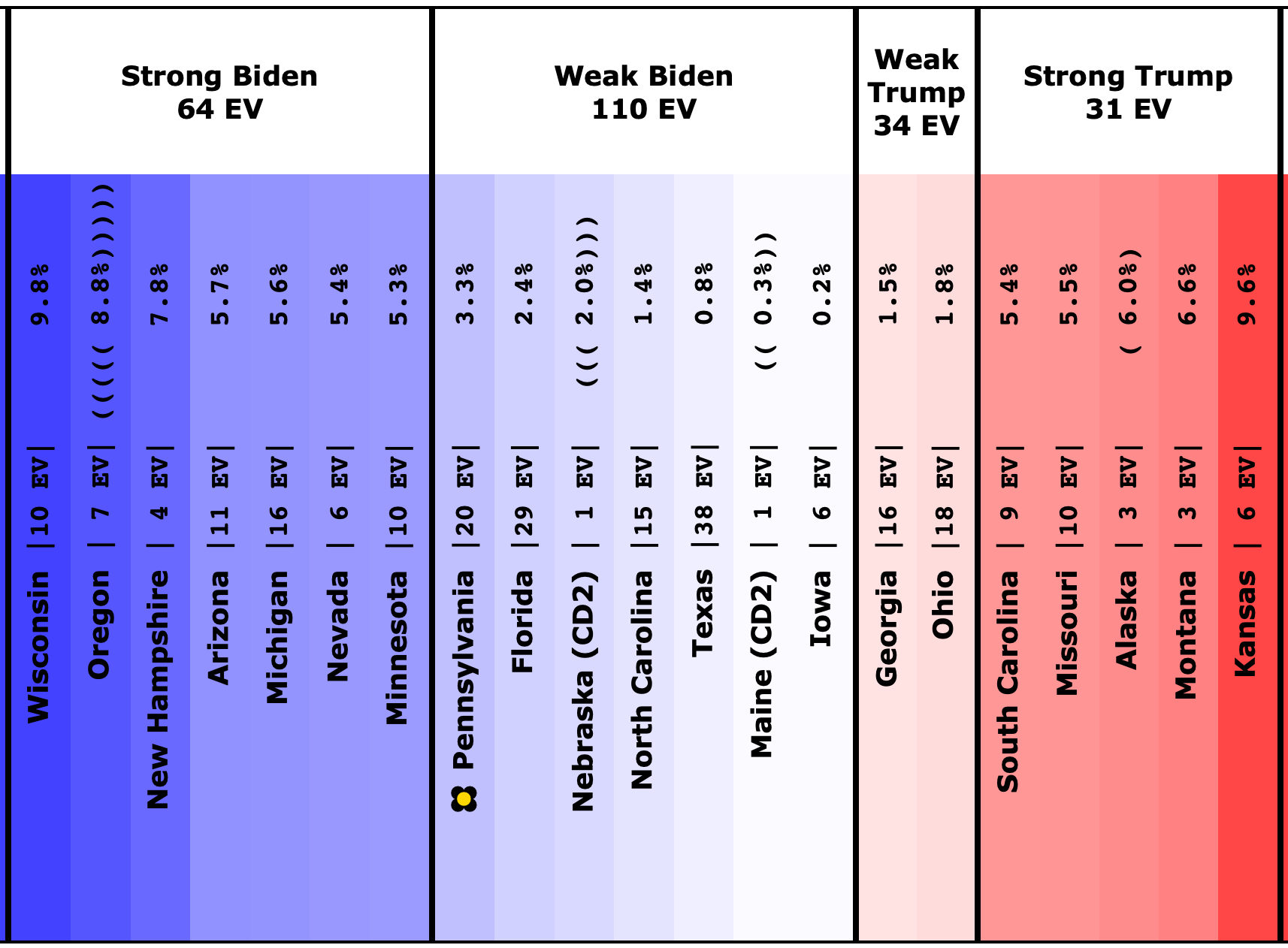
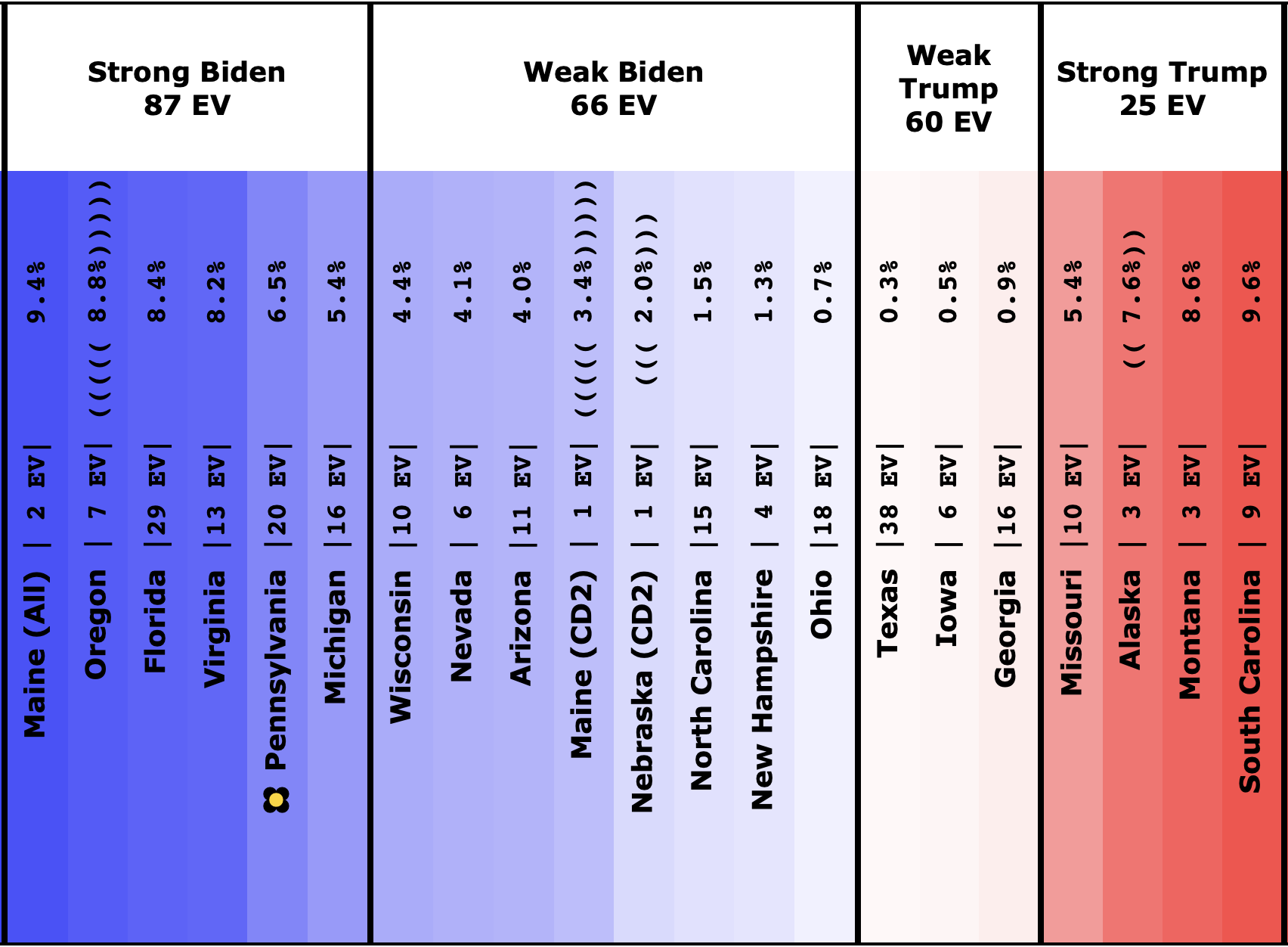
This time there were 9 states that moved in or out of the "Weak Biden" or "Weak Trump" categories since the last blog post:
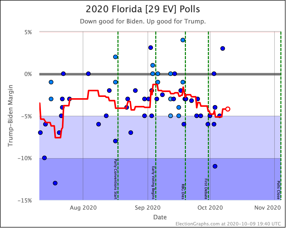
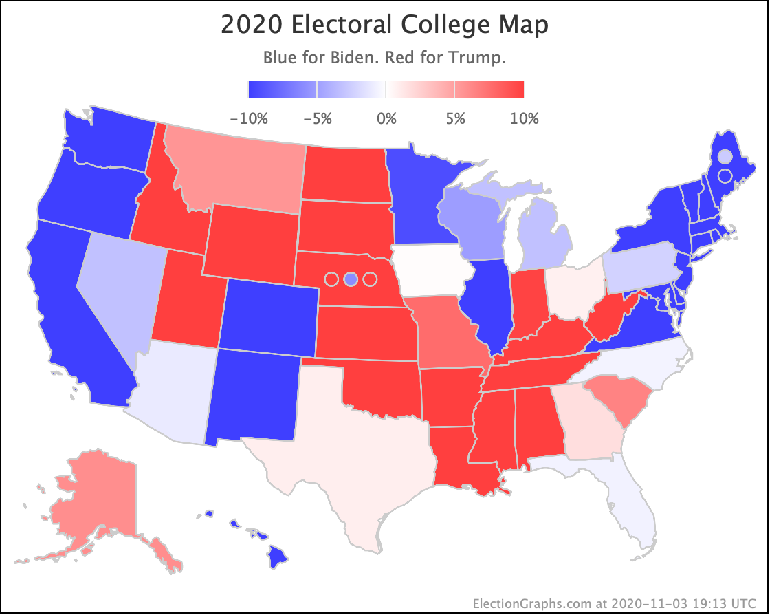
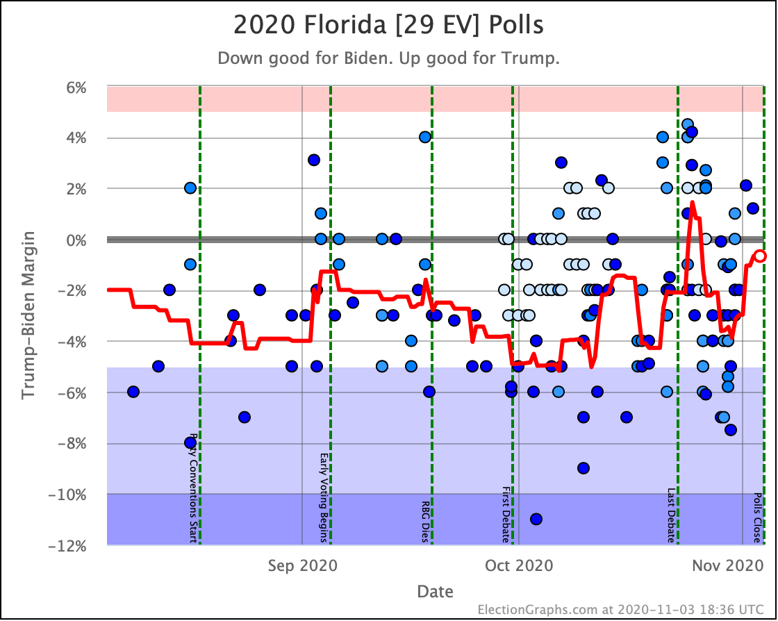
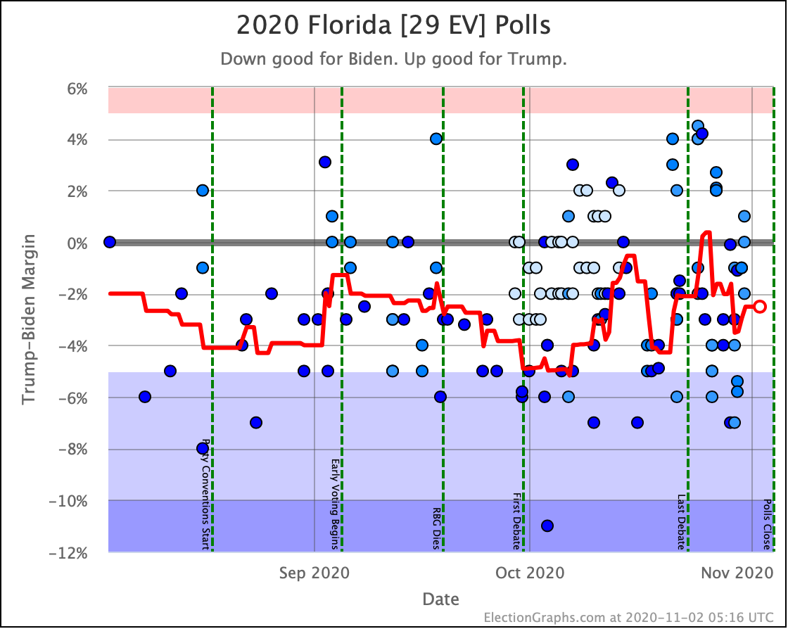
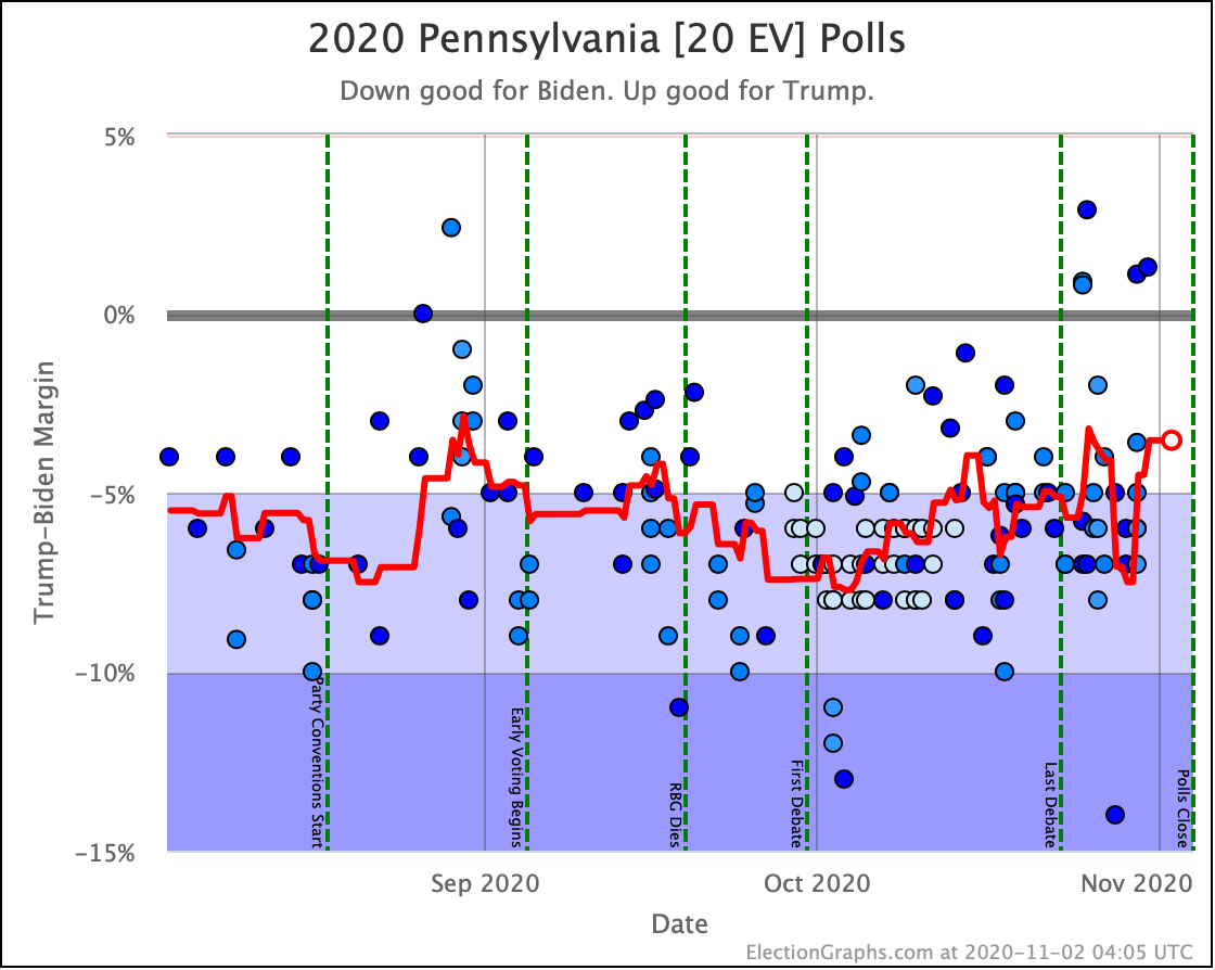
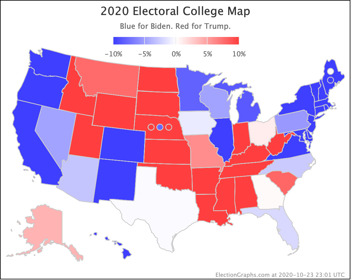
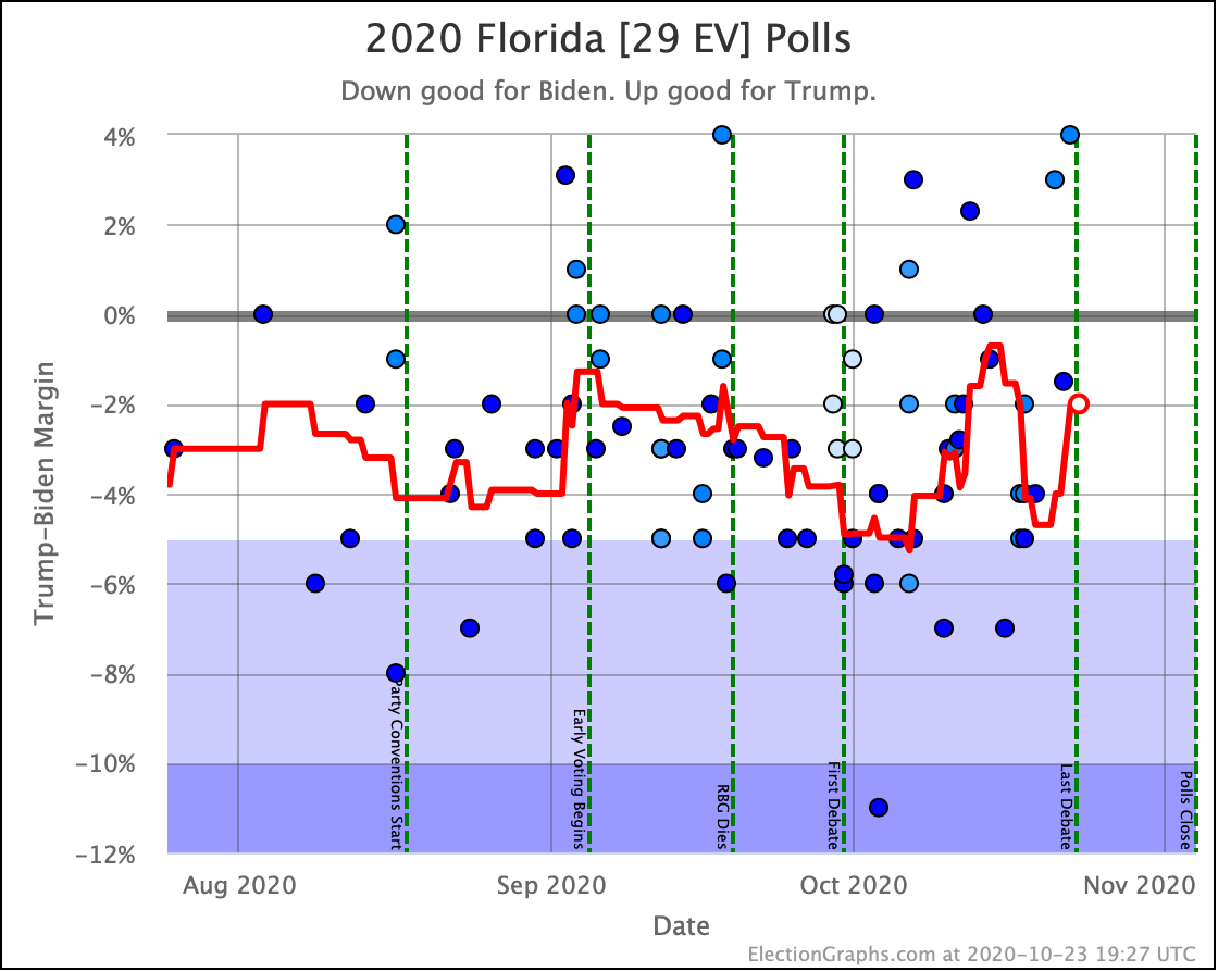
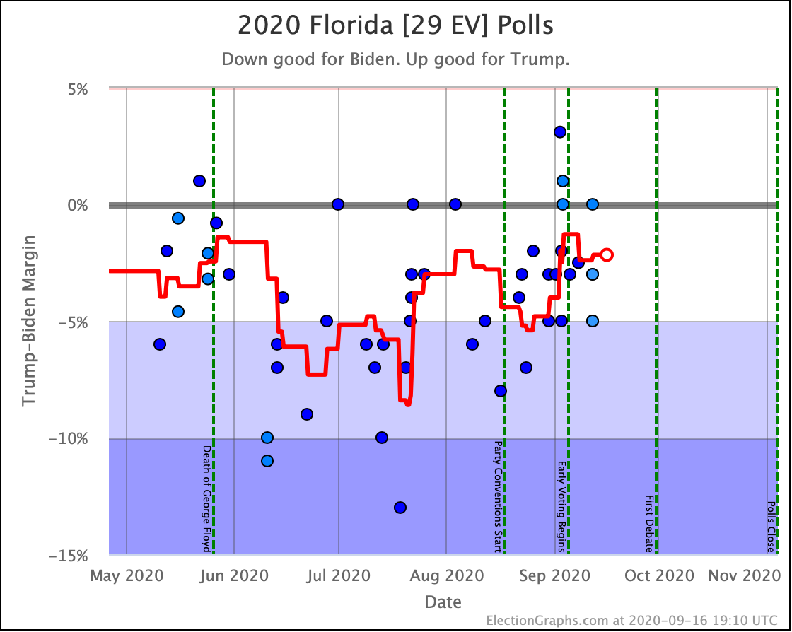
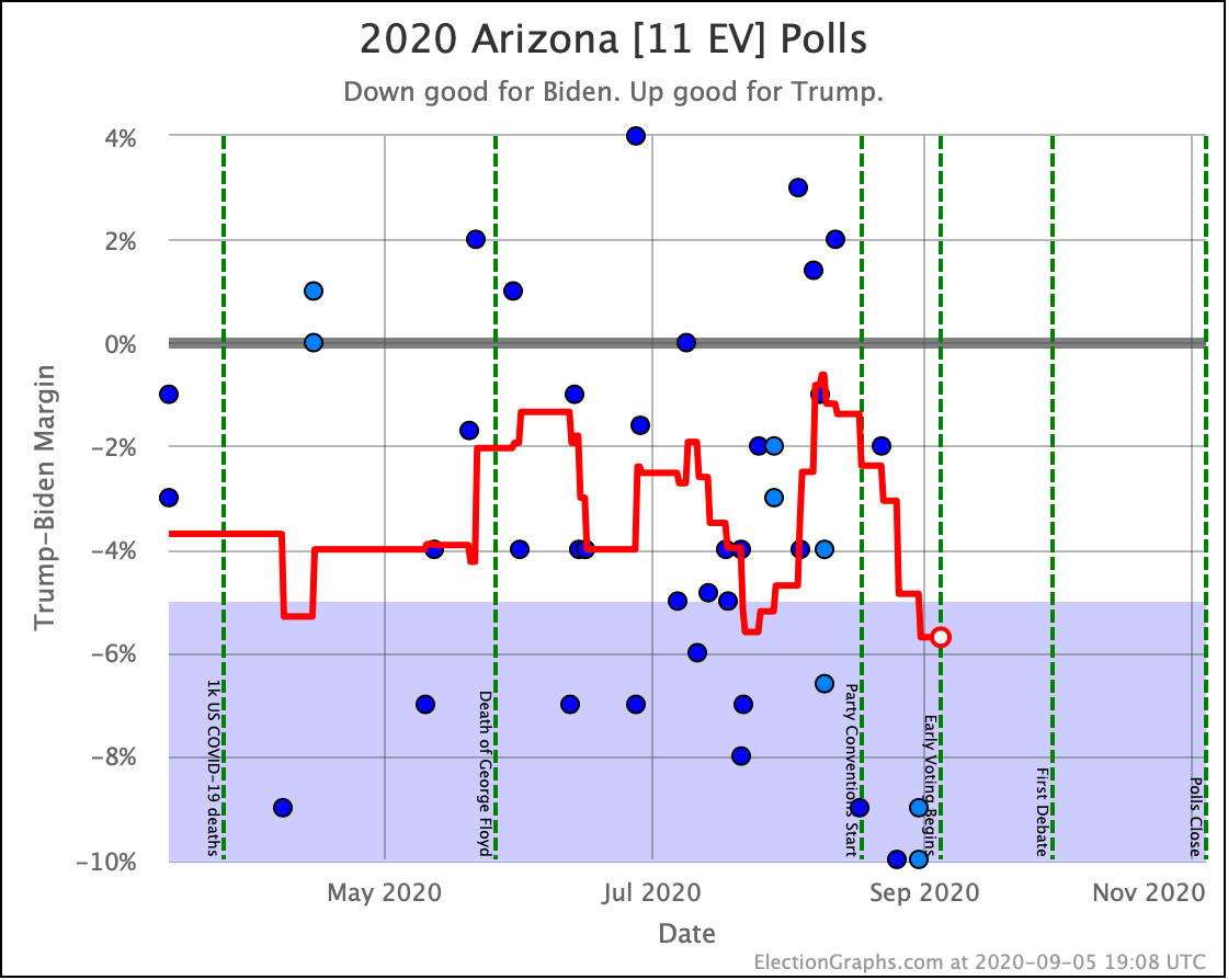
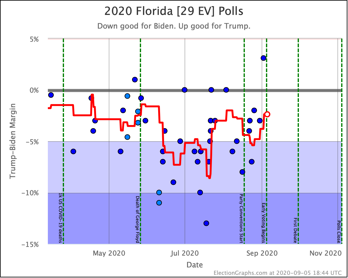
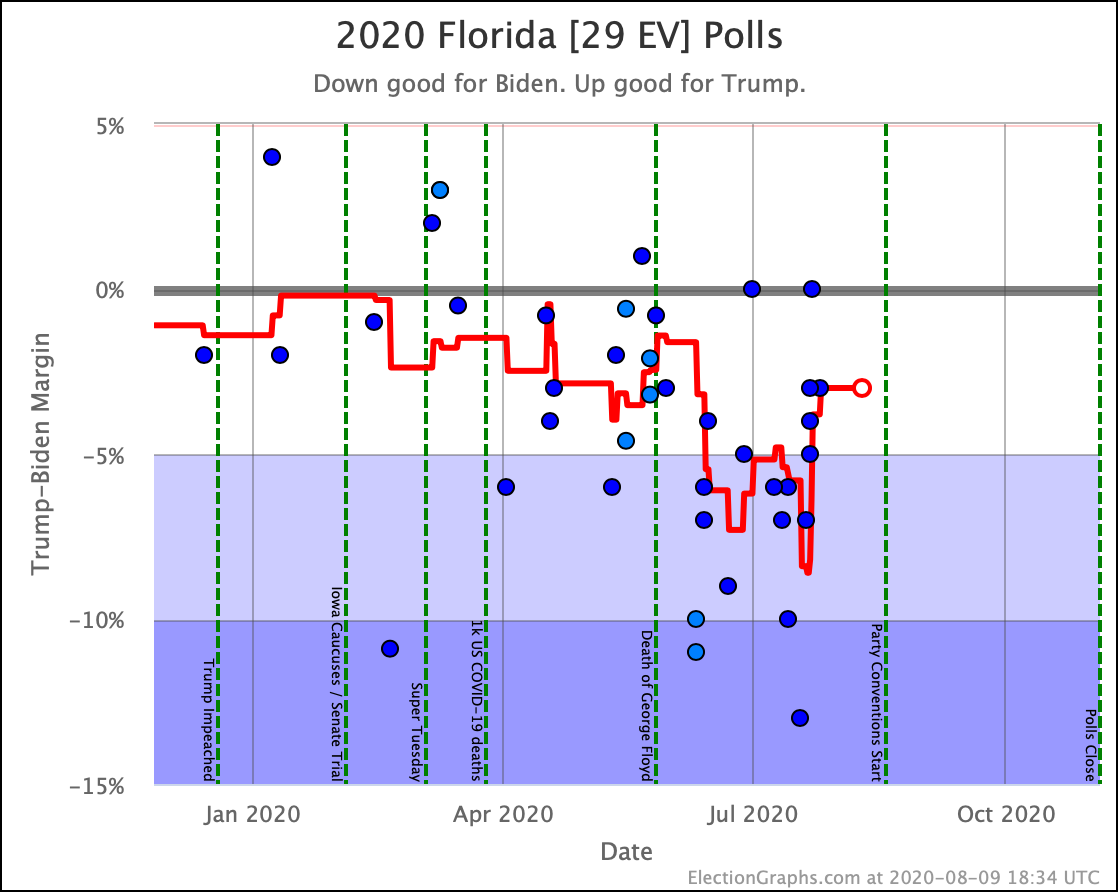
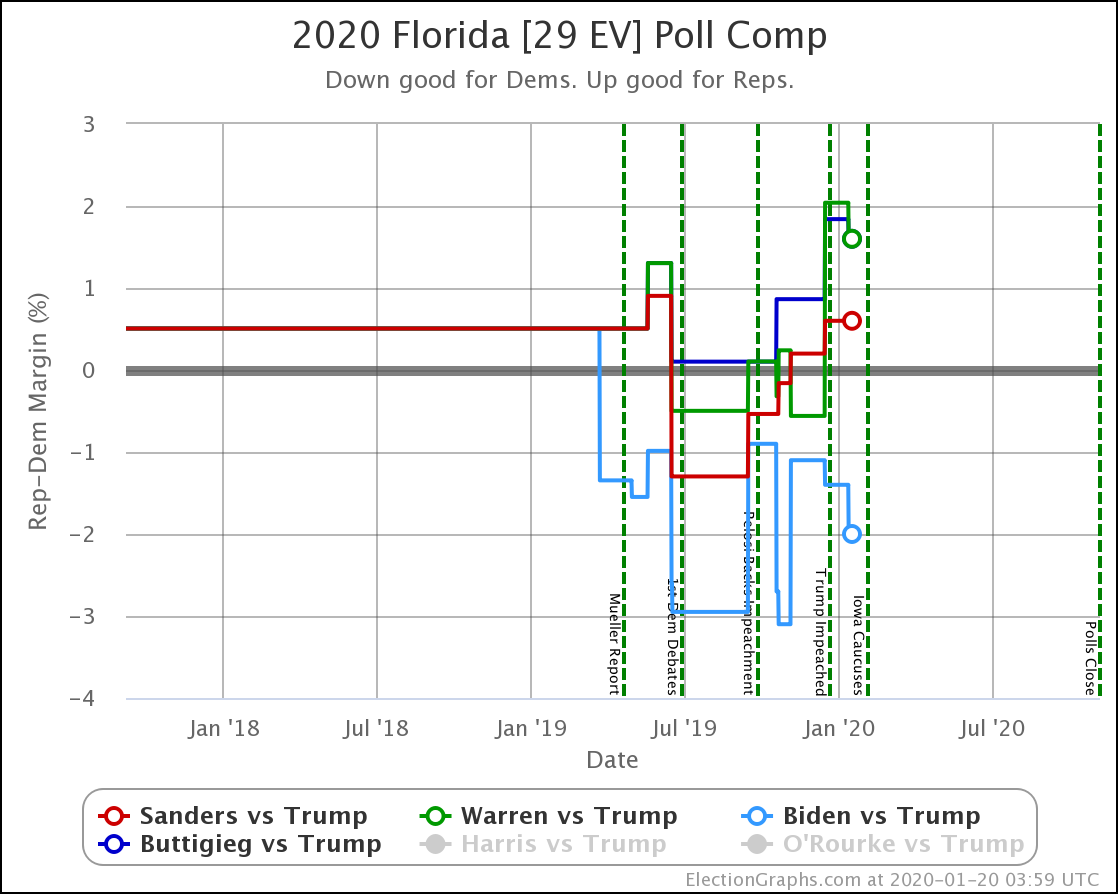
Biden's lead in Florida very briefly popped over 5% into the "Strong Biden" zone, but then dropped back down again into "Weak Biden". So no net change to the category. Biden remains strong in Florida, but not so strong that it is completely out of Trump's reach.
Biden's current 4.2% lead maps to an 84.9% chance of winning the state given the previous accuracy of Election Graphs averages.
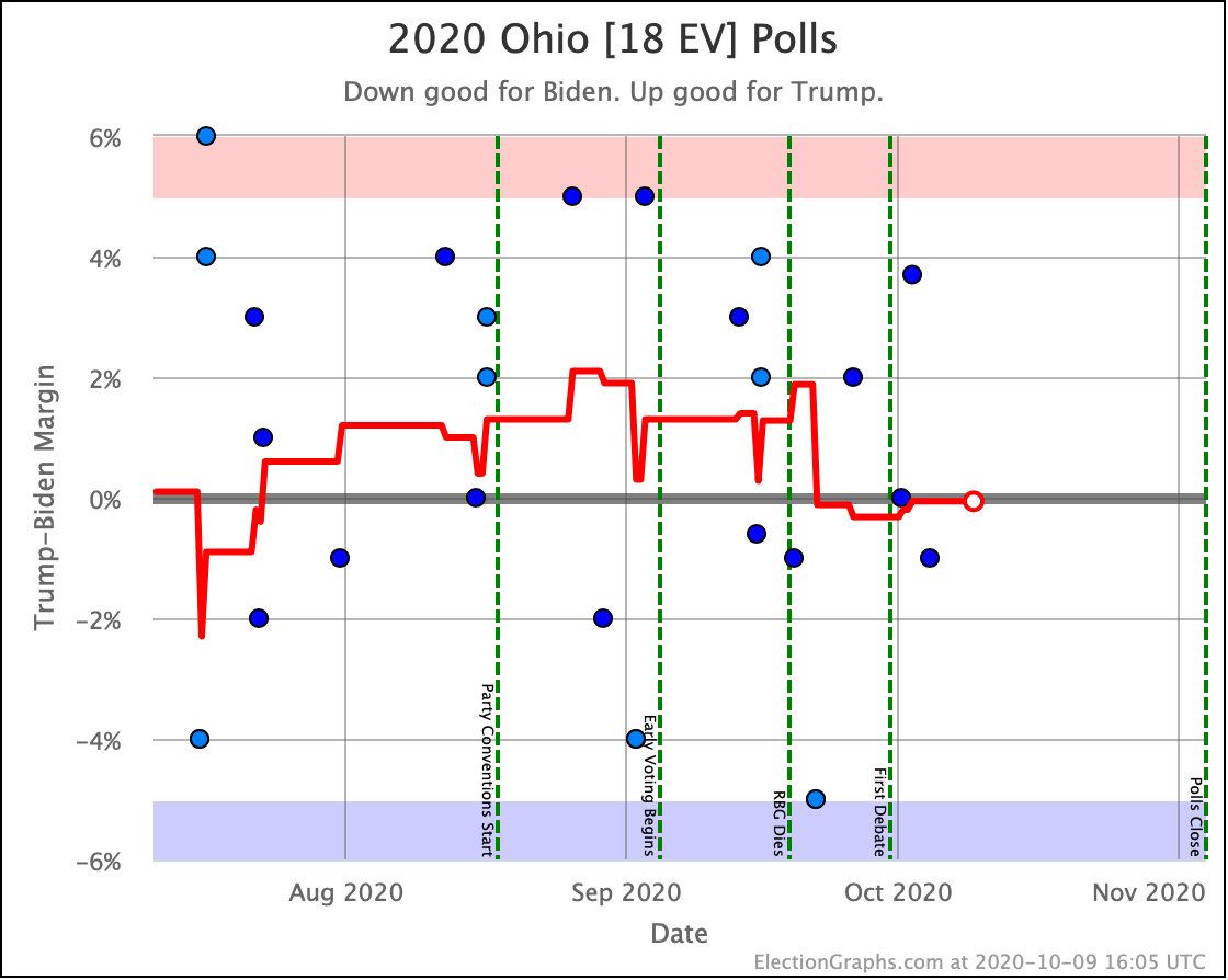
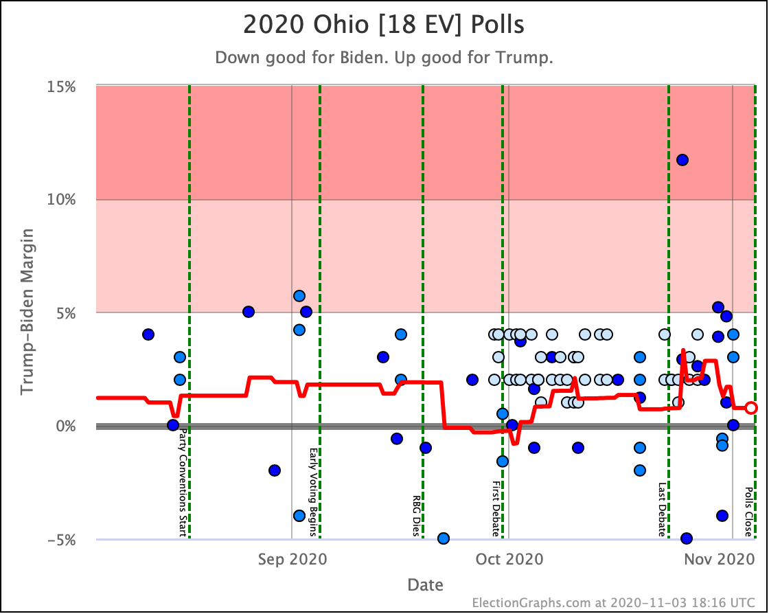
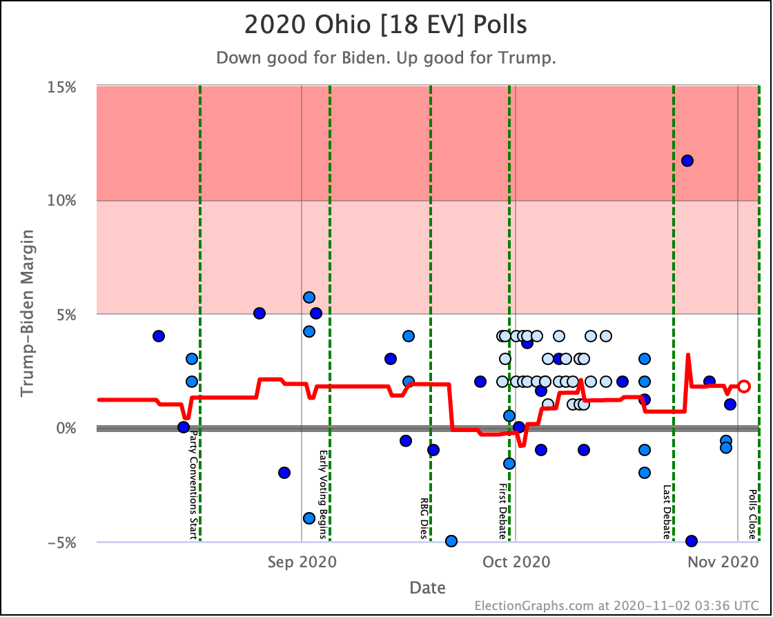
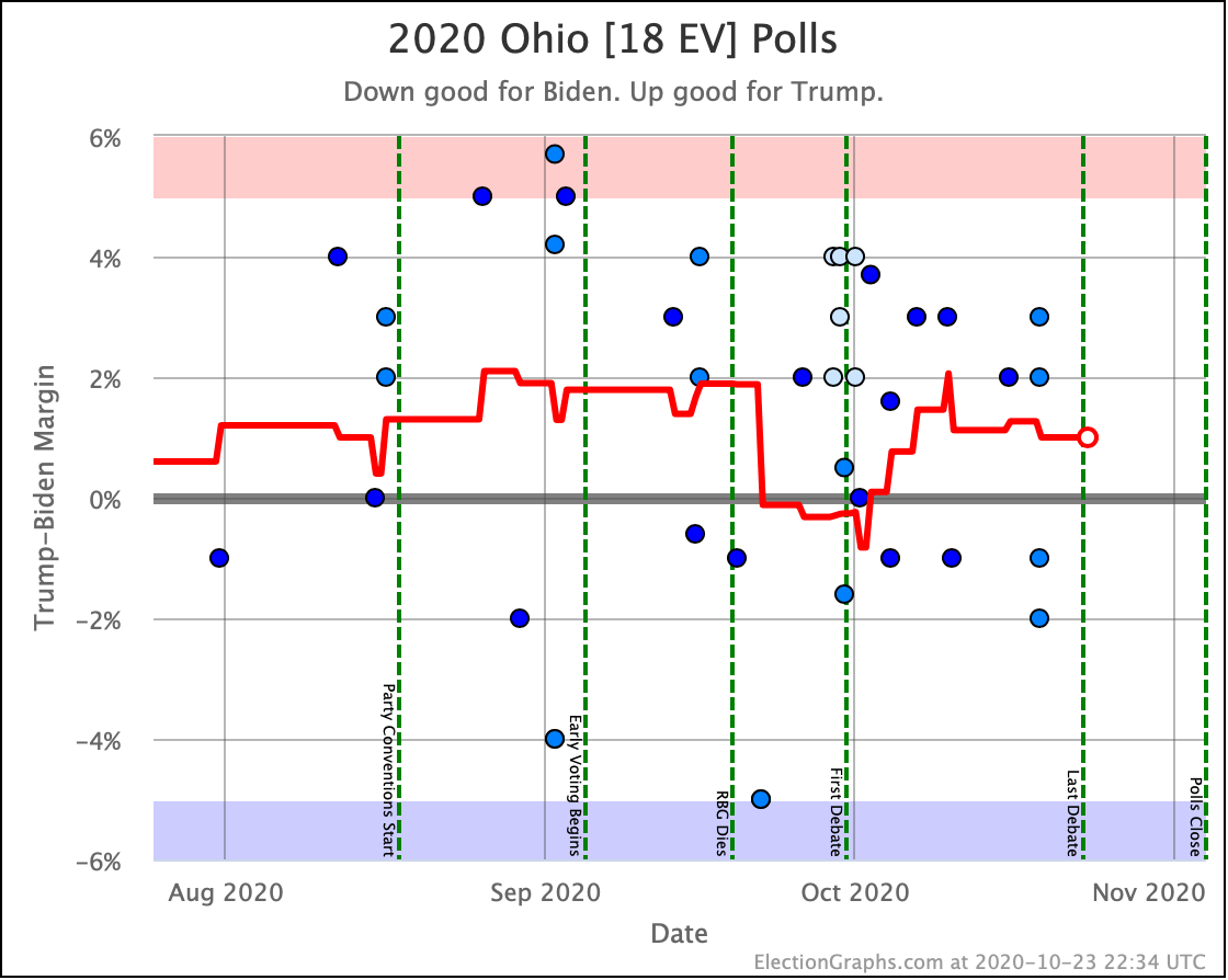
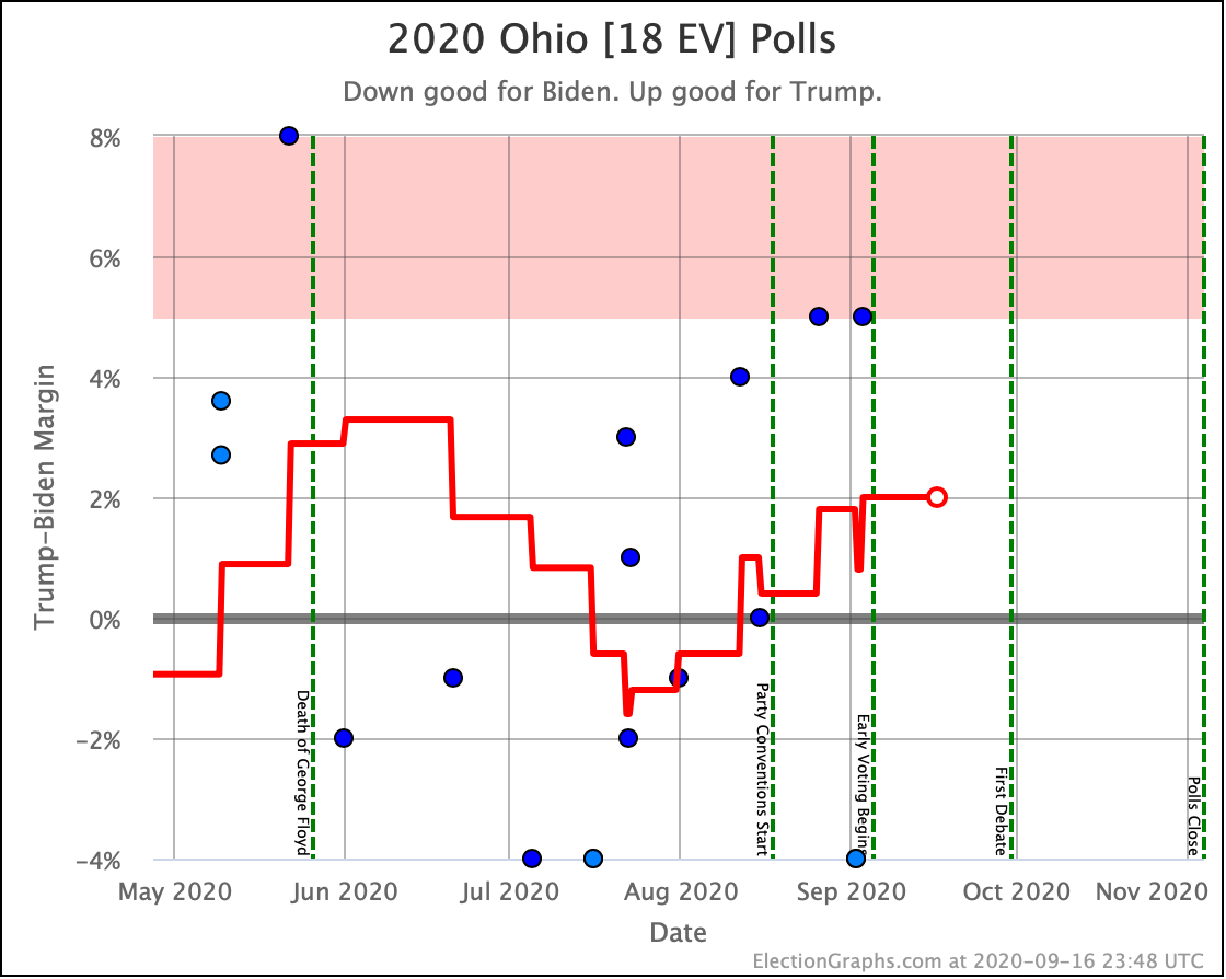
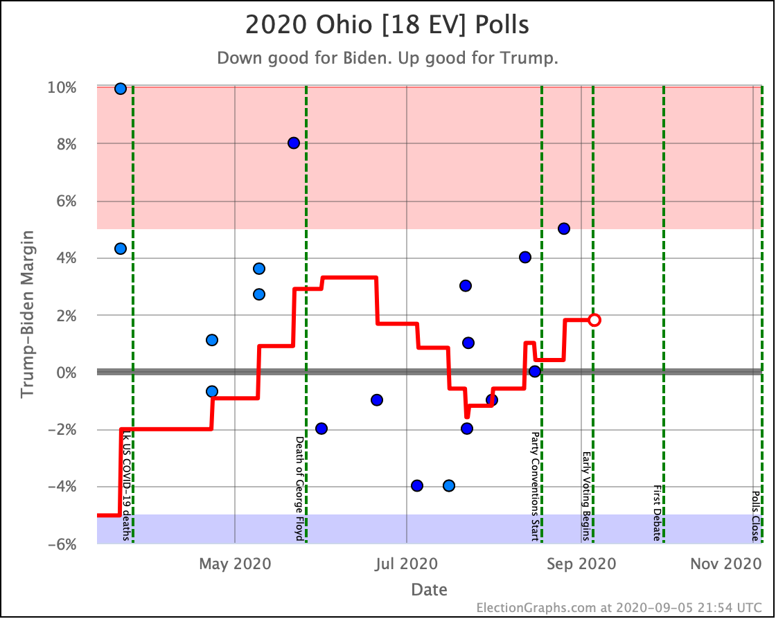
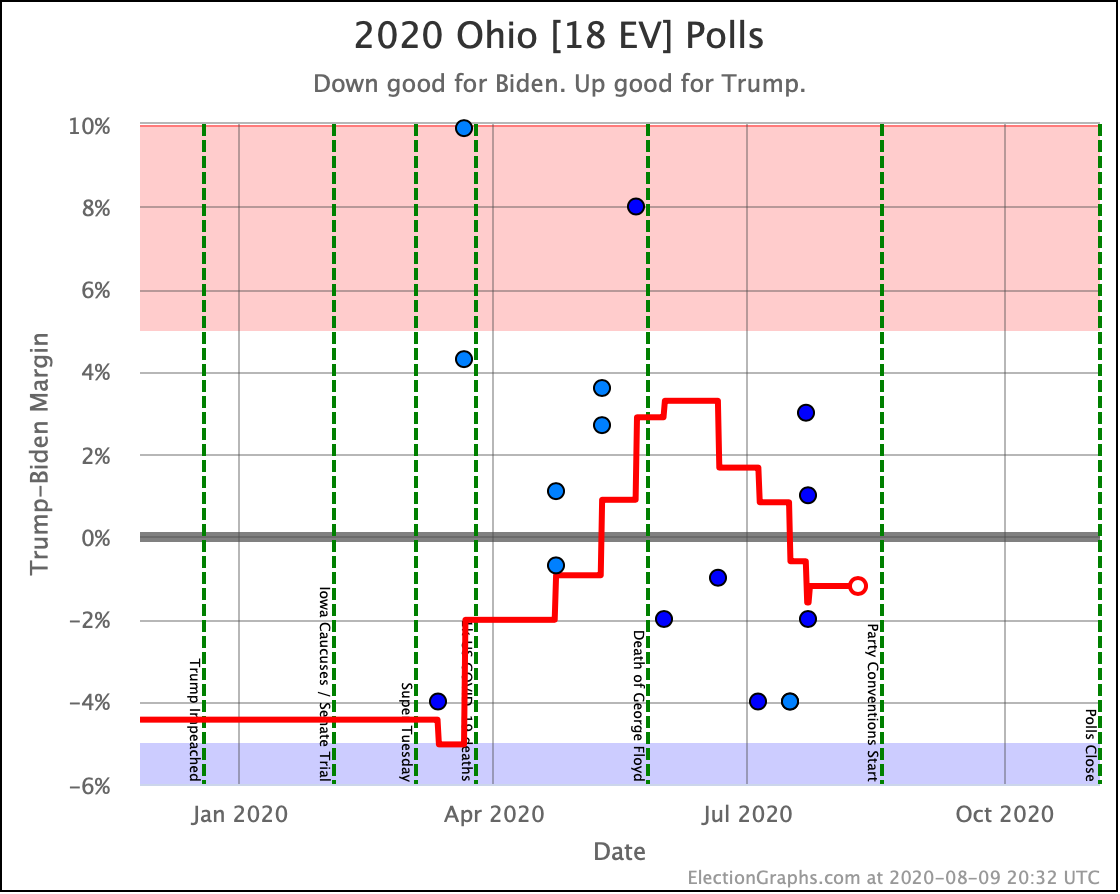
Ohio is pretty much as close to a tie as possible. Since the last update, it moved briefly from the Biden side to the Trump side, and then back again. No net change.
Because of the order of the polls, the brief trip across the line isn't visible on the chart anymore, but it did happen. Either way though, Ohio is too close to call.
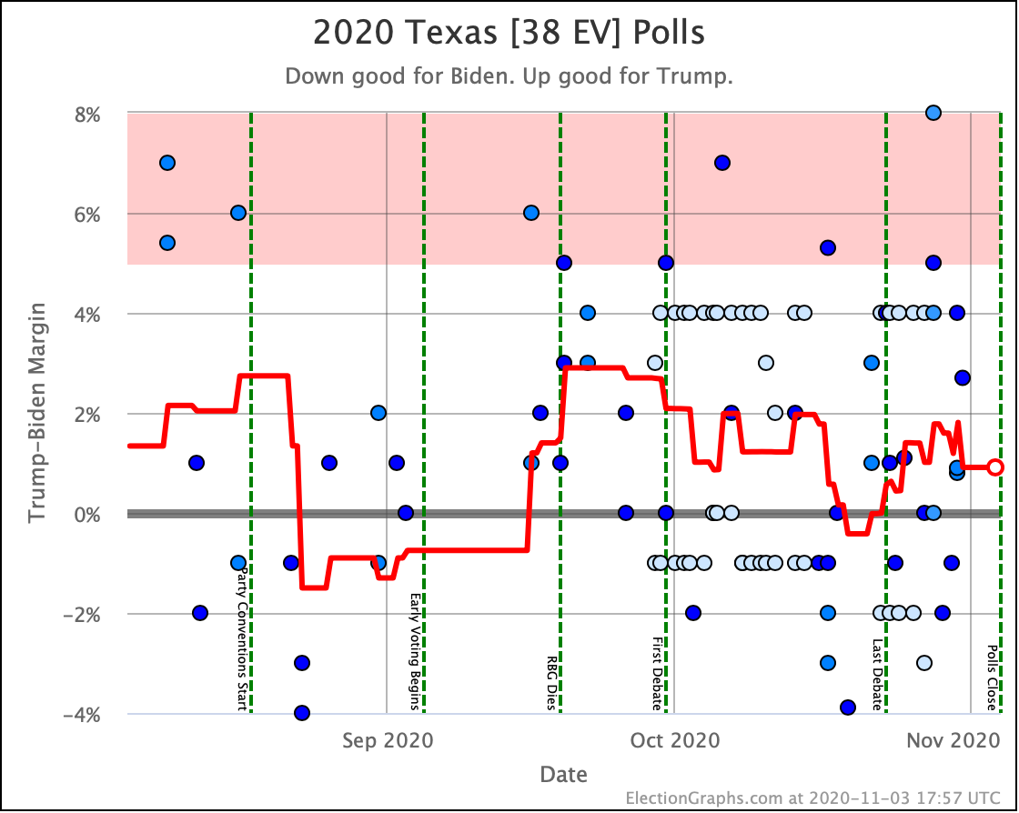
Looking at the specific margin, Ohio is actually in an oddball zone. Biden leads by 0.1% at the moment, but our win odds are based on the results in 2008 through 2016, and looking at those years, a Democratic lead this small actually means the Republican is still slightly favored. We currently have Trump at a 53.2% chance of winning Ohio based on this poll average.
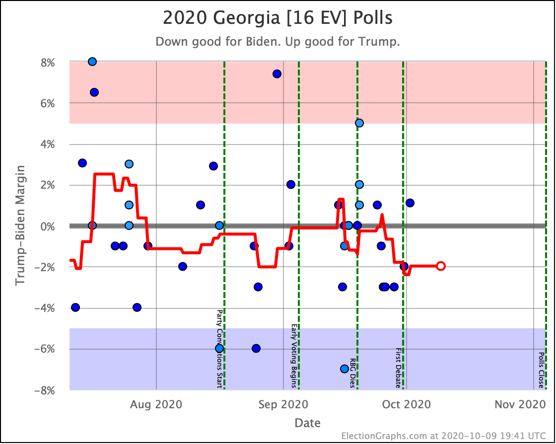
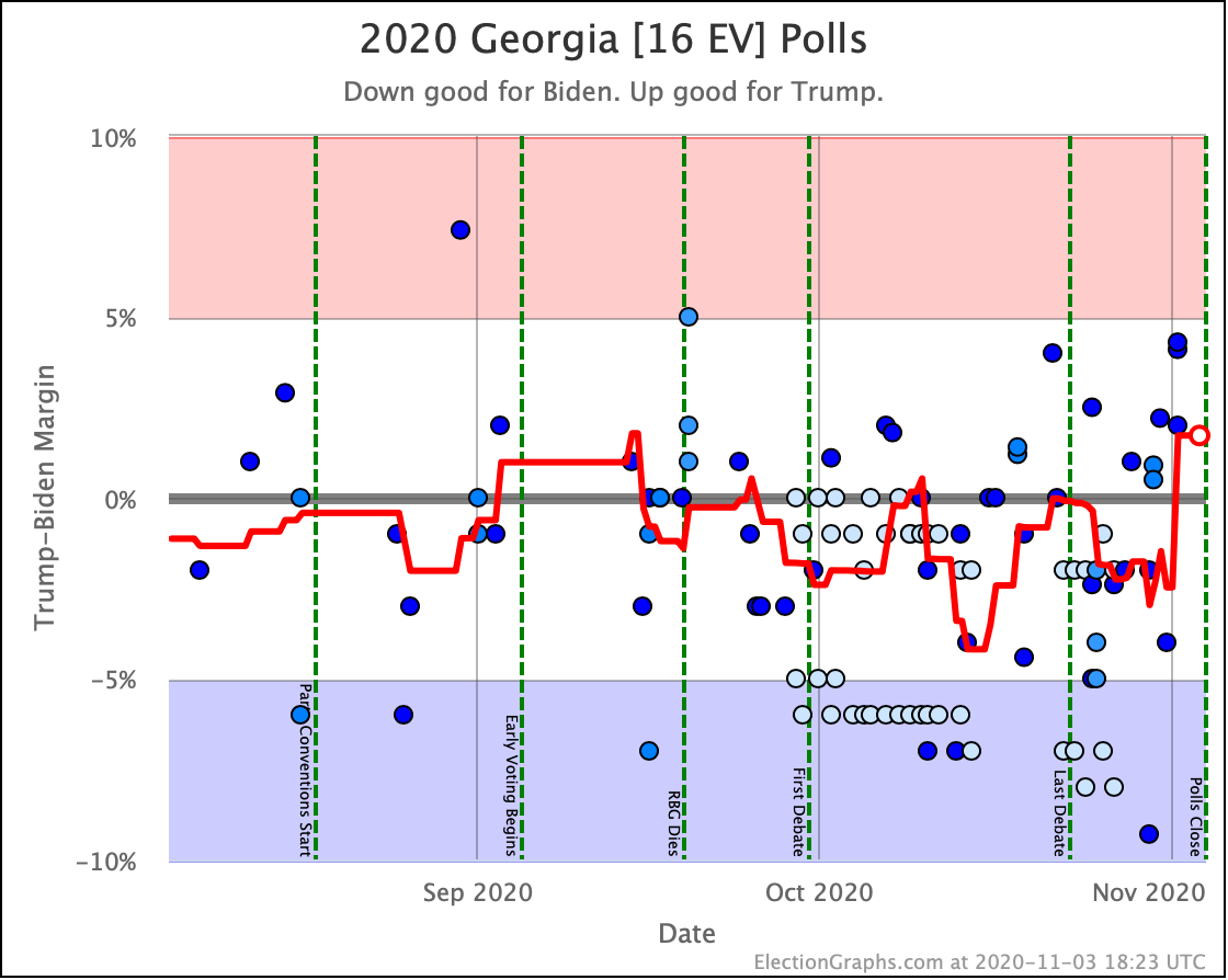
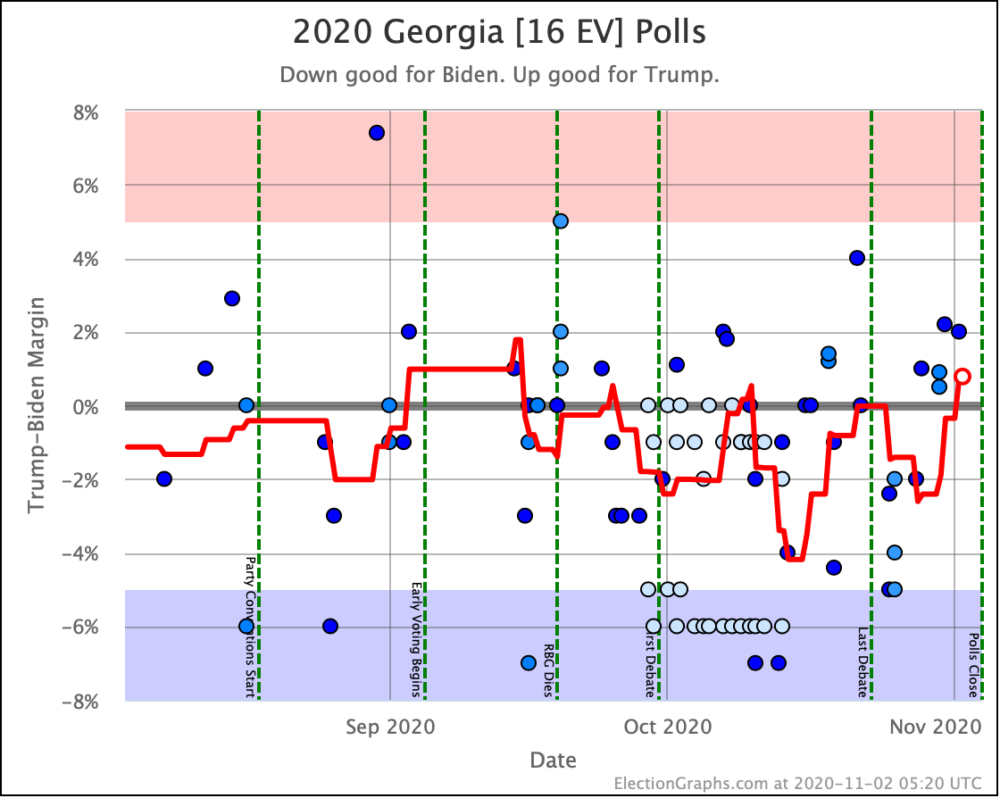
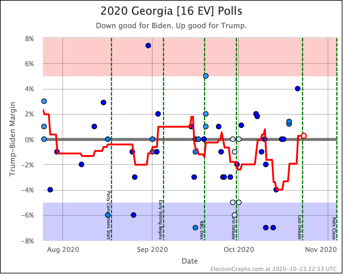
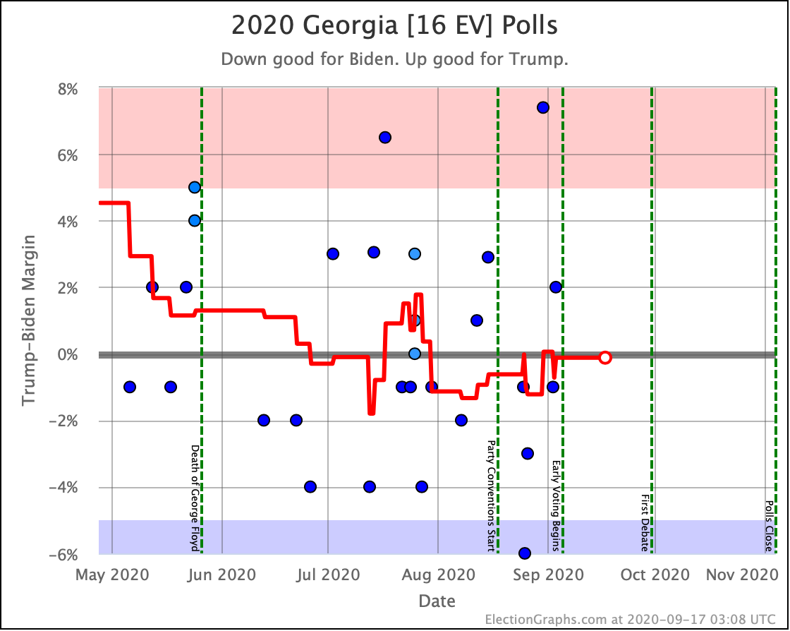
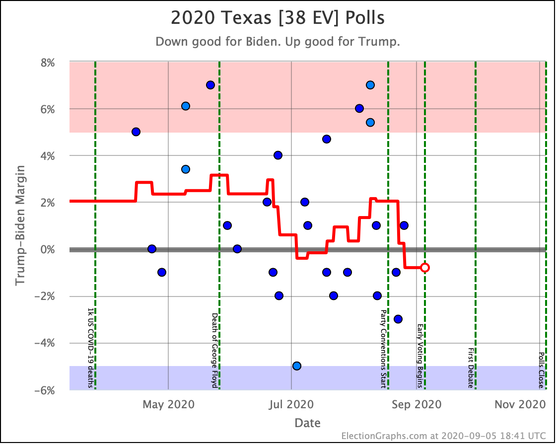
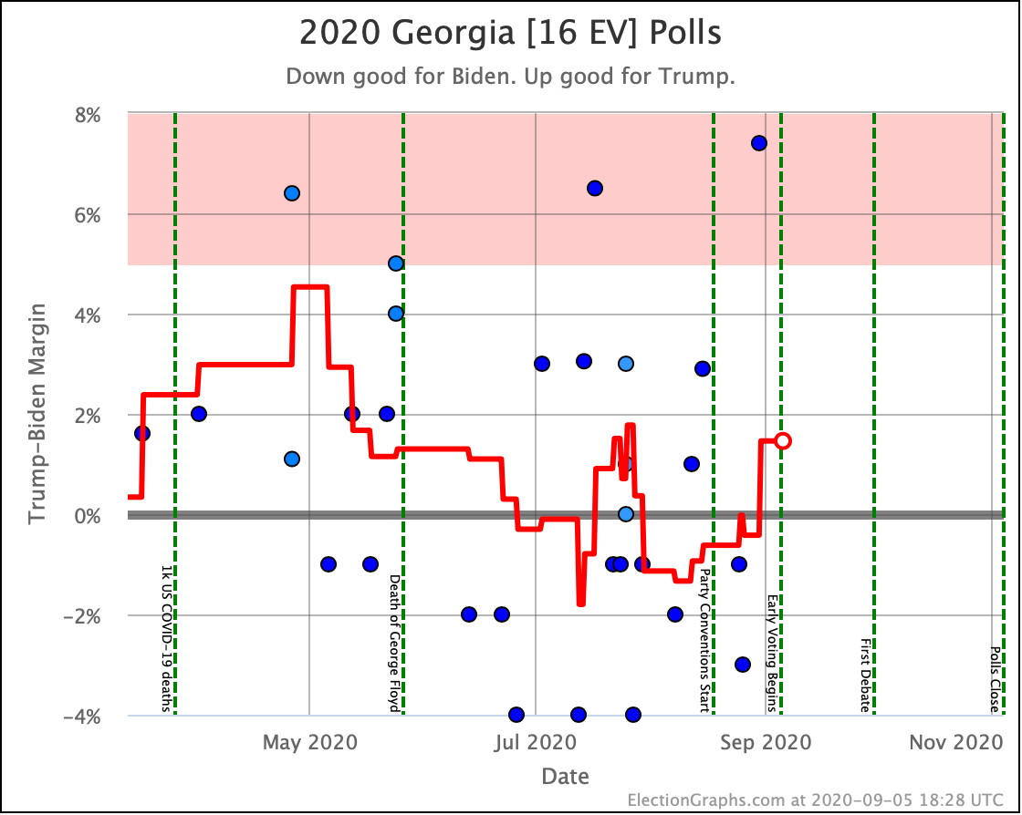
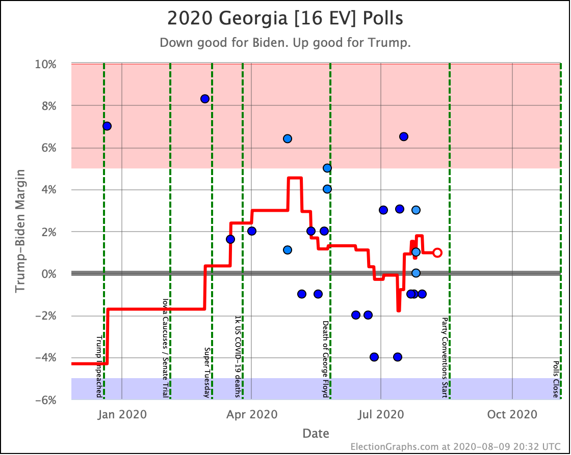
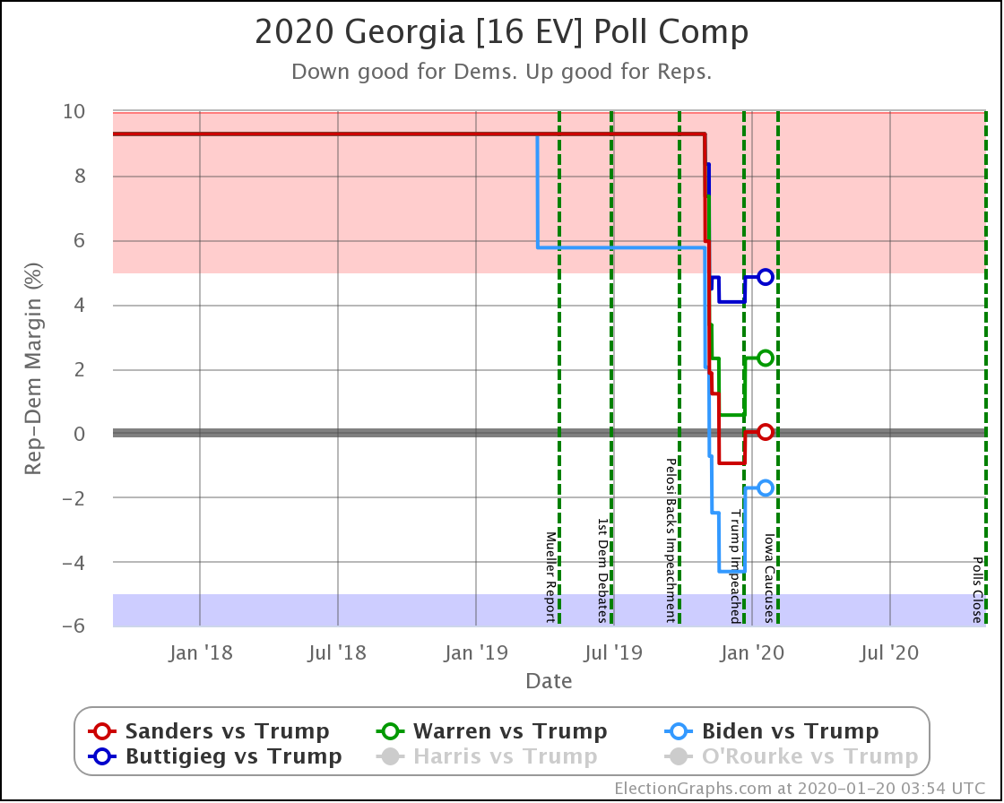
At the time of the last blog post, Georgia had moved to be just barely "Weak Trump". It is now "Weak Biden" again, where it has been most of the time since July. Biden now leads by 2.0% in the average, which we have as a 67.9% chance of winning.
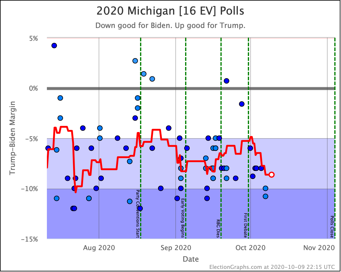
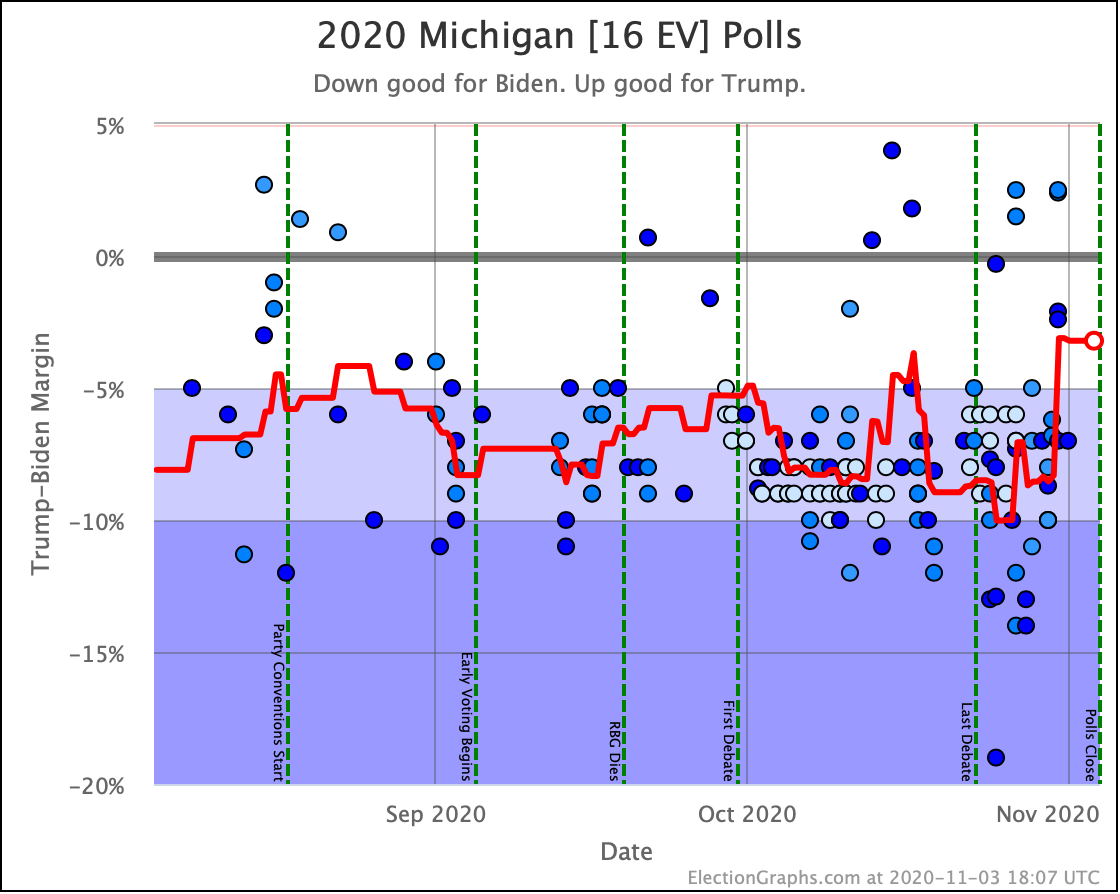
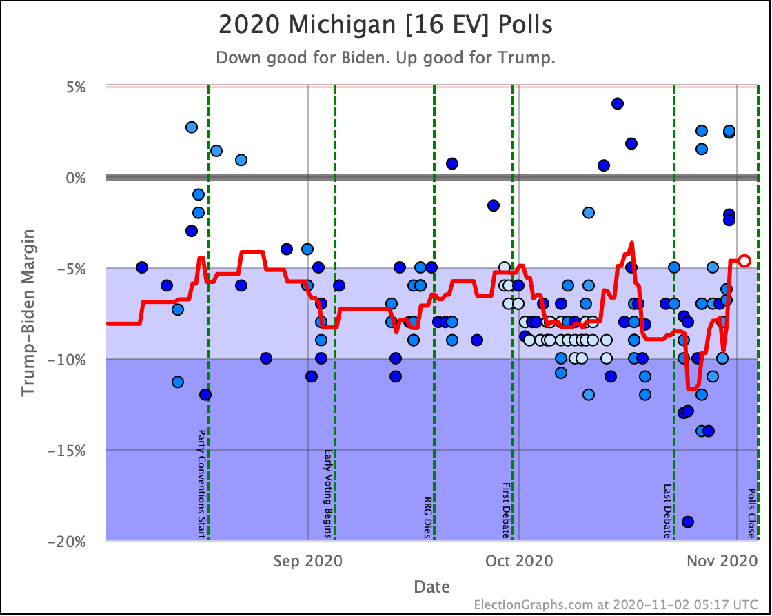
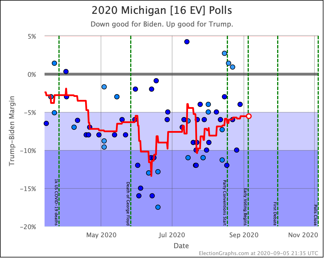
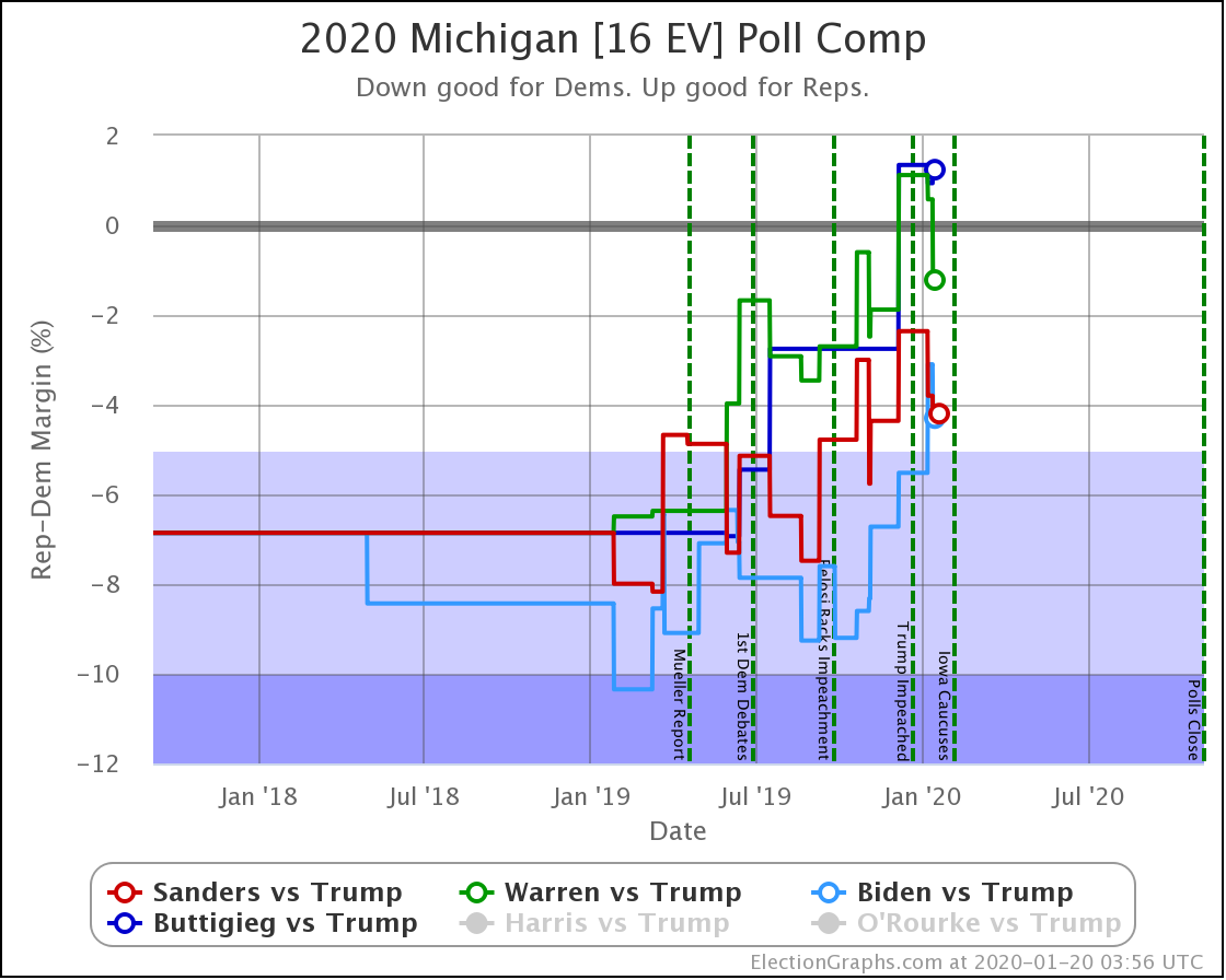
Only one is left visible on the graph, but since last time Michigan went from Stong Biden to Weak Biden, then Strong then Weak, then finally Strong again before Biden's lead increased up to 8.6% as we write this, firmly within the Strong Biden zone. This corresponds to a 99.1% chance of a Biden win. If nothing changes before election day of course.
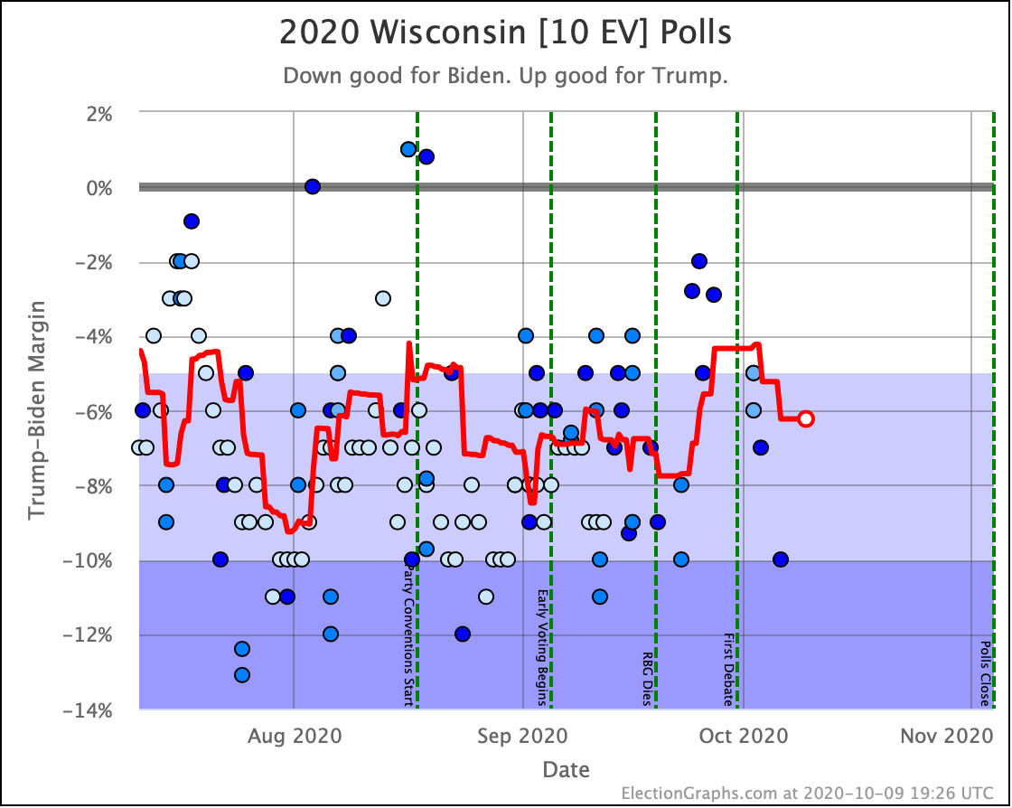
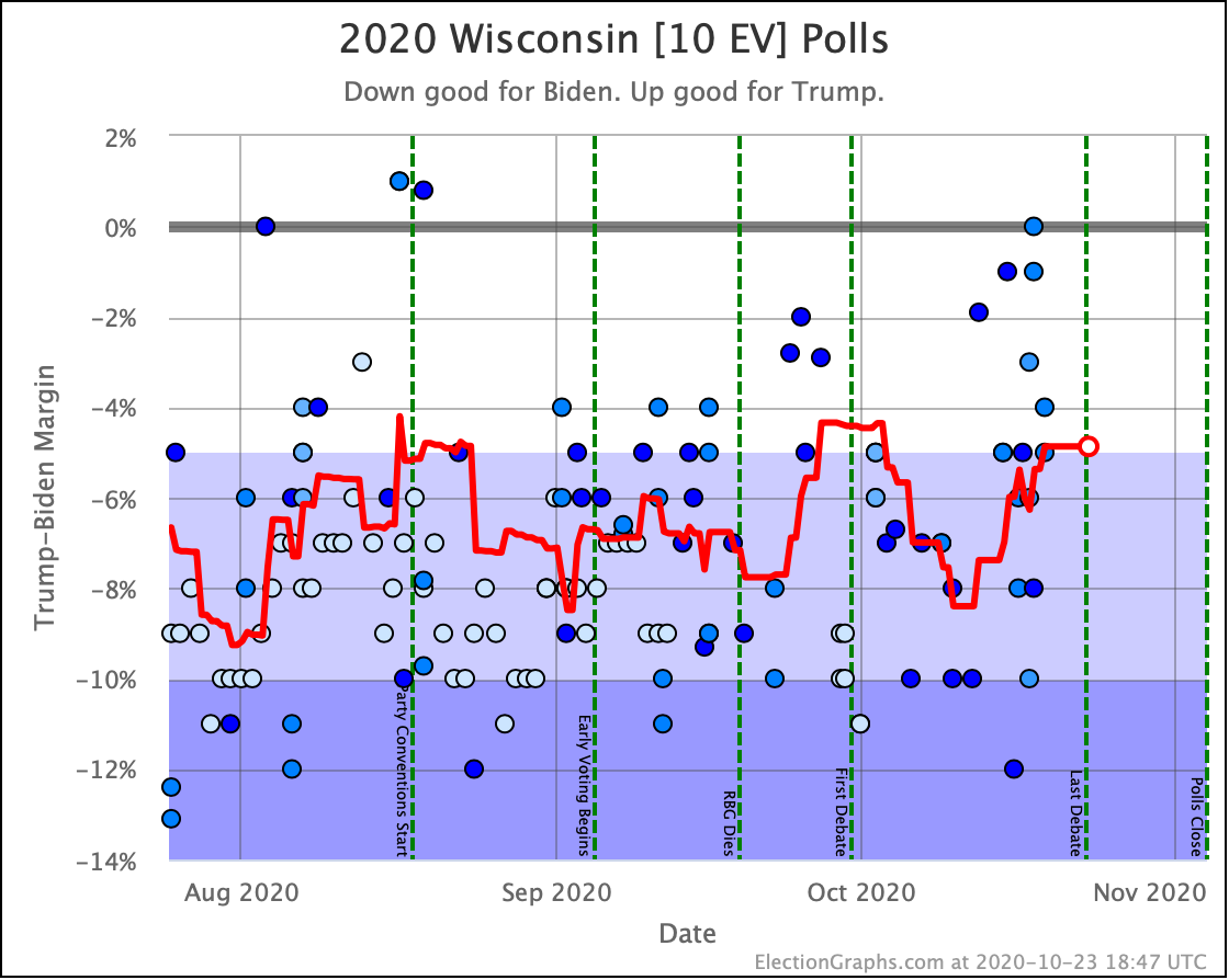
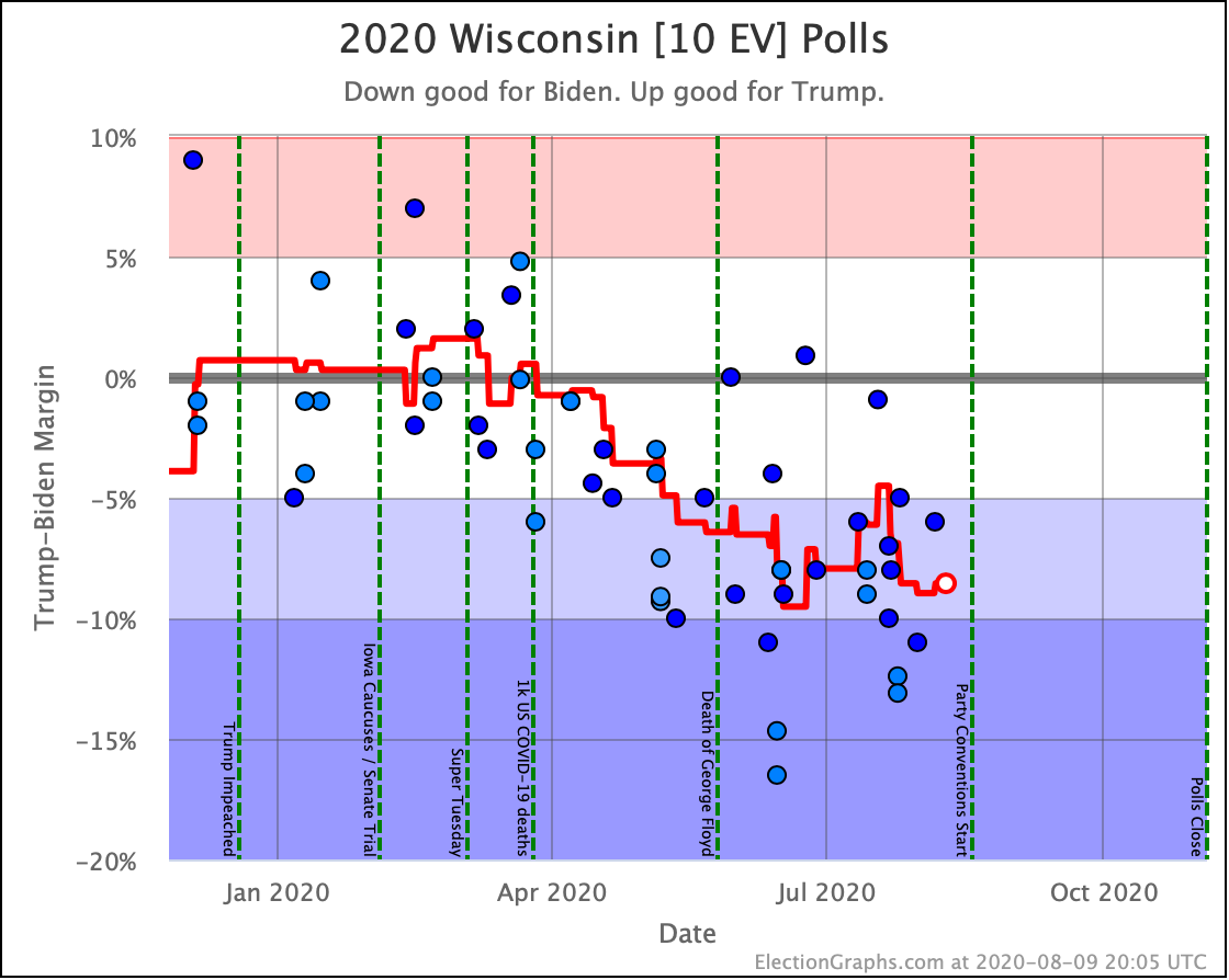
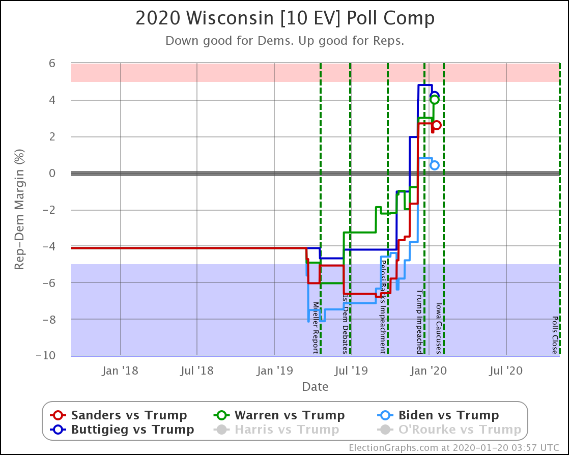
Wisconsin is another back and forth with no net category change. It dipped into "Weak Biden", then moved back into "Strong Biden" where it has been most of the time since July. Biden currently has a 6.2% lead, or about a 94.8% chance of winning.
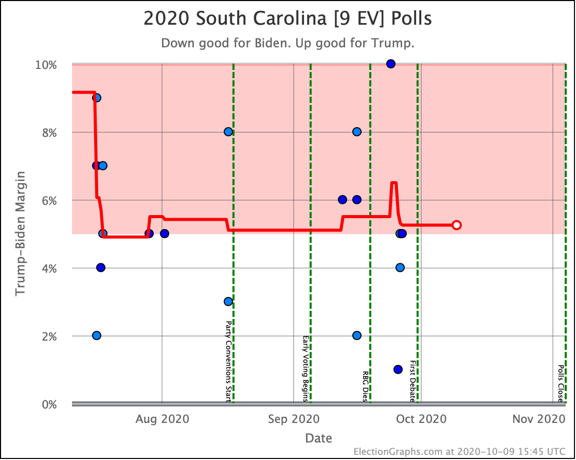
Since the last update, Trump's lead in South Carolina very briefly dipped below 5%, then went back up again. Once again, this is a chance that was actually erased by subsequent polls. Right now, Trump leads by 5.3%, which means about a 97.3% chance of winning.
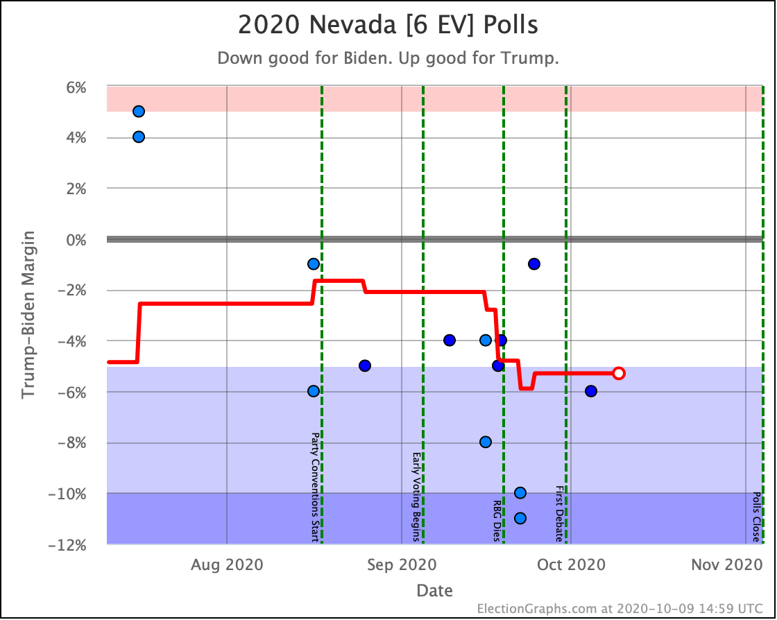
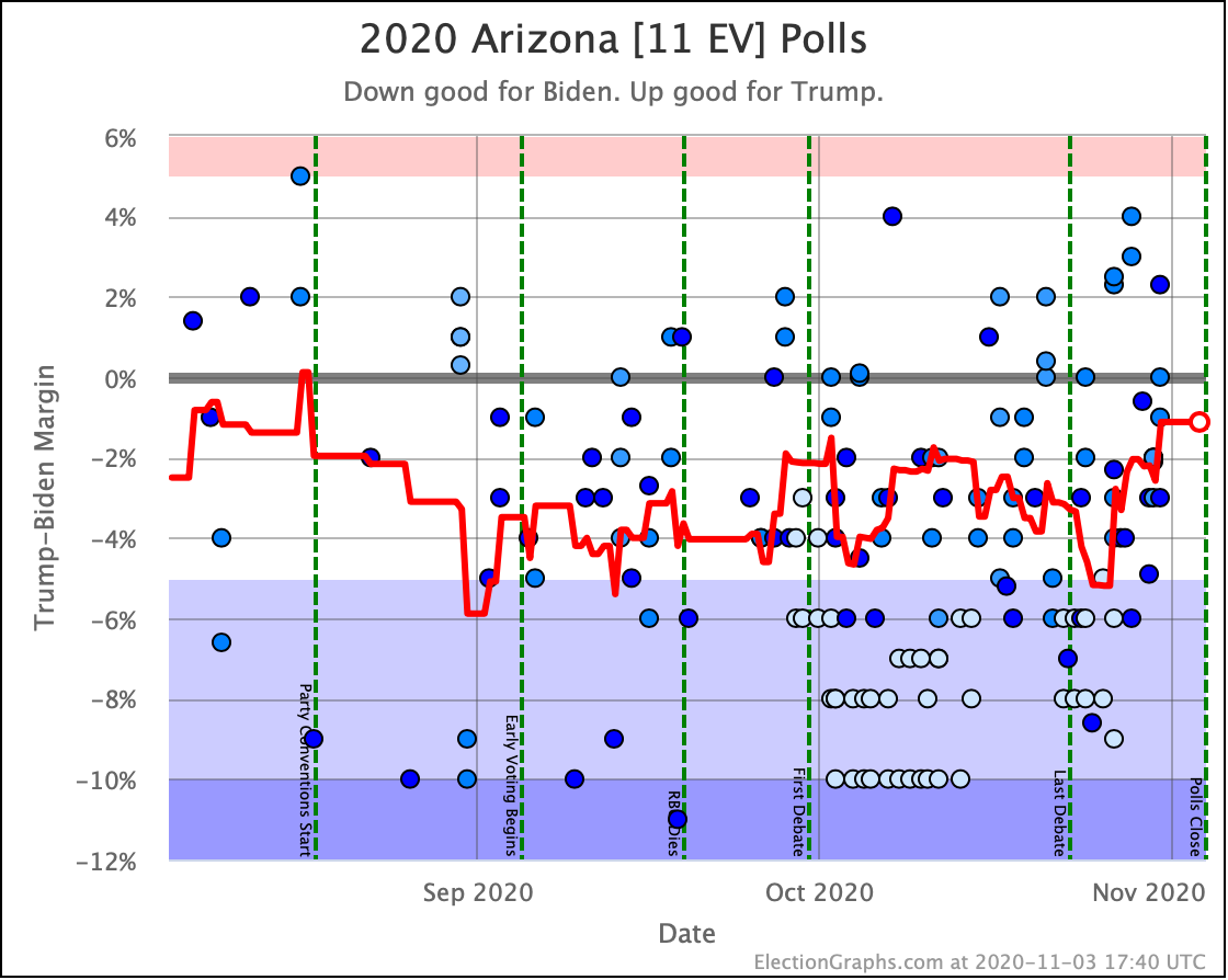
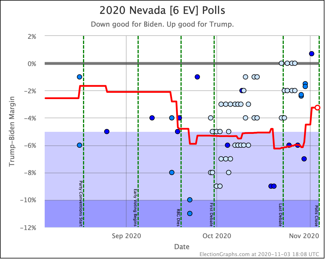
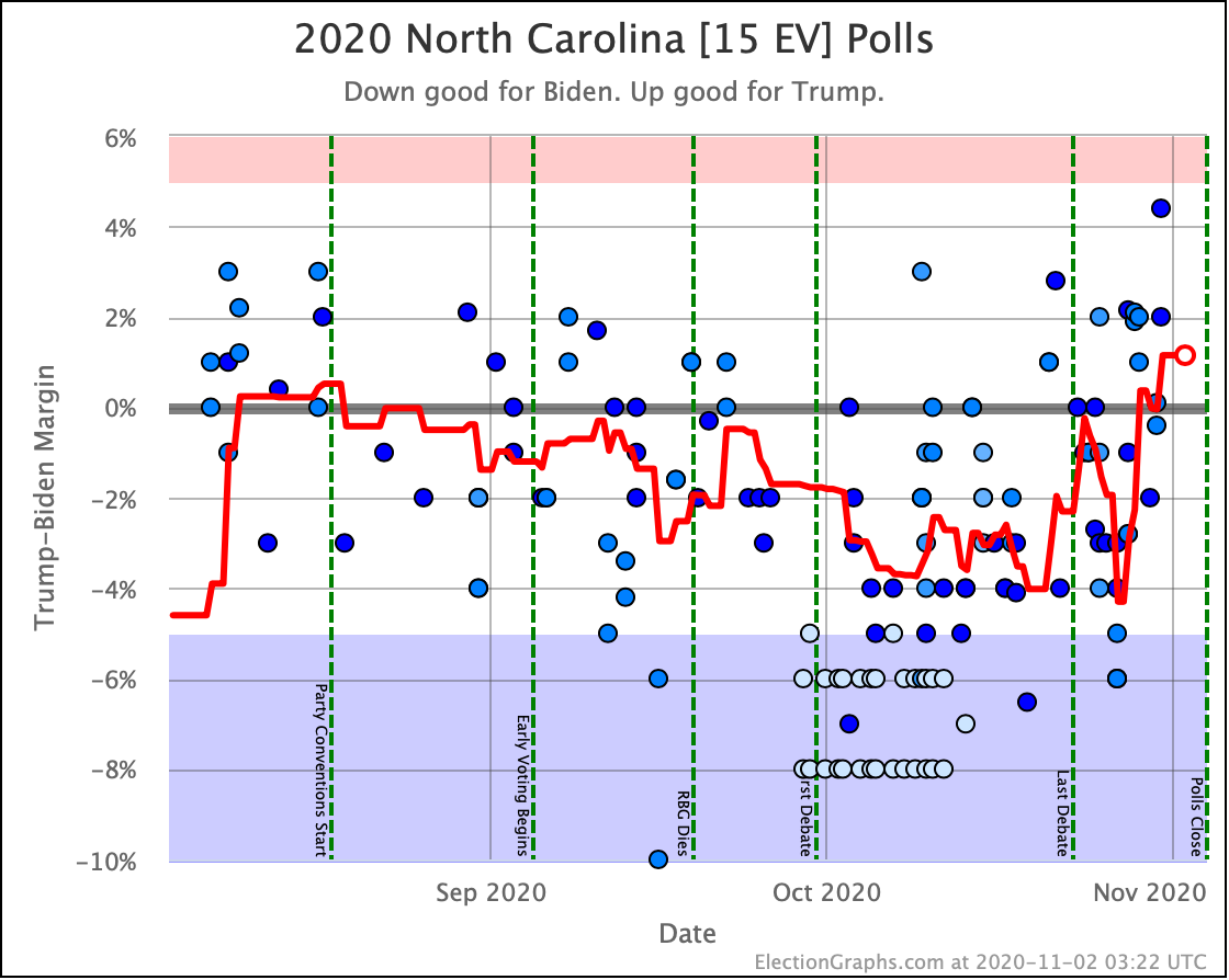
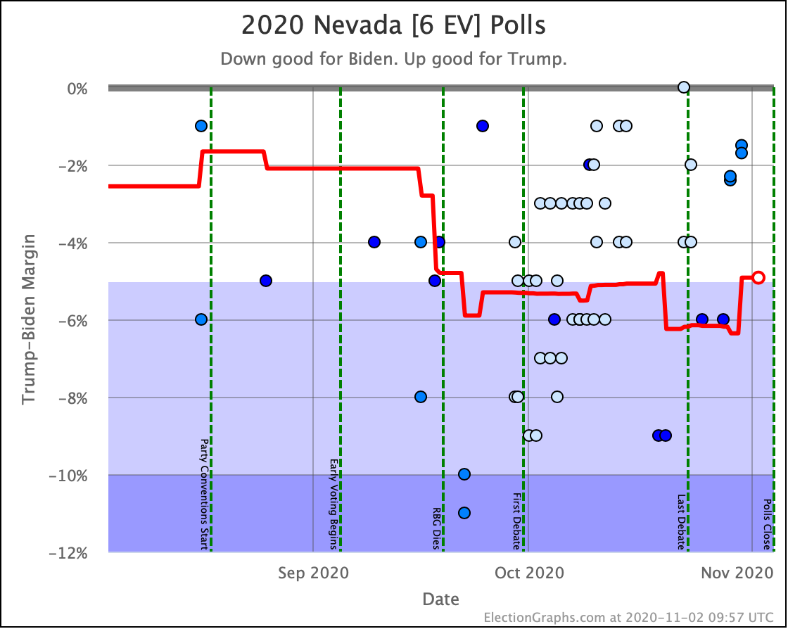
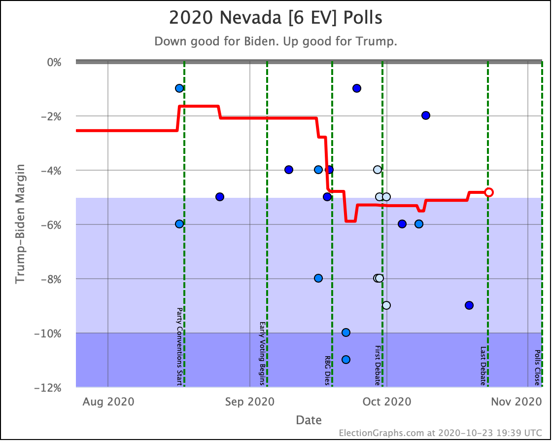
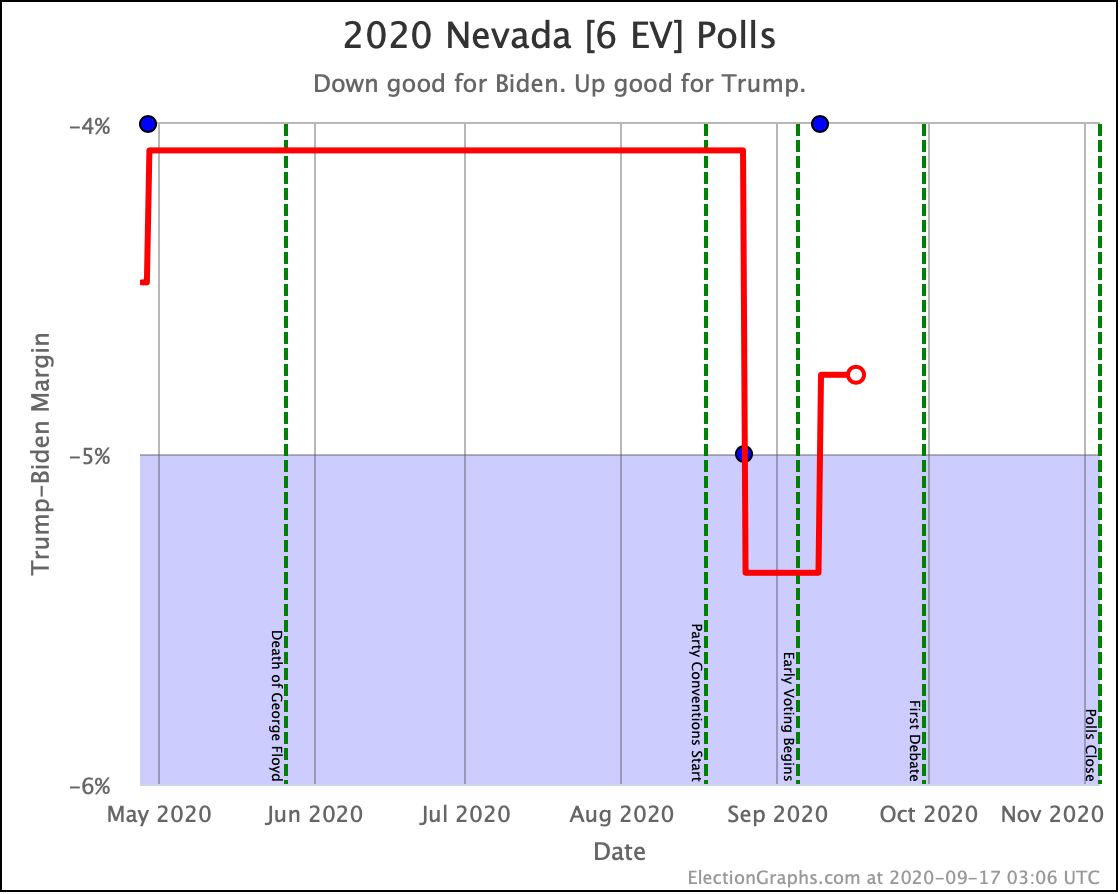
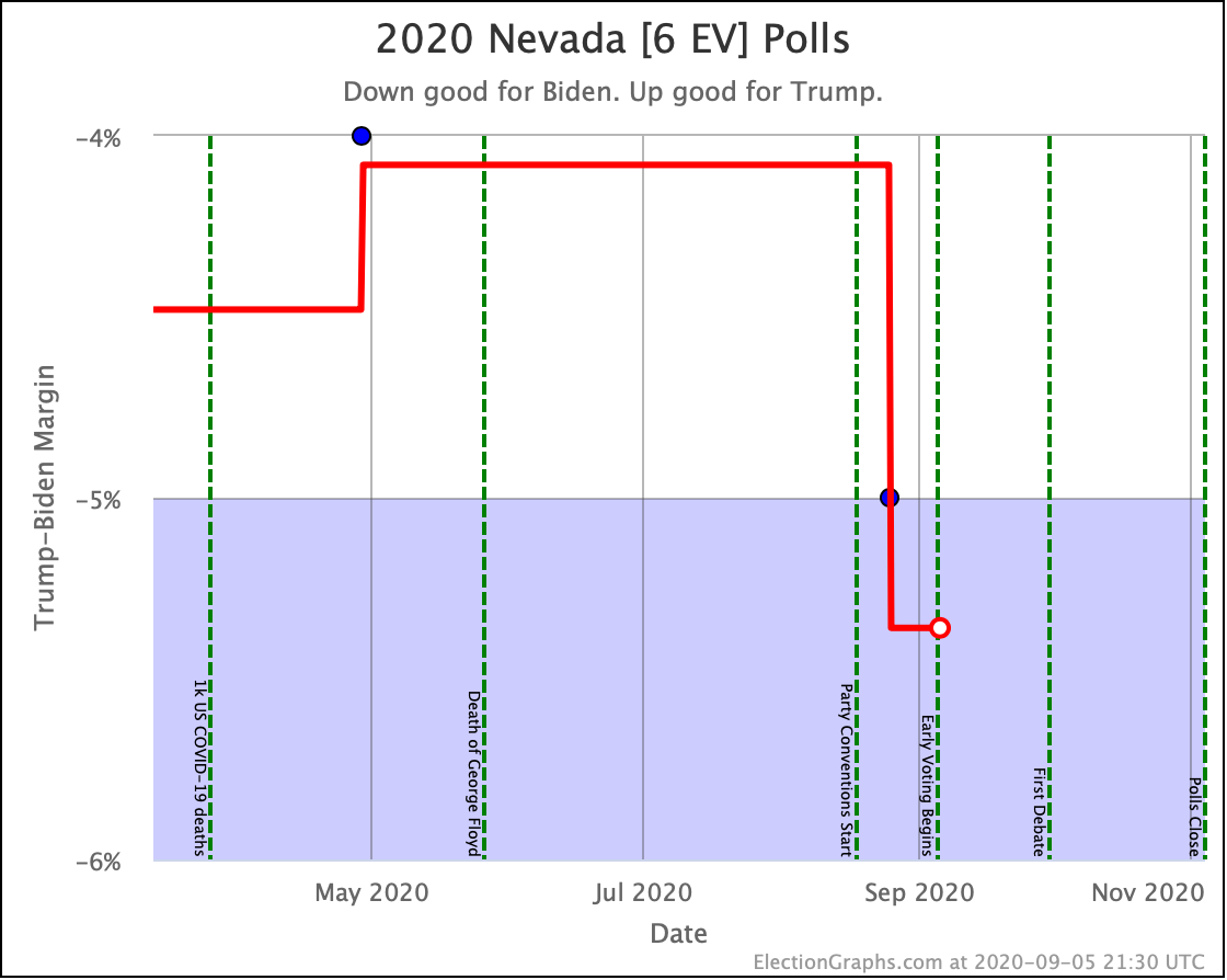
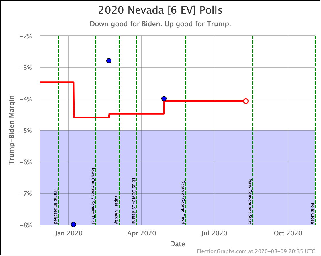
Biden's lead in Nevada grows to 5.3% or a 91.7% win chance, pulling it out of the "Weak Biden" zone.
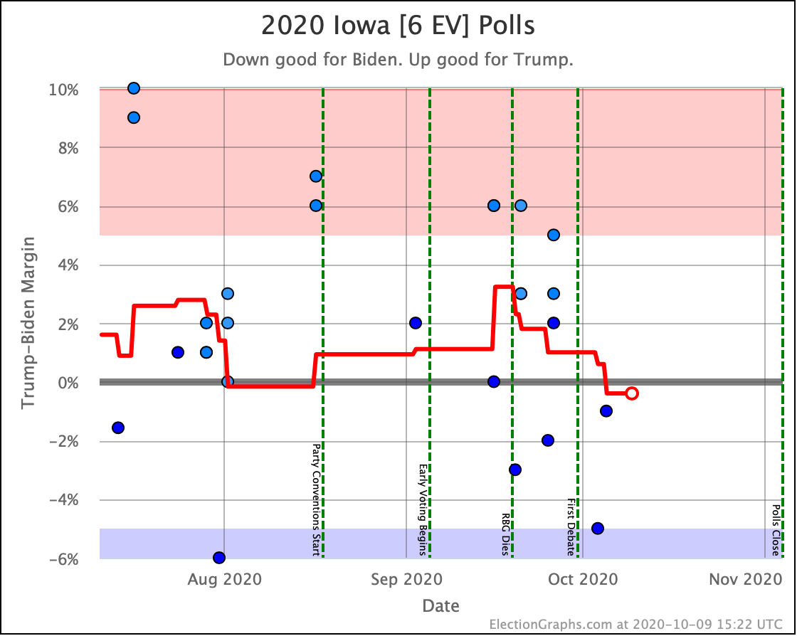
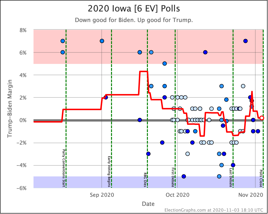
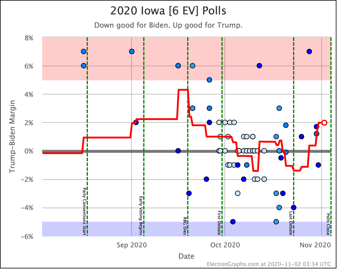
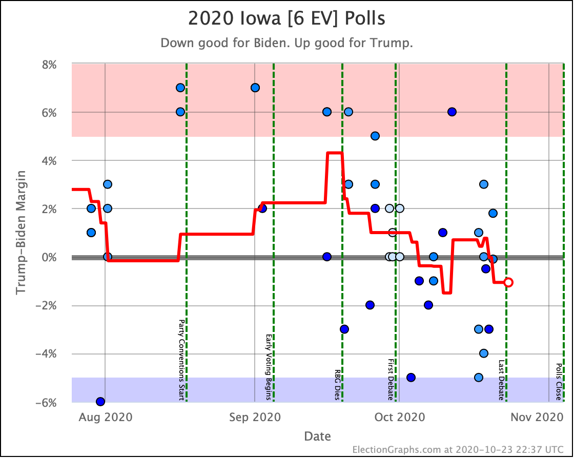
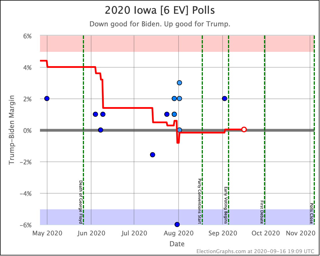
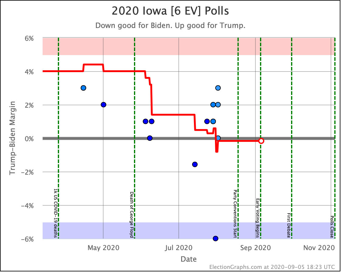
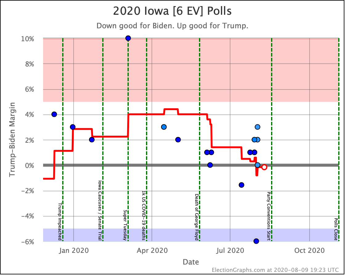
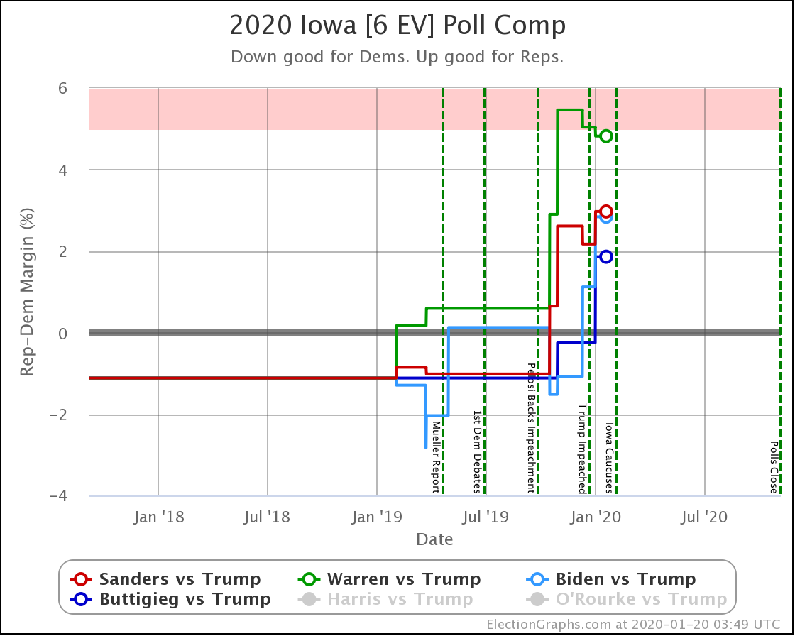
For the second time in the last few months, Iowa slips to the blue side of the line. Barely. The poll average has Biden at a 0.4% lead, which would be a 50.8% chance of winning the state. This is clearly a toss-up, but also given the history, it would not be surprising at all to see Iowa slip back into the red with the next polls that come in. The "usual" situation for Iowa seems to be just barely Trump, and it is way too early to make any determination that there has been a lasting change.
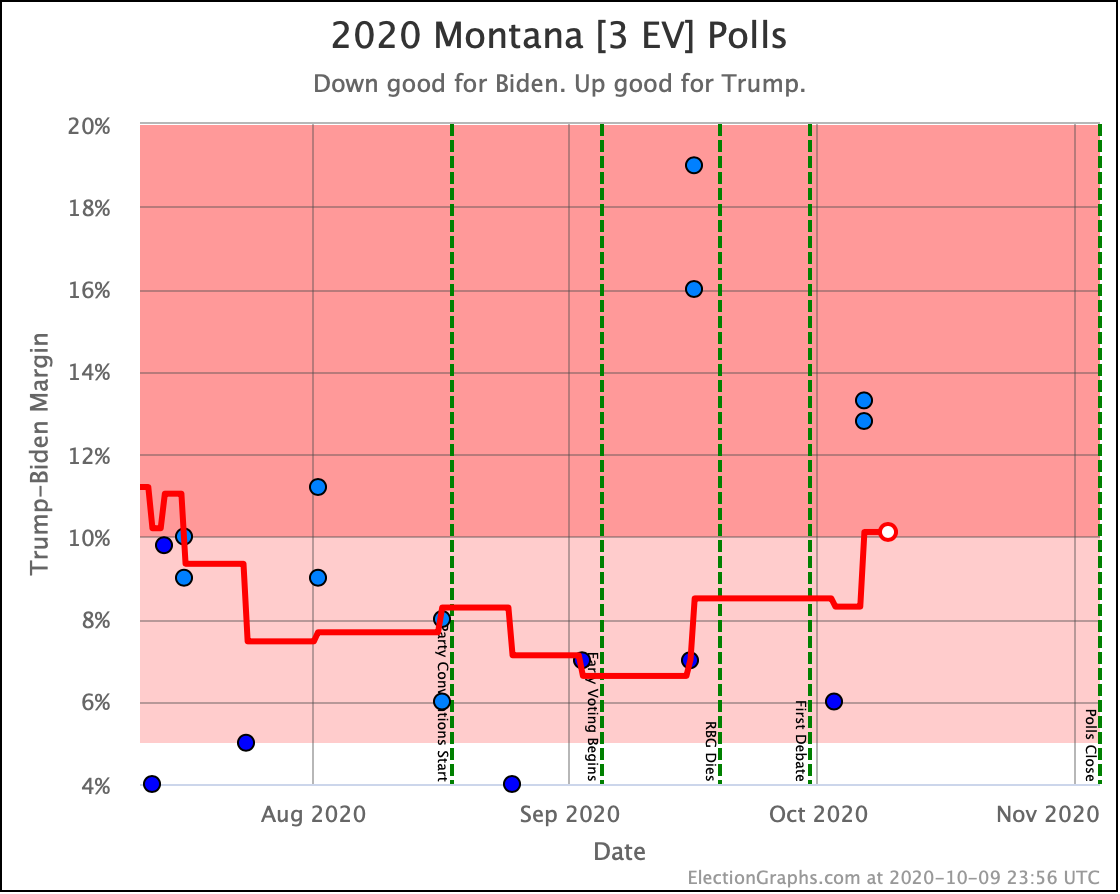
Last time we had Montana move into the "Weak Trump" category. A series of poll updates covering older time periods, including a correction to one outlier data point, completely erased that change. And by the time of this post, Trump's lead was actually up to 10.1%, putting the state not just into "Strong Trump" but all the way into "Solid Trump". Trump's chance of winning the state is now 99.9%.
So yeah, the Democrats probably won't be flipping Montana this time around.
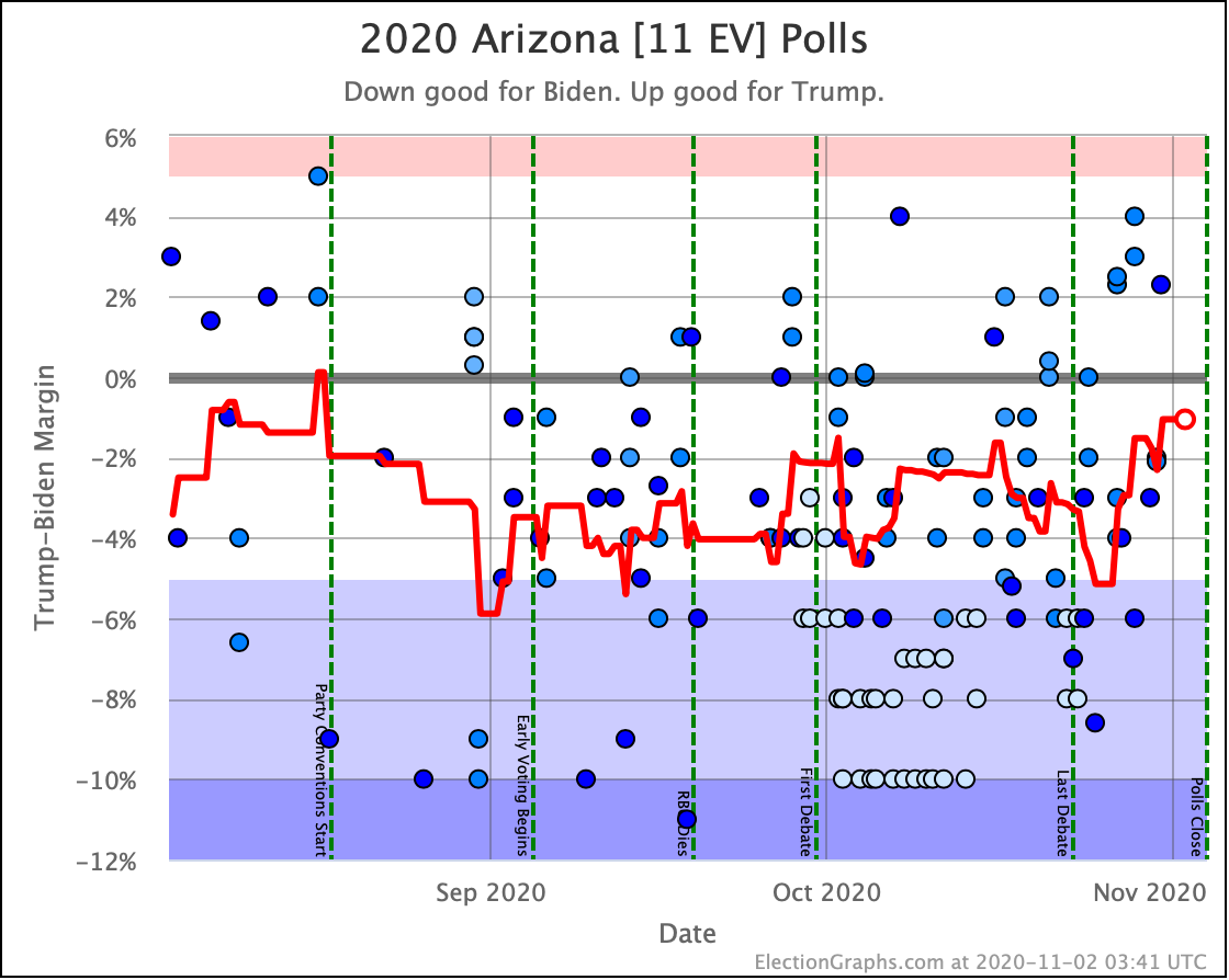
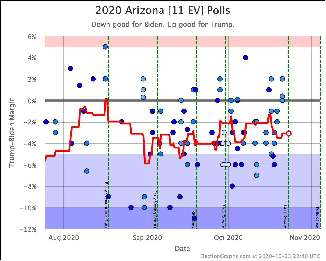
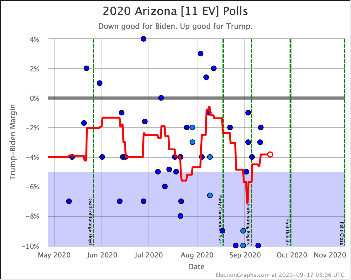
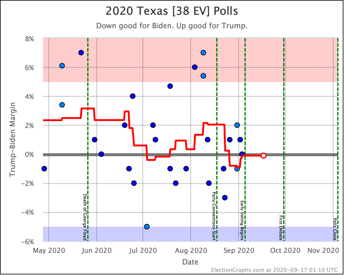
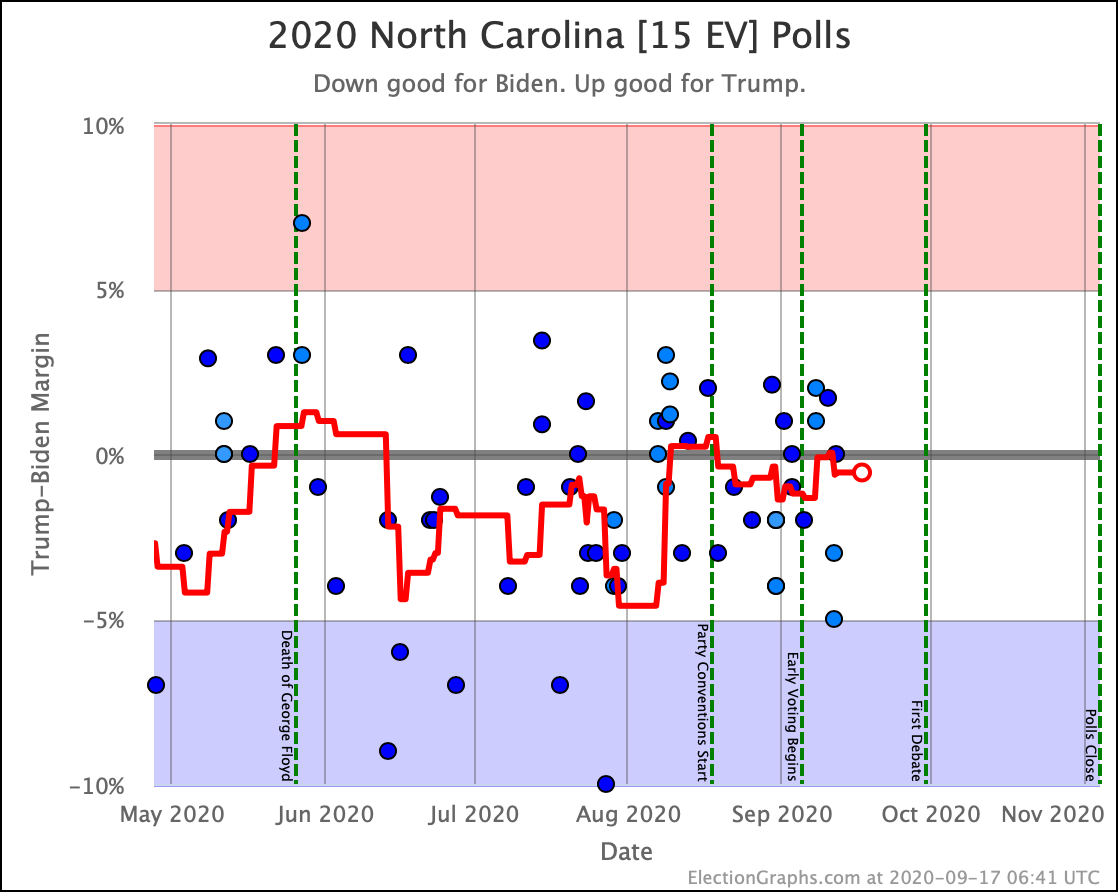
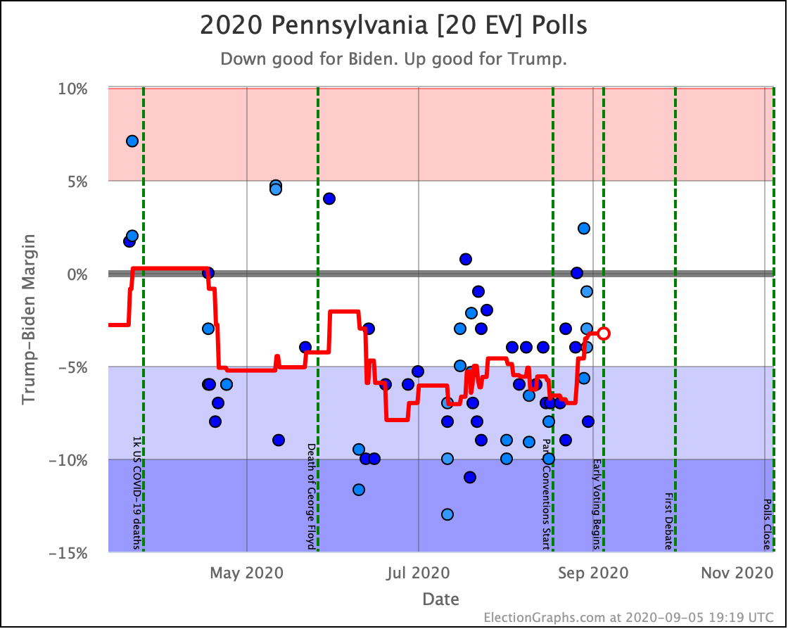
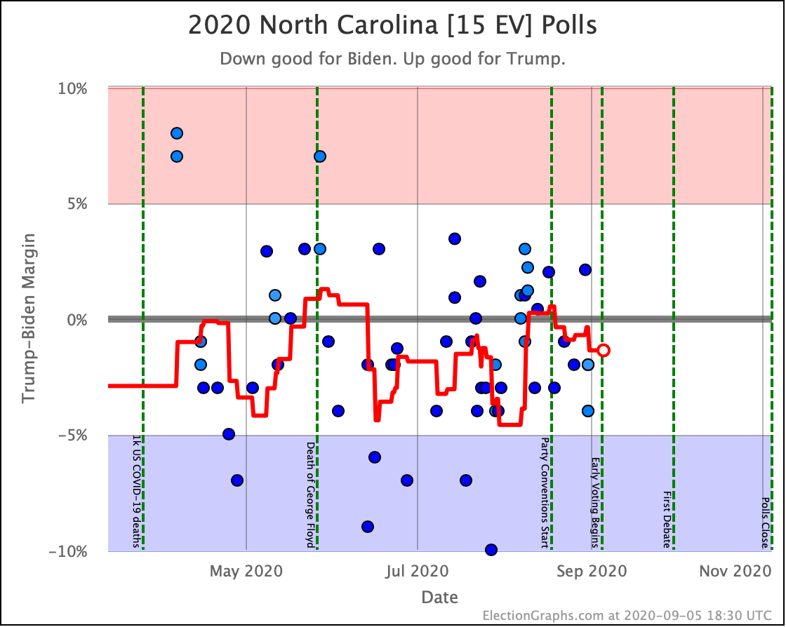
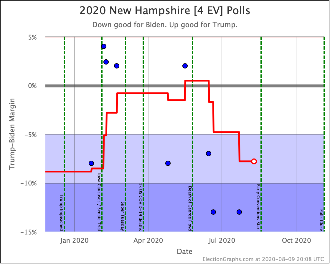
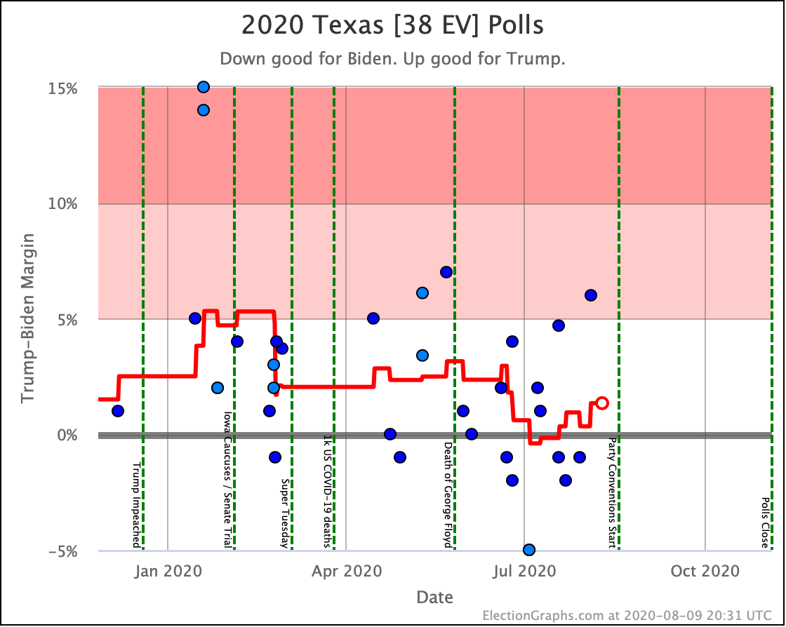
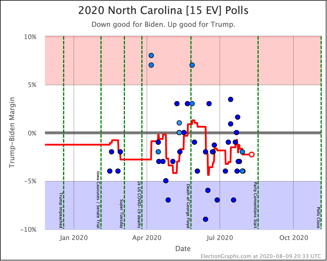
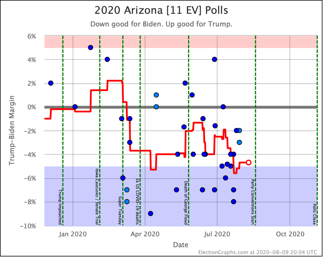
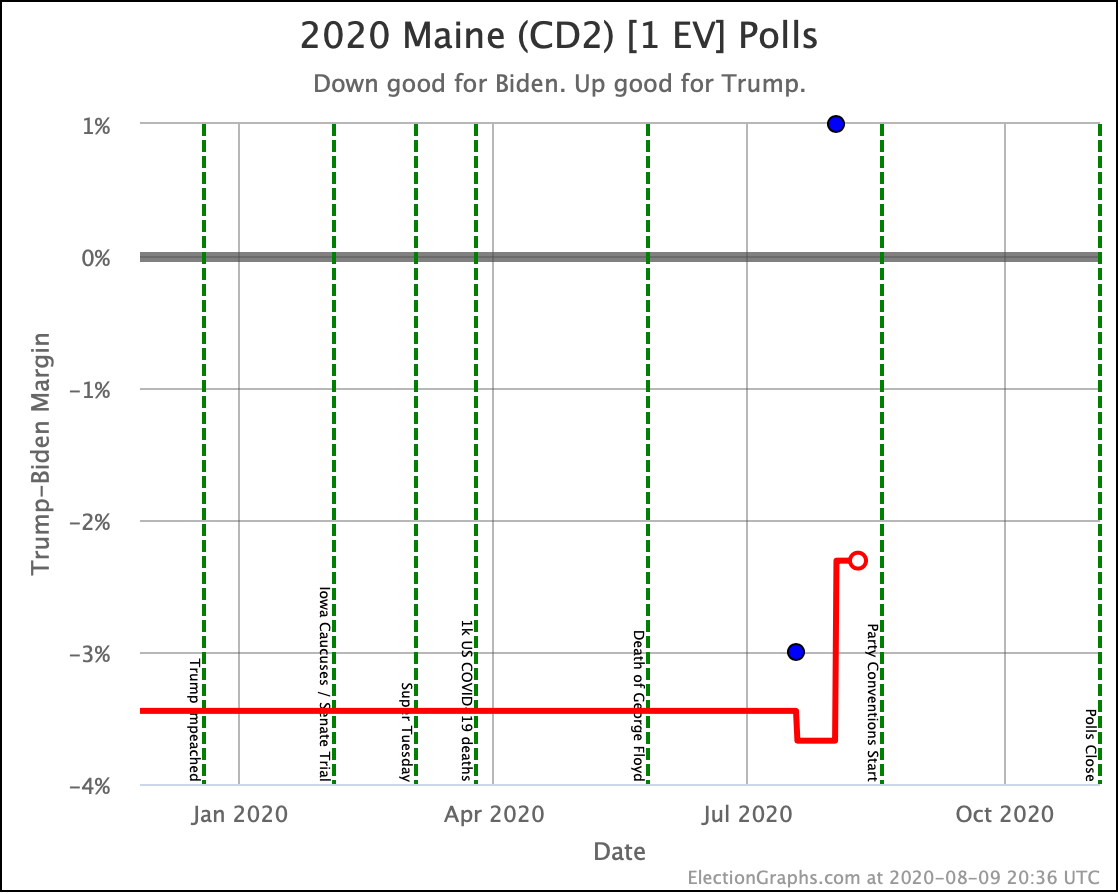
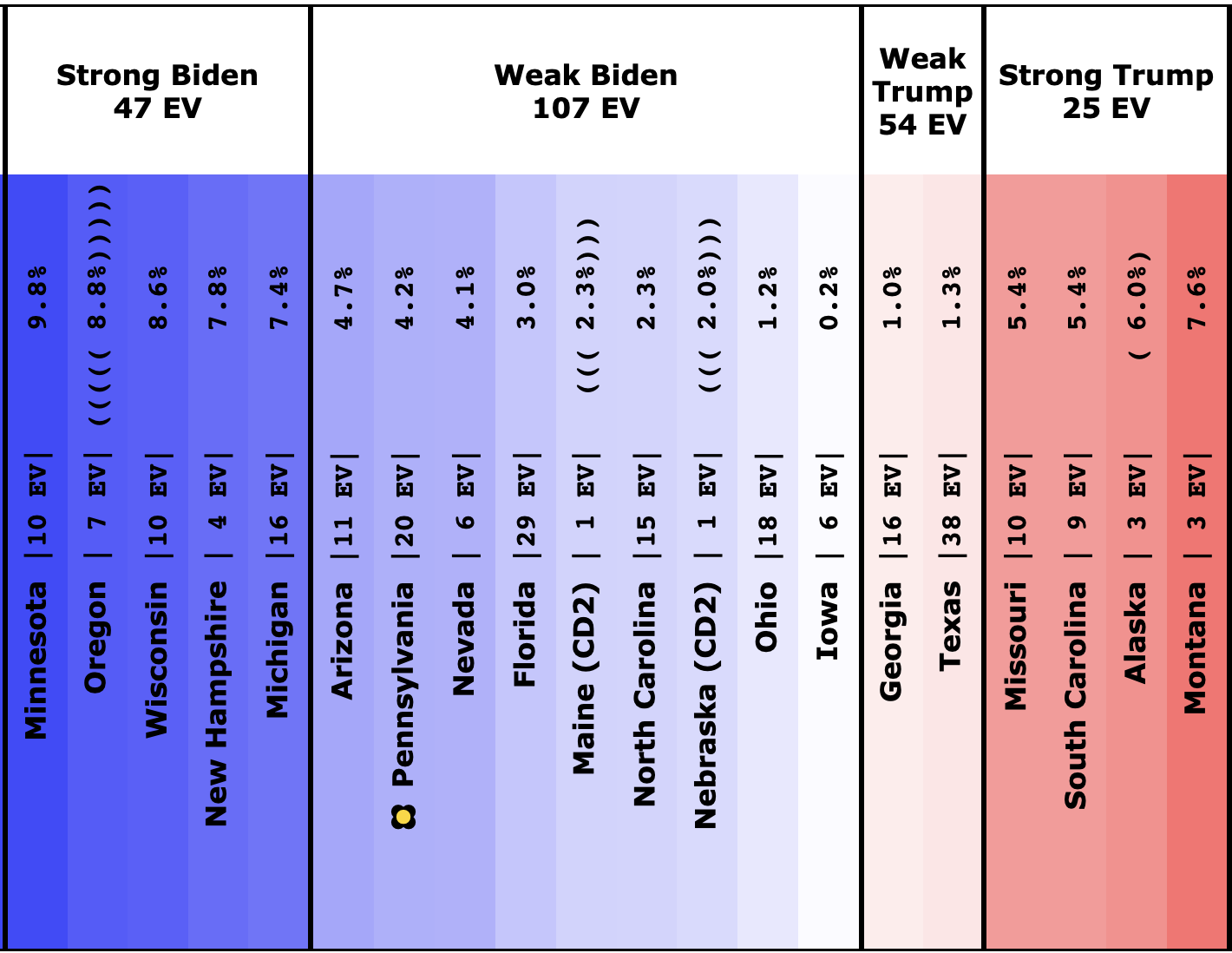
Beyond the states that changed categories, here are the rest of the states that are currently in the "Weak" categories, but did not shift their classifications at all this time around. With no additional commentary.
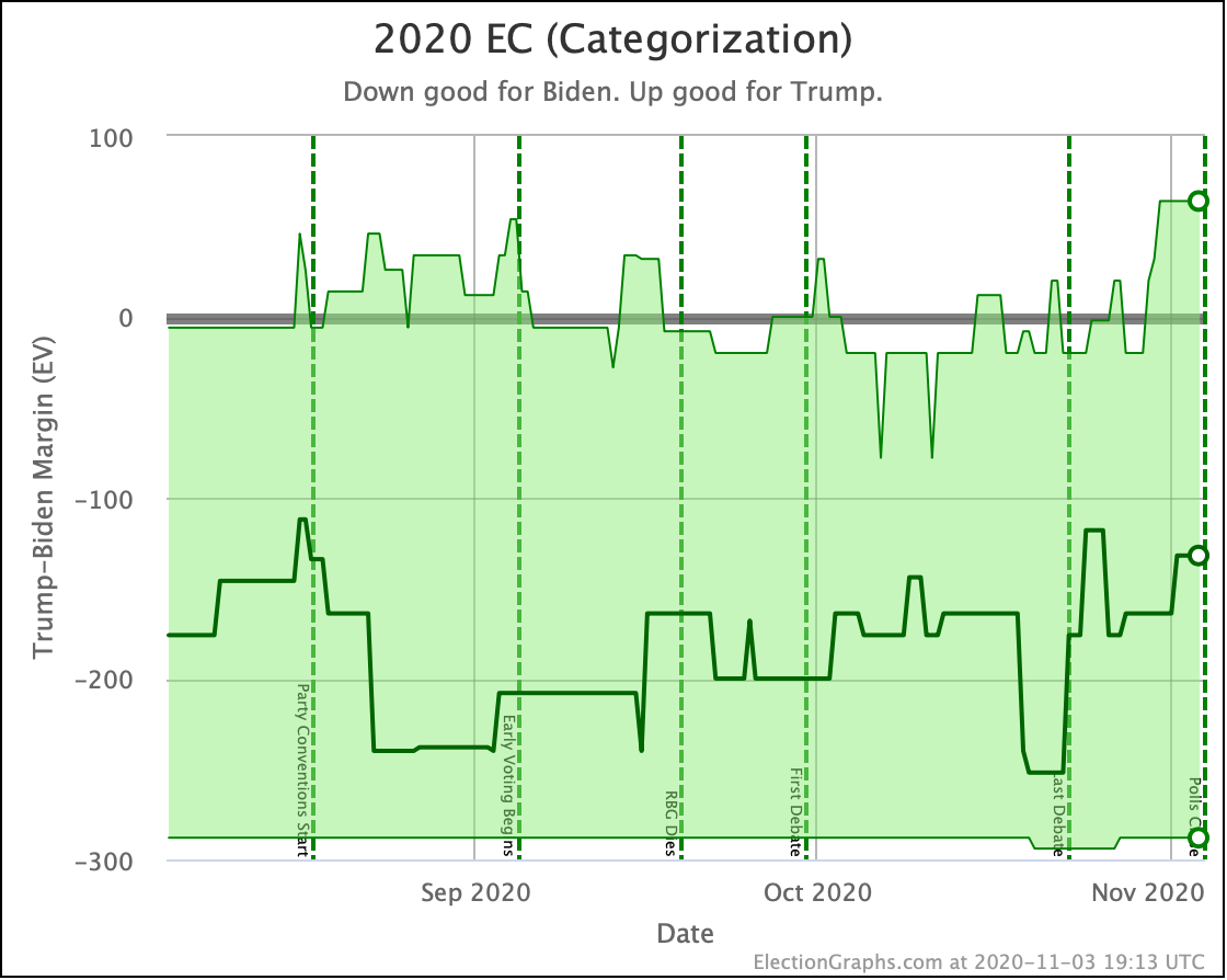
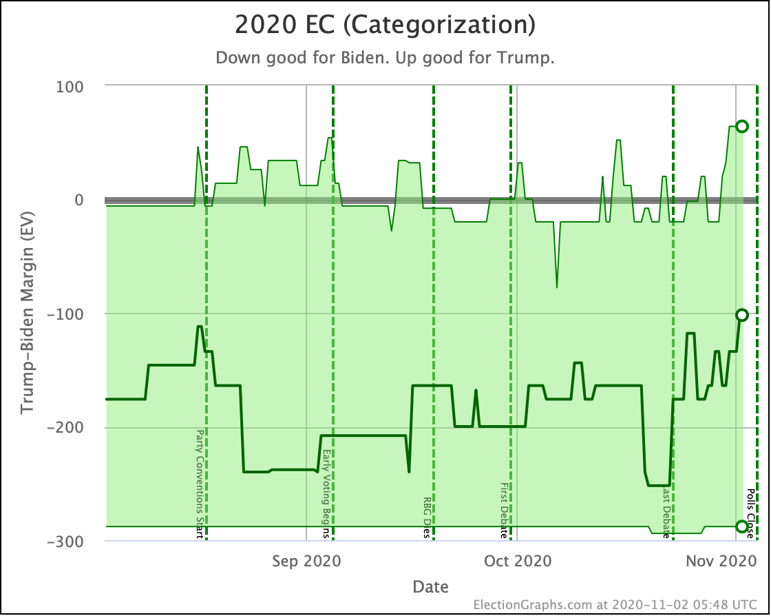
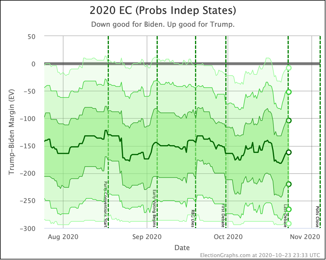
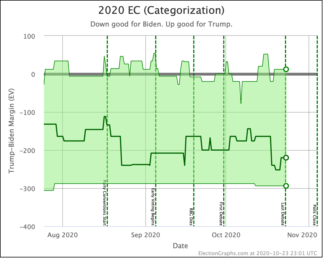
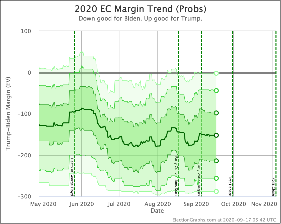
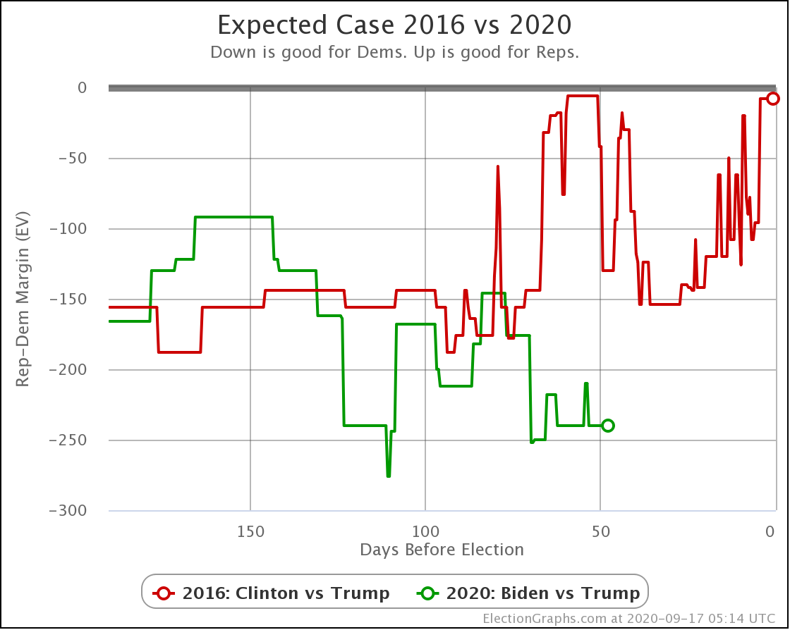
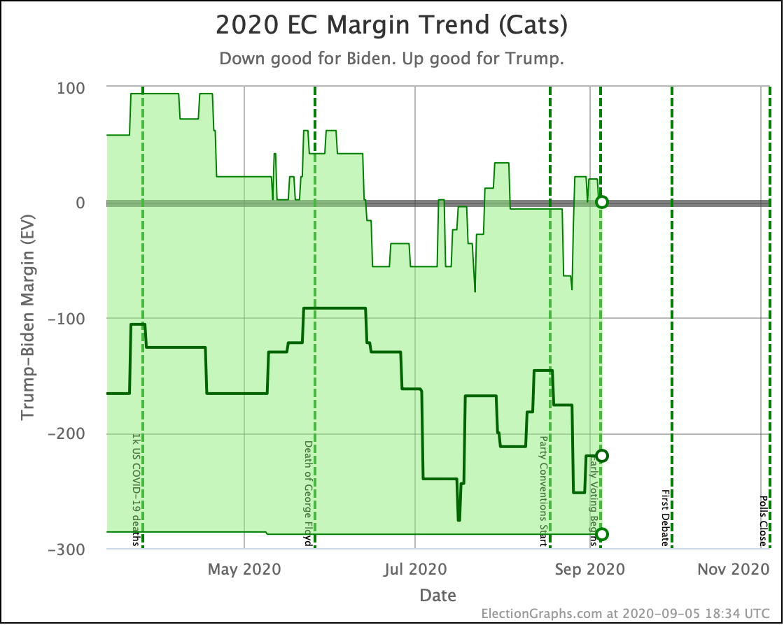
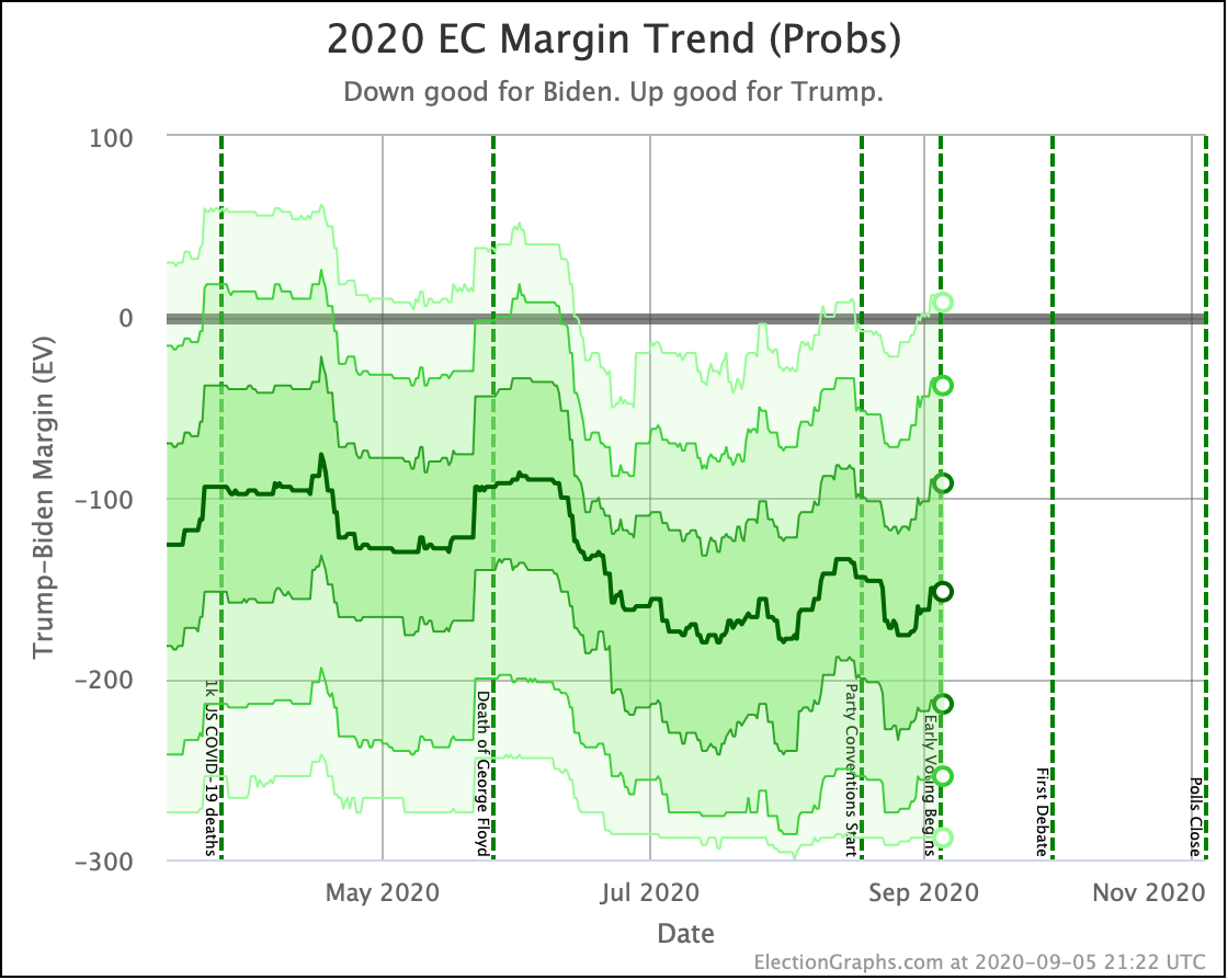
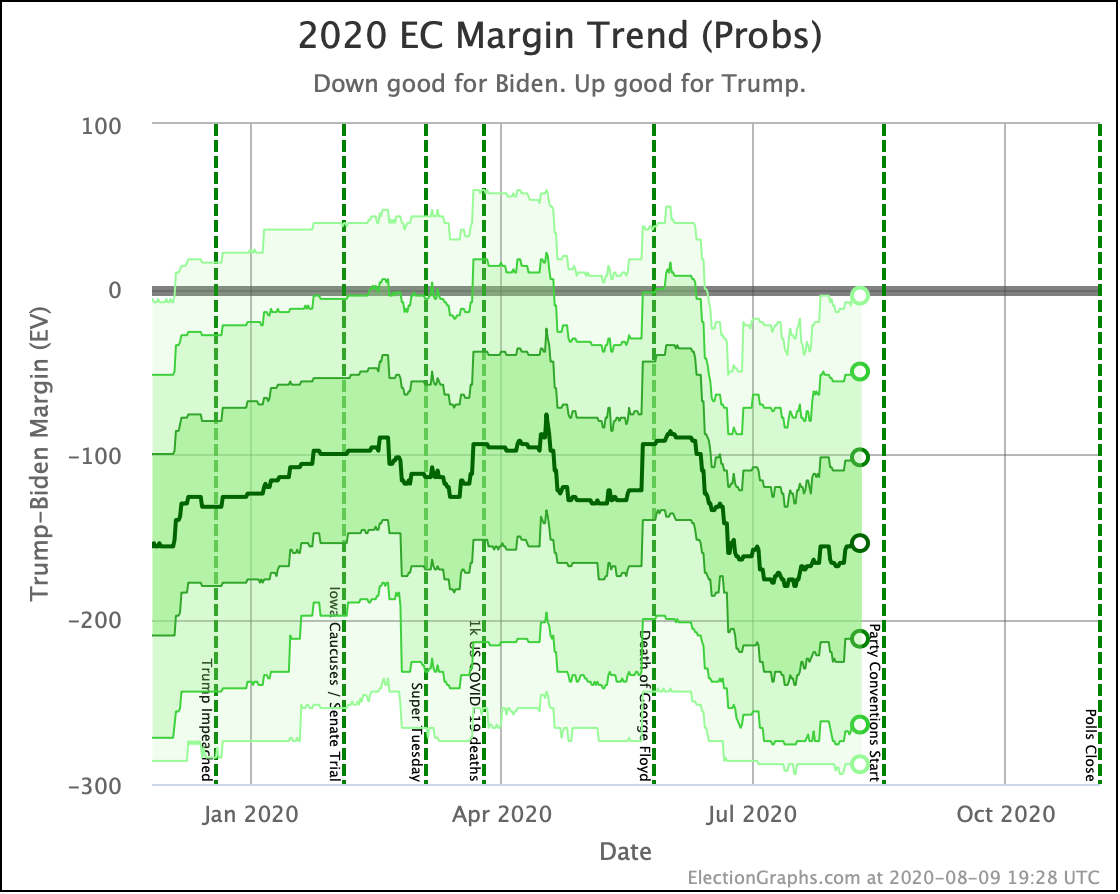
With all the state views out of the way, time for the three different models for the range of electoral college possibilities.
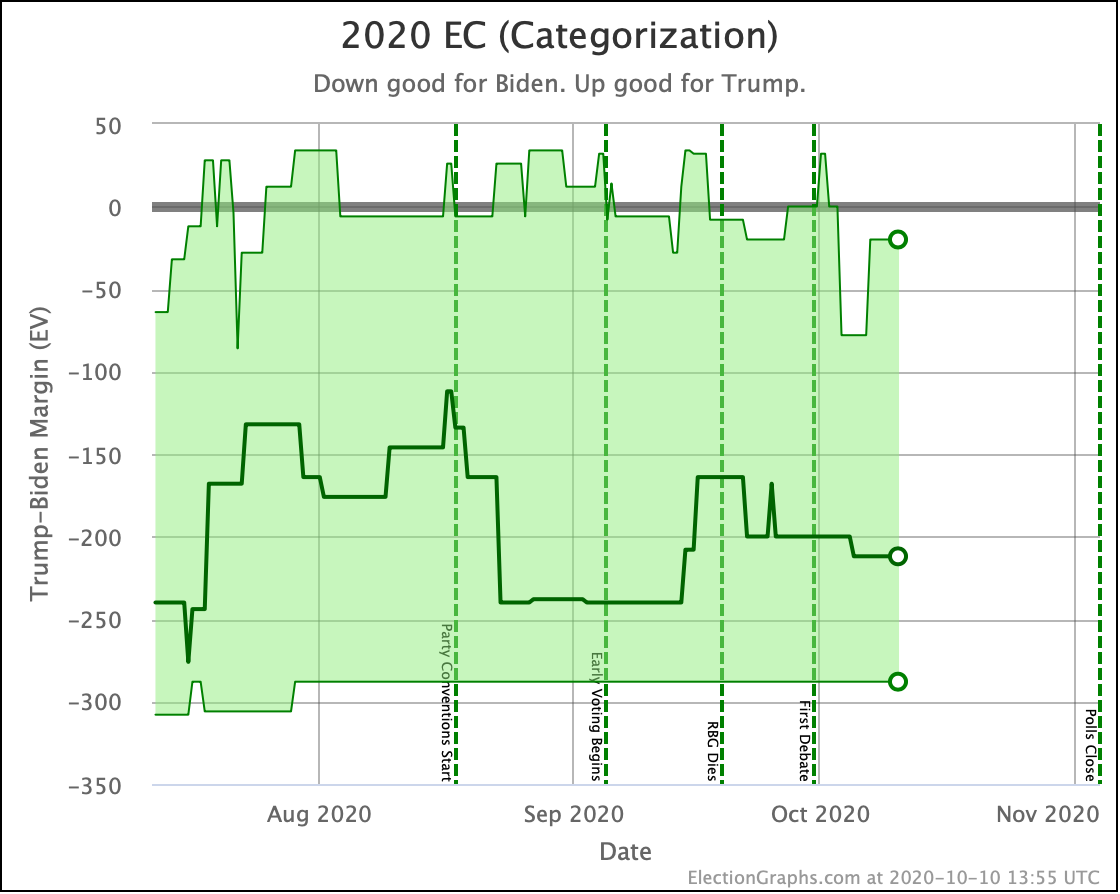
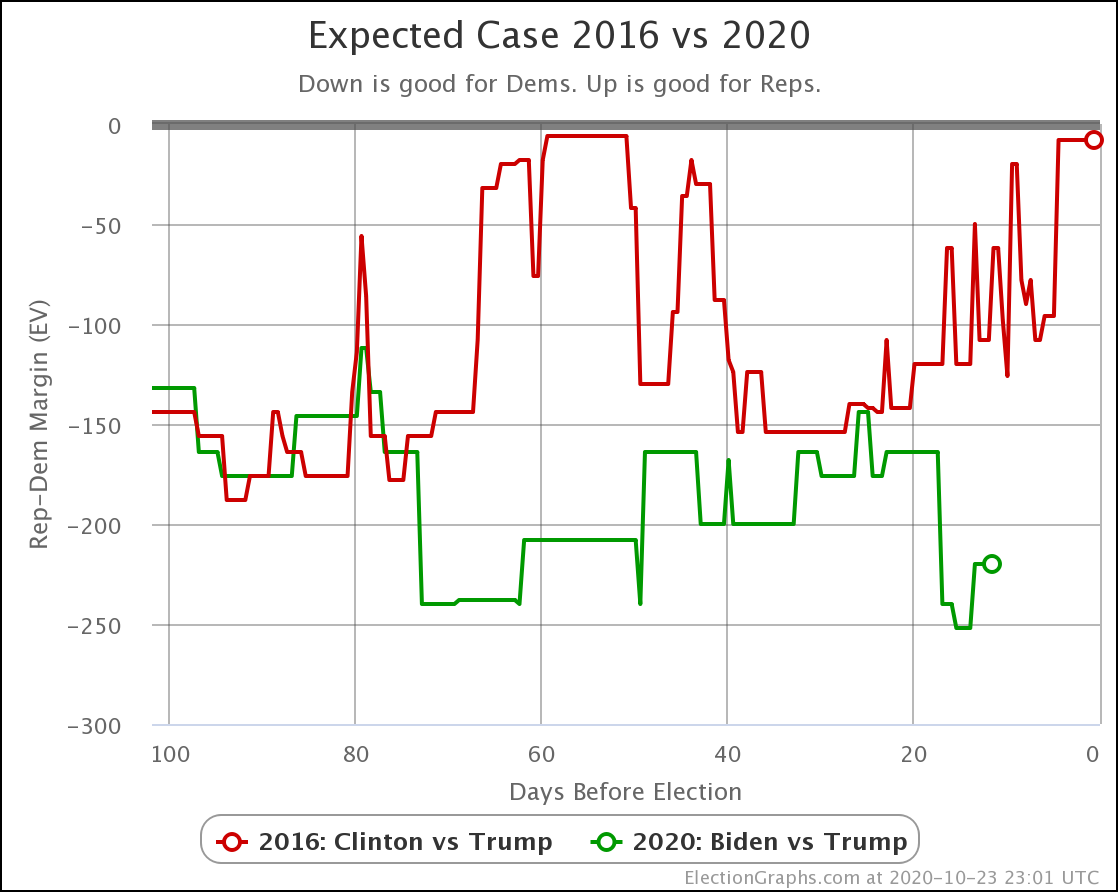
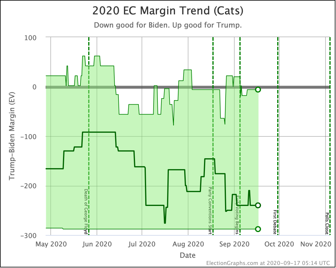
The centerline of this chart is at a 212 EV Biden win, the best it has been since mid-September, but overall, this shows the steadiness of the race. The ups and downs we are seeing are a small handful of very close states going back and forth across the zero line as the polls jitter.
Looking at the best cases… where one candidate or the other wins ALL of the close states… Biden's best-case very rarely moves at all. Trump's best-case moves a lot more. This is a factor of there being a lot more states close to a 5% Biden lead than there are states close to a 5% Trump lead. But even there, the Best cases have just bounced in a range since July. There is no clear trend.
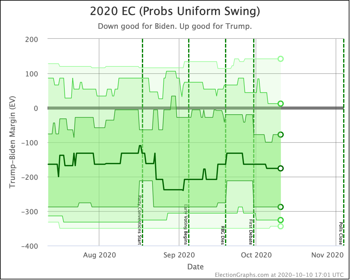
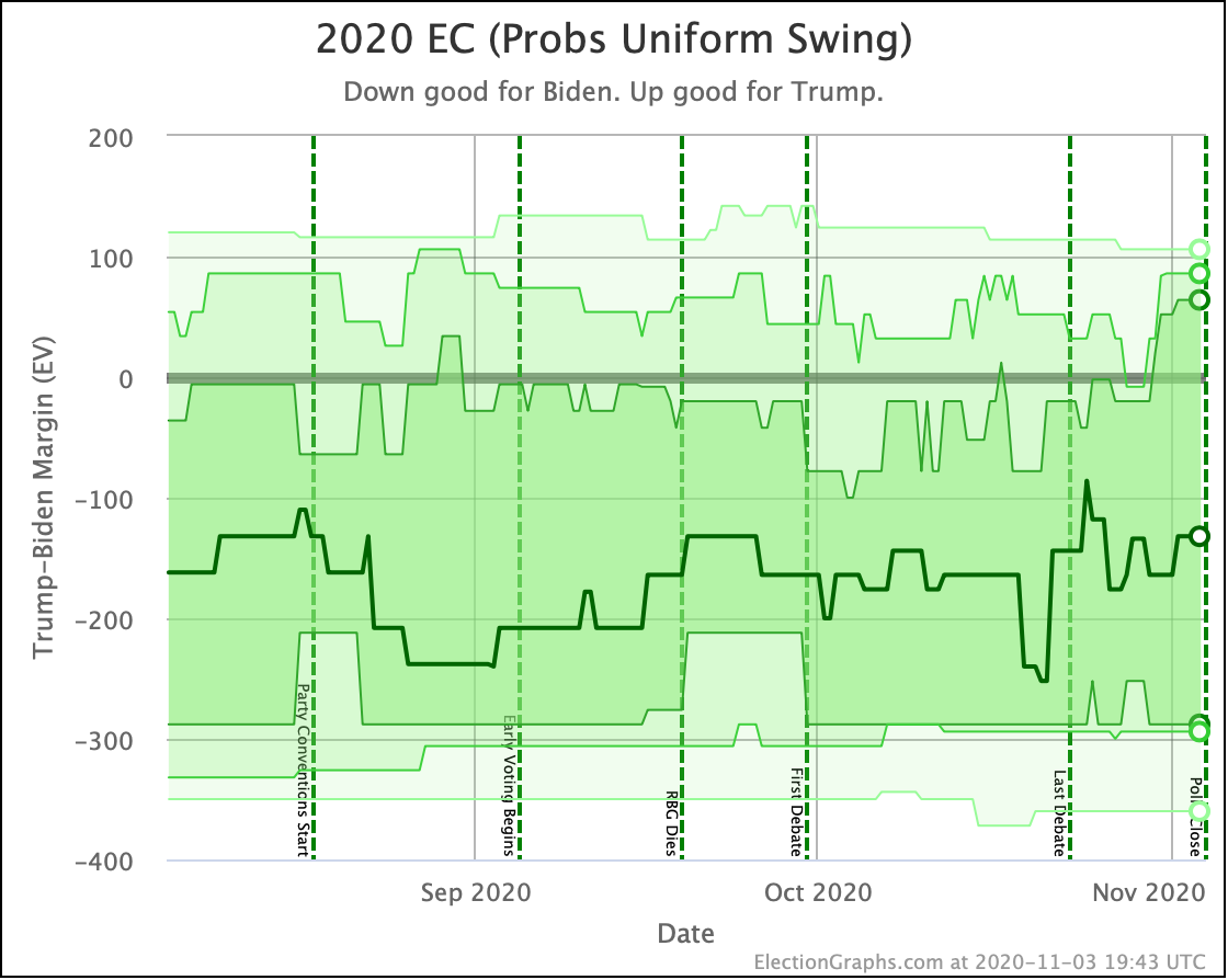
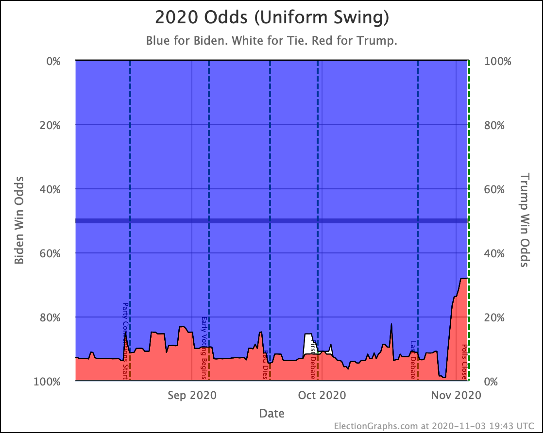
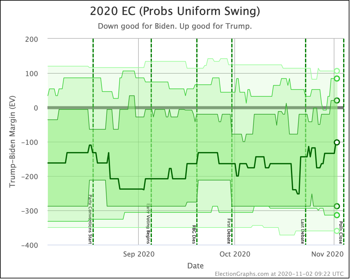
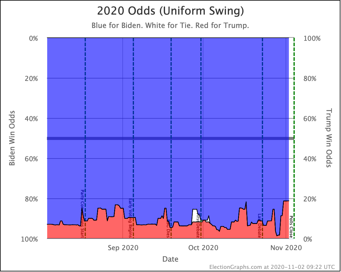
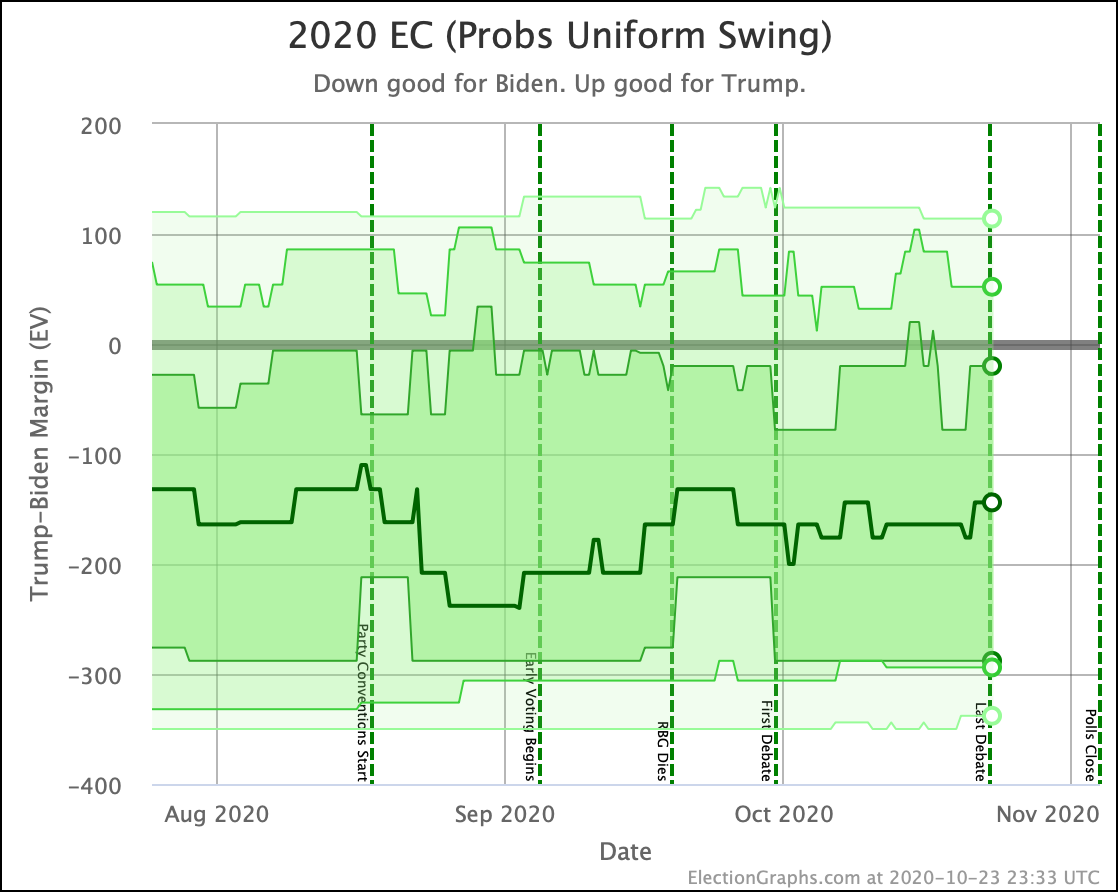
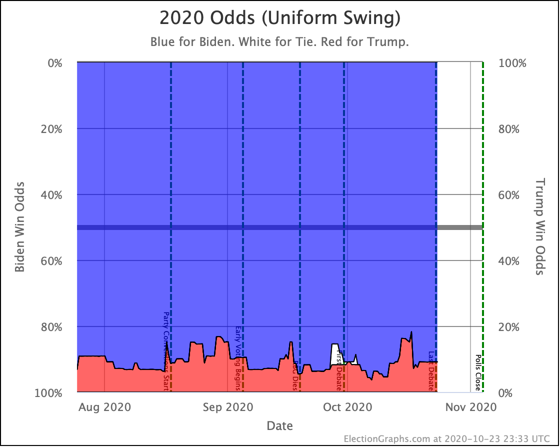
Next up, the probabilistic view using "uniform swing" where we force all of the states to move up and down together. This gives both the maximum chances of an upset and the maximum chances of the current leader getting a landslide.
And we see the same thing. Yes, improvement for Biden lately, but well within what has been the normal range of possibilities lately.
The only place where you can claim a breakout is the top of Trump's 2σ (95.45%) range, which is down to a 12 EV Trump win. That is indeed the worst we have seen for Trump on that line in this election cycle.
This range does still include Trump winning, but barely. This version of the model currently gives Trump a 5.2% chance of winning.
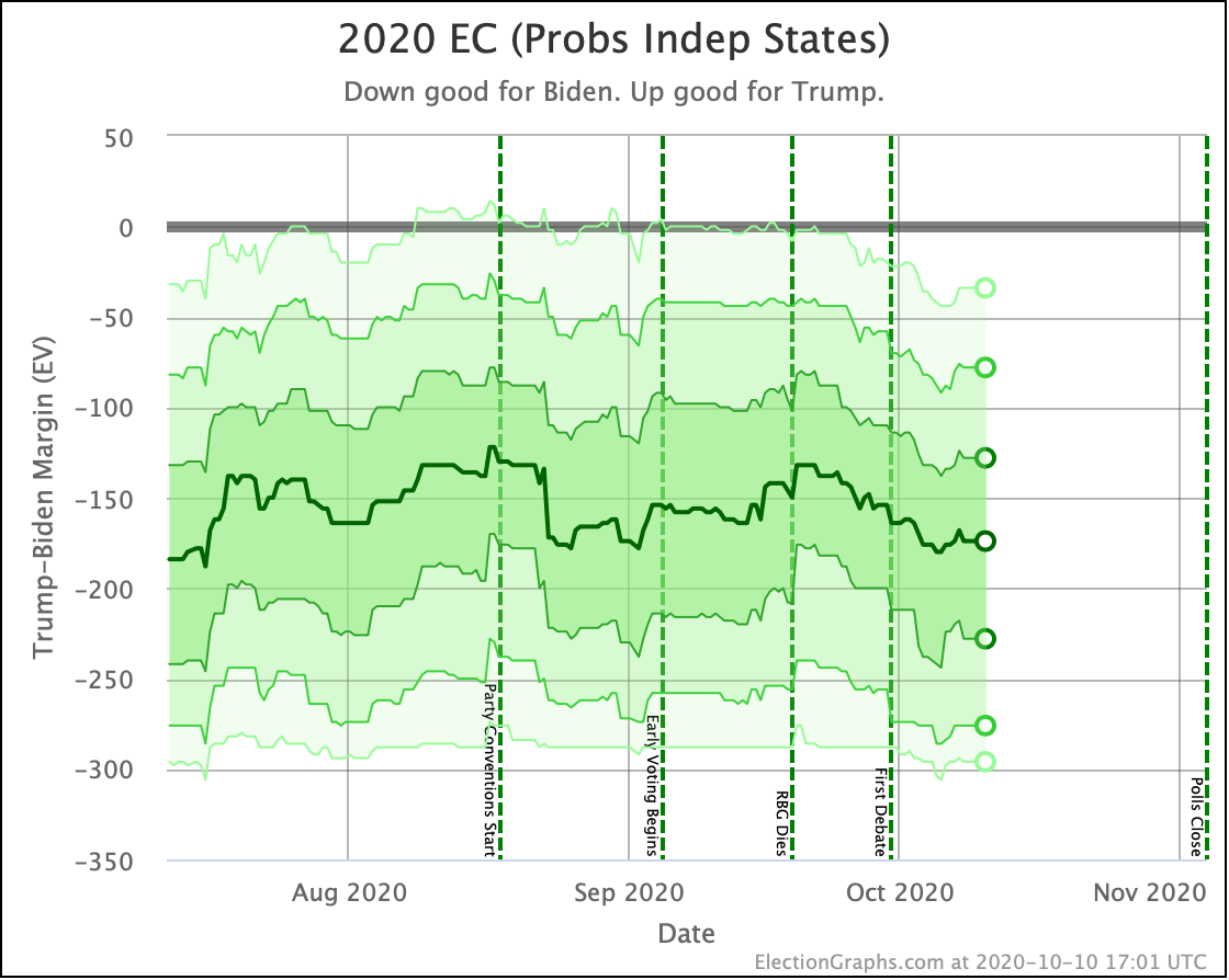
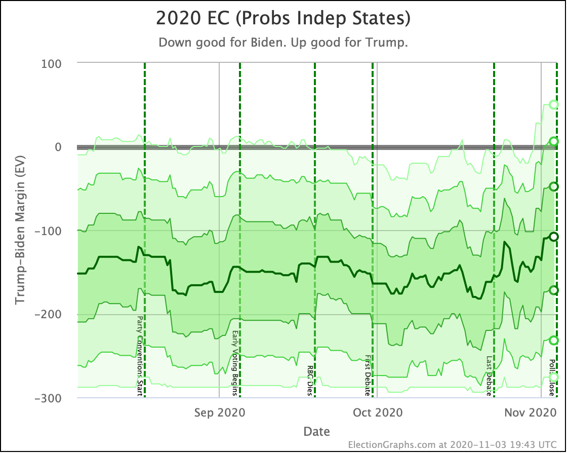
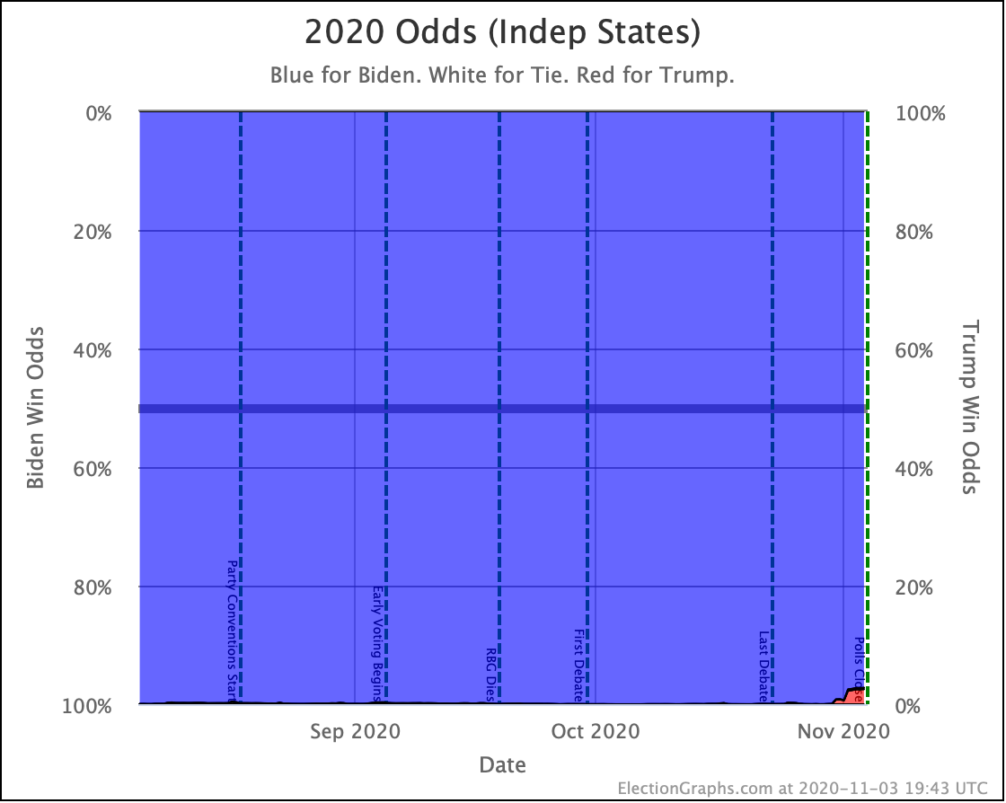
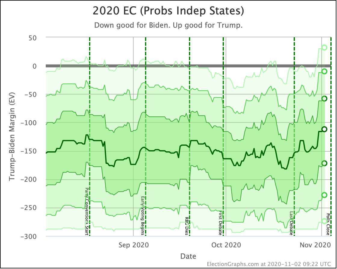
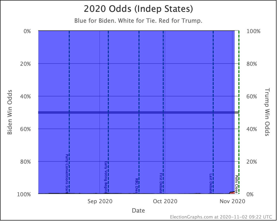
And then the "Independent States" view. This does a simulation assuming what happens in each state is completely independant of what happens in all the others. So if the polls underestimate Trump's support in Ohio, it means nothing to what may happen in Pennsylvania, etc. This results in the tightest range of possible results.
On this view as well, Trump has declined the last few weeks, but we aren't breaking new ground.
We are however in the territory where even the 3σ (99.73%) range does not include the possibility of Trump winning. In fact, the standard display on the 2020 Electoral College page now rounds Biden's win odds to 100%. Looking at the unrounded simulation results, we actually have 99.996% Biden wins, 0.0027% Trump wins, and 0.0013% ties.
Both the "Uniform Swing" and "Independent States" represent the extremes of how correlated or not state results are to each other. The truth is somewhere in between, but where in between is not predicted by these models.
So the Election Graphs statement on odds right now is simply that Trump's odds of winning are between 0.0027% and 5.2%.
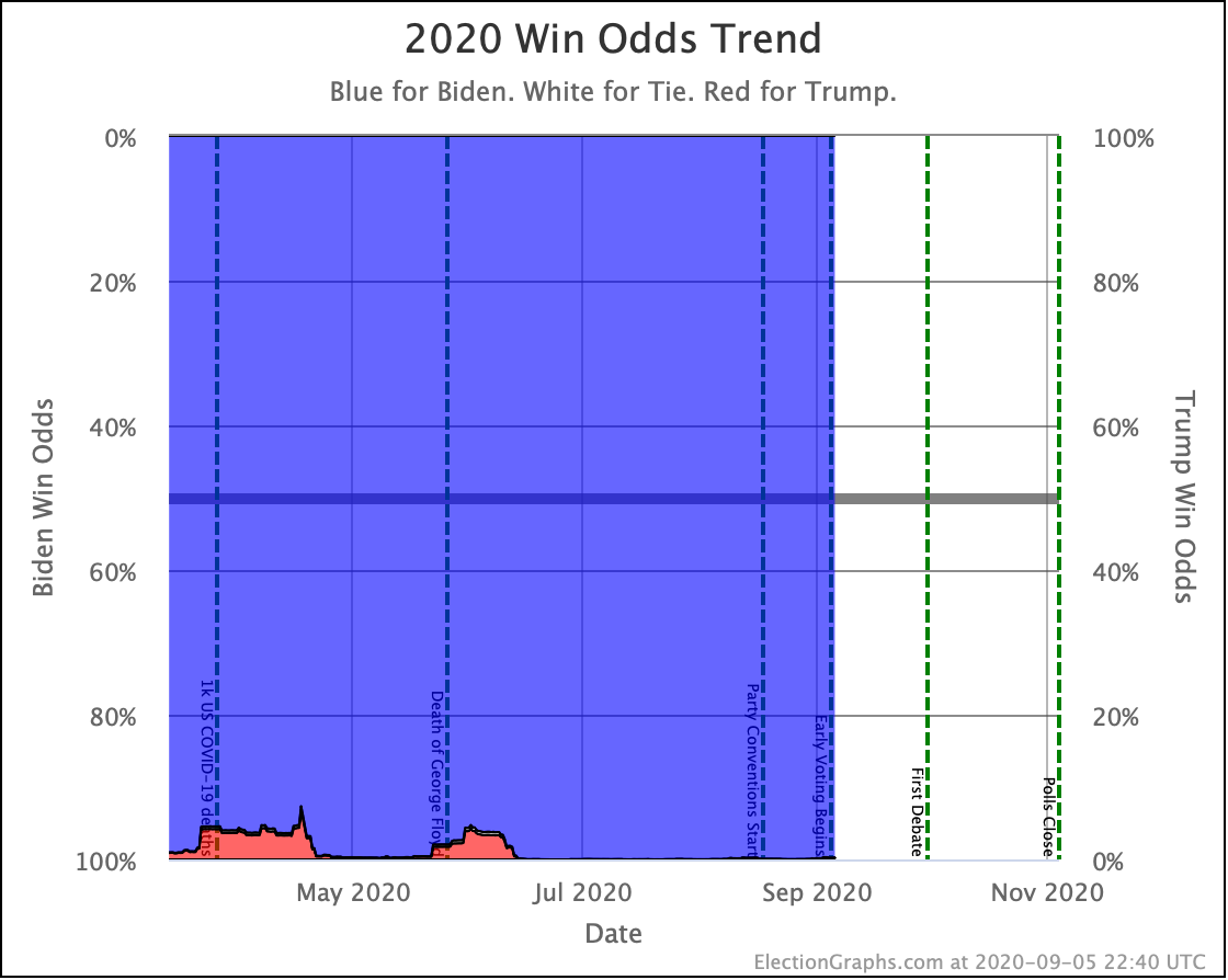
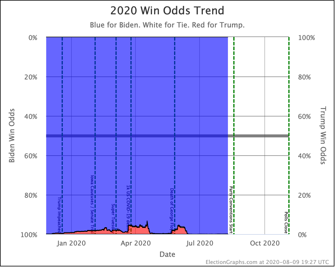
So let's look at the odds charts.
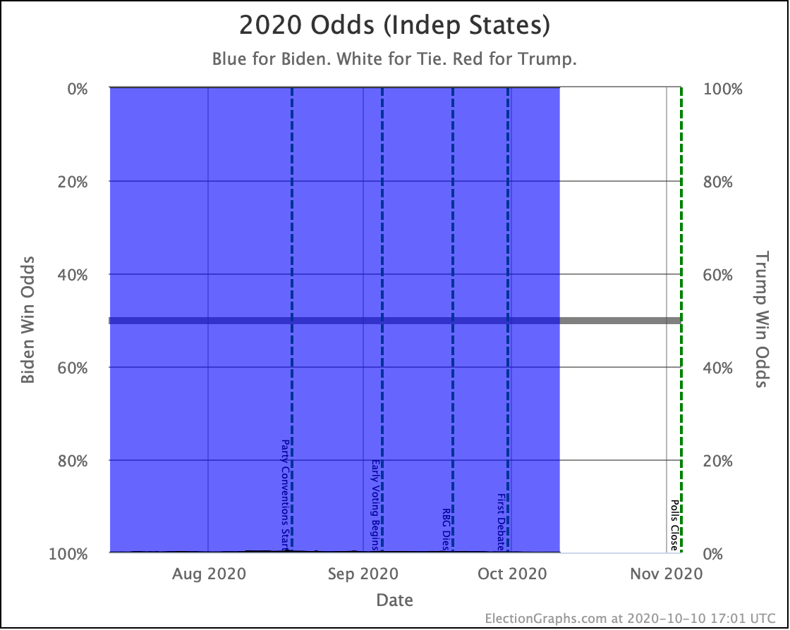
So, uh, yeah. We probably won't show this one much unless Trump starts spiking and there is something to see. In the Independent States view, Trump has been so close to zero for so long that you can't even see any red on this chart.
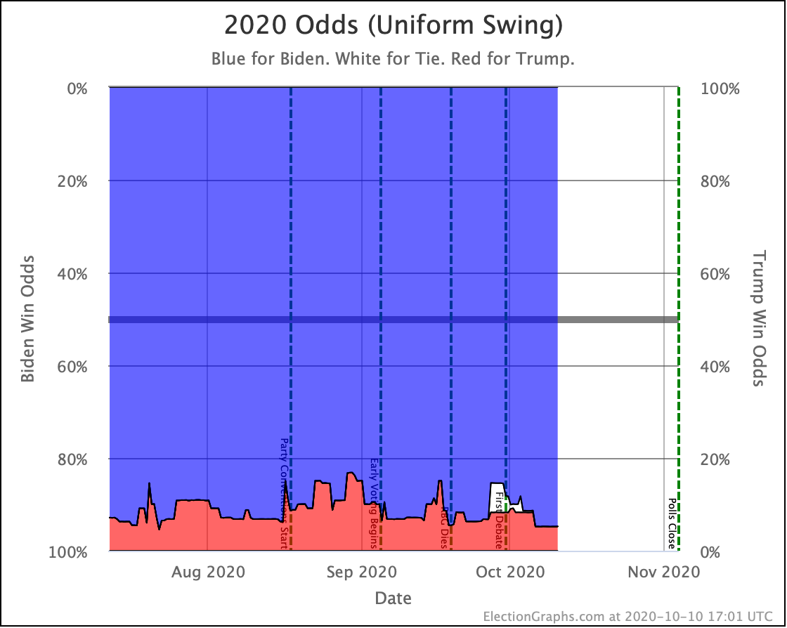
On uniform swing, there is at least something to see. But again, we are bouncing around in a well-trod range. We're currently at a 5.2% Trump win probability in this view. The range on this chart (currently showing the race since July 12th) is from a 4.6% to a 16.9% chance of a Trump win.
Now, to be clear, there is a big difference between a 4.6% chance of winning and a 16.9% chance of winning. But that seems to be the range we have been living in for Trump's maximum odds of winning. We are still in that range, although near the low end.
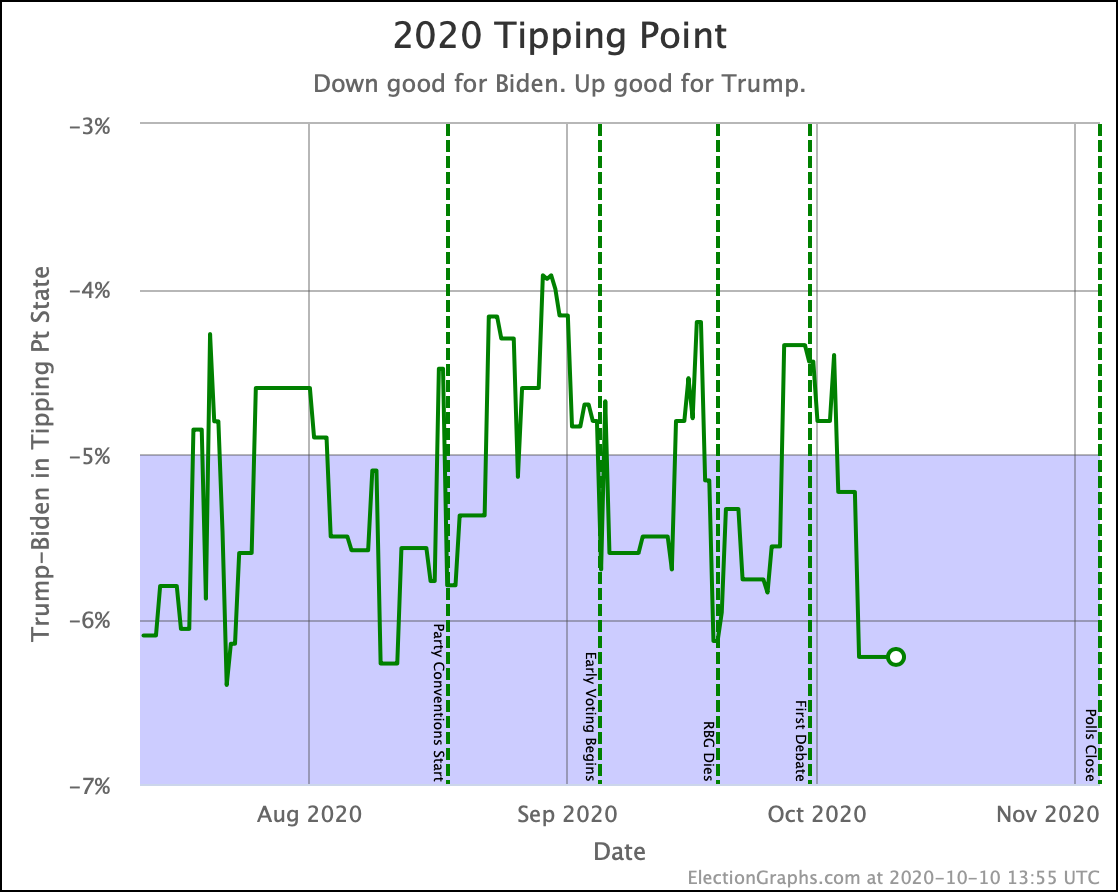
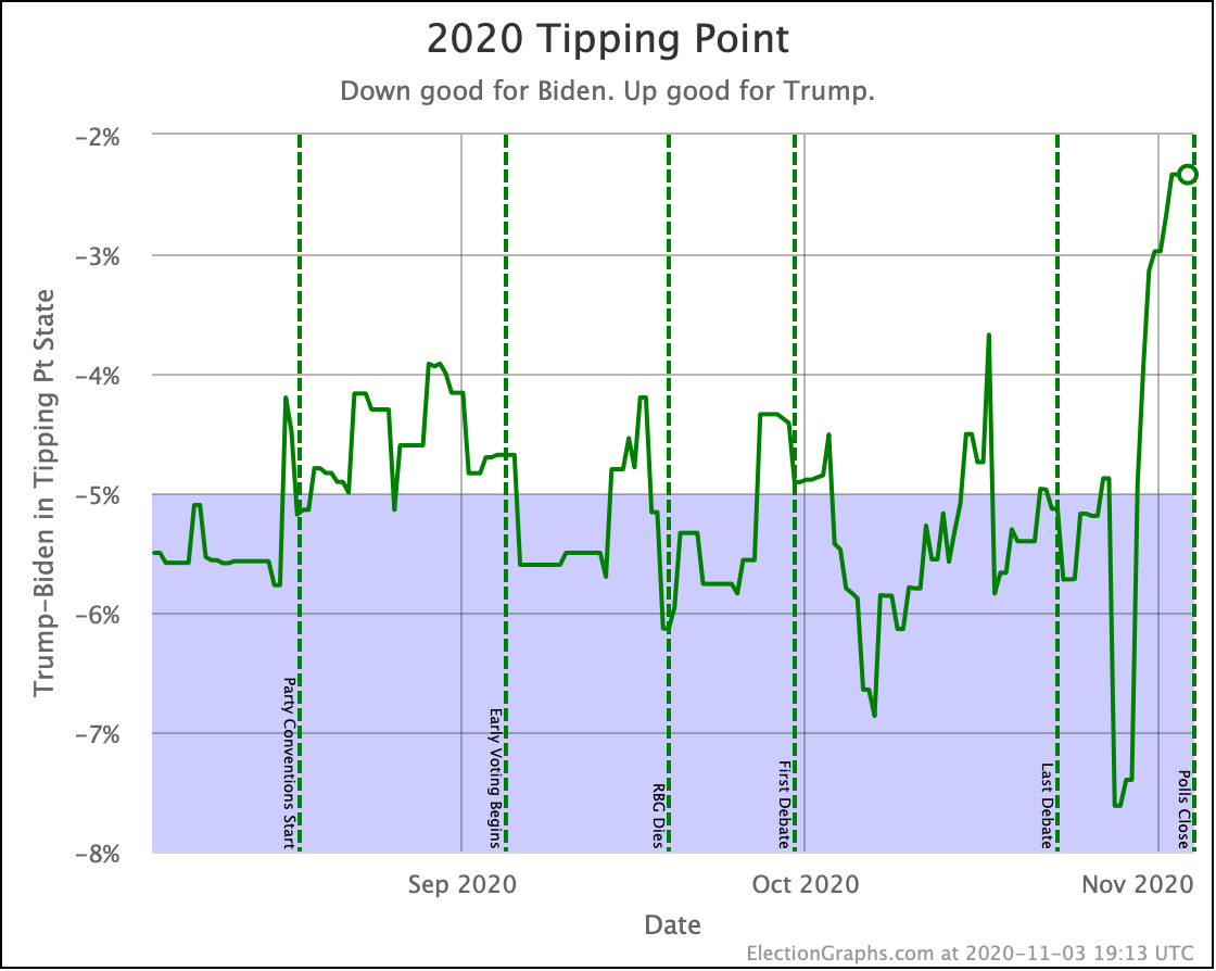
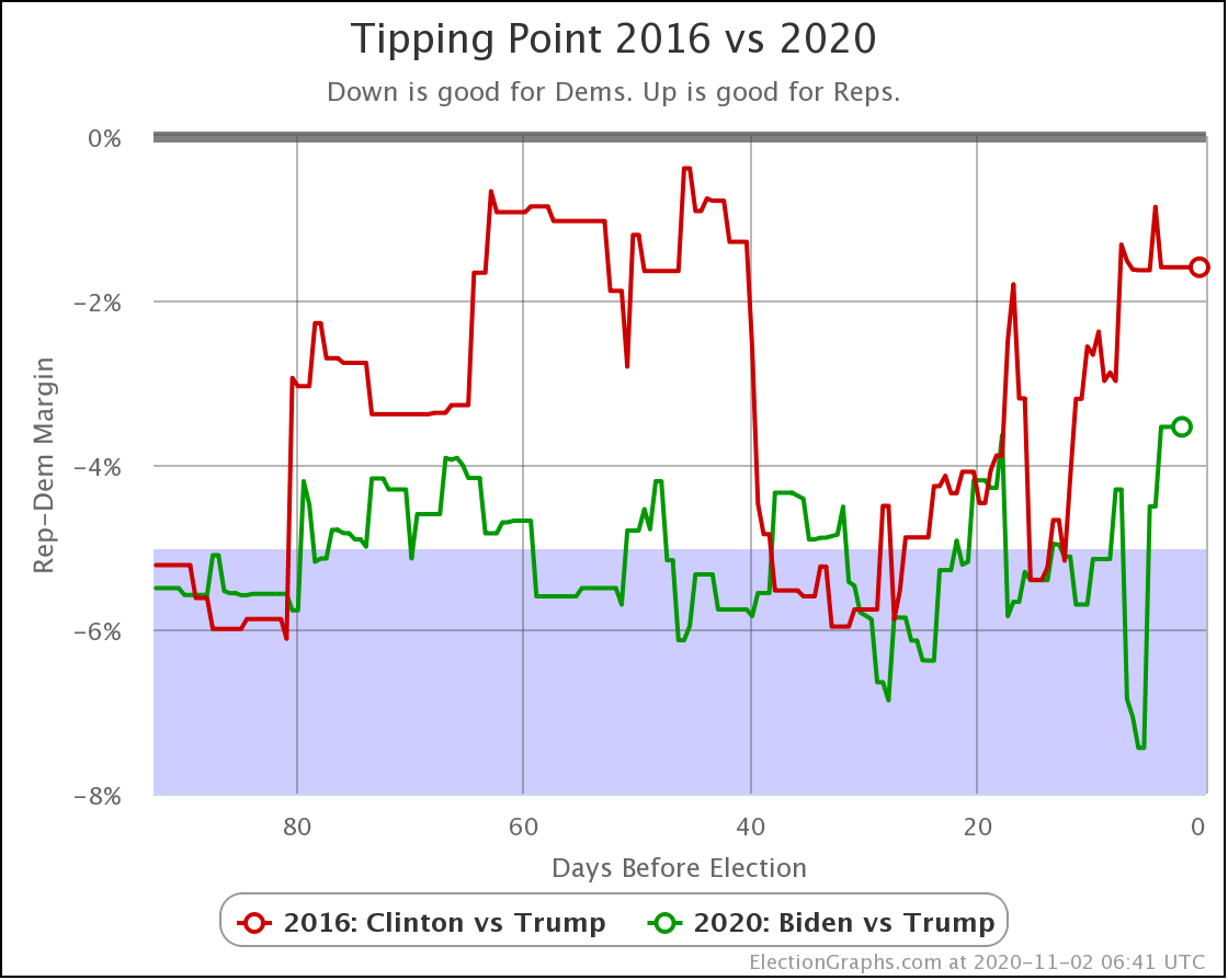
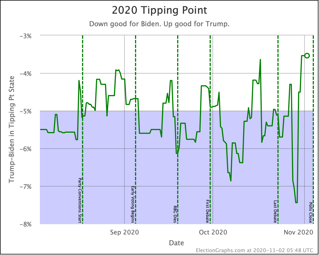
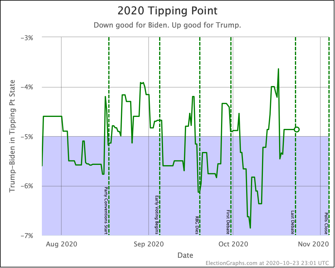
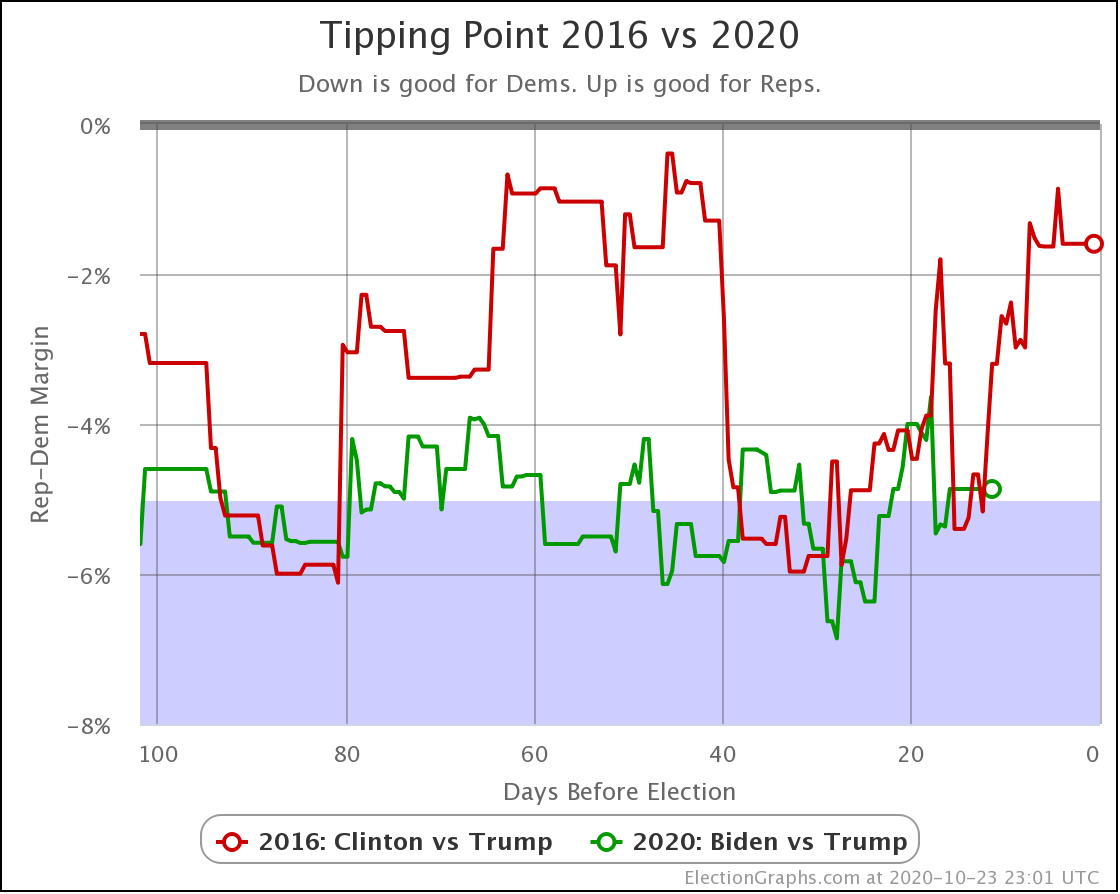
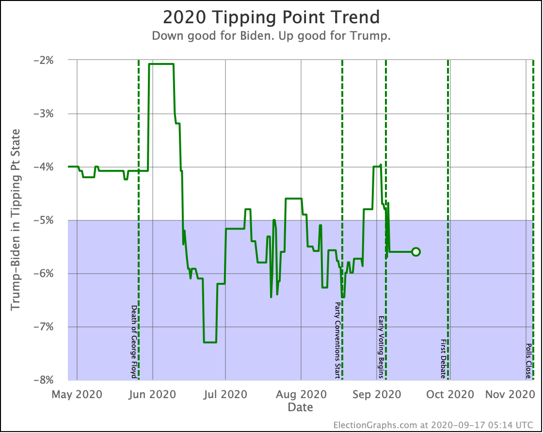
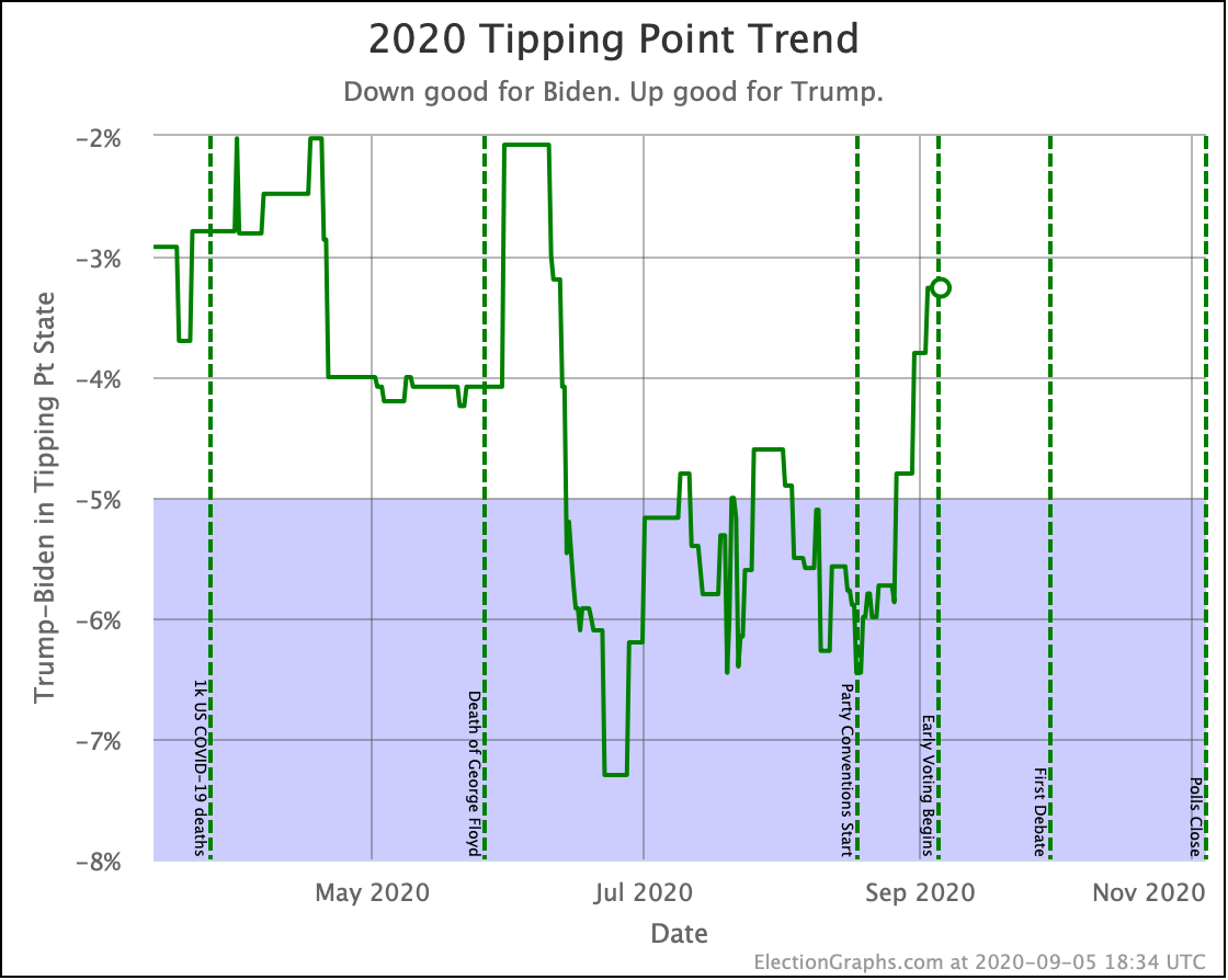
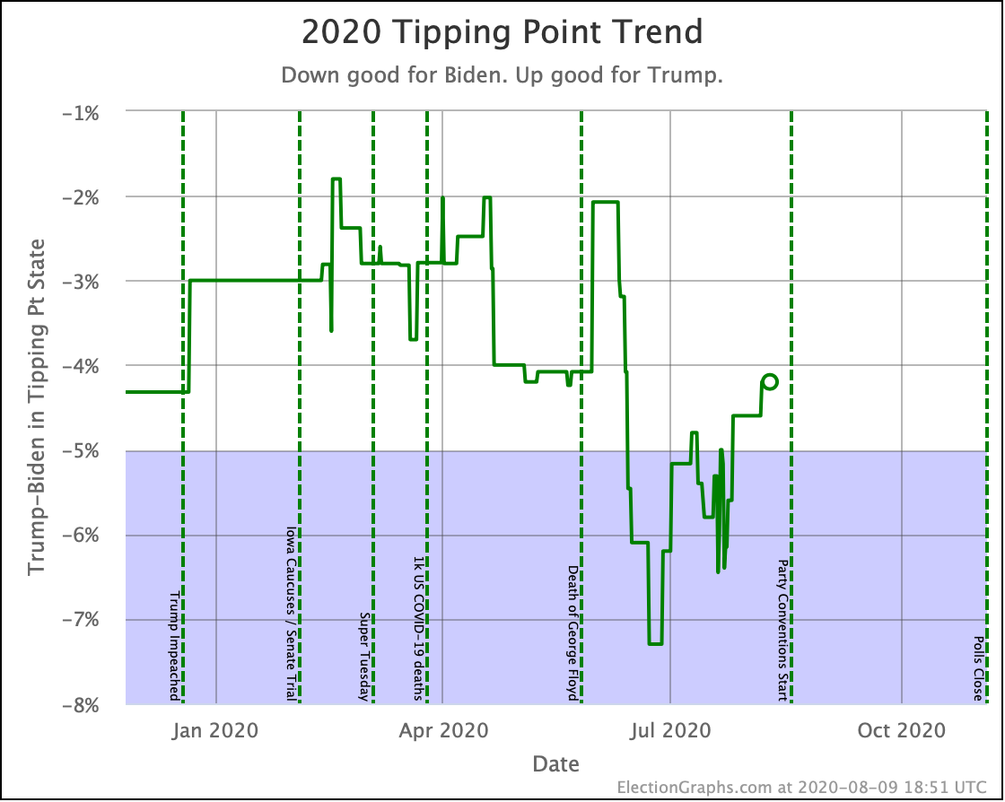
And now the tipping point. This represents how much the national popular vote would need to move… assuming a uniform swing of states… in order to flip the overall result. Once again, we see us near Biden's best, but not quite setting records. Right now the 6.2% is the best Biden has seen since August 11th. But he was close to this level as recently as September 19th.
Unless there is a breakout, this is once again a picture of a steady race. Yes, Biden is near the top of his range, but basically, things have been flat for months. There is no overarching trend.
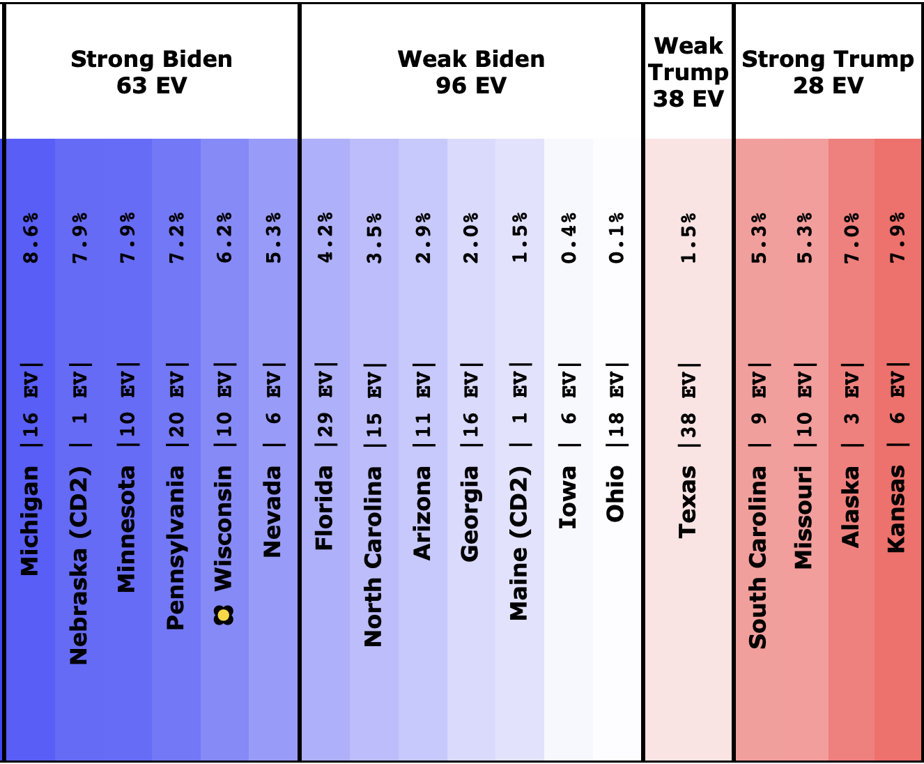
And there is the center of our spectrum of states. There are a LOT of close states right now. Trump winning all of them isn't enough. He has to also pull in Nevada and Wisconsin. Or some of the states where he is behind by even more.
The RCP average of national polls currently shows a 9.6% Biden lead. Comparing to the 6.2% tipping point, this implies that the structure of the electoral college is currently giving Trump a 3.4% head start. This is up from 0.7% in the last update.
The increase in this delta since last time would indicate that a lot of Biden's gain in the national popular vote is coming from states that don't matter. Biden winning by a bit more in New York, or losing by a bit less in West Virginia is simply irrelevant given how we actually choose presidents.
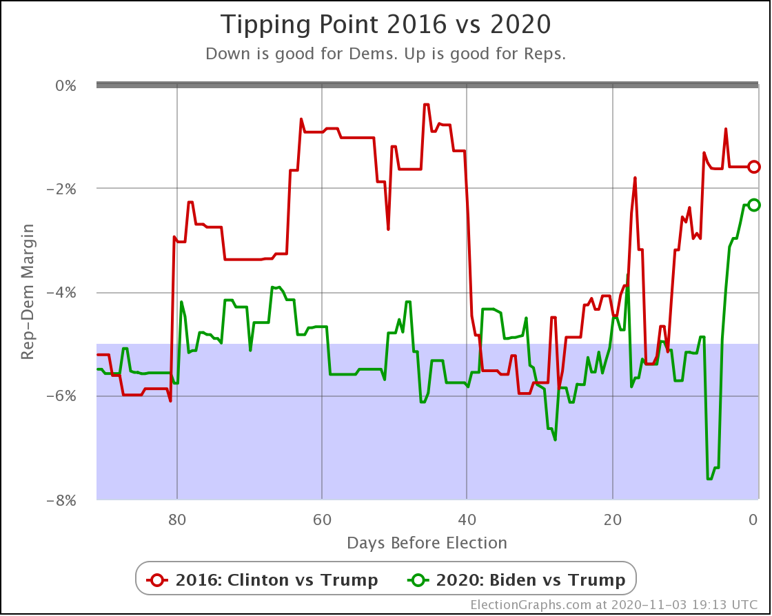
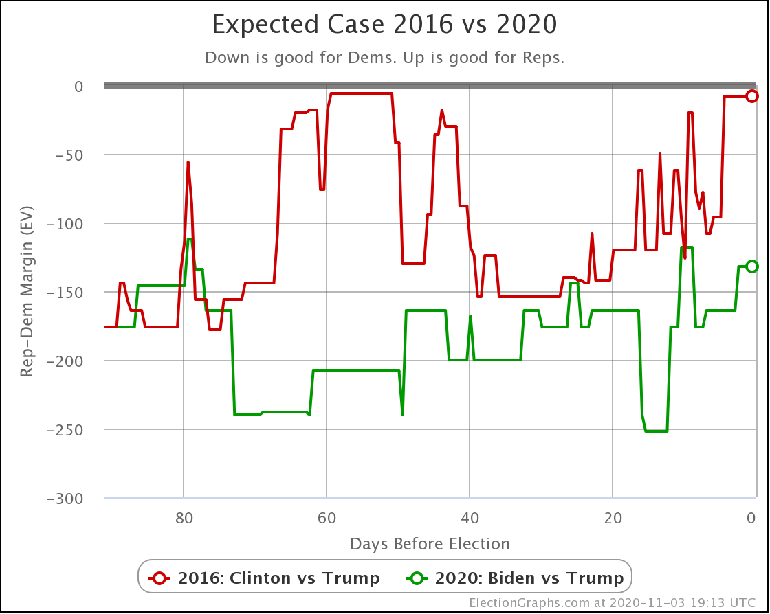
Finally, let's do the 2016 comparison.
Reader Ali D recently asked in the post comments if I could do 2016 comparisons based on the probabilistic views in addition to what I have been doing here. He wasn't sure the expected case was a good comparison since it could change so much based on close states crossing the centerline.
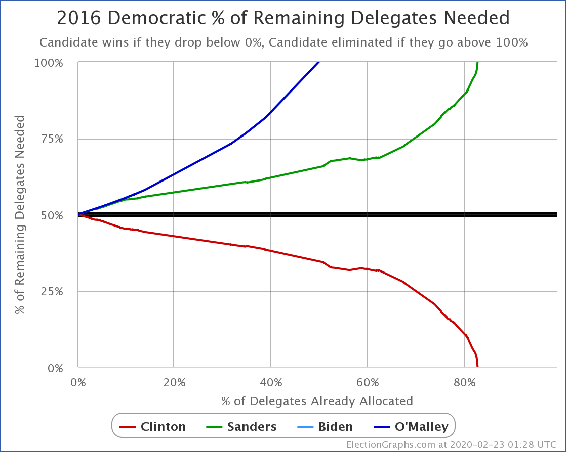
The short answer is no. The probabilistic views are all new for 2020, so I have no 2016 line to compare to. Sorry!
Going into more detail, the estimates of how close to reality the poll averages end up that drive the probabilistic analysis are based on looking at the 2008 through 2016 results, so even though I once did it as a one-off, applying that analysis to 2016 would not be valid since you are essentially using the 2016 results to predict 2016.
It theoretically would be possible for me to generate separate state win odds using only 2008 and 2012 data using the same method I used, then retroactively generate a full probabilistic trend for 2016, but even doing this with only 3 election cycles of data seemed a little iffy, doing it with two really would be. Plus, realistically, I'm not going to have time to do anything like that before election day.
So once again, sorry!
Ali D is also correct that JUST looking at the expected case doesn't give you a good sense of how close things really are since you don't know if the states making up the winning margin have the winner ahead by 0.1% or by 1% or by 10%.
This is why we look at BOTH the Expected Case and the Tipping Point to understand the comparison… I guess we could expand this to also compare the best cases for both candidates, but things are already complicated enough… so we'll stick to just these two.
Here we go…
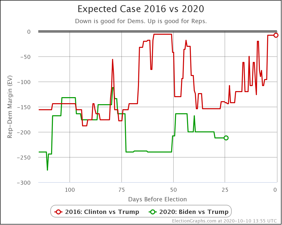
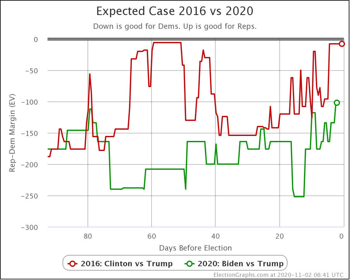
In the expected case, Biden has been doing better than Clinton ever since we hit the 76 day out mark. We are now past Clinton's last surge, and into the part of the race where her lead had started to slip.
So far, Biden's lead is not slipping. It is increasing.
But let's look at the tipping point comparison:
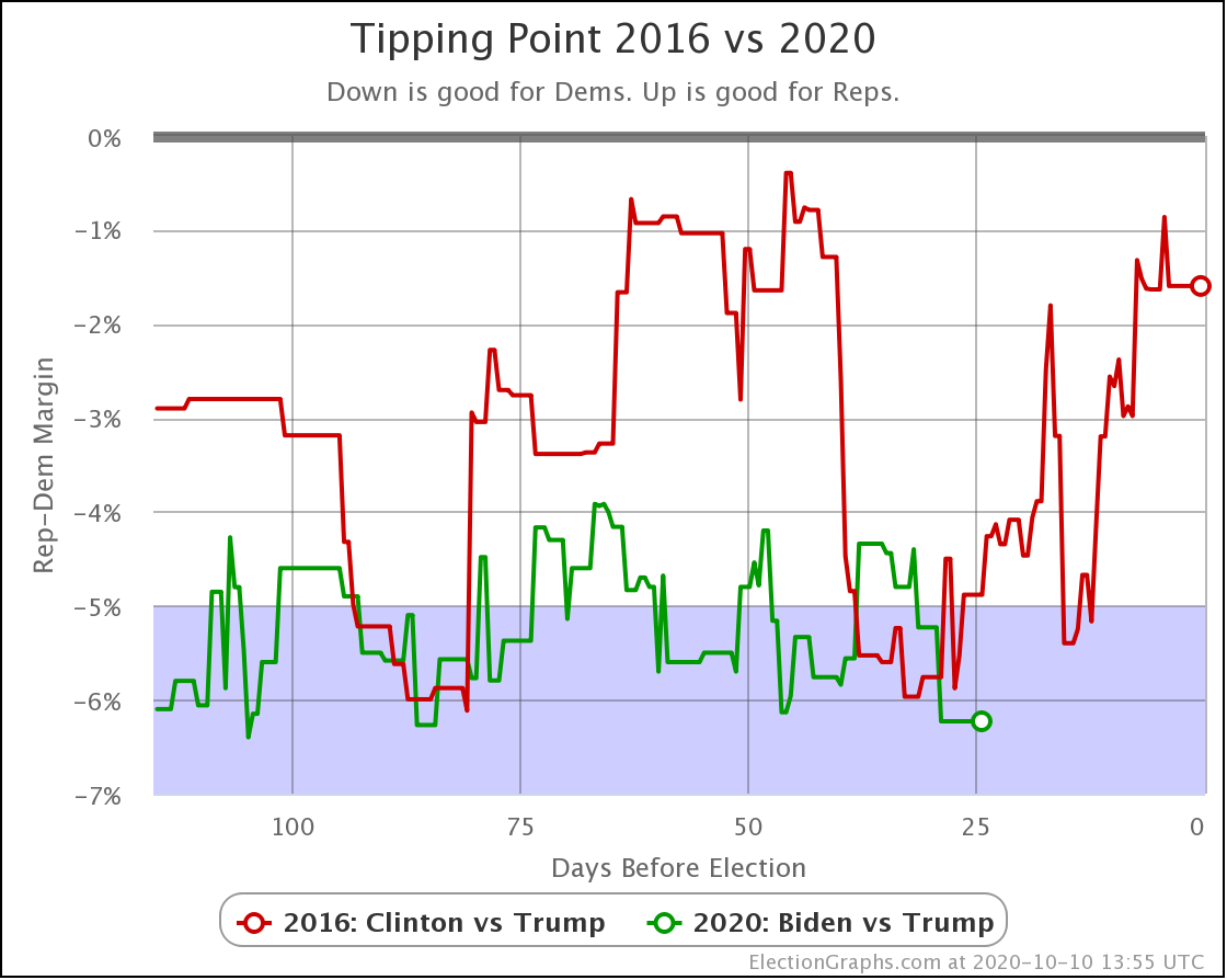
In this metric, between 37 and 29 days out, when Clinton was at a high point and Biden was at the low end of his range, Biden was actually doing worse than Clinton was at the same point. But that Clinton peak is over, Biden is gaining, and so Biden once again is stronger than Clinton was at this point.
We certainly can't say it is impossible for this picture to change before the election. But for Trump to actually be FAVORED to win, Biden needs to start collapsing soon, and he needs a bigger and faster collapse than Clinton suffered in 2016.
Unlike Clinton, who regularly fell to levels where the race was tight and she was favored but Trump clearly had a very good shot, Biden has been consistently strong all the way along. So to let Trump take the lead, he would have to do significantly worse than we have ever seen, not just a little bit worse.
Or course Trump doesn't have to be favored in order to win. With existing polling, the Uniform Swing view gives Trump a 5.2% chance of an upset. And 5.2% is NOT ZERO.
Embedding the most recent XKCD because it is directly relevant:
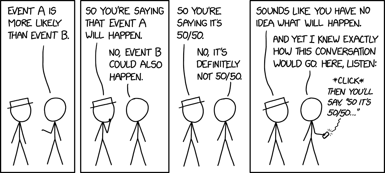
Of course Election Graphs is actually saying that the chances of a Trump win are LESS than 5.2% if the election was today. Even so, it is STILL NOT ZERO.
Plus there is still time for things to change. Over 9 million people have already voted. Voting is well underway. But as I write this we have a little over three weeks until the the end of voting and most people haven't voted yet. While it seems increasingly likely that it will be hard for Trump to actually get to a position where he is the favorite on election day, he may very well improve his odds in that time.
There still could be an October Surprise that makes a difference!
We shall see.
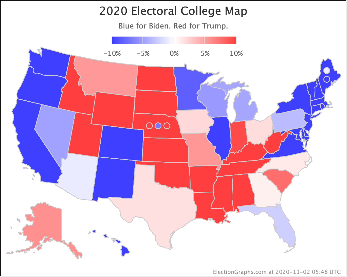
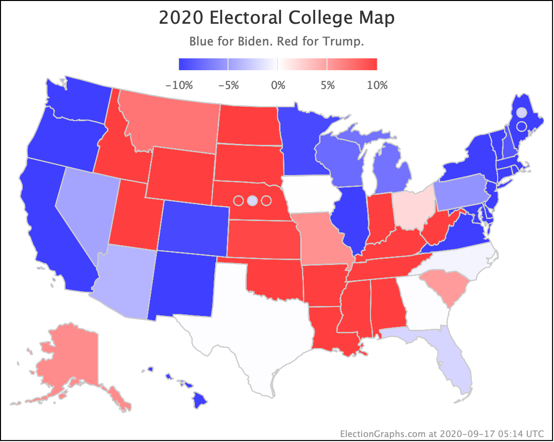
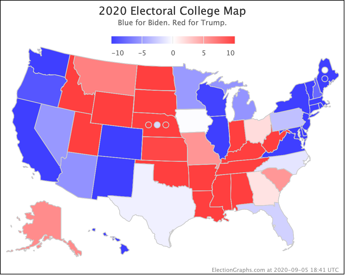
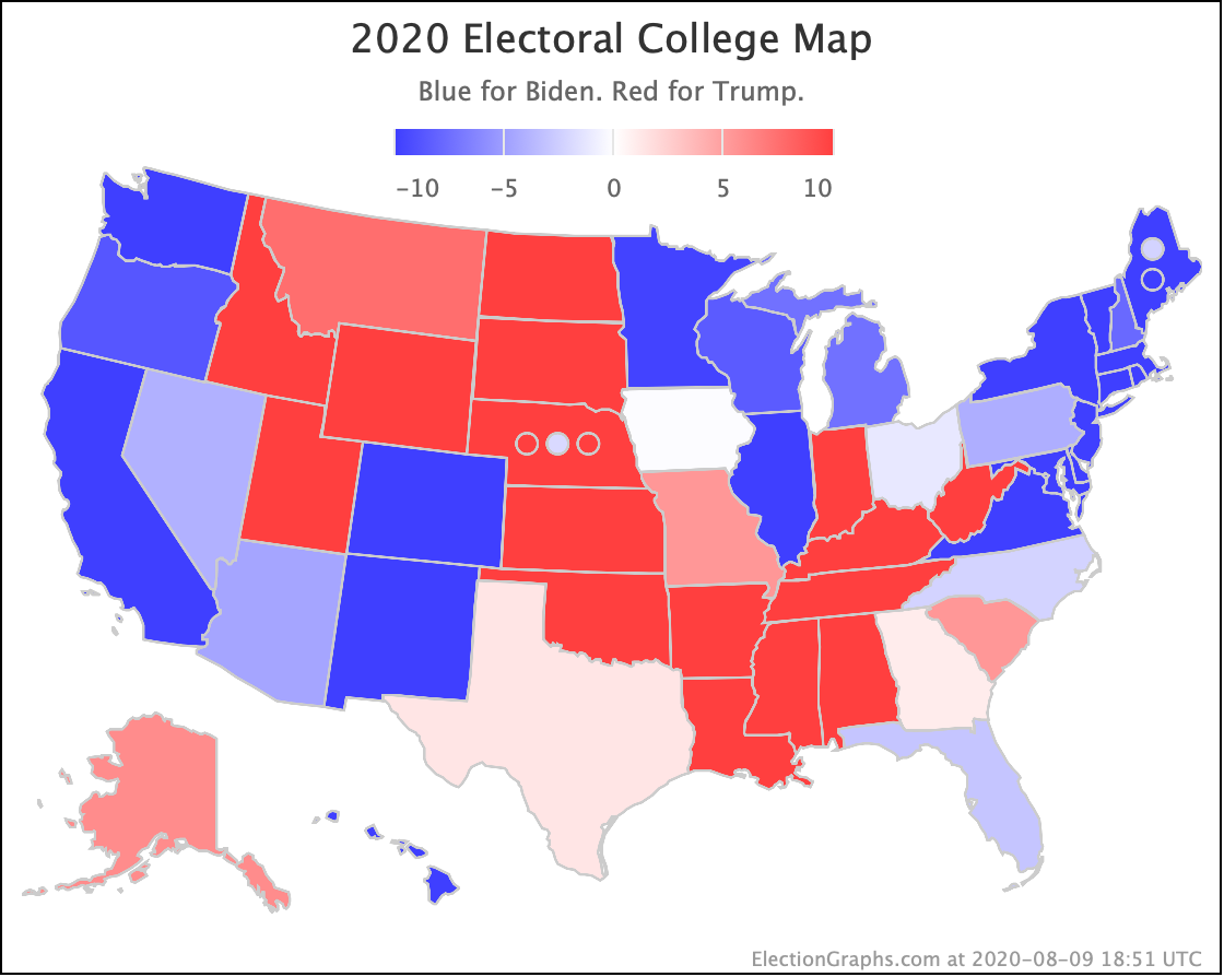
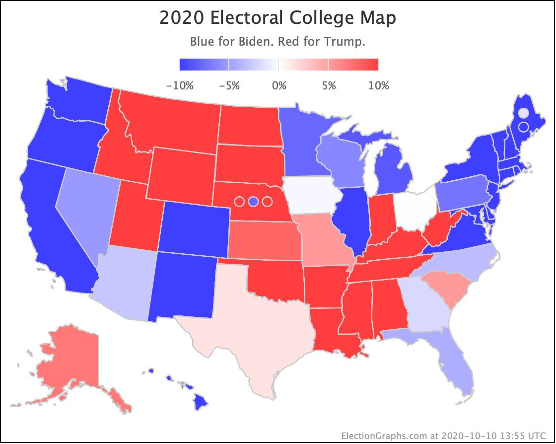
Finally, the map as it stands right now:
Everything above represents the situation as of when I started writing this blog post. Looks like at least two new polls have been published while I have been writing. So time to close this out and start updating the site again…
But first, the usual closing with the countdown:
24.1 days until the first results start coming in for Election 2020.
Tune in for the inevitable ups and downs that happen in those days…
For more information:
This post is an update based on the data on the Election Graphs Electoral College 2020 page. Election Graphs tracks a poll-based estimate of the Electoral College. The charts, graphs, and maps in the post above are all as of the time of this post. Click through on any image for current interactive versions of the chart, along with additional details.
Follow @ElectionGraphs on Twitter or Election Graphs on Facebook to see announcements of updates. For those interested in individual poll updates, follow @ElecCollPolls on Twitter for all the polls as I add them. If you find the information in these posts informative or useful, please consider visiting the donation page.