As always, if you are impatient for one of these updates, the 2020 Electoral College pages on Election Graphs are updated every day as new polls come in. Or you can follow @ElecCollPolls on Twitter to see all the polls as I add them. While you are at it, follow @ElectionGraphs too.
The last blog update here was three days ago on October 24th. Here are the high-level changes since that last post:
| Model | Metric | 24 Oct | 27 Oct | 𝚫 |
| Probabilities (Indep States) |
Trump 2σ Median Biden 2σ |
Biden +52 Biden +162 Biden +254 |
Biden +38 Biden +142 Biden +256 |
Trump +14 Trump +20 Biden +2 |
| Trump Win Tie Biden Win |
0.1% 0.0% 99.9% |
0.1% 0.0% 99.8% |
FLAT FLAT -0.1% |
|
| Probabilities (Uniform Swing) |
Trump 2σ Median Biden 2σ |
Trump +52 Biden +144 Biden +294 |
Trump +52 Biden +144 Biden +300 |
FLAT FLAT Biden +6 |
| Trump Win Tie Biden Win |
9.1% 0.0% 90.9% |
11.8% 0.0% 88.2% |
+2.7% FLAT -2.7% |
|
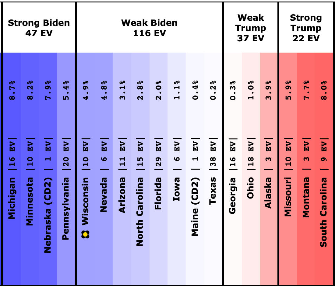
| Categories | Trump Best Expected Biden Best |
Trump +12 Biden +220 Biden +294 |
Trump +20 Biden +176 Biden +294 |
Trump +8 Trump +44 FLAT |
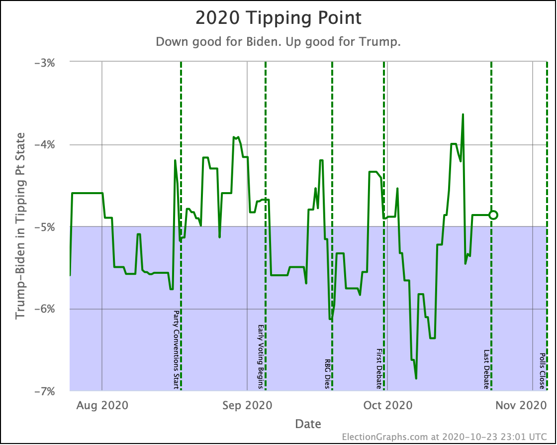
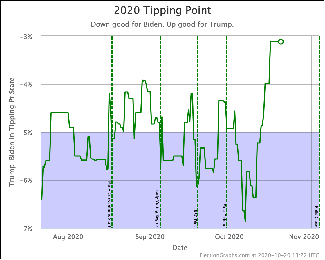
| Tipping Point | Biden +4.9% | Biden +4.4% | Trump +0.5% |
So, as we are only 7 days out now, I'm trying to update much more frequently. But honestly, not much has changed since the post three days ago.
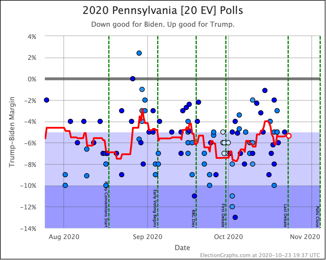
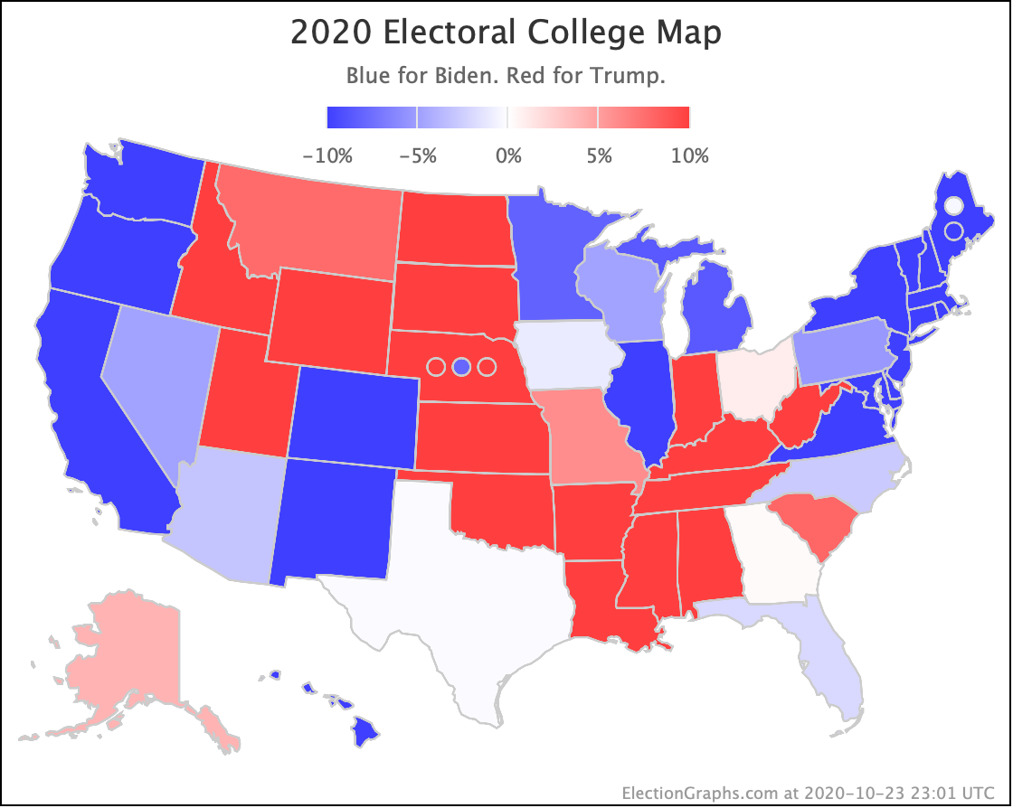
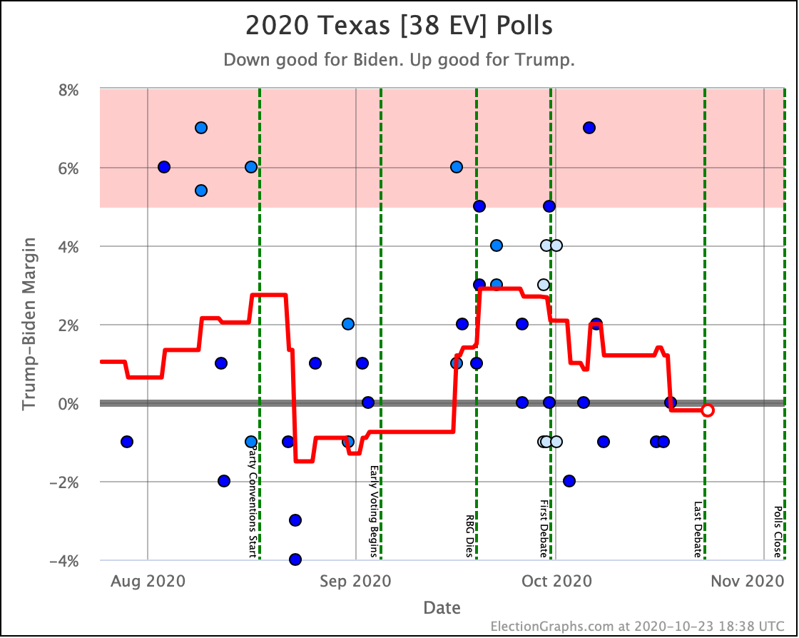
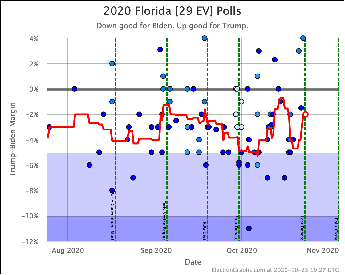
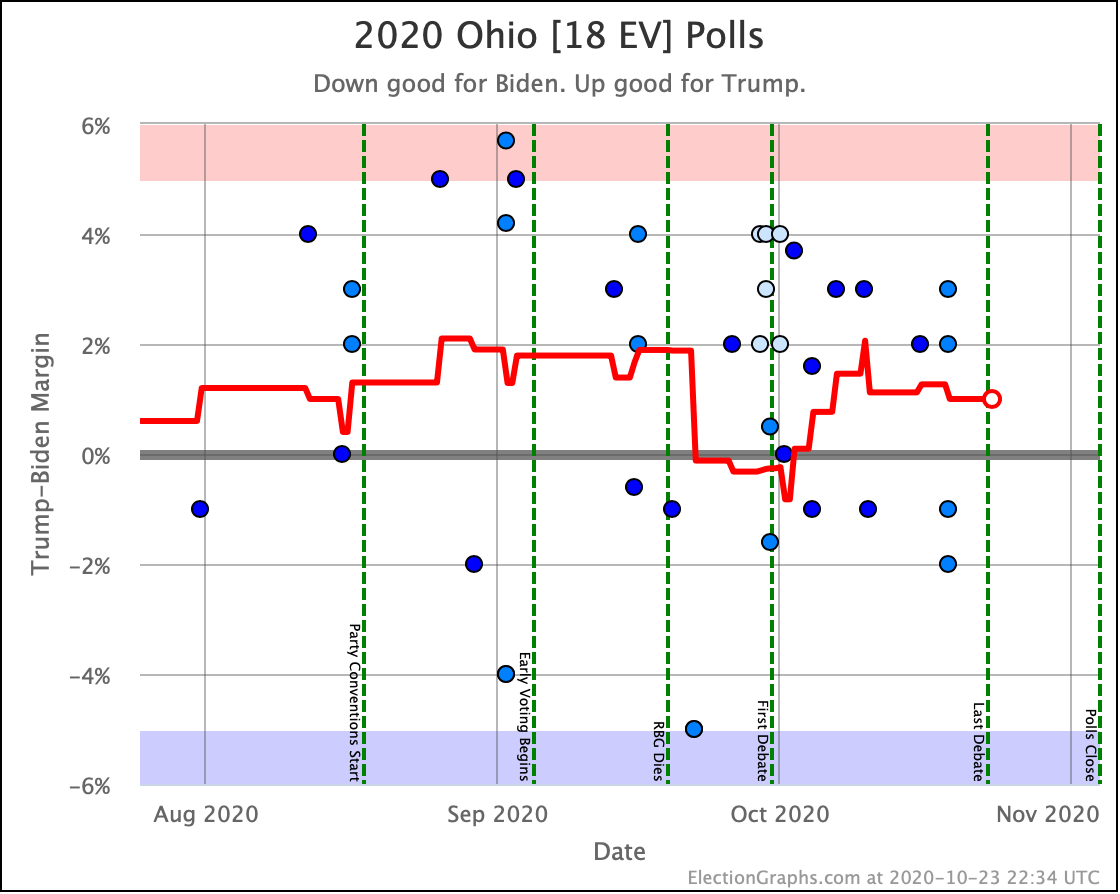
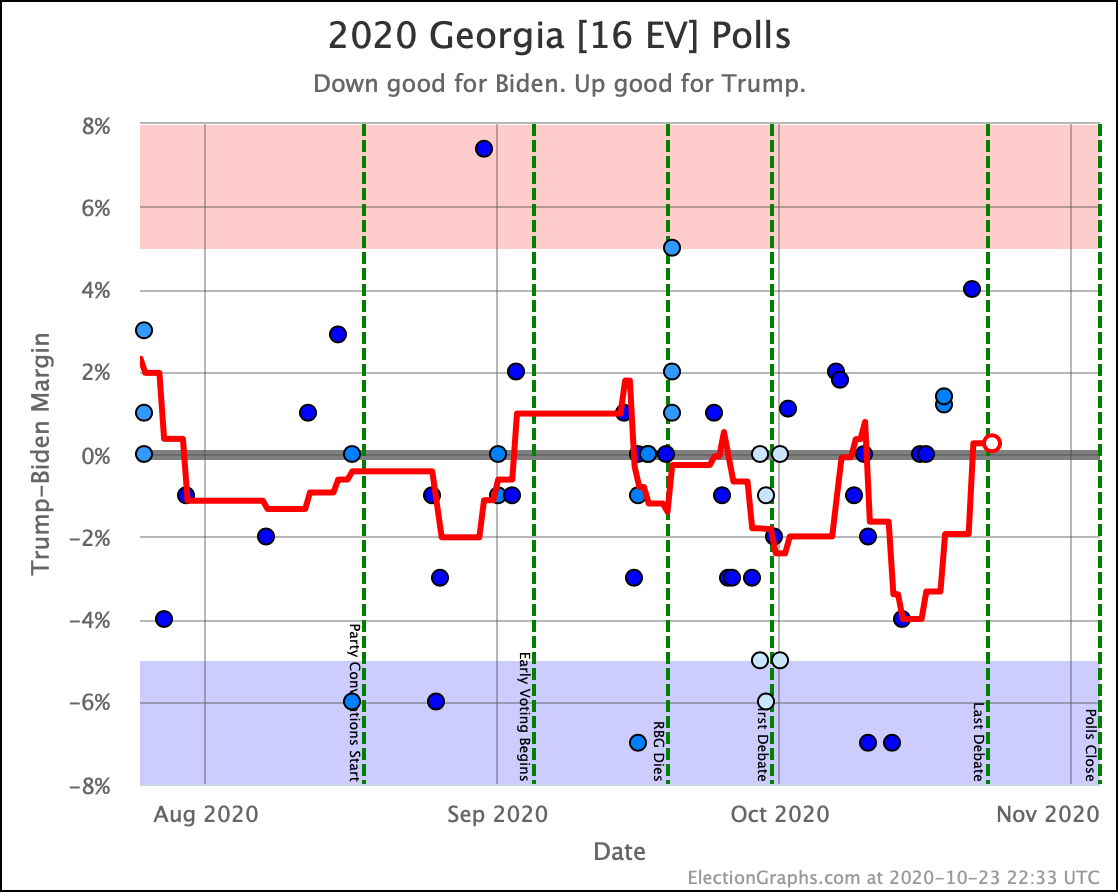
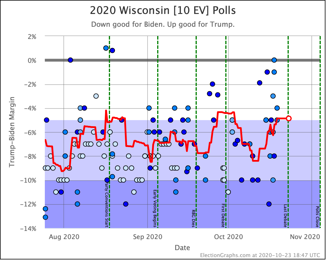
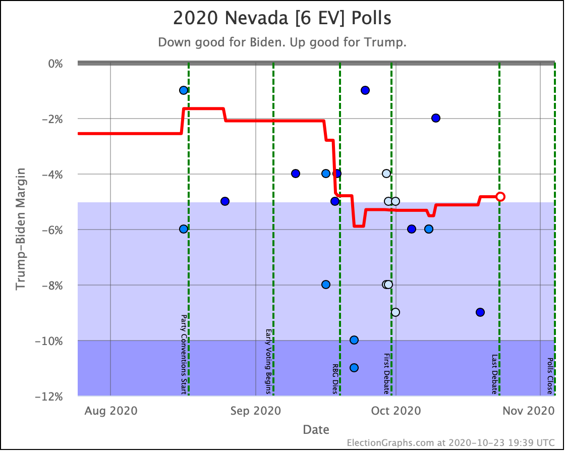
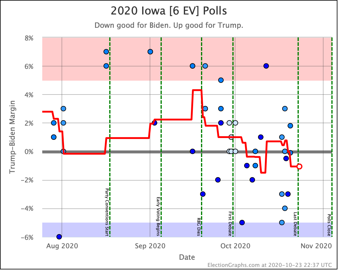
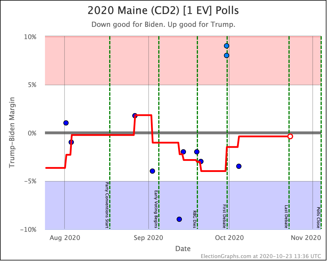
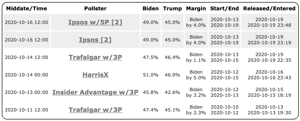
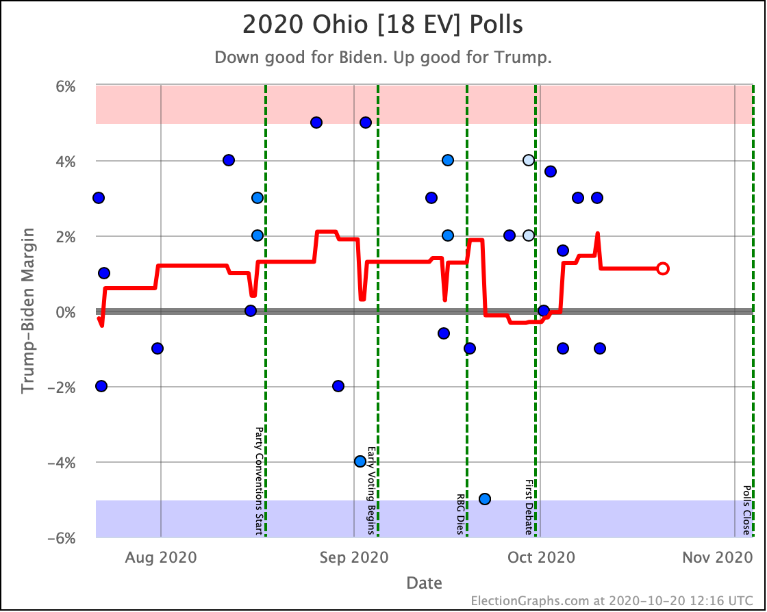
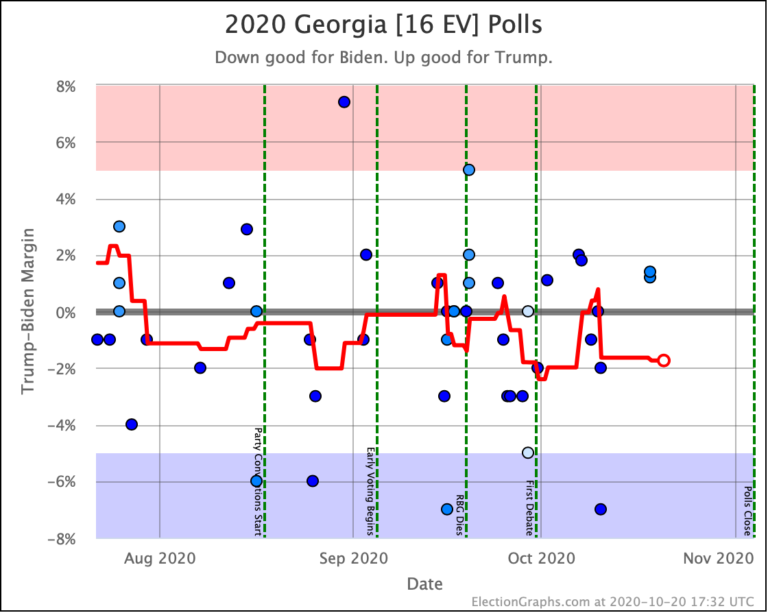
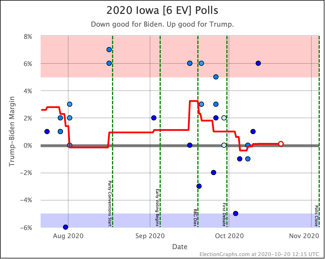
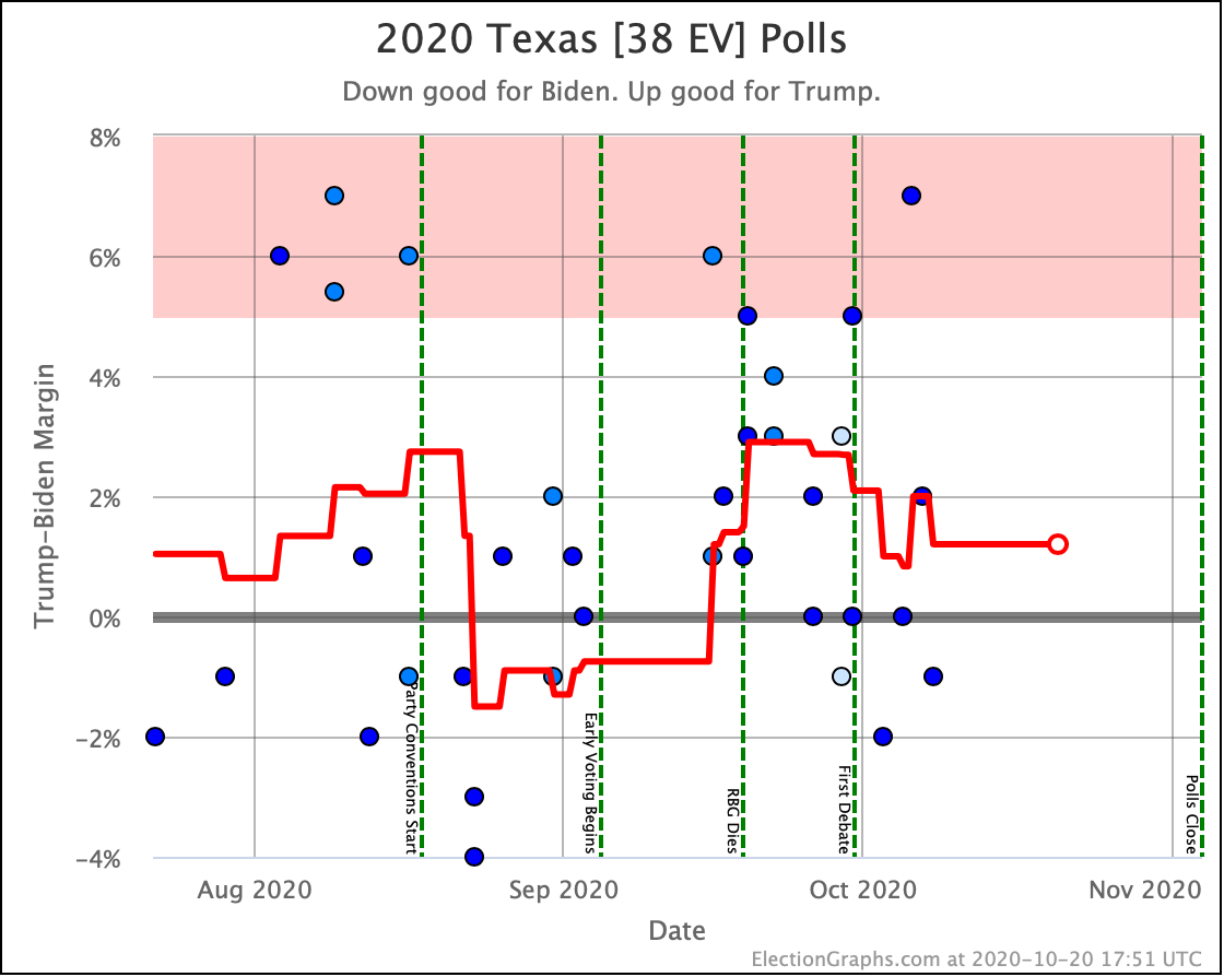
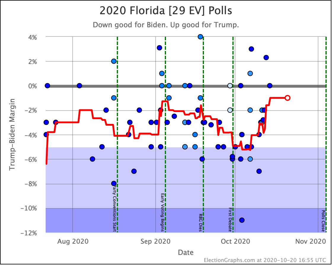
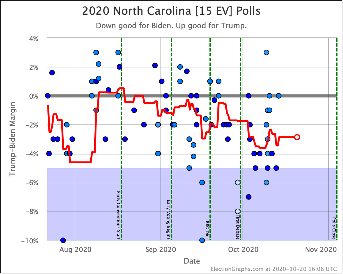
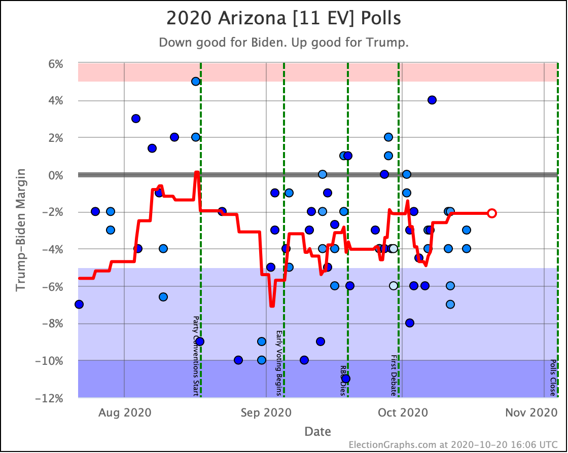
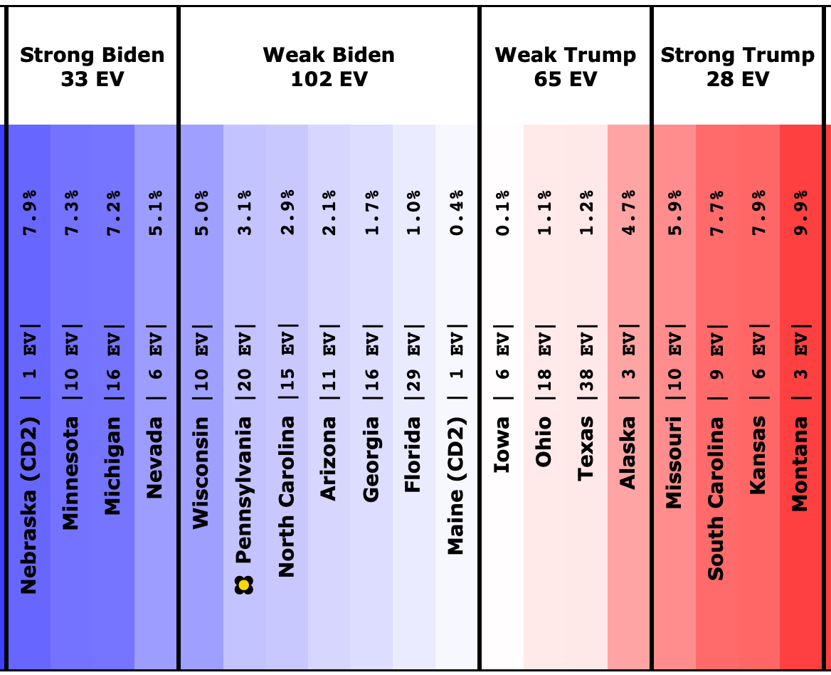
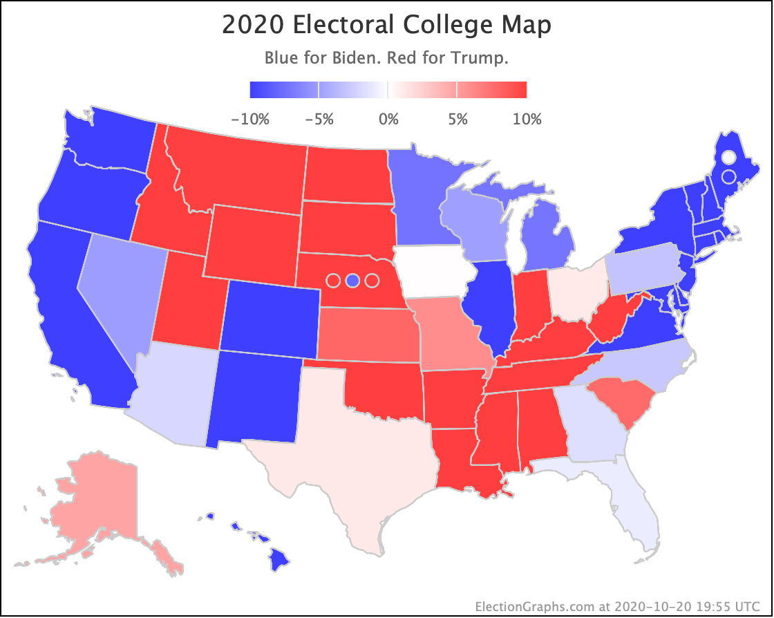
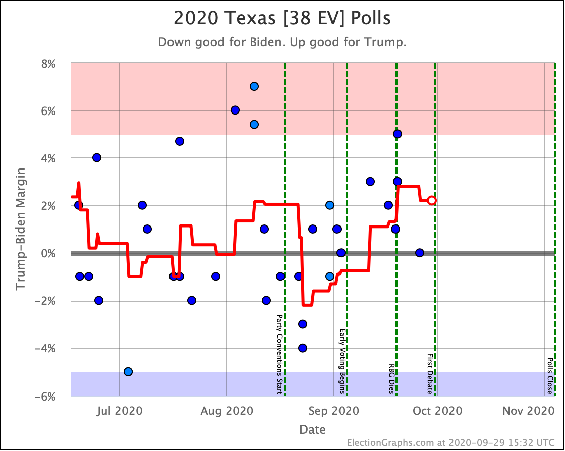
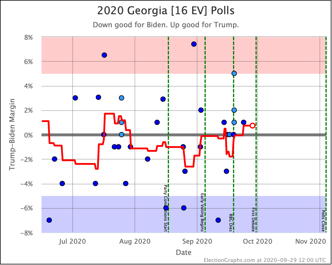
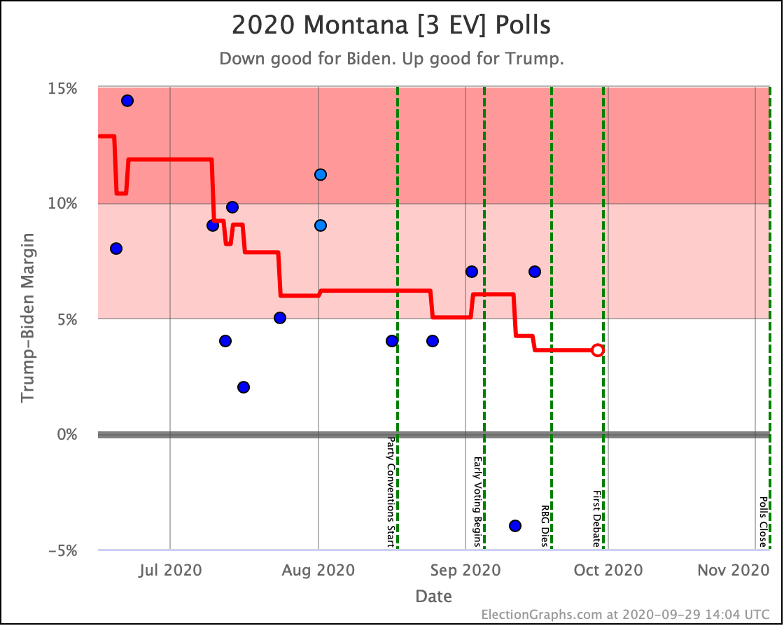
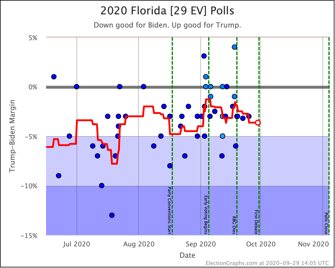
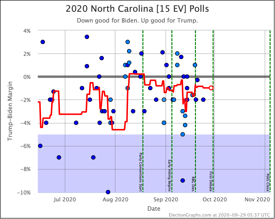
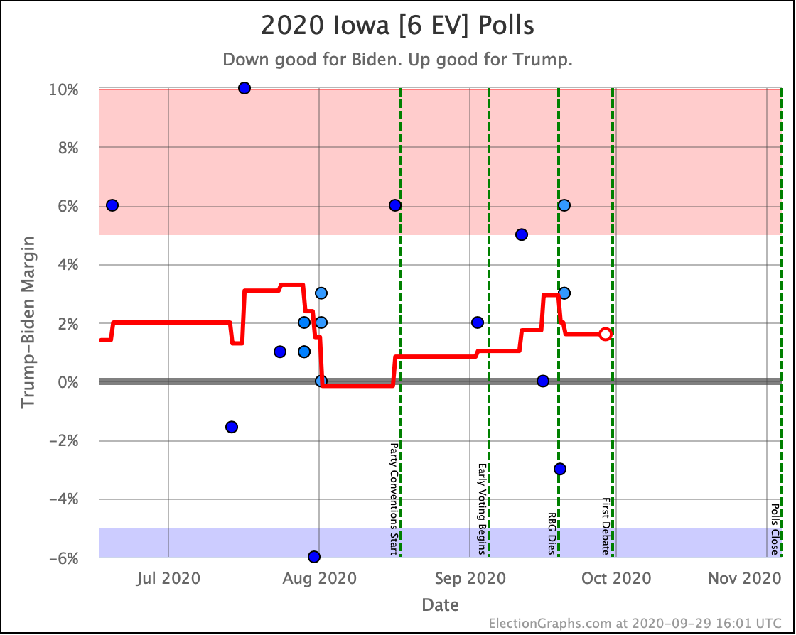
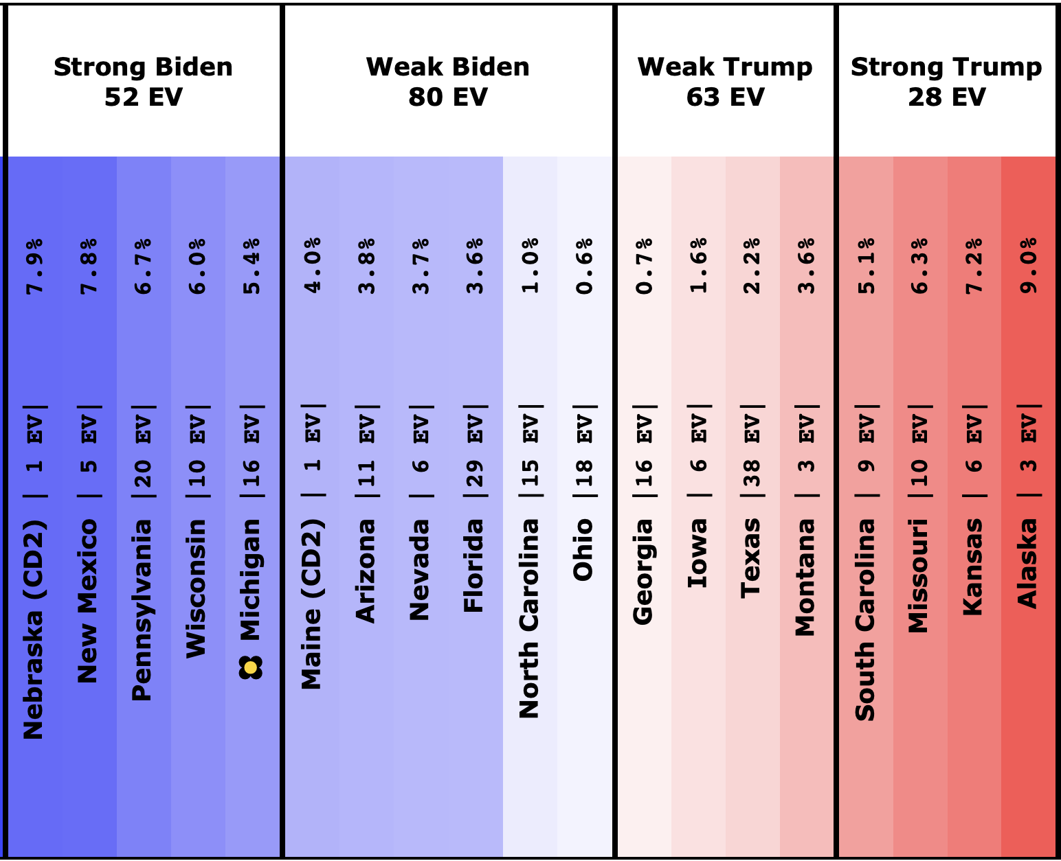
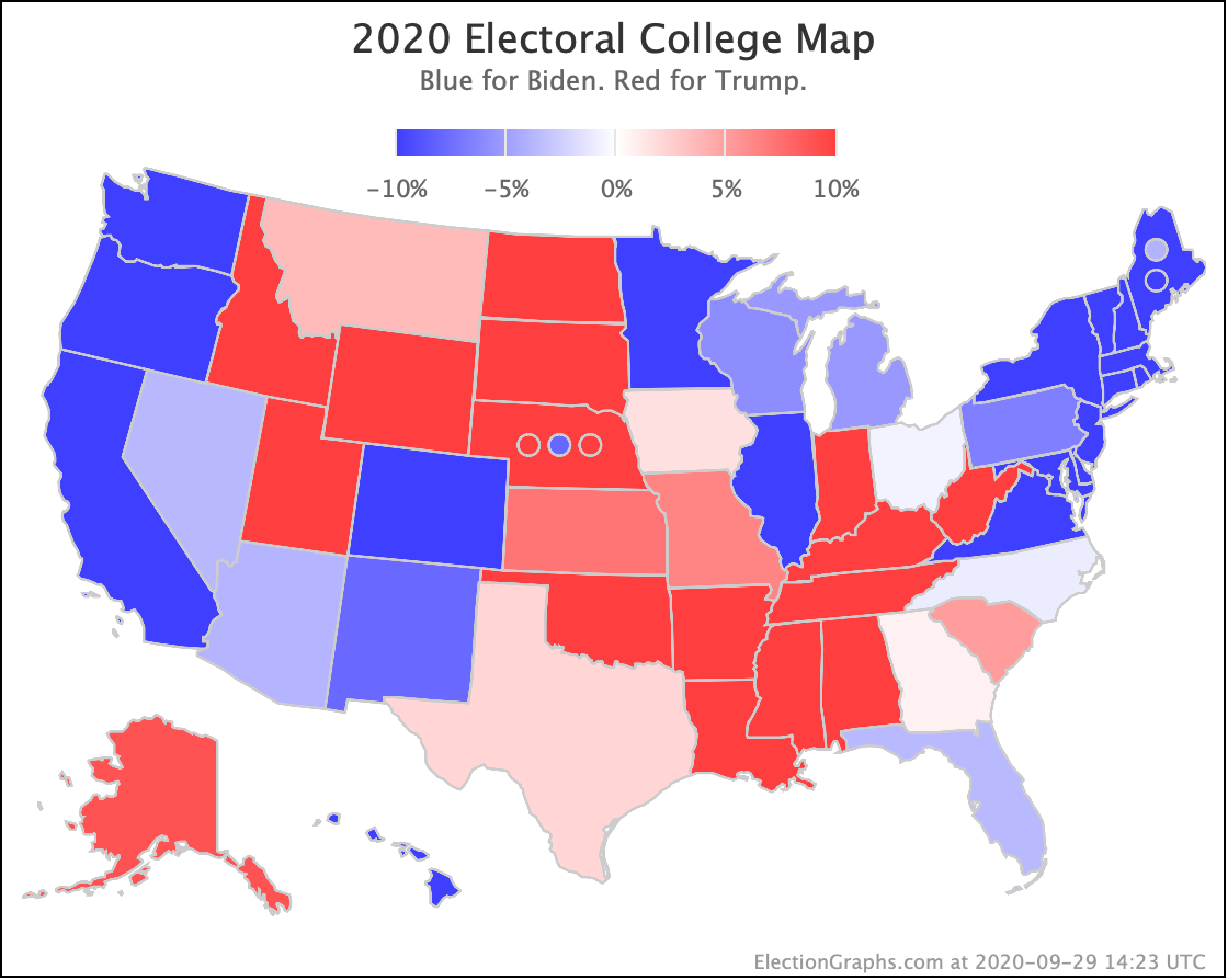
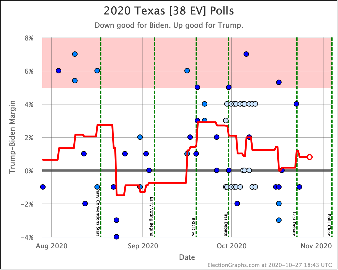
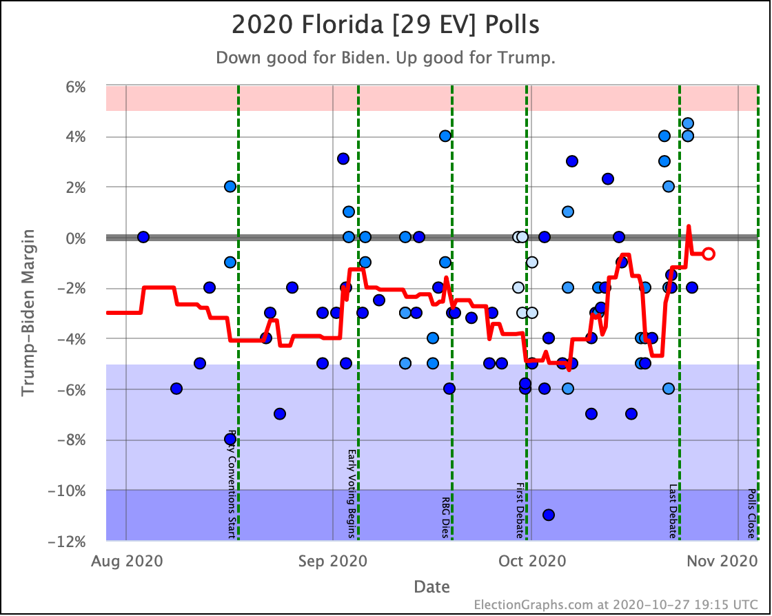
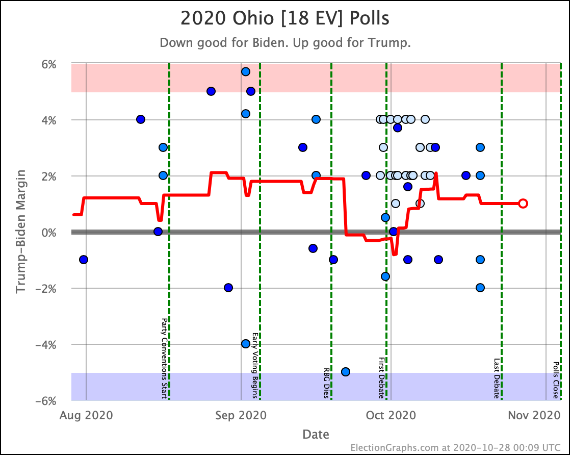
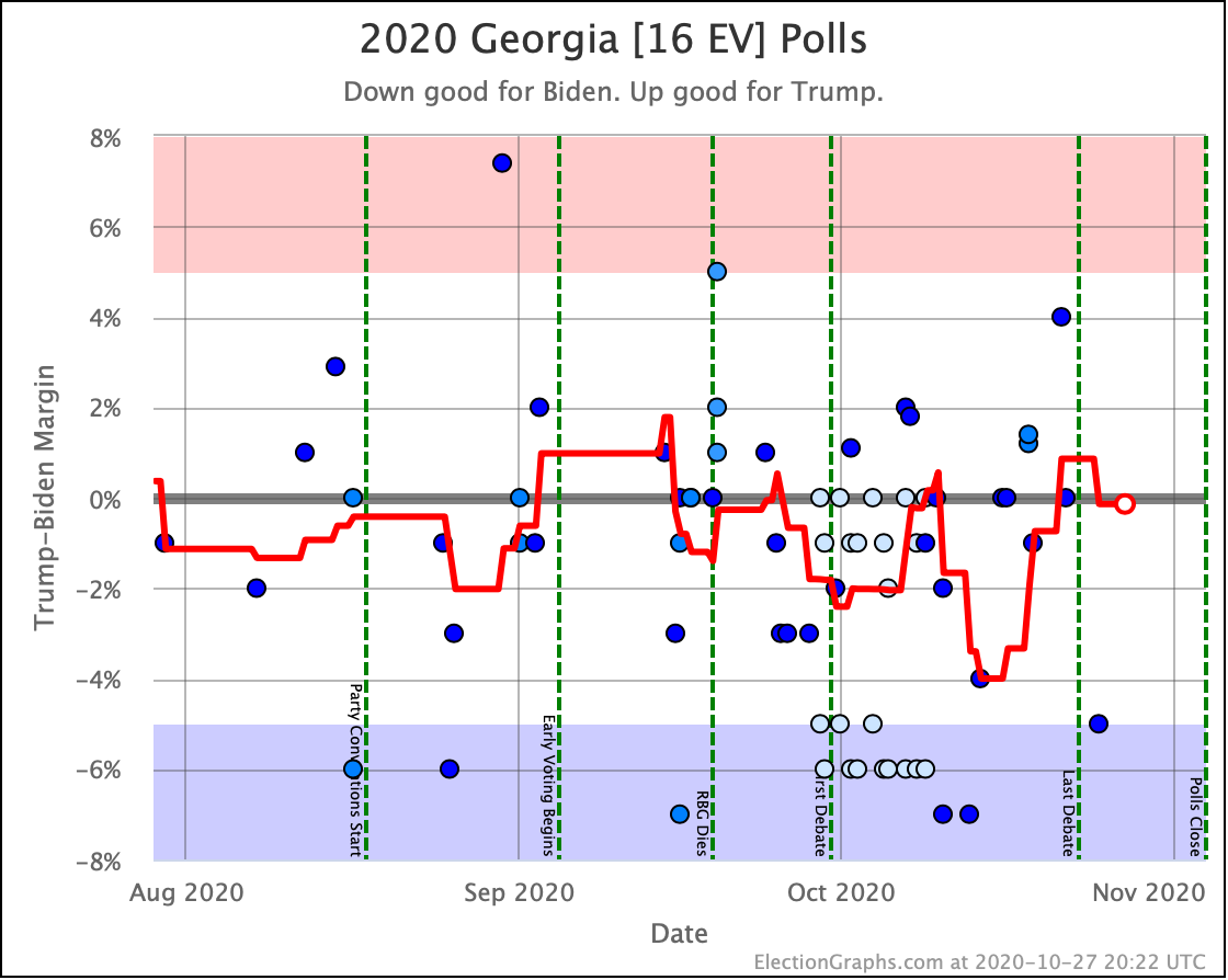
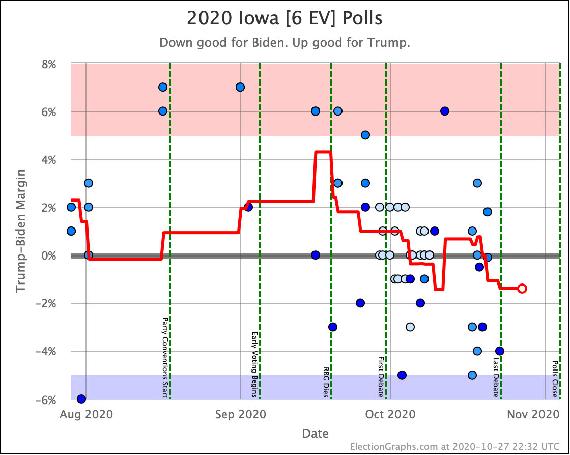
Some states have bounced around. Biden had taken a tiny lead in Texas last time. Texas has now moved back to a small Trump lead. Meanwhile, Georgia had bumped into a small Trump lead but is now back to a small Biden lead. Iowa crossed the center line too, moving from Trump to Biden. Florida moved from Weak Biden to Weak Trump, and then back to Weak Biden again since last time as well.
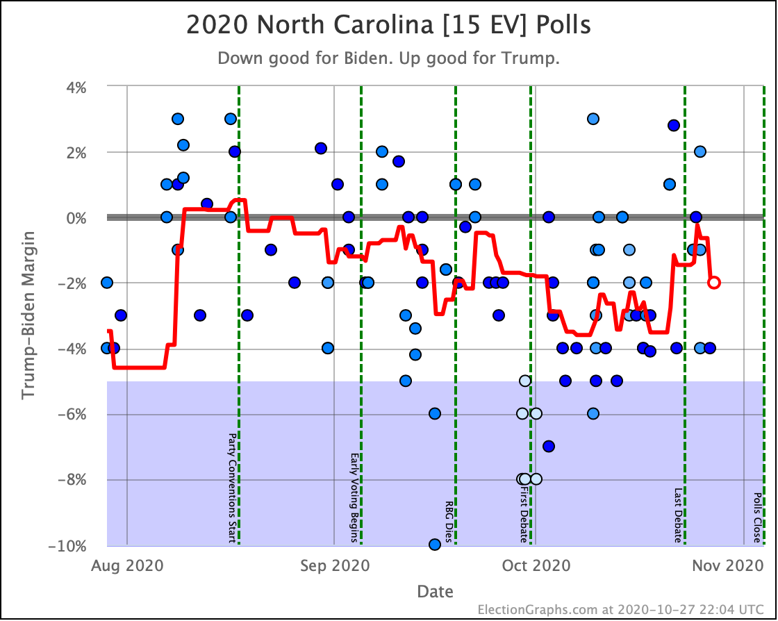
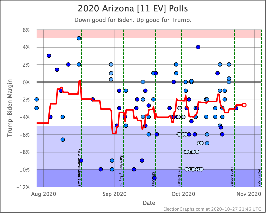
All of these are states that are really toss-ups getting jostled around by whatever individual polls come out at any given moment. There is still no evidence of any sustained trend.
It looks like we are back once again to the part of the normal range that is most favorable to Trump, but we are still in the same range we have been since June. That translates to the reasonable possibilities ranging from a narrow Trump win if there is a substantial polling error or last-minute move, to a Biden landslide if the error or move goes in the other direction.
That entire range is reasonably possible, but the most likely outcome continues to look like a Biden win of a magnitude somewhere between Obama's 2012 win and Obama's 2008 win.
So with that out of the way, let's just look at all of the graphs.
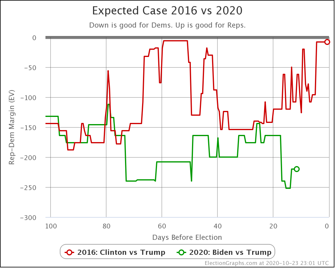
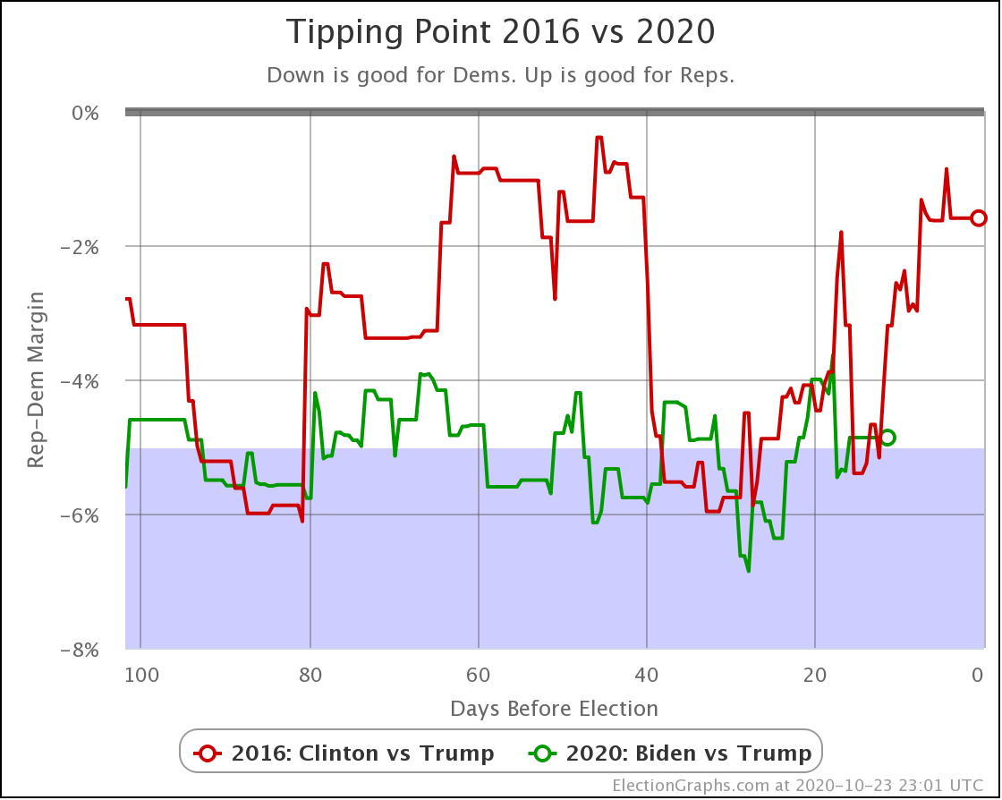
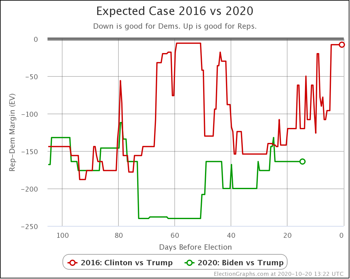
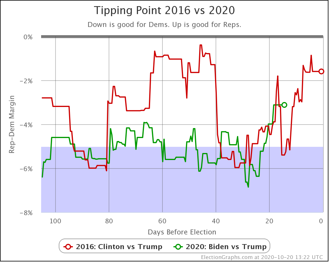
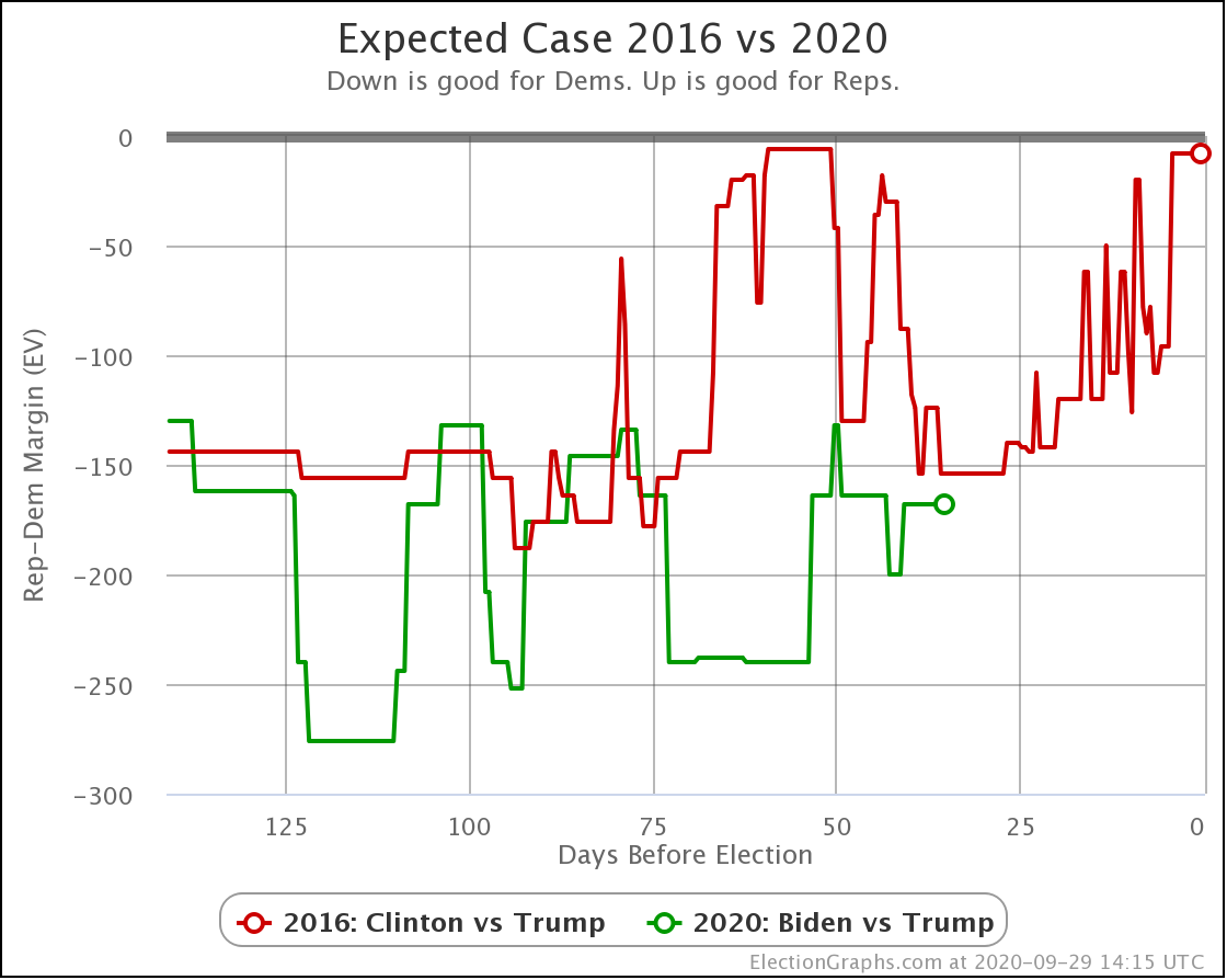
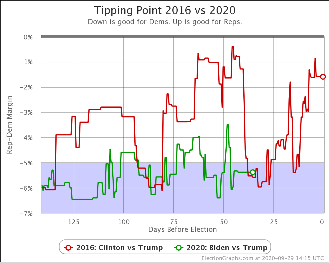
This time, we'll start with 2020 vs 2016 comparisons since that continues to come up again and again in the discussions of this election cycle.
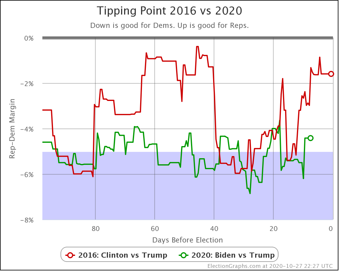
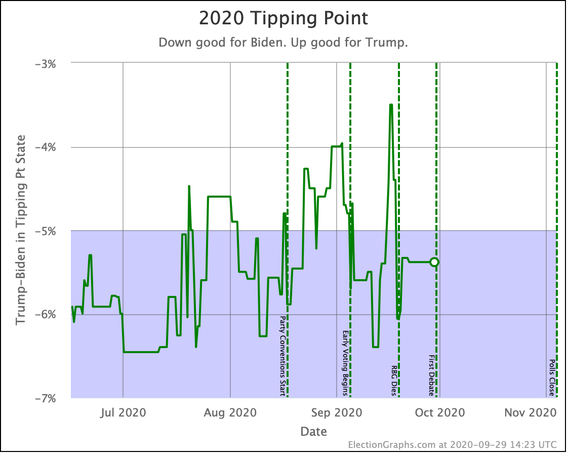
In the tipping point, which represents the degree polls need to be wrong and/or change before the end in order to flip the winner, Biden now holds a 4.4% lead. Clinton had dropped to 1.3% by this point in 2016.
Biden is closer to the 4% end of his 4% to 6% range than he is to the 6% end, but he is still in the same zone he has been in for a long time. By this time Clinton had collapsed and there was a really close race happening.
To be fair though, 7 days out from the 2016 election we didn't know this yet. Her tipping point number at the 7-day mark as we look back at it today is influenced by polling that was in the field at this point, but not actually released until the last few days before the election. The first Election Graphs post noting the final Trump surge in 2016 came at the 4-day mark.
So while we haven't seen any signs of Biden collapse yet, and Biden's pattern has been much less volatile than Clinton, this is just another reminder that Clinton's final collapse didn't show up here until the very very end.
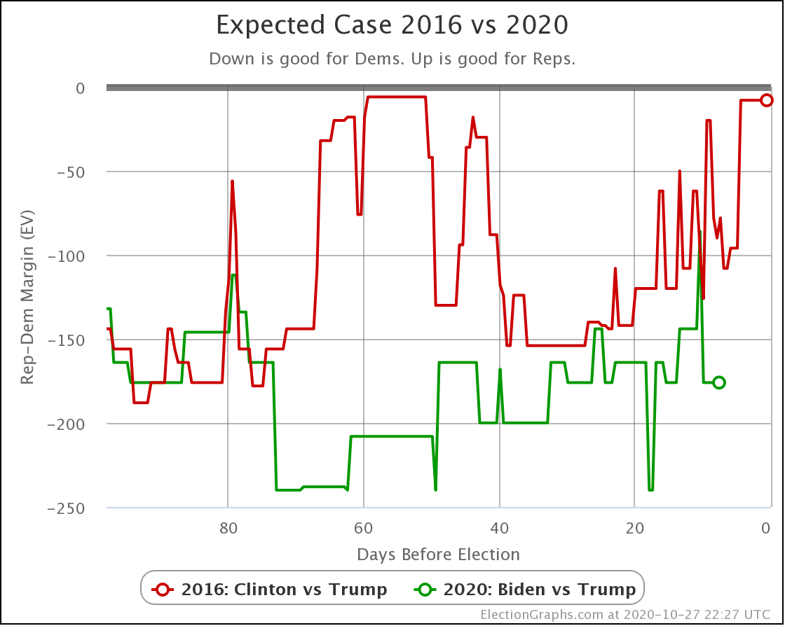
In terms of the expected case, where each candidate wins every state where they lead the Election Graphs average, Biden is pretty much in the center of the normal zone. Within the last two weeks, the expected case has ranged from Biden +86 to Biden+240. That is a huge range!
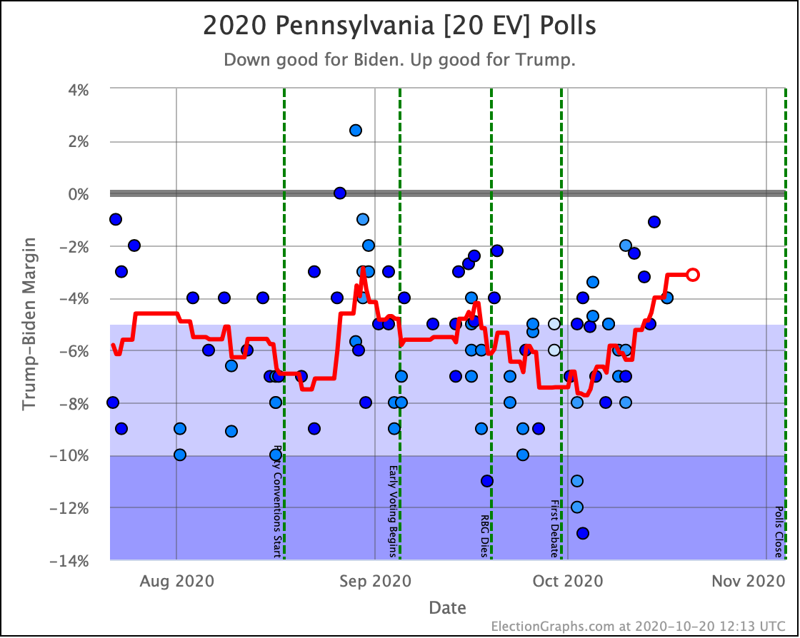
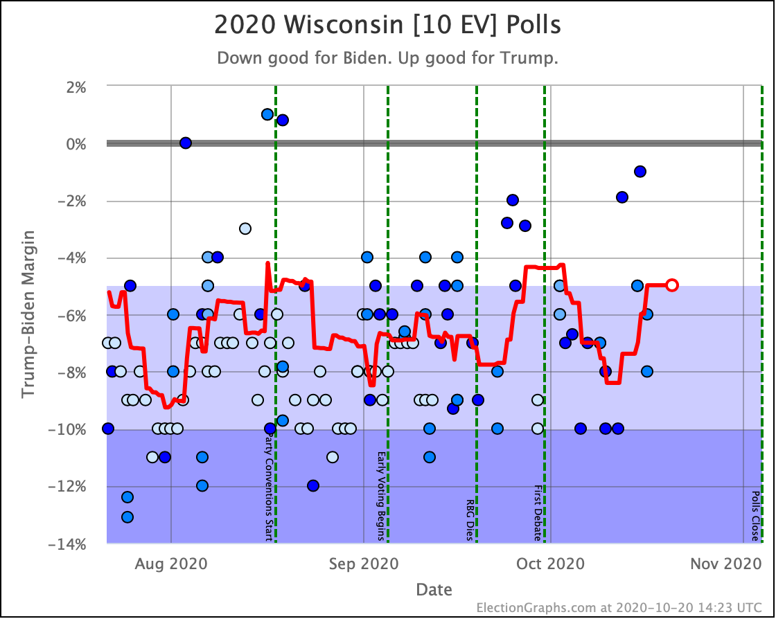
But with Texas (38 EV), Florida (29 EV), Georgia (16 EV), and Iowa (6 EV) all close enough that they are flipping back and forth across the center line semi-regularly, having volatility of this sort should be expected. With the exception of one brief moment though, Biden has consistently been ahead of where Clinton was four years ago, and usually by quite a bit.
OK. Forget 2016 now.
Time for the three envelopes we have covering this year:
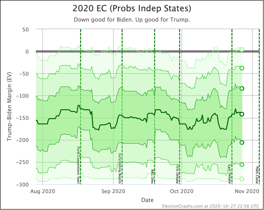
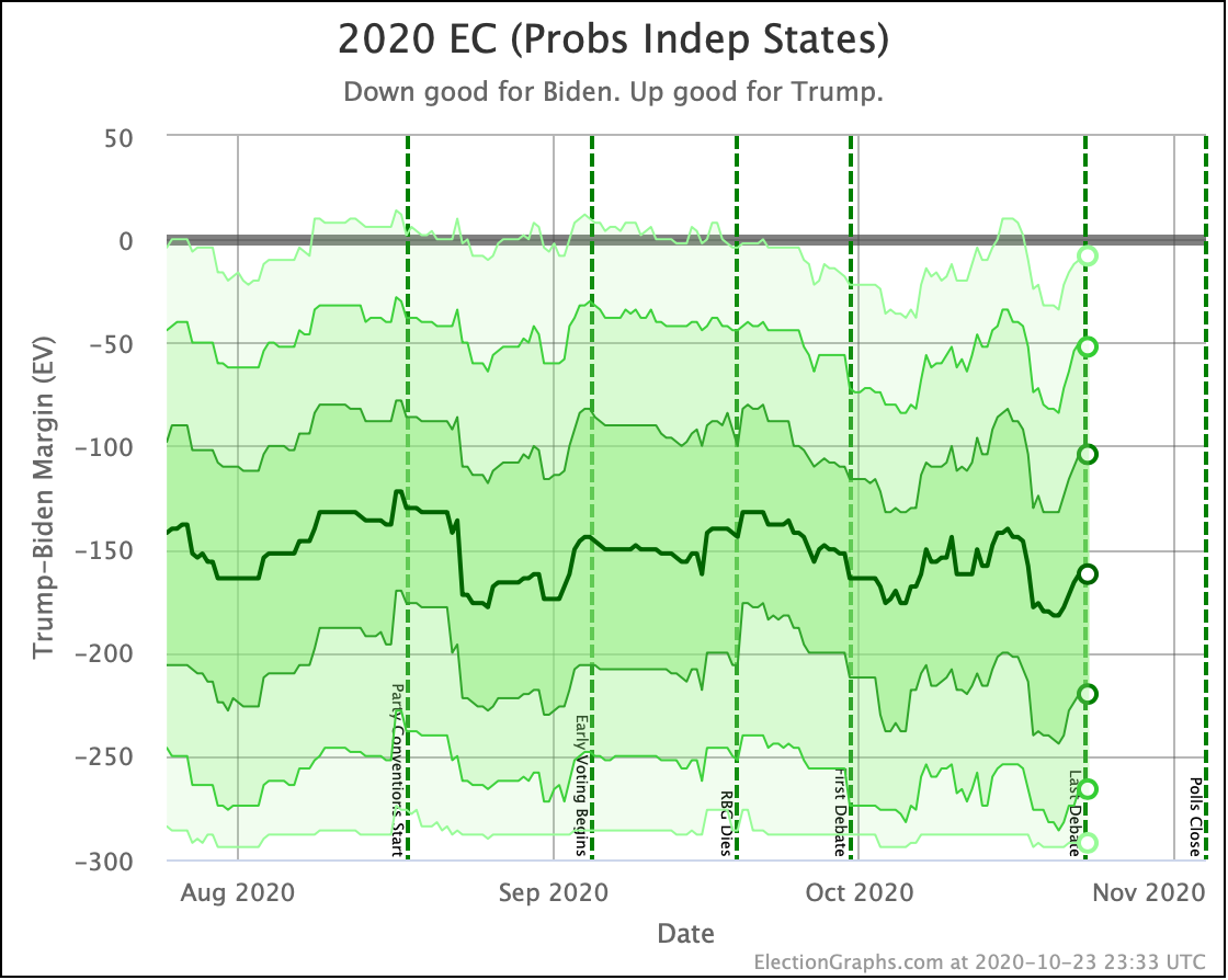
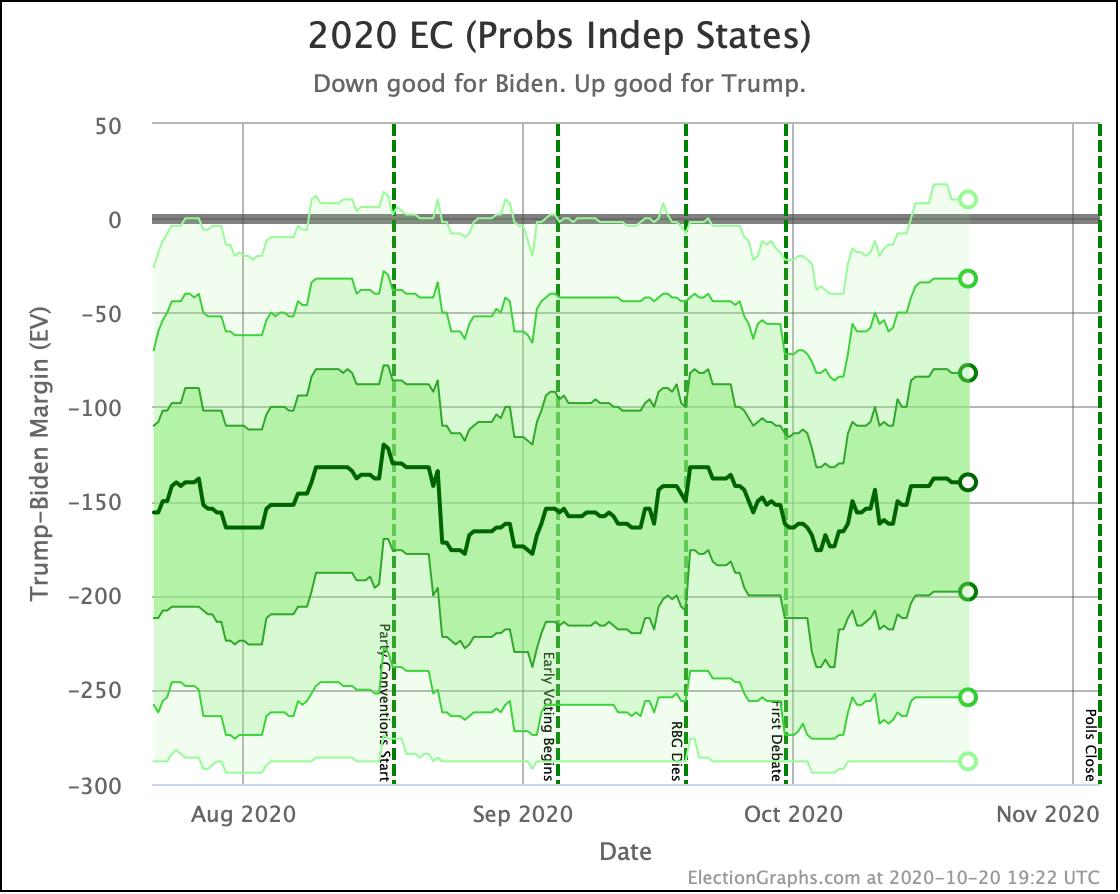
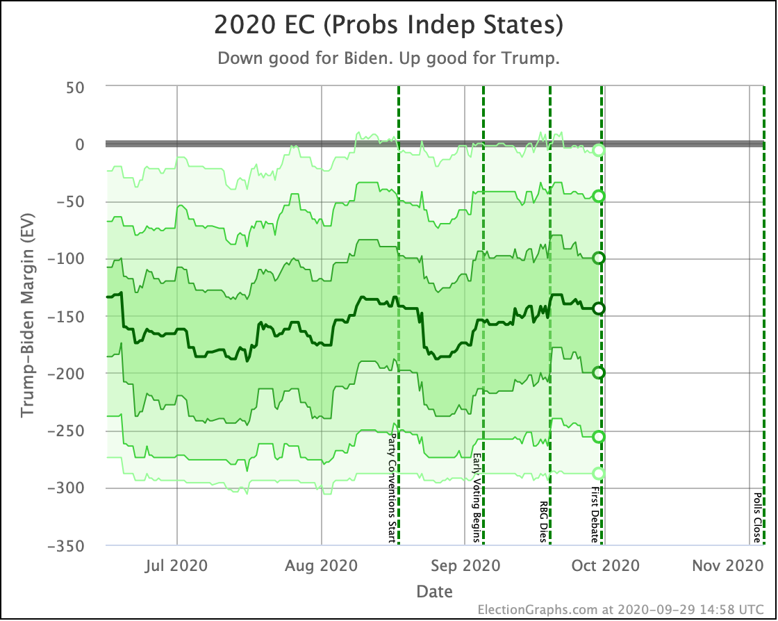
Our median of the probabilistic view assuming all states are completely independent shows us near the top end of the normal range, but still in the range.
The 3σ envelope (99.73% of all outcomes within the bubble) just barely stretches to a Trump win by 4 EV, while the other end of this bubble would be Biden winning by the largest margin since Bush beat Dukakis in 1988.
The darker bubbles are of course more likely than those extreme scenarios. The 1σ (68.27%) range goes from Biden by 84 to Biden by 206. Comparing that to previous elections, that is basically from a narrow win similar in scale to Trump's win in 2016 to a Clinton 1992 level win on the other.
Converting this to odds, this view has Biden with a 99.8% chance of winning. This is down a little from before, but still so close to 100% that our chart of this just looks like a blue box. So we once again skip that chart.
As we have discussed before though, the independent states view results in the narrowest possible distribution of possibilities, since a candidate outperforming the polls in one state tends to be balanced by underperforming in another.
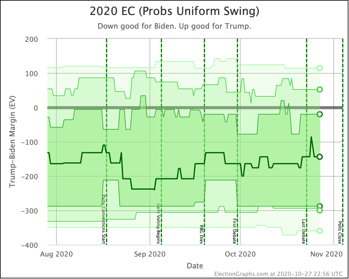
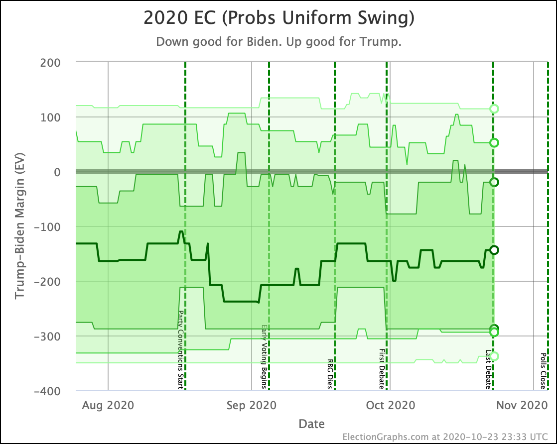
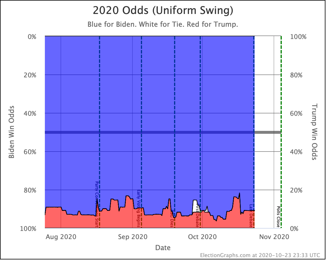
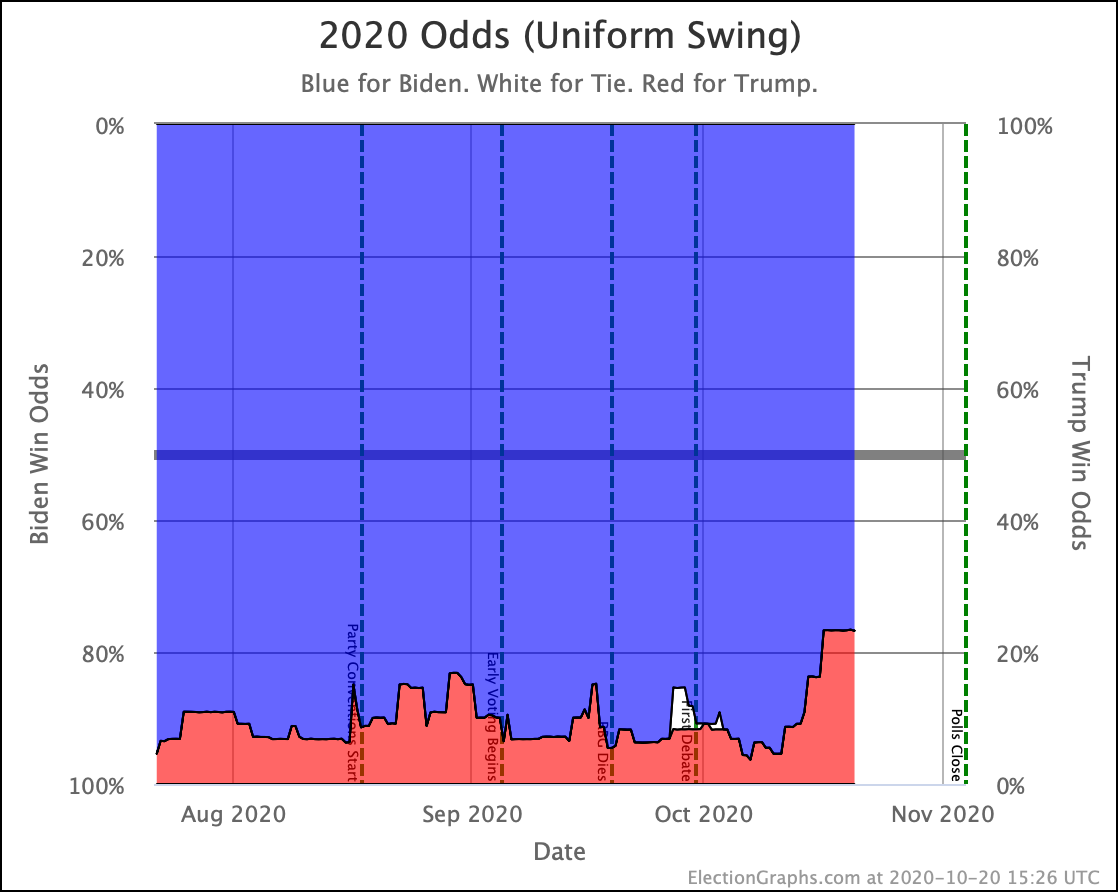
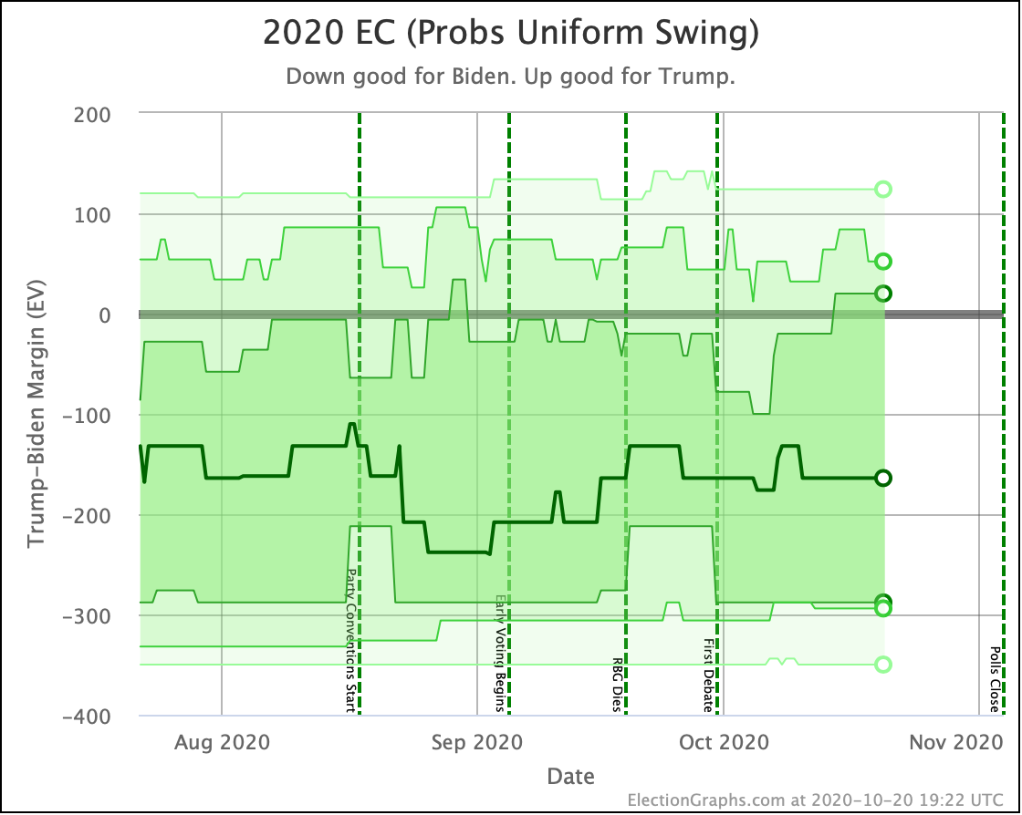
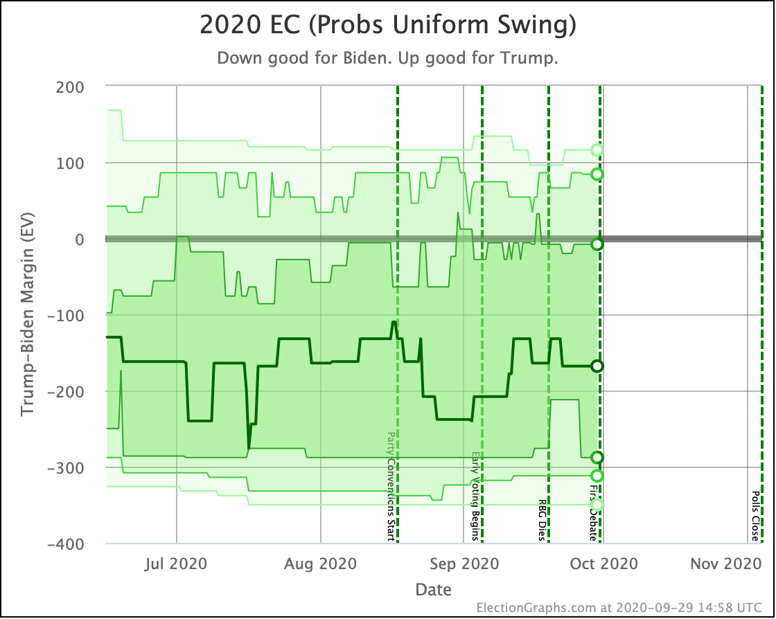
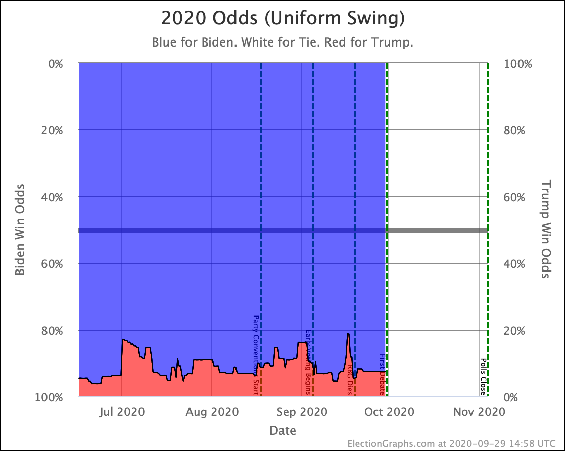
The uniform swing view instead locks all the states so they move together. This results in a much wider range of possibilities, since now if a candidate overperforms the polls, we assume they do so in EVERY state.
With this view, the 3σ (99.73%) range goes all the way from Trump beating his 2016 numbers with a 114 EV win, to Biden having a landslide even bigger than Bush in 1988 (but not quite as big as Reagan in 1984).
This view also shows a race with very little movement though.
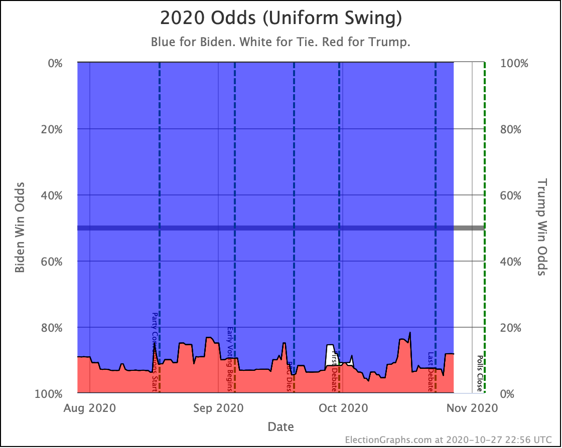
Looking at the odds corresponding to the uniform swing view, Trump is now at an 11.8% chance of winning. Again, not breaking new ground.
Both of these views are extremes though. The official Election Graphs view of Trump's chances at this point is "between 0.1% and 11.8%". The middle of that range is just about 6%, but we don't specify a spot within the range since we haven't modeled how much correlation between states to expect.
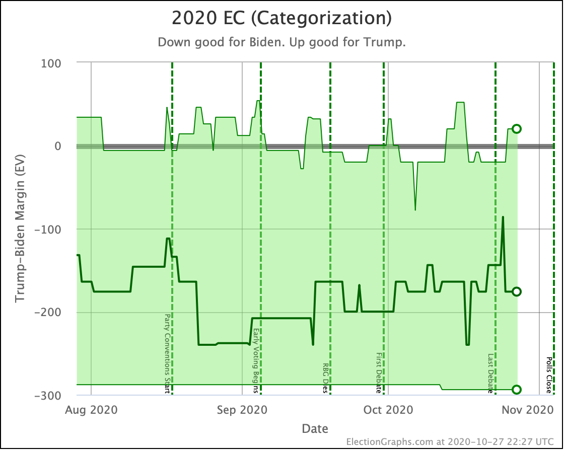
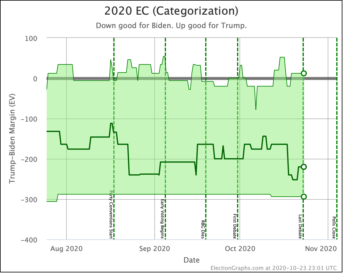
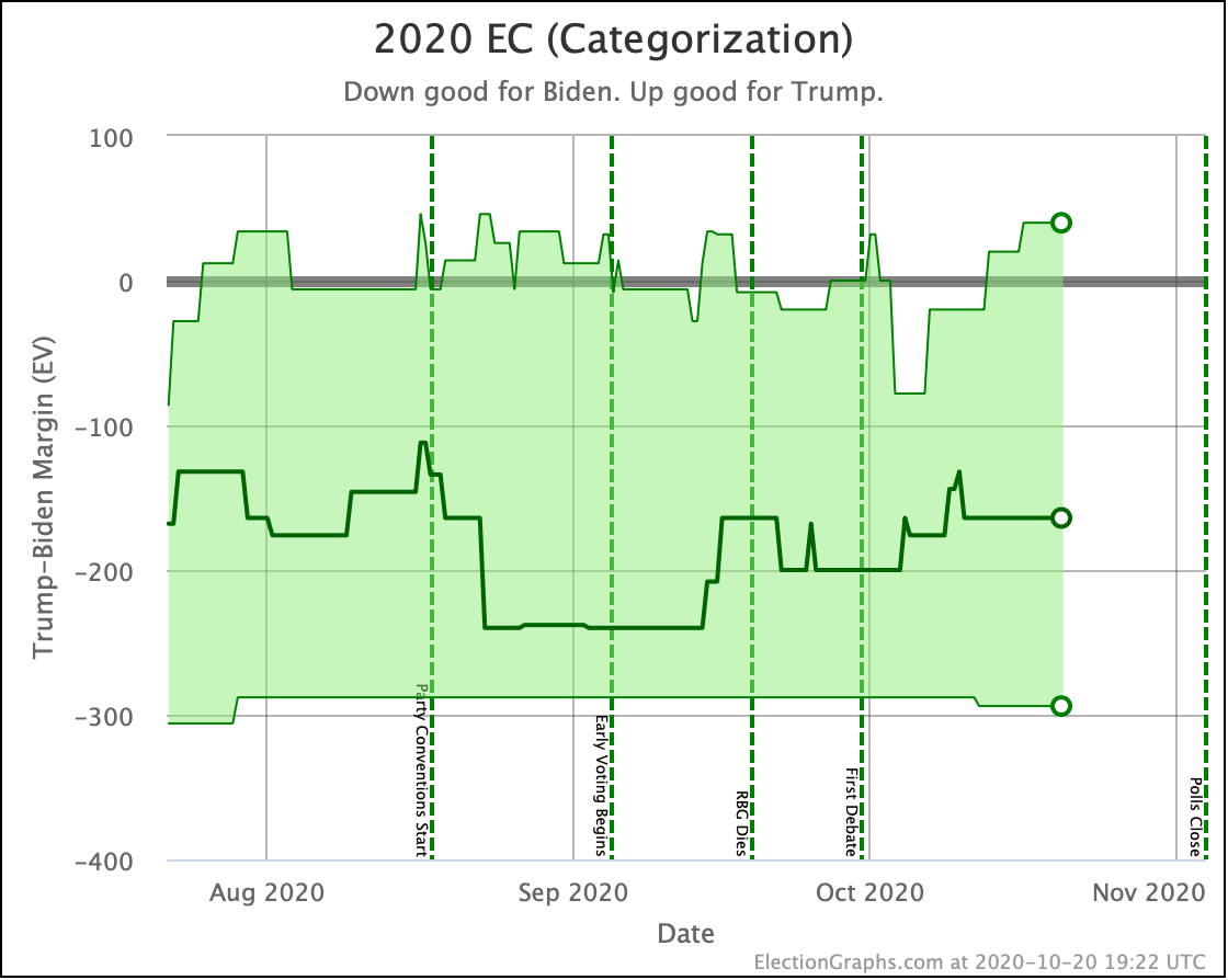
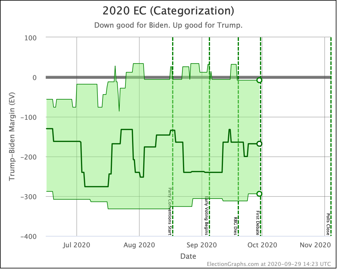
And of course the good old categorization view we have used on Election Graphs since 2008. The lack of movement in this race is even more obvious in this view.
Biden's best case (where he wins every single state with a margin under 5%) barely moves at all.
Trump's best case does wander a little bit as some blue states dip over and under the 5% Biden lead line, but there is no trend here. At the moment though, if Trump wins every one of the close states, he squeaks out a 20 EV win.
Similarly, the centerline just meanders up and down as the very close states move back and forth between "Weak Biden" and "Weak Trump" as new polls bat them back and forth.
But overall, we just don't have any substantial change in the overall picture or trend in months.
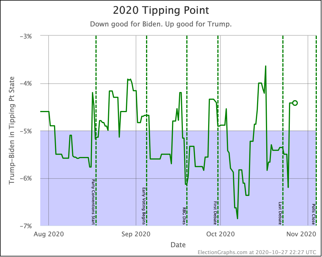
Without the 2016 comparison line, we're more zoomed in on the tipping point here, so it looks like this is swinging dramatically, but that is just the scale. Aside from very brief moments, this has been between 4% and 6% for months.
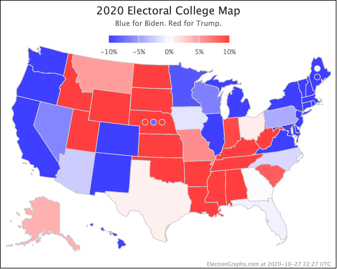
OK, now the map and spectrum of the states:
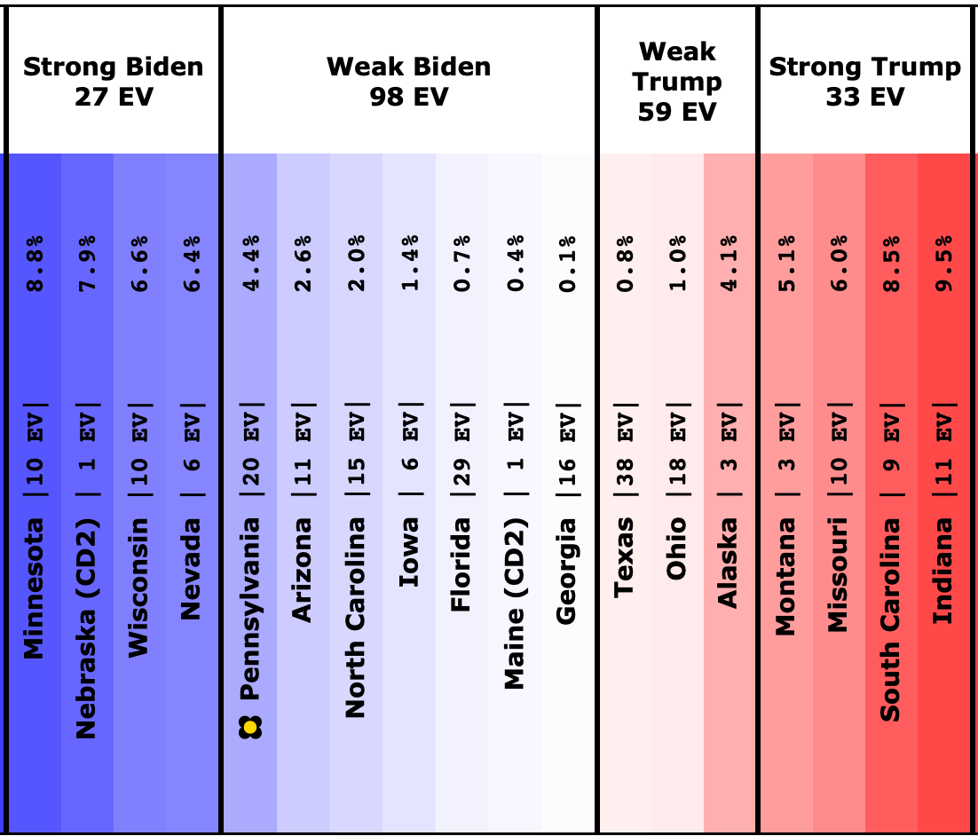
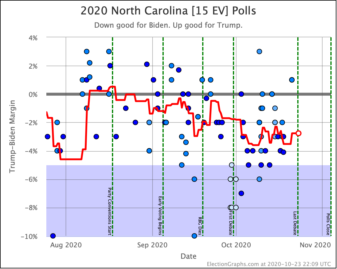
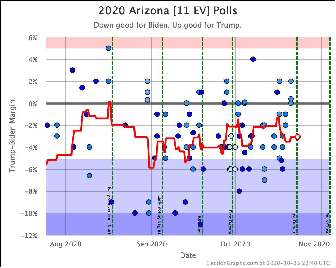
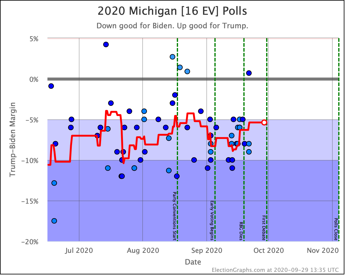
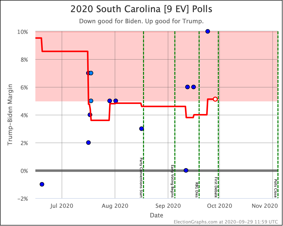
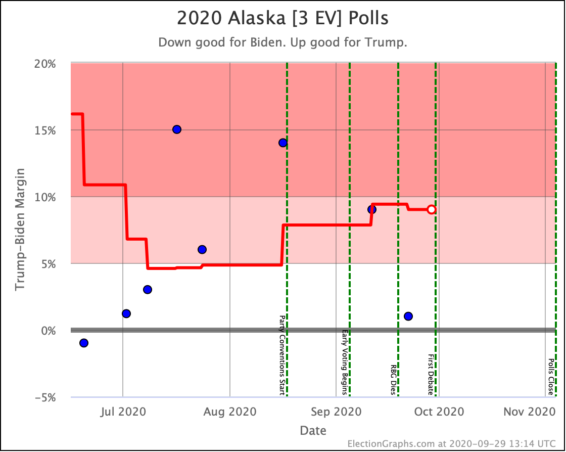
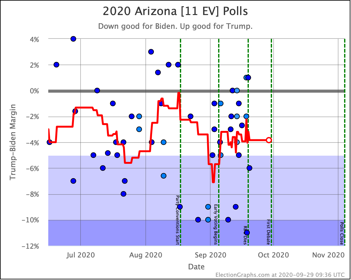
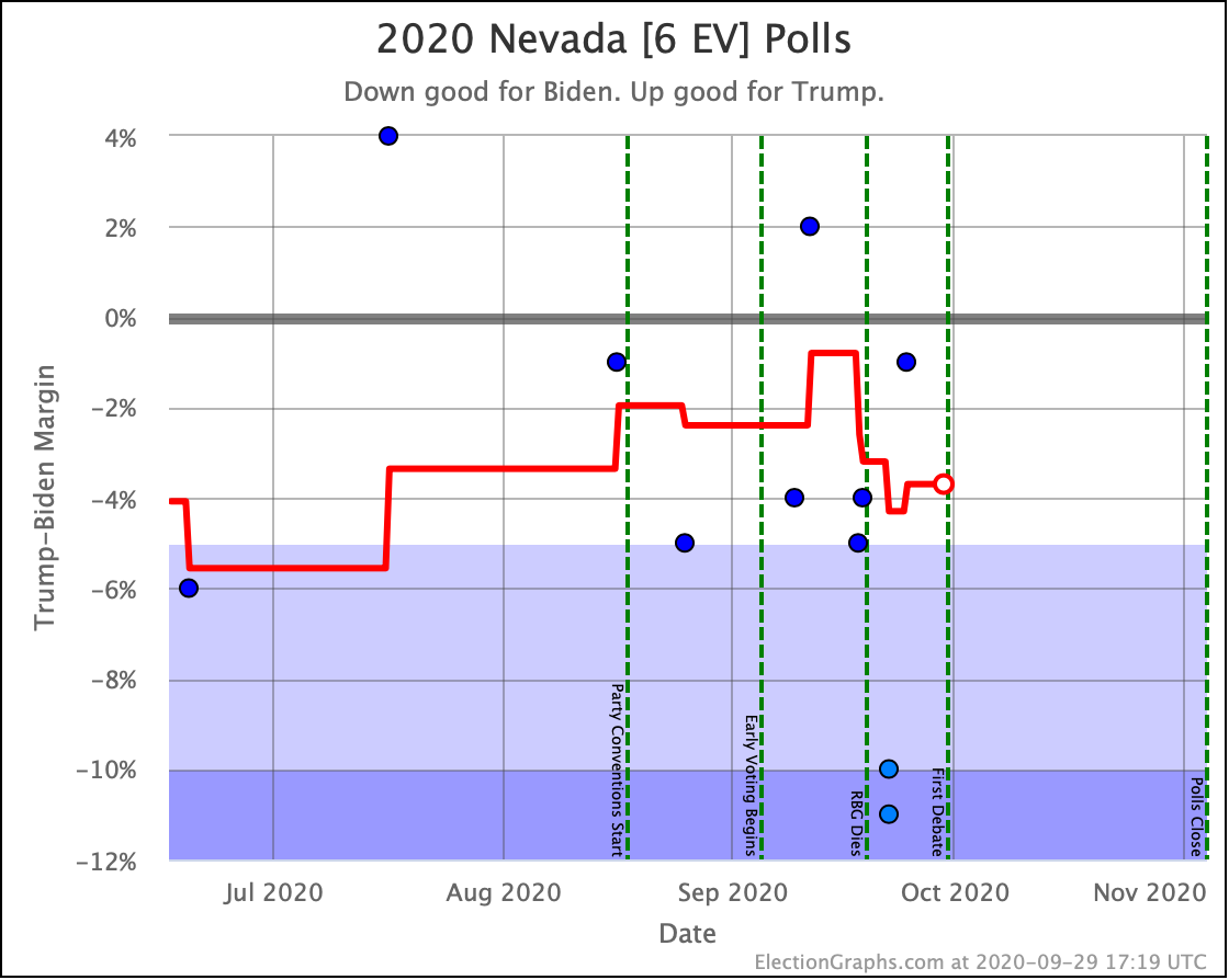
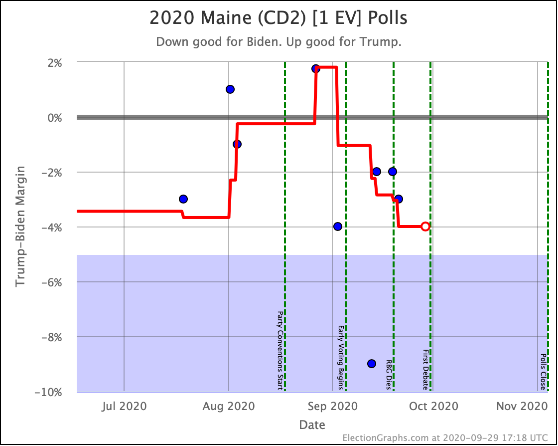
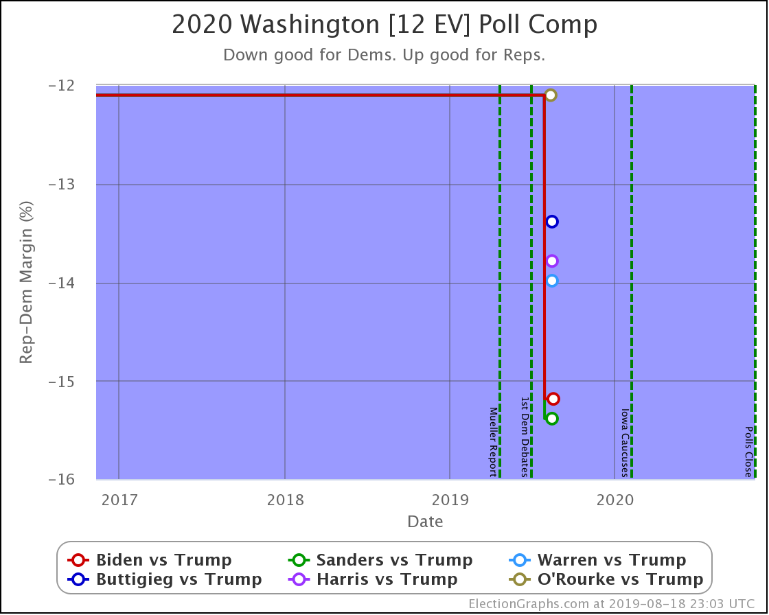
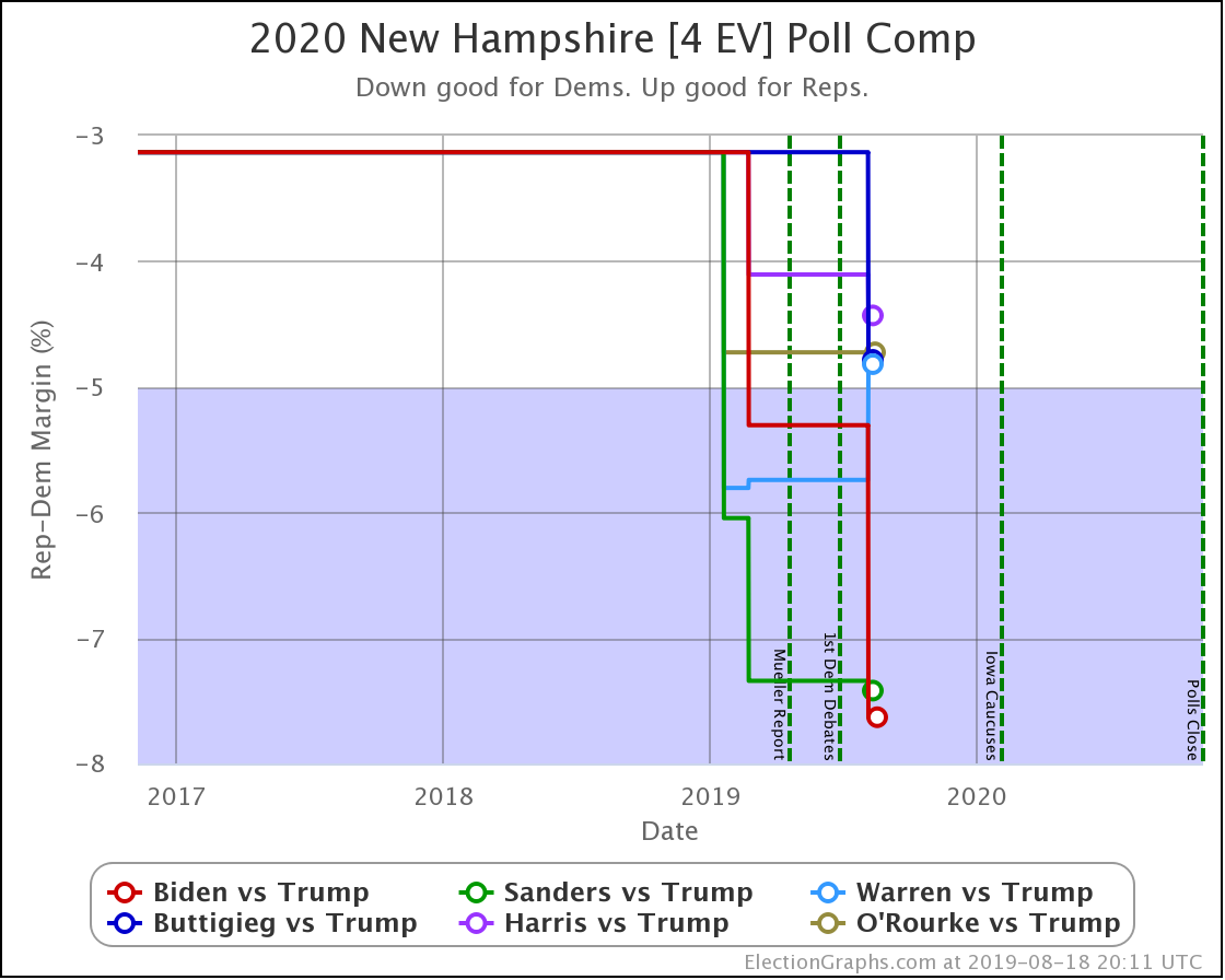
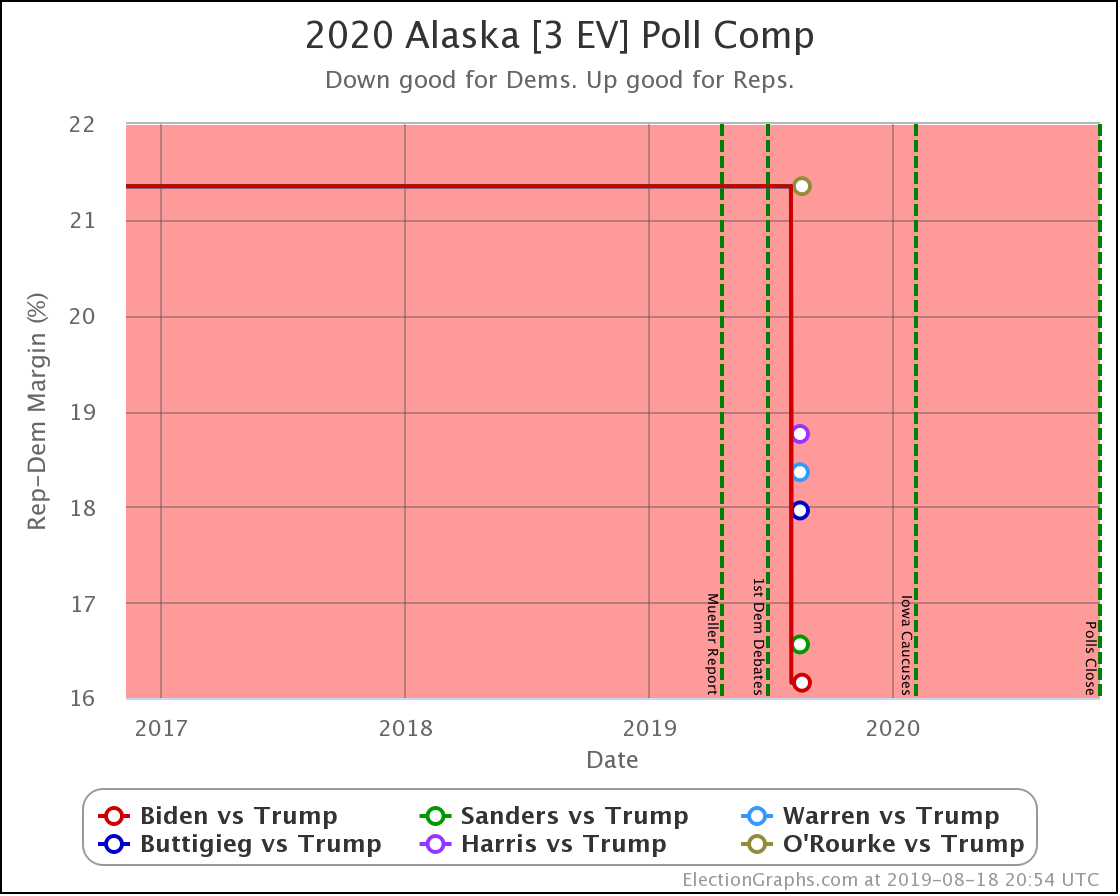
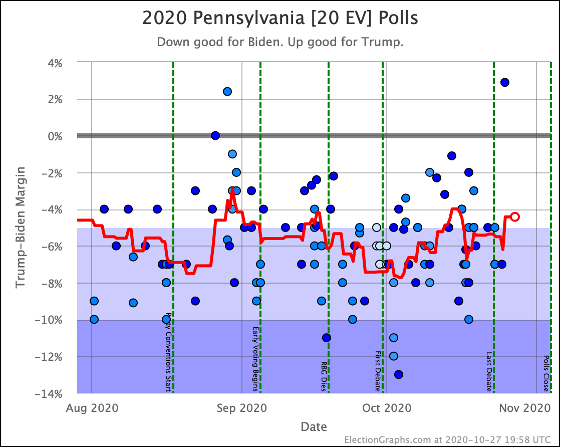
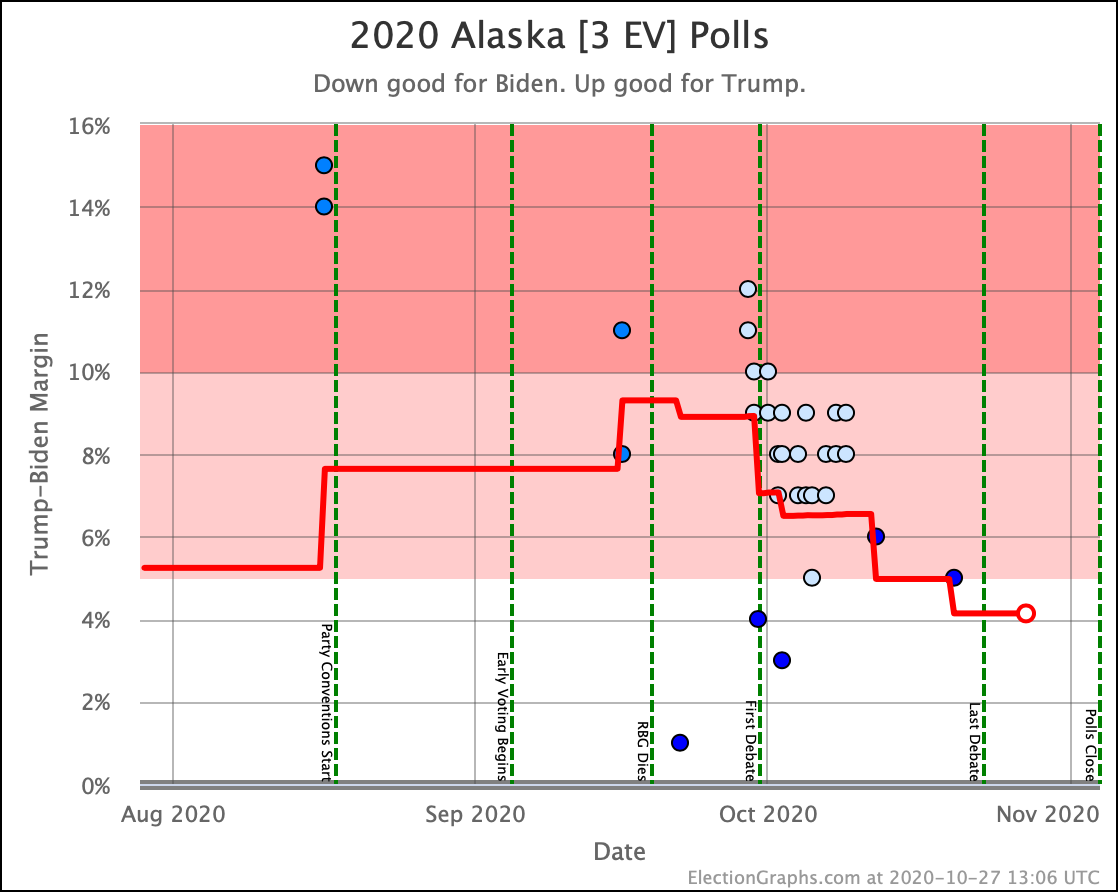
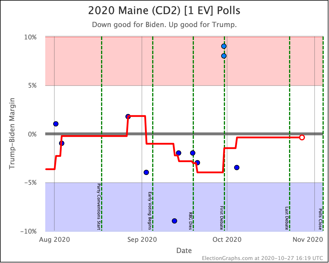
And now the trends in all the close states:
And that is that.
7.0 days until the first results start coming in on election night.
One week. That's all.
For more information:
This post is an update based on the data on the Election Graphs Electoral College 2020 page. Election Graphs tracks a poll-based estimate of the Electoral College. The charts, graphs, and maps in the post above are all as of the time of this post. Click through on any image for current interactive versions of the chart, along with additional details.
Follow @ElectionGraphs on Twitter or Election Graphs on Facebook to see announcements of updates. For those interested in individual poll updates, follow @ElecCollPolls on Twitter for all the polls as I add them. If you find the information in these posts informative or useful, please consider visiting the donation page.