
I'm sure anyone reading blog posts on Election Graphs already knows about all the drama about getting results from the Iowa caucuses. So suffice it to say that they had some issues.
The 2020 Delegate Race page has been updating whenever new results have become available over the last few days. For the most part, we use the excellent delegate breakdowns at The Green Papers as our definitive source for this information. You can find their current detailed status of the Democratic results in Iowa here. Note that they present a more conservative estimate at the top of the page, but a more aggressive estimate (using more provisional data) at the bottom of the page. Election Graphs uses the second estimate.
The delegate estimates here represent the best estimates for national delegates at the point the Iowa Democrats reported 100% of the vote counted. These may change slightly if there are corrections or recanvasses based on some of the irregularities that were found. And they almost certainly will be adjusted months down the line when national delegates are actually selected at the Iowa Democratic Convention in June.
With that in mind, let's jump right in and explain the central chart that Election Graphs uses to examine the delegate race. It isn't a straight forward chart of the number of delegates each candidate has accumulated either at the present moment or over time. You can find that kind of chart, and others, on the 2020 Delegate Race page. But the most important chart to watch is actually this one:
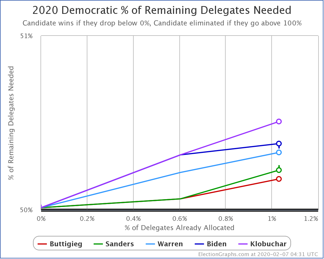
Rather than the date on the horizontal axis, we show the percent of available delegates that have been allocated so far. In the case of the Democrats this year, this is only the PLEDGED delegates (no superdelegates) since superdelegates will not be able to vote in the first round at the convention unless it is mathematically impossible for them to change the winner.
Using % allocated rather than date gives us a better idea of how far along we are in the race, given that primary and caucus dates are scattered across the calendar irregularly, and the number of delegates available on different dates varies wildly based on which and how many states are handing out delegates that day.
Even more critically though, the vertical axis is not simply a count of delegates. We do have that graph too. But the headline graph shows something that gives a much better idea of how the race is going.
Namely: The percentage of the remaining delegates each candidate would have to win in order to have a majority of the delegates (and therefore clinch the nomination).
If you support a particular candidate, you want this number to go DOWN. When it reaches 0%, a candidate has clinched the nomination. If it goes above 100%, on the other hand, then a candidate has been mathematically eliminated. (Absent pledged delegates being released from their pledges and voting a different way than they were "supposed" to.)
In practice, a candidate can be in a position where they have not yet been mathematically eliminated, but it becomes harder and harder to envision a scenario where they would win. For instance, if a candidate would need 60% of the remaining vote to win, but their percentage of the vote so far is only 40%, unless you know that they are really heavily favored in the remaining states, their chances are actually very slim.
Candidates who are on a pace to win will see their lines moving down.
Candidates who are not on a winning pace will see their lines moving up.
So, what do we see so far after the preliminary results from Iowa?
Well, everybody is moving up. This is quite simply because nobody got over 50% of the available delegates in this first round, which is where you start when nobody has any delegates yet. To move your line down, you need to collect delegates faster than your current "% of remaining needed". If you don't, your line keeps going up, as it becomes harder and harder to catch up.
This is just like how if you are behind in a race, to win you have to not just go faster than the car that is in the lead, you have to go enough faster to catch up with them before the finish line.
As of this writing, the best estimate of the delegate breakdown is:
- 14 for Buttigieg
- 12 for Sanders
- 8 for Warren
- 6 for Biden
- 1 for Klobuchar
This seems like an absolutely huge difference between the top and bottom of this list until you realize that only 41 delegates out of 3979 have been allocated so far. That is only 1.03%.
So the "% of remaining delegates needed" varies from 50.18% for Buttigieg, to 50.51% for Klobuchar. (It would be 50.53% for any candidates who still have zero delegates.) These numbers are still very very close to each other.
The news has been filled with pronouncements of the possibility of Biden being doomed by this result or hyperventilation about the momentum for Buttigieg or Sanders. If such a small percentage of the delegates have been allocated so far, and everybody is still pretty close to each other, why is this?
Well… How candidates do in Iowa impacts their perception in New Hampshire. And New Hampshire impacts their perception in Nevada. Which impacts South Carolina. Which impacts Super Tuesday. And perhaps even more importantly, their performance in each state impacts fundraising and media coverage.
In these early stages, the "narrative" dominates. It does matter. A lot.
But in the end, it is all about the delegates. And so far, there is still not all that much difference between the candidates. Anything can still happen.
In terms of the graph above, look for when one of the curves starts heading down instead of up. That's when someone is really getting some momentum. It means that in every new contest, they don't even have to do as well as they have before in order to win. They can just keep chugging along how they have been, and they will end up winning.
For now, though, things can still get crazy.
Finally, before wrapping up, there was another surprise in Iowa besides Biden doing badly and Buttigieg doing well. The surprise was on the Republican side, where Iowa was actually the third state to allocate delegates (after Hawaii and Kansas).
In the Republican Iowa Caucuses, Bill Weld got 1.29% of the vote. Which was enough to get him one delegate out of the 40 available. So we have a race on the Republican side too!
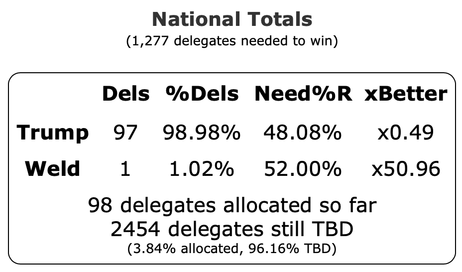
Yeah, OK. Not really. But hey. Weld got a delegate.
157.4 days until the Democratic National Convention.
199.4 days until the Republican National Convention.
It is going to be a fun ride…
For more information:
This post is an update based on the data on the Election Graphs 2020 Delegate Race page. Election Graphs tracks estimates of the convention delegate totals for both parties. The charts, graphs, and maps in the post above are all as of the time of this post. Click through on any image to go to a page with the current interactive versions of that chart, along with additional details.
Follow @ElectionGraphs on Twitter or Election Graphs on Facebook to see announcements of new blog posts. For those interested in more granular updates of delegate updates or general election polling, follow @ElecCollPolls on Twitter. If you find the information in these posts informative or useful, please consider visiting the donation page.