There were new polls in Florida since the last update, but they didn't result in any category changes for the state, so instead I'll talk about some new features I added to the site a few days ago.
Back on January 29th, I discussed a way of taking the historical performance of state-level Election Graphs averages vs. actual election results and using that to infer the odds of the Republican or Democratic candidate winning based on the current Election Graphs average.
Now, to be clear, since this analysis compares the FINAL average before the election to the election results… it did not look at how those averages varied over time in the leadup to the election… this is looking at the odds "if the election was today." There is no factoring in the likelihood of changes over those intervening months as some more complicated models might.
But it still gives a snapshot I think is interesting, and EVERYTHING on Election Graphs is "if the election was today," so it fits in well.
In my May 8th post, I mentioned that I had added a display of these state-level win odds to the state detail pages and state comparison pages. I was only displaying the numbers, not any visualizations. As of this week, I am now displaying charts of how these numbers change over time as well.
To illustrate, I'll show examples of the new charts and how they relate to the older charts.
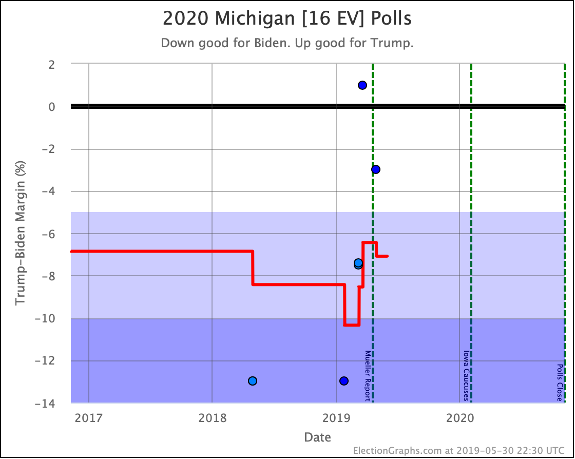
The above is the standard graph for an individual candidate combination and state that has been on Election Graphs since the 2016 cycle. It shows dots for the specific polls and a red line for the Election Graphs average. While this is only a static image in this blog post, on the actual detail page, you can hover over elements of the chart and get more details.
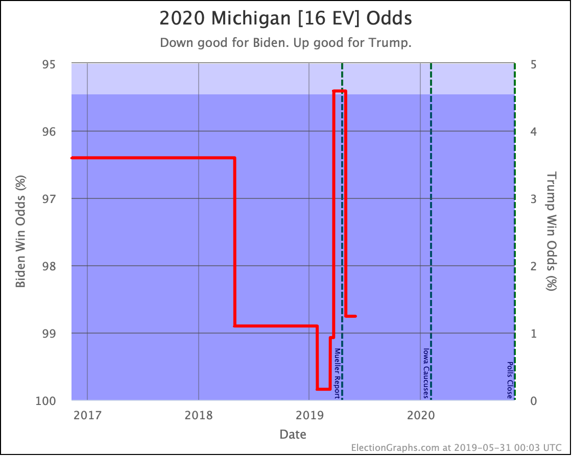
This new view is the graph that I added to the page. It translates the poll average into the chances of each candidate winning the state based on the methodology detailed in that January blog post.
So, in this example, as of right now, Biden has a 7.1% lead in the poll average, which translates into a 98.8% chance of Biden winning the state (or a 1.2% chance of Trump winning). I show the axis labels for the Democrat's chances on the left, but if you prefer, the axis labels on the right show the Republican's chances.
While the first chart does a great job at showing in an absolute way where the polls are, this second chart gives a better idea as to what this means for who is probably going to win and shows how much changes in the poll average do or do not change those odds.
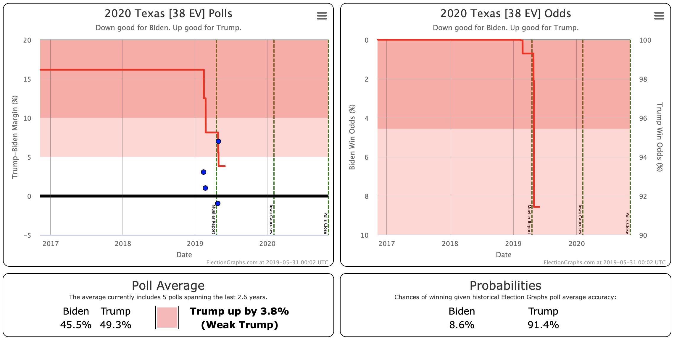
When looking at the state detail page, these two charts are side by side for easy comparison:
Looking at this example makes clear that the "Weak" category is still pretty broad! That 3.8% Trump lead in Texas translates into a 91.4% chance of Trump winning!
Remember though the following important caveats:
- As mentioned above, this is "if the election was today." It does not take into account how polls may move in the time between now and the election. Until we get right up to the election, this is very important. Poll averages can and do move quickly. A few weeks can make a huge difference (as shown by the last few weeks before the 2016 election). In the over 500 days we have left at the moment, the world could change completely!
- I base the odds estimates on the aggregated performance of the Election Graphs averages in 2008, 2012, and 2016. It is possible that those three elections will not be representative or predictive of 2020. As they say in the investment world, "past performance is not a guarantee of future results."
- For the moment, Michigan is the only state where the Election Graphs average is based only on 2020 polls. For the rest, I'm still "priming" the numbers with election results from 2000 to 2016. Only 13 states have any 2020 polling at all at this early stage, and most of them have three or less. So we still have pretty sparse data.
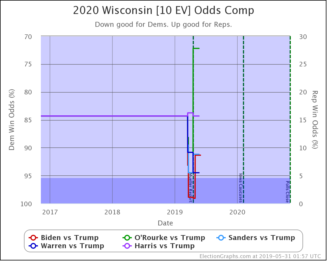
Of course, in addition to the state detail pages for individual candidate matchups, there are also the charts on the comparison page:
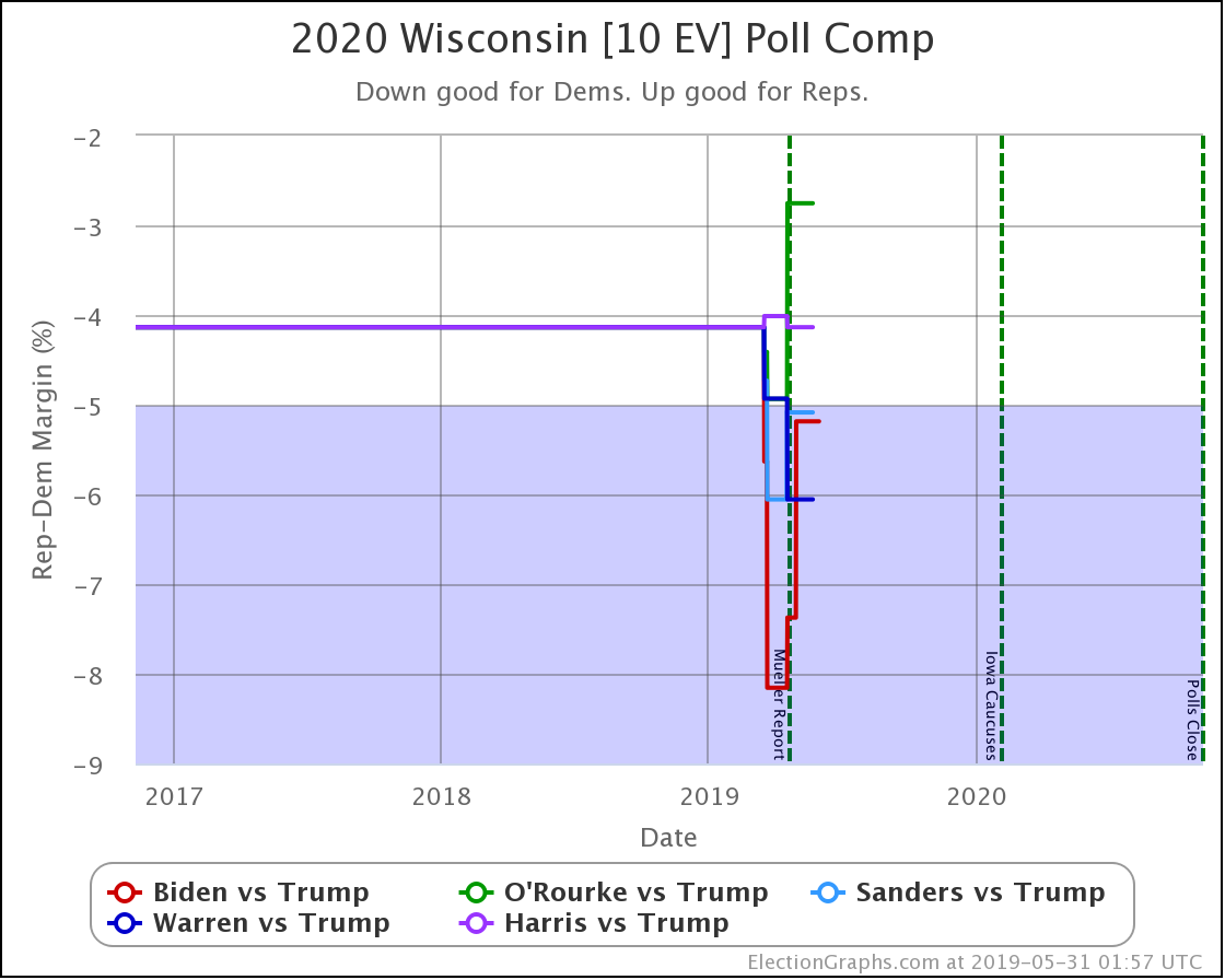
Above is the traditional poll view.
And then the odds based view. The idea is the same as the view for the individual candidate pairs, but of course, you see all five of the best-polled candidate pairs and can compare how they are doing.
Now, all of the new graphs are on state-level views. What about national? How does this roll up into an overall picture of the election?
Well, it is coming but isn't ready yet. As I described in my January 30th post, you can use these state-level probabilities as part of a Monte Carlo simulation to generate some information on the national picture.
I don't have any of that automated and live yet on the site yet, but I have started to build some of the elements. So here is a preview of the kinds of information this will produce.
First, looking at the odds of winning for the five best-polled candidate pairs (with all the caveats I mentioned above) based on the current Election Graphs averages and 1,000,001 Monte Carlo trials each:
- Biden 87.3% to Trump 11.9% (0.8% tie)
- Sanders 74.9% to Trump 23.7% (1.5% tie)
- Warren 66.1% to Trump 32.0% (1.9% tie)
- Harris 58.9% to Trump 39.0% (2.0% tie)
- O'Rourke 48.6% to Trump 49.7% (1.7% tie)
These stats differ a little bit from simply looking at the "expected result" where each candidate wins every state they lead in, or looking at the tipping point metric, as these also look at how likely it is that the various close states end up flipping and going the other way. So this should provide a bit better view of what might happen than those simpler ways of looking at things. But of course, that comes at the cost of complexity and being a bit harder to understand.
Another kind of view that will come out of this is looking at the range of possibilities in a bit more sophisticated way than the "envelopes" already shown on the site. Looking at Biden vs. Trump as an example:
- Median Result: Biden by 52 electoral votes
- Central 1σ (68.3% chance): Biden by 106 EV to Biden by 6 EV
- Central 2σ (95.4% chance): Biden by 158 EV to Trump by 30 EV
- Central 3σ (99.7% chance): Biden by 218 EV to Trump by 66 EV
So, sometime in the next few weeks, I'll probably get these textual stats added to the live site and automatically updated when I add new polls. After that, I'll try to get some visualizations of both the current state and how that evolves up on the site, but that will take longer.
Anyway. Coming soon.
522.8 days until polls start to close!
For more information:
This post is an update based on the data on the Election Graphs Electoral College 2020 page. Election Graphs tracks a poll-based estimate of the Electoral College. The charts, graphs, and maps in the post above are all as of the time of this post. Click through on any image to go to a page with the current interactive versions of that chart, along with additional details.
Follow @ElectionGraphs on Twitter or Election Graphs on Facebook to see announcements of updates. For those interested in individual poll updates, follow @ElecCollPolls on Twitter for all the polls as I add them. If you find the information in these posts informative or useful, please consider visiting the donation page.

