
This is the fifth in a series of blog posts for folks who are into the geeky mathematical details of how Election Graphs state polling averages have compared to the actual election results from 2008, 2012, and 2016. If this isn’t you, feel free to skip this series. Or feel free to skim forward and just look at the graphs if you don’t want or need my explanations.
If you just want 2020 analysis, stay tuned, that will be coming soon.
You can find the earlier posts here:
- Polling Averages vs Reality
- Win Chances from Poll Averages
- Polling Error vs Final Margin
- Predicting 2016 by Cheating
Criticism
So, after the Predicting 2016 by Cheating post went up, Patrick Ruffini decided to quote tweet it, after which Nate Silver replied saying "whoever did that is incompetent".
That was exciting.
In any case, despite being incompetent, I will soldier on.
A reminder here though that I am indeed an amateur doing this sort of thing for fun in my spare time. I am not a professional statistician, data scientist, or even pundit. (Although, like everybody else on the planet, I do have a podcast.)
This is not my day job. I make no money off this. I never expect to make any money off this. I just enjoy doing it. I am always happy to take constructive criticism. I've changed things on the site based on reader feedback before, and undoubtedly will again.
Also though, in this series of blog posts specifically, I have been exploring different ideas and ways of looking at the 2008-2016 data. The Monte Carlo simulation in the last post was NEVER a valid prediction for 2016, because it used the actual results of 2016 in the model. Which I said repeatedly in that post. It was just a proof of concept that using that data in that way would provide something reasonable looking.
I'm not sure if Nate actually read the posts describing how I was modeling things and all the caveats about how running that simulation was cheating since I was using 2016 data to predict 2016. Maybe he did. Maybe he didn't.
He is right of course that the Monte Carlo graph he was reacting to does give a much narrower distribution than his model did. The Polling Error vs Final Margin post shows how I got the probabilities that led it to be that narrow. The distribution is actually narrower than I expected coming in. But that particular way of looking at the data leads there. It may or may not be a good way of looking at things. I am experimenting.
Having said that, the results gave Trump win odds near what FiveThirtyEight had, but with the median being further toward Trump than their model, and with a narrower distribution. Looking at some other folks who showed distributions for 2016 on their sites (and still have them easily findable today in 2019), it looks like this distribution would not have been out of place. It didn't match any of them of course, since the methodology is different from all of them. But it isn't wildly out of line.
Running this on 2016 data is bogus of course, as I explained in the last post, and again a few paragraphs ago. But the results are interesting enough that using the data from the analysis in the Polling Error vs Final Margin post to do some Monte Carlo simulations for 2020 would at least be fun to look at.
OK, enough of that unintended detour. Now back to the originally intended topic for this post…
Tipping Points
All of the previous posts have been looking exclusively at the state poll averages as they compared to the actual election results in 2008 through 2016. But for the last couple of cycles, Election Graphs has also looked at the "tipping point". I borrowed the idea from the "meta-margin" Sam Wang at Princeton Election Consortium uses. Basically, it is the margin in the state that would put the winning candidate over the edge if you sorted the states by margin.
The tipping point essentially gives a measure of the overall margin in the national race, similar to a popular vote margin, but modified to account for the structure of the electoral college. It is a nice way of looking at who is ahead and who is behind in a way that isn't (quite) as volatile as looking directly at the center line of the electoral college estimates.
So how did the final Election Graphs tipping point numbers based on our state poll averages do compared to the actual tipping point as measured by the final vote?
For this, since there is only one tipping point per election, we unfortunately only have three data points:
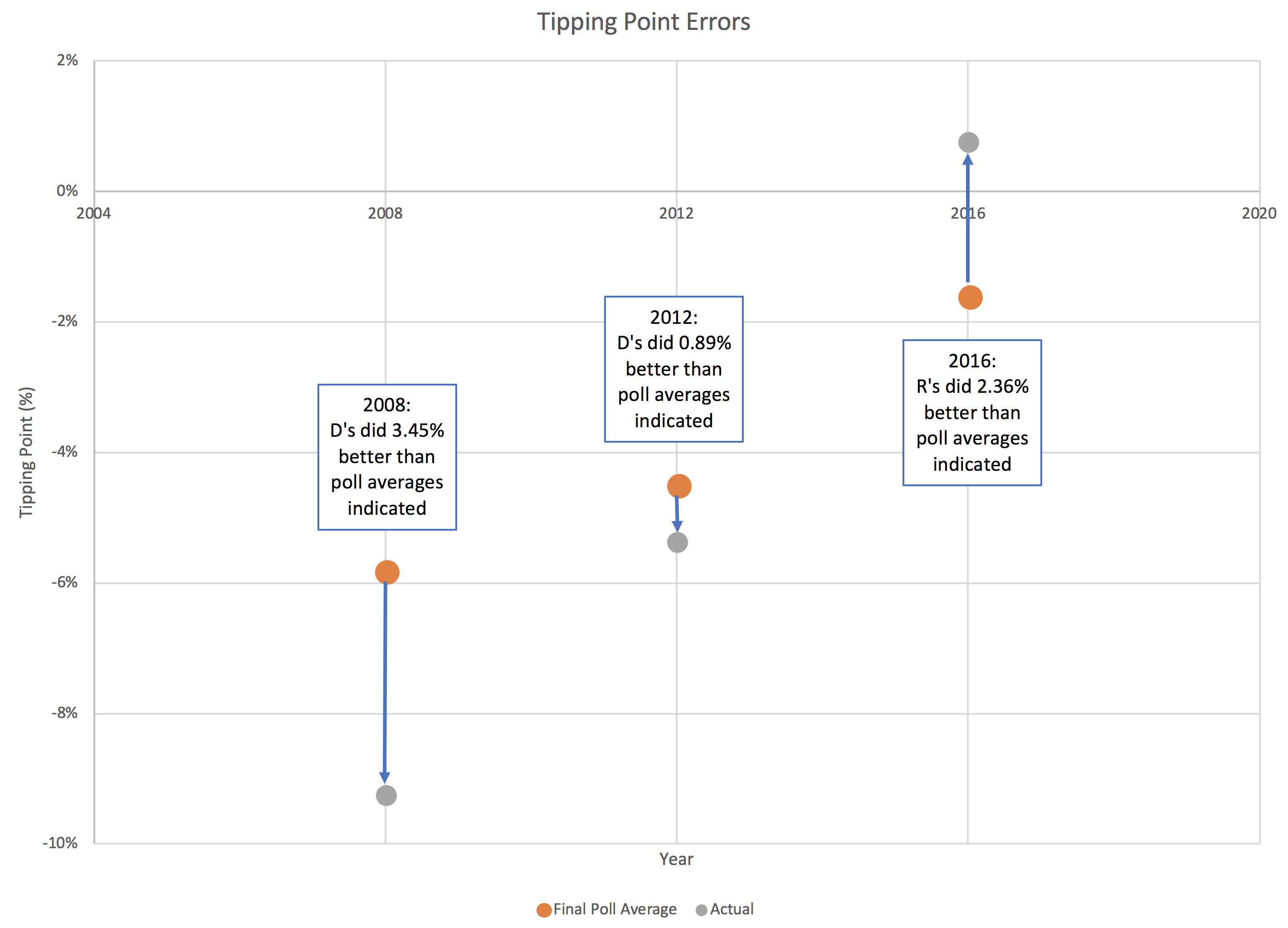
In 2016, I used the same 5% boundary to determine what was "close" for the tipping point as I did for state poll averages. Once again just a round number, with nothing specific behind it other than a gut feel that less than 5% seemed close.
We only have three data points, but even with just that, we can produce a very VERY rough estimate of the 1σ and 2σ levels. Basically, for 1σ, you use the 2 closest of the 3 data points, and for 2σ you use all 3. This is ballpark only (at best) due to the low number of data points, but it gives an idea.
So to be 68.27% sure the current leader will actually win, you want a tipping point margin greater than 2.36%.
For 95.45% confidence, you want a tipping point margin lead of more than 3.45%.
OK, OK, that is kind of pathetic. I know. But there is only so much you can do with only three data points.
Anyway…
Clinton's final tipping point margin in 2016 was only 1.59% in Pennsylvania. Even assuming you only knew the 2008 and 2012 results, it should have been clear that a 1.59% tipping point represented an incredibly close race, far closer than either 2008 or 2016, and well within the realm where it could have gone either way.
The 5% boundary Election Graphs used in 2016 also indicated a close race of course, but narrowing that boundary based on the results of the last three elections seems like it would give a better impression on how close things need to be before we should consider that things really do look like a toss up where anything could reasonably happen.
So, what, if anything, will Election Graphs actually do differently for the 2020 cycle compared to 2016?
I'll talk about that in the next post…
You can find all the posts in this series here: