Another Mixed Week for Dems

Since last week's update,Ā there has been new polling released in Arizona (x2), Colorado, Kentucky, Maine, North Carolina, California (x2), Florida, Texas, and Missouri.

Once again we have mixed results.

Two of the six most polled Democrats (Biden and O'Rourke) improve their positions in the probabilistic view when you combine the results of all of those polls.

The other four (Sanders, Buttigieg, Warren, and Harris) slip in their matchups against Trump. Some weaken significantly.

So let's start with the national "Odds of a Democratic Win" view:
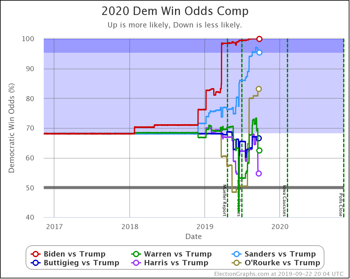
Dem 15 Sep 22 Sep šš«
Biden 99.8% 99.9% +0.1%
Sanders 96.9% 95.3% -1.6%
O'Rourke 80.8% 83.1% +2.3%
Buttigieg 67.0% 66.5% -0.5%
Warren 69.0% 62.4% -6.6%
Harris 65.7% 54.7% -11.0%

The two that stand out here are Warren and Harris. The new polls this week hurt their win chances significantly. Harris is now looking only slightly better off than a coin toss in a race against Trump.

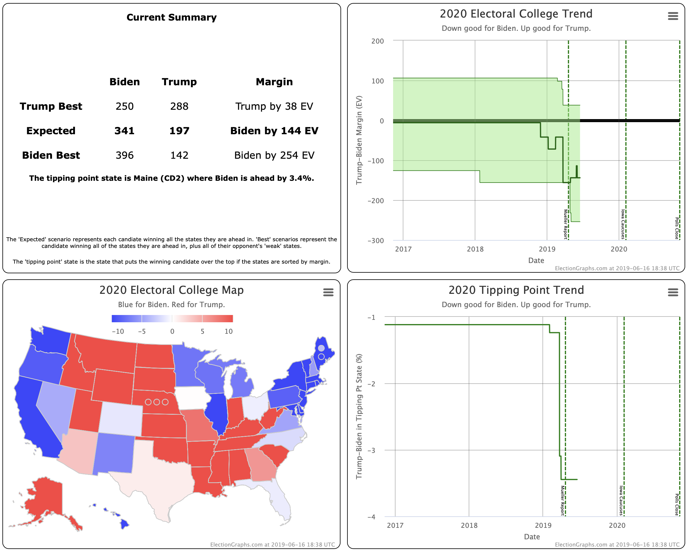
We'll look at each state to determine where these changes are coming from, but first, you can also see this pattern dramatically when looking at the "Median Case" from the Monte Carlo simulations.

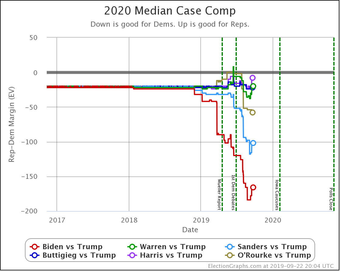
In this view, you can see that the winning margins of every Ā Democratic candidate except O'Rourke have been decreasing lately. Including Biden.

A lot of the "movement" of these various lines up until now could still be attributed to actual 2020 polling replacing old elections in our state polling averages. We are getting to the point though where a lot (although not all) of the critical states are mostly 2020 polls.

So we may start seeing trends that represent real changes in public opinion. We will also begin to see what level of variability is just inherent in looking at the election this way. It may end up being "normal" that some of these lines bounce up and down quite a bit as we go along.

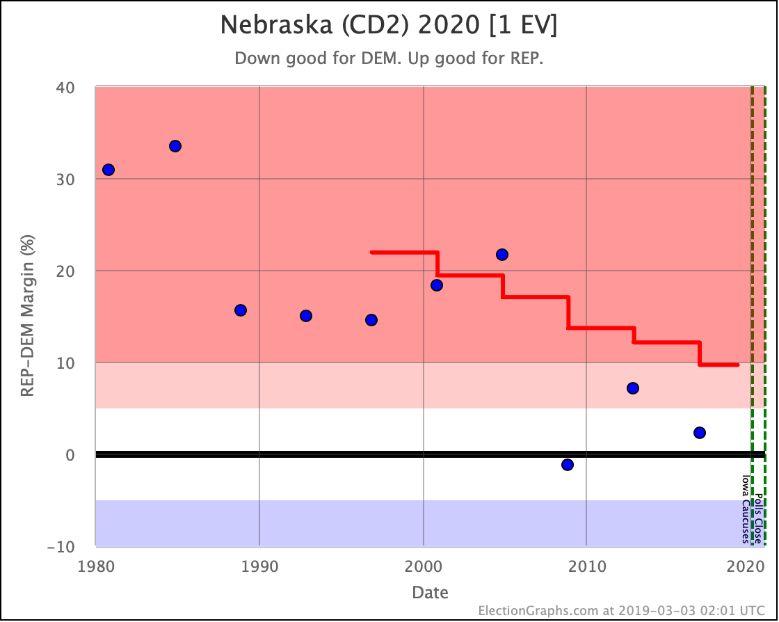
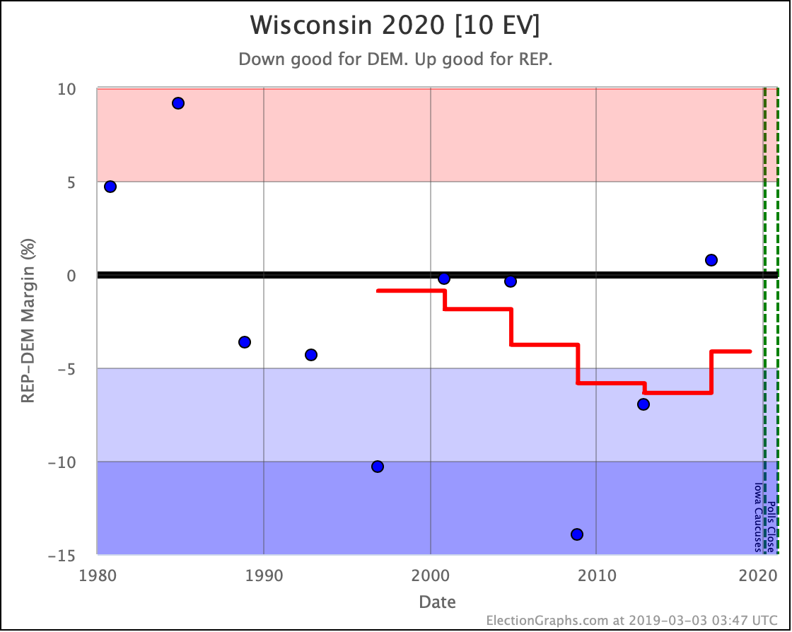
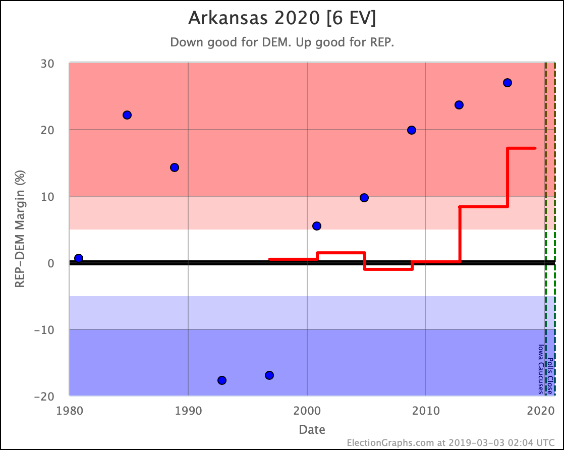
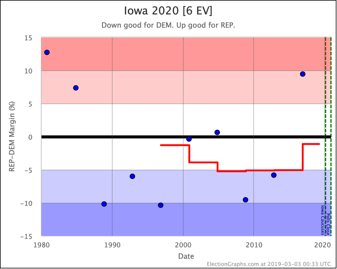
In the meantime though, time to look at the trends in each of the states where there was new polling over the last week. There are a lot, so I'll be brief.

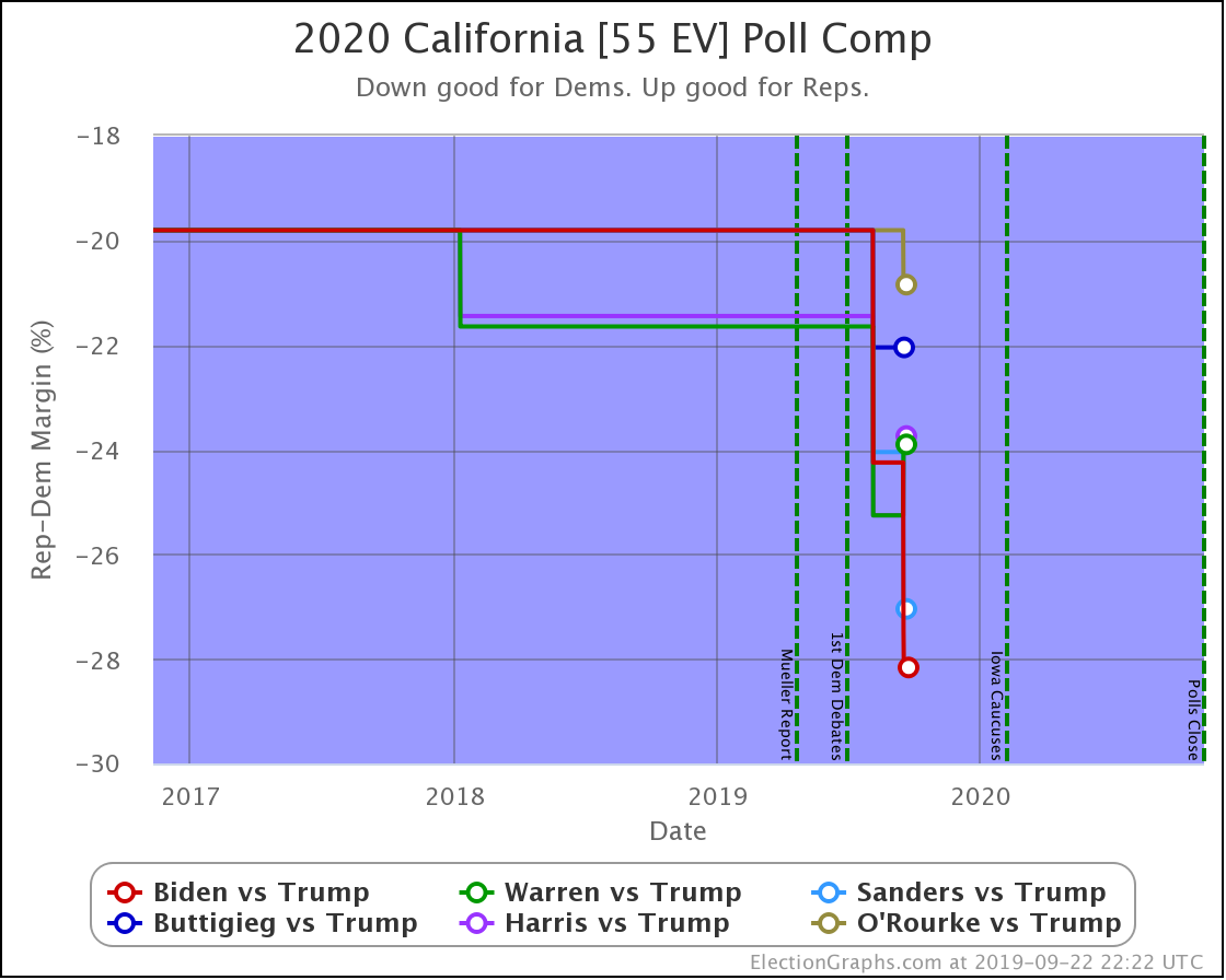
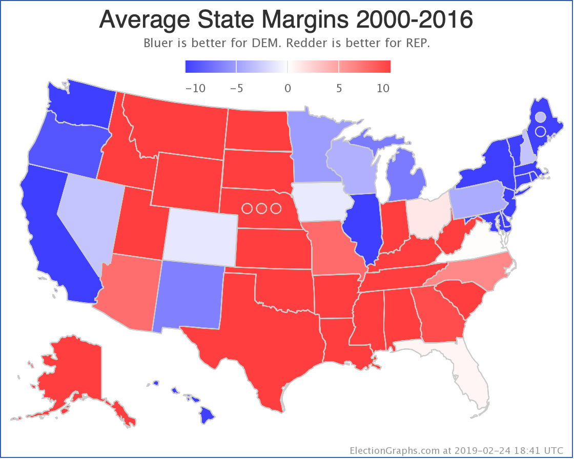
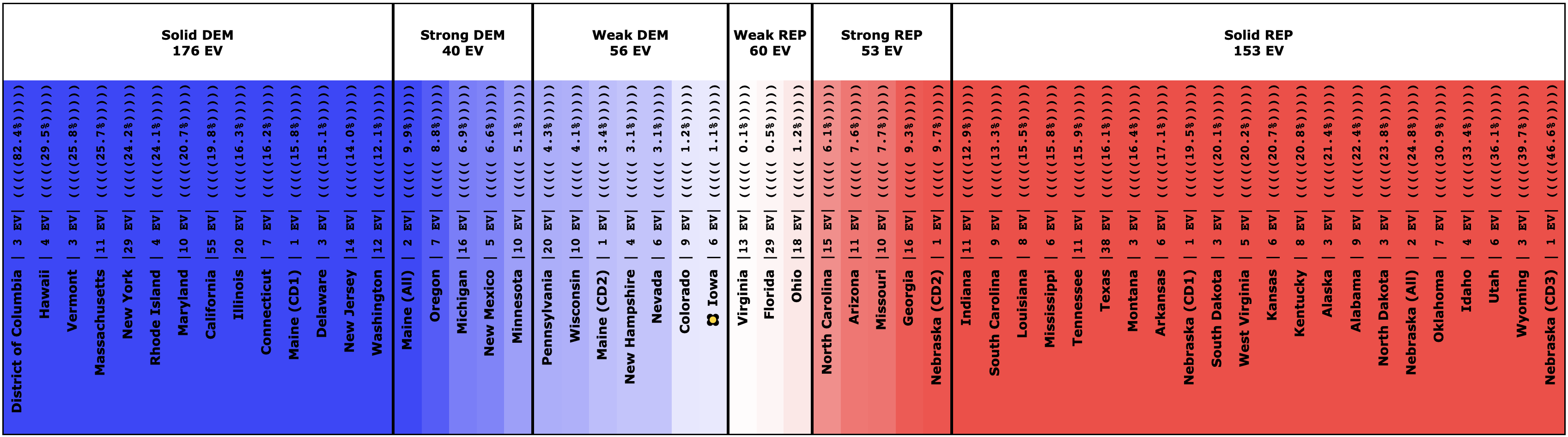
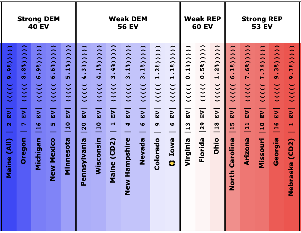
California is so blue; it is mostly irrelevant to the national race. All of the Democrats have a 100% chance of winning California. It is notable though that all six candidates are doing even stronger in California than the historical average from the 2000Ā to 2016 elections. California is getting even bluer.

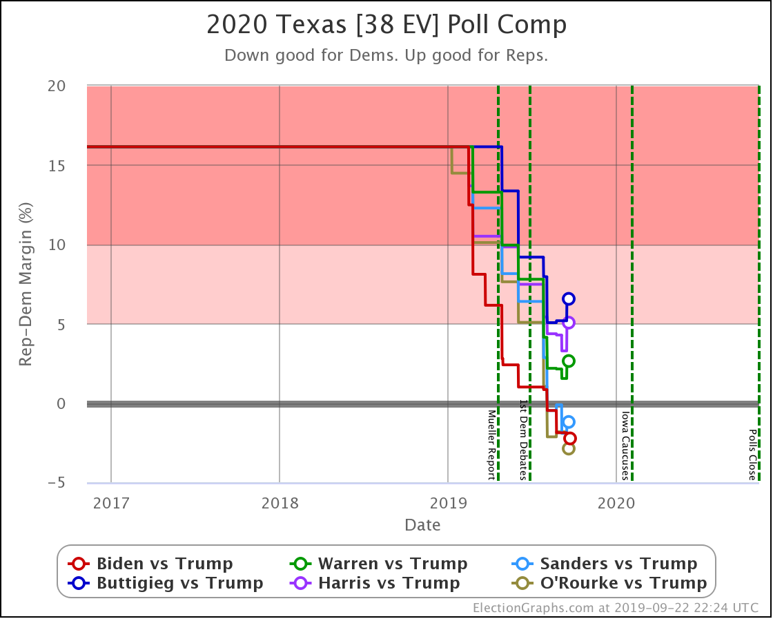
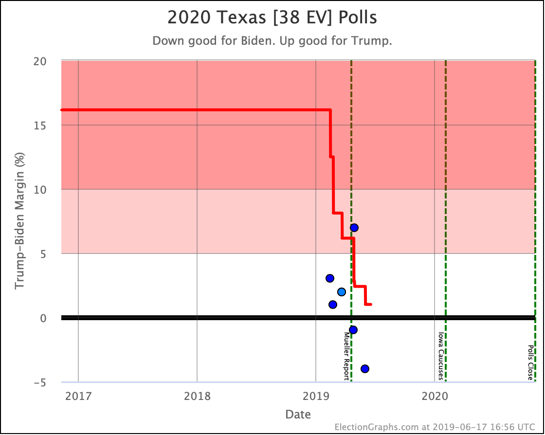
A lot of the win odds changes this week can be attributed to Texas. With the latest polling in Texas, the trend of each new poll moving the state further in the Democratic direction has ended. Biden and O'Rourke still improve slightly, but every other Democrat erodes. Along with Biden and O'Rourke, Sanders retains a lead. Warren, Harris, and Buttigieg not only lose Texas but the picture of them "making it close" is slipping. At least this week.

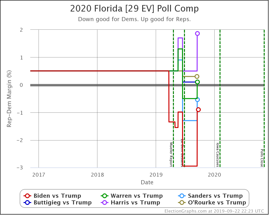
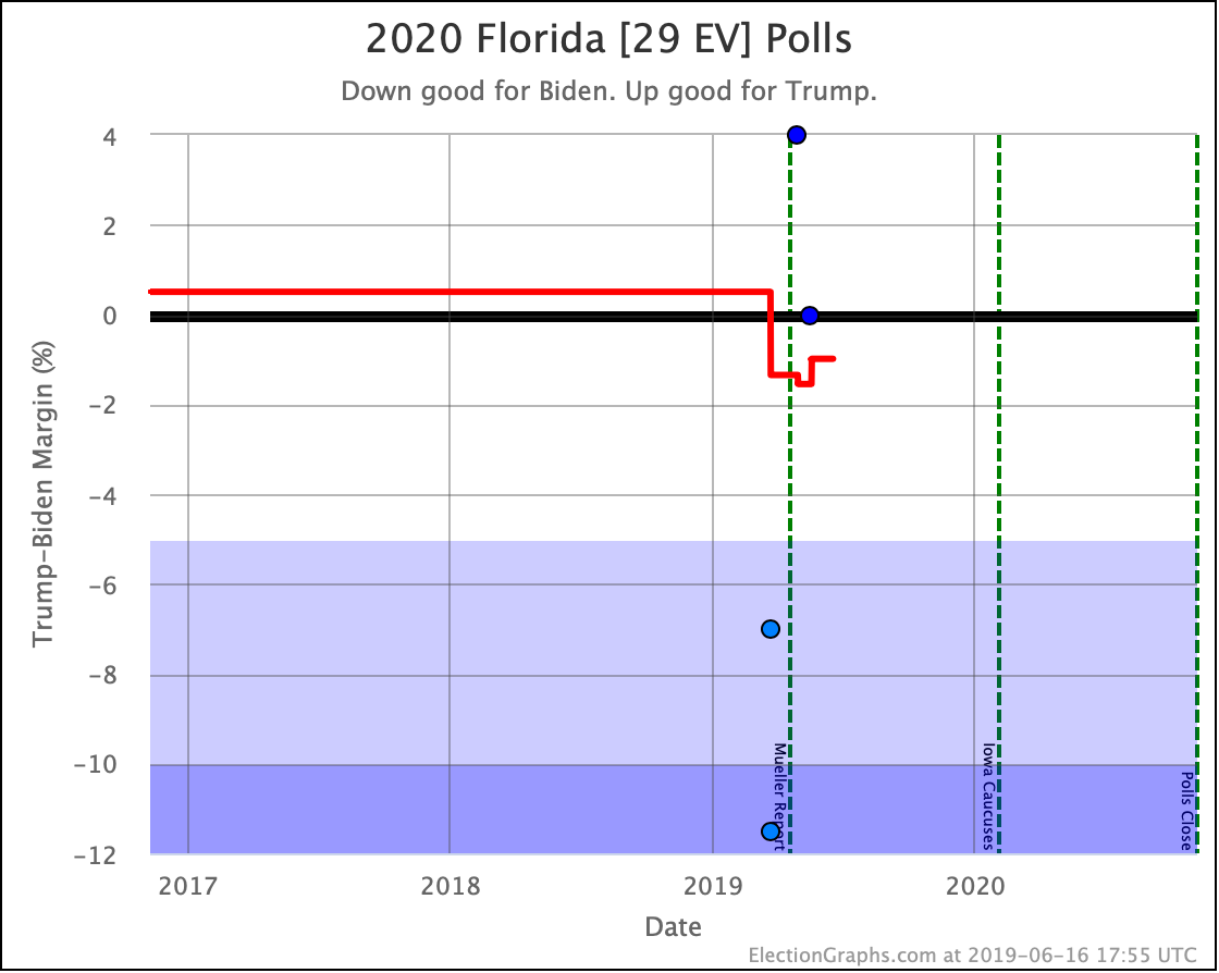
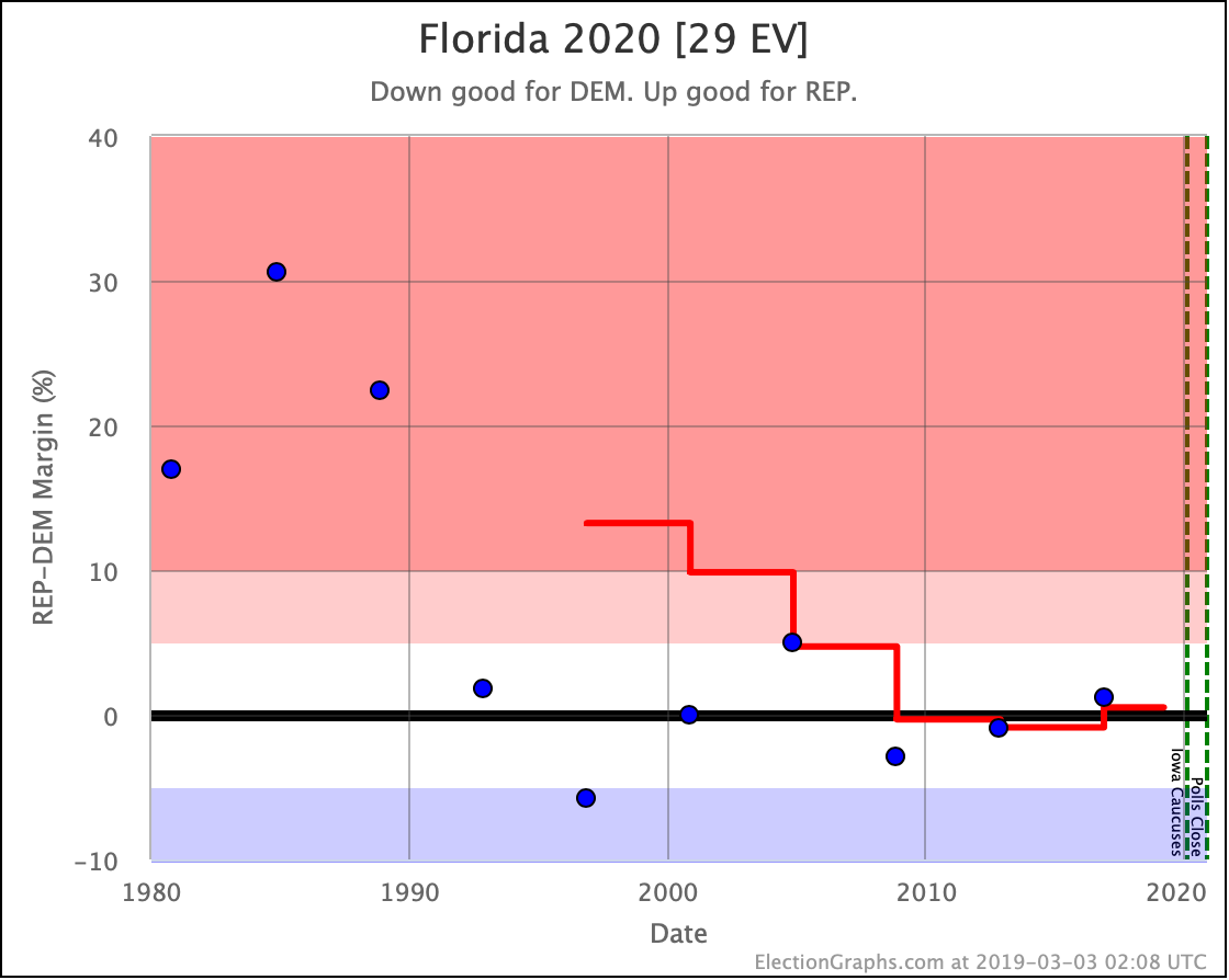
Florida is the other big state responsible for much of this week's changes. The only Democrats who did not weaken in Florida this week are the ones that were not in the polls. Florida has a lot of electoral votes, and Florida is close, so it has an outsized impact on the national picture.

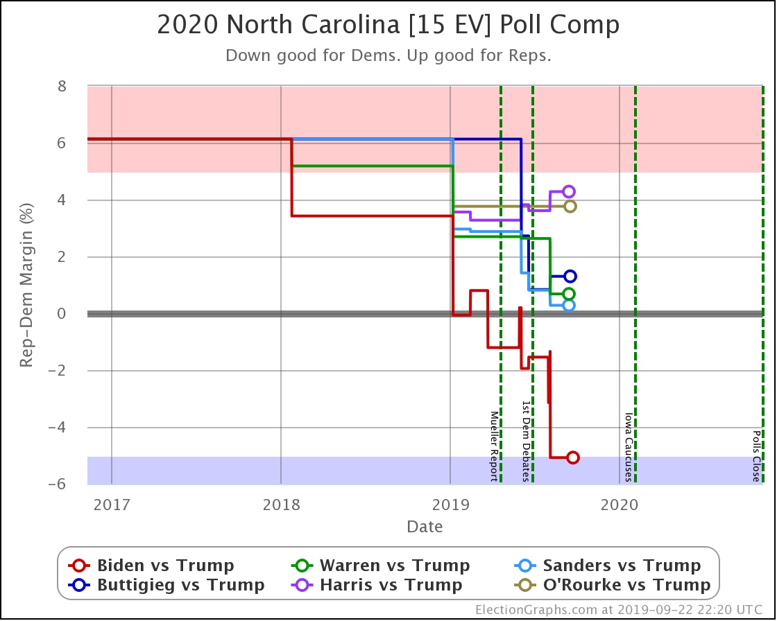
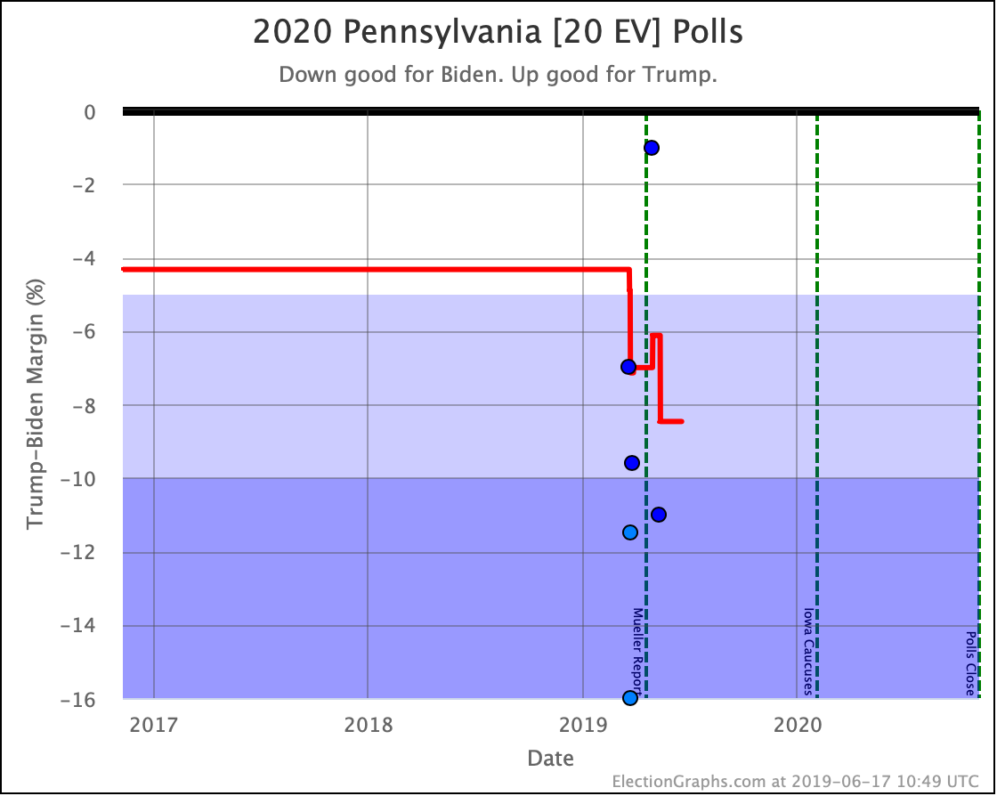
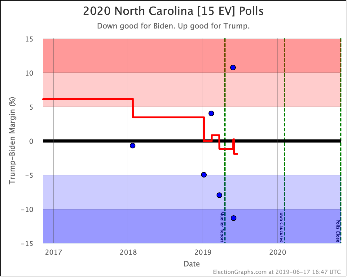
The only mover this week in North Carolina is Biden, with his average moving to a greater than 5% lead for the first time. Trump leads all the other Democrats by narrow margins.

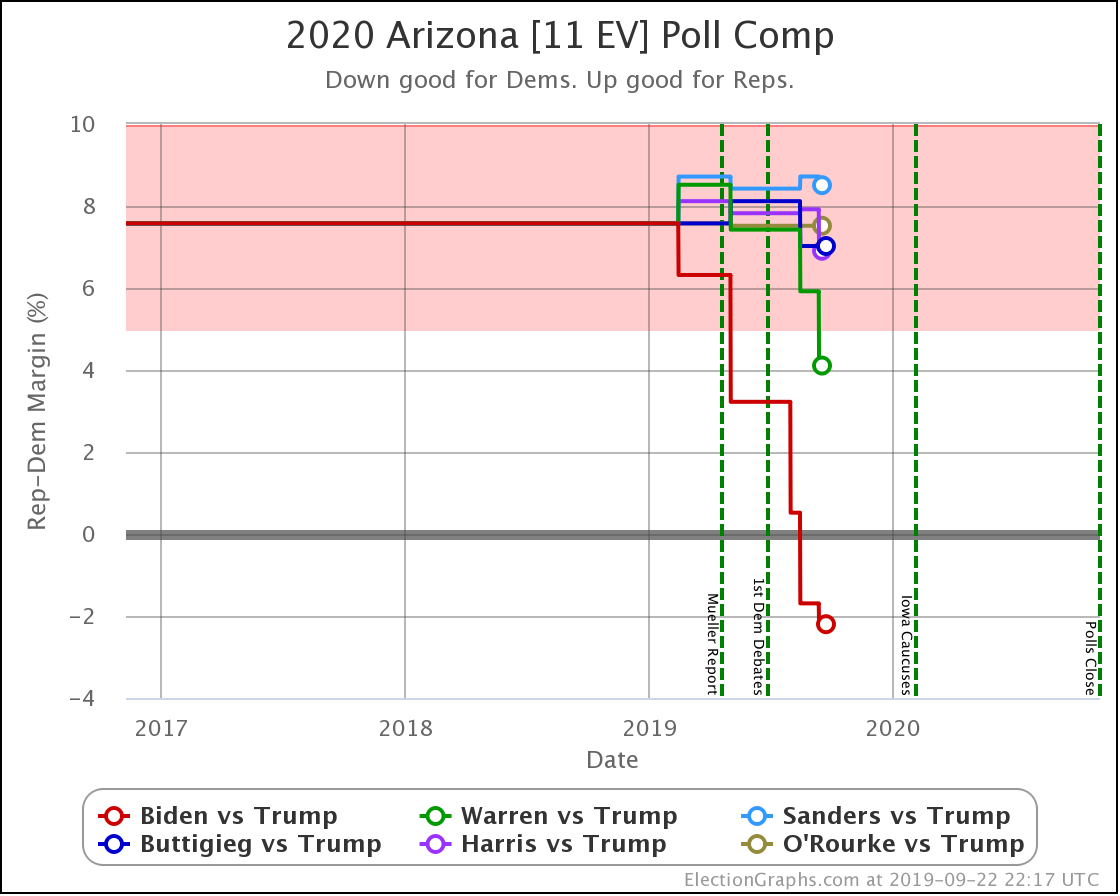
Arizona is another state where there is a big gap between Biden and the rest of the field. This week Biden took the lead in the Arizona poll average. Add Arizona to Texas as red states that flip, and you can see why Biden's national position remains so strong. Ā Sanders also makes Arizona close, but all of the other Democrats are hovering around the historical average, which is a Strong Republican win.

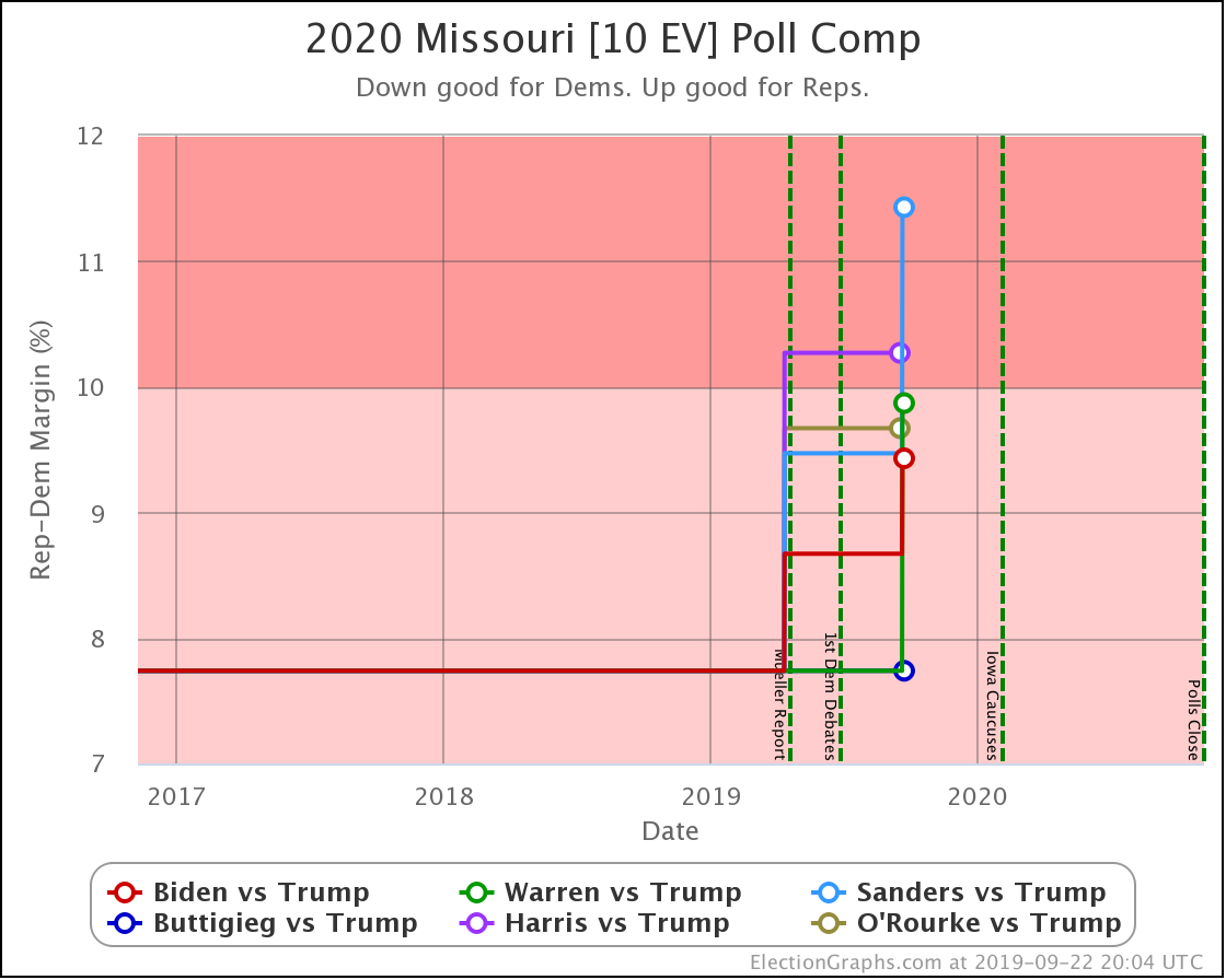
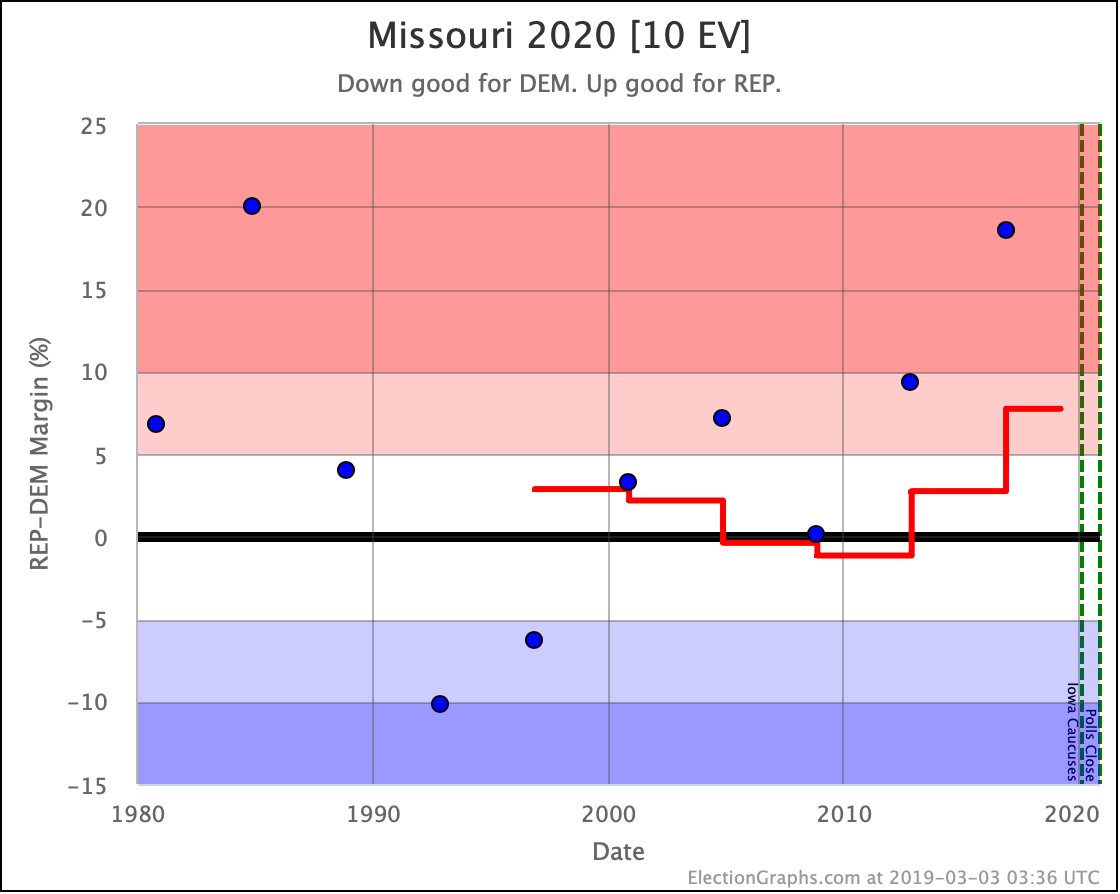
Missouri is clear red state, and with two polls so far this cycle, it just looks like it is getting redder.

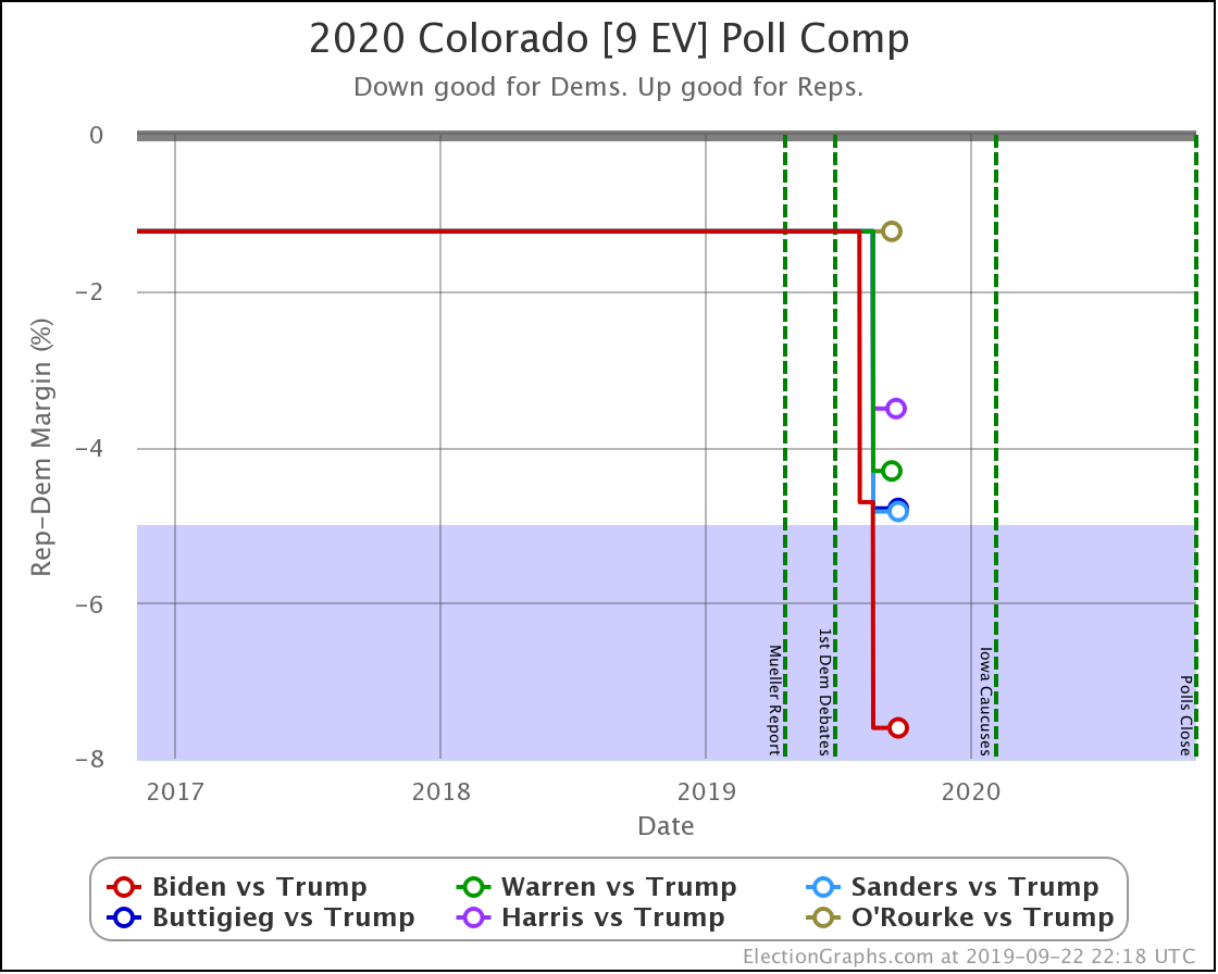
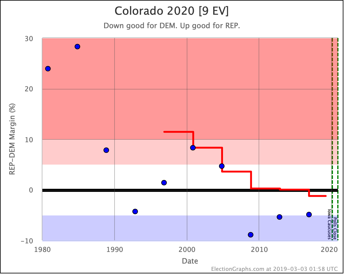
At the same time, Colorado is getting bluer. Only Biden moves the state into Strong Democrat territory so far though. The other candidates still only have narrow leads in the polling average.

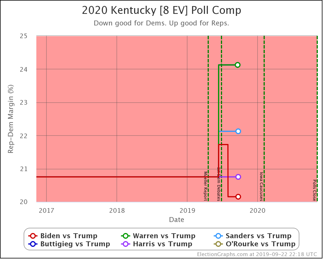
Kentucky is red and not in contention for 2020. With the small amount of polling so far though, Biden still does best, actually decreasing the Republican margin slightly. Not so much for the others.

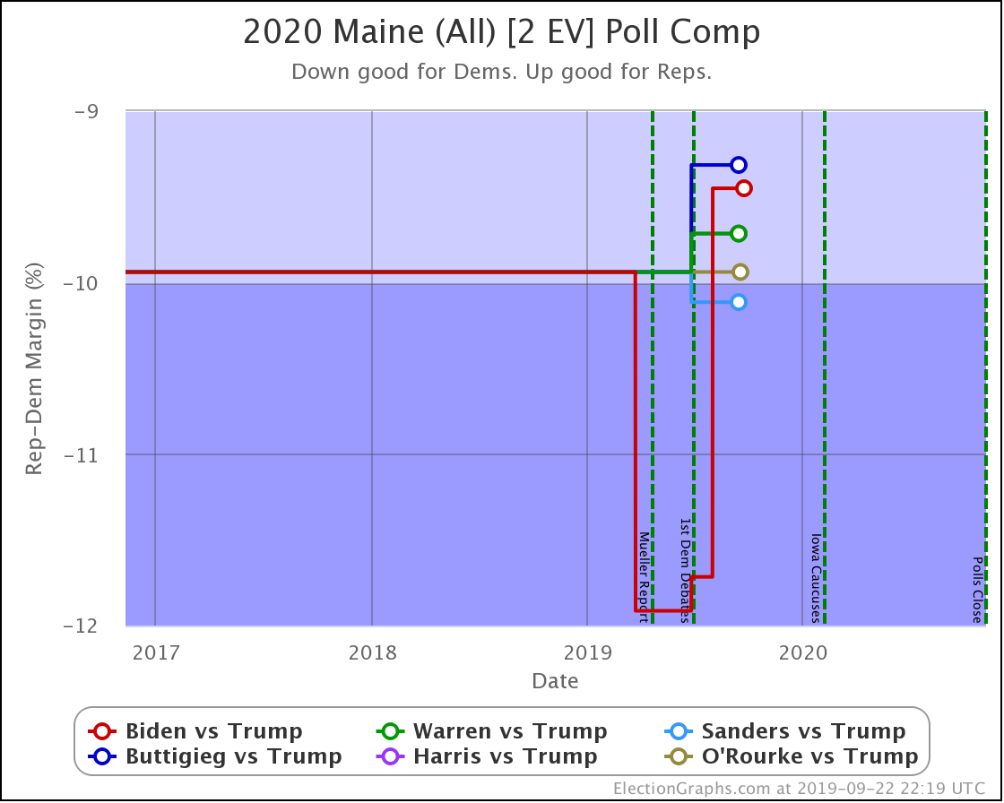
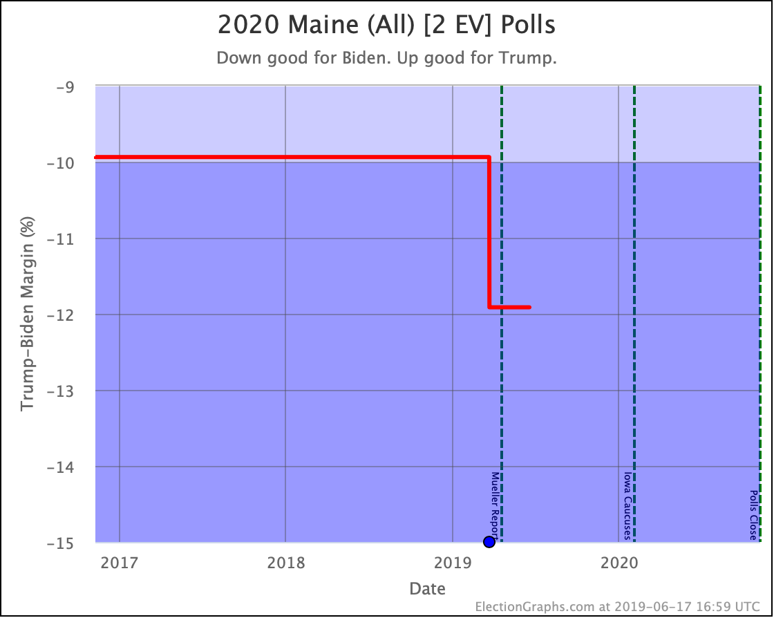
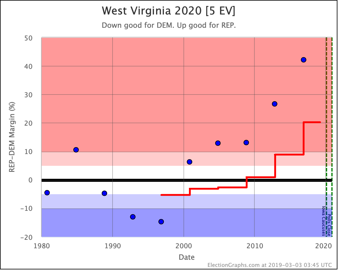
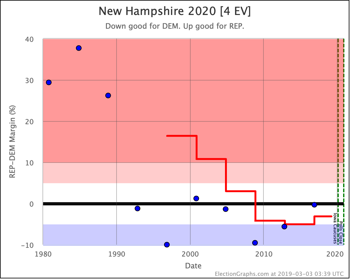
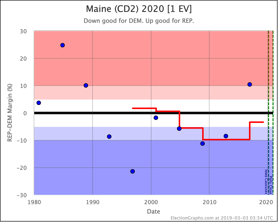
Finally Maine. Maine is blue and does not look to be changing into anything else. With the first few polls, Biden looked like he might be making it even bluer than before. But as we stand today, all of the Democrats are pretty close to the historical average for the state.

And that is where things are this week.

408.0 days until polls start to close.

For more information:

This post is an update based on the data on the Election Graphs Electoral College 2020 page. Election Graphs tracks a poll-based estimate of the Electoral College. The charts, graphs, and maps in the post above are all as of the time of this post. Click through on any image to go to a page with the current interactive versions of that chart, along with additional details.

Follow @ElectionGraphs on Twitter or Election Graphs on Facebook to see announcements of updates. For those interested in individual poll updates, follow @ElecCollPolls on Twitter for all the polls as I add them. If you find the information in these posts informative or useful, please consider visiting the donation page.

Trump Internal Polls All Good News For Biden

Since the last update,Ā there have been polls in North Carolina, New York, Michigan, Pennsylvania, Wisconsin, Florida, Texas, Virginia, Maine (All), Minnesota, Iowa, Ohio, and Georgia.

Now, most (but not all) of these are internal Trump campaign polls that were leaked and reported on by first ABCĀ and then NBC. The full internal polling reportedly included 17 states and matchups against multiple Democrats, but the leaks so far only includeĀ Biden versus Trump results in 12 of them. Because this is a leak of internal polls and not "regular polls," I tweeted a series of notes on these polls, that I will repeat here:

  • 1st: Some aggregators automatically exclude internal polling because of potential selective release bias, etc. I default to including as much as possible. So they are reflected on Election Graphs.
  • 2nd: Iā€™m going with ABC on the field dates, not NBC. ABC reports March 15th to March 28th, which is precisely two weeks. NBC reports March 13th to March 28th, which includes two extra days. These almost certainly are the same batch of polls though.
  • 3rd: ABC and NBC differ slightly on their reports of the results in Pennsylvania, Wisconsin, and Florida. In these cases, I will include both, but weighted as half polls, just as I do when a pollster reports results in multiple ways (with & without 3rd parties, registered vs. likely voters, etc.)
  • 4th: For some states this leak only includes margins. Election Graphs only uses margin in calculations, but it displays & reports candidate results too. For the instances where we only have leaked margins, I will log the polls such that Trump-Biden=Margin and Trump+Biden=100%.
  • 5th: If a range of possible margins is reported rather than a specific margin, I will log these as the center of that range.
  • 6th: If more detailed leaks become available, I will adjust how these polls are recorded to reflect any new information.

With those caveats, here are the status changes that occurred as a result of this batch of polls. After that, we'll start looking at the graphs.

All of these changes are for the Biden versus Trump matchup.

State Level:

  • Florida (29 EV) has moved from Weak Trump to Weak Biden
  • Virginia (13 EV) has moved from Weak Trump to Weak Biden

National Level:

  • Expected case change: Biden 299 to Trump 239 -> Biden 341 to Trump 197
  • Tipping point moves from Biden by 1.9% in NC to Biden by 3.4% in ME-CD2.

We'll look nationally first, then the states that changed categories, then a brief look at the locations that did not. Finally, I'll report on what all this does to the Monte Carlo simulation of the national race.

Keep in mind that all of the leaked internal polls were in the field back in March, so they are older data, and will change not just the end of the lines in the charts, but the shape of those lines over March, April, May, and June.

Rather than going graph by graph, here is the whole summary block from the Biden versus Trump page. The two charts on the right show a clear trend toward Biden.

Now, we are still at the stage where most states don't have five polls yet, so we are filling in data based on previous general election results when constructing state averages. So it is crucial to note that this "movement" is mostly not representing changes in public opinion yet, but rather is reflecting the increasing knowledge over time of what Biden vs. Trump looks like specifically, rather than a generic Democrat vs. Republican based on the average historical results from 2000 to 2016.

So the trend may not represent people flocking to Biden over the last few months, but instead, it shows that the more polls we get in more states, the stronger Trump looks against Trump.

Also important to note that while the "expected case" now has Biden winning by 144 electoral votes, a month before the 2016 election, the "expected case" was a 154 electoral vote win for Clinton. By election day that had slipped to only an eight electoral vote lead. And of course, Trump won by 77 electoral votes. The "expected case" can move very quickly, and does not give the whole picture anyway.

Similarly, the tipping point is now a 3.4% Biden lead, while less than two weeks before the election, Clinton had a 5.4% tipping point lead. That evaporated to 1.6% in the last two weeks, and the actual tipping point in the election was an 0.8% Trump margin.

So Biden looks formidable, but Clinton looked even stronger at times.

Also, things can move very quickly even in two weeks, let alone 506 days.

We have a long way to go.

OK, now the two states that changed categories in this update:

Including the two slightly different versions of the Trump internals leak as one averaged result, there have only been three Biden vs. Trump polls in Florida so far. And they cover a vast range. The average (including 2016 and 2008 to round things out) is a 1.0% Biden lead.

ThisĀ lead translates into about a 55.6% chance of a Biden win, and a 44.4% chance of a Trump win.

As usual, Florida is a swing state.

The Trump internals leak is the very first 2020 polling for Virginia. From 2000-2016, there had been 3 Democratic wins, and 2 Republican wins. The average had been a very narrow 0.1% Republican lean for Virginia.

With this new poll, the 8.0% margin Republican win from 2000 slips off the average and a 17.0% lead for Biden enters. That's quite a swing! As a result, the current pollĀ average moves to a 4.9% Biden lead, which translates into a 90.9% chance of winning the state.

And now, quickly, the other states with Biden vs. Trump polls in this update that did not change category:

Trump leads in Texas by only 1.0%, which translates into a 66.4% chance of victory if the election was today. Trump is still a favorite in Texas, but that this is even a question is striking in and of itself.

Biden leads by 8.5% in Pennsylvania. That would be a 99.1% chance of winning. (If the election was held today, which of course it is not.)

Biden leads by 0.9% in Ohio. 55.3% chance of winning the state.

The Trump internal poll was the first Biden vs. Trump polling for Georgia. It shows Biden with a significant lead, but given the historical Republican wins in Georgia, it will take a few more polls showing a Biden lead before the average goes there. For now, the average sits at a 5.8% Trump lead, which is a 98.1% chance of a Trump victory.

Biden leads by 7.1% in Michigan. 98.8% chance of winning.

Biden leads by 1.9% in North Carolina. 67.0% chance of winning.

The internal Trump poll is the first Biden vs. Trump polling in Minnesota. Biden is now leading by 7.4%, which would be a 99.1% chance of winning.

Biden leads by 7.5% in Wisconsin. 98.3% chance of winning.

Iowa is currently the closest state in the Biden vs. Trump spectrum of Election Graphs averages, with Trump squeaking out an 0.1% lead, which translates into a 55.1% chance of a Trump win.

The Trump internal polling was the very first polling on Maine. Biden is looking stronger than the historical average for Maine general elections. Biden is leading by 11.9%, which translates into a 100.0% chance of winning the state.

There were also polling results in New York (from Spry, not Trump's internal polling), but only for Gillibrand and de Blasio, who aren't in our "top five matchups against Trump" list that I discuss here on the blog. It was also heavily blue New York, and the results were unsurprising.

So finally, an updated look at how where the Monte Carlo simulation puts the Trump vs. Biden race after this update. As usual:

  • ThisĀ simulation is "if the election was held today," which it is not.
  • The model uses the past accuracy of the final Election Graphs averages in the 2008-2016 elections to estimate poll-average reliability in 2020. It is always possible that polling accuracy in 2020 will differ in important ways from previous election cycles.
  • We still have very sparse polling, and many states have averages that are based in whole or in part on election results from 2000 to 2016 rather than actual 2020 polls.

OK. With that out of the way, a Monte Carlo simulation with 1,000,001 trial election runs:

  • Median result: Biden by 110
  • 1šœŽ (68.3%) range: Biden by 168 to Biden by 56
  • 2šœŽ (95.4%) range: Biden by 220 to Biden by 12
  • 3šœŽ (99.7%) range: Biden by 254 to Trump by 24

Expressing the results as win odds instead:

  • Biden win: 99.1%
  • Trump win: 0.7%
  • 269-269 tie: 0.2%

Ouch, this last set of polls, mostly the Trump internal points, really hurt for Trump. That 0.7% chance of a Trump win is down significantly from the 6.2% in the last update.

Should I repeat the caveats? The results above may look good for Biden, but it is still a long time until the election, and things will change.

Actually, they already have.

Because I had other things to do, it took me a couple of days to get this blog post done, and in the meantime, there have been new polls in five states. I'll be updating the site with the new data shortly, and will be back with another blog post if there are notable changes to mention.

503.9 days until polls start to close.

For more information:

This post is an update based on the data on the Election Graphs Electoral College 2020 page. Election Graphs tracks a poll-based estimate of the Electoral College. The charts, graphs, and maps in the post above are all as of the time of this post. Click through on any image to go to a page with the current interactive versions of that chart, along with additional details.

Follow @ElectionGraphs on Twitter or Election Graphs on Facebook to see announcements of updates. For those interested in individual poll updates, follow @ElecCollPolls on Twitter for all the polls as I add them. If you find the information in these posts informative or useful, please consider visiting the donation page.

The 2020 Starting Line

Well, here we are. A few months later than I intended, but it is finally time to launch the Election Graphs coverage of Election 2020.

Before I start rolling in the state polls that have already come out, let's look at a more general Democratic vs Republican view based on the last few elections, just as I did four years ago.

Election Graphs uses a five poll average generally (with certain exceptions I won't get into here). When there have not yet been five polls, we use previous election results to "jump start" the poll averages.

The map above represents the average percentage margins (Republican-Democrat) over the last five election cycles. That would be 2000, 2004, 2008, 2012, and 2016. This is a very long time period. Things look different in 2019 than they did in 2000.

You could argue that just using the 2016 results would be a better starting point, but averaging over a long time period like this to some degree gives us an impression of where states stand independent of the specifics of any one specific election.

Looking at specific states and where those averages are, you get this spectrum:

Specifically, let's zoom in and look at the states where the margin in this 5 cycle average is under 10%:

These are the states (and Maine and Nebraska congressional districts) that look like they are in play based on the historical results from 2000 to 2016.

Once we get close to the election, "Strong" states mostly will slip out of reach. (Although Wisconsin was a "Strong Clinton" state and Trump still managed to win it, so it CAN happen, it is just exceedingly rare.) This far out though, just under 612 days until the first election night polls close, this whole zone is potentially up for grabs.

If the right set of events happens, even someĀ states outside of this group may end up becoming competitive. Major changes do happen during presidential campaigns. But here at the beginning, it seems unlikely that any of the states (or CD's) outside of those above will be in play.

Things will move quickly as new polls putting actual candidates against each other get added. But this is the starting line.

Where does this put us in terms of who might be ahead or behind? Election Graphs traditionally not only shows an electoral college breakdown based on who is ahead in every state but also where things would end up if you let all of the "Weak" states swing to one or the other candidate to generate "Best Case" scenarios for each candidate.

Here is what that looks like at the starting line:

DEM REP Margin
REP Best 216 322 REP by 106 EV
Expected 272 266 DEM by 6 EV
DEM Best 332 206 DEM by 126 EV
The tipping point state is Iowa where DEM is ahead by 1.1%.

So… we start at essentially a dead heat. The average of the last five elections (three where Republicans won, and two where Democrats won), is a Democratic squeaker. When you throw the "Weak" states from side to side, you get a fairly large range as well.

That's as good a place to start a presidential race as any. Dead even.

Now the specific candidates for 2020 will start differentiating themselves with their campaigns, and they will move this to one side or another… or of course, we can arrive at the election itself with things still too close to call… which is always fun.

Before I close out this post and start adding in actual 2020 polls though, it is worth also looking at how this "five election average" has shifted over the years. I currently have elections back to 1980 entered into the data Election Graphs pulls from, so we can look at these averages back through 1996.

First up, here is the electoral college trend itself:

From 1996 through 2008, each election moved the electoral college results based on these averages toward the Democrats… even when the Republicans won… because they won by less than the Republicans from the earlier elections that dropped out of the average.

That stopped in 2012. Obama won in 2012, but not as strongly as Clinton won in 1992, which dropped off the five election average that year.

Then Trump won in 2016, which was obviously a more Republican result than Clinton winning in 1996.

2016 also reversed another trend, which was that the electoral college totals of the states that were closer than 5% had been going down with each election. In other words, there were fewer close states each time. But dropping 1996 and adding 2016 expanded the range between "best case" scenarios a bit. We have a wider playing field going into 2020 than we did going into 2016.

Next, the tipping point:

This basically shows the same pattern, so I won't spend time digging deeper there.

But there is one more place to spend a little time. Time to look at how each state moved from the 1996-2012 average to the 2000-2016 average.

Let's start this historical review with an animation of the national view flipping between how things looked four years ago, and how they look today:

As expected, since we are replacing Clinton's 1996 win with Trump's 2016 win, the overall map becomes redder and blue retreats.

Now let's look at individual states that moved to different Election Graphs categories ("Solid", "Strong", "Weak" for either party) in this change.

Of these category changes, only two favored the Democrats:

Every other category change was toward the Republicans:

All of the states moved of course. The ones highlighted here are just the ones that shifted between my categories. And of course, many of those were not decisive. But the shift toward the Republicans is clear.

The stage is set.

Next up, very soon, I'll start folding in the polls on specific candidate matchups that have already been released on the state level, and we'll see how things look once we are looking at real data on the 2020 race rather than just long term generic averages.

The race is on, and Election Graphs will be tracking it for you.

Here we go.