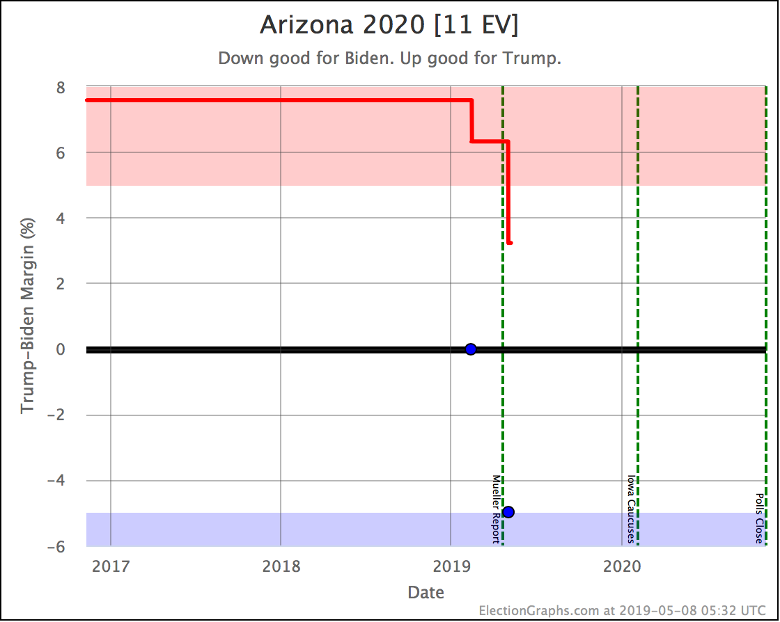
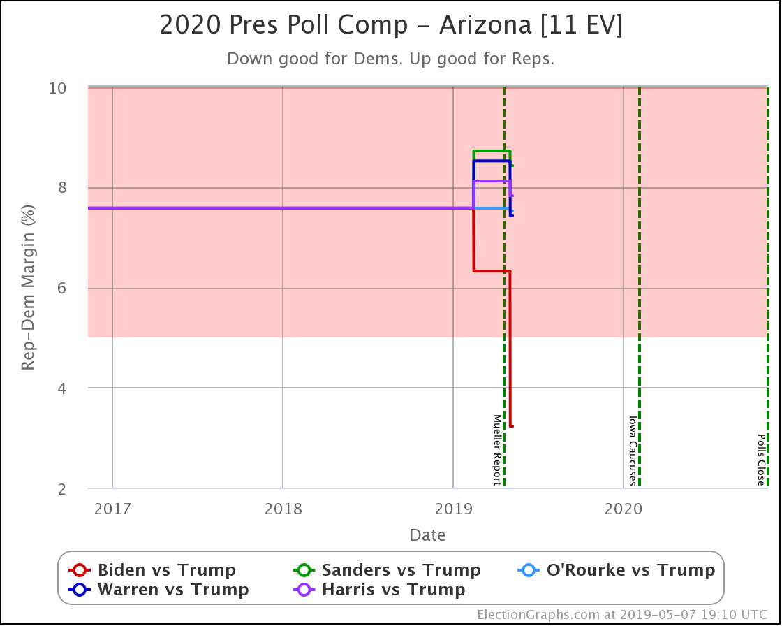
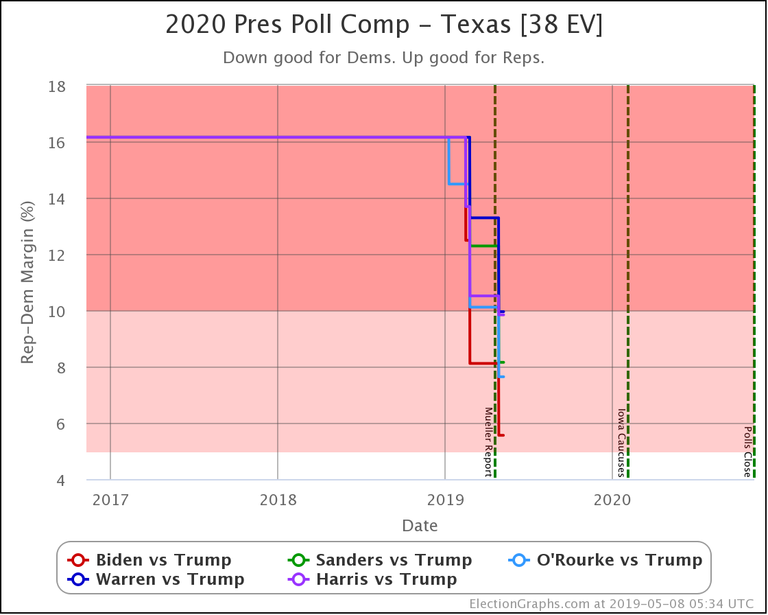
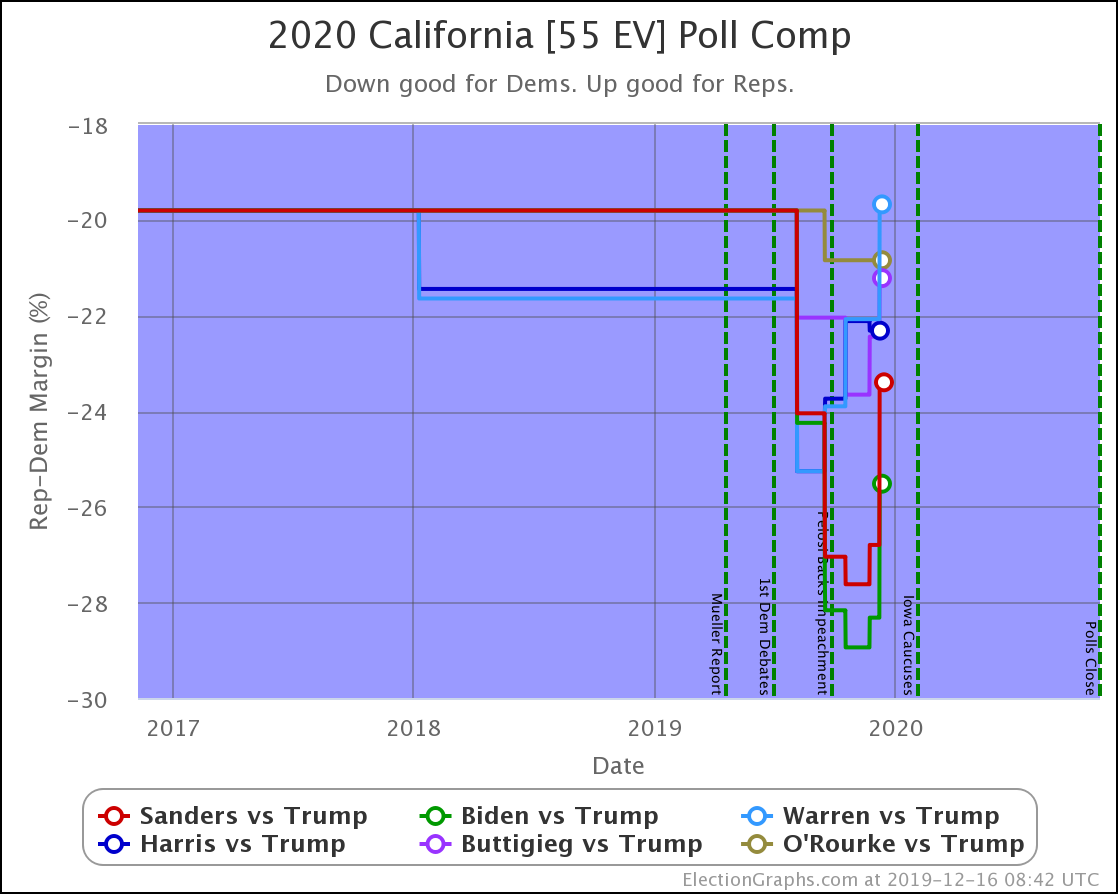
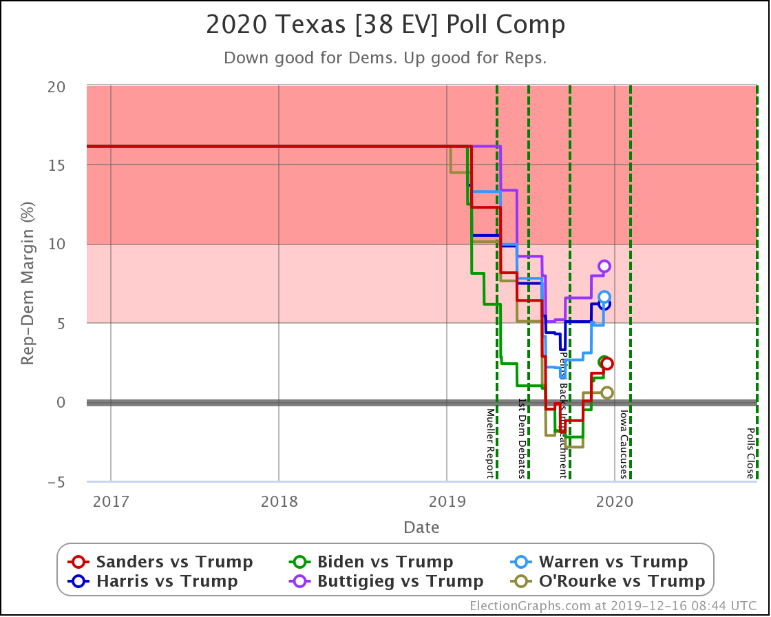
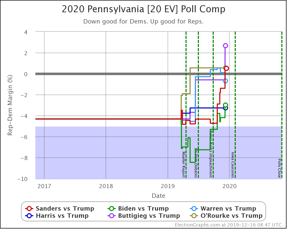
Once again, too long between updates. Since the last one on November 20th there have been new polls in Wisconsin (x3), New Hampshire, California (x2), Texas (x2), Arizona, Michigan, Pennsylvania, and Iowa.
If I'd been posting weekly as I had intended, there would have been a post looking at how Election Graphs win odds correlated to the popular vote polling averages at RCP and using that to measure the Democrats' Electoral College disadvantage. (Spoiler: As of right now it looks like Democrats need an approximately 6% popular vote win margin to have a 50/50 chance of winning the Electoral College.)
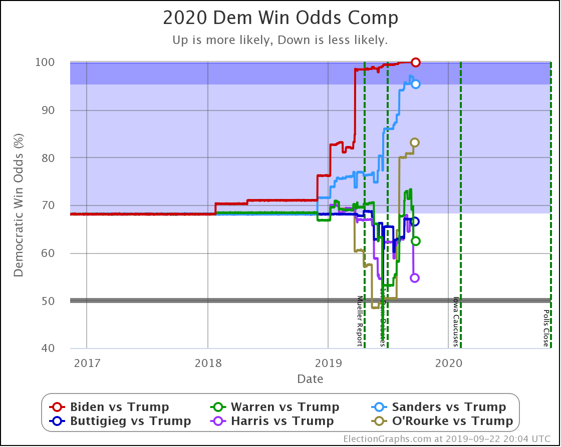
I also would have done a post talking about how while for us political junkies, it seems inconceivable that people don't know who at least the top five Democratic candidates are, this article in the Washington Post by Robert Griffin lays out a pretty convincing case that a large part of the differences in polling between Democratic candidates vs. Trump is STILL simply that lots of people don't know who some of these people are, something that clearly would change before Election Day if they were to win the nomination. That is obviously very important when interpreting what we see here on Election Graphs, which is 100% driven by state level general election matchup polls.
But I kind of missed talking about both those points when they were fresh. So I'll let the above suffice for now.
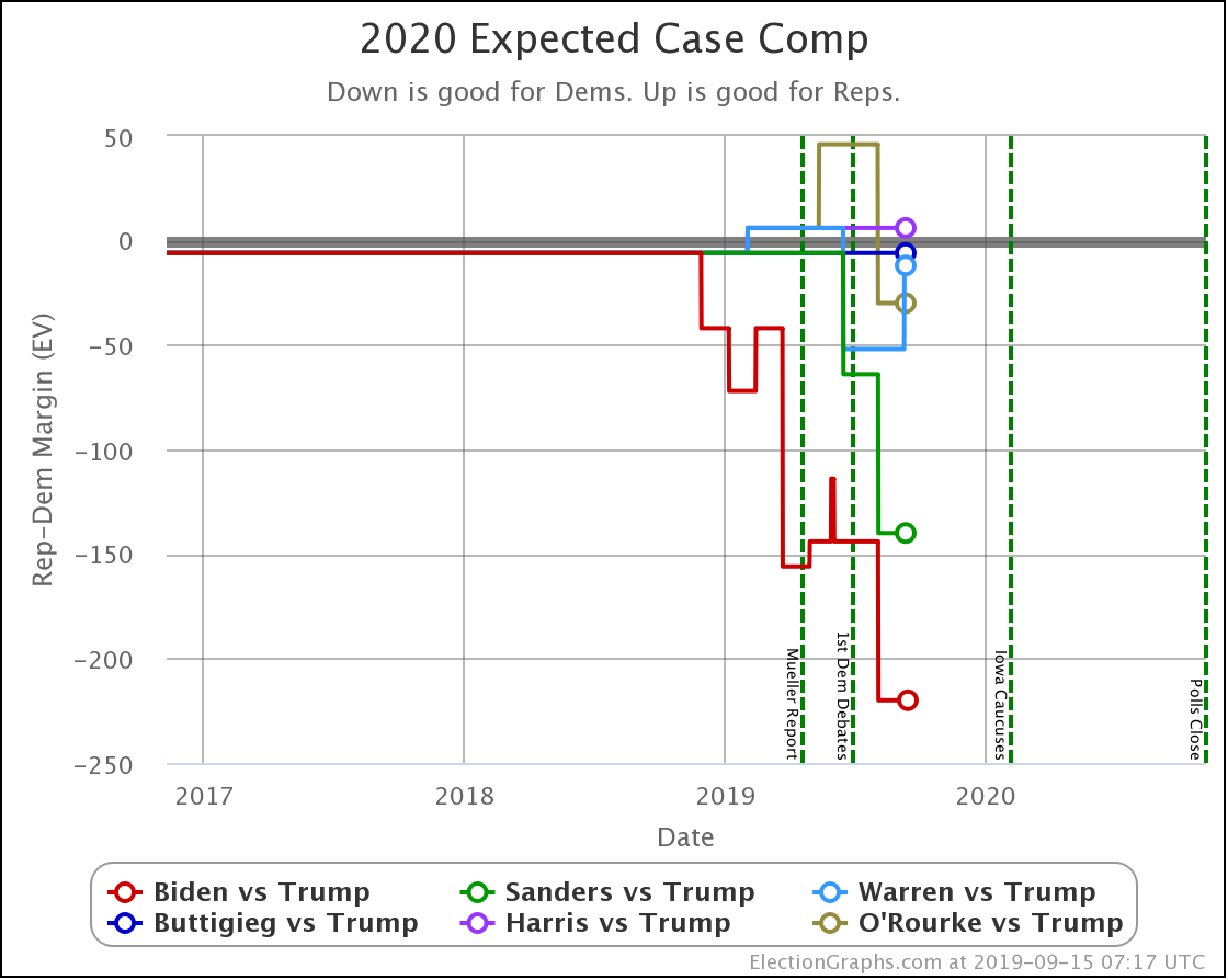
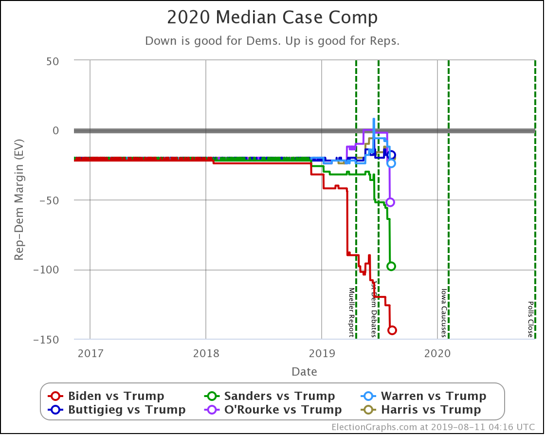
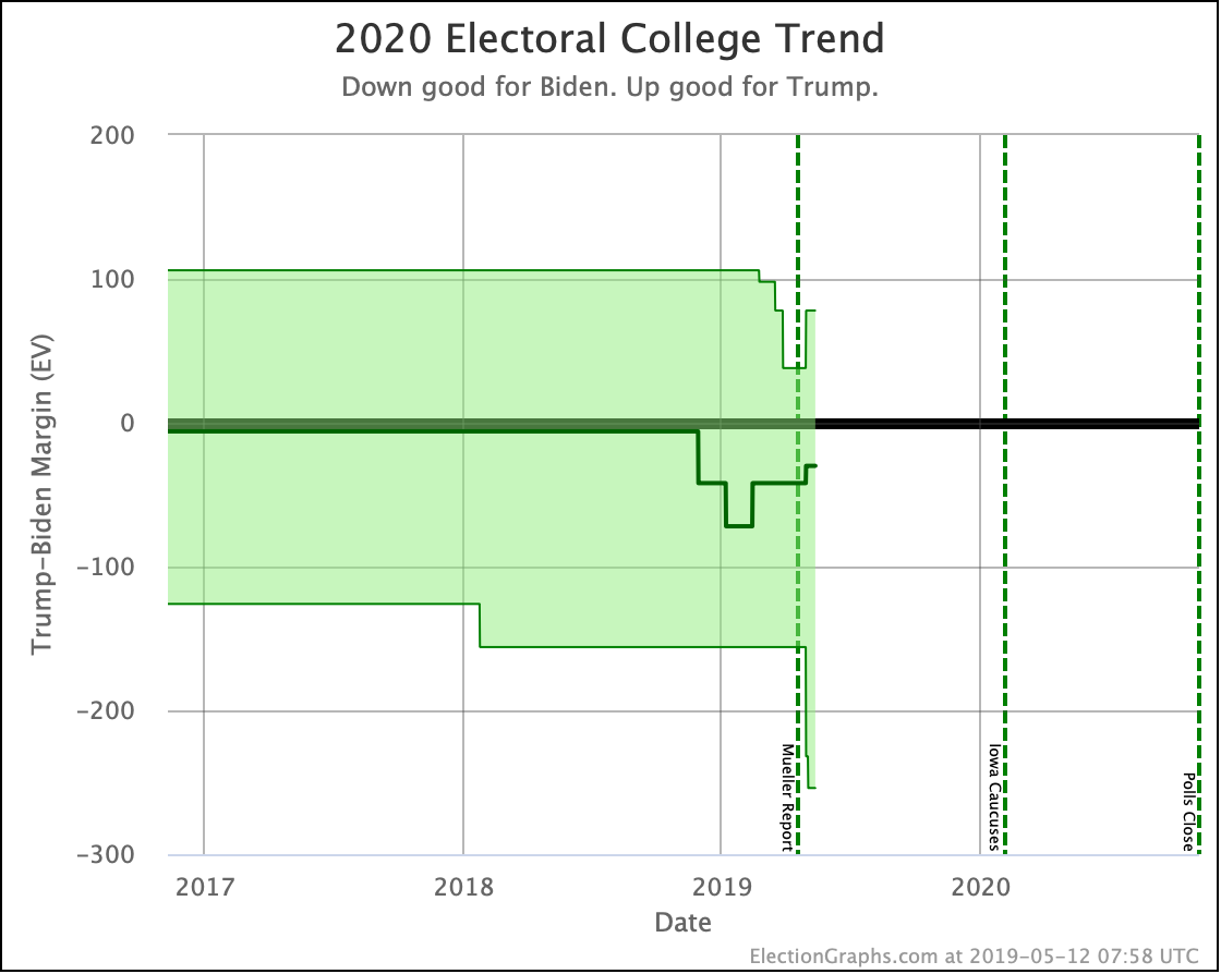
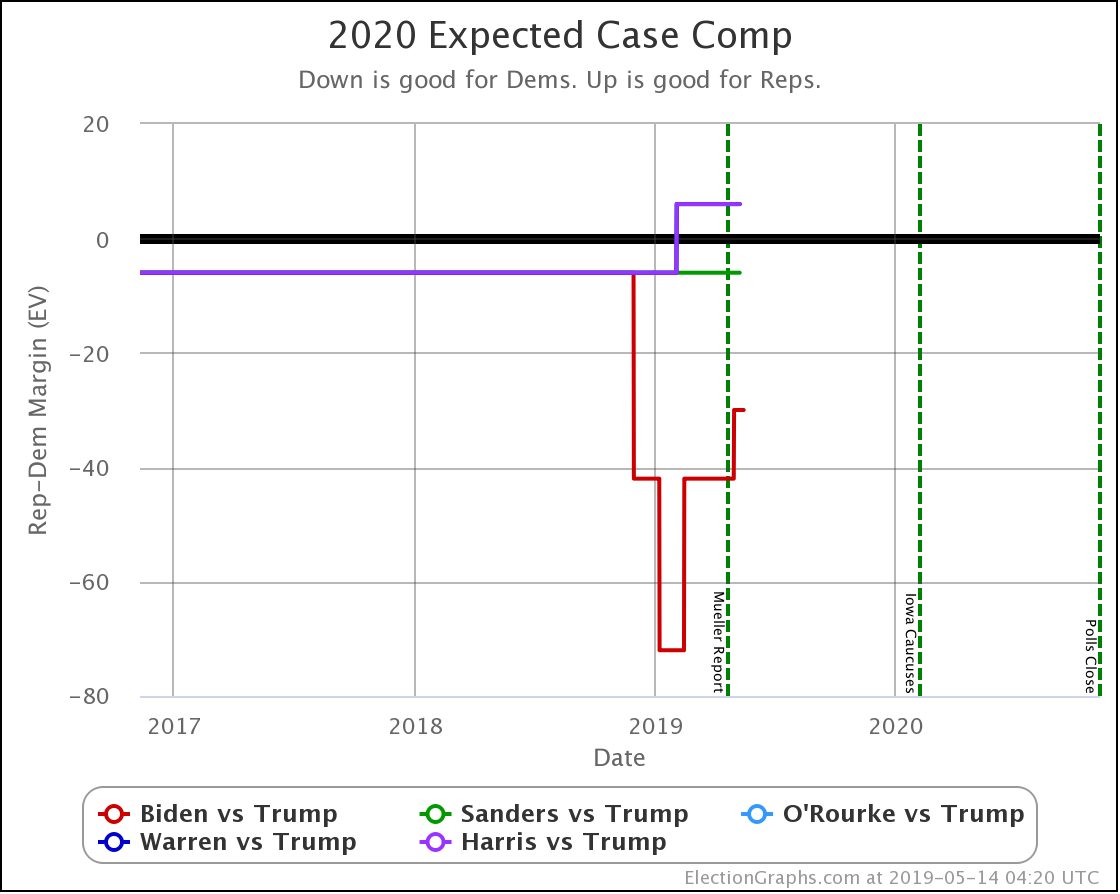
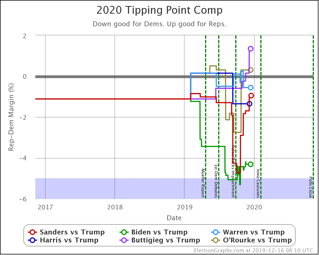
The main thing I want to look at today is this:
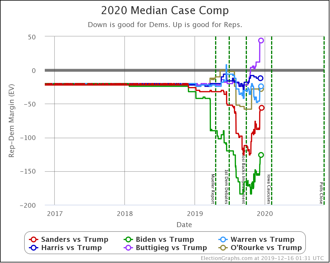
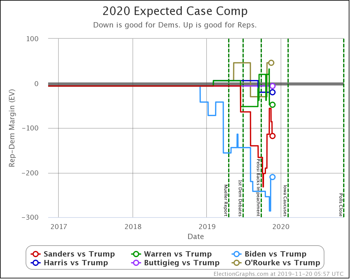
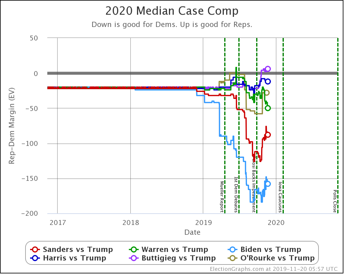
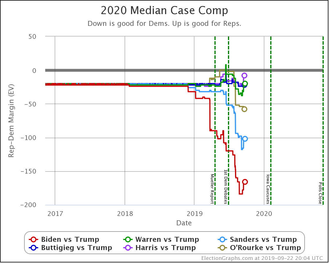
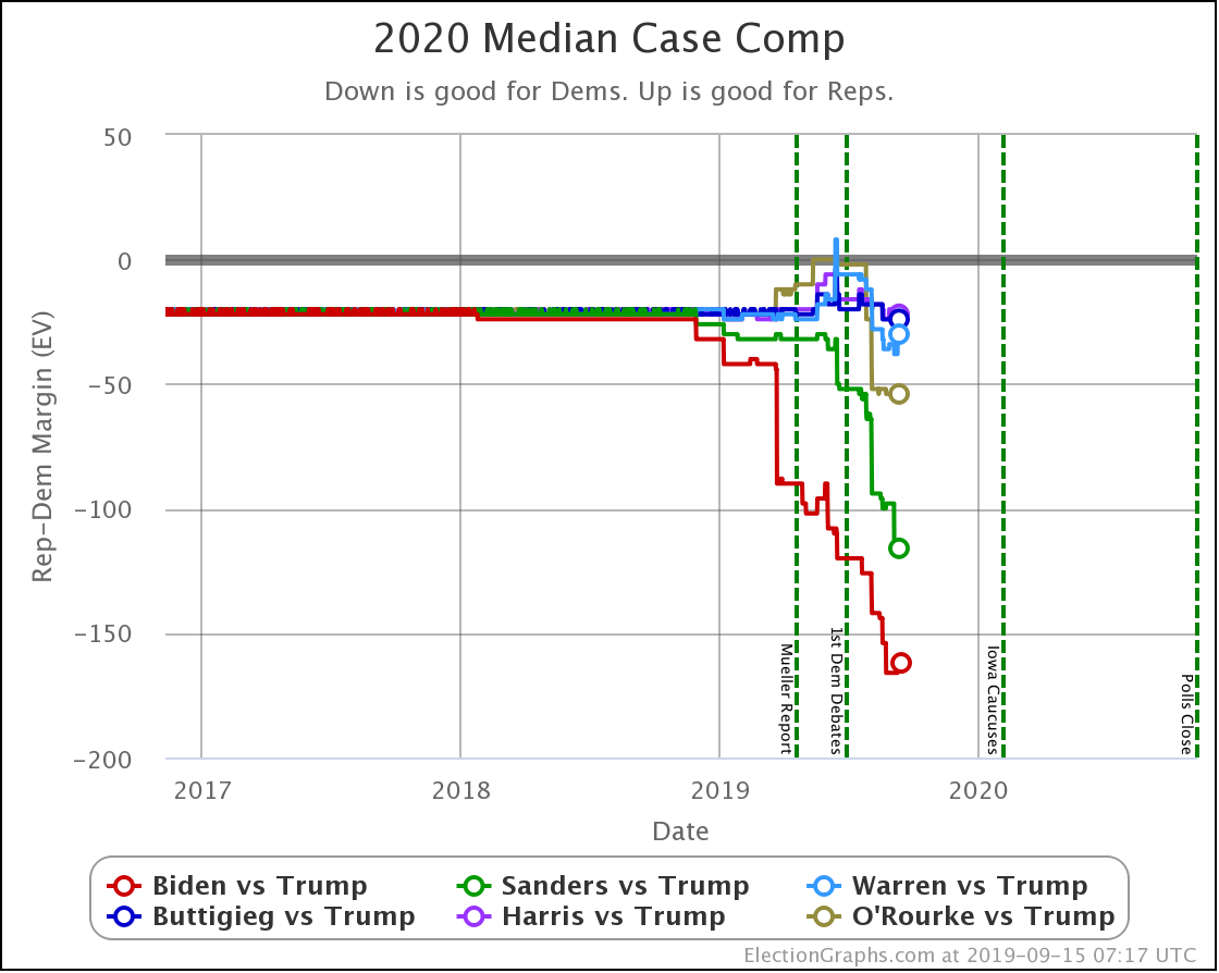
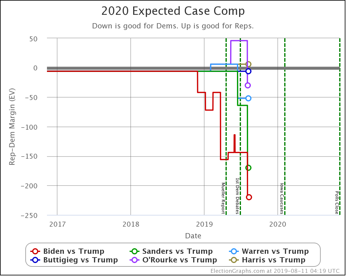
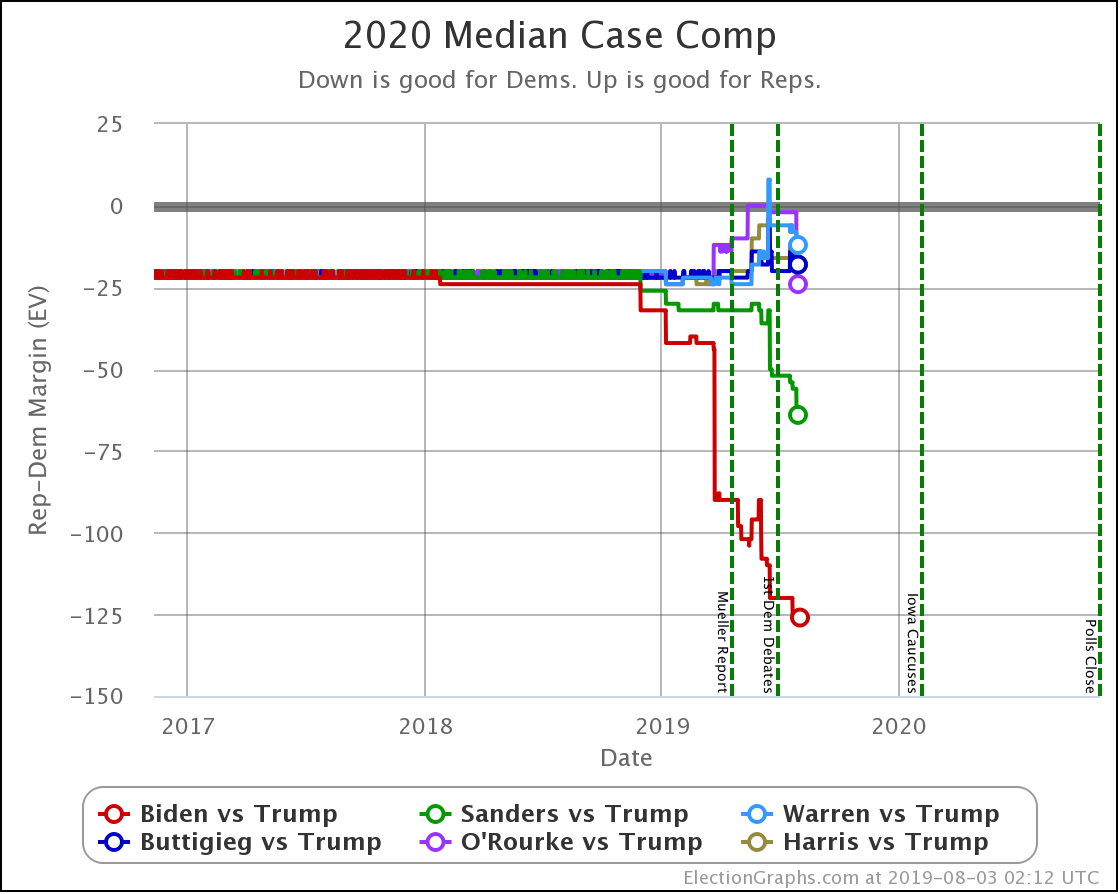
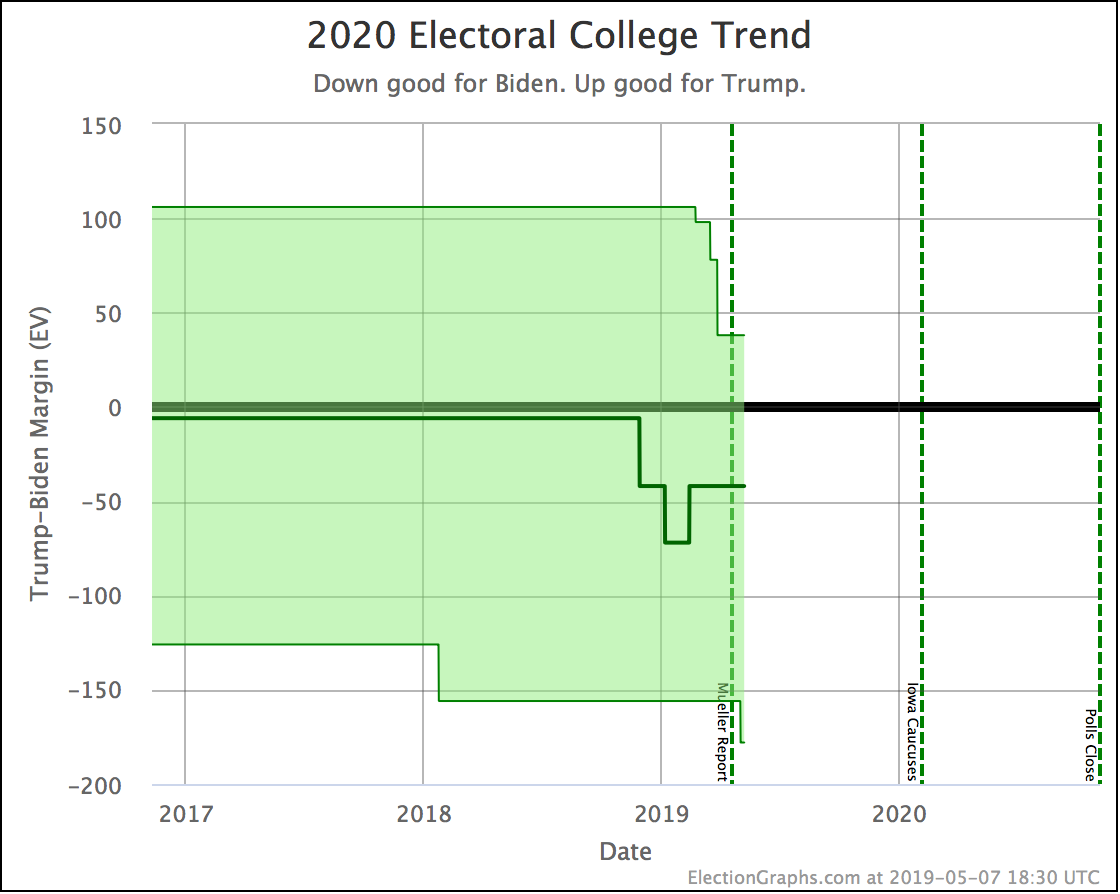
This shows the median electoral college result from the Election Graphs Monte Carlo simulations for each candidate pair.
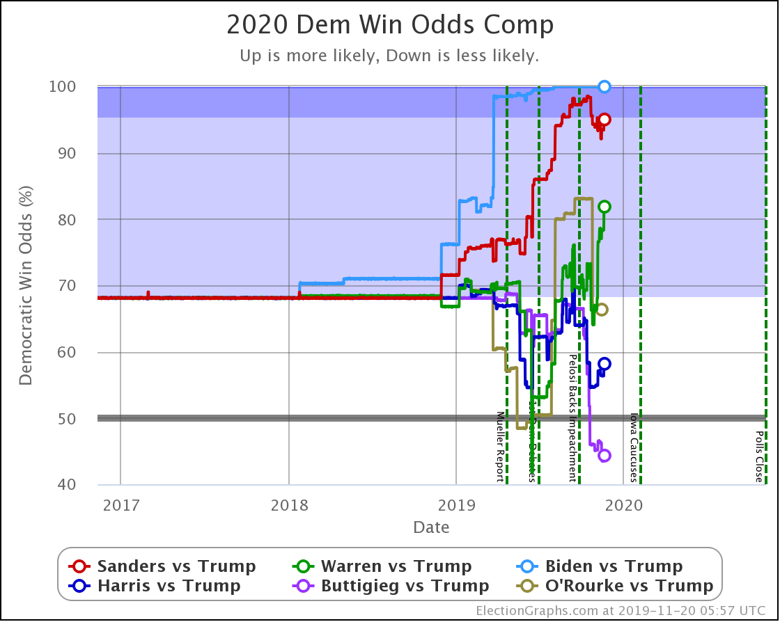
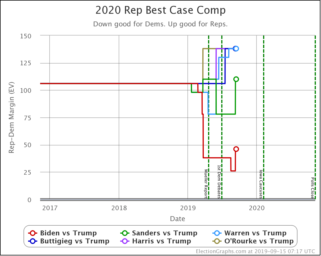
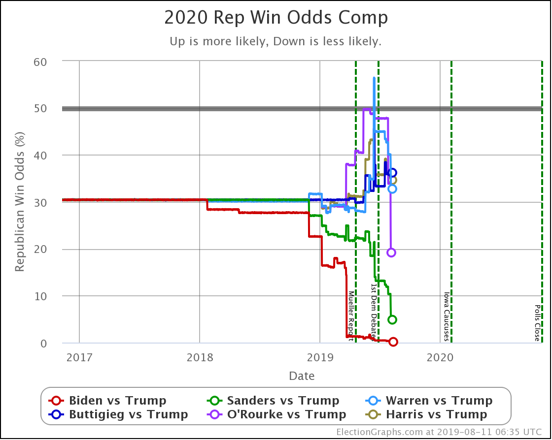
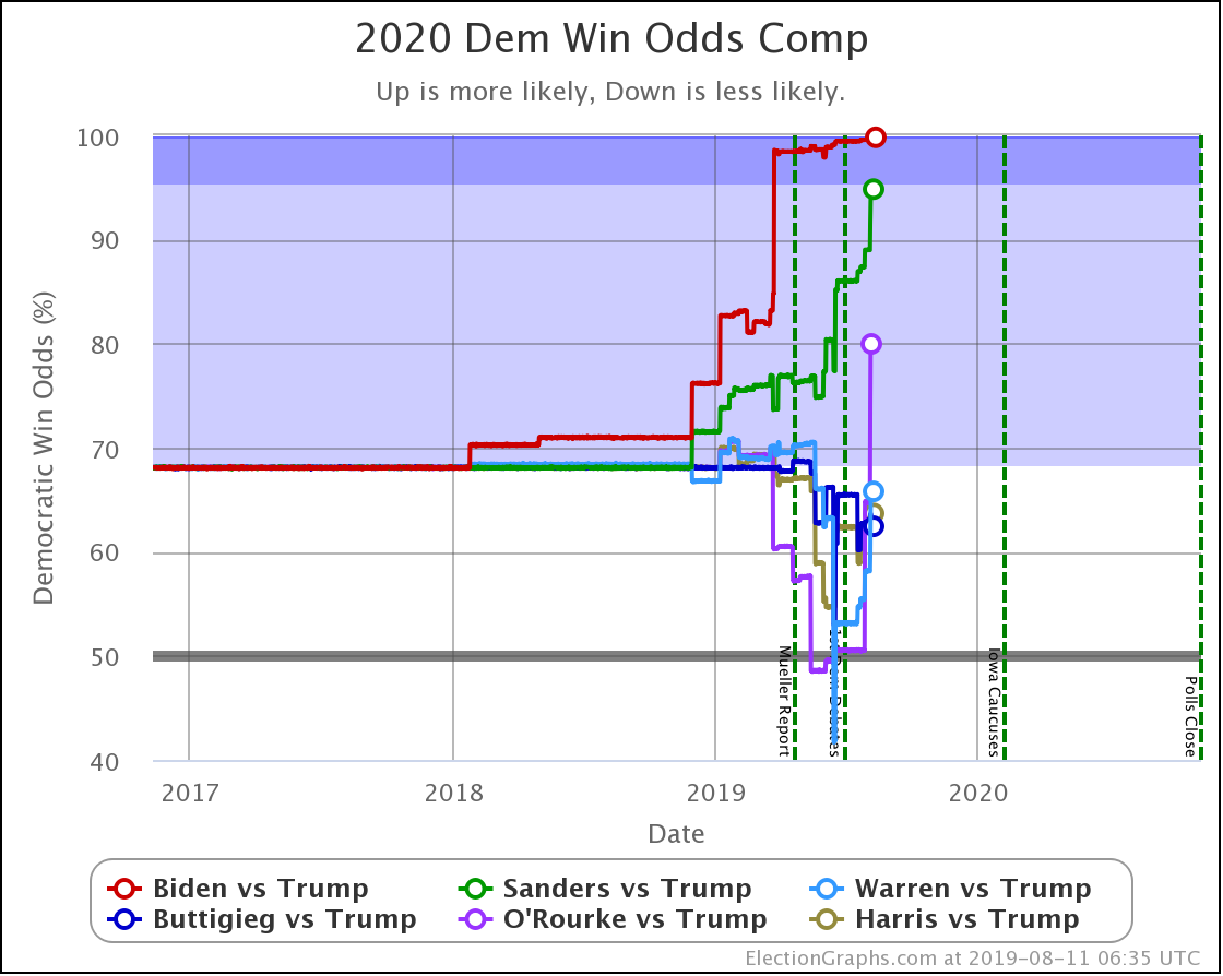
For both Biden and Sanders there is a very clear "V" shaped pattern. (OK, if you look closely, you can see a "W", but the large scale pattern is a "V".) In the first half of this V, as new polls came in and the state averages moved from the baseline based on the 2000-2016 elections, to averages based on 2020 polls, almost every poll made Sanders and Biden look better.
Although he dropped out already, you can see a smaller scale version of this "V" pattern with O'Rourke as well.
Buttigieg doesn't show the initial portion of this V. As the initial polls came in, his results basically just stayed at about the same level as the 2000-2016 baseline. Frankly though, there was very little Buttigieg vs. Trump state level polling in this time frame though, which would explain that.
But all four of these candidates share the second half of the "V". Starting at a specific point in time, as new polling results came in, more often than not, the state averages would move away from the Democrat, and so the median electoral college results would also move the same direction.
When you look at the charts, the inflection point seems to be… well… very close to the date Nancy Pelosi announced that she was officially backing the impeachment investigation over the Ukraine issue.
There are some ups and downs, and you could argue that the best numbers for the Democrats were perhaps a little bit earlier or a little bit later, but roughly speaking, leading up to that announcement on September 24th, every week Sanders, Biden, and O'Rourke looked better in the polls than the week before, while Buttigieg held steady. After September 24th though, Sanders, Biden, Buttigieg, and O'Rourke all looked weaker in each subsequent week.
This may be a coincidence. It may just relate to which pollsters put out polls in which states during this time period. It may just be a "reversion to the mean" after a series of earlier polls were more favorable to the Democrats than was really reflected by the ground truth…
But the location of the inflection point compared to the date when impeachment moved from something a few people were talking about, to a real thing that was happening is hard to ignore. It certainly LOOKS like the impeachment efforts are hurting the Democratic candidates in state level head to head polling against Trump. State after state where the polling averages had moved from red to blue, have now slipped back into the red again.
But wait. There has been one clear omission in the discussion above.
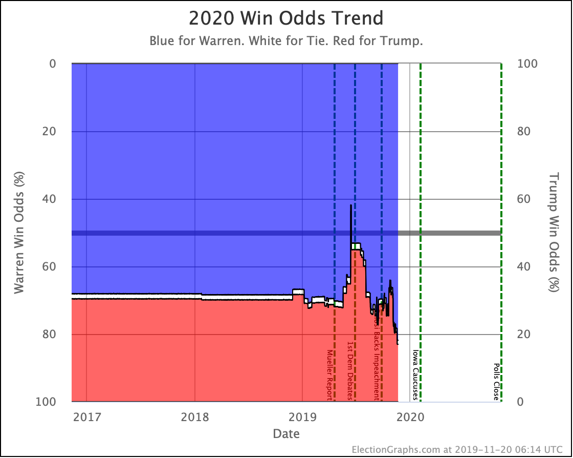
Warren's trend line just does not match the patterns followed by the four candidates discussed above. (Neither did Harris's for that matter, but she dropped out, so we won't spend more time there.) There is no clear "V" shape like Sanders, Biden, and O'Rourke. Nor does Warren follow Buttigieg's pattern.
In fact, Warren does not show any change that looks like it coincides with impeachment events. Initially as early polls came in, she looked like she would do worse than the median based on the 2000-2016 averages. Then she started doing a little better than that. And now she's a little worse again.
The fact that the reversal in fortunes that lines up with the impeachment announcement does not seem to apply to Warren (or Harris) seems notable. After all, Warren was one of the first Democratic candidates to come out strongly in favor of impeachment, and she did so strongly. If there was an impact from impeachment, why wouldn't it touch her? Perhaps even more than other candidates? This may in fact be an argument toward this movement NOT being tied directly to impeachment, but rather to something unrelated.
Without information that specifically digs into motivations rather than just candidate preferences, it is hard to say anything definitive. But the alignment certainly is suggestive. We shall see if those trends continue as the impeachment saga continues to play out.
In the mean time, we'll close out by looking at the changes in our main metrics since the last update post, followed by some of the state level charts.
| Dem | 20 Nov | 16 Dec | 𝚫 |
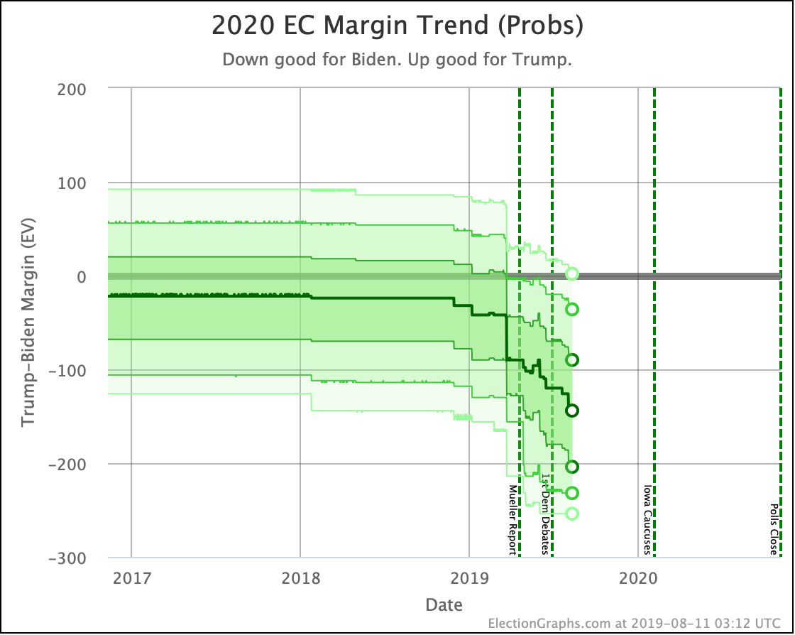
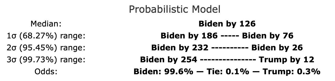
| Biden | +158 | +126 | -32 |
| Sanders | +88 | +56 | -32 |
| Warren | +50 | +24 | -26 |
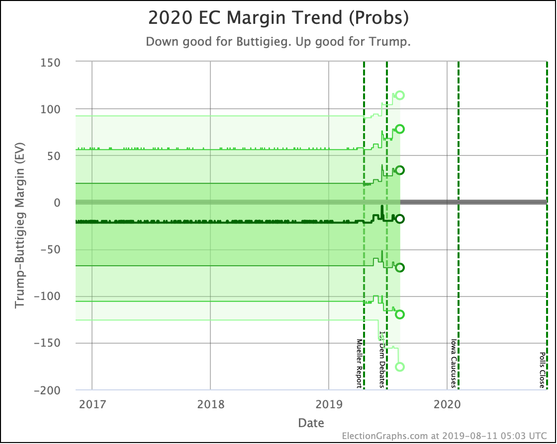
| Buttigieg | -6 | -44 | -38 |
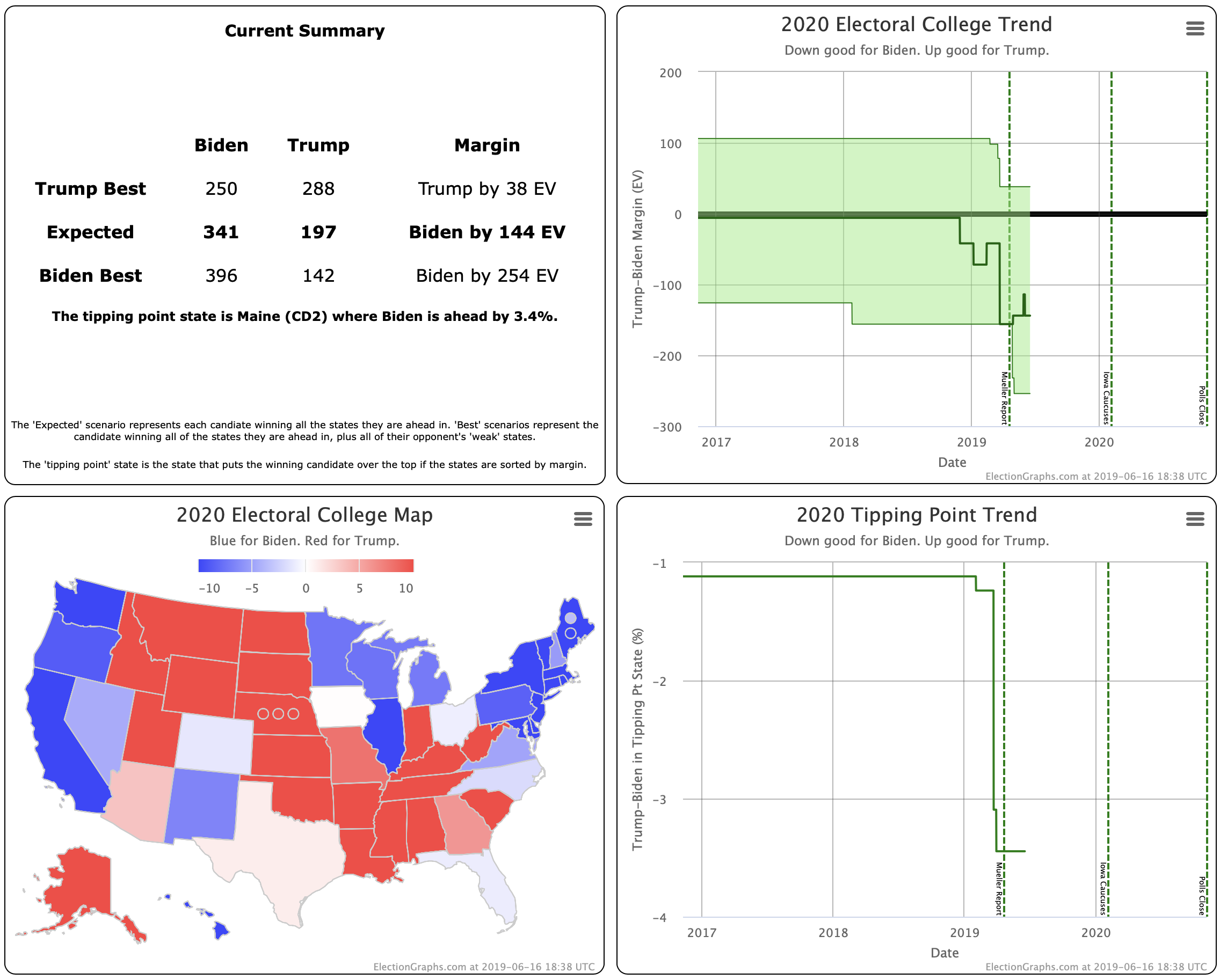
All four still active Democrats weakened significantly in their "median case" from the Election Graphs Monte Carlo simulations.
This has not been a good month for the Democrats.

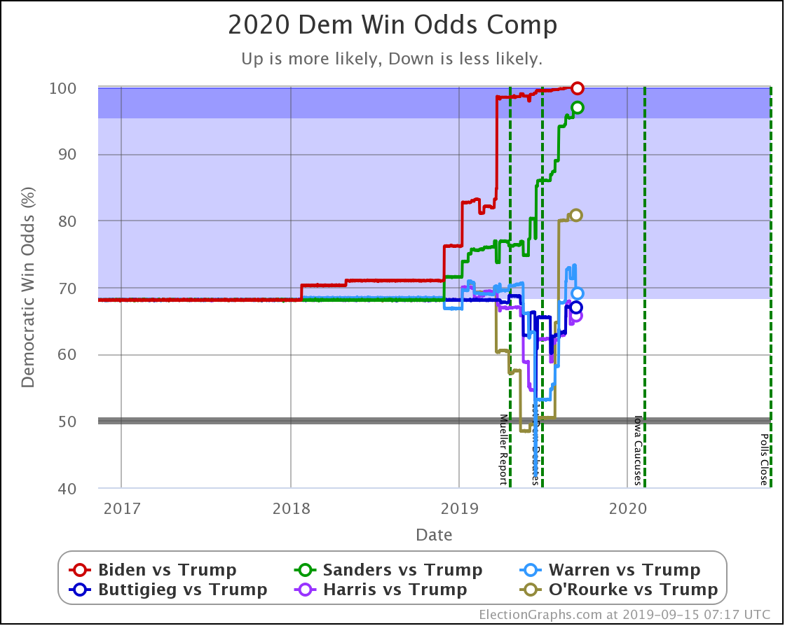
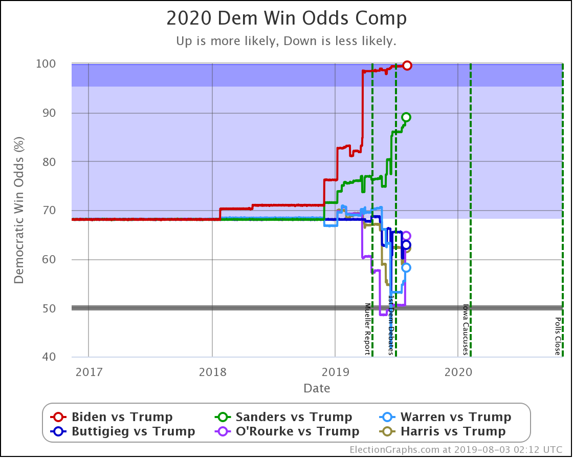
| Dem | 20 Nov | 16 Dec | 𝚫 |
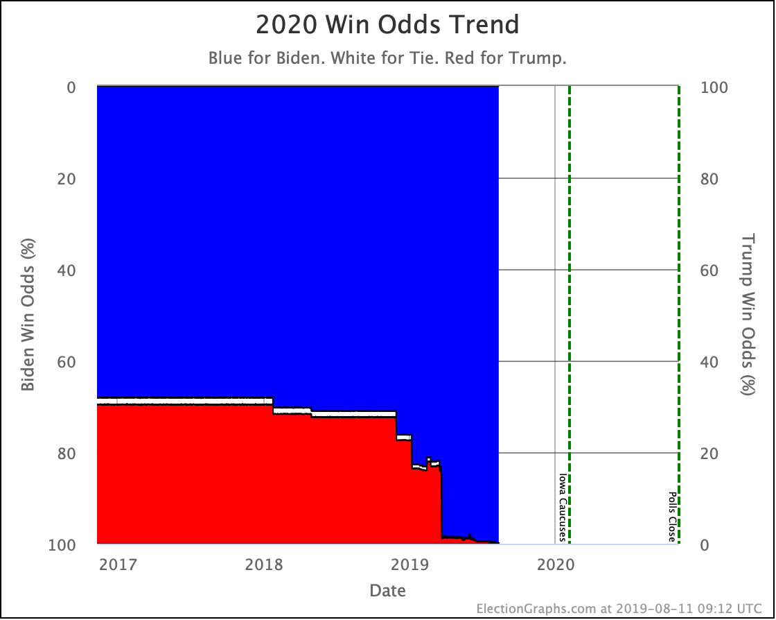
| Biden | 99.9% | 99.4% | -0.5% |
| Sanders | 95.0% | 83.5% | -11.5% |
| Warren | 81.8% | 67.2% | -14.6% |
| Buttigieg | 44.3% | 16.5% | -27.8% |
Given how far ahead Biden was, his win odds are still 99%+. But the other three took pretty big hits these last few weeks.
Especially Buttigieg. Last time he was already the only candidate with a less than 50% chance of beating Trump. But now that has dropped to a paltry 16.5%.
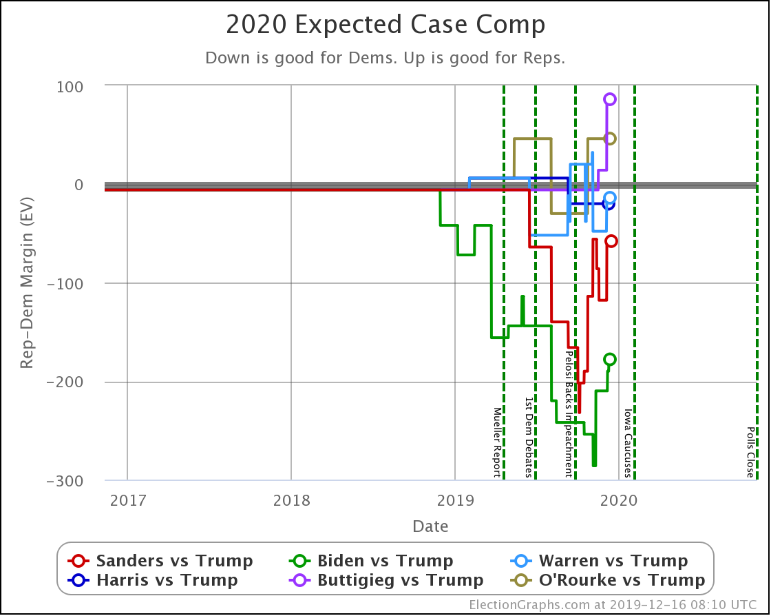
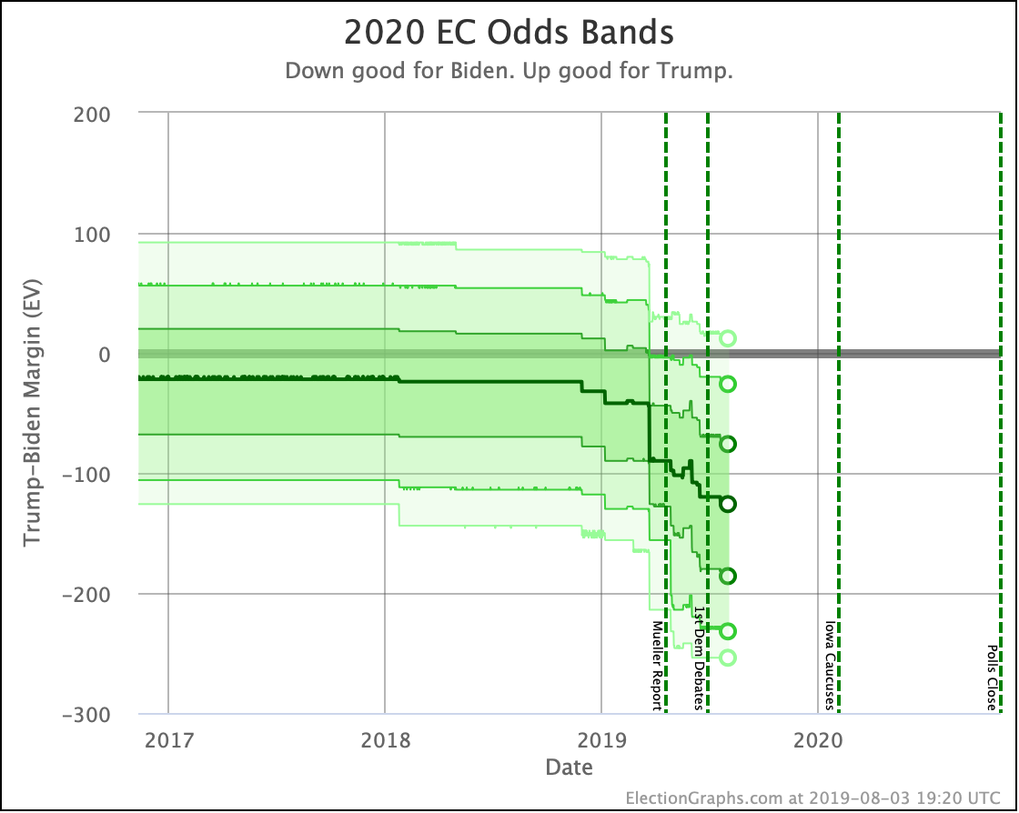
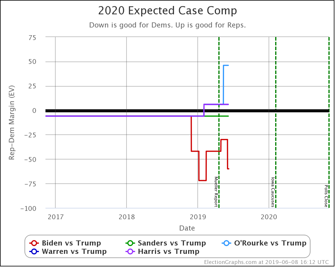
| Dem | 20 Nov | 16 Dec | 𝚫 |
| Biden | +210 | +178 | -32 |
| Sanders | +118 | +58 | -60 |
| Warren | +48 | +14 | -34 |
| Buttigieg | +6 | -86 | -92 |
Using the older and simpler "expected case" where every candidate simply wins every state where they lead the polls, you see similar across the board drops to what you see in the "median case" from the simulation, but the drops are even more dramatic.
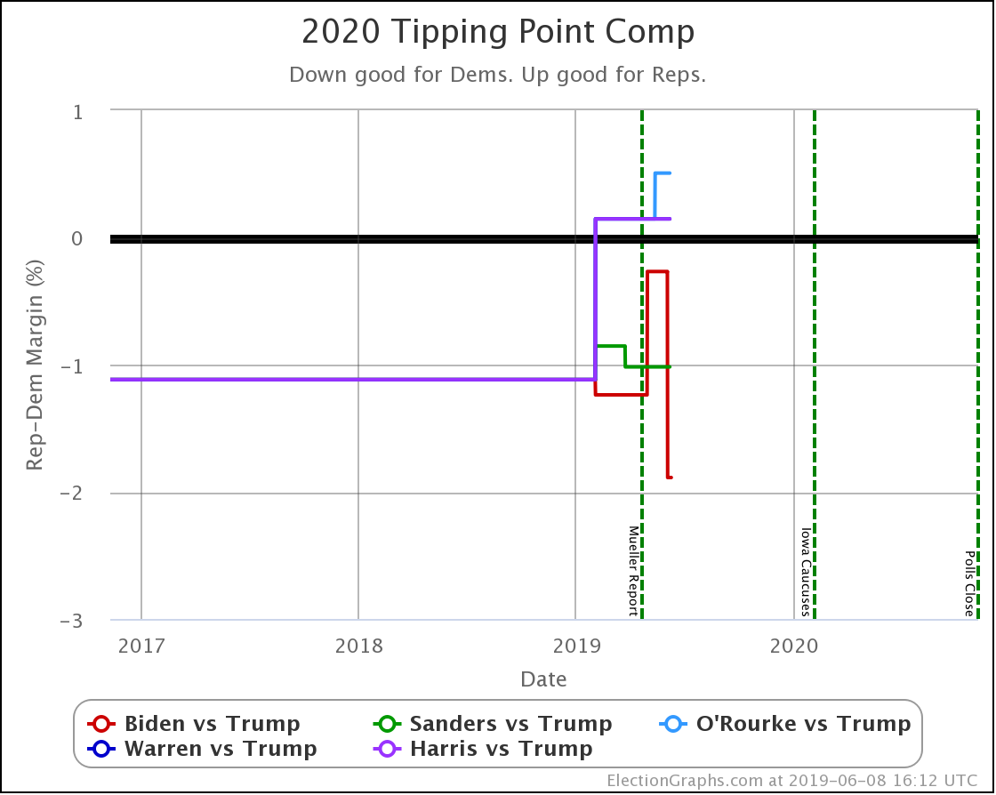
| Dem | 20 Nov | 16 Dec | 𝚫 |
| Biden | +4.4% | +4.3% | -0.1% |
| Sanders | +1.8% | +1.0% | -0.8% |
| Warren | +0.6% | +0.6% | Flat |
| Buttigieg | +0.2% | -1.3% | -1.5% |
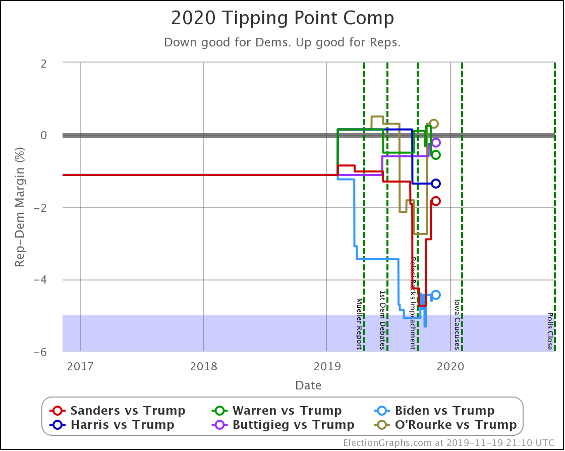
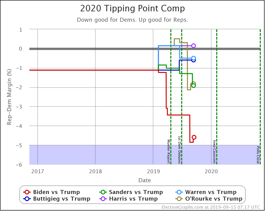
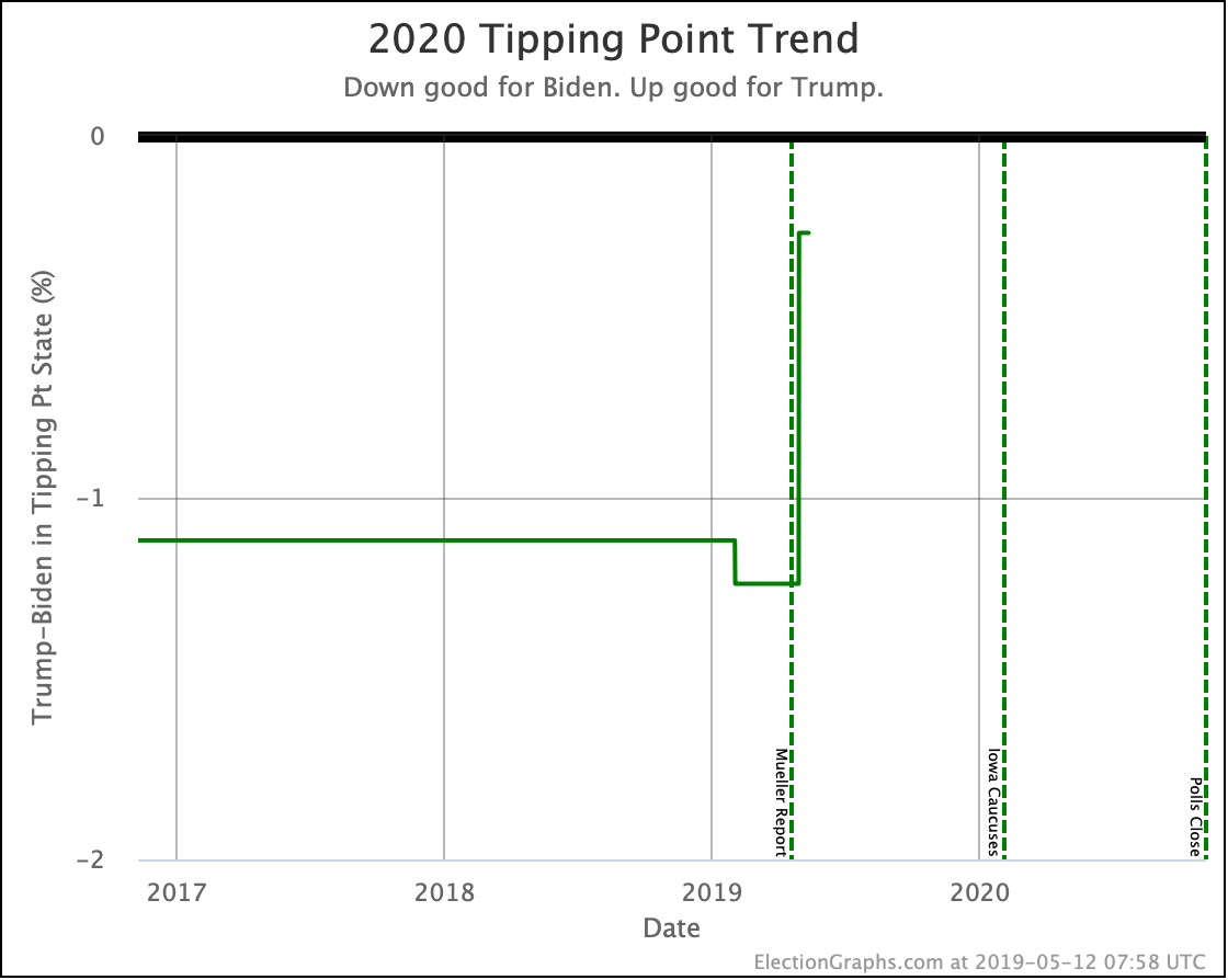
For the tipping point, which measures how much of a gain would be needed to flip the electoral college winner if that gain occurred uniformly across all states, Warren manages to stay flat, but the other three Democrats get weaker.
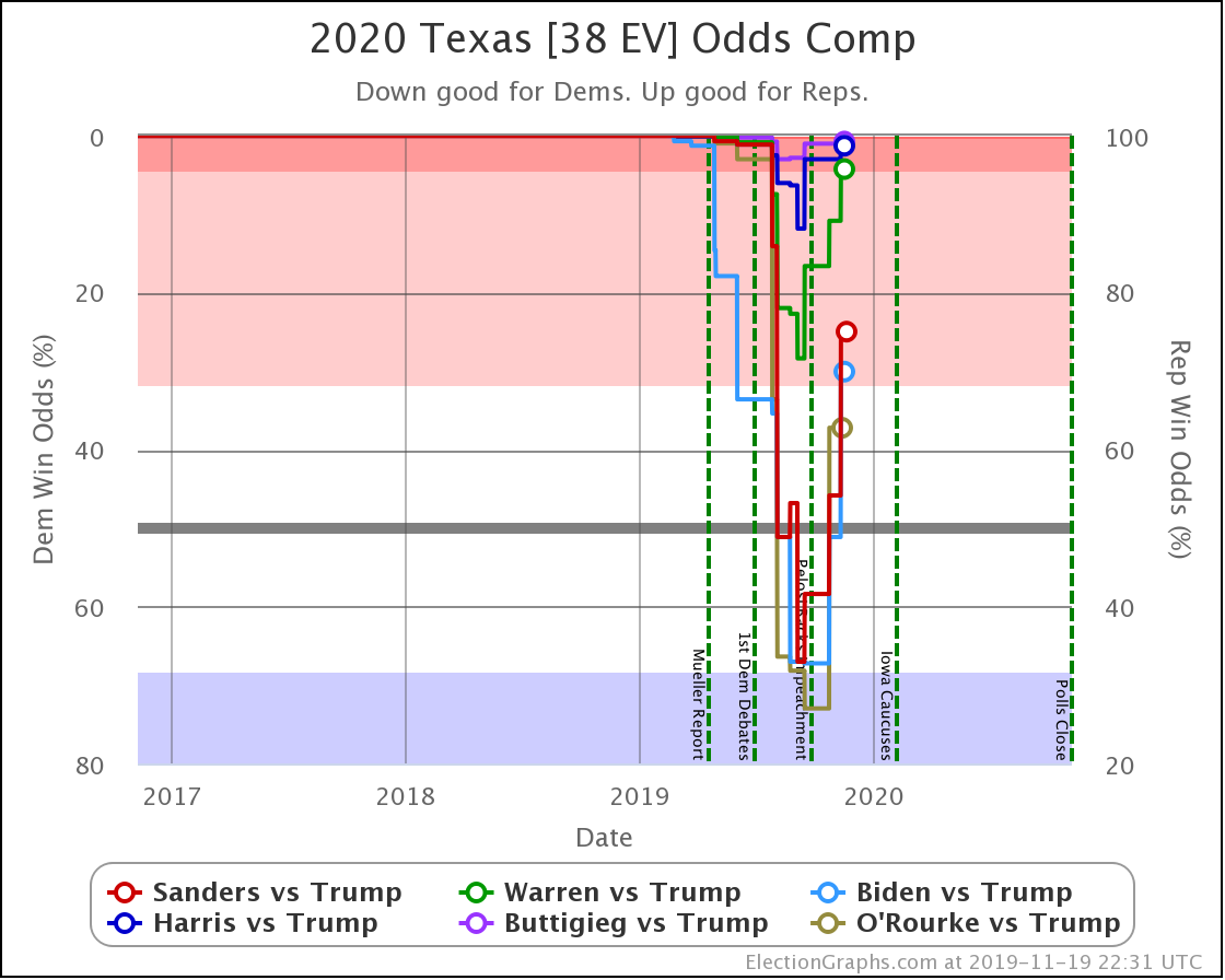
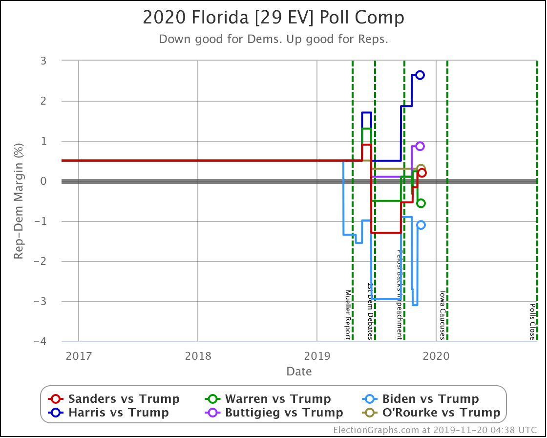
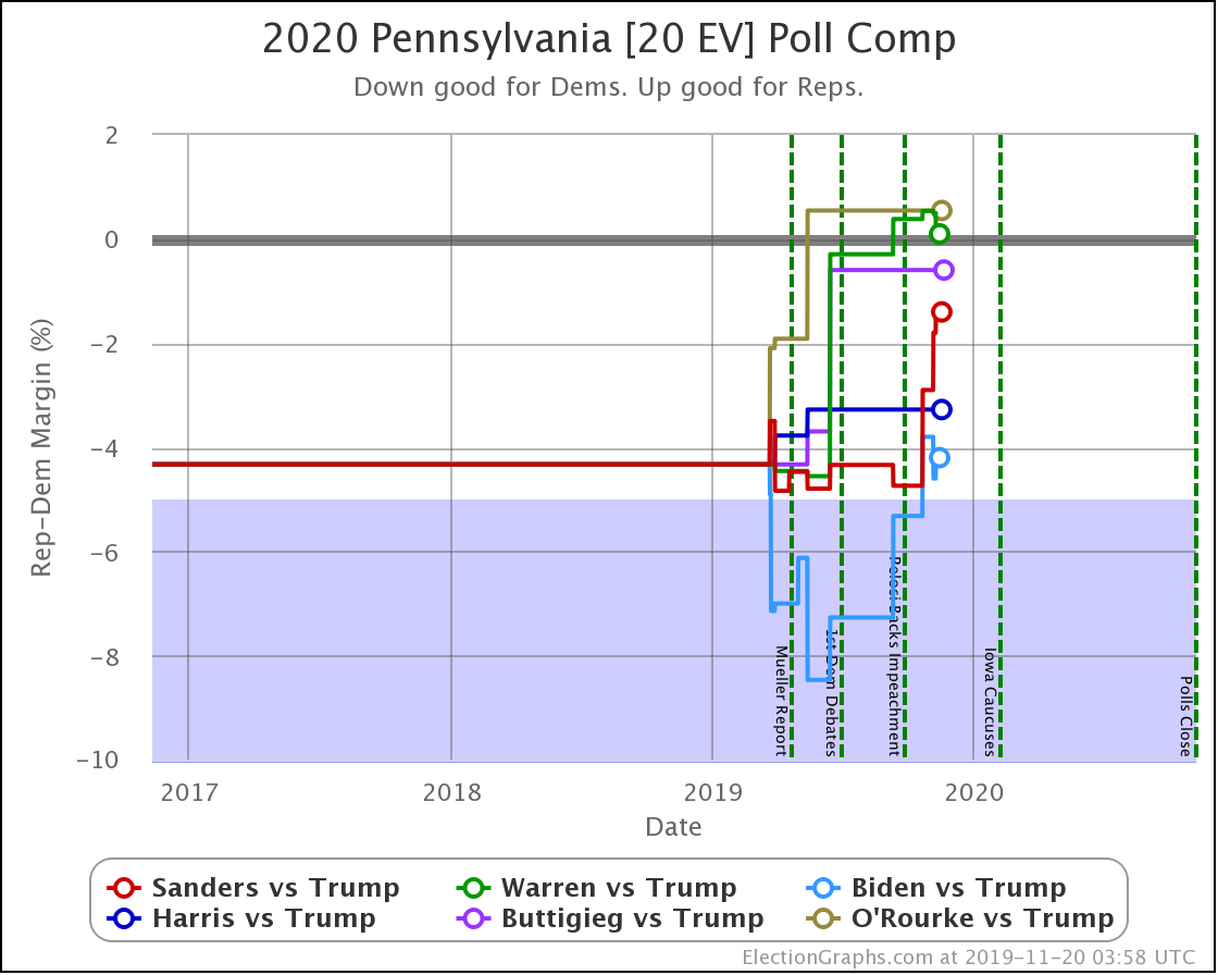
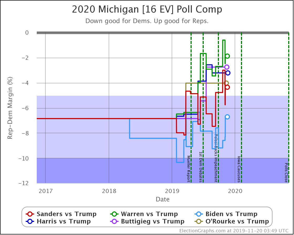
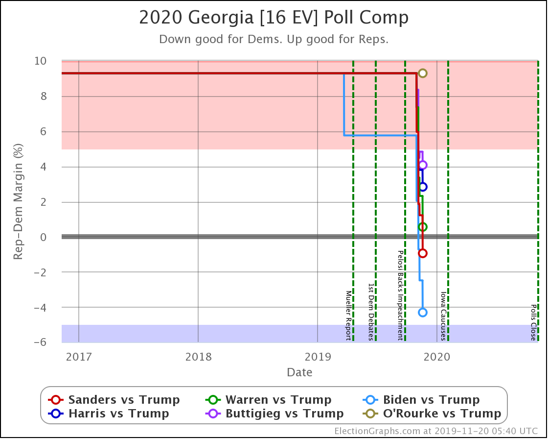
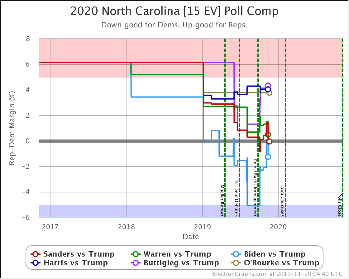
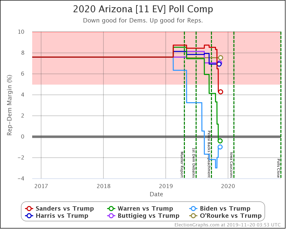
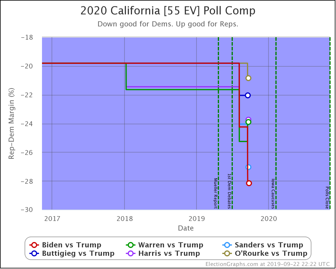
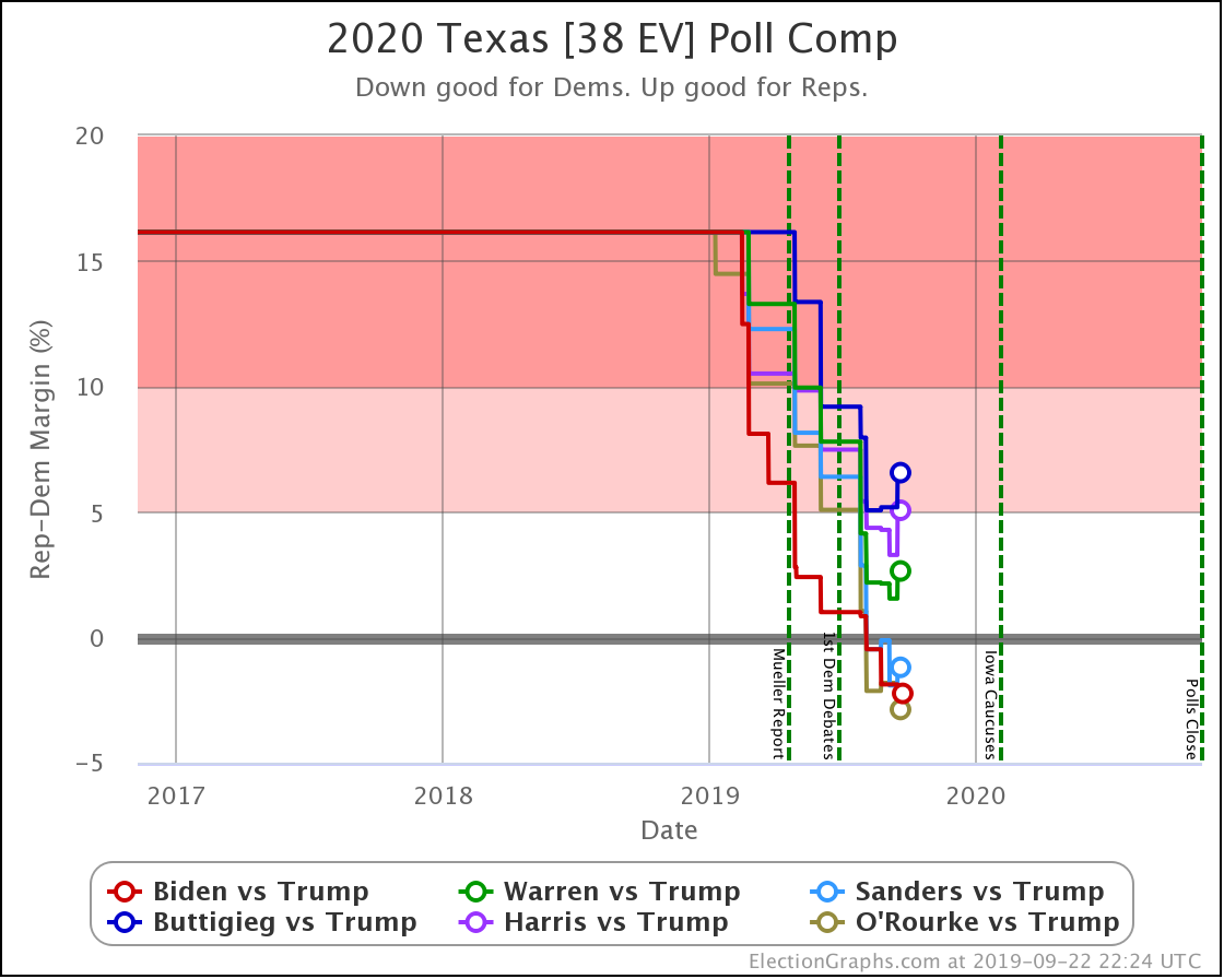
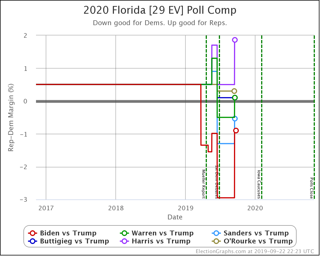
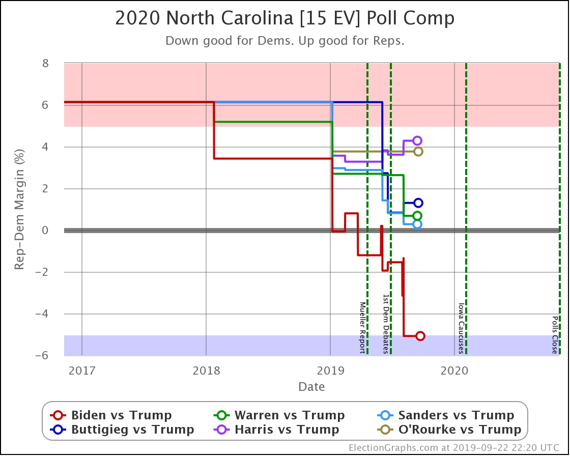
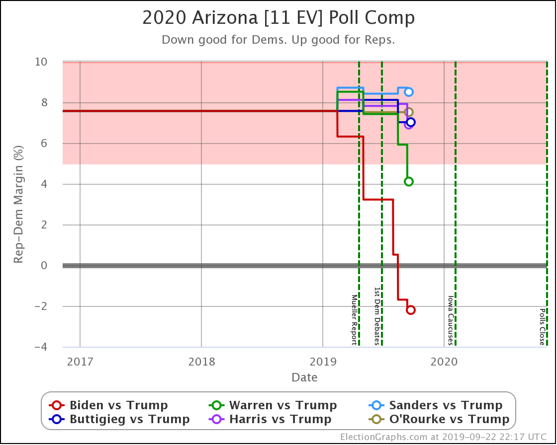
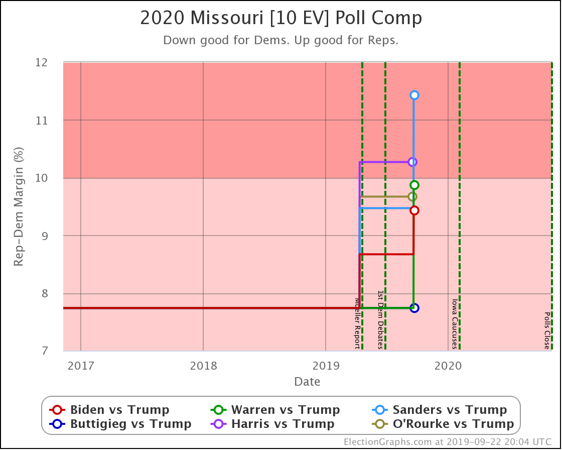
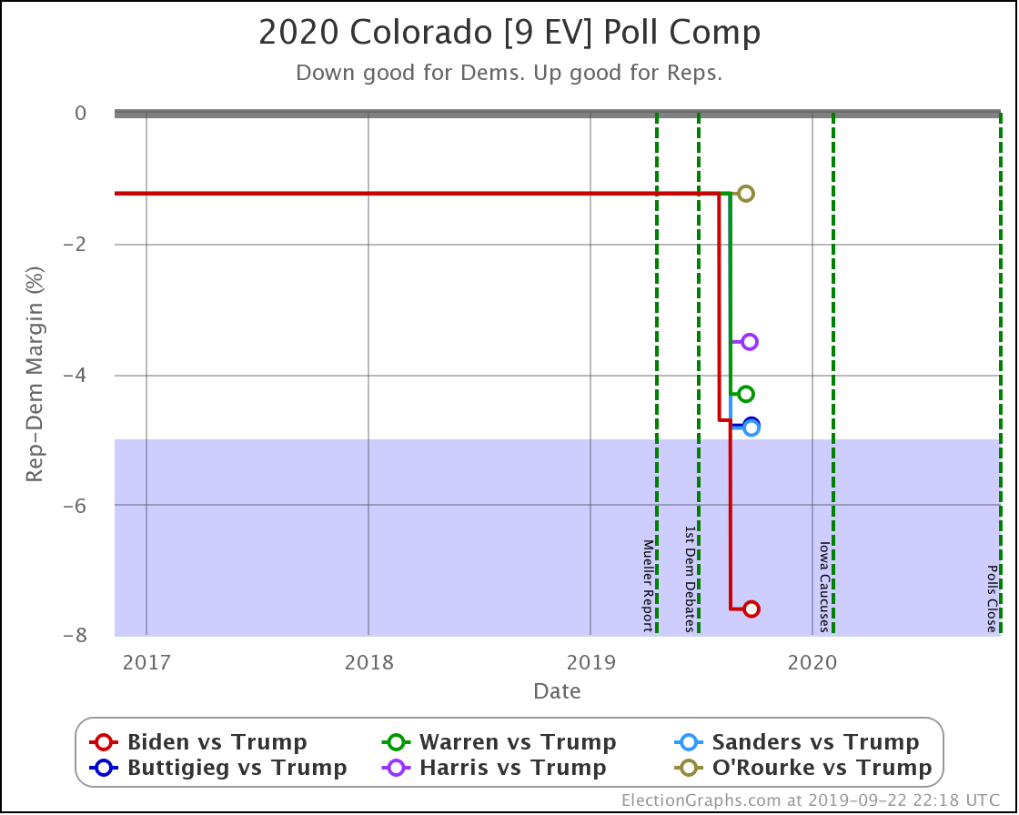
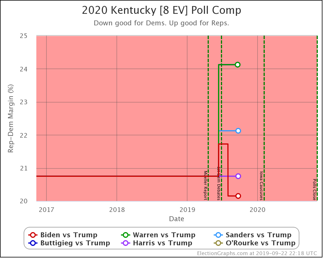
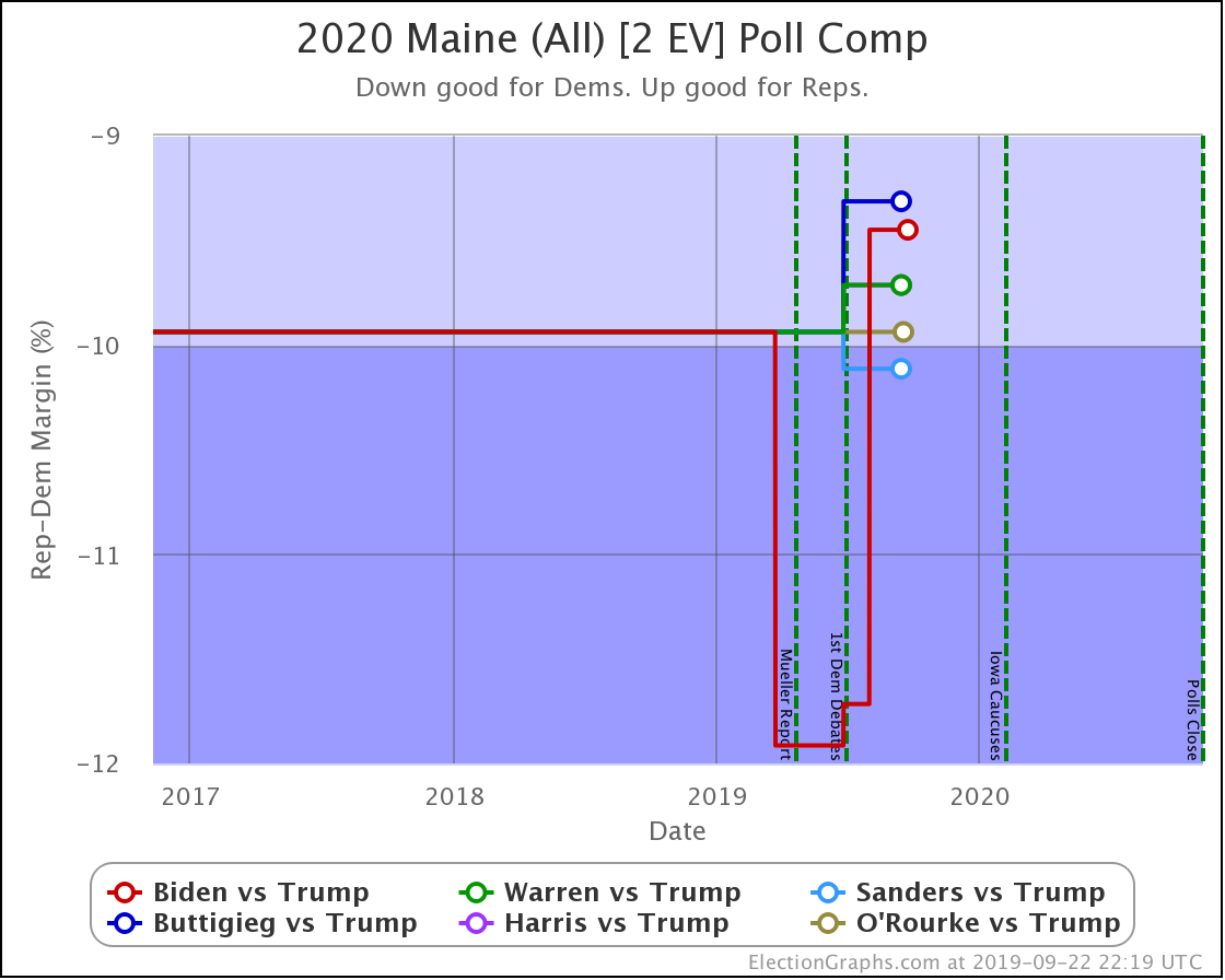
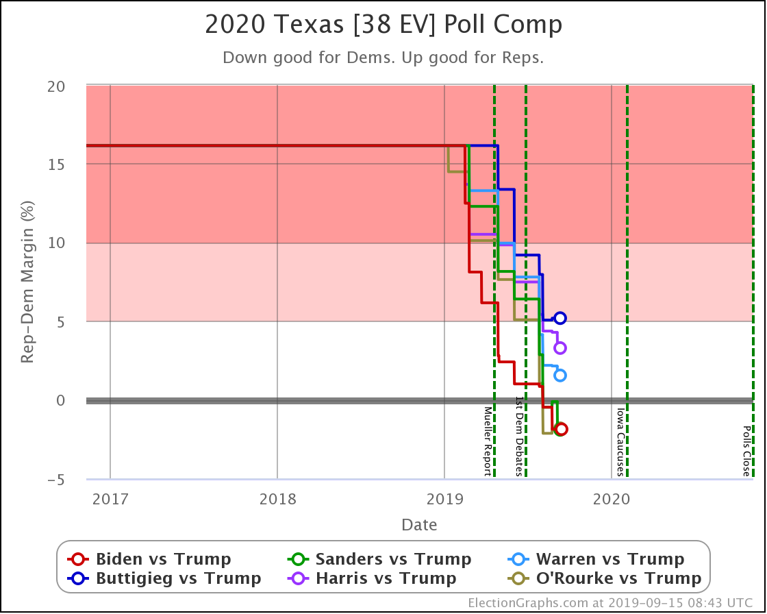
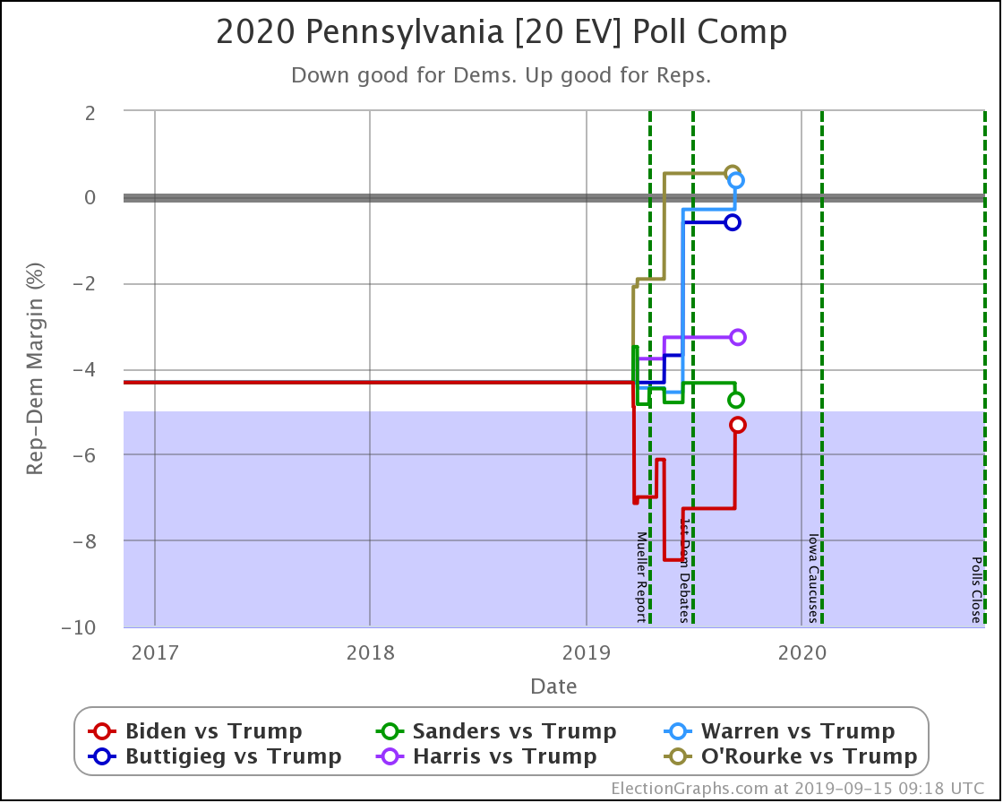
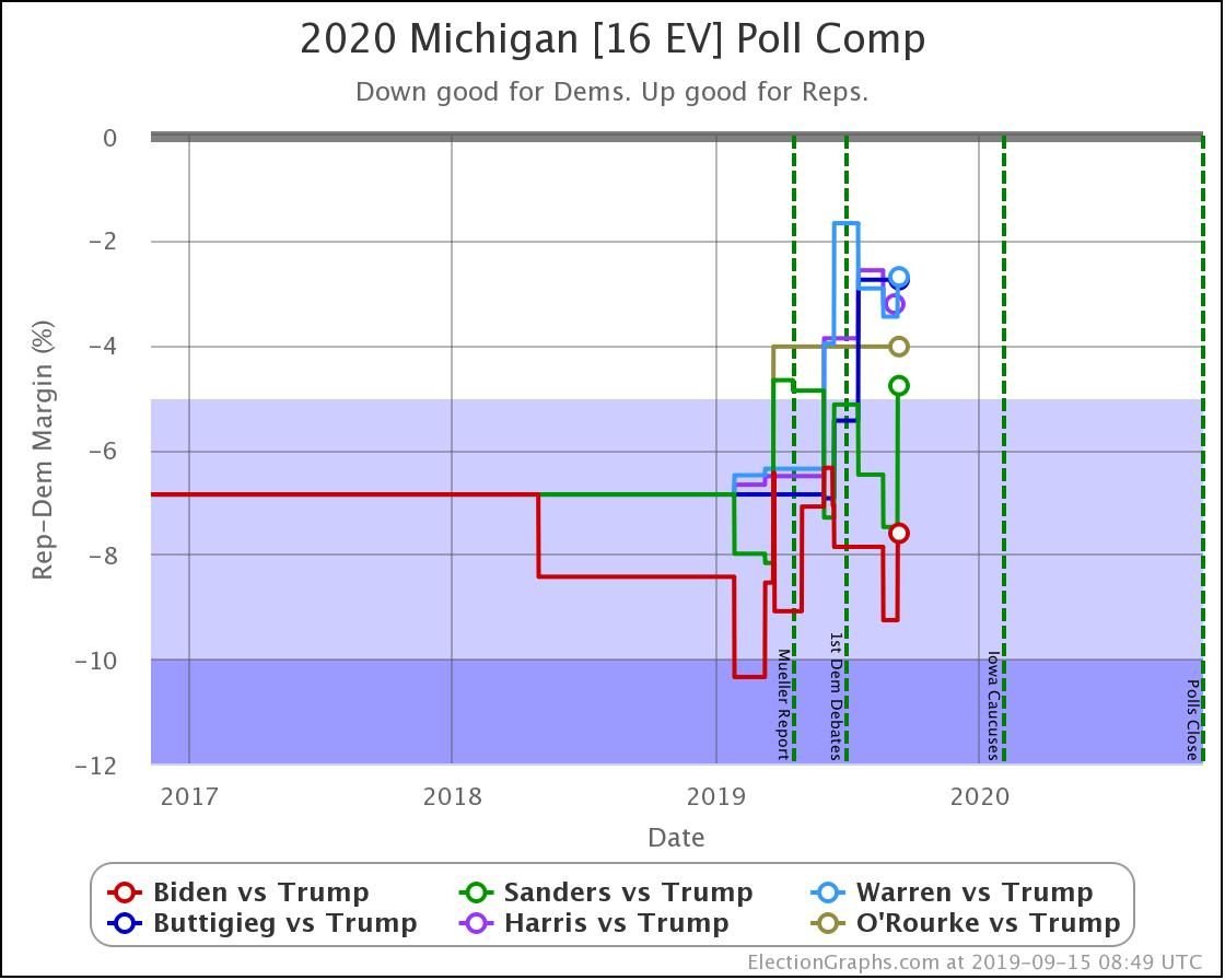
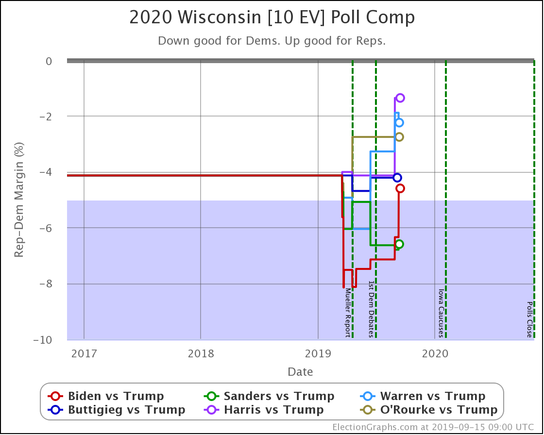
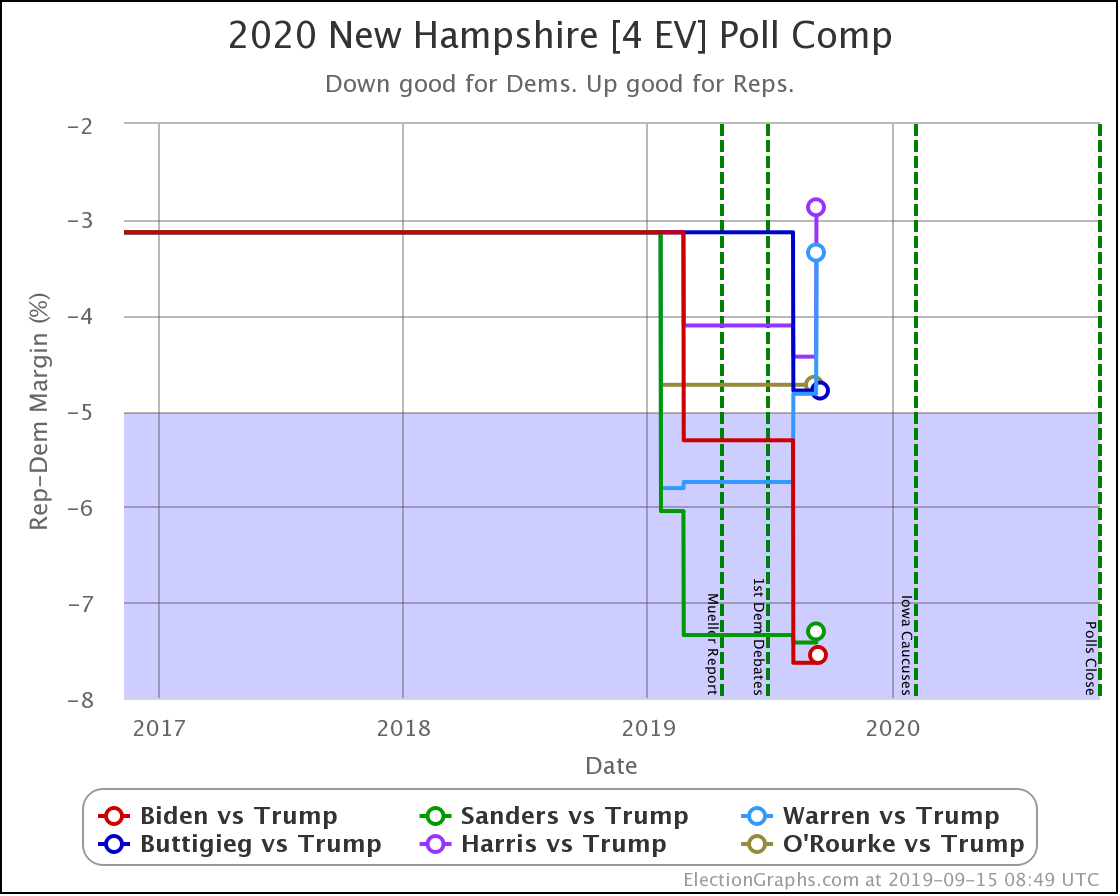
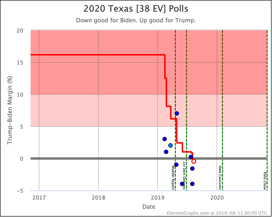
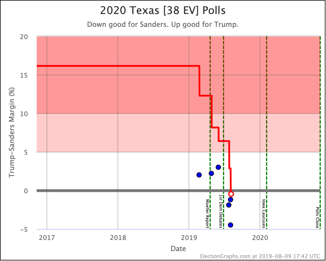
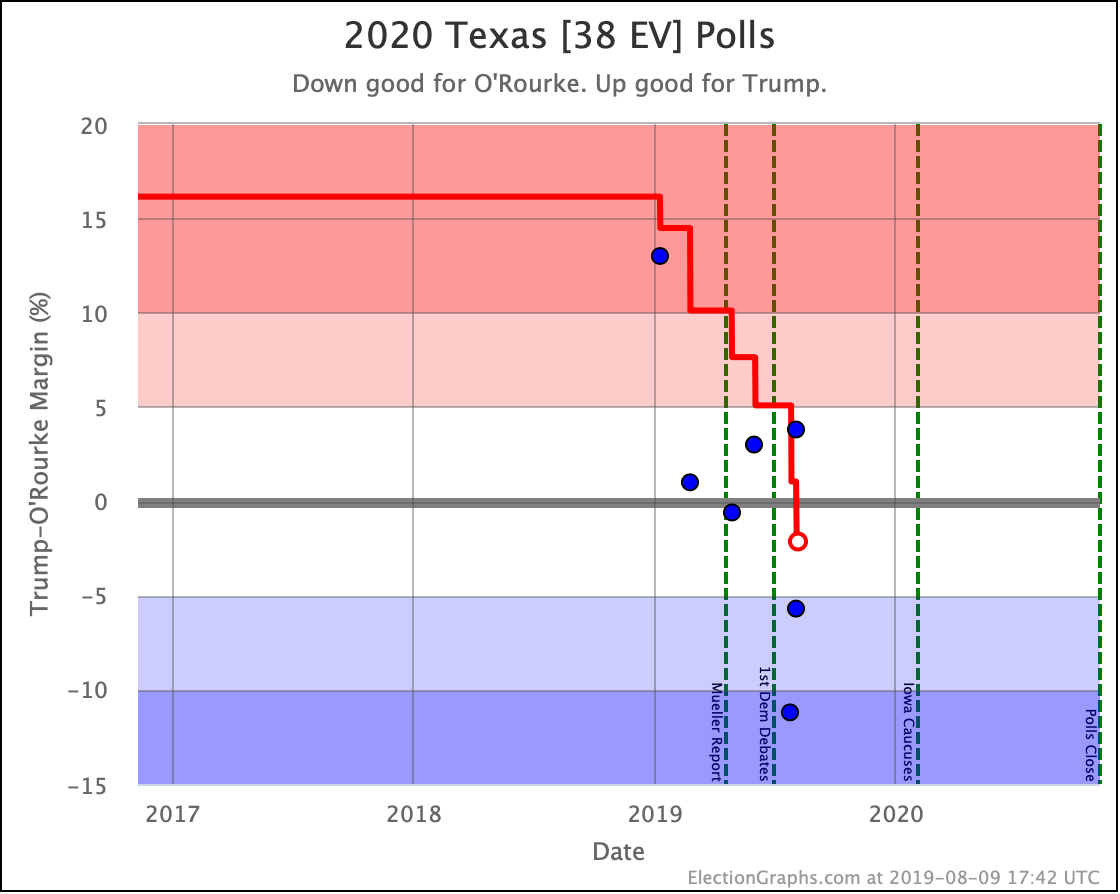
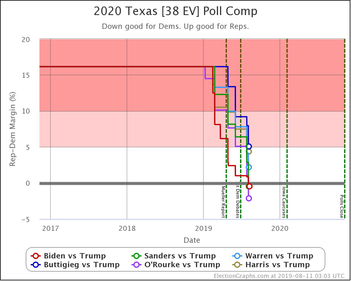
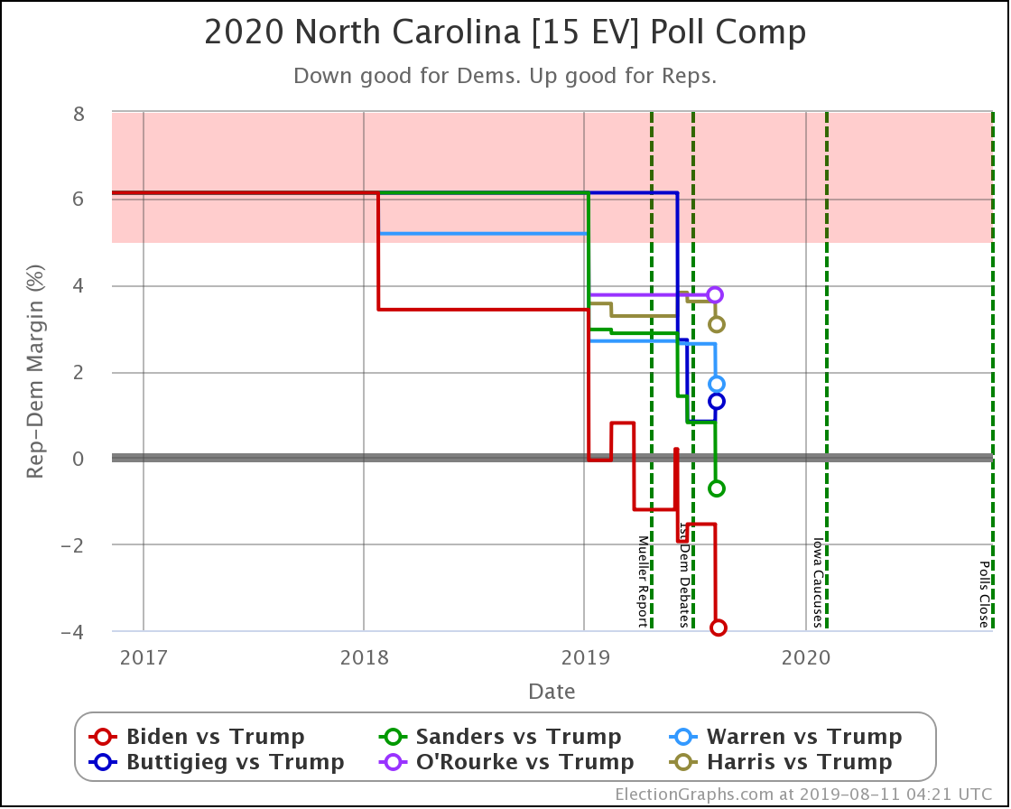
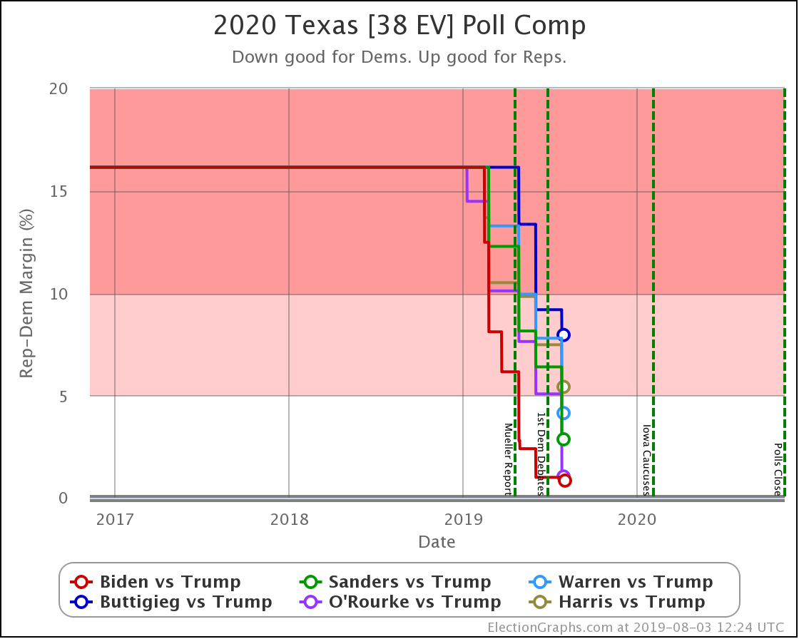
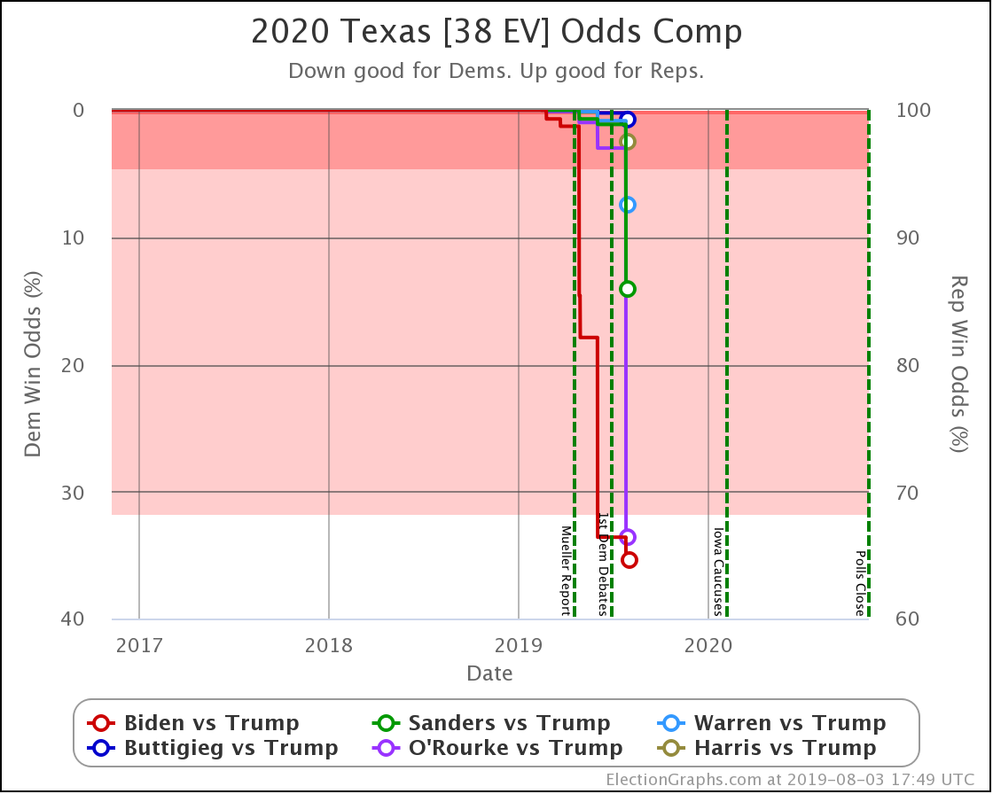
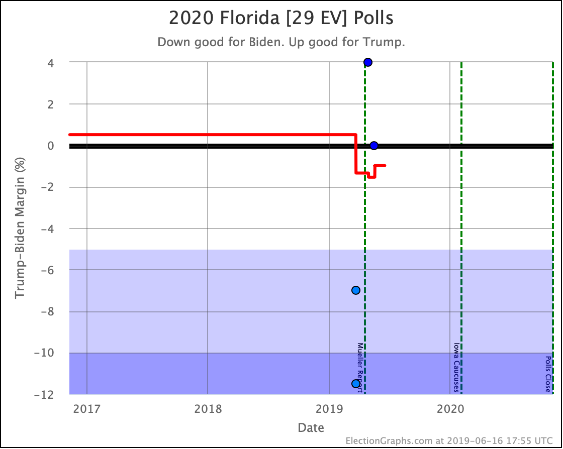
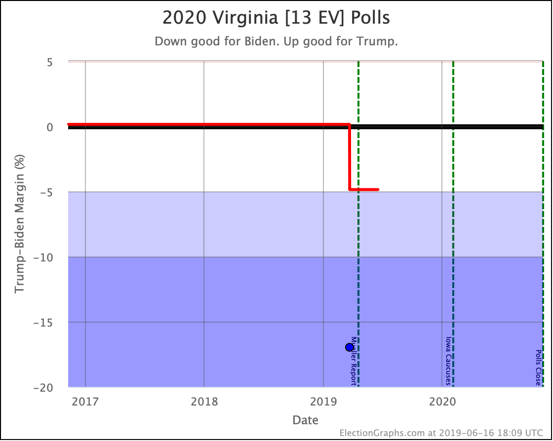
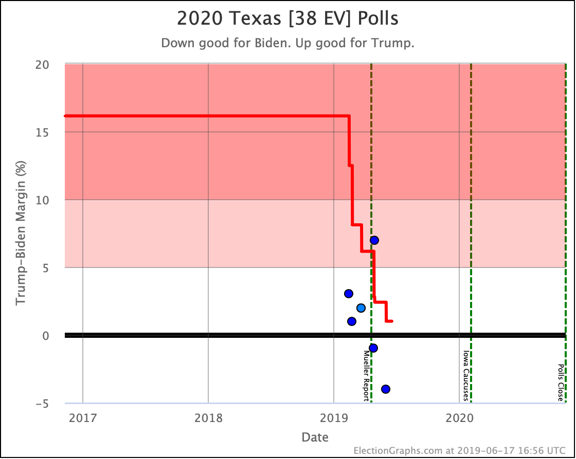
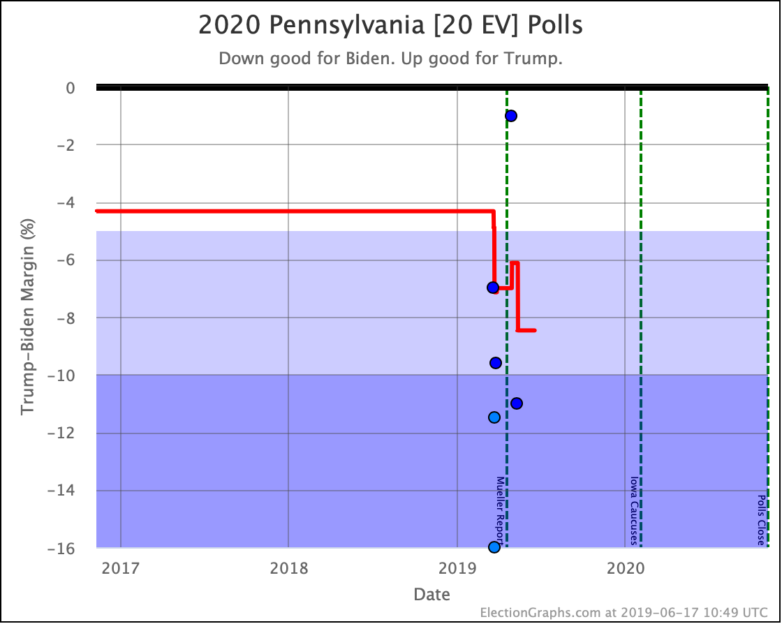
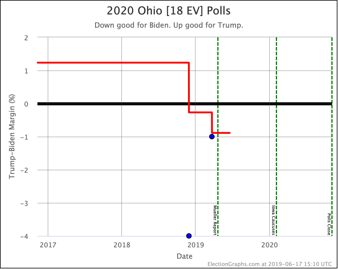
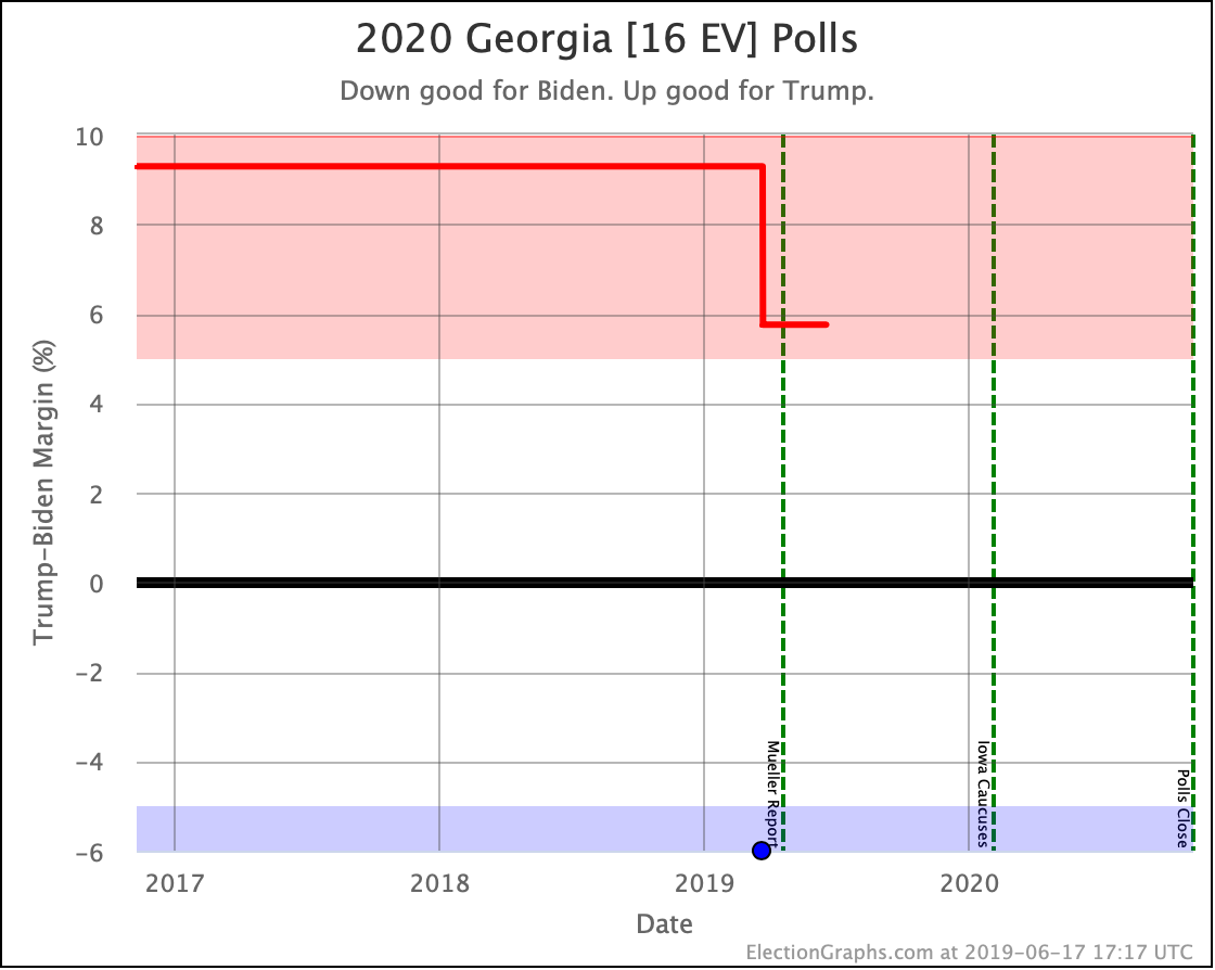
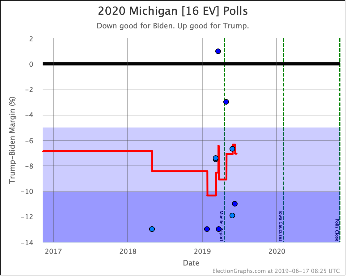
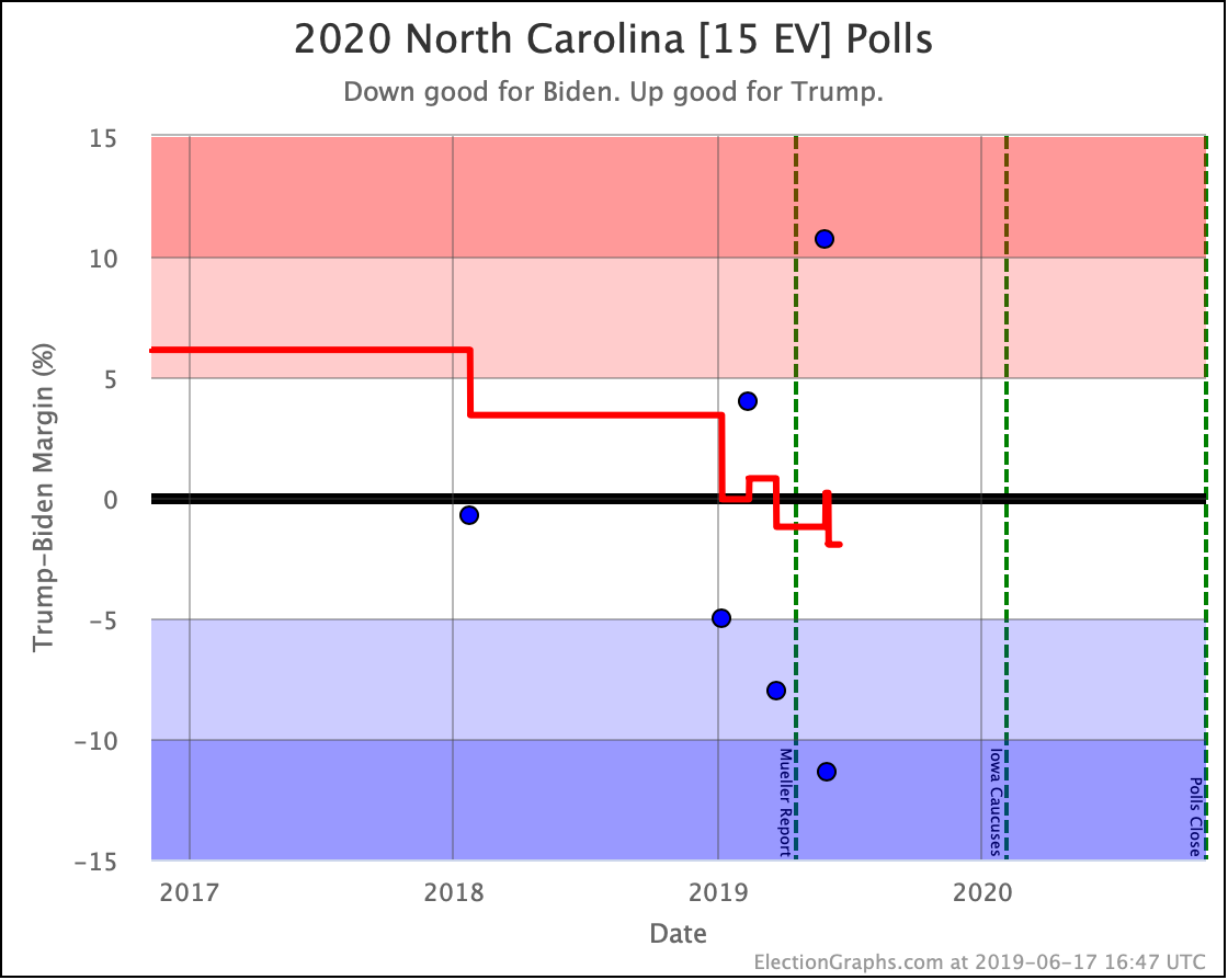
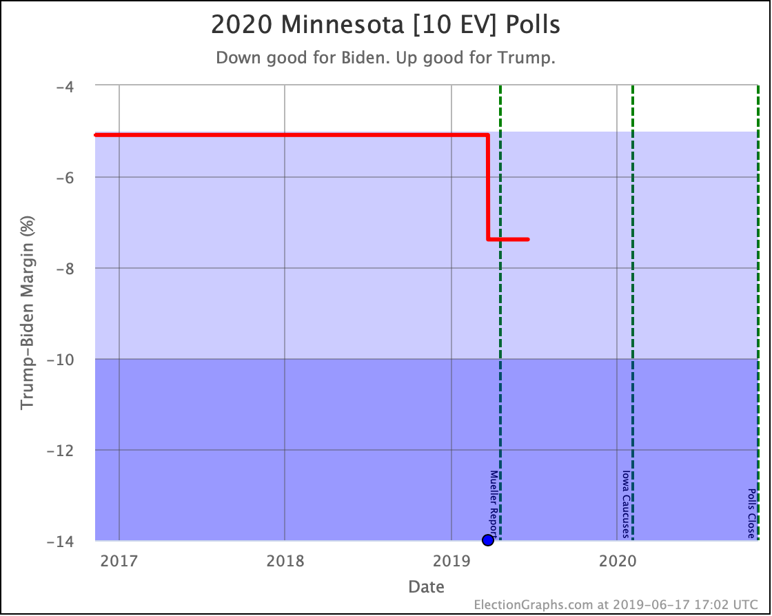
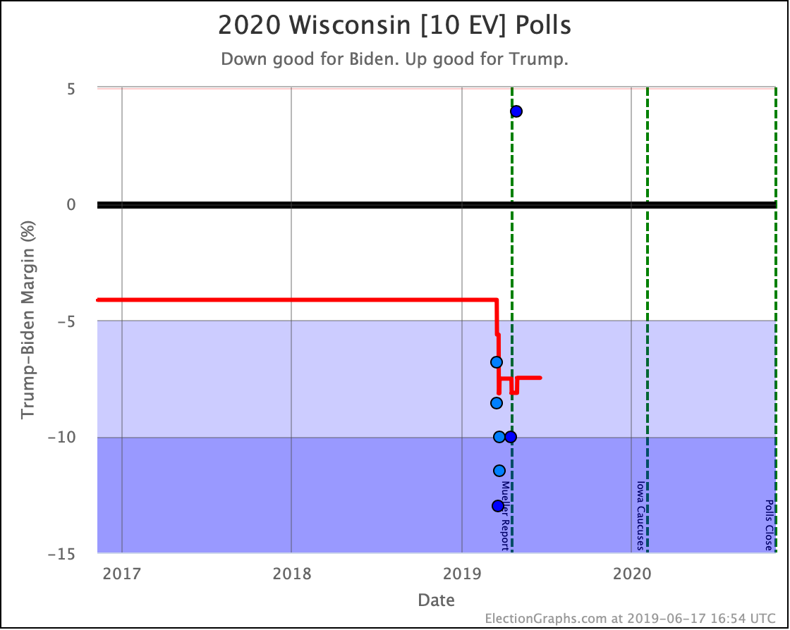
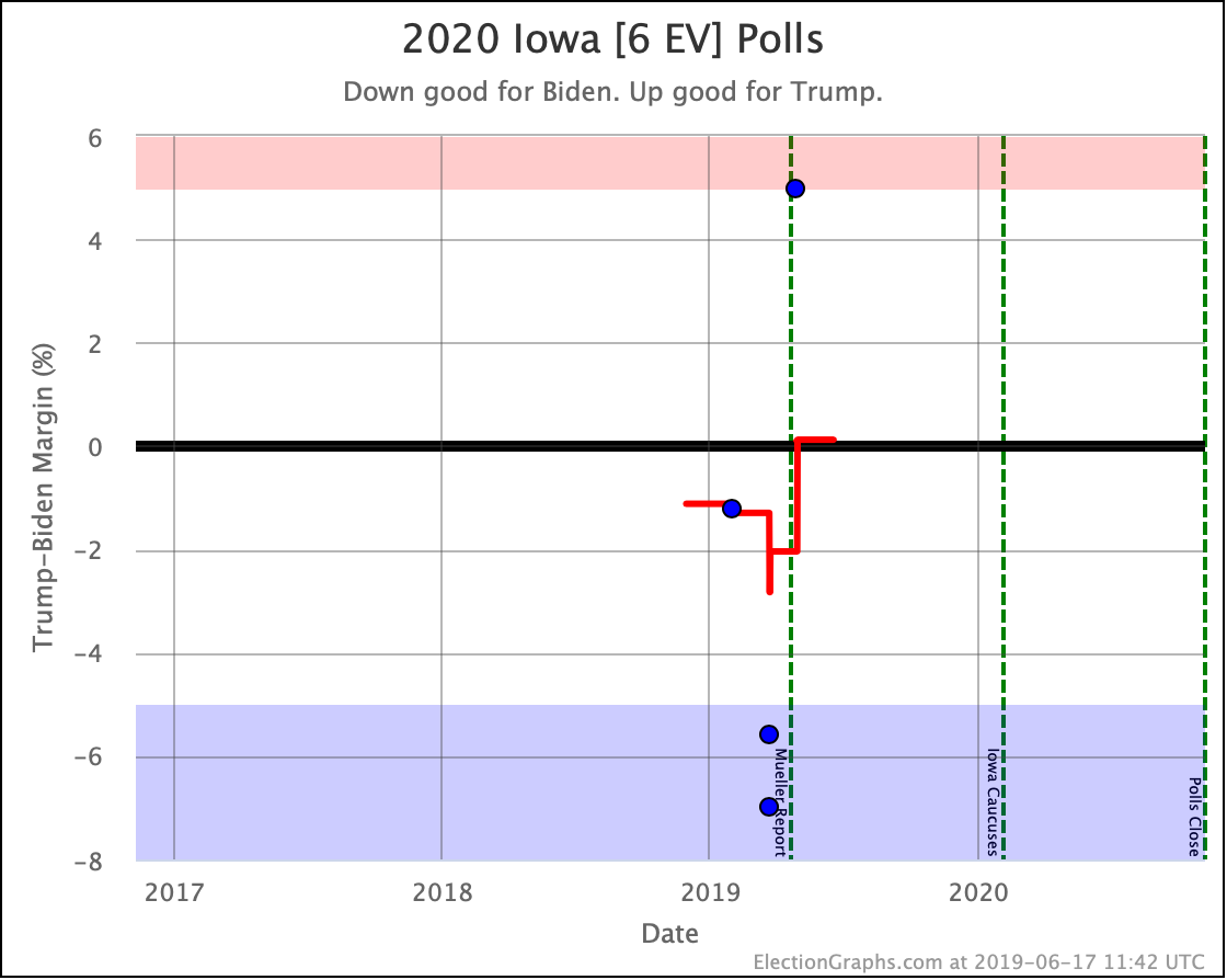
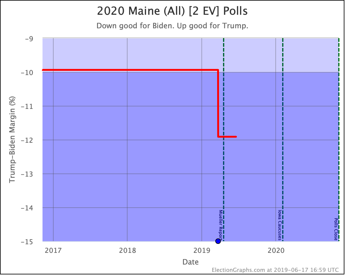
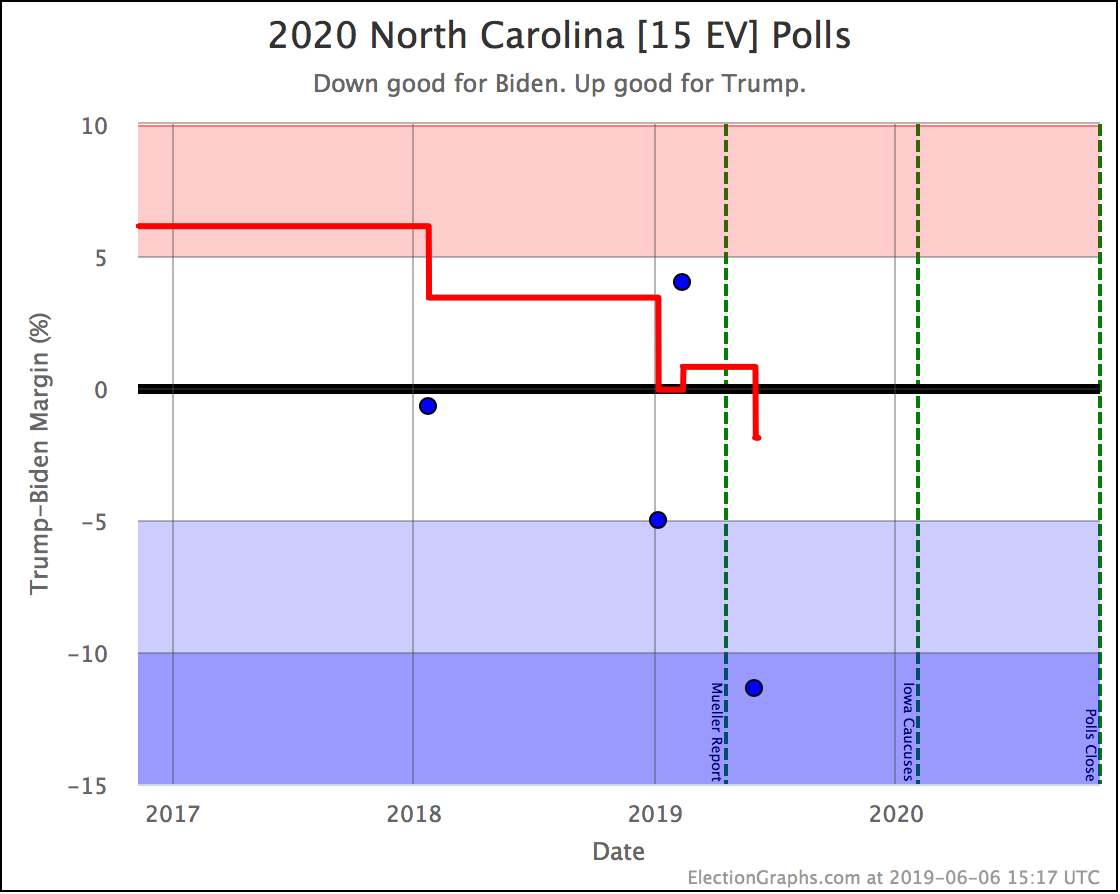
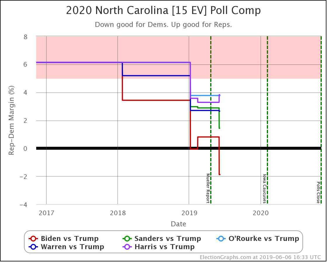
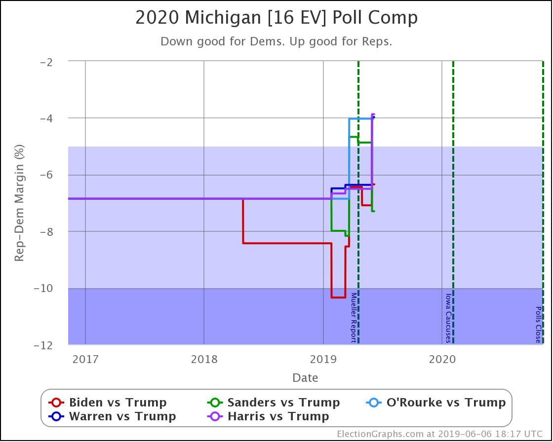
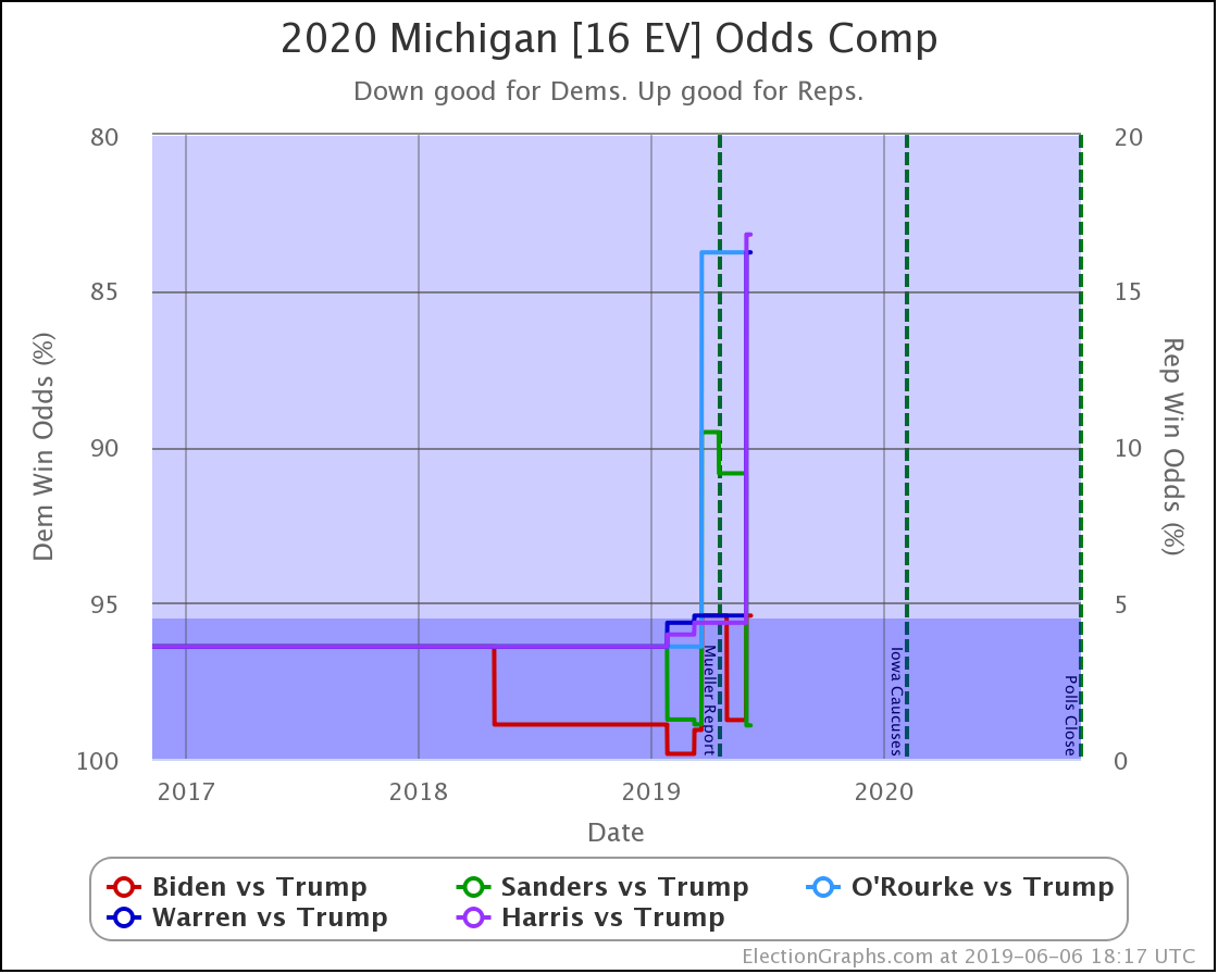
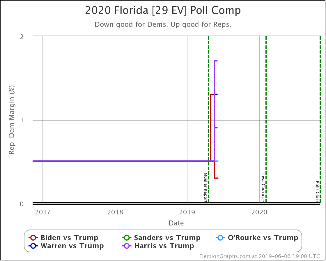
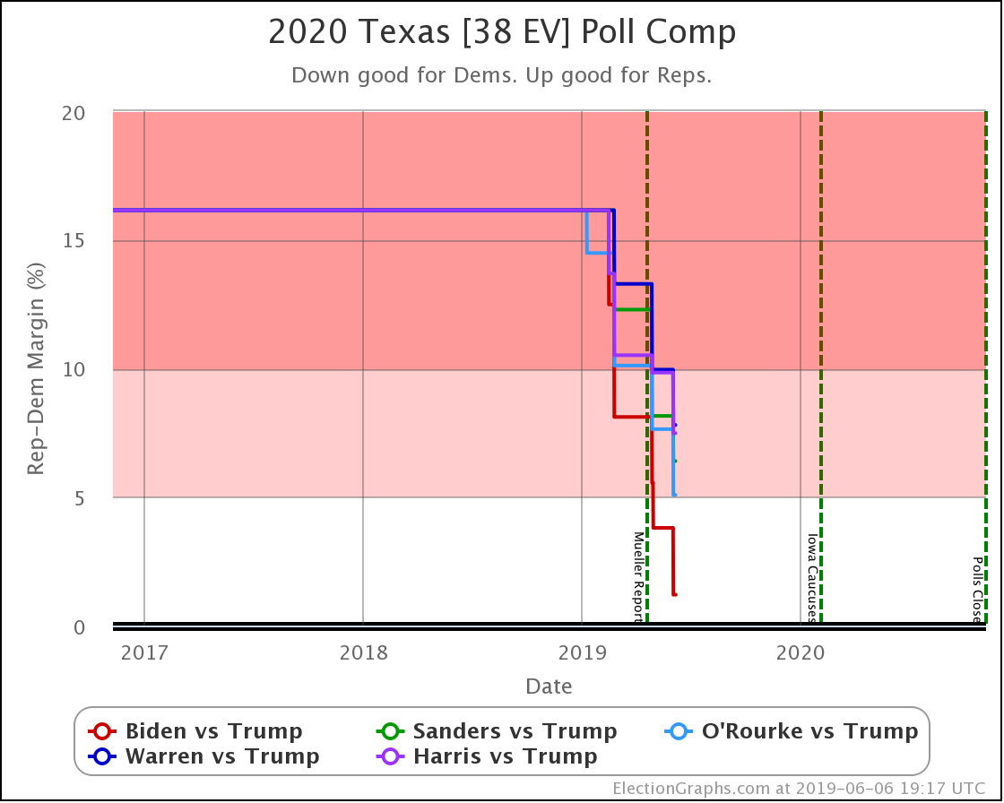
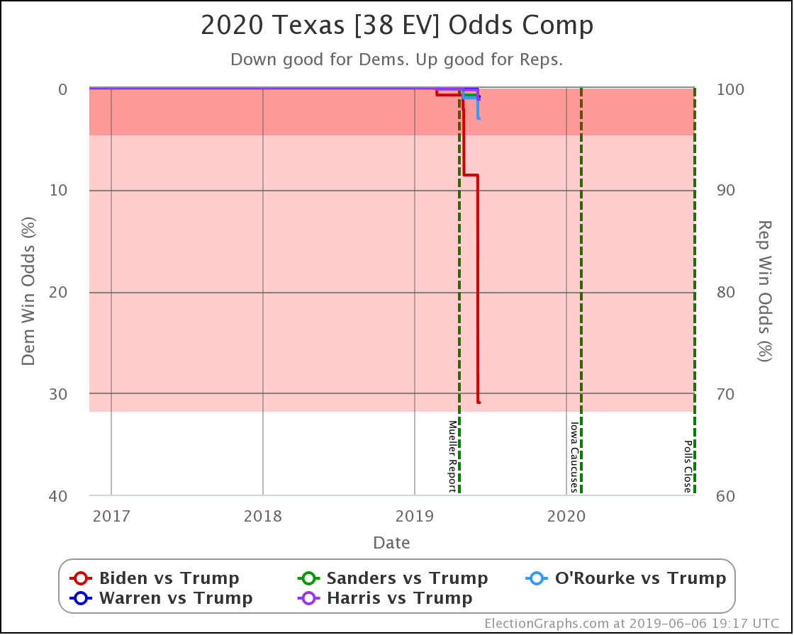
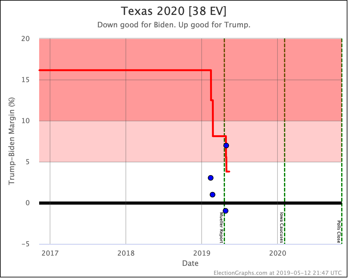
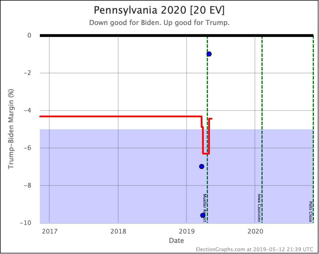
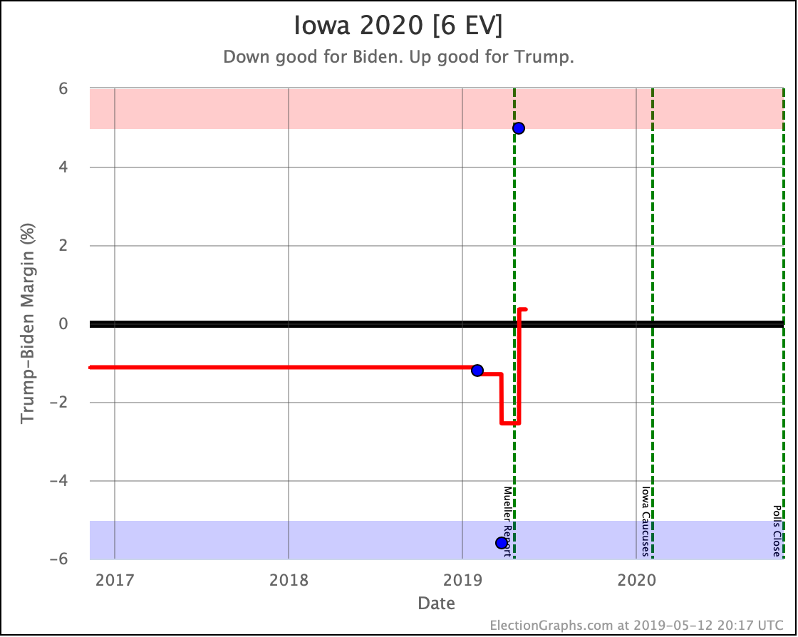
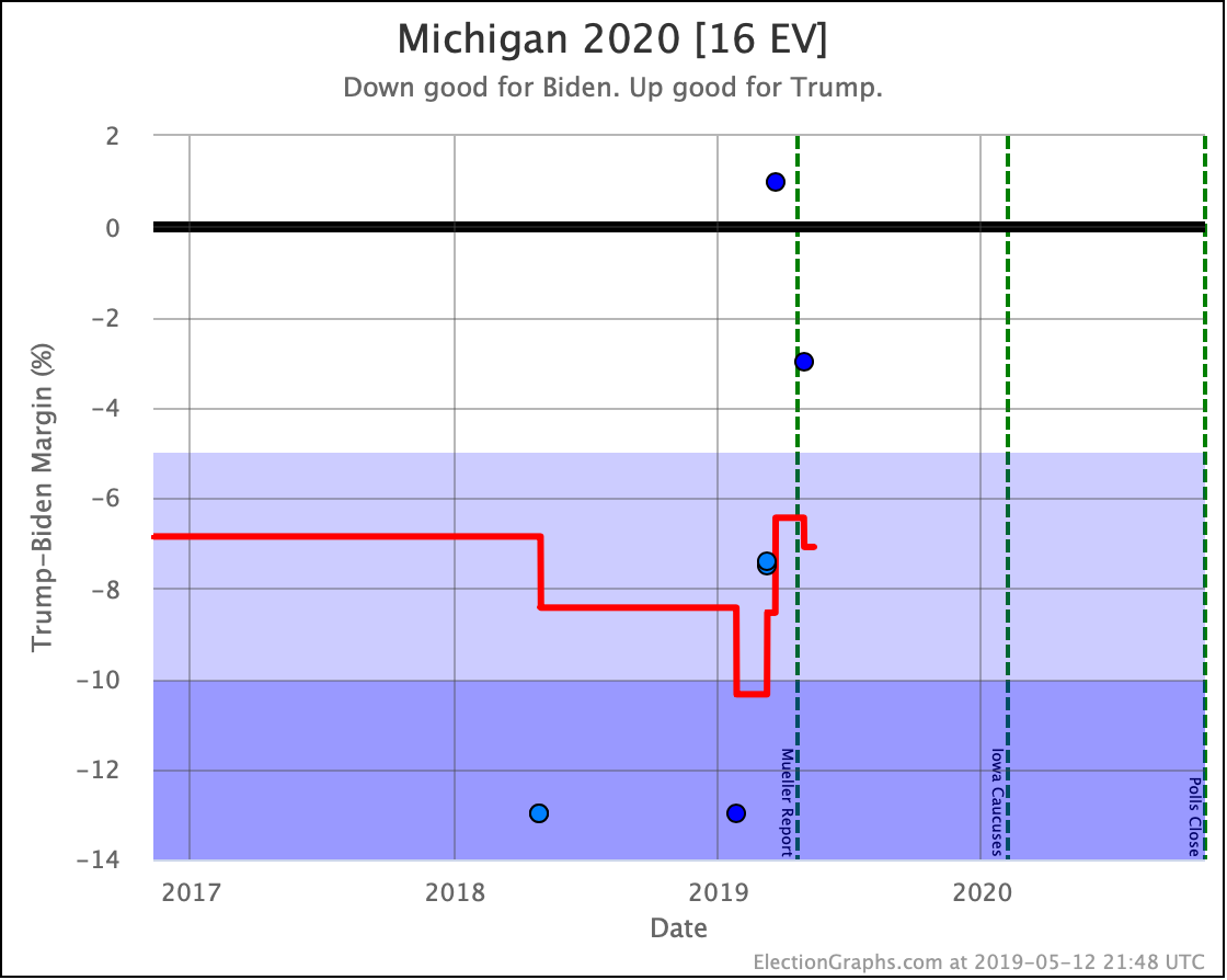
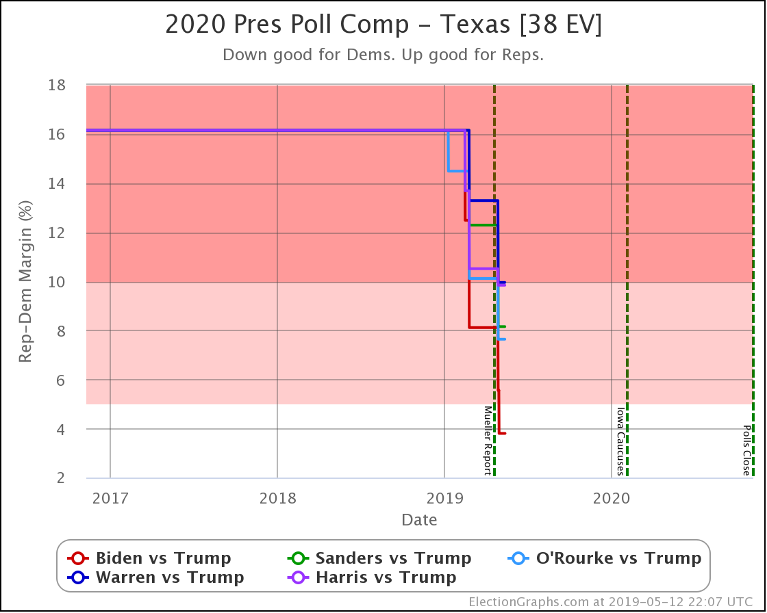
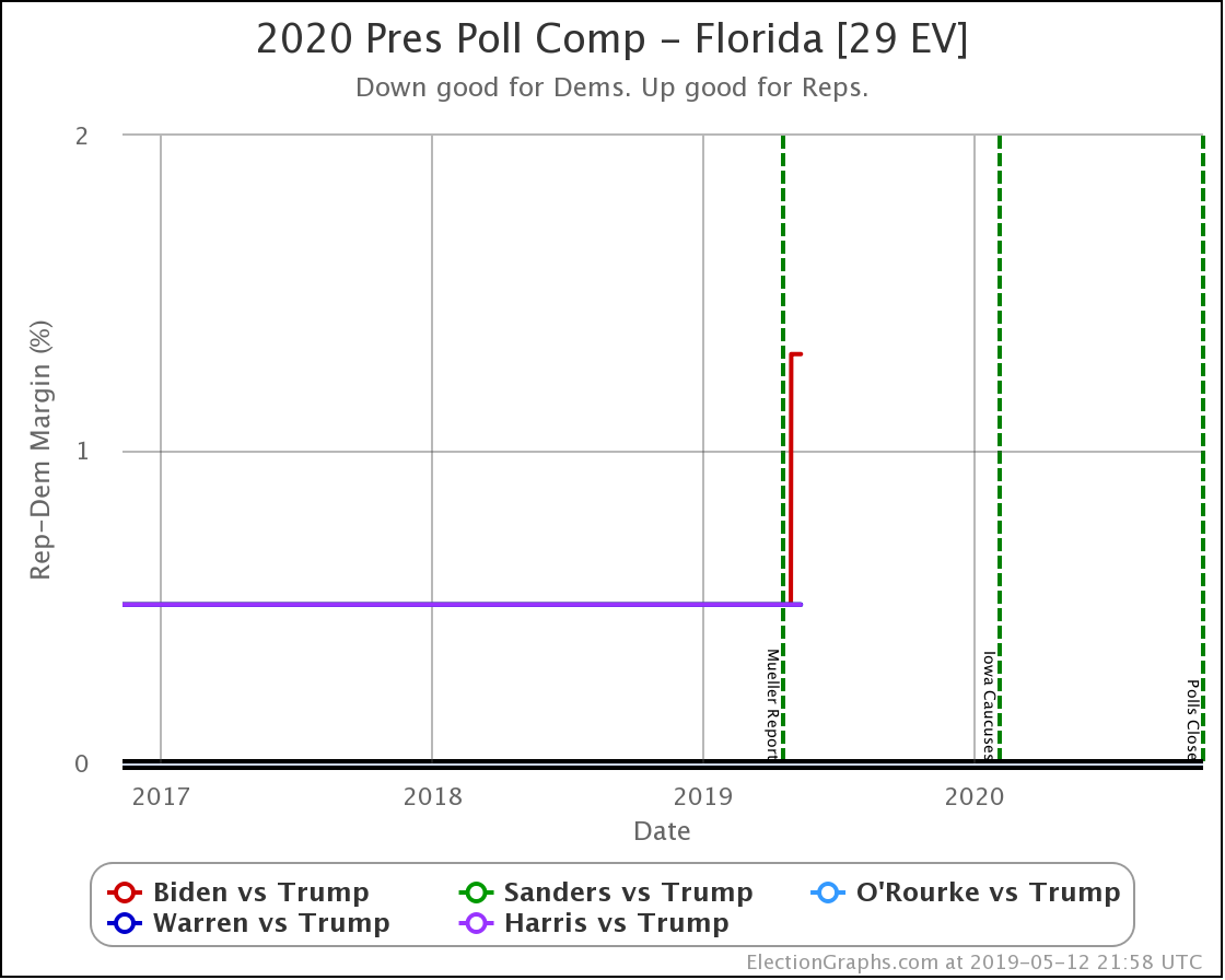
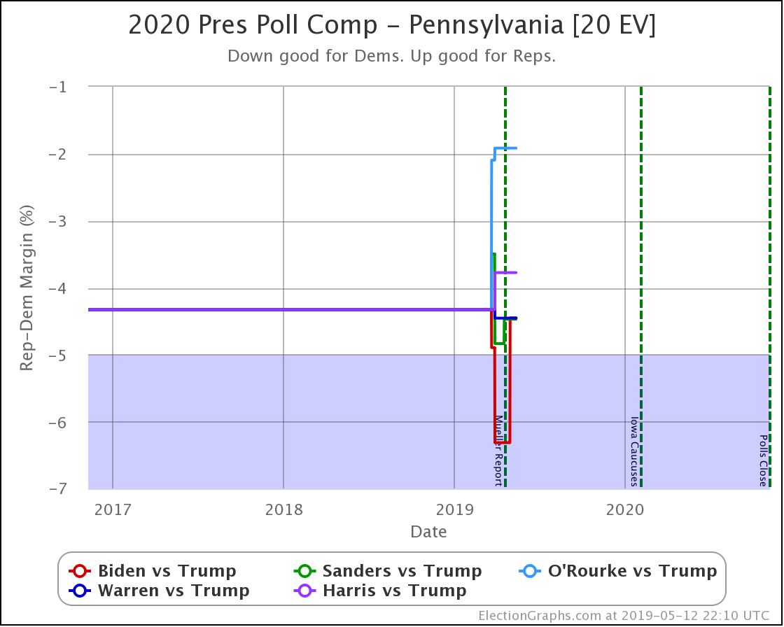
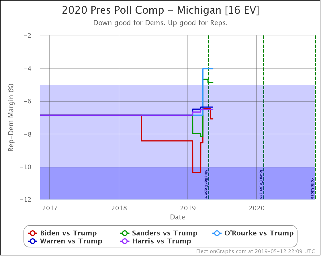
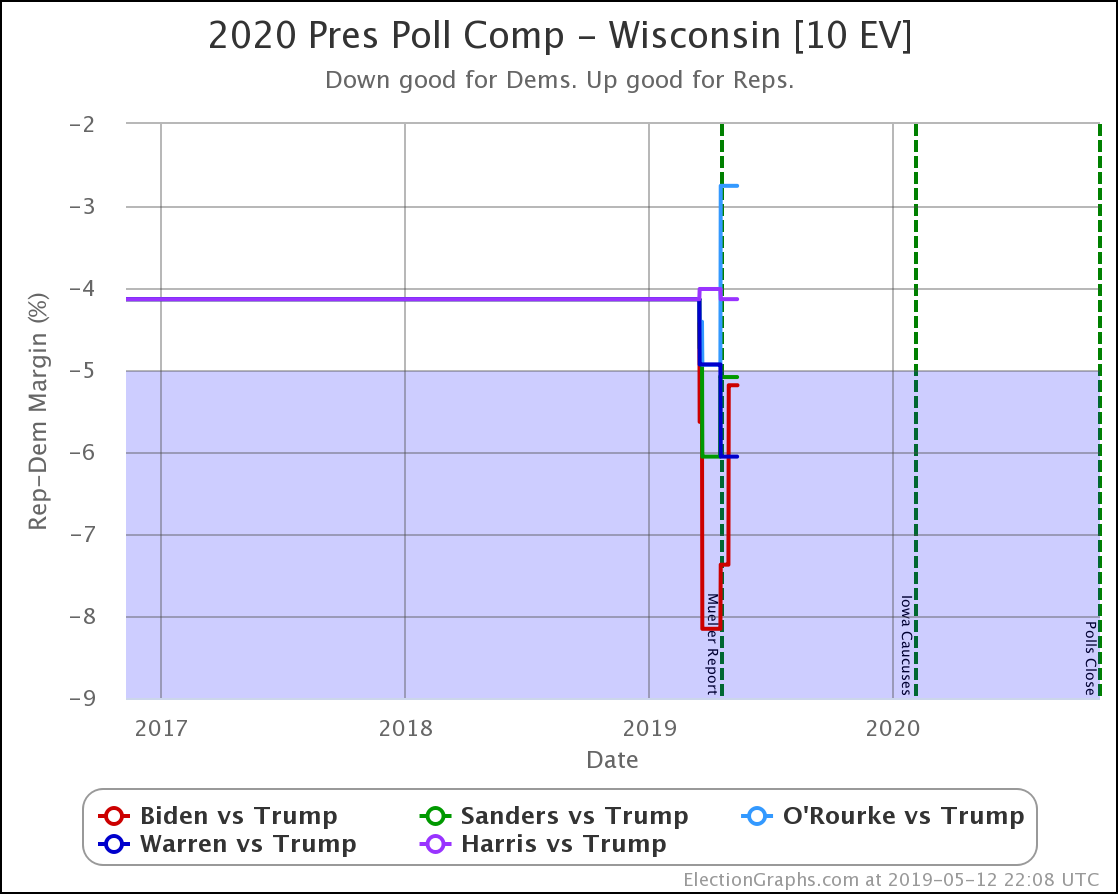
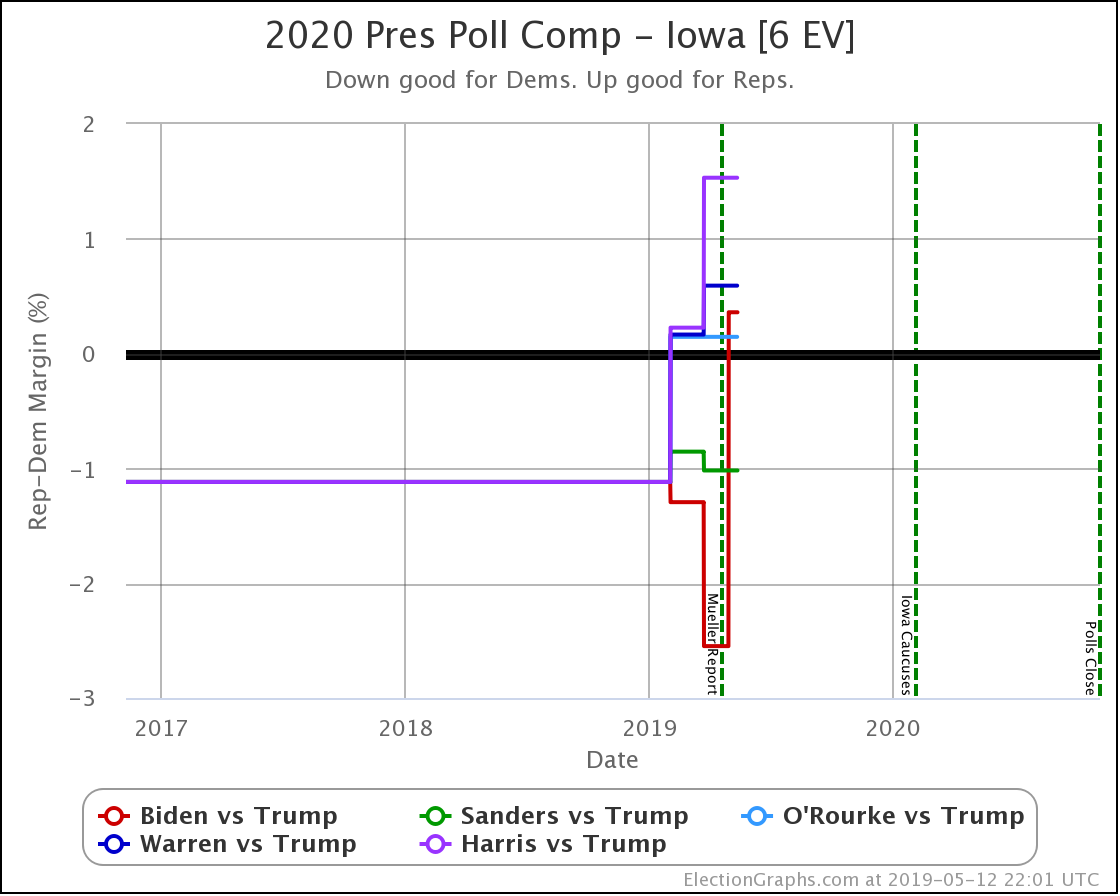
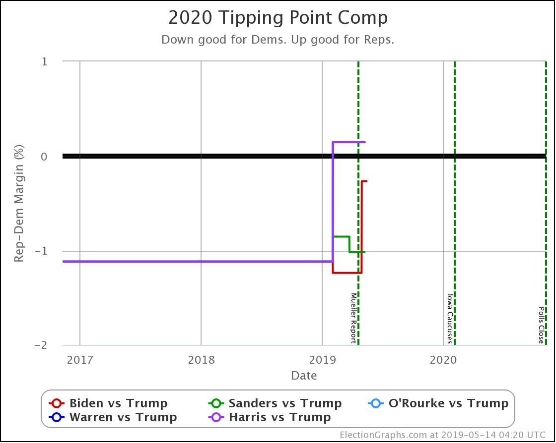
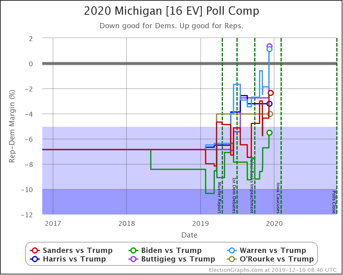
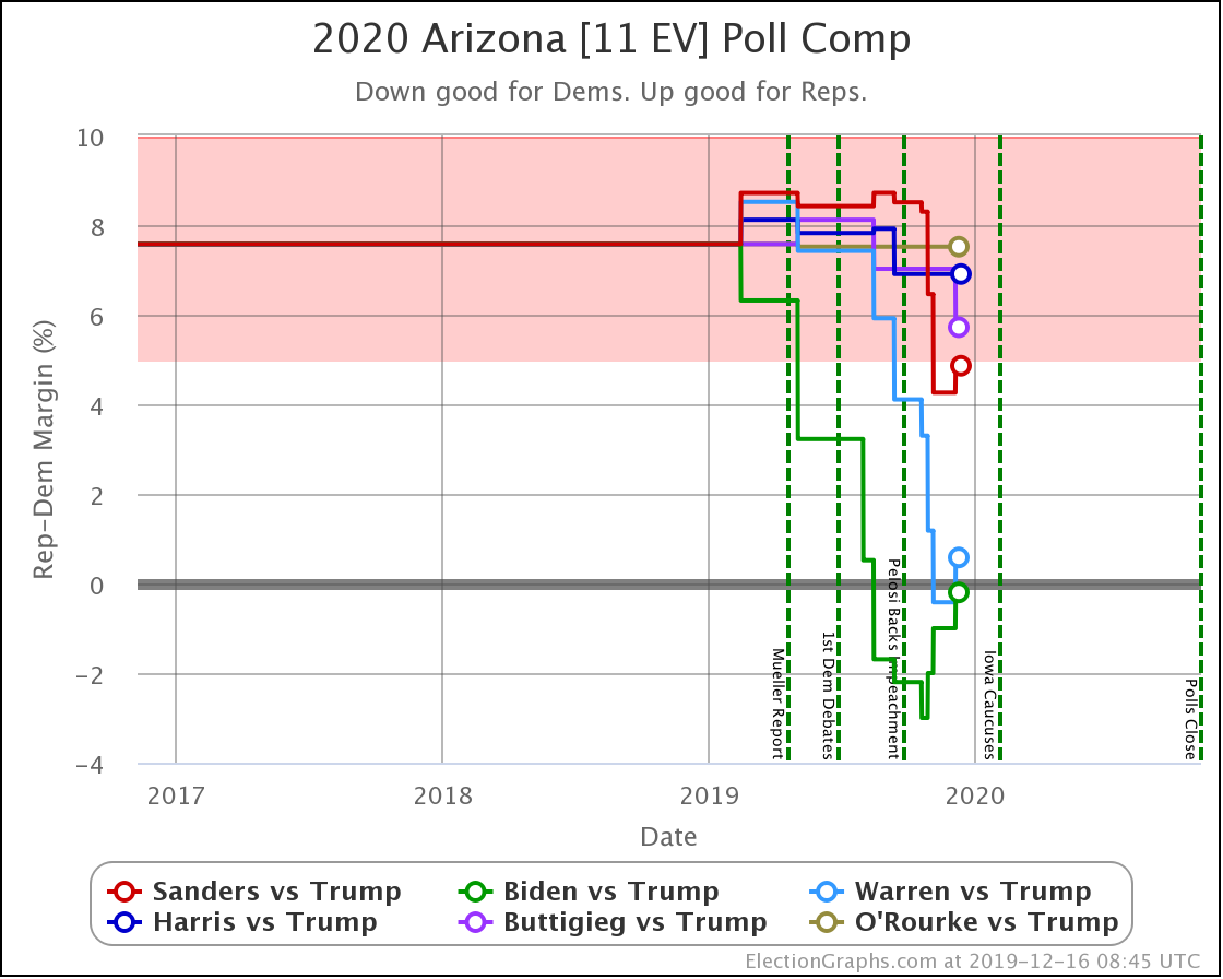
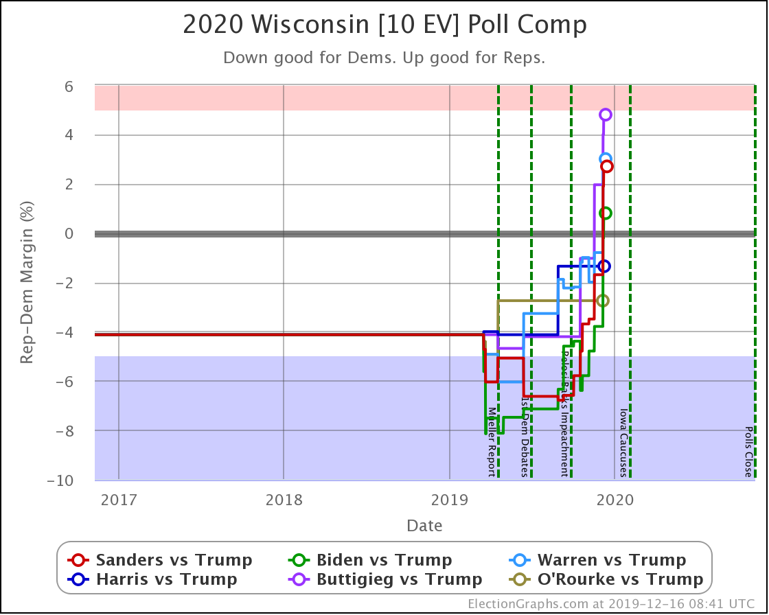
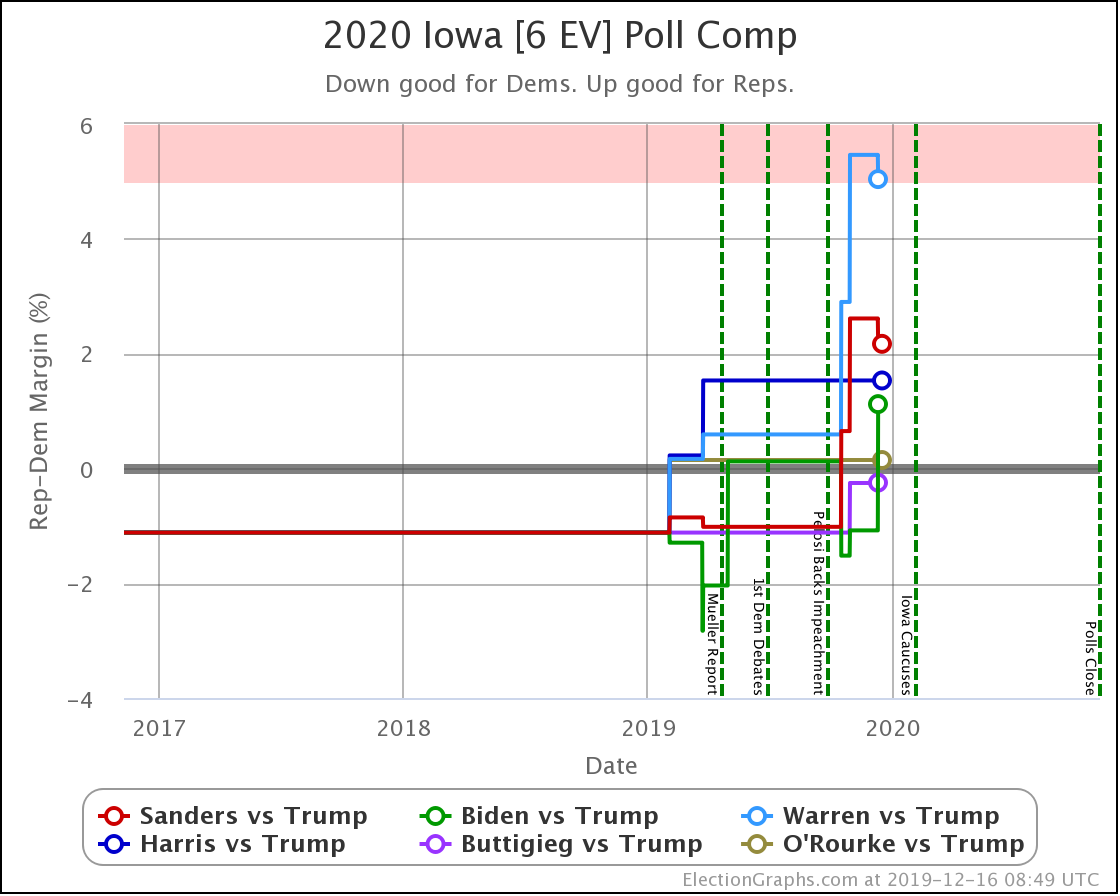
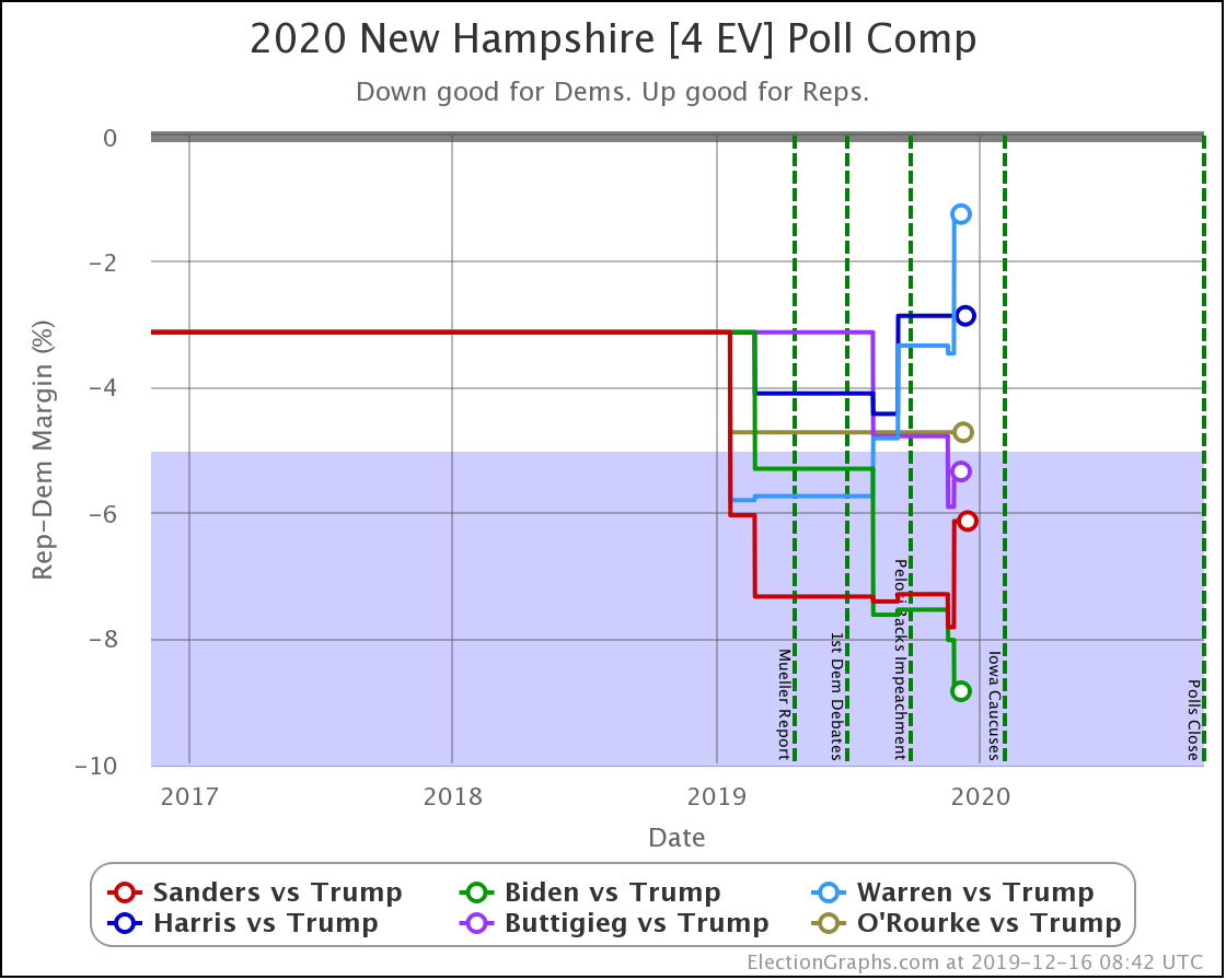
Finally, presented without additional commentary, the updated state charts in each of the states with new polling. You'll notice the recent swing toward Trump occurs in almost every state.
The news is coming hot and heavy these days. Iowa is now less than 50 days away. Things will develop quickly. Stay tuned.
323.6 days until polls start to close.
For more information:
This post is an update based on the data on the Election Graphs Electoral College 2020 page. Election Graphs tracks a poll-based estimate of the Electoral College. The charts, graphs, and maps in the post above are all as of the time of this post. Click through on any image to go to a page with the current interactive versions of that chart, along with additional details.
Follow @ElectionGraphs on Twitter or Election Graphs on Facebook to see announcements of updates. For those interested in individual poll updates, follow @ElecCollPolls on Twitter for all the polls as I add them. If you find the information in these posts informative or useful, please consider visiting the donation page.