Some Dems Up, Some Dems Down

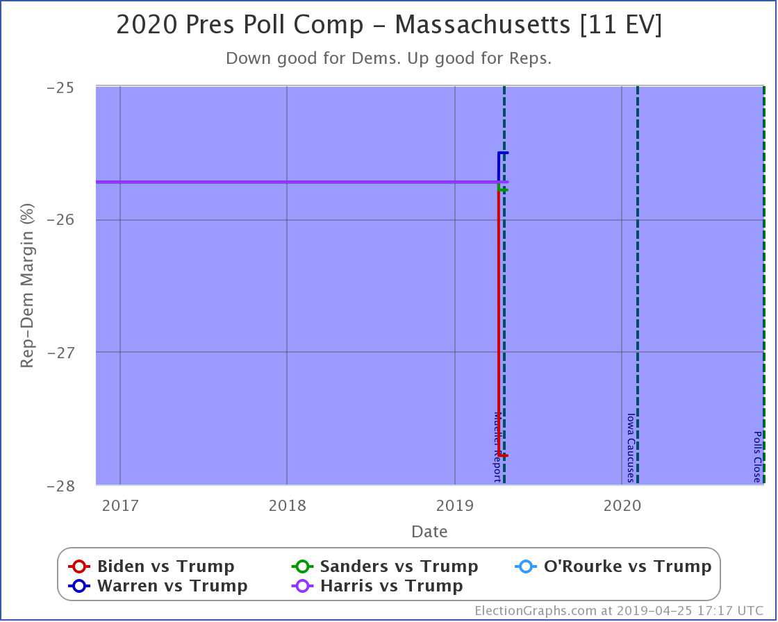
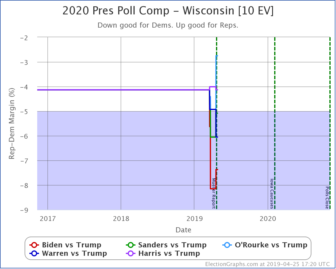
Since last week's update, there have been two new polls in Texas, and one each in New Hampshire, Wisconsin, Michigan, and Pennsylvania.

For the six most polled Democrats against Trump (Biden, Sanders, Warren, Buttigieg, Harris, and O'Rourke) this week saw the following category changes:

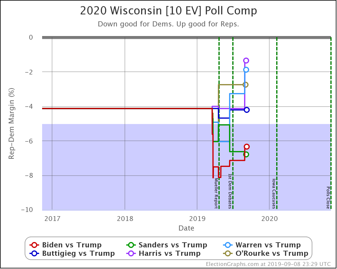
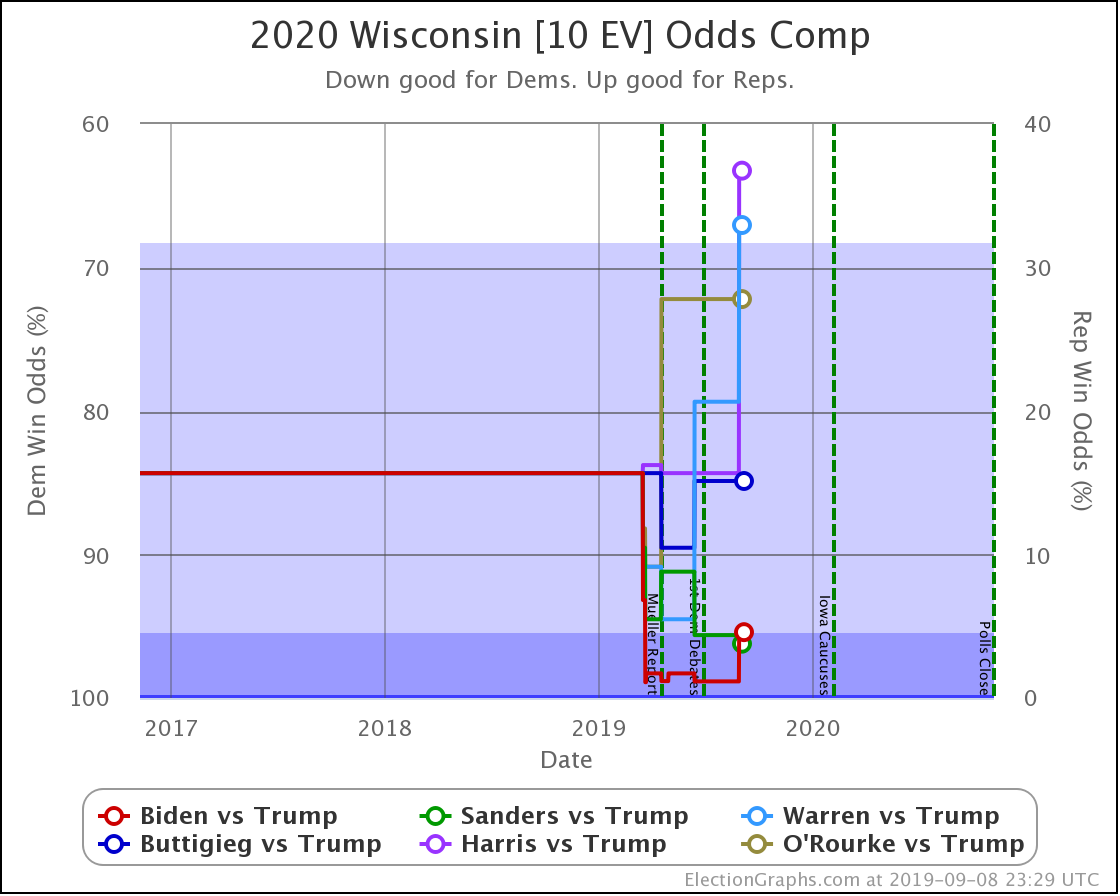
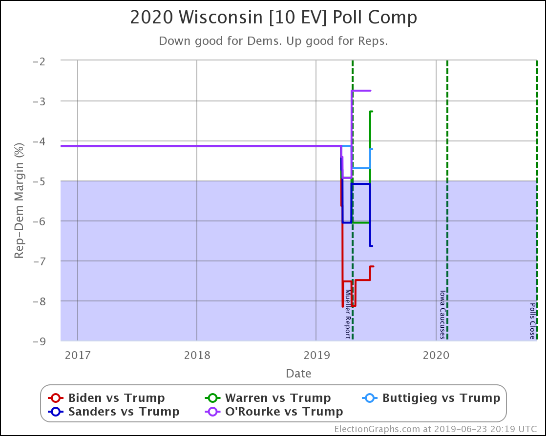
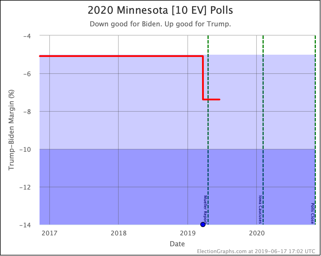
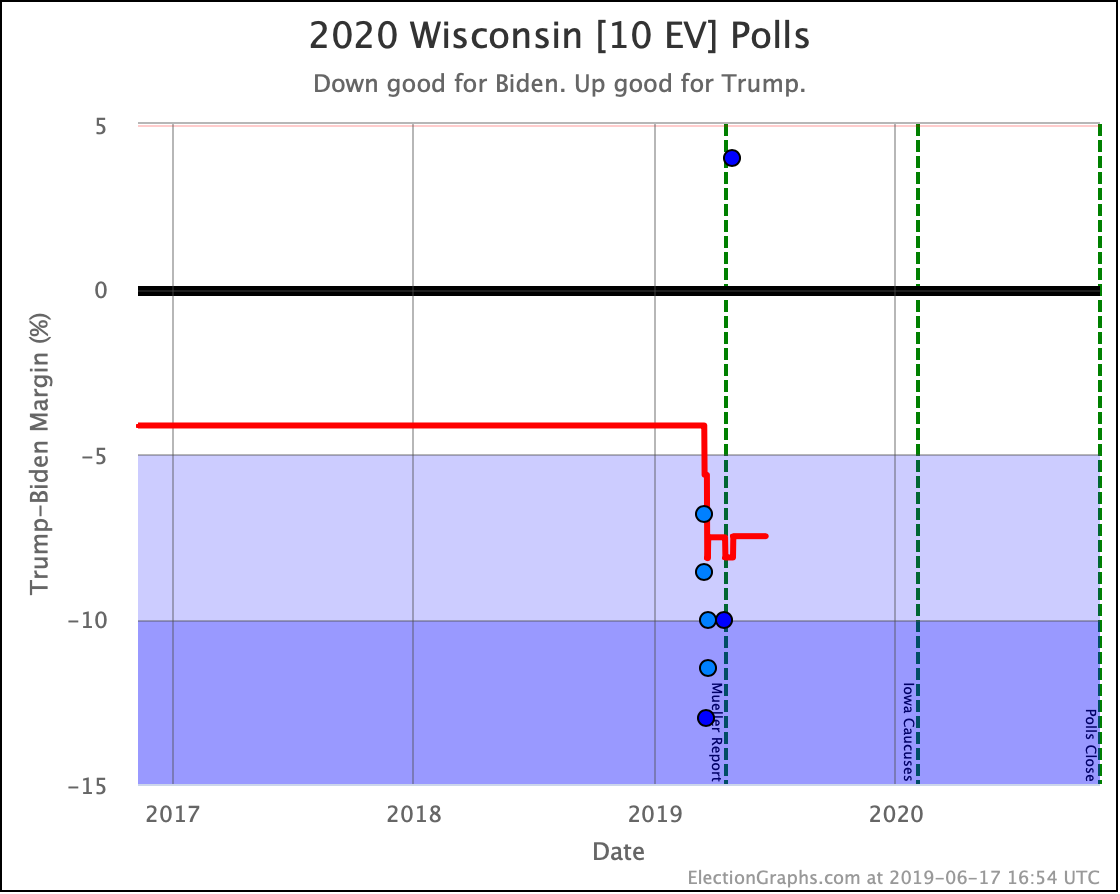
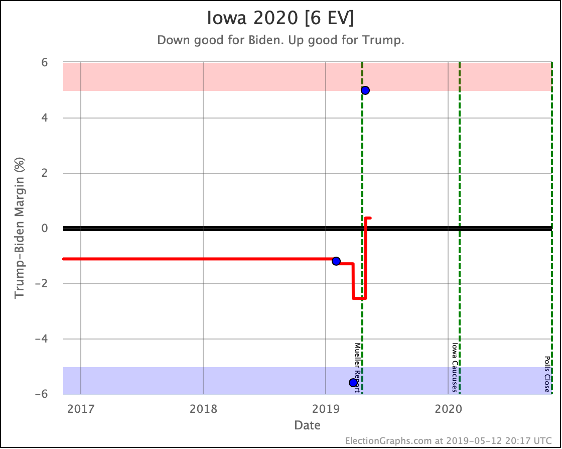
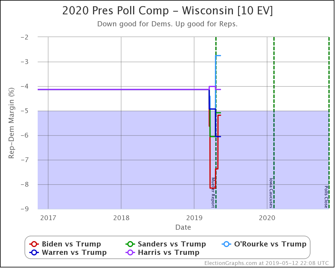
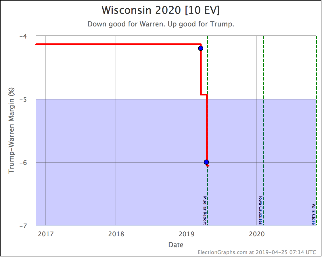
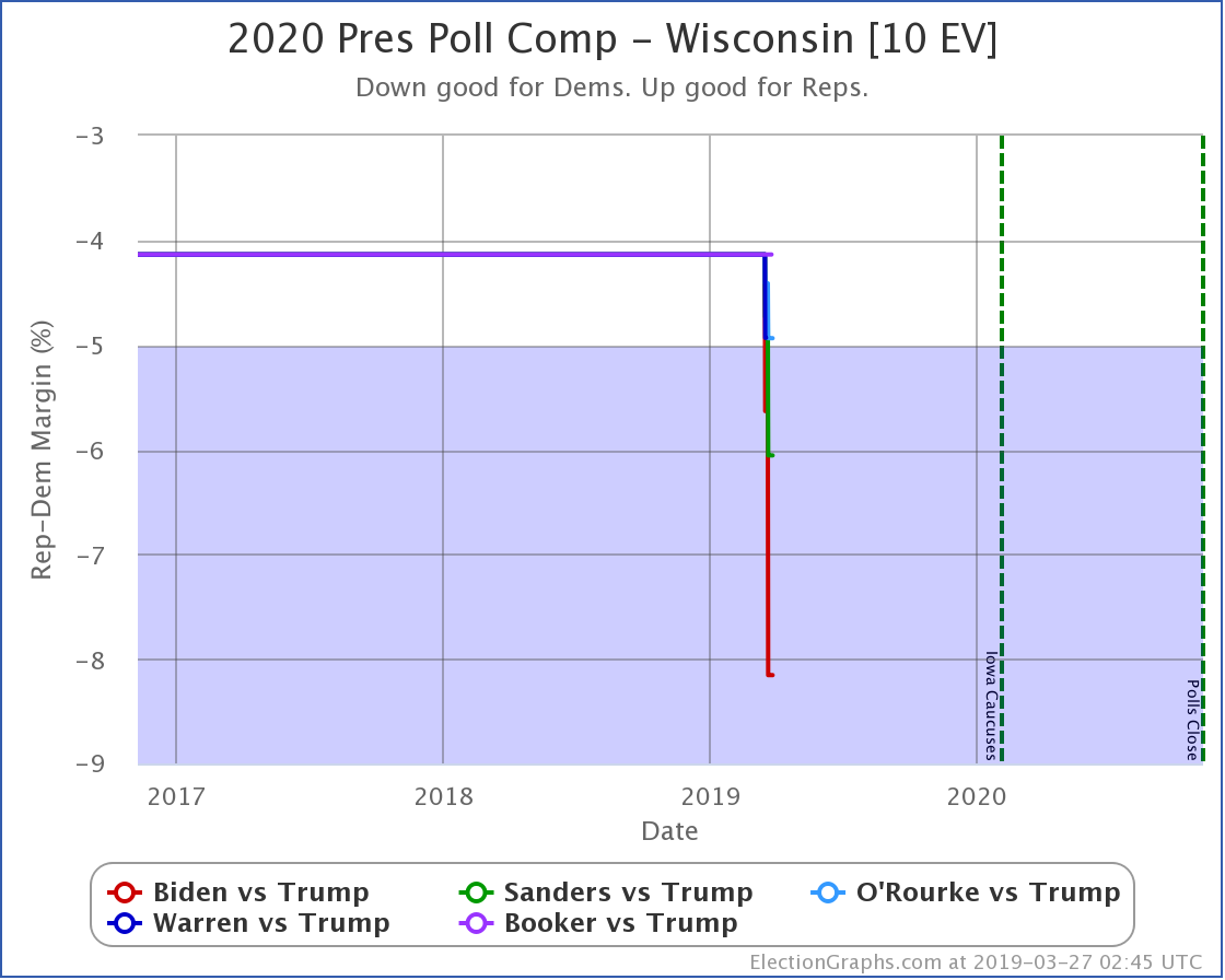
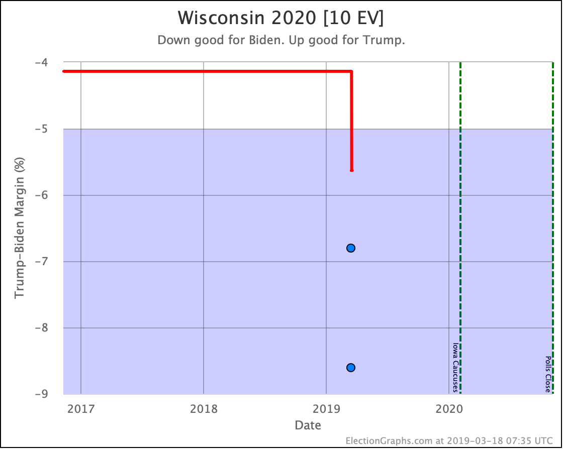
  • Biden vs. Trump state category change: WI has moved from Strong Biden to Weak Biden
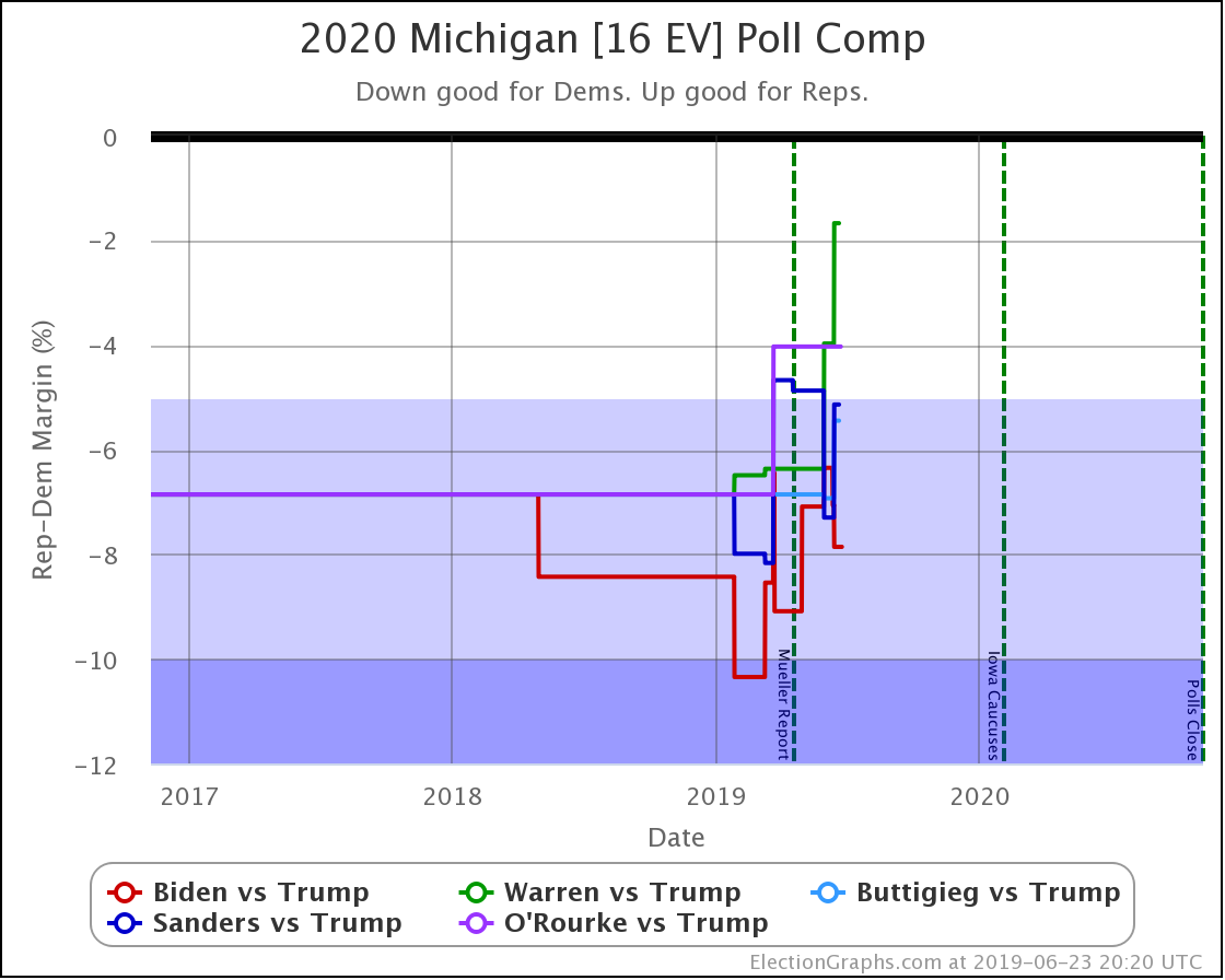
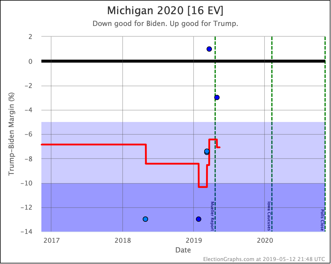
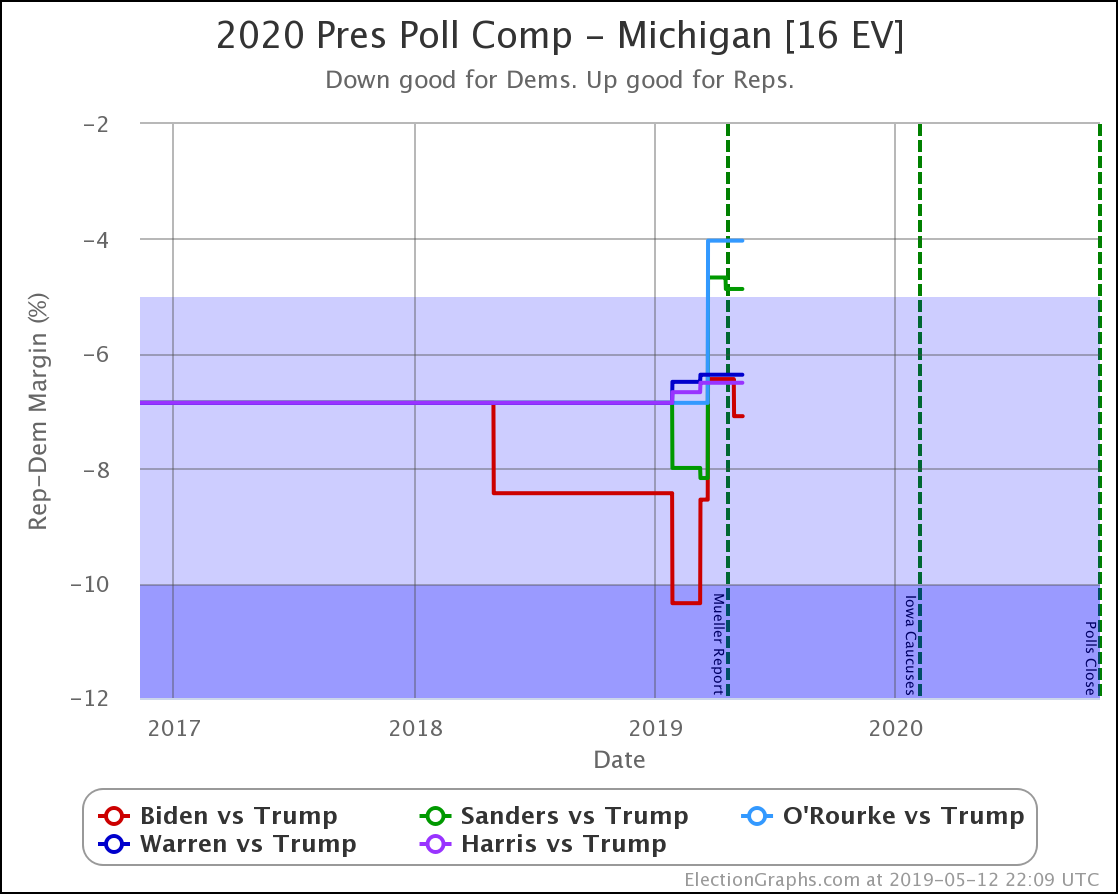
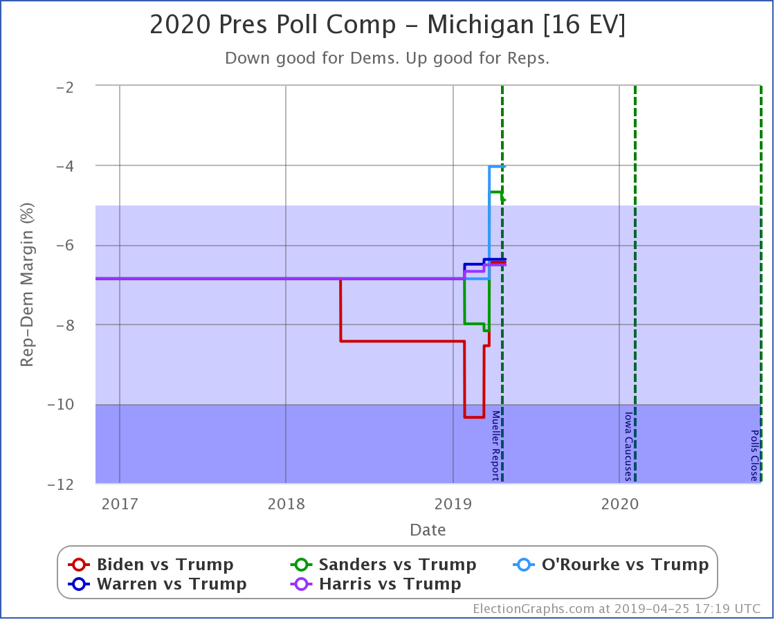
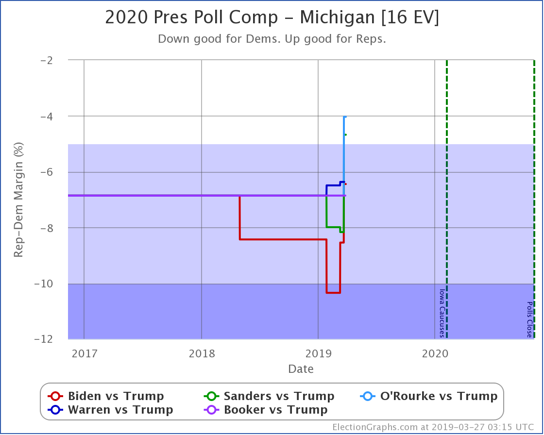
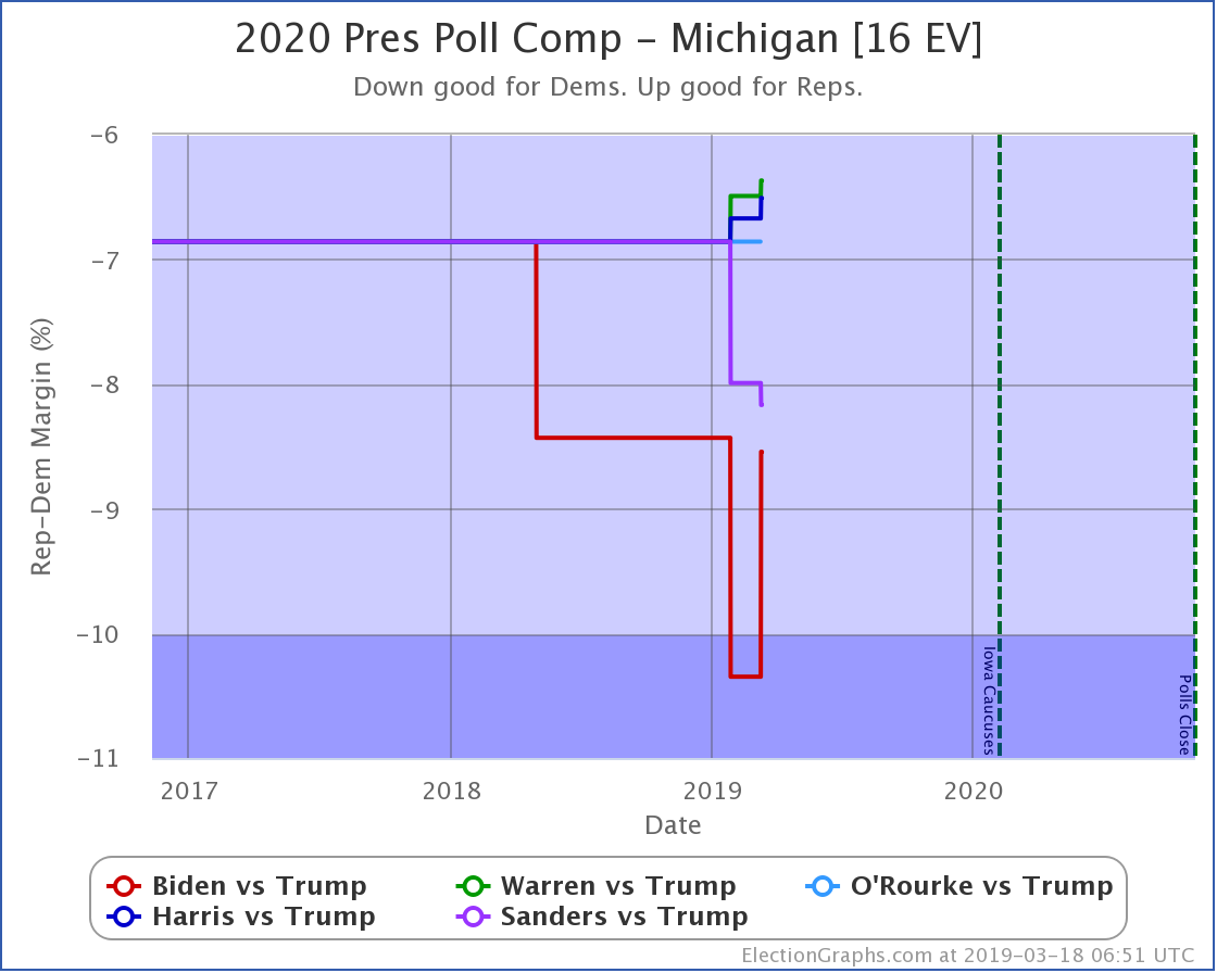
  • Sanders vs. Trump state category change: MI has moved from Strong Sanders to Weak Sanders
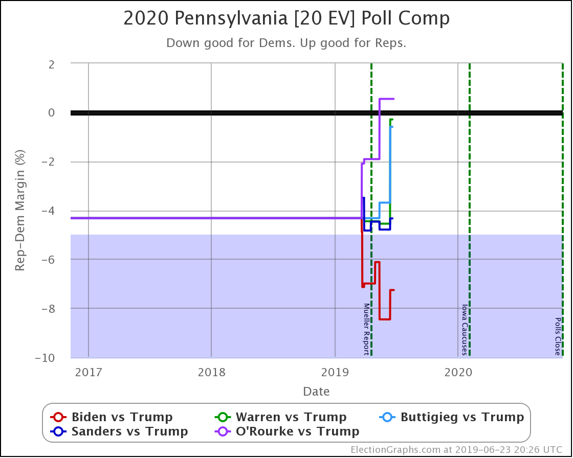
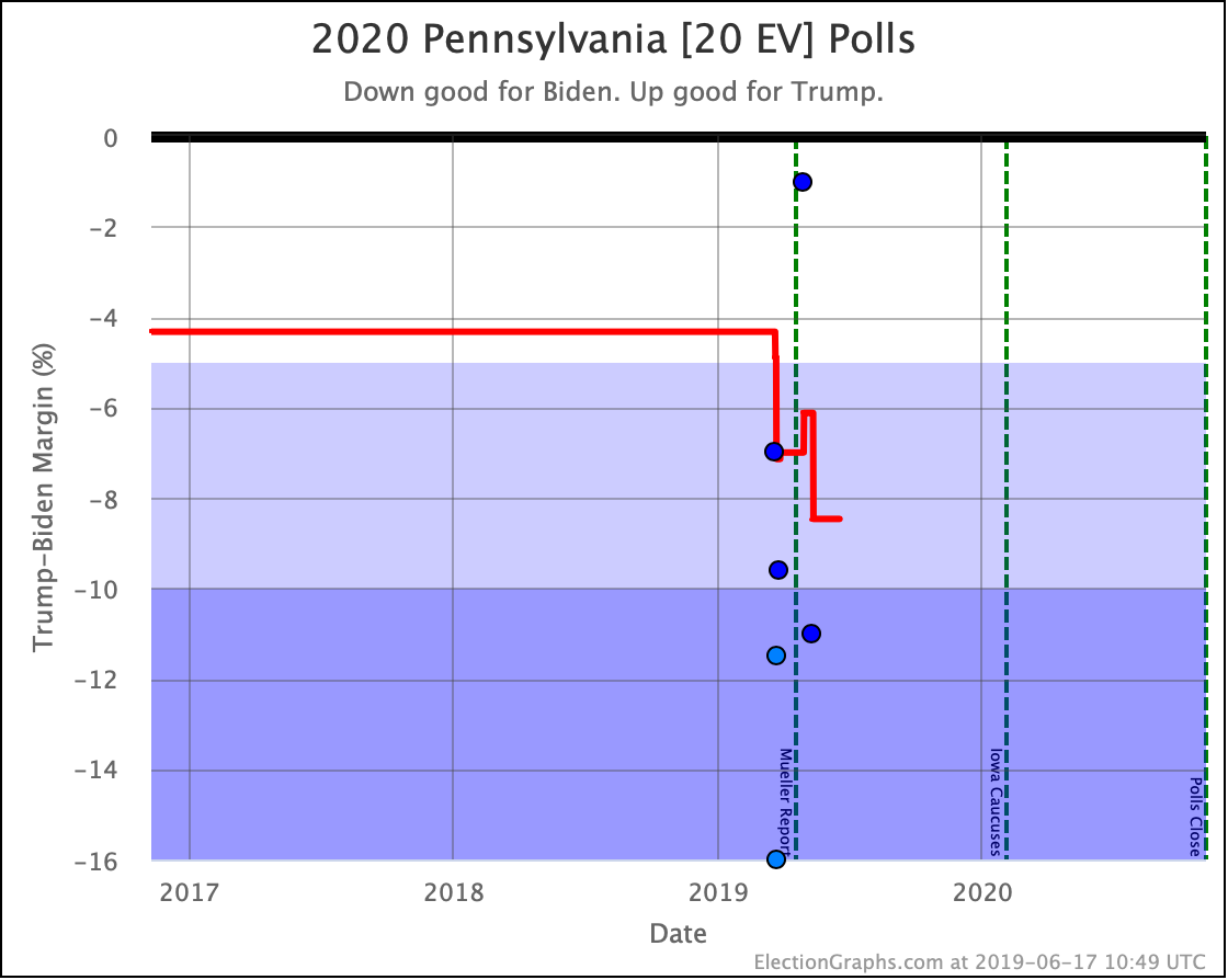
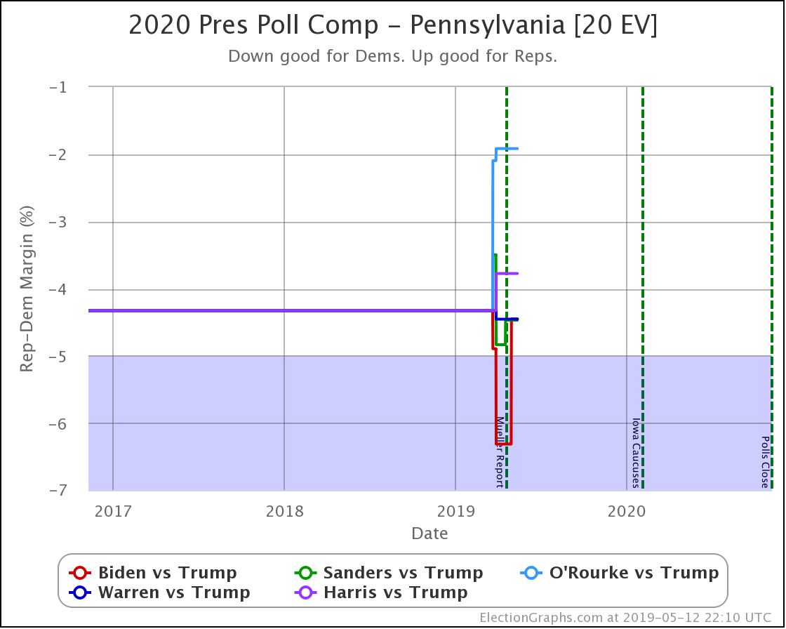
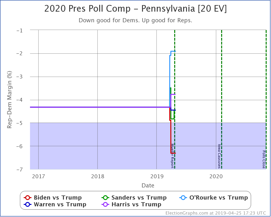
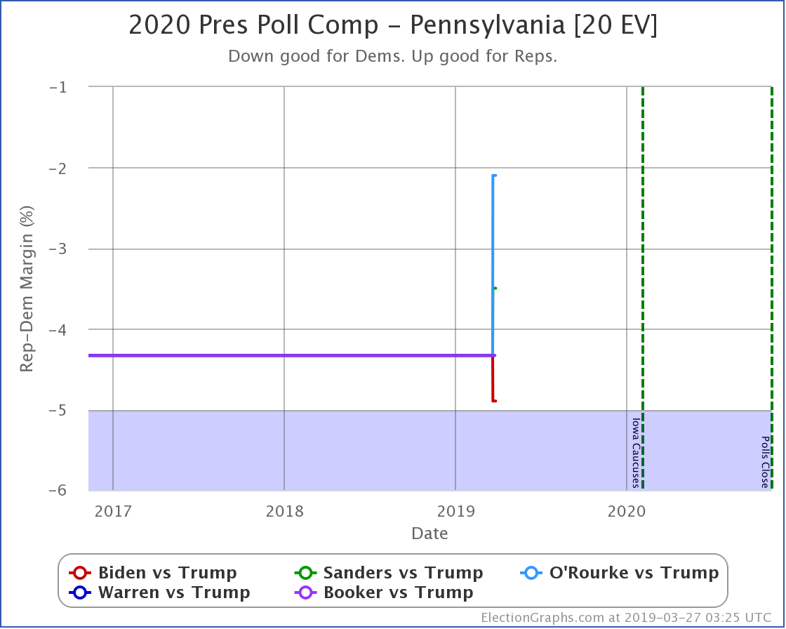
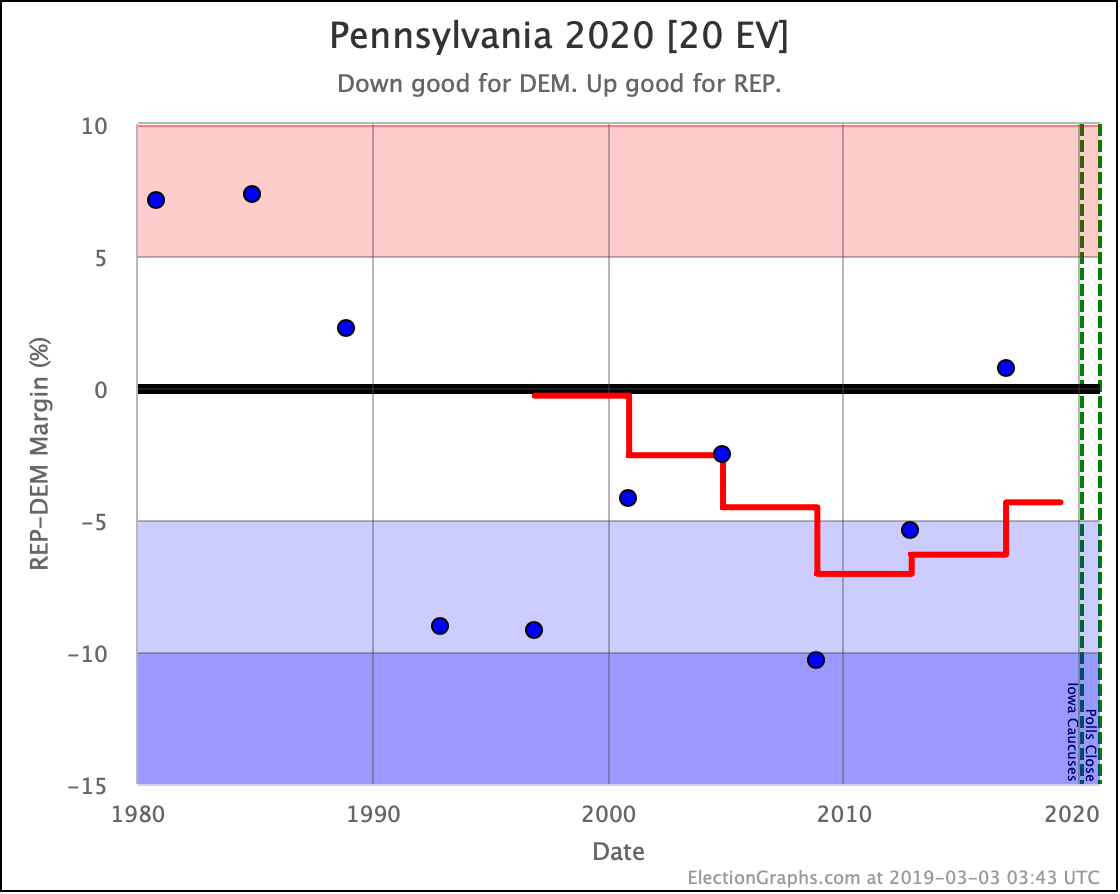
  • Warren vs. Trump state category change: PA has moved from Weak Warren to Weak Trump

Looking at how this impacted the national numbers:

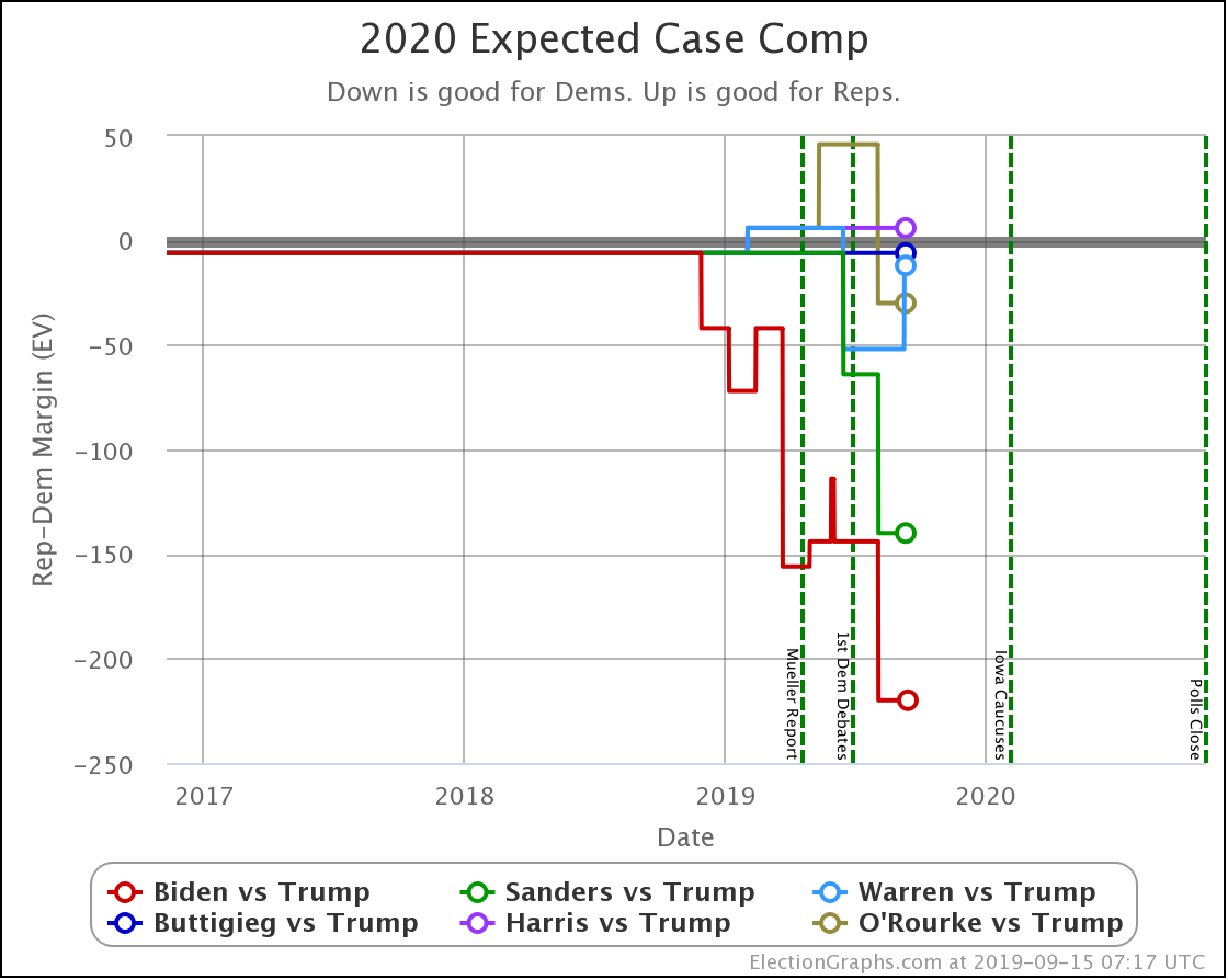
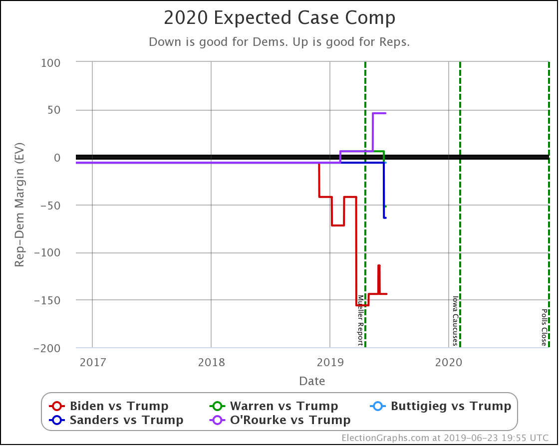
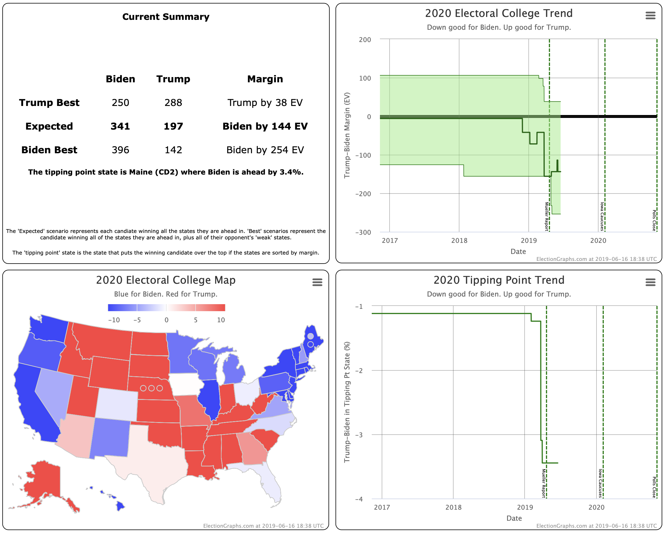
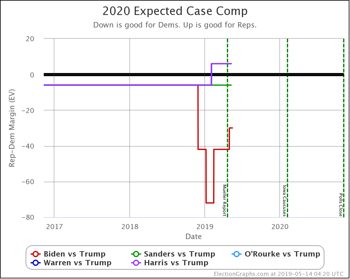
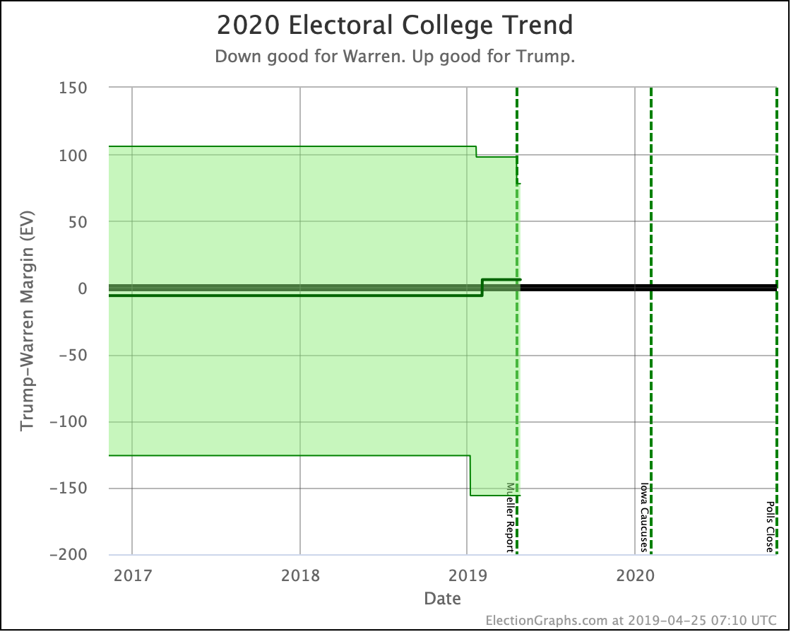
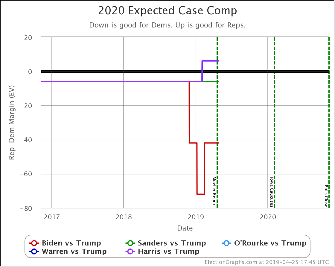
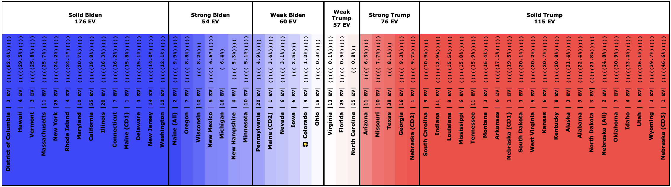
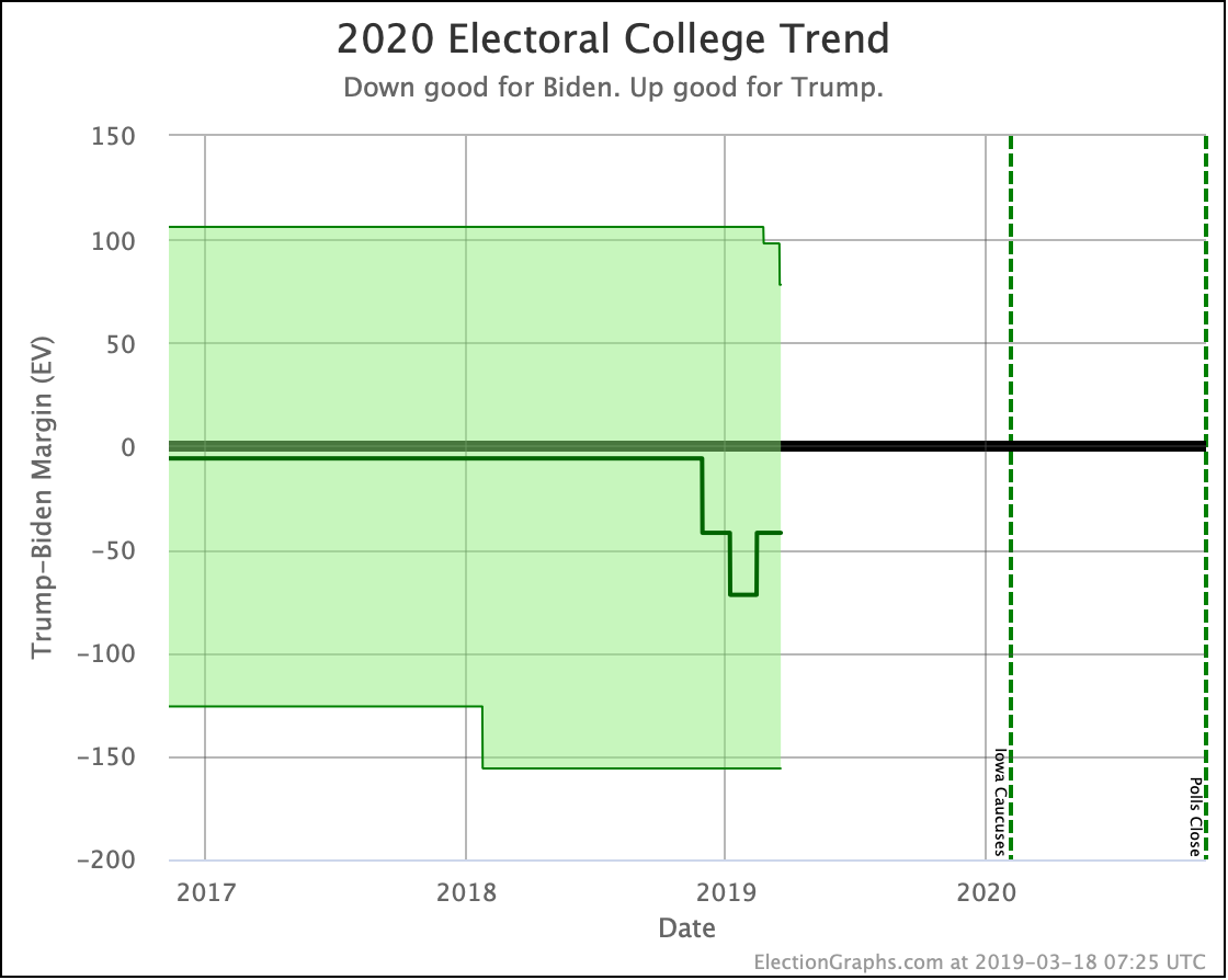
In the "Expected Case" where every candidate wins every state they are ahead in, Pennsylvania moving from slightly Warren to slightly Trump means that Warren now only has a 12 electoral vote margin in this scenario.

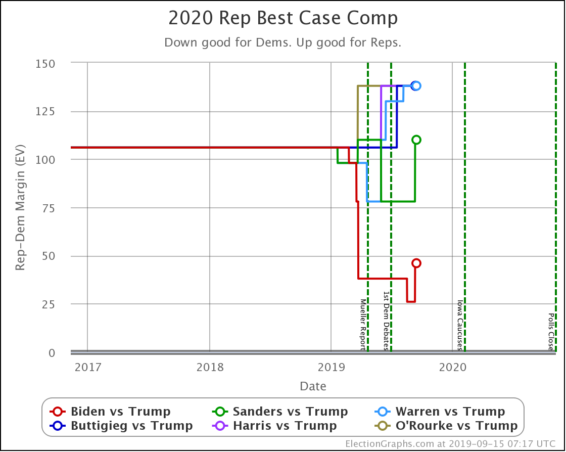
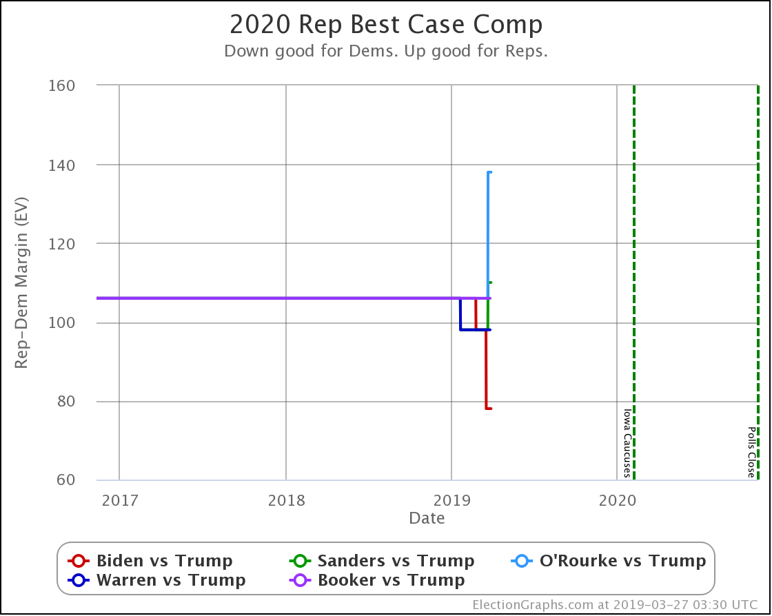
Biden's lead dropping below 5% in Wisconsin, and Sander's lead dropping below 5% in Michigan meanwhile, improves Trump's "Best Case" (where he wins not only all of the states where he is ahead but also all the ones where he is behind by less than 5%) against both candidates.

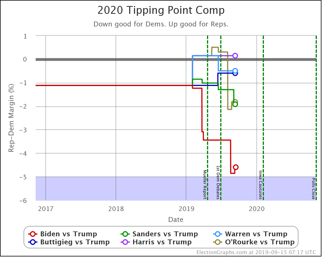
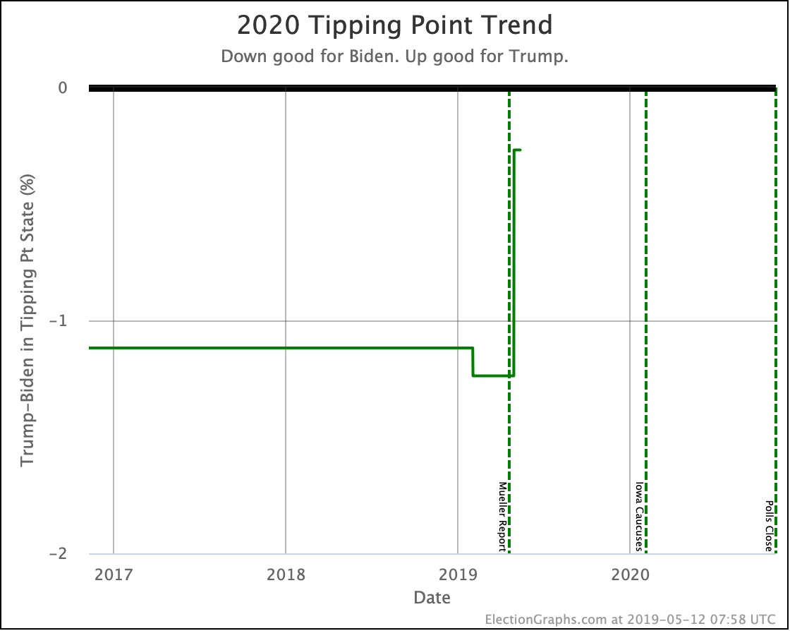
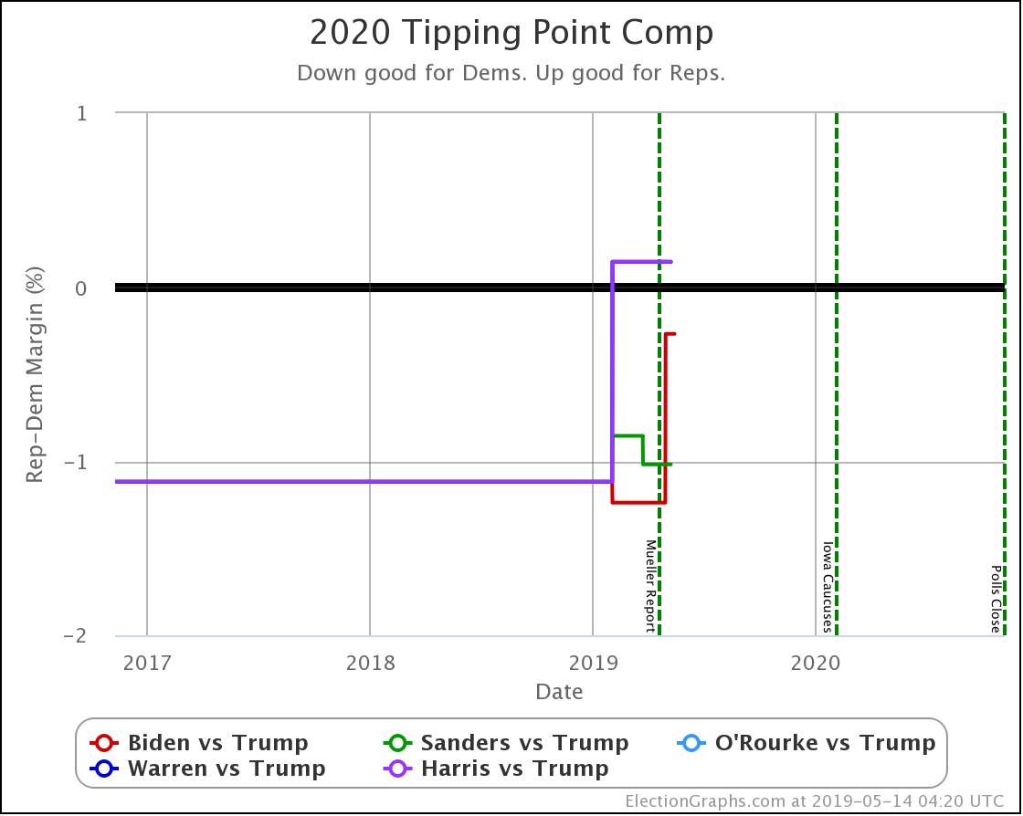
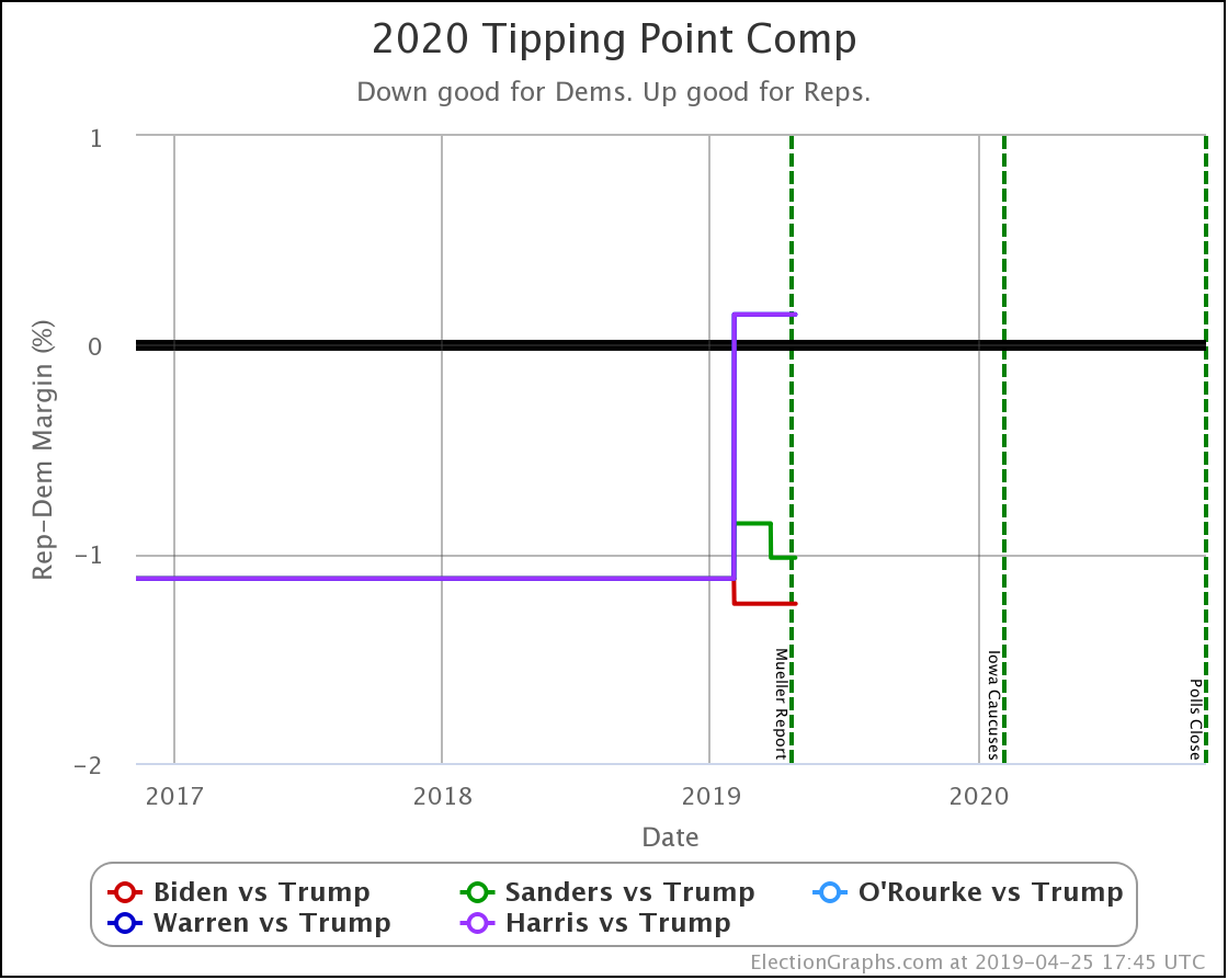
As these five states moved around, several tipping points moved as well.

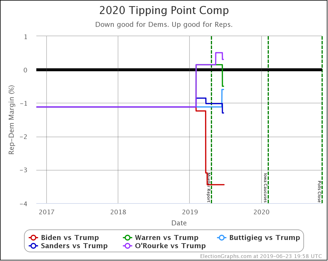
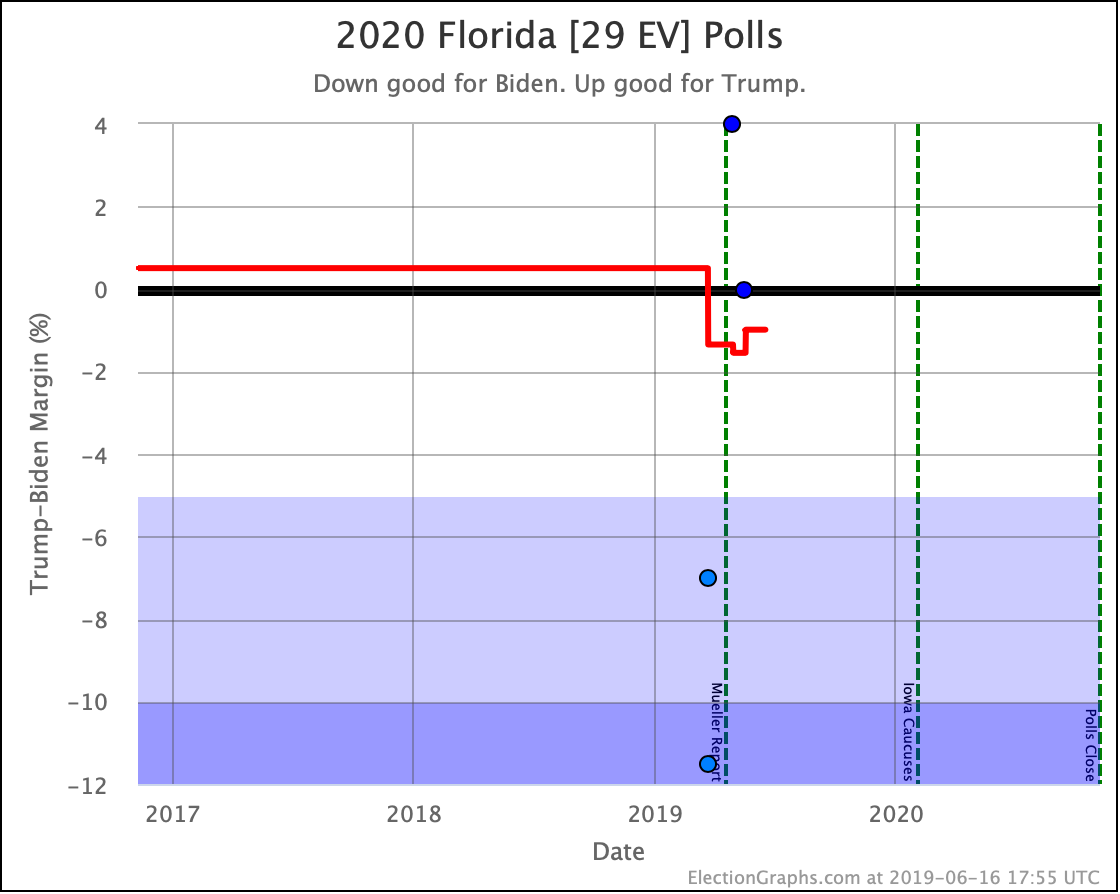
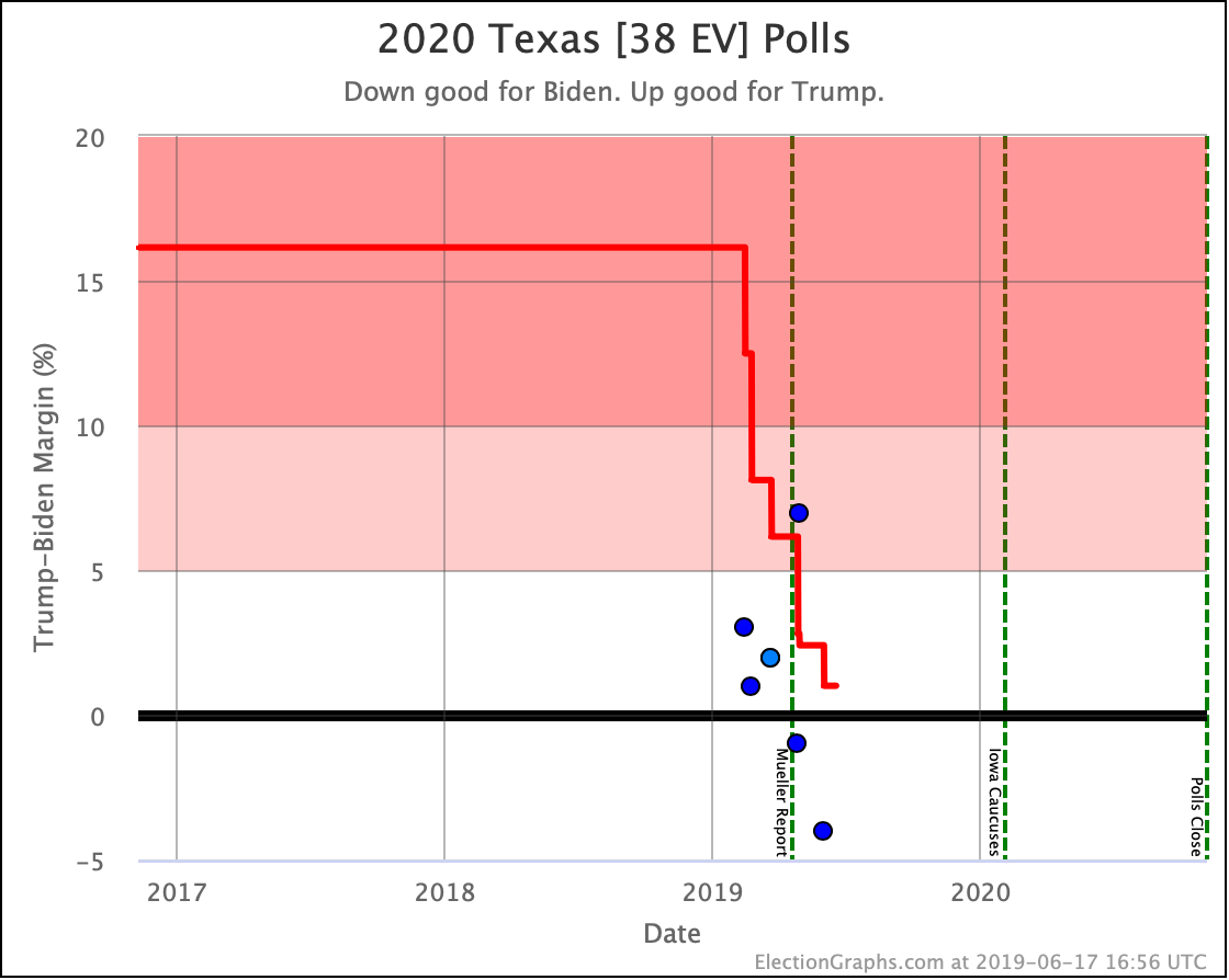
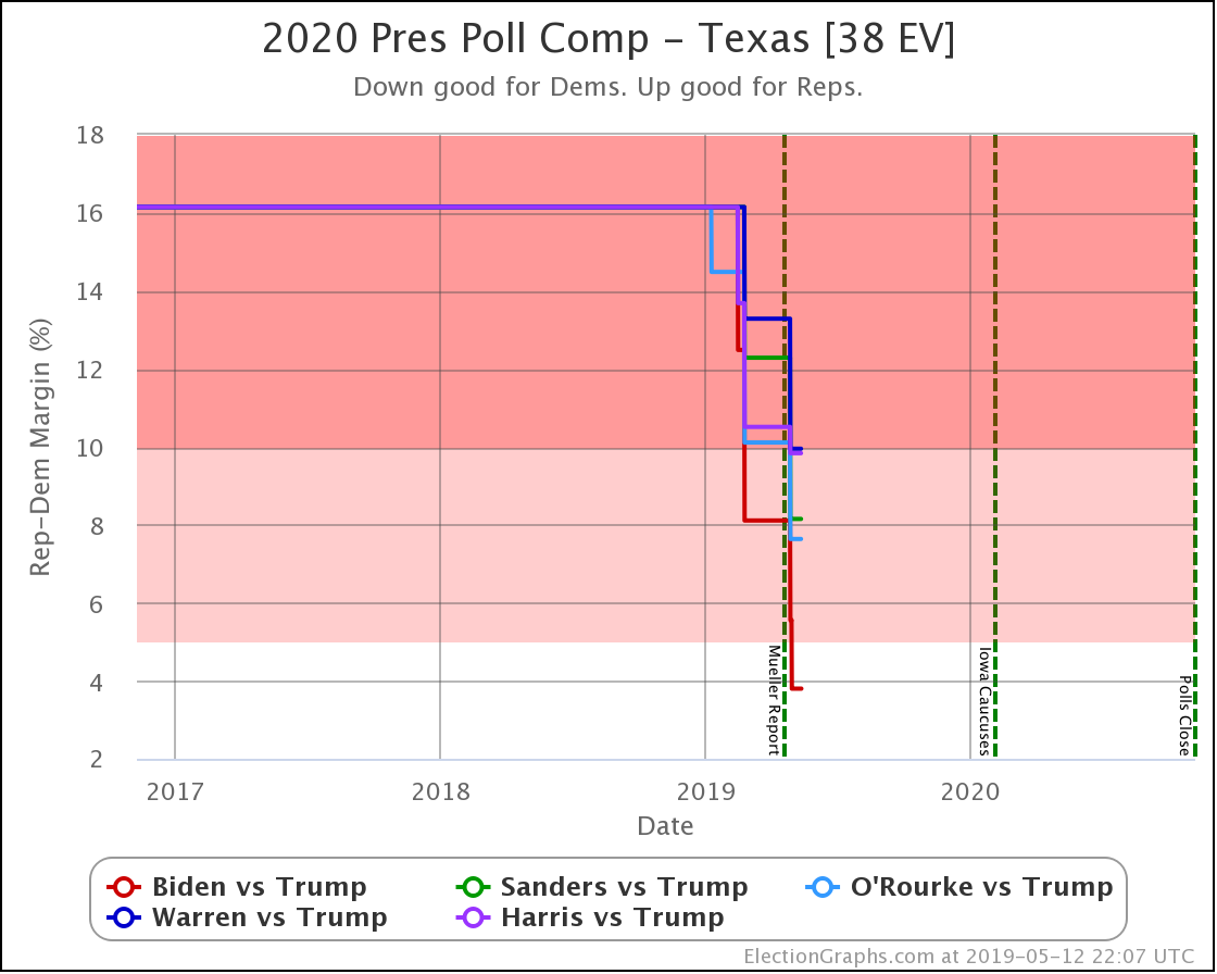
  • Sanders vs. Trump tipping point change: Sanders by 1.3% in FL -> Sanders by 1.9% in TX
  • O'Rourke vs. Trump tipping point change: O'Rourke by 2.1% in TX -> O'Rourke by 1.8% in TX
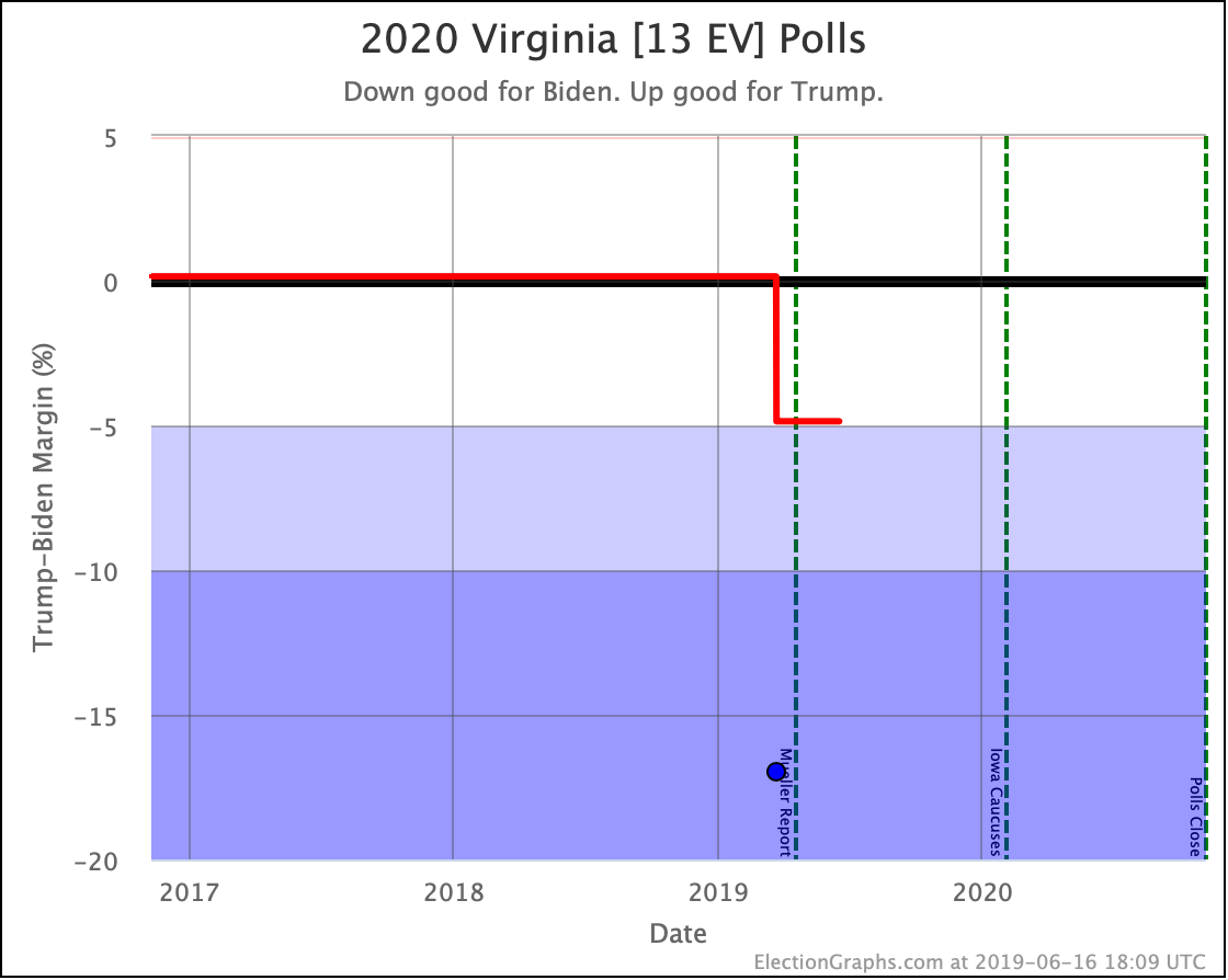
  • Biden vs. Trump tipping point change: Biden by 4.9% in VA -> Biden by 4.6% in WI

The tipping point changes already make it clear that this was a mixed week. Some Democrats improved their positions against Trump; some moved in the opposite direction. This mix in the situation exists despite all of the actual category changes being in Trump's direction.

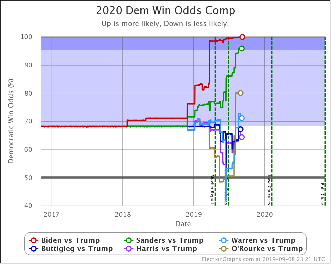
The movement within categories that starts to be shown by the tipping point is something we can see even better if we switch to the probabilistic simulation view:
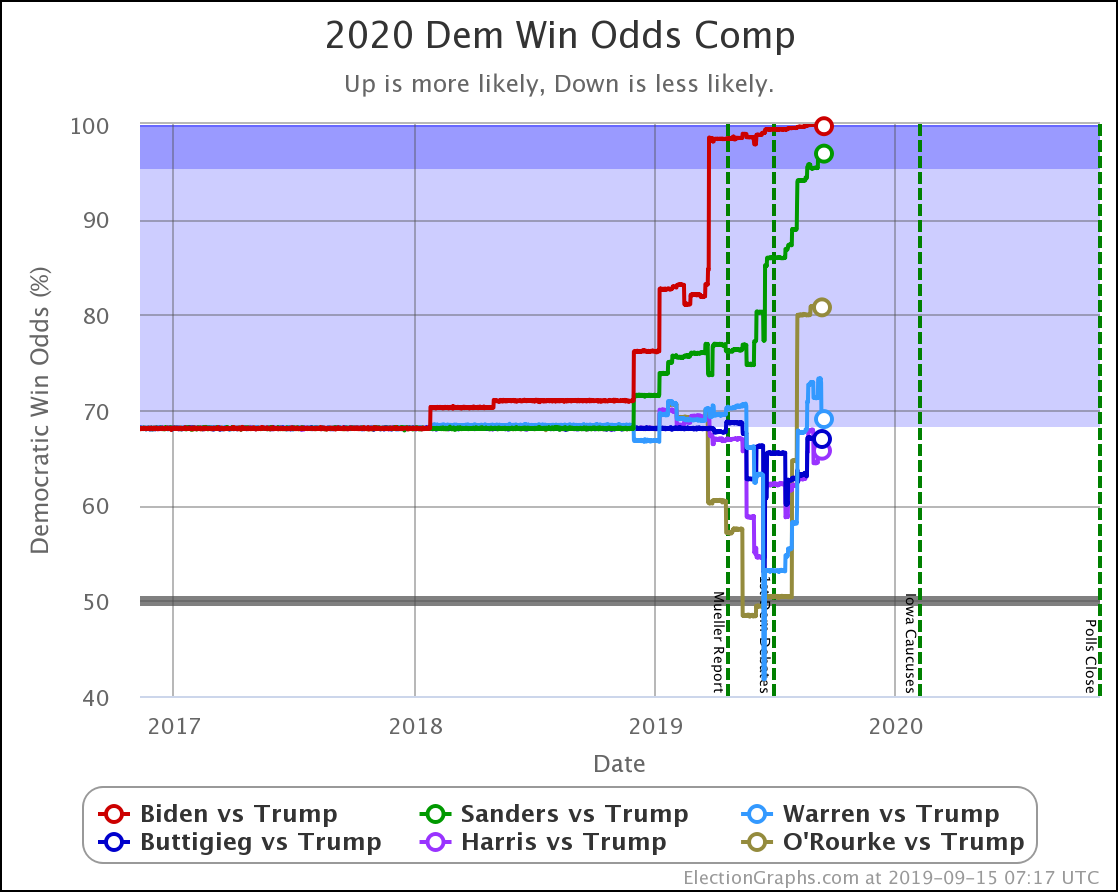
Dem 8 Sep 15 Sep 𝚫
Biden 99.9% 99.8% -0.1%
Sanders 95.8% 96.9% +1.1%
O'Rourke 80.0% 80.8% +0.8%
Warren 71.1% 69.0% -2.1%
Buttigieg 67.1% 67.0% -0.1%
Harris 64.3% 65.7% +1.4%

There were a lot of mixed results in a lot of states this week. But when you balance it all out in terms of the odds of winning in the Electoral College:

  • Harris, Sanders, and O'Rourke strengthened against Trump
  • Warren, Biden, and Buttigieg weakened against Trump

Another way of looking at this is the median margins in the Monte Carlo simulations for each of the candidate combinations:

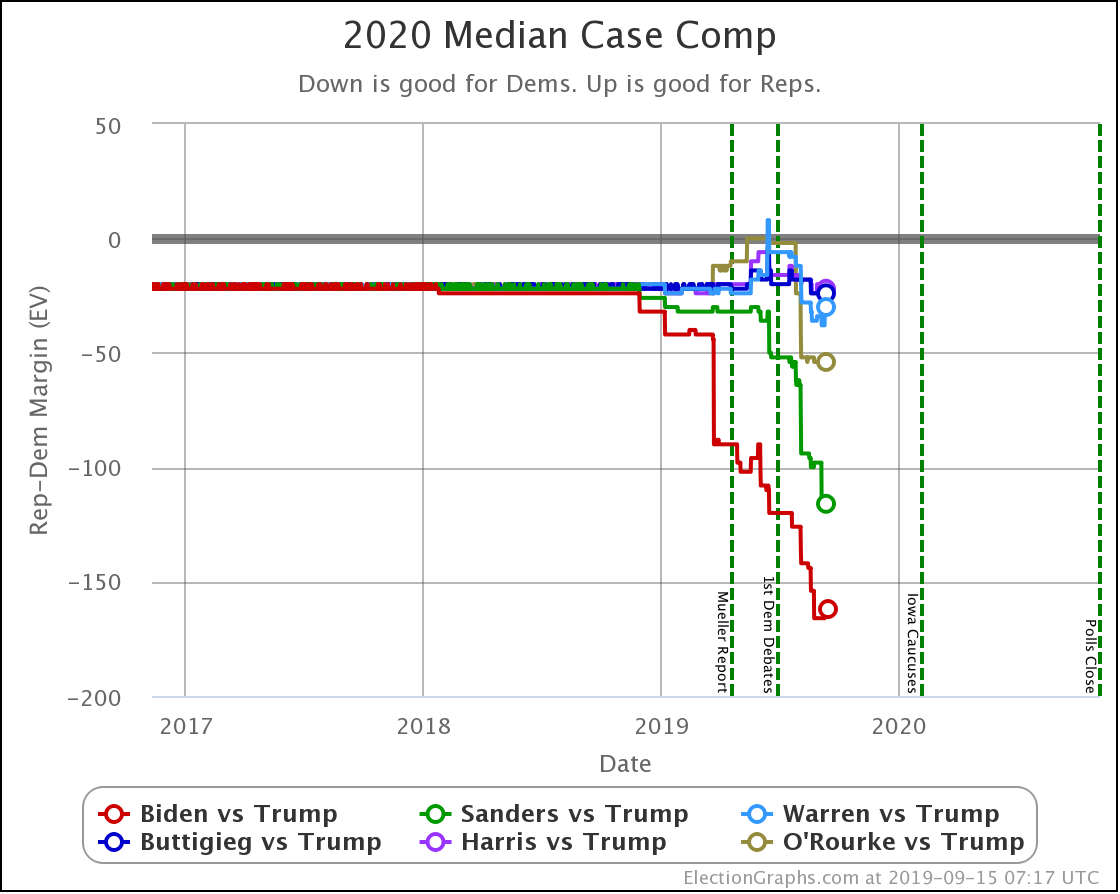
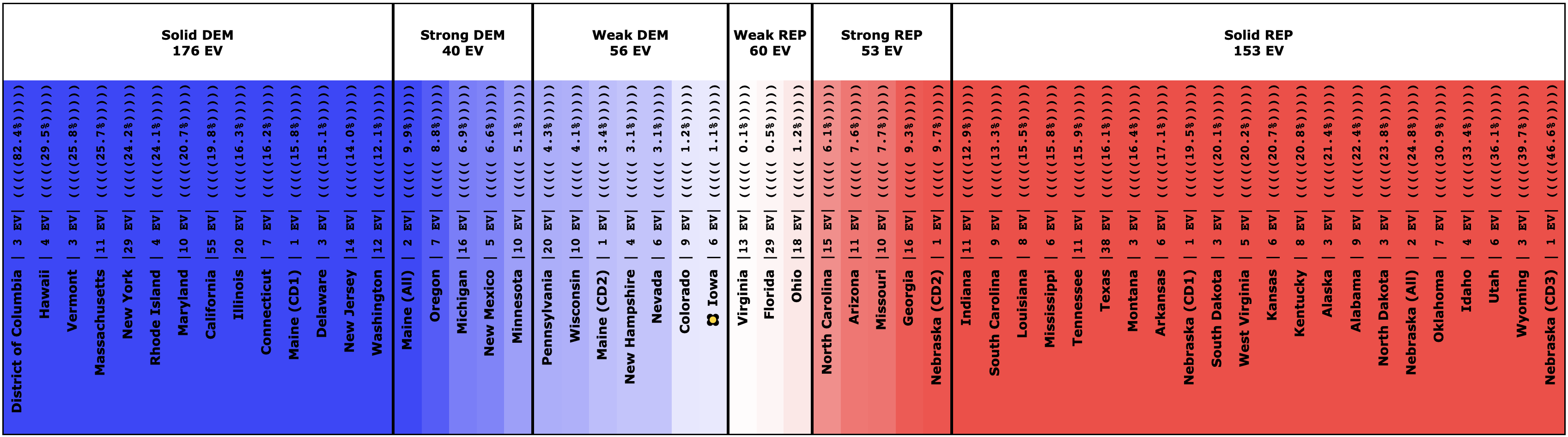
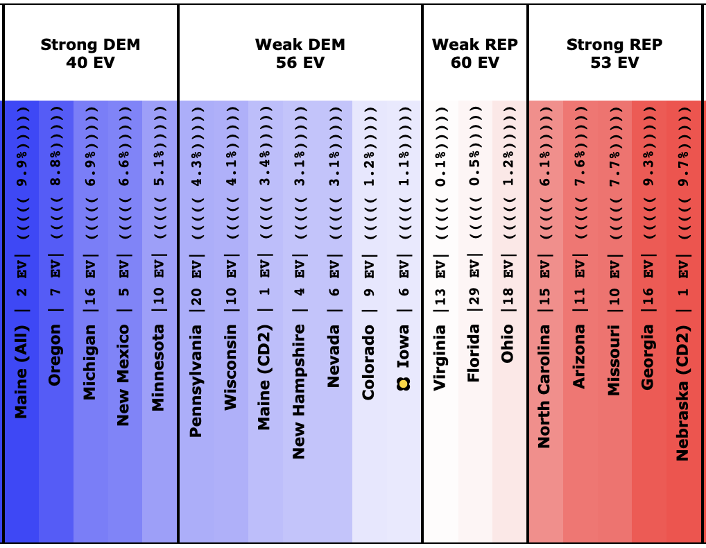
Unlike the categorization "Expected Case" view, where Harris narrowly loses to Trump, all six Democrats lead Trump in the probabilistic "Median Case."

Warren, Buttigieg, and Harris all lead by 30 or less electoral votes, though. In electoral vote terms, that is a very tight race. Any state with more than 15 electoral votes slipping to the other side of the centerline would switch the outcome.

O'Rourke, Sanders, and Biden, each, in turn, have more of a margin than the candidate before, so additional buffer. They can afford for more to go wrong before they lose.

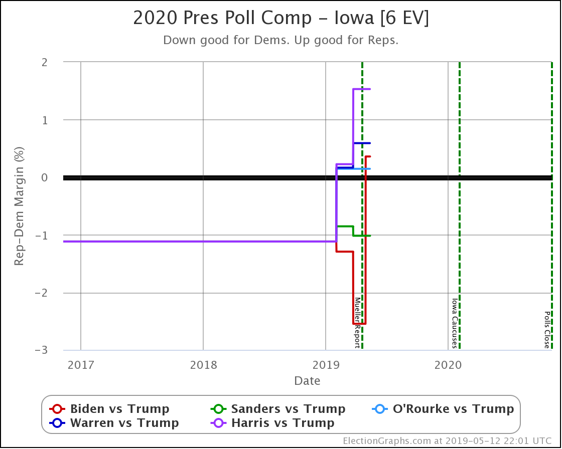
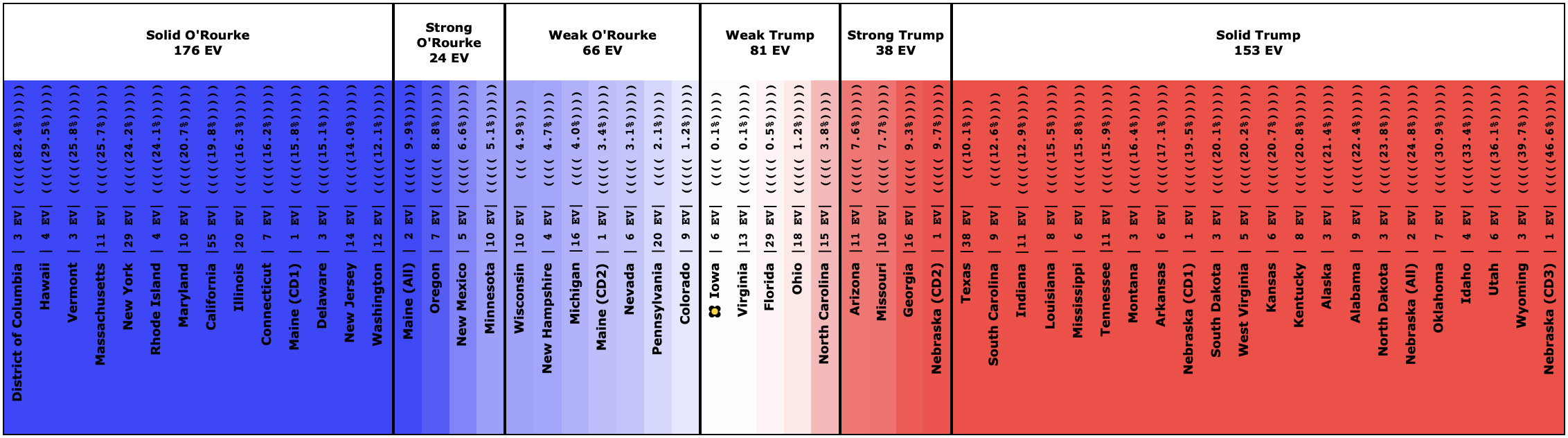
Now, let's look at each of the five states that got polled this week.

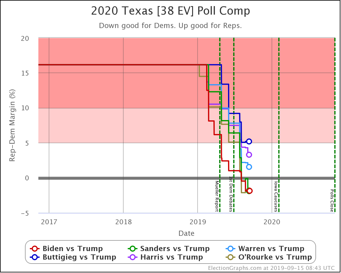
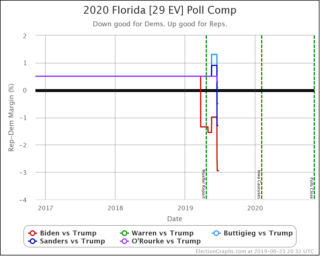
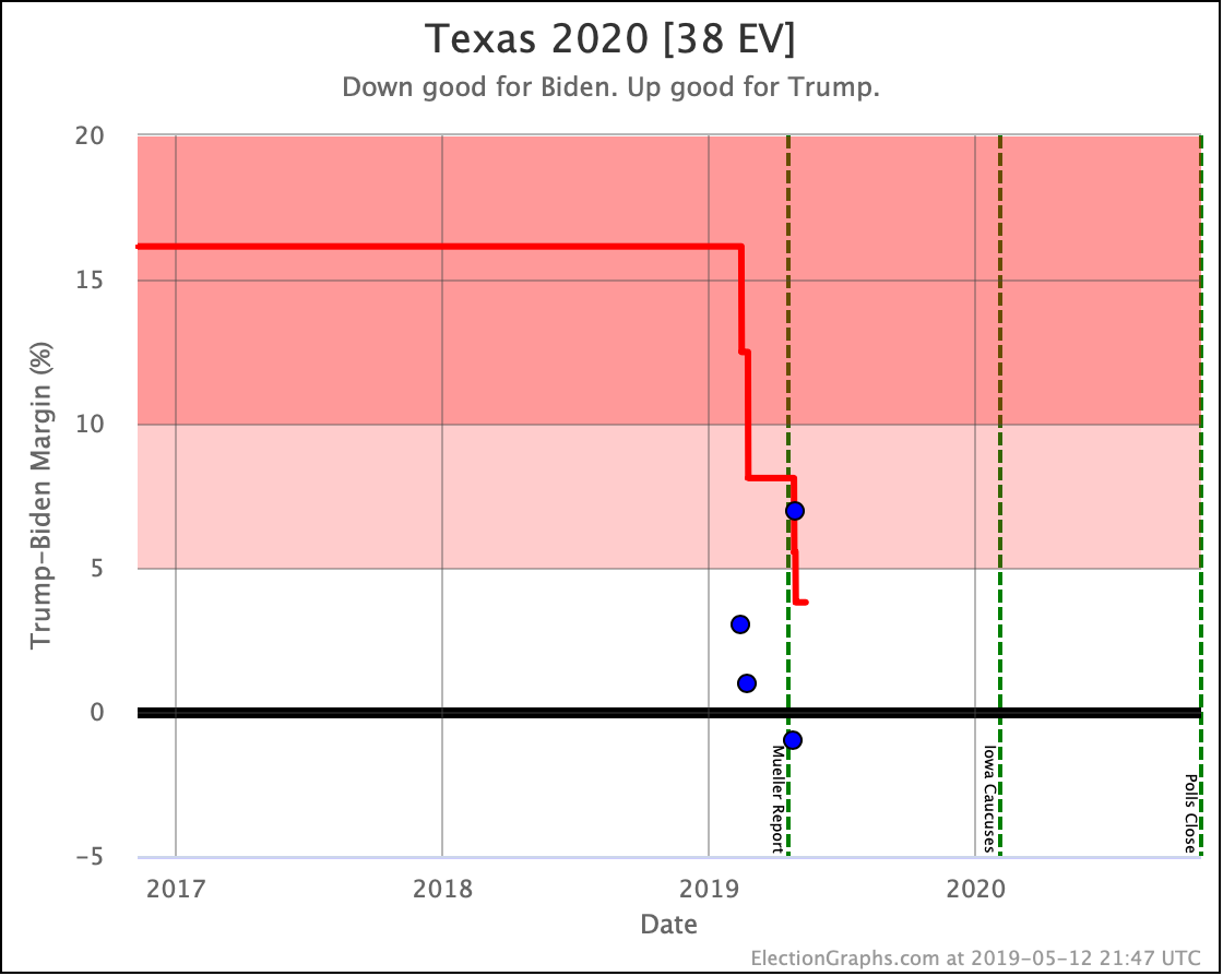
Of the two polls in Texas, one matched other recent surveys and was mostly favorable to the Democrats. The other showed clear Republican leads.

The net impact of the two polls on the averages was that Biden, Sanders, Warren, and Harris continued improving in Texas, while Buttigieg and O'Rourke got a little weaker.

You do get one piece of oddness, though. I use the methodology I described in my Polling Error vs. Final Margin post to translate margins into odds of winning. When I use the straight-up unsmoothed numbers from the 2008 to 2016 elections, there are a few places where the relationship between the polling average and the win odds are not monotonic.

This behavior means that even though O'Rourke's polling average dropped from a 2.1% lead to a 1.8% lead, my computed "odds of winning Texas" for O'Rourke INCREASED from 66.4% to 68.2%.

Now, I could have smoothed the handful of places where this non-monotonic behavior occurs out of existence. But I chose when I first set up the odds based view to use the numbers that came straight out of my analysis of the previous election results without any further manipulation.

Given the historical data and the methodology I used, a 1.8% Democratic lead is indeed slightly more likely to win than a 2.1% Democratic lead. Of course, this does seem a little crazy and is quite possibly just an example of overfitting.

But it isn't a huge difference and occurs at only a few specific margin zones, so I'll leave it be.

We still end up with a situation where three of the six Democrats are leading in Texas though, and another two make it close.

Texas continues to be one of the most important states to watch.

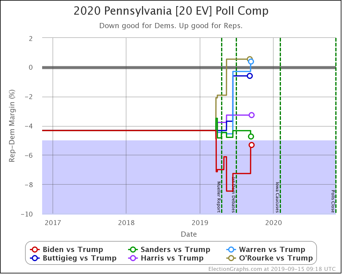
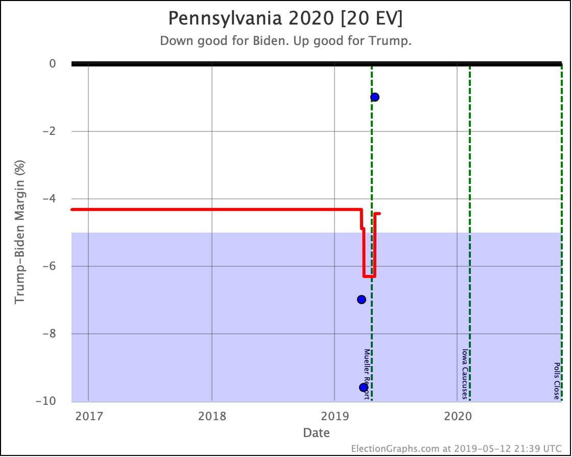
Sanders improved slightly in Pennsylvania.

Biden's lead deteriorated significantly.

Warren lost her lead to Trump.

The poll did not include the others.

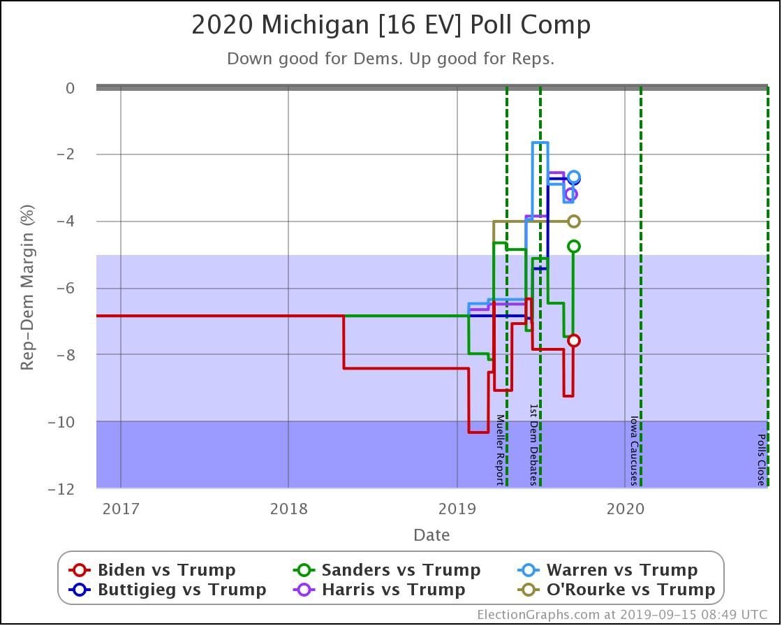
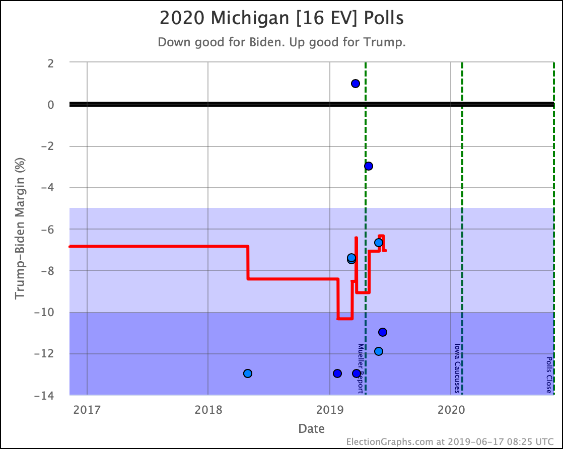
Biden, Sanders, and Warren all weaken against Trump in Michigan with this week's update.

The poll did not include the others.

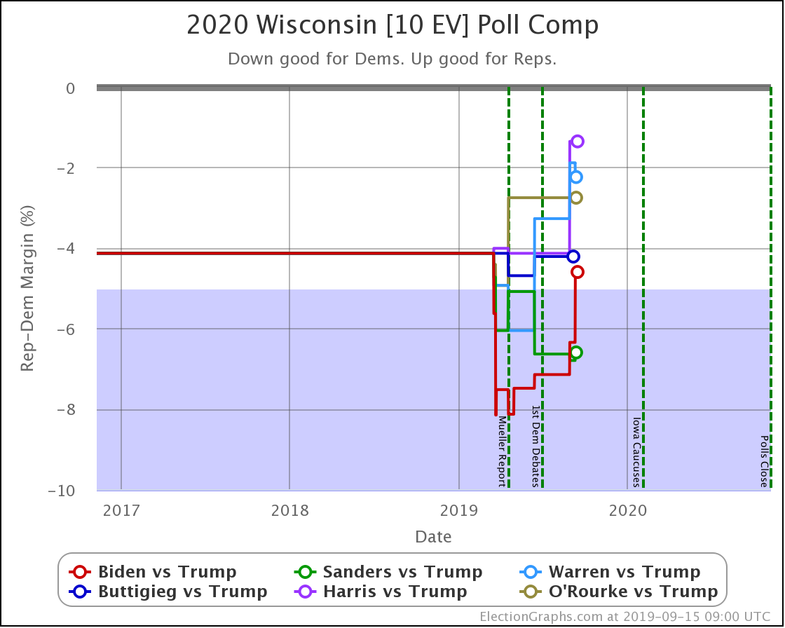
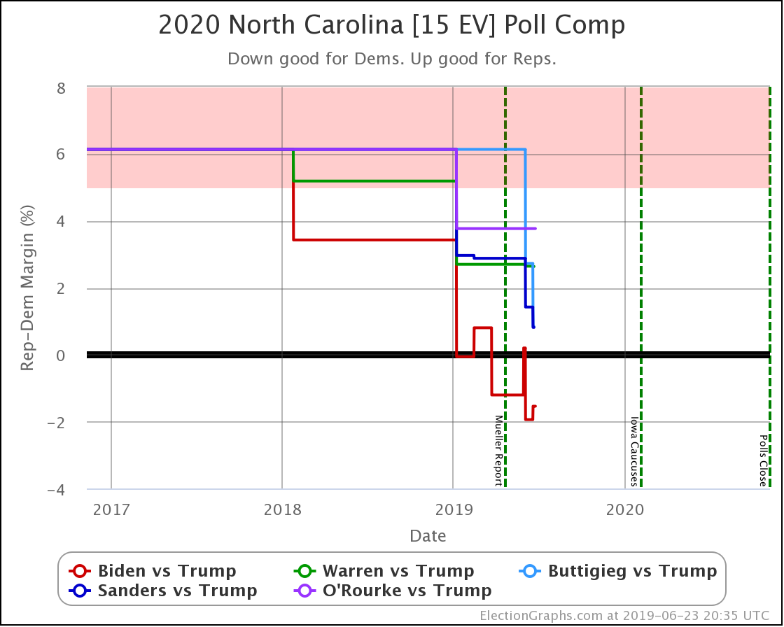
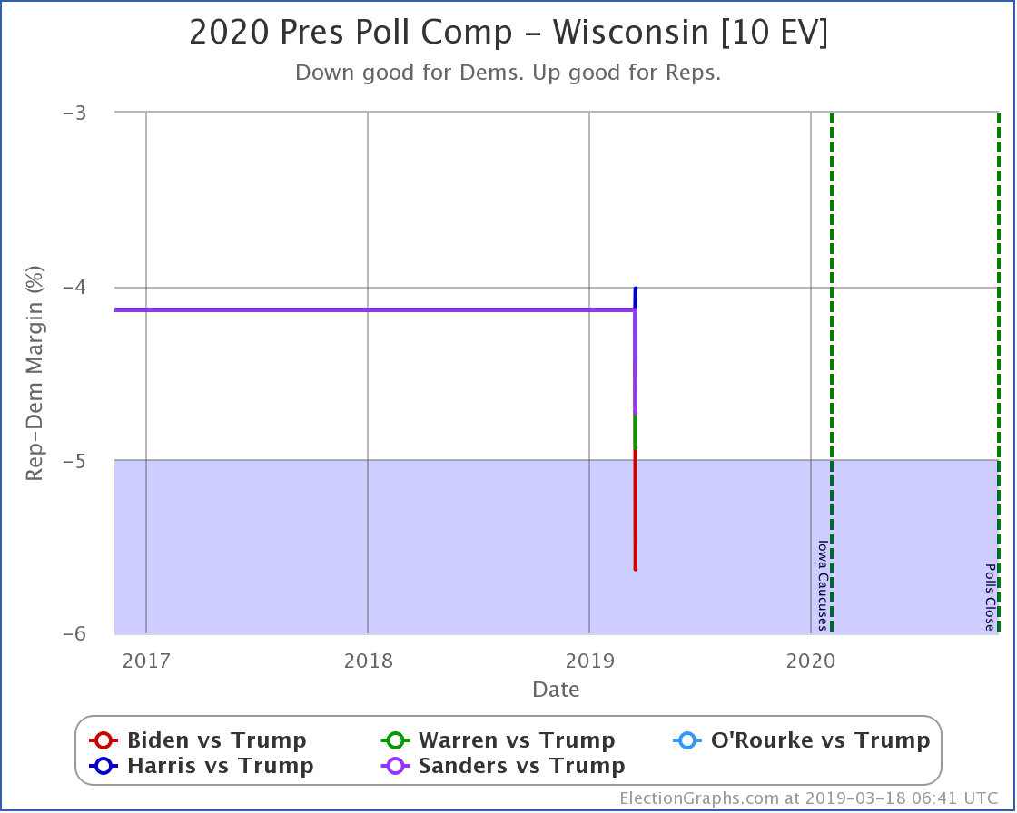
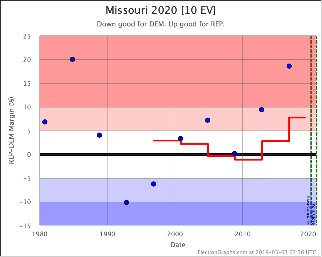
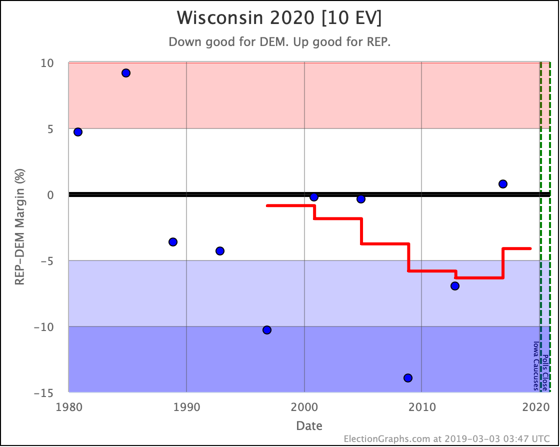
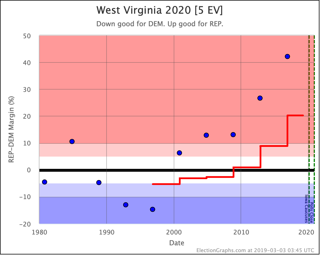
Warren got stronger in Wisconsin.

Biden and Sanders got weaker.

The poll did not include the others.

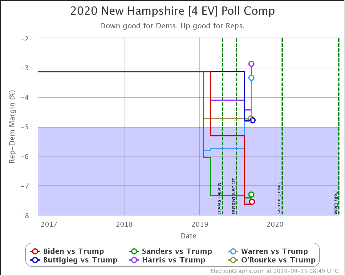
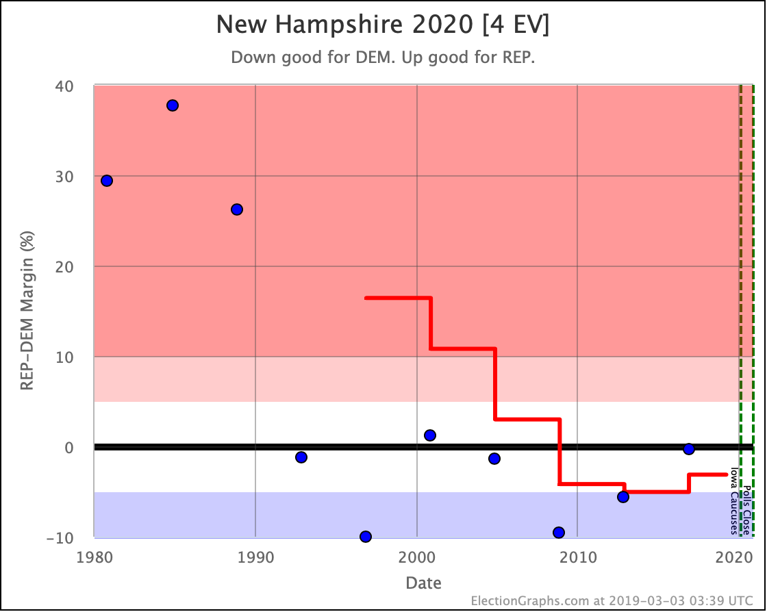
Biden, Sanders, Warren, and Harris all got weaker in New Hampshire with the latest polling.

The poll did not include Buttigieg or O'Rourke.

And that's it for this week's update.

415.6 days until polls start to close.

For more information:

This post is an update based on the data on the Election Graphs Electoral College 2020 page. Election Graphs tracks a poll-based estimate of the Electoral College. The charts, graphs, and maps in the post above are all as of the time of this post. Click through on any image to go to a page with the current interactive versions of that chart, along with additional details.

Follow @ElectionGraphs on Twitter or Election Graphs on Facebook to see announcements of updates. For those interested in individual poll updates, follow @ElecCollPolls on Twitter for all the polls as I add them. If you find the information in these posts informative or useful, please consider visiting the donation page.

Most Democrats Weaken in Wisconsin

Since last week's update, there was only one new state-level general election poll. The addition this week was a Marquette poll of Wisconsin.

There were no category changes based on these results.

Biden and Sanders continue to have strong leads in Wisconsin (more than a 5% margin but less than a 10% margin).

Meanwhile, Warren, Buttigieg, Harris, and O'Rourke have weak leads (less than a 5% margin).

There has been some movement within the broader categories though, so let's take a look:

Marquette did not poll Buttigieg or O'Rourke, so their averages do not change.

Of the rest, only Sanders improved their Election Graphs average in Wisconsin, going from a 6.6% lead to a 6.8% lead.

Everybody else weakens.

Biden drops from a 7.2% lead to 6.4%.

Warren goes from a 3.3% lead to only 1.9%.

Harris goes from a 4.1% lead to just 1.4%.

In terms of winning odds, while every Democrat here is favored to win, we have a vast range.

Sanders is now best off with a 96.2% chance of winning Wisconsin.

Harris is weakest, with only a 62.3% chance of winning the state.

So, how does this change the national picture?

Dem 1 Sep 8 Sep 𝚫
Biden 99.9% 99.9% Flat
Sanders 95.7% 95.8% +0.1%
O'Rourke 80.0% 80.0% Flat
Warren 72.6% 71.1% -1.5%
Buttigieg 67.1% 67.1% Flat
Harris 67.9% 64.3% -3.6%

Even though Biden weakened a bit in Wisconsin, his overall position is strong enough that things look flat when rounding to the nearest 0.1%. But if you must know an additional digit after the decimal point, his national win chance in the Election Graphs simulation moves from about 99.89% to approximately 99.86%. But we don't deserve that additional digit. That is false precision. So it is flat.

Sanders, of course, has a small gain, while Warren and Harris both drop.

Harris is hurt the most by this week's polling and takes over from Buttigieg as the weakest of these six Democrats against Trump.

And that's it for this week.

422.0 days until polls start to close.

For more information:

This post is an update based on the data on the Election Graphs Electoral College 2020 page. Election Graphs tracks a poll-based estimate of the Electoral College. The charts, graphs, and maps in the post above are all as of the time of this post. Click through on any image to go to a page with the current interactive versions of that chart, along with additional details.

Follow @ElectionGraphs on Twitter or Election Graphs on Facebook to see announcements of updates. For those interested in individual poll updates, follow @ElecCollPolls on Twitter for all the polls as I add them. If you find the information in these posts informative or useful, please consider visiting the donation page.

Most Dems improve against Trump while Buttigieg weakens

Since the last update, there have been new polls in Kentucky, Wisconsin, Michigan, Pennsylvania, Florida (x2), and North Carolina.

With this update, Buttigieg vs. Trump has now replaced Harris vs. Trump in the "five best-polled candidate combinations" that I'll spend time on in these posts. The new list is Biden, Warren, Buttigieg, Sanders, and O'Rourke all paired against Trump.

With this latest batch of polls, we have the following changes:

National:

  • Trump best case vs. Warren has changed: Warren 214 to Trump 324 -> Warren 204 to Trump 334
  • Warren vs. Trump tipping point change: Trump by 0.1% in VA -> Warren by 0.5% in FL
  • Warren vs. Trump expected case change: Warren 266 to Trump 272 -> Warren 295 to Trump 243
  • Buttigieg vs. Trump tipping point change: Buttigieg by 1.1% in IA -> Buttigieg by 0.6% in PA
  • Sanders vs. Trump tipping point change: Sanders by 1% in IA -> Sanders by 1.3% in FL
  • Sanders vs. Trump expected case change: Sanders 272 to Trump 266 -> Sanders 301 to Trump 237
  • O'Rourke vs. Trump tipping point change: Trump by 0.5% in FL -> Trump by 0.3% in FL

Wisconsin:

  • Warren vs. Trump state category change: WI has moved from Strong Warren to Weak Warren

Florida:

  • Sanders vs. Trump state category change: FL has moved from Weak Trump to Weak Sanders
  • Warren vs. Trump state category change: FL has moved from Weak Trump to Weak Warren

OK, now on to the graphs… national first:

In the expected case, Warren and Sanders improve.

Notably, Warren moves from losing to winning with this update.

Biden continues to do the best of the five Democrats, while O'Rourke does worst.

In the tipping point Warren, Sanders, and O'Rourke improve, while Buttigieg weakens.

Once again, you can see Warren crossing the center line to the winning side of the field.

And once again Biden does best, while O'Rourke does worst.

Now let's look at all of the states that had new polls in this batch:

In Florida, O'Rourke and Buttigieg are losing to Trump. Biden, Warren, and Sanders are beating him. As usual, Biden is doing better than the other Democrats. But every single matchup here is close. As usual, Florida is a battleground state.

Biden has a healthy lead in Pennsylvania. O'Rourke is behind Trump. All the rest of these five Democrats are in the lead over Trump, but they have narrow edges.

In Michigan, Biden is doing best. Warren is doing worst. Strong leads for Biden, Sanders, and Buttigieg. Warren and O'Rourke ahead by narrower margins. But all five leading Trump.

Biden is the only Democrat leading Trump in North Carolina. But all five would make it a close race. North Carolina is definitely in play at the moment.

In Wisconsin, Biden is doing best, O'Rourke is doing worst. Biden and Sanders have strong leads. Buttigieg, Warren, and O'Rourke are only weakly ahead. But all five lead Trump.

Kentucky is very very solidly red. With the very first Kentucky poll of the cycle, it looks like it may be even redder this time around than the average of the last five elections.

OK, finally, the odds based view of the national race. I haven't managed to make this view live on the site with graphs and all yet, but I'll at least provide updates here.

Democrat Dem Odds Trump Odds Tie Odds
Biden 99.4% 0.4% 0.1%
Sanders 86.0% 13.2% 0.8%
Buttigieg 65.5% 33.2% 1.2%
Warren 53.2% 44.9% 1.9%
O'Rourke 50.5% 47.8% 1.7%

For those missing Harris, since she dropped off my top five, she's now at a 62.3% chance of winning.

It remains striking what a vast range there is between Biden on the one end of this spectrum and O'Rourke on the other.

As always, the caveat that things can and will change, but if the election was today, Biden looks about as close to a sure thing as you can get (much stronger than the median odds based view Clinton had, which was at about 86% on election day), while meanwhile, O'Rourke looks like a coin toss.

If this is primarily due to name recognition and the main deciding factor for voters is simply Trump vs. non-Trump, you should see the divergence between various Democrats reduce over the next few months as people get to know some of the lesser-known Democrats.

If on the other hand, these kinds of differences persist as we get closer to the Iowa caucuses, then there are lots of people out there where the choice of Democrat does indeed influence them on their final vote. In this case, "electability" becomes a valid criterion for Democrats to consider when making their choices in the primaries and caucuses.

3.1 days until the first Democratic debate.

499.1 days until polls start to close on Election Day 2020.

For more information:

This post is an update based on the data on the Election Graphs Electoral College 2020 page. Election Graphs tracks a poll-based estimate of the Electoral College. The charts, graphs, and maps in the post above are all as of the time of this post. Click through on any image to go to a page with the current interactive versions of that chart, along with additional details.

Follow @ElectionGraphs on Twitter or Election Graphs on Facebook to see announcements of updates. For those interested in individual poll updates, follow @ElecCollPolls on Twitter for all the polls as I add them. If you find the information in these posts informative or useful, please consider visiting the donation page.

Trump Internal Polls All Good News For Biden

Since the last update, there have been polls in North Carolina, New York, Michigan, Pennsylvania, Wisconsin, Florida, Texas, Virginia, Maine (All), Minnesota, Iowa, Ohio, and Georgia.

Now, most (but not all) of these are internal Trump campaign polls that were leaked and reported on by first ABC and then NBC. The full internal polling reportedly included 17 states and matchups against multiple Democrats, but the leaks so far only include Biden versus Trump results in 12 of them. Because this is a leak of internal polls and not "regular polls," I tweeted a series of notes on these polls, that I will repeat here:

  • 1st: Some aggregators automatically exclude internal polling because of potential selective release bias, etc. I default to including as much as possible. So they are reflected on Election Graphs.
  • 2nd: I’m going with ABC on the field dates, not NBC. ABC reports March 15th to March 28th, which is precisely two weeks. NBC reports March 13th to March 28th, which includes two extra days. These almost certainly are the same batch of polls though.
  • 3rd: ABC and NBC differ slightly on their reports of the results in Pennsylvania, Wisconsin, and Florida. In these cases, I will include both, but weighted as half polls, just as I do when a pollster reports results in multiple ways (with & without 3rd parties, registered vs. likely voters, etc.)
  • 4th: For some states this leak only includes margins. Election Graphs only uses margin in calculations, but it displays & reports candidate results too. For the instances where we only have leaked margins, I will log the polls such that Trump-Biden=Margin and Trump+Biden=100%.
  • 5th: If a range of possible margins is reported rather than a specific margin, I will log these as the center of that range.
  • 6th: If more detailed leaks become available, I will adjust how these polls are recorded to reflect any new information.

With those caveats, here are the status changes that occurred as a result of this batch of polls. After that, we'll start looking at the graphs.

All of these changes are for the Biden versus Trump matchup.

State Level:

  • Florida (29 EV) has moved from Weak Trump to Weak Biden
  • Virginia (13 EV) has moved from Weak Trump to Weak Biden

National Level:

  • Expected case change: Biden 299 to Trump 239 -> Biden 341 to Trump 197
  • Tipping point moves from Biden by 1.9% in NC to Biden by 3.4% in ME-CD2.

We'll look nationally first, then the states that changed categories, then a brief look at the locations that did not. Finally, I'll report on what all this does to the Monte Carlo simulation of the national race.

Keep in mind that all of the leaked internal polls were in the field back in March, so they are older data, and will change not just the end of the lines in the charts, but the shape of those lines over March, April, May, and June.

Rather than going graph by graph, here is the whole summary block from the Biden versus Trump page. The two charts on the right show a clear trend toward Biden.

Now, we are still at the stage where most states don't have five polls yet, so we are filling in data based on previous general election results when constructing state averages. So it is crucial to note that this "movement" is mostly not representing changes in public opinion yet, but rather is reflecting the increasing knowledge over time of what Biden vs. Trump looks like specifically, rather than a generic Democrat vs. Republican based on the average historical results from 2000 to 2016.

So the trend may not represent people flocking to Biden over the last few months, but instead, it shows that the more polls we get in more states, the stronger Trump looks against Trump.

Also important to note that while the "expected case" now has Biden winning by 144 electoral votes, a month before the 2016 election, the "expected case" was a 154 electoral vote win for Clinton. By election day that had slipped to only an eight electoral vote lead. And of course, Trump won by 77 electoral votes. The "expected case" can move very quickly, and does not give the whole picture anyway.

Similarly, the tipping point is now a 3.4% Biden lead, while less than two weeks before the election, Clinton had a 5.4% tipping point lead. That evaporated to 1.6% in the last two weeks, and the actual tipping point in the election was an 0.8% Trump margin.

So Biden looks formidable, but Clinton looked even stronger at times.

Also, things can move very quickly even in two weeks, let alone 506 days.

We have a long way to go.

OK, now the two states that changed categories in this update:

Including the two slightly different versions of the Trump internals leak as one averaged result, there have only been three Biden vs. Trump polls in Florida so far. And they cover a vast range. The average (including 2016 and 2008 to round things out) is a 1.0% Biden lead.

This lead translates into about a 55.6% chance of a Biden win, and a 44.4% chance of a Trump win.

As usual, Florida is a swing state.

The Trump internals leak is the very first 2020 polling for Virginia. From 2000-2016, there had been 3 Democratic wins, and 2 Republican wins. The average had been a very narrow 0.1% Republican lean for Virginia.

With this new poll, the 8.0% margin Republican win from 2000 slips off the average and a 17.0% lead for Biden enters. That's quite a swing! As a result, the current poll average moves to a 4.9% Biden lead, which translates into a 90.9% chance of winning the state.

And now, quickly, the other states with Biden vs. Trump polls in this update that did not change category:

Trump leads in Texas by only 1.0%, which translates into a 66.4% chance of victory if the election was today. Trump is still a favorite in Texas, but that this is even a question is striking in and of itself.

Biden leads by 8.5% in Pennsylvania. That would be a 99.1% chance of winning. (If the election was held today, which of course it is not.)

Biden leads by 0.9% in Ohio. 55.3% chance of winning the state.

The Trump internal poll was the first Biden vs. Trump polling for Georgia. It shows Biden with a significant lead, but given the historical Republican wins in Georgia, it will take a few more polls showing a Biden lead before the average goes there. For now, the average sits at a 5.8% Trump lead, which is a 98.1% chance of a Trump victory.

Biden leads by 7.1% in Michigan. 98.8% chance of winning.

Biden leads by 1.9% in North Carolina. 67.0% chance of winning.

The internal Trump poll is the first Biden vs. Trump polling in Minnesota. Biden is now leading by 7.4%, which would be a 99.1% chance of winning.

Biden leads by 7.5% in Wisconsin. 98.3% chance of winning.

Iowa is currently the closest state in the Biden vs. Trump spectrum of Election Graphs averages, with Trump squeaking out an 0.1% lead, which translates into a 55.1% chance of a Trump win.

The Trump internal polling was the very first polling on Maine. Biden is looking stronger than the historical average for Maine general elections. Biden is leading by 11.9%, which translates into a 100.0% chance of winning the state.

There were also polling results in New York (from Spry, not Trump's internal polling), but only for Gillibrand and de Blasio, who aren't in our "top five matchups against Trump" list that I discuss here on the blog. It was also heavily blue New York, and the results were unsurprising.

So finally, an updated look at how where the Monte Carlo simulation puts the Trump vs. Biden race after this update. As usual:

  • This simulation is "if the election was held today," which it is not.
  • The model uses the past accuracy of the final Election Graphs averages in the 2008-2016 elections to estimate poll-average reliability in 2020. It is always possible that polling accuracy in 2020 will differ in important ways from previous election cycles.
  • We still have very sparse polling, and many states have averages that are based in whole or in part on election results from 2000 to 2016 rather than actual 2020 polls.

OK. With that out of the way, a Monte Carlo simulation with 1,000,001 trial election runs:

  • Median result: Biden by 110
  • 1𝜎 (68.3%) range: Biden by 168 to Biden by 56
  • 2𝜎 (95.4%) range: Biden by 220 to Biden by 12
  • 3𝜎 (99.7%) range: Biden by 254 to Trump by 24

Expressing the results as win odds instead:

  • Biden win: 99.1%
  • Trump win: 0.7%
  • 269-269 tie: 0.2%

Ouch, this last set of polls, mostly the Trump internal points, really hurt for Trump. That 0.7% chance of a Trump win is down significantly from the 6.2% in the last update.

Should I repeat the caveats? The results above may look good for Biden, but it is still a long time until the election, and things will change.

Actually, they already have.

Because I had other things to do, it took me a couple of days to get this blog post done, and in the meantime, there have been new polls in five states. I'll be updating the site with the new data shortly, and will be back with another blog post if there are notable changes to mention.

503.9 days until polls start to close.

For more information:

This post is an update based on the data on the Election Graphs Electoral College 2020 page. Election Graphs tracks a poll-based estimate of the Electoral College. The charts, graphs, and maps in the post above are all as of the time of this post. Click through on any image to go to a page with the current interactive versions of that chart, along with additional details.

Follow @ElectionGraphs on Twitter or Election Graphs on Facebook to see announcements of updates. For those interested in individual poll updates, follow @ElecCollPolls on Twitter for all the polls as I add them. If you find the information in these posts informative or useful, please consider visiting the donation page.

Texas and Pennsylvania close, Iowa flips red

Since the last update, there have been poll updates in Florida, Iowa, Texas, Wisconsin, Michigan, and Pennsylvania. These new polls were all part of a single release from WPA Intelligence, and they ONLY polled the Biden vs. Trump matchup.

There are several caveats about this polling. For more on that, I'll point you to a great thread on Twitter by Charles Franklin, Director of the Marquette Law School Poll where he goes into the details.

Election Graphs tries to include everything though, without any fancy weighting, so a poll like this can make some waves. So let's look at what Election Graphs status changes came out of this polling.

Due to Iowa:

  • IA has moved from Weak Biden to Weak Trump
  • Biden vs. Trump tipping point change: Biden by 1.2% in CO -> Biden by 0.3% in OH
  • Biden vs. Trump expected case changed: Biden 290 to Trump 248 -> Biden 284 to Trump 254

Due to Texas:

  • TX has moved from Strong Trump to Weak Trump
  • Biden best case vs. Trump has changed: Biden 358 to Trump 180 -> Biden 396 to Trump 142

Due to Pennsylvania:

  • PA has moved from Strong Biden to Weak Biden
  • Trump best case vs. Biden has changed: Biden 250 to Trump 288 -> Biden 230 to Trump 308

We'll look at the national charts first, then dig into the state charts.

The most significant impact on the "envelope" is that it has widened significantly. Texas and Pennsylvania are now "in play," and just a few days ago Arizona started looking close too.

The difference between the case where all the close states go to Trump (a 78 electoral vote margin in Trump's favor, coming close to replicating Trump's 2016 margin), and the case where all the close states go to Biden (a 254 electoral vote margin in Biden's favor), is now huge.

There are lots of electoral votes in swing states, so there is a wide range of reasonable possibilities here.

At the same time, the middle line, showing where we are if both candidates win precisely the set of states where they are ahead in the poll average, gets closer. Biden still leads, but by only 30 electoral votes.

At the moment, this looks to be a very close race.

The tipping point chart shows this as well. The tipping point is the margin in the state that puts the winning candidate over the top. That is now Ohio, where Biden leads Trump by 0.3% in the current polling average.

As a comparison, on election eve in 2016, Clinton led Trump by 1.6% in the tipping point metric. And she lost.

Adding to that, given the historical performance of Election Graphs poll averages, an 0.3% Democratic lead ends up being only about a 48.8% chance of the Democrat winning. Given how actual election results have gone vs. the Election Graphs poll averages, the Republican is more likely to succeed when the Democrat leads by this narrow a margin!

Now, I don't have simulations in place yet for the full general election to produce odds there (maybe that will happen sometime in June if I get enough free time to do that), but with the tipping point this close to zero, and the envelope being so broad, things are clearly too close to call.

Now, let's look at some of the individual states, first with Biden vs. Trump only, then we'll compare to some of the other candidates.

In Texas, the new poll, showing Trump leading Biden by 7%, is the most favorable of the four surveys done in Texas so far, but along with the others, it confirms a race much closer than the historical average of a 16.1% Republican win from the 2000-2016 elections.

This change was enough to tip the state into "Weak Trump" territory. With a 3.8% lead in the average though, this still translates into a 91.4% chance of a Trump win.

In Pennsylvania, this is only the third Biden vs. Trump poll. This poll shows the closest race yet and brings the average for the state back near the historical average election performance. Which of course means it is back in "Weak Biden" territory after a brief foray in the "Strong Biden" zone. Given the historical accuracy, this 4.5% Biden lead becomes an 88.6% chance of a Biden win.

Once again the best poll result for Trump out of three, and once again a large range in recent polls. This time the average gets pulled from just barely Biden, to just barely Trump.

Before we start comparing to other candidates, one more state to highlight:

Biden vs. Trump in Michigan now has FIVE polls. This matchup/state combo is the first to have a full five data points, meaning the polling average is based only on actual polls and is not being "filled out" using previous election results.

Presumably, this will be happening more and more often now, but this is the first.

Now, this set of polls ONLY looked at Biden vs. Trump, but it moved how Biden was doing relative to the other Democratic contenders in terms of how they fare against Trump.

Before this set of polls, there had been Biden vs. Trump polling in 12 states: MA, MI, NH, WI, NV, PA, OH, IA, NC, AZ, TX, SC.

Of those states, Biden did better against Trump than the rest of the "best polled" candidates in all except New Hampshire and Michigan.

So he was better than the other Democrats in 83.3% of the states where there was polling.

Let's see where he is after these six polls:

In Texas, Biden continues to do better than the other Democrats. So still 10/12.

This survey is the very first poll in Florida, so the other candidates still show up as the average of the last five elections. But the new data point makes Florida a bit redder, so Biden is not doing better than the others here now. So 10/13 now.

In Pennsylvania, Biden had been doing better than the rest, but now he ties with Sanders and Warren. So now 9/13.

Michigan WAS one of the two states where Biden wasn't doing better than the other Democrats. Now he is. So 10/13.

Biden had been doing best in Wisconsin. Now Warren does better. 9/13.

Biden had been doing best in Iowa, now both Sanders and O'Rourke do better. So we are now at 8/13.

8/13 = 61.5%. So of the individual states where there has been polling, what HAD been a very consistent story of Biden doing better than everyone else against Trump has slipped considerably.

A quick look nationally:

The "expected case" where each candidate gets the states where they lead in the Election Graphs average, no more, no less, still has Biden winning by a 30 electoral vote margin, while Sanders only wins by 6 electoral votes, and O'Rourke, Warren, and Harris all LOSE to Trump by 6 electoral votes. So Biden is still slightly ahead here.

In the tipping point though,  Biden now leads by 0.3%, which is better than O'Rourke, Warren, and Harris, who all lose by 0.1%. But Sanders leads by 1.0%.

So by this metric Sanders is doing better in the national race than Biden against Trump.

So what does this mean? Biden being ahead on the electoral vote margin, but behind on tipping point, essentially means that while his expected winning margin might be more, that lead is much more precarious.

Of course, as I said before, Clinton had a 1.6% tipping point lead and lost. So with all of these tipping points, the bottom line is that this still looks like a very very close race.

No matter which Democrat you pit against Trump, it looks like a dead heat.

And there is no longer a convincing case that any one of those Democrats is doing distinctly better than the others against Trump.

Can I put this in terms of percent chances of winning for each of the Democrats when matched against Trump? No. Not yet. But I'll be working on it.

Stay tuned. Everything is wide open.

539.8 days until polls start to close.

For more information:

This post is an update based on the data on the Election Graphs Electoral College 2020 page. Election Graphs tracks a poll-based estimate of the Electoral College. The charts, graphs, and maps in the post above are all as of the time of this post. Click through on any image to go to a page with the current interactive versions of that chart, along with additional details.

Follow @ElectionGraphs on Twitter or Election Graphs on Facebook to see announcements of updates. For those interested in individual poll updates, follow @ElecCollPolls on Twitter for all the polls as I add them. If you find the information in these posts informative or useful, please consider visiting the donation page.

Warren improves in Wisconsin

Since the last update, there have been new general election polls in Nevada, Massachusetts, Michigan, Wisconsin, Pennsylvania, and Wisconsin again.

With this new batch of polling, Harris vs. Trump supplants Booker vs. Trump in our "five best-polled matchups" that we spend time talking about here. Those five at the moment are Biden, Sanders, O'Rourke, Warren, and Harris. All vs. Trump of course.

But of all of those polls, only the last Wisconsin poll resulted in any category changes for any of the candidate pairs. That would be Warren vs. Trump, which moves from Weak Warren (a Warren lead less than 5%) to Strong Warren (a Warren lead more than 5% but less than 10%).

Keep in mind that the average here still includes election results from 2008 to 2016 to "baseline" the state while we don't have enough polls for a meaningful average based solely on the candidate pair. There are still only two actual Warren vs Trump poll results in Wisconsin. So as with everything at this stage, things are still very very preliminary.

The Warren vs. Trump "bubble" now looks like this:

This change makes the scenario where "Trump wins all of the close states" weaker. But note that the center line (every state goes to the current leader in the poll average) still gives the election to Trump over Warren.

Of the five best-polled matchups at the moment, Biden and Sanders beat Trump. O'Rourke, Warren, and Harris all lose to Trump.

All five of these matchups are incredibly close though. These are all tossups, with Biden doing just a smidge better than the others.

We are more than 18 months out right now, lots will change before the election, so these aren't predictions — just statements of how things look today.

In addition to the big picture stuff above, a quick look at all five states with polls since the last update to see not just the category changes, but the movement within the categories.

In Pennsylvania, Biden has a "strong" lead against Trump (6.3%). All the rest are in the "weak" category (less than 5% ahead of Trump). Of these, O'Rourke does the worst.

Wisconsin is one of the better-polled states so far. O'Rourke and Sanders have weak leads (less than 5%) over Trump, while Warren, Biden, and Harris now are classified as "Strong Dem" (more than 5% but less than 10%) over Trump. Biden's lead is not what it once was though, and now Michigan joins New Hampshire as one of the few states where Biden is not doing better than the other Democrats. Harris leads Trump by 6.5% compared to Biden's 6.4% lead. OK, yeah, close enough to not be a difference that matters. But given that it is such a rarity, it is worth noting.

In Massachusetts, all five Democrats have solid leads (more than 10%) against Trump. Biden does best. Warren does worst.

In Wisconsin, O'Rourke and Harris have leads in the "weak" category. Biden, Sanders, and Warren have leads in the "strong" category. Biden is doing best against Trump. O'Rourke is doing worst against Trump.

In Nevada, all five Democrats lead Trump weakly. Biden does best. Warren does worst.

That's it for now.

558.1 days until polls start to close on Election Day 2020.

For more information:

This post is an update based on the data on the Election Graphs Electoral College 2020 page. Election Graphs tracks a poll-based estimate of the Electoral College. The charts, graphs, and maps in the post above are all as of the time of this post. Click through on any image to go to a page with the current interactive versions of that chart, along with additional details.

Follow @ElectionGraphs on Twitter or Election Graphs on Facebook to see announcements of updates. For those interested in individual poll updates, follow @ElecCollPolls on Twitter for all the polls as I add them. If you find the information in these posts informative or useful, please consider visiting the donation page.

Sanders and O'Rourke in the Midwest

Since the last updateFirehouse/0ptimus released three new polls in Pennsylvania [20 EV], Michigan [16 EV], and Wisconsin [10 EV] resulting in the following notable changes in Election Graphs status:

  • Sanders vs. Trump
    • Michigan has moved from Strong Sanders to Weak Sanders
    • Wisconsin has moved from Weak Sanders to Strong Sanders
    • Trump best case vs. Sanders has changed: Sanders 220 to Trump 318 -> Sanders 214 to Trump 324
  • O'Rourke vs. Trump
    • Michigan has moved from Strong O'Rourke to Weak O'Rourke
    • Trump best case vs. O'Rourke has changed: O'Rourke 216 to Trump 322 -> O'Rourke 200 to Trump 338

Biden vs. Trump was the only other candidate pairing looked at in these polls, but no category or tipping point changes resulted.

Before I show all the relevant graphs, I thought I'd show another comparison for these three candidate pairs. Let's look at the current spectrum of the states:

Click through on any of these to look at the specific numbers or details. The point here is to look at the overall pattern though. You can see here how at the moment as you move from Biden to Sanders to O'Rourke, Trump gains strength, moving more states from Weak Dem to Weak Trump, and more areas slip from Strong Dem to Weak Dem. There is even one move from Strong Trump to Solid Trump (Texas).

This is just another view of the theme that has been present in all the Election Graphs update posts so far: Biden doing better than other Democrats against Trump. This situation will very likely change. The other candidates will get more exposure, and name recognition factors will fade. But that hasn't happened yet.

OK. Now to graphs.

On the national level, Trump's "best case" changed against these three candidates. Best case is perhaps a misnomer here, as 2016 showed, it is possible for a candidate to do better than the "best case" described here, which is merely the candidate winning all of the close states. But doing better than this best case is enough of an outlier to be a surprise. So it still serves as a good reference for the upper end of likely outcomes.

Looking at the Trump best cases only, not the "expected case" or "tipping point" that we usually spend more time looking at, Trump does best against O'Rourke, followed by Sanders, then Booker, then Warren, then finally does worst against Biden. (As usual, I am looking only at the five best-polled candidate pairs.)

Finally, a quick look at the comparison charts for the three states included in this latest batch of polls. Remember only Biden, Sanders, and O'Rourke were in this batch of polls.

Pennsylvania was a mix with Biden improving, while Sanders and O'Rourke did worse.

Trump improved against all three in Michigan.

All three Democrats improved their position in Wisconsin.

And yet again Biden is doing better against Trump than the other Democrats in all three states.

587.0 days until polls start to close on Election Day 2020.

For more information:

This post is an update based on the data on the Election Graphs Electoral College 2020 page. Election Graphs tracks a poll-based estimate of the Electoral College. The charts, graphs, and maps in the post above are all as of the time of this post. Click through on any image to go to a page with the current interactive versions of that chart, along with additional details.

Follow @ElectionGraphs on Twitter or Election Graphs on Facebook to see announcements of updates. For those interested in individual poll updates, follow @ElecCollPolls on Twitter for all the polls as I add them. If you find the information in these posts informative or useful, please consider visiting the donation page.

Biden Strong in Wisconsin

Since the last update, there have been polls in Michigan and Wisconsin.

The only category changes that resulted were in the Biden vs. Trump matchup.

  • Michigan moved from Solid Biden to Strong Biden
  • Wisconsin moved from Weak Biden to Strong Biden.

Only the second of these changes the Election Graphs "expected range," lowering Trump's "Best Case" from a 98 electoral vote win to a 78 electoral vote win by taking Wisconsin out of the list of swing states.

That dip in the upper right of the "envelope" represents this change.

Now, keep in mind that this is the result of the very first Biden vs. Trump poll in Wisconsin. It showed Biden leading Trump by 8.6% in a two-way race, and leading by 6.8% if you include Schultz as a third party candidate. Since the 2000 election result, where the Democrat won by 0.2% was getting knocked off the average, this represents an improvement.

The average goes from a Democratic lead of 4.1% based on the last five presidential elections, to a 5.6% Biden lead based on the previous four presidential elections, plus this first poll.

But this is still only one poll. And of course people will point out that the final Election Graphs average in Wisconsin in 2016 was Clinton up by 7.1%, and Trump still won by 0.8%. So yes, polls can be wrong. But that was one of only a very few. For now though, with this minimal data, Biden is looking very good in Wisconsin.

And just checking the comparisons with how other candidates are doing against Trump, Biden is still doing better than the other four "best polled" Democrats in both Michigan and Wisconsin.

596.6 days until polls start to close. Stay tuned.

For more information:

This post is an update based on the data on the Election Graphs Electoral College 2020 page. Election Graphs tracks a poll-based estimate of the Electoral College. The charts, graphs, and maps in the post above are all as of the time of this post. Click through on any image to go to a page with the current interactive versions of that chart, along with additional details. Follow @ElectionGraphs on Twitter or Election Graphs on Facebook to see announcements of updates. For those interested in individual poll updates, follow @ElecCollPolls on Twitter for all the polls as I add them. If you find the information in these posts informative or useful, please consider visiting the donation page.

The 2020 Starting Line

Well, here we are. A few months later than I intended, but it is finally time to launch the Election Graphs coverage of Election 2020.

Before I start rolling in the state polls that have already come out, let's look at a more general Democratic vs Republican view based on the last few elections, just as I did four years ago.

Election Graphs uses a five poll average generally (with certain exceptions I won't get into here). When there have not yet been five polls, we use previous election results to "jump start" the poll averages.

The map above represents the average percentage margins (Republican-Democrat) over the last five election cycles. That would be 2000, 2004, 2008, 2012, and 2016. This is a very long time period. Things look different in 2019 than they did in 2000.

You could argue that just using the 2016 results would be a better starting point, but averaging over a long time period like this to some degree gives us an impression of where states stand independent of the specifics of any one specific election.

Looking at specific states and where those averages are, you get this spectrum:

Specifically, let's zoom in and look at the states where the margin in this 5 cycle average is under 10%:

These are the states (and Maine and Nebraska congressional districts) that look like they are in play based on the historical results from 2000 to 2016.

Once we get close to the election, "Strong" states mostly will slip out of reach. (Although Wisconsin was a "Strong Clinton" state and Trump still managed to win it, so it CAN happen, it is just exceedingly rare.) This far out though, just under 612 days until the first election night polls close, this whole zone is potentially up for grabs.

If the right set of events happens, even some states outside of this group may end up becoming competitive. Major changes do happen during presidential campaigns. But here at the beginning, it seems unlikely that any of the states (or CD's) outside of those above will be in play.

Things will move quickly as new polls putting actual candidates against each other get added. But this is the starting line.

Where does this put us in terms of who might be ahead or behind? Election Graphs traditionally not only shows an electoral college breakdown based on who is ahead in every state but also where things would end up if you let all of the "Weak" states swing to one or the other candidate to generate "Best Case" scenarios for each candidate.

Here is what that looks like at the starting line:

DEM REP Margin
REP Best 216 322 REP by 106 EV
Expected 272 266 DEM by 6 EV
DEM Best 332 206 DEM by 126 EV
The tipping point state is Iowa where DEM is ahead by 1.1%.

So… we start at essentially a dead heat. The average of the last five elections (three where Republicans won, and two where Democrats won), is a Democratic squeaker. When you throw the "Weak" states from side to side, you get a fairly large range as well.

That's as good a place to start a presidential race as any. Dead even.

Now the specific candidates for 2020 will start differentiating themselves with their campaigns, and they will move this to one side or another… or of course, we can arrive at the election itself with things still too close to call… which is always fun.

Before I close out this post and start adding in actual 2020 polls though, it is worth also looking at how this "five election average" has shifted over the years. I currently have elections back to 1980 entered into the data Election Graphs pulls from, so we can look at these averages back through 1996.

First up, here is the electoral college trend itself:

From 1996 through 2008, each election moved the electoral college results based on these averages toward the Democrats… even when the Republicans won… because they won by less than the Republicans from the earlier elections that dropped out of the average.

That stopped in 2012. Obama won in 2012, but not as strongly as Clinton won in 1992, which dropped off the five election average that year.

Then Trump won in 2016, which was obviously a more Republican result than Clinton winning in 1996.

2016 also reversed another trend, which was that the electoral college totals of the states that were closer than 5% had been going down with each election. In other words, there were fewer close states each time. But dropping 1996 and adding 2016 expanded the range between "best case" scenarios a bit. We have a wider playing field going into 2020 than we did going into 2016.

Next, the tipping point:

This basically shows the same pattern, so I won't spend time digging deeper there.

But there is one more place to spend a little time. Time to look at how each state moved from the 1996-2012 average to the 2000-2016 average.

Let's start this historical review with an animation of the national view flipping between how things looked four years ago, and how they look today:

As expected, since we are replacing Clinton's 1996 win with Trump's 2016 win, the overall map becomes redder and blue retreats.

Now let's look at individual states that moved to different Election Graphs categories ("Solid", "Strong", "Weak" for either party) in this change.

Of these category changes, only two favored the Democrats:

Every other category change was toward the Republicans:

All of the states moved of course. The ones highlighted here are just the ones that shifted between my categories. And of course, many of those were not decisive. But the shift toward the Republicans is clear.

The stage is set.

Next up, very soon, I'll start folding in the polls on specific candidate matchups that have already been released on the state level, and we'll see how things look once we are looking at real data on the 2020 race rather than just long term generic averages.

The race is on, and Election Graphs will be tracking it for you.

Here we go.