Apologies for the radio silence. I had been trying to post a blog update here weekly, but things got in the way the last few weeks. One of the items was the fact that my wife Brandy is running for local office, and I've been helping do things like put out signs and such. If you happen to live in South Snohomish County, Washington, take a look at her campaign site and vote! Ballots are due Tuesday! No polls for races like this, so no previews. We'll see the results when we see the results.
In any case, it is only the blog summaries that have suffered; the actual polls have continued to be updated this whole time. You can always check the 2020 Electoral College page for the current status. In any case, let's look at what has changed.
Since the last update, there have been new polls in North Carolina (x2), Ohio (x2), Virginia, Maine (All), Iowa, Minnesota, California, Florida, Wisconsin, Arizona, and Washington.
Let's look first at the changes to the national probabilistic views.
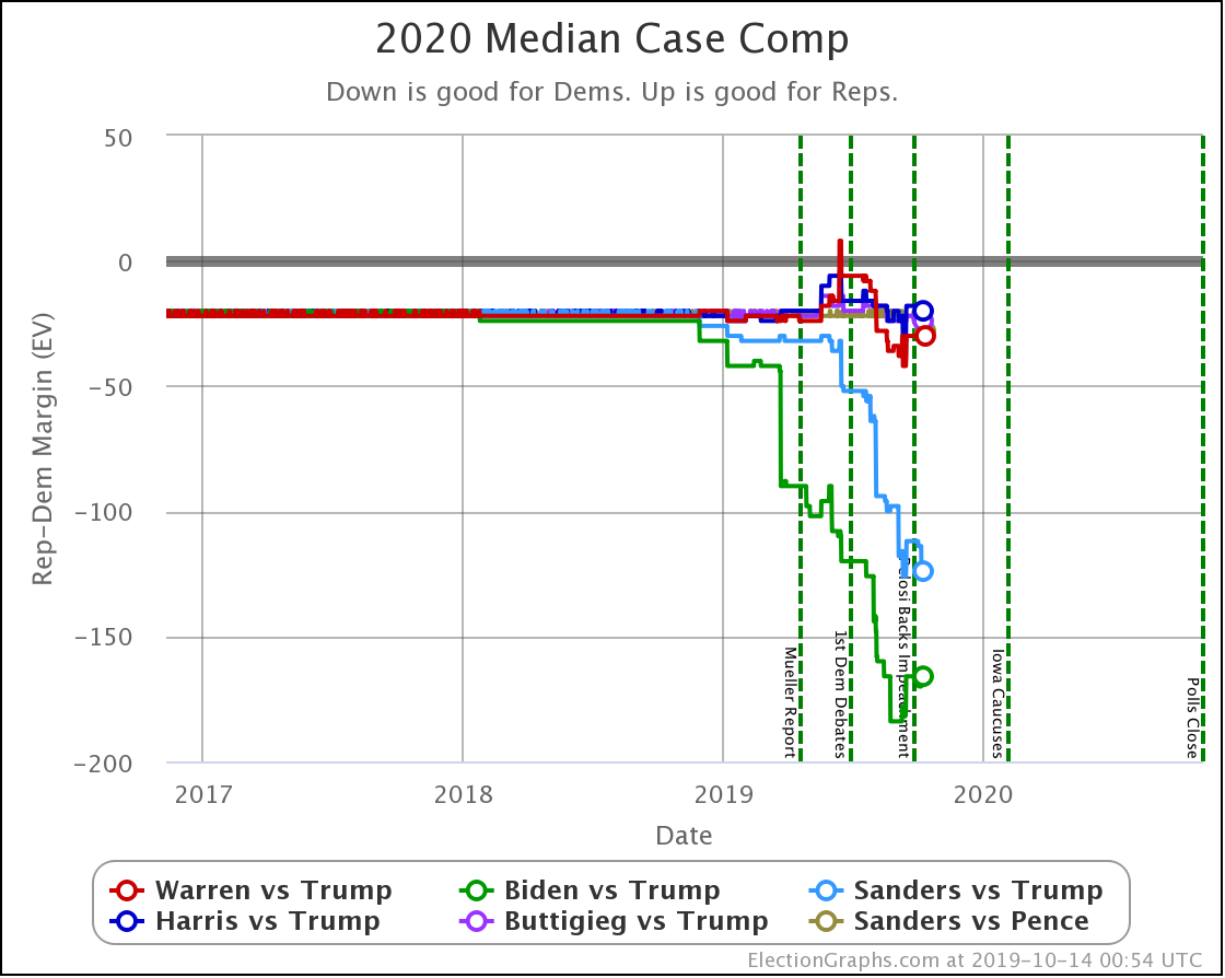
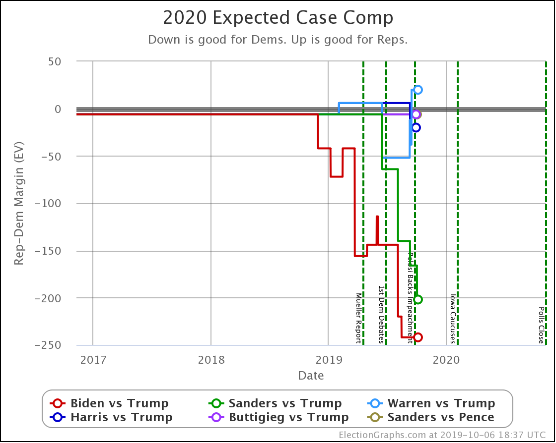
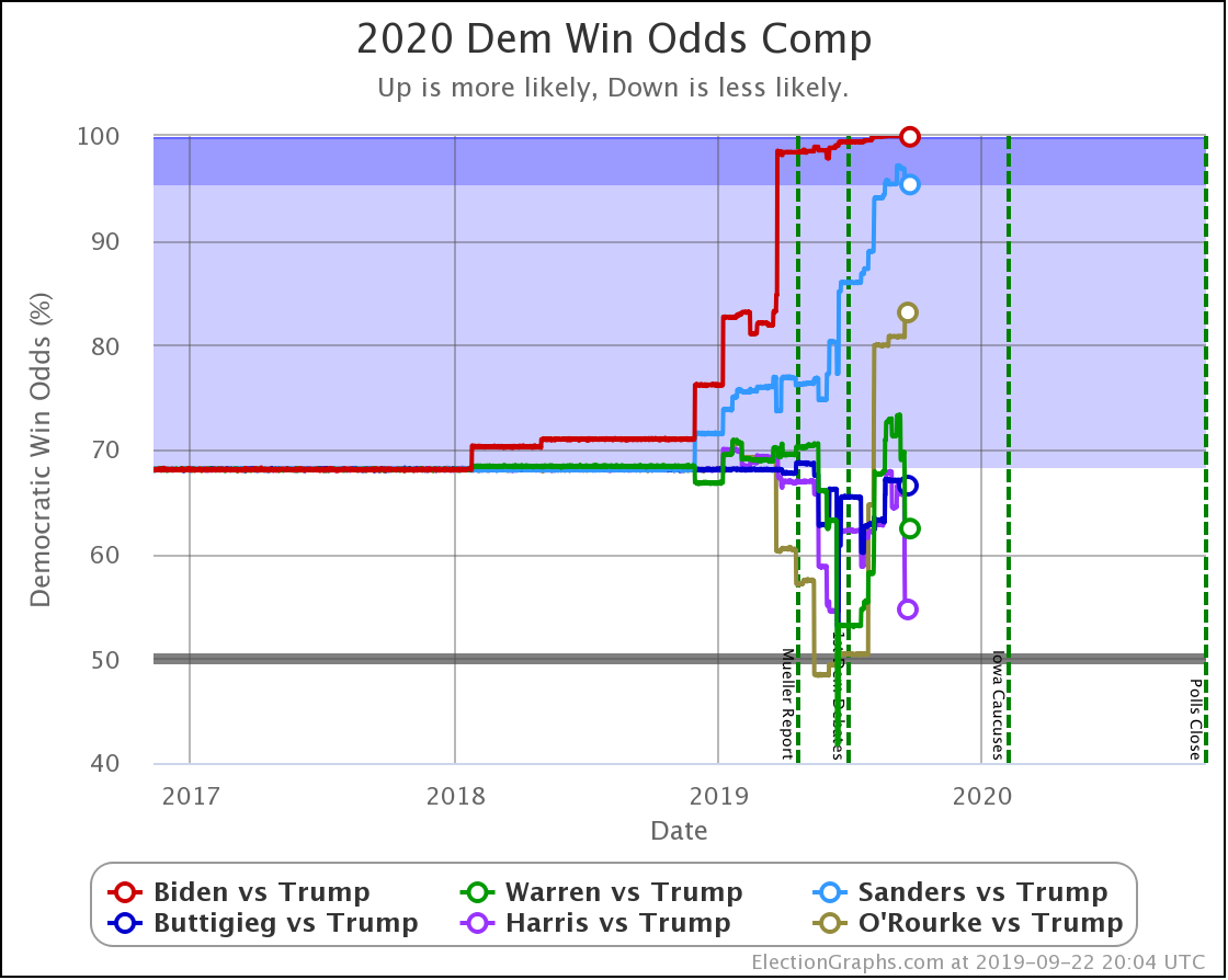
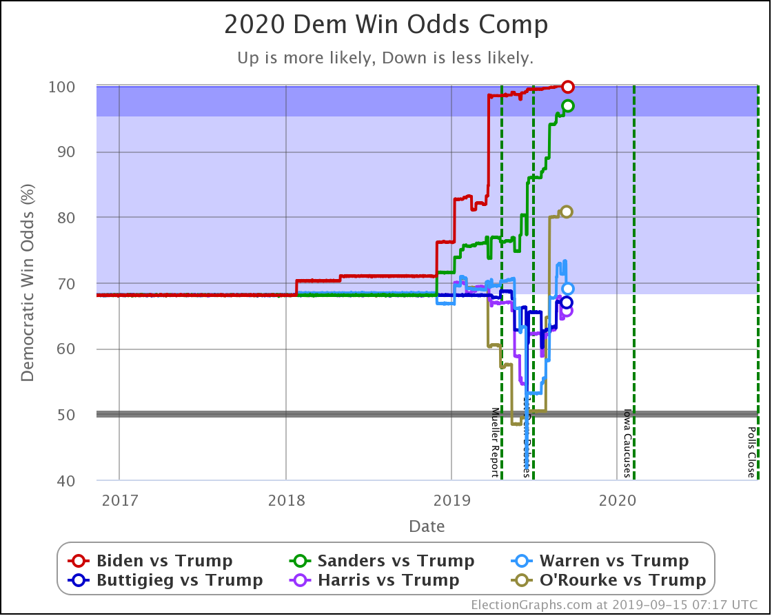
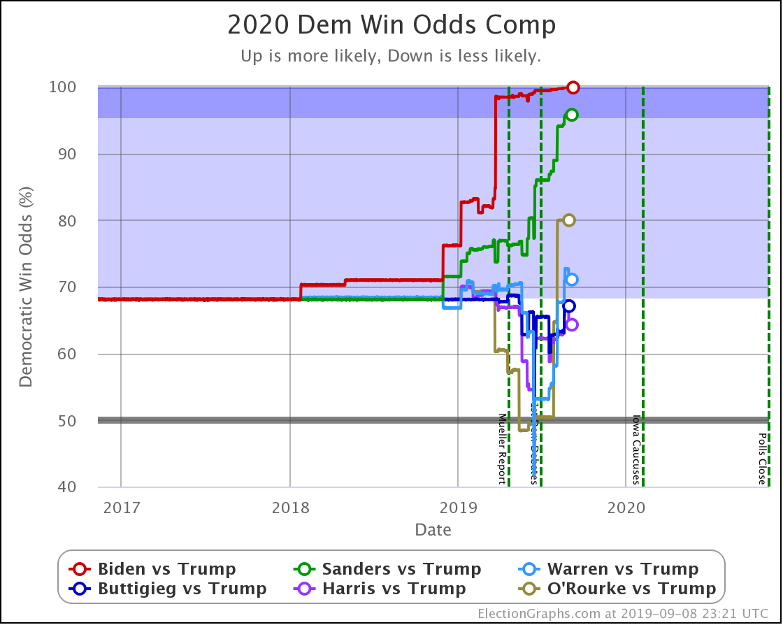
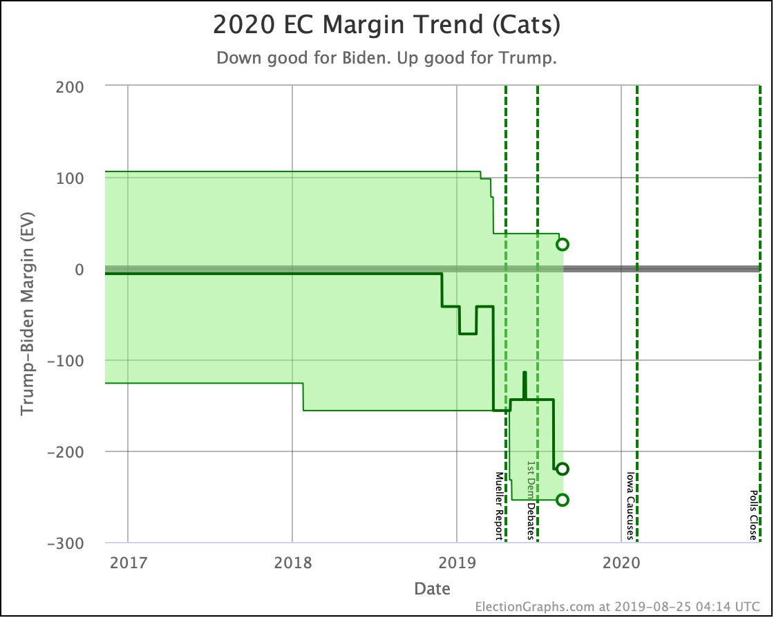
The main theme of the nearly three weeks since the last update is Harris and Buttigieg doing significantly worse in matchups against Trump.
| Dem | 13 Oct | 1 Nov | 𝚫 |
| Biden | +166 | +184 | +18 |
| Sanders | +124 | +124 | Flat |
| Warren | +30 | +36 | +6 |
| Harris | +20 | +8 | -12 |
| Buttigieg | +24 | -4 | -28 |
All of the above vs. Trump. Sanders vs. Pence flat at Sanders +28.
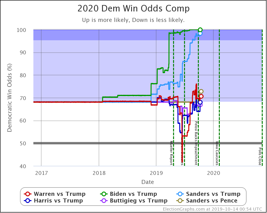
The decline for Harris and Buttigieg is even more apparent in the win odds:
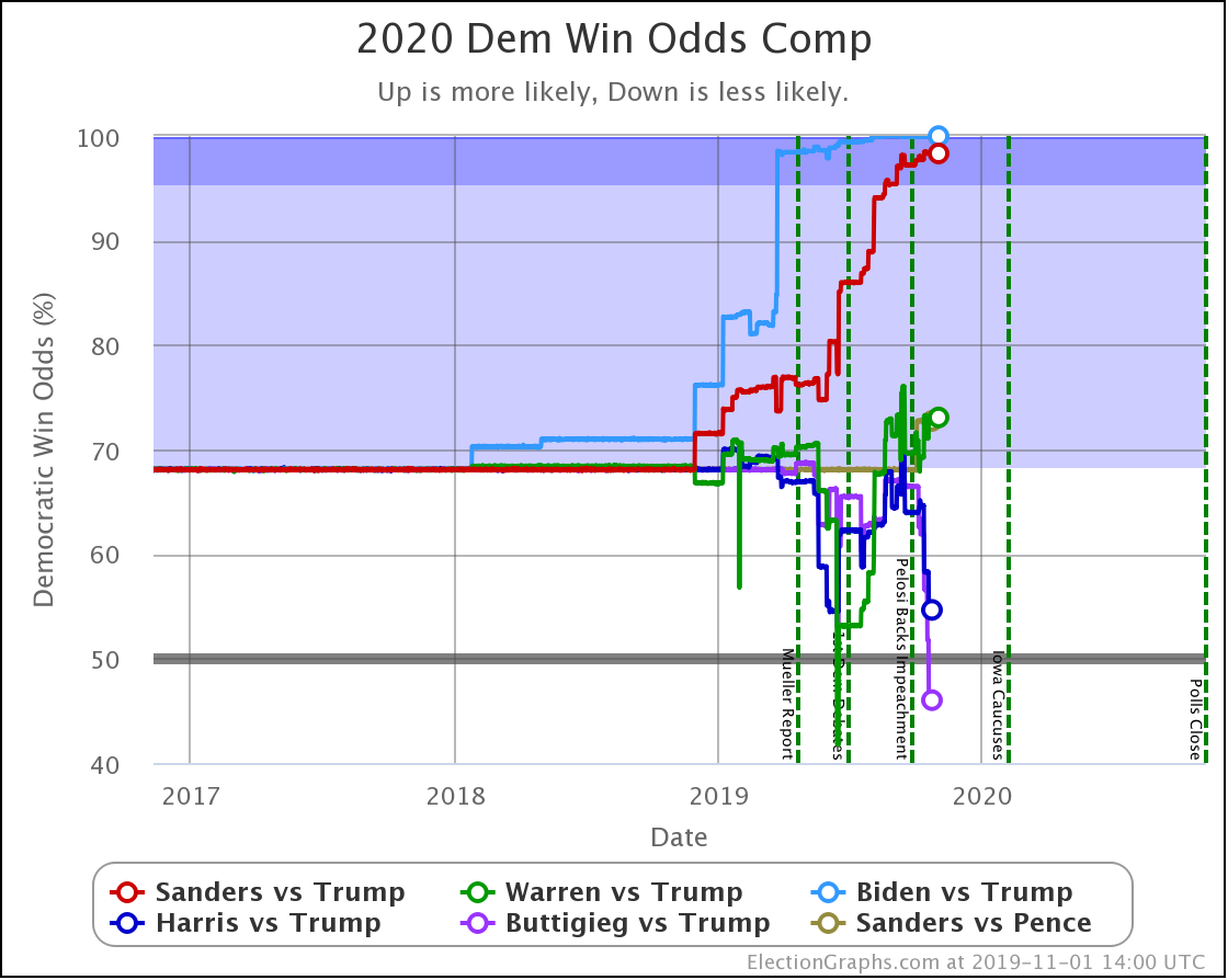
| Dem | 13 Oct | 1 Nov | 𝚫 |
| Biden | 99.9% | 100.0% | +0.1% |
| Sanders | 98.3% | 98.3% | Flat |
| Warren | 70.6% | 73.1% | +2.5% |
| Harris | 68.0% | 54.6% | -13.4% |
| Buttigieg | 66.8% | 46.0% | -20.8% |
All of the above vs. Trump. Sanders vs. Pence at a 72.7% chance of a Sanders win. This percentage is down 0.1% from 72.8% on 13 Oct, but this is just random fluctuation of the Monte Carlo model, not a real change. (There was one new Sanders vs. Pence poll, but it was in California and did not make any difference.)
Biden ticks up to 100.0%, but that is because I round. It is really 99.98% at the moment. Still, Biden is doing extraordinarily well in these state by state polls against Trump and continues to get stronger.
Note that Buttigieg is now at a less than 50% chance to win against Trump. The last time any of the most polled Democrats were under 50% was in June when Warren briefly dropped below that threshold before rebounding.
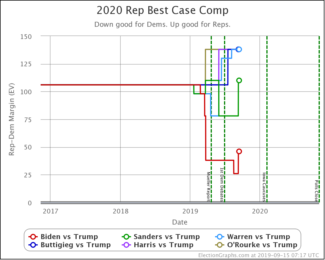
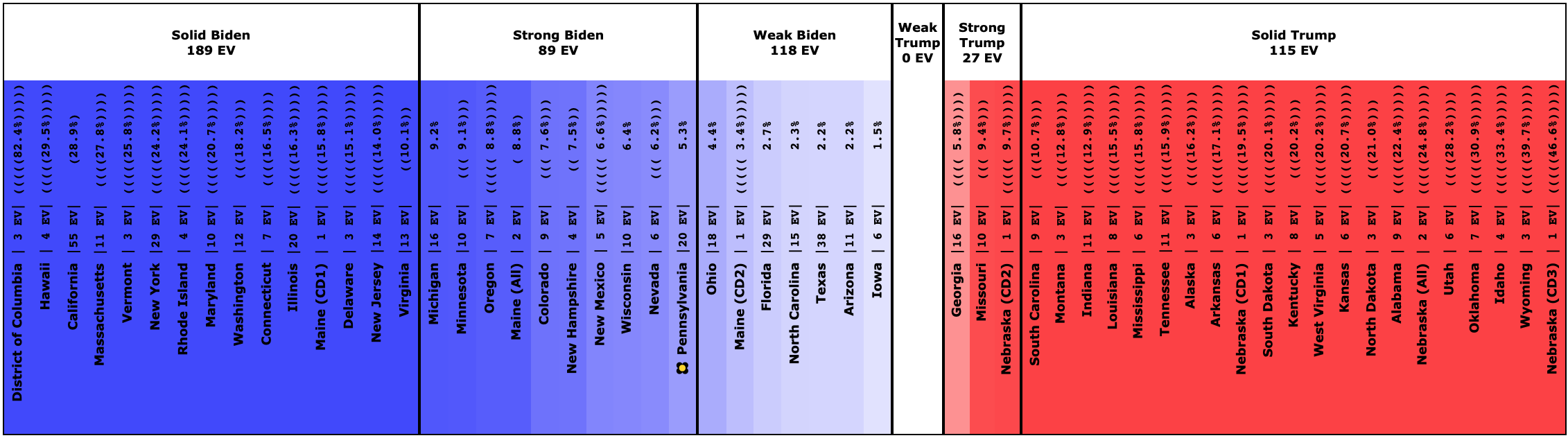
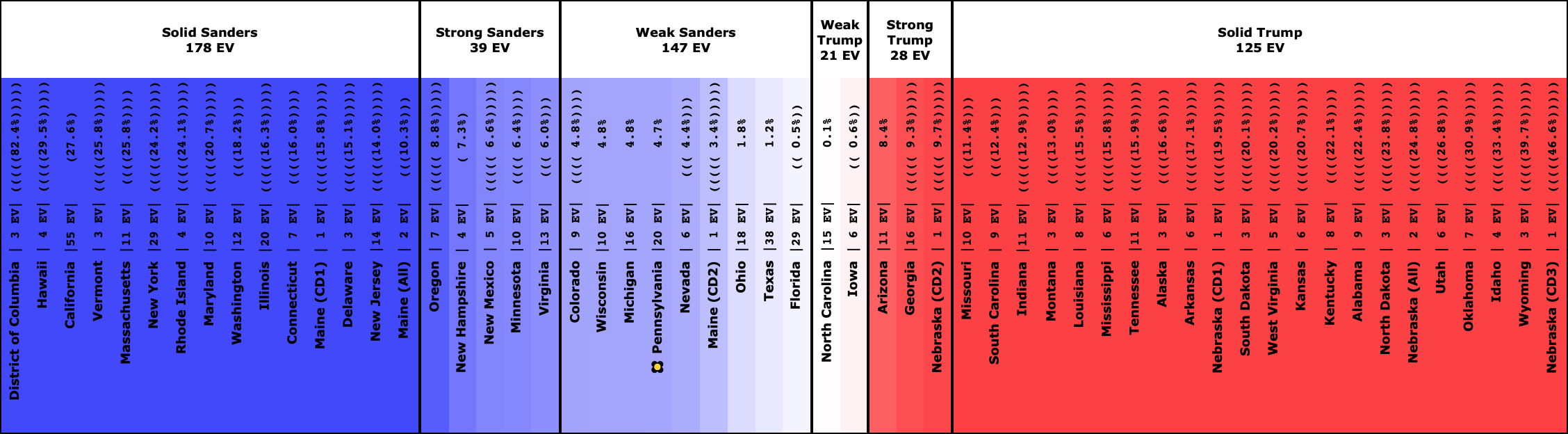
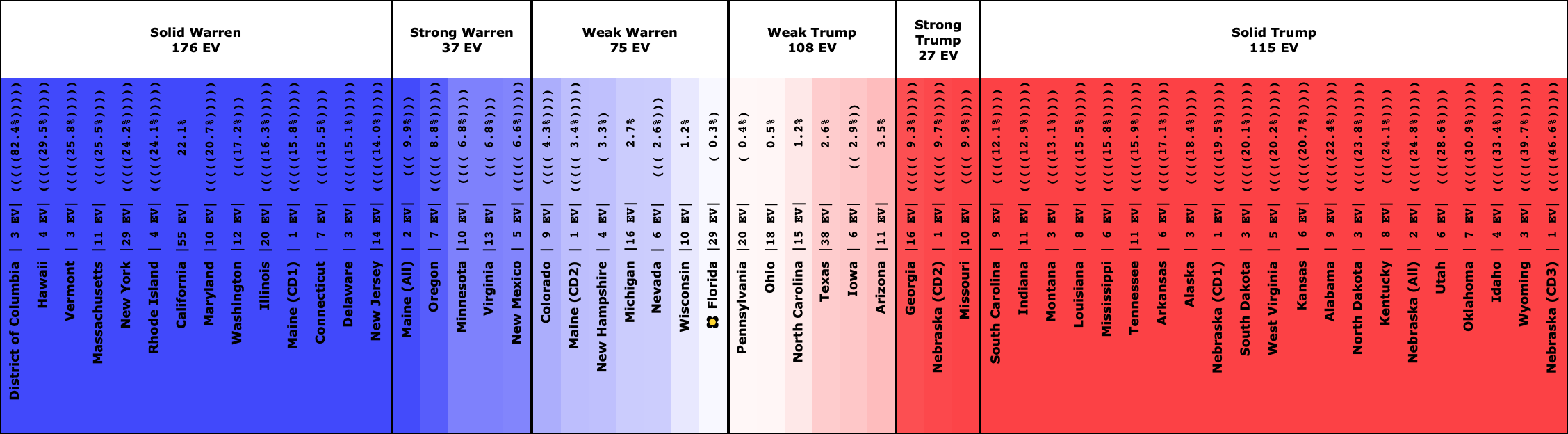
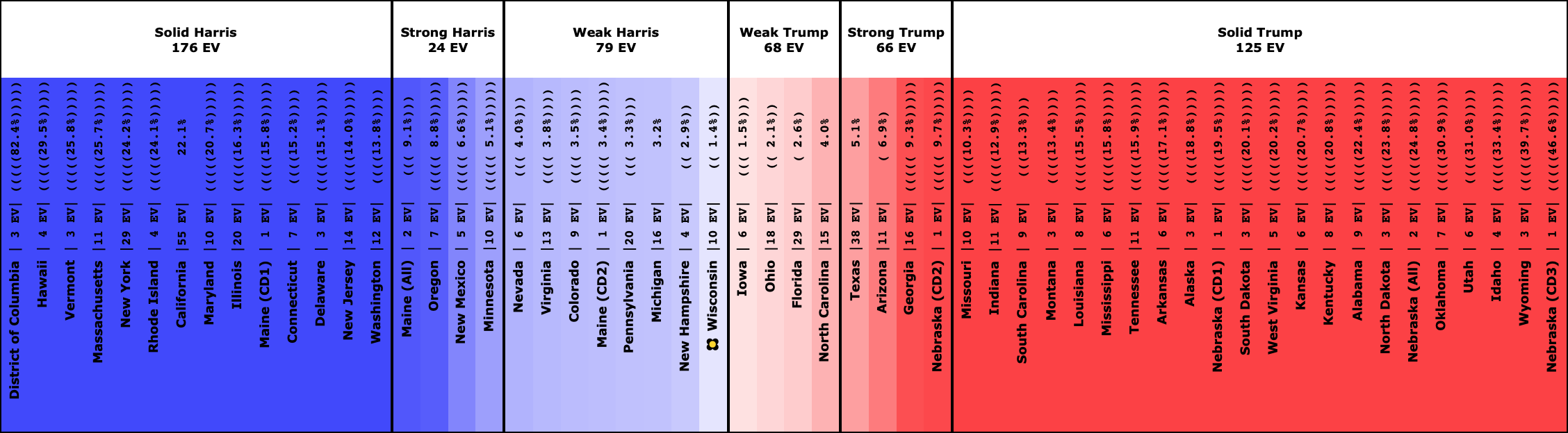
At this point, there are three tiers of Democrats against Trump.
- Winning decisively: Biden and Sanders
- Leading, but narrowly: Warren
- Coin toss: Harris and Buttigieg
Next, let's look at the changes in each state with new polls to see what is driving the national results.
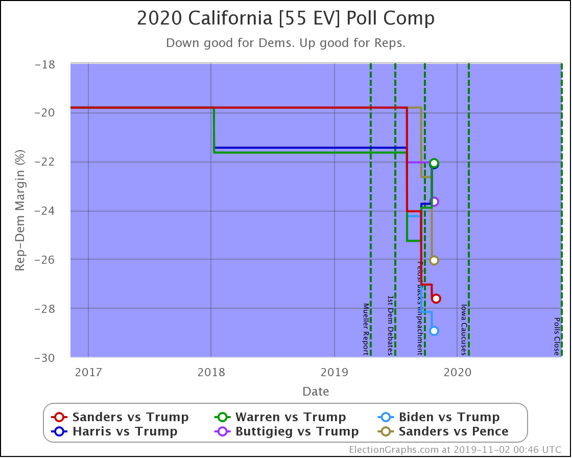
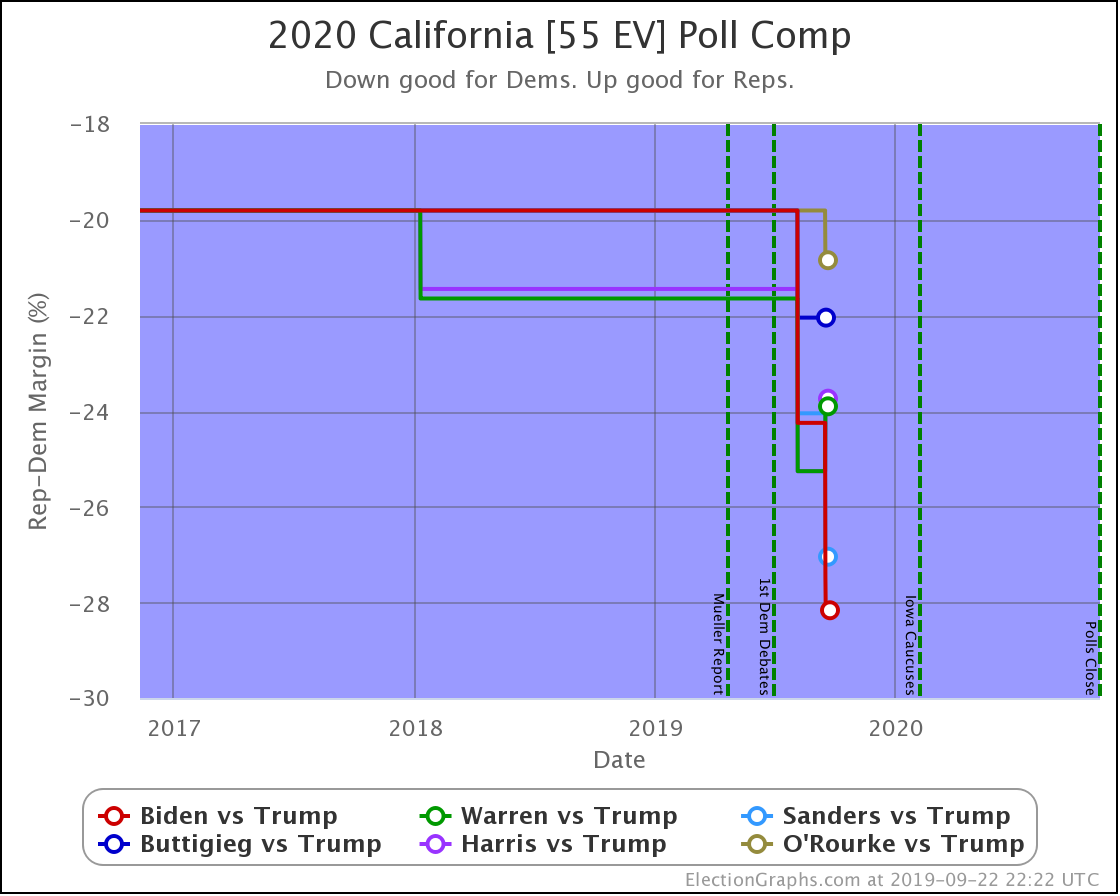
Starting with California since it has the most electoral votes, but you won't find any hints as to changes to the national picture here. California is very solidly blue, and nothing is changing about that.
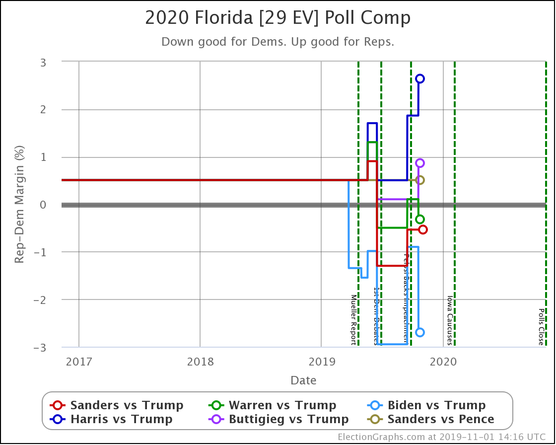
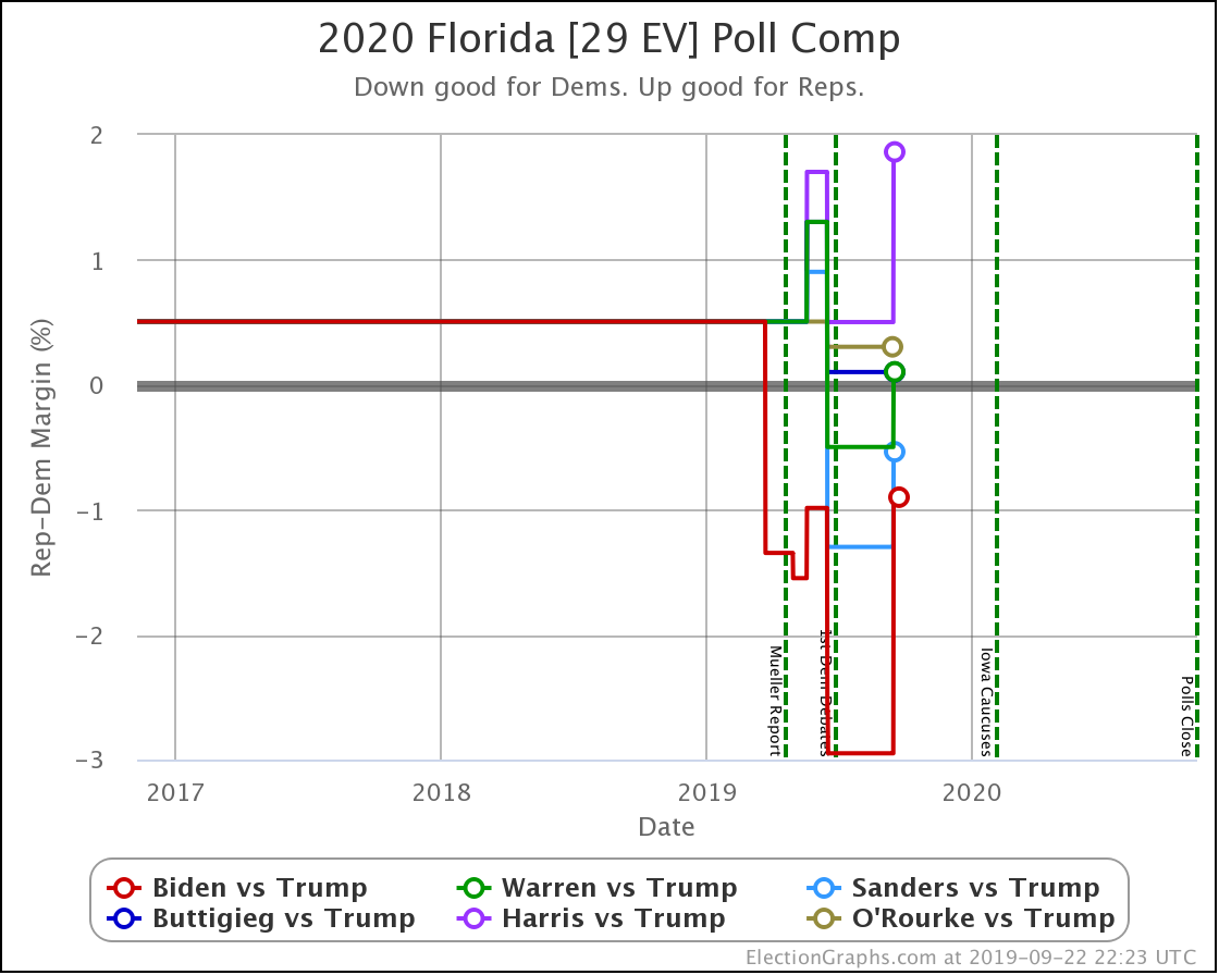
Florida, on the other hand, has lots of electoral votes and is close. So small changes make a big difference. Harris is now 2.6% behind Trump, which translates into only having a 16.6% chance of winning the state, down from 24.2% before this update. With 29 electoral votes at stake, that makes a real difference in the overall picture.
Similarly, Buttigieg moves from a 45% chance of winning the state down to 35%.
Compare to Biden with a 2.7% lead and a 71% chance of winning.
Florida is important. Winning it is part of many paths to victory on the national level.
So when Biden and Warren make gains in Florida and lead, while Harris and Buttigieg fall further behind, it makes a difference.
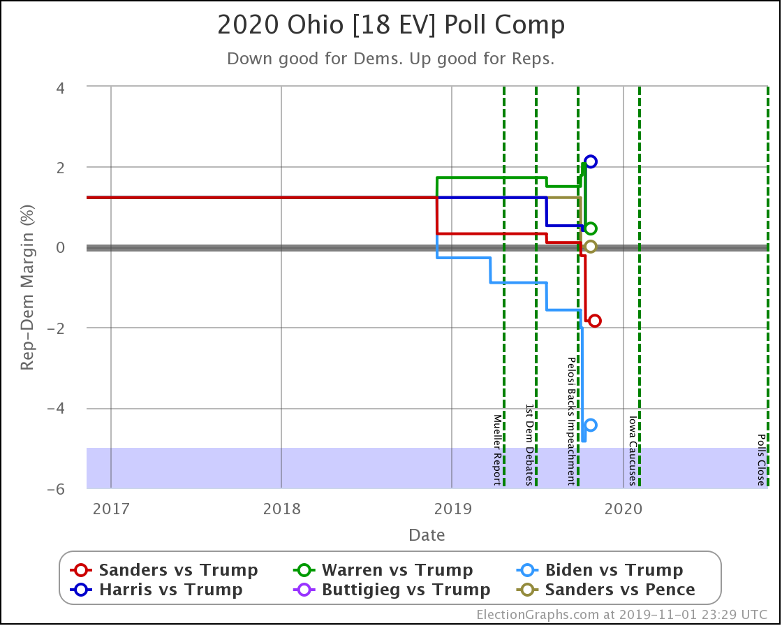
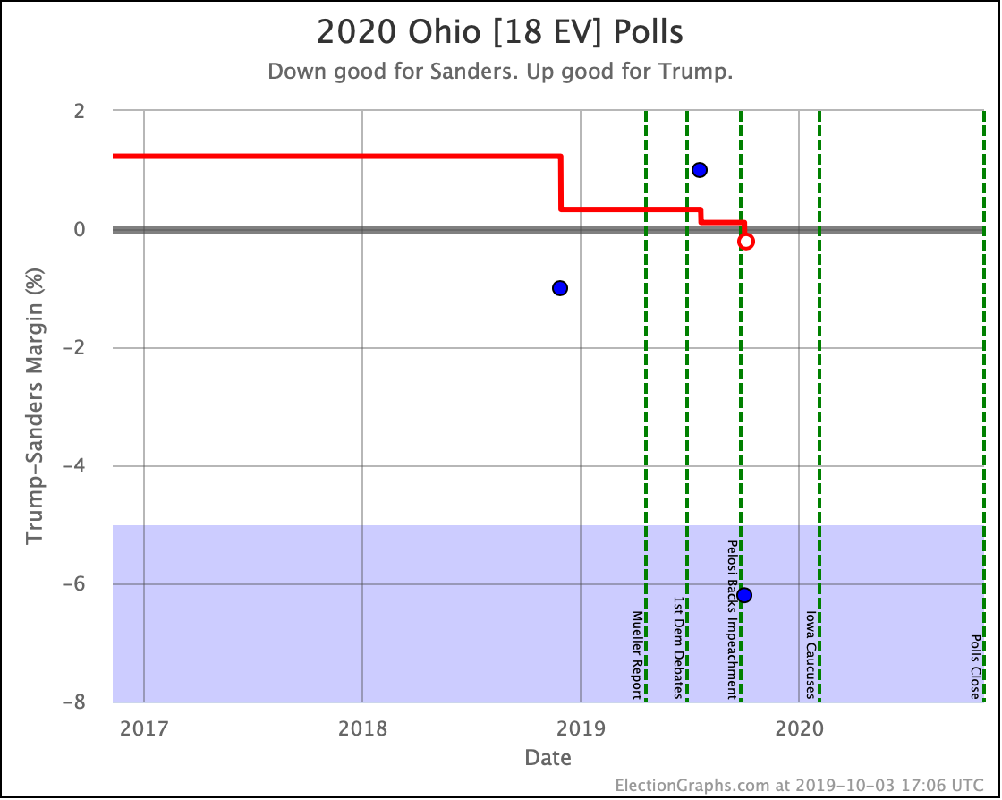
No category changes, but Sanders, Warren, and Biden are clearly improving, while Harris and Buttigieg (whose lines overlap) are moving in the opposite direction. In win chance terms, Harris and Buttigieg move from a 40% chance of winning Ohio, down to only 23%.
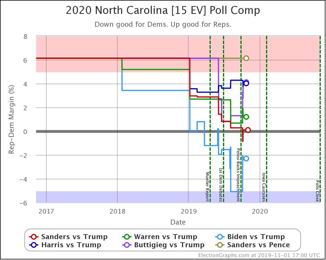
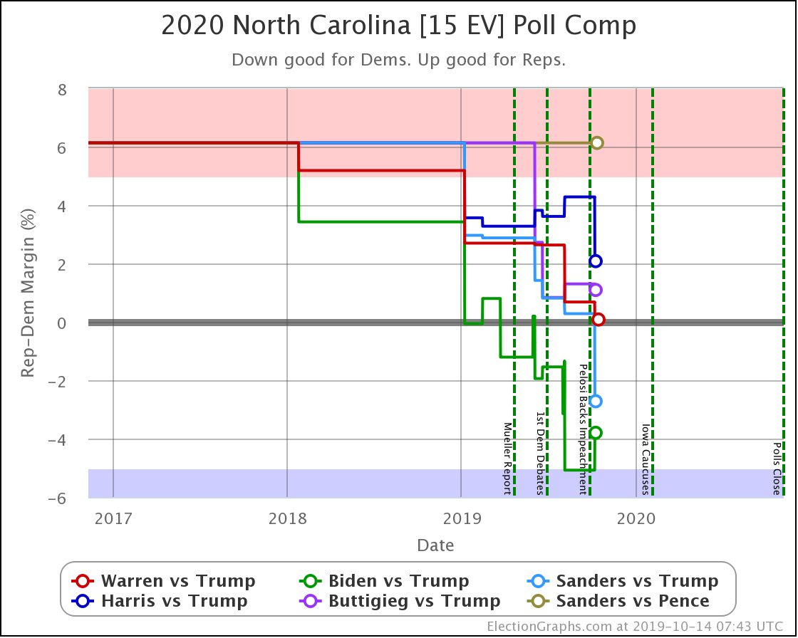
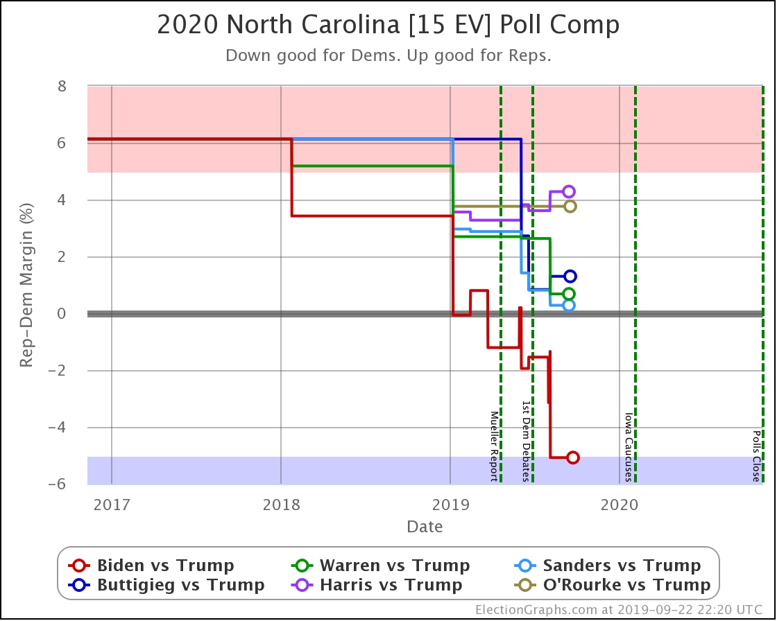
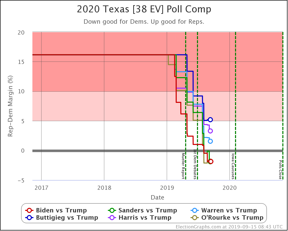
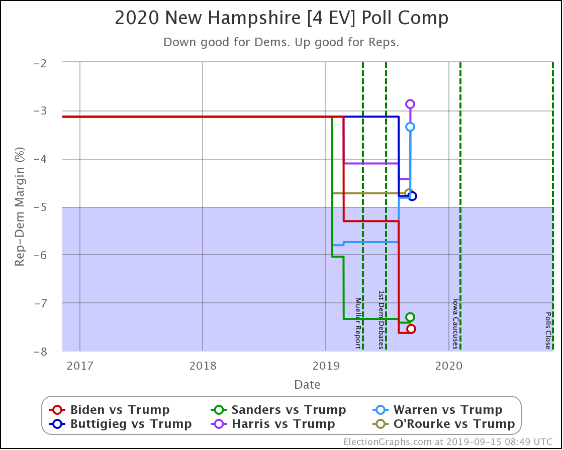
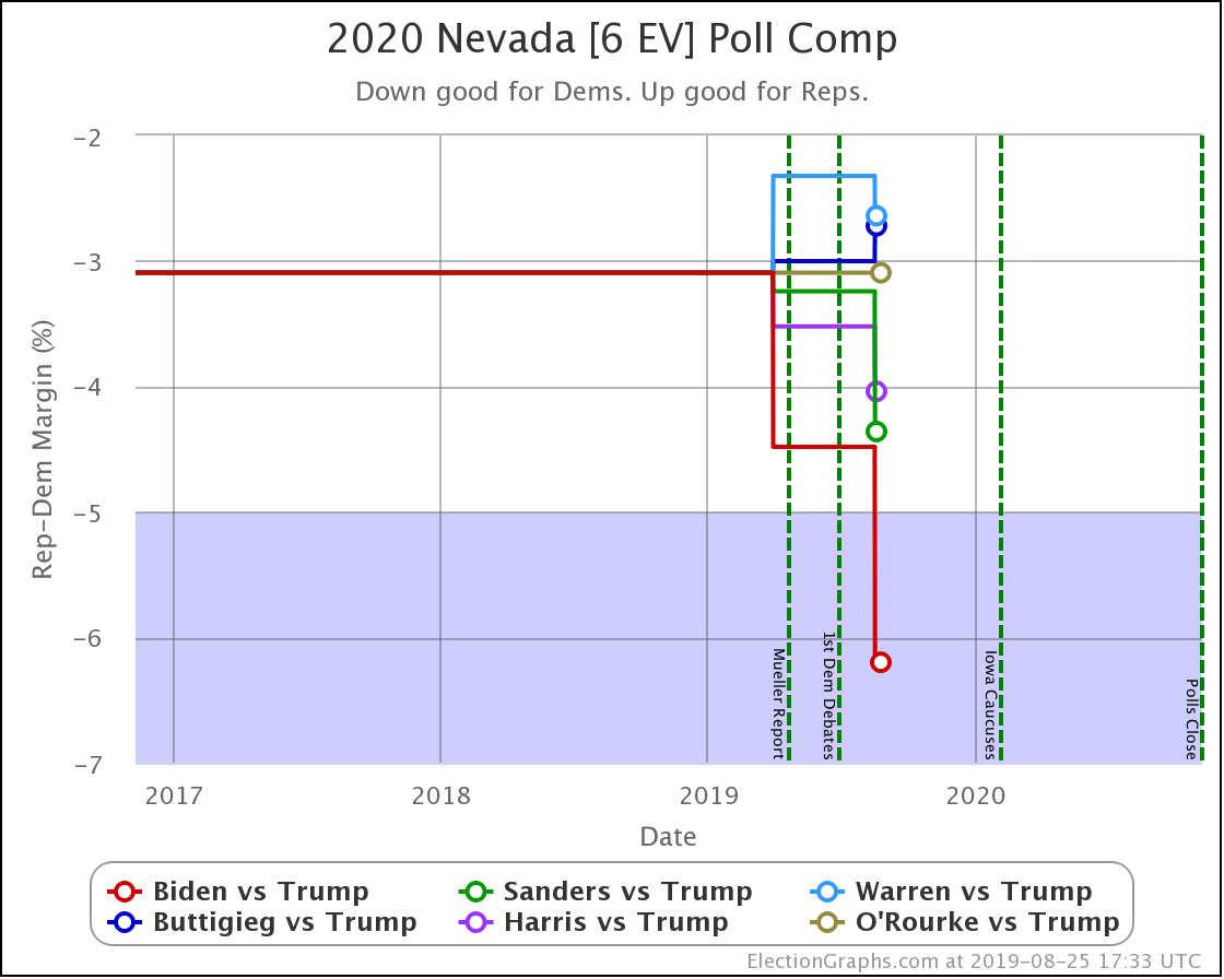
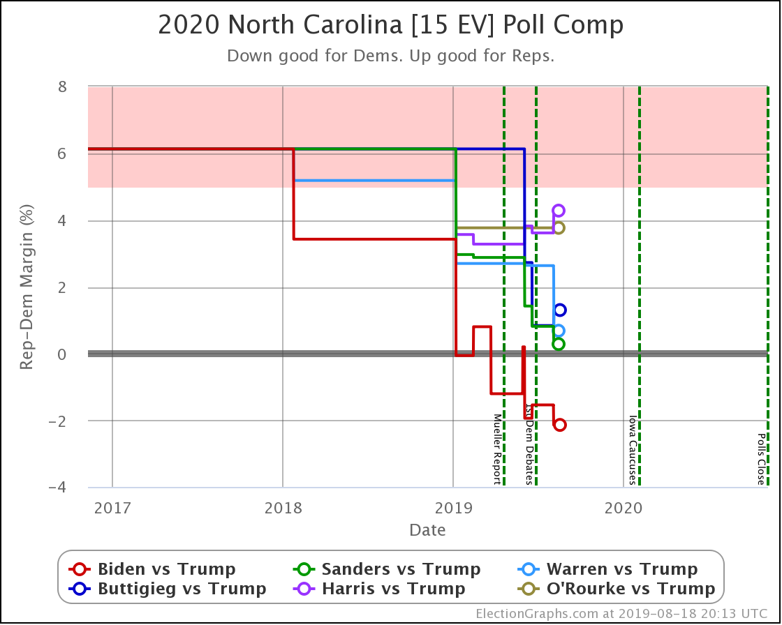
North Carolina is a key state. It is in the "swing state" zone for all five of these Democrats against Trump.
Sanders flipped from just barely winning, to barely losing in North Carolina.
That was the only category change, but both Biden and Buttigieg weakened considerably here. Looking at how this translates into win chances, Biden goes from a 91% chance of winning North Carolina to a 68% chance. Either way, still nicely favored, although certainly by less than before.
But Buttigieg drops from a 30% chance of winning down to only about 8%. Basically, from "OK, he's behind but has a shot" to "Yeah, not impossible, but it would be a major upset if he pulled off a win."
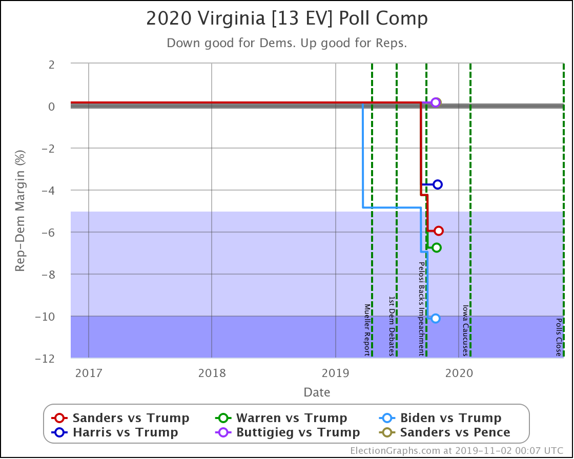
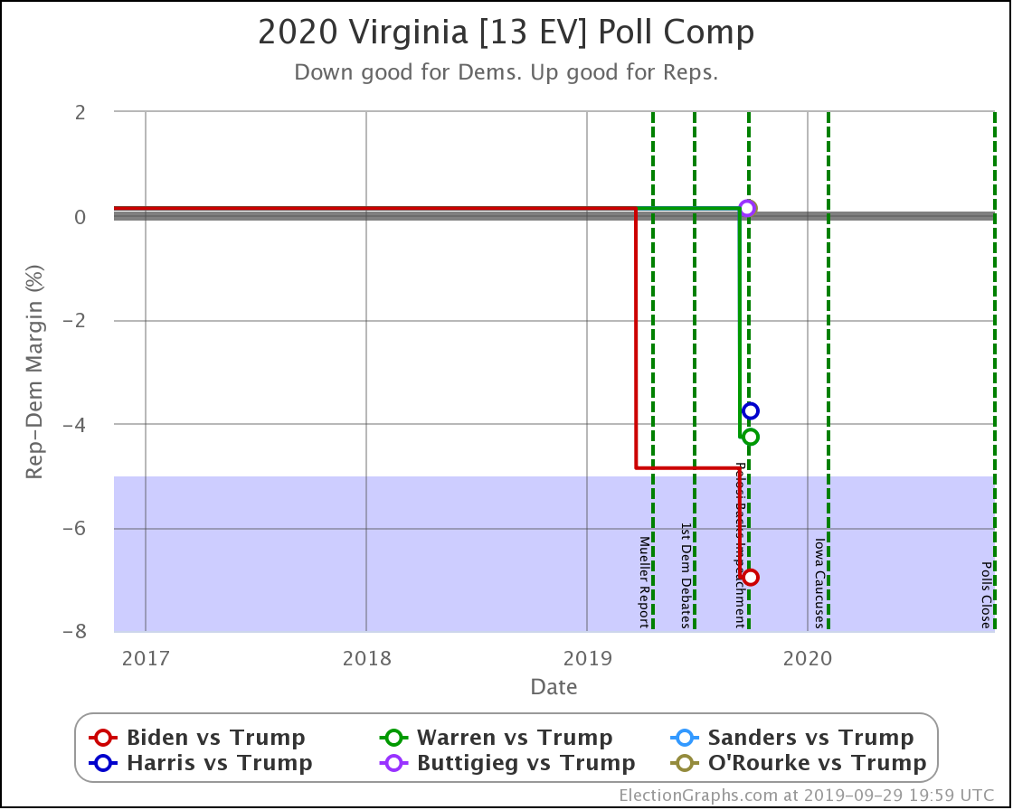
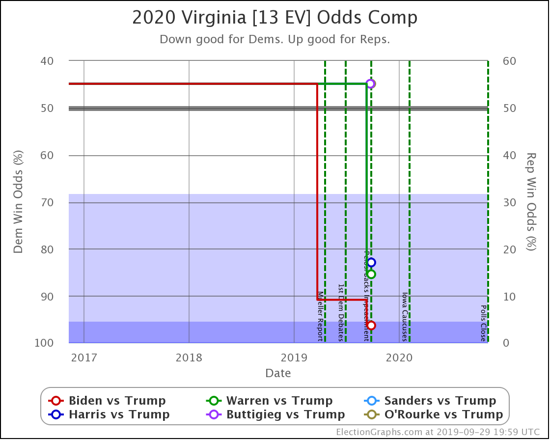
Every Democrat improves in Virginia. The state is still significantly under polled. So far, each update makes it look bluer as real 2020 polls replace old elections in the averages.
Biden's lead moves from "strong" to "solid" in my categorization.
Sanders' and Warren's leads both improve from "weak" to "strong" in the categories.
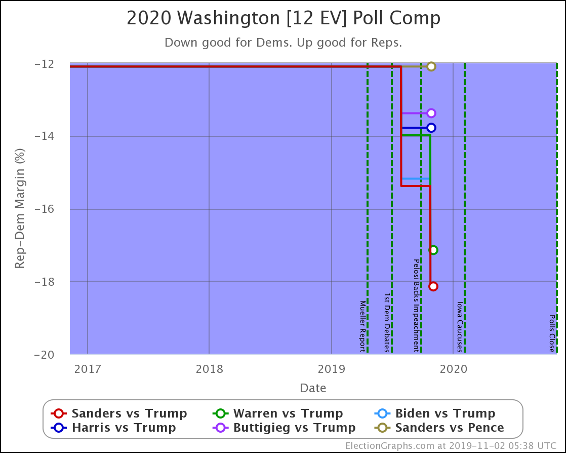
All the polled Democrats increased their leads over the historical average margin. Washington is a blue state that is getting bluer. It is not in contention right now.
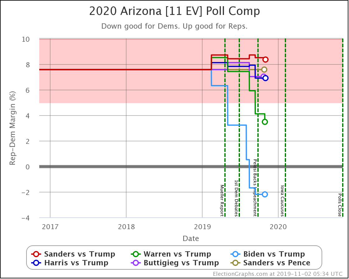
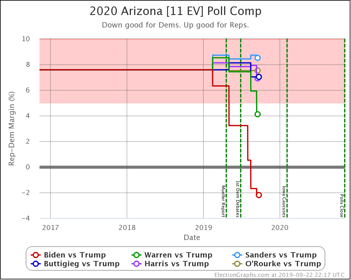
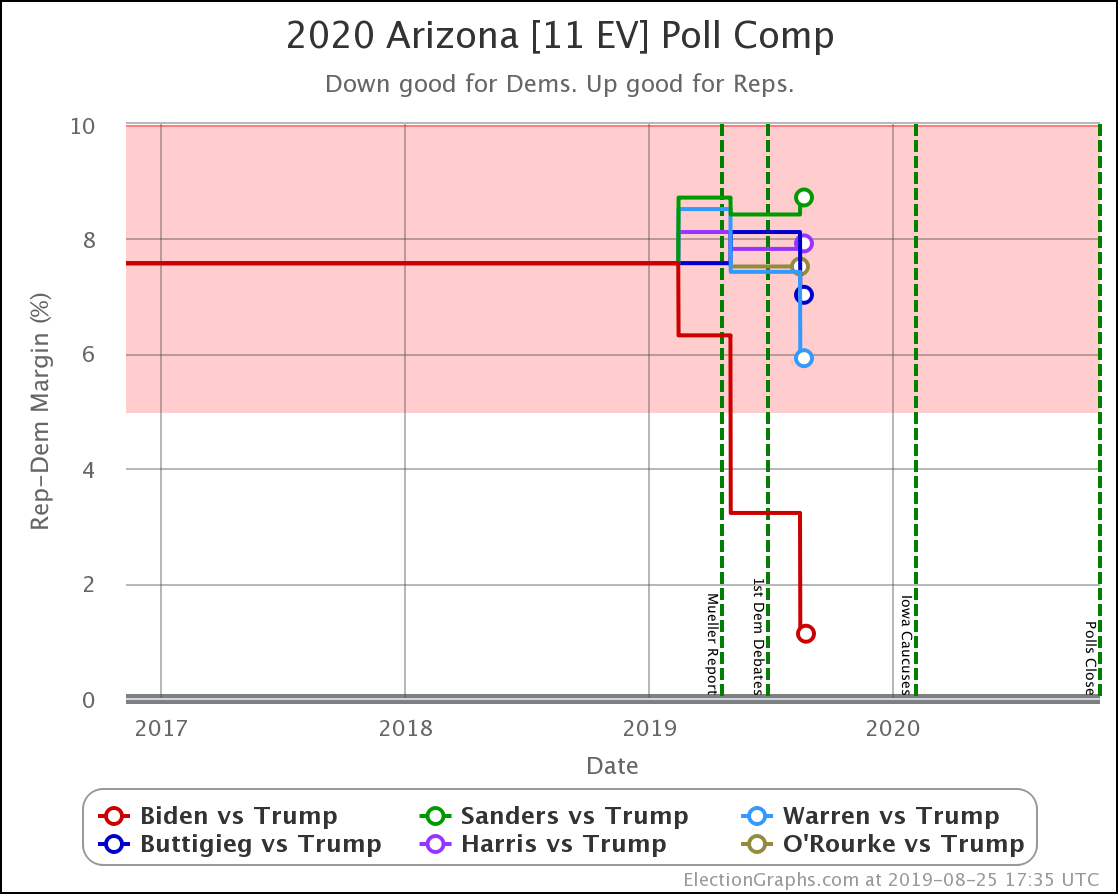
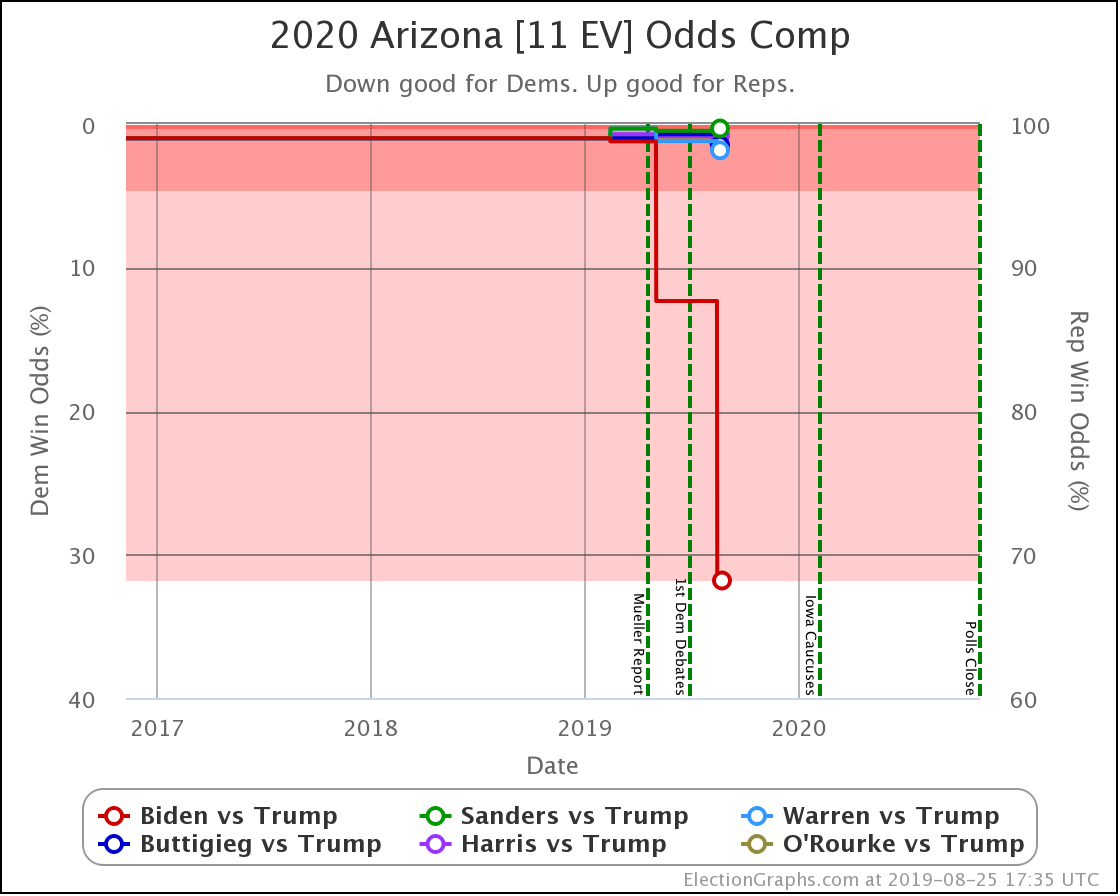
In Arizona, Warren improves a little bit against Trump, but every other combination is flat.
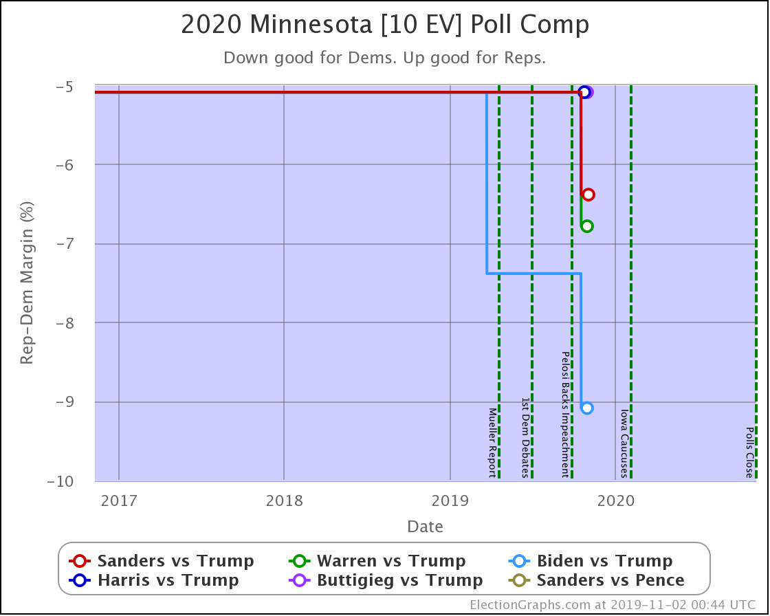
All of the Democrats have significant leads in Minnesota, and the new polling just increased the margins for those polled. Minnesota is not currently in play.
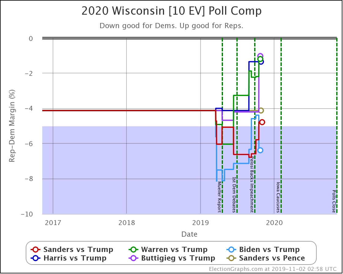
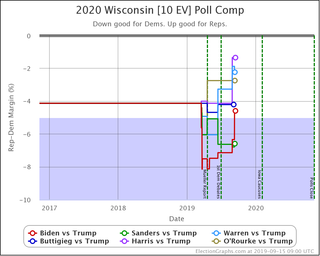
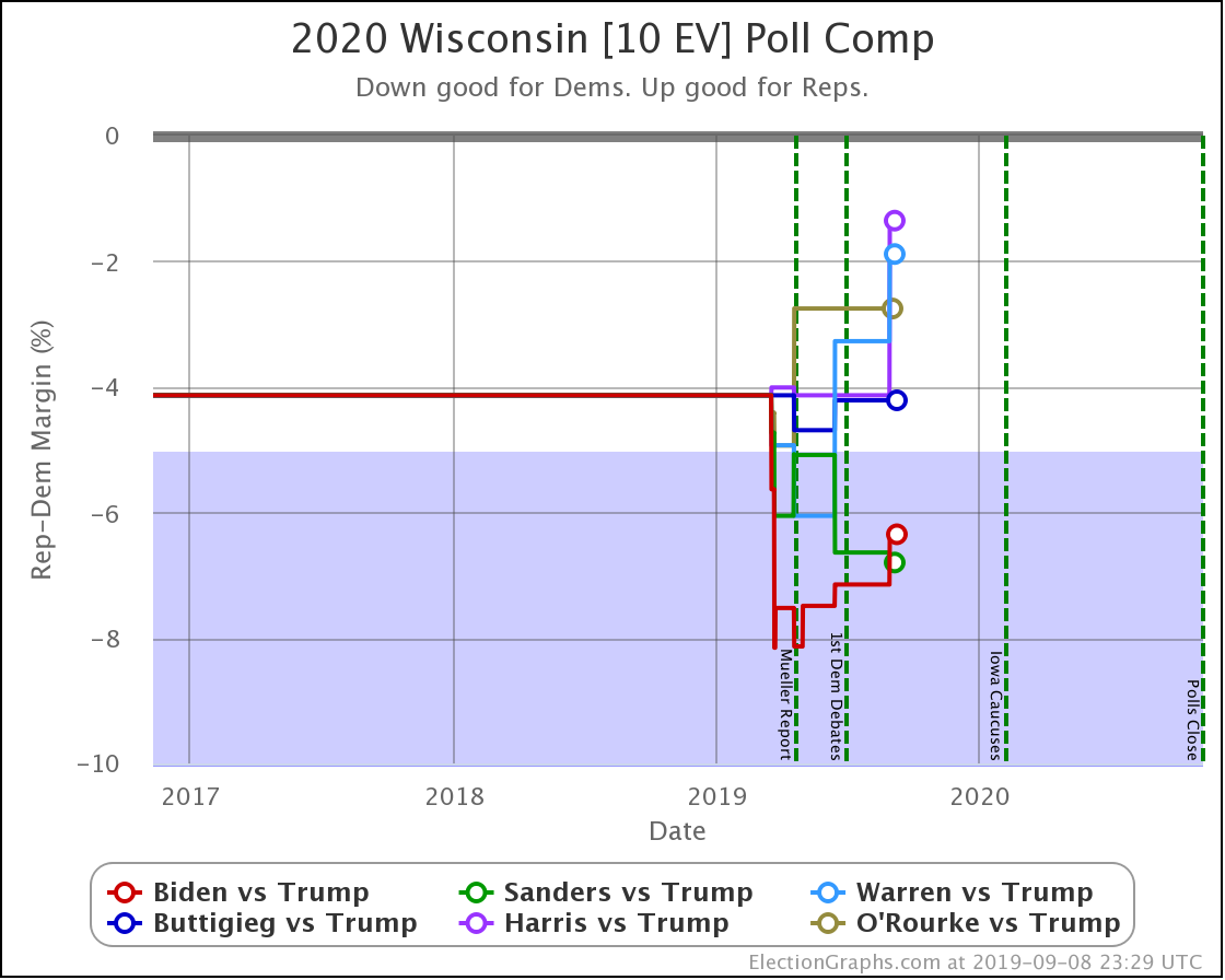
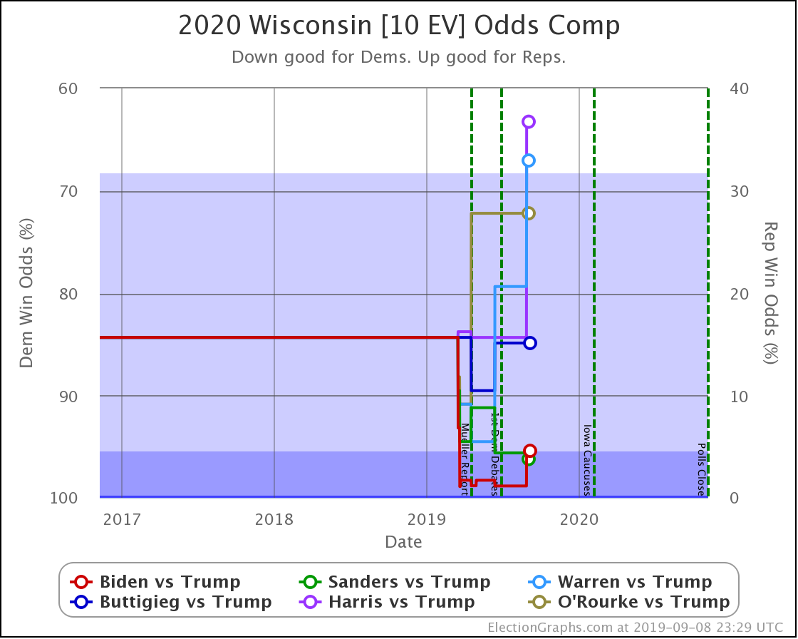
With this last update, Wisconsin moved from Weak Biden to Strong Biden, and from Strong Sanders to Weak Sanders.
But the most significant change was for Buttigieg, whose 4.2% lead (85% chance of winning) dropped to a 1.0% lead (56% chance of winning).
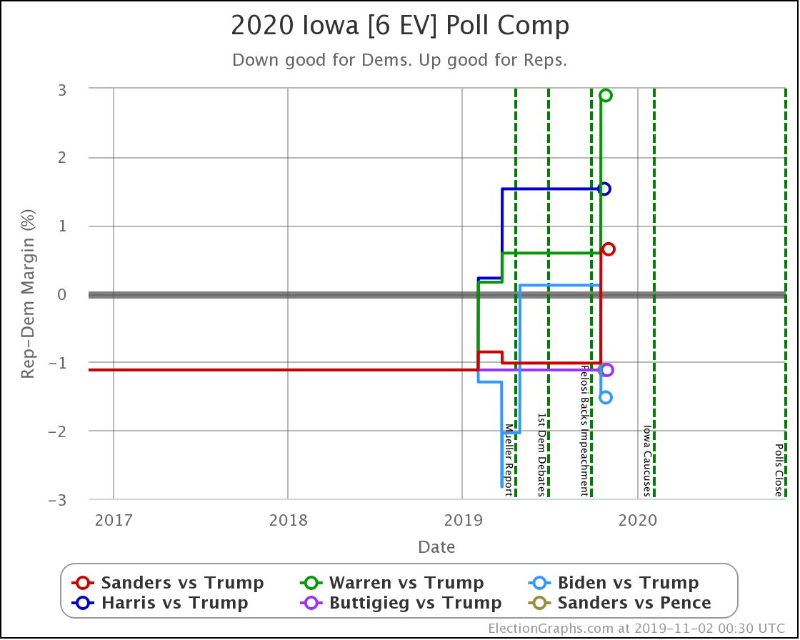
Iowa is a swing state for all candidate combinations. But with this last update, Sanders and Warren both weakened, with Sanders moving from slightly ahead to slightly behind. Biden strengthened, moving from just slightly behind to just slightly ahead. Warren drops to only a 14% chance of winning the state.
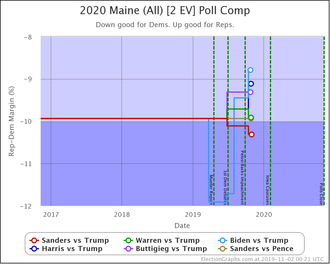
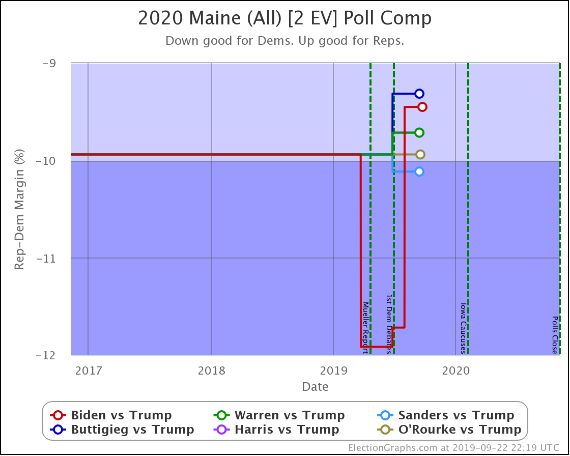
The worst Democrat in Maine (Biden) still has a 99.2% chance of winning the state. Maine (CD2) might come into play again, but Maine as a whole doesn't look like it will.
That's all the states.
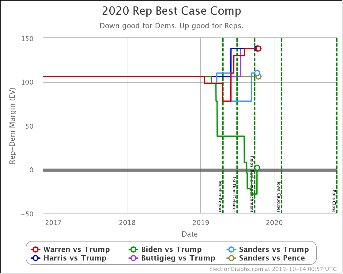
Now to wrap things up by looking at the changes on the categorization view. I prefer the probabilistic view these days, but just looking at who leads where and by how much is still useful.
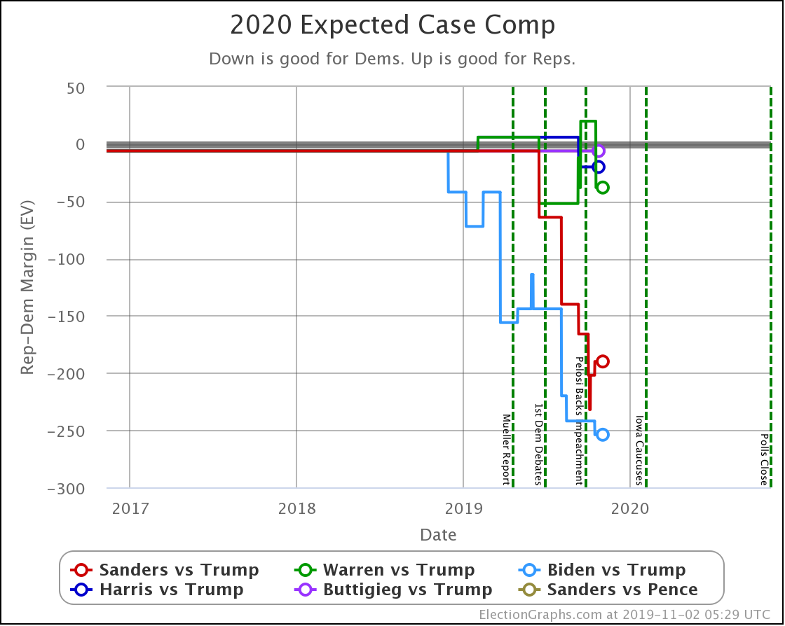
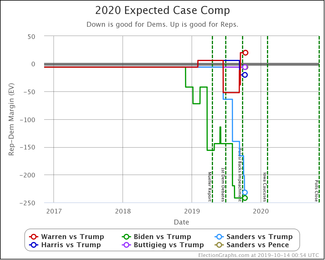
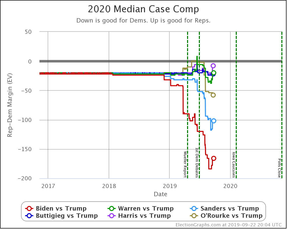
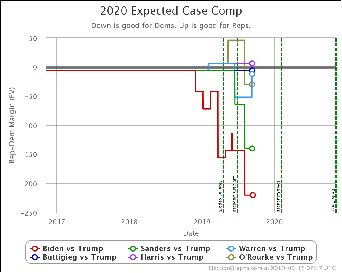
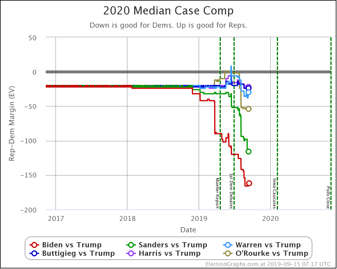
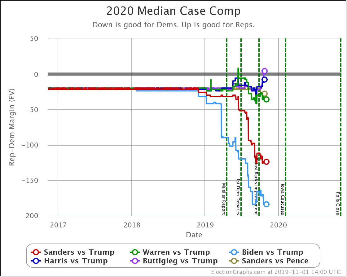
The expected case changes:
- Biden vs. Trump: Biden +242 to Biden +254
- Sanders vs. Trump: Sanders +232 to Sanders +190
- Warren vs. Trump: Trump +20 to Warren +38
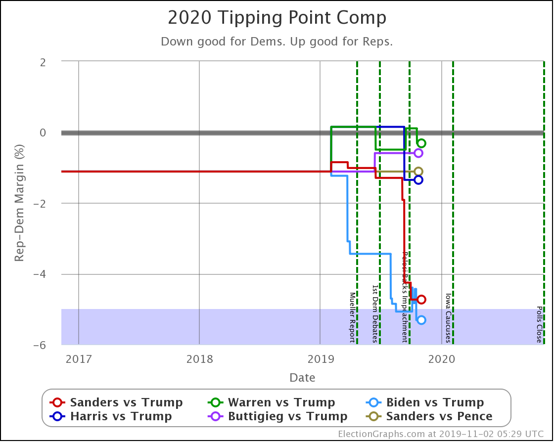
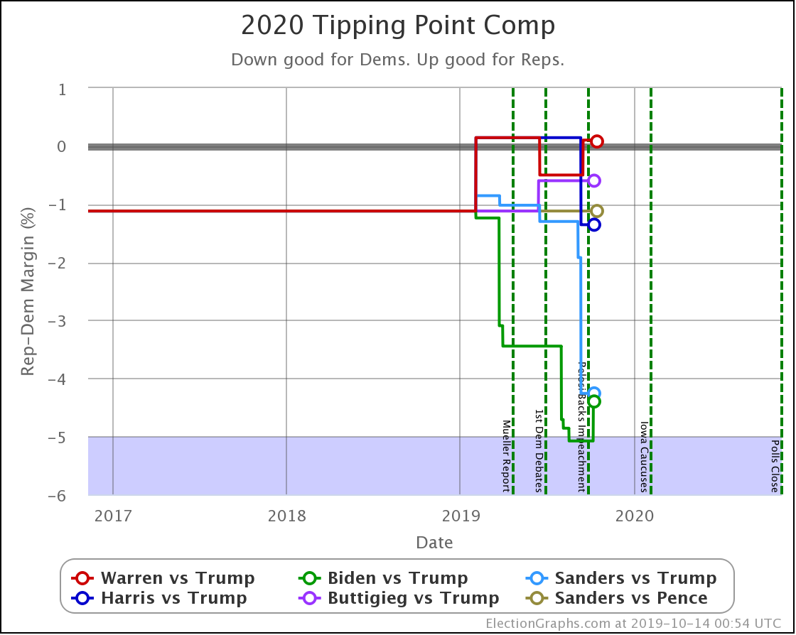
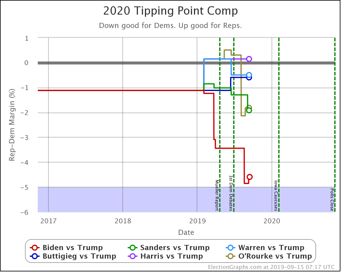
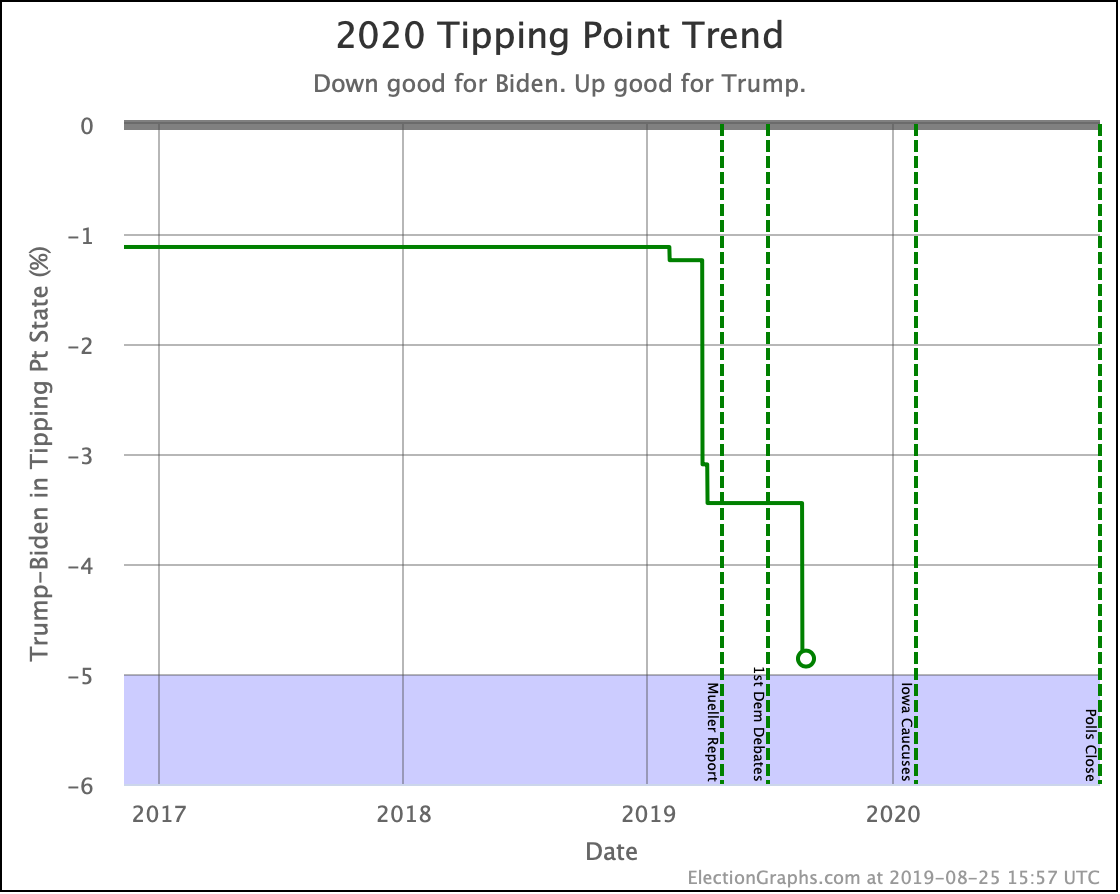
And the tipping point changes were:
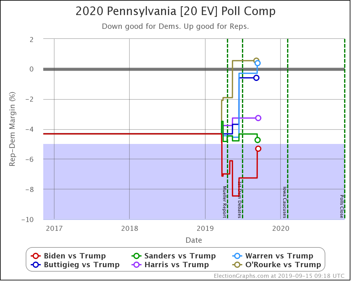
- Biden vs. Trump: Biden by 4.4% in WI to Biden by 5.3% in PA
- Sanders vs. Trump: Sanders by 4.3% in VA -> Sanders by 4.7% in VA
- Warren vs. Trump: Trump by 0.1% in NC to Warren by 0.3% in FL
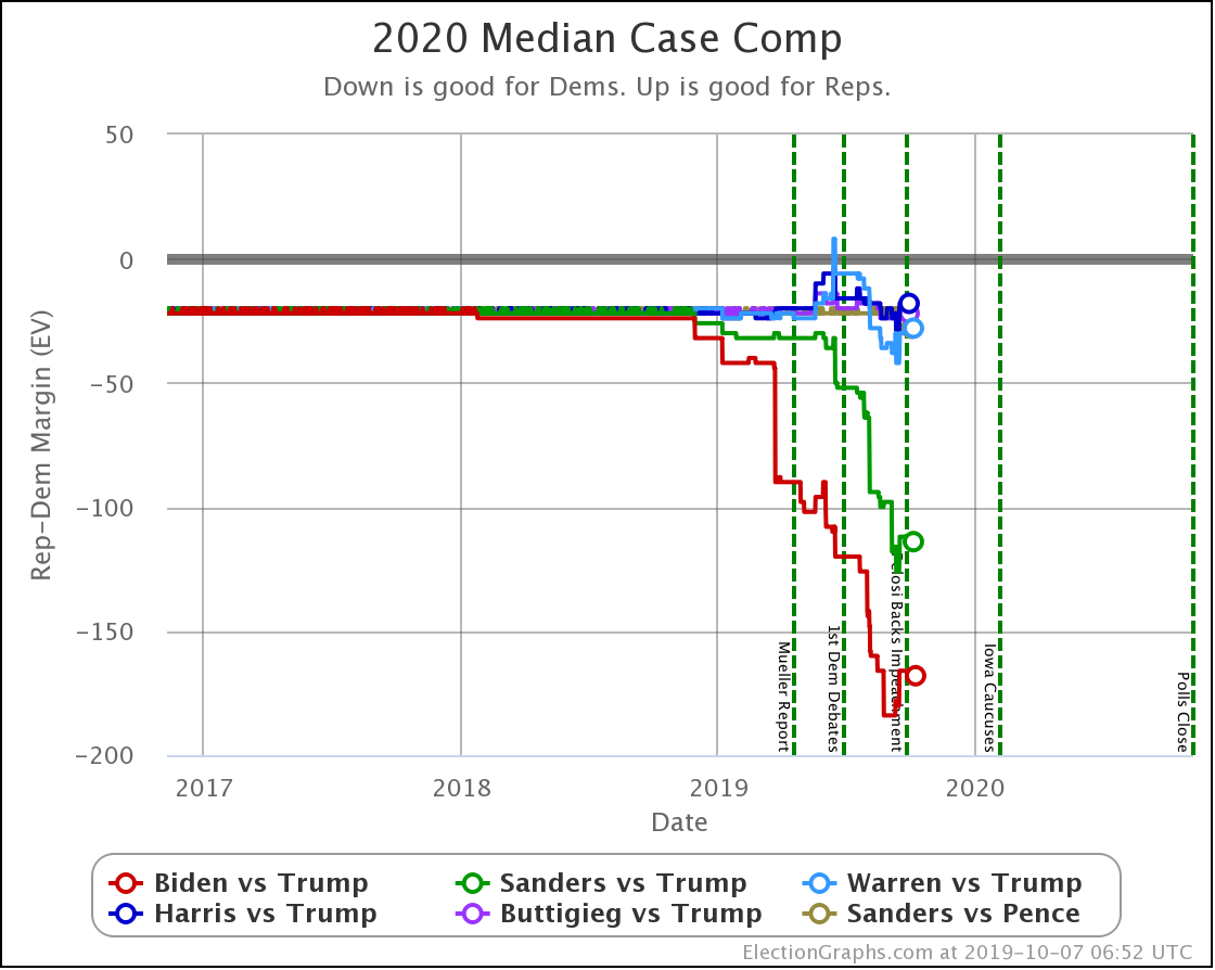
A reminder that sometimes the "median case" in the probabilistic view can have a different leader than the "expected case" in the categorization view.
Divergence like this occurs when there are states that the leader barely leads, and there is a better chance of enough of them to make a difference flipping than there is of states flipping the other direction.
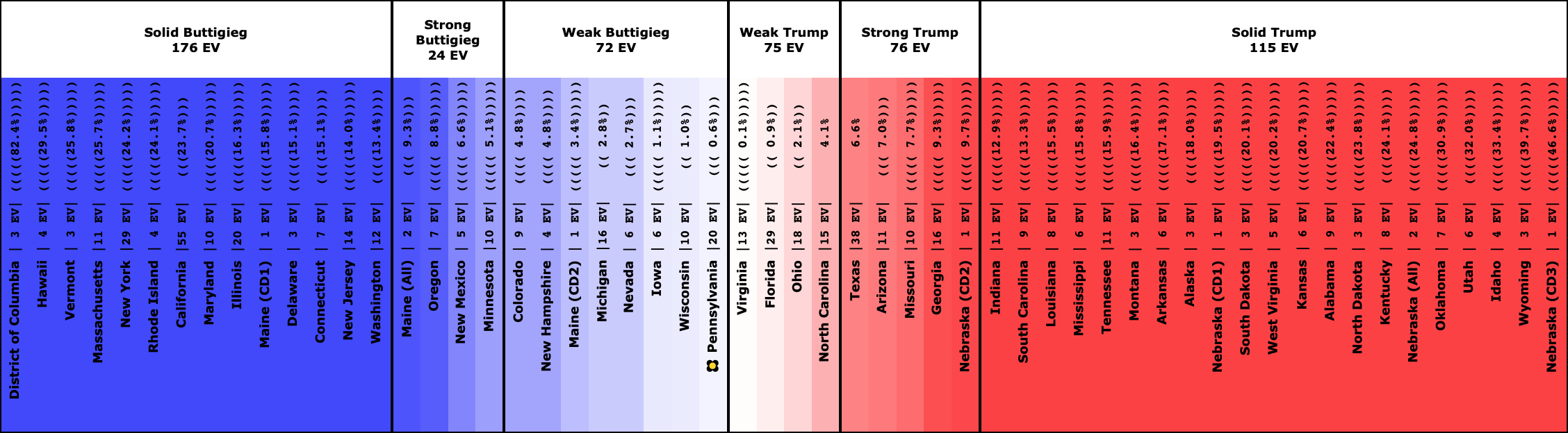
One final categorization comparison to show the three tiers of Democratic candidates against Trump that I mentioned at the start of the post. Time to look at the "spectrum of the states" for the five Democrats against Trump and compare what they look like:
The Democrats that are winning decisively:
The Democrat who is leading, but narrowly:
The Democrats whose chances are a coin toss:
And that is where we are.
367.7 days until polls start to close.
For more information:
This post is an update based on the data on the Election Graphs Electoral College 2020 page. Election Graphs tracks a poll-based estimate of the Electoral College. The charts, graphs, and maps in the post above are all as of the time of this post. Click through on any image to go to a page with the current interactive versions of that chart, along with additional details.
Follow @ElectionGraphs on Twitter or Election Graphs on Facebook to see announcements of updates. For those interested in individual poll updates, follow @ElecCollPolls on Twitter for all the polls as I add them. If you find the information in these posts informative or useful, please consider visiting the donation page.