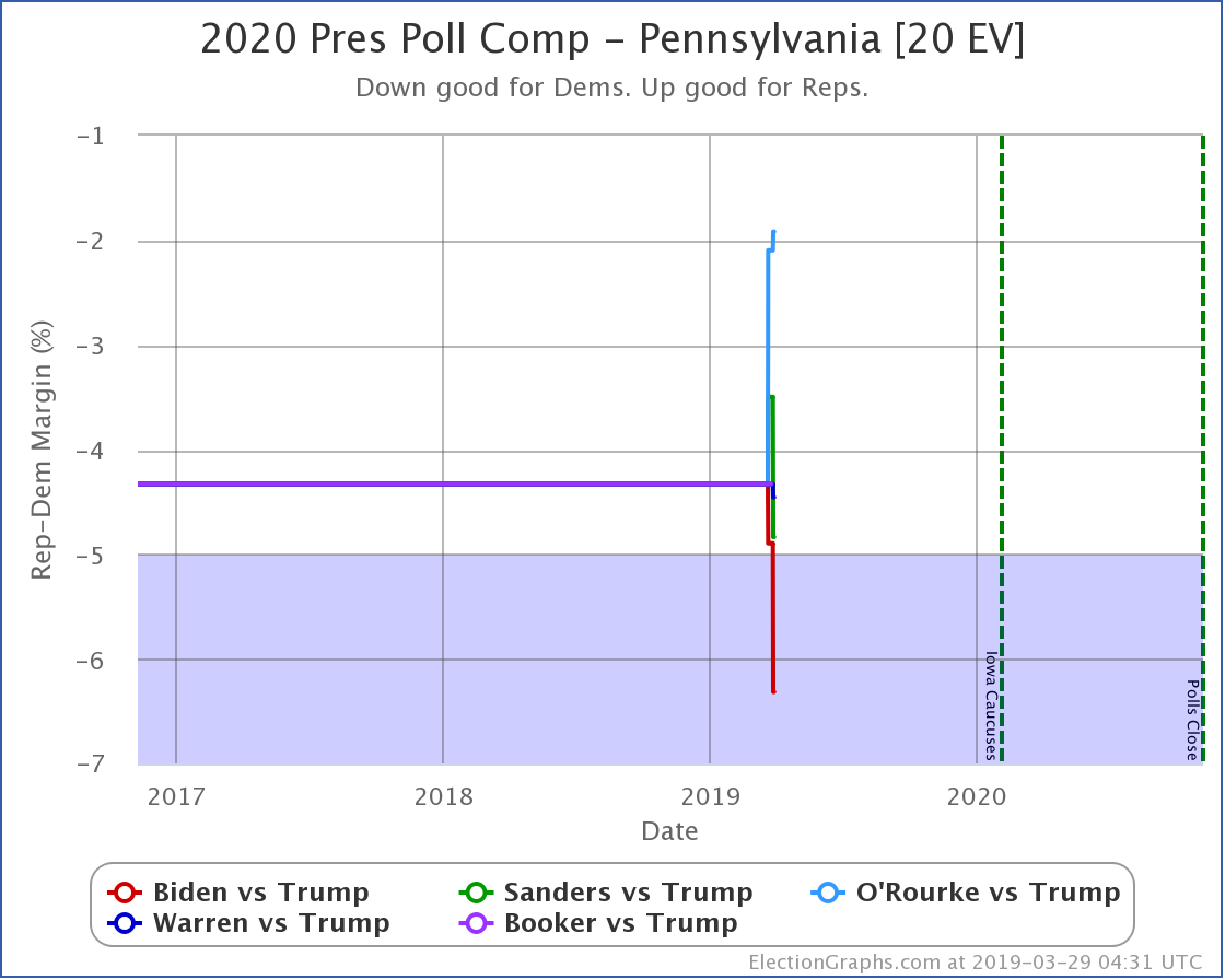
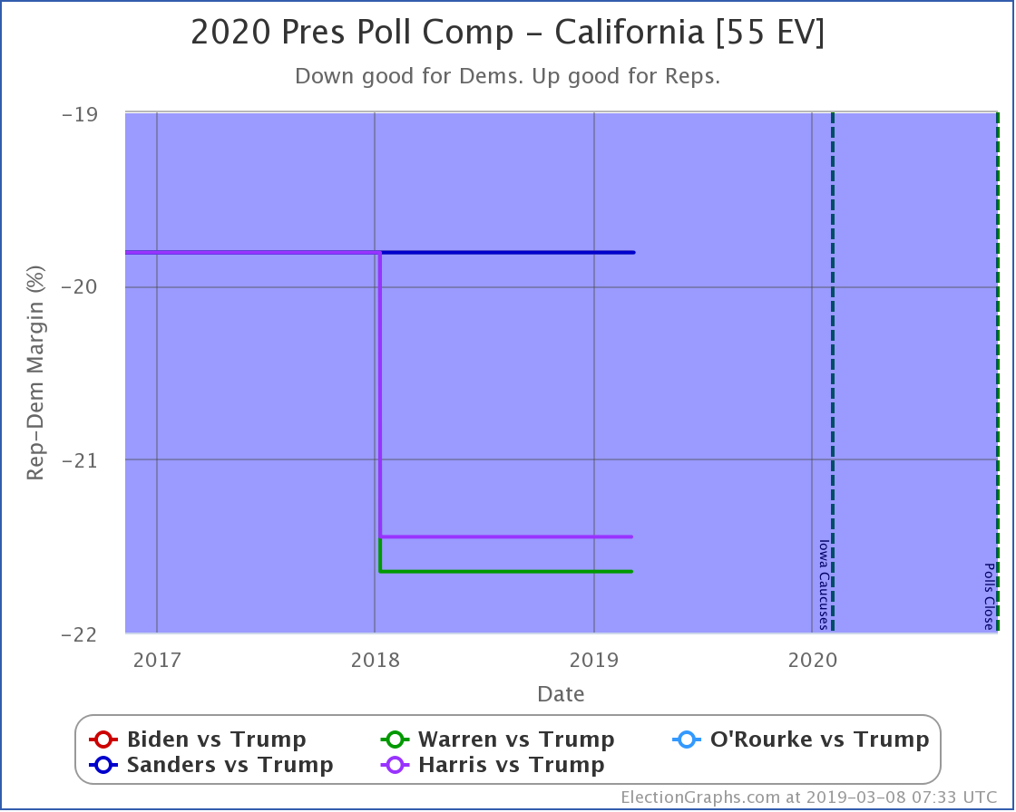
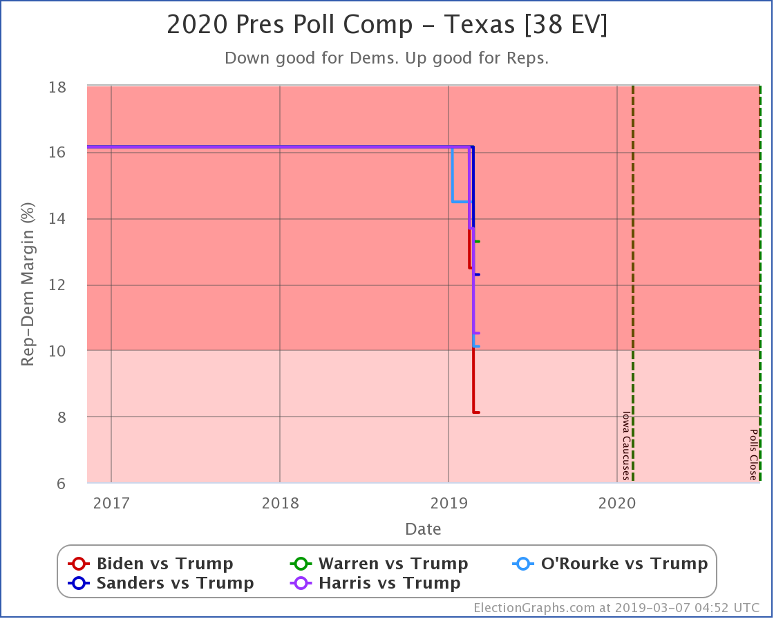
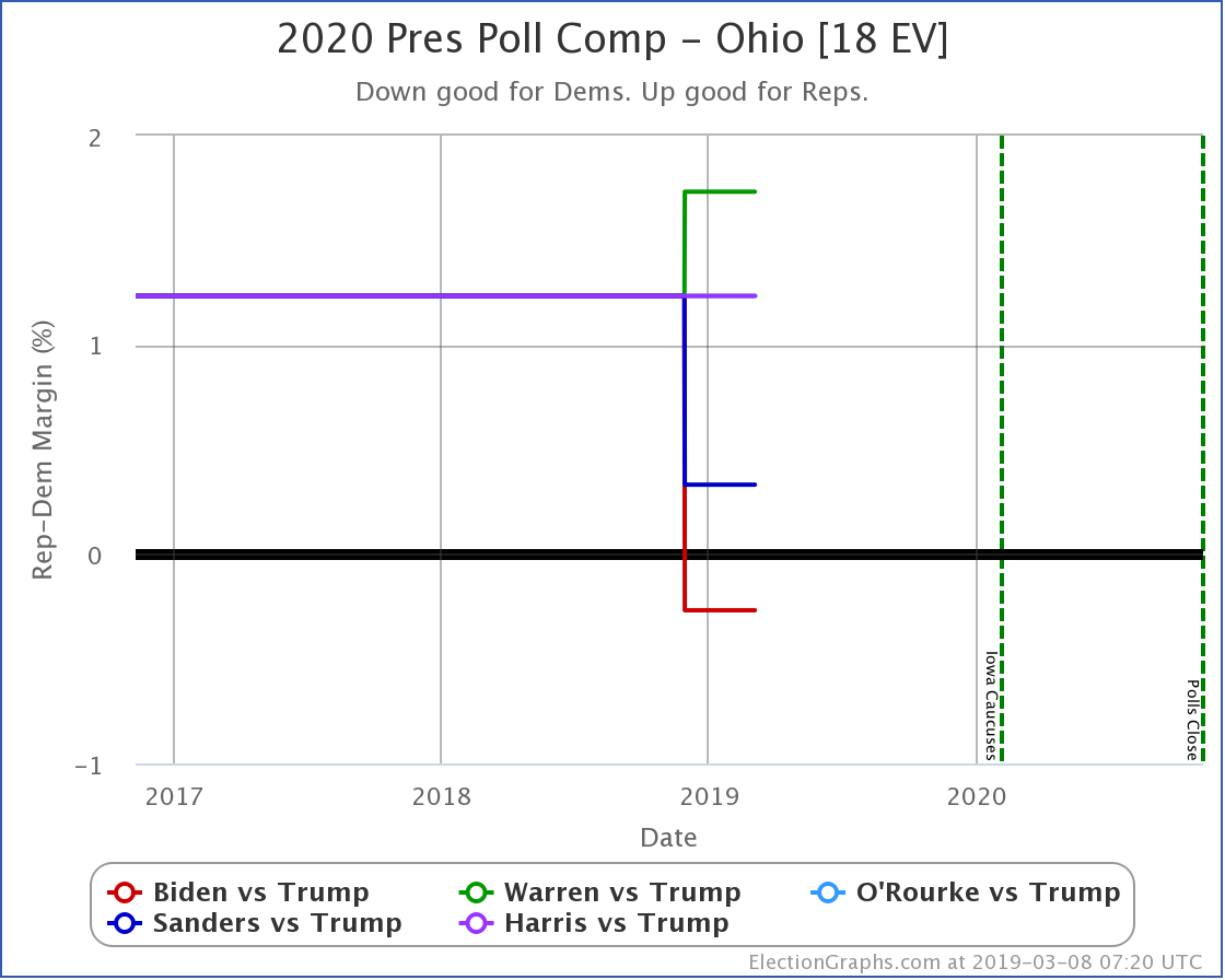
Since the last update, there have been new general election polls in Nevada, Massachusetts, Michigan, Wisconsin, Pennsylvania, and Wisconsin again.
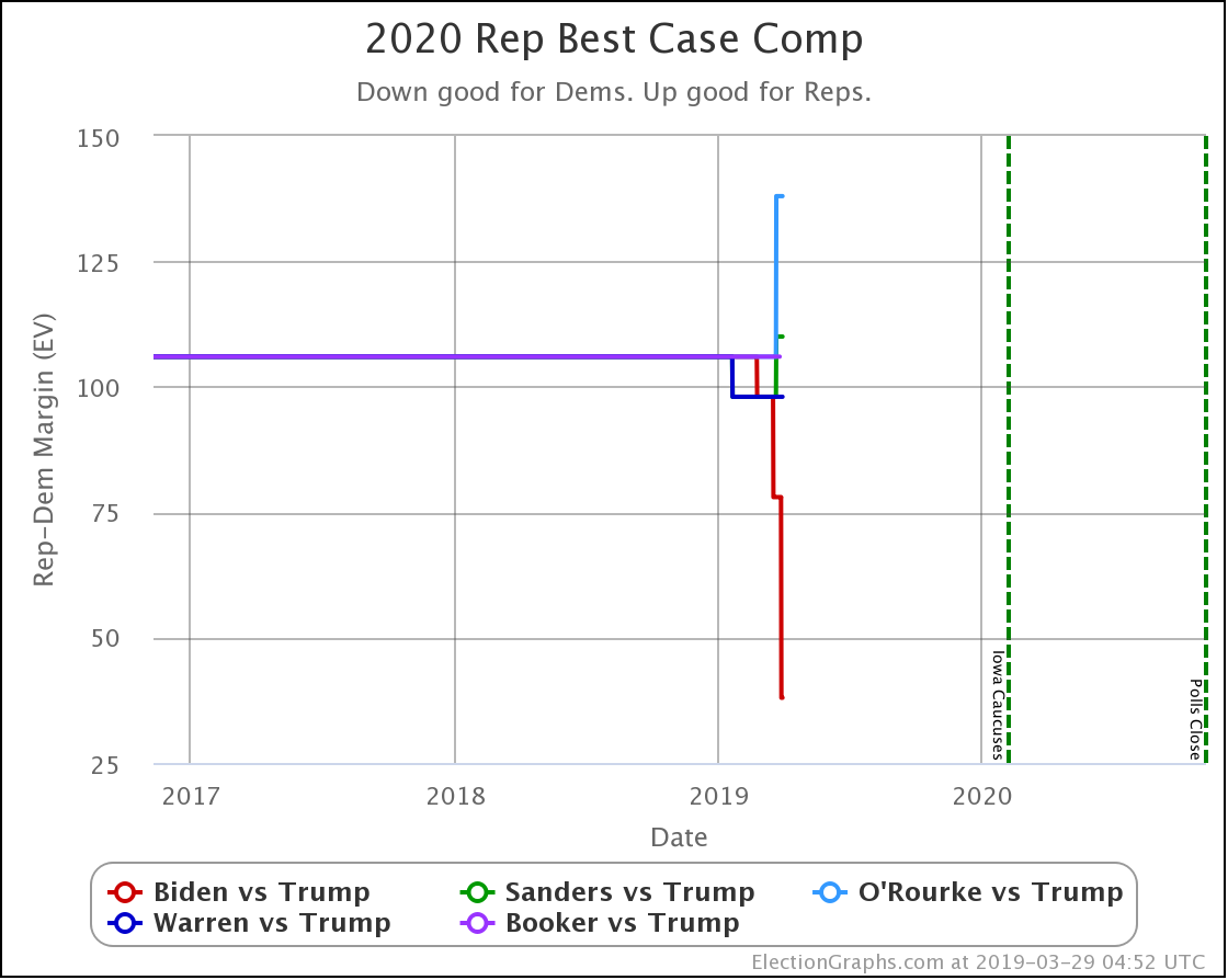
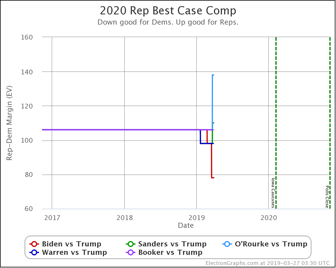
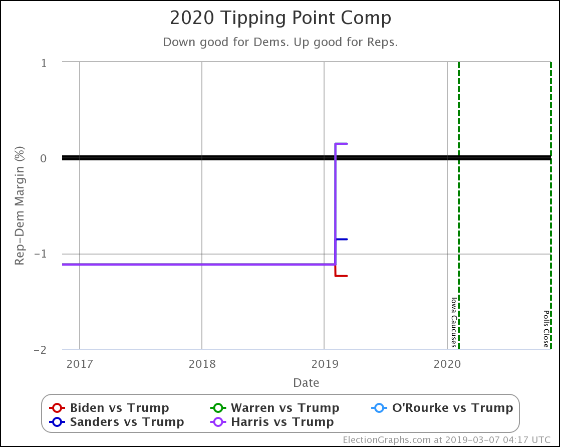
With this new batch of polling, Harris vs. Trump supplants Booker vs. Trump in our "five best-polled matchups" that we spend time talking about here. Those five at the moment are Biden, Sanders, O'Rourke, Warren, and Harris. All vs. Trump of course.
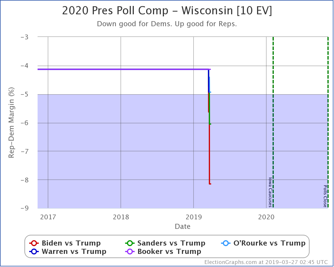
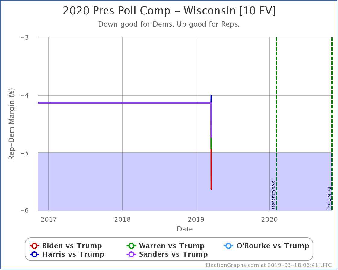
But of all of those polls, only the last Wisconsin poll resulted in any category changes for any of the candidate pairs. That would be Warren vs. Trump, which moves from Weak Warren (a Warren lead less than 5%) to Strong Warren (a Warren lead more than 5% but less than 10%).
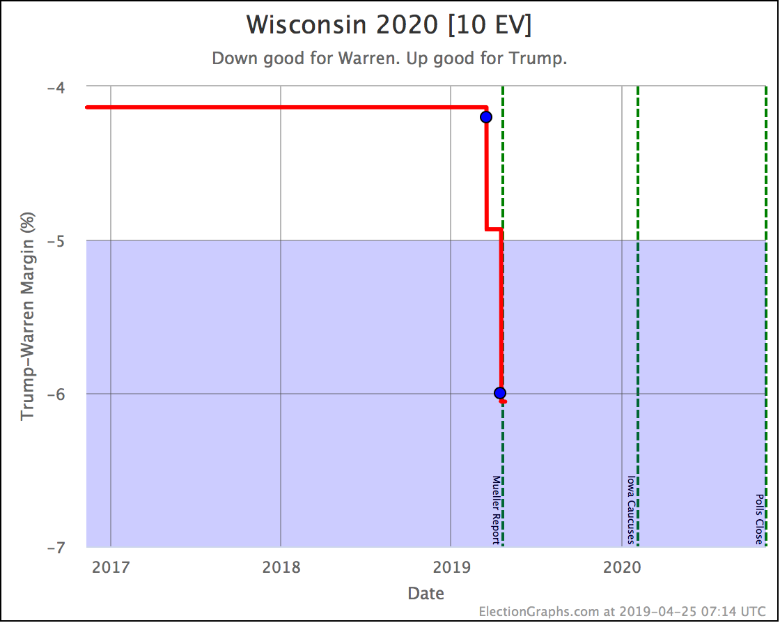
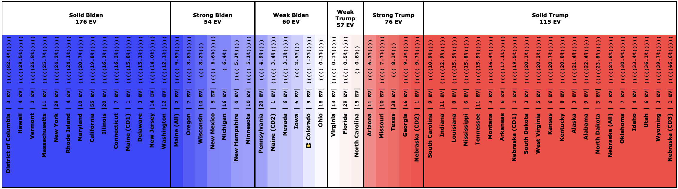
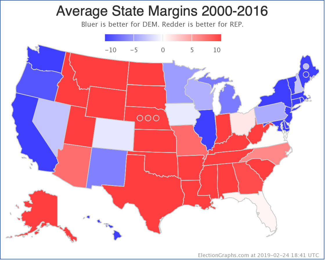
Keep in mind that the average here still includes election results from 2008 to 2016 to "baseline" the state while we don't have enough polls for a meaningful average based solely on the candidate pair. There are still only two actual Warren vs Trump poll results in Wisconsin. So as with everything at this stage, things are still very very preliminary.
The Warren vs. Trump "bubble" now looks like this:
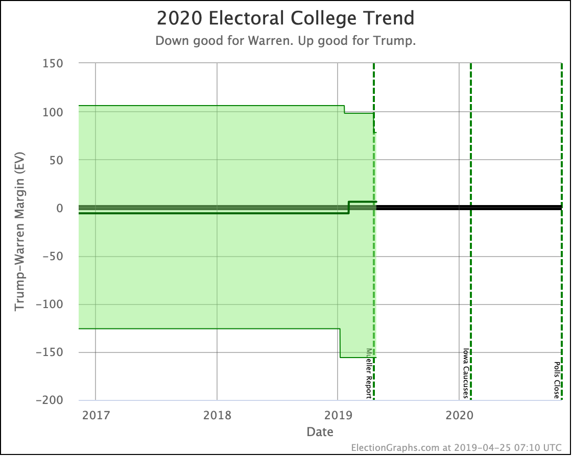
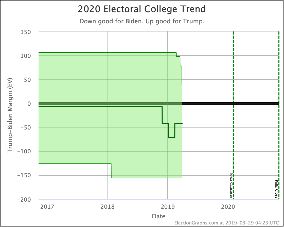
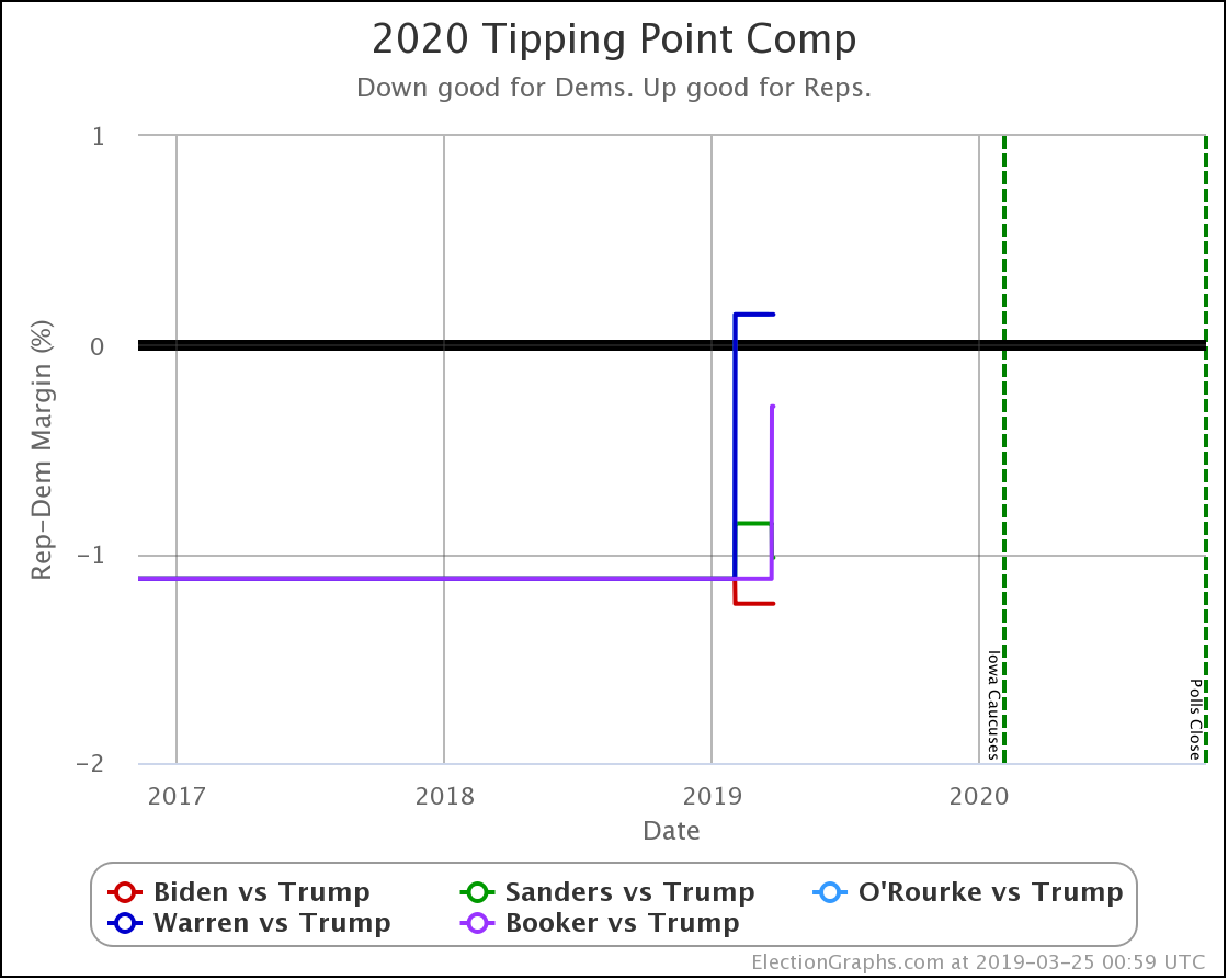
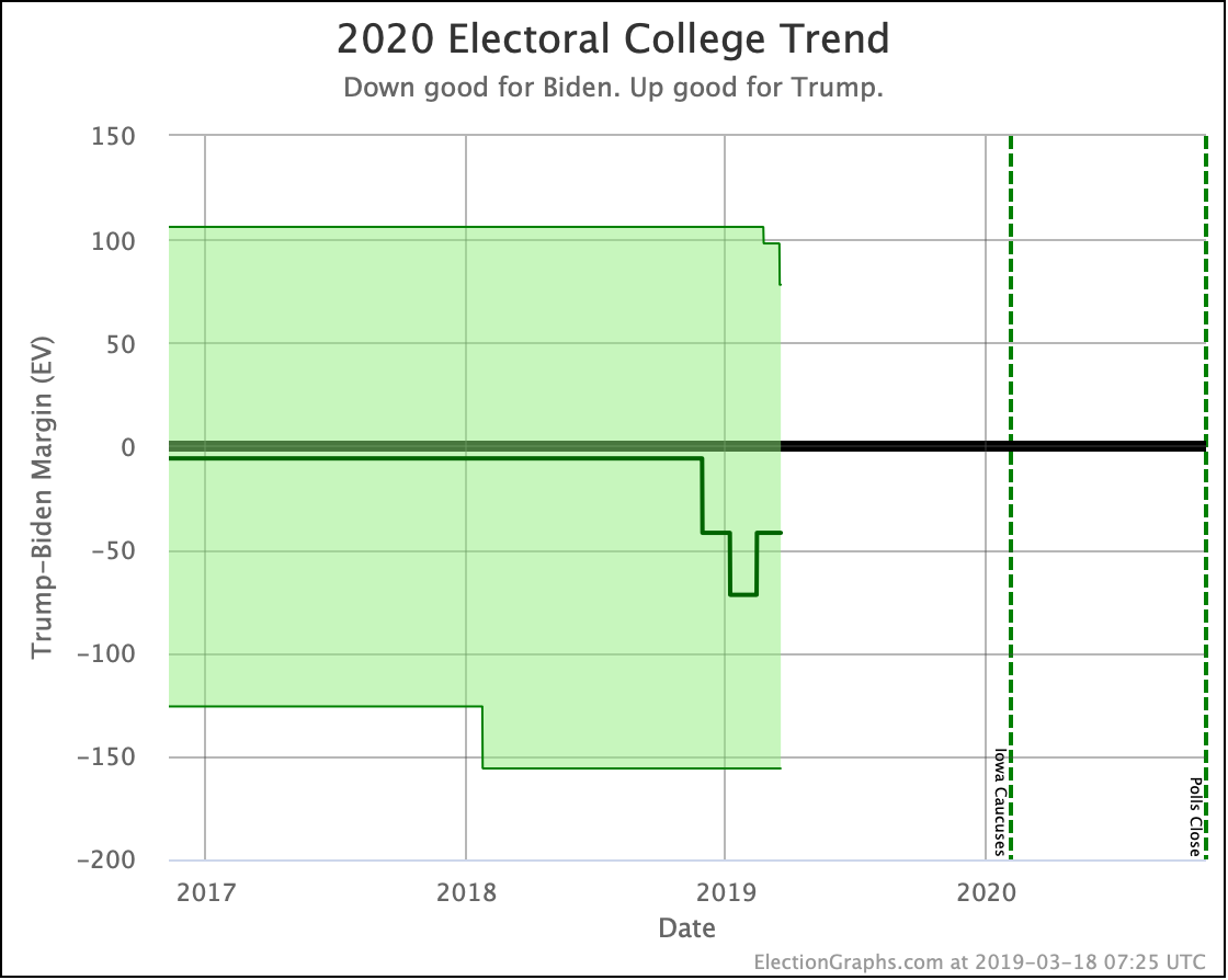
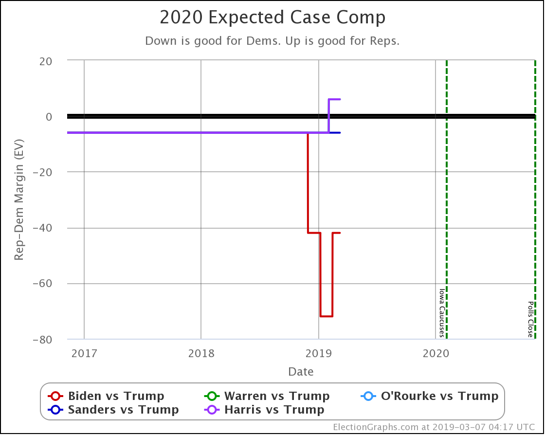
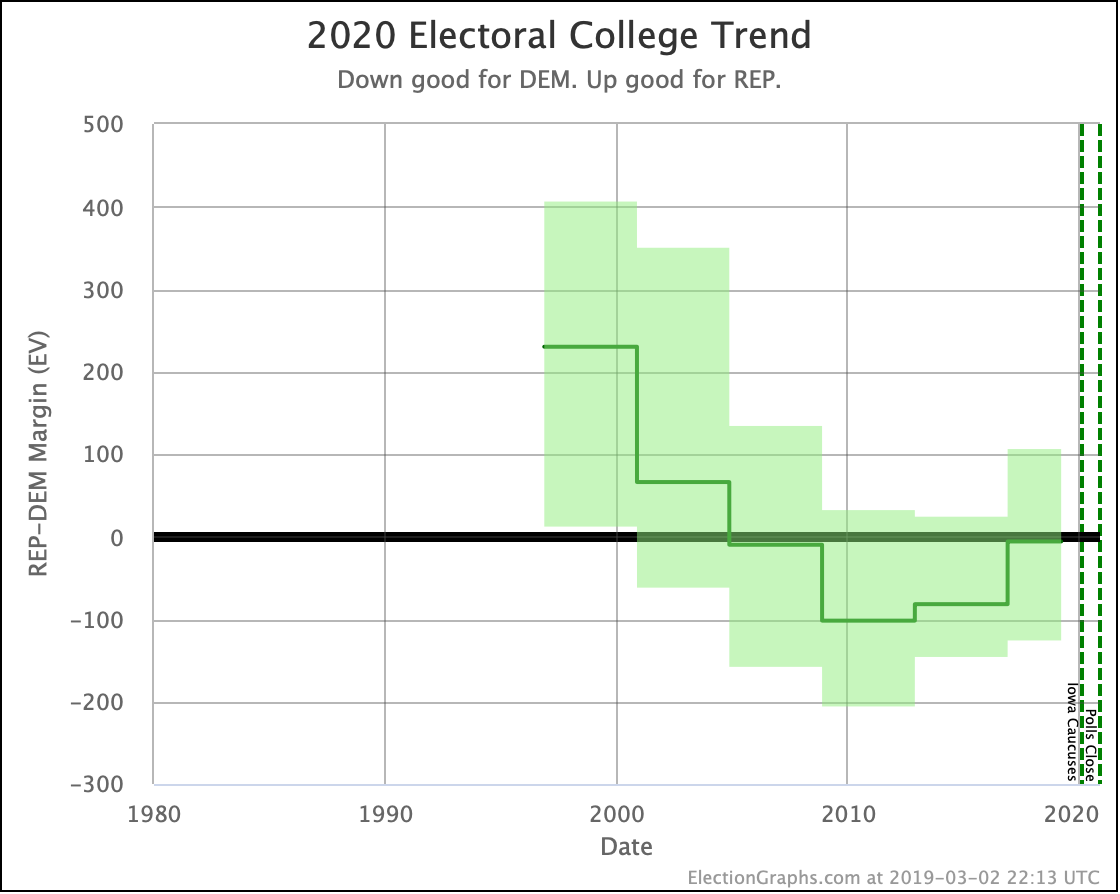
This change makes the scenario where "Trump wins all of the close states" weaker. But note that the center line (every state goes to the current leader in the poll average) still gives the election to Trump over Warren.
Of the five best-polled matchups at the moment, Biden and Sanders beat Trump. O'Rourke, Warren, and Harris all lose to Trump.
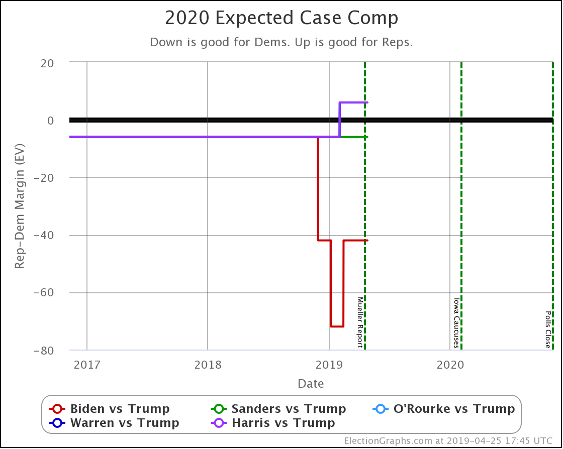
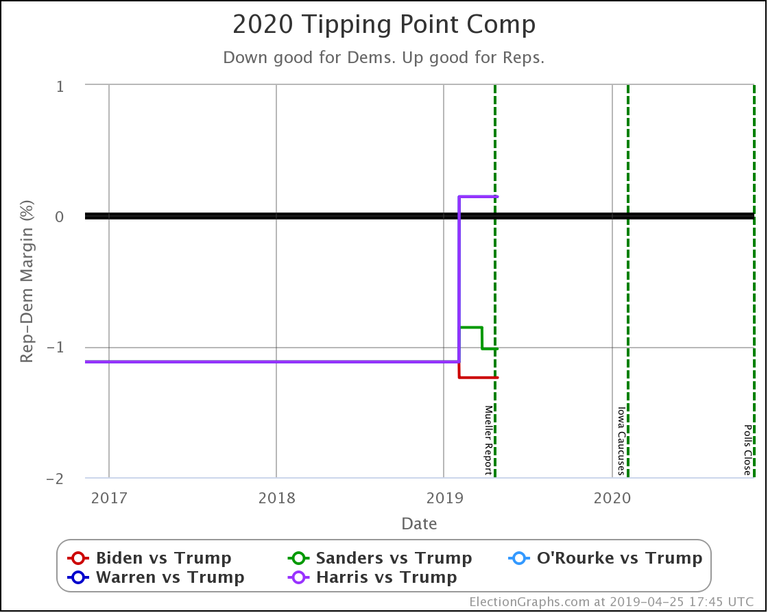
All five of these matchups are incredibly close though. These are all tossups, with Biden doing just a smidge better than the others.
We are more than 18 months out right now, lots will change before the election, so these aren't predictions — just statements of how things look today.
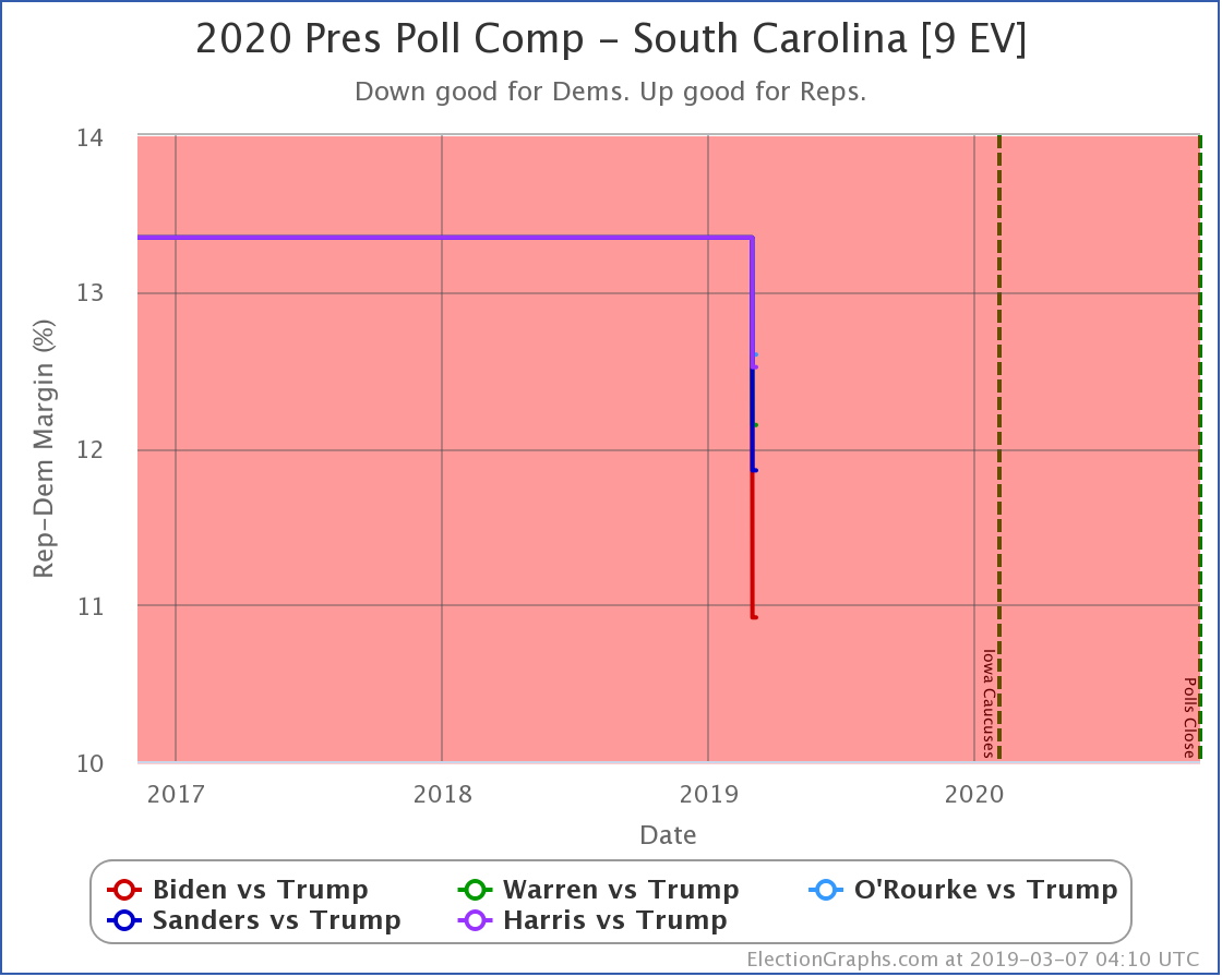
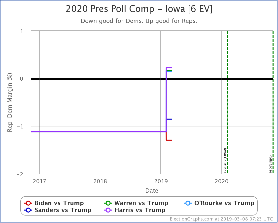
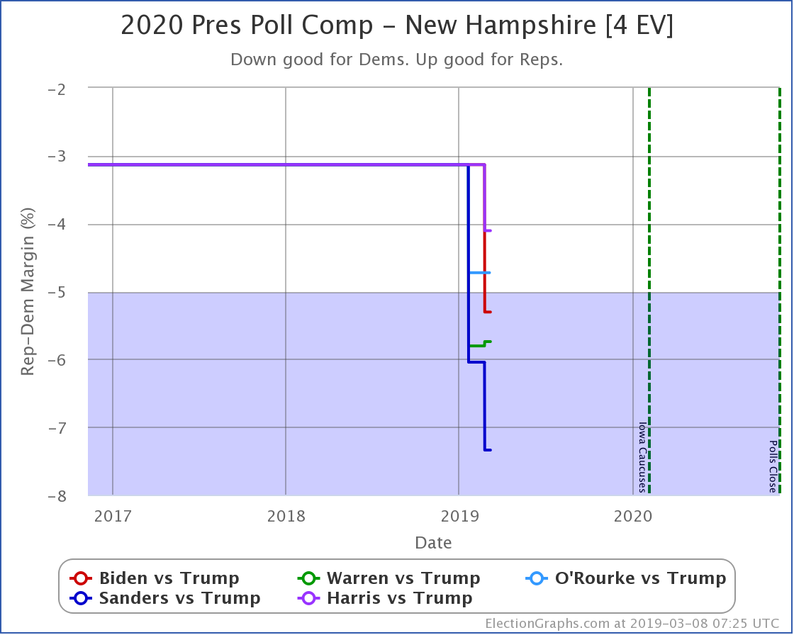
In addition to the big picture stuff above, a quick look at all five states with polls since the last update to see not just the category changes, but the movement within the categories.
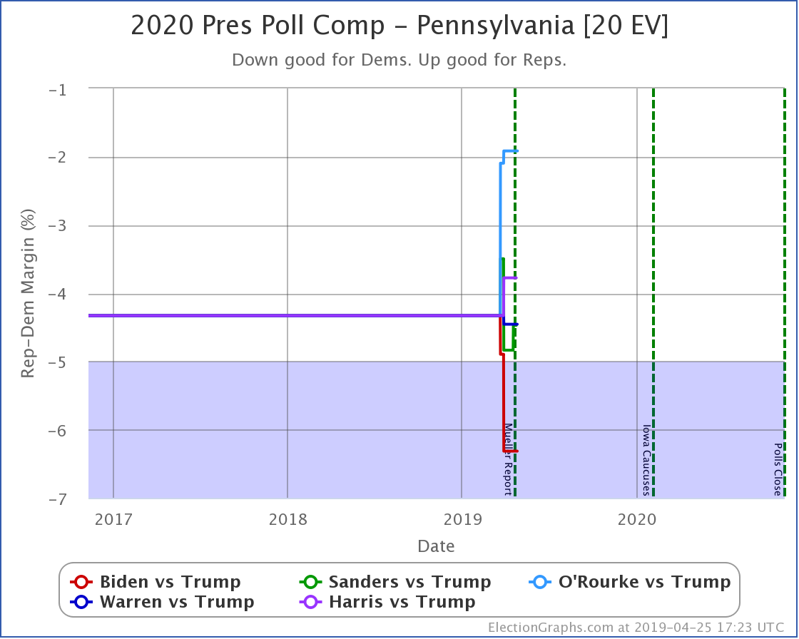
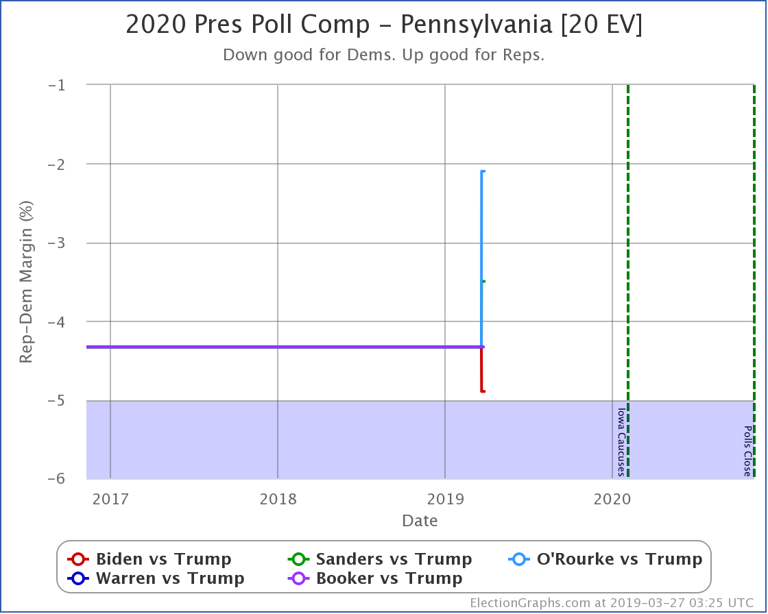
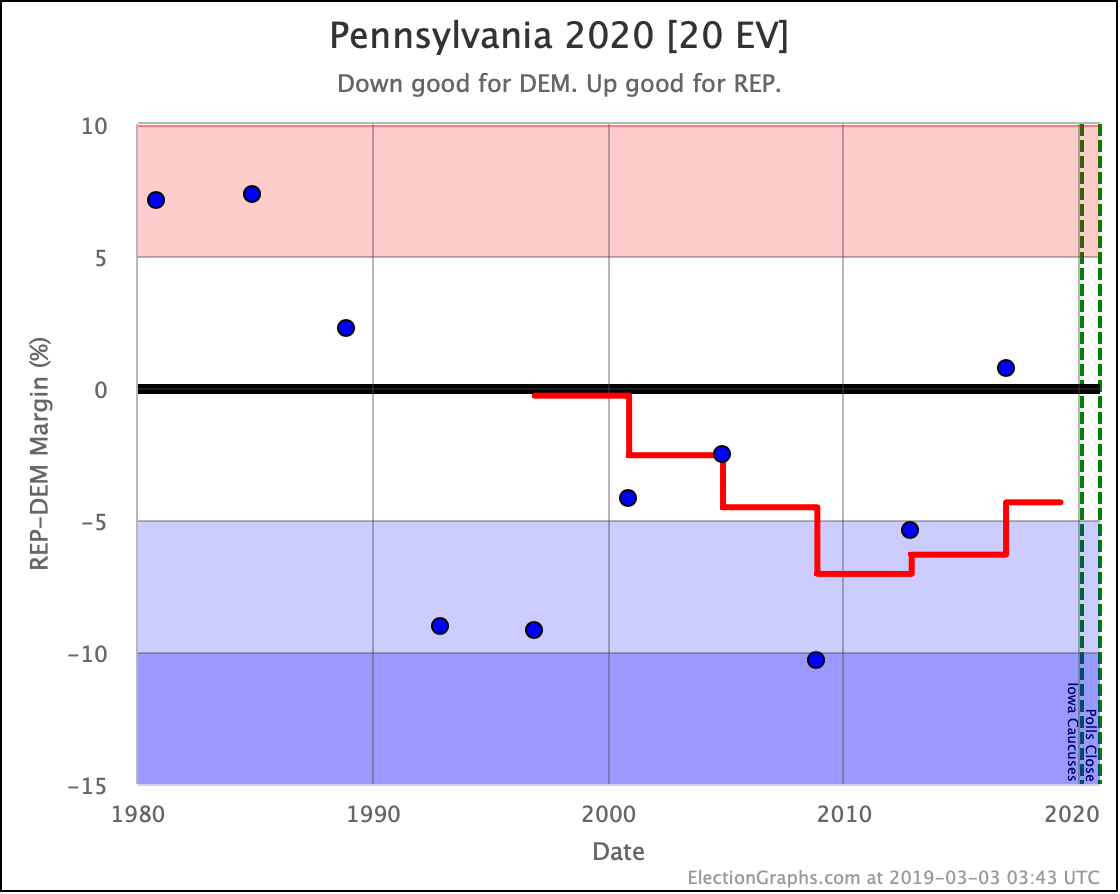
In Pennsylvania, Biden has a "strong" lead against Trump (6.3%). All the rest are in the "weak" category (less than 5% ahead of Trump). Of these, O'Rourke does the worst.
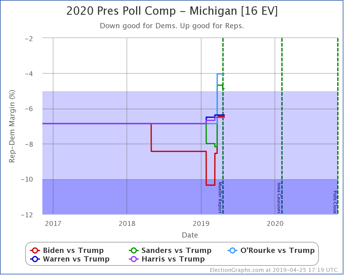
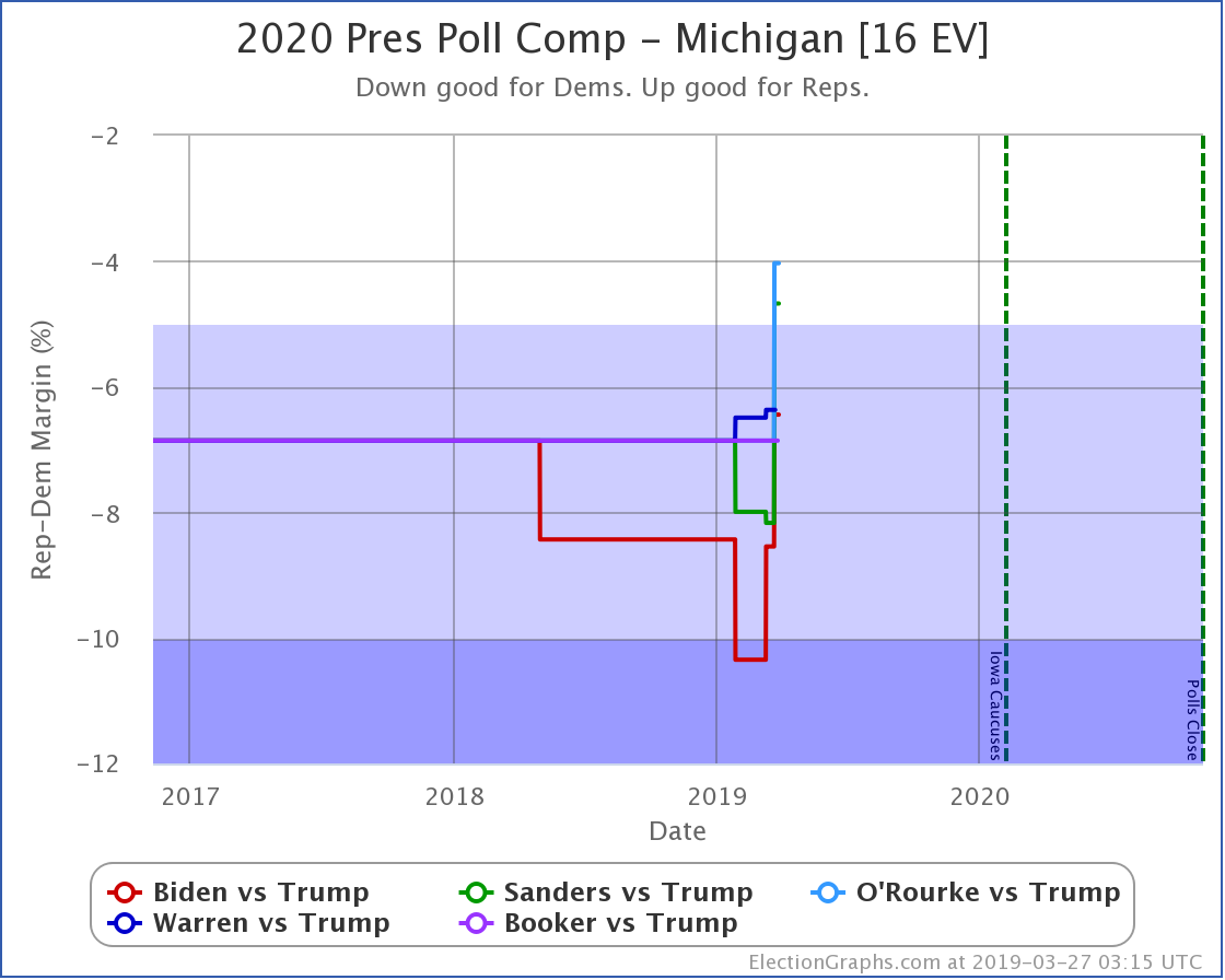
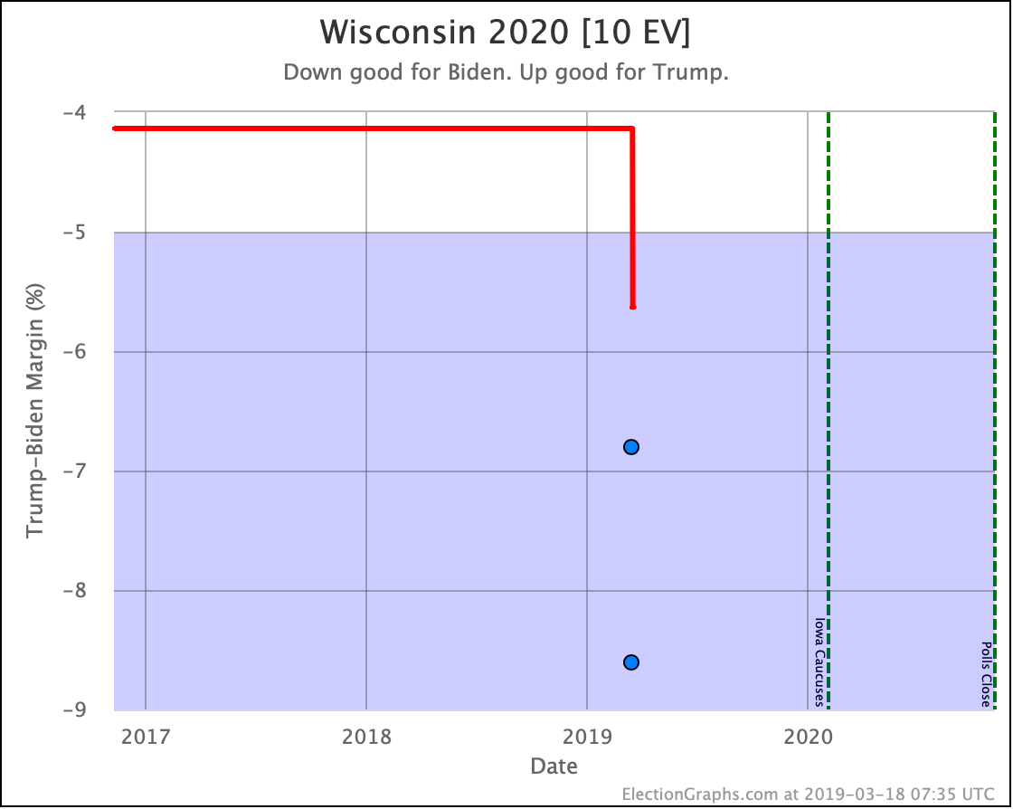
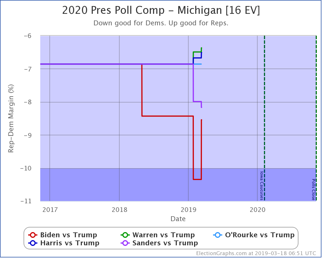
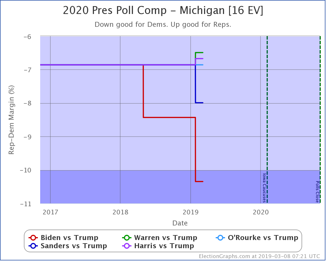
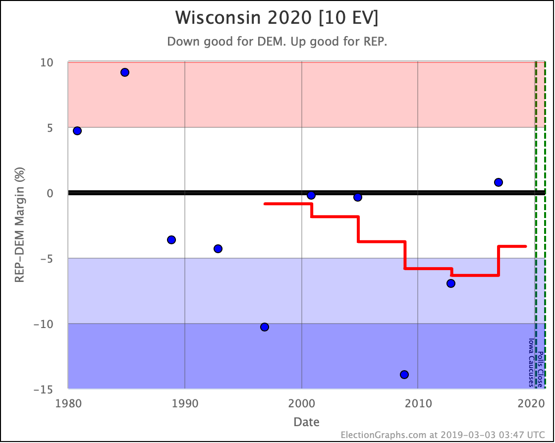
Wisconsin is one of the better-polled states so far. O'Rourke and Sanders have weak leads (less than 5%) over Trump, while Warren, Biden, and Harris now are classified as "Strong Dem" (more than 5% but less than 10%) over Trump. Biden's lead is not what it once was though, and now Michigan joins New Hampshire as one of the few states where Biden is not doing better than the other Democrats. Harris leads Trump by 6.5% compared to Biden's 6.4% lead. OK, yeah, close enough to not be a difference that matters. But given that it is such a rarity, it is worth noting.
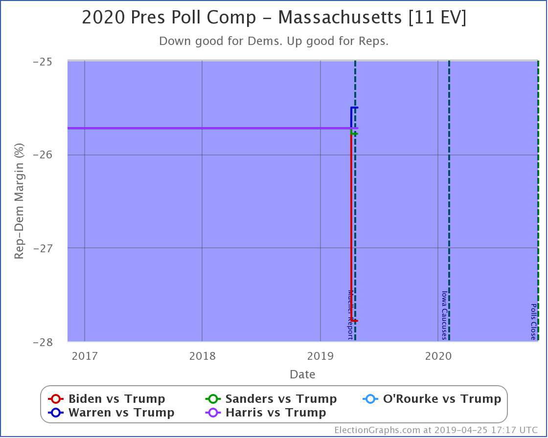
In Massachusetts, all five Democrats have solid leads (more than 10%) against Trump. Biden does best. Warren does worst.
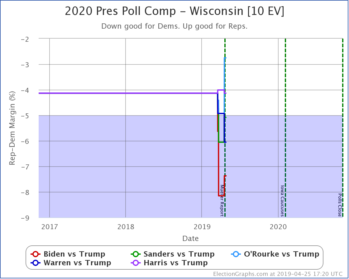
In Wisconsin, O'Rourke and Harris have leads in the "weak" category. Biden, Sanders, and Warren have leads in the "strong" category. Biden is doing best against Trump. O'Rourke is doing worst against Trump.
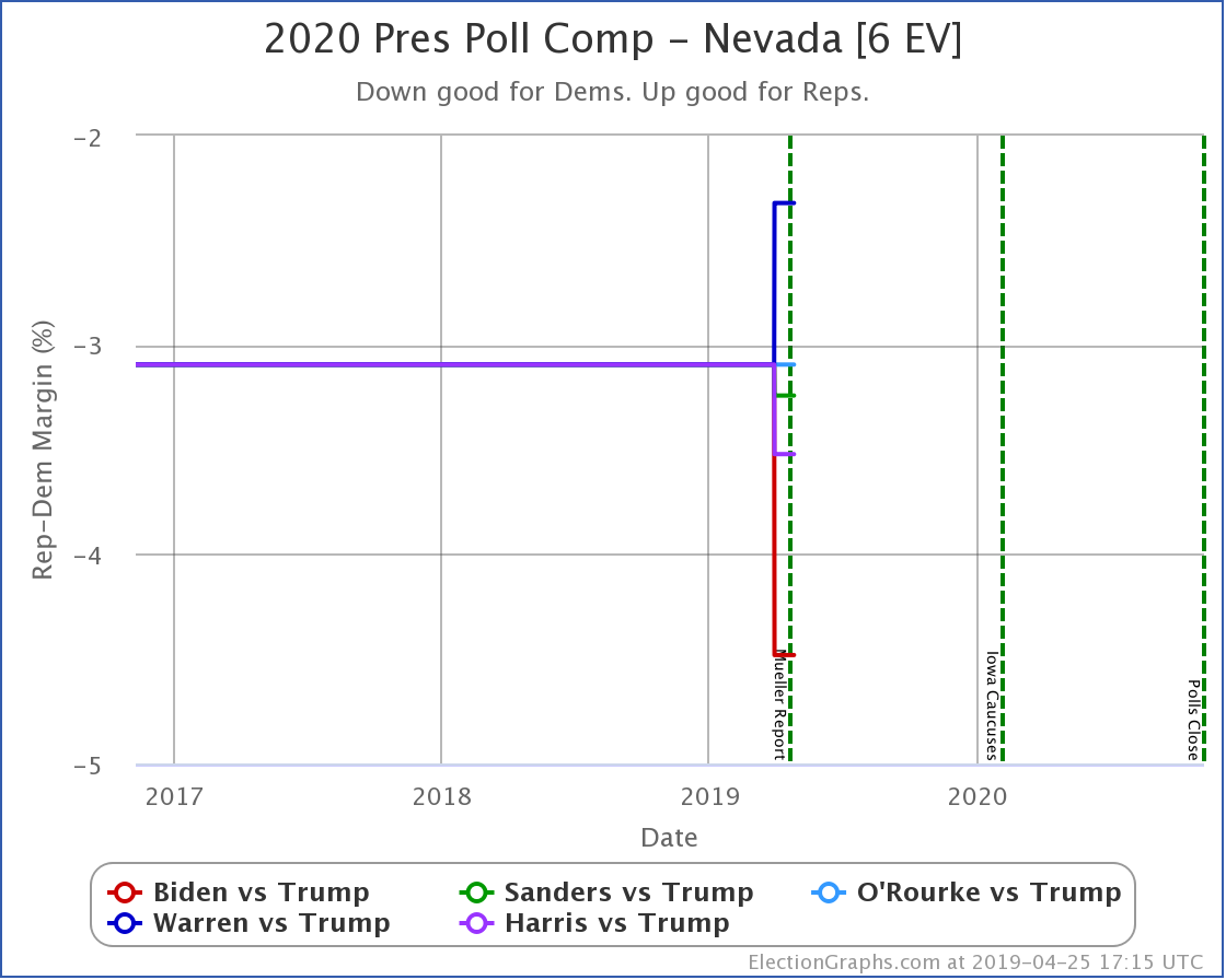
In Nevada, all five Democrats lead Trump weakly. Biden does best. Warren does worst.
That's it for now.
558.1 days until polls start to close on Election Day 2020.
For more information:
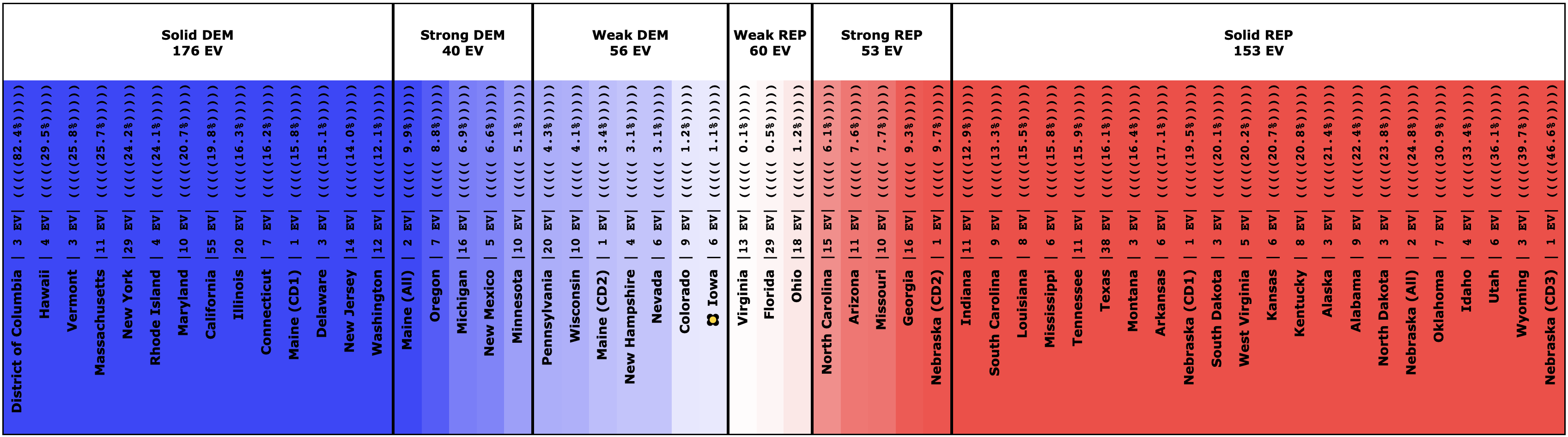
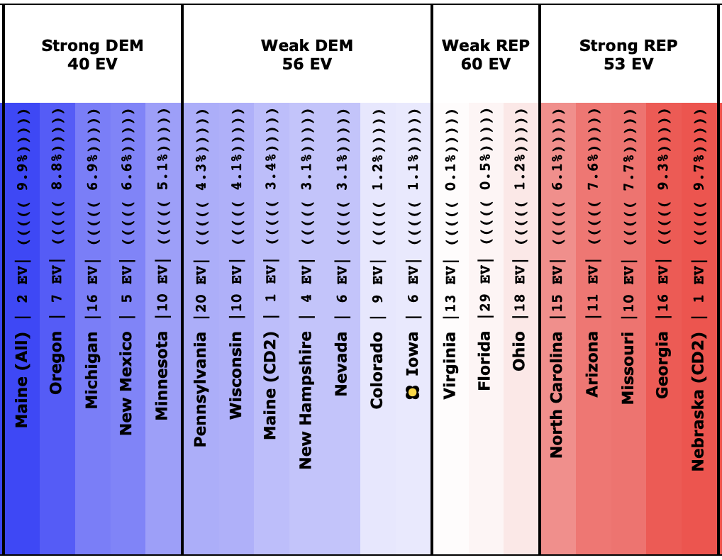
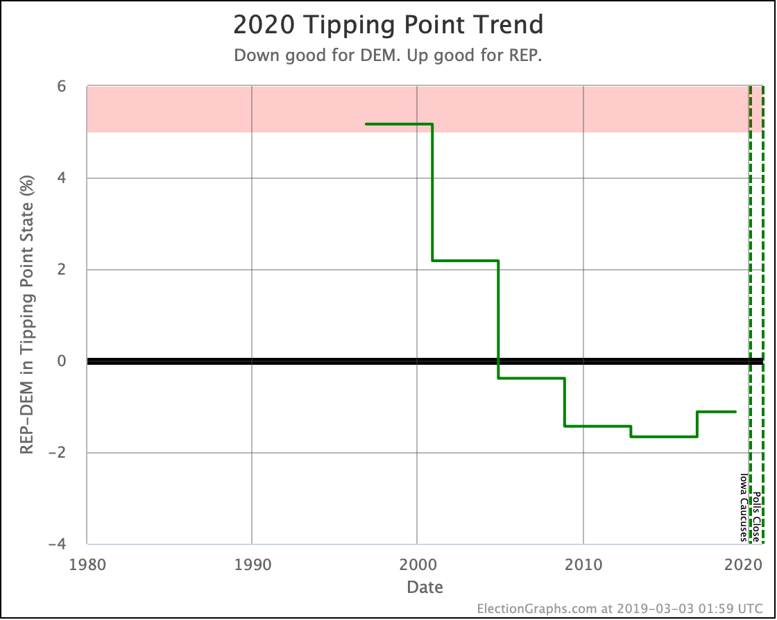
This post is an update based on the data on the Election Graphs Electoral College 2020 page. Election Graphs tracks a poll-based estimate of the Electoral College. The charts, graphs, and maps in the post above are all as of the time of this post. Click through on any image to go to a page with the current interactive versions of that chart, along with additional details.
Follow @ElectionGraphs on Twitter or Election Graphs on Facebook to see announcements of updates. For those interested in individual poll updates, follow @ElecCollPolls on Twitter for all the polls as I add them. If you find the information in these posts informative or useful, please consider visiting the donation page.