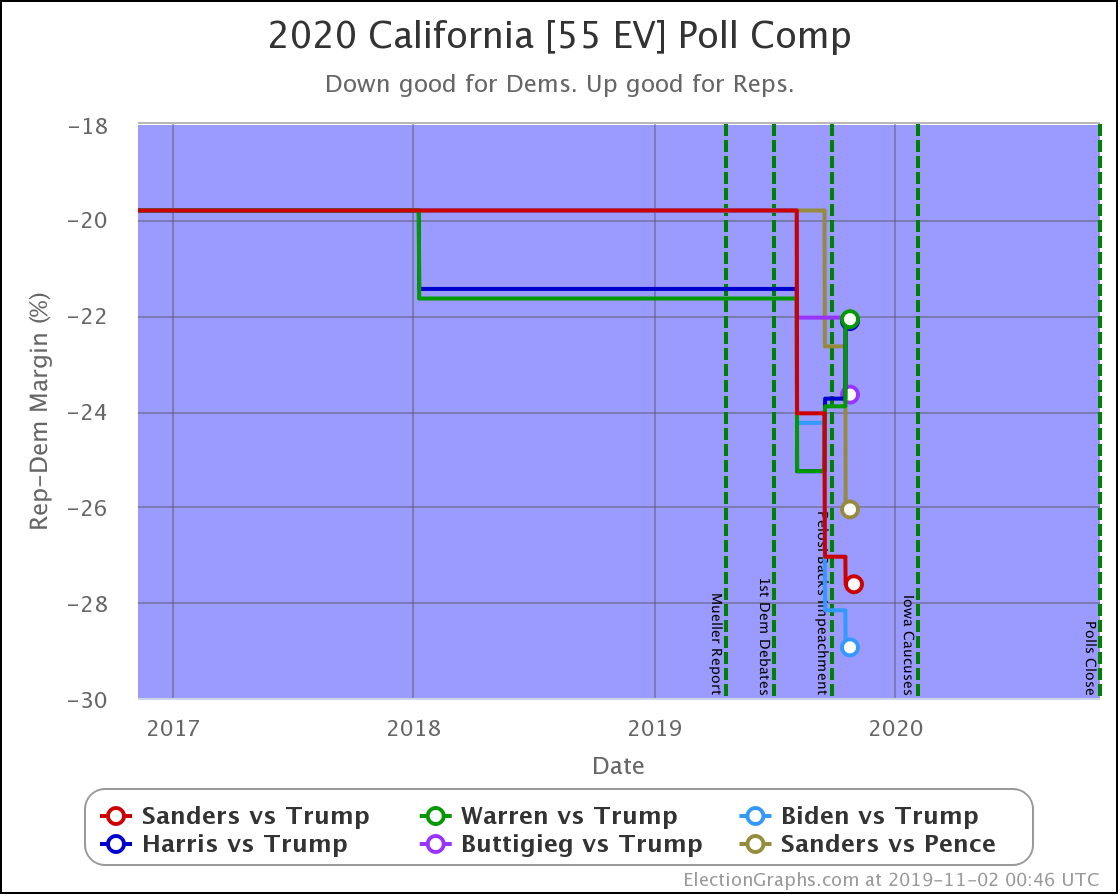
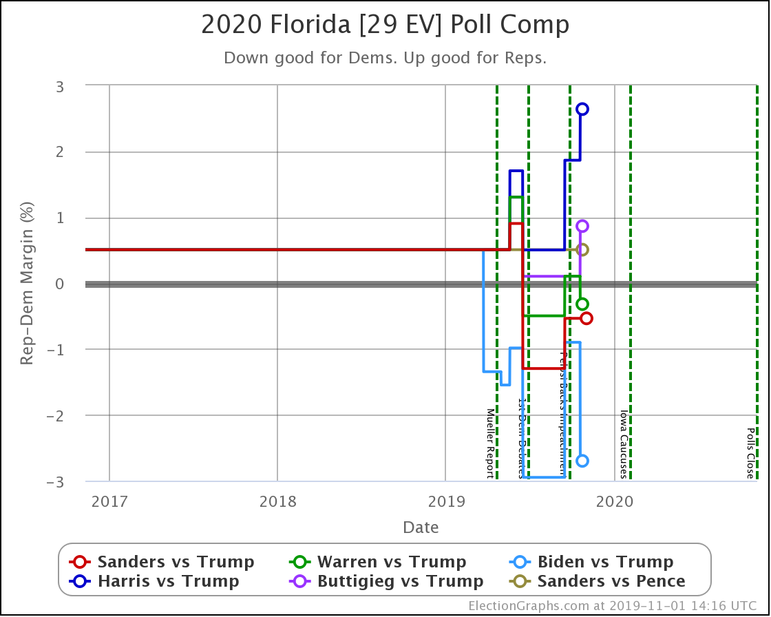
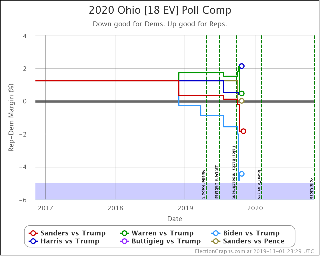
Since the last blog post on January 20th, there have been new polls in Florida, California, Iowa, New Hampshire, Delaware, Alabama, Texas (x3), Missouri, and Utah.
As I write this we are less than 24 hours away from the Iowa caucuses, so we'll move the usual "how things have changed since the last update" summaries to the end of the post, and instead, we will look at how each of the best-polled Democrats is doing against Trump as of the day before the Iowa caucuses.
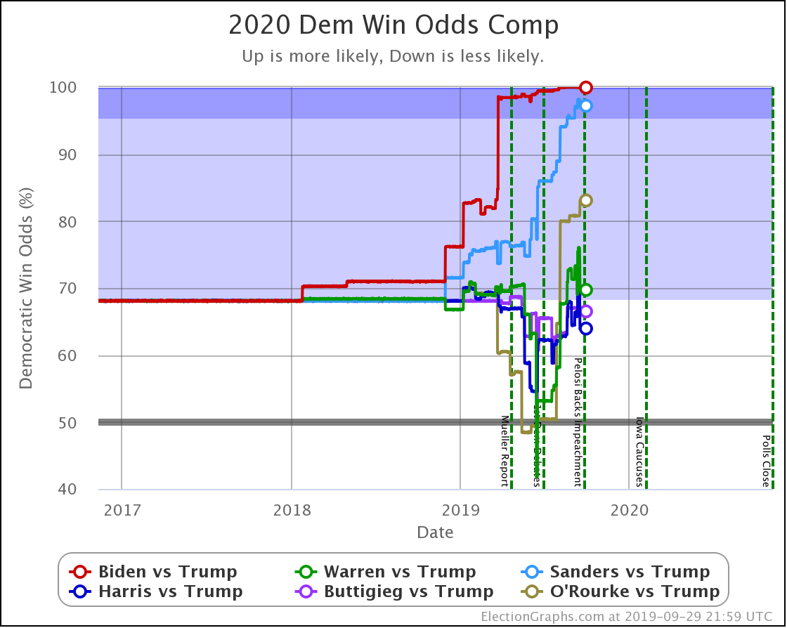
There are many factors that go into voter decisions on who to vote for in primary and caucuses. But this cycle, time and time again, "who can beat Trump" comes up as a critical part of what Democratic voters are considering.
Election Graphs obviously looks at this question in a variety of ways. Our snapshots are "if the election was held today" though. We don't try to prognosticate how things will change in the months between now and November. We recognize things will indeed change. And we've seen very convincing arguments that a big part of the differences we see between how different Democrats do vs. Trump is due directly to name recognition and that if the lesser-known candidates actually won the nomination, they would, therefore, do better than current polling indicates.
None the less, the best view we can get right now is by looking at the current state by state polling. So we will do that. Just keep in mind the limits of that approach.
So here we go. One by one.
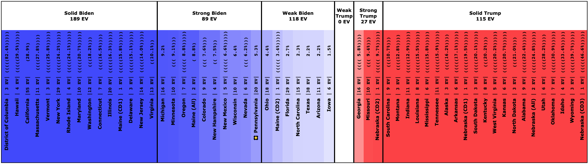
Biden vs. Trump
Let's begin the look at Biden's polling by comparing it to the 2016 election results.
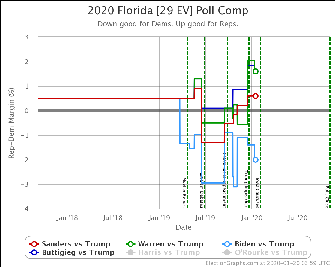
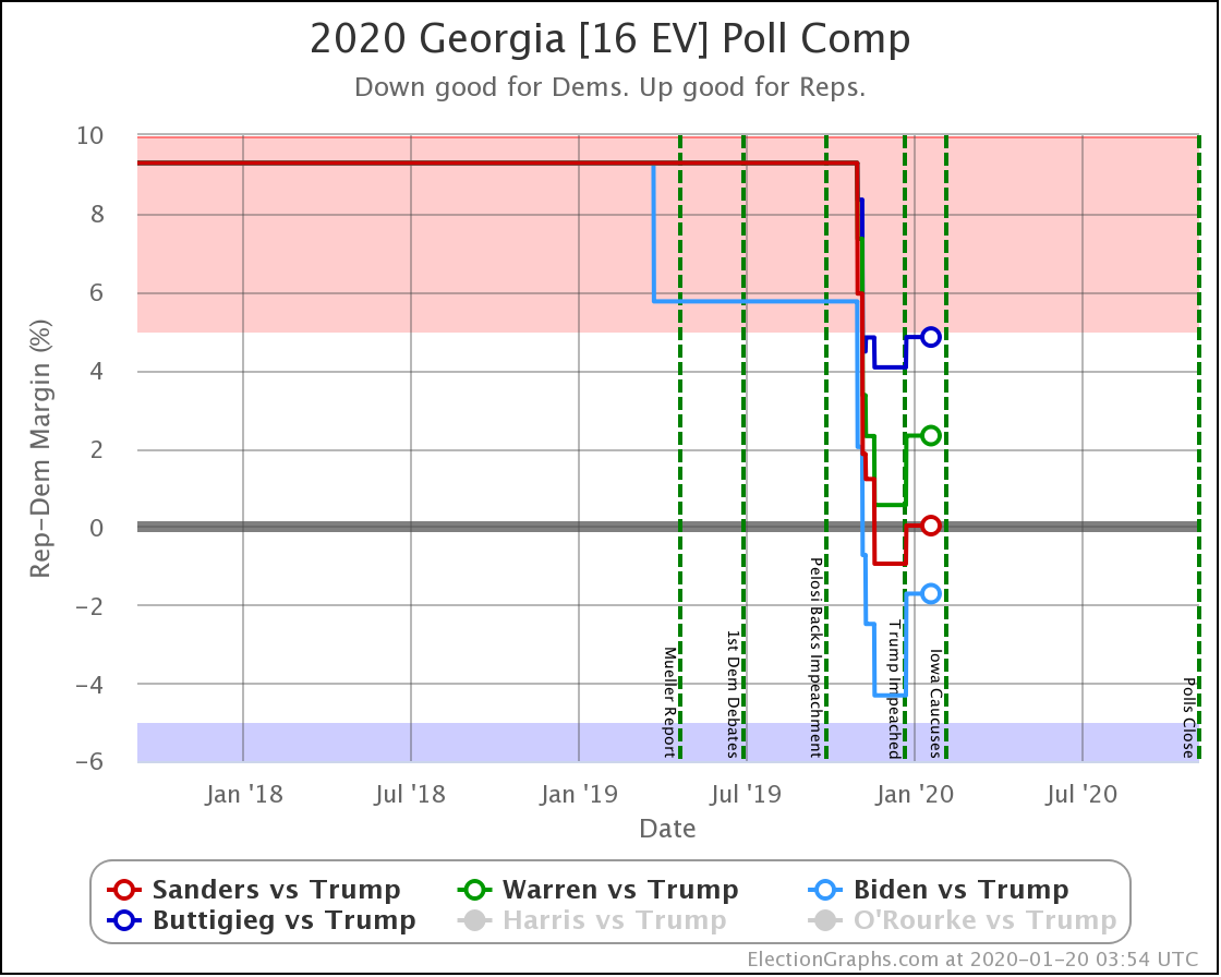
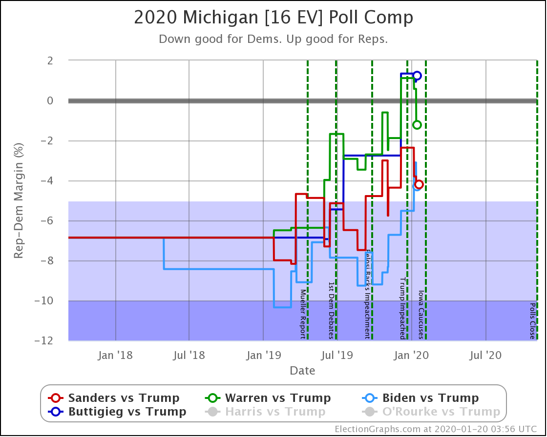
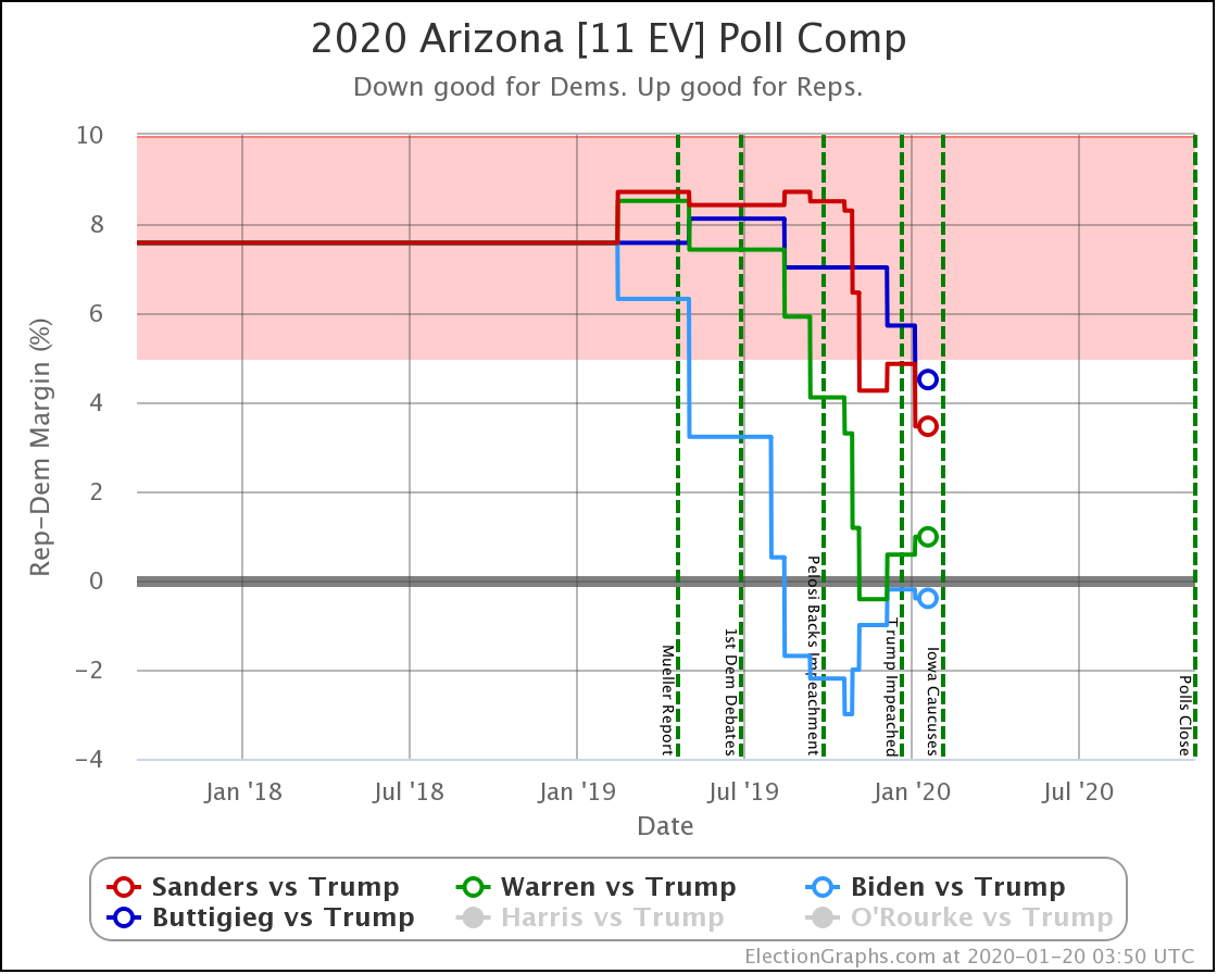
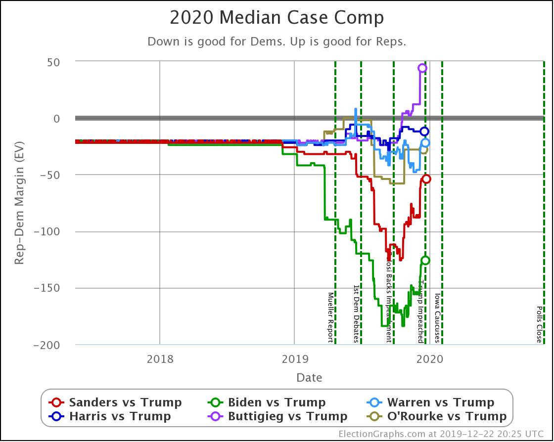
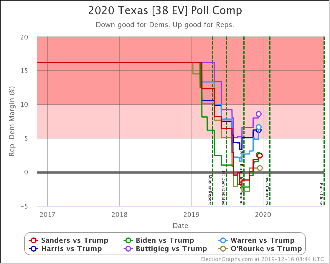
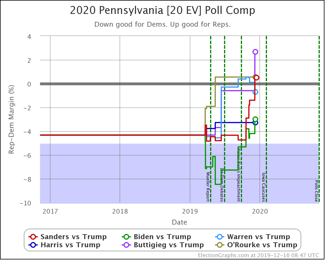
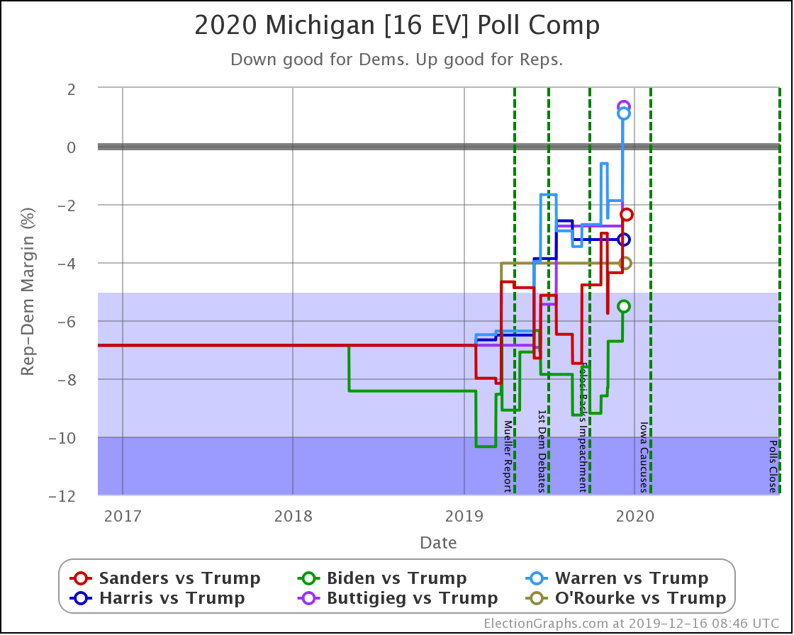
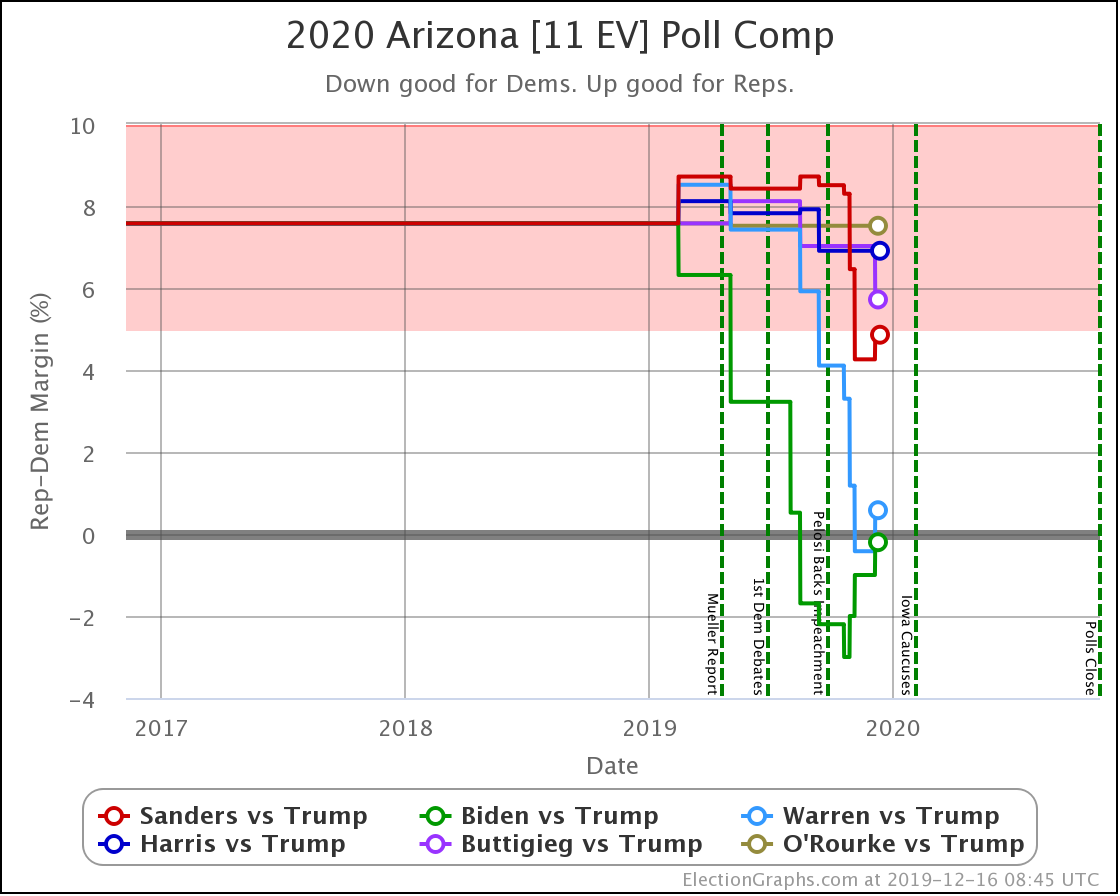
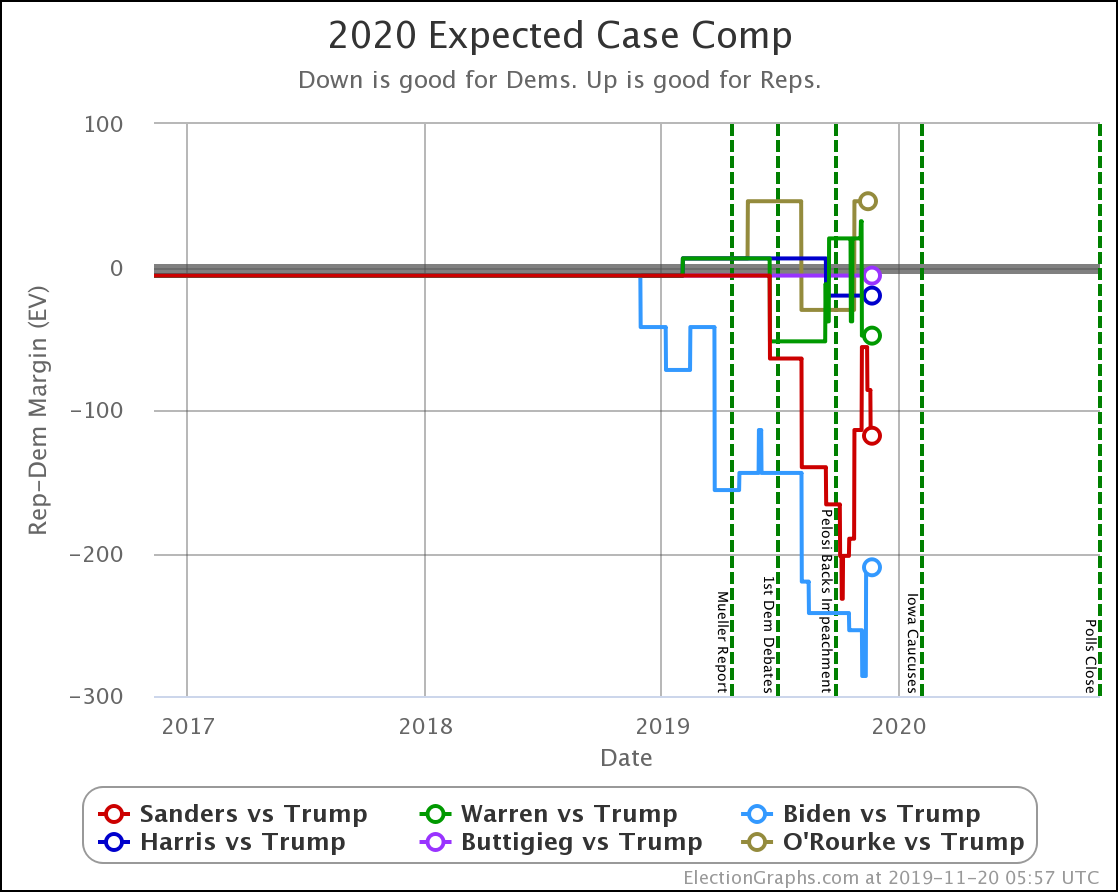
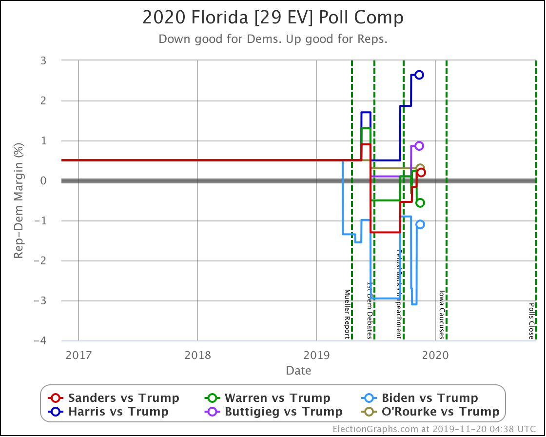
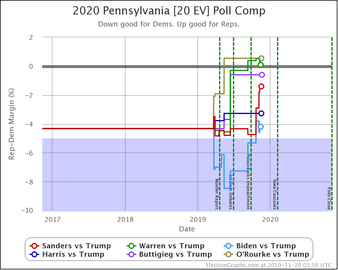
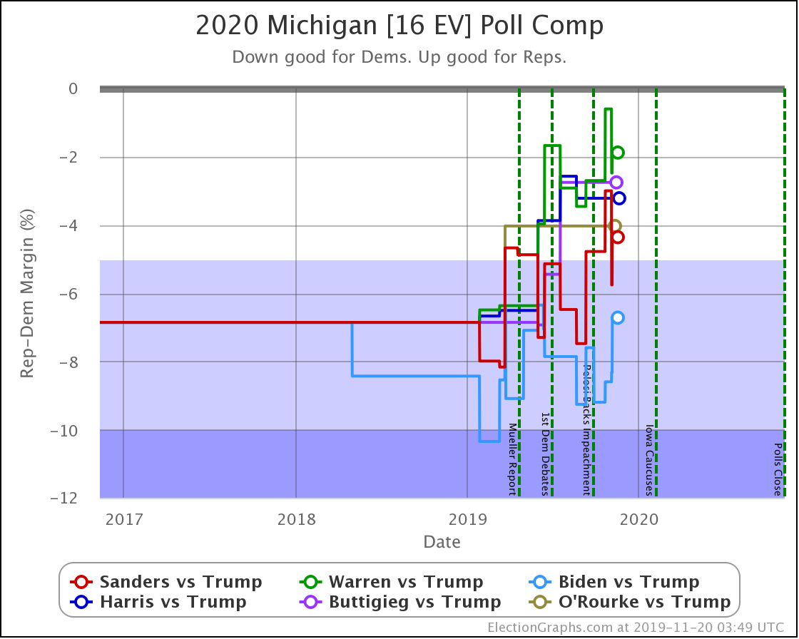
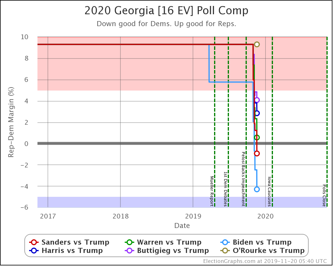
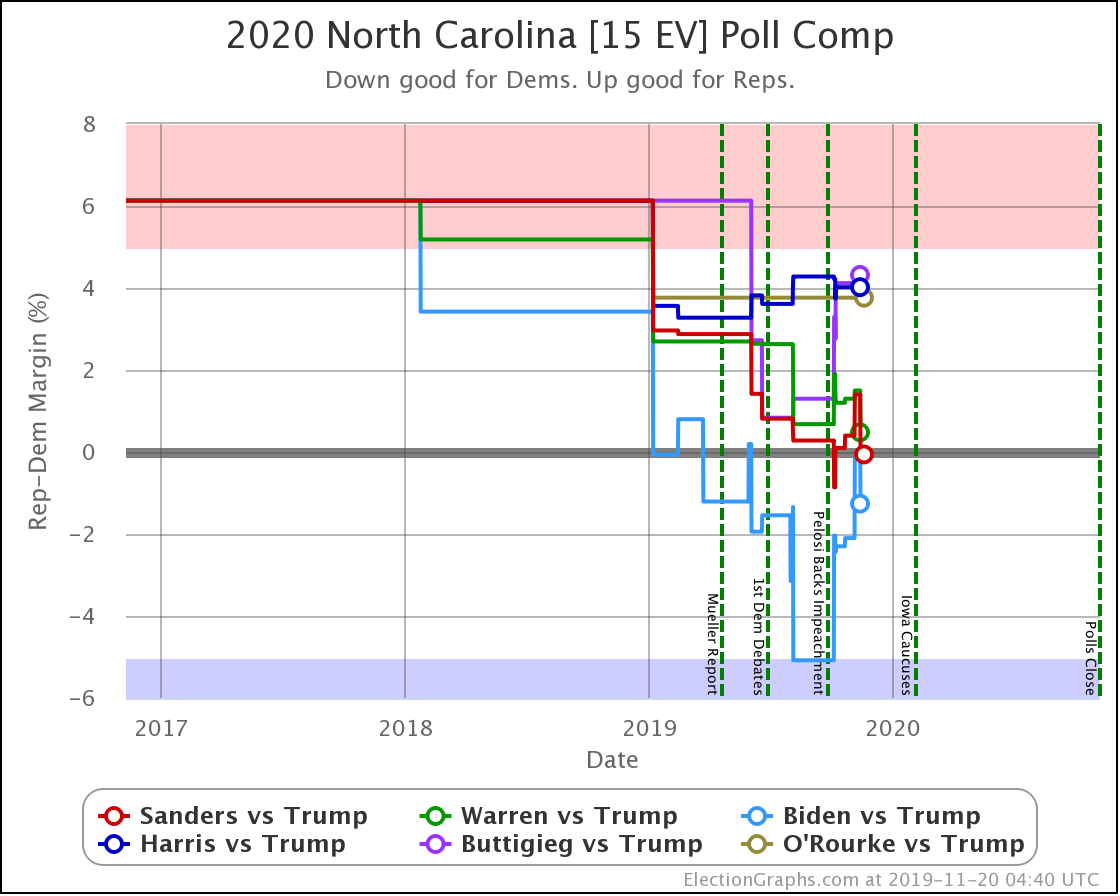
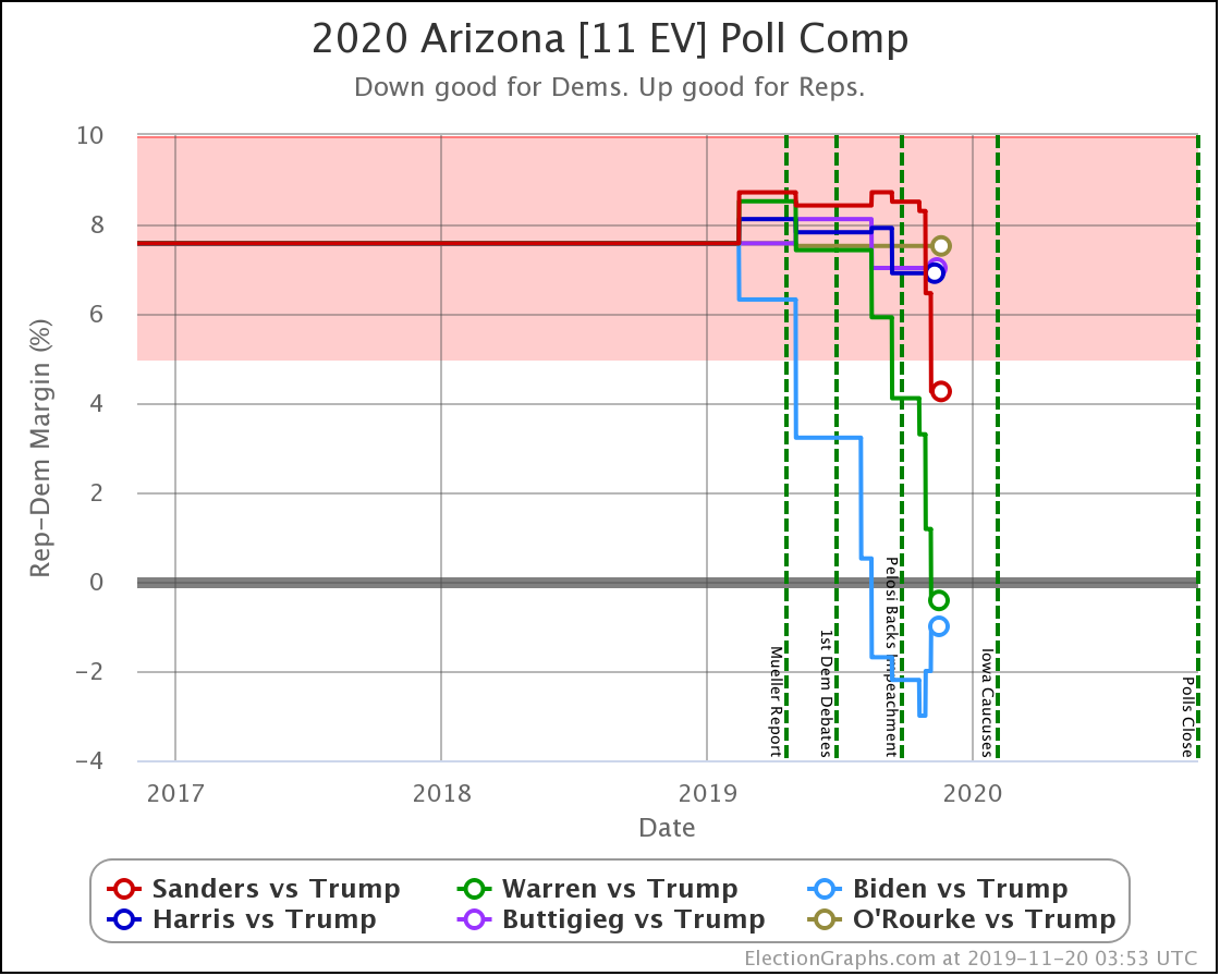
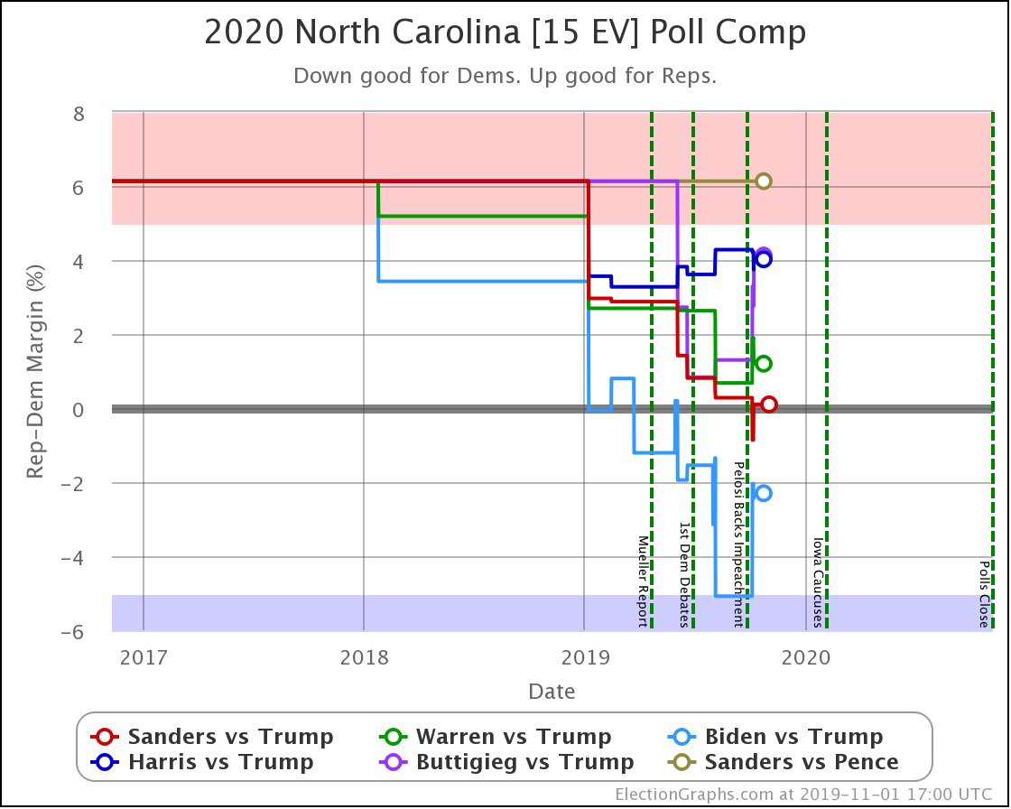
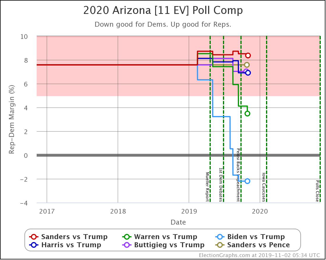
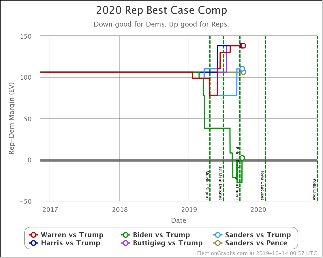
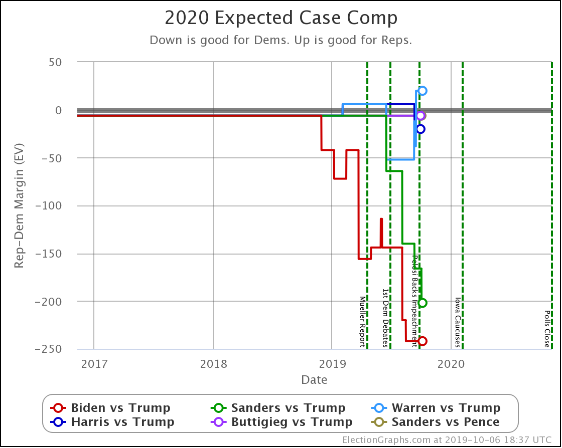
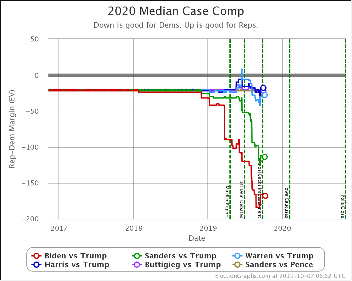
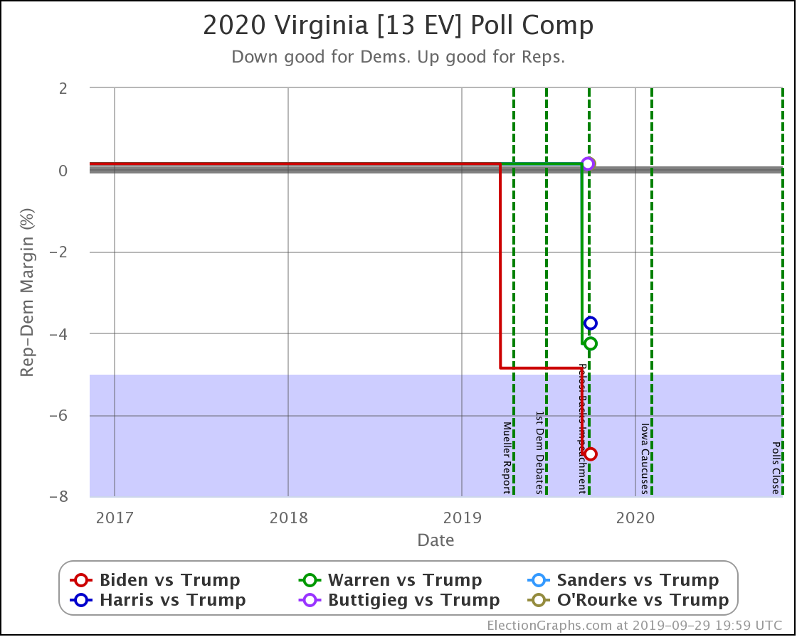
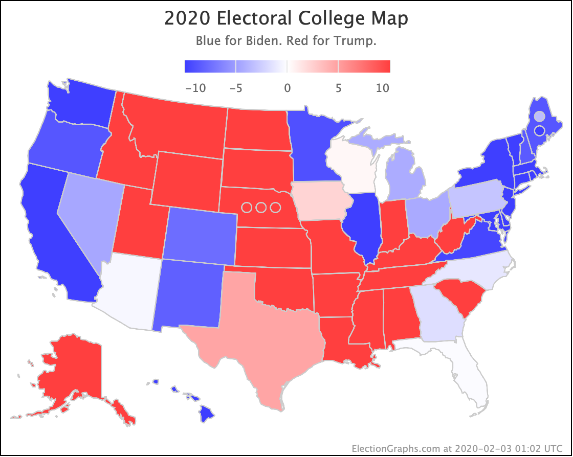
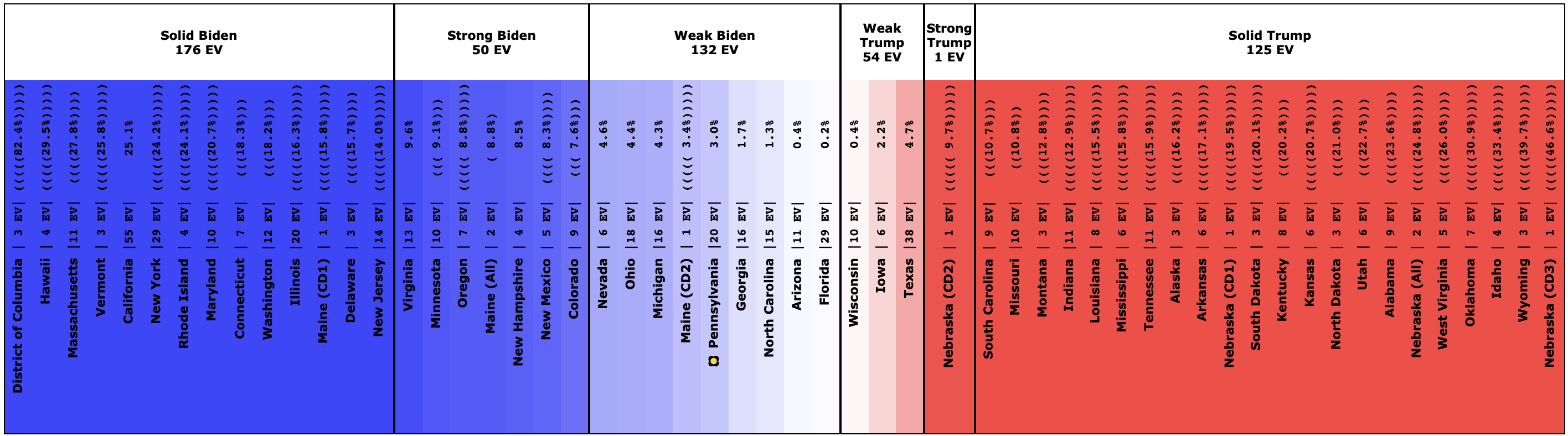
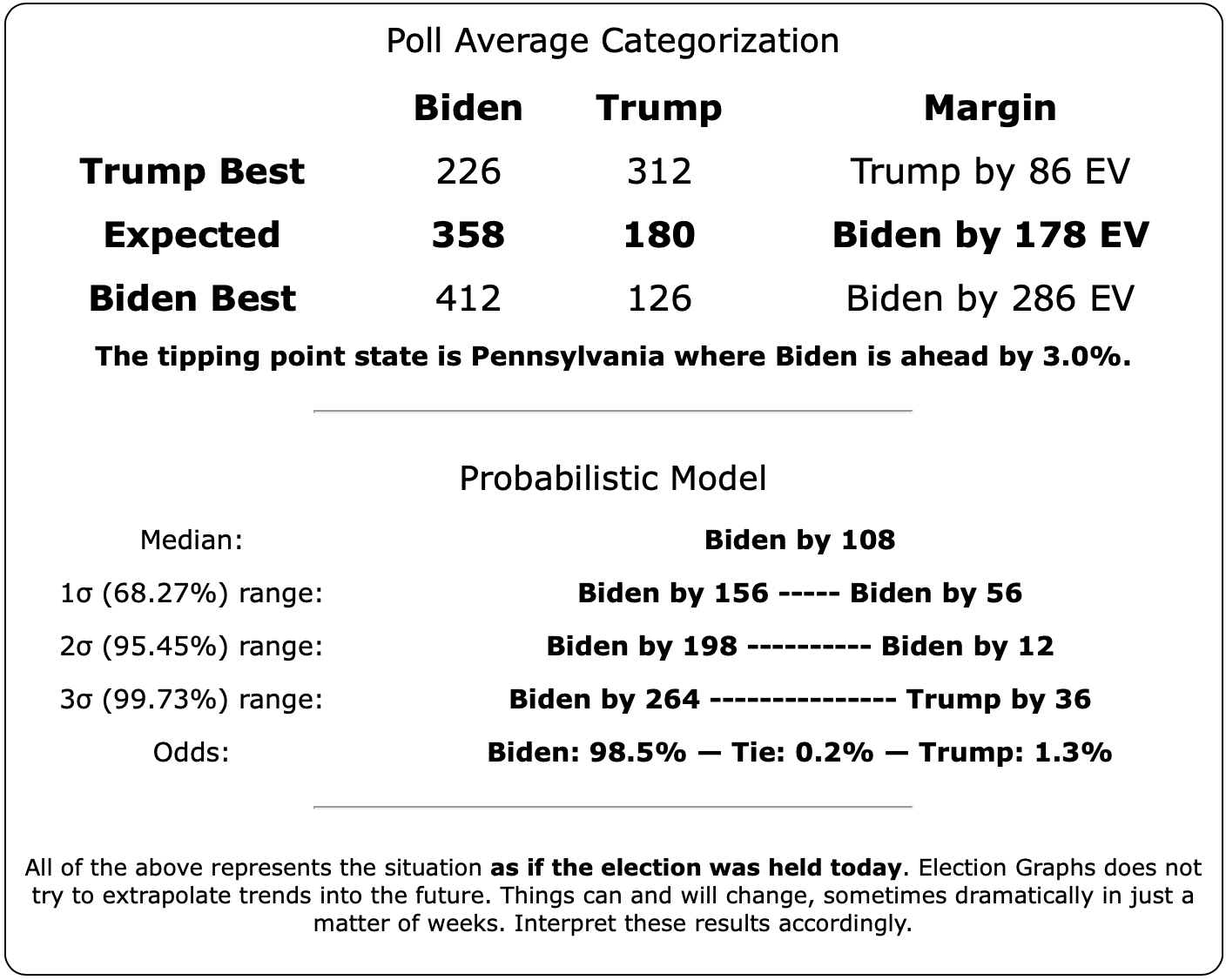
If Biden won every state where he leads in the Election Graphs poll average (even by a little bit), then compared to Clinton in 2016, he picks up Florida (29 EV), Pennsylvania (20 EV), Ohio (18 EV), Georgia (16 EV), Michigan (16 EV), North Carolina (15 EV), Arizona (11 EV), and Maine-CD2 (1 EV) while not losing any states that Clinton won.
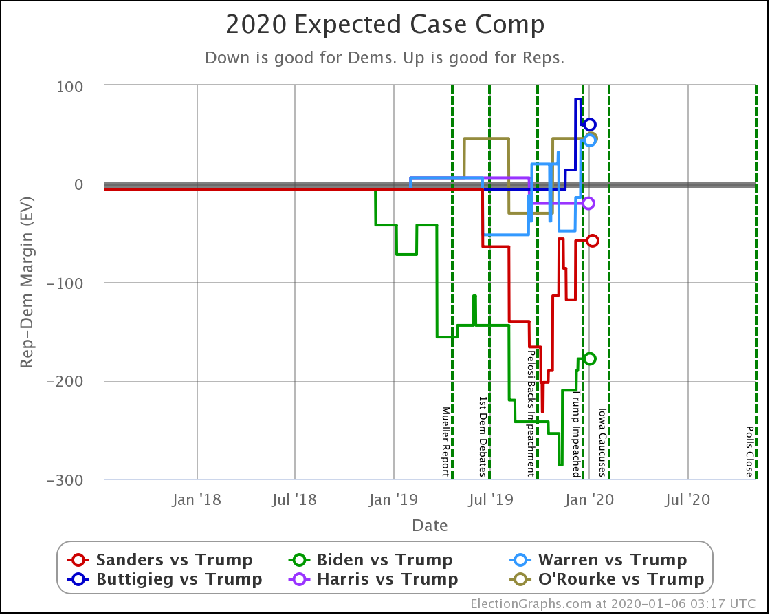
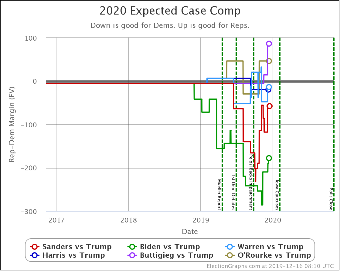
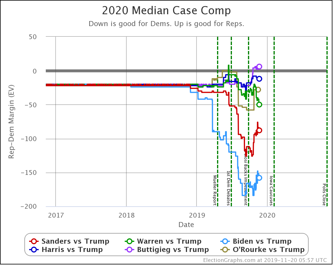
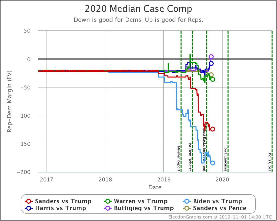
Clinton's final earned result was a 74 electoral vote loss (it was a 77 electoral vote loss after the faithless electors did their thing). If Biden were indeed to win every state he leads right now, he would have a 178 electoral vote victory.
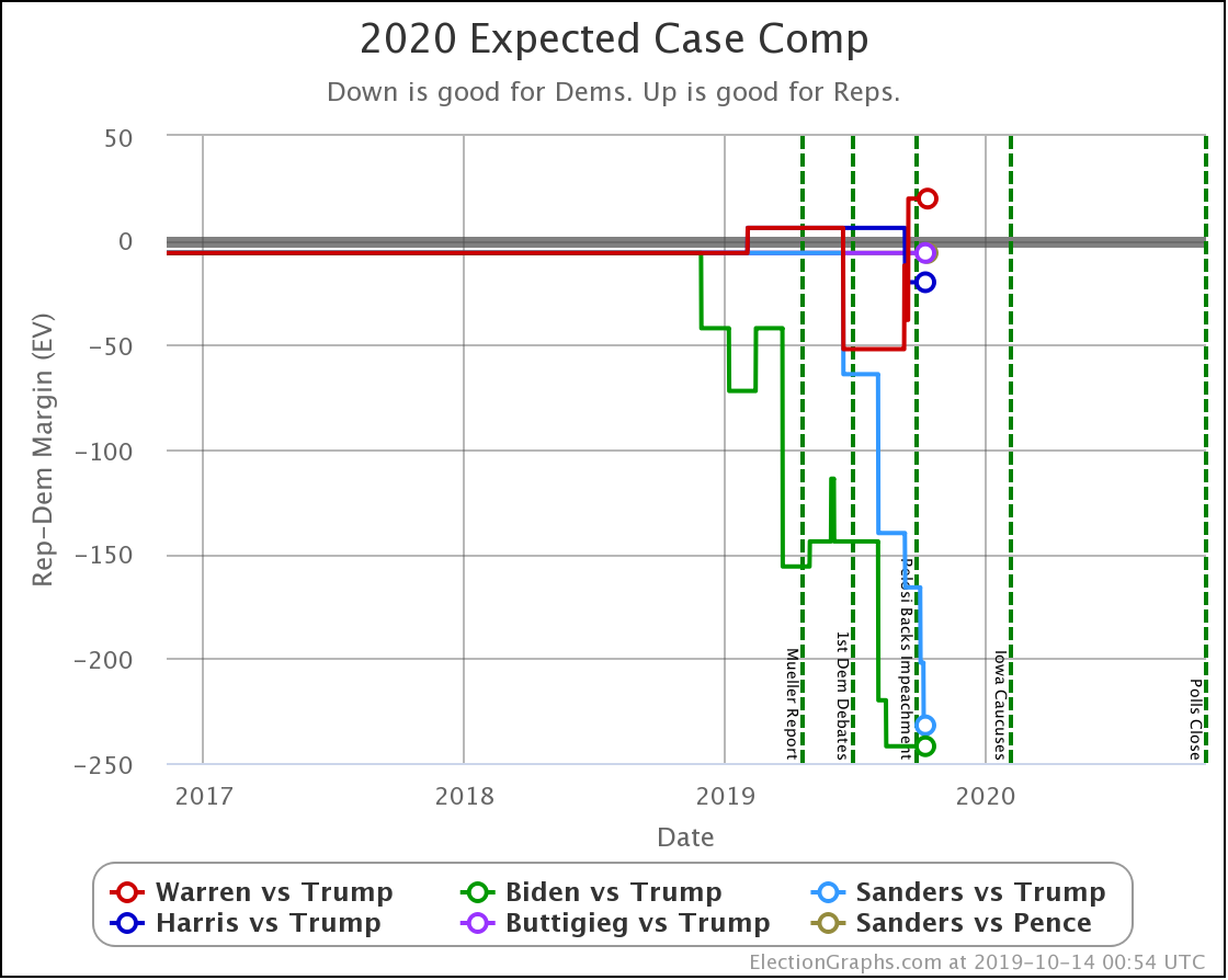
Now, it is unlikely that Biden would actually win EVERY state where he leads in the poll average, even if the election was indeed today. Many of the states listed above show Biden just barely ahead. So if you look at the probabilistic model, which takes into account the chances of all the close states flipping one way or another, you end up with a median case of only a 108 electoral vote victory for Biden. This is much less than the 178 you get with the more naive view, but still pretty substantial.
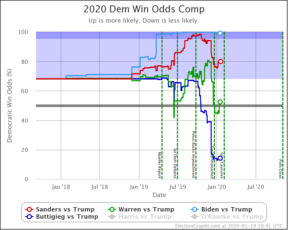
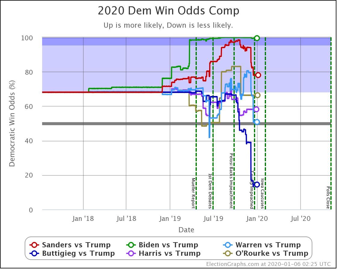
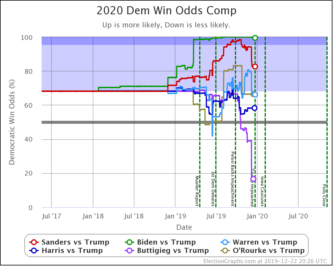
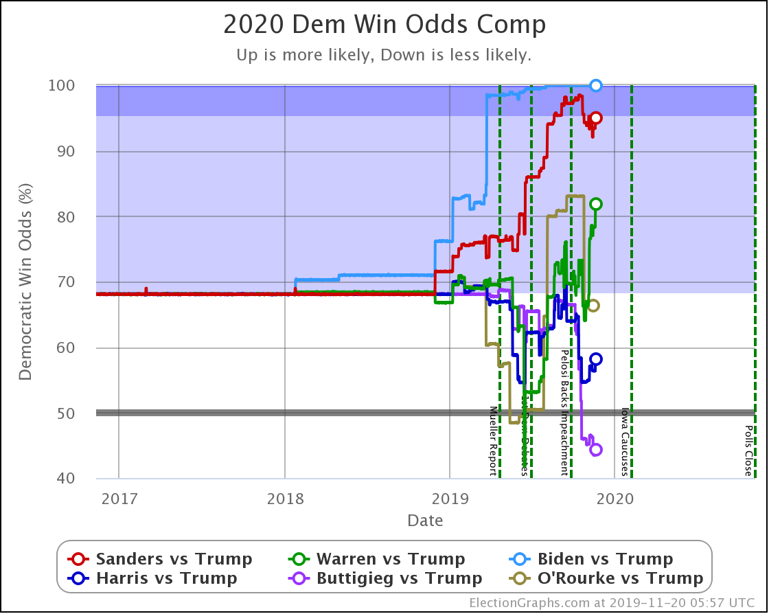
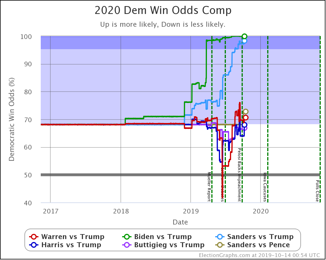
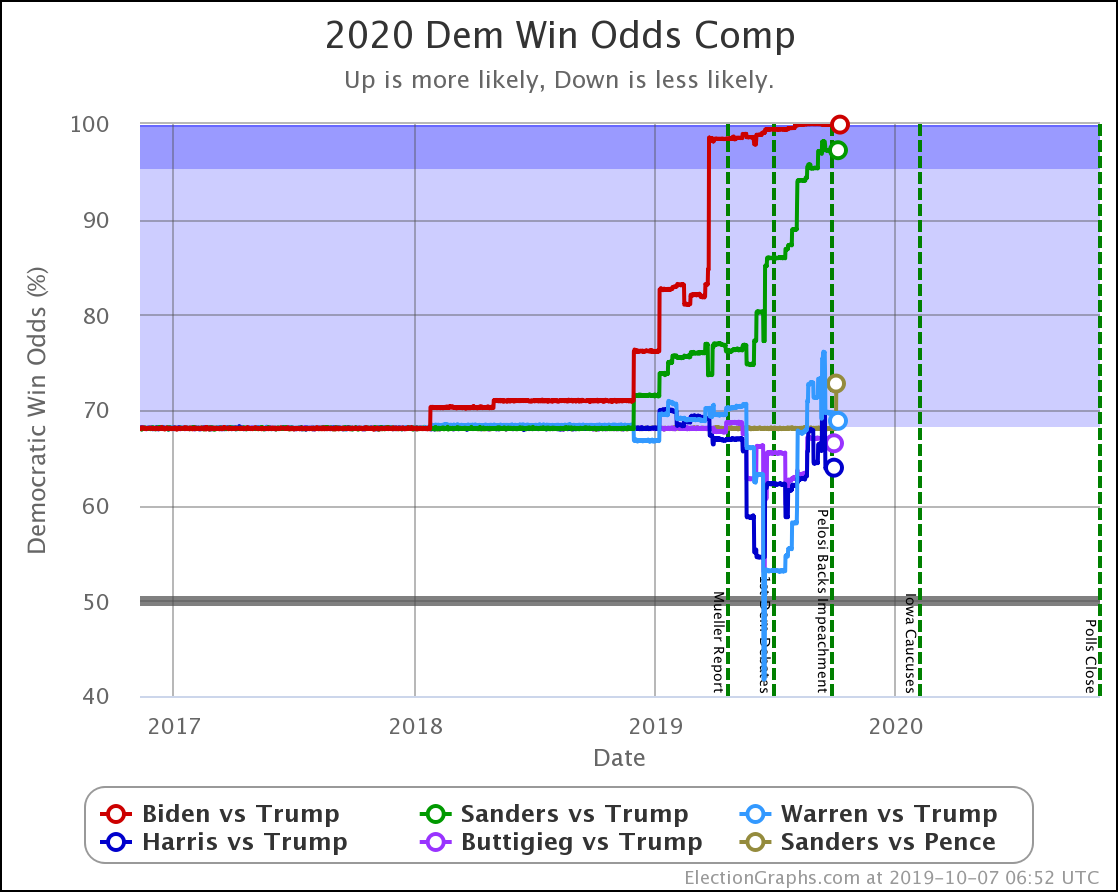
In terms of odds of winning based on the past accuracy of Election Graphs averages going into election night, Biden is at a 98.5% chance of winning the electoral college.
Keep in mind though, on this exact date four years ago, Election Graphs showed Clinton with an 80 electoral vote lead if she won all the states where she was ahead in the polls. Later in the year that rose to 188 electoral votes, then it collapsed to only an 8 electoral vote lead on election eve, followed by her 74 (or 77 counting faithless electors) electoral vote loss in reality. So again, never forget that things can and do change, sometimes very rapidly. Most of Clinton's collapse happened in the last few weeks before the election.
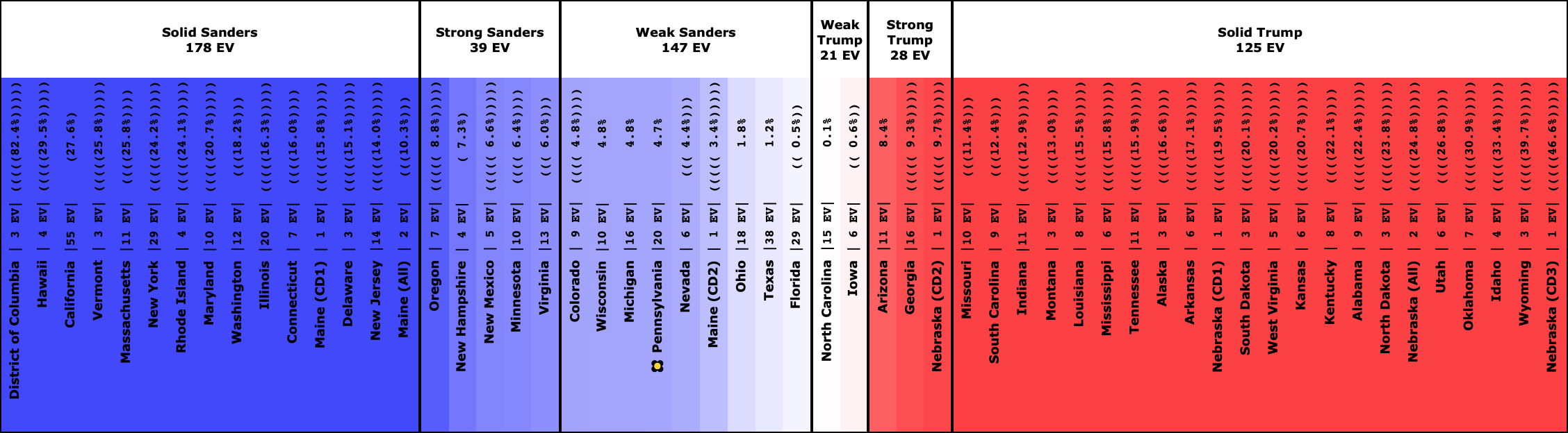
Sanders vs. Trump
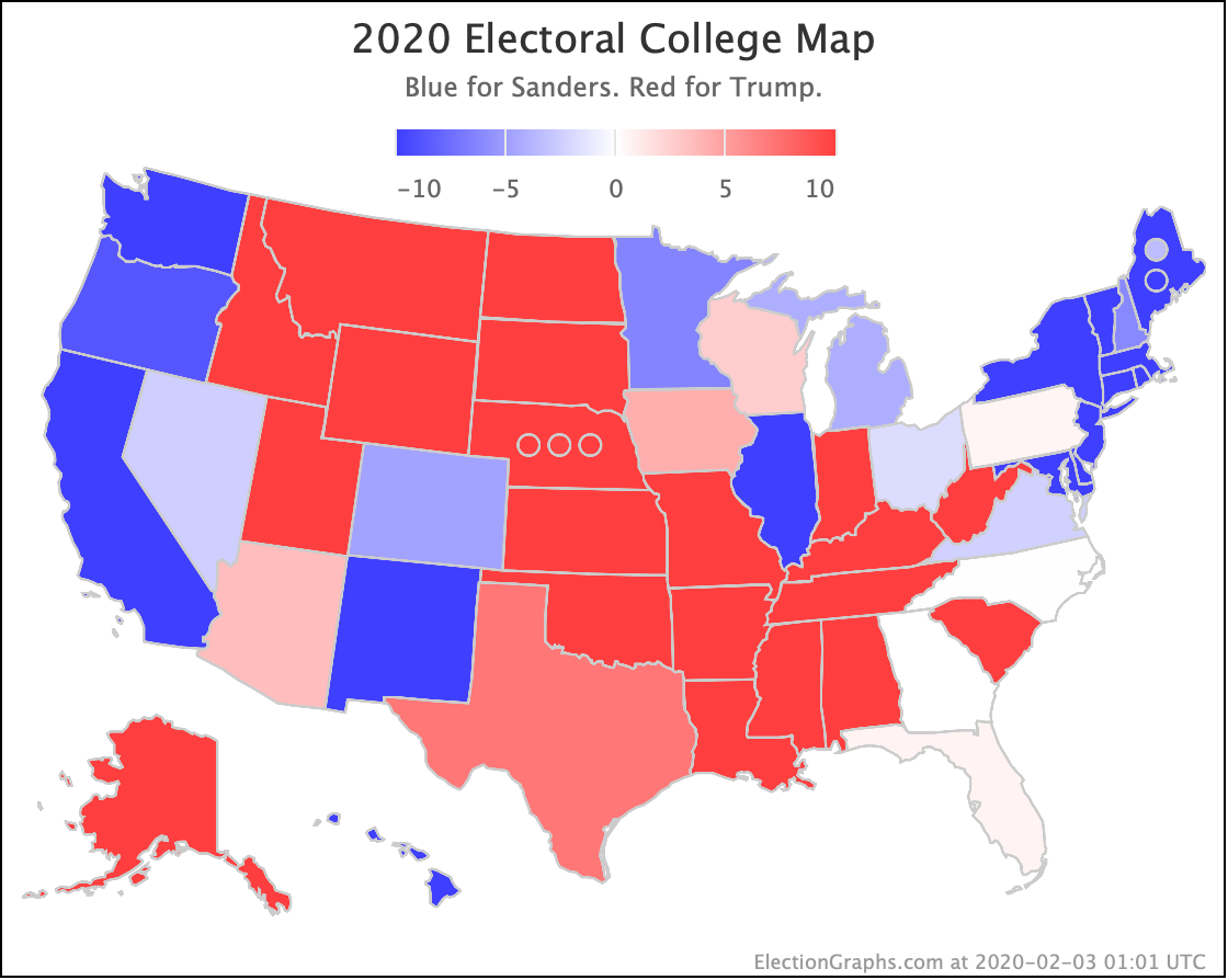
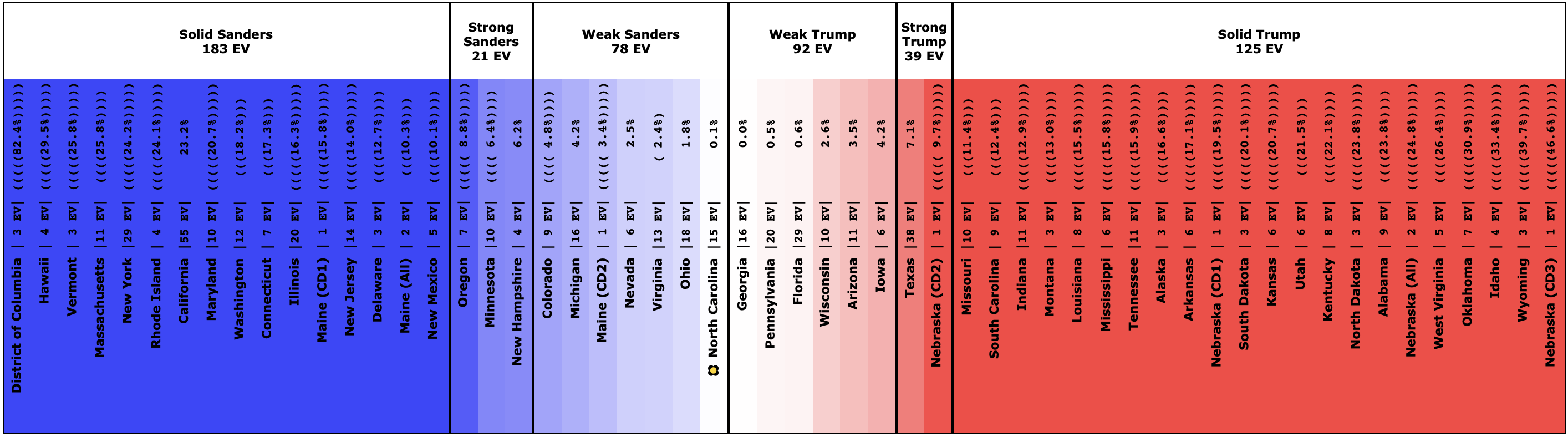

Compared to Biden vs. Trump, Sanders loses Florida (29 EV), Pennsylvania (20 EV), Georgia (16 EV), and Arizona (11 EV).
Now, all of those states are still close. But they flip to the other side of the line, and Sanders doesn't pull anything in the other direction to compensate.
This leaves Sanders only ahead by 26 electoral votes when you just count up the states in which he is ahead.
Unlike Biden, the probabilistic model helps Sanders. In the Biden case, there were several big "just barely blue" states. With Sanders, there are several big "just barely red" states. So the median in the probabilistic model is actually a 36 electoral vote win.
The odds of a Sanders win come in at 75.3%.
So Sanders would still be a favorite to win over Trump but is significantly weaker against him than Biden.
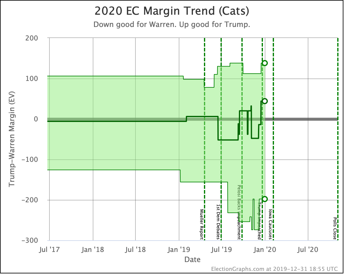
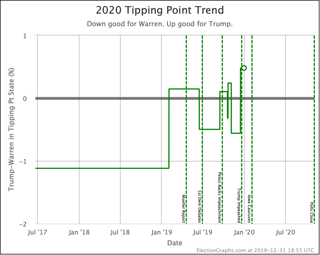
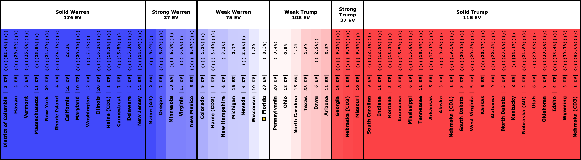
Warren vs. Trump
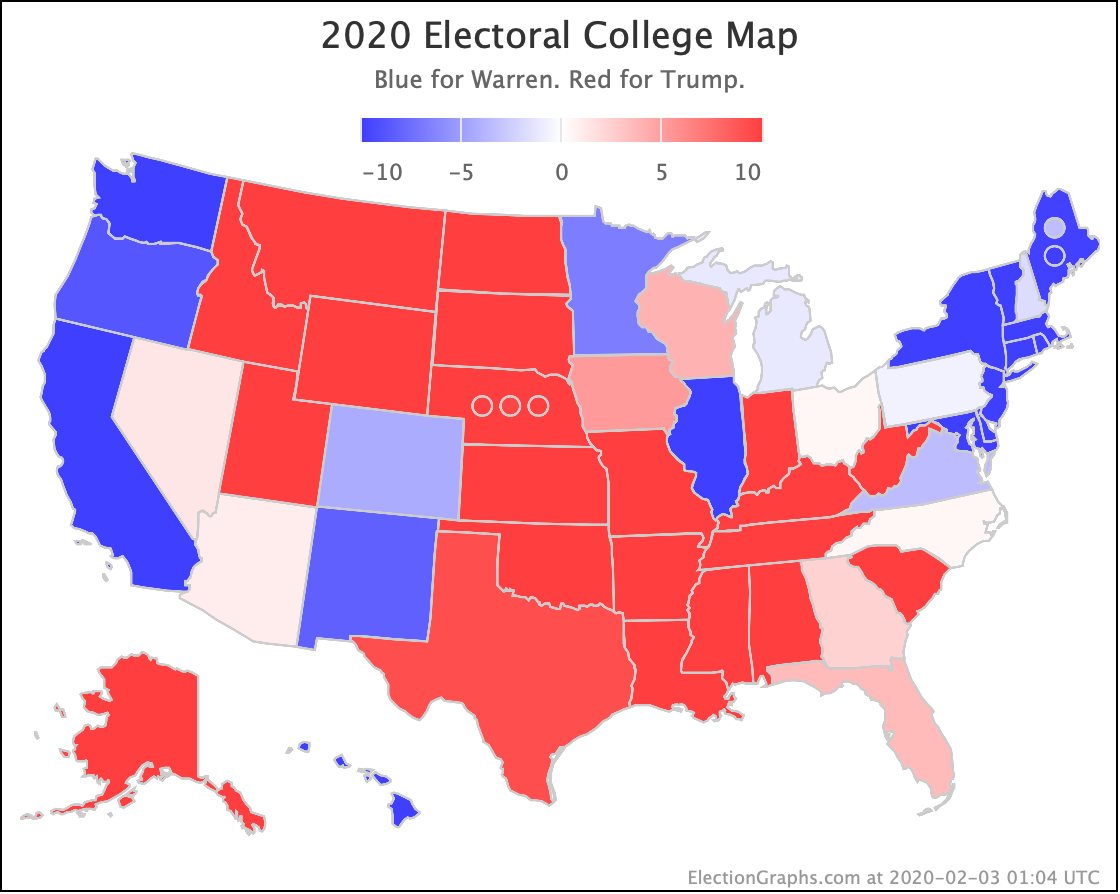
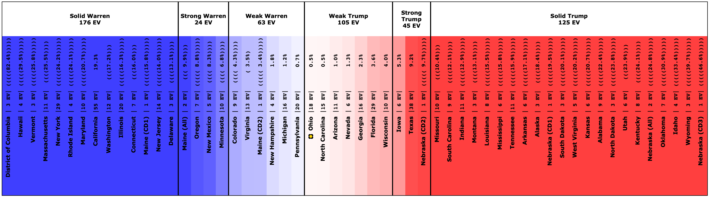
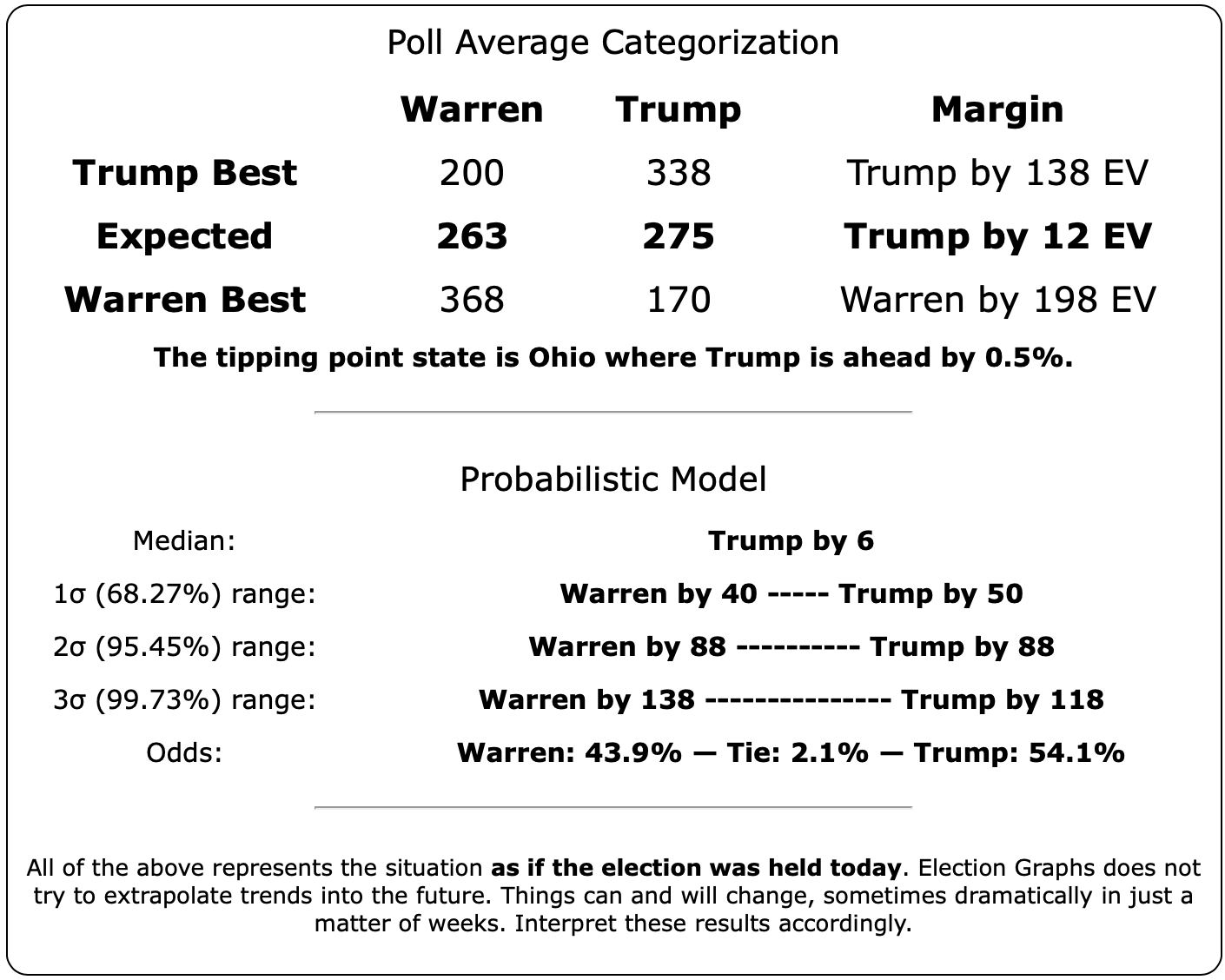
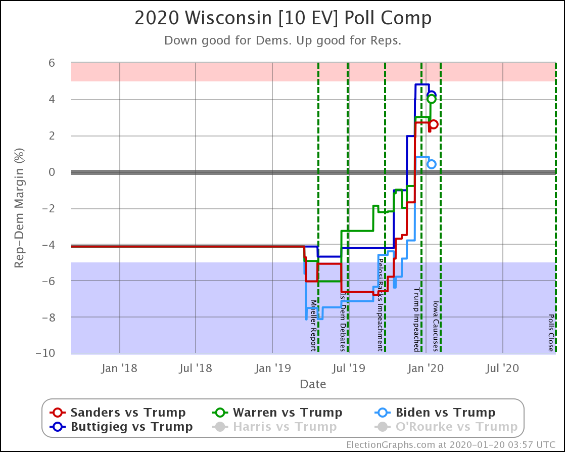
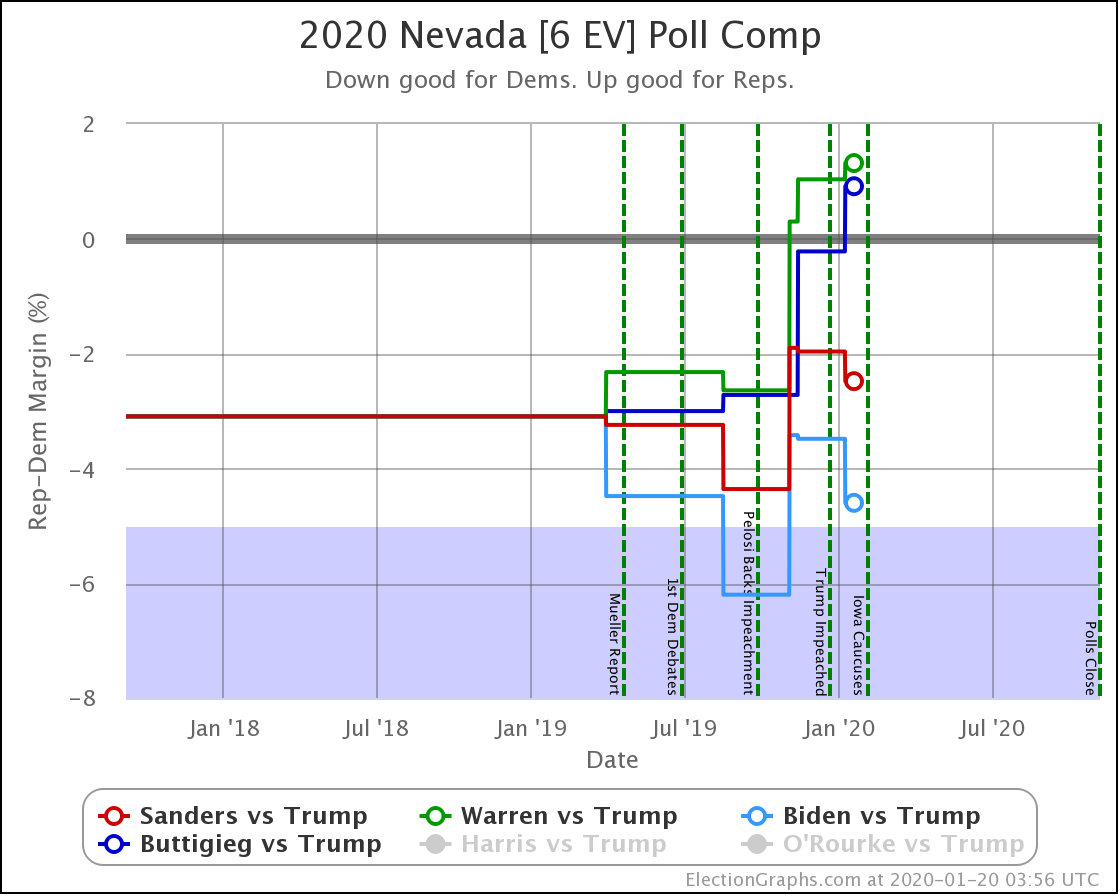
This time starting with Sanders vs. Biden, in comparison Warren loses Ohio (18 EV), North Carolina (15 EV), and Nevada (6 EV), but gains back Pennsylvania (20 EV) in exchange. That is a net loss of 19 electoral votes compared to Sanders.
But that 19 electoral vote change puts Warren on the other side of the win line. If both Trump and Warren won exactly the states where they lead the Election Graphs averages, you end up with a 12 electoral vote Trump win.
The probabilistic model helps Warren a little bit, but not enough. When you take into account how the close states might behave, you end up with the median case being only a 6 electoral vote win for Trump.
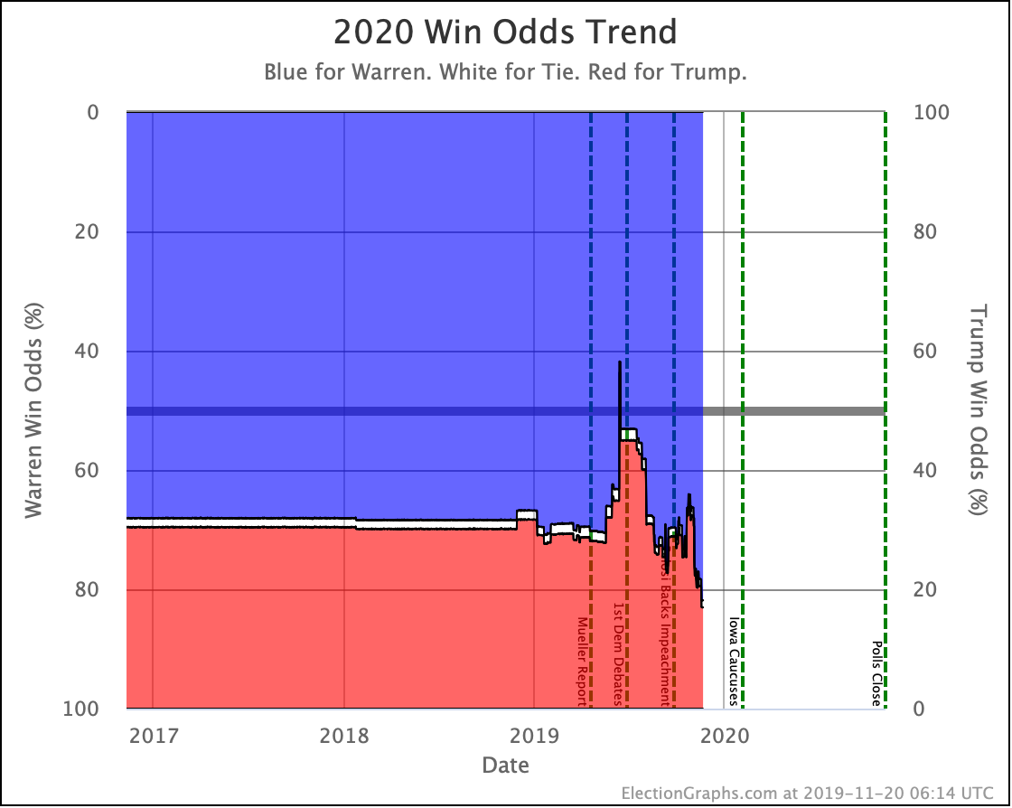
With things this close, and a slight Trump lead, we're currently showing Warren with a 43.9% chance of winning the electoral college.
This combination is so close that we're currently showing a 2.1% chance of an actual 269-269 tie for Warren vs. Trump, a scenario that would throw the election into the House of Representatives.
43.9% is not zero. Warren could win. But she would be an underdog. You'd be better off with a coin flip at the moment.
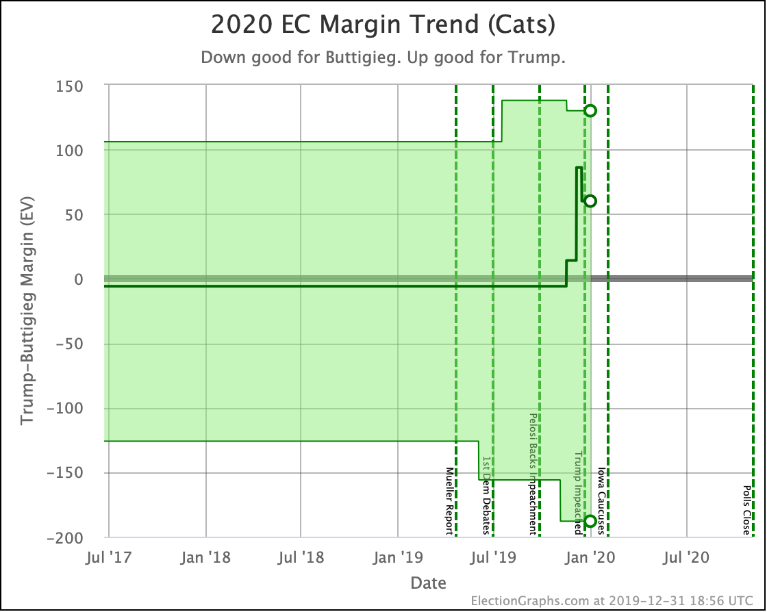
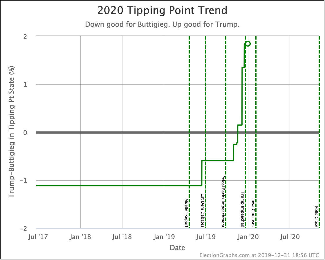
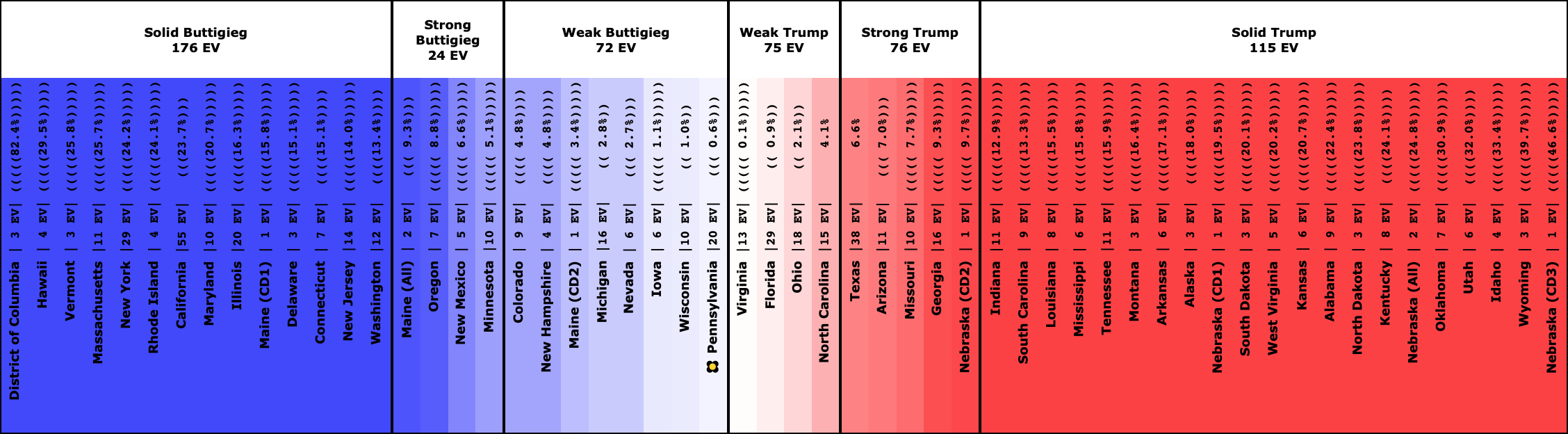
Buttigieg vs. Trump
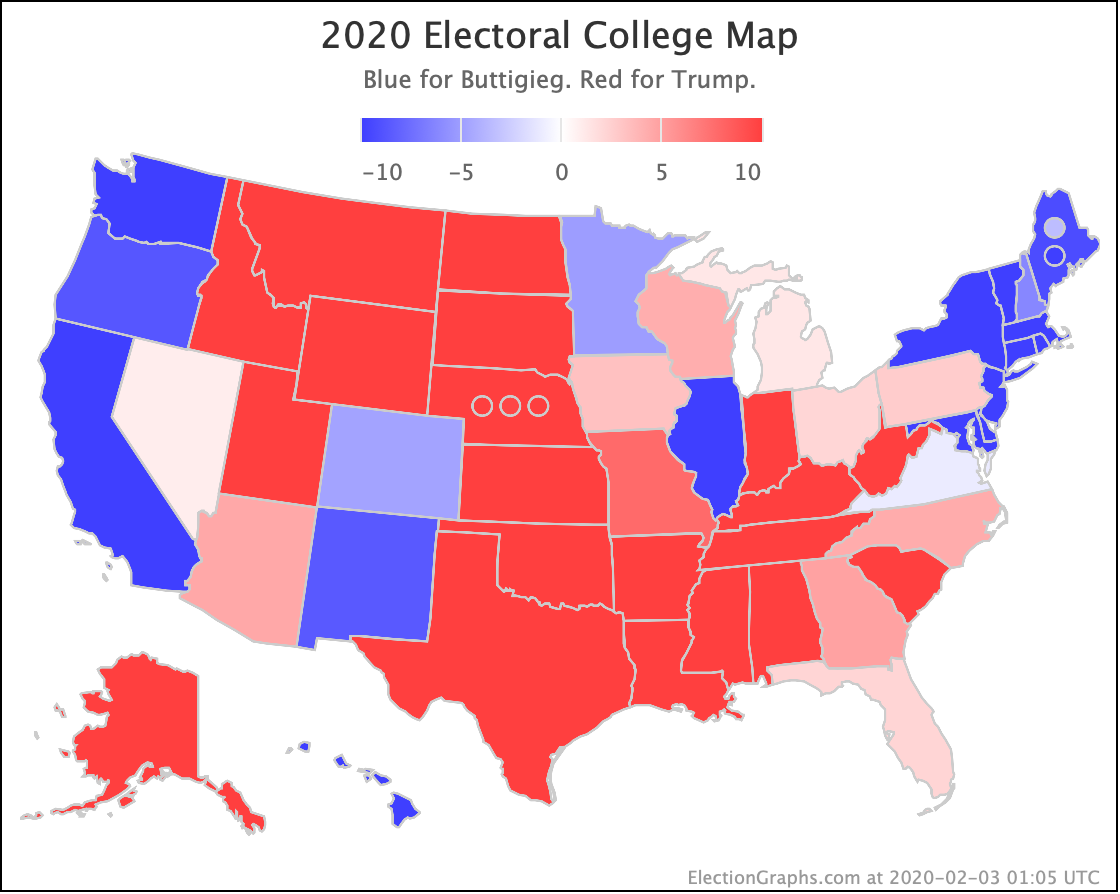
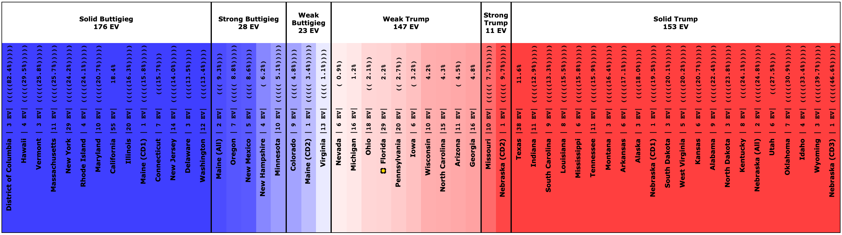
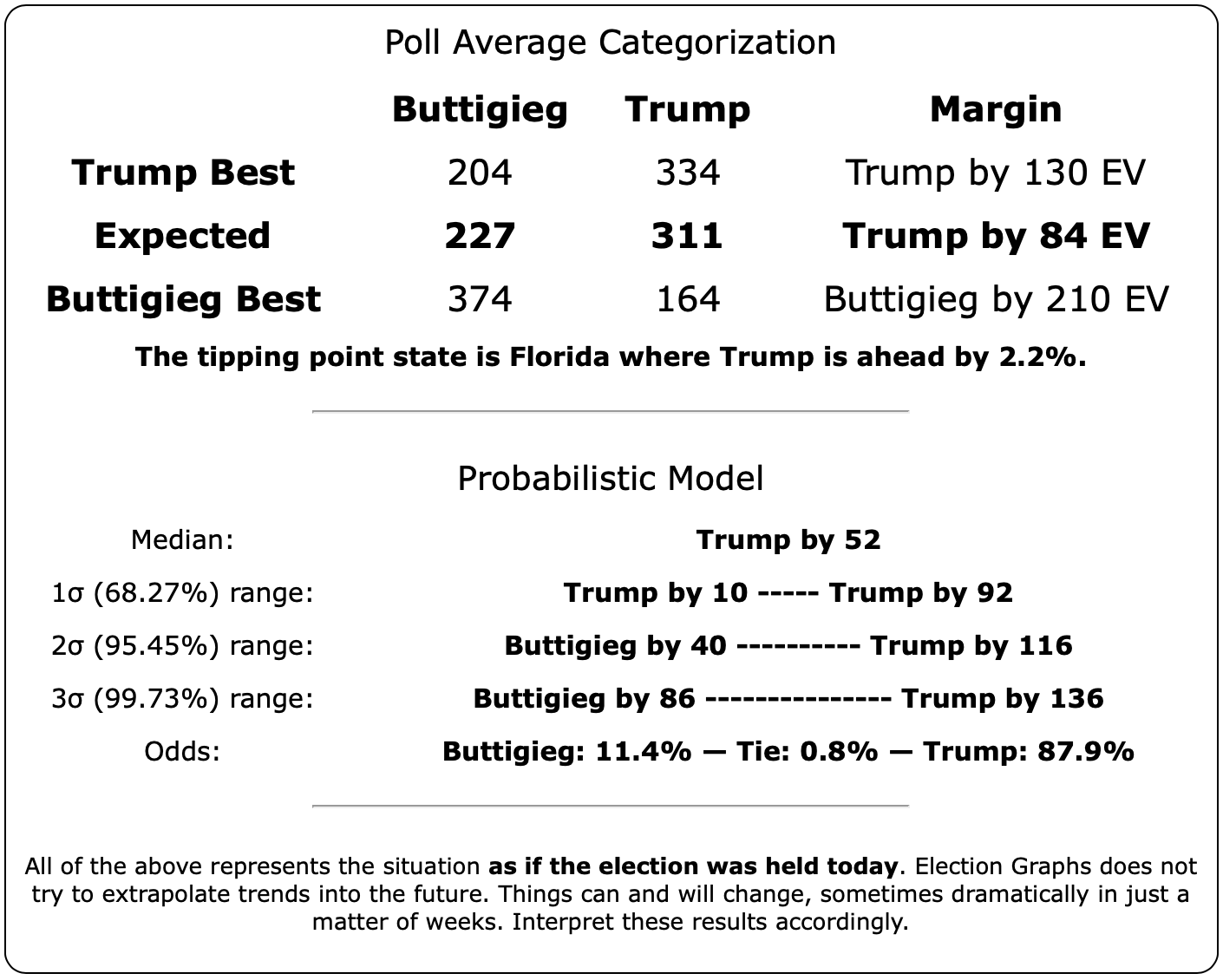
This time starting with Warren vs. Trump, Buttigieg loses Pennsylvania (20 EV) again, as well as Michigan (16 EV). Adding all this up, you have Buttigieg losing to Trump by 84 electoral votes.
The probabilistic model helps slightly, with the median case being only a 52 electoral vote loss. But the odds of winning outright are a dismal 11.4%.
It would not be impossible for Buttigieg to win with these odds, but it would be a bigger upset than Trump's win in 2016 when the median of the odds given by sites that gave odds was a 14% chance of a Trump victory.
Now, as mentioned up top, there is a lot of evidence that even at this late date, part of why someone like Buttigieg is doing so badly is simply that a lot of people still don't know who he is. And presumably, that would change if he was nominated.
But counting on that seems like a big gamble.
How about Bloomberg, Yang, Klobuchar, and the rest?
Yes, Election Graphs does have data for these folks. And more. You can go to the main 2020 Electoral College page and select any of these Democrats and see the data. You can even see combinations with non-Trump Republicans. If there has been a state-level poll including a candidate, they are listed.
But frankly, of the currently active candidates, the four big ones (Biden, Sanders, Warren, and Buttigieg) are the only ones that have enough state-level data to say anything meaningful. Harris was there too. But she dropped out. O'Rourke had a bit less, but still, maybe you could say something. He's out too.
But these others just plain still don't have enough state-level polling. Even though it has been quite some time since Harris and O'Rourke dropped out, we still have better data about them than any of these others.
Of the rest of the active Democrats, Klobuchar vs. Trump has the next best volume of polling, followed by Bloomberg vs. Trump. Look if you want to. The links are right there. But take anything with you see with a huge grain of salt. There has been so little polling, in so few states, that you will not be looking at a reliable picture of anything.
Presumably, if any of these candidates start to look like serious contenders, we'll get a bunch of new polling including them, and that will change. But as of now, state-level polling on these combinations just doesn't have the volume to be meaningful.
The Choice for Democrats
There are many many reasons Democrats may have for picking one candidate over another in the primary process. Policy preferences and character being two of the biggest.
But for those whose biggest deciding factor is simply who is best positioned to beat Trump, the numbers above are pretty clear cut. It is Biden. By a wide margin.
Sanders is next, but it is a bit more of a gamble. Then Warren is slightly worse than a coin toss. Finally, Buttigieg is just a long shot, much more likely to lose than to win.
Now, again, this is all based on current state-level polling. Things will change.
Perhaps if Buttigieg runs the gauntlet and somehow ends up the Democratic nominee this will be accompanied by a huge rise in the polls against Trump. Maybe the Democrats would rally with excitement around a Warren nominee and you would see that big improvement against Trump there too. Maybe something else will happen that will cause Trump to plummet in the polls against all the Democrats.
Or in the other direction, perhaps Biden will completely collapse, and his advantage against Trump will disappear.
Any of the above could happen.
There is a strain of thought that says that because of this kind of uncertainty, the ultimate comparative electability of these candidates against Trump is fundamentally unknowable, and therefore this kind of examination should be ignored.
It is true that head-to-head state-level polls, or corresponding national level polls for that matter, can only tell you where things stand NOW. They are not a crystal ball into the future. But there is still a substantial amount of data there.
It probably isn't wise for anybody to make their primary choices ONLY on this kind of information. It must be balanced against the other factors that lead people to like or dislike particular candidates.
But based on where things are now, there are clear differences in how these four candidates fare against Trump, and it seems to me that it would be folly to ignore that information.
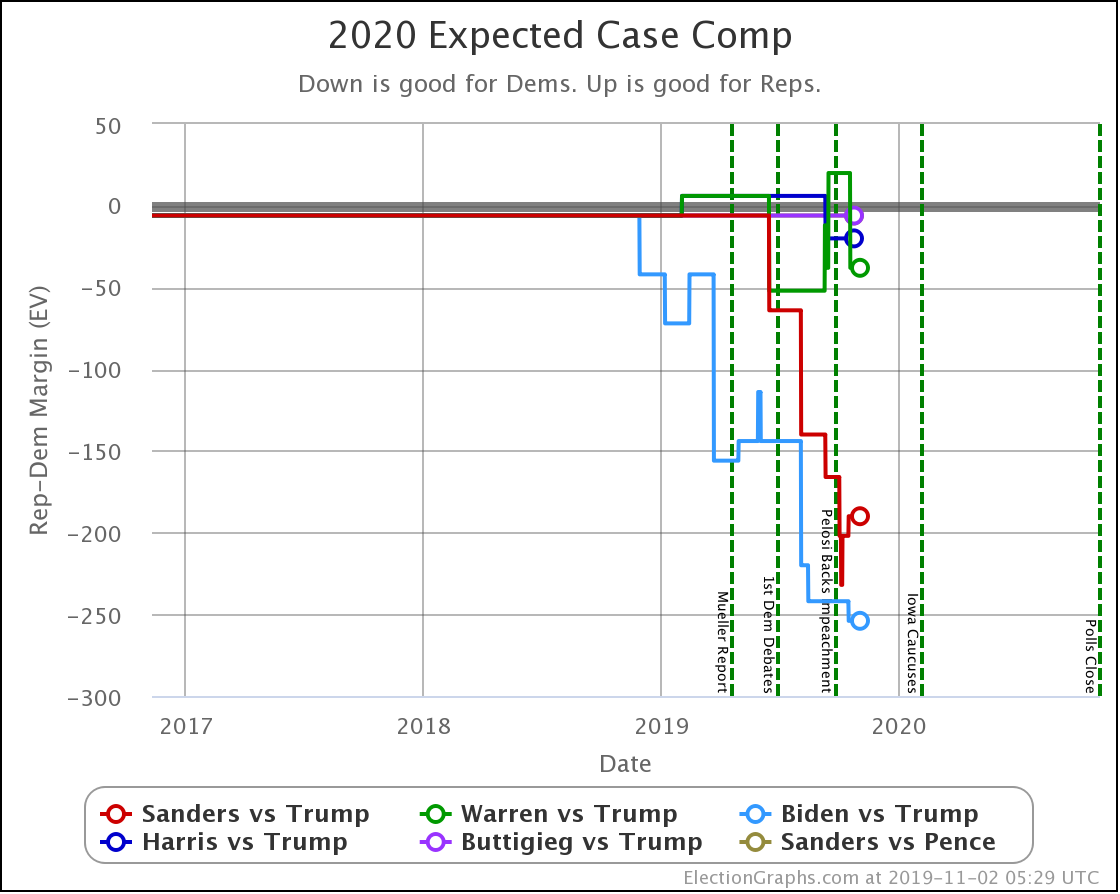
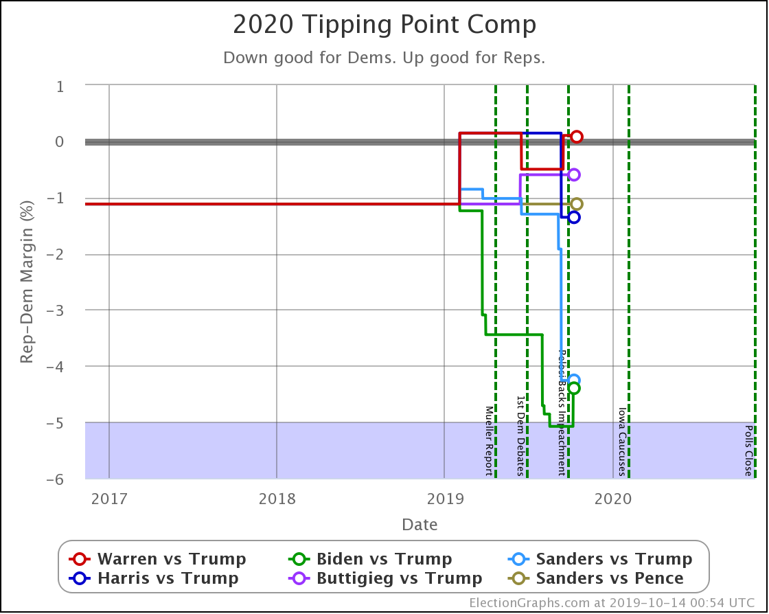
Since the Last Update
OK, that's it for the snapshot in time examination of the Democrats on the verge of the Iowa Caucuses. Now time for the standard look at how things have evolved since my last Election Graphs blog post.
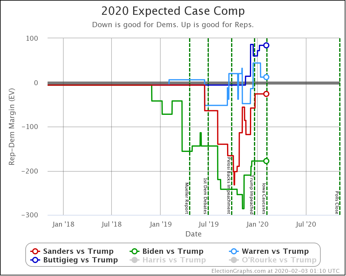
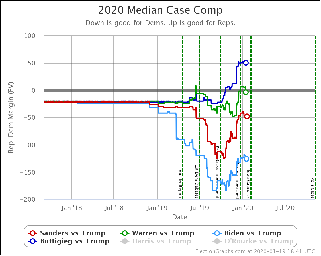
| Dem | 19 Jan | 3 Feb | 𝚫 |
| Biden | +178 | +178 | Flat |
| Sanders | +26 | +26 | Flat |
| Warren | -12 | -12 | Flat |
| Buttigieg | -84 | -84 | Flat |
So, in the straight-up, what happens if everybody wins all the states they lead, there were no changes this time around.
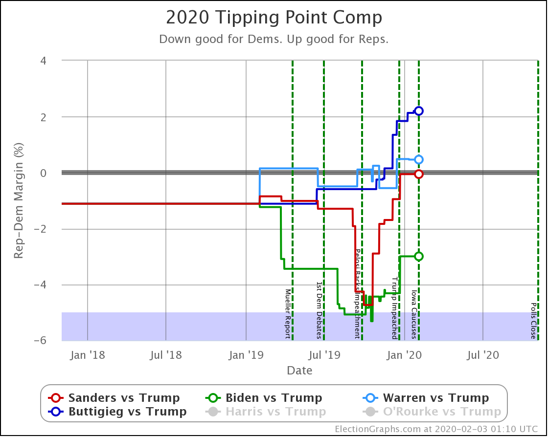
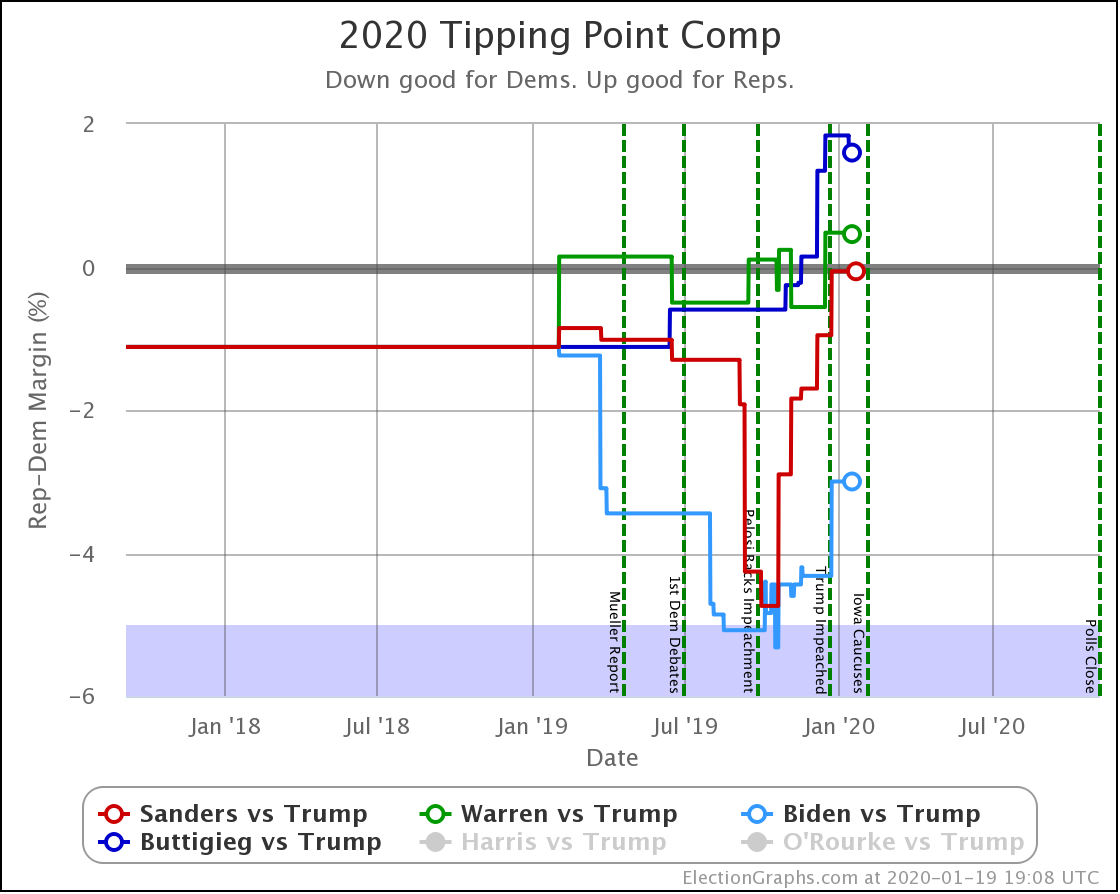
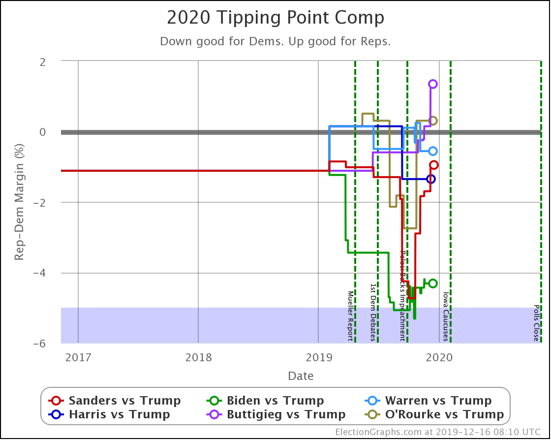
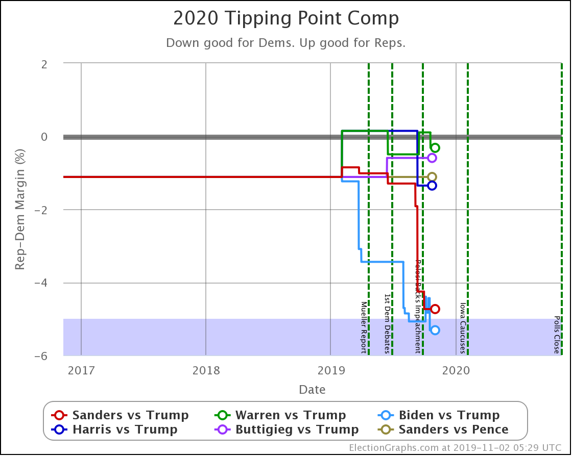
| Dem | 19 Jan | 3 Feb | 𝚫 |
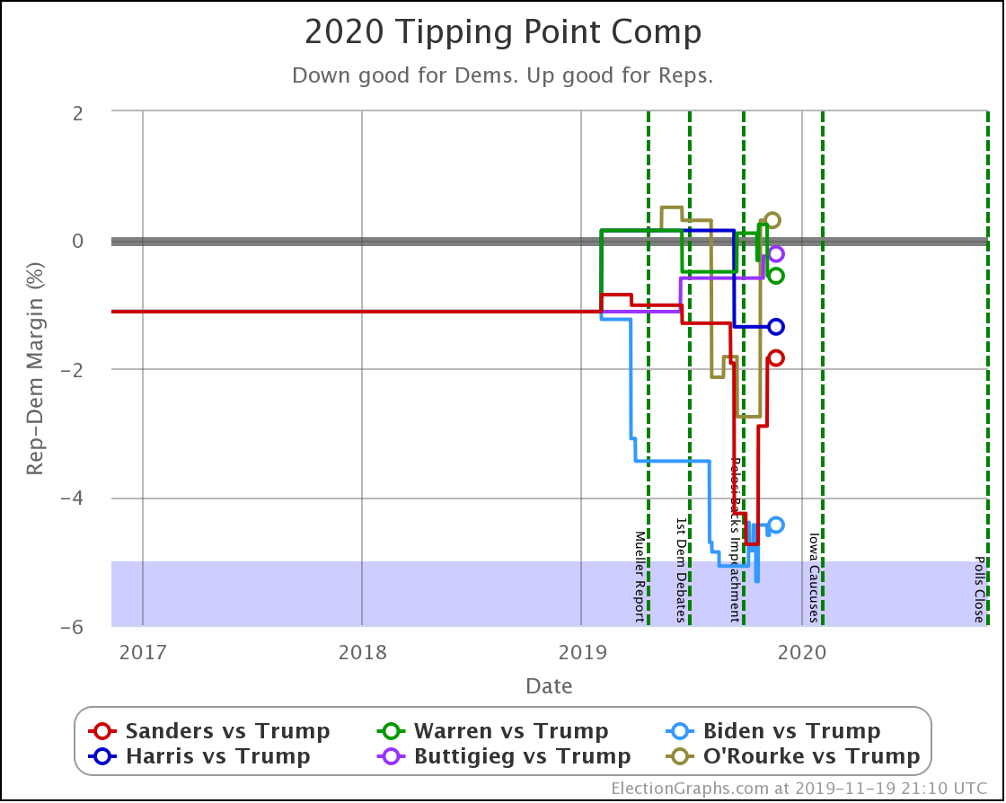
| Biden | +3.0% | +3.0% | Flat |
| Sanders | +0.1% | +0.1% | Flat |
| Warren | -0.5% | -0.5% | Flat |
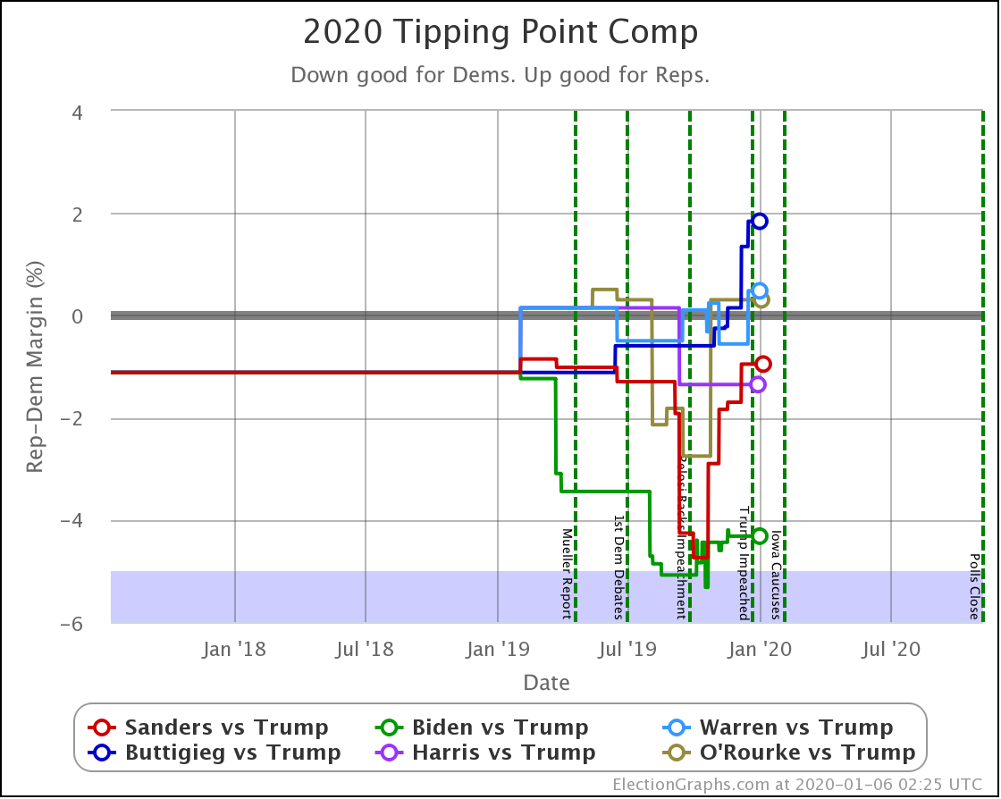
| Buttigieg | -1.6% | -2.2% | -0.6% |
In the tipping-point view, only Buttigieg declined.
Looking at the numbers above, keep in mind that in 2016 the tipping point moved more than 5% in mere weeks on more than one occasion. Things can be very volatile once we get into the final stages of the campaign. A movement of just a couple of percent in the tipping points above would lead to a completely and totally different picture of the race.
Frankly, in the end, ALL of these tipping points show a close race.
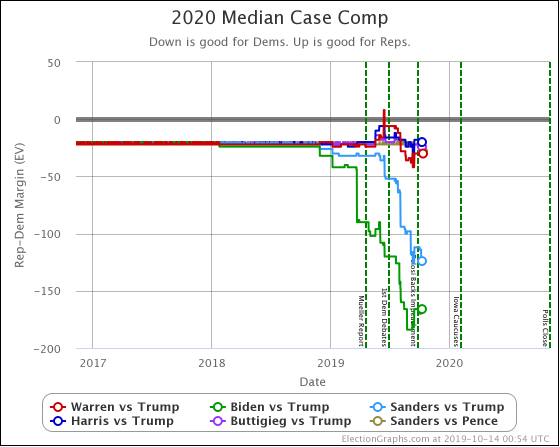
With the categorization view, things have looked more static, and we see changes less frequently, because states have to jump categories or move past the existing tipping point to make a change.
So let's move to the probabilistic view, which is much more sensitive to individual poll changes, regardless of any category changes which may or may not happen.
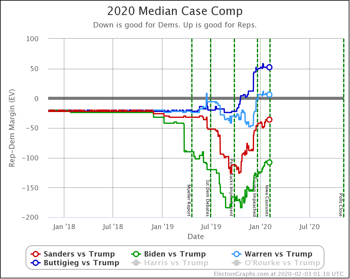
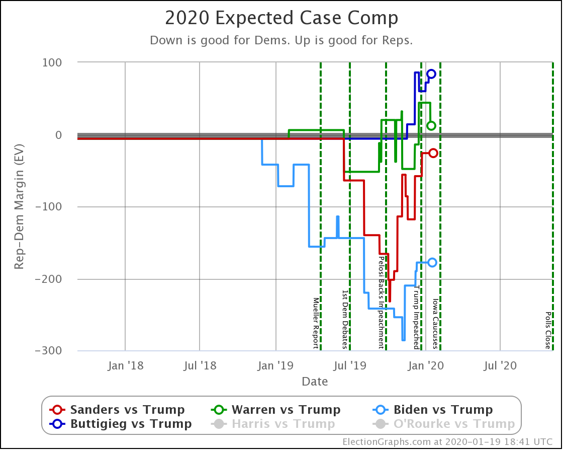
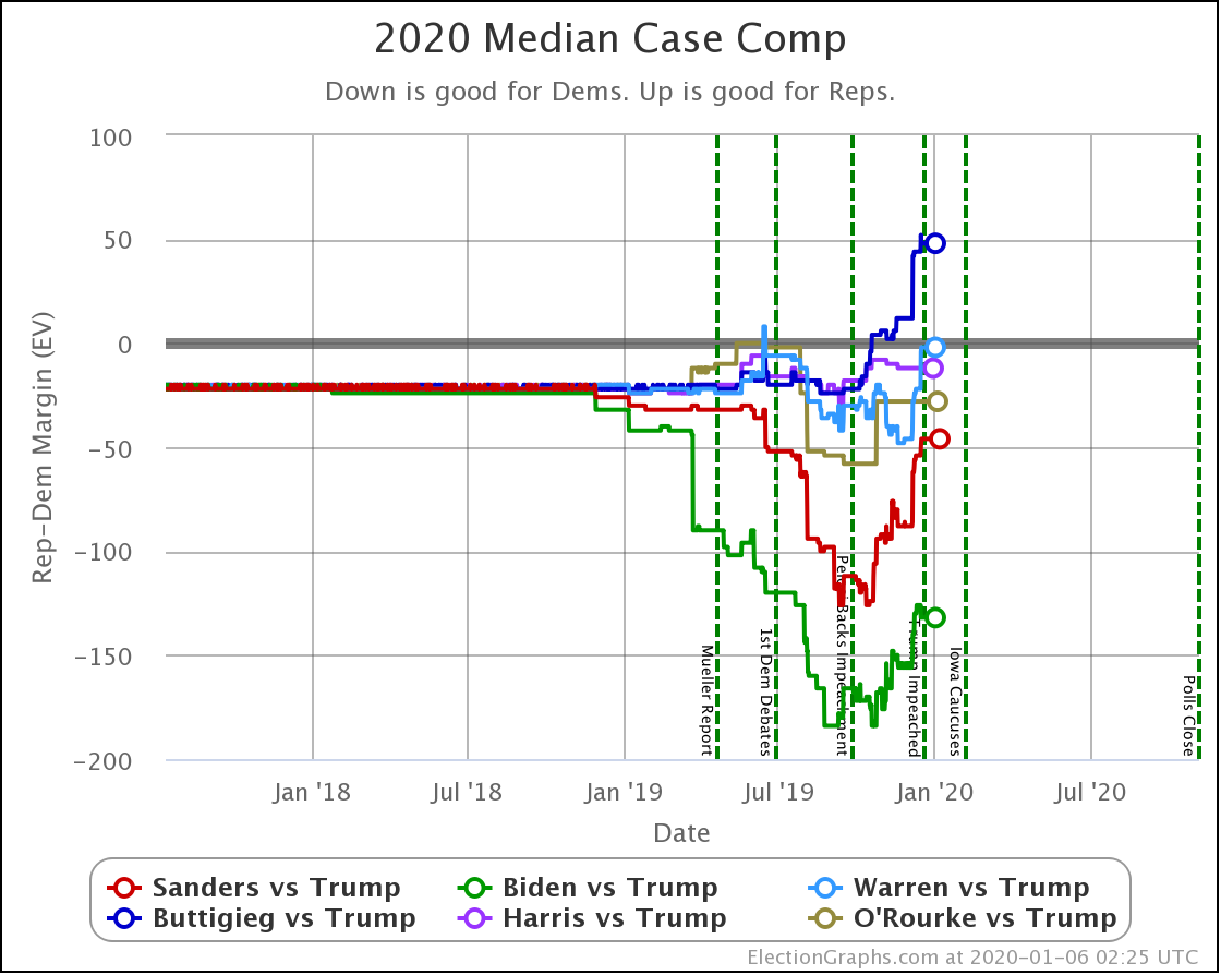
| Dem | 19 Jan | 3 Feb | 𝚫 |
| Biden | +126 | +108 | -18 |
| Sanders | +48 | +36 | -12 |
| Warren | +4 | -6 | -10 |
| Buttigieg | -50 | -52 | -2 |
All four Democrats worsened their positions against Trump in the median case for the Election Graphs probabilistic model. Biden drops the most, while Warren flips to the loss side of the centerline.
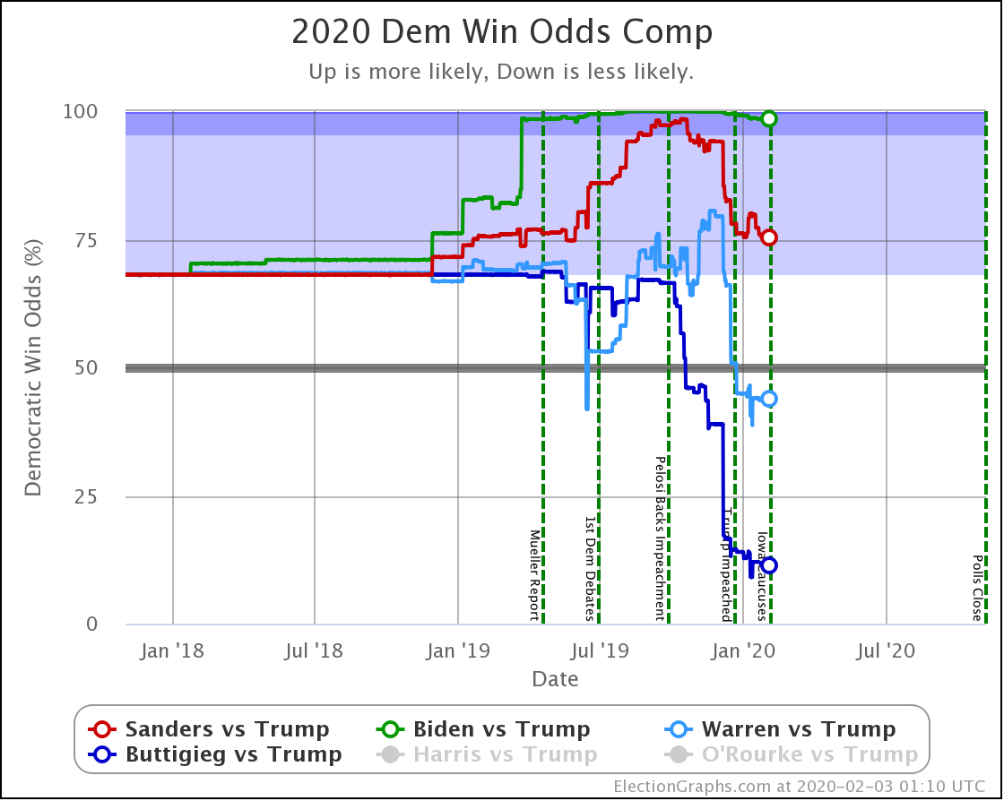
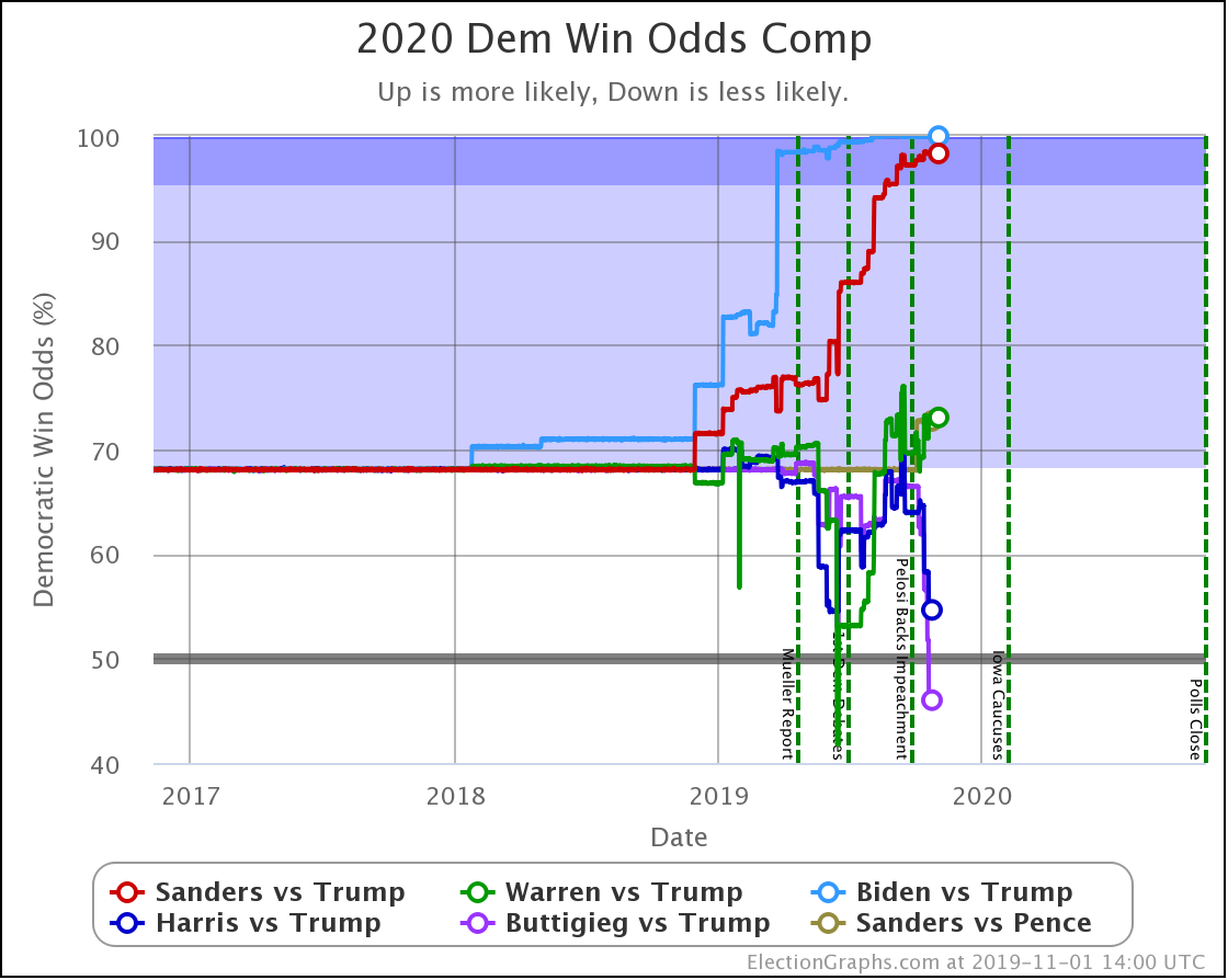
| Dem | 19 Jan | 3 Feb | 𝚫 |
| Biden | 99.2% | 98.5% | -0.7% |
| Sanders | 79.9% | 75.3% | -4.6% |
| Warren | 52.4% | 43.9% | -8.5% |
| Buttigieg | 14.2% | 11.4% | -2.8% |
Finally, the win odds.
Once again, all four Democrats slipped in these last 15 days.
This continues the movement away from the Democrats and toward Trump that started in the fall. Judging from the graphs, there are some signs that the movement is slowing. But it does not appear to have stopped yet.
The Democrats are still bleeding.
Perhaps the start of the delegate battle with the Iowa Caucuses will be a turning point. Or not. We shall see.
In the meantime, the 2020 Delegate Race page is itching to get some real data. As soon as results start coming out of Iowa, that page will start being updated with the delegate totals as they develop, along with calculations on what that means for the remainder of the race. And of course, there will be blog posts here after each major primary or caucus with an analysis of what it all means.
Buckle up, here we go.
274.6 days until polls start to close.
For more information:
This post is an update based on the data on the Election Graphs Electoral College 2020 page. Election Graphs tracks a poll-based estimate of the Electoral College. The charts, graphs, and maps in the post above are all as of the time of this post. Click through on any image to go to a page with the current interactive versions of that chart, along with additional details.
Follow @ElectionGraphs on Twitter or Election Graphs on Facebook to see announcements of updates. For those interested in individual poll updates, follow @ElecCollPolls on Twitter for all the polls as I add them. If you find the information in these posts informative or useful, please consider visiting the donation page.