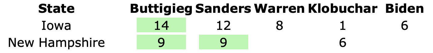
It took a couple of days, but as of Monday afternoon, the Nevada results were final. It was clear from the moment returns started coming in that Sanders was going to win handily, but the extent of that lead in terms of the delegate estimate moved around a bit as the returns slowly came in.
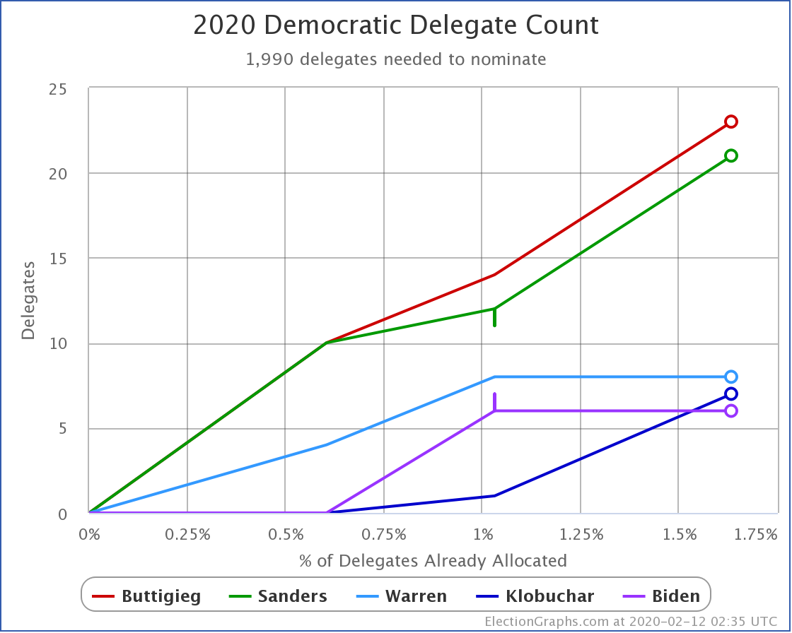
During this time, the estimated number of Sanders delegates in Nevada ranged from 22 to 28, Biden ranged from 7 to 11, Buttigieg ranged from 0 to 6, and Warren ranged from 0 to 1. But once we knew the final count, these were the results from Nevada:
- Sanders 24
- Biden 9
- Buttigieg 3
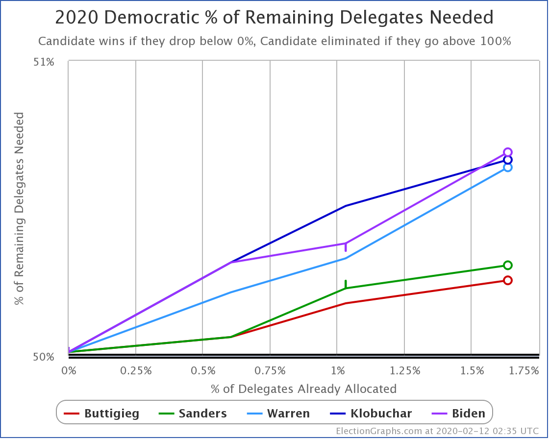
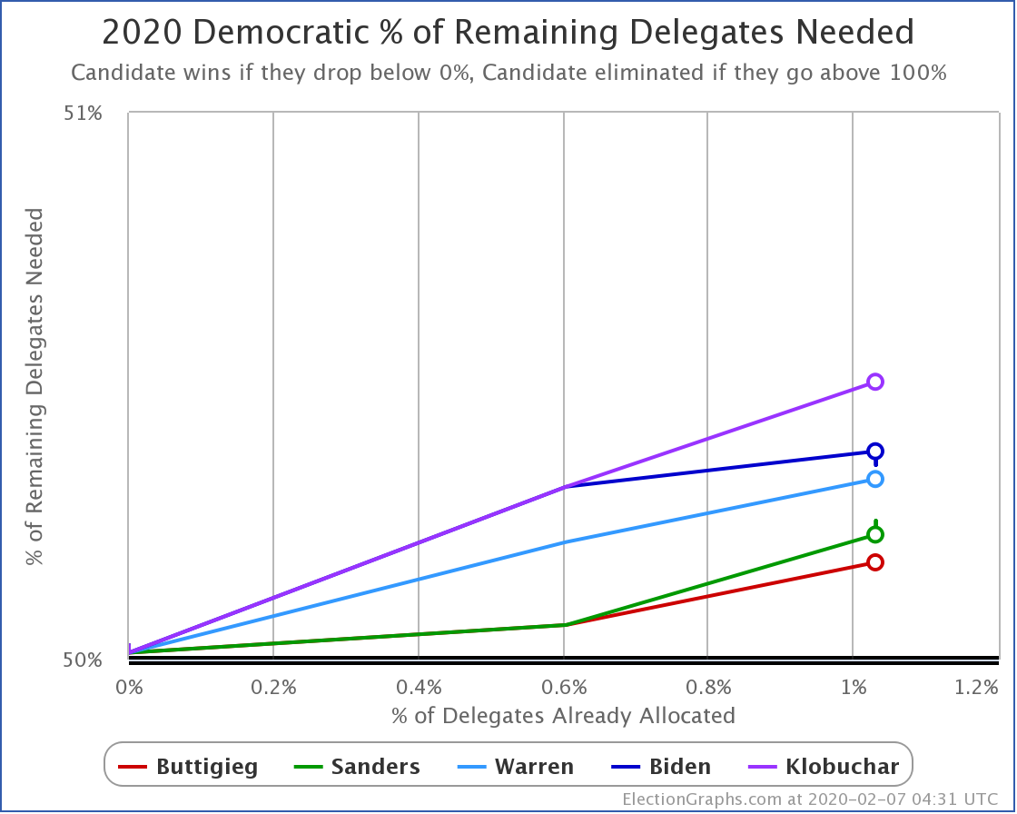
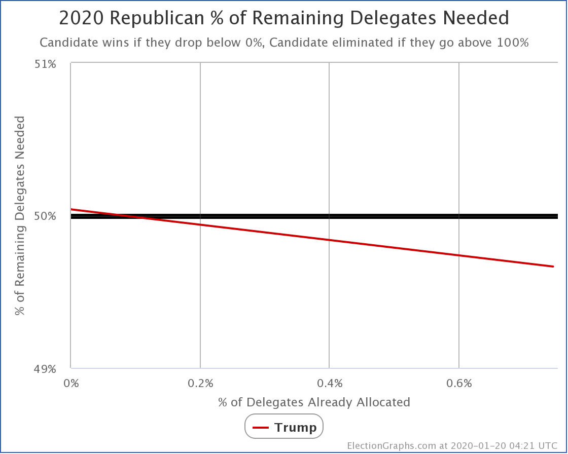
Sanders needed to get 19 or more of the Nevada delegates to improve his overall position in terms of the % of remaining delegates needed to win. He did that handily. The updated chart of that metric looks like this:
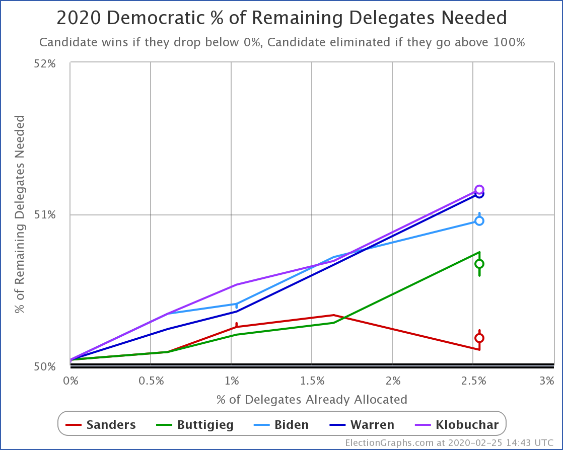
Remember, for this chart down is positive and up is negative. When you get down to 0%, you clinch the nomination. If a candidate goes up to 100%, they become mathematically eliminated.
Sanders has made a turn downward. He is not only in the lead, but Nevada put him on a winning pace.
Now, the general talk is about how absent a significant change, Sanders may be in an uncatchable position after Super Tuesday. That isn't based simply on today's delegate totals, but also on his polling in South Carolina, the Super Tuesday states, and nationwide, and a bit of knowledge of how a small popular vote lead translates into a massive delegate lead.
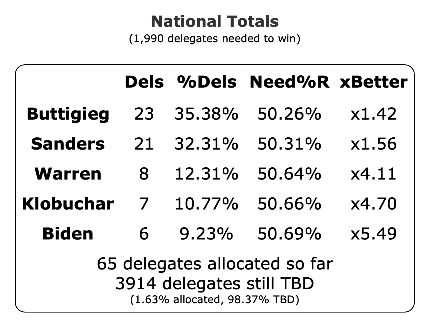
For instance, in Nevada, Sanders got about 33% of the popular vote, but that translated into 67% of the delegates. This kind of magnification for the winner is intentional in the delegate allocation rules. The 15% delegate threshold in one cause. The fact that the results in individual congressional districts determine many of the delegates is another.
Rather than look at the prognostications of how future states might go, instead, let's look at how you would expect the % of remaining delegates needed to win chart to change as this progresses. That will help us know how we will identify if it seems like Sanders is on track to a clear win, if we are heading towards a contested convention, or if someone else still has a chance to win.
To illustrate, we'll look at some graphs from previous cycles to compare to where things are now.
Let's look at the contested races in both parties since 2008 when we did the first Election Graphs delegate tracking. We'll look at them in order of how quickly the nominee was pretty clear in each contest.
Which means we will start with the Democrats in 2016:
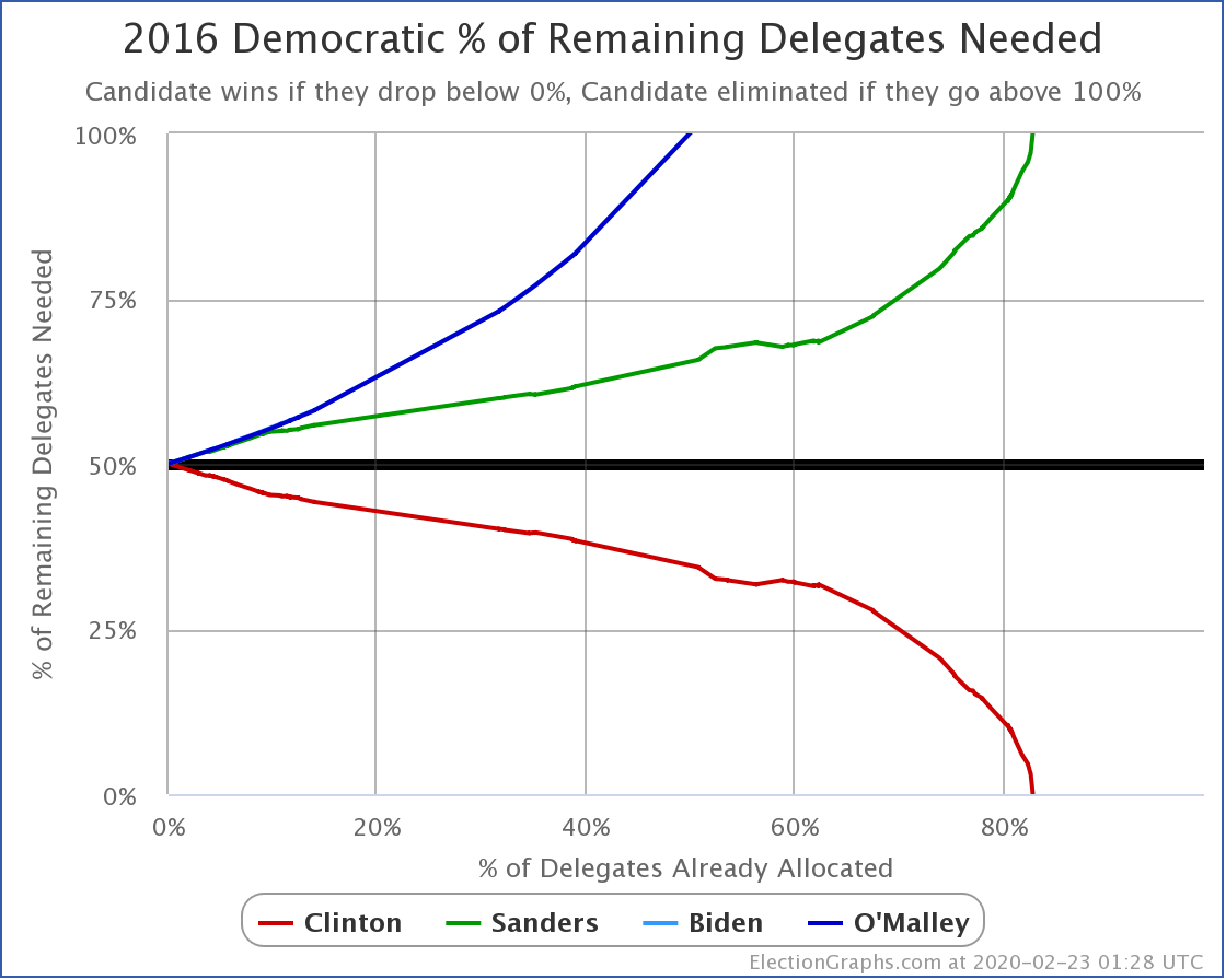
This chart shows what it looks like when we have a runaway victory that is clear from the beginning.
Sorry, Sanders folks. 2020 is going differently, but in 2016, because of the courting of superdelegates long before Iowa even happened, Clinton built up a delegate lead starting from the very beginning.
From the 0% starting line, Clinton improved her position with every contest, and Sanders's situation got worse. The only exception was a slight bump around the 58% mark when Sanders had one outstanding day. But the overall trend was clear from the very beginning. Clinton was on the road to an outright victory, and Sanders never managed to slow that progress.
Next up, the Republicans in 2008:
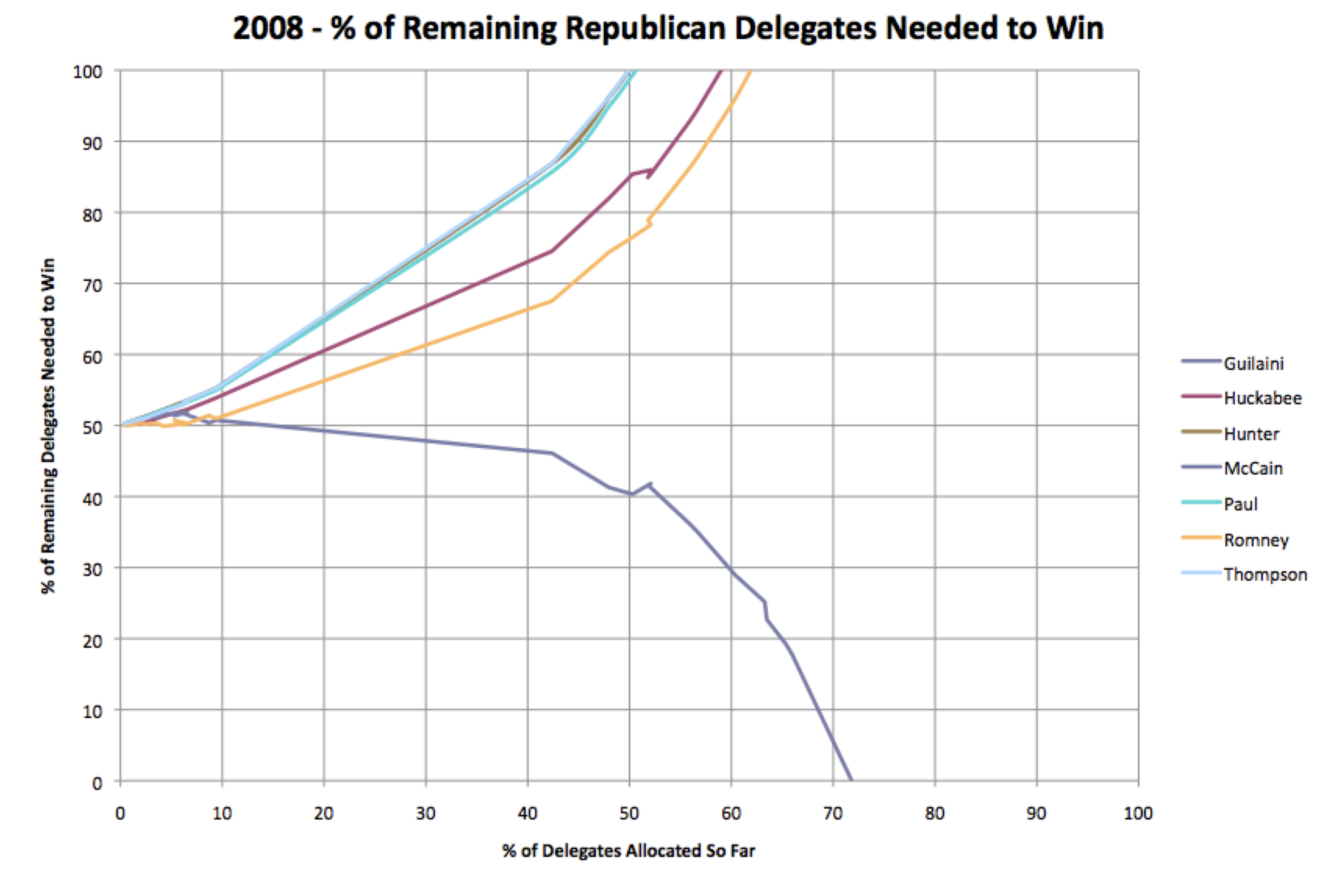
It took slightly longer for this one to become apparent. Romney took an early lead, but his line stayed flat, hovering around the 50% line. McCain was heading upward along with the also-rans. But at about the 5% mark, McCain started hitting his mark and improving his position with every contest. He pulled ahead of Romney at about the 10% mark, then when Super Tuesday jumped the race over 40% every other candidate was at the point where they needed 60%+ of the remaining delegates to catch up and win. That was, of course, unrealistic. Except for one short jog just past the 50% mark, McCain kept improving his position in every race.
Unlike Clinton in 2016, McCain had some issues before Super Tuesday but hit his pace quickly, and Super Tuesday made things inevitable.
Next up, Republicans in 2012:
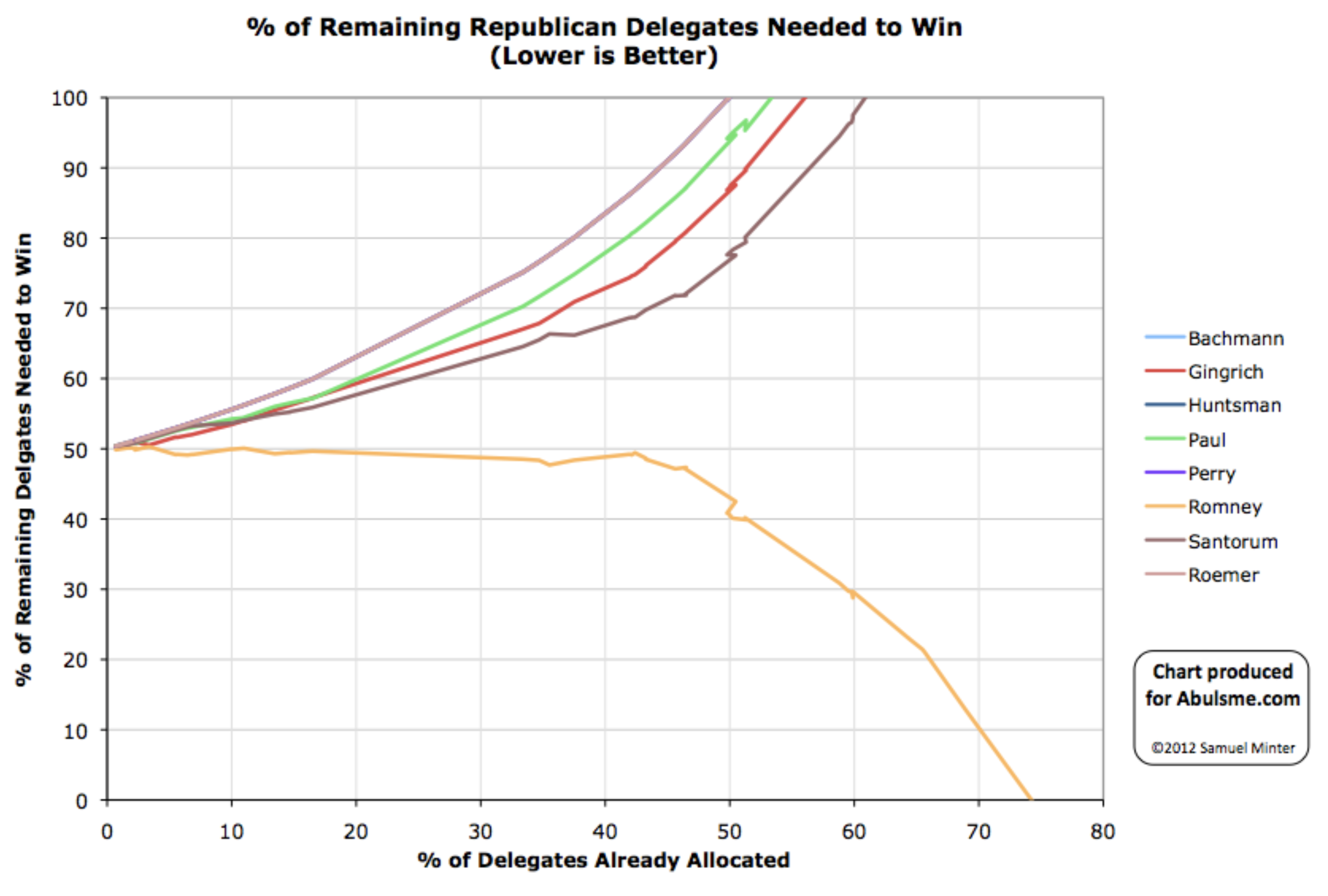
This chart shows an example of a slower burn. Romney was in the lead from the very beginning, but his "% of remaining delegates needed to win" basically stayed flat right around the 50% mark for a long time.
This pattern means that he was accumulating delegates much faster than anybody else, and it was clear the other candidates were not going to win outright. But the other candidates were continuing to take enough delegates to keep a contested convention an active possibility for awhile.
That changed around the 43% mark though. Winner-take-all states on the Republican side undoubtedly helped with this. But also once it is clear that candidates can't win, it becomes tough for them to actively continue a campaign based on the idea of forcing a contested convention where maybe they will be picked, but probably not. So one by one, the other candidates drop out, and then the candidate in the lead starts rolling up the remaining delegates.
So this race had a clear leader way ahead of the rest virtually from the 0% mark, but Romney didn't start hitting a winning pace consistently until 43%.
Now Democrats in 2008:
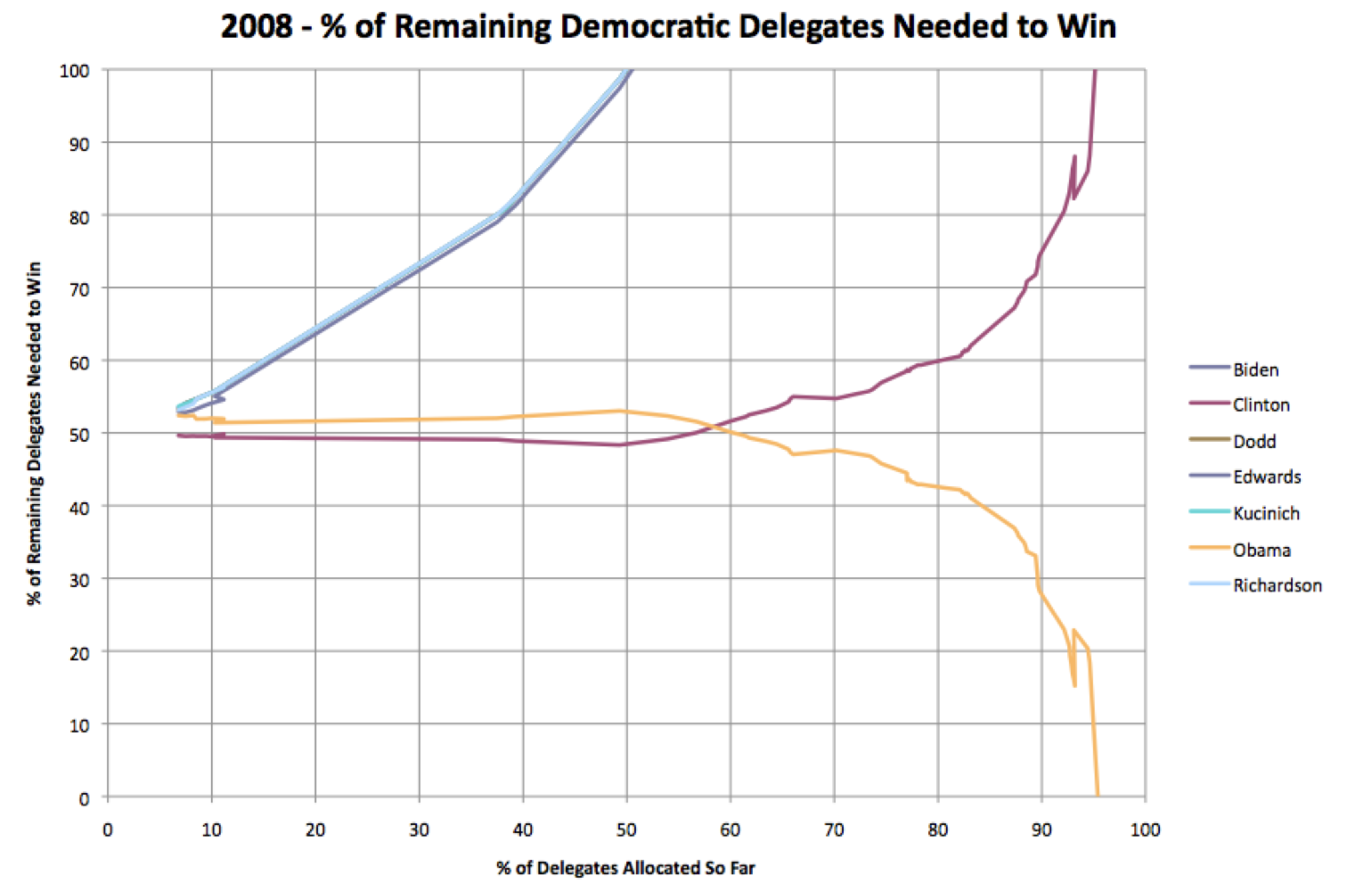
This graph shows a real two-person race. Both Obama and Clinton maintained flat lines for a long long time. Clinton was even improving a little. But not very much. Obama was getting enough delegates to keep her from hitting the marks she needed to improve the "% of remaining delegates needed to win" number significantly.
Clinton still had the advantage for more than the first half of the campaign delegate wise. Around the 50% mark, though, Obama started consistently hitting the percentages needed to improve his position while Clinton fell further and further behind. For a long time, though, the situation was dynamic. Clinton didn't get mathematically eliminated until around the 96% mark!
Finally, the Republicans in 2016:
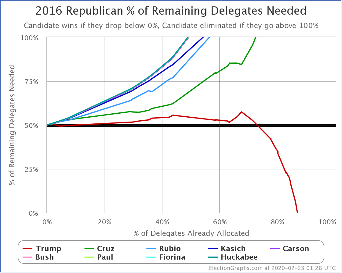
This graph shows the closest we have gotten to a contested convention since I started tracking delegates in 2008. The other Republican candidates kept Trump over 50% of delegates needed until more than 70% of the delegates were allocated; around the same time, Cruz became mathematically eliminated. Although there were a couple of ups and downs along the way, Trump didn't start consistently improving his numbers until about the 67% mark. Until then, while Trump was way ahead, the possibility of a contested convention was kept open. But just like 2012, once it was clear that other candidates did not have a realistic path, and they started to drop away, the leader was able to take all or almost all of the remaining delegates, and wrap things up.
This year after South Carolina, we will be at 3.9% of the delegates allocated.
After Super Tuesday, we will be at 38.0%.
We'll hit 50% on March 17th after Arizona, Florida, Illinois, and Ohio.
We'll hit 67% on April 4th after Alaska, Hawaii, Louisiana, and Wyoming.
As we pass each of these milestones, the question is, does 2020 look like one of these past patterns? Or something else entirely?
If Sanders (or any other candidate) is under 50% of remaining delegates needed, and the number goes down after each contest, then we are on track for that candidate running away to an outright win with no significant obstacles to that result. (This is like the Democrats in 2016, or the Republicans in 2008.)
If all of the candidates except one are racing up to 100%, but the leader is kept flat around 50%, it means that while one candidate has a chance of winning outright, the other candidates are combining at a level that keeps the possibility of a contested convention open. The tendency in this situation is that once all the opposing candidates are mathematically eliminated, they will drop out, and the leader will be able to at that point hit the marks they need to get to a majority. (This is like the Republicans in 2012 or 2016.)
If two candidates are managing to keep their lines relatively flat, you have a two-person race, with both really still in contention. Until the point where one person's line goes up consistently, and the other person's line goes down, you have a real race. Unless the two candidates are closer together than the sum of the other candidates' delegate totals though, one of the two will end up winning. The only question is how close to the end you get before the winner becomes clear. (This is like the Democrats in 2008.)
So what pattern would we see if we are actually on a path to a contested convention?
If after each contest ALL the candidates' numbers for "% of remaining needed to win" go up, time after time, and every candidate is heading up toward 100%, and no candidate is curving down toward 0%, then we are actually on a path to a contested convention.
Be aware, though, until EVERY candidate has gone over 100%, someone can still win. If every candidate other than the leader drops out and stops collecting delegates, allowing the remaining candidate to claim 100% of the remaining delegates, that remaining candidate can still manage to get the delegates they need to win outright.
A contested convention scenario requires multiple candidates who know they are not on pace to get a delegate majority to keep running and accumulating delegates anyway.
That is a pretty tricky path to follow, especially for the candidates who rely on fundraising to keep going.
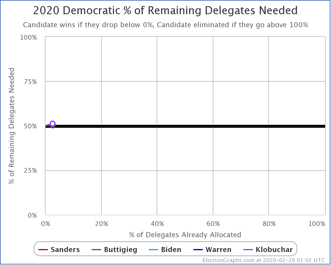
So far, Sanders is ahead, but it is hard to classify which of these patterns will hold. The situation is even more apparent if you rescale the 2020 Democratic chart to show the entire race:
We have just barely started. Current polling in South Carolina and the Super Tuesday states is driving the current predictions of how this race will turn out. If those polls are correct, then the projections of Sanders winning outright or having a contested convention where Sanders has a significant plurality are probably right.
But we don't know for sure quite yet.
So after South Carolina, and especially after Super Tuesday, come back here and see which ways these lines are all moving, and we'll know a lot better which kind of pattern 2020 is going to follow.
Depending on what we see, this thing may be mostly over, or we'll have indications it will go on awhile.
It will be a fun week. Keep watching Election Graphs!
138.6 days until the Democratic National Convention.
180.6 days until the Republican National Convention.
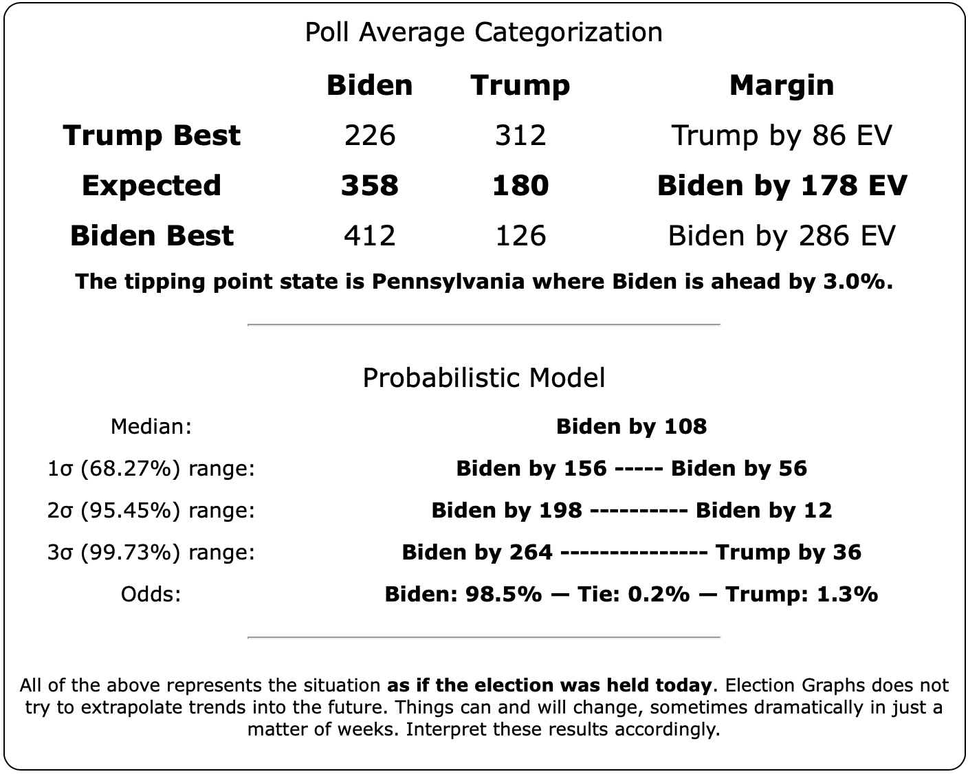
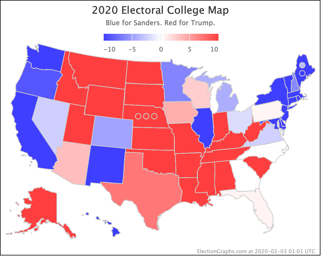
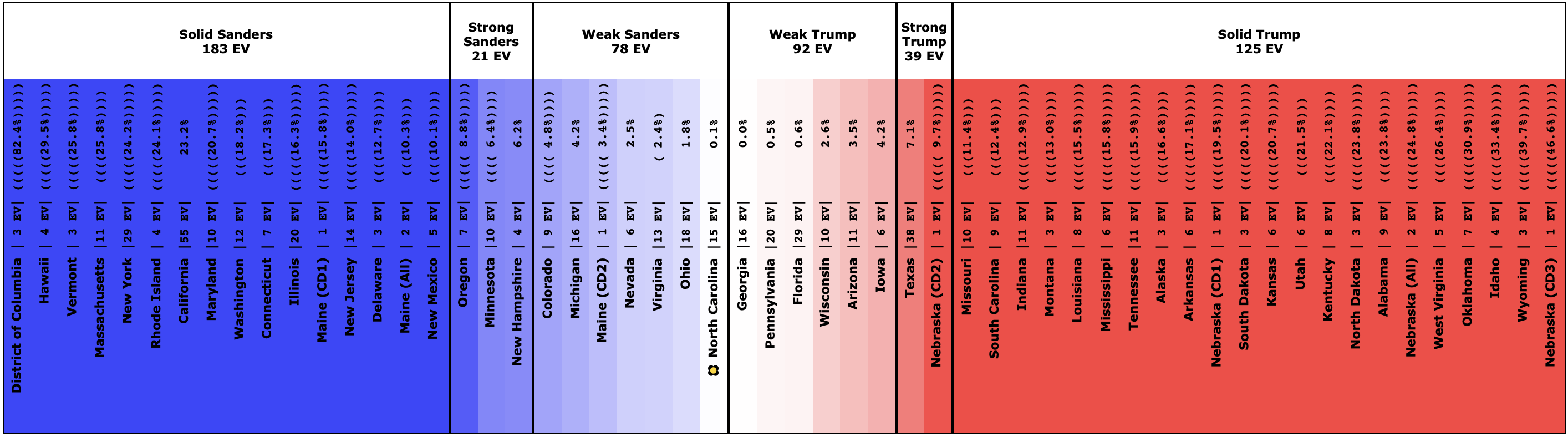
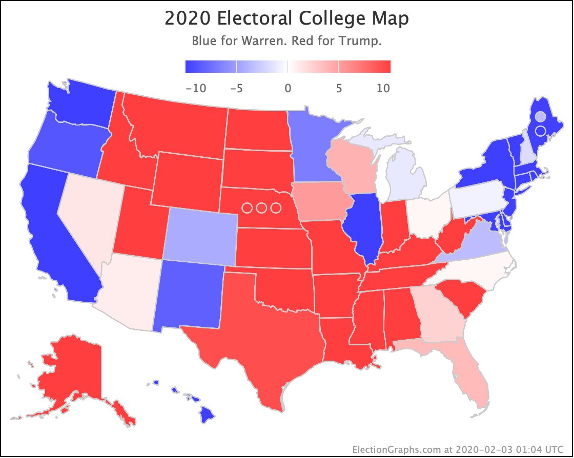
This post is an update based on the data on the Election Graphs 2020 Delegate Race page. Election Graphs tracks estimates of the convention delegate totals for both parties. The charts, graphs, and maps in the post above are all as of the time of this post. Click through on any image for the current interactive versions of that chart, along with additional details.
Follow @ElectionGraphs on Twitter or Election Graphs on Facebook to see announcements of new blog posts. For those interested in more granular updates of delegate updates or general election polling, follow @ElecCollPolls on Twitter. If you find the information in these posts informative or useful, please consider visiting the donation page.