Muddled Week

Since last week's update, there have been new polls in New Hampshire, North Carolina, Alaska, and Washington.

In terms of category changes:

  • NH has moved from Strong Warren to Weak Warren
  • NC has moved from Weak Sanders to Weak Trump

That's it.

Biden's tipping point also moved from a 3.9% lead to a 3.4% lead.

All three of these changes are moves in Trump's direction. But if you look at the more granular changes, things are muddled, and it seems like a pretty flat week overall.

The national "win odds" from the probabilistic model now look like this:

In terms of changes since we looked last week:

Dem 11 Aug 18 Aug 𝚫
Biden 99.8% 99.7% -0.1%
Sanders 94.8% 94.1% -0.7%
O'Rourke 80.0% 80.0% Flat
Warren 65.8% 67.6% +1.8%
Buttigieg 62.4% 63.2% +0.8%
Harris 63.7% 62.9% -0.8%

Warren and Buttigieg improve a little bit.

Biden, Sanders, and Harris weaken a bit.

Harris drops to being the weakest of these six candidates against Trump.

O'Rourke doesn't move. But that is because none of the four polls this week even bothered to include him. Oops.

Let's look at each of these four states:

Biden is the only Democrat with a lead in North Carolina.

Before the Civitas poll added this week, Sanders had a very narrow lead in North Carolina as well. But although the Civitas poll was RELEASED this week, it had an earlier mid-date than the SurveyUSA poll that had given Sanders that lead last week, and so the Civitas poll (which showed a Trump lead) essentially erased that change from the chart.

The rest of the Democrats all lose to Trump, but narrowly.

The trends all show the Democrats generally improving as more polls come in though.

Except for Harris. She is getting weaker in North Carolina.

The Zogby poll added this week is the first general election polling for Washington State. Washington is a very blue state. But all five Democrats polled move the polling average to be even bluer than the 2000-2016 historical average.

It is of note that this is one of the very few states where Sanders does better against Trump than Biden does.

As usual, though, those two do noticeably better than the other Democrats.

Biden and Sanders have strong leads over Trump in New Hampshire. The other Democrats also lead, but by more narrow margins. The general trend as new polling comes in is toward the Democrats though.

Except for Warren's recent move in the other direction.

These are the very first Alaska polls this cycle.

Alaska is a very red state. But all five Democrats polled improve their Election Graphs averages over the historical average of the 2000-2016 elections that I use as a starting point before there are any polls.

As usual, Biden does best against Trump, followed by Sanders.

But Alaska is still a very red state.

And that is where things stand this week.

443.0 days until polls start to close.

For more information:

This post is an update based on the data on the Election Graphs Electoral College 2020 page. Election Graphs tracks a poll-based estimate of the Electoral College. The charts, graphs, and maps in the post above are all as of the time of this post. Click through on any image to go to a page with the current interactive versions of that chart, along with additional details.

Follow @ElectionGraphs on Twitter or Election Graphs on Facebook to see announcements of updates. For those interested in individual poll updates, follow @ElecCollPolls on Twitter for all the polls as I add them. If you find the information in these posts informative or useful, please consider visiting the donation page.

Blue Texas?!?

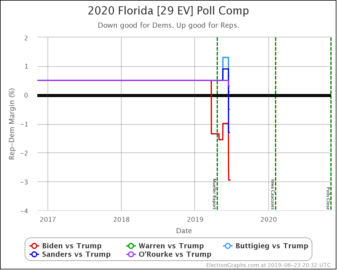
I hate to talk about Texas two posts in a row, but even though there have been polls in California, North Carolina, and North Dakota since the last update as well, once again the most significant changes are in Texas. The two new polls in Texas continued to move things toward the Democrats.

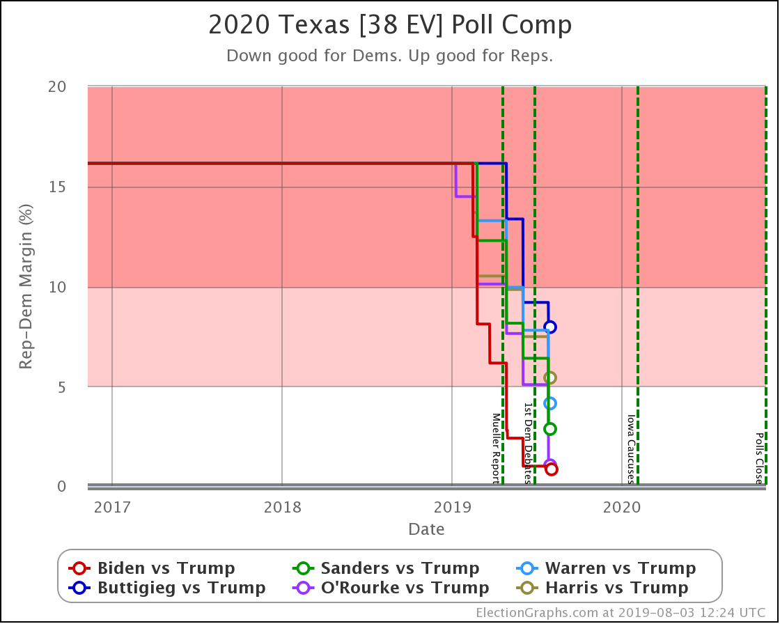
In Texas, Harris did move within 5% of Trump in the Election Graphs average. This change leaves Buttigieg the only one of the six most polled Democrats where Trump has a Texas lead more than 5%.

More notably though, with this set of polls, the lead flips over to the Democratic side for Biden, Sanders, and O'Rourke.

Now, this very well may be transient. These leads may well evaporate long before the election. At the moment, though, three of the top six Democrats are LEADING in Texas.

That is remarkable.

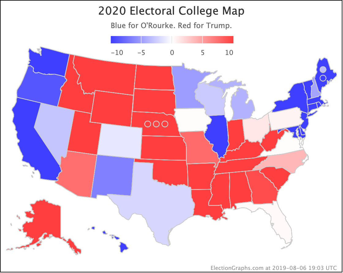
At the moment, O'Rourke has the most significant margin of the three. He has a 2.1% lead. Which to be clear, is a very narrow lead. It translates into a 66.4% chance of winning the state, compared to 33.6% for Trump. But still. For now, it makes Texas notably blue on my national O'Rourke vs. Trump map:

After last week's update, I got a comment on Facebook saying one of the recent polls looked like an outlier. Even at the time, it only looked like an outlier for some candidate pairings, not for others, but let's look at what things look like now for each of the three Democrats showing a lead in Texas.

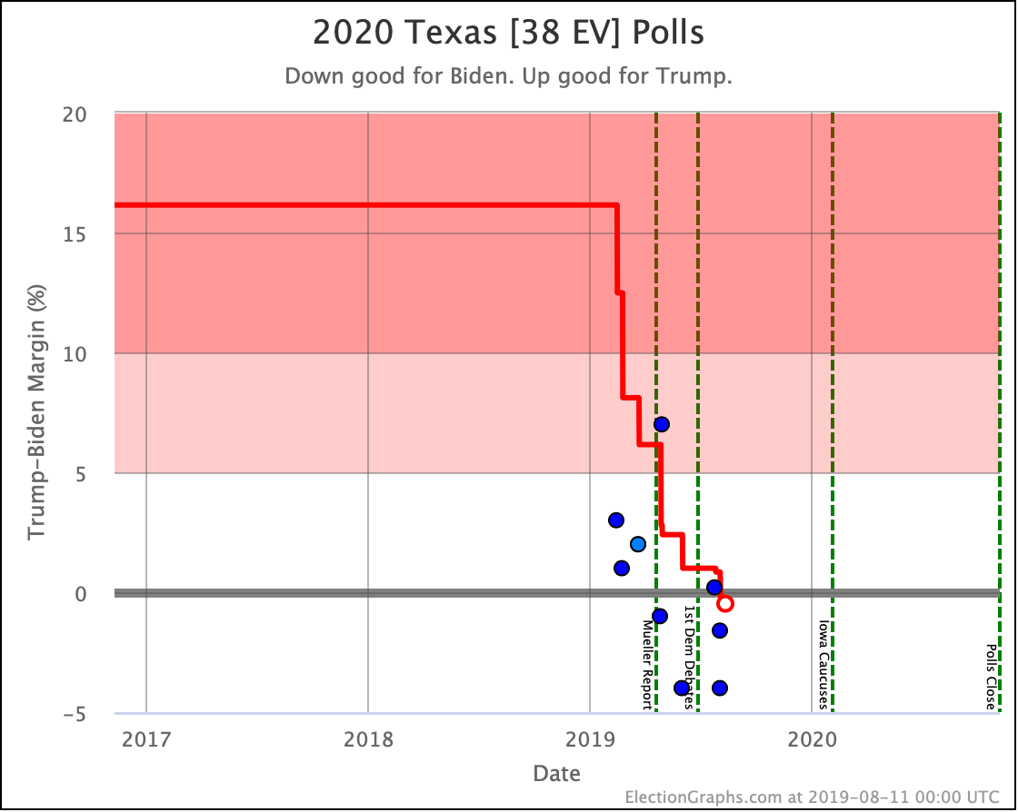
First Biden vs. Trump: It is hard to tell just visually which are the last five polls that are included in the average because the 5th and 6th oldest polls are close together in time, but number five is the one with a 7% Trump lead. That was a poll from WPA Intelligence back in April, and if anything, THAT is the recent poll that looks like an outlier. If you excluded that poll, the average of the last five polls would be a 2.1% Biden lead instead of the 0.5% lead he has.

UT Tyler is responsible for two of the polls in the average because they polled Texas right before and right after the second Democratic Debates. But even accounting for that there looks to be plenty of evidence from multiple pollsters at this point that Biden is leading Trump in Texas at the moment.

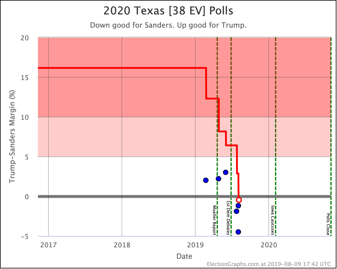
Now Sanders vs. Trump: Every single one of the polls from the last year shows a close race for this paring. Three show Trump with a small lead. Three show Sanders slightly ahead. Of the five that go into the Election Graphs average, three have Sanders ahead. These three are the most recent. Two of these three are from UT Tyler. But there are also two Emerson polls in the five poll average.

Overall, showing Sanders with an 0.5% lead seems reasonable here.

Sanders matches Biden with that 0.5% lead. In both cases, this is just barely a lead. It translates into a 51.1% chance of the Democrat winning, vs. 48.9% for Trump based on historical Election Graphs results. So it is essentially a coin toss.

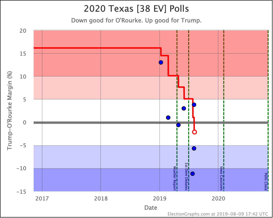
Finally O'Rourke vs. Trump: If we look at all the polls this year, the two that look like outliers are the Atlantic poll from January showing Trump ahead by 13%, and the UT Tyler poll from July showing O'Rourke ahead by 11.2%. The Atlantic one is already out of the five poll average. If you take out that UT Tyler poll (leaving the other UT Tyler poll that shows a 5.7% O'Rourke lead) and average the last five polls other than that one, O'Rourke's 2.1% lead disappears, and you have a 0.3% lead for Trump instead.

So of these three, O'Rourke's lead, while the biggest, seems the most likely to be due to an outlier result rather than a real edge.

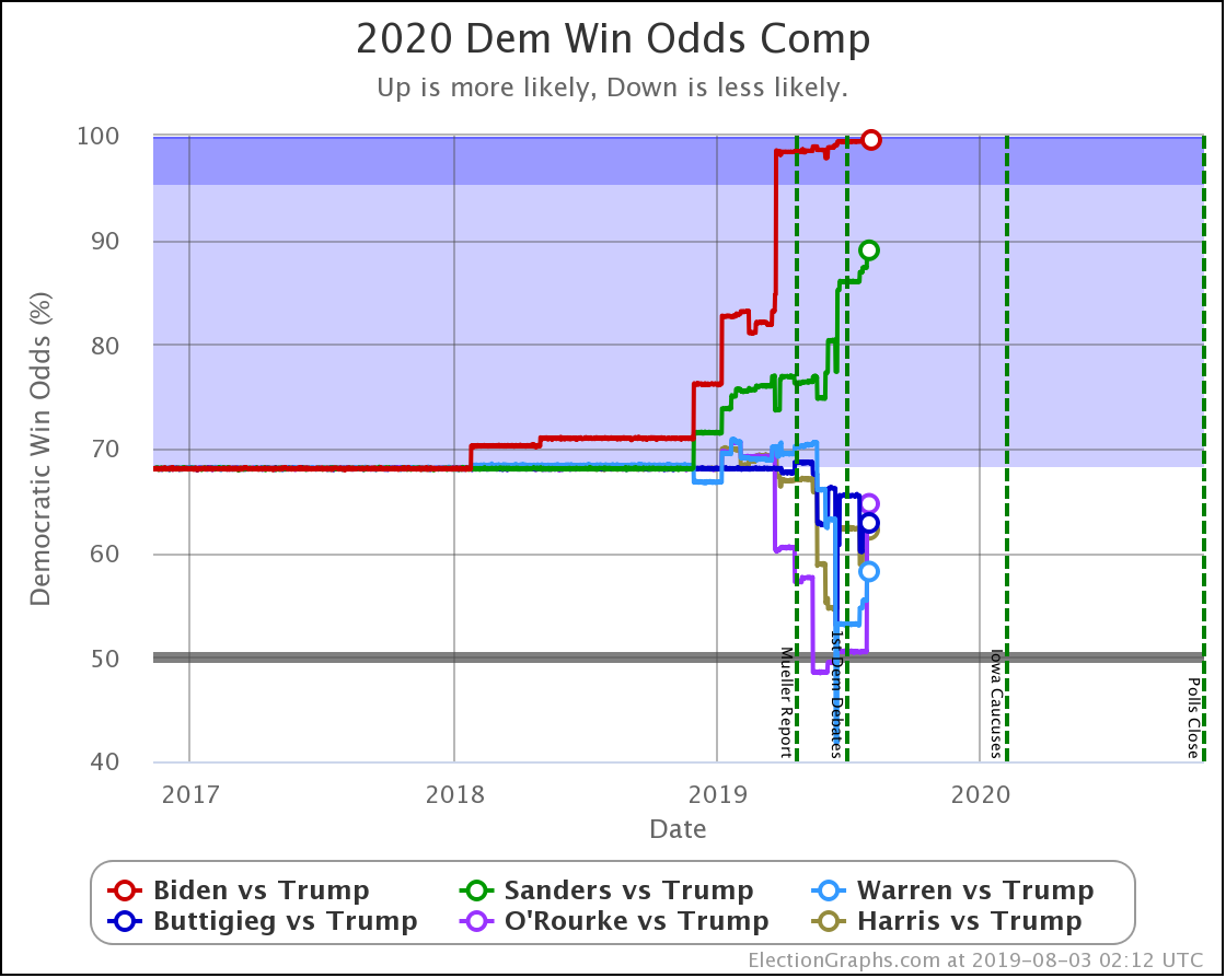
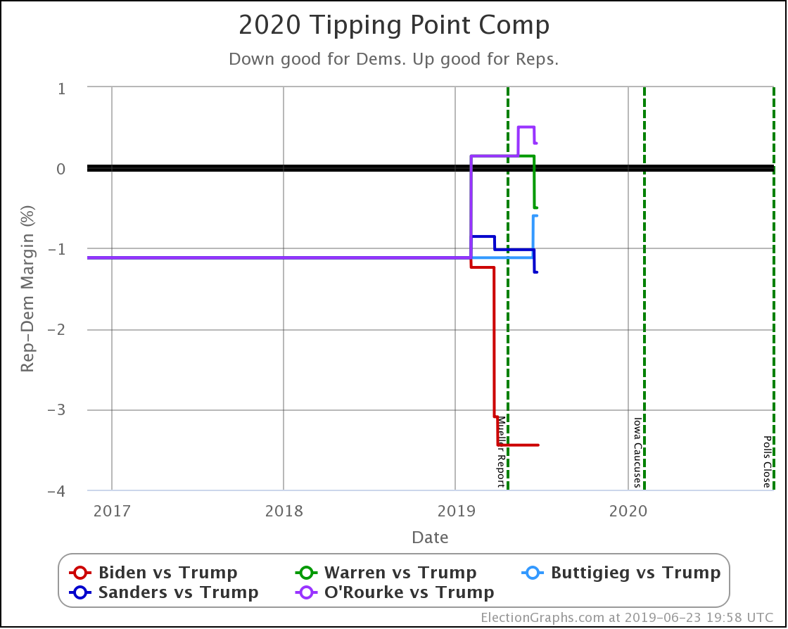
Let's look at the comparison of all six democrats against Trump:

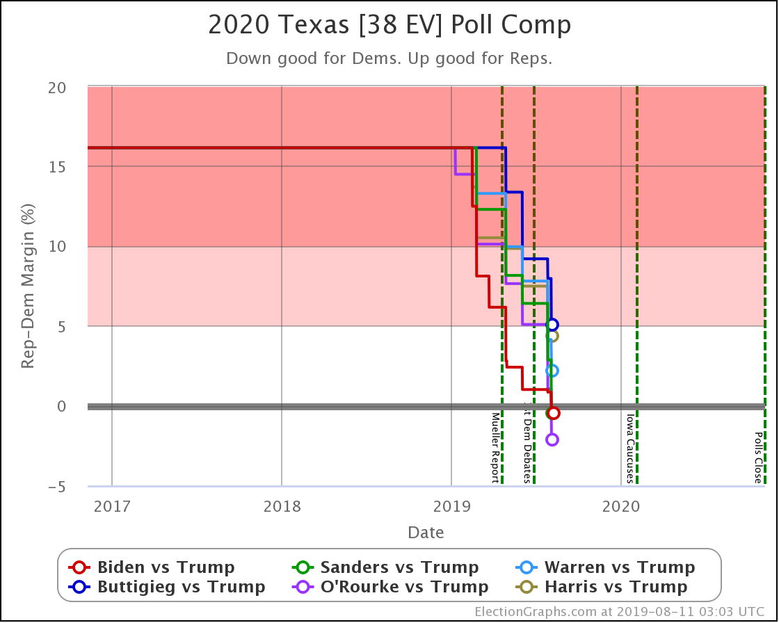
The leads by Biden, Sanders, and O'Rourke may not be real. Or they may be temporary, something that will be gone as soon as we have a few more polls. And even if they are not imaginary, they are very narrow leads.

But five of the six best polled Democrats are making Texas look like it is in contention. And the 6th isn't far behind. That is the real story of Texas at the moment.

It is in play in a way it hasn't been in decades.

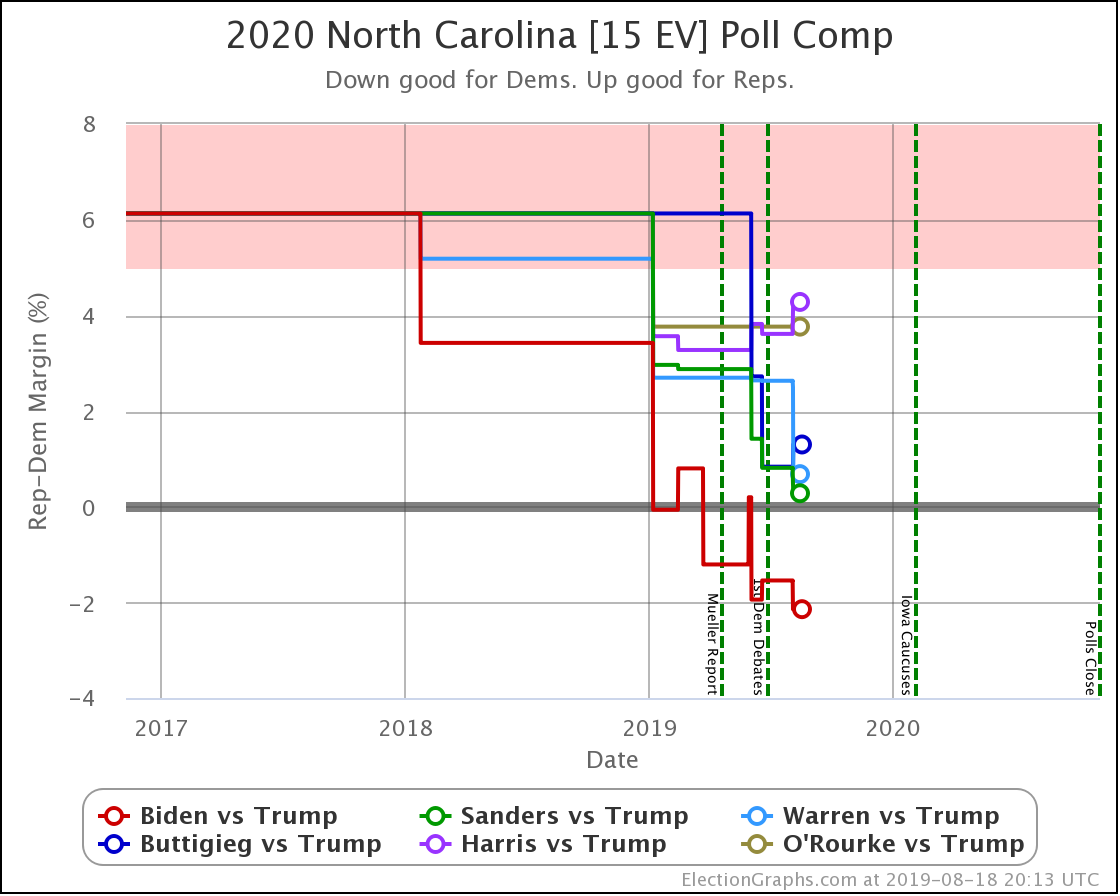
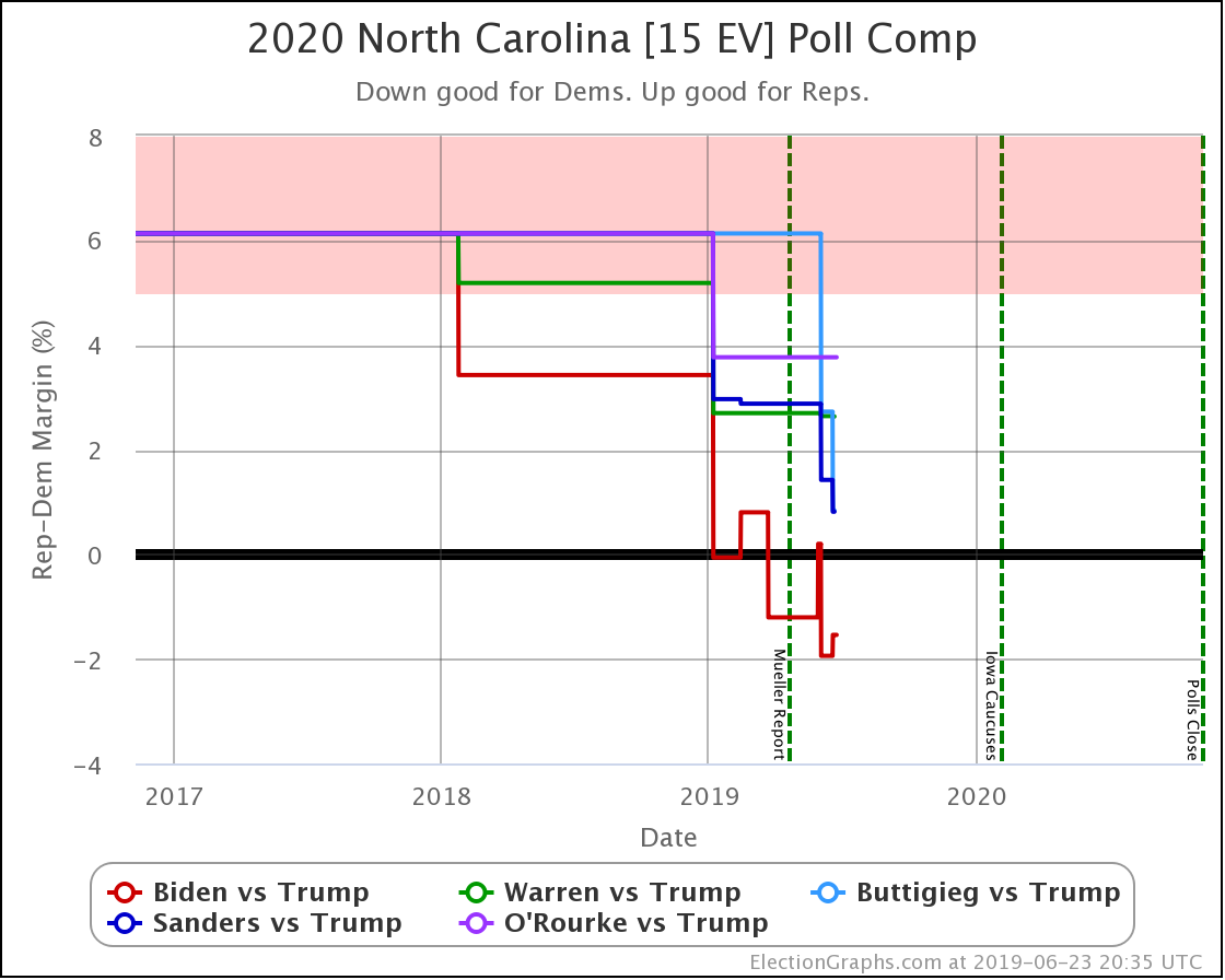
Biden, Sanders, Warren, and Harris all improved with this week's North Carolina poll as well, with Sanders now joining Biden with leads in the Election Graphs averages over Trump.

As one might guess, the new polls in North Dakota and California didn't change what you would expect of those two states.

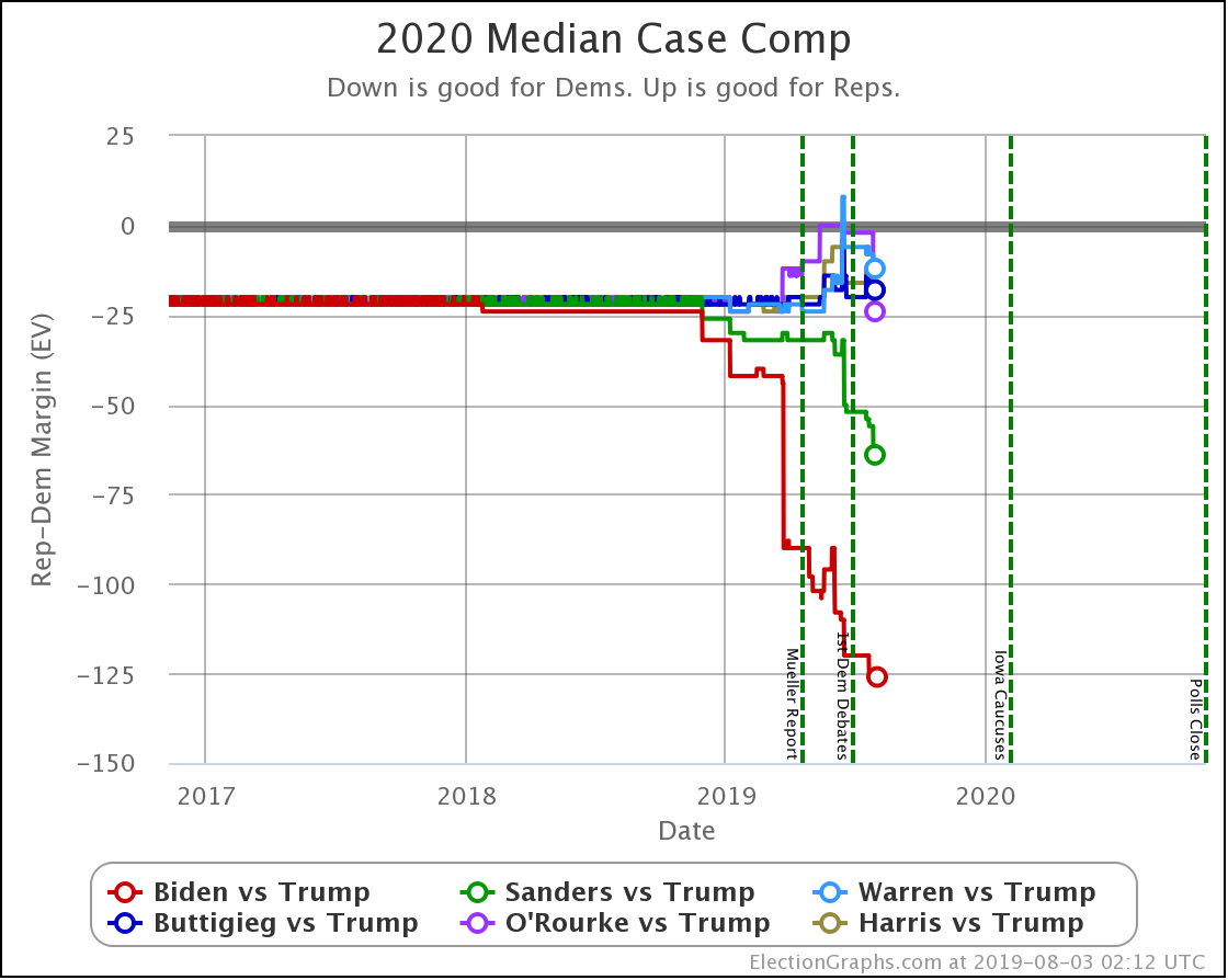
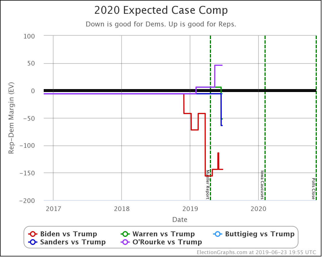
Between Texas and North Carolina, there is a pretty significant impact on the national picture:

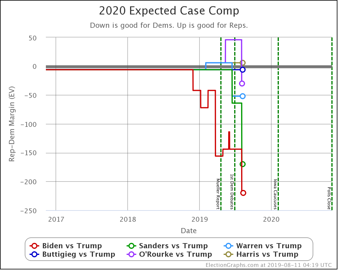
On the straight-up "Expected Case" where each candidate wins every state they lead the Election Graphs poll average, you can see the improvements for Biden and O'Rourke as they take the lead in Texas, and for Sanders, as he takes the lead in both Texas and North Carolina.

By this way of looking at things, out of these six Democrats, all except Harris are now ahead in the Electoral College view, with Harris losing to Trump by six electoral votes.

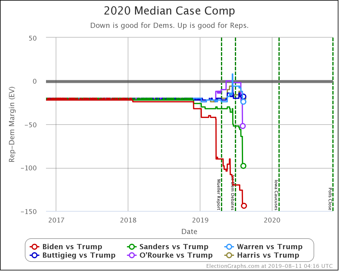
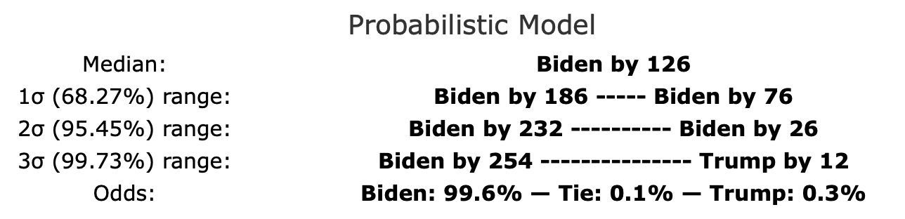
Looking at the more sophisticated probabilistic model, we can see that all six Democrats win in the median case. Biden, Sanders, and O'Rourke win by a bit larger margins, while Warren, Buttigieg, and Harris are all bunched up together with relatively narrow wins.

The median, of course, doesn't tell the whole story.

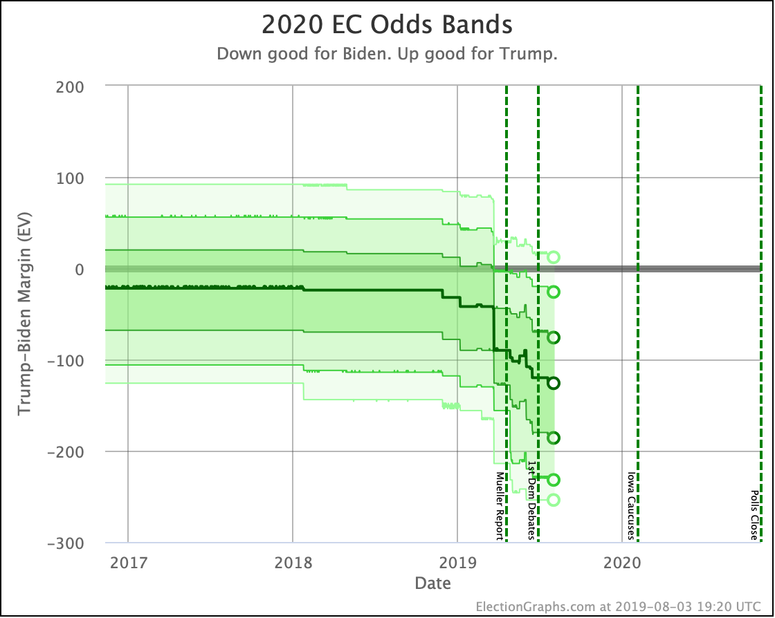
As of this week, the candidate detail pages now all show charts showing the likely ranges of Electoral College results given the results of our probabilistic model.

The exact distributions are very spiky, with certain electoral college margins being much more likely than others right next to them due to how state distributions work. You can see an example distribution based on 2016 data on this post from January describing the Monte Carlo methods I'm using in my model.

I've considered a couple of different visualizations of the exact distribution, and may still do that in the future if I have time, but for now, I thought it would be more useful to show a simplified version highlighting "zones" of likelihood.

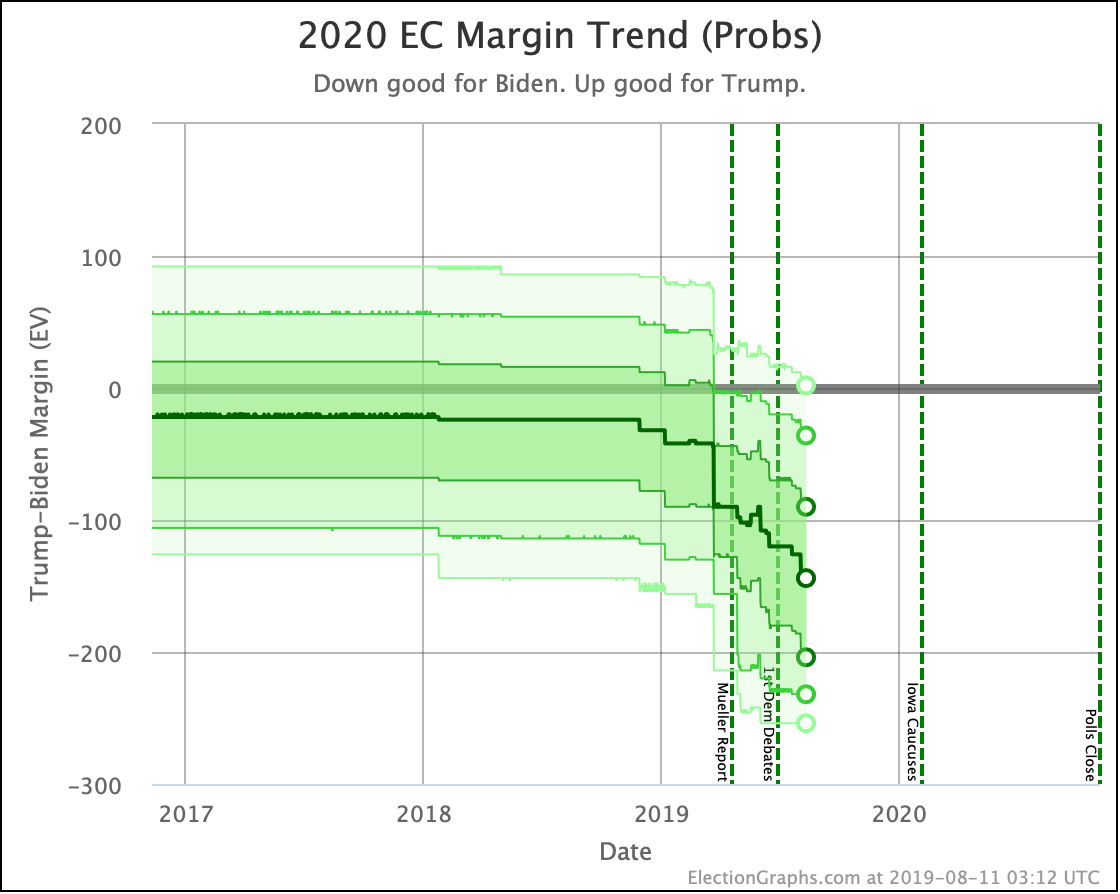
The dark line in the center is the median.

The darkest band includes 1σ (68.27%) of the simulation outcomes.

The next darkest band includes 2σ (95.45%) of the results.

And the lightest band includes 3σ (99.73%) of them.

So basically, the darker the color band, the more likely the result.

You can see the 3σ band only barely includes the possibility of a Trump victory.

Compare this with how this chart looks for Buttigieg, currently the weakest of these six candidates:

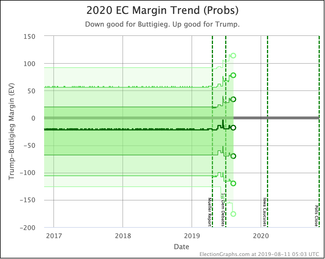
While Biden shows relentless improvement across all bands as additional polling comes in, Buttigieg's median stays just about constant, while all of the probability zones widen. Buttigieg's median result is not doing any better or any worse as we get more polls and time progresses, but the uncertainty on how Buttigieg would do is increasing.

Looking at these probability band trends tells you a lot more than just looking at the medians.

Of course, you can also look at the simulation and count the wins on each side, and the number of 269-269 ties, and then come up with the odds for each of those events. That's where all the probabilistic results I've mentioned in the last few updates have come from, but now there are charts for that too. Looking again at Biden and Buttigieg as examples:

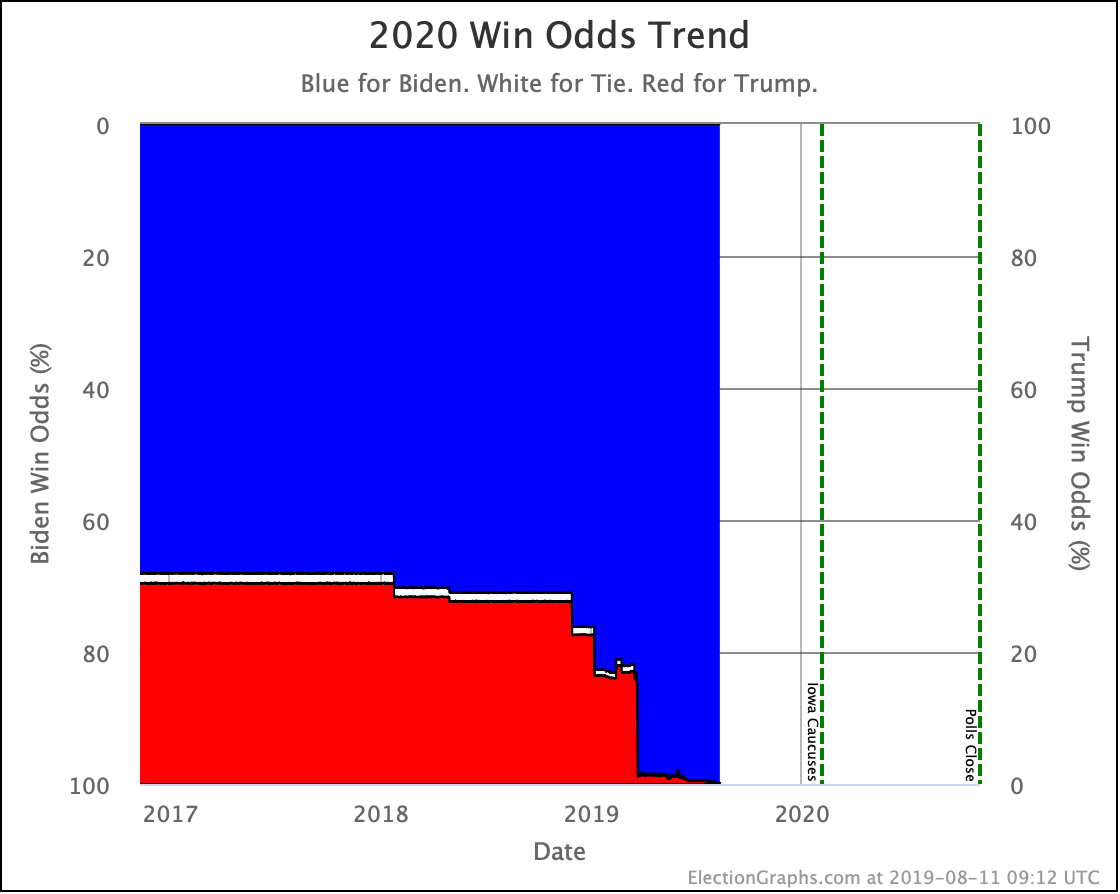
You can see that as more and more polling has come in, Biden has increased his chance of winning, to the point where it is now nearly 100%. (Insert at this point the usual caveats about how long it is until the election and how much can change.)

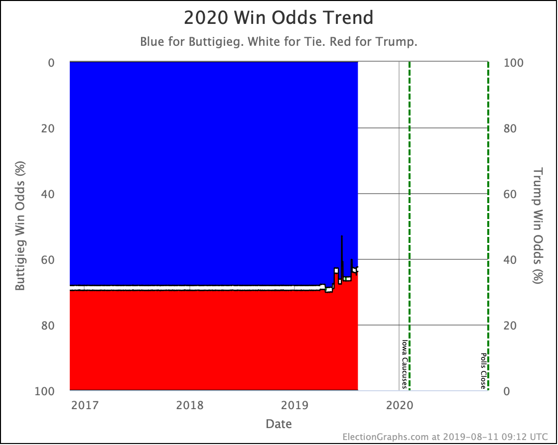
Meanwhile, Buttigieg has not done that. Chances of a Trump win over Buttigieg have increased as more polling has come in.

Those are the two new graph types I added this week. I hope you like them.

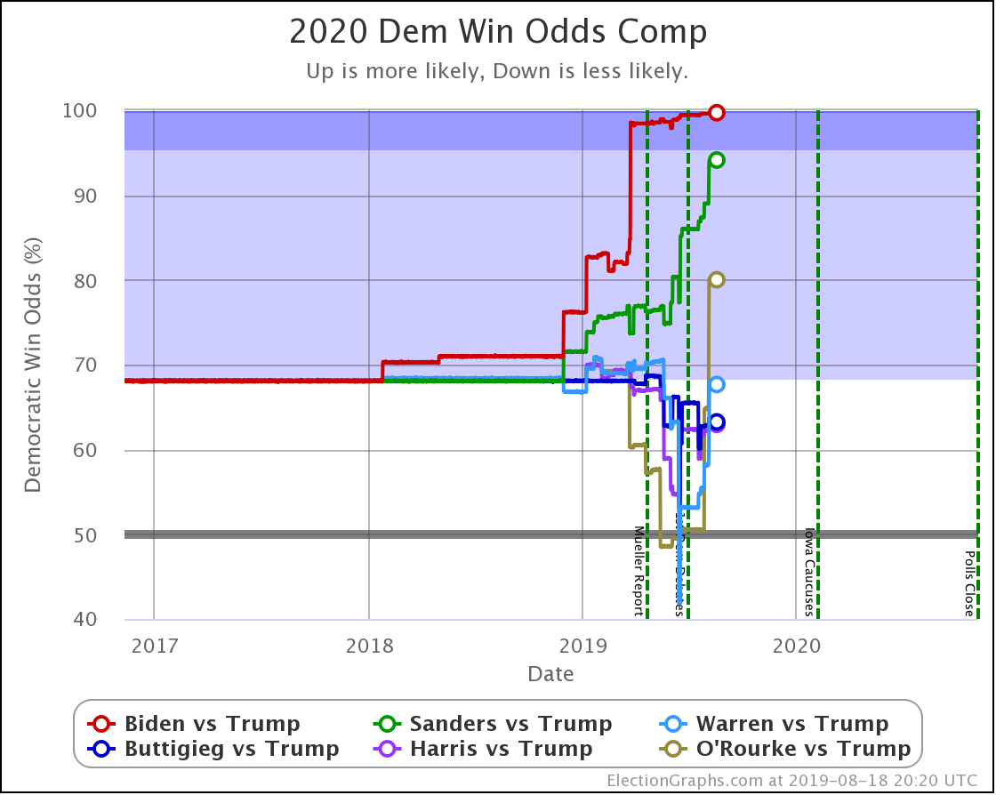
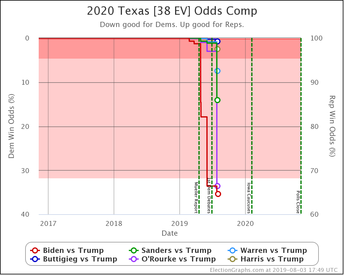
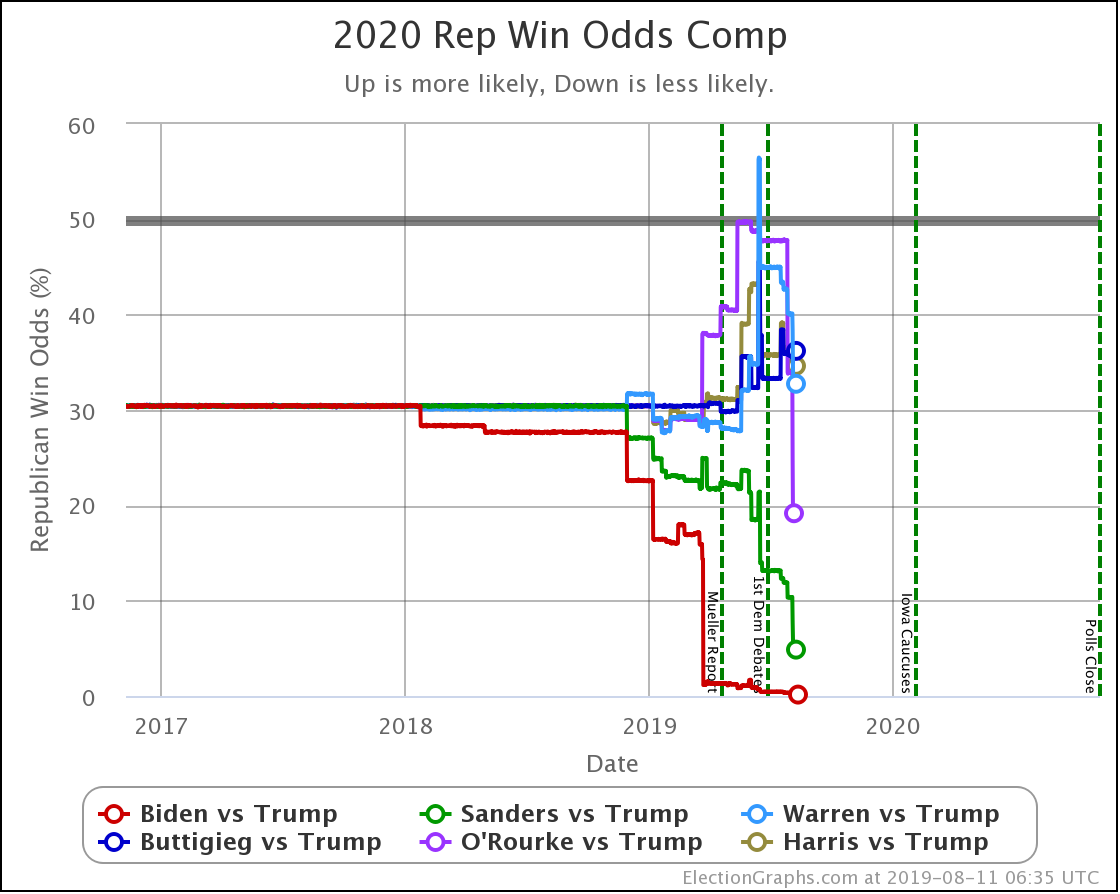
Lets put this all together by looking at the comparisons of the odds for each of the Democrats against Trump.

To keep the same "Down good for Democrat. Up good for Republican" orientation, we would look at the odds of a Republican win. It looks like this:

Given that we have the same Republican in all six cases though, it has been somewhat handier to look at the odds of the Democrat winning.

So let's flip it over.

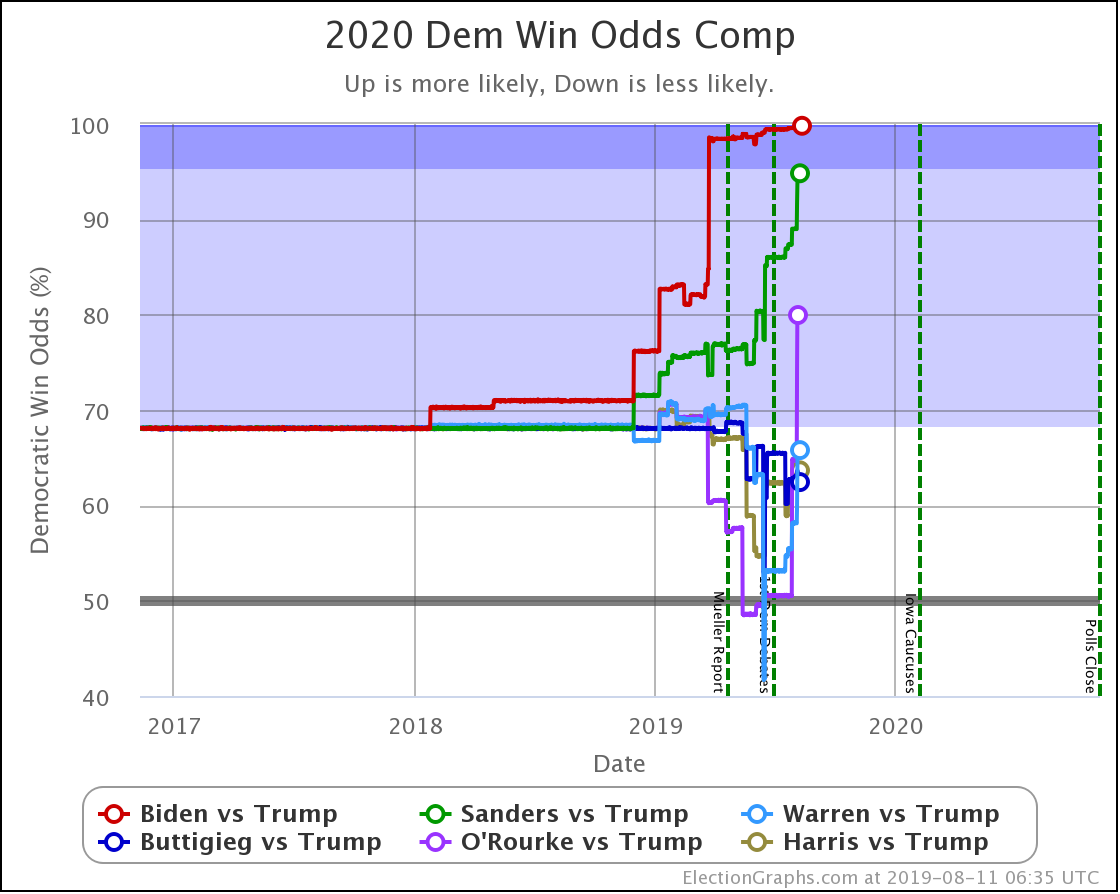
Because there is a non-zero and changing chance of a 269-269 tie in all of these cases, these aren't quite exactly just the same graph reversed top to bottom. They differ by the width of the white strip of ties in the two previous charts. But it is close.

You can see the jumps up with Sanders and O'Rourke based on the batch of new polling in this update. The polls were good for Biden too, but he has very little room left to improve in this view.

Let's look at the table:

Dem 3 Aug 11 Aug 𝚫
Biden 99.6% 99.8% +0.2%
Sanders 89.0% 94.8% +5.8%
O'Rourke 64.7% 80.0% +15.3%
Warren 58.2% 65.8% +7.6%
Harris 62.2% 63.7% +1.5%
Buttigieg 62.9% 62.4% -0.5%

The big gainers this last week were O'Rourke, Warren, and Sanders.

Warren, Harris, and Buttigieg are still only a little better than tossups against Trump, while Biden, Sanders, and O'Rourke look like clear favorites.

450.7 days until polls start to close.

For more information:

This post is an update based on the data on the Election Graphs Electoral College 2020 page. Election Graphs tracks a poll-based estimate of the Electoral College. The charts, graphs, and maps in the post above are all as of the time of this post. Click through on any image to go to a page with the current interactive versions of that chart, along with additional details.

Follow @ElectionGraphs on Twitter or Election Graphs on Facebook to see announcements of updates. For those interested in individual poll updates, follow @ElecCollPolls on Twitter for all the polls as I add them. If you find the information in these posts informative or useful, please consider visiting the donation page.

Whoa, Look at Texas

Since the last update (not counting the update about new graphs) there have been new polls in Maine (All), South Carolina, Ohio, Michigan, Texas, and North Dakota.

Of those, only Texas and Michigan resulted in category changes for any of the six best-polled candidate pairs.

In Michigan, Buttigieg moved from a 6.4% lead to a weak 2.8% lead in the Election Graphs average.

In Texas, Sanders, Warren, and O'Rourke pulled Trump's lead down under 5% into the "weak" category in the Election Graphs average. Biden had already gotten there back in June.

Texas is the headline.

Trump's lead in Texas in the Election Graphs average is now down to under 5% for four of the six most polled Democrats against him. Only Buttigieg and Harris lag. But even they are trending stronger as more polls come in.

None of the averages show a Democratic lead in Texas. That would be seismic. However, at this point five of the six Democrats have at least one poll showing them ahead in Texas. (The exception is Buttigieg.)

Nobody would call Texas blue at this point. But it is trending purple. We have enough polls for enough candidates showing only narrow Republican leads (or even Democratic leads) to say that it looks competitive.

Now, what does competitive mean? Let's look at the "odds" view, where we use the historical performance of final Election Graphs averages to convert the poll margins into odds of victory:

Democrats making Texas "close" essentially means Trump has a noticeably less than 100% chance of winning.

Of these six Democrats, Buttigieg is weakest…  with Trump still having a 99.2% chance of winning the state.

Biden is strongest, but Trump still has a 64.6% chance of winning Texas against him.

Now, that means Biden has a 35.4% shot, which is remarkable given where Texas has been in other cycles. But Trump is still favored.

Now is the time to once again mention that Election Graphs does not model how the race evolves. These "odds" are static snapshots in time. "If the election was today." The election is not even remotely today. Polls can swing wildly in just a matter of weeks, let alone the 15 months we still have until the general election.

This "closeness" in Texas could evaporate long before we get to November 2020. Or it could turn into a Democratic lead.

But it is clear that Texas is a state to watch, and Republicans will need to play defense there, and not take it for granted, as has often been the case in recent cycles.

Now, the national picture, where all the caveats above also apply:

This batch of polls changed the "Best Case" scenarios for Sanders, Warren, and O'Rourke in the category based ranges (their best cases now include winning Texas). But the "Expected Case" and "Tipping Point" did not change.

However, the new probabilistic based simulations do show changes worth reviewing.

This first chart shows the "median case" of the simulations, the spot where half the time the Republican does better, and half the time the Democrat does better.

Biden doing better than the rest of the pack stands out clearly. His median case is a 126 electoral vote margin over Trump. To put this in historical context, this would exactly match Obama's 2012 margin over Romney but be quite a bit less than Obama's 2008 margin over McCain.

Sanders also breaks out from the pack, doing considerably better than the other Democrats.

Both Biden and Sanders have improved their median positions significantly over the last few weeks covered by this batch of new polls.

Meanwhile, Warren, Buttigieg, O'Rourke, and Harris stay within a zone maintaining only small electoral college margins in the median case.

So, switching from looking at margins to looking at chances of winning:

Biden is pegged near the top right now. 99.6% chance of victory over Trump. There isn't that much room to improve, although weaker polls could certainly knock him off this pedestal.

Sanders clocks in second at an 89.0% chance of beating Trump.

Looking at the others, while they do have the upper hand on Trump, if this were election day, it wouldn't be fair to say it was anything other than "too close to call" with odds ranging from Warren at 58.2% to O'Rourke at 64.7%.

Election Graphs didn't have a probabilistic view in 2016, but the median "chance of Trump winning" from the sites that did was 14% going into Election Day. Only Biden and Sanders push Trump below that line at the moment.

So how have things been changing?

Comparing the odds of the Democrat winning from the update on June 23rd to where things stand now, we see this:

Dem 23 Jun 3 Aug 𝚫
Biden 99.4% 99.6% +0.2%
Sanders 86.0% 89.0% +3.0%
Buttigieg 65.5% 62.9% -2.6%
Harris 62.3% 62.2% -0.1%
O'Rourke 50.5% 64.7% +14.2%
Warren 53.2% 58.2% +5.0%

The stand out is, of course, O'Rourke. His improvement is almost all due to his performance in the latest Texas poll, which was better than all other Democrats, and significantly better than his previous polling in the state as well. So he adds to his chances of winning Texas, which while still under 50%, is enough to boost his chances of taking the whole thing significantly.

Warren and Sanders also improved a bit. Buttigieg dropped a bit. And Biden and Harris are essentially flat.

Finally, a quick preview of a new chart type coming soon to Election Graphs:

It is the equivalent of the Electoral College trend chart based on the straight-up categorization of states based on who is ahead, but with the results of the probabilistic modeling.

The dark line represents the median electoral college result in the simulation. Then the bands represent result ranges at different levels of probability. The deeper the shade, the more likely the result.

This is a visual representation of the single candidate time series of the probabilistic summary now on the comparison page:

The text summary will also, of course, be added to the candidate national summary pages once I get a chance.

I also added little circles in a lot of the time series charts to highlight the current values better. I think it makes the charts clearer. Hope you like them.

In any case… 458.1 days until polls start to close. Stay tuned!

For more information:

This post is an update based on the data on the Election Graphs Electoral College 2020 page. Election Graphs tracks a poll-based estimate of the Electoral College. The charts, graphs, and maps in the post above are all as of the time of this post. Click through on any image to go to a page with the current interactive versions of that chart, along with additional details.

Follow @ElectionGraphs on Twitter or Election Graphs on Facebook to see announcements of updates. For those interested in individual poll updates, follow @ElecCollPolls on Twitter for all the polls as I add them. If you find the information in these posts informative or useful, please consider visiting the donation page.

Most Dems improve against Trump while Buttigieg weakens

Since the last update, there have been new polls in Kentucky, Wisconsin, Michigan, Pennsylvania, Florida (x2), and North Carolina.

With this update, Buttigieg vs. Trump has now replaced Harris vs. Trump in the "five best-polled candidate combinations" that I'll spend time on in these posts. The new list is Biden, Warren, Buttigieg, Sanders, and O'Rourke all paired against Trump.

With this latest batch of polls, we have the following changes:

National:

  • Trump best case vs. Warren has changed: Warren 214 to Trump 324 -> Warren 204 to Trump 334
  • Warren vs. Trump tipping point change: Trump by 0.1% in VA -> Warren by 0.5% in FL
  • Warren vs. Trump expected case change: Warren 266 to Trump 272 -> Warren 295 to Trump 243
  • Buttigieg vs. Trump tipping point change: Buttigieg by 1.1% in IA -> Buttigieg by 0.6% in PA
  • Sanders vs. Trump tipping point change: Sanders by 1% in IA -> Sanders by 1.3% in FL
  • Sanders vs. Trump expected case change: Sanders 272 to Trump 266 -> Sanders 301 to Trump 237
  • O'Rourke vs. Trump tipping point change: Trump by 0.5% in FL -> Trump by 0.3% in FL

Wisconsin:

  • Warren vs. Trump state category change: WI has moved from Strong Warren to Weak Warren

Florida:

  • Sanders vs. Trump state category change: FL has moved from Weak Trump to Weak Sanders
  • Warren vs. Trump state category change: FL has moved from Weak Trump to Weak Warren

OK, now on to the graphs… national first:

In the expected case, Warren and Sanders improve.

Notably, Warren moves from losing to winning with this update.

Biden continues to do the best of the five Democrats, while O'Rourke does worst.

In the tipping point Warren, Sanders, and O'Rourke improve, while Buttigieg weakens.

Once again, you can see Warren crossing the center line to the winning side of the field.

And once again Biden does best, while O'Rourke does worst.

Now let's look at all of the states that had new polls in this batch:

In Florida, O'Rourke and Buttigieg are losing to Trump. Biden, Warren, and Sanders are beating him. As usual, Biden is doing better than the other Democrats. But every single matchup here is close. As usual, Florida is a battleground state.

Biden has a healthy lead in Pennsylvania. O'Rourke is behind Trump. All the rest of these five Democrats are in the lead over Trump, but they have narrow edges.

In Michigan, Biden is doing best. Warren is doing worst. Strong leads for Biden, Sanders, and Buttigieg. Warren and O'Rourke ahead by narrower margins. But all five leading Trump.

Biden is the only Democrat leading Trump in North Carolina. But all five would make it a close race. North Carolina is definitely in play at the moment.

In Wisconsin, Biden is doing best, O'Rourke is doing worst. Biden and Sanders have strong leads. Buttigieg, Warren, and O'Rourke are only weakly ahead. But all five lead Trump.

Kentucky is very very solidly red. With the very first Kentucky poll of the cycle, it looks like it may be even redder this time around than the average of the last five elections.

OK, finally, the odds based view of the national race. I haven't managed to make this view live on the site with graphs and all yet, but I'll at least provide updates here.

Democrat Dem Odds Trump Odds Tie Odds
Biden 99.4% 0.4% 0.1%
Sanders 86.0% 13.2% 0.8%
Buttigieg 65.5% 33.2% 1.2%
Warren 53.2% 44.9% 1.9%
O'Rourke 50.5% 47.8% 1.7%

For those missing Harris, since she dropped off my top five, she's now at a 62.3% chance of winning.

It remains striking what a vast range there is between Biden on the one end of this spectrum and O'Rourke on the other.

As always, the caveat that things can and will change, but if the election was today, Biden looks about as close to a sure thing as you can get (much stronger than the median odds based view Clinton had, which was at about 86% on election day), while meanwhile, O'Rourke looks like a coin toss.

If this is primarily due to name recognition and the main deciding factor for voters is simply Trump vs. non-Trump, you should see the divergence between various Democrats reduce over the next few months as people get to know some of the lesser-known Democrats.

If on the other hand, these kinds of differences persist as we get closer to the Iowa caucuses, then there are lots of people out there where the choice of Democrat does indeed influence them on their final vote. In this case, "electability" becomes a valid criterion for Democrats to consider when making their choices in the primaries and caucuses.

3.1 days until the first Democratic debate.

499.1 days until polls start to close on Election Day 2020.

For more information:

This post is an update based on the data on the Election Graphs Electoral College 2020 page. Election Graphs tracks a poll-based estimate of the Electoral College. The charts, graphs, and maps in the post above are all as of the time of this post. Click through on any image to go to a page with the current interactive versions of that chart, along with additional details.

Follow @ElectionGraphs on Twitter or Election Graphs on Facebook to see announcements of updates. For those interested in individual poll updates, follow @ElecCollPolls on Twitter for all the polls as I add them. If you find the information in these posts informative or useful, please consider visiting the donation page.