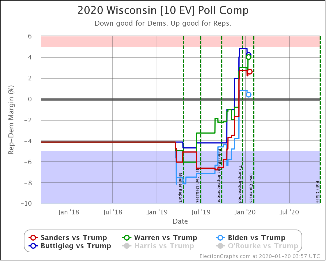
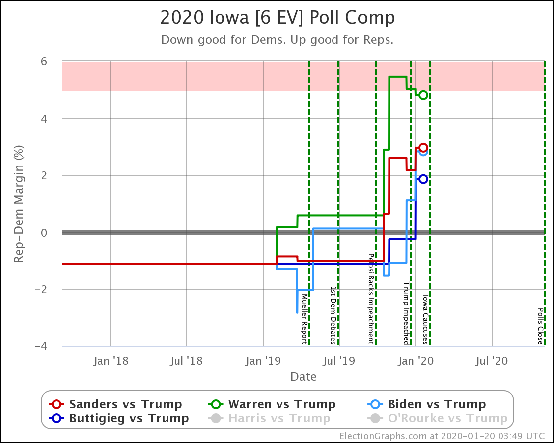
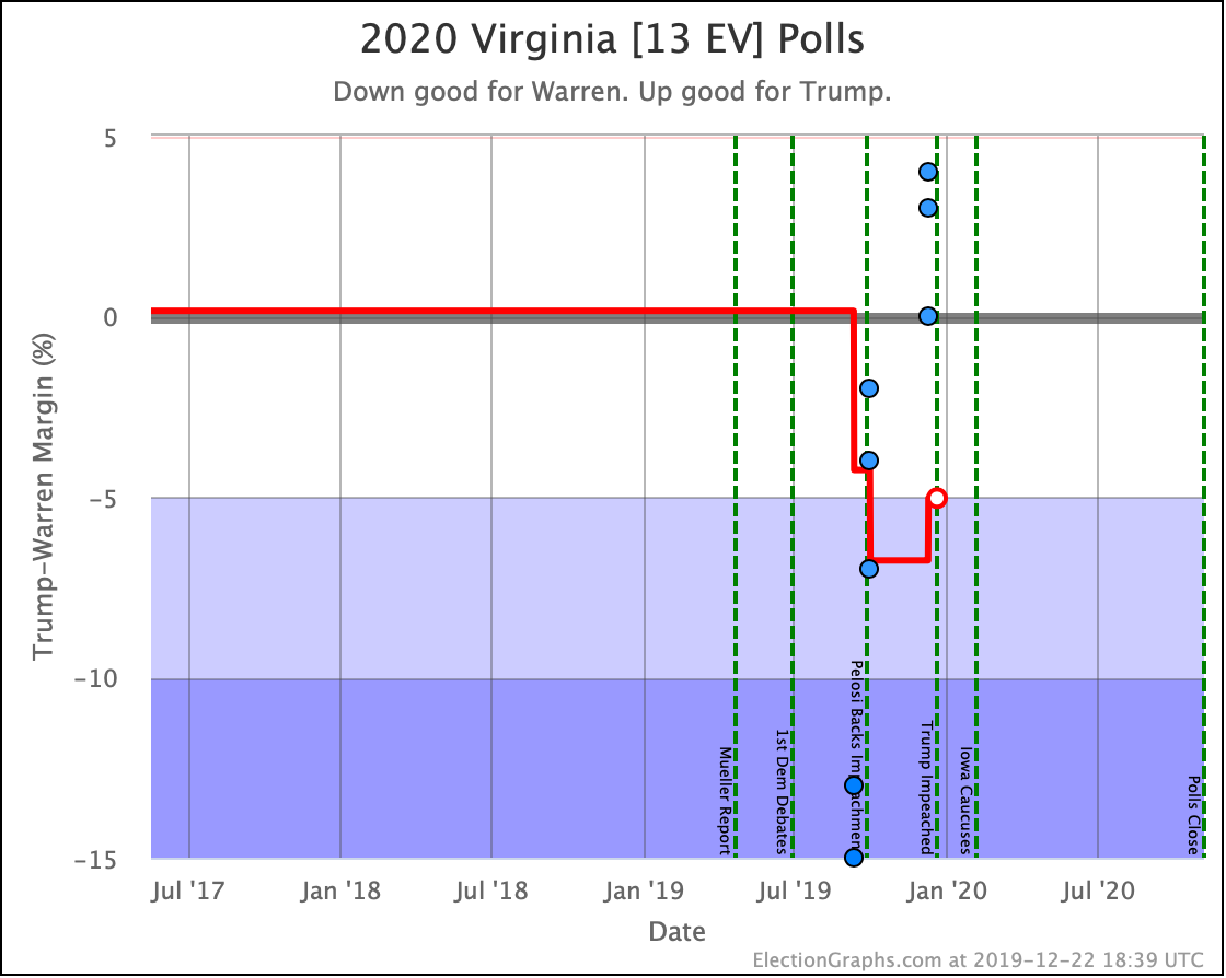
Since the last update on February 11th, there have been new state-level general election polls in Alabama, Wisconsin (x2), Texas, Kansas, Oklahoma, New Jersey, North Carolina, California (x2), Florida, Michigan, and Pennsylvania.
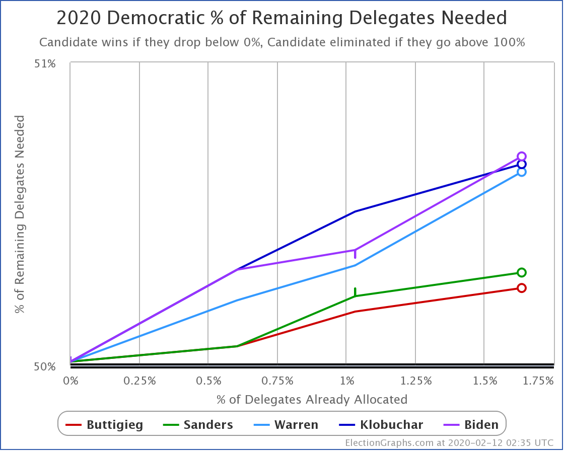
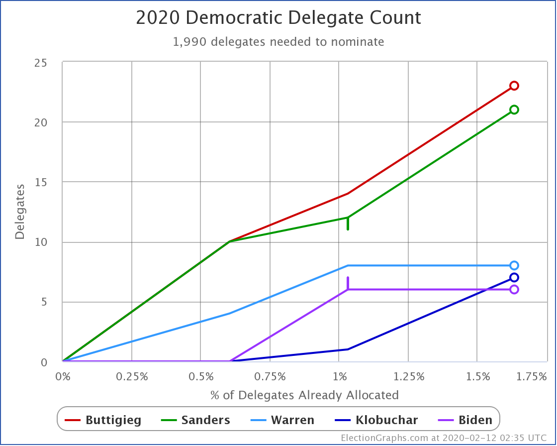
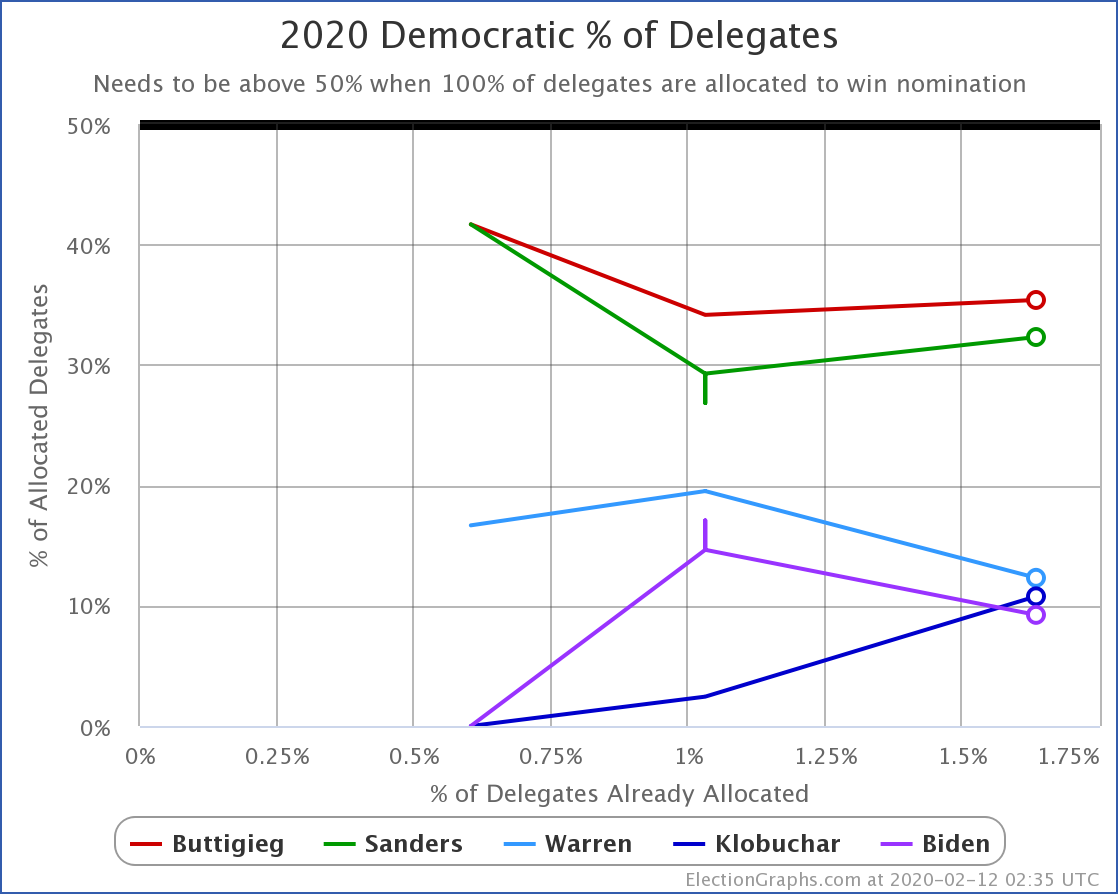
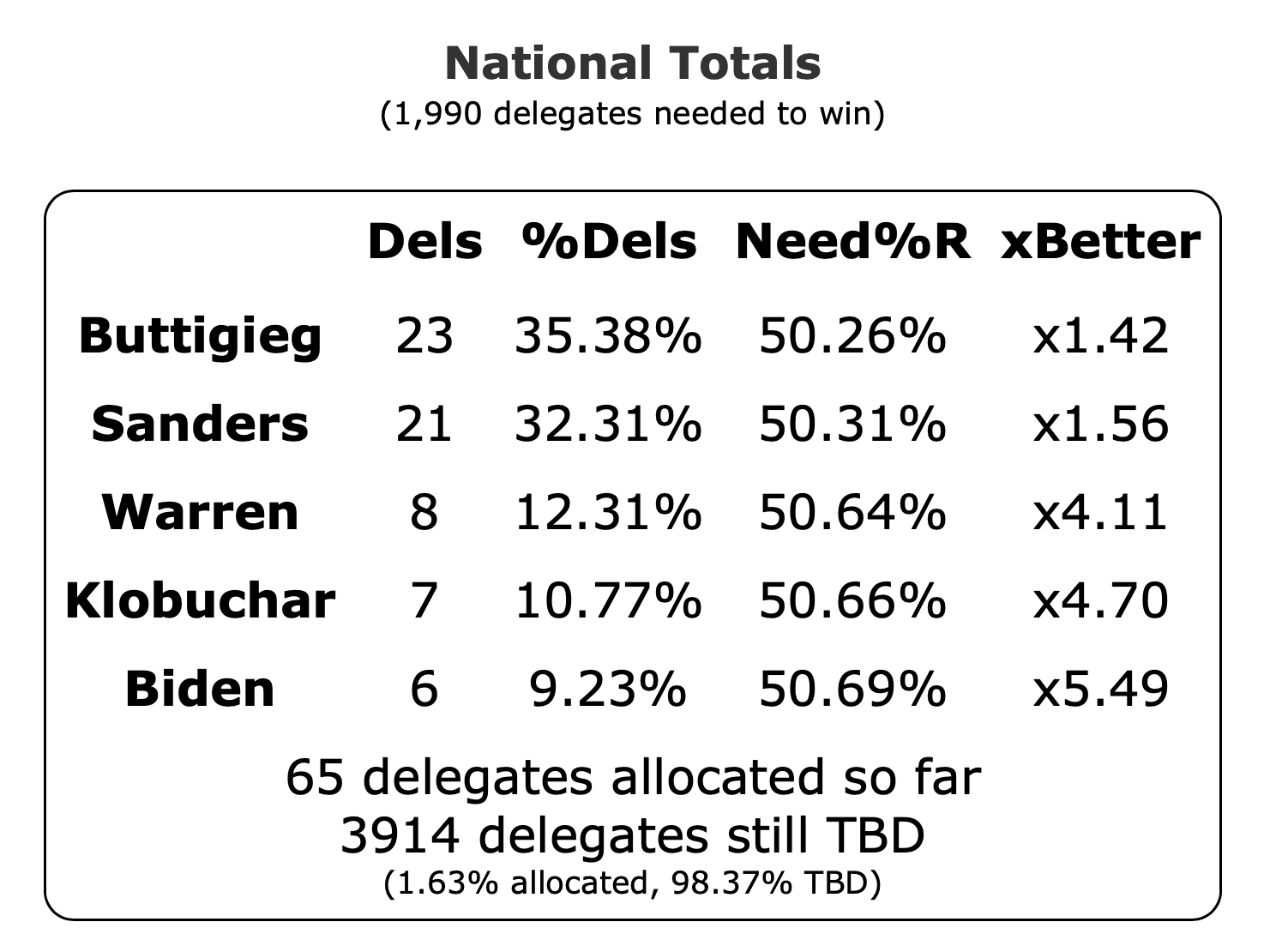
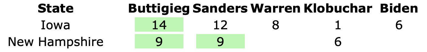
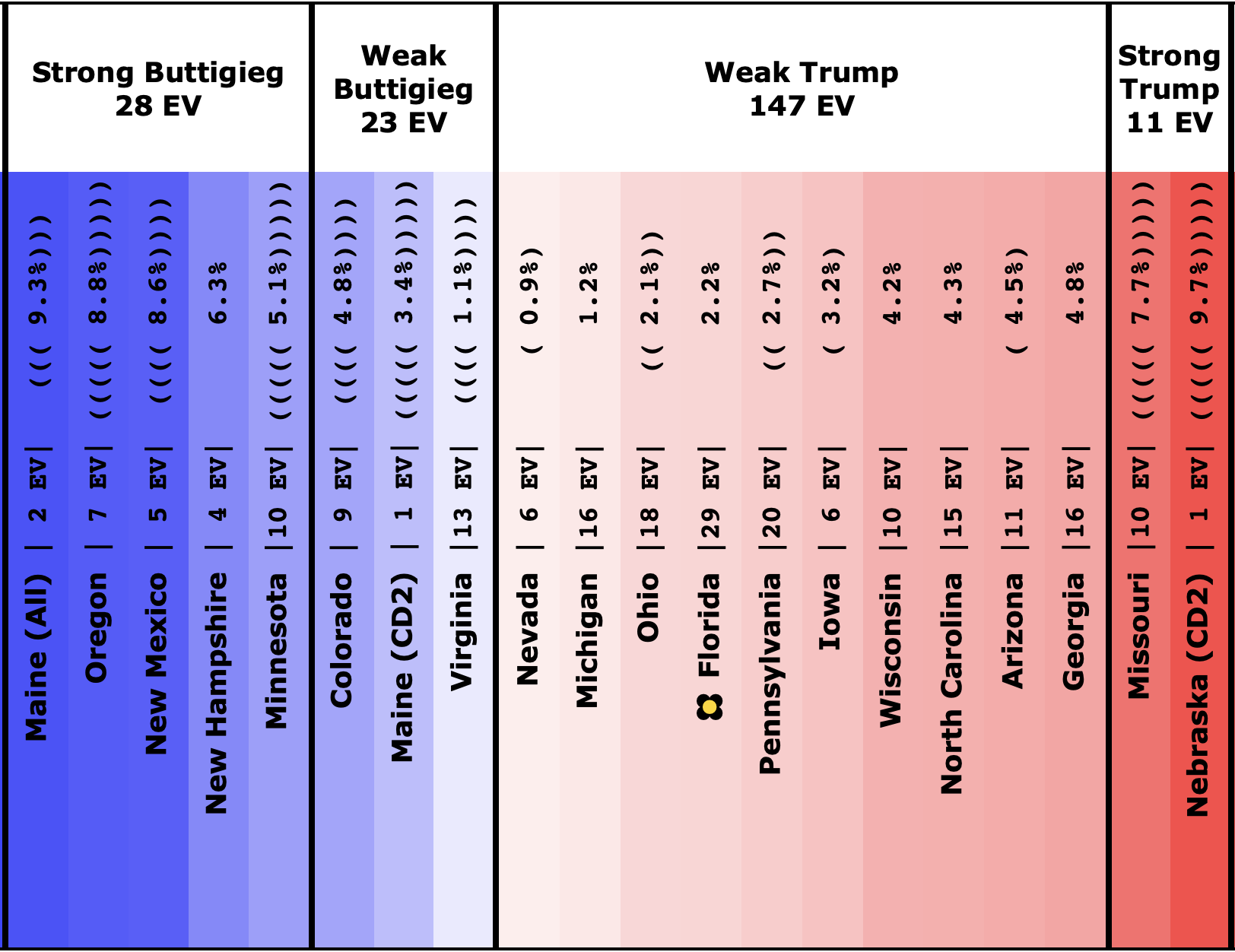
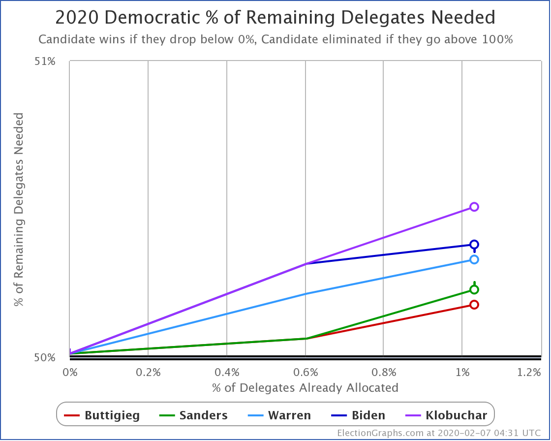
Over on the delegate side, we currently have Buttigieg in the lead with 23 delegates, with Sanders just behind with 21, followed by Warren, Klobuchar, and Biden in single digits. But the Nevada caucuses are tomorrow, and that will all get shaken up again, and we will have a new set of narratives to run with.
In the meantime, let's look at how the various contenders are doing versus Trump with the latest polling updates.
Using the poll recency weighted by polling margin metric I use to determine which candidate pairs are the "best polled" with this update Bloomberg vs. Trump finally has better polling than O'Rourke vs. Trump, so even though that polling is still a bit more sparse than we would like we'll start including that matchup in these summaries. (This may be temporary, this only happened because at the moment the Bloomberg vs. Trump margin happens to round to zero in Wisconsin.)
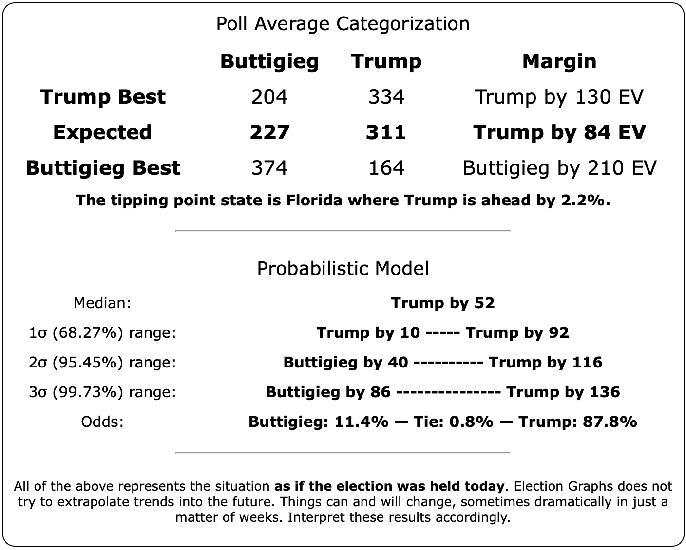
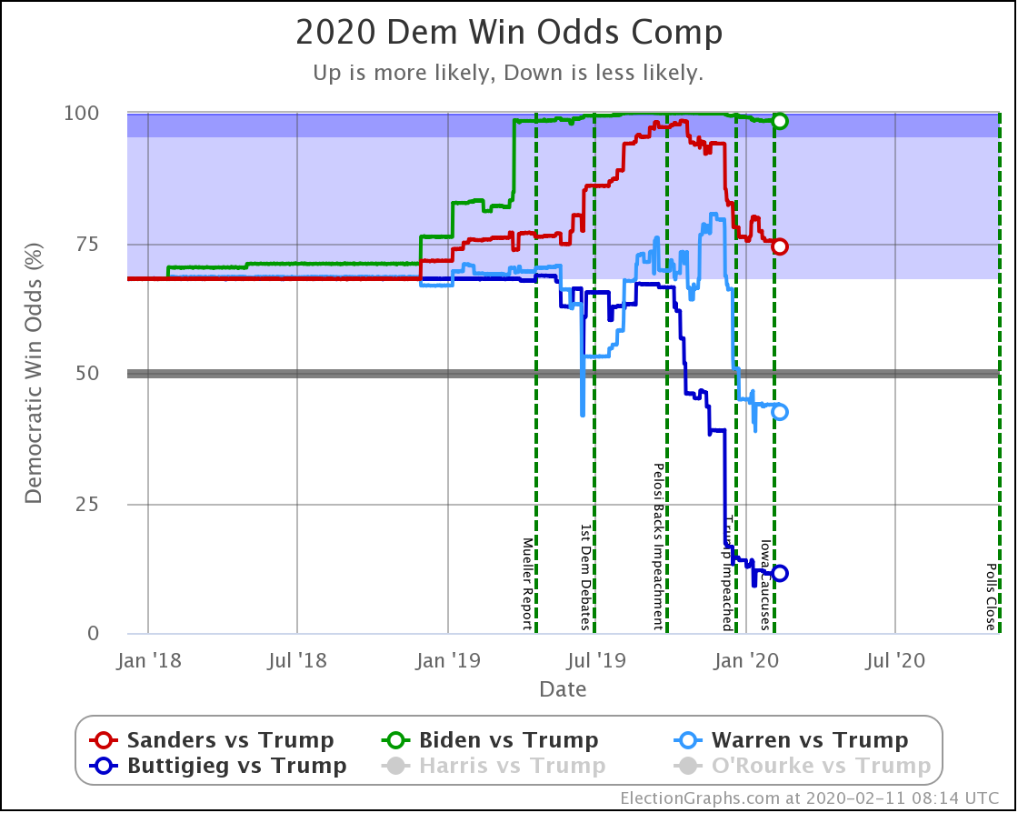
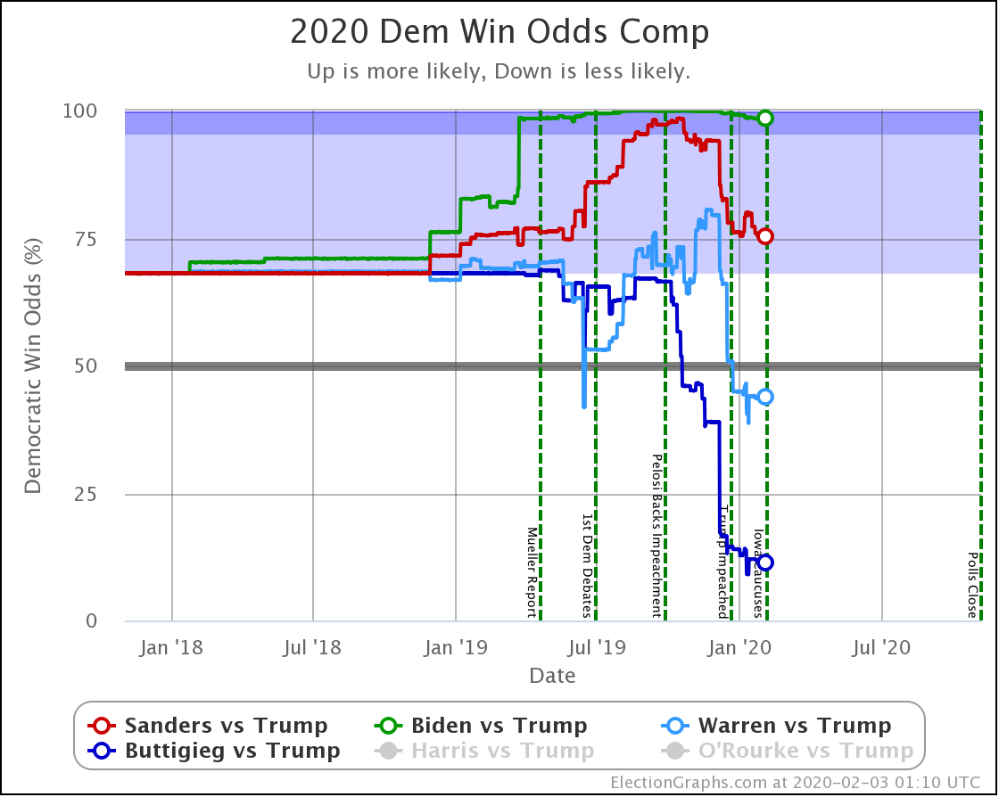
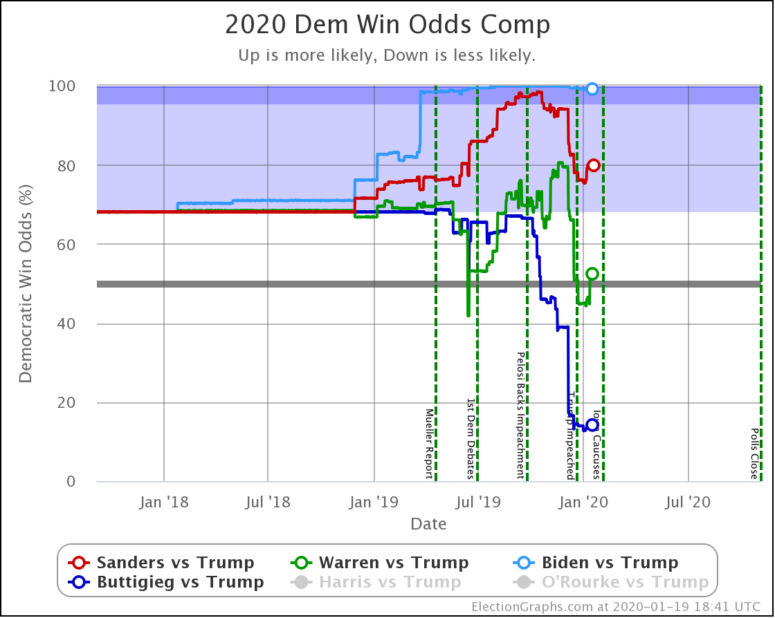
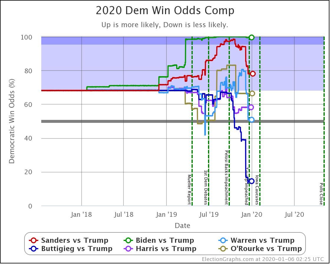
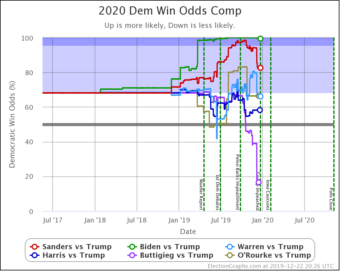
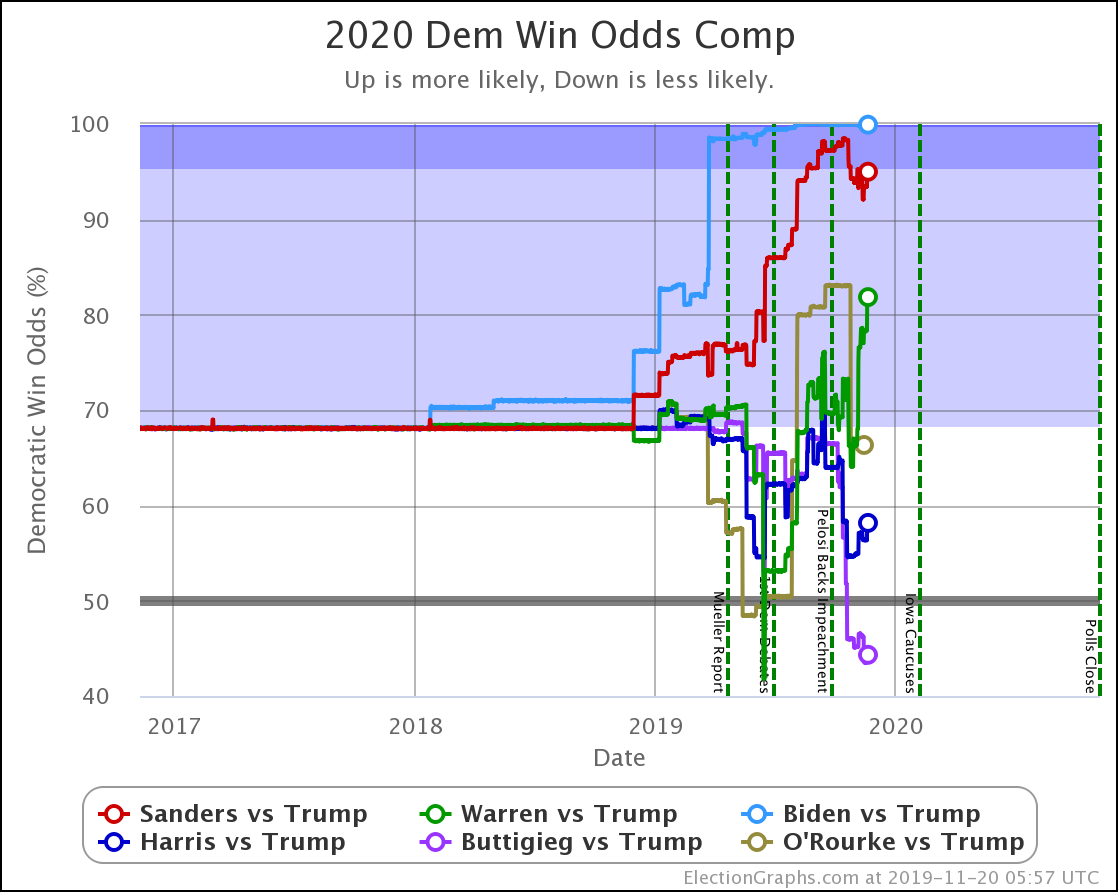
Starting this time with the bottom line, the odds of winning in our probabilistic model:
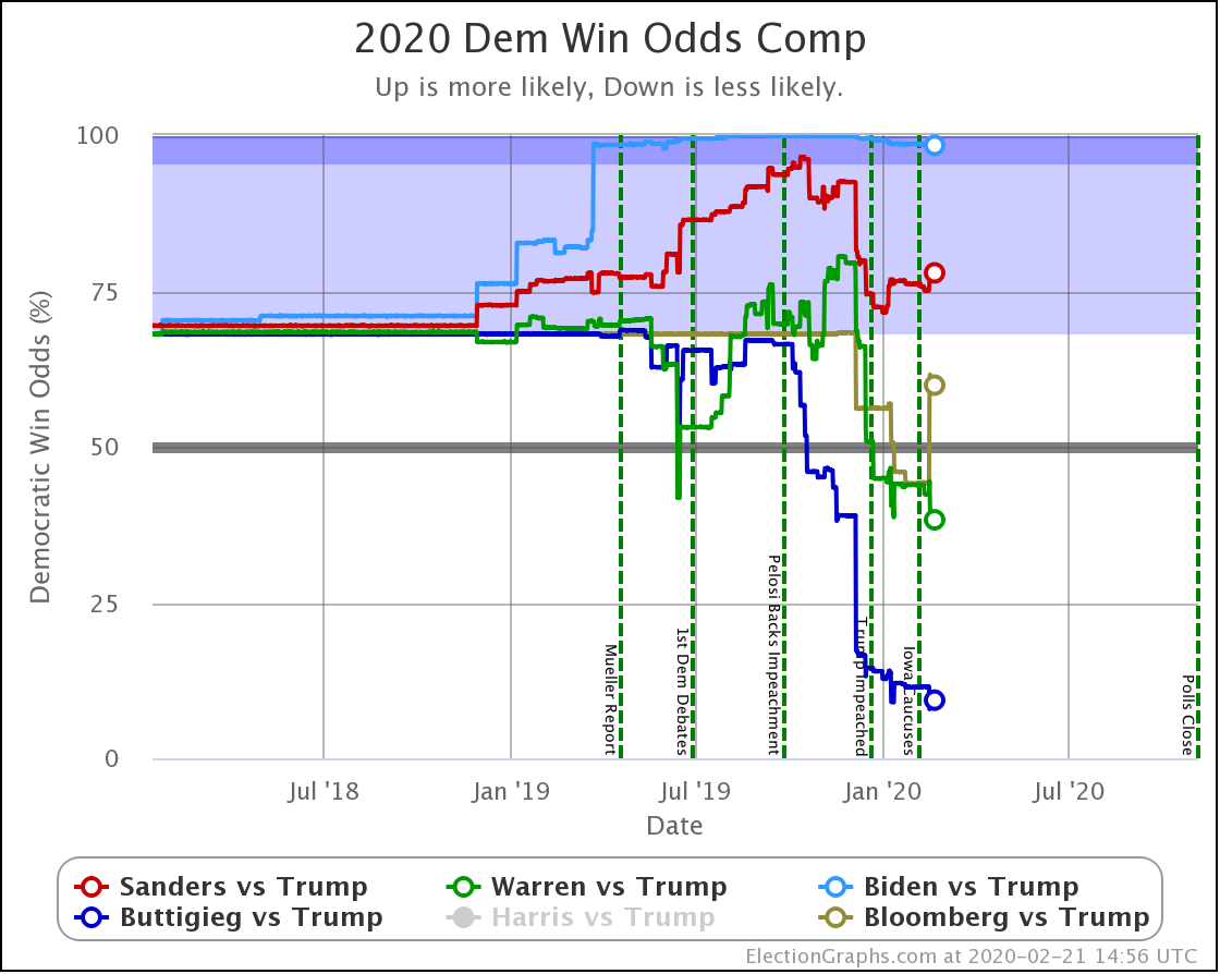
| Dem | 11 Feb | 21 Feb | 𝚫 |
| Biden | 98.4% | 98.4% | Flat |
| Sanders | 74.2% | 77.9% | +3.7% |
| Bloomberg | —– | 59.9% | —– |
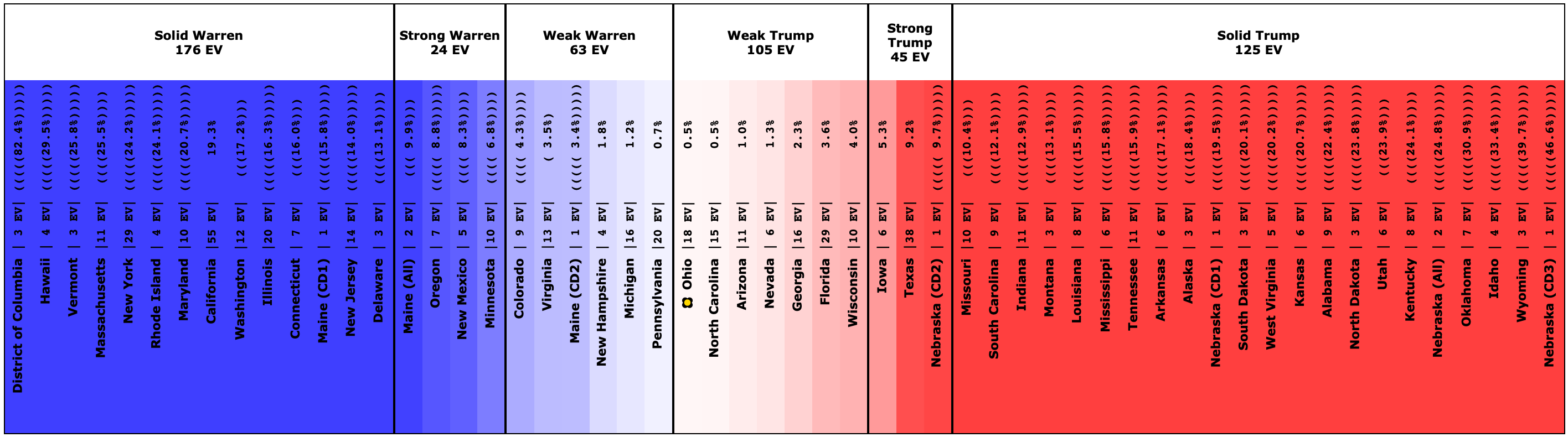
| Warren | 42.5% | 38.3% | -4.2% |
| Buttigieg | 11.4% | 9.3% | -2.1% |
First of all, Bloomberg debuts doing better against Trump than Buttigieg and Warren, but not as well as Sanders or Biden. At 59.9% he is better than a coin toss, but not by a lot.
Now, caveats on Bloomberg. So far he has only been polled against Trump in 17 states, and for some reason, many of those states are ones like California or Utah, where we pretty much know who will win and the poll doesn't change the picture very much. In the close states, there still isn't even a single state where he has been polled five times, which means that we are still heavily reliant on past election results rather than 2020 polls to estimate where things are.
So maybe consider the Bloomberg numbers provisional.
Bloomberg has been spending hundreds of millions of dollars on advertising campaigns that for the most part have not been directed at the other Democrats, but instead have been attacking Trump. Bloomberg has been trying to make the case that he is better positioned to win against Trump than the other candidates in part due to his ability to do that. At this week's debate, he also specifically claimed that nominating Sanders would guarantee a Trump win.
The numbers so far just don't back that up.
Where there have been polls including Bloomberg, he generally performs in the middle of the pack against Trump. He isn't clearly doing better than the other Democrats.
Now, the others.
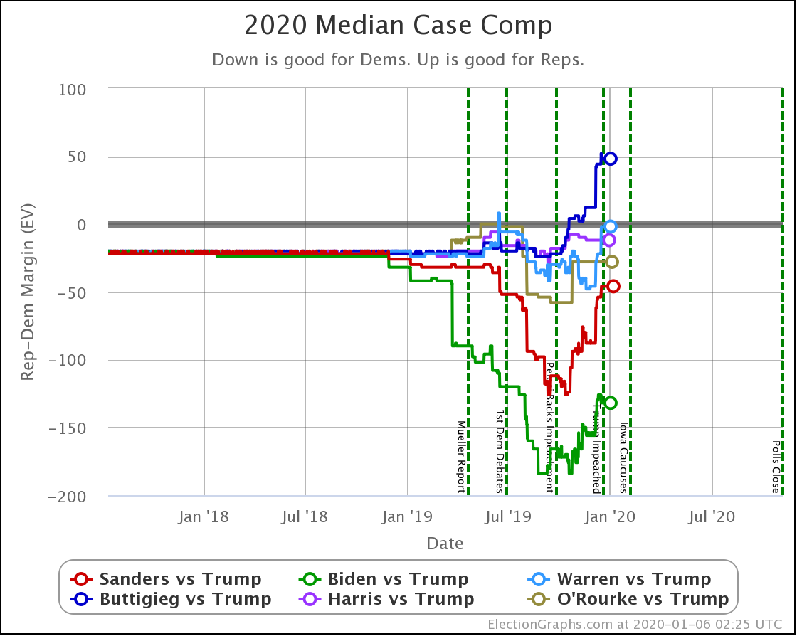
Sanders is the only Democrat who has improved their position over the last 10 days, moving from a 74.2% chance of winning to 77.9%.
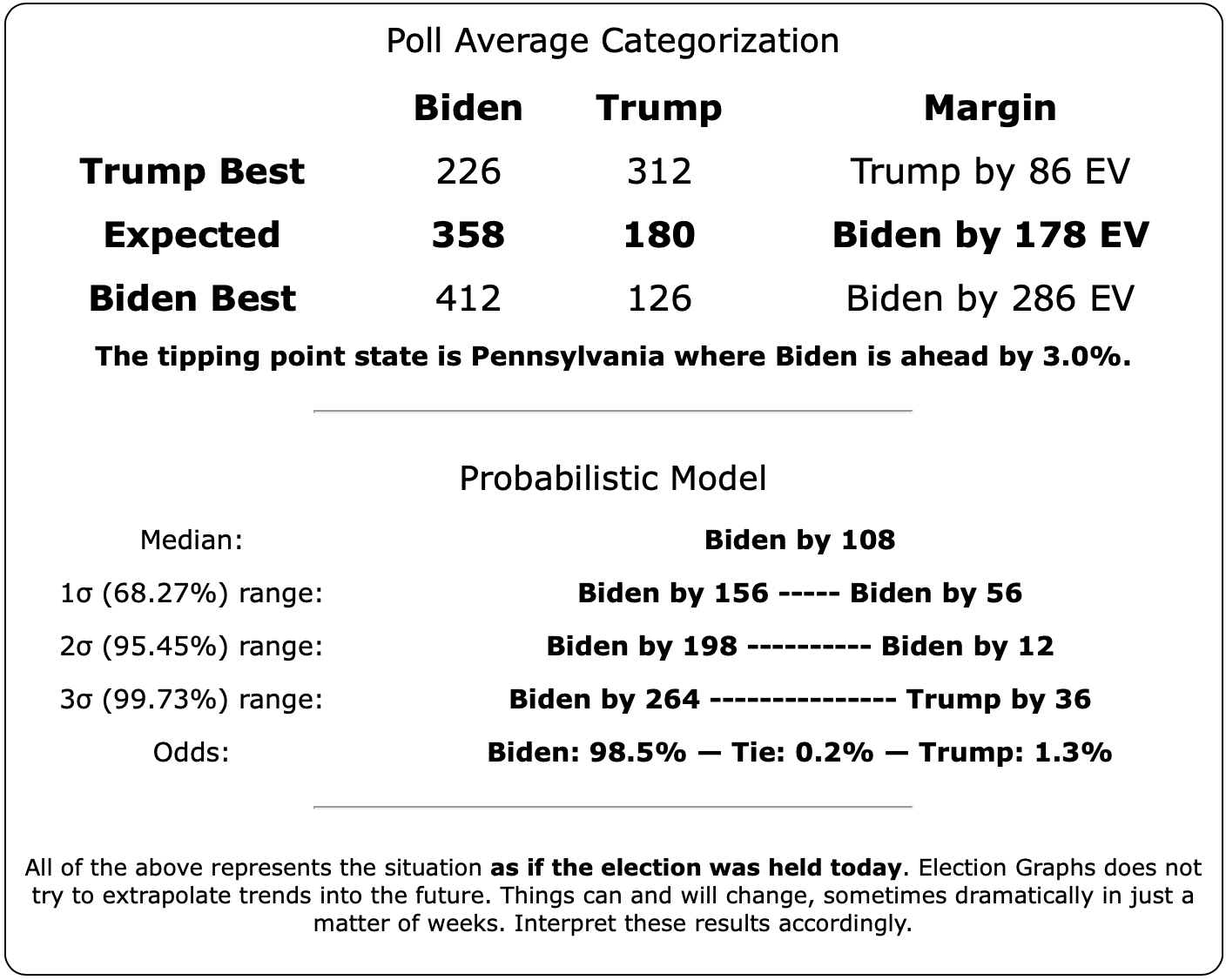
Biden still does better than anybody else against Trump, down from his highs, but still at a very strong 98.4% with no significant change since last we looked.
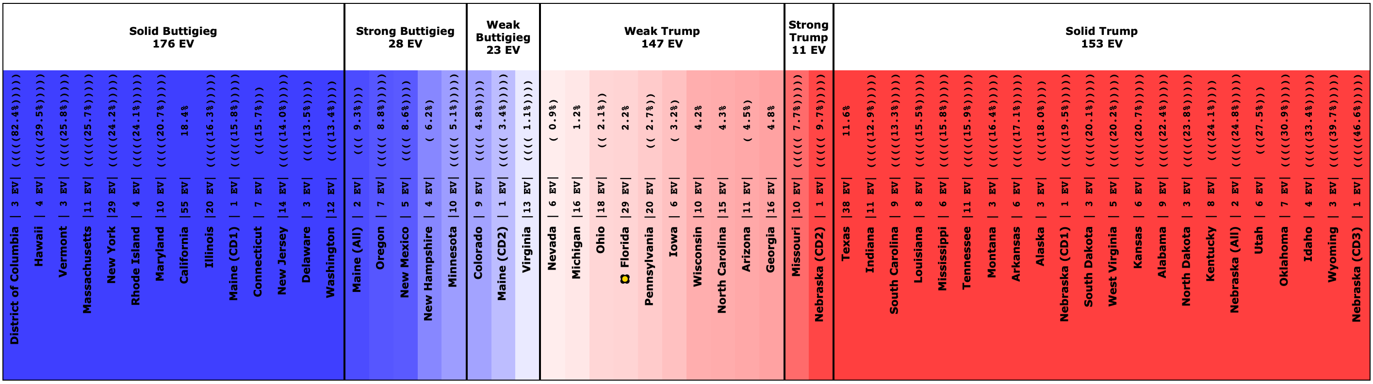
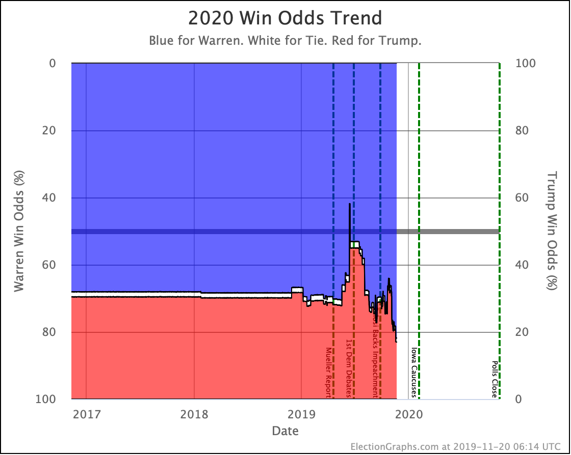
Warren and Buttigieg continue to fade. Current polling shows both to be more likely to lose than to win, and the picture is getting worse with time.
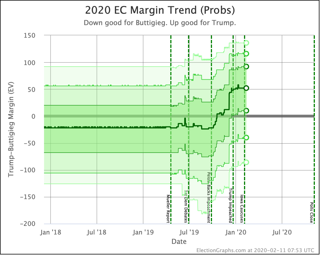
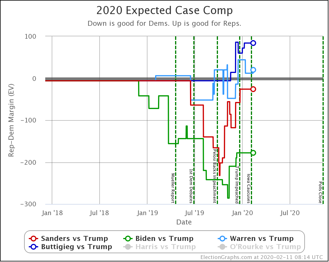
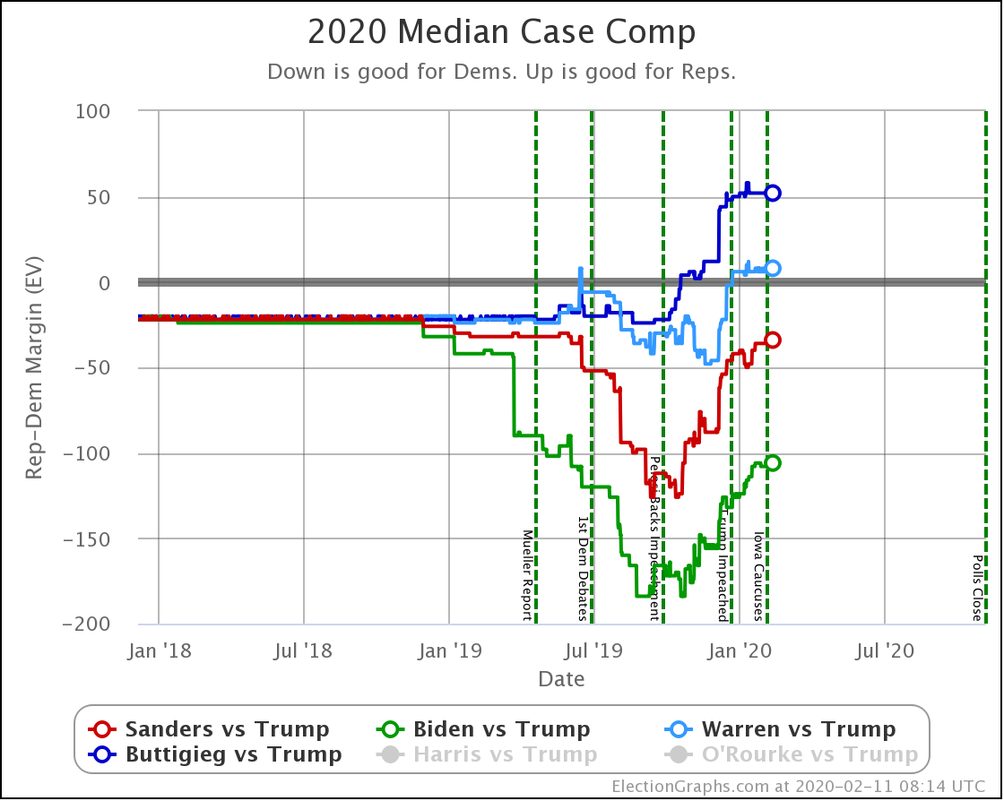
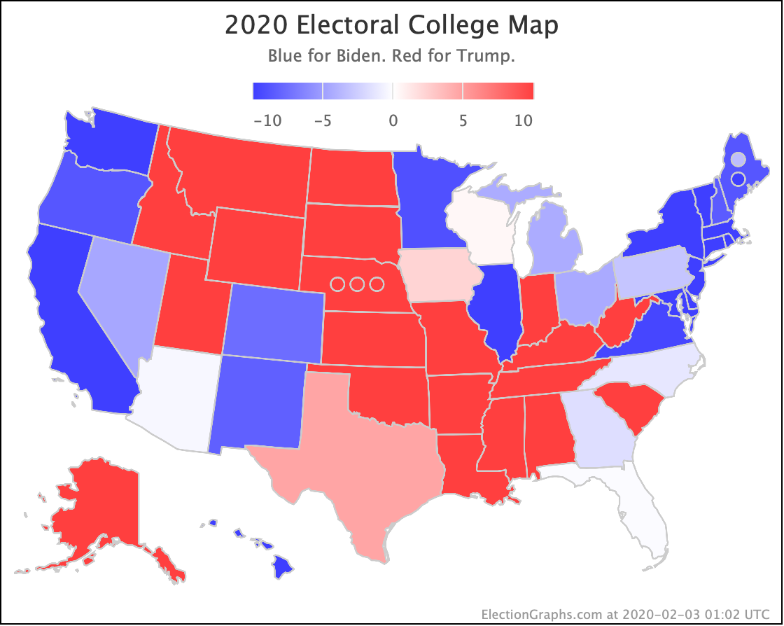
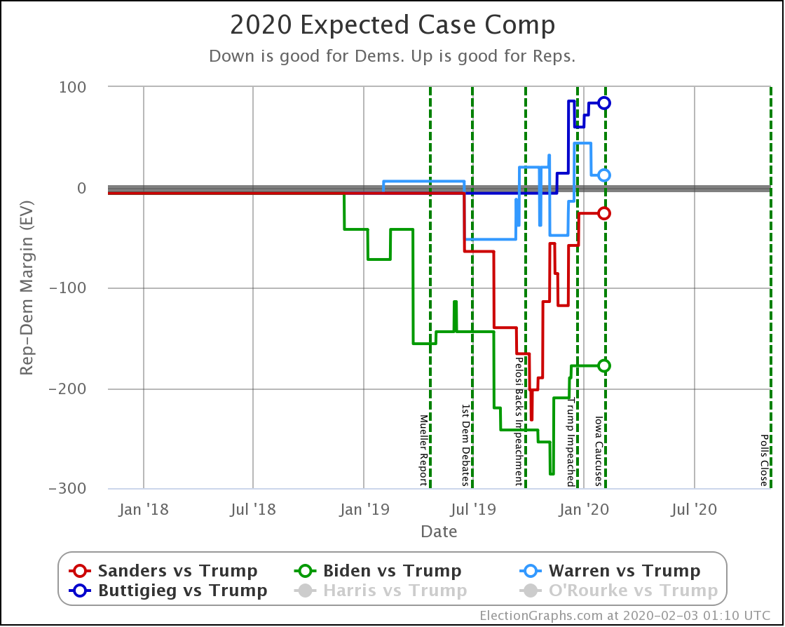
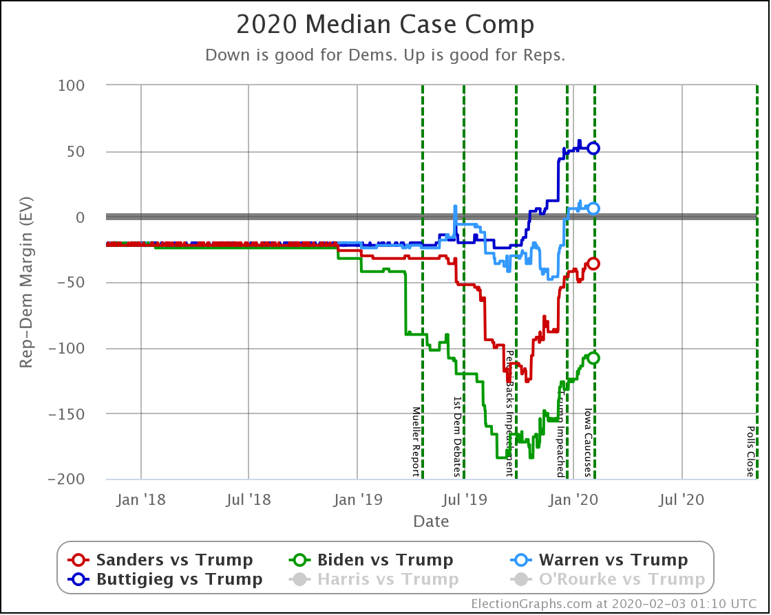
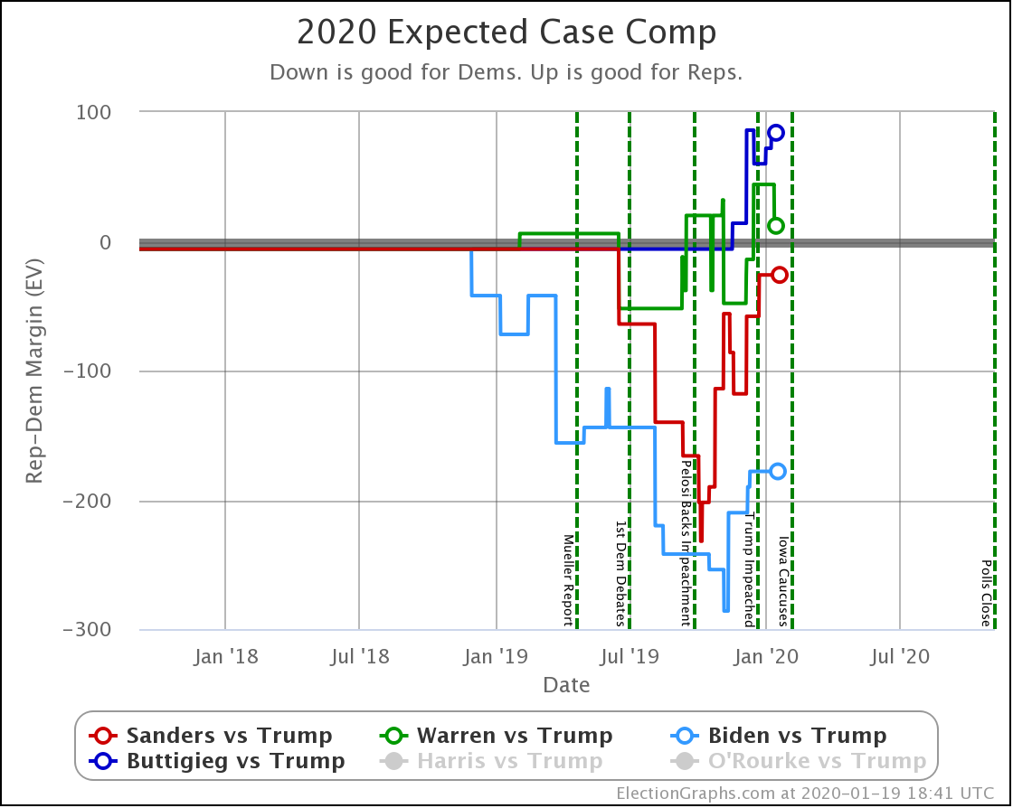
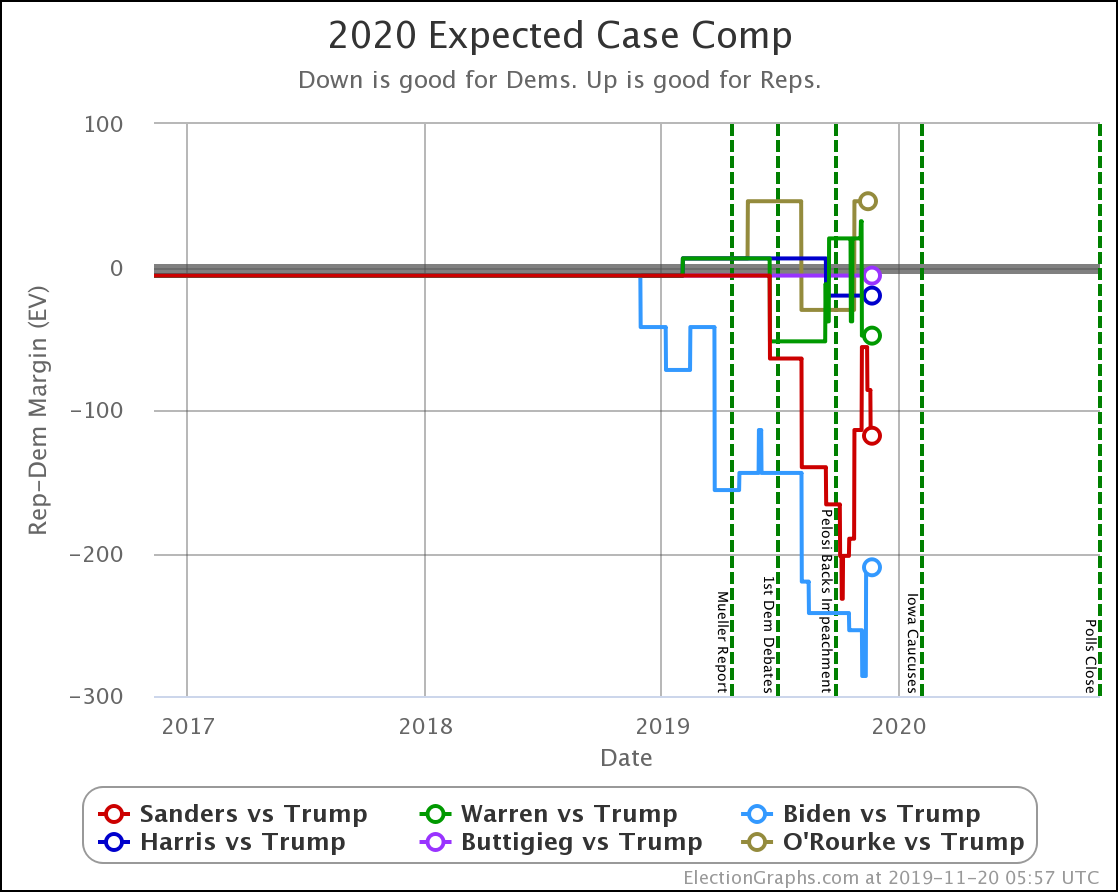
OK, now the view that shows the median electoral vote result in the Monte Carlo simulations for each candidate pair. As always, keep in mind that the simulations actually show that a very large range of results is possible for each candidate, this is essentially just the line marking the middle, where half the time the Democrat does better, and half the time the Republican does better.
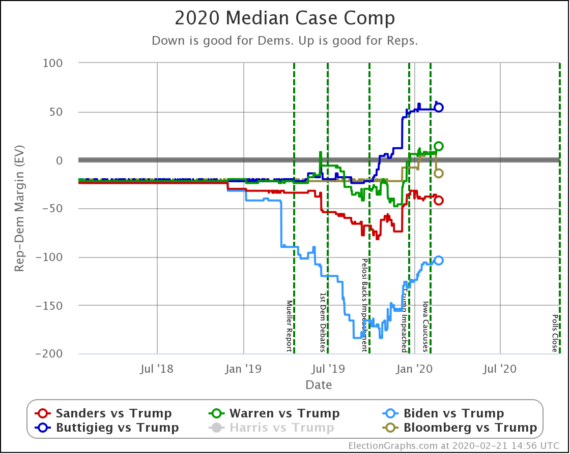
| Dem | 11 Feb | 21 Feb | 𝚫 |
| Biden | +106 | +104 | -2 |
| Sanders | +34 | +42 | +10 |
| Bloomberg | —– | +14 | —– |
| Warren | -8 | -14 | -6 |
| Buttigieg | -52 | -54 | -2 |
With this view, you can see Biden also dropped a little bit, even though his odds of winning didn't change within the rounding limit.
That's it for the probabilistic model.
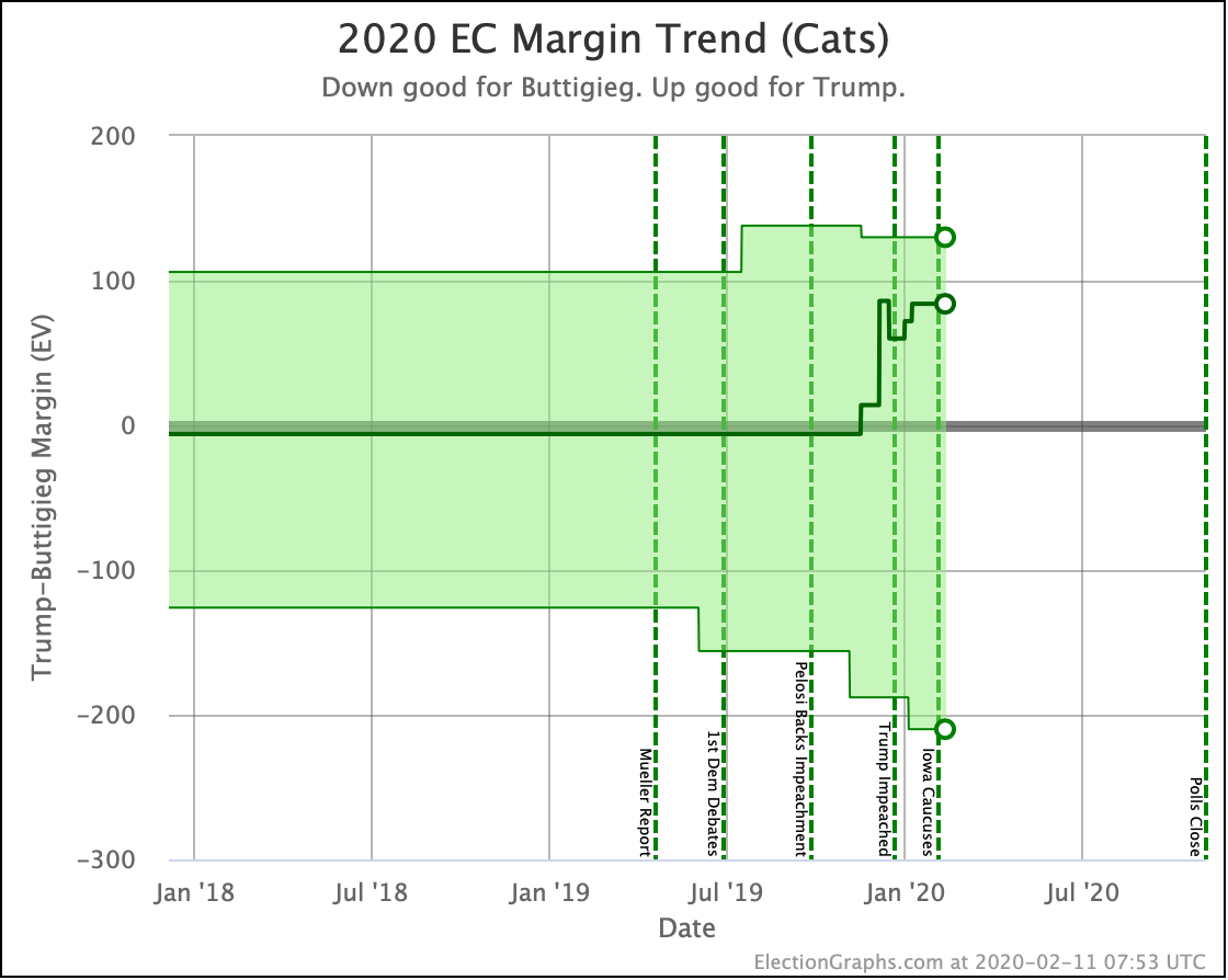
For those of you who prefer the older and simpler categorization model, where we just look at what would happen if each candidate won every state where they lead the averages, here you go:
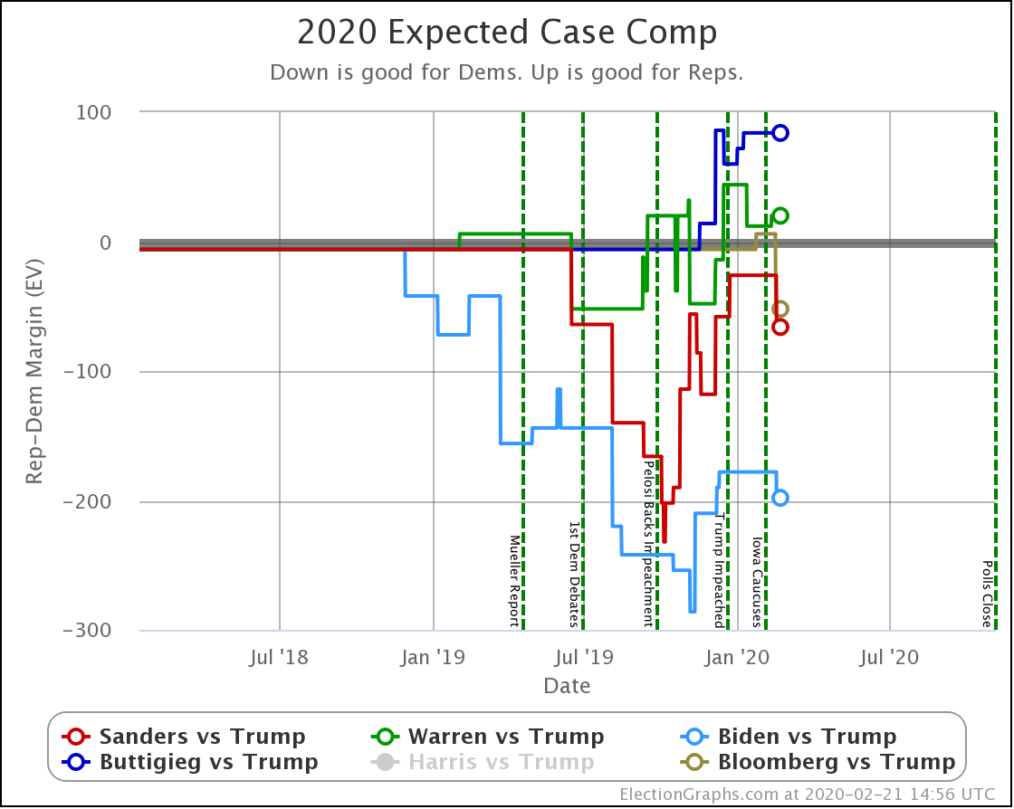
| Dem | 11 Feb | 21 Feb | 𝚫 |
| Biden | +178 | +198 | +20 |
| Sanders | +26 | +66 | +40 |
| Bloomberg | —– | +52 | —– |
| Warren | -20 | -20 | Flat |
| Buttigieg | -84 | -84 | Flat |
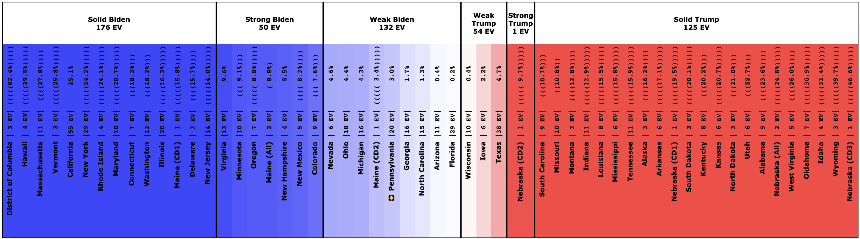
Interestingly, in this view Biden actually improves a bit. How can he improve here while getting worse or staying flat in the last two views?
Well, without digging up all the specific state by state details, it boils down to flipping from just barely losing to just barely winning in one state (Wisconsin) while getting a bit worse in a few other close states without the state actually crossing the centerline. In the probabilistic view, the declines in the other states slightly outweigh the change in Wisconsin. But in the categorization view, the change in Wisconsin is the only change that matters at all.
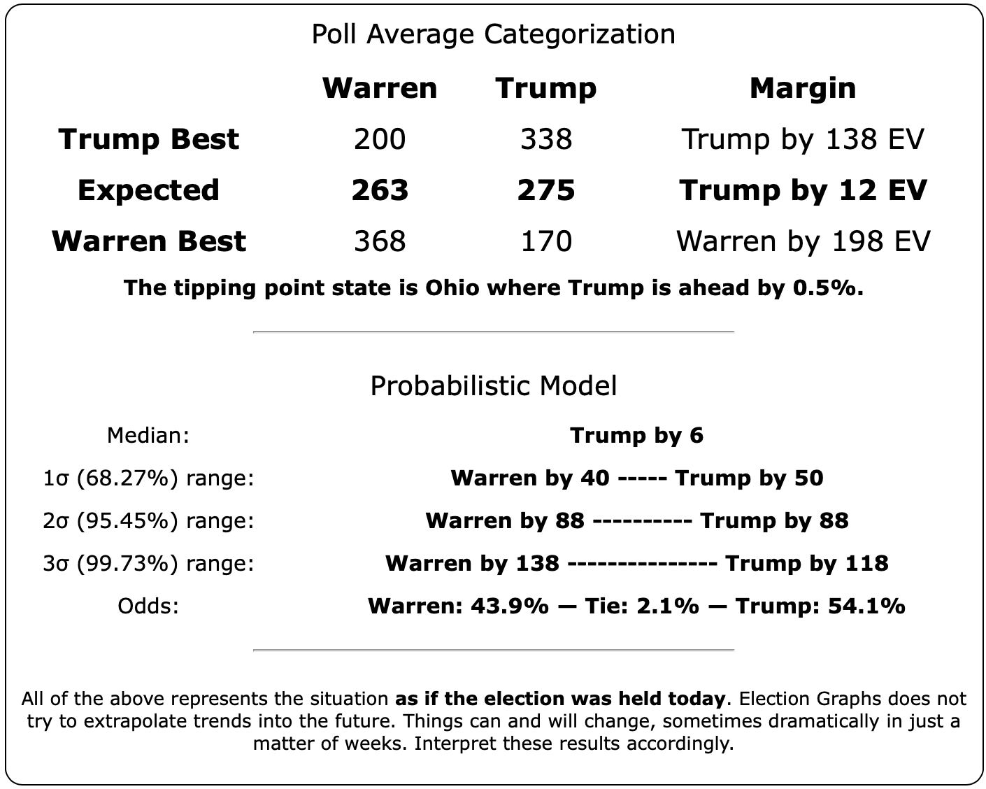
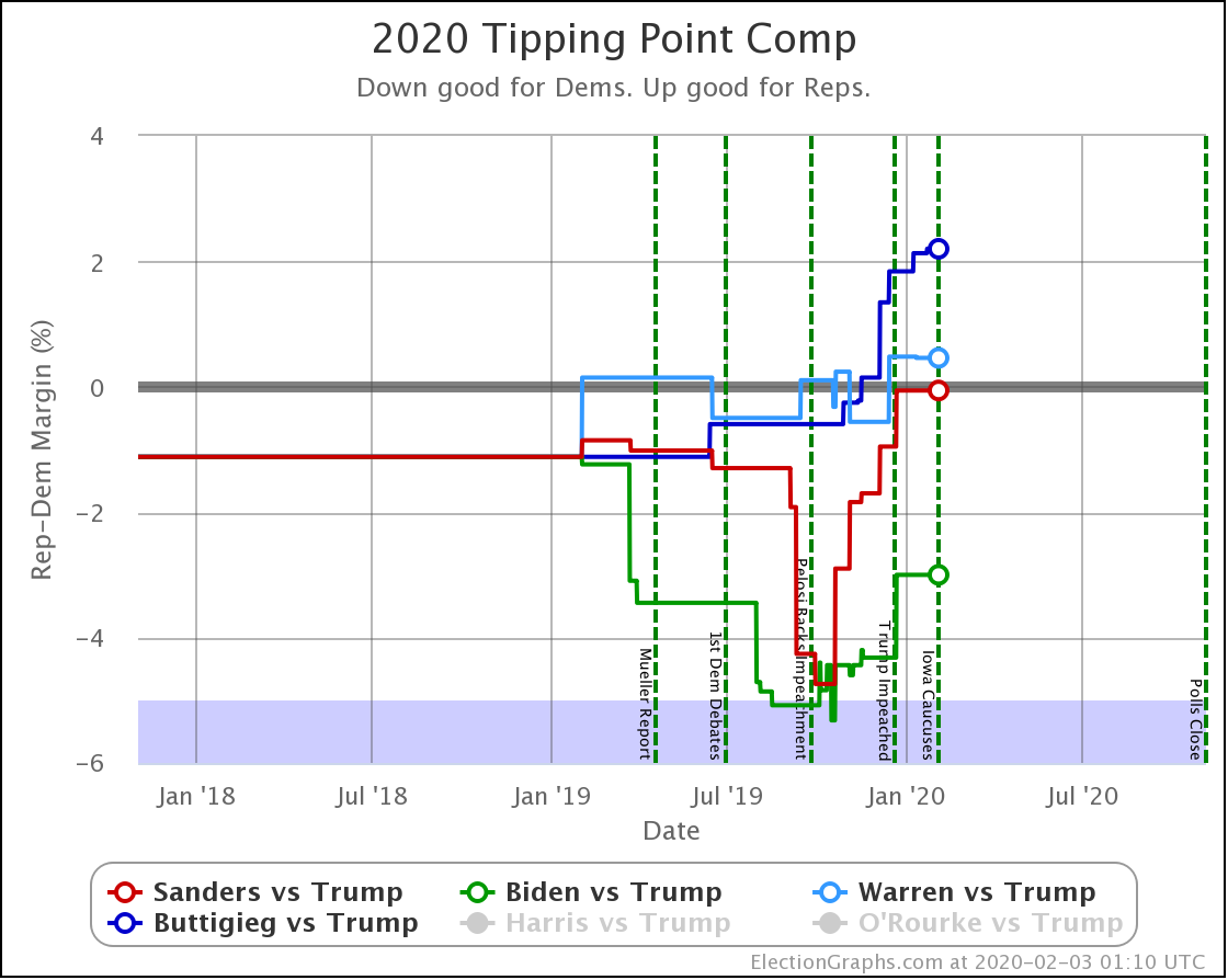
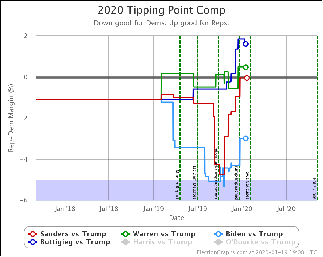
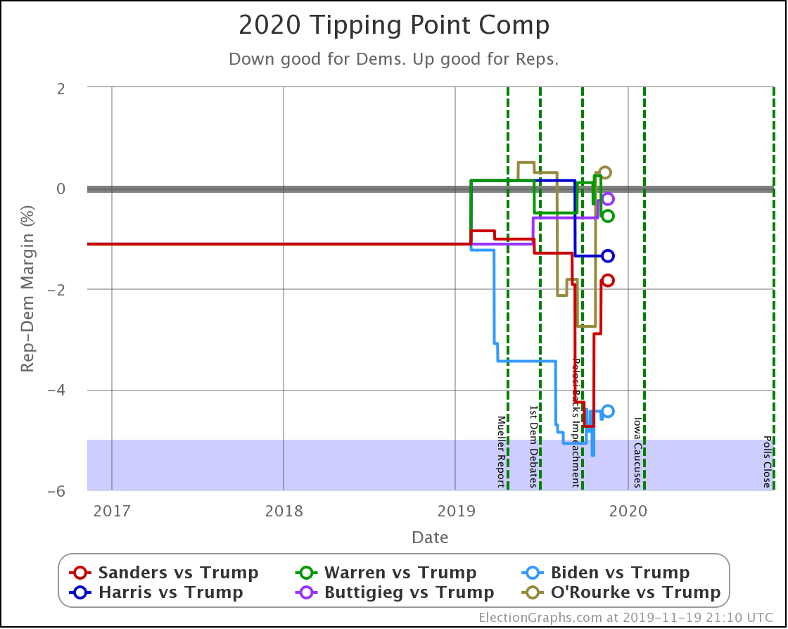
Finally, the tipping point, which is in the margin in the state that would put the winner over the top (if the results all matched the polling averages and you sorted the states by the margins). Basically, this shows you how much polling would have to shift across the board in all states to change the winner.
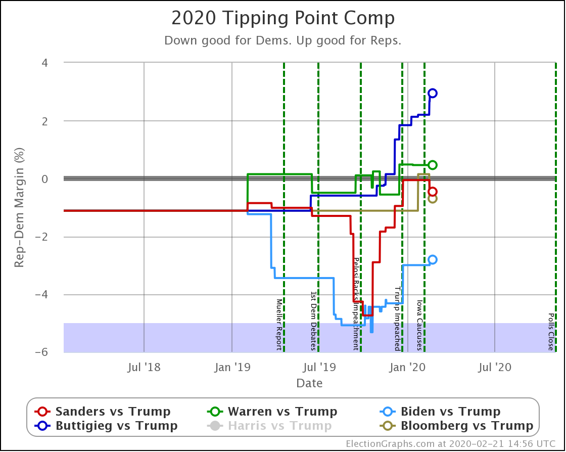
| Dem | 11 Feb | 21 Feb | 𝚫 |
| Biden | +3.0% | +2.8% | -0.2% |
| Bloomberg | —– | +0.7% | —– |
| Sanders | +0.1% | +0.5% | +0.4% |
| Warren | -0.5% | -0.5% | Flat |
| Buttigieg | -2.2% | -2.9% | -0.7% |
In terms of the tipping point, Bloomberg actually does slightly better than Sanders. Otherwise, this looks similar to the patterns seen elsewhere. One way to interpret this result is that while Sanders is in a stronger position than Bloomberg in the current polling, that position is a bit more tenuous, and could change more easily.
But bottom line, ALL of these tipping points show a very volatile race. In 2016 the tipping point showed it could swing 5% in just weeks as a reaction to campaign events in the news. None of these candidates are further than 2.9% from the centerline. So with the right stories in the news, they could go from winning to losing or vice versa very quickly.
And that is where we are a day before Nevada.
256.3 days until polls start to close.
For more information:
This post is an update based on the data on the Election Graphs Electoral College 2020 page. Election Graphs tracks a poll-based estimate of the Electoral College. The charts, graphs, and maps in the post above are all as of the time of this post. Click through on any image to go to a page with the current interactive versions of that chart, along with additional details.
Follow @ElectionGraphs on Twitter or Election Graphs on Facebook to see announcements of updates. For those interested in individual poll updates, follow @ElecCollPolls on Twitter for all the polls as I add them. If you find the information in these posts informative or useful, please consider visiting the donation page.