Here we go. It has been another 50 days, so time for another blog post update on the 2024 race. I'll do these more often when we get really close to the end, but for now 50 days still seems good.
Remember, here on the blog I try to do periodic narrative updates, but I update the live status on ElectionGraphs.com as quickly as I can when new state level polls come up, so the graphs and charts there will always be more up to date than these blog posts. Also follow Election Graphs on Mastodon for updates every single time a poll is added, plus daily status summaries.
As usual, I'll start with a summary.
- Bottom line: There may be lots of time left for things to play out, but Trump is doing great right now, and Biden is… not.
OK, a little bit more:
- The last 50 days of polls have continued to move in Trump's direction. Biden's best position of the last year was in June. The next three months were not great, but things were mostly steady. Then the bottom fell out around the start of October, and things have only gotten worse since.
- Some of the graphs have started to turn around and move toward Biden again in the last month or so, but due to the winter holidays polling has actually been pretty sparse, and so it is too early to tell if this is the start of a new sustained trend, or just a temporary bump.
- The tipping point right now is Trump ahead by 4.0% in Michigan. That still represents a close race. 4.0% is an amount that can disappear in less than a week depending on news events, or if polls are wrong in the opposite direction this year compared to 2020 or 2016, that lead could be a mirage.
- Polls this far out ARE NOT predictive of the final result. However, we can see where things stand today and compare to previous cycles. Trump continues to massively outperform his state level polling at the same time in the 2016 and 2020 cycles.
- In 2020, Biden won Georgia and Arizona. At the moment, those two states don't even look competitive, with polling showing strong leads for Trump in both.
- In 2020, Biden also won Pennsylvania, Michigan, Wisconsin, and Nevada. Trump is currently showing narrow leads in all four. These states have been battlegrounds before, and clearly will be again this time. To get things moving back in his direction, Biden needs to start here.
- Some Democrats are acting as if Trump has a weak hand and any current good polling for him is just an aberration and will disappear as the election approaches and Trump's legal issues continue to unspool. Or they point to special elections and abortion referenda where they have over performed relative to expectations. Or to the large number of undecided voters that they think will end up breaking for Biden in the end. Perhaps they will be right on all that. But right now Trump is ahead, and it is foolish to underestimate him.
With that out of the way, anybody who only cares about the summary should leave. For those of you who are left, I'll dump a lot of charts and graphs…
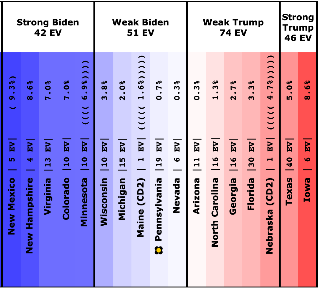
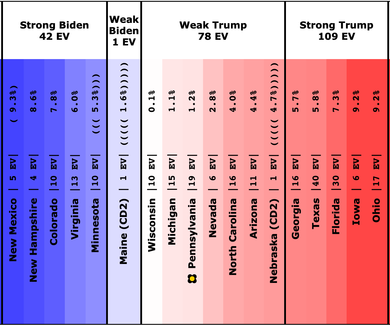
Here is what the spectrum of close states (poll average margin 10% or less) looked like when I did the last blog post on 2023-11-24:
And here we are on 2024-01-15:
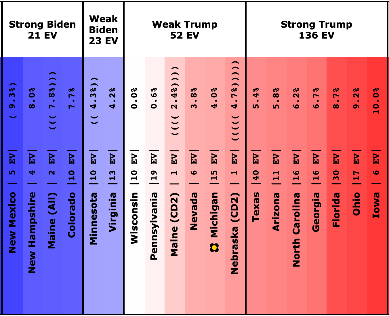
Categorizing the movement of all of these states:
Movement toward Trump:
- Maine-CD2 (1 EV): Biden by 1.6% -> Trump by 2.4% (Trump+4.0%)
- Maine-All (2 EV): Biden by 11.1% -> Biden by 7.8% (Trump+3.3%)
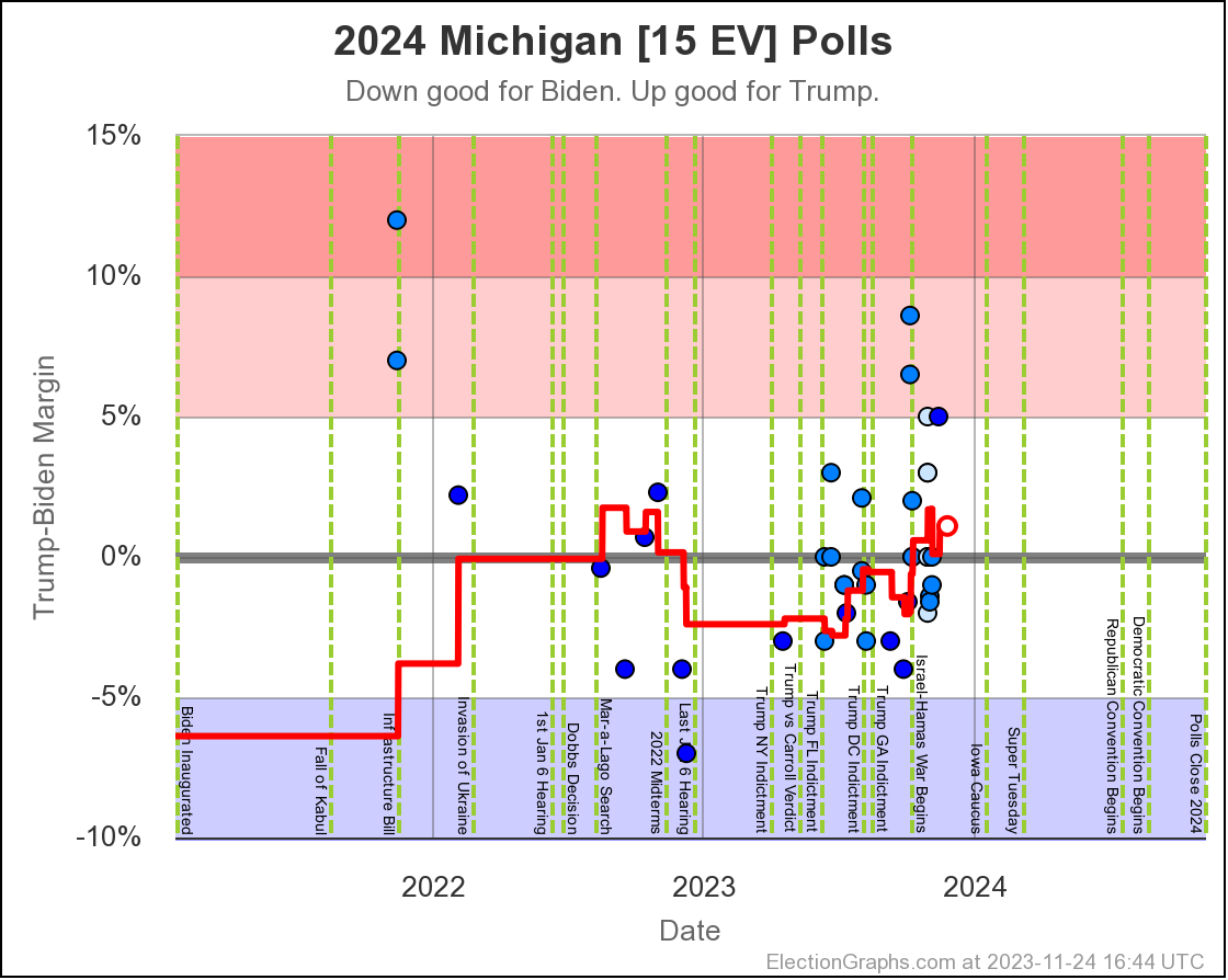
- Michigan (15 EV): Trump by 1.1% -> Trump by 4.0% (Trump+2.9%)
- North Carolina (16 EV): Trump by 4.0% -> Trump by 6.2% (Trump+2.2%)
- Virginia (13 EV): Biden by 6.0% -> Biden by 4.2% (Trump+1.8%)
- Arizona (11 EV): Trump by 4.4% -> Trump by 5.8% (Trump+1.4%)
- Florida (30 EV): Trump by 7.3% -> Trump by 8.7% (Trump+1.4%)
- Minnesota (10 EV): Biden by 5.3% -> Biden by 4.3% (Trump+1.0%)
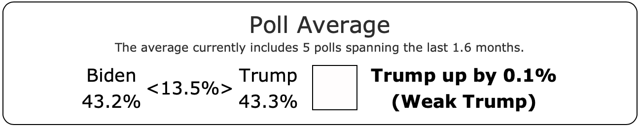
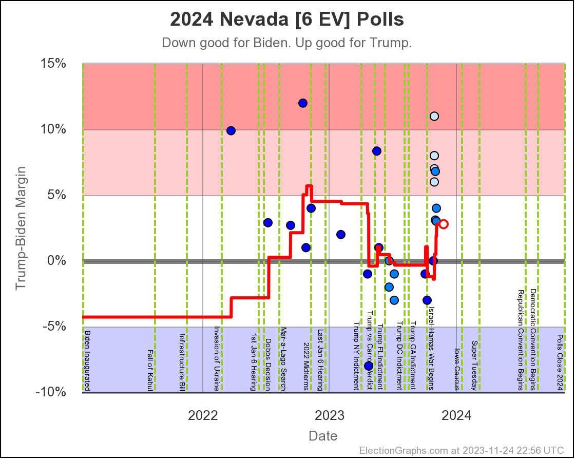
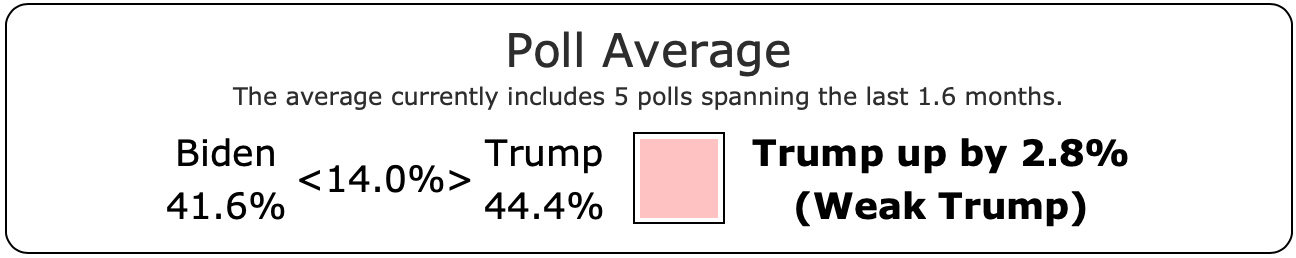
- Nevada (6 EV): Trump by 2.8% -> Trump by 3.8% (Trump+1.0%)
- Georgia (16 EV): Trump by 5.7% -> Trump by 6.7% (Trump+1.0%)
- Iowa (6 EV): Trump by 9.2% -> Trump by 10.0% (Trump+0.8%)
- New Hampshire (4 EV): Biden by 8.6% -> Biden by 8.0% (Trump+0.6%)
- Colorado (10 EV): Biden by 7.8% -> Biden by 7.7% (Trump+0.1%)
No change:
- New Mexico (5 EV): Biden by 9.3%
- Nebraska-CD2 (1 EV): Trump by 4.7%
- Ohio (17 EV): Trump by 9.2%
Movement toward Biden:
- Wisconsin (10 EV): Trump by 0.1% -> Trump by 0.0% (Biden+0.1%)
- Texas (40 EV): Trump by 5.8% -> Trump by 5.4% (Biden+0.4%)
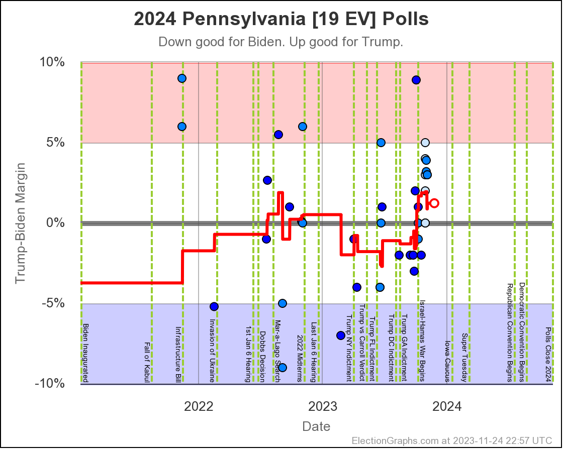
- Pennsylvania (19 EV): Trump by 1.2% -> Trump by 0.6% (Biden+0.6%)
Just like last time the moves were overwhelmingly toward Trump.
Wisconsin and Pennsylvania, both important states given how close they are, did go the other way by a small amount, but the impact of this was overwhelmed by so many other states moving against Biden.
The only thing that actually flipped from Biden to Trump since 50 days ago was Maine-CD2. This was due to the very first poll for this congressional district this cycle, showing a 14.0% Trump lead, displacing the 2004 election results in the average. In 2004 Kerry beat Bush by 5.8% there.
But in 2016 and 2020 Trump won ME-CD2 by healthy margins, so this is essentially just the new poll in the average confirming that the move toward the red in this district is likely to continue in 2024, and now that it has moved into that zone, it should not be surprising if ME-CD2 not only stays red, but gets redder once there are a few more 2024 polls in the mix.
But that's just one electoral vote. Lets take a deeper look at the four states currently in the "Weak Trump" category, in order by how many Electoral votes they have:
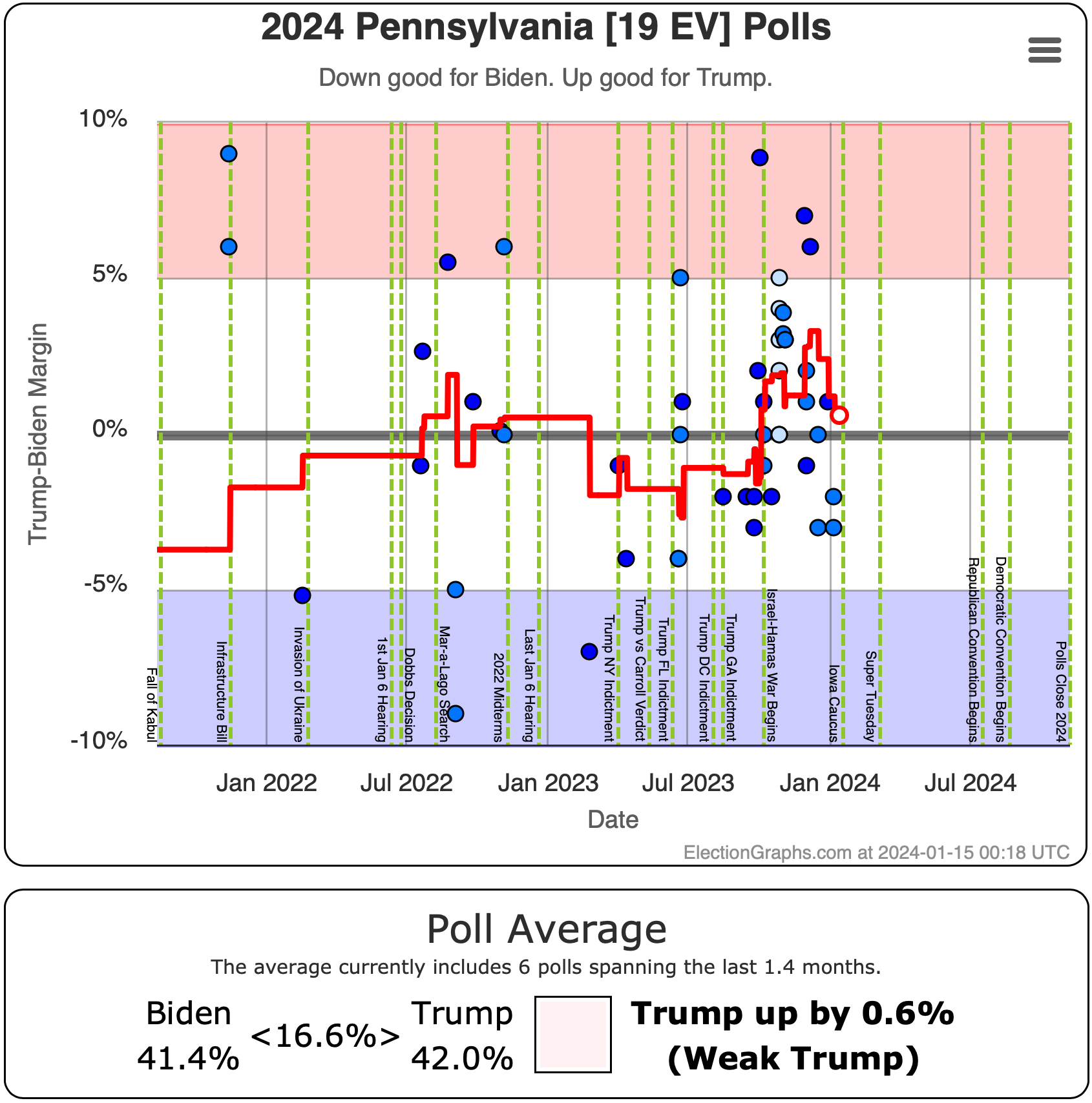
First up, Pennsylvania. This is of course one of the states that bucked the trend and seems to be moving back toward Biden. From June through the middle of December, with a few exceptions, the movement was usually toward Trump, with some individual polls showing Trump with margins as high as 8.9%. But starting in mid-December, things started to go the other way, with 2 out of 3 polls since then actually showing Biden in the lead, and the third with only a 1% Trump lead.
You never know what the next poll will bring of course, but for the moment at least, Pennsylvania seems to be trending back toward Biden.
Repeating something I've mentioned before though, the "neither one" category, which includes both people who say they will vote for other candidates, and folks who say they are truly undecided, is huge compared to the margin between Biden and Trump. Trump leads by 0.6%. The average has 16.6% saying "neither" in Pennsylvania at the moment.
That is massive, and indicates that the situation is potentially very volatile, as both 3P support and "undecided" tend to collapse as elections approach. As an example, the "neither" category in Pennsylvania on Election Graphs on election eve in 2020 was only 3.7%.
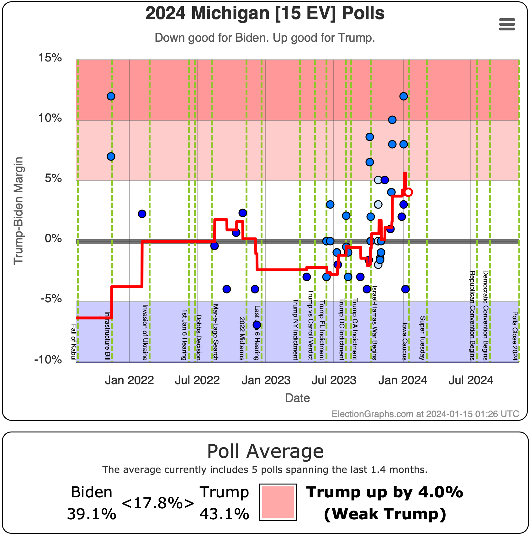
Next up Michigan. Michigan has been moving dramatically toward Trump since July. The average has gone from Biden by 2.8% to Trump by 4.0% today. A 6.8% swing in six months.
And it looked worse a few days ago. The most recent poll in Michigan, from Target Insyght, in the field from January 4th to 10th, shows Biden ahead by 4%. But this is the first poll showing a Biden lead since early November. It is way out of line with all the other recent Michigan polls. It honestly looks like an outlier.
Immediately before this poll was added, the average in Michigan had Trump up by 5.8%… which was redder than Texas currently is in the EG average.
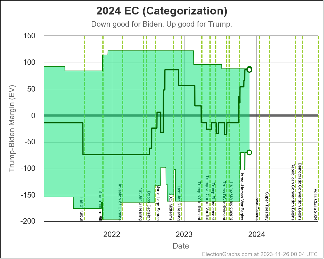
Michigan with Trump ahead by more than 5% is very very bad news for Biden. With Michigan at those levels, the EG "categorization view" which takes the poll averages at face value, and just says any state with a margin under 5% could go either way, shows Biden still losing even if he won ALL of those close states.
That new poll puts Michigan back as "Weak Trump" rather than "Strong Trump" though. Because while I may speculate here on the blog that maybe it is an outlier, for the averages on the site, I don't judge, and just include everything.
Maybe that new poll is actually just the start of a new trend, and it is really the earlier polls showing Trump significantly ahead in Michigan that were the outliers, in which case maybe things are starting to move toward Biden again. Who knows? But if not, Michigan is looking very challenging for Biden right now.
If Biden campaign people aren't deep diving to figure out how to tackle Michigan right now, then they are committing political malpractice. They need Michigan. (And all of the states we are talking about today actually, but Michigan is the biggest problem at the moment.)
Oh, and once again we have a massive 17.8% of people in the "neither" category. They are probably the people that Biden needs to target first.
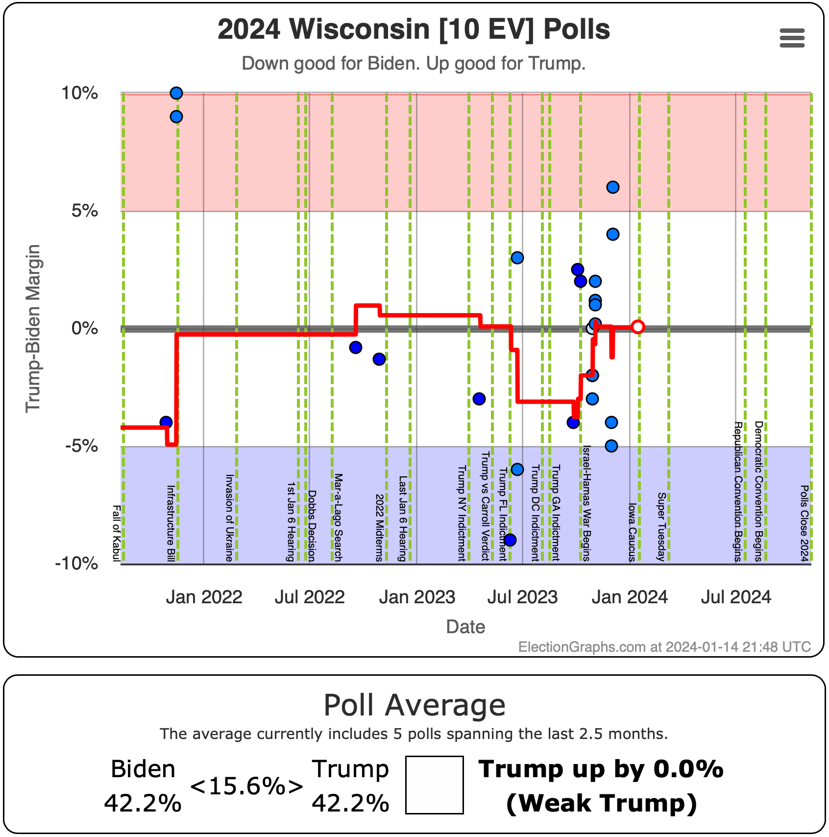
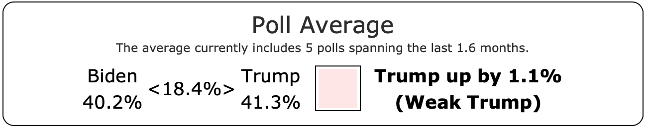
The current EG average shows Trump by 0.0%. This is of course rounded. The unrounded average has Trump leading by 0.04%. But that level of precision is false precision. This average is really a tie.
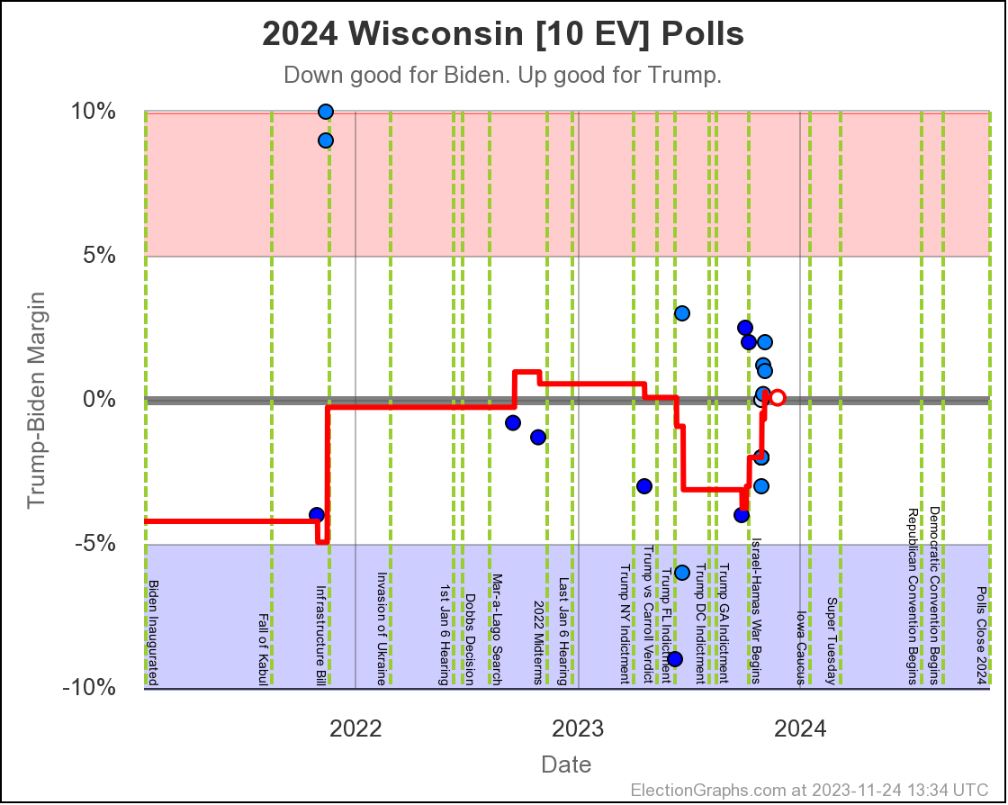
Looking at the actual individual poll results included in the average, they range from Biden up by 5% to Trump up by 6%. The scatter on the chart is all over the place. There is no obvious trend, and we have about as many polls with Biden leading as with Trump leading. The average has been close to the tie line since the beginning of November.
I really want more polls in Wisconsin. For the moment, all I can say is that it looks like Wisconsin is close, the variation on the polls there is pretty wide, and polling there is slow enough that we can't really judge short term trends.
And of course big "neither" numbers in Wisconsin too.
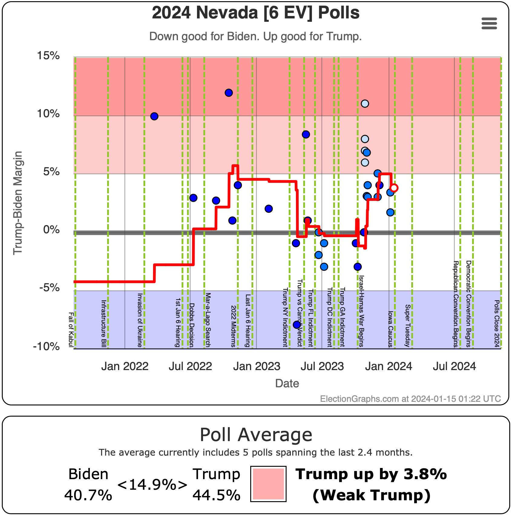
Biden hasn't led a poll in Nevada since October, but looking at the polls since then, it looks like they might be trending back toward Biden after a spike toward Trump, but with Trump still firmly in the lead. Well, once again with a "neither" category much larger than the margin. But still a lead on the margin.
Nevada is only 6 electoral votes, but at the moment if you gave Biden all the states where he leads the average, plus Pennsylvania, Michigan, and Wisconsin… you end up at a 269/269 tie, which would send the election into the House of Representatives where the NEW House that just won election would vote by state delegation, not by individual representatives… a voting structure that would probably mean a Trump win in the end, even if the Democrats win back the House.
So if Biden wants a clean win, Nevada needs to get pulled back over the line too.
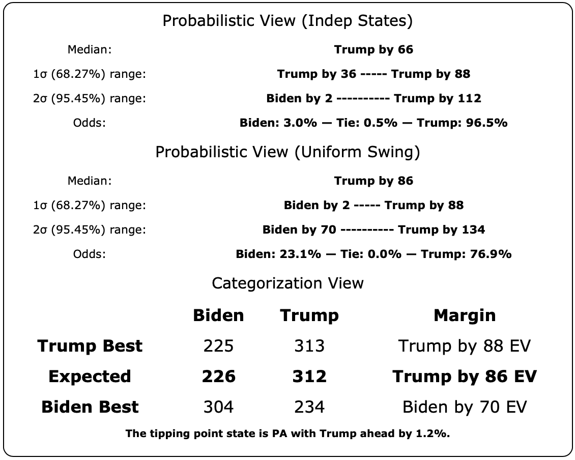
OK, so now lets zoom back out to the national view, and bring in all three of the different ways EG has of looking at the national picture:

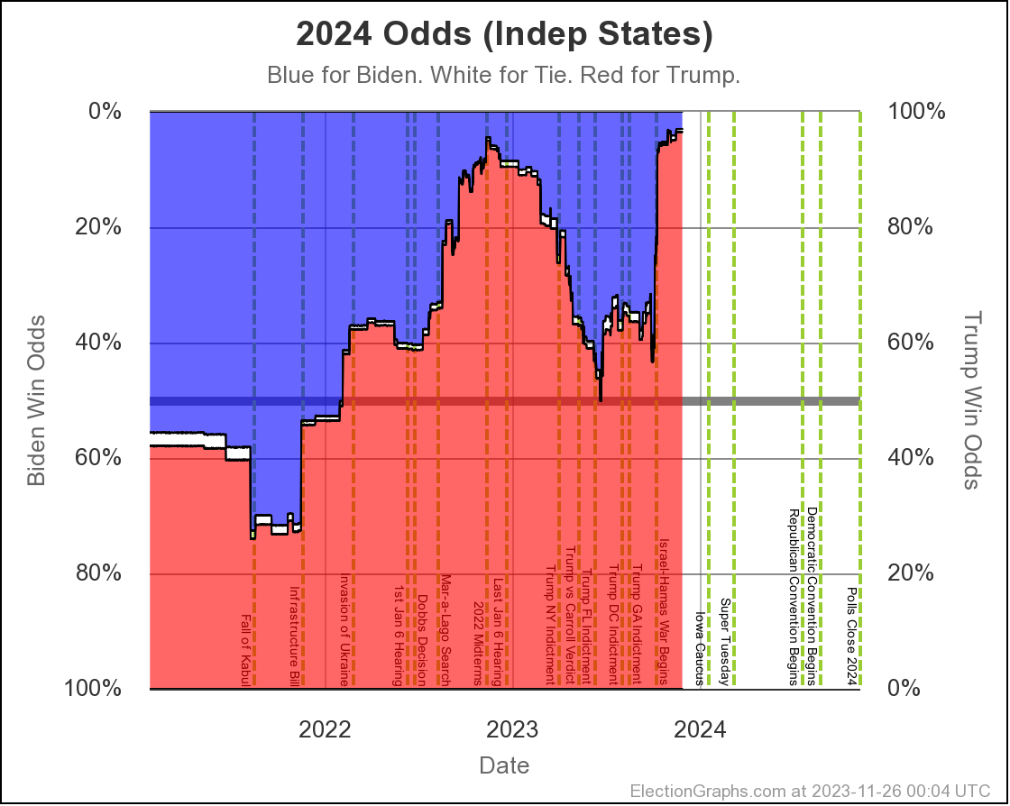
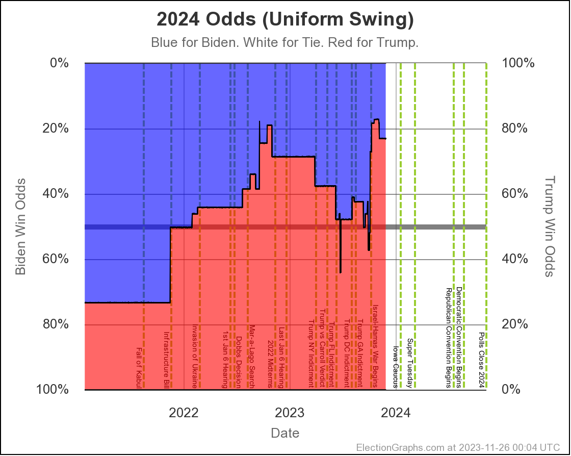
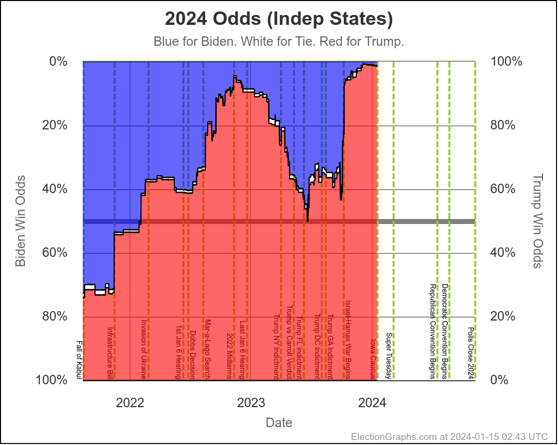
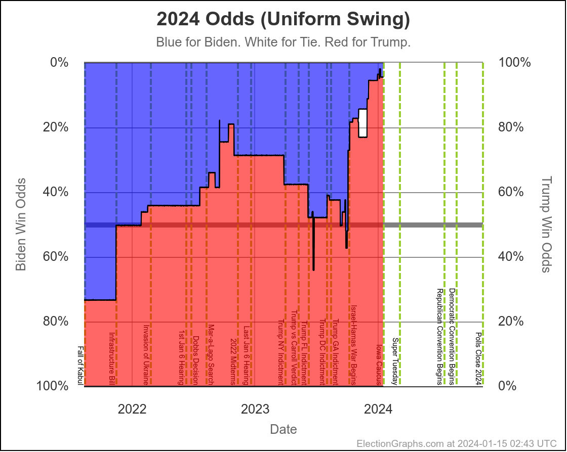
Let's look first at the "odds ranges" between the Independent States and Uniform Swing views. These are the odds of a Biden win:
- 2023-03-25: Between 17.8% and 25.8%
- 2023-04-24: Between 24.9% and 32.3%
- 2023-05-21: Between 34.9% and 35.9%
- 2023-06-25: Between 43.9% and 46.0%
- 2023-08-13: Between 42.9% and 44.2%
- 2023-10-01: Between 35.7% and 44.2%
- 2023-11-26: Between 3.0% and 23.1%
- 2024-01-15: Between 1.2% and 4.4%
This is by far the worst performance we've seen in these blog posts. The two ends of these ranges represent the difference between assuming that the polling errors are going to be the same in every state, and assuming that the polling error in each state is completely independent of the errors in other states. The truth is going to be somewhere in between.
Both probabilistic views do base their probabilities on the differences between the final EG poll averages and the actual vote totals in 2008 through 2020. For details of how all this works see my post from January 2023. The bottom line though, is the probabilistic views assume that in the closest states, the Election Graphs poll averages are underestimating the Republican by a bit, because that is how it was averaging out all the results from 2008 to 2020. If the poll error is in the other direction this time, things will of course look a bit better for the Democrat.
I should make a graph that explicitly shows the range between these two probabilistic views, but in the mean time, here are the two charts on the probabilities:
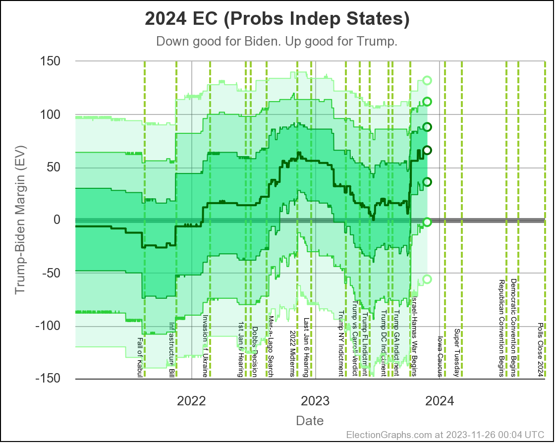
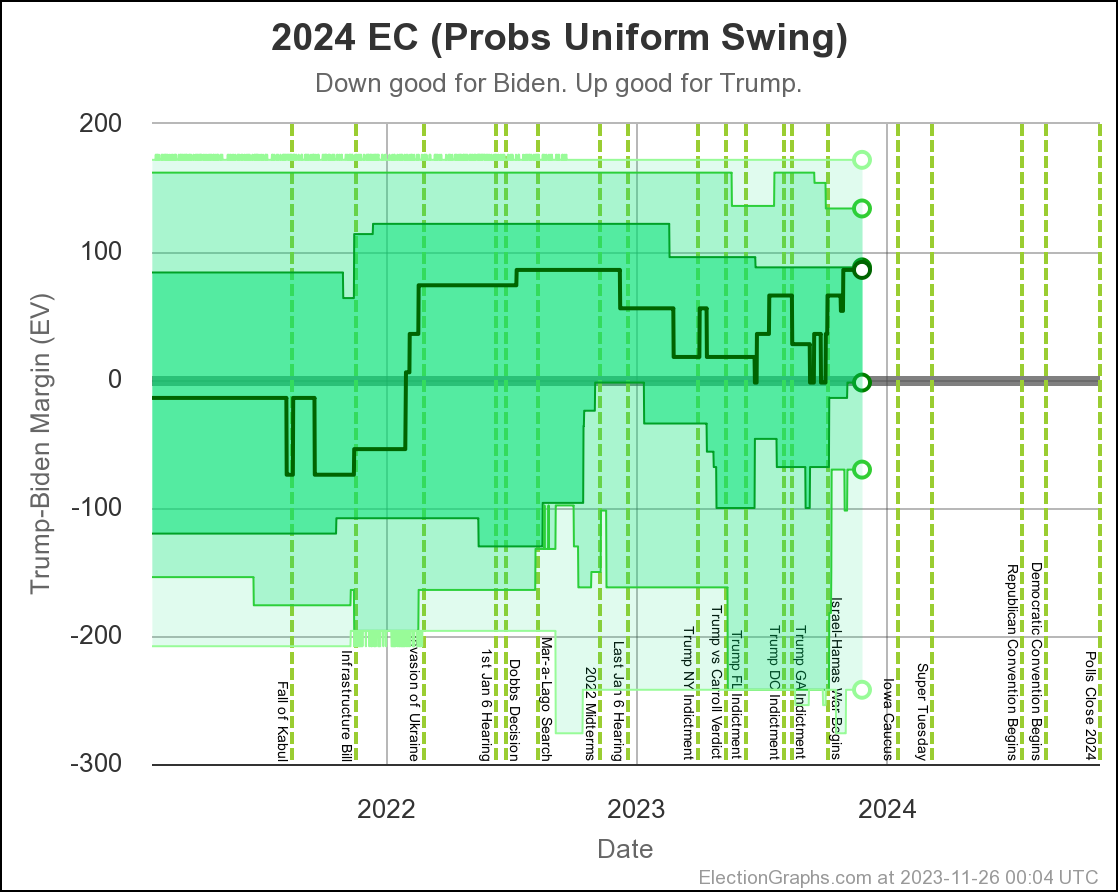
Still looking at the probabilistic view, but looking at likely Electoral College outcomes instead of the odds:
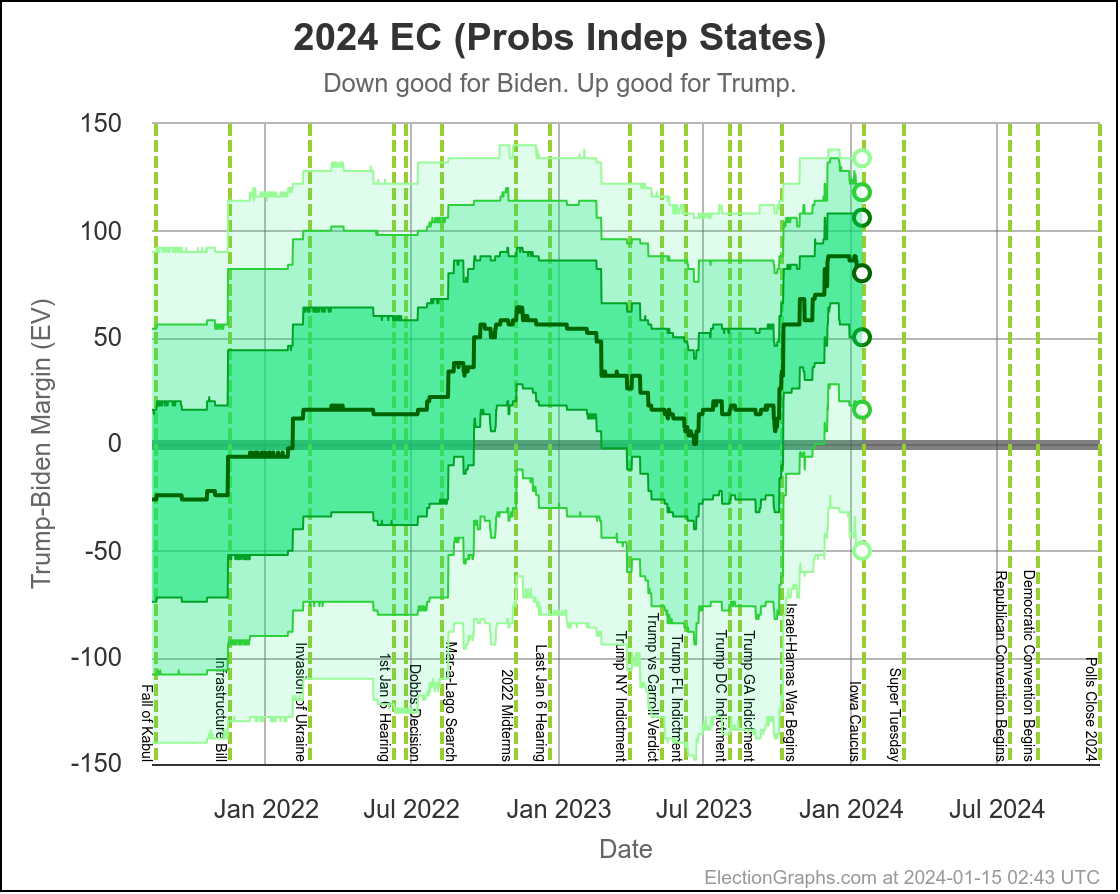
The independent states view is the most dynamic in terms of how sensitive it is to every single new poll added, so when looking for trends, it is the one to look at. Looking carefully at this chart, there is an inflection point around December 12th.
Trump is still way ahead of course, but there starts to be SOME movement toward Biden after that date. Trump had "a" peak on December 12th. Only time will tell if this was "Peak Trump" overall.
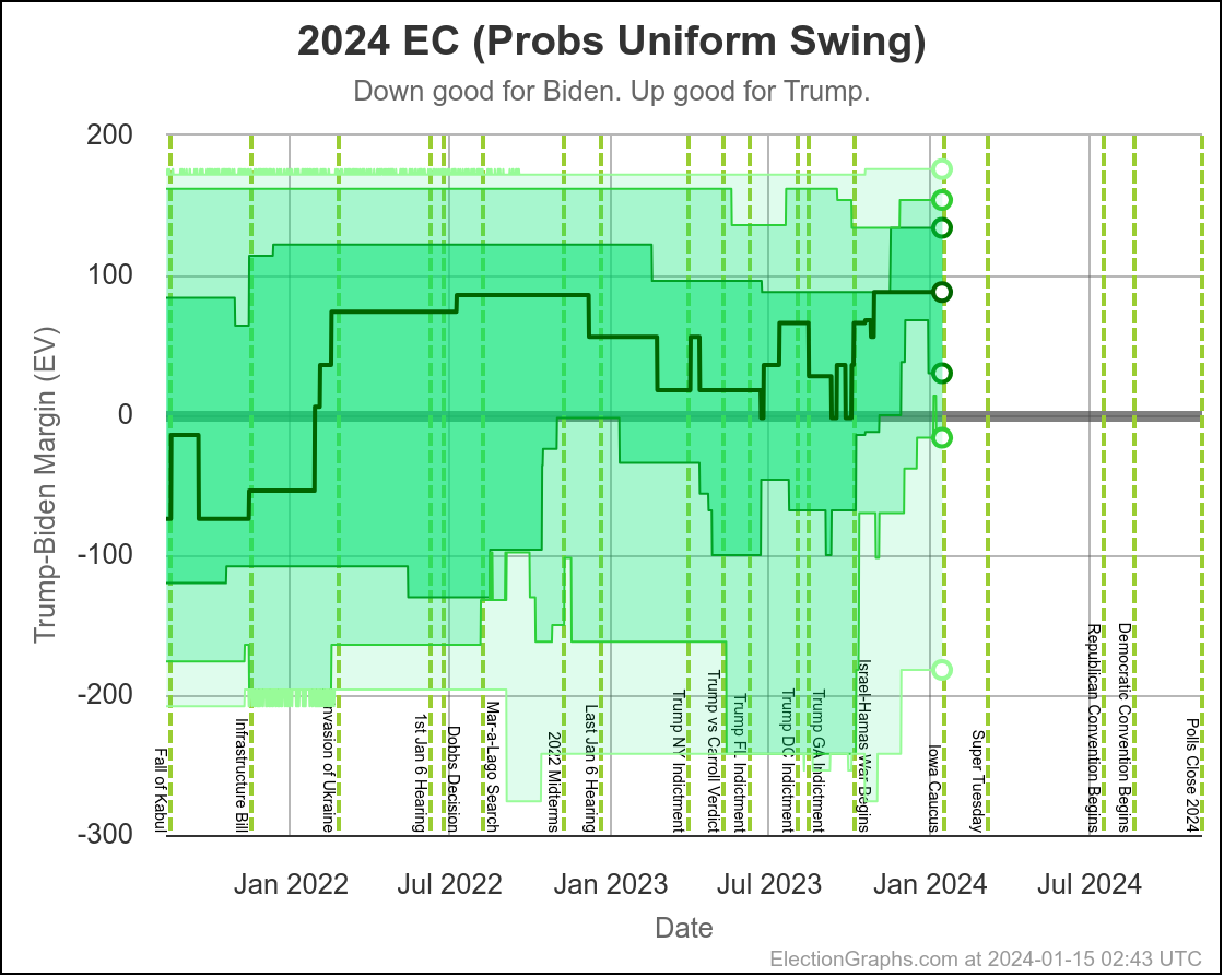
The uniform swing view is a lot less clear, but you can see a little movement toward Biden in recent weeks if you squint.
Taking the probabilities out of it, and just looking at the Classification view, you get this:
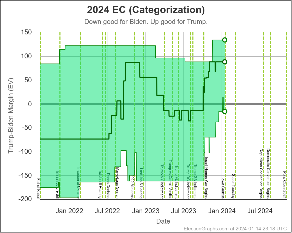
The only sign of movement toward Biden on this view so far is that the spike representing Michigan being out of reach because Trump's margin was greater than 5% was really short lived.
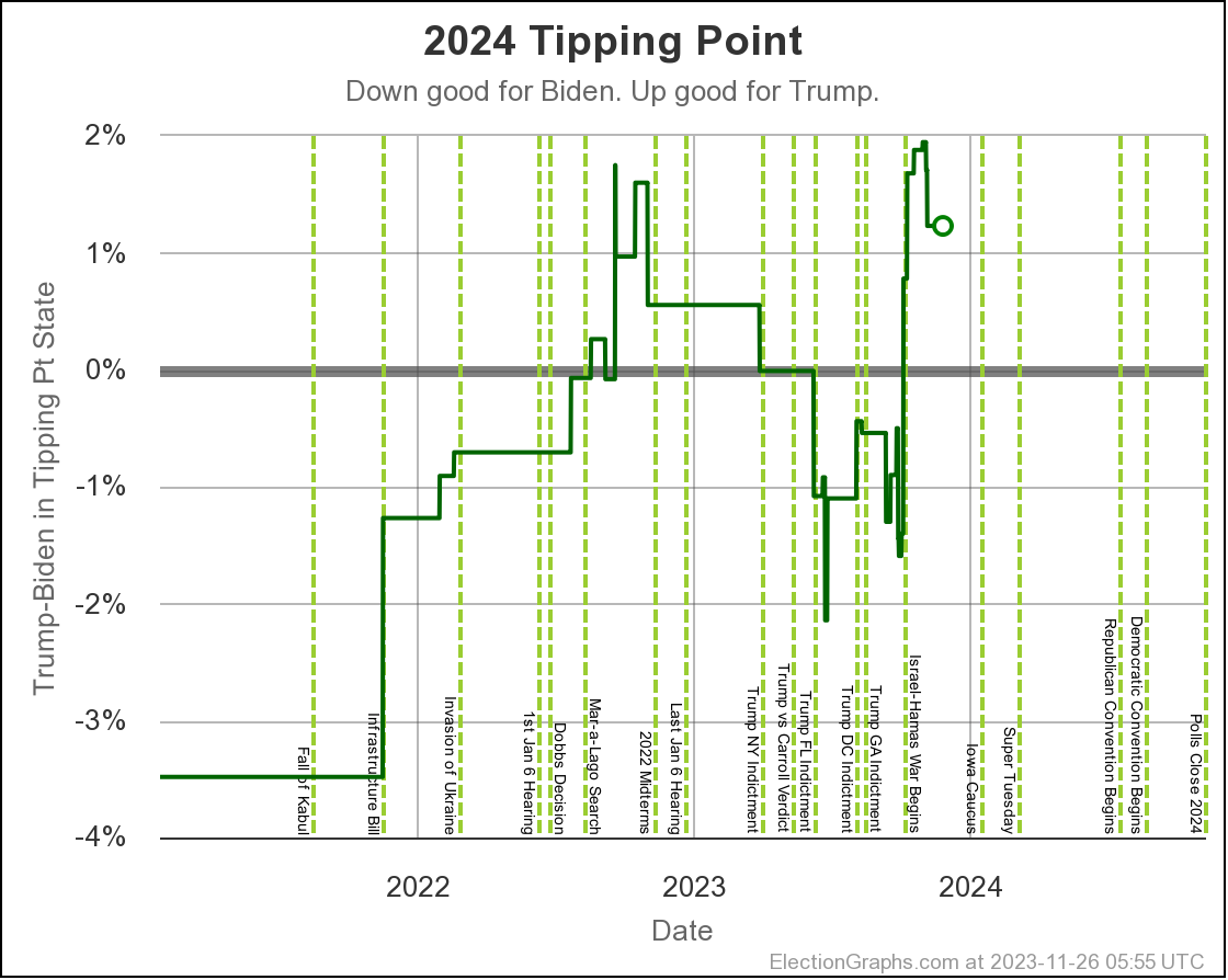
For the categorization view though, there is another way of looking at things, namely through the "tipping point", which is the margin in the state that puts the winner over the edge:
- 2023-03-25: Trump by 0.7% in Wisconsin
- 2023-04-24: Trump by 0.5% in North Carolina
- 2023-05-21: Trump by 0.2% in Wisconsin
- 2023-06-25: Biden by 0.9% in Georgia
- 2023-08-13: Biden by 0.7% in Michigan
- 2023-10-02: Biden by 0.7% in Pennsylvania
- 2023-11-26: Trump by 1.2% in Pennsylvania
- 2024-01-15: Trump by 4.0% in Michigan
We do have a graph of this one though!
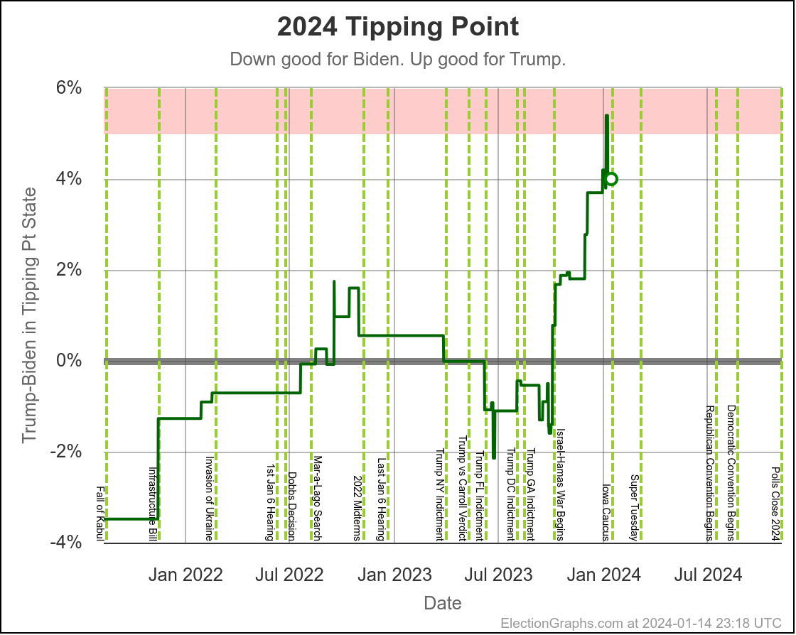
We see the spike over 5% for the short time Trump's margin rose up to 5.6% in Michigan, moving the tipping point very briefly to 5.4% in TEXAS.
That was stunning. Texas as the tipping point state? But it didn't last long, and the tipping point is back down to a 4.0% Trump lead in Michigan.
That is still substantial though. Since I have been doing this sort of election analysis, the biggest delta between the final EG tipping point and the actual tipping point based on the election results was 3.45% in 2008. That year the polls underestimated Obama.
We have many months to go, but if we still had a Trump by 4.0% tipping point on Election Day, the overall polling error would need to be underestimating Biden this time, and be bigger than the errors we had in any of the previous four presidential elections in order to result in a Biden win.
The tipping point can also move very quickly. In 2016, Clinton's lead in the tripping point lost almost 6% in just the last couple of weeks before the election. There is the variability inherent in polling in general, plus news events really can move opinion. Leads can evaporate almost overnight under the right circumstances.
This is one of many reasons why polling this far out is not predictive, it only tells you about how things are right now, and where candidates need to put in effort to change things.
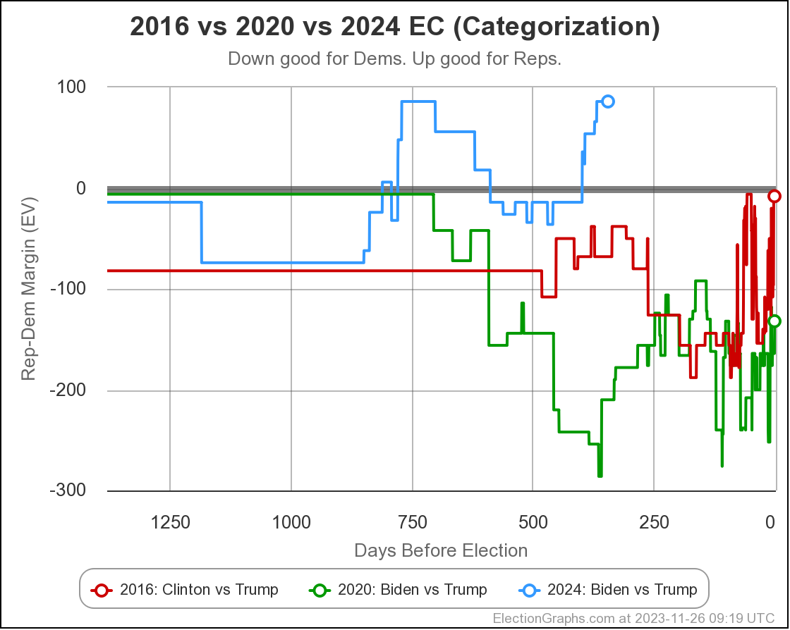
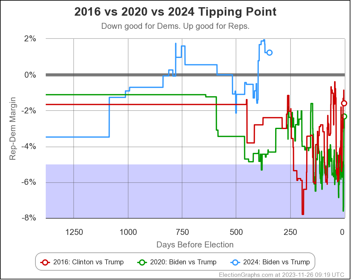
Here is the tipping point comparison with the last two election cycles:
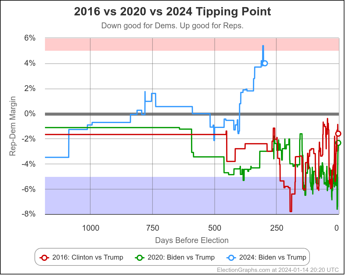
For almost this entire election cycle Trump has been doing better than he was doing in either the 2016 or 2020 cycles. Since October, he has been doing SUBSTANTIALLY better than these previous cycles.
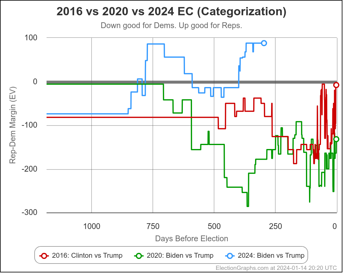
You can also see this looking at the center lines for the electoral college margin view:
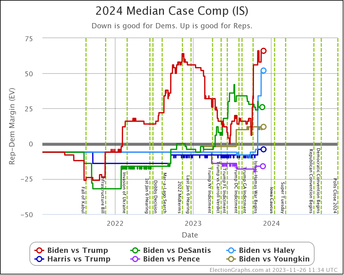
All of the above assumes Biden vs Trump, because that currently seems like the almost certain matchup, absent something really unexpected coming up.
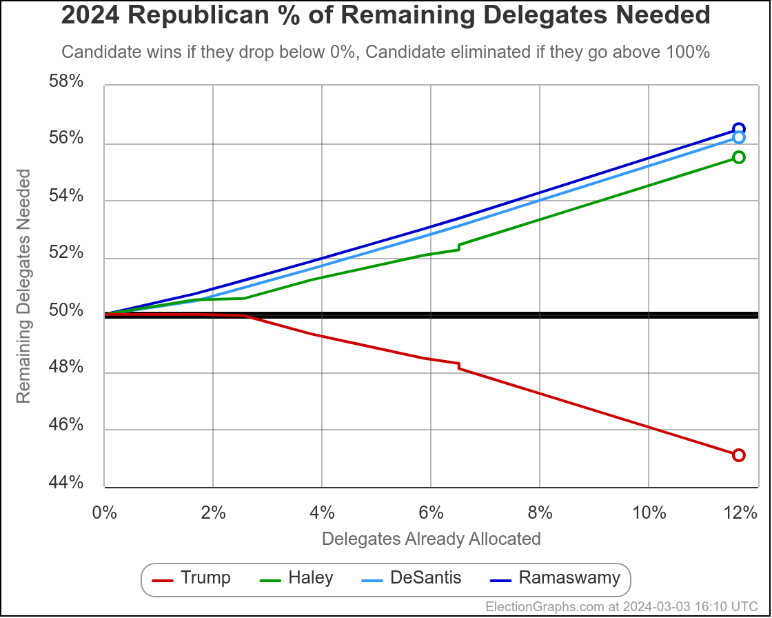
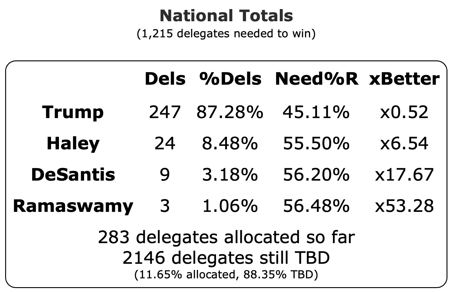
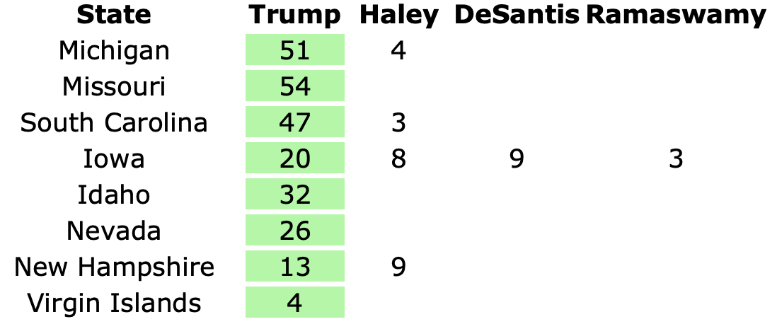
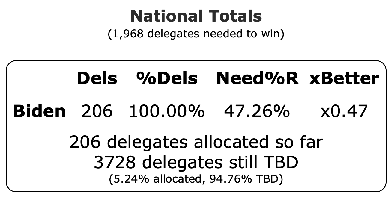
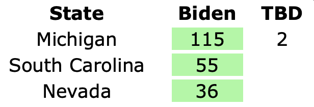
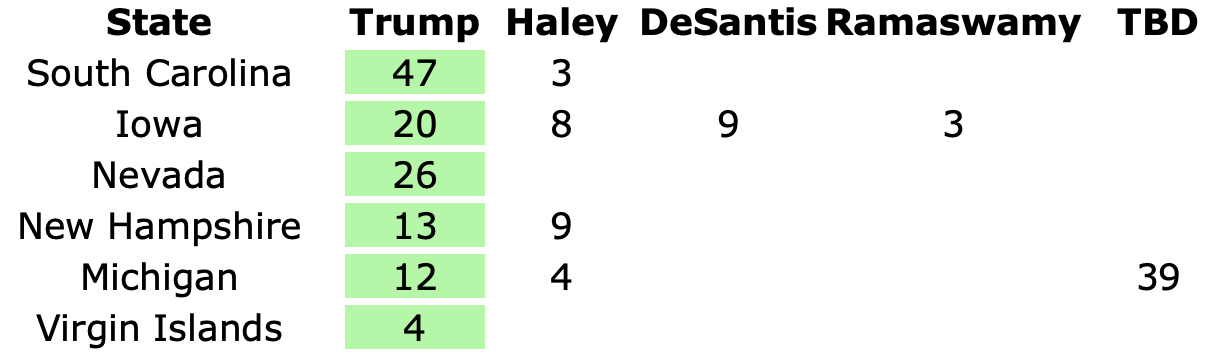
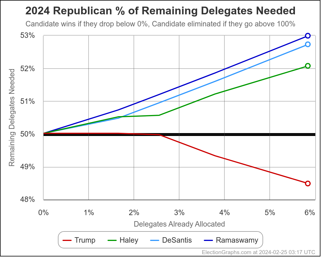
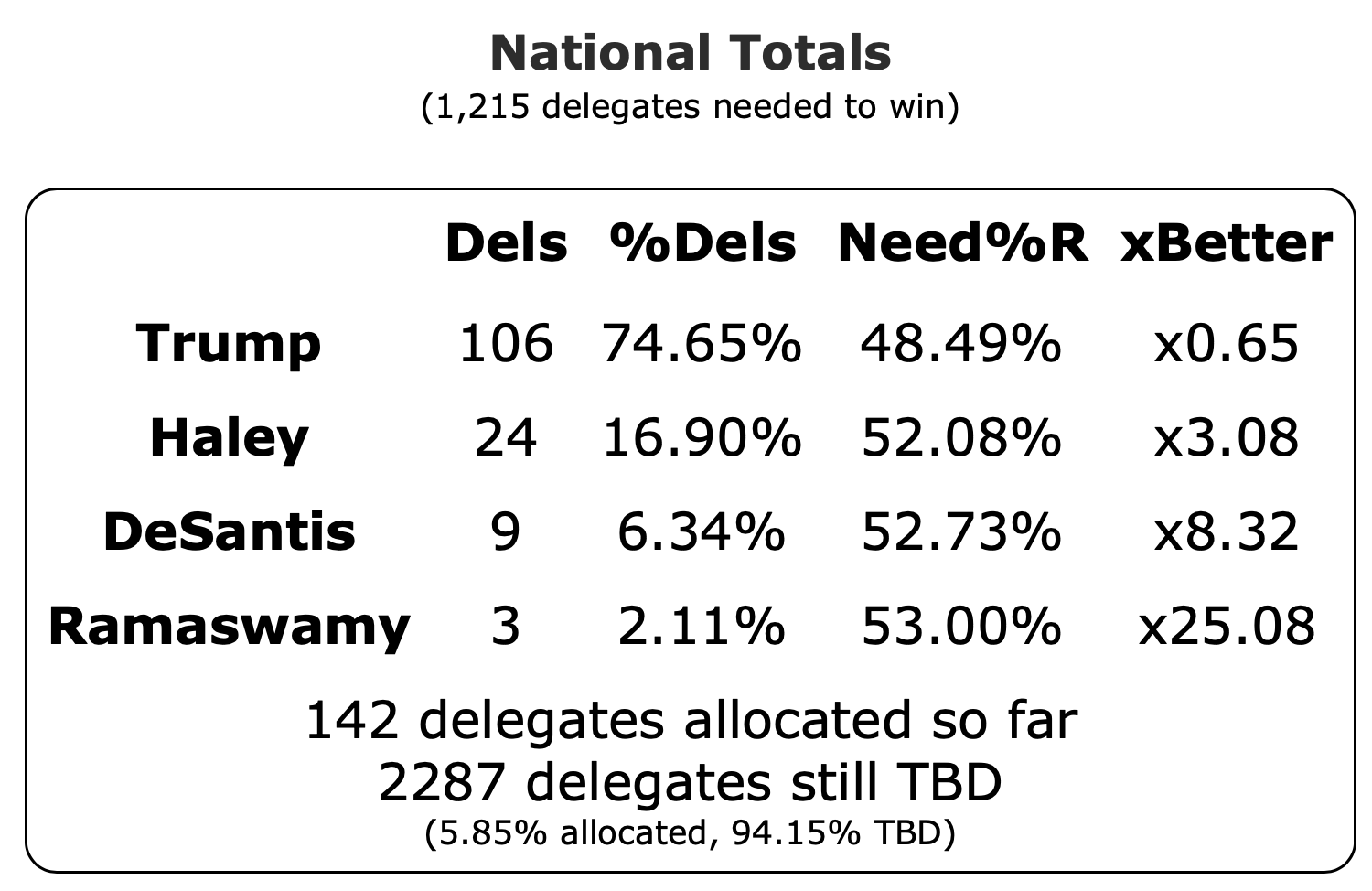
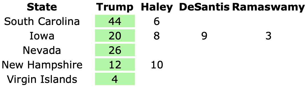
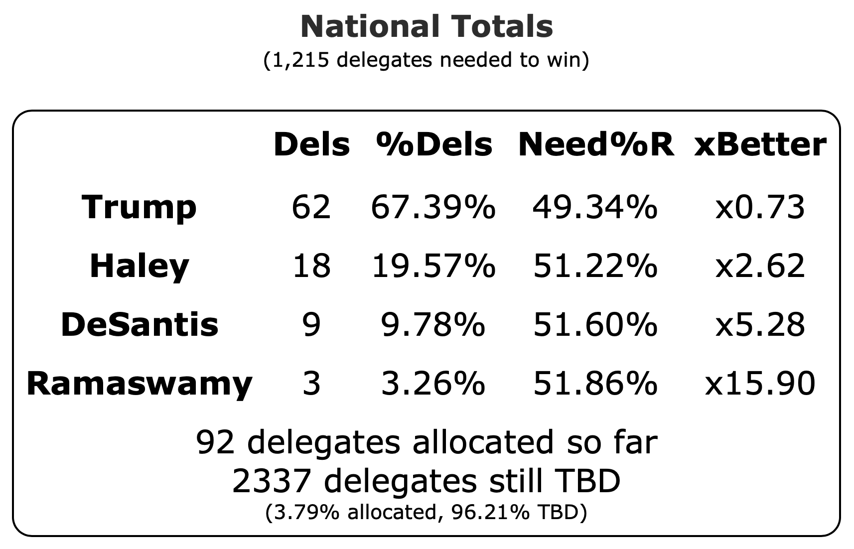
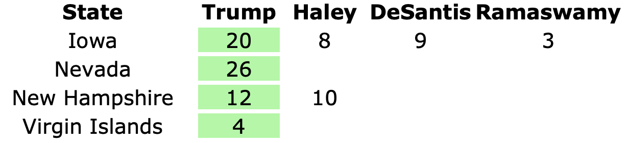
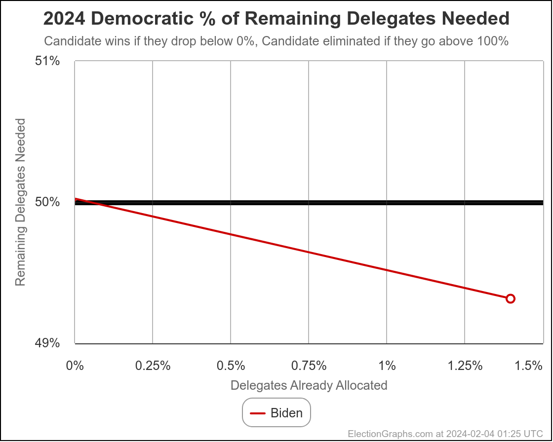
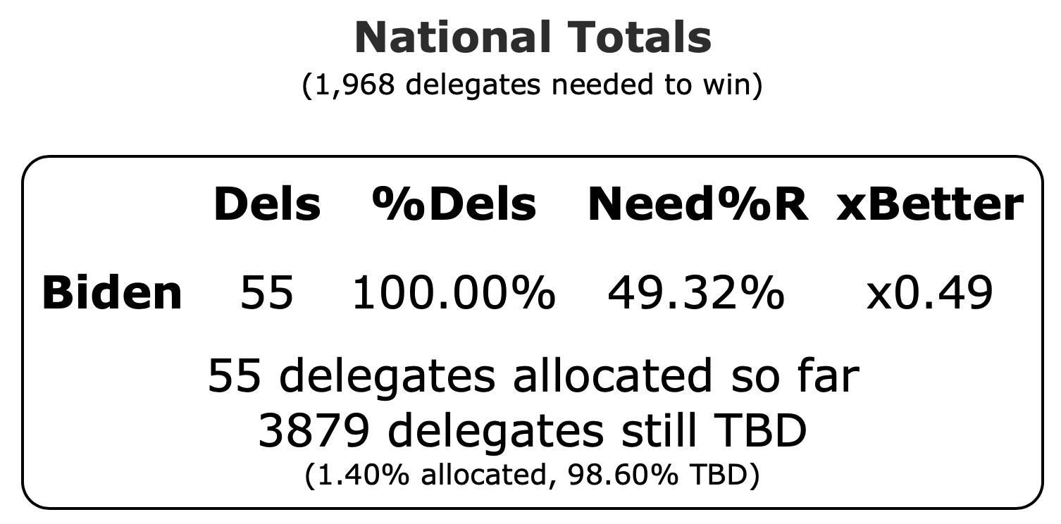
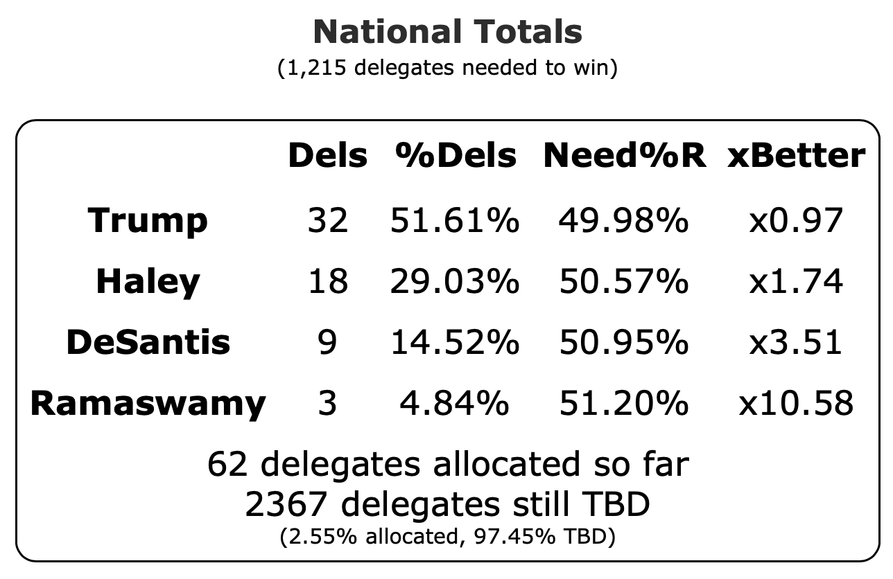
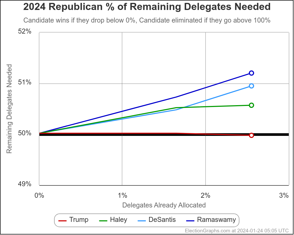
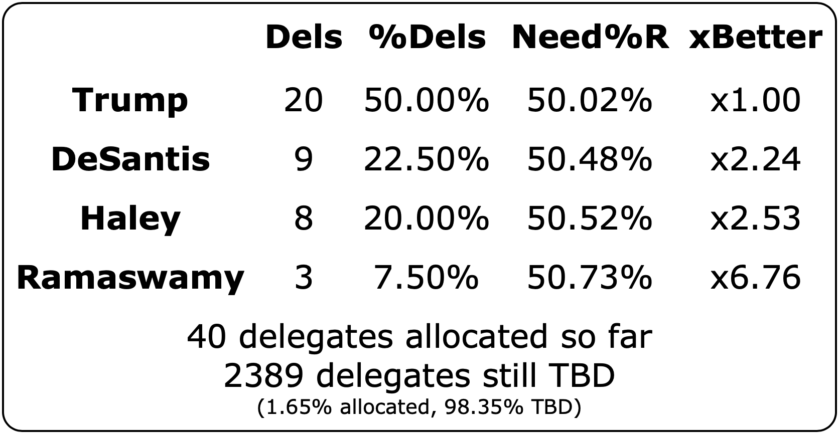
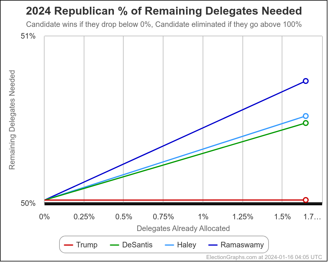
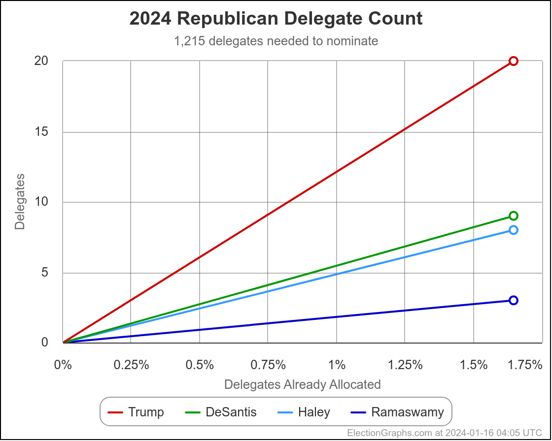
Election Graphs will be covering the delegate race starting with the Republican caucus results in Iowa, which will start to come in less than 24 hours from when I publish this blog post.
Expect a post about Iowa delegates once things settle down a bit in the election coverage and it looks like we have stable delegate estimates.
We will know before too much longer if the Biden vs Trump assumption about Election 2024 ends up holding true.
In the mean time, a quick look at other possibilities for the Election 2024 matchup, using the Independent States Probabilistic View median electoral college result since that is the most interesting to look at:
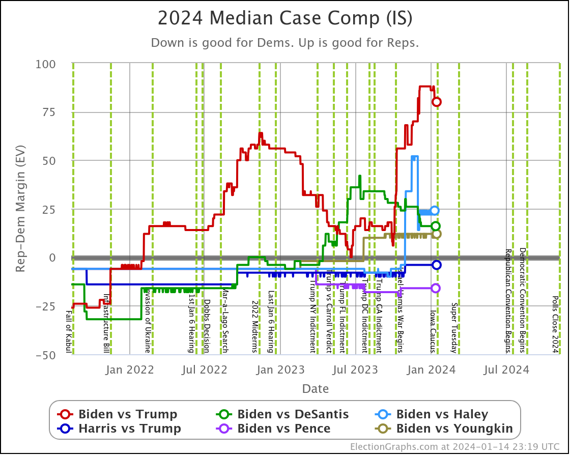
There is enough polling on Biden vs Trump and Biden vs DeSantis to feel like the lines above are pretty good. Trump is considerably stronger than DeSantis when pitted against Biden.
Biden vs Haley is getting there, but should still be taken with a significant dose of salt, because state by state polling for that combination is still pretty sparse, so a lot of the EG state poll averages are still based significantly on election results from previous cycles. But it looks like she PROBABLY does better against Biden than DeSantis, but not as well as Trump does.
All three of these Republican candidates are leading Biden though, the question is by how much, and how secure that lead is.
The other three combinations on the chart above have barely been polled, and should be ignored. Harris, Pence, and Youngkin aren't even running at this point anyway.
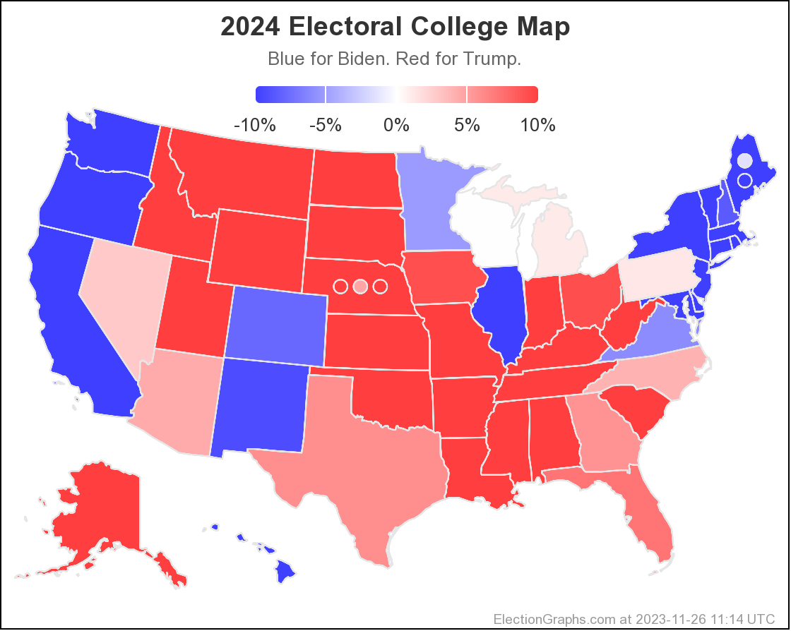
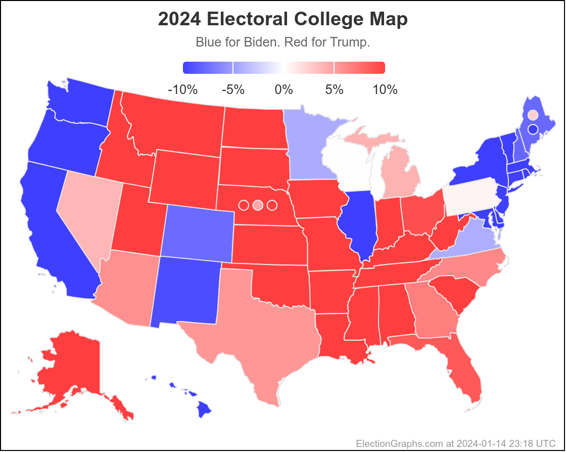
Finally, closing the post with the current Biden vs Trump map:
295.8 days left until the polls start to close on Election Day 2024.
Less than a day until the Iowa caucuses on the Republican side.
Buckle up everybody. Things are starting for real now!