
OK, in my last post I mentioned that the next thing to do was:
Finish up the calculations to use all four elections from 2008 to 2020 as the baseline "how well did Election Graphs averages do compared to the final results" data I use to try to generate odds from the polling averages and do a blog post about that.
So I guess it is time to do that.
OK, actually, it is way past time for that. I had hoped to have all this done by midterms, but I ended up spending most of the time I would have spent on that helping to do things like put out campaign signs for my wife's campaign. She won. Other things took up my time too. Anyway. I was delayed. But lets get this done…
Let's start with a simple scatterplot showing every state (and the DC and ME/NE congressional districts) from 2008 when I started doing this through to the 2020 results. Each data point will have the FINAL Election Graphs average on the X axis, and the ACTUAL election results on the Y axis:
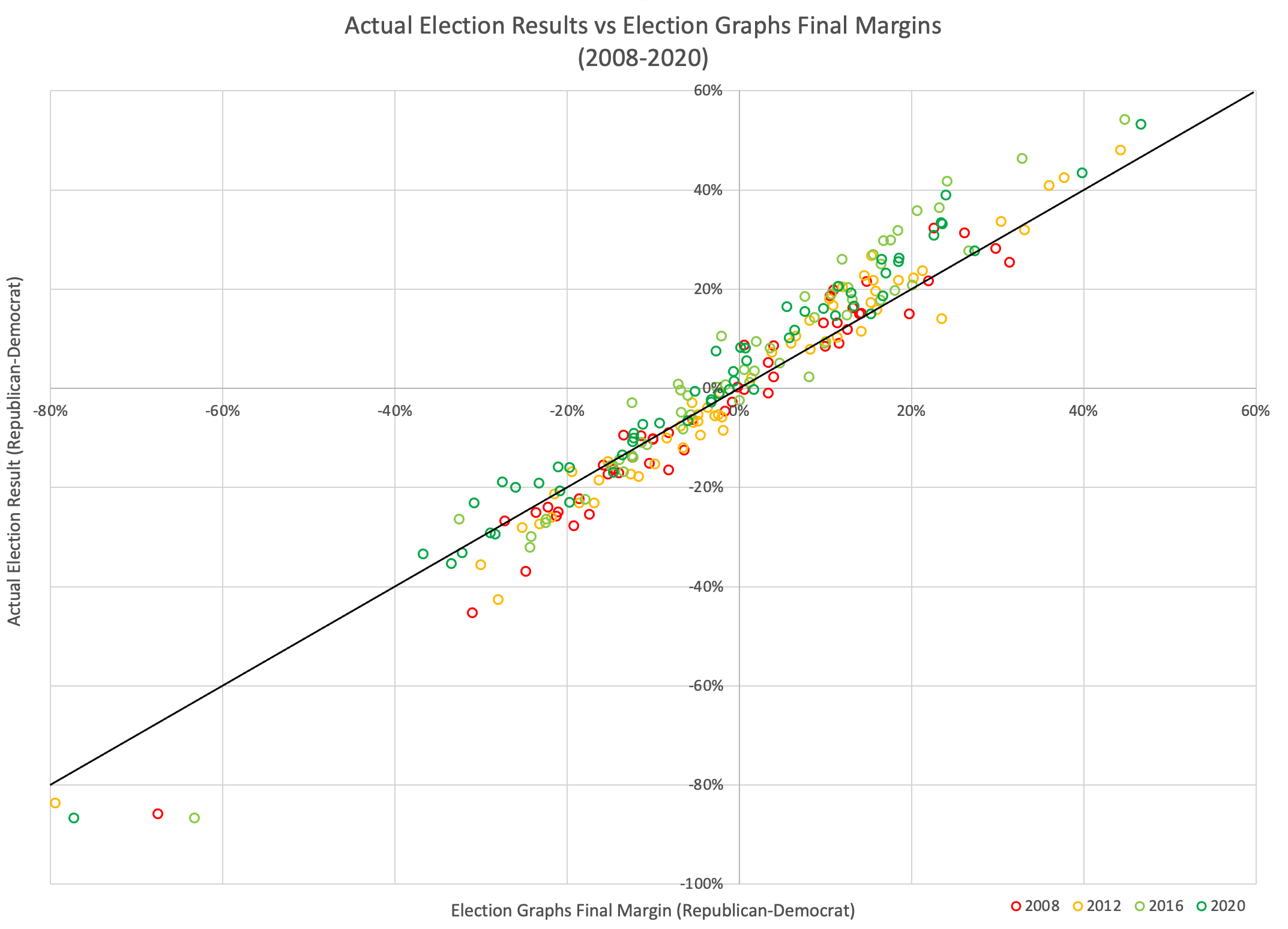
As you would hope, these are nicely correlated at this scale. If EG's averages were always exactly right, every point would be along the black diagonal line. Of course, polls don't work like that, and even poll averages don't work like that. There is a vertical spread due to the inherent randomness of polling. A pretty wide spread actually.
But also if you look carefully, you can see that on the right side of the graph there are more points above the line, and on the left there are more points below the line. This means that there is also some bias here. Specifically a bias where the Election Graphs polling average tends to UNDERSTATE the magnitude of the winner's margin.
Let's do a transformation on the graph to try to look into the patterns a bit more deeply though:
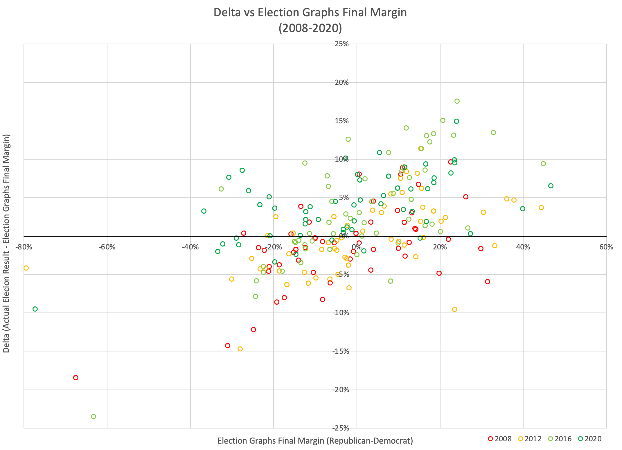
That just looks like a messy colored blob initially. But what did I do here? I just transformed things by subtracting out the diagonal. Instead of looking at the actual election results vs the Election Graphs final margin, I look at the Delta… how far off the election results were from the Election Graphs final margin, vs the Election Graphs final margin. So, for instance, if on the top graph we had a point where the EG average was a 10% Republican lead, but the actual result was that the Republican won by 15%, that would show up as x=10%, y=5%.
OK, but can we say anything at all about this blob? Is this just two things that show no useful relationship at all?
Well, in this post from 2019 I actually looked at this before. So let me just quote a bit from there:
Before going further, let's talk a bit about what this chart shows, and how to interpret it. Here are some shapes this distribution could have taken:
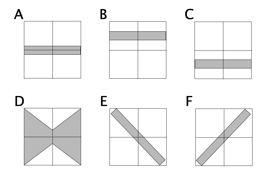
Pattern A would indicate the errors did not favor either Republicans or Democrats, and the amount of error we should expect did not change depending on who was leading in the poll average or how much.
Pattern B would show that Republicans consistently beat the poll averages… so the poll averages showed Democrats doing better than they really were, and the error didn't change substantially based on who was ahead or by how much.
Pattern C would show the opposite, that Democrats consistently beat the poll averages, or the poll averages were biased toward the Republicans. The error once again didn't depend on who was ahead or by how much.
Pattern D shows no systematic bias in the poll averages toward either Republicans or Democrats, but the polls were better (more likely to be close to the actual result) in the close races, and more likely to be wildly off the mark in races that weren't close anyway.
Pattern E would show that when Democrats were leading in the polls, Republicans did better than expected, and when Republicans were leading in the polls, Democrats did better than expected. In other words, whoever was leading, the race was CLOSER than the polls would have you believe.
Finally, Pattern F would show that when the polls show the Democrats ahead, they are actually even further ahead than the polls indicate, and when the Republicans are ahead, they are also further ahead than the polls indicate. In other words, whoever is leading, the race is NOT AS CLOSE as the polls would indicate.
In all of these cases the WIDTH of the band the points fall in also matters. If you have a really wide band, the impact of the shape may be less, because the variance overwhelms it. But as long as the band isn't TOO wide the shape matters.
Now, back in 2019, at this point I jumped directly into looking at the pattern based on the combination of all the data from 2008 to 2016. Rather than doing the same thing now, but just adding in 2020, I think it is actually instructive to take a bit of a detour to look at each of the four election cycles separately.
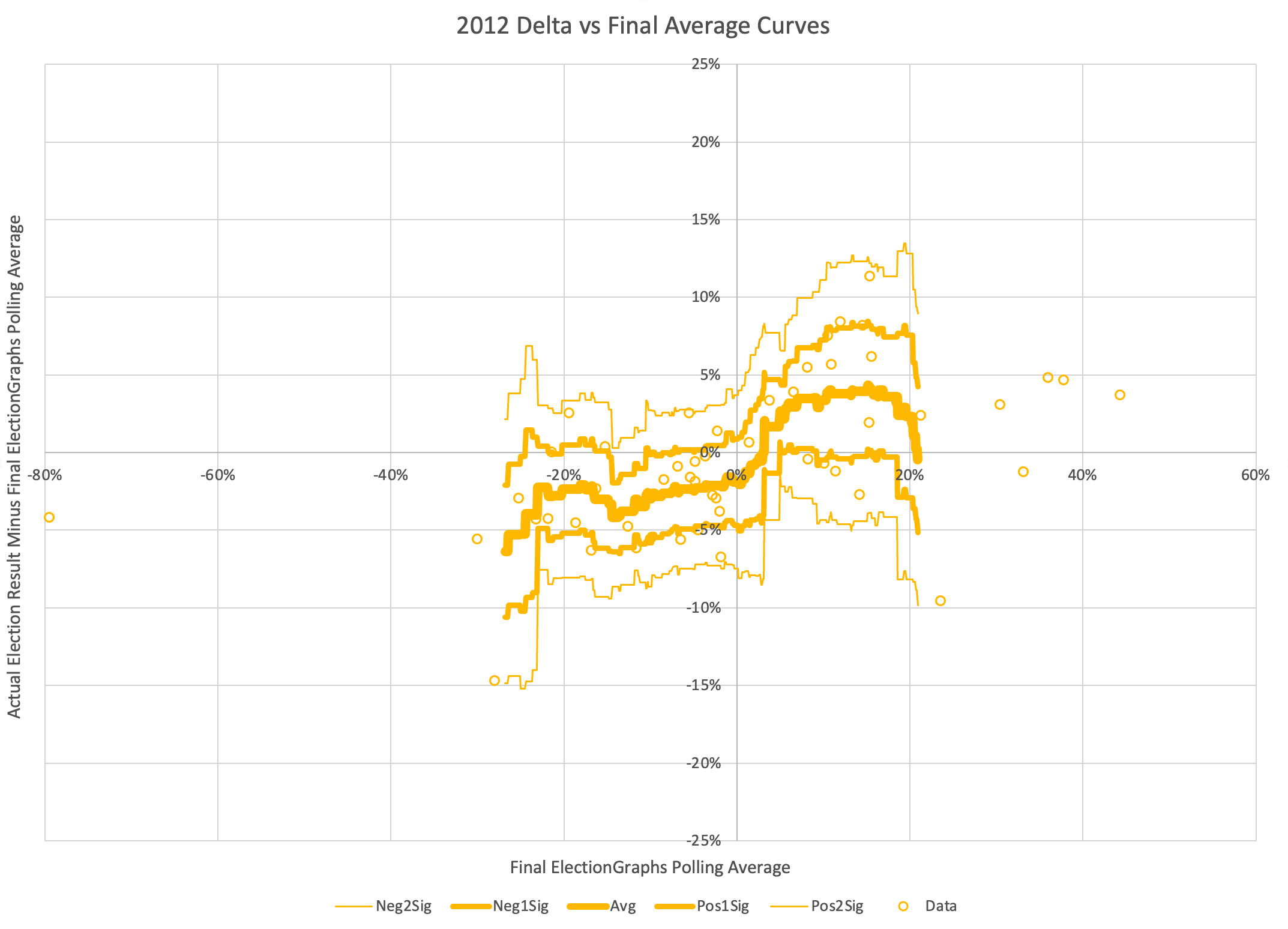
First lets look at just the 2008 data points:
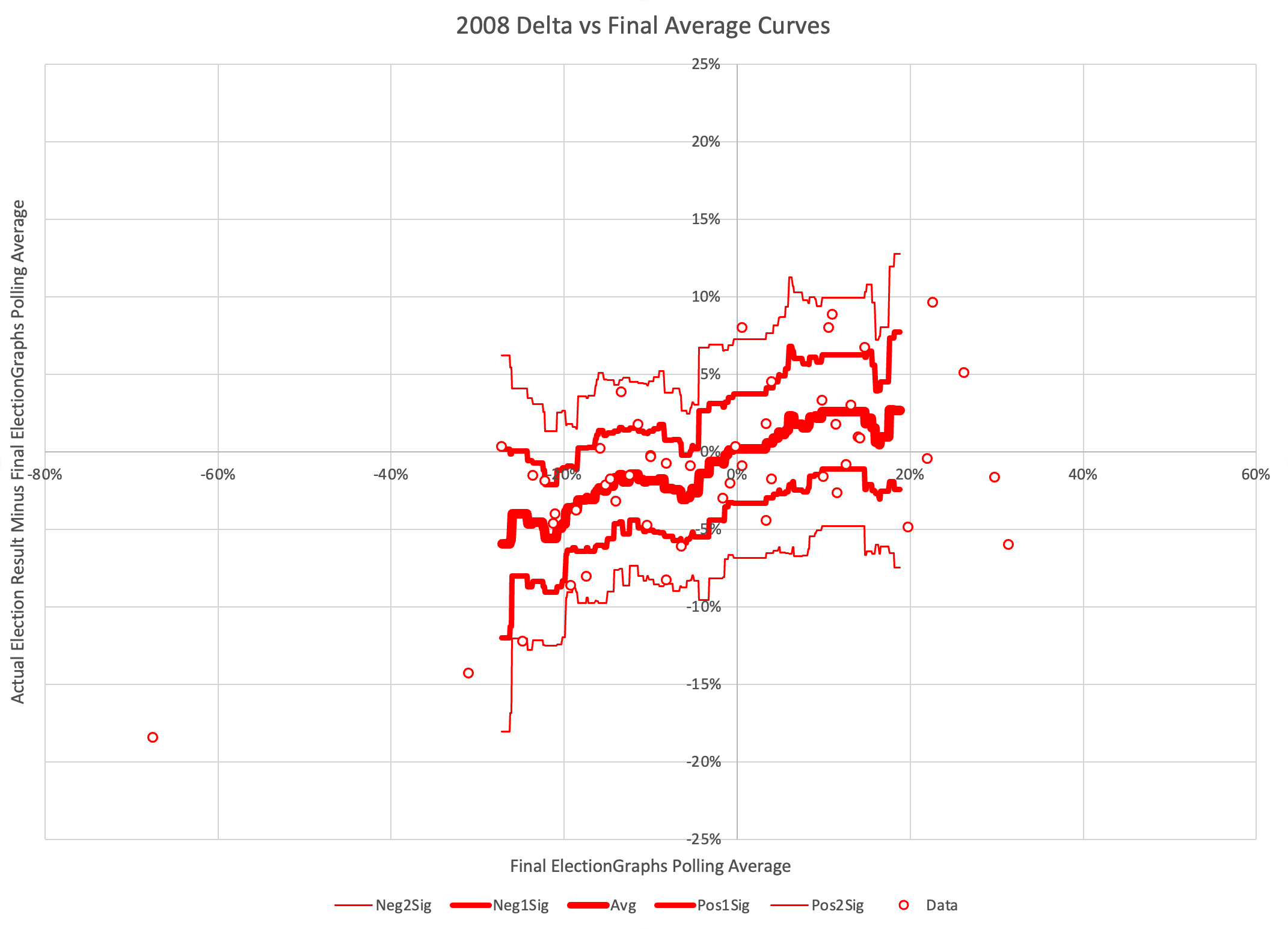
OK, the circles are just the individual 2008 data points, but what is the rest, what have I done here?
I've constructed "envelopes" using windowed averages and standard deviations.
Specifically, I am looking at windows with a 5% radius. At every value for the polling average at 0.1% increments, I look 5% in either direction (so a window 10% wide) and find all the data points within that window, then if there are at least five points, I calculate the average and standard deviation of those points. The 5% is of course just an arbitrary round number, as is the 5 data point minimum.
The bold line in the center is the mean, the next lines out are 1 standard deviation from the mean (about 68.3% of the data points should be inside these lines), and the next lines are 2 standard deviations from the mean (which should contain about 95.4% of the data points).
So the final chart here shows both the general trend in how far off final election results were from the Election Graphs average given where the average was, but also just how variable those results are.
For 2008, we can now see pretty clearly that this looks like "Pattern F".
When Election Graphs showed a tie, on average the actual election results were a Republican win by 0.2%. That's pretty close to a tie too. So not a lot of bias in one direction or another at the center. There is a BIG window though. If the EG average was a tie, the 95% confidence interval goes all the way from Democrats winning by 6.8% to Republicans winning by 7.3%.
But there is also definitely a trend where in cases where when Republicans were ahead in the EG average, they actually tended to win by MORE than the EG average, and if the Democrats were ahead, THEY tended to win by more than the EG average.
OK, you get the idea, so lets look at the rest of the election cycles Election Graphs has covered.
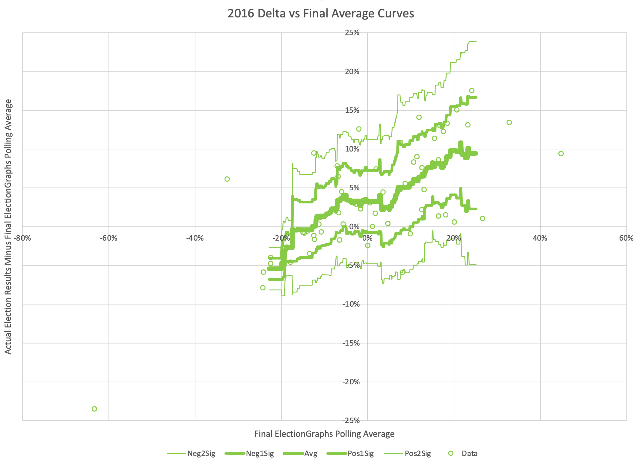
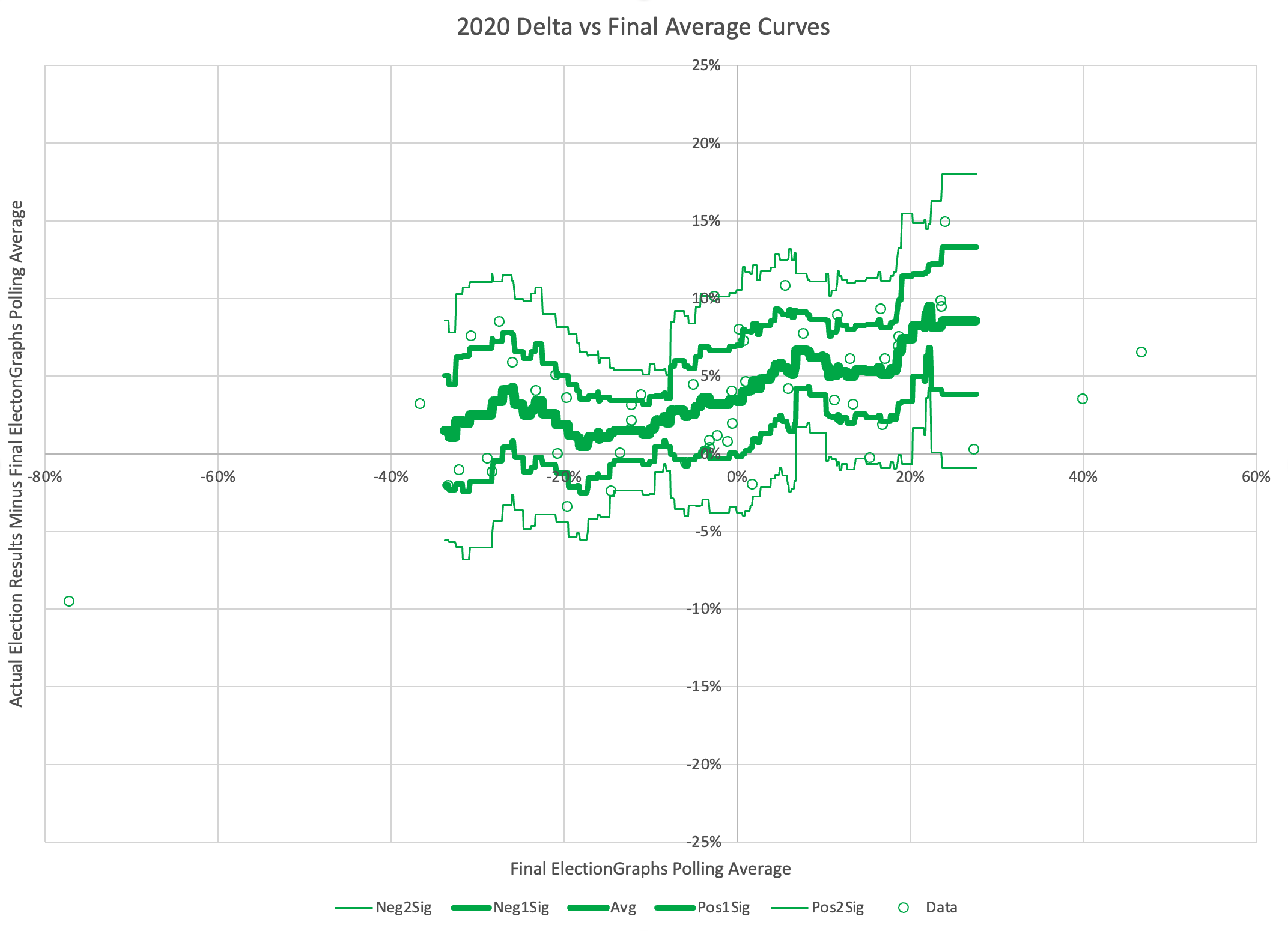
I've made the scales the same on all of these to make it easier to compare the cycles. While these all have the same high level diagonal pattern, the detailed shape of the curves is very different cycle to cycle, both in terms of the central average, and pattern of the variances.
Lets concentrate on those central curves and put them all on one chart…
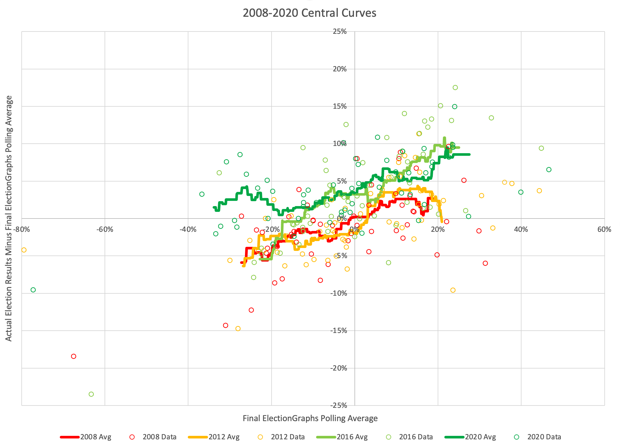
You can immediately see the two elections Obama was in (the red and goldish ones) clump together, and the two that Trump was in (the light and dark greenish ones) clump together too.
They all have the general diagonal shape (Pattern F), but it stands out how, at least near the "Election Graphs average near zero" area which by definition are the states that matter in close races, how much more the poll averages underestimated Trump in 2016 and 2020, compared to a more neutral 2008, and an underestimation of Obama in 2012. Maybe these all have the Pattern F shape, but the slopes are different, and even more importantly, they are shifted vertically. They don't all just go through the origin.
And of these four years, 2020 is the only race yet where the average curve is above the zero line for its full length. For 2008 and 2012 if the Democrats were ahead in the average, on average they would do even better in the election than the polls indicated. In 2016, that was only true if the Democratic poll advantage was more than a 12.8% margin. But that didn't happen at ANY part of the range in 2020. At every range for the Election Graphs average, on average the Republicans did better than the average indicated, and the Democrats did worse. (Note that is not true for every single data point, just for the trend line.)
Does this mean anything for 2024? Quite probably not. As they say "past performance is not a guarantee of future results". It is unclear what all the reasons are for the shape of these error curves, and if pollsters are actively working on "correcting" things in the next cycle. Were the two Obama curves more "normal" and there is something unusual that just makes it harder to poll races with Trump in them? Or were the Obama races unusual too, and "normal" is somewhere in between? Or was there a systematic error that pollsters have a handle on now, and 2024 will just be a nice flat line? Or none of the above?
It would be nice if I had this kind of data from before 2008, but since that is when I started doing this, I don't. Also of course, you could argue that the world of 2024 is so different to 2004 that it wouldn't really be meaningful to look at that anyway. For other things on Election Graphs I use five election cycles (20 years) as a baseline, so I might still use older data if I had it. At least 2004. In general, I'd love to see how these kinds of curves have varied over even longer time periods. Oh well.
As it is though, since we don't know which way the errors will go in 2024, the best option I have available is to create this same sort of envelope using all four available election cycles.
This is what that looks like:
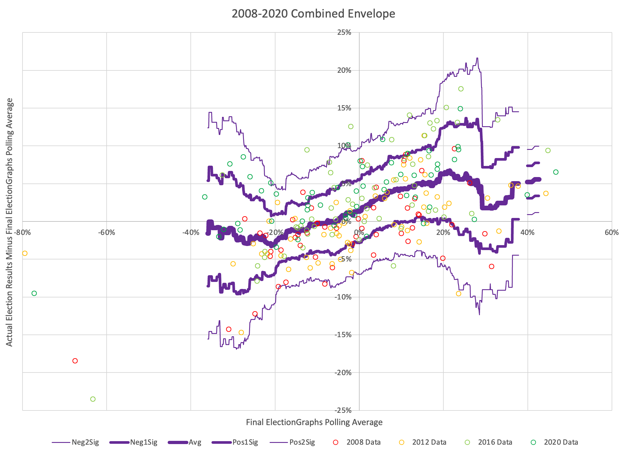
Doing this you lose the specific distinctiveness of the four presidential election cycles going into this. Instead, you essentially fold in some information about just how much polling accuracy has varied cycle to cycle.
Now, the "core" of Election Graphs has always been the dead simple method of taking the polling average at face value and classifying any states where the margin is less than 5% as states that could go either way, and presenting that range of possible results.
But starting in 2020 I experimented with producing probabilistic results too. Those probabilities were based on the 2008-2016 version of the chart above, and for 2024 I'll be using this 2008-2020 version.
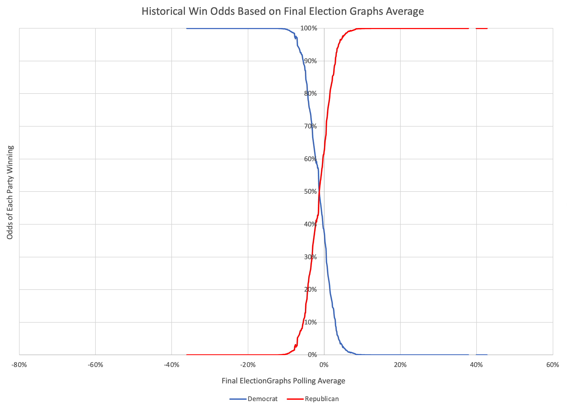
The key is that for every value of the Election Graphs average, we have numbers for the mean actual election result (the EG average plus the delta), as well as an associated standard deviation. From this, we can construct a chart showing for each value of the Election Graphs average, the chances of a Democratic win and the chances of a Republican win based on the historical data. (As usual, since Election Graphs operates off the margin and not raw support numbers, if a 3rd party is ever in contention, this method falls apart.)
So what does that look like?
 OK, that's nice at the same scale as all the other charts, but lets zoom into the critical central part here.
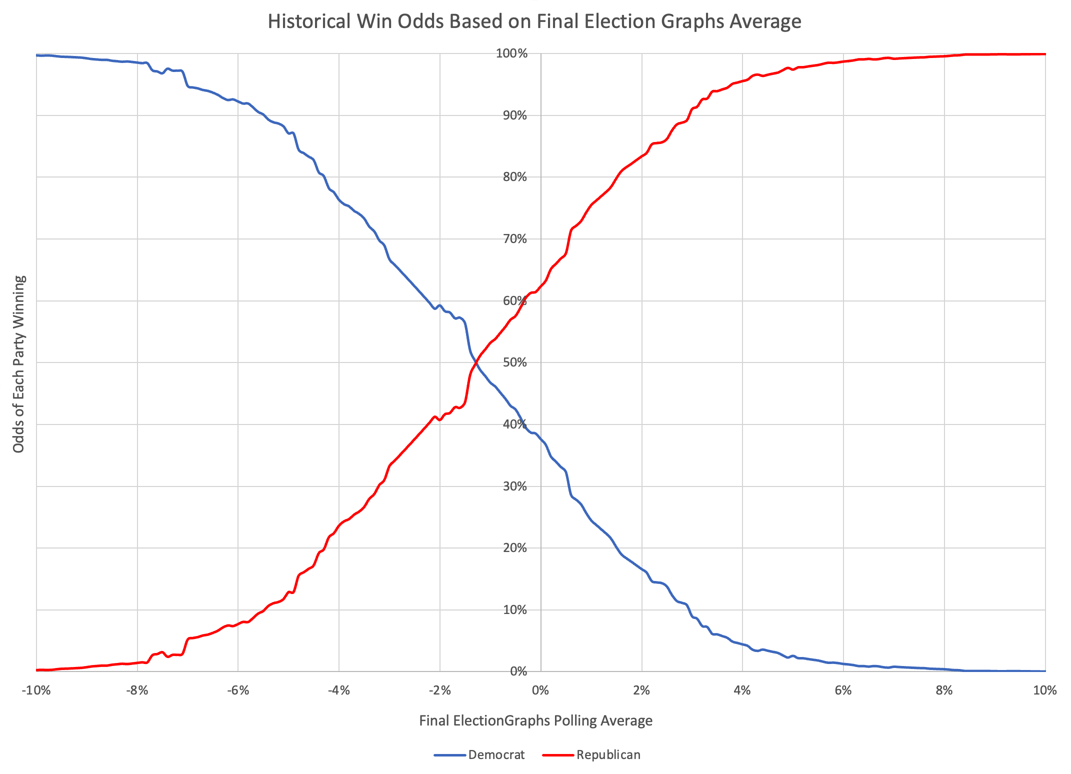
OK, given my methodology, this is a bit bumpy. I should probably smooth it out a bit or do a logistic regression or something. But given the levels of uncertainty we are talking about, I probably won't bother. I like a little bumpiness.
Anyway, this is the critical graph. And yes, this does smell a little of "unskewing" the polls. Don't worry though, ElectionGraphs will continue to show the straight up averages.
But what we see here is that over the last four election cycles, there HAS been a tendency to underestimate Republicans. Yes, as discussed above, all four cycles look different, and 2008 and 2012 look distinctly different than 2016 and 2020. But taken as a whole, the Election Graphs poll averages have underestimated Republicans.
So lets look specifically at a few data points on this chart.
Now, technically speaking because the way Election Graphs calculates averages (see FAQ, which I'm just realizing I need to update as well) there can't be exact ties in the Election Graphs average. But if there was an exact tie according to the curve above based on historical data, the Republican would actually have a 62.4% chance of winning, and the Democrat only a 37.6% chance. In order to have a better than 50% chance of winning, the Democrat would need to lead by at least 1.3%.
Looking at this another way, for the Democrat to have a better than 95% chance of winning, they need to be leading by 7.1% or more. For the Republican to have a better than 95% chance of winning, they only have to lead by 3.8%.
Again, this is based on comparing the Final Election Graphs averages to actual election results from 2008 to 2020. There is a chance 2024 looks nothing like the last four elections. Polling may be better. Polling may be worse. Polling may underestimate the Democrats this time rather than underestimating the Republicans. We just don't know. So looking at the four cycles of data I have so far is the best I can do…
Anyway, that is the curve I will be using to make my "probabilistic" views for 2024. This will not impact the traditional "categorization" views at all. They will remain as they always have been, classifying any state with a margin less than 5% as a "weak" state that could go either way. No "unskewing" there.
But I will allow the probabilistic views to take into account that based on this historical data, the Democrats have to be further ahead to have an even shot, etc.
Also important to note, is that these are the odds on a PER STATE basis (and CD for ME and NE). You can't apply these numbers to national polls. It just doesn't work that way. For that, I'll once again be doing Monte Carlo simulations using the state poll averages and the odds on the chart above.
One thing none of the above takes into account though is trying to estimate how correlated errors are between states. If errors were just completely uncorrelated, then when you run your simulation, you just roll the dice for each state. Distributions end up a bit narrower. But if things are completely correlated, so that if one state underestimates the Republican, they all do, then you essentially roll once to see how far off ALL the states are, and you end up with a much wider distribution with higher odds for the tails.
The reality is somewhere in between. I haven't had a good method for modeling "somewhere in between". So in the 2020 cycle, after a brief time mentioning only the fully independent version (which was a mistake, for which I was indirectly called stupid by Nate Silver), I ended up just showing both extremes. This wasn't entirely satisfactory either though. But at the moment I don't have a better idea.
If you are a stats and modeling person who wants to help me properly model the right degree of correlation between errors here, please get in touch. I'd love to learn more and do better.
That applies to everything else in the analysis above as well. I am well aware I am doing a few things that may not be exactly the right way to do things. I don't think anything is outright "bad", but I recognize there may be better ways of accomplishing what I am trying to accomplish, and maybe I'm wrong and some things ARE just bad. If so, I'd love to hear about it and learn… as long as you can give me that feedback nicely and gently, rather than being mean about it. Thanks.
OK. I guess that is it for the "preliminary math stuff".
Next up is standing up the actual 2024 page with only the previous actual election data (no 2024 polls yet) to define a "starting point". And updating the FAQ and things like that.
I'll post again once that is done, and before I start feeding it actual state polls for 2024 (of which there have already been quite a few).