It has been 40 days since my last post.
The last post was right before Trump's conviction in his New York trial. We are now a little more than a week after the first debate, and a little more than a week before the start of the Republican National Convention. So it is a good time for another check in.
We will do the usual run down of what has changed since last time in a moment, but first, an announcement of a new feature on Election Graphs.
To quote the new item on my FAQ:
Initially this site only did the two sets of probabilistic views based on the FINAL Election Graphs averages vs the actual election results. This is essentially "if the election was today", or alternately "if the polls don't change at all between now and the election". But of course until we get to Election Day, the election is not today, and polls change a lot over time. There are lots of ups and downs over the course of an election season, as the candidates campaign, and news events change the course of the news.
As of July 2024, I have added "Accounting For Time Left" views of both the Independent States and Uniform Swing models. Basically, at any given date, instead of comparing the final election graphs average to the actual election results, I use the Election Graphs averages the same number of days before the election instead. The methodology for computing the odds and doing the simulation is otherwise identical. But now it is based on how far off the poll averages were X days before the election.
…
Anyway, this means Election Graphs now has views that are no longer just "if the election was today". These two views do take into account how much things may change before the election. They of course are still based on assuming that the current cycle shows similar patterns for how far off poll results are from election results in the past few elections. Which may or may not end up being true. But using the past as a model for the future is the best I can do.
It took a lot of work to add this. I took a week off from my day job to build all of it out. So please take a look at the revamped national summary and the revised state detail pages and poke around and explore. Lots of good stuff there. Feedback is welcome! Email me at feedback@electiongraphs.com. Or you can find Election Graphs on Mastodon at @ElectionGraphs@newsie.social.
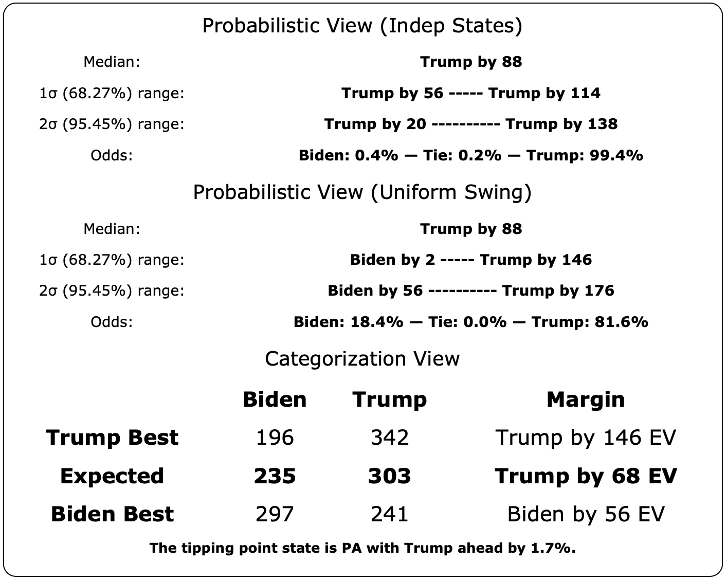
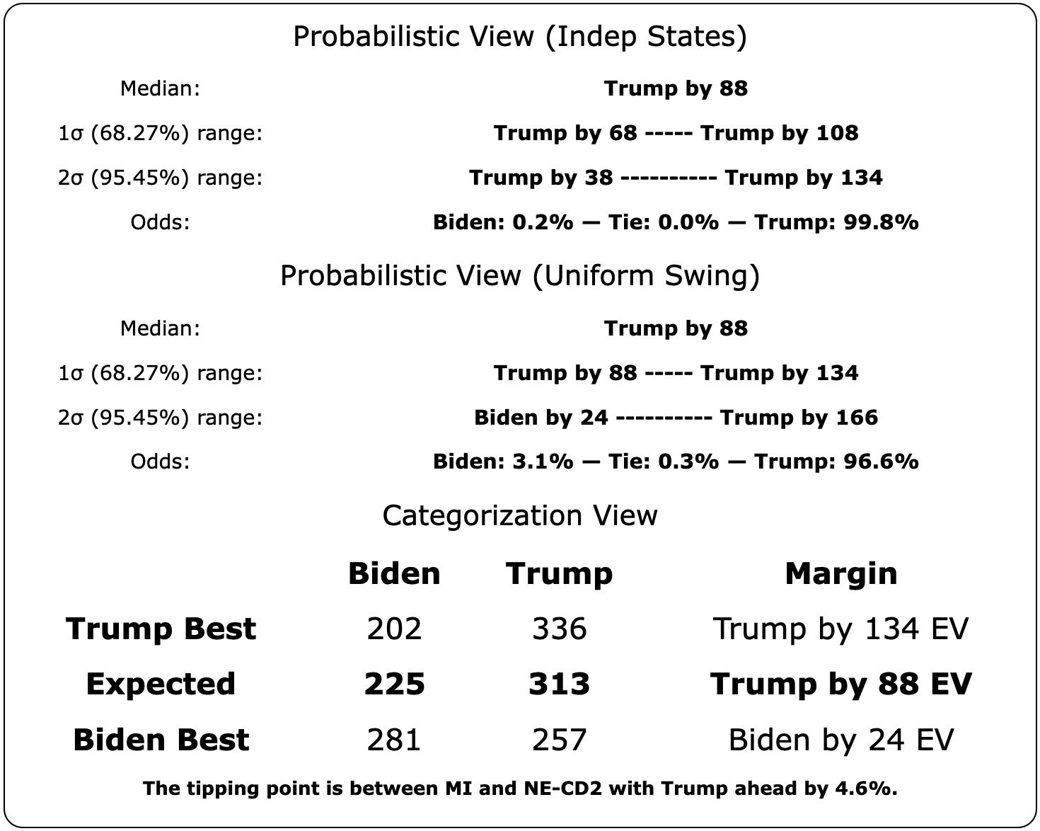
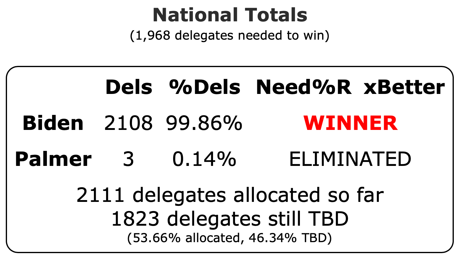
I'm sure folks want to know the bottom line on those new models, so here it is:
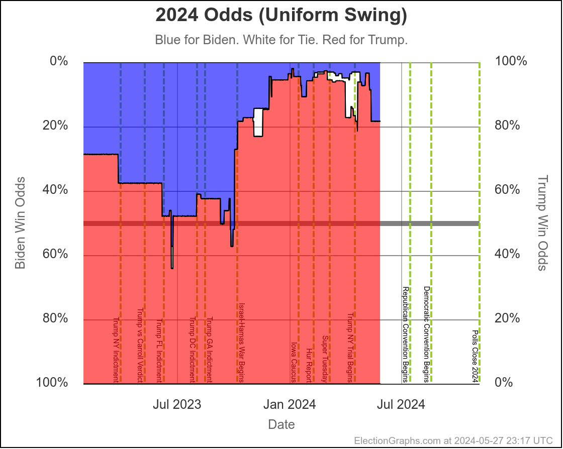
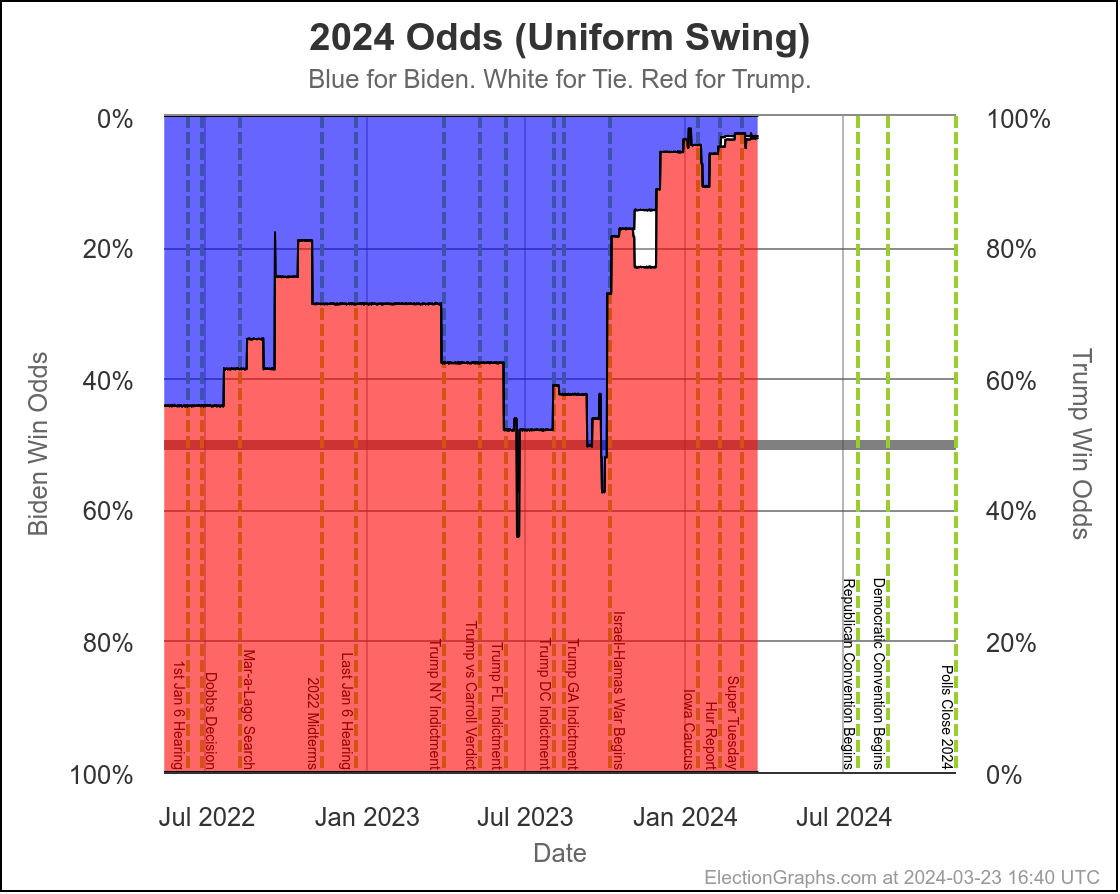
Uniform Swing Odds accounting for 122 days left:
- Biden: 22.0% — Tie: 0.0% — Trump: 78.0%
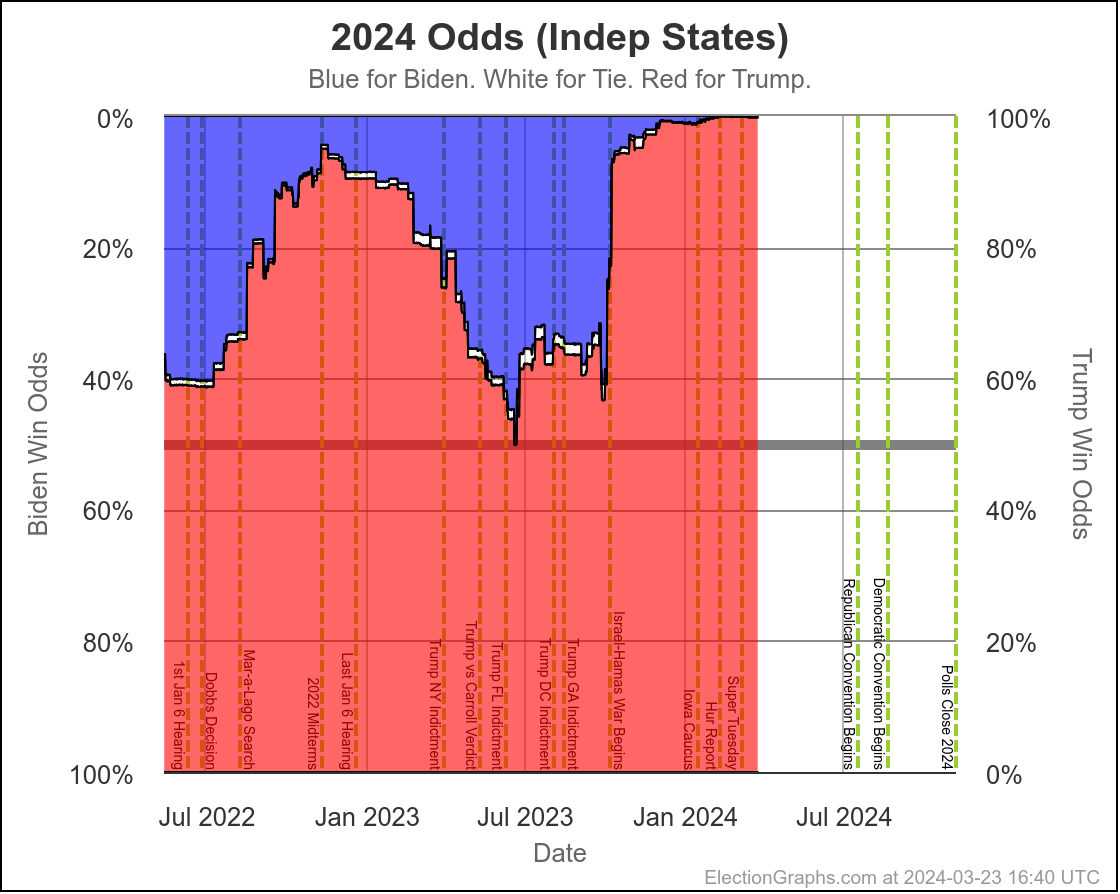
Independent States Odds accounting for 122 days left:
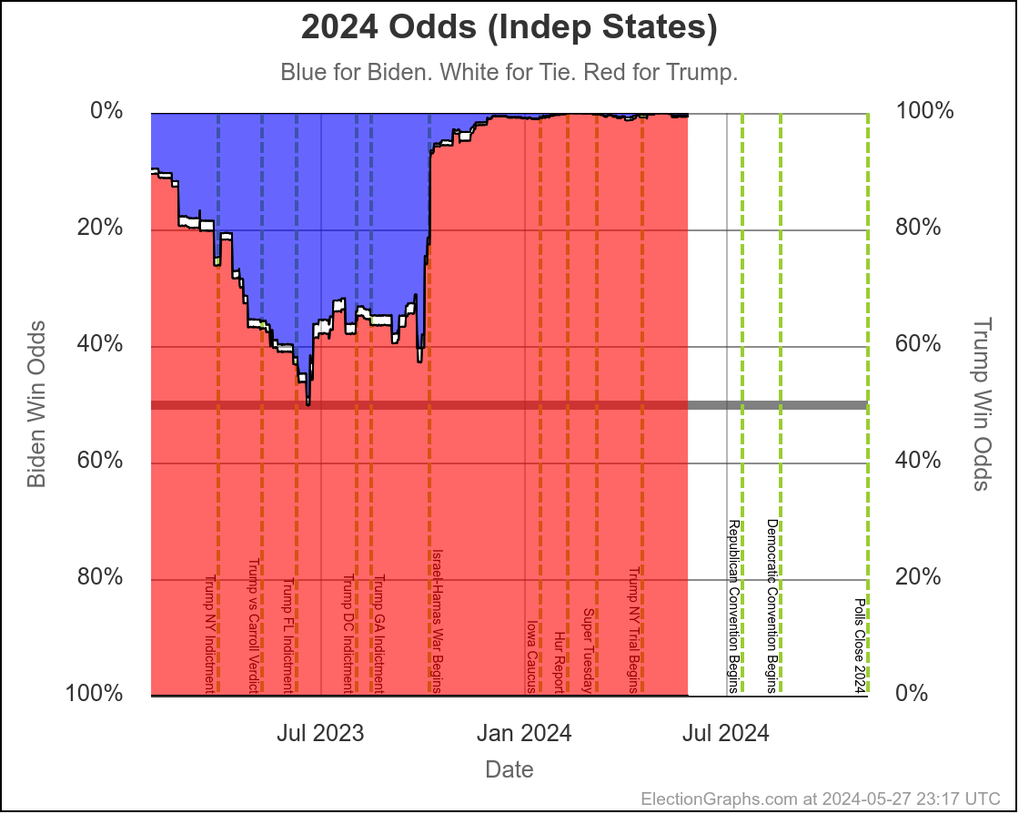
- Biden: 2.6% — Tie: 0.2% — Trump: 97.2%
By comparison, the "if the election was today" view has Biden at 11.2% for Uniform Swing and 0.2% for Independent States.
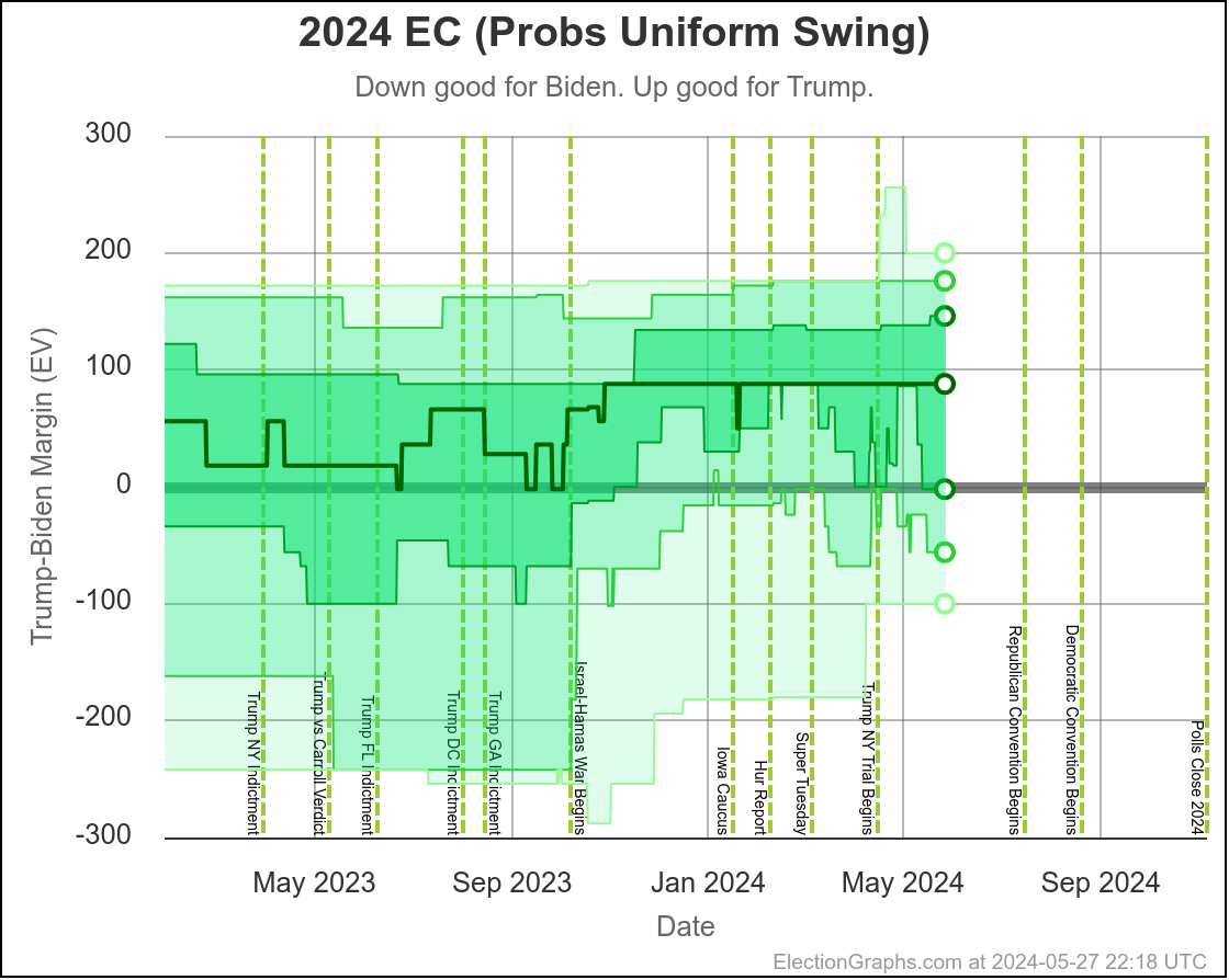
The truth is somewhere between Uniform Swing and Independent States, but there are a number of reasons to think if pollsters are making a specific mistake in one state, they will make the same mistake in many states, so the truth is probably closer to the Uniform Swing model than the Independent States model.
OK, with that out of the way, a quick TL;DR on the overall state of the race.:
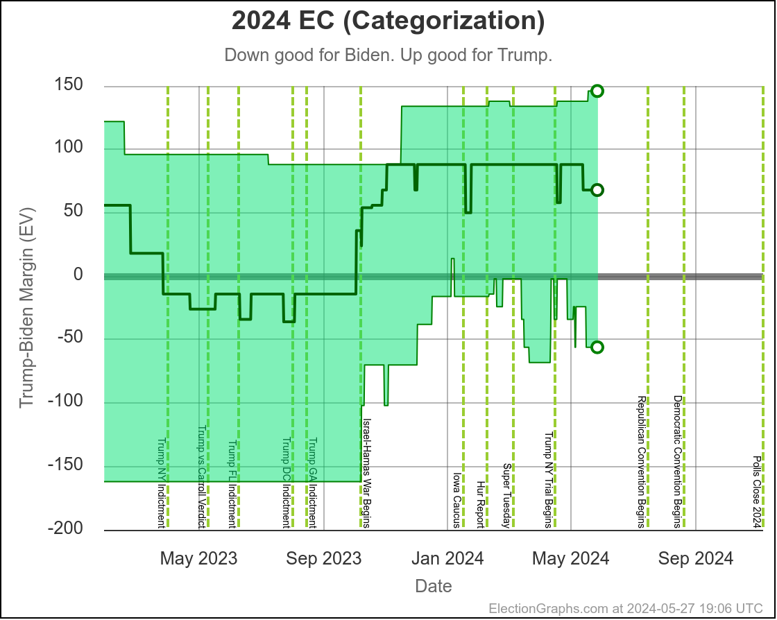
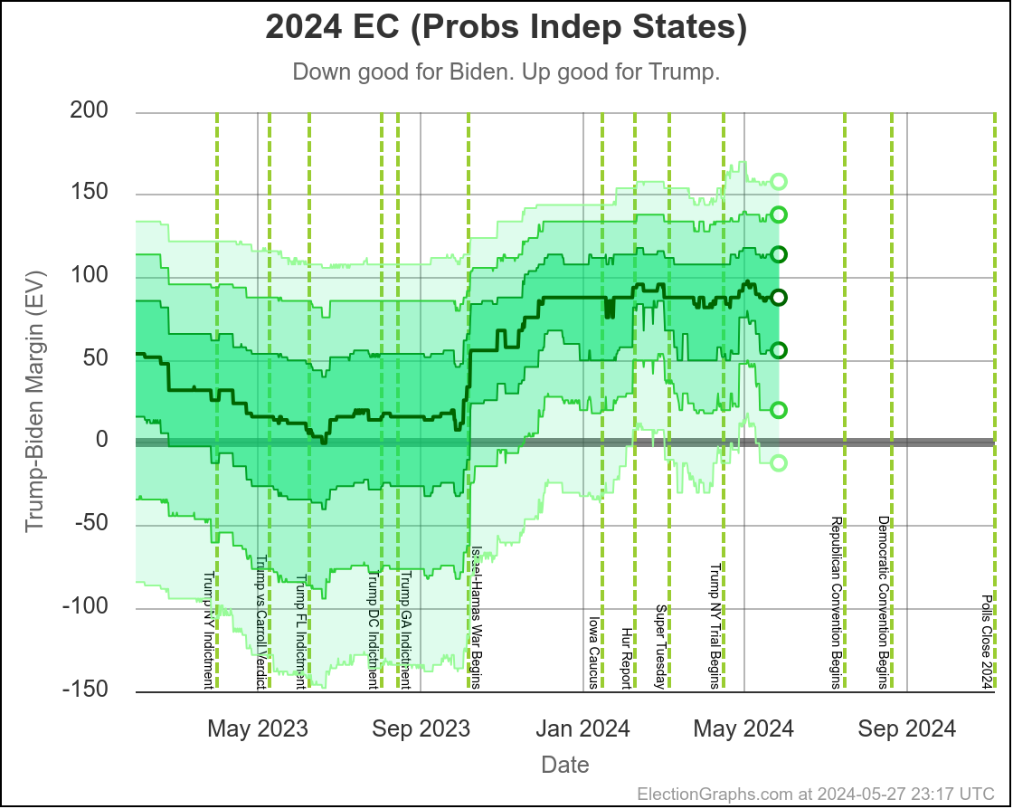
- Things have generally been slowly moving in Biden's direction since Trump peaked in December, although there have been lots of short term ups and downs along the way.
- Specifically, things had been moving toward Biden DURING Trump's NY Trial.
- But since the verdict, things have once again been moving back toward Trump.
- There are only a handful of post-debate state level polls at this point, so it is too soon to have a definitive signal on what if any impact that will have, and with the Republican National Convention coming soon, it may end up being hard to isolate the impact of the two events.
- Given all the talk of non-Biden alternatives, it is natural to wonder how matchups other than Biden vs Trump are looking, but state level polling for other Democrats vs Trump is sparse, and most of what does exist is old. So until or unless there is a wave of new polling, there is nothing definitive that can be said about those matchups. If you want to look at Harris vs Trump anyway though, here it is.
- As has been true since October, Trump remains favored. He is leading, and far outperforming his polling in both 2016 and 2020.
- There is still time for things to change. The new Uniform Swing accounting for 122 days left view gives Biden a 22.0% chance of pulling out a win. But Trump is clearly the frontrunner, and Biden is clearly behind at the moment.
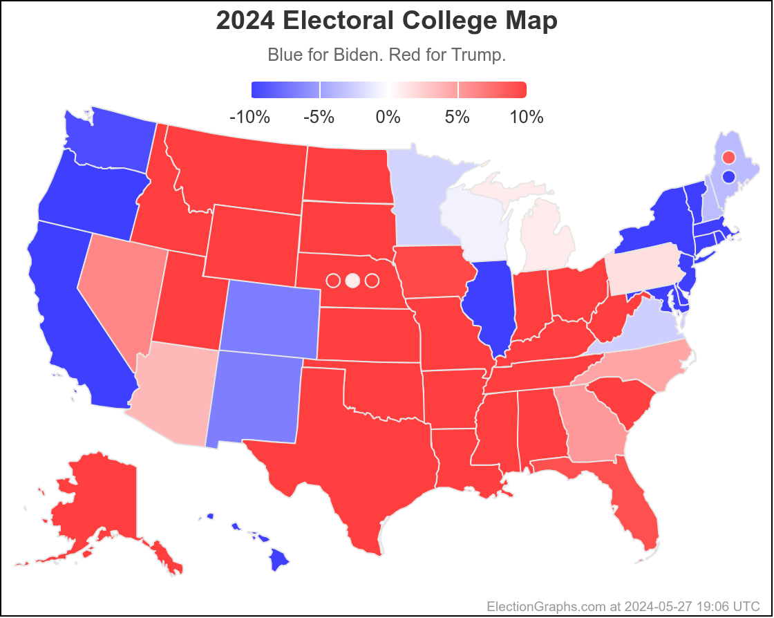
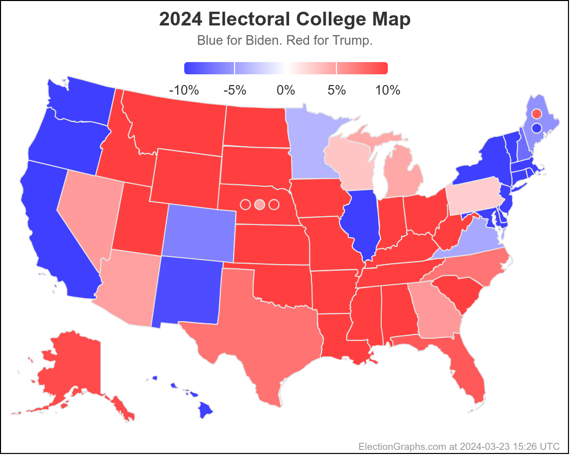
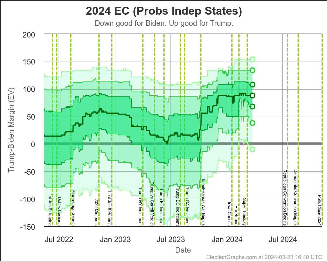
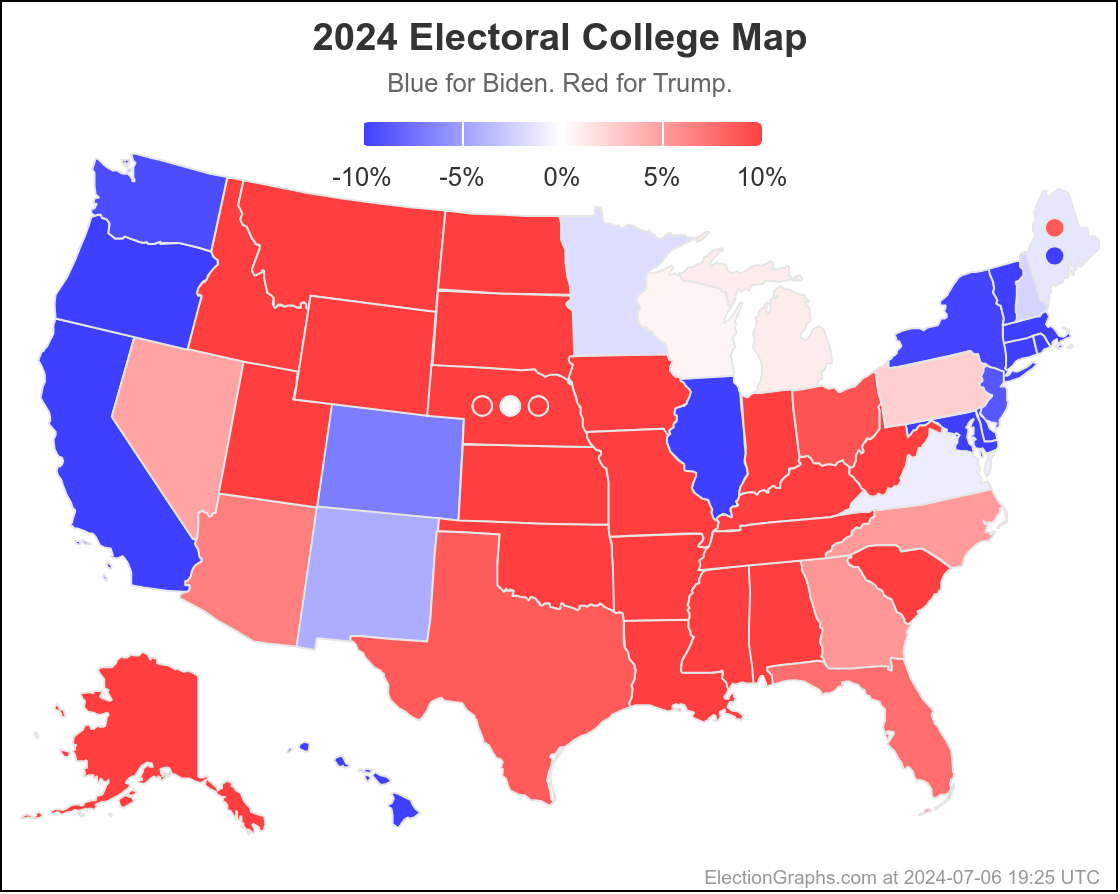
And the current map:
OK, now time for details. Most if not all of you can leave now. The rest of this is for poll geeks only. 🙂
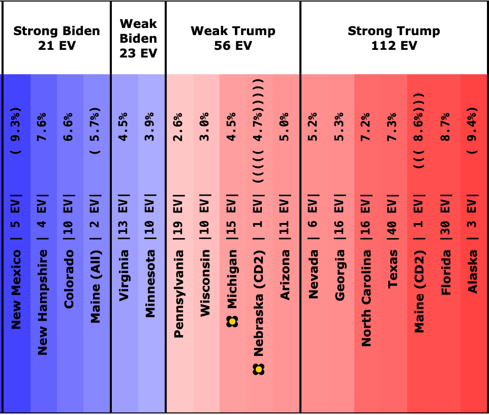
Lets start by just looking at how state averages in any of the even remotely close states (margin under 10%) have moved since the last blog post.
Here is where things were on May 28th:
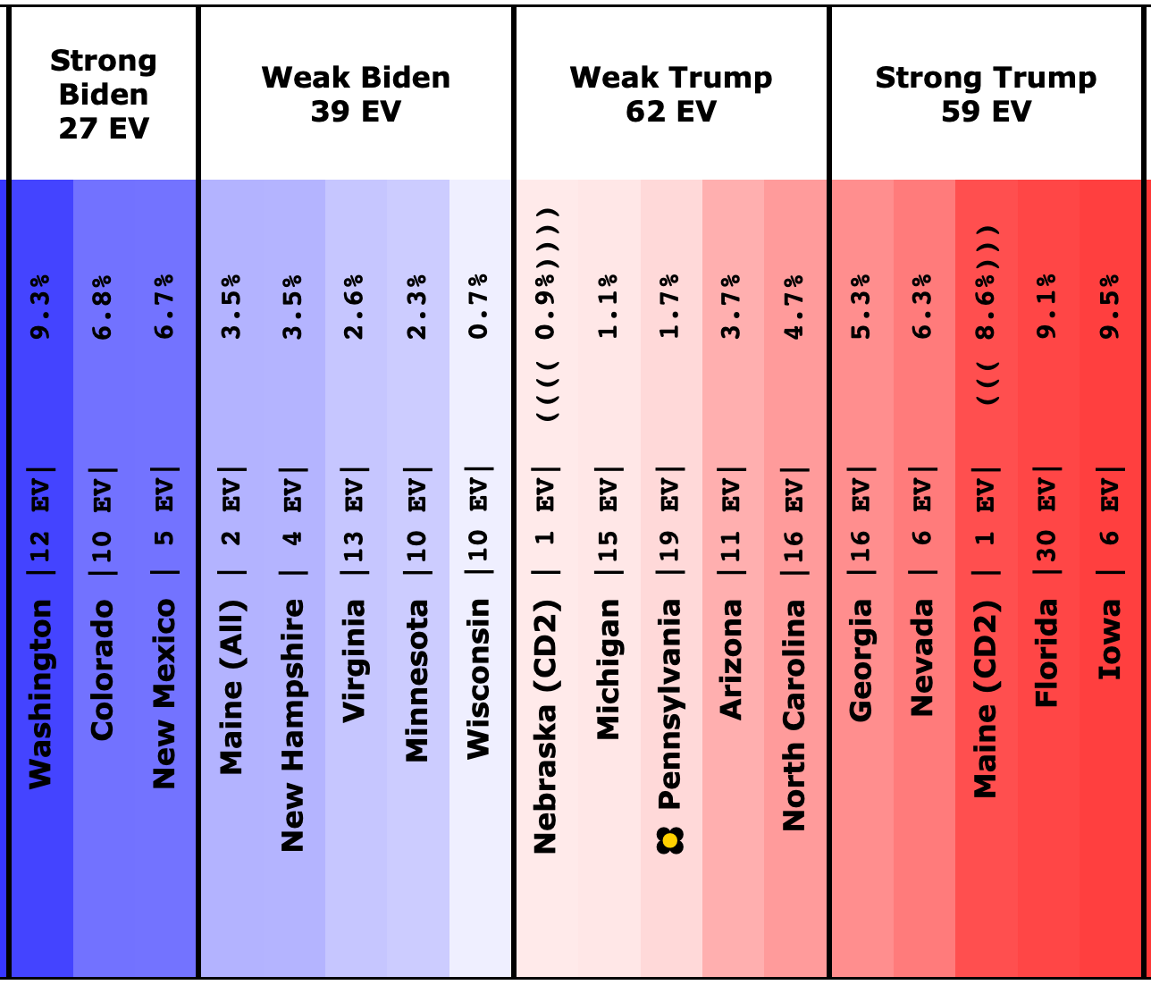
And here is what that spectrum looks like on July 6th:
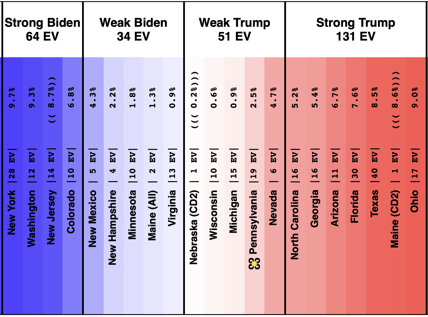
Checking out all the deltas:
Net movement toward Trump:
- New Jersey (14 EV): Biden by 12.5% -> Biden by 8.7% (Trump+3.8%)
- Arizona (11 EV): Trump by 3.7% -> Trump by 6.7% (Trump+3.0%)
- New Mexico (5 EV): Biden by 6.7% -> Biden by 4.3% (Trump+2.4%)
- Maine-All (2 EV): Biden by 3.5% -> Biden by 1.3% (Trump+2.2%)
- Iowa (6 EV): Trump by 9.5% -> Trump by 11.4% (Trump+1.9%)
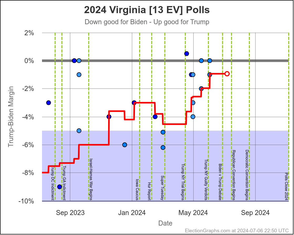
- Virginia (13 EV): Biden by 2.6% -> Biden by 0.9% (Trump+1.7%)
- New Hampshire (4 EV): Biden by 3.5% -> Biden by 2.2% (Trump+1.3%)
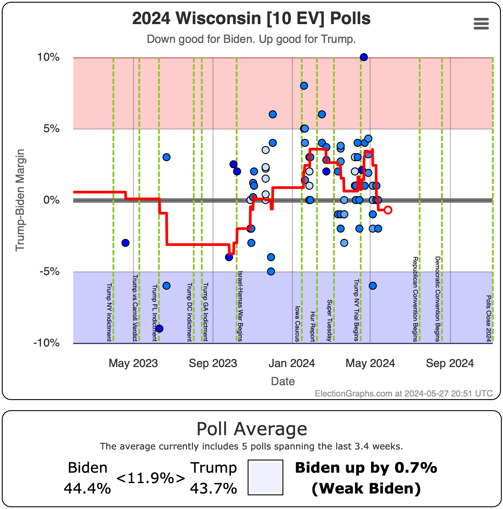
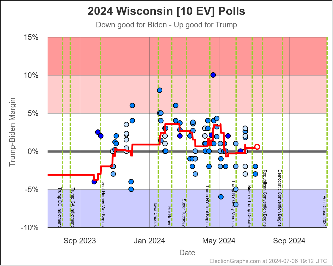
- Wisconsin (10 EV): Biden by 0.7% -> Trump by 0.6% (Trump+1.3%)
- New York (28 EV): Biden by 10.8% -> Biden by 9.7% (Trump+1.1%)
- Pennsylvania (19 EV): Trump by 1.7% -> Trump by 2.5% (Trump+0.8%)
- Minnesota (10 EV): Biden by 2.3% -> Biden by 1.8% (Trump+0.5%)
- North Carolina (16 EV): Trump by 4.7% -> Trump by 5.2% (Trump+0.5%)
- Georgia (16 EV): Trump by 5.3% -> Trump by 5.4% (Trump+0.1%)
No net movement:
- Washington (12 EV): Biden by 9.3%
- Colorado (10 EV): Biden by 6.8%
- Maine-CD2 (1 EV): Trump by 8.6%
Net movement toward Biden:
- Michigan (15 EV): Trump by 1.1% -> Trump by 0.9% (Biden+0.2%)
- Nebraska-CD2 (1 EV): Trump by 0.9% -> Trump by 0.2% (Biden+0.7%)
- Florida (30 EV): Trump by 9.1% -> Trump by 7.6% (Biden+1.5%)
- Texas (40 EV): Trump by 10.0% -> Trump by 8.5% (Biden+1.5%)
- Ohio (17 EV): Trump by 10.5% -> Trump by 9.0% (Biden+1.5%)
- Nevada (6 EV): Trump by 6.3% -> Trump by 4.7% (Biden+1.6%)
So mixed, but most of the movement has been toward Trump in the last 40 days, including the only state to cross the center line (Wisconsin).
Wisconsin is and has been RIGHT next to that center line for awhile now:
One key to note here is that Biden's margin in several states where he used to have more substantial leads are becoming more tenuous. A prime example of this would be Virginia:
And Minnesota:
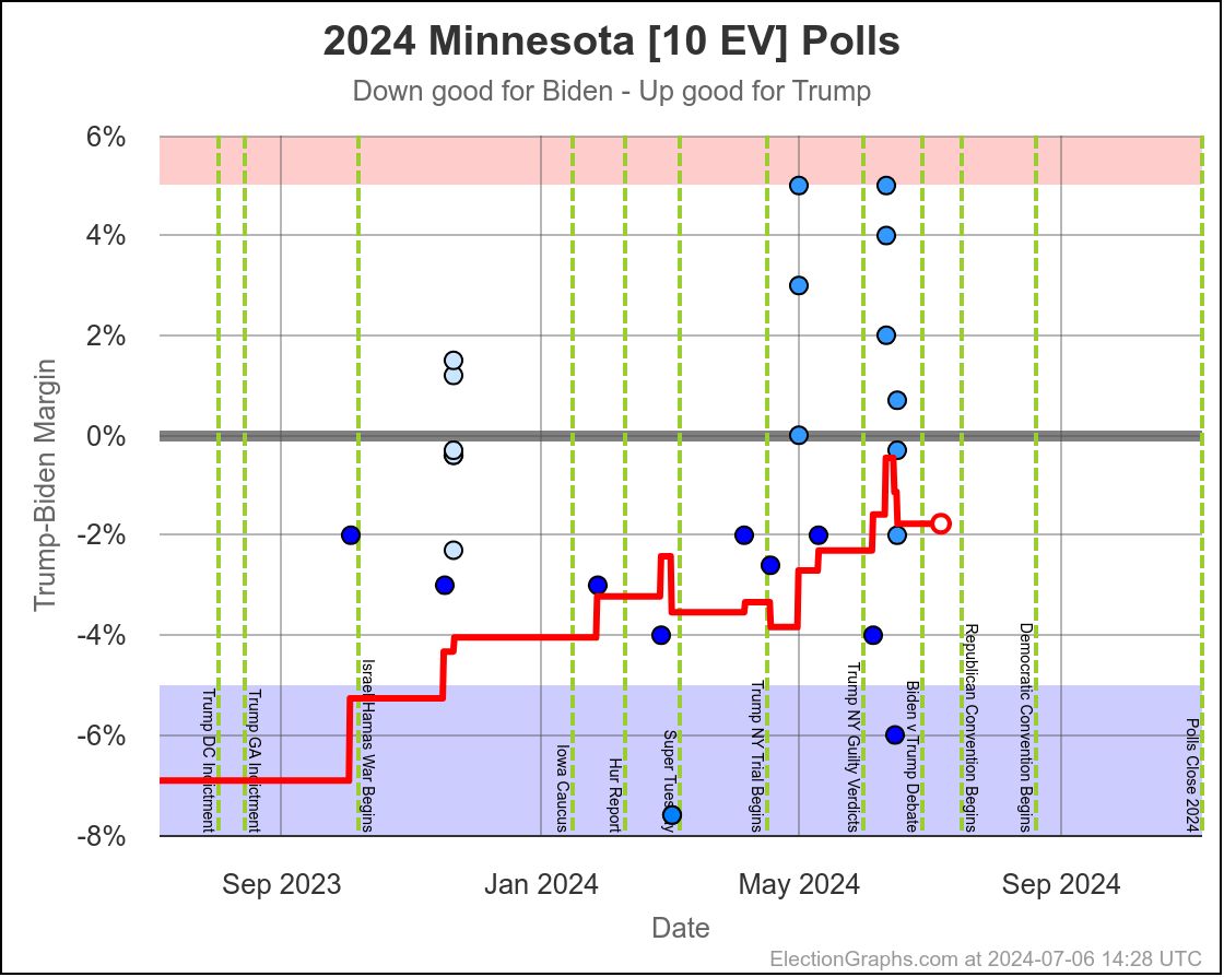
These are states that Biden may not have expected to have to seriously defend. But they are both very much in play at this point. Trump's best case now includes winning not just these two, but also Maine, New Hampshire, and even New Mexico. All states that a few months ago seemed out of reach, but which are now all close enough to be fought for.
There are so many charts and stats now on the national summary page that I'm not about to go through all of them. Please go there and explore. But here are the others I think are worth highlighting.
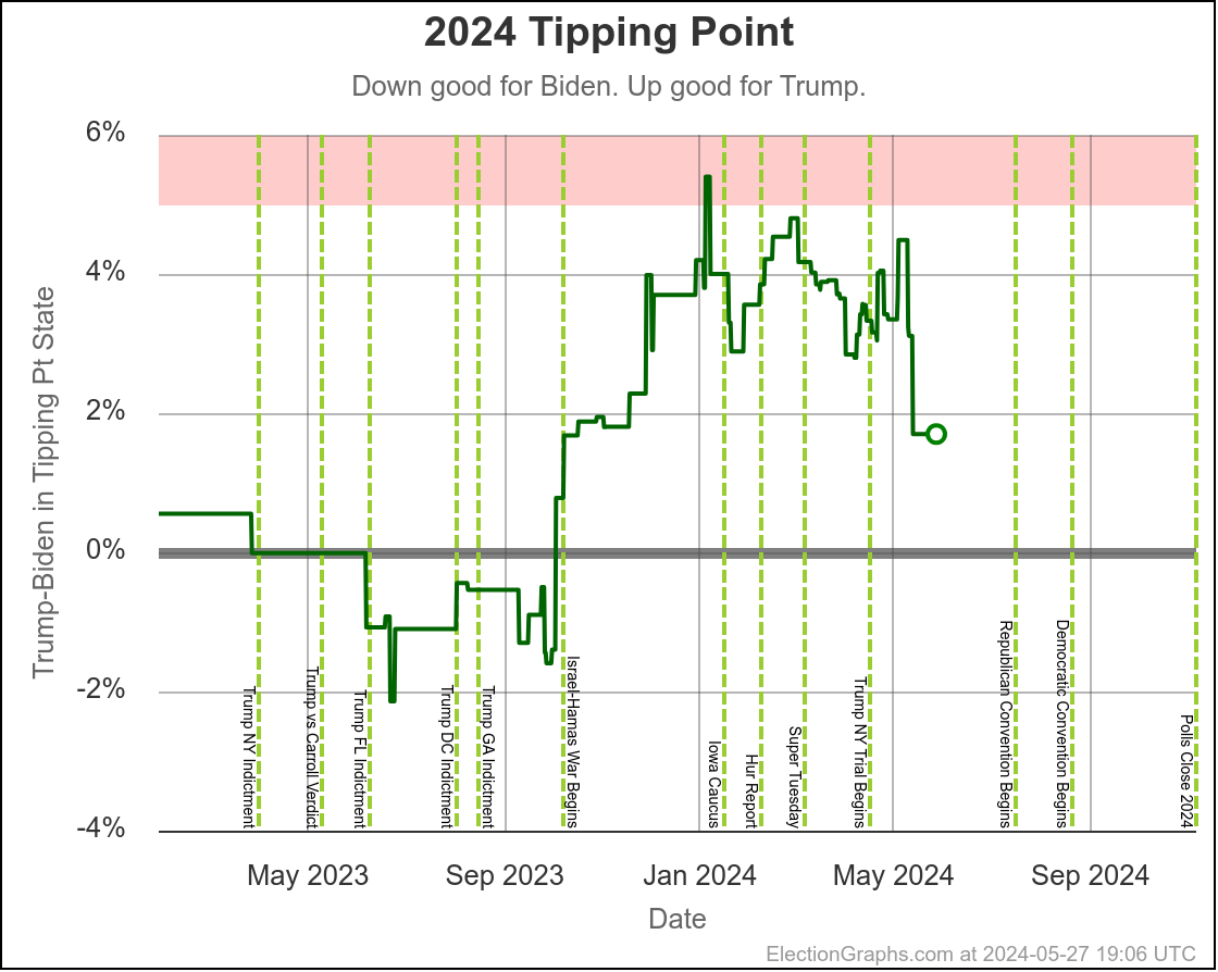
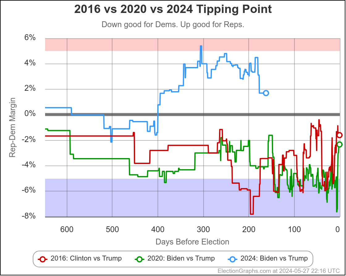
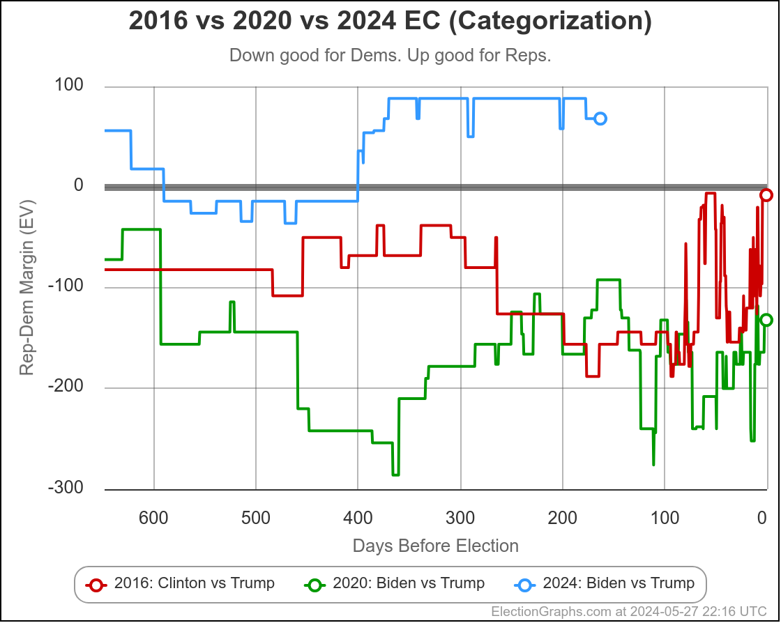
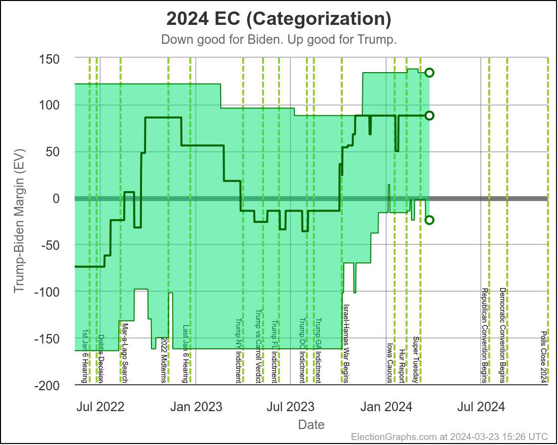
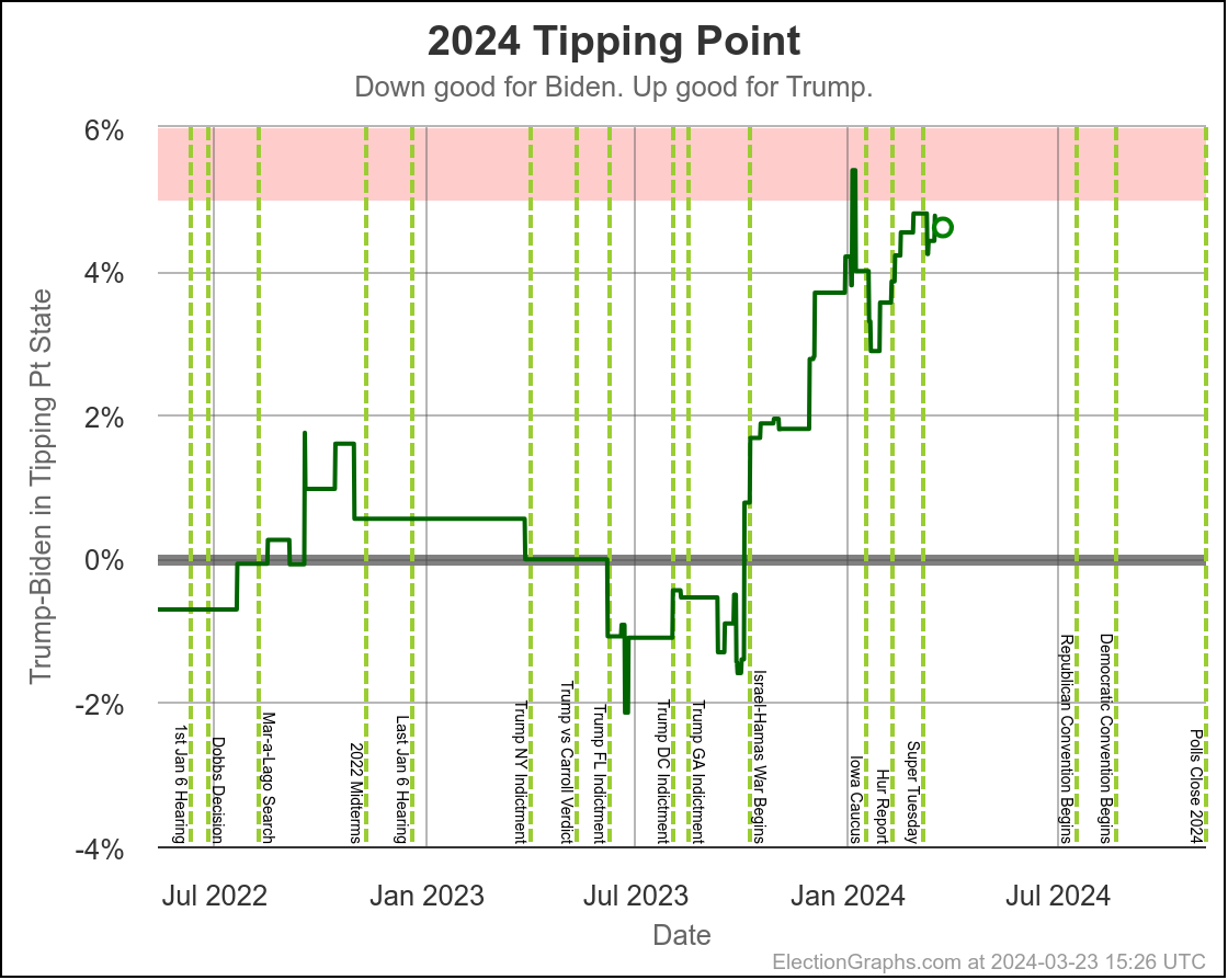
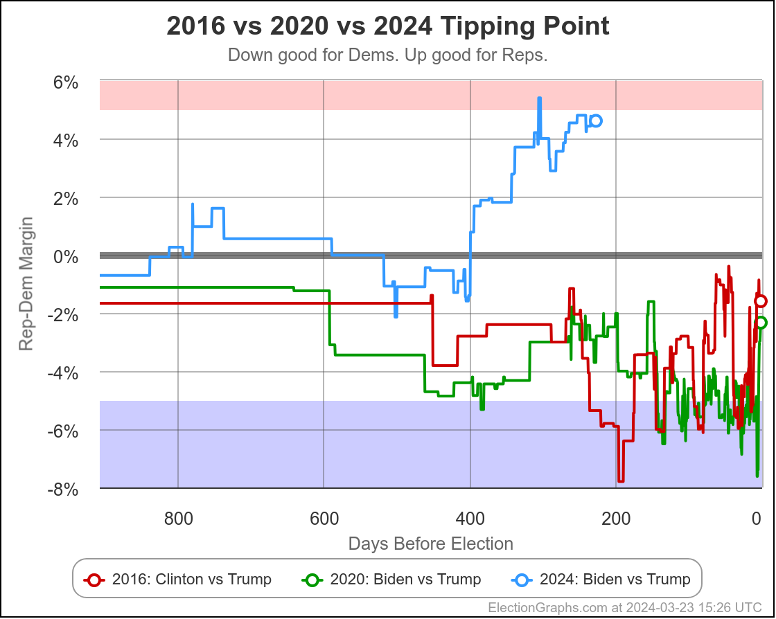
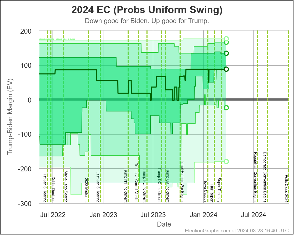
First up, I often tell people that if they were to look at only one thing on the site, they should look at the tipping point graph. So here that is. Specifically, here is the version that includes 2016 and 2020 for comparison:
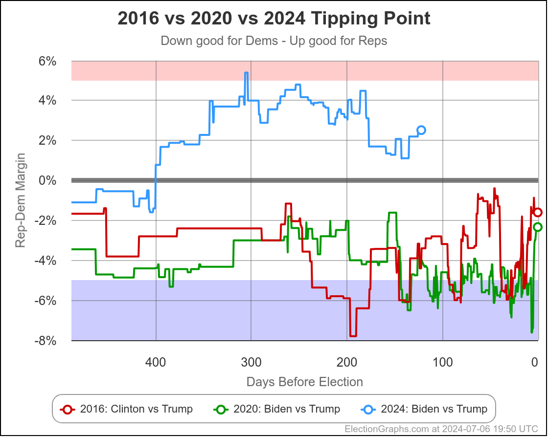
Bottom line here is that Biden has improved significantly since his worst point in December, but the more recent trend has been going in the opposite direction again, and perhaps even more significantly, Trump is running 6.4% ahead of where he was at the same point in 2020, and a full 6.9% ahead of where he was in 2016 at this time.
Trump is blowing away his numbers from the previous cycles. And he just barely lost in 2020, and he won in 2016.
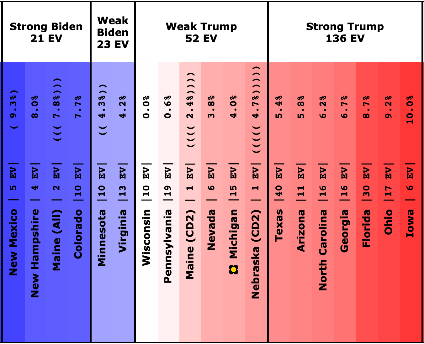
Here is the "envelope of the possible" given the idea that any state with a margin under 5% could go either way:
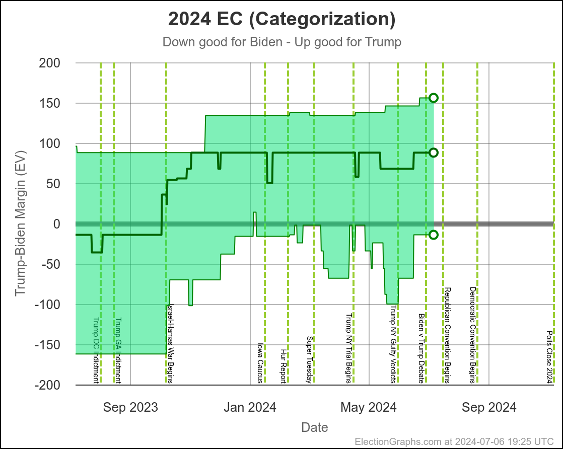
A Biden win is in the envelope, but just barely. He has to win all the states where he is ahead, but then also pull in Nebraska-CD2, Wisconsin, Michigan, and Pennsylvania. Of the states in my "weak" categories, he can only afford to lose Nevada. He has to almost run the table.
As they have been since the beginning, Wisconsin, Michigan, and Pennsylvania, with an assist from Nebraska-CD2, are part of almost any conceivable Biden win scenarios. These are "must win" for Biden, and he is currently behind in all of them.
For a Biden win, one of four things has to happen:
- Biden has to gain a lot of support that so far has not been evident
- Trump has to lose a lot of support that he has held on to so far
- The "undecideds" end up disproportionally falling to Biden in the end
- The polling proves to be massively wrong (overestimating Trump and underestimating Biden this time)
Or some combination of the four.
OK, since I added all of this new probabilistic information in the last couple of weeks, I need to highlight something probabilistic too. There is a lot there though. So which view is the "best" to look at?
I am now showing four separate probabilistic models. Both "if the election was today" and "accounting for the time left", but then also both "independent states" and "uniform swing".
On the first choice, I think it is obvious "accounting for time left" is better. If it wasn't, I probably wouldn't have spent the time to add it.
Ever since I introduced the probabilistic views I have had to explain away "yes, but this is as of right now, things have time to change" every time I talked about this. Now it has something quantitive in terms of modeling "OK, but how much are things likely to actually change?"
It acknowledges that if you have a very small lead, the chances of things changing enough to make a difference are bigger than if you have a very large lead. It also knows that the closer we get to the election, the less the chance of something substantially different happening.
Having said that, we have to bring out that old cliche: "Past performance is not indicative of future results".
These models specifically are based on looking at how the EG polling averages have differed from the actual election results at various numbers of days before the election in 2008, 2012, 2016, and 2020. So fundamentally, if something radically different happens in 2024 than in the aggregate of those cycles, then the models may be off. And I may be "overfitting" to what happened in those cycles as well.
But absent a magic crystal ball, that's the best I can do for the moment, and it is clearly better than not accounting for the time left at all. "If the election was today" gives a good idea of just how much work the candidate who is behind needs to do to change their fate, but if we want an idea of what is actually likely to happen, taking into account the amount of time left just makes sense.
Now, on the second choice. I alluded to this earlier, but fundamentally the question here is, does the direction and magnitude of the poll average error in one state predict in any way the error in another state, or are they unrelated? The reality is that a lot of the same pollsters are active in many of the states, especially in the swing states. And I think a lot of these pollsters are also making similar assumptions about the electorate.
So I think the "uniform swing" model, where the errors in the states are perfectly correlated, is closer than than the "independent states" model where they are completely independent.
So lets look at the odds based on the Uniform Swing model, taking into account the amount of time left:
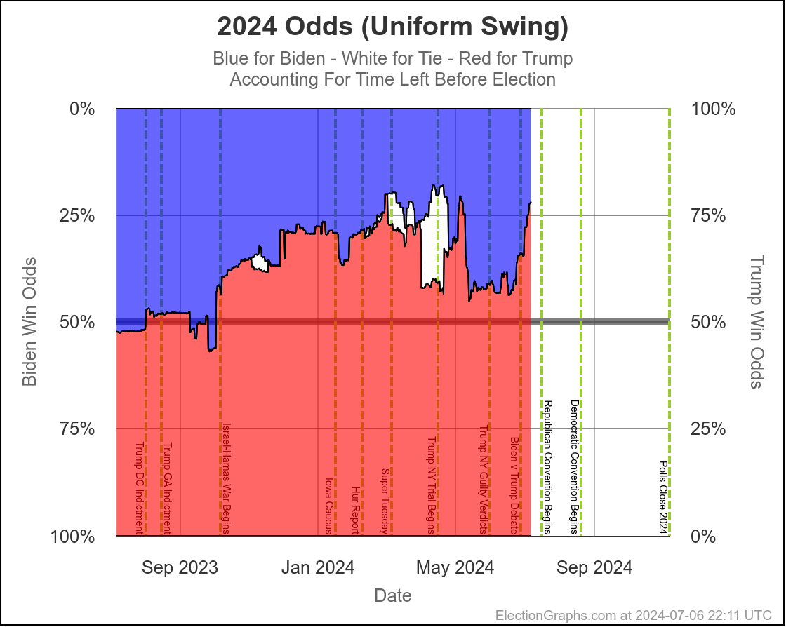
Before October, it was basically a coin toss. Since then Trump has been favored, but the amount has varied.
For a few weeks from about mid-May to mid-June, Trump was down to a chance of winning of between 55% and 60%, which was the worst he had been since October.
Since then though he has moved to once again being near his highs, now up to a 78% chance of winning.
And we still haven't fully baked in people's reactions to Biden's debate performance or the subsequent massive media maelstrom questioning if he should even stay in the race. And the Republican National Convention will be starting before too long, which generally gives a boost to the Republican candidate for awhile.
So it is quite likely that things will continue to move toward Trump for a bit before a Biden recovery is possible.
You never know though, news happens, campaigns happen. And tomorrow's narrative may be different than today's.
And of course if the Democrats do change candidates, then everything changes and we'll need new polling to see where things stand.
With that, it's time to close.
122.0 days until polls start to close on Election Day 2024.
Stay tuned.