Not counting the post about new features, there have been new polls in Florida, North Carolina, Michigan, and Texas since the last update.
For the five best-polled candidate pairs (Biden, Sanders, O'Rourke, Warren, and Harris versus Trump), there were only Election Graph status changes in North Carolina and Michigan. We'll summarize them up top, then start looking at specific graphs for more detail.
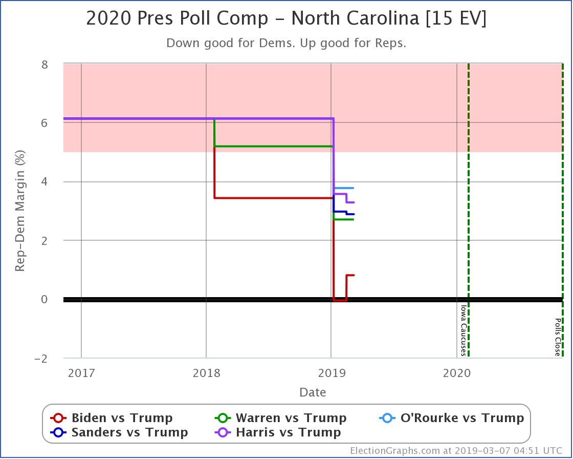
North Carolina:
- Biden vs. Trump:
- State category change: NC has moved from Weak Trump to Weak Biden
- Expected case change: Biden 284 to Trump 254 -> Biden 299 to Trump 239
- Tipping point change: Biden by 0.3% in OH -> Biden by 1.9% in NC
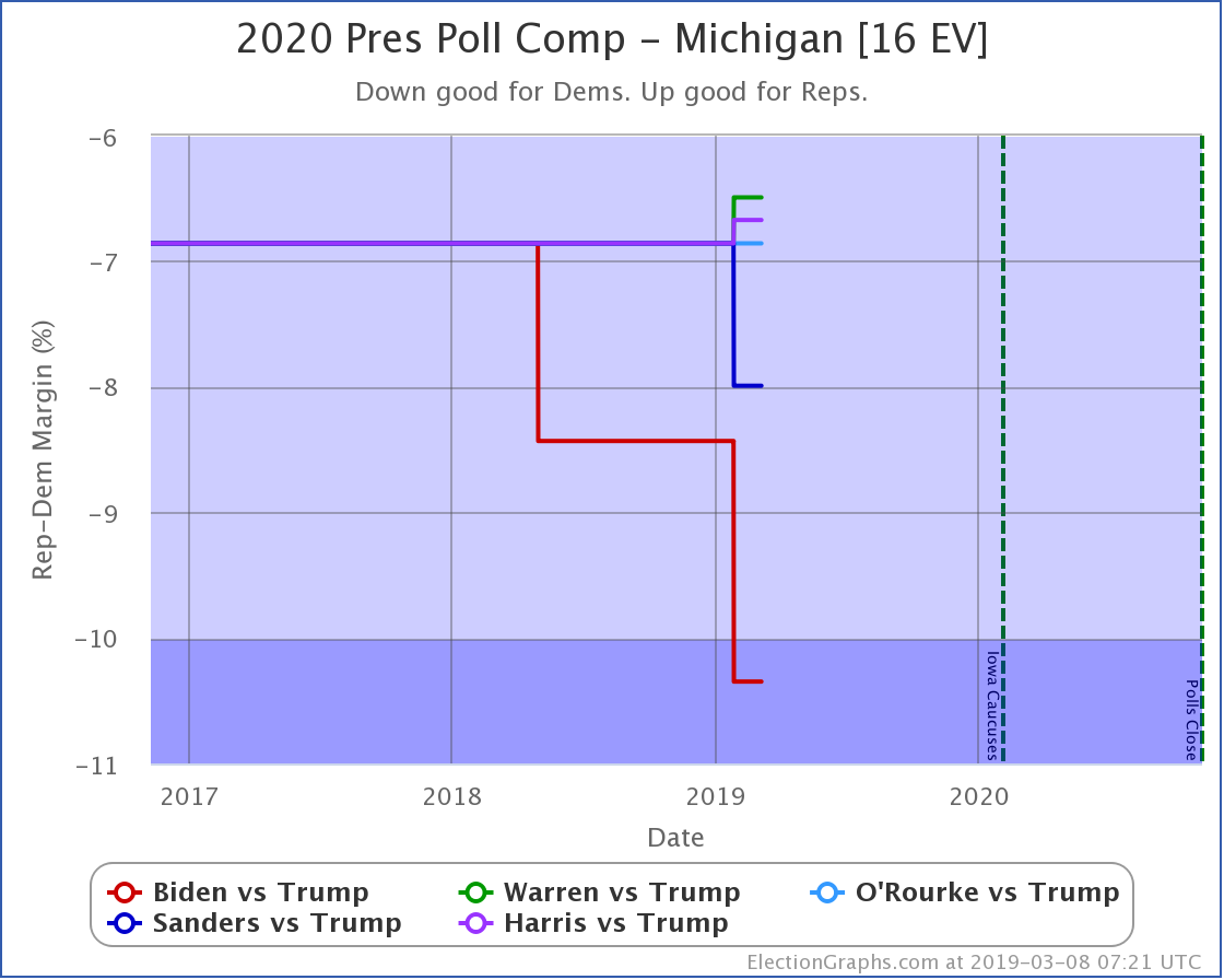
Michigan
- Sanders vs. Trump:
- State category change: MI has moved from Weak Sanders to Strong Sanders
- Trump best case vs. Sanders has changed: Sanders 214 to Trump 324 -> Sanders 230 to Trump 308
- Warren vs. Trump:
- State category change: MI has moved from Strong Warren to Weak Warren
- Trump best case vs. Warren has changed: Warren 230 to Trump 308 -> Warren 214 to Trump 324
- Harris vs. Trump:
- State category change: MI has moved from Strong Harris to Weak Harris
- Trump best case vs. Harris has changed: Harris 216 to Trump 322 -> Harris 200 to Trump 338
Let's look first at Biden in North Carolina:
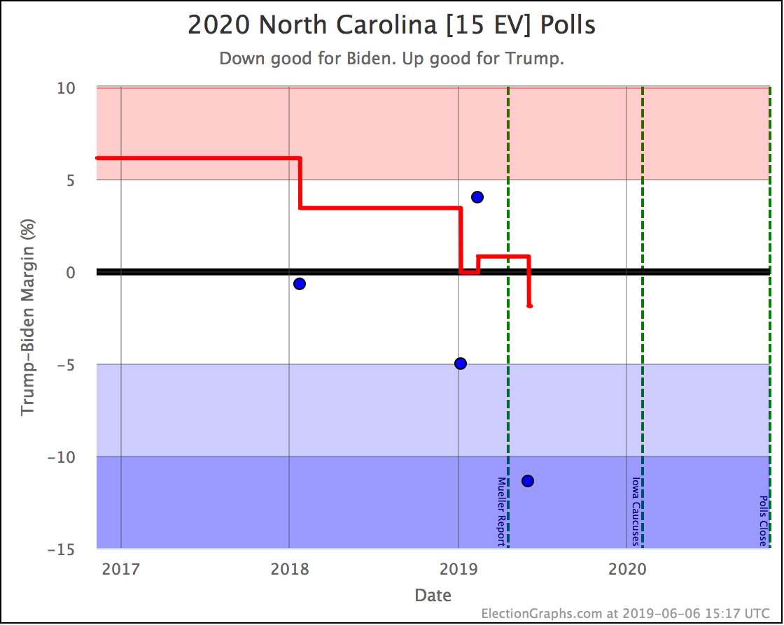
The election graphs average now contains 4 actual 2020 polls, plus the 2016 election results. Of the four actual Biden vs. Trump polls, three show Biden leading. Together this pulls the average back to the blue side of the fence. (It was there before for a bit, just barely, back in January and February.) Biden now leads in the average by 1.9%, which based on Election Graphs history translates into about a 67% chance of winning the state if the election was today.
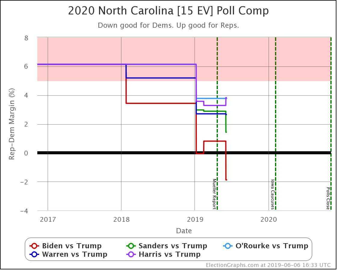
Looking at a wider range of candidates, Biden continues to do significantly better than any of the other Democrats against Trump. For Michigan, three candidates changed categories, so I'll skip the individual candidate charts and move straight to the comparison chart:
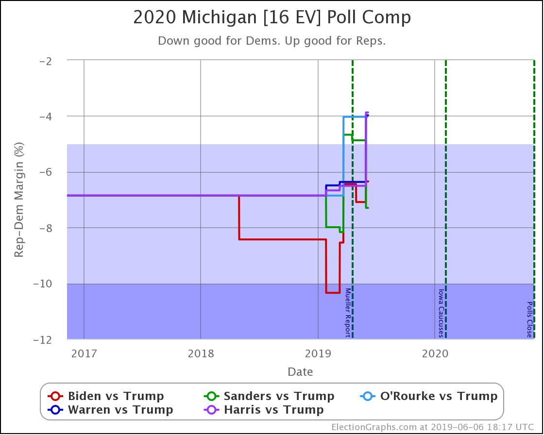
The Michigan comparison chart is messy. No question about that. In these latest changes, Sanders improved his average dramatically, while both Warren and Harris slipped significantly.
Now, the range within all these candidates is from Sanders having a lead of 7.3% to Harris, who is leading by 3.9%. So a 3.4% range. Not that large, right? Well, let's look at it converted into win odds:
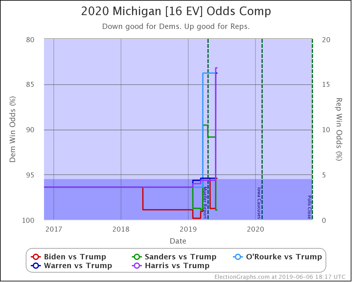
With an odds based view, Sanders has a 98.9% chance of winning Michigan, while Harris only has an 83.2% chance. OK, that still doesn't sound like THAT big a difference, they are both pretty high.
But if you look at it as Trump's chance of winning, it goes from 1.1% against Sanders, to 16.8% against Harris. These are just the same numbers looked at a different way, but this way of looking at it makes the difference a lot clearer. Trump's chances in Michigan (based on current polling data) are much better against Harris than they are against Sanders.
A small difference in the poll averages can make a massive difference in the odds. The closer the state is, the more dramatic this impact is.
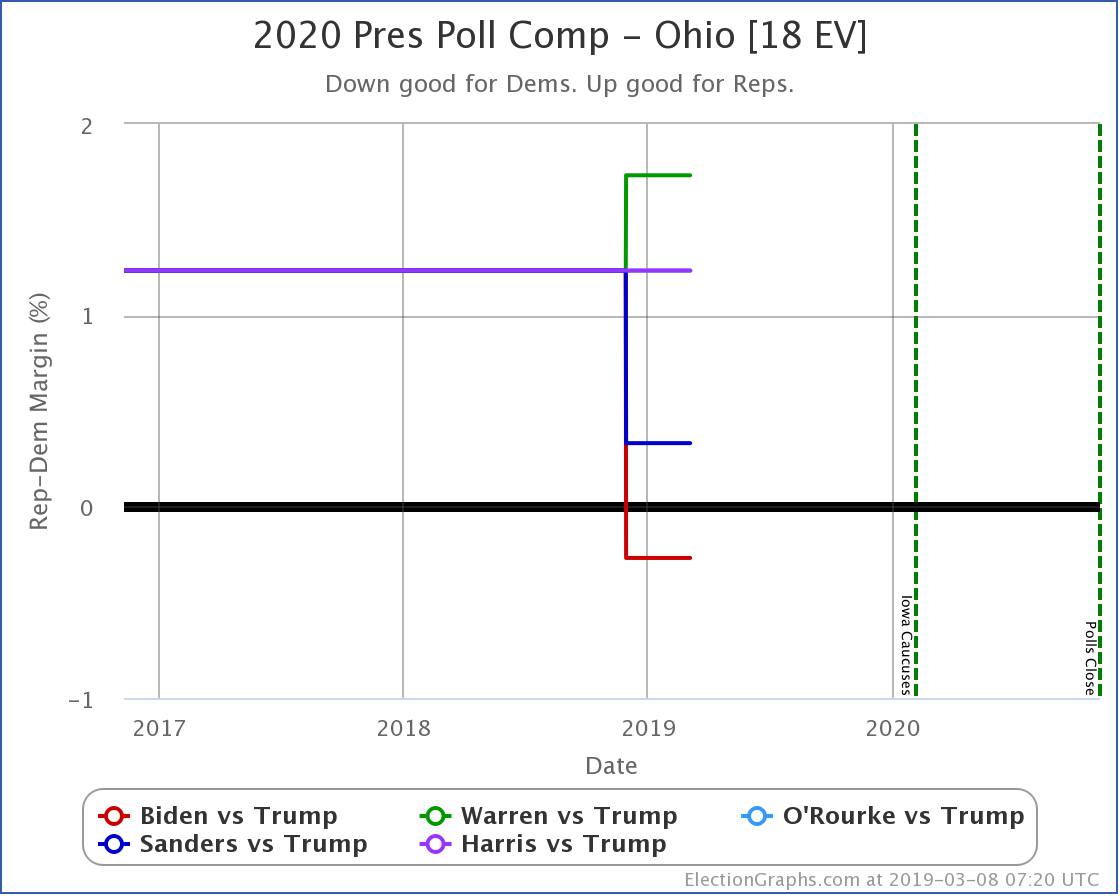
OK. The polls in the other two did not result in category changes, but we'll look at them quickly anyway.
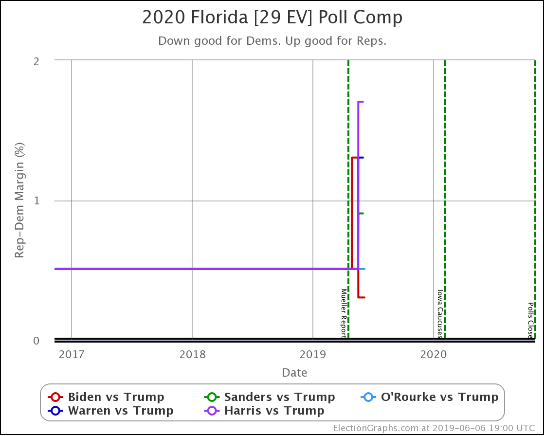
Despite being large and usually very close, very few organizations have polled Florida so far. Of the five matchups shown here, we have two polls of Biden vs. Trump. We have one survey each for Sanders, Warren, and Harris vs. Trump. And O'Rourke vs. Trump hasn't been polled at all.
Given that, there isn't much to say about Florida yet. So far, Trump still beats all five Democrats. Biden does best. Harris does worst. But it is still very early, and we need more polls.
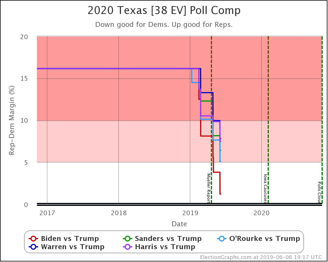
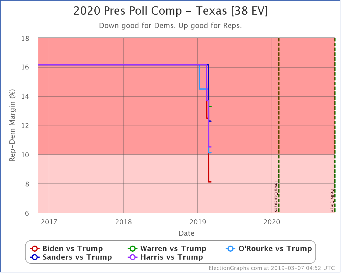
Ah. Texas. The most recent survey here was a Quinnipiac poll released on June 5th. That has resulted in a lot of conversation, because every Democrat they polled was within the margin of error of Trump, and Biden was beating Trump. Of course, you should never look at just a single poll. But look at the poll averages above.
The movement here does not represent changes in the opinion of Texans over the first half of 2019. What this does show are actual 2020 polls slowly taking over the average from the prior assumptions based on previous election cycles. As 2020 polls filter in, the poll averages have been rushing toward the Democrats.
None of these lines have flipped to a "Blue Texas" as of now though.
The Republicans still lead.
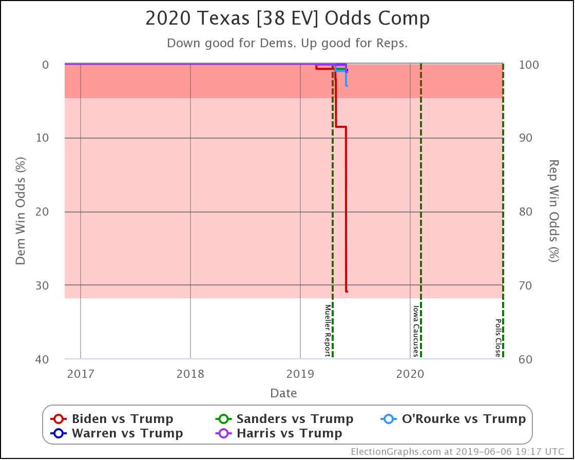
Looking at the odds view, only Biden has started to break out from the "extreme long shot" zone. He's now at a 30.9% chance of winning Texas.
You should still bet on Trump to win Texas, but at this point, it is already clear that Texas is looking a lot closer in 2020 than it has in previous election cycles.
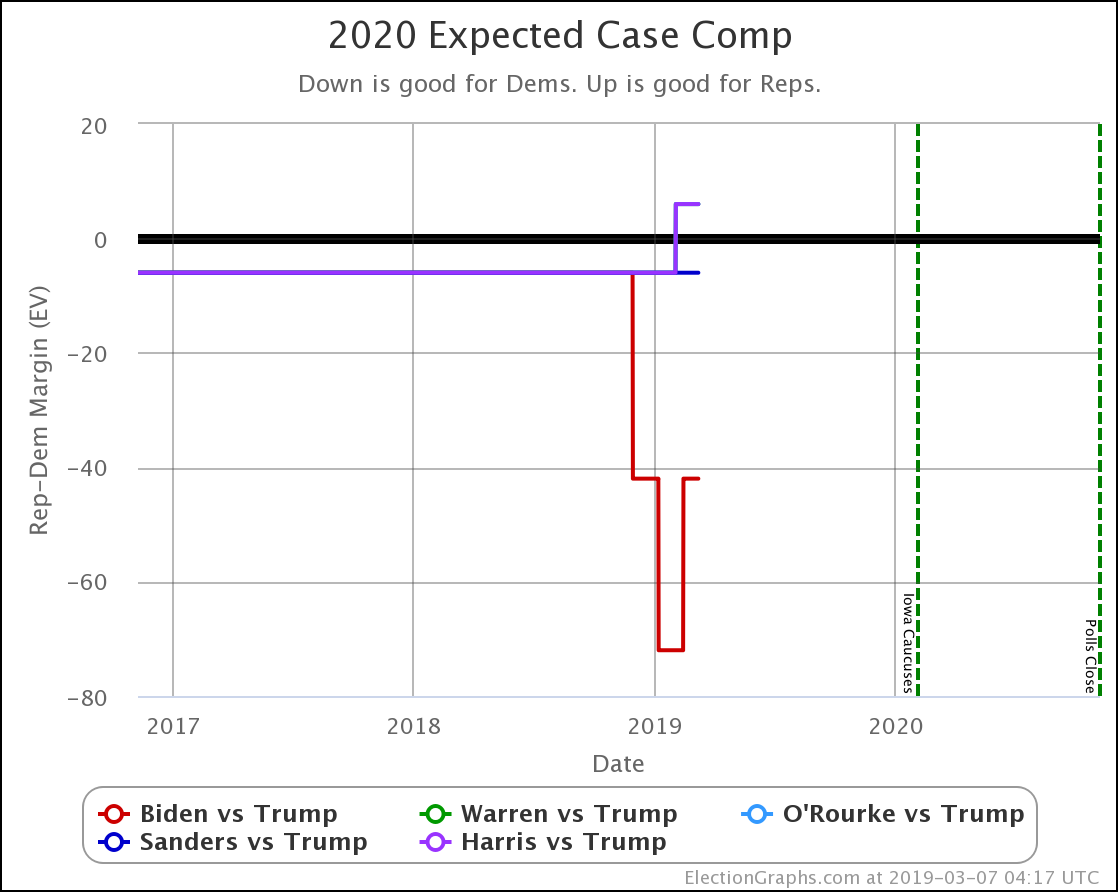
Switching to the national view, a quick look at the expected case comparison:
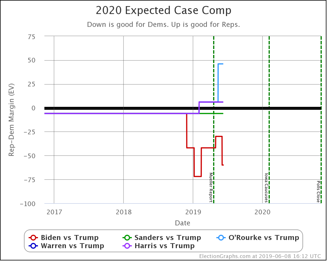
Biden still looks best against Trump, O'Rourke looks worst against Trump.
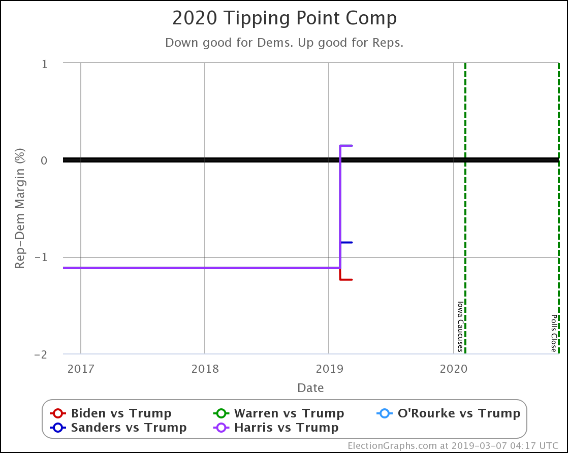
And the tipping point:
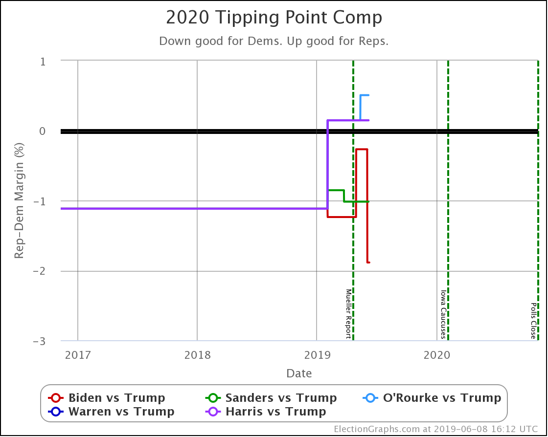
After a brief time with Sanders having the best tipping point against Trump, Biden once again is doing best. And as with the expected case, O'Rourke looks worse.
While I don't have the statistics and graphs live on the website yet, I've started to do some offline Monte Carlo simulations of the whole country based on the state poll averages and the statistics for how well election graphs averages have done over the last three election cycles.
I think it is time to share a bit of that.
Before I present these, please remember that these are "if the election was held today" numbers, based on polling that is still very sparse.
These can and will change dramatically during the many months before the election.
First, let's look at Biden versus Trump and how it was changed by these four polls, in order by the mid-date of their field dates, which is how Election Graphs orders polls:
| Timeframe | Biden Odds | Trump Odds | Tie Odds |
| Before polls | 83.4% | 15.6% | 0.9% |
| After FL poll | 87.4% | 11.9% | 0.8% |
| After MI poll | 86.6% | 12.6% | 0.8% |
| After TX poll | 89.9% | 9.5% | 0.6% |
| After NC poll | 93.4% | 6.2% | 0.4% |
You can see here that each of these individual polls noticeably changed the picture for Biden versus Trump. Collectively, this was a good polling week for Biden, significantly strengthening his position.
I won't repeat the poll by poll evolution for all five candidate pairs, but it is fascinating to see how they compare at the moment.
| Democrat | Dem Odds | Trump Odds | Tie Odds |
| Biden | 93.4% | 6.2% | 0.4% |
| Sanders | 80.4% | 18.4% | 1.1% |
| Warren | 63.3% | 34.8% | 2.0% |
| Harris | 54.7% | 43.2% | 2.1% |
| O'Rourke | 49.5% | 48.8% | 1.7% |
It is striking how much of a difference there is between these five matchups.
There are important debates on the Democratic side about "Electability" and how it should or should not play into decisions people make about which candidate to support in the primary process.
In terms of that debate, I reiterate the caveats I stated earlier: These numbers will almost certainly change significantly over time, and we have only very sparse polling to generate these numbers.
I'll add that the Biden and Sanders advantage over the rest of the field is almost certainly at least partially due to name recognition, and as the campaign season progresses and other candidates gain visibility, this will probably fade.
But this is something to watch. And while looking at this NOW may not be indicative of much, if there is still a large spread between how the leading candidates fare by the time Democrats start voting in caucuses and primaries, it might make sense to start paying attention to odds like this as part (not all) of the decision making process.
I hope to have website features based on this sort of analysis up on the website before too long.
Keep watching.
514.2 days until polls start to close.
For more information:
This post is an update based on the data on the Election Graphs Electoral College 2020 page. Election Graphs tracks a poll-based estimate of the Electoral College. The charts, graphs, and maps in the post above are all as of the time of this post. Click through on any image to go to a page with the current interactive versions of that chart, along with additional details.
Follow @ElectionGraphs on Twitter or Election Graphs on Facebook to see announcements of updates. For those interested in individual poll updates, follow @ElecCollPolls on Twitter for all the polls as I add them. If you find the information in these posts informative or useful, please consider visiting the donation page.