Well, here we are. A few months later than I intended, but it is finally time to launch the Election Graphs coverage of Election 2020.
Before I start rolling in the state polls that have already come out, let's look at a more general Democratic vs Republican view based on the last few elections, just as I did four years ago.
Election Graphs uses a five poll average generally (with certain exceptions I won't get into here). When there have not yet been five polls, we use previous election results to "jump start" the poll averages.
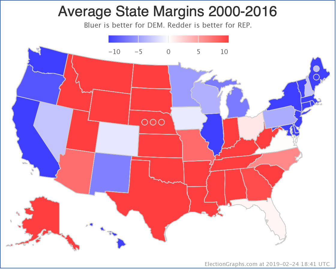
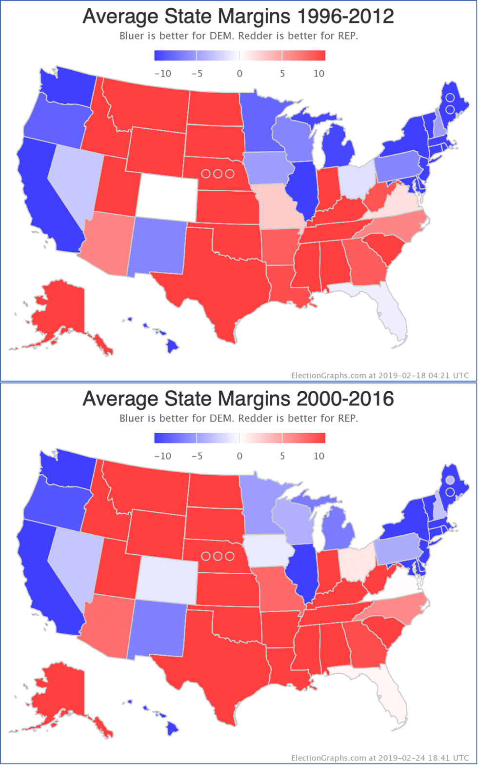
The map above represents the average percentage margins (Republican-Democrat) over the last five election cycles. That would be 2000, 2004, 2008, 2012, and 2016. This is a very long time period. Things look different in 2019 than they did in 2000.
You could argue that just using the 2016 results would be a better starting point, but averaging over a long time period like this to some degree gives us an impression of where states stand independent of the specifics of any one specific election.
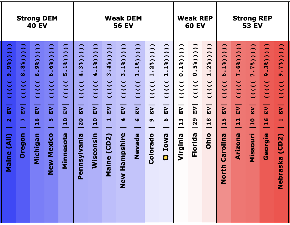
Looking at specific states and where those averages are, you get this spectrum:
Specifically, let's zoom in and look at the states where the margin in this 5 cycle average is under 10%:
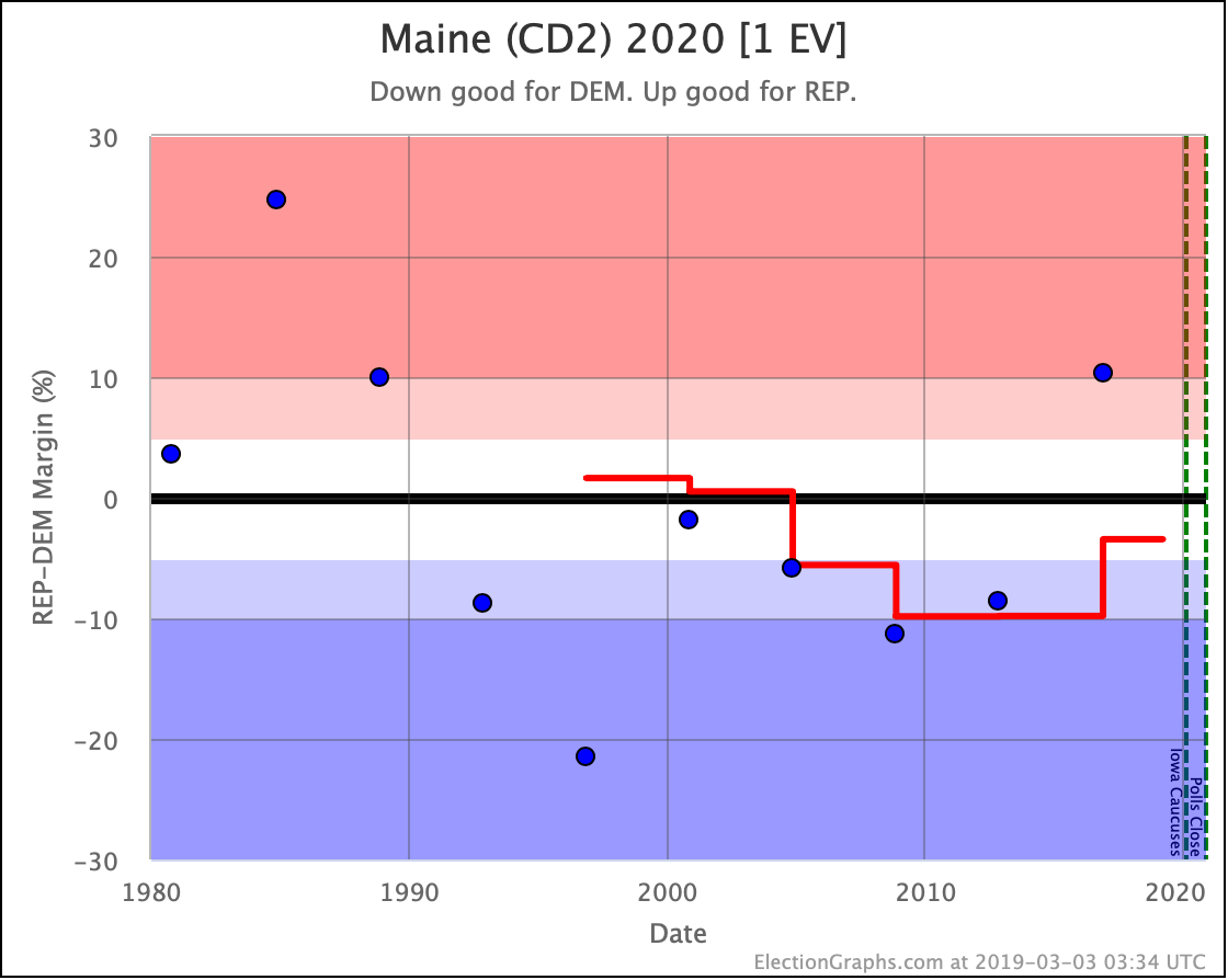
These are the states (and Maine and Nebraska congressional districts) that look like they are in play based on the historical results from 2000 to 2016.
Once we get close to the election, "Strong" states mostly will slip out of reach. (Although Wisconsin was a "Strong Clinton" state and Trump still managed to win it, so it CAN happen, it is just exceedingly rare.) This far out though, just under 612 days until the first election night polls close, this whole zone is potentially up for grabs.
If the right set of events happens, even some states outside of this group may end up becoming competitive. Major changes do happen during presidential campaigns. But here at the beginning, it seems unlikely that any of the states (or CD's) outside of those above will be in play.
Things will move quickly as new polls putting actual candidates against each other get added. But this is the starting line.
Where does this put us in terms of who might be ahead or behind? Election Graphs traditionally not only shows an electoral college breakdown based on who is ahead in every state but also where things would end up if you let all of the "Weak" states swing to one or the other candidate to generate "Best Case" scenarios for each candidate.
Here is what that looks like at the starting line:
| DEM | REP | Margin | |
|---|---|---|---|
| REP Best | 216 | 322 | REP by 106 EV |
| Expected | 272 | 266 | DEM by 6 EV |
| DEM Best | 332 | 206 | DEM by 126 EV |
|
The tipping point state is Iowa where DEM is ahead by 1.1%.
|
|||
So… we start at essentially a dead heat. The average of the last five elections (three where Republicans won, and two where Democrats won), is a Democratic squeaker. When you throw the "Weak" states from side to side, you get a fairly large range as well.
That's as good a place to start a presidential race as any. Dead even.
Now the specific candidates for 2020 will start differentiating themselves with their campaigns, and they will move this to one side or another… or of course, we can arrive at the election itself with things still too close to call… which is always fun.
Before I close out this post and start adding in actual 2020 polls though, it is worth also looking at how this "five election average" has shifted over the years. I currently have elections back to 1980 entered into the data Election Graphs pulls from, so we can look at these averages back through 1996.
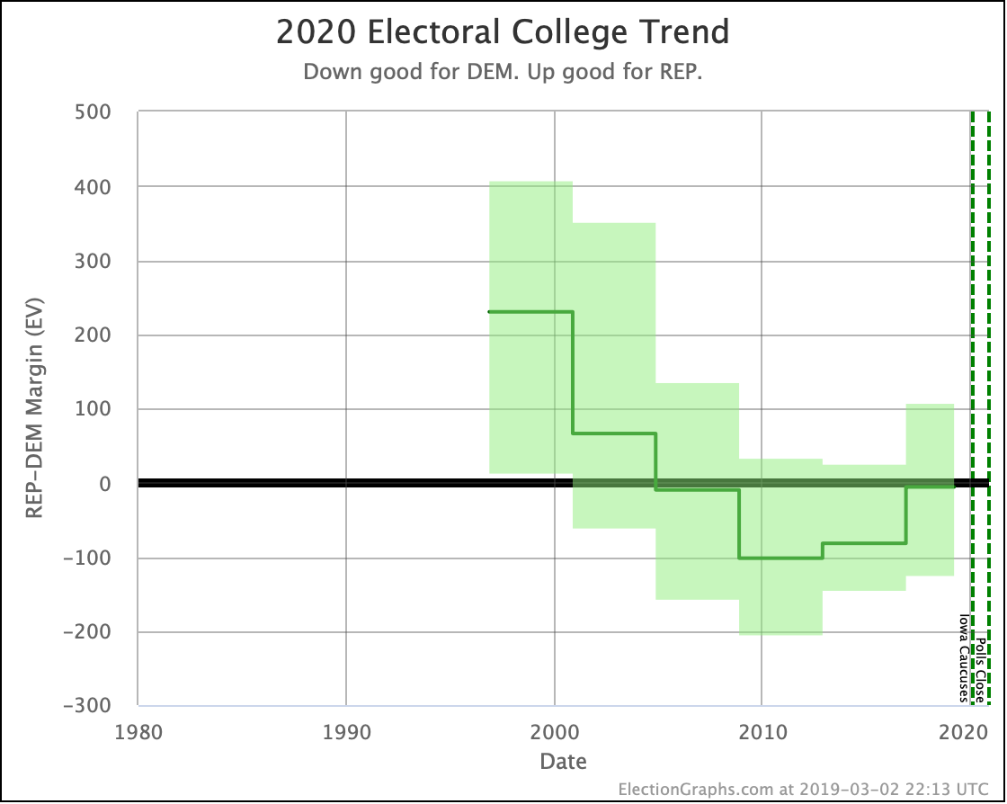
First up, here is the electoral college trend itself:
From 1996 through 2008, each election moved the electoral college results based on these averages toward the Democrats… even when the Republicans won… because they won by less than the Republicans from the earlier elections that dropped out of the average.
That stopped in 2012. Obama won in 2012, but not as strongly as Clinton won in 1992, which dropped off the five election average that year.
Then Trump won in 2016, which was obviously a more Republican result than Clinton winning in 1996.
2016 also reversed another trend, which was that the electoral college totals of the states that were closer than 5% had been going down with each election. In other words, there were fewer close states each time. But dropping 1996 and adding 2016 expanded the range between "best case" scenarios a bit. We have a wider playing field going into 2020 than we did going into 2016.
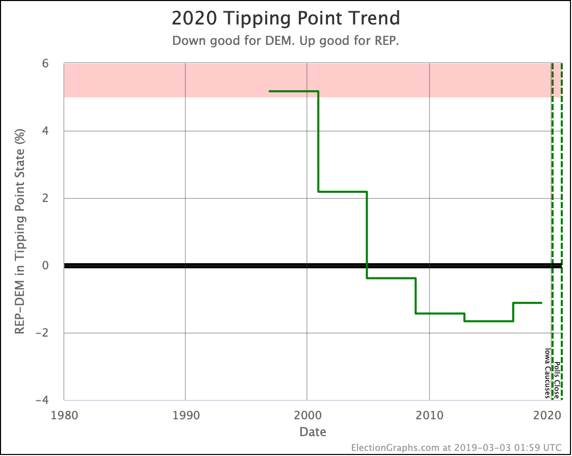
Next, the tipping point:
This basically shows the same pattern, so I won't spend time digging deeper there.
But there is one more place to spend a little time. Time to look at how each state moved from the 1996-2012 average to the 2000-2016 average.
Let's start this historical review with an animation of the national view flipping between how things looked four years ago, and how they look today:
As expected, since we are replacing Clinton's 1996 win with Trump's 2016 win, the overall map becomes redder and blue retreats.
Now let's look at individual states that moved to different Election Graphs categories ("Solid", "Strong", "Weak" for either party) in this change.
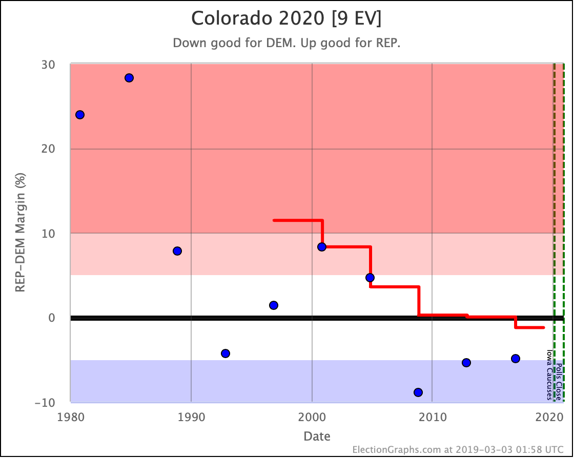
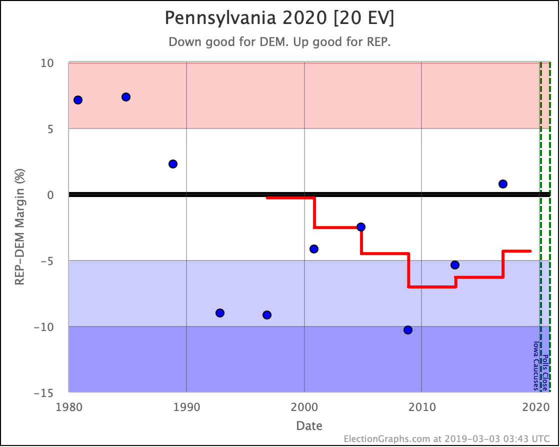
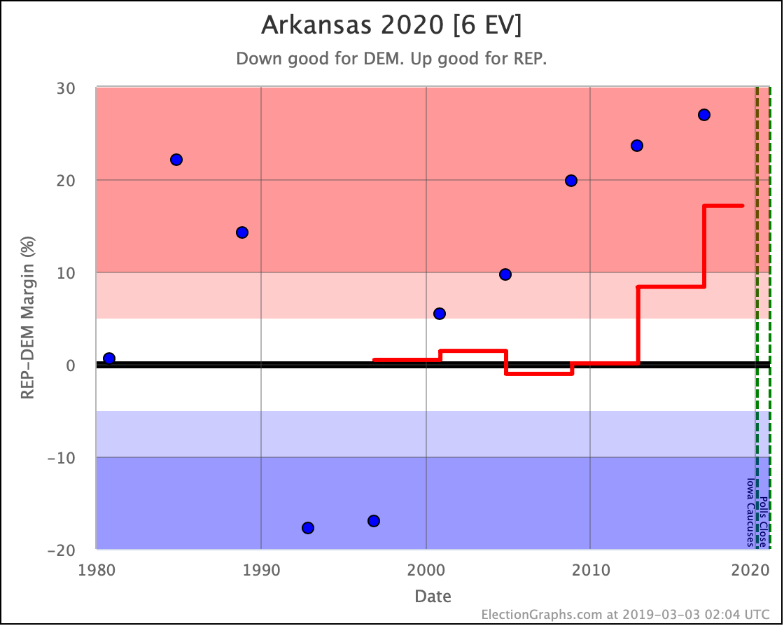
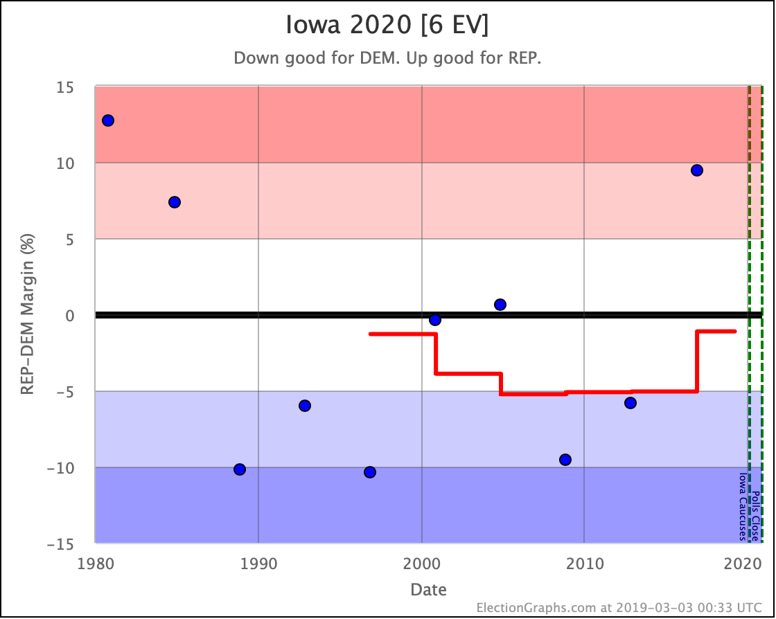
Of these category changes, only two favored the Democrats:
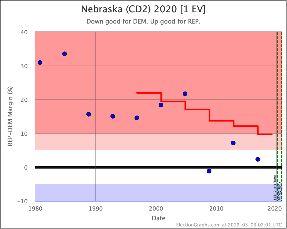
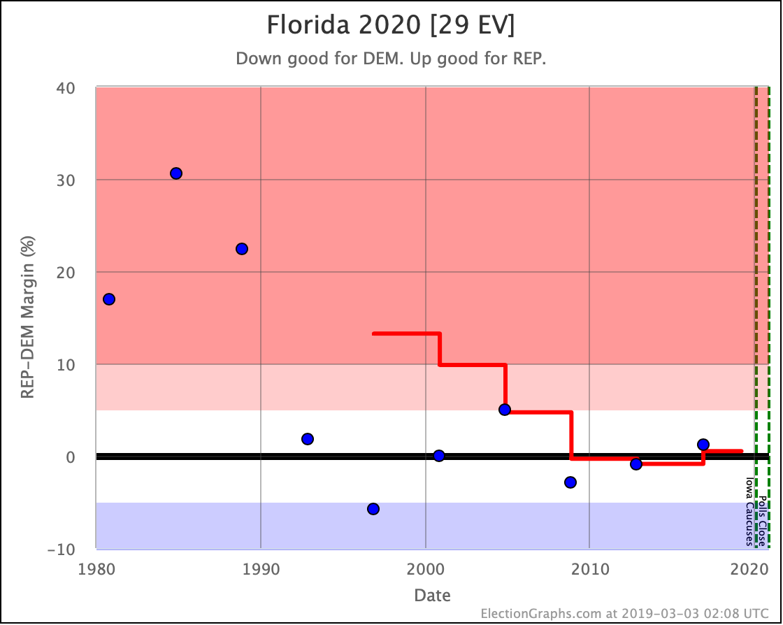
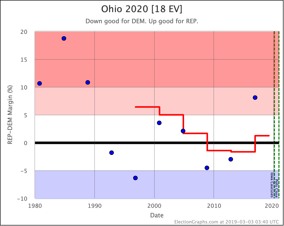
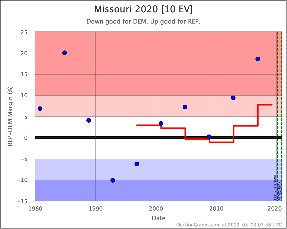
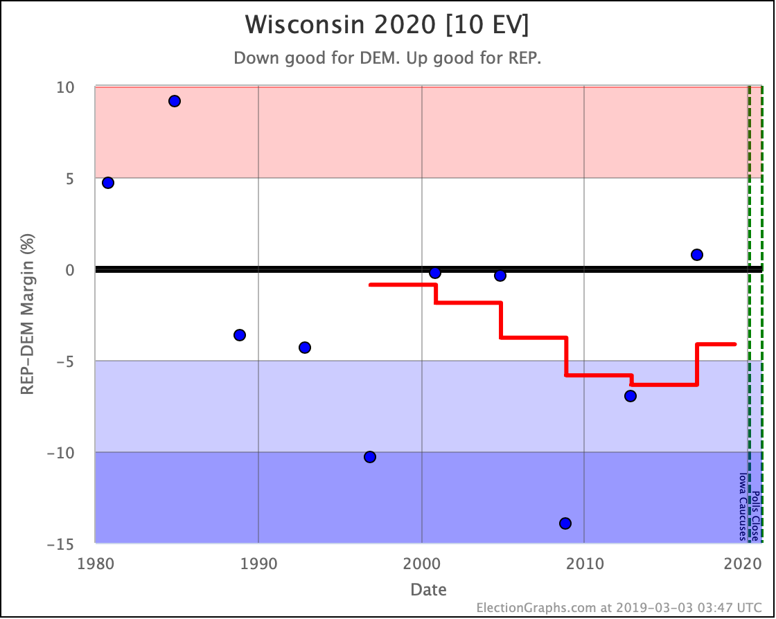
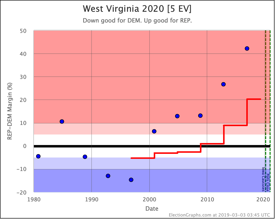
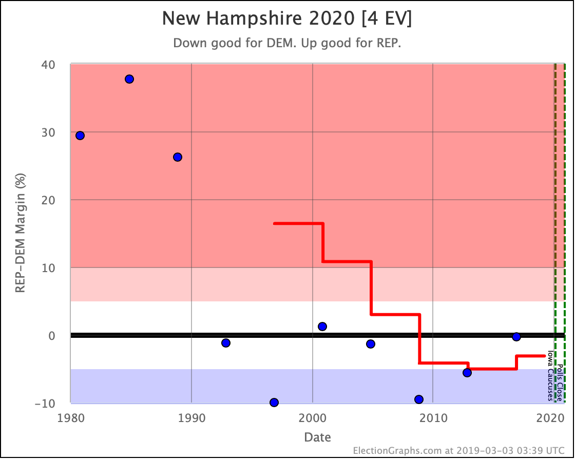
Every other category change was toward the Republicans:
All of the states moved of course. The ones highlighted here are just the ones that shifted between my categories. And of course, many of those were not decisive. But the shift toward the Republicans is clear.
The stage is set.
Next up, very soon, I'll start folding in the polls on specific candidate matchups that have already been released on the state level, and we'll see how things look once we are looking at real data on the 2020 race rather than just long term generic averages.
The race is on, and Election Graphs will be tracking it for you.
Here we go.




2 thoughts on “The 2020 Starting Line”