I hate to talk about Texas two posts in a row, but even though there have been polls in California, North Carolina, and North Dakota since the last update as well, once again the most significant changes are in Texas. The two new polls in Texas continued to move things toward the Democrats.
In Texas, Harris did move within 5% of Trump in the Election Graphs average. This change leaves Buttigieg the only one of the six most polled Democrats where Trump has a Texas lead more than 5%.
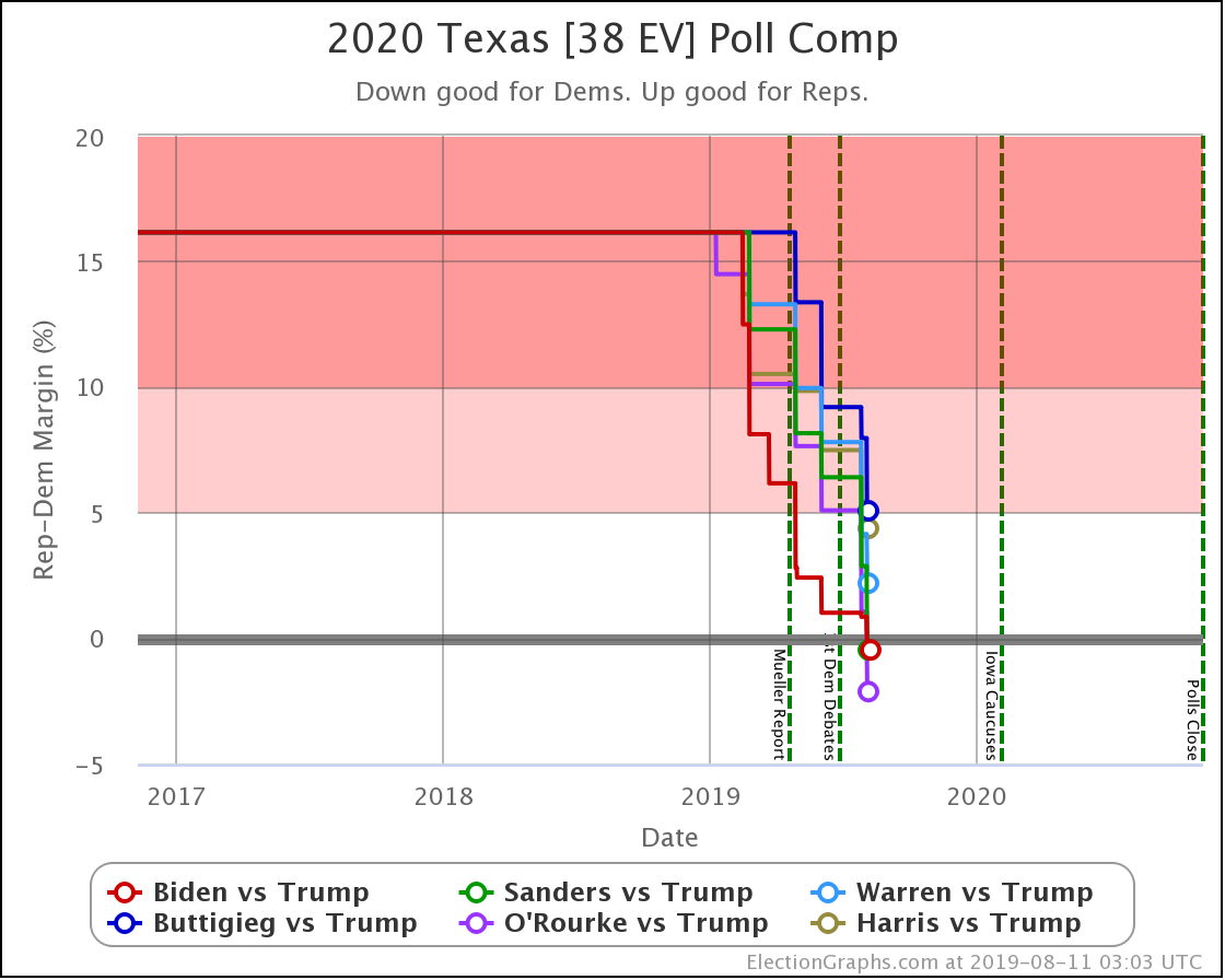
More notably though, with this set of polls, the lead flips over to the Democratic side for Biden, Sanders, and O'Rourke.
Now, this very well may be transient. These leads may well evaporate long before the election. At the moment, though, three of the top six Democrats are LEADING in Texas.
That is remarkable.
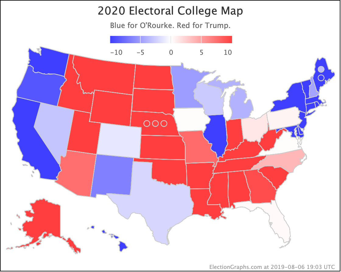
At the moment, O'Rourke has the most significant margin of the three. He has a 2.1% lead. Which to be clear, is a very narrow lead. It translates into a 66.4% chance of winning the state, compared to 33.6% for Trump. But still. For now, it makes Texas notably blue on my national O'Rourke vs. Trump map:
After last week's update, I got a comment on Facebook saying one of the recent polls looked like an outlier. Even at the time, it only looked like an outlier for some candidate pairings, not for others, but let's look at what things look like now for each of the three Democrats showing a lead in Texas.
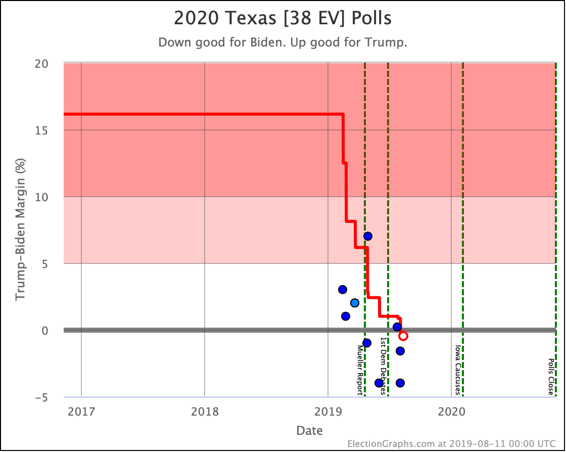
First Biden vs. Trump: It is hard to tell just visually which are the last five polls that are included in the average because the 5th and 6th oldest polls are close together in time, but number five is the one with a 7% Trump lead. That was a poll from WPA Intelligence back in April, and if anything, THAT is the recent poll that looks like an outlier. If you excluded that poll, the average of the last five polls would be a 2.1% Biden lead instead of the 0.5% lead he has.
UT Tyler is responsible for two of the polls in the average because they polled Texas right before and right after the second Democratic Debates. But even accounting for that there looks to be plenty of evidence from multiple pollsters at this point that Biden is leading Trump in Texas at the moment.
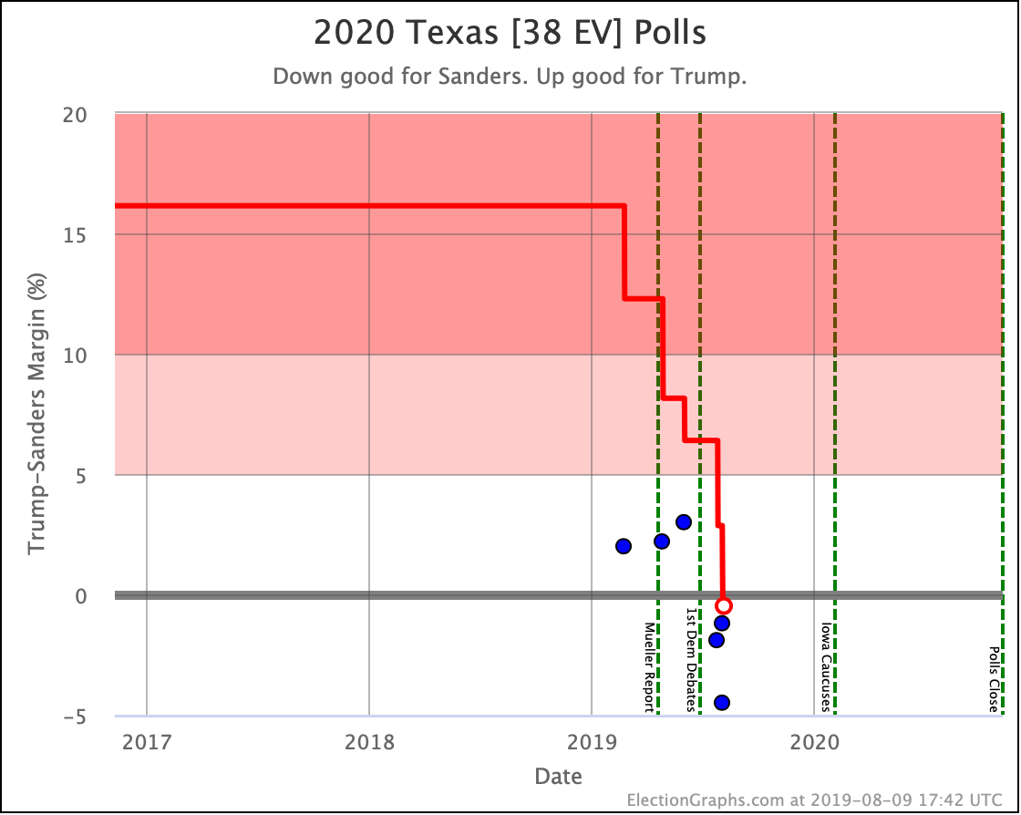
Now Sanders vs. Trump: Every single one of the polls from the last year shows a close race for this paring. Three show Trump with a small lead. Three show Sanders slightly ahead. Of the five that go into the Election Graphs average, three have Sanders ahead. These three are the most recent. Two of these three are from UT Tyler. But there are also two Emerson polls in the five poll average.
Overall, showing Sanders with an 0.5% lead seems reasonable here.
Sanders matches Biden with that 0.5% lead. In both cases, this is just barely a lead. It translates into a 51.1% chance of the Democrat winning, vs. 48.9% for Trump based on historical Election Graphs results. So it is essentially a coin toss.
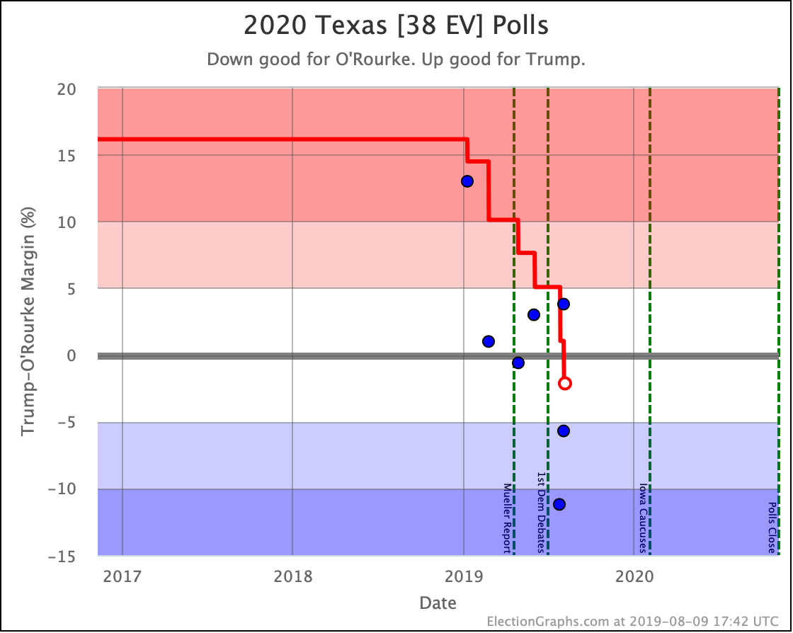
Finally O'Rourke vs. Trump: If we look at all the polls this year, the two that look like outliers are the Atlantic poll from January showing Trump ahead by 13%, and the UT Tyler poll from July showing O'Rourke ahead by 11.2%. The Atlantic one is already out of the five poll average. If you take out that UT Tyler poll (leaving the other UT Tyler poll that shows a 5.7% O'Rourke lead) and average the last five polls other than that one, O'Rourke's 2.1% lead disappears, and you have a 0.3% lead for Trump instead.
So of these three, O'Rourke's lead, while the biggest, seems the most likely to be due to an outlier result rather than a real edge.
Let's look at the comparison of all six democrats against Trump:
The leads by Biden, Sanders, and O'Rourke may not be real. Or they may be temporary, something that will be gone as soon as we have a few more polls. And even if they are not imaginary, they are very narrow leads.
But five of the six best polled Democrats are making Texas look like it is in contention. And the 6th isn't far behind. That is the real story of Texas at the moment.
It is in play in a way it hasn't been in decades.
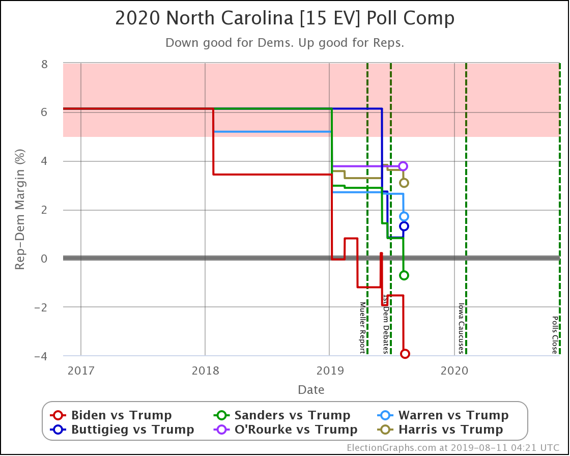
Biden, Sanders, Warren, and Harris all improved with this week's North Carolina poll as well, with Sanders now joining Biden with leads in the Election Graphs averages over Trump.
As one might guess, the new polls in North Dakota and California didn't change what you would expect of those two states.
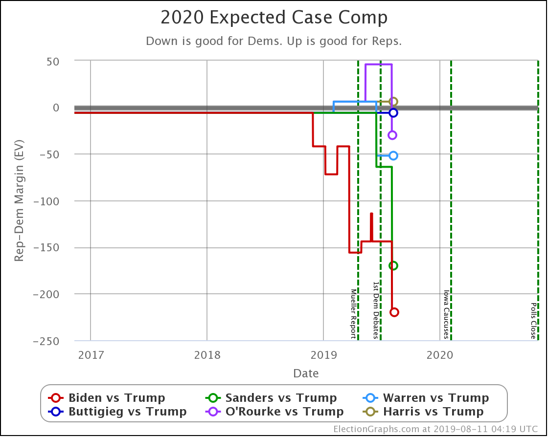
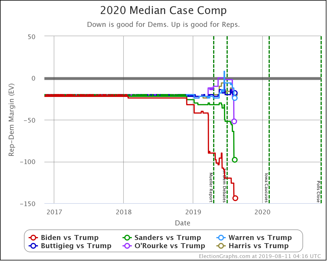
Between Texas and North Carolina, there is a pretty significant impact on the national picture:
On the straight-up "Expected Case" where each candidate wins every state they lead the Election Graphs poll average, you can see the improvements for Biden and O'Rourke as they take the lead in Texas, and for Sanders, as he takes the lead in both Texas and North Carolina.
By this way of looking at things, out of these six Democrats, all except Harris are now ahead in the Electoral College view, with Harris losing to Trump by six electoral votes.
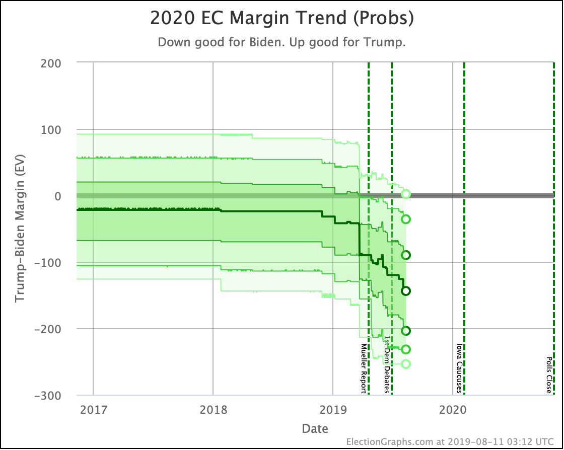
Looking at the more sophisticated probabilistic model, we can see that all six Democrats win in the median case. Biden, Sanders, and O'Rourke win by a bit larger margins, while Warren, Buttigieg, and Harris are all bunched up together with relatively narrow wins.
The median, of course, doesn't tell the whole story.
As of this week, the candidate detail pages now all show charts showing the likely ranges of Electoral College results given the results of our probabilistic model.
The exact distributions are very spiky, with certain electoral college margins being much more likely than others right next to them due to how state distributions work. You can see an example distribution based on 2016 data on this post from January describing the Monte Carlo methods I'm using in my model.
I've considered a couple of different visualizations of the exact distribution, and may still do that in the future if I have time, but for now, I thought it would be more useful to show a simplified version highlighting "zones" of likelihood.
The dark line in the center is the median.
The darkest band includes 1σ (68.27%) of the simulation outcomes.
The next darkest band includes 2σ (95.45%) of the results.
And the lightest band includes 3σ (99.73%) of them.
So basically, the darker the color band, the more likely the result.
You can see the 3σ band only barely includes the possibility of a Trump victory.
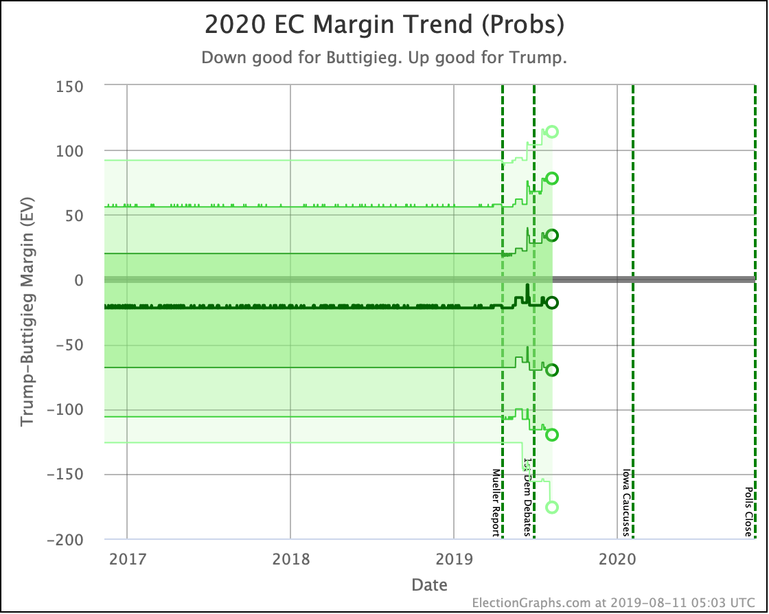
Compare this with how this chart looks for Buttigieg, currently the weakest of these six candidates:
While Biden shows relentless improvement across all bands as additional polling comes in, Buttigieg's median stays just about constant, while all of the probability zones widen. Buttigieg's median result is not doing any better or any worse as we get more polls and time progresses, but the uncertainty on how Buttigieg would do is increasing.
Looking at these probability band trends tells you a lot more than just looking at the medians.
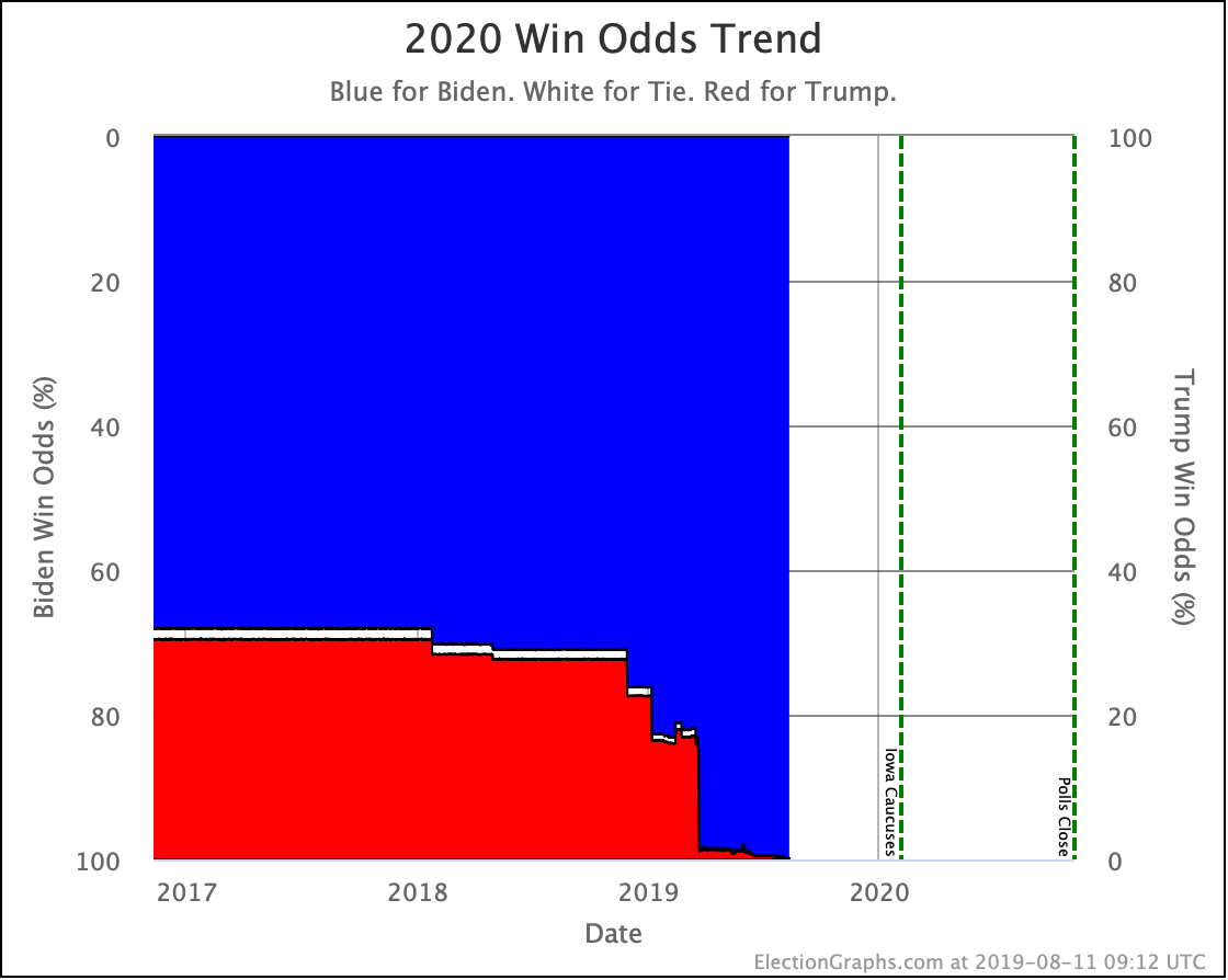
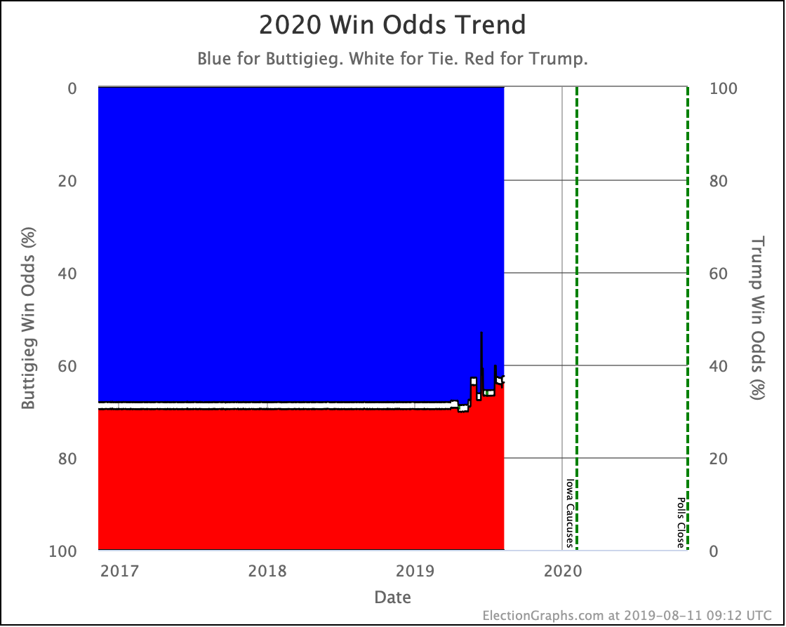
Of course, you can also look at the simulation and count the wins on each side, and the number of 269-269 ties, and then come up with the odds for each of those events. That's where all the probabilistic results I've mentioned in the last few updates have come from, but now there are charts for that too. Looking again at Biden and Buttigieg as examples:
You can see that as more and more polling has come in, Biden has increased his chance of winning, to the point where it is now nearly 100%. (Insert at this point the usual caveats about how long it is until the election and how much can change.)
Meanwhile, Buttigieg has not done that. Chances of a Trump win over Buttigieg have increased as more polling has come in.
Those are the two new graph types I added this week. I hope you like them.
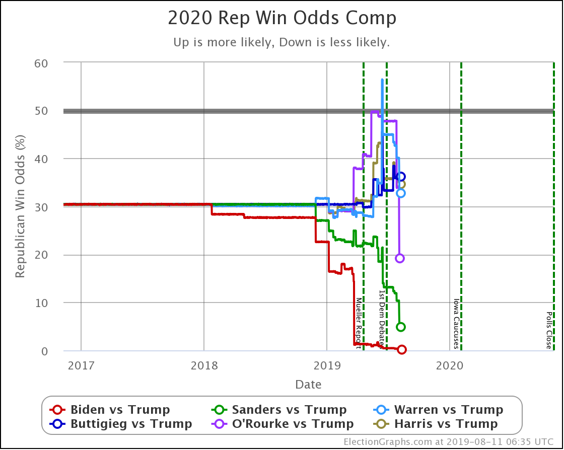
Lets put this all together by looking at the comparisons of the odds for each of the Democrats against Trump.
To keep the same "Down good for Democrat. Up good for Republican" orientation, we would look at the odds of a Republican win. It looks like this:
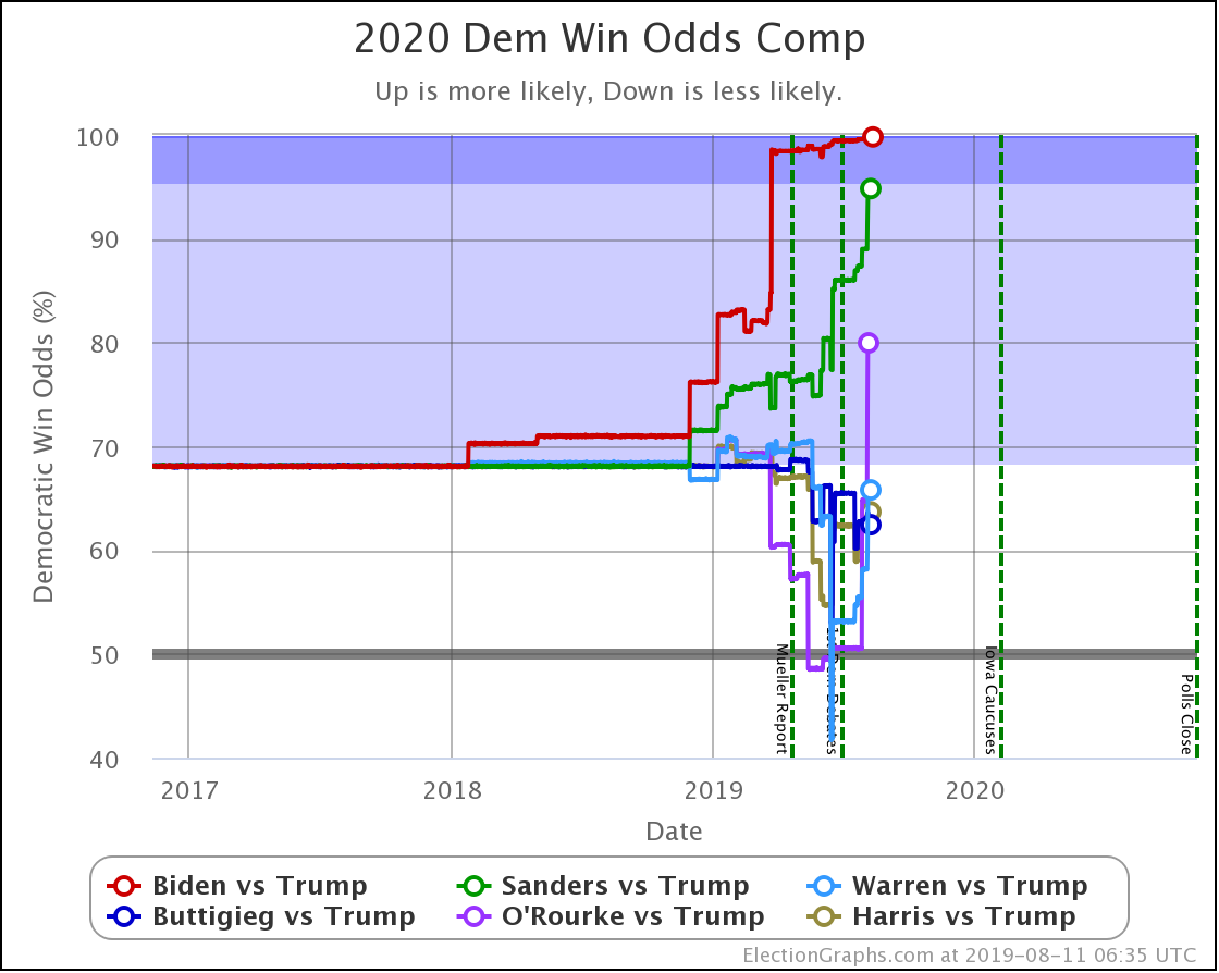
Given that we have the same Republican in all six cases though, it has been somewhat handier to look at the odds of the Democrat winning.
So let's flip it over.
Because there is a non-zero and changing chance of a 269-269 tie in all of these cases, these aren't quite exactly just the same graph reversed top to bottom. They differ by the width of the white strip of ties in the two previous charts. But it is close.
You can see the jumps up with Sanders and O'Rourke based on the batch of new polling in this update. The polls were good for Biden too, but he has very little room left to improve in this view.
Let's look at the table:
| Dem | 3 Aug | 11 Aug | 𝚫 |
| Biden | 99.6% | 99.8% | +0.2% |
| Sanders | 89.0% | 94.8% | +5.8% |
| O'Rourke | 64.7% | 80.0% | +15.3% |
| Warren | 58.2% | 65.8% | +7.6% |
| Harris | 62.2% | 63.7% | +1.5% |
| Buttigieg | 62.9% | 62.4% | -0.5% |
The big gainers this last week were O'Rourke, Warren, and Sanders.
Warren, Harris, and Buttigieg are still only a little better than tossups against Trump, while Biden, Sanders, and O'Rourke look like clear favorites.
450.7 days until polls start to close.
For more information:
This post is an update based on the data on the Election Graphs Electoral College 2020 page. Election Graphs tracks a poll-based estimate of the Electoral College. The charts, graphs, and maps in the post above are all as of the time of this post. Click through on any image to go to a page with the current interactive versions of that chart, along with additional details.
Follow @ElectionGraphs on Twitter or Election Graphs on Facebook to see announcements of updates. For those interested in individual poll updates, follow @ElecCollPolls on Twitter for all the polls as I add them. If you find the information in these posts informative or useful, please consider visiting the donation page.

One thought on “Blue Texas?!?”