This is the fourth in a series of blog posts for folks who are into the geeky mathematical details of how Election Graphs state polling averages have compared to the actual election results from 2008, 2012, and 2016. If this isn’t you, feel free to skip this series. Or feel free to skim forward and just look at the graphs if you don’t want or need my explanations.
You can find the earlier posts here:
The 2016 states we got wrong
In the last post I used the historical deltas between the final Election Graphs polling averages in 2008-2016 to construct a model that given a value for a poll average, would produce an average and standard deviation for what we could expect the actual election results to be. So what can we do with that?
I don't have another election year with data handy to test this model on. No 2020, no 2004, no 2000, no earlier cycles either. So I'm going to look at 2016, even though I shouldn't.
Just as examples, lets look at what the odds this model would have given to the states Election Graphs got wrong in 2016… This technically isn't something you should do, since we are using a model on data that was used to construct the model, which isn't cool, but this is just to get a rough idea, so…
| Final Avg | Dem Win% | Rep Win% | Actual | |
| WI | D+7.06% | 98.76% | 1.24% | R+0.77% |
| MI | D+2.64% | 70.59% | 29.41% | R+0.22% |
| ME-CD2 | D+2.04% | 67.92% | 32.08% | R+10.54% |
| PA | D+1.59% | 66.27% | 33.73% | R+0.71% |
| NV | R+0.02% | 45.85% | 54.15% | D+2.42% |
The only one that is really surprising is Wisconsin, just as it was on Election night in 2016. Every other state was clearly a close race, where nobody should have been shocked about it going either way.
Wisconsin though? It was OK to be surprised on that one.
OK, and maybe the margin in ME-CD2, but not that Trump won it.
Doing some Monte Carlo
Let's go a bit farther than this though. One thing Election Graphs has never done is calculate odds. The site has provided a range of likely electoral college results, but never a "Candidate has X% chance of winning". But with the model we developed in the last post, we now have a way to generate the chance each candidate has of winning a state based on the margin in the poll average, and with that, you can run a Monte Carlo simulation on the 50 states, DC, and five congressional districts.
Now, once again, it is kind of bogus to do this for 2016 since 2016 data was used to construct the model, but we're just trying to get an idea here, and we'll just recognize this isn't quite a legitimate analysis.
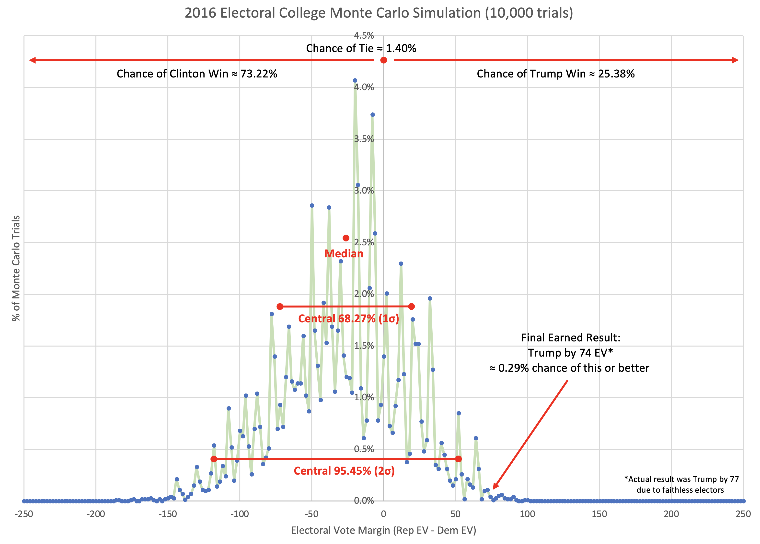
So, here is a one off running the simulation 10,000 times to generate some odds. I'd probably want a bit larger number of trials if I was doing this "for real". I might also smooth the win chances curve in the last post to get rid of some of the jaggy bits before using it as the source of probabilities for the simulation. And obviously if you ran this again, you'd get slightly different results. But here is the result of that one run with 10,000 trials…

Well, that is a fun graph. It puts the win odds for Trump at 25.38%.
Now, I emphasize again that this is cheating. Because the facts of Trump's win are baked into the model. We're testing on our training data. That's not really OK. Having said that though…
How does this compare to where other folks were at the end of 2016? I looked at this in my last regular update prior to the results coming in on election night, so here is my summary from then:
- 28% – FiveThirtyEight
- 20% – Election Betting Odds
- 16% – New York Times
- 16% – HorsesAss
- 12% – PredictWise
- 8% – Daily Kos
- 2% – Huffington Post
- <1% – Princeton Election Consortium
So this Monte Carlo simulation using the numbers calculated as I have described would have given Trump better odds than anybody other than FiveThirtyEight. Again though, I am cheating here. A lot.
But here is the thing. Even though I would be giving Trump pretty good odds with this model, the chance of him actually winning by as much as he did (or more) is actually still tiny at 0.29%. With these odds a Trump win should not have been a surprise, but a Trump win by as much as he actually won by… that still should have been very surprising.
Comparisons
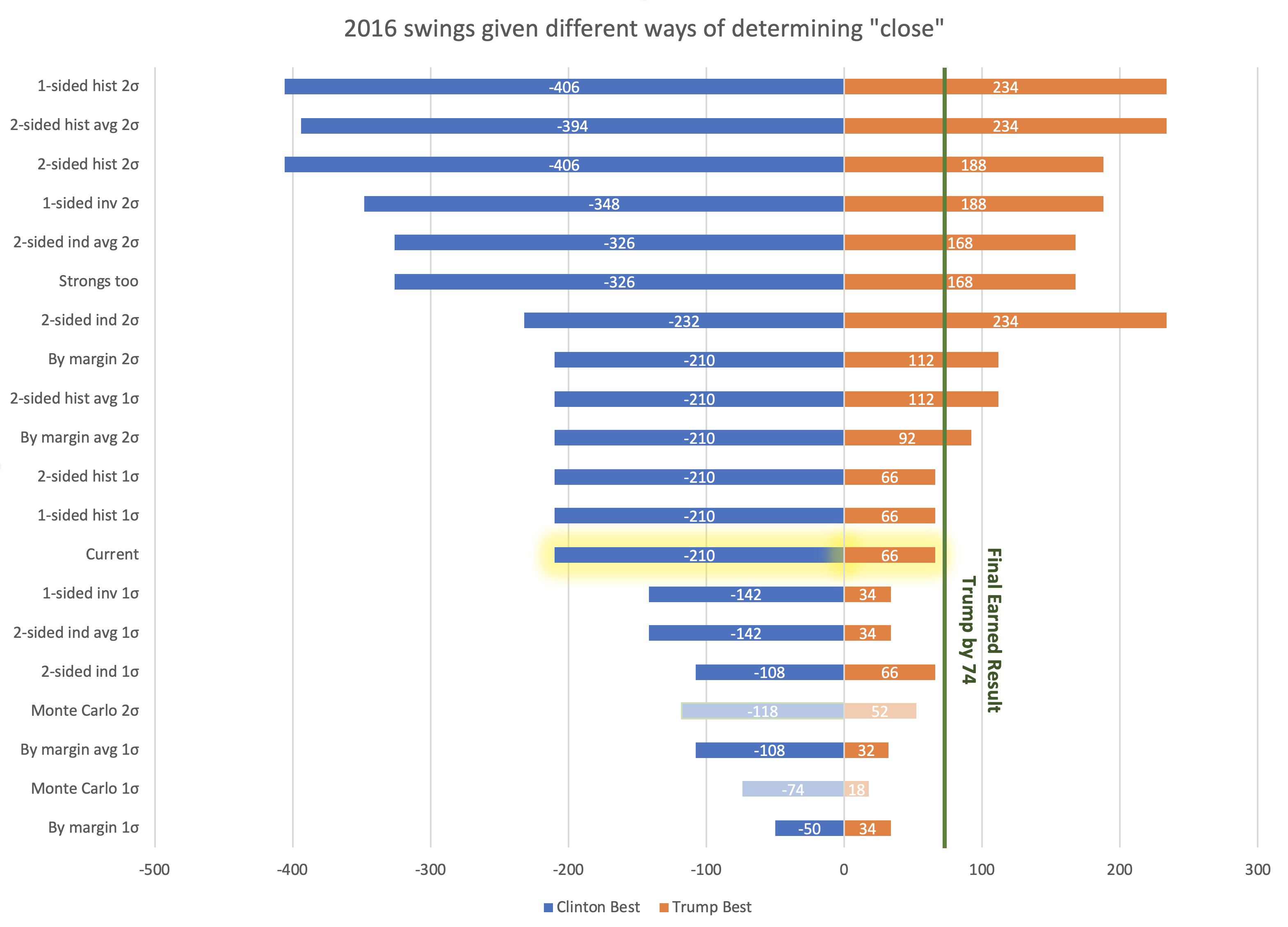
In this series of posts, we've been looking at a whole bunch of different ways of answering the basic question "what is a close state?". One reason I am looking at this is that the way Election Graphs has done our "range of possibilities" in the past is just to define what a close state is, and then let all of them swing either to one candidate or the other, and see what the range of electoral college results would be.
So lets see what electoral college ranges we would have gotten in 2016 with each of the methods I've gone over in the last few blog posts:

The two showing the ranges from the Monte Carlo simulation are dimmed out because they are determined by a completely different method, not swinging all close states back and forth.
It is interesting that both the 1 sided and 2 sided histogram 1σ boundaries would end up with the exact same boundaries as my current 5% bounds. But as you can see there are a ton of different ways to define "too close to call" which result in a huge variation on how the range of possibilities gets described.
So what to do for 2020? How will I define close states?
You'll have to wait a little longer for that.
Before I get to that, it is also worth looking at the national race as opposed to just states. On Election Graphs I have used the "tipping point" to measure that. What tipping point values should be considered "too close to call"?
I'll look at that in the next post….
You can find all the posts in this series here:

4 thoughts on “Predicting 2016 by Cheating”