
2018 is over. Multiple candidates have announced they are at least investigating running for President in 2020, and a few are even past that stage. But before Election Graphs starts posting new graphs and charts for 2020, one more look back at the past.
This will be the first in a series of blog posts for folks who are into the geeky mathematical details of how Election Graphs state polling averages have compared to the actual election results from 2008, 2012, and 2016. If this isn't you, feel free to skip this series. Or feel free to skim forward and just look at the graphs if you don't want or need my explanations.
For those of you who just want to know about 2020… Keep checking in… actual new graphs and charts and analysis for 2020 will be here before too much longer! How much longer? I'm not sure. But after this series of posts is done, getting up the basic framework of the 2020 site is my next priority!
Now, for the small group of you who may be left… any thoughts, advice, or checks on my math are welcome. While this is all interesting on its own, some of this is just me thinking aloud as I figure out what (if anything) I am going to do differently for 2020. Please email me at feedback@electiongraphs.com for longer discussions, or just leave comments here. Raw data, Excel spreadsheets, etc., are available on request to anybody who wants them, although fair warning, they aren't all cleaned up and annotated to be scrutable to anyone other than me without some explanation or effort.
Anyway, one of the key elements I called out in my 2016 Port Mortem was the need to "trust the uncertainty" and look at the range of possibilities, not just the prediction's center line. Part of this is just being vigilant in avoiding the temptation to reduce things to a single point estimate rather than a range of possibilities. Another part is repeating over and over again that a 14% chance of something happening isn't the same as 0%. Although pretty much everybody doing poll analysis did explain these things to some extent in 2016, in retrospect it is clear that there was still too much emphasis on that centerline by most people, including by me.
But another important element is defining what that uncertainty is. Ever since I started doing presidential election tracking in 2008, I have used "margin less than 5%" to define states I was going to categorize as close enough you should take seriously the possibility they could go either way. I also used 5% as the limit of "too close to call" for the tipping point metric. I had a second boundary at 10% on the state polls to mark off the outer boundaries that you could even imagine being in play if a candidate made a huge surge.
Those numbers were just arbitrary round numbers though. With three election cycles of data behind me now though, it is time to do some actual analysis of the real life differences between the final polling averages and the actual election results, to get a better idea of what kind of differences are reasonable to expect.
Over the next few blog posts I will look at this in several different ways, then decide if anything about Election Graphs should change for 2020.
One sided histogram
First, let's just look at a simple histogram showing how far off the poll averages were from the actual margins.
For each of the three election cycles, we have 50 states and DC. For 2012 and 2016, we also have the five congressional districts in Maine and Nebraska. (I didn't track those separately in 2008 unfortunately.) For each one of those results, I look at the unsigned delta between the final poll average margin and the margin in the actual election results, and show a histogram for each of the three election cycles, and a combined line using all 163 data points.
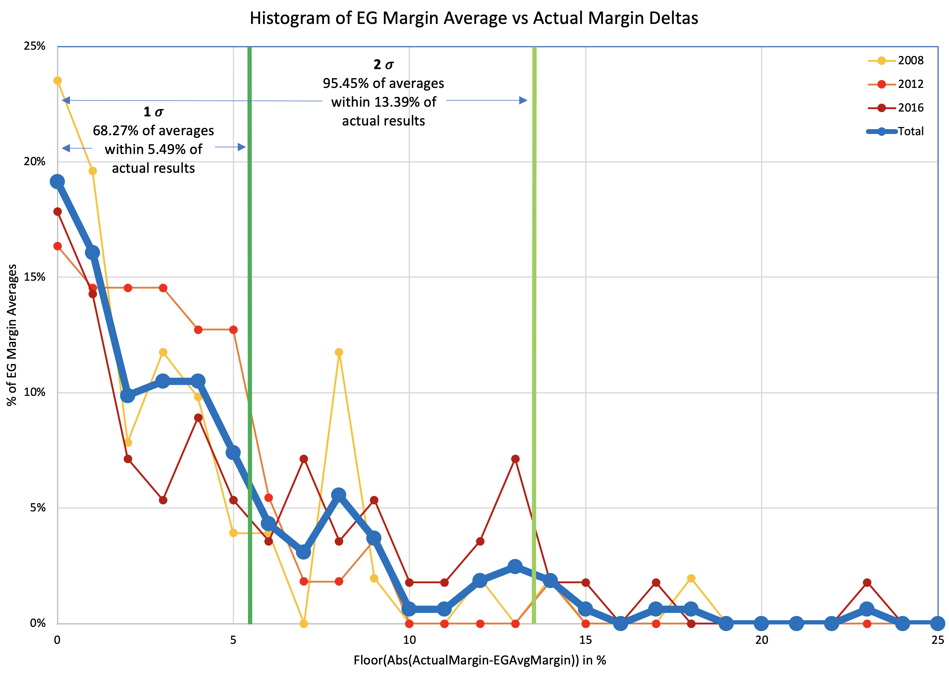
Somewhat improperly using the "Nσ" notion… with 1σ being about 68.27% of the time, and 2σ being about 95.45% of the time, we see that 68.27% (1σ) of the poll averages were within 5.49% of the actual results. But to get to 95.45% (2σ) you have to move out to 13.39%.
| 68.27% (1σ) | 95.45% (2σ) | |
| Margin | 5.49% | 13.39% |
[Note for sticklers #1: There is no way this kind of analysis is significant to 0.01%, so showing two digits after the decimal point is false precision and the value depends on my choices for how to interpolate… among a variety of other things. But I've standardized on two digits after the decimal for everything in this series of posts anyway because… well, just because. Feel free to round to the nearest 0.1% or even 1% if you prefer.]
[Note for sticklers #2: Each election cycle I made some modifications to the fiddly details of how I calculated the averages, including things like what I did if there were less than 5 polls, how I dealt with polls that included more than one version of the result (for instance registered vs likely voters or with and without third party candidates), and if I used the end or middle of the field dates as the date used to determine poll recency. These differences may technically make it improper to do calculations that combine data from these three cycles without recalculating everything based on the same rules. I contend that the differences in my methodology over the three cycles were minor enough that it wouldn't substantially change this analysis, but given the amount of work that would be involved, I have NOT spent the time to convert 2008 and 2012 to match my 2016 methodology in order to confirm this.]
It is very tempting in the context of Election Graphs to just move my boundaries between "Weak" and "Strong" states from 5% to 5.49%, and the boundary between "Strong" and "Solid" from 10% to 13.39%. Both of those numbers are kind of close to where the old boundaries are, just expanded a bit to show a bit more uncertainty than before, which seems intuitively right after the 2016 election cycle.
Two sided histogram
But wait, why just look at the magnitude of the errors? Isn't the direction of the errors important too? Are the polls systematically favoring one side or the other? Very possible. Time to do that histogram again, but taking into account which direction the polls were off:
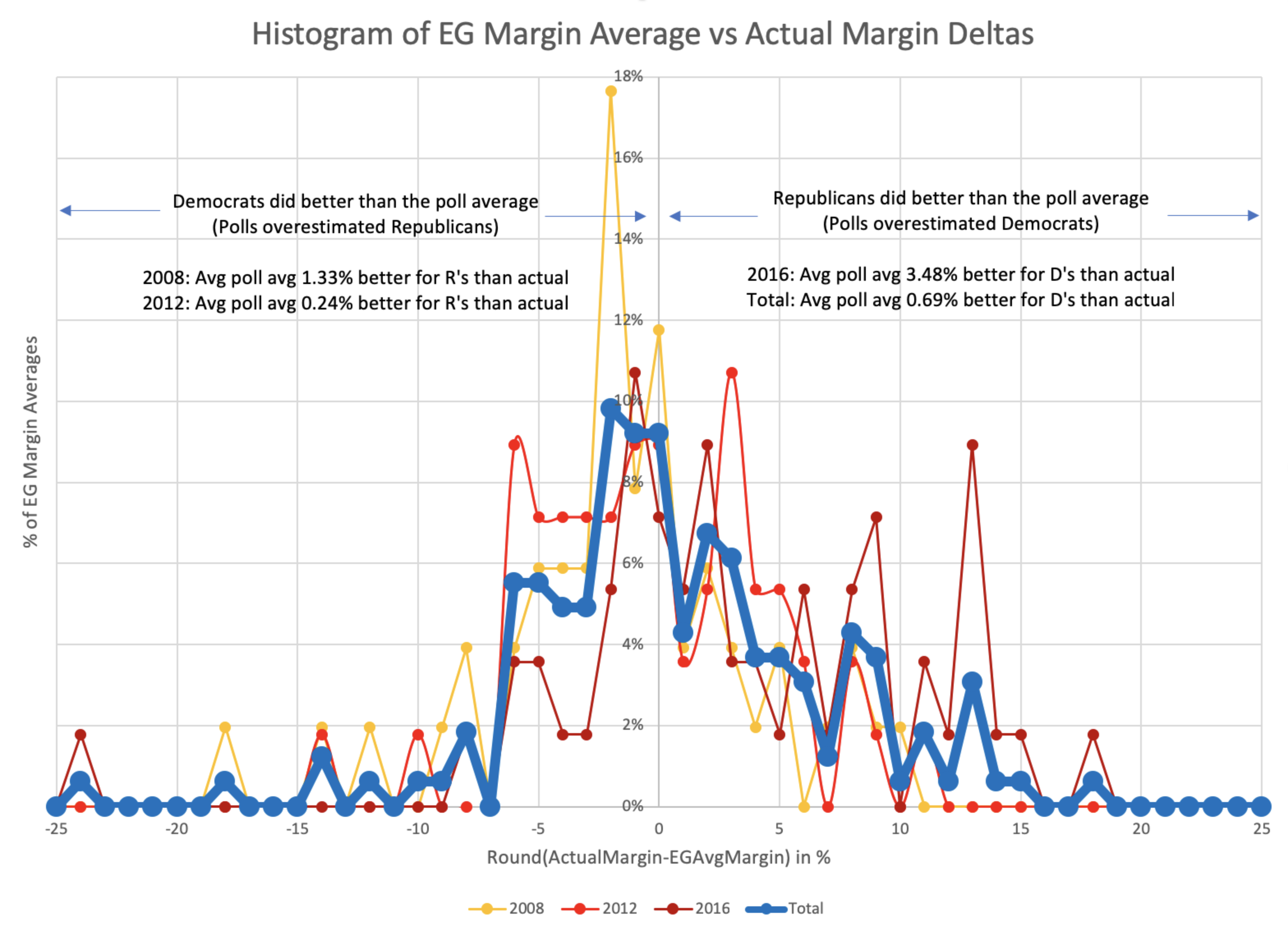
The pattern isn't symmetrical, although it is certainly possible (perhaps even likely) that if I had data for a few more election cycles it would become more so. At the moment though, while the peak looks to be very slightly on the side of Democrats doing better than the poll average (in other words the polls showed Republicans doing better than they actually were), when you average out all the polls, the bias is actually that the Republicans beat the poll averages by 0.69%. (In other words, the poll averages showed Democrats doing slightly better than they actually did.)
The asymmetry is notable here. When the poll averages overestimate the Republicans, most of the time the error is 6% or less, but when the poll average overestimates the Democrats it is often by quite a bit more.
I didn't put it on the plot because it was already pretty busy, but you can also use this to get the ranges for the central 1σ and 2σ:
| Middle 68.27% (1σ) | Middle 95.45% (2σ) | |
| Range | D+4.61% to R+7.45% | D+12.21% to R+13.32% |
| Avg Limit | 6.03% | 12.77% |
Maybe these numbers could be used to define category boundaries? You would have to either explicitly have different category boundaries for the two parties or use the averages of the R and D boundaries to make it symmetric. The median is also not quite at the center… it is at an 0.01% Democratic lead. But that is probably small enough to just count as zero.
But looking at how many polls are a certain amount off favoring one party or another doesn't really hit exactly what we want.
See, for what we care about on a site like Election Graphs, if we have a poll average at a certain point, we don't actually care that much if the actual result is that the leading candidate wins by an even bigger margin. We only really care if the polls are wrong in the direction that leads the opposite candidate to win.
I'll look into that in the next post…
You can find all the posts in this series here: