It has been 11 days since my last post. I didn't mean to let it go that long at this stage. Oops.
As usual, lets start with a TL;DR.
The overall situation remains about the same as it has been since the end of September:
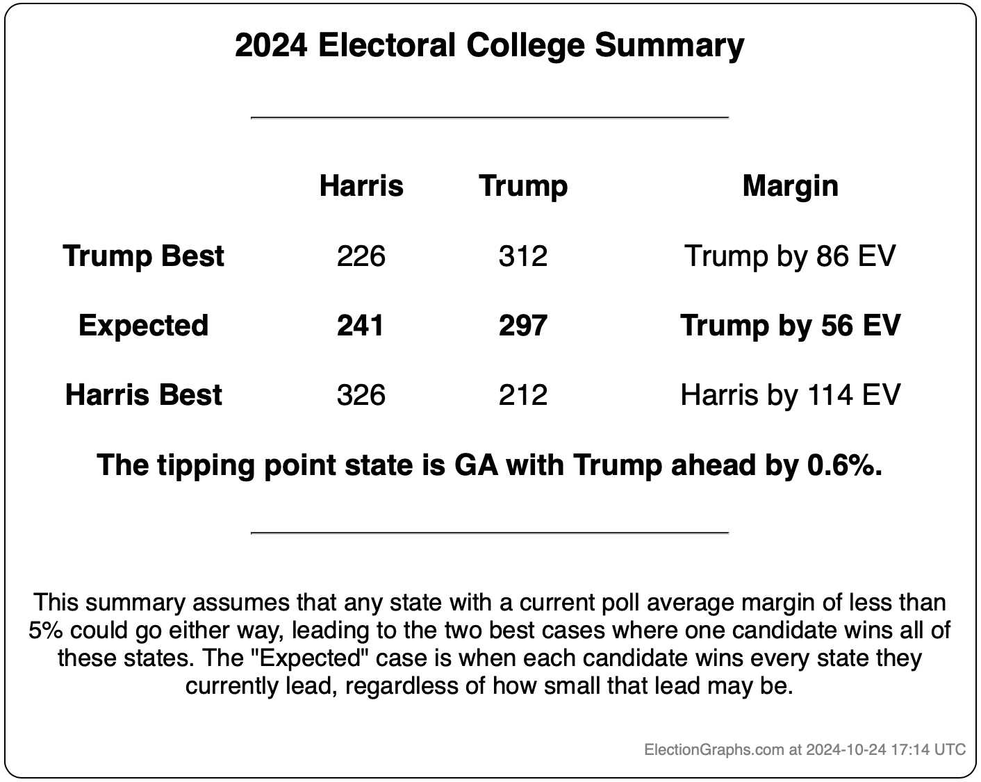
It is too close to call, but with Trump having a slight edge. Right now if you just directly give each state to the candidate that is ahead in the Election Graphs poll average, no matter how tiny the margin, then Trump wins by 56 electoral votes.
But there are so many close states that anything from Trump winning by 86 EV to Harris winning by 114 EV is within the realm of the reasonably possible and would not be a surprise.
The tipping point is currently Georgia, where Trump leads by 0.6%.
The EG probabilistic estimates, based on the patterns of EG polling average errors from 2008 to 2020 (where the Republican has been slightly underestimated in the close states more often than not) and accounting for the amount of time left, give Harris's chances of winning as somewhere between 17.5% and 32.5%.
Other places that give probabilities are closer to 50/50 because they assume the direction of polling errors in the past isn't relevant at all to how they may go this time, whereas I use the variances from the past to build my models, essentially assuming that the range of error patterns over the past few elections can tell us something about the range of possible errors we might see this time.
There has also been a lot of talk about low quality polls "polluting" poll averages like those here at Election Graphs. Looking into that, I do a review of the seven swing states including only the highest quality pollsters rather than everything I usually include.
When I do this the tipping point moves from Trump by 0.6% to Harris by 0.1%. A bit better for Harris, but still too close to call.
OK, with the high level conclusions out of the way, lets get into the details.
Normally at this point in the post, I'd jump into looking at how each of the close states has evolved in the polling since my last post. I'll do that in a bit, but I thought I would start a little differently this time.
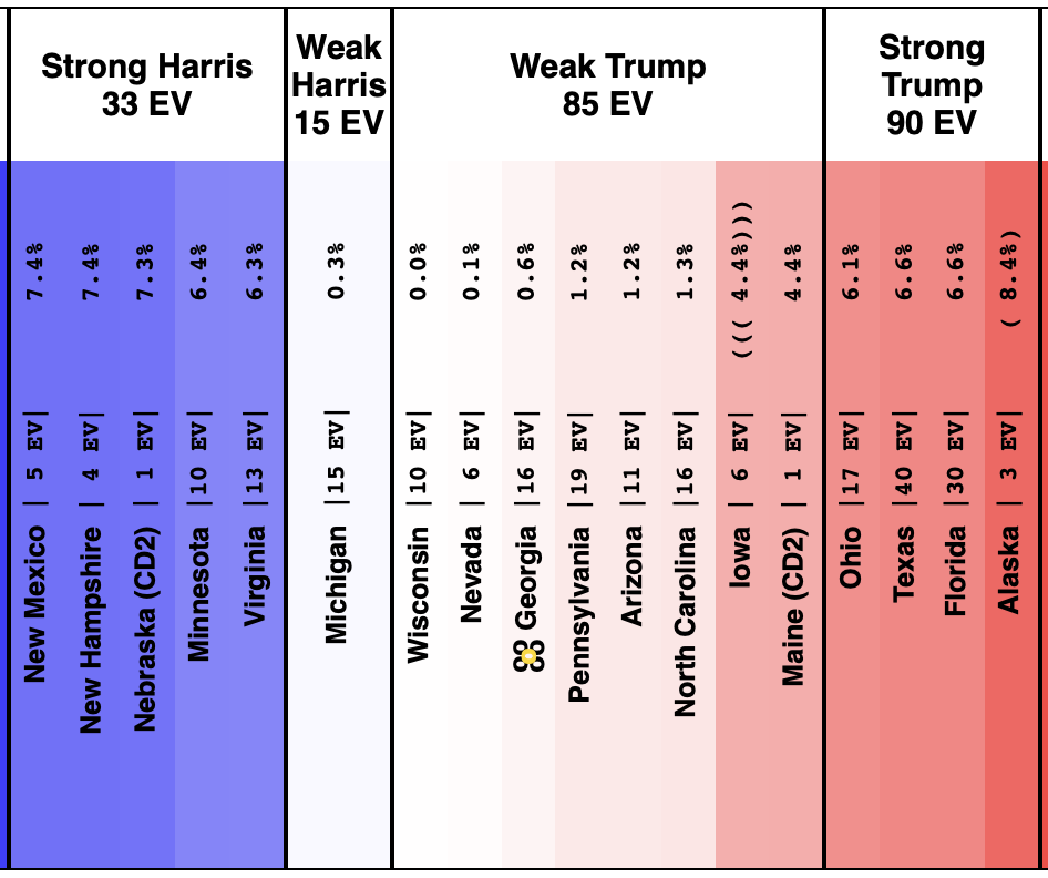
As of when I started writing this post at 18:00 UTC on October 24th, the categorization view summary looked like this:
And the spectrum of states with margins under 10% looked like this:
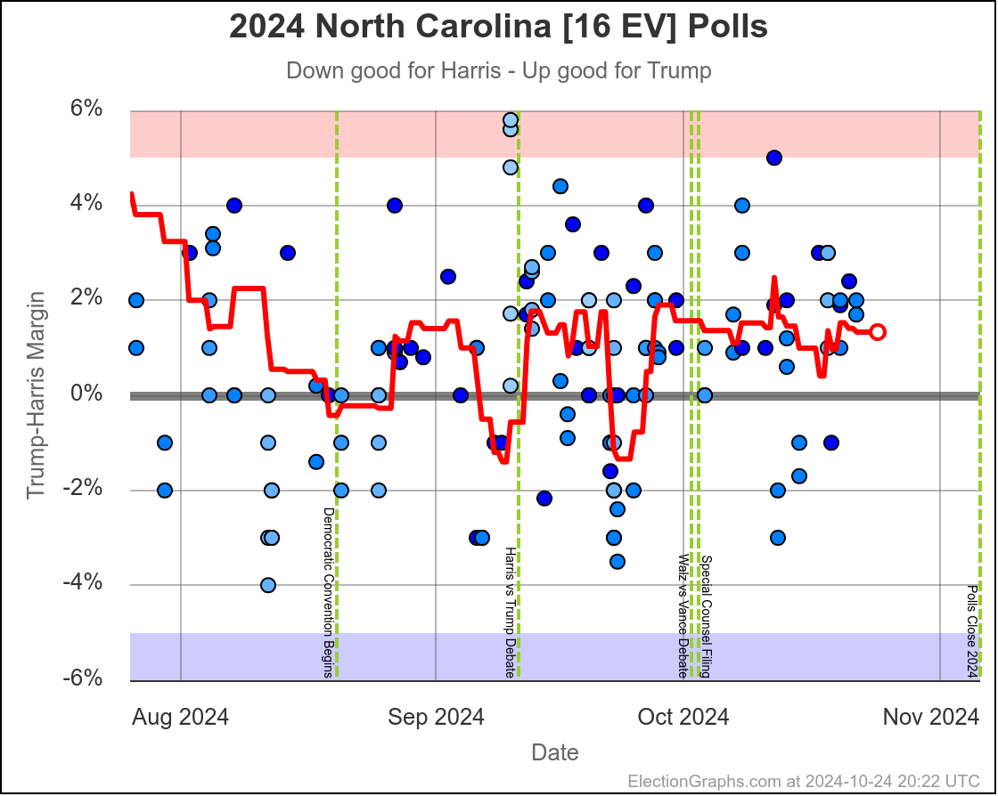
The seven key "swing states" all currently have margins under 1.5% in the Election Graphs averages right now. That is tiny. Well within the margins of error of individual polls, and certainly within the ranges that poll averages like mine "bounce around" based on which polls specifically happen to be in the average at any given time.
But there has been a LOT of talk lately about conservative pollsters trying to "flood the averages" with Trump leaning polls. There are a variety of speculations as to the motives for doing something like this.
- Motivate Republicans
- Discourage Democrats
- Set up a narrative for a stolen election if Harris wins
- Just make Trump happy
- They just believe their models, no ulterior motive
If this is happening, Election Graphs is certainly vulnerable to it, because my philosophy is to include everything and just let the averages wash it out over time, just like any other outliers. If there is an intentional effort to manipulate the averages, EG will be impacted by that effort.
I don't care to speculate on the motives of various pollsters, and I certainly don't feel comfortable categorizing pollsters in terms of whether or not they are the kind of pollster who might be trying to intentionally manipulate polling averages.
But 538 keeps a handy set of pollster ratings. These are not based on the affiliations and political leanings of the pollsters, but rather on "the historical track record and methodological transparency of each polling firm's polls". They rate pollsters on a 0 to 3 scale, with 3 being the most trustworthy and reliable pollsters, and go down from there. Some pollsters have no ratings at all either due to a limited track record, or being outright banned from 538 because they are so bad.
In response to a question on Mastodon on October 16th I did a quick look at how Pennsylvania's average would change if instead of including everything in the EG averages, I used 538's pollster ratings as a filter:
@Deixis9@mastodon.social @mastodonmigration@mastodon.online Excellent Question.
Using PA as an example and using 528's pollster ratings (scores from 0 to 3), and only including pollsters above various ratings, using the same averaging methodology otherwise:
My Current Avg: Harris by 0.1%
Only 1.5 and Above: Harris by 0.4%
Only 2.0 and Above: Harris by 0.8%
Only 2.5 and Above: Harris by 1.5%Since my averages are “last 5 polls”, the more restrictive you are, the longer a time period would be included in the average.
The timeframe of the polls included in the average at that time moved from about one week to about three weeks because of the need to go further back in time to get enough polls at the higher ratings.
At least for Pennsylvania, at that specific time 8 days ago, looking at only the highest quality pollsters instead of letting any old pollster into the average improved Harris's position by 1.4%. Which doesn't sound like a lot, but with 7 states with margins under 1.5%, that 1.4% potentially makes things look a lot different.
If we just shifted every state in the summary above by 1.4% toward Harris, instead of losing by 56 electoral votes, Harris would win by 100 electoral votes. Instead of the tipping point being Trump by 0.6%, the tipping point would be Harris by 0.8%.
But lets not do that, lets do this calculation for all 7 swing states based on the polling that we have today, and see where we end up. For this exercise, we'll look at the averages as I have them today, and then redo each one, otherwise using the exact same logic used in my averages normally, but only using pollsters rated 2.5 or above at 538.
So here we go:
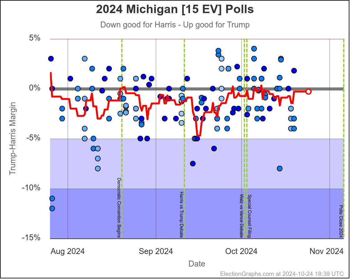
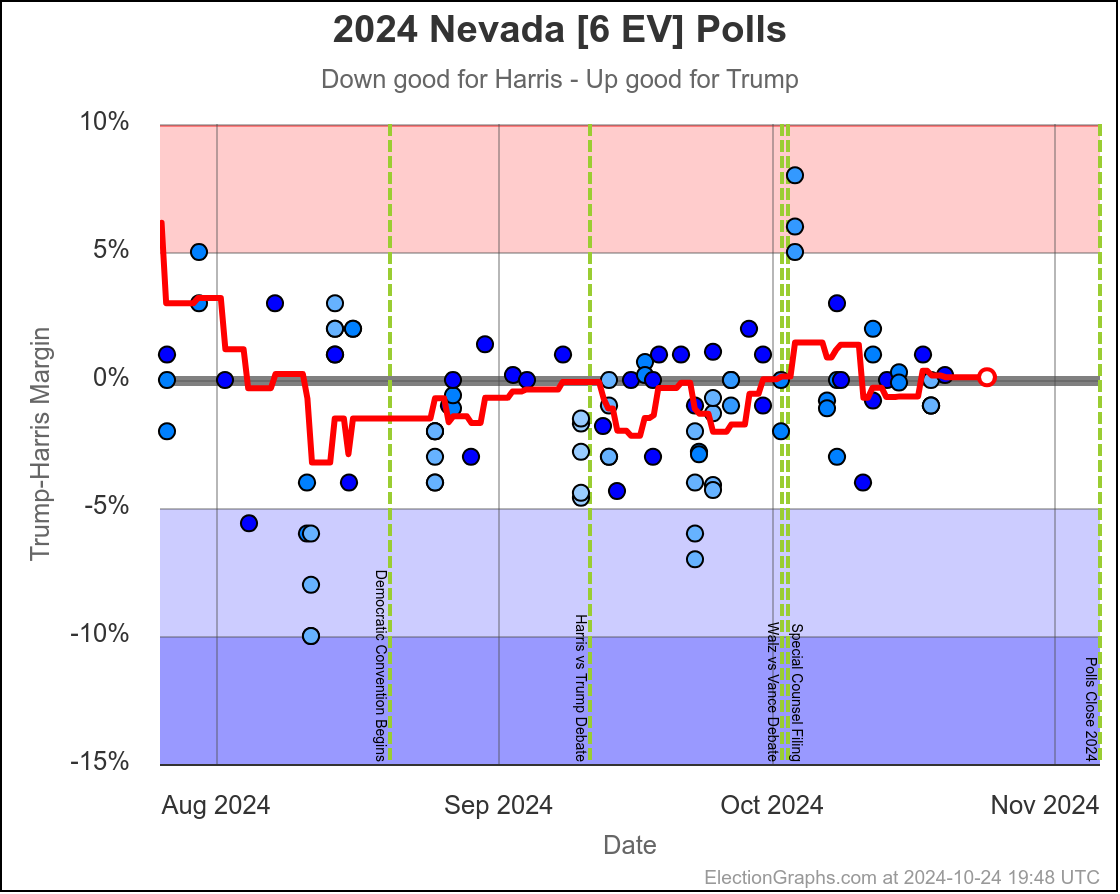
Right now we have Michigan as Harris by 0.3%.
If we only included the high quality pollsters this would be… Trump by 0.5%
So at least for Michigan, moving to the high quality pollsters actually helps Trump by 0.8% at the moment.
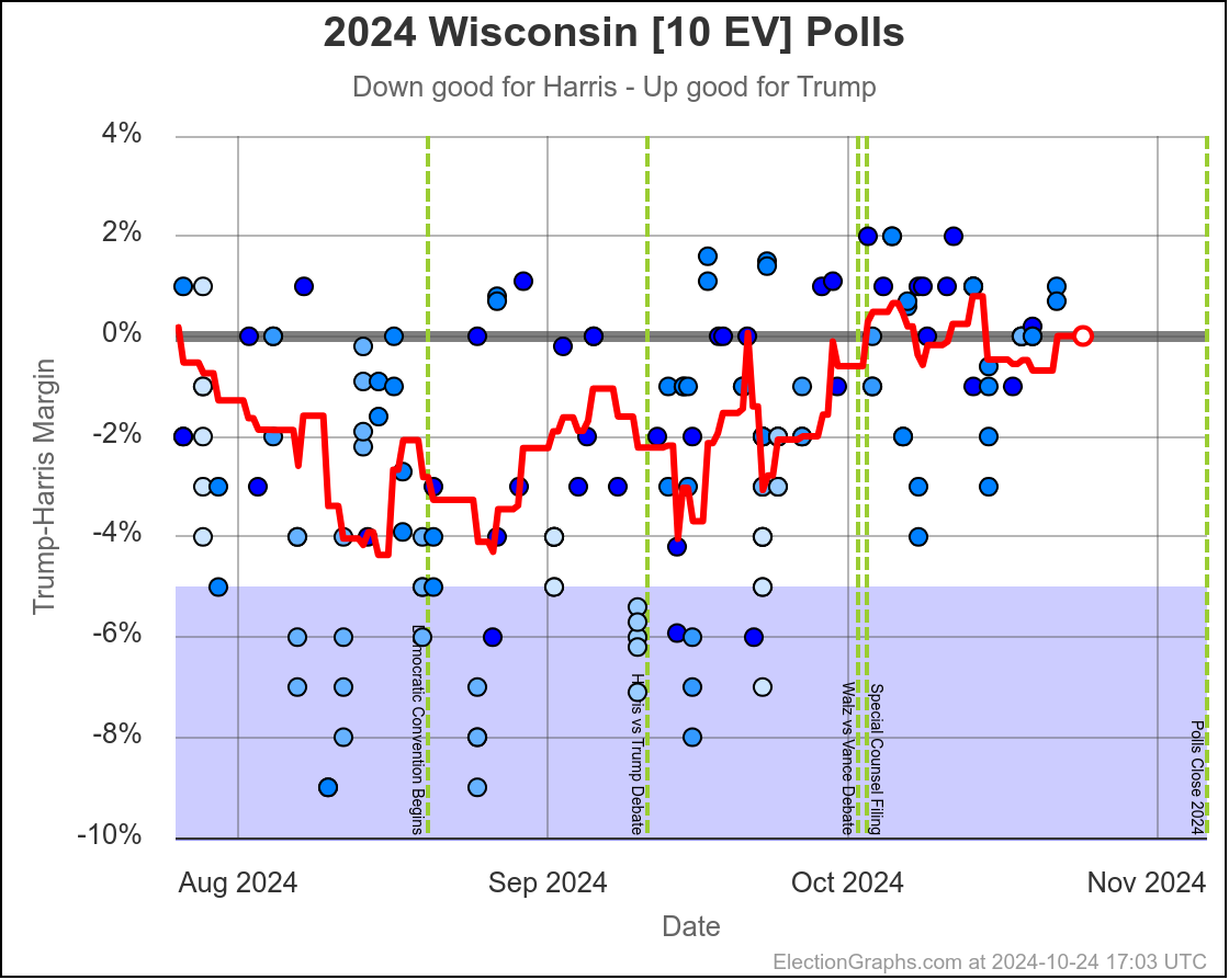
Current average: Trump by 0.0% (rounded from Trump by 0.01%).
With only the 2.5 and above pollsters: Harris by 0.6%
So eliminating the low quality pollsters boosts Harris by 0.6%.
Current average: Trump by 0.1%
Only the 2.5s: Harris by 0.8%
So moves things 0.9% toward Harris.
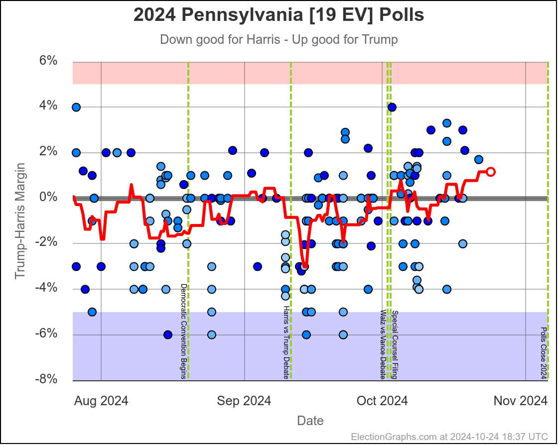
Current: Trump by 0.6%
Only the 2.5s: Trump by 1.1%
So limiting helps Trump by 0.5%
Current: Trump by 1.2%
Only the 2.5s: Harris by 0.1%
So 1.3% better for Harris
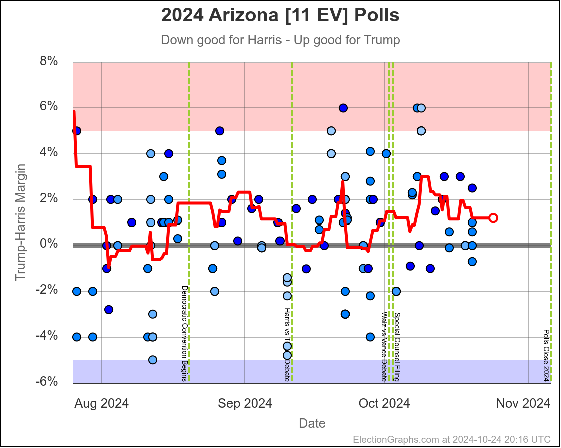
Current: Trump by 1.2%
Only the 2.5s: Trump by 2.7%
So helps Trump by 1.5%
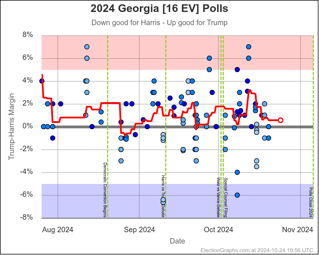
Current: Trump by 1.3%
Only the 2.5s: Harris by 0.3%
So helps Harris by 1.6%
OK, that's all seven of them. They vary from helping Harris by 1.6% to helping Trump by 1.5%. Averaging the effects in these 7 states leads to… helping Harris by 0.2%.
So pretty small on average. But how would this change the tipping point or who was winning or losing and all that? Lets put the states in order based on these new averages:
- Nevada (6 EV): Harris by 0.8%
- Wisconsin (10 EV): Harris by 0.6%
- North Carolina (16 EV): Harris by 0.3%
- Pennsylvania (19 EV): Harris by 0.1% <– Tipping Point
- Michigan (15 EV): Trump by 0.5%
- Georgia (16 EV): Trump by 1.1%
- Arizona (11 EV): Trump by 2.7%
With these numbers, the tipping point moves from Trump by 0.6% to Harris by 0.1%, so restricting to the highest quality pollsters improves Harris's tipping point by 0.7%.
This would result in Harris 277 to Trump 261, a 16 electoral vote win for Harris.
So yes, looking at only the highest quality pollsters does result in a bit better picture for Harris. (At least right now, this will obviously change whenever new polls come in, which is multiple times every day at this point.)
But we still end up in a situation where the result is dependent on 7 states with margins under 3%, with 5 of those under 1%, and with a tipping point just barely different than zero.
This is as close to a tie race as you can get.
What would it mean for the EG probabilistic views? Well, you can't really tell directly. The analysis of the 2008 to 2020 elections showing how far off averages were from actual election results included the low quality polls. So to properly answer that question you wouldn't just plug the new averages into the models I already have, you'd have to build new models based on similarly restricting the 2008 to 2020 data to high quality pollsters only.
Plus, at least until we actually have election results, we won't know if the average with or without the lower rated pollsters actually ends up closer to the real results. In 2016 and 2020, my memory is that having these lower rated pollsters in the average actually pushed the averages CLOSER to the actual results in the end, as opposed to making them worse. (I haven't gone back to double check that though.)
Ignoring all of that that, there is one back of the envelope approximation I can make pretty easily. The "Uniform Swing" probability is generally very close to the probability of a win given the margin in the tipping point state. In this case a 0.1% Democratic lead.
This calculation would give Harris a 36.2% chance of winning, compared to the 32.5% chance with the current averages as of when I started this blog post (accounting for the amount of time remaining).
So again a bit of an improvement for Harris, but not enough to flip this from "too close to call but with Trump favored" to "too close too all with Harris favored".
Trump is still favored even when you restrict the poll averages to only the highest quality pollsters. Just by a little less.
So all in all, the "junk pollsters" do make things look a little bit better for Trump than if we used high quality pollsters only, but we don't actually know for sure if that is a better or worse picture of reality, and the overall picture doesn't change. It is still too close to call regardless.
OK, now, with all that out of the way, guess I should do the usual, "how have things changed since last time" thing…
Movement toward Trump:
- Pennsylvania (19 EV): Trump by 0.0% -> Trump by 1.2% (Trump+1.2%)
- Texas (40 EV): Trump by 5.8% -> Trump by 6.6% (Trump+0.8%)
- North Carolina (16 EV): Trump by 1.1% -> Trump by 1.3% (Trump+0.2%)
No movement:
- Nebraska-CD2 (1 EV): Harris by 7.3%
- Virginia (13 EV): Harris by 6.3%
- Iowa (6 EV): Trump by 4.4%
- Florida (30 EV): Trump by 6.6%
Movement toward Harris:
- Maine-CD2 (1 EV): Trump by 4.5% -> Trump by 4.4% (Harris+0.1%)
- New Mexico (5 EV): Harris by 7.2% -> Harris by 7.4% (Harris+0.2%)
- Wisconsin (10 EV): Trump by 0.3% -> Trump by 0.0% (Harris+0.3%)
- Arizona (11 EV): Trump by 1.5% -> Trump by 1.2% (Harris+0.3%)
- New Hampshire (4 EV): Harris by 6.8% -> Harris by 7.4% (Harris+0.6%)
- Maine-All (2 EV): Harris by 9.3% -> Harris by 10.1% (Harris+0.8%)
- Georgia (16 EV): Trump by 1.4% -> Trump by 0.6% (Harris+0.8%)
- Minnesota (10 EV): Harris by 5.4% -> Harris by 6.4% (Harris+1.0%)
- Ohio (17 EV): Trump by 7.1% -> Trump by 6.1% (Harris+1.0%)
- Michigan (15 EV): Trump by 0.8% -> Harris by 0.3% (Harris+1.1%)
- Nevada (6 EV): Trump by 1.2% -> Trump by 0.1% (Harris+1.1%)
- Alaska (3 EV): Trump by 9.8% -> Trump by 8.4% (Harris+1.4%)
So 12 moving toward Harris, with only 3 moving toward Trump. But with all of that, the tipping point still only moved from Trump by 0.8% in Michigan to Trump by 0.6% in Georgia.
So even though a bunch of states moved toward Harris, with Pennsylvania moving toward Trump, the net impact on the tipping point was negligible.
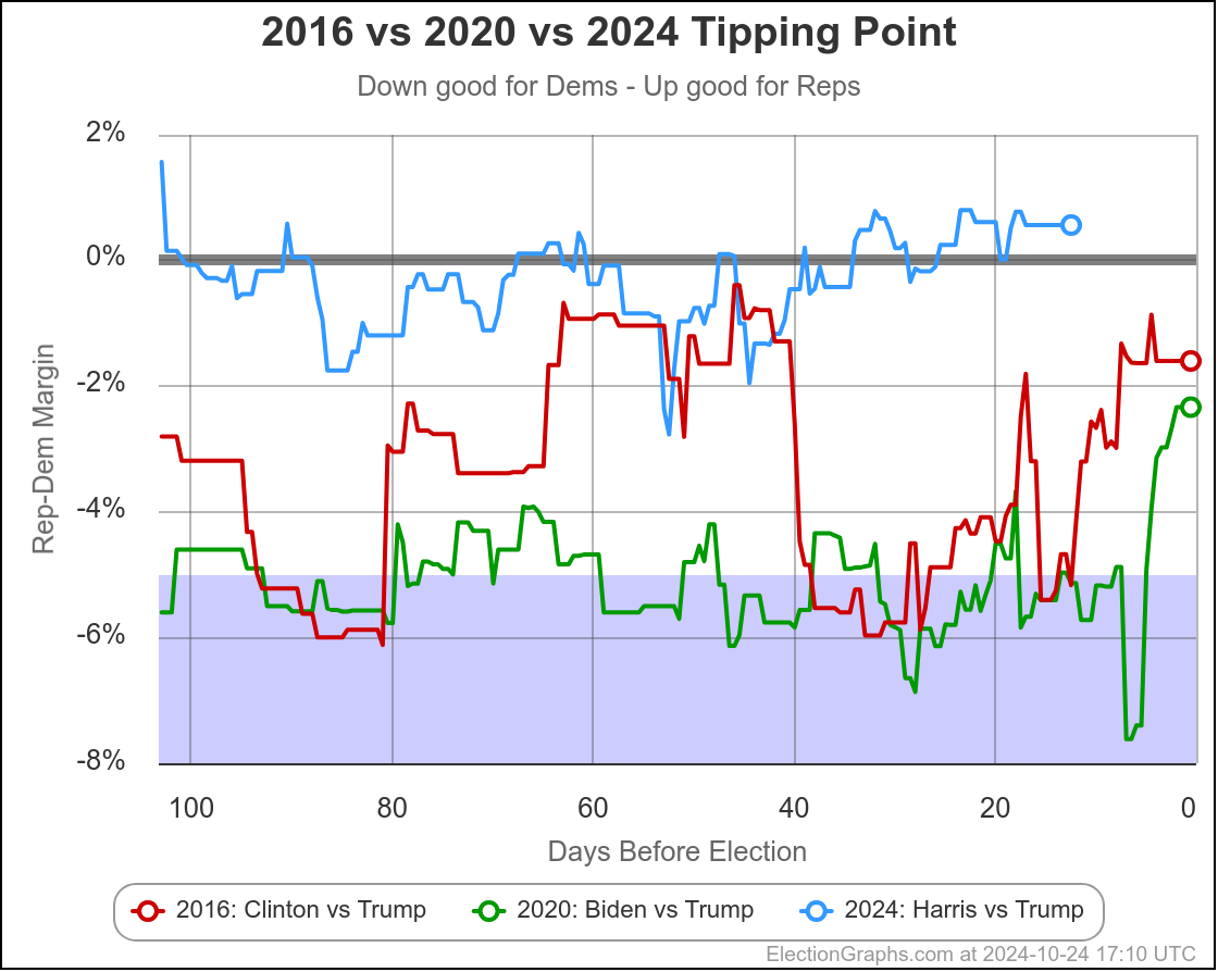
So lets look at the tipping point chart, with the 2016 and 2020 comparison lines:
For the last few weeks, the tipping point has been bouncing around barely on the Trump side of the center line. This is movement from the weeks before that, when it was bouncing around barely on the Harris side of the line instead.
As usual, I will point out that Harris is doing significantly worse than both Biden in 2020 and Clinton in 2016. In both of those years, the polling underestimated Trump. Absent a large movement in Harris's direction in the next 12 days, if the polls are underestimating Trump again, then he wins. Because he is already leading, and the error would just mean he wins by even more.
To pull out a win, Harris either needs that last minute big move in her direction, or for the polls to be overestimating Trump this time around.
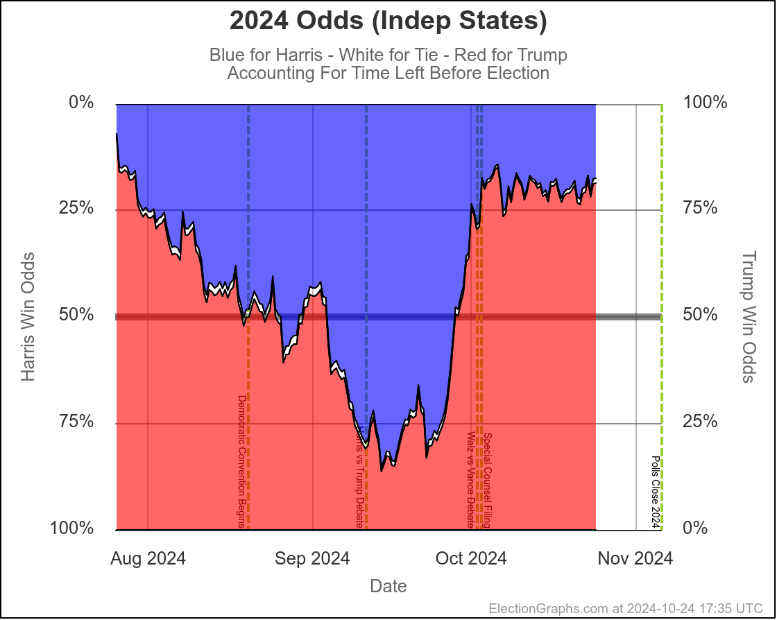
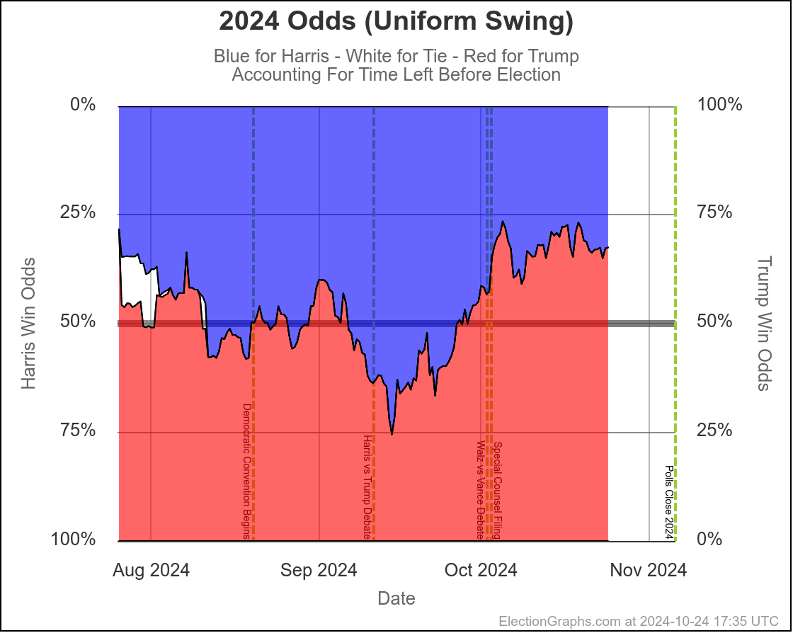
The trends in the two probabilistic models (accounting for time left) look like this:
You'll note that the win odds for both of these models haven't really moved around all that much in October. The Uniform Swing odds have varied a bit more, but both basically show Trump favored, but with non-trivial chances still available for Harris. But no big trend toward either candidate.
This may still change before the end, but time is running out quickly.
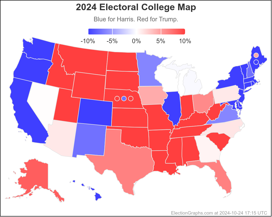
We'll end with the current map:
11.7 days until polls start to close on Election Night.

Wow! No wonder you took vacation to work on this! Not sure how you identify "better" polls. I rather suspect each has a constituency who answers and a lot who never do – and the never do folks may also vote. Oh well. We will find out in a few weeks when actual votes are done being counted. Love your intensity on this. Enjoy! mother
I didn't determine better or worse pollsters myself, I used the work of fivethirtyeight, which is part of ABC News at the moment. They rate pollsters based on how accurate they have been in the past, plus how transparent they are on their methodology. Response bias (who answers the poll and who isn't) is a core part of any polling. At this point there are absolutely zero pollsters that just have 1000 people answer, and 450 say they will vote for Candidate A, so the percentage is 45%. They all ask a bunch of demographic questions, and then weight the responses in order to match the expected turnout. So for instance, if they expect Group A to make up 40% of the voters, but they only get 20% of their sample in Group A, then every one of those Group A people will count double when they find the result. Problem with this is that it requires each pollster to guess how each of those groups will turn out, and they can of course be off!